#cool toned colours
Text
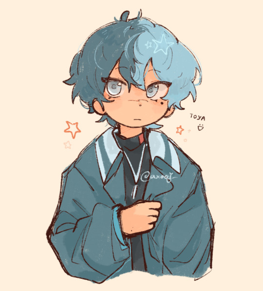
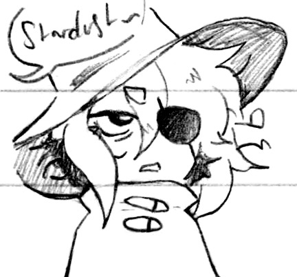
toya doodle 😢
#stares at u with big eyes#going through the worst art block of my life#i like the purple blue colours of toya's design but i also am terrible with cool toned drawings so hes just. no longer ourple. sorry#aoyagi toya#toya aoyagi#aoyagi touya#touya aoyagi#the guy#vbs#prsk#pjsk#project sekai#colorful stage#prsk fa#proseka#my art
614 notes
·
View notes
Text
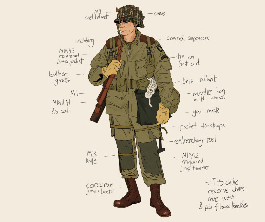


uniform studies + kit lists
#theres literally no cohesion between anyones uniform like. they all have diff bits at any moment. anyway! studies#hbo war#band of brothers#the pacific#masters of the air#joe toye#eugene sledge#rosie rosenthal#ww2#ww2 uniforms#also wanna do service/dress uniforms and the other airmen flying kits becoz theres so much variation in each + its fun researching#this comes from my oc stuff but i like giving their uniforms slight colour variations to tell them apart like rosies is more pink toned#bubbles is more blue/dark grey. sledge is cool tones. snaf is warm etc. the bob guys are all the same shade tho
386 notes
·
View notes
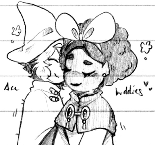
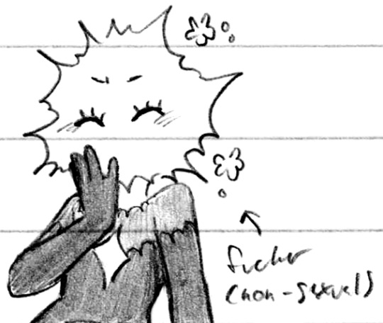
Text
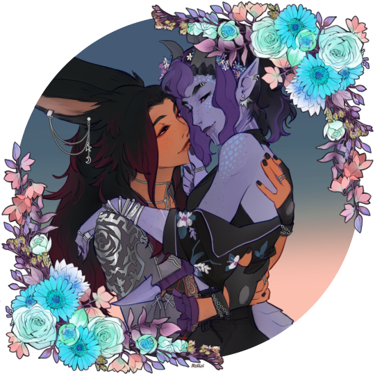
I got this comm back from @britishmuffin today and aaaaaaa I cannot get over it those are my little guys. the permanent residents of my mental microwave. both being Held Tenderly by each other, like they deserve 😭💜🖤
(edit: idk if anyone will see this original post anymore but please do not refer to these two as women! they're both non-binary; transmasc and genderfluid respectively. tyvm <3)
#I can't get over it all the little details RAAAGHHH the swapped motifs! the warm/cool tone contrast! how they're looking at each other!#they're peak yaoiyuri to me. this just makes it better#the trans flag forget me nots in dusk's hair I'm v glad I picked out those colours... the whole idea turned out even better than I hoped 😭#anyway yeah I'm Normal about this one muffin smashed it out of the park again ❤#ari#dusk#🌙🐇
162 notes
·
View notes
Text

I have decided to stop meddling with this piece. It has to be done at some point, and here it is!
I'm happy with how it turned out 😁
My last chimpanzee painting was two years ago, so it's time I make another one!
Painted in acrylics and touched up with CSP.
Shared some process shots too, just below :)
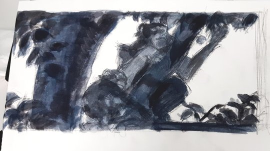
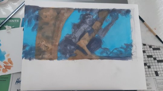
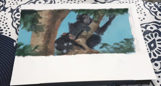
it was very messy.... and the lighting made a HUGE difference in the end!
#chimpanzee#acrylic painting#mixed media#shoutout to my friends in art group chats#your critiques saved me#THANK YOU!#the thing about painting chimpanzees is that youth and adults have such different skin tones#a mother-child piece is... interesting. They don't really blend together#youths have pale skin#while adult chimpanzees have this bluish-black-grey skin.#some still retain a bit of redness#but in a lot of the reference shots I used they look so BLUE when they are standing in strong sunlight#and this piece is in strong sunlight and right up against the blue sky#it was very challenging to put warm light on their cool coloured skin#hope it worked out...
77 notes
·
View notes
Text

Been putting some time into Doily 14 (Yarn | Pattern) since it's easy enough knitting to do while reading and man. Every row takes a year.
Probably because every row is over 500 stitches at this point. Ouch. And I still have almost 20 more rows to go. I'm averaging something like 2 rows a day (while swapping in other projects when I get bored). Keeping my energy by admiring the pretty gradient every chance I get.
#knitting#knitblr#wip#lace rot#lace knitting#project: doily 14#this will be so gorg on an end table as like a small table cloth#I need to buy one billion round end tables just to put my doilies on.#Or find someone to give this to tbh. it doesn't match my house. everything is cool toned blues/reds/greens#our puter room is less cool toned and more neutral tho so it could be a good pop of colour#brings me back to the need for round end tables
81 notes
·
View notes
Photo
Family ♥ (Patreon)
#Doodles#ISaT#Siffrin#Isabeau#Mirabelle#Odile#I have not been able to stop drawing Sif's black ensemble under their cloak ever since I learned about it#The cutest#His favourite colour is black and he wears all black and he dyed his hair black so now it's two-tone!#Stopppp that's too cute#Got curious and yes - fully black-haired Sif is Very cute <3 Contrast lad#Pls gentle touches to Sif they deserve soft holds <3#I'm really happy with their hand expressions there ah Isa's big hands and Sif's small and cute#They love each other!! However whichever way <3#The posing for Sif and Mira is awkward because I was trying to draw the one with them hugging and failed lol#So they're just existing in proximity and happy about it <3 Just being together is fun!#I do love Sif getting practice in on positive touch but also just being nearby and being happy <3#Good company for certain#Can you tell I'm less practiced at drawing Odile so far lol#She is pretty <3 I didn't fully understand the lesbian catnip comments at first but I think I get it now lol#Her flyaways are probably my favourite hehe <3 Gotta draw her with crows feet sometime! Lovely ♪#I love her watching out for the younger members of the party in her cool and dry way hehe - Sif is sleepy! But he needs a push to go nap#There's the hug yaaay <3#I like everyone's outfits very much but I will admit to not using references when I drew Mira :'D More the vibes of her clothes lol#I'll draw them proper sometime!#Odile's outfit is very pretty <3 I love all the allusions to gems ah it's so cool#Such a lovely bunch!
115 notes
·
View notes
Text
devastating to admit as a phillie but dan absolutely killed this one. it’s glittery!!!! what’s a girl to do!!!
#dan and phil#phan#dapg#amazingphil#daniel howell#phil lester#i love cool toned colour palettes as well so. mr on fire you get this one#robin 📢
57 notes
·
View notes
Text
Idk I've been demotivated to do Wish stuff lately so take some loose redraws
@gracebethartacc @chillwildwave @spectator-zee @your-ne1ghbor
#rewrite the stars au#the wishing kingdom#shooting stars au#the kingdom of roses and thorns#disney wish#wish 2023#asha x star#saph doodles#asha#star x asha#human star#starsha#if you want me to redraw something from your au just send an ask or put it in the reblogs ig#no guarantees on whether it'll be coloured but#make sure to have a coloured ref for them#that helps#also zee like#orion doesn't look the best? i'll have to do more studies on him#the differences in skintones for the ashas' i enjoy#grace's asha is more cool-toned like tiana#versus wave's i preferred warmer colours to compliment her dress#and sorry neighbour yours was the only one i didn't colour bc i didn't know what colours siren!star was#anyways#wishverse moots ✨
37 notes
·
View notes
Text


fuck it, my own Hoenn protag redesigns!!
i actually like most of ORAS redesigns (esp the gym leaders), buuut I really don't like the protagonists and the evil teams (maxie what did they do to you). also I love Emerald more so i guess you can say these designs would be for an ORAS-like Emerald remake lol
#painter's colours#my fanart#pokemon#pokemon emerald#pokemon rse#pokemon oras#trainer may#trainer brendan#also i usually play with may so i never really viewed her as a rival#so she has always been pretty battle-ready-ish and trainer-like for me#cool gurl#and i love that brendan is boyish and cocky lmaoo#i legit gasped when i played pokemon emerald that boy is so passive-aggressive sometimes#but not in a dickish way like blue/gary#and i rather like that they toned it down in oras but still kept the concept
33 notes
·
View notes
Text
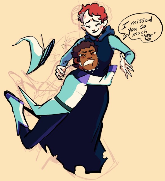
[ID: a coloured and shaded digital sketch of Luz and Lilith from the owl house. They're depicted with their designs from For the Future. Luz is tackle-hugging Lilith, ugly crying and exclaiming "I missed you so much". Lilith braces for the hug and smiles with tears also in her eyes. The background is a pale yellow colour and previous versions of the sketch can be seen at low opacity behind the full drawing. End ID]
When you see your cool aunt (actually a loser but you love her) for the first time in months and she has a badass apocalypse makeover but still somehow looks like a librarian
#the owl house#toh#luz noceda#lilith clawthorne#I have a distinct feeling they won't reunite until the last episode (which I'm cool with#we're kinda busy rn)#but that won't stop me from imagining self-indulgent scenarios!! I love their relationship so much#luz really went from calling Lilith a bitch in the only way the disney channel would allow to being like. okay she's pathetic#in the first few episodes of season 2 and then by elsewhere and elsewhen when Lilith is visibly doing better luz is so supportive#of like. her new job and hobbies and stuff#and Lilith is still the same cringe fail slug woman we all know and love but she cares about Luz!#she wants to help her and share her interests with her!#they're so lame together and I adore them soooo much. adhd and autism best friends forever (real)#this was a quick doodle that i put way too mucn effort into colouring and posing wise to not post#I'm proud of the shading not bc it's especially intricate or pretty#but because the process was entirely me colour picking each individual colour and futzing with it until i got coherent shading#it's not something i do often but i love to practice it cause i feel like it improves my colour sense#and also allows me to micro manage the palette#like how Luz's azura outfit and the inside of her mouth and Lilith's skin are all the same shade of off-white#BUT i gave Lilith's a warmer shading tone (bc it's skin and has blood beneath it) while Luz's teeth has a yellow shading cast#(since that's the colour teeth turn w/o enamel and most ppls teeth is a yellowy off-white anyway) and then Luz's outfit has a teal cast!#bc i wanted white fabric to look different to pale white skin or teeth#that's such a niche thing to have fun doing and appreciate abt my own work but like. it's there!#I'm not a master of colour by any means it's just nice to be able to do that
407 notes
·
View notes
Text
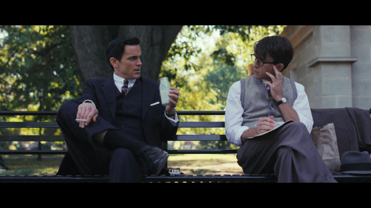
Fellow Travelers | The Orange Elephant in the Room
Alright, let's talk about it.
For those who've watched the available episodes of FT so far; I'm sure we've all noticed the citrus haze they all seem to be living in.
Especially if you've attempted to edit/GIF any portion of it. The struggle is real and I'm sure has inspired many colouring dilemmas.
And we're all asking "WHY?!".
Now, I'm writing this having not looked up anything about it. So I dunno if anyone responsible has made a formal confession.
One of my initial thoughts around it was; okay... so is this just a 1950s thing? But after watching (and rewatching) episode 2, I feel like it's part of the story in a different way; It's clearly a stylistic choice, yes (I should hope that doesn't just happen by accident). But it also seems to double as a narrative choice.
Putting the rest, with image examples, under a cut because it's kinda long.
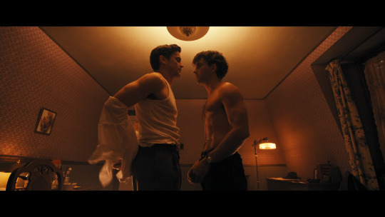
Warm vs Cool
The conclusion I've come to is pretty simply, one that we've seen used across media in a lot of movies and shows. Warm tones used to colour scenes that are meant to literally be 'warm'; a loving environment or somewhere where the character(s) feel like they can be themselves. Cool tones used for scenes where it's quite the opposite; a cold hostile environment where the character(s) does not feel welcome. Gradients in between for all the neutral/'greyarea' spaces.
Consider
Cool/neutral outdoor bench scene (with park spies around):
Maybe it's an indoor/outdoor thing? No...
Indoors (even with the mandatory orange lamps nearby) they stay pretty neutral:

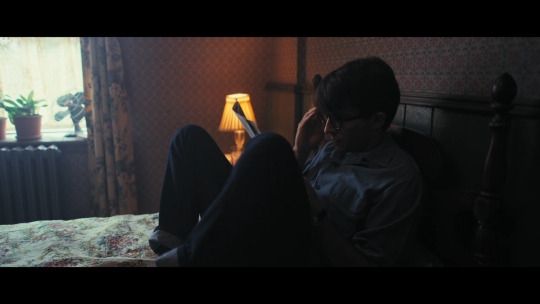
Night time/day time thing? No...
Night time vs day time in Tim's apartment:
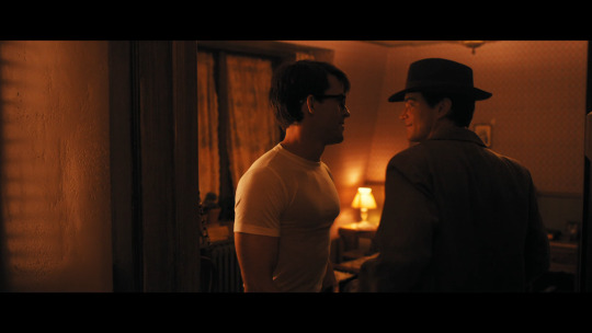
Compare it to day time neutral alone Tim in the same room before. The difference is that he's with Hawk, out of sight of any would be naysayers.
So yeah, while I am mad about the colouring for giffing needs, I do think what they're doing is pretty neat, and the POC in the show look glorious in the warm tones.
The warm/cool motif is dialled up even more in episode 2, with the contrast of Mary's warm welcoming party and Hawk's cold af family gathering (even though they still have the orange lamps/sconces around, they add nothing to the warmth):
🥺 Ugh, Tim at Mary's party. Might be my favourite part of the episode, alongside the kissing n spooning. Anyway...
The transition of Mary from the same living room where she hosted that party, to the kitchen they were just questioned in:
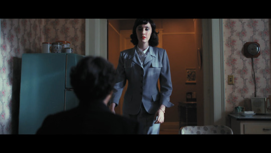
That transition made me start paying more attention and go back to rewatch previous scenes just for colour themes.
Interestingly Hawk's apartment seems to live in this neutral/warmish space. It was more warm earlier in the episode, especially when they were in the bedroom the morning Tim left his glasses. But in general it's a lot less warm than Tim's apartment when compared; still their skin glows with a hint of tangerine:

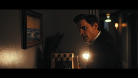
Of course, not only the lighting/colouring but their outfit choices say a lot. Tim is usually in the warm browns with his dress, while Hawk pretty much sticks to black, white, grey (hints of a cool toned blues and reds in his ties). This coupled with the differences in their own living space probably reflects a lot about the character and how 'welcoming' they are to others. Idk... or I could just be thinking too much about it.
This is another really interesting transition in episode 2. As Hawk hangs up the phone in that cool toned side room, opens the door to the main room of a gay bar, the warm tones literally seem to absorb him in. Which makes sense, this is obviously a gay friendly place in San Francisco. He doesn't have to try to hide any part of himself, like he probably was still trying to do on that voicemail to Lucy just before.
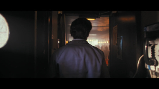

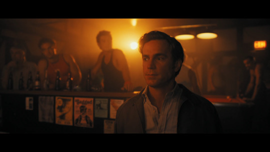
Now, I could go through and screenshot a load more examples (some scenes with Lucy are interesting, and that lounge/club), but you probably get the gist, you see the pattern. If not before, on your next watch, you'll certainly see it.
This has got longer than intended; I'd be surprised if anyone got this far, I did NOT fully organise my thoughts before I started this, I just began rambling and I feel like it could've been more organised and laid out better. But if you have thoughts about the colouring, I'd really like to see those too. 🤗
#fellow travelers#orange#ft spoilers#ft motifs#tim laughlin#hawkins fuller#colouring#lighting#colour grading#tim x hawk#hawk x tim#gay#lgbtq+#warm tones#cool tones#colour theory#giffing things#long ramble#this show make we wanna convert every pic/gif to greyscale
83 notes
·
View notes
Text


my rendering style is too all over the place to do something like this usually (something I'm working on fixing tbh it's not very efficient) + I am a do everything on one layer person so it's hard to keep track of my steps. But anyways thought I'd share this :D
I realize a lot of this is step 1 circle step 2 details ndkdodsj ok next time I'll export progress pics as I go ...
#fairy tail#natsu dragneel#fanart#art#fairy tail fanart#p sure i got rid of the lineart layer at some point#or painted over it??#i also have to colour correct everything i do digitally#bec the display on my ipad is veryyy yellow#so the actual drawing is more cool toned than i realize on other displays#erza scarlet
27 notes
·
View notes
Note
24
'do you have a shameful art past?'
like every 10 year old (in the early 2000s on deviantart) i used to trace manga panels and colour them in lmao (so much one piece tracing LOL) and i used a lot of 'bases' on deviantart to make ref sheets for my crappy ocs. not sure if that's 'shameful' as learning to draw is SO tough that i think everyone references/traces/colour picks as a child or young teen in order to gain the vaguest foundation of 'knowledge' that they then can build on.
Colour picking (like recently...during photo studies) was literally how I made the power of mid-tone greys 'unlock' in my head despite being told countless times 'if you desaturate a colour it'll appear grey next to its more saturated chroma' it never clicked until I did some dirty colour picking and saw the pattern emerging countless times. 'hmm maybe those dang art books are right'
#asks#when i say grey i mean#if you desaturate a colour it'll appear COOL next to the more saturated chroma#which in turn is often interpreted as grey#mid tone greys are REALLY cool and powerful#its the whole is the dress yellow or blue thing
28 notes
·
View notes
Text
Thor 1 has so much banger dialogue and visuals that are that way because of the very specific context they’re in and I love that for them despite all the tilted angle shots 💯✨👍
#the movie is actually so so good for analysis for a bunch of narrative reasons which is cool#I’m still smitten by the use of colours alone#the way so much is implied but through proper integration into the setting#it’s very evident with the relationship establishment especially and I love that#because it does so much in a small amount of time???#a lot of the movie is slow but the meaning of what’s going on happens pretty concisely#like oh Thor is on Earth thinking he’s stuck for the foreseeable future and is becoming less arrogant and more aware of consequences#and how he is able to make mistakes#and ah maybe the way I interact with others should be more considerate to their perspective#and there is knowledge and stories that can and should be learnt and shared#etc.#the COLOURS#I love the use of cool and warm tones so so so so so so much#it’s so clever#the entire movie is colour coordinated#forget the camera angles Thor’s fall from grace STILL landed him in a golden desert albeit in the middle of the night#while Loki on Asgard had the blue tones EVERYWHERE#like BROOO#the times he had gold it was when he was in the room with Odin/Frigga and trying to ‘save’ Asgard by killing Laufey#he went to meet Thor when he was captured by SHIELD and things were WHITE#THEY WERE WHITE
48 notes
·
View notes
Photo
Time Loops are they/them culture (Patreon)
Bonus of my little guy in ISaT style:

#Doodles#Pixel art#ISaT#Siffrin#Loop#And then I still don't have even a code name for smol and my time loop concept lol#I'm sure you can imagine my excitement upon seeing a time loop RPG <3#Not to be silly but the thought of either of us picking up the wavelength and running with it is fun to me haha ♪#I...may or may not have developed brainworms about it it's fine lol#Good characters! Good story! I'm always a sucker for a tragedy with bright spots <3 It's hard to even call the ending bittersweet tho hehe#It's very sweet! Like sugar :) Hehe#Shock of shocks I - person who has done this how many times now - liked the dynamic between Sif and Loop best haha#Is it spoilers if it requires past knowledge of my faves hmmm inconclusive lol#These were just introduction doodles - not even Getting Used To doodles yet a step before that!#Fun designs :D I like Sif's hair a lot <3 The way it's two-tone because he likes black! Adorable! And cowlicks hehehe#And eyepatch hehehe Sif's design is so fun ♪#What no my time loop shop keep lad having a hat like that has no bearing! I'm completely unbiased! Lol#For the pixel art I did directly just use Siffrin's hat in shape haha I just added the belt and buckle ouò#Man it's been too long since I've played with pixel art it's still so fun <3#Someday I'll get Aseprite. Someday#In the meanwhile it was fun to make their colour palette :D#I love that ISaT is in black and white canonically as well I think it's really cool ♪#Me when monochrome red 💕💖😭🤌💗#It is simply The Best colour palette out there I'm sorry others need not apply#Again my pencils and blood pen surely give away none of my biases because I don't have any lol#Hrmng I want SASASAP too pixel art cool - the glow up in ISaT is only strengthened by looking at the original closely!#Ah well I'll just admire at a distance until then <3
46 notes
·
View notes
Photo

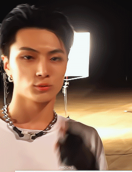

the 'J' in Jay stands for gorgeous
#enhypen#jay#enhypen jay#enhypenet#kpop#kpopco#ultkpopnetwork#malegroupsnet#dailybg#boyidoledit#heyjoy#userjelly#*gifs#*jay#so i used gradient map for this and some colour adjustments just to get the same skin tone as i always get#lmfao the only diff is that gradient map is smoother than using colour balance#pretty cool ig#and yes the entire point of this caption is for it to not make sense#i giffed this ages ago but never posted bc i hated the prev colouring
308 notes
·
View notes
Last Seen Blogs

alexwoloch-blog
Alex Woloch

shurahumphreys
SHURA ART

techmagone
Tech Magone

batterybhai
Car and Inverter Battery Online Store

jualperumahanmewahwinataproperti
Untitled