#costume illlustration
Text
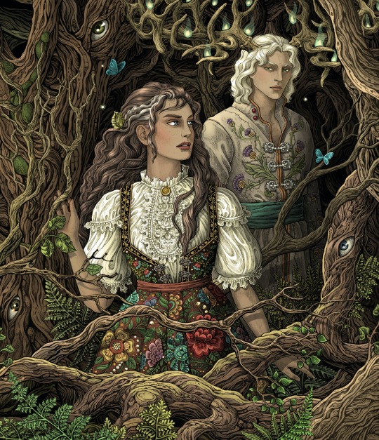

Book dust cover illustration made for "Where the Dark Stands Still" by Ania Poranek, a beautiful YA gothic fantasy novel inspired by Polish folklore, published by Penguin Random House and Simon & Schuster.
#book cover#book#young adult#slavic#slavic mythology#romance#polish#polish author#polish folklore#czantory#polish folk costumes#leszy#ania poranek#bubug#illlustration
238 notes
·
View notes
Text
Batgirl is ready for Halloween!
#I'm not ready tho#I have no costume 😭#my art#batman#batgirl#barbara gordon#dc comics#witches#illustration#halloween#illlustration#artists on tumblr
56 notes
·
View notes
Text


Part 2 of sharing my 2023 designs for future projects heading in to 2024... so let me just say I'm quite excited
#art#artwork#digital art#artists on tumblr#original art#my art#drawings#illlustration#fashion#fashion design#fashion illustration#sewing#my sewing#sewist#seamstress#crafts#stitching#diy#behind the seams#costume design#costume ideas#costuming#costume details#costume
12 notes
·
View notes
Text
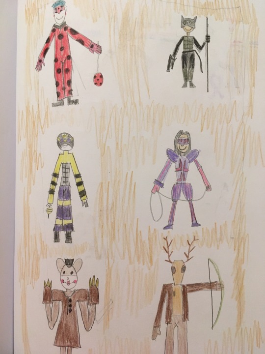
Fanart for Miraculous Team volume 10: Cosplay Chaos.
Available to read on Fanfiction.net, AO3, and Deviantart.
A lot happens in this volume: Hawk Moth recruits another lieutenant, Max discovers a device that could expose the Kwamis, the Japanese Expo comes to Paris, and Marinette is commissioned to help a mysterious cosplayer with her costume.
The whole thing is a love letter to pop culture and comic conventions. In my favorite chapter the team discusses people cosplaying as their hero selves, and they mention some creative gender benders. I’ve illlustrated some of the genderbends mentioned.
Left to right, top to bottom:
Buglad (based on Ladybug)
Chatte Noir (based on Chat)
King Drone (based on Queen Bee)
Tarantula (based on Arachnid)
Ursa Major (based on Grizzly Bear)
Forest Stag (based on Forest Doe)
For the fun of it, I named the cosplayers after my favorite voice actors. Buglads’ real name is Corey, after Corey Burton. Chatte’s is Kree, after Kree Summer. Drone is named Jim, after Jim Cummins. Tarantella is named Tress after Tress MacNeil. Ursa is Tara, after Tara Strong. And Stag is named Wayne after Wayne Knight.
1 note
·
View note
Text

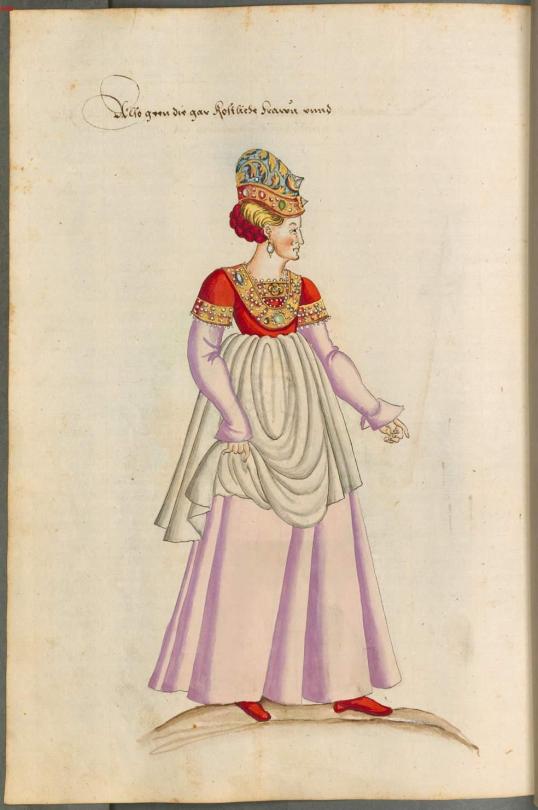
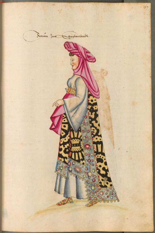
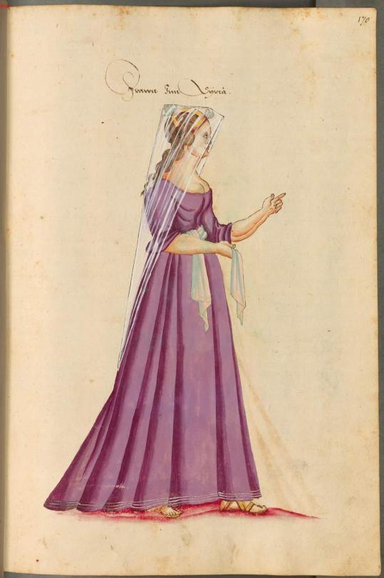
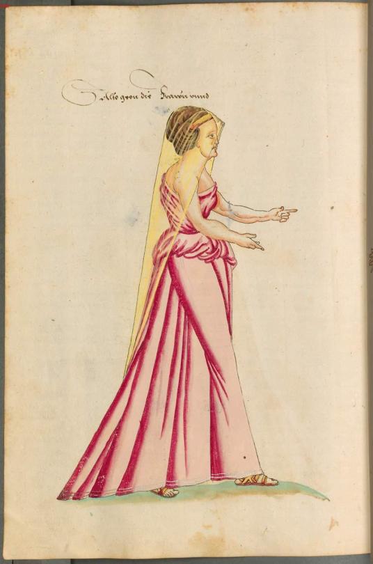
Illustrations from "Kostüme der Männer und Frauen in Augsburg und Nürnberg, Deutschland, Europa, Orient und Afrika", 4th quarter of 16th c
#mdporient#mdpillustration#costume illlustration#illustration#16th century#orient#costume book#illustrated book#costume history
346 notes
·
View notes
Photo

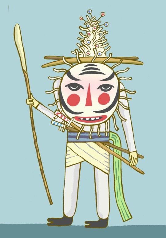
This guy was one of my favorites. Gnome of the Steamwalke party. Another contribution to Lost Spheres Publishing.
“Gods? Angels? Bah! They are just the totemic-metaforms of a cruxing-statigenic amplifier of massive size! The concept itself is relatively rudimentary involving ether-oscillations between variable pairings within the Seraphic-matrix. Each focal-bond achieves a kind of “zenith point” of reinforcement and the collapses from quasi-reality decay before affecting a dissonance with other recent resonance pairings. I mean the actuality of it is of course more complicated than that if one considers Alhimaht’s constant of mnemonic overlay for instance, which states….”
– Viondi Bronzegird, Head of Oppositional Etherics for the Steamwalkers Parity
#concept art#steampunk#game design#costume design#gnome#crystals#fantasy art#sci fi#science fiction#illlustration#fairy#fantasy illustration#mythology#artists on tumblr#dwarf
311 notes
·
View notes
Photo
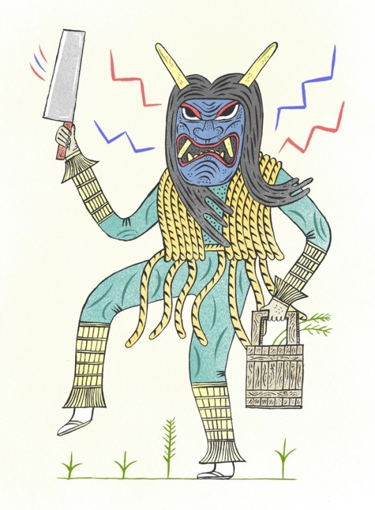
#yokainoshima#charlesfreger#illlustration#monster#folklore#japan#japanese#mask#costume#festival#islandofmonsters
85 notes
·
View notes
Text
‘Byte Me’ - Pixel Art Workshop Review
In this workshop, I’m exploring a retro 8-bit aesthetic to my characters and the economic approach games such as Mario took to animation, additionally to discussing why the pixel has become so popular in modern culture.
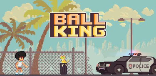
Recently, computer games with a retro style have become rather popular in modern culture - with examples like Minecraft, the popular app Ball Kings and the NES game consoles being reissued to eager fans. There’s a nostalgic appeal to pixel art, a loving look back at a bygone era of digital graphics and games. These simple pixelated graphics effectively paved the way for on-screen imagery - allowing gamers to play as a character rather than just a shape or line.
South Korean illustrator Jaebum Joe is renowned for his use of the style, which follows an approach that allows the artist to produce more detailed and exciting characters, with differing body shapes and fun character designs. His work harkens back to the side-scrolling beat ‘em up arcade games than a pixel platformer, with a Street Fighter aesthetic that results in a brilliant and striking animation for Nike, of an imaginary basketball game.

Nike / RUN_IT. (2018). Jaebum Joe.
Whilst I won’t be taking this more detailed approach, his work possesses a life and cinematic excitement unrivalled by any other pixel artist in his field. Joe isn’t limited to striking, flashy movements either - with his Tiger Office being a perfect example of a much-needed subtlety. It’s only fifteen seconds long, but the quiet whirring of the PC booting up and the flickering lights illuminating a quiet, lonely workspace speak volumes.

Tiger Office. (2017). Jaebum Joe.
In contrast to this more detailed and exciting approach to pixel art is Ivan Dixon, who works with significantly less pixels to embrace that retro aesthetic and nostalgia. Where Joe is focusing on exciting character designs, Dixon is an animator at heart - and how his characters move reflects this. His website is a showcase of extremely fluid and lively characters bouncing around in their small pixel boxes, with a naive and child-like sense of fun that’s rather infectious.
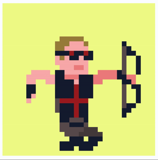
Avengers. (2018). Ivan Dixon.
His characters are often inspired by pop culture, with characters from films, games and popular tv shows all getting the bouncy pixel treatment. It’s this limited, cyclic animation approach that I’ll be exploring in my response, but in a more restricted way.
It’s Dixon’s limited colour palettes and embrace of the pixel aesthetic that I’ll be responding to in this workshop. The more detailed Street Fighter style is exciting too, but I’m looking to create a character and animation that’s clearly retro pixel art - so I’ll be sticking to a strictly 8-bit style.
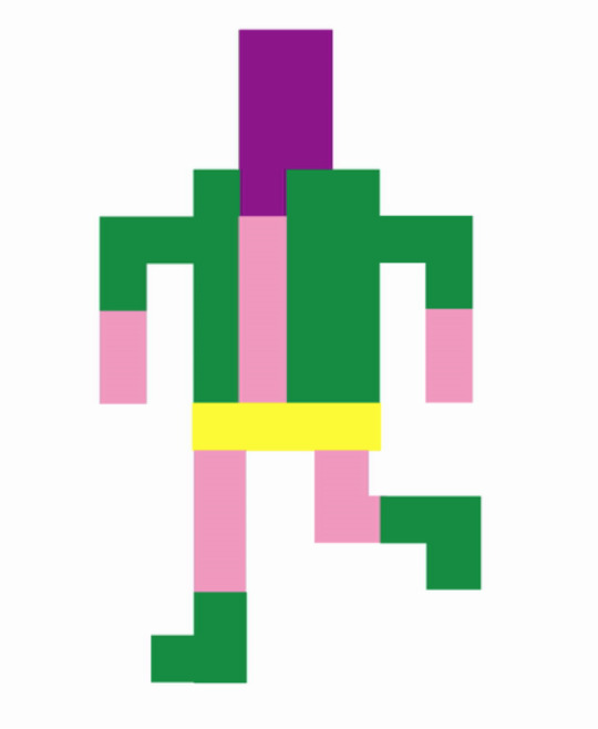
Step 1: Draw
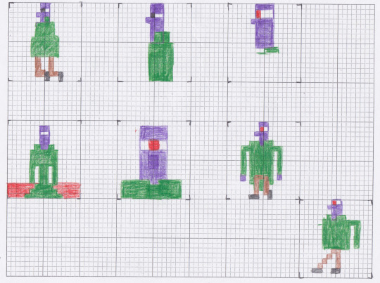
The process began by creating a few sketches, using grid paper to create a square module of 8 by 8 squares. For these drawings, I was working off a few observational sketches, taking inspiration from these to create my own character.
All of the examples I’ve looked at use bright colours - something studios did at the time to grab the gamer’s attention and make up for the lack of character detail. I wanted to follow this idea, so used a combination of green, purple and orange pencils to build my character.
My main idea was to create a supervillain character, looking at comic book villains such as Green Goblin, Joker and a whole host of other bad guys that also sport the same green and purple colour scheme. These pencil sketches, whilst just quick coloured studies, provided most of the design process for me.
When you work digitally, there’s an unconscious restriction and lack of experimentation. We’re so quick just to ‘undo’ anything that isn’t perfect the first time, that we might miss a great idea. With a pencil and paper, the pressure is off and I’m just sketching whatever comes to mind.
Step 2: Pixelate

Having a basic idea of the character I want to create, I headed into Photoshop in order to build a digital version. After setting up a new custom document with the correct specifications, I could then begin piecing together the bit-mapped image.
Pixel art is a style I haven’t really explored up until now, but it’s a process that I found rather intuitive and straight forward - as I’m restricting myself to a 8x8 grid, there’s no half pixels or diagonal lines - so it’s just a process of dragging and dropping blocks onto the grid.
When building my character, I played around with adding different features and colour schemes, but decided to leave the eyes, nose and mouth - instead, I explored a minimalist approach that resulted in an appealing character design, I think.
Having shown a few of my peers, I’ve found the success of the design lies in the simplicity, I feel. It’s purposely restrictive and minimal - and it finds a power within that limitation. Something I didn’t account for was my audience assuming the character is naked - the pink was supposed to be a costume, rather than skin - so I had to reconsider my choices if I wanted to illlustrate a super-villain character.
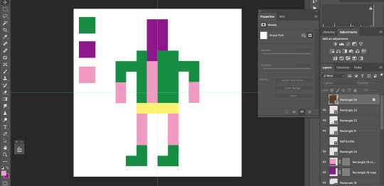
After experimenting with a few different colour palettes, I initially decided to use a monochromatic brown colour palette - going against the flashing vibrant colours of Dixon and Joe in favour of a quiet, subtle aesthetic.

Just in this pixelated style, I find there to be great potential using this technique. There’s a universal appeal to the style that cannot be overlooked, the naive quality of the designs engage audiences of all demographics due to it’s child-like creativity and sense of fun.
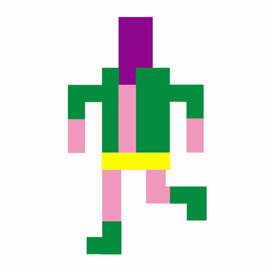
Step 3: Animation
My next move was to animate the character. Our tutor showed us how to do subtle movements using replacement parts, however I wanted to create a walk cycle so I made separate illustrations using the same character design. Working on my research into examples of how to animate walk cycles, I only needed four frames to capture that limited movement, but I think it really works here.
To create the sequence, I created separate illustrations for each frame: a contact and passing pose, and reversed them to create a walk cycle. It’s a bit jarring, but it works and the audience knows the character is walking. Its a fun asthetic that I hope to explore further. It’s a simple frame by frame animation, dragging the body down on the contact poses and then up again as the body steps up. As a looping animation, though, it’s quite endearing. The rather crude movements and jolting actions results in a visually interesting walk cycle, separate from any other sequence I’ve created so far.

The brown colour scheme works, exploring that idea of nostalgia once again, but I do feel as if removing the bright colours removes a life to the piece. The animation is still successful, but if I were to create another pixel walk cycle, I would want to experiment with a range of colours beyond the monochrome palette I’ve chosen here. It’s interesting, but the pixels aren’t properly arranged here - there’s some overlap that defeats the 8 bit style.
Having identified this, I went back and used my original bright colours, embracing the bizarre character design and cleaned up the actual animation. My final piece is much more exciting and successful, I think.
My animation is more restricted and minimal in design than the examples I’ve looked at here - but there’s a charm in that simplicity. If we compare my animation to fellow student Alex’s pixel characters, we can see we’ve both taken a relatively minimalist approach to design - something that’s inherent to the 8-bit restriction. Like myself, Alex decided to create full body figures, rendering famous characters from 70s horror movies. It’s her Cthulu avatar that I think is the most visually exciting, an ominous red eye amidst the blur of dark green tentacles makes the avatar look suitably omniscient and more than a bit sinister.

Alex has also stuck to the more abstract pixel approach, using a limited grid to embrace that retro aesthetic. If we compare this to an artist like Joe’s work, there’s a noticeable difference in style and concept - we’re actively embracing that lo-fi, pixelated look whilst Joe’s working on creating a more refined piece that looked like it jumped out of a 90s street fighter arcade game. Both approaches are successful, but Joe’s results in a much more refined outcome and visual style that I wasn’t really going for. It almost hides the fact it’s pixel art, and Alex and I wanted to embrace the process with our examples.
Although not animated, there is a life to Alex’s designs. I think it’s the dark grey backdrop and floor - a frame to the characters - that results in a piece looking like it’s about to bounce in true Mario fashion. I’ve said these pieces are appealing to a universal audience, due to the simplicity of the designs - but now I’m going to attempt to discuss why pixel art is so popular.
There’s a few factors as to why pixel art is seeing a somewhat of a resurgence in games and animation, as described by a few articles on the topic on the internet, from art discussion blog Widewalls to the more mainstream media hub IGN.
The main factor, of course, is nostalgia. People who were born in the early 80’s and later grew up with games featuring pixel graphics - and now, they’ve got their own money to spend. Adults see these games and apps with that retro pixel aesthetic, like Ball King and a whole host of other platformers, and they’re reminded of their happy memories as a kid, playing those games.
Nostalgia for the time of old is an extremely powerful tool on any audience, so game developers take advantage of this effect and produce games and animations that capitalise on that warm feeling.
It also helps that these pixelated games are rather cheap to make, in comparison to 3D rendering and graphics. It’s an open door for anyone - both big studios and independent developers alike. It’s approachable and comparatively much more easy to make. It’s this simplicity of process and technique that inspires hundreds of artists to produce works of their own, and it’s a way in to the gaming industry for many independent developers and small studios hoping for their big break.
Finally, there’s definitely something to be said about the inherent simplicity of the process - pixel art is commonly not detailed, and doesn’t need intensive rendering. It’s not intimidating, doesn’t look too intensive and as a result - draws a wide audience in. When games have high-quality graphics and specific settings just for the image resolution, fps and graphics card, casual gamers might feel a little alienated. As that myself, I can personally agree that this is the case. I go to a pixel game because of the neat aesthetic, but also the simple charm of the minimalist design.
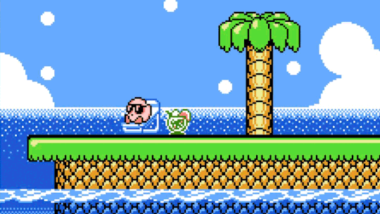
This simplicity consequently reflects the simplicity of the mechanics - when an audience member sees a game with pixel art, say Kirby - they aren’t expecting a difficult experience. Contrast this with the latest Fallout game and it’s a different story altogether. Complex graphics can be appealing, but as a whole - it can intimidate and even alienate a wide audience, who associates high graphics with ‘hardcore gaming’ - a style of gaming that might not be appealing or approachable to the general public.
Just in that brief discussion I’ve been able to explore why I think pixel art is so popular with a wide audience - but a good development from this would be to ask other students why they think pixel art has such a hold on the games industry, or contact pixel artists asking for their opinion on the matter. I’ve only looked at a few perspectives with my discussion, so exploring a few more would be a good way to further establish the context of this workshop.
In this workshop, I was able to learn a new process within Photoshop - how to create not only a pixel character, but how to animate him too. It’s a rather intuitive and straightforward technique, but one that allows me to work in an entirely different and exciting aesthetic. This visual style is universally appealing, and it provides an interesting contrast in not only style but movement in comparison to my other walk cycles I’ve produced so far.
There’s some real potential in this process, and I’d love to create a whole host of characters using the process, exploring different movements. Perhaps I could take some of the characters I’ve already designed and pixelate those, for example Michael.
I’m really inspired by the incredibly fluid and bouncy motion Dixon has been able to integrate whilst keeping to those pixel restrictions, and I could look at that approach as a potential development. Seeing a pixel character just bounce like a traditional animation is just appealing to me, so exploring how he creates these animations, by breaking them down frame by frame, would be a good way to follow this line of enquiry.
Moving forward, though, I’m going to be jumping from two dimensions to three - beginning some stop motion walk tests using my armature. So far I’ve explored digital and pixel animation, and I want to challenge myself to produce some stop motion tests too. I’ll be building a puppet, but I want to begin exploring the medium of stop motion and a physical walk cycle before I move onto producing an actual model, using my ready-built armature. We’ve recently acquired the professional stop motion software DragonFrame, a programme used by animator in the industry at the moment, for films like Isle of Dogs and Kubo and the Two Strings - so I’ll also be attempting to get to grips with the program in the process.
Actions
Make some stop motion walk tests using my armature, get to grips with professional and industry standard stop motion software DragonFrame.
Potentials
Produce another pixel walk cycle animation, based on my character Michael
0 notes
Text
So-Eventful Critique
John Wade
http://so-eventful.com/
Very Eventful
The organization’s website which I chose to cover is So Eventful. The website leaves a great first impression as it opens with a video which displays spectacular footage of wedding ceremonies. What I like about the video is that it doesn’t lock your screen up and you can still browse the page while it plays in the background.
Another thing I like about the website is that every page has a “Start Planning Today” to provide convenience and to make an inquiry one click away at all times. The photos and videos on the website are all high quality and most also match the peach and ivory color scheme.
The website is easy to navigate and aesthetically pleasing. The “Press” tab was one of the more intriguing options on the website and it has a very long list of mentions throughout a plethora of magazines.
The “Services” tab is basically just fluff, but necessary fluff. This tab mentions the main ways in which they can help you achieve your dream wedding. One thing I don’t like is that every tab leads to the “Contact” tab instead of a new page. They could have used these tabs to further illlustrate how they can help you while providing more examples but it does serve its purpose in getting costumers to contact the company.
The “Gallery” tab was another highlight of th website because of how many pictures it has, how high quality they are, and most of them seem like original concepts. It showed examples like a circus wedding with performers and a big tent, and others that looked like a royalty wedding.
The “Clients” tab was a bit surprising since it has Google and GE but I don’t recognize any of the other groups. Based off of the websites presentation I was expecting to see celebrities on the clients page, but it is only companies.
The only major critic I have is that the website isn’t the most optimal for phones or my laptop. An example of the differences is that on the desktop you can see all of the staff members on one screen, but on other devices you will only see about three. It’s a very minor complaint that probably won’t affect most people or hinder their experience, but the layout of the website is substantially better on a desktop.
0 notes
Text
Taxonomist Appreciation Day is coming up
Taxonomist Appreciation Day is coming up - Send a taxonomy pun to the @BuzzHootRoar contest!
pun by by @phishdoc, illlustration by @verdanteleanor. It’s been hard to wait a whole year, I know! Taxonomist Appreciation Day is coming up, on 19 March! I imagine museums, science departments, and libraries will have costume shows, trivia, art competitions, and potluck taxonomic salad festivals. Meanwhile, the talented scientific artists of BuzzHootRoar are running their annual taxonomy pun…
View On WordPress
0 notes
Text

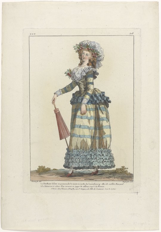

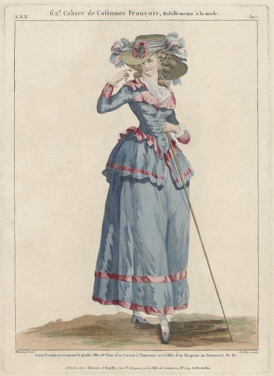
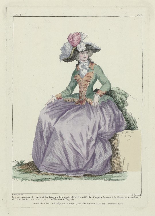
Illustrations of 1780s jacket styles from "Gallerie des Modes et Costumes Français", after Francois-Louis-Joseph Watteau;
"Amazon" after Francois-Louis-Joseph Watteau, circa 1784
"La sémillante Lisett.." after Francois-Louis-Joseph Watteau, 1786
"La Belle Omphale", 1787
"Jeune Nymphe provoquant le plaisir", circa 1787
Le jeune amazone se reposant...", 1787
#Gallerie des Modes#france#1780s#1787#1786#18th century#francois louis joseph watteau#fashion plate#illustration#costume illlustration#18th c. france#mdpillustration
93 notes
·
View notes
Text
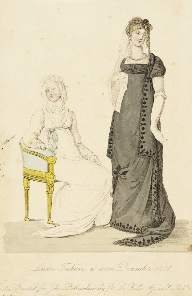
Fashion plate from "London Fashions As Worn" by John Bell, 1806
#1806#1800s#19th c. britain#britain#19th century#mdpillustration#fashion plate#costume illlustration#john bell
128 notes
·
View notes
Photo
60 notes
·
View notes
Last Seen Blogs


ivanninfus
Ivanninfus
operasrsly
Opera, srsly!

3003033333
Untitled

violet-rose-tea
Would You Like Tea?