#css nest
Explore tagged Tumblr posts
Visit Tumblr Blog
Explore Tumblr blogs with no restrictions, modern design and the best experience.
Last Seen Tumblr Blogs


Fun Fact
Hackers stole 65M passwords from Tumblr in 2013.
Text
post cssやってみたのでその時に見てた記事。 なんか色々調べたけどGulpで使うのが一番良さそうだったのでこちらを参考に対応してみた。
まずscssを使わずにネストcssでやりたいというのが今回の契機なのだが、ネストcssって古いIphone(~8ぐらいまで)が対応してないんよね。。。
さすがにまだ使ってる人結構いるので、これはそのままでは無理となったときに、post cssの記事を目にした。
前からあったのだが、いわゆるcssでコンパイルしてる感じ。やってることは変わらないが、書き方が昔と同じ方法で行けるのでめんどくさくはなくていい。
あとこの記事だと自動的に監視してくれる記載がないので、注意。このままだと毎回実行する手間が出てくるのでそのあたりはまた違う記事調べて実装することはオヌヌメする。
使ってみた率直的な感想はpreprosを使ってたときのscssとあまり変わらない・・・w
でも今後発展してきてネストcssがpost cssなしでも対応できそうになったらこの対応も吉かもしれない。何にせよ、まだ他のものには流用できそうにはないな・・・。
ということでまたやりたくなったときのためにここにメモしておく。
0 notes
Text
Ready to time travel to 2021 Hermitblr/Trafficblr?

Bogwaters Demo out now on itch.io!
A hand to hold until the end. A hand to hold because we're friends.
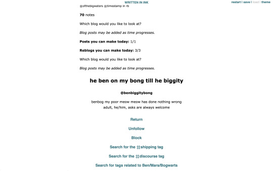

June 2021. The experimental Minecraft series Triple Life SMP has just aired its finale and you're obsessed with the dynamic between the Minecraft YouTubers Benbog and Mars OfTheBigWaters.
Problem? The fandom still hates shipping. Solution? Start an underground Discord server to quarantine your shipping activities. To avoid being cancelled, you'd have to scour your social media to find potential members who are secretly open to shipping.
ABOUT
Bogwaters is a free, text-based, interactive fiction browser game. The game is a parody of the Third Life SMP fandom in mid 2021 that is focused on Treebark (the romantic ship between Rendog/Martyn InTheLittleWood) and its fandom relevance.
This is a demo version (prototype) meant to test the limits and feasibility of this game.
You play as the owner of a Discord server named Bogwaters. Your goal is to invite 4 people within 7 days, from June 1 to June 7.
Full "how to play" guide can be found within the game.
This is the author's first interactive fiction game so it may be wonky. Constructive feedback is appreciated!
Word count: ~10k
Estimated play time: 30 to 45 minutes
FEATURES
3 endings
5 NPCs you can attempt to invite
Friendship levels for NPCs
Fandom enjoyment meter that can increase or decrease based on your actions
New Tumblr dashboard for each of the seven days
Tumblr, Discord, Ao3, DMs
Special events on certain days
Light/dark mode
CONTENT WARNINGS
MCYTshipping (hermit and traffic)
2019-2021 type ship discourse
2019 Hermitblr
2021 Hermittwt/Traffictwt
Canon-typical innuendos
Swearing
Written in Ink by Inkle Studios.
Original inspiration post here (May 13, 2025) (Yes I wrote this in less than two weeks)
I had a lot of fun making this and I hope you enjoy it too if you play it! Please talk to me if you have any thoughts and opinions, I'd love to ramble :D
<3
#interactive fiction#ink#inkle#bogwaters#trafficblr#treebark#life series smp#mcyt#mcytblr#this game has taken over me. it's my ugly css baby and i'm throwing it out of the birds nest <3#who up bogging these waters
776 notes
·
View notes
Text

121 links and counting hehehe. i didnt think compiling links would take this long but goddamn
these are all from my bookmarks so ive yet to search through ones ive tagged as ref and such and then ill publish the page
#i was originally separate thins into tabs but turns out that due to how css selections can only(?) target children that wouldnt work#since the link panel isnt nested inside the sidebar. which i guess would have been more annoying than a scrollable area#my palette rules so hard btw. the black +green teal n purple. never gonna get sick of it its so cool#i also wanted to have a Xor pagedoll at the top but the glass pane in the background didnt allow for that since it would be misaligned#im also gonna axe the music tab for a games one since theres like only 10 music-related links#wips
3 notes
·
View notes
Text
at last…. the final header:

this blog is a promotional site for a hole-in-the-wall cocktail bar on a commercial starliner in the year 2202, headed to the inner Oort cloud on a two-year sightseeing cruise. people from all over the globe have bought, earned, or snuck their way onboard its maiden voyage, and all seems well until the ship loses contact with Earth, very far away from home…
all the characters will be bar staff or ‘frequent flier’ patrons, and each will have their own usernames, icons, and ‘about me’ pages. i’m sticking to pixel art for this project because it’s fun, cute, and doesn’t take forever! character communications will mainly run through posts and comments, with chat rooms and hidden messages later on, if i Get Good at coding 👍 most of the groundwork is done - now i just need to paint lots of cool futuristic cocktails :)

draft header for an html blog project 🌟
#my post and comment system is just way too many nested divs 😔 BUT IT WORKS! AND IT KICKS ASS#it’s fully html and css rn but i’m learning javascript to make it even cooler#gonna put it up on neocities soon#science fiction#html css
196 notes
·
View notes
Text
If anyone is proper good at html/css can you please help me understand how to organise containers in complex grids 😭 everytime i try to do it, they do NOT go where I want them to. (Am I nesting divs wrong? Am I not using flexbox attributes correctly? WHO KNOWS!!! I am God's experiment)
#I'll draw out what im trying to achieve later#i have a lot of questions honestly id appreciate it if someone was super kind and took the time to answer them through Discord 😭#cal.txt
7 notes
·
View notes
Text
Latest work on the editor:
Pure css loader that displays while the SAP is loading so the user doesnt have to wait on a blank screen
Loading the filesystem into a nested dictionary for the file browser for proper hierarchy
Recursive jinja2 templating for the file browser that can handle the nested dictionary representation of the filesystem
9 notes
·
View notes
Text


After learning SCSS, using CSS feels completely off to me.
Why doesn't CSS by default comes with nested rules? Or at least update the stylesheet so it can do so now?
Working on my old projects and I couldn't be bothered to turn the CSS to SCSS - keep getting errors because I tried to nest but converting everything to SCSS right now is more of a bother.
#xc: side note post#css is ew#scss is cool#codeblr#coding#progblr#programming#studyblr#studying#computer science#tech
56 notes
·
View notes
Text
also my semi-professional website is a very nice little example of minimal design with hand-written frameworkless CSS (i use sass but only for nesting selectors and spreading it across a few files), hand-written HTML templates that are still readable even without CSS, and a couple hundred KB of tasteful custom fonts (set to font-display: swap of course). responsive design so it works on wide and narrow screens. no JS aside from maybe if i want to implement a manual light/dark mode toggle once I actually implement light mode (with it defaulting to your browser/OS preferences, of course). you can still make beautiful web sites without all this fucking cruft.
i'd show it off but if I linked it here you could doxx me so I'm not doing that
21 notes
·
View notes
Text
webdev log 2
implemented a gallery. I originally wanted it to be more grid-like but I decided I didn't want to mess too much with that, and I like the simple look anyways. forces you to really take in every shitty drawing.

it features a search function that only works for tags. its purpose is mostly just to search multiple tags, because I couldn't be fucked to add a feature where you could click on multiple tags there at the tags list at the top. it lists out all used tags in the table that stores art so you have an idea of what there all is.

at the bottom there's pagination. it's INSANELY easy to do with this framework I'm using. I was gushing about it to my partner on call!! they made fun of me but that's okay!!!!

anyways, clicking on the date underneath the drawing takes you to a view with the image itself (a kind of "post", if I can call it that) here you can view comments and leave one yourself if you so desire. guests are NOT allowed to reply to existing comments because I'd rather things not get too clogged up. I can't stop anyone if they did an "@{name} {message}" type comment, but I don't think anyone is gonna be chatting it up on my site, so idc. I just want it very minimal, and no nesting beyond one single reply.

of course, you can comment on story chapters too so here's what it looks like for a user (me). of course, if a user (me) posts then it gets automatically approved.
the table that stores comments differentiates story comments and art comments with foreign keys to the primary keys of the the chapter and art tables. it's a little convoluted and I kind of wish I didn't do it this way but it's too damn late isn't it. but honestly it might've been the only way to do it. the problem is just repeating code for both chapter and art views.. making a change to one means I gotta manually make the same change to the other. huge pain..

added user authentication and a really shitty bare bones dashboard for myself to approve/reject comments directly on the site in case someone comes along and wants to be mean to me :( rejecting a comment deletes it OFF my site forever. though I kind of want to be able to keep hate mail so I dunno.. oh, and also a big fat logout button because I have nowhere else to put it.
I'll spare everyone the more technical ramblings.
anyways, I'm hoping to add more things later. these are my plans:
allow users (me) to post stories/art through the site itself instead of doing it manually in the vscode terminal for every. single. story. and drawing. (probably took me 6+ hours total just doing this. I don't know why I did it.) (btw this consists of writing commands to store information via the terminal. also, sql and similar databases don't store things like markup or even line breaks. I had to alter all my stories and put \n every time there was a line break... and you have to escape apostrophes (or quotes, depending on which you use) so every "it's" had to be made into "it\'s" HUGE. PAIN. I didn't do this manually obviously but sifting and plugging my stories into character replacers was so time consuming)
delete comments button.... For my eyes and fingers only
make an About page. I've been avoiding all the fun things and doing just the scary stff
figure out SSH stuff...
clean up the shitty css. I refuse to use tailwind even tho it's trying to force me.. I don't want some sleek polished site I want it look like it's in shambles, because it is
but yeah thanks for reading about my webdev and coding journey. even though using the laravel framework made things a thousand times easier it's still a crazy amount of work. let's say building a site completely from scratch means buying every material and designing the house yourself, and using a website builder like wix is just like buying a pre built home and you're just decorating it. using this framework is like putting together a build-your-own-house kit. you're still building a fucking house.
I feel crazy. it felt like the site was close to breaking several times. been sleep deprived for several days working on this nonstop I think I'm getting a little sick 😵💫
going to bed now. it's 9 am.
6 notes
·
View notes
Text

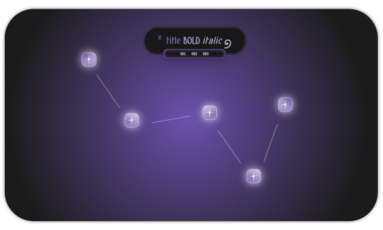
𖥨 ̟⊹♡ milky way , a page by gordonramsei
here i am with milky way , a javascript - free navigation page designed to resemble the constellation cassiopeia . there are five special links as well as three extra links nested in the subtitle . the vibe is dreamy , ethereal and gradient heavy with some css tricks to make objects appear dimensional . if u guys enjoy this type of navigation page , i will make more in the future in the shape of different constellations ! as always , if u encounter any issue within the code , pls let me know and i will troubleshoot asap !
if u intend on using this theme or just want to be a supportive hottie , please give this post a like and a reblog ! stay hydrated and be sure to pet a cute animal today ! mwuah ! 🤍 🤍 🤍

ⅰ. PAGE FEATURES .
x. this page is 100% javascript - free x. dreamy radial background gradient x. five clickable stars in the constellation to serve as links x. three extra links in the subtitle x. for a more detailed compilation of credits and features , please see the google doc containing the code
𖥨 ̟⊹♡ this page is a patreon exclusive : want access ? consider signing up to join the fam - a - lam to get ur hands on this page as well as my entire coding catalogue . click here to learn more !
source link directs to a live preview of milky way .
#rph#indie rph#rp theme#indie rp theme#rp page#navigation page#supportcontentcreators#mine#rec#page#for patrons#for patreons
17 notes
·
View notes
Text
I just learned that a friend passed away last month. We didn't speak as often as we used to, but he was still someone I thought of often.
He was always kind, patient, ready with a joke and a funny meme. The last meme I shared with him was a photo of a 3D-printed CSS trophy award with hilarious misalignments, and the last meme he shared with me was about gay penguins who'd steal eggs from other penguins' nests to raise as their own.
He was a fan, in the beginning. Someone who read and loved Jump Leads. But we became friends. We met for the first time in Seattle for PAX one year, and that friendship lasted 15 years. He was kind, funny, big-hearted, and deeply pleasant to be around.
He once, inexplicably, called me his favorite writer. No one has ever called me that before or since, and I always wondered if he was just being polite.
I will hold those words close to my chest tonight.
10 notes
·
View notes
Text
Things I've learned about AO3 styling recently
It's rather difficult to work around the existing default styling of things like <p> and <h#>s. Better to use <div>s to circumvent that entirely.
If you use <p> and <div> elements in the same block, the <div> will inherit the <p> because AO3 puts freakin <p>s on EVERYTHING
^^ you don't need to add extra padding or margin on stuff a lot because of the existing margins on <p>s which, as we have noted, go on everything thanks to AO3's parser. Just keep it in mind.
ID css selectors don't work. Use classes instead.
AO3 doesn't really style lists or tables, so you can use those selectors without working around anything
Selectors like :nth-child still work though!!
Just keep your nesting organized and save your work somewhere where the tab stops and formatting makes sense, because AO3's html editor likes to move stuff around and it's hard to find after the fact. Keep a copy for editing.
40 notes
·
View notes
Note
I bet the reason the nested replies UI is so ugly is they're saving space to add reactions too. That's my conspiracy theory for today. 🧐 I'm onto u tumblr... I see the future......
WAIT actually no what if they added up/downvotes for replies instead. Introducing a ratio effect to a previously ratio-free site. The replies are traditionally the underfunded petting zoo of tumblr after all. Lotta laugh potential there.
Any of these options will still be very ugly though lol
Ha, we'll have to wait and see, but now you have receipts for the future if you're proven right!!
Of those two options, I think reactions are slightly more likely because upvotes/downvotes seem kind of antithetical to how engagement works on this site? But who knows, tumblr does what tumblr does lol
Honestly, though, I'd wager the devs just aren't particularly good at UI work and/or simply don't have the *time* to do UI work (since staff is so tiny these days). The spacing on the new reply panel looks to me like they plopped in the reply button icon, and then maybe spent a total of 5 seconds trying to adjust the padding in the CSS code before giving up lmao. Given this site's propensity for spaghetti code, it's also possible they *tried* to fix it, and had a contradictory style somewhere they couldn't find slfjddsl.
Basically, the layout has a lot of spacing that looks more to me like unnecessary padding rather than space for additional elements. Personally, though, I think tumblr should add exactly one (1) react button, and it should just be the tumbeasts from days of old
#decent chance you *do* see the future though WE'LL SEE#seriously though i'm shocked we've been getting any new features at all given most of tumblr staff was moved to wordpress#be kind to the devs fr#anon#ask
9 notes
·
View notes
Note
hi so i was playing around with my codes and the link color does not work ? the hover , active , and visited does but the actual link itself will not change the color or text decoration. also wayfarer works pretty well on mobile nested nicely on screen. what code did you use because the code i am using makes it all squished thanks !
The CSS for the hover is separate from the CSS for the link.
Here's the CSS from the default Sugarcube UI. The element a (anchor, which creates links) controls your link styling. a:hover controls the styling for when the cursor hovers over it. a[disabled] controls a disabled/visited link. You can see how they have different colours and text decorations.
a { cursor: pointer; color: #68d; text-decoration: none; transition-duration: 200ms; } a:hover { color: #8af; text-decoration: underline; }
a[disabled], span.link-disabled { color: #aaa; cursor: not-allowed !important; text-decoration: none; }
Making your game responsive isn't a one-size fits all scenario. It depends on the dimensions of your UI and a number of other unique factors. You can use media queries to change what your game looks like on different viewport sizes.
If you open your game in a browser, right click and hit Inspect, you can test what it looks like with different resolutions. Switch it to mobile mode and there will be a dropdown menu with the dimensions for different common phones and tablets.

You can switch through them to see how your media queries are working with each size; usually you will have to fiddle with things to get it to fit right.
10 notes
·
View notes