#css reset
Explore tagged Tumblr posts
Visit Tumblr Blog
Explore Tumblr blogs with no restrictions, modern design and the best experience.
Last Seen Tumblr Blogs


Fun Fact
Tumblr.com is the 103rd most visited website in the world.
Text
1kb CSS Reset for Clean HTML Styling - mi.css
mi.css is a tiny CSS file (~ 1kb) that acts as either a CSS reset or a “CSSless” framework. It applies basic, clean styling directly to semantic HTML elements. You don’t need to add any classes. Unlike other frameworks that require you to learn specific class naming conventions or component structures, mi.css simply enhances the native appearance of standard HTML elements. Main…
2 notes
·
View notes
Text

whos fucking idea was it to add so many STUPID activity options and still keep the window this fucking small.
10 notes
·
View notes
Text
goal!
0 notes
Text
sooo, is anything up with ao3? my drafts were supposed to go bye-bye three days ago
#which‚ funny story‚ i was just pondering typing up a rant about how i wish ao3 had a way to reset the one-month-timer FFN style#because my css/html drafts‚ which‚ by the way‚ are a Huge pain in the ass to set up over and over‚ were about to get nuked AGAIN#and then they didn't XD#i mean i know there were some server issues again a few days ago so it's probably that‚ but the timing??? 👌👌👌
1 note
·
View note
Note
So I have a few questions now.
I don't understand, "Appearance Options: If you want to edit your blog’s title, description and avatar, you can do so in the customizer under “Appearance Options”. Editing your appearance in the Customizer is the same as editing it in your blog settings or in the blog view. Most themes will display the blog title, description and avatar you set here (but not all). Some themes may have extra settings that you can find and edit under “Theme Options”." Is this the same thing as what you do in mobile? The avatar and names?
"Open links in new window: Enabling this will make all links on your blog open in a new window."
"Use default mobile theme: If your custom theme is not displaying on mobile, you’ll need to disable the “Use default mobile theme” in the Customizer. This setting is enabled by default and will override your custom theme with a special layout optimized for browsing on mobile devices. Toggling off this setting is recommended only if your custom theme is responsive and works on different screen sizes."
"Preview: You can select between displaying different posts in your theme preview in the Customizer. Your options are: My posts: This will display all your posts in the theme preview. Sample posts: This will display a set of sample posts in the theme preview. Posts per page: Select how many posts per page your theme will display on one page. Note that some themes may have infinite scroll rather than a pagination."
"Add custom CSS: If your theme allows it, this is where you can enter custom CSS styles without making changes to the theme’s code itself."
I feel like I'm misunderstanding a lot here and feel like I might mess up if go and try to see how everything is... 😔
yes and no. the appearance options, yes, it’s the same as what you’re editing on mobile. but theme options are unique to whatever theme you choose and will let you choose different colors and fonts and stuff. this will only show up on your .tumblr.com site.
this just opens your link in a new tab when you click on it so you don’t lose the page you were just on
turn this off if you want your theme to show on mobile web apps like safari or chrome. if you keep it on, you’ll only see the mobile layout even if you visit the .tumblr.com version of your blog and you’ll only be able to see it on desktop.
this is just to help you while you’re editing your blog; it has no affect on your actual blog.
ok this is more advanced, and would require a lot of teaching because CSS is what really customizes a theme LOL. i suggest you learn via W3Schools or MDN web docs, but before any of that, maybe just get comfortable with the customizer first. there are already a lot of great free themes out there
unfortunately, there’s no way for you to actually understand and learn what any of this is unless you play around with editing your blog. you can always choose not to save and it won’t affect anything! plus, since you’re starting from scratch, it would be easy to reset anything you don’t like. don’t be afraid; messing up is part of the learning haha. good luck! 🩷
2 notes
·
View notes
Note
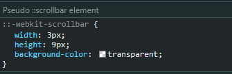
Hii!! I wanted to try Wayfarer since a lot of people recommend it but I'm having issues with the scroll bar being too thin. Whenever I try to click it, my mouse keeps missing and it takes me 2-3 tries to actually scroll. I've been looking at the code and I can't seem to find where the scroll bar is and I don't know how else to fix it. Do you have any tips for this?
Hello!
I would recommend the following:
use a mouse with a scrollwheel to scroll
you can also move the scrollbar up and down with the arrow keys (I don't use Mac, but I believe it's fn + down and fn + up)
pressing space bar will move the scrollbar down
pressing PG UP and PG DN moves the scrollbar up and down
If none of these options work for you and you're poking at the CSS, you can reset the width by de-selecting the following, or adjust it by changing the px of width and height:
13 notes
·
View notes
Text
my neocities site used to have a bunch of javascript.
for example, i had a page that existed to load up chapters of various stories so that you could read all of the chapters in one page, sort of like ao3's view full work feature. because it was scripted dynamically, i didn't have to maintain a separate copy of the text, and it was actually more flexible than what ao3 offers, because you could read specific arcs, heck, you could read a specific sequence of chapters (e.g., 2-13 specifically)
another thing i didn't want to maintain by hand was header at the top of the page with navigational links, so i had a script that updates them on page load.
problem is, it kind of just feels bad to load a page, then see a visible delay before the header pops in.
i spent almost a year living like that, but i eventually stopped maintaining my html by hand, and learned the joys of the static site generator.
i didn't need the chapter loader anymore, either - i could code my site generator to concatenate chapters into a full-text page, and since it's static, it'd load much faster than make the user's browser stitch together the html every time they want to open that page.
slowly but surely, everything i might've used js for was getting replaced by simpler, faster, and easier means.
i don't make much use of it, but my site actually has discord-style spoiler text. blocks of text you can click to reveal (and the css is uses currentColor, so it works even on different themes)


i don't even need javascript for this; the way i accomplish it is a bit clever:

it's a checkbox! even if you hide the actual box, you can still click the label to toggle its state
this was something i implemented early, based on this blog post where a similar trick was used for a no-js dark/light mode toggle.
but i took this to a new height this year: i added fancy footnotes

but under the hood, it's the same principle

check box to toggle the state, then some fancy css it position it to float above the text.
but of course, if i'm doing all of this without javascript, what do i need javascript for?
and there was only one feature that stuck around. it's something that i think no one really used, but i'm attached to it.
you see, i'm notorious for writing long chapters. i could split them up, but i have particular stopping points in mind. still, i am merciful, so in my stories with consistently long chapters, i'm gone out of my way to insert break points, "subchapters" seamless into the main text.

those little roman numerals would trigger a script that reformatted the page to hide all the other subchapters, and reconfiguring the next/prev buttons so that clicking them takes you to the next section rather than the next chapter
in theory, you could read Hostile Takeover as if it were a fic with 72 chapters instead of 16.
now, this is a very complex feature. you cant use checkbox tricks to emulate this, unless you want to go crazy writing a dozen css rules for every permutation of checkboxes, or force the user to figure out an arcane system where you need to uncheck one section before loading the next
but it turns out, while i wasn't paying attention, the css committee added a crazy new feature. there are :has selectors, enabling you to style elements based on the properties of elements that come below it in the document.
the whole game has changed now.
couple this with learning about :target selectors courtesy of wonder how a couple of really ambitious ao3 fics do their magic, i had everything i need
all it took to make subchapters happen now a few simple rules

really, you only need that first line. it says "if main has a target element, hide all subchapters that aren't the target"
the other lines are convenience; they had the next/prev chapter buttons if you're in the middle of the chapter. there's a couple other rules (beside the subchap nav i added a button that takes you to the top of the page, which resets the anchor target), but overall, it was quick and painless. really, the actual struggle was teaching my site generator spit out the right html. (i spent five minutes tearing out my hair and rebuilding to no effect because i forgot i had two layers of caching. whoops)
this new approach does sacrifice the ability to make the arrow buttons do double duty, but i don't think it's a big loss when the subchapter buttons are right there, and arguably retaining the single function of each button is a win for usability.
the biggest loss is that there's no real way to style the buttons differently if they've been clicked, so you don't actually know which subchapter you're actually browsing.
(maybe if anyone i actually uses this feature, they can complain to me and i'll whip up a quick bit of js to patch it :v)
but until then, i'll take some satisfaction in delete my site's scripts entirely. in a way, that's the biggest loss, but it's one of i'm proud of
2 notes
·
View notes
Note
idk if you can help but ive been using your theme Requested for a few months but now when i go to change anything like colour/font/etc i just get a message saying "HTML tags are not allowed in custom CSS code" do you know what that means and how to get around it, tysm
Hi, sorry for the late reply. I was busy, but I also tried looking for solutions to your problem but didn't find much.
I tried the code, and everything seems to work fine, but I couldn't find anything related? like it doesn't seem to be a problem within Tumblr, so my solution would be to try resetting your blog theme settings, following this tutorial (from step three (3)) by glenthemes, then copy the code from GitHub using the little icon on the top right of the top bar.

[transcript. Screenshot of Github site showcasing some repository and highlighting the button on the code header wich allows you to direct copy the raw file, used as reference to the sentence above.]
Also, don't know if this could help you, but I'm gonna share some links regarding the "HTML Invalid" trouble, maybe try checking some out and see if it works for you too (:
theme-hunter/psa-invalid-html-message-if-you-are-receiving
nyctothemes/hello-there-i-am-trying-to-use-your-amethyst
megscoding/invalid-html
Invalid html Tumblr tag
I do hope this helps you and please do not hesitate to reach out again if there seems to be another problem with any code. Have a nice day xx
3 notes
·
View notes
Text
Modern Web Styling Without Class Declarations - Classless.css
Classless.css is a “class-less” CSS framework that allows you to apply styling directly to standard HTML elements without adding any CSS classes. It solves the problem of quickly adding a decent, modern look to web projects without the overhead of writing custom CSS or wrestling with a complex class-based system. It can be useful when you want to focus on content and structure first. What sets it…
2 notes
·
View notes
Text
Revisiting CSS Multi-Column Layout
New Post has been published on https://thedigitalinsider.com/revisiting-css-multi-column-layout/
Revisiting CSS Multi-Column Layout
Honestly, it’s difficult for me to come to terms with, but almost 20 years have passed since I wrote my first book, Transcending CSS. In it, I explained how and why to use what was the then-emerging Multi-Column Layout module.
Hint: I published an updated version, Transcending CSS Revisited, which is free to read online.
Perhaps because, before the web, I’d worked in print, I was over-excited at the prospect of dividing content into columns without needing extra markup purely there for presentation. I’ve used Multi-Column Layout regularly ever since. Yet, CSS Columns remains one of the most underused CSS layout tools. I wonder why that is?
Holes in the specification
For a long time, there were, and still are, plenty of holes in Multi-Column Layout. As Rachel Andrew — now a specification editor — noted in her article five years ago:
“The column boxes created when you use one of the column properties can’t be targeted. You can’t address them with JavaScript, nor can you style an individual box to give it a background colour or adjust the padding and margins. All of the column boxes will be the same size. The only thing you can do is add a rule between columns.”
She’s right. And that’s still true. You can’t style columns, for example, by alternating background colours using some sort of :nth-column() pseudo-class selector. You can add a column-rule between columns using border-style values like dashed, dotted, and solid, and who can forget those evergreen groove and ridge styles? But you can’t apply border-image values to a column-rule, which seems odd as they were introduced at roughly the same time. The Multi-Column Layout is imperfect, and there’s plenty I wish it could do in the future, but that doesn’t explain why most people ignore what it can do today.
Patchy browser implementation for a long time
Legacy browsers simply ignored the column properties they couldn’t process. But, when Multi-Column Layout was first launched, most designers and developers had yet to accept that websites needn’t look the same in every browser.
Early on, support for Multi-Column Layout was patchy. However, browsers caught up over time, and although there are still discrepancies — especially in controlling content breaks — Multi-Column Layout has now been implemented widely. Yet, for some reason, many designers and developers I speak to feel that CSS Columns remain broken. Yes, there’s plenty that browser makers should do to improve their implementations, but that shouldn’t prevent people from using the solid parts today.
Readability and usability with scrolling
Maybe the main reason designers and developers haven’t embraced Multi-Column Layout as they have CSS Grid and Flexbox isn’t in the specification or its implementation but in its usability. Rachel pointed this out in her article:
“One reason we don’t see multicol used much on the web is that it would be very easy to end up with a reading experience which made the reader scroll in the block dimension. That would mean scrolling up and down vertically for those of us using English or another vertical writing mode. This is not a good reading experience!”
That’s true. No one would enjoy repeatedly scrolling up and down to read a long passage of content set in columns. She went on:
“Neither of these things is ideal, and using multicol on the web is something we need to think about very carefully in terms of the amount of content we might be aiming to flow into our columns.”
But, let’s face it, thinking very carefully is what designers and developers should always be doing.
Sure, if you’re dumb enough to dump a large amount of content into columns without thinking about its design, you’ll end up serving readers a poor experience. But why would you do that when headlines, images, and quotes can span columns and reset the column flow, instantly improving readability? Add to that container queries and newer unit values for text sizing, and there really isn’t a reason to avoid using Multi-Column Layout any longer.
A brief refresher on properties and values
Let’s run through a refresher. There are two ways to flow content into multiple columns; first, by defining the number of columns you need using the column-count property:
Second, and often best, is specifying the column width, leaving a browser to decide how many columns will fit along the inline axis. For example, I’m using column-width to specify that my columns are over 18rem. A browser creates as many 18rem columns as possible to fit and then shares any remaining space between them.
Then, there is the gutter (or column-gap) between columns, which you can specify using any length unit. I prefer using rem units to maintain the gutters’ relationship to the text size, but if your gutters need to be 1em, you can leave this out, as that’s a browser’s default gap.
The final column property is that divider (or column-rule) to the gutters, which adds visual separation between columns. Again, you can set a thickness and use border-style values like dashed, dotted, and solid.
These examples will be seen whenever you encounter a Multi-Column Layout tutorial, including CSS-Tricks’ own Almanac. The Multi-Column Layout syntax is one of the simplest in the suite of CSS layout tools, which is another reason why there are few reasons not to use it.
Multi-Column Layout is even more relevant today
When I wrote Transcending CSS and first explained the emerging Multi-Column Layout, there were no rem or viewport units, no :has() or other advanced selectors, no container queries, and no routine use of media queries because responsive design hadn’t been invented.
We didn’t have calc() or clamp() for adjusting text sizes, and there was no CSS Grid or Flexible Box Layout for precise control over a layout. Now we do, and all these properties help to make Multi-Column Layout even more relevant today.
Now, you can use rem or viewport units combined with calc() and clamp() to adapt the text size inside CSS Columns. You can use :has() to specify when columns are created, depending on the type of content they contain. Or you might use container queries to implement several columns only when a container is large enough to display them. Of course, you can also combine a Multi-Column Layout with CSS Grid or Flexible Box Layout for even more imaginative layout designs.
Using Multi-Column Layout today
Patty Meltt is an up-and-coming country music sensation. She’s not real, but the challenges of designing and developing websites like hers are.
My challenge was to implement a flexible article layout without media queries which adapts not only to screen size but also whether or not a <figure> is present. To improve the readability of running text in what would potentially be too-long lines, it should be set in columns to narrow the measure. And, as a final touch, the text size should adapt to the width of the container, not the viewport.
Article with no <figure> element. What would potentially be too-long lines of text are set in columns to improve readability by narrowing the measure.
Article containing a <figure> element. No column text is needed for this narrower measure.
The HTML for this layout is rudimentary. One <section>, one <main>, and one <figure> (or not:)
<section> <main> <h1>About Patty</h1> <p>…</p> </main> <figure> <img> </figure> </section>
I started by adding Multi-Column Layout styles to the <main> element using the column-width property to set the width of each column to 40ch (characters). The max-width and automatic inline margins reduce the content width and center it in the viewport:
main margin-inline: auto; max-width: 100ch; column-width: 40ch; column-gap: 3rem; column-rule: .5px solid #98838F;
Next, I applied a flexible box layout to the <section> only if it :has() a direct descendant which is a <figure>:
section:has(> figure) display: flex; flex-wrap: wrap; gap: 0 3rem;
This next min-width: min(100%, 30rem) — applied to both the <main> and <figure> — is a combination of the min-width property and the min() CSS function. The min() function allows you to specify two or more values, and a browser will choose the smallest value from them. This is incredibly useful for responsive layouts where you want to control the size of an element based on different conditions:
section:has(> figure) main flex: 1; margin-inline: 0; min-width: min(100%, 30rem); section:has(> figure) figure flex: 4; min-width: min(100%, 30rem);
What’s efficient about this implementation is that Multi-Column Layout styles are applied throughout, with no need for media queries to switch them on or off.
Adjusting text size in relation to column width helps improve readability. This has only recently become easy to implement with the introduction of container queries, their associated values including cqi, cqw, cqmin, and cqmax. And the clamp() function. Fortunately, you don’t have to work out these text sizes manually as ClearLeft’s Utopia will do the job for you.
My headlines and paragraph sizes are clamped to their minimum and maximum rem sizes and between them text is fluid depending on their container’s inline size:
h1 font-size: clamp(5.6526rem, 5.4068rem + 1.2288cqi, 6.3592rem); h2 font-size: clamp(1.9994rem, 1.9125rem + 0.4347cqi, 2.2493rem); p font-size: clamp(1rem, 0.9565rem + 0.2174cqi, 1.125rem);
So, to specify the <main> as the container on which those text sizes are based, I applied a container query for its inline size:
main container-type: inline-size;
Open the final result in a desktop browser, when you’re in front of one. It’s a flexible article layout without media queries which adapts to screen size and the presence of a <figure>. Multi-Column Layout sets text in columns to narrow the measure and the text size adapts to the width of its container, not the viewport.
Modern CSS is solving many prior problems
Structure content with spanning elements which will restart the flow of columns and prevent people from scrolling long distances.
Prevent figures from dividing their images and captions between columns.
Almost every article I’ve ever read about Multi-Column Layout focuses on its flaws, especially usability. CSS-Tricks’ own Geoff Graham even mentioned the scrolling up and down issue when he asked, “When Do You Use CSS Columns?”
“But an entire long-form article split into columns? I love it in newspapers but am hesitant to scroll down a webpage to read one column, only to scroll back up to do it again.”
Fortunately, the column-span property — which enables headlines, images, and quotes to span columns, resets the column flow, and instantly improves readability — now has solid support in browsers:
h1, h2, blockquote column-span: all;
But the solution to the scrolling up and down issue isn’t purely technical. It also requires content design. This means that content creators and designers must think carefully about the frequency and type of spanning elements, dividing a Multi-Column Layout into shallower sections, reducing the need to scroll and improving someone’s reading experience.
Another prior problem was preventing headlines from becoming detached from their content and figures, dividing their images and captions between columns. Thankfully, the break-after property now also has widespread support, so orphaned images and captions are now a thing of the past:
figure break-after: column;
Open this final example in a desktop browser:
You should take a fresh look at Multi-Column Layout
Multi-Column Layout isn’t a shiny new tool. In fact, it remains one of the most underused layout tools in CSS. It’s had, and still has, plenty of problems, but they haven’t reduced its usefulness or its ability to add an extra level of refinement to a product or website’s design. Whether you haven’t used Multi-Column Layout in a while or maybe have never tried it, now’s the time to take a fresh look at Multi-Column Layout.
#:has#ADD#almanac#Article#Articles#back up#background#book#box#browser#challenge#clamp#colours#columns#container#content#course#creators#CSS#CSS Grid#css-tricks#Design#designers#desktop#developers#digitalocean#display#easy#English#Explained
2 notes
·
View notes
Note
Yo. How do you code? (I only know the basics to HTML and CSS :/)
Idk which specific question you’re asking, like like how do I code as in what tools do I use, or what do I do and what is my process, or how did I learn to code, or can you teach me to code
And because I don’t know I’ll answer all of them :3
1. What tools do I use?
I use a few things to code, VS Code for actually writing the code, GitHub for storing projects and collaboration, Google and StackOverflow and depending on the project various other apps
2. How do I do it and my workflow process
Uh I have like no idea, I kinda just learn how certain things work via Google and then I slot them together, But the workflow process, I know exactly how to do that, ok so get a white board or a notepad or something, write what you want your program to do, and then break it down into steps and then break it down again and again, so for example,
For my current project, (The Incorrect Quote Generator), I need to take inputs, from a list of quotes choose one that fits the parameters, replace names in the quote with the inputted ones and then print the whole thing
Breaking down the first bit I need the inputs, what inputs do I need? I need the amount of characters and the names of the characters, ok done, second bit, take the quotes, sort them based off of character amount, using the amount of characters from the previous step, pick a set of quotes that match, replace the names, last bit, take the quote with it replaced and done
Breaking down again, first bit, done already, second bit, do we want something like autocapitalisation to make it nicer , yeah sure, what about capitalising the entire name if it fits the circumstance, makes it smoother, done, last bit done
Ok what about formatting, do we want all of this on one line or do we want separate lines for each person speaking, yeah we want separate lines, ok use an “&” symbol to represent a space and when the piece of code that assembles the end string encounters it, print the string and reset continuing from where we are to make a new line
That’s the design process for that
But first you make a prototype of it, to see if it works, like I didn’t have the autocaps or anything at first, I only added that when one of the submissions needed it
Anyways-
3. How did I learn to code
Through a number of ways, first I had gone to this computer club thing when I was like 8 or something and I found Scratch and learned about that, then when I was about 10 I was curious about html and websites, so I ended up making websites for classmates, then lockdown hit and I had nothing to do, I wanted to make a game, so what did I do? I jumped headfirst into Unity and struggled to get absolutely anything done (DON’T DO THIS), at some point I ended up joining this thing called Coderdojo which is like a coding class which worked really well (I actually still go there every Saturday although I’m at more advanced stuff now) and I learned about python and then kept learning more, then I made my own projects and learned more on my own from that
If you are looking to learn on your own, I’d recommend W3Schools, they have tons of courses, are entirely free and very in depth
But first I’d recommend you check out Scratch, it’s great for learning how to think in computer terms
4. Can I teach you to code
I know this probably wasn’t what you were asking but I’ll answer it anyway
Sure, I’d love to, coding one of the things I enjoy a lot because it combines logic and making things, and I love helping and teaching people things so teaching someone else to code sounds good to me :3
Stuff mentioned here
5 notes
·
View notes
Note
just wanna pop in and say that it’s okay to take a break, take your time with what you wanna create! Burnout and stuff are a pain so I just want you to know that your art is lovely and there is no rush <3
if it helps, maybe try to do something else aside from writing/making art so you give you mind a lil reset? Take care of yourself!!
its a bit funny how i received this at the same time as me sending in art to a manufacturer to make myself a glitter acrylic block of desertduo lol..... <- add to cart therapy 💀 (i will show the actual thing when it comes in its gonna be soooo cool)
youre very sweet anon ;; ive been having some rough days irl (the Horrors of Chronic Physical Conditions) so this is a really nice reminder...
i think ill go.... do some css coding maybe
#in reality i just wanna rp right now but my friends are asleep so like ok </3#邮箱#literally anything is better than job hunting rn DJASKDASF
15 notes
·
View notes
Text
Hey Web Devs, Hear Me Out
Day 228 - Jun 20th, 12.024
In web development, we have Tailwind right?

But what if...

It is cursed? Yes, HOWEVER, it pretty much the same of what Tailwind generates:

It is cursed? Yes, and I love it, and the advantage is using just a static CSS file instead of a CLI to generate one, so less one dependency.
This is an idea that I had as a joke, but maybe in the future days I will try to experiment with. I don't know, I see something in this.
---
Edit: Ok, never mind, reading the docs from MDN, custom properties values cascade to the children elements, so something like:

Would add padding to the children <p> elements also. But I will try something just to experiment and maybe learn something. --- Edit 2: Adding a "reset" to the variables stops it from propagating to the children, there's hope!

Today's artists & creative things Music: The Death of God's Will - by Heaven Pierce Her
© 2024 Gustavo "Guz" L. de Mello. Licensed under [CC BY-SA 4.0
4 notes
·
View notes
Text
Simple react/next js todo list
Modeled after this tutorial by Web Dev Simplified, but using Next.js and Tailwind
I think following a plain react tutorial while using next js is what gave me some issues, especially being my first react project. I probably should have learned some basic react first before going into frameworks, but oh well.
Trying to line up the text with the CSS paper was a huge pain. I still don't like how it looks but at least it's not floating through the lines anymore lol.
The data persistence gave me the most trouble (took me like FIVE hours 😭). The way it was done in the video did not work for me at all, so I had to figure it out. Local storage can't be accessed during server-side rendering, so accessing localStorage has to be done during client-side rendering, using the useEffect hook. But, as I've learned, the useEffect hook doesn't have a return value, and hooks can only be called at the top level. Then I found out that React intentionally calls useEffect twice and that was resetting my local storage with the empty initialization value -_- But in the end i got it working :)
Now I wanna add some more features; a delete all, clear selected, maybe edit note.
6 notes
·
View notes
Text

Day 4 - 100 Days CSS Challenge
CSS ANIMATIONS
Hey everyone!
Today, we’re working with three circles and our goal is to create a smooth animation where the circles scale up and down in a staggered sequence.
Step 1: The Basics
First, let’s talk about the structure. The design is made up of three circles:
Circle 1: The largest circle.
Circle 2: Medium-sized, nested inside Circle 1.
Circle 3: The smallest, nested inside Circle 2.
All three circles are white, and they animate against that reddish background. The animation involves scaling the circles up and down in a staggered sequence.
Step 2: The Animation Struggle
The main challenge here was getting the circles to animate one after the other instead of all at the same time. At first, I thought, "Easy, just add some delays!" But it wasn’t that straightforward. Here’s what I learned:
animation-delay
To create the staggered effect, I used the animation-delay property. This property allows you to delay the start of an animation for a specific amount of time. For example:
Circle 1: No delay (0s).
Circle 2: Delayed by 0.2s.
Circle 3: Delayed by 0.4s.
This way, each circle starts its animation slightly after the previous one, creating that beautiful cascading effect.
Step 3: Understanding animation-fill-mode
One of the biggest "aha!" moments for me was understanding the animation-fill-mode property. This property determines how an element is styled before and after the animation runs.
animation-fill-mode: both: ensures that the element retains the styles defined in the first and last keyframes of the animation. Without this, the circles would snap back to their default state (scale 0) after the animation ends, which would ruin the smooth transition.
What happens if we don’t use it? Without animation-fill-mode: both, the circles would abruptly disappear or reset at the end of the animation, making the whole thing look janky.
Step 4: The Magic of alternate
The alternate value in the animation property is what makes the animation reverse direction after each cycle. Here’s how it works:
Without alternate, the animation would play forward and then jump back to the start.
With alternate, the animation plays forward, then reverses, creating a smooth back-and-forth effect.
This is perfect for our circles because it makes them scale up and then scale down seamlessly, without any awkward jumps.
Step 5: reverse vs. alternate
You might be wondering, "What’s the difference between reverse and alternate?" Great question!
reverse: The animation plays backwards from 100% to 0%. It doesn’t alternate; it just runs in reverse.
alternate: The animation plays forward (0% to 100%) and then backwards (100% to 0%) in a continuous loop.
So alternate is NOT reverse + infinite
For our circles, alternate is the way to go because we want them to scale up and down repeatedly.
What I Learned :
animation-delay is your best friend when you want staggered animations.
animation-fill-mode: both is crucial for smooth transitions.
alternate creates a seamless back-and-forth effect.
cubic-bezier gives you fine control over the animation’s timing.
I’m so excited to keep going with this challenge, and I can’t wait to see what Day 5 has in store.
Keep coding and keep learning.
#100dayscssChallenge#codeblr#code#css#html#javascript#java development company#python#studyblr#progblr#programming#comp sci#web design#web developers#web development#website design#webdev#website#tech#html css#learn to code
1 note
·
View note
Text
Life Update
First thing first, I finally learn HTML language. It probably will come in handy for my future college seasons. Next thing I wanna learn is CSS and some web design. Second, I reset my phone, that's why I haven't online for months. It feels great having so much storage left. I can fill up with only my important apps. Third, I am dual booting windows 10 and Linux mint. Yes, you read it right! but, why? My windows takes so much memory that I can barely open anything. 1 tab of browser and my memory became full. In Linux I can multitasking freely, keeping my focus in learning programming HTML and anything. OH AND ALSO I CAN PLAY YOUTUBE IN 1080p YAY. With unlimited customization, I can create my own desktop environment to my liking.
2 notes
·
View notes