#custom tabs html css
Explore tagged Tumblr posts
Visit Tumblr Blog
Explore Tumblr blogs with no restrictions, modern design and the best experience.
Last Seen Tumblr Blogs


Fun Fact
Tumblr was the first site to host the blog for President Barack Obama in 2011.
Text
CSS Custom Tabs Design
#css custom tab design#custom tabs html css#css tricks#html css#codenewbies#css#html5 css3#webdesign#frontenddevelopment#html css tutorial#pure css tutorial#css for beginners
2 notes
·
View notes
Text


CONSTANZA - BLOG & PAGE THEME !!!
These themes are completely free. Please support me and my work by liking and reblogging this post!
[ GENERAL GUIDELINES ]
Do not claim as your own.
Do not remove the credit!
Do not use as a base code or take parts of this code for your theme.
Feel free to edit as much as you want!
All credits are mentioned in the codes!
[ BLOG THEME INFORMATION ]
Non-Contained Theme with the option of 400px, 450px, 500px and 540px posts.
Custom Body Fonts and Body Font sizes.
Custom Body Fonts and Body Font sizes (11px - 14px)
Navigation changeable from sidebar to header navigation
Up to 3 custom sidebar/header links
Navigation Tab is optional.
5 extra links in the navigation tab.
Visible Source link!
Fully supports NPF (beta editor) posts (but also works with legacy posts still)
The theme adjusts to different screen sizes.
MANY different design options. Everything can be edited in the design panel. No HTML knowledge necessary.
BLOG THEME - STATIC PREVIEW AND CODE
[ PAGE THEME INFORMATION ]
This code is JAVASCRIPT FREE!!!!!!!!
Adjusts to different screen sizes automatically.
Custom links on the welcome page.
Ask Page, Rules Page, Multimuse Page
Comes with a "pseudo" filtering/category system for the muse page which is also easy to remove.
All colors are easily editable in the css root!
Basic HTML knowledge necessary when editing the page.
PAGE THEME - PREVIEW AND CODE
#blog theme#free theme#tumblr theme#theme#non contained theme#page theme#muse page#rules page#rp theme
2K notes
·
View notes
Text
i dunno. it's nice in a lot of ways, but its janky in a lot of other ways, and like- the layout leaves a lot to be desired i'm finding. Chewing glass about it tbh
hm. I know i spent like a week on it. and i'm not really in a state to revisit it. but i kind of hate our toyhouse theme a little bit lmao. goddamn it
#.txt#i know why we've done it this way (the issue with the containers)#(where the other pages use your custom css but not the html)#so like I get it. I understand why it's organised the way it is#but its Bad.#its not good and i hate it.#the character cards are cool in theory but aren't executed well in practice#and i don't know what to do about it#hypothetically you could move the tab menu elsewhere#and have more space for the actual tab display?#but then the question becomes where would the tab menu go. and it just-#it just gets messier and messier and the container limitations really start to grate me the wrong way#the irony is of course that we have our own website.#i should just be putting all of this on there instead of fighting toyhouse the entire time#but toyhouse has the social functionality you see.#and updating our website is an undertaking i am yet to actually deal with.
3 notes
·
View notes
Text
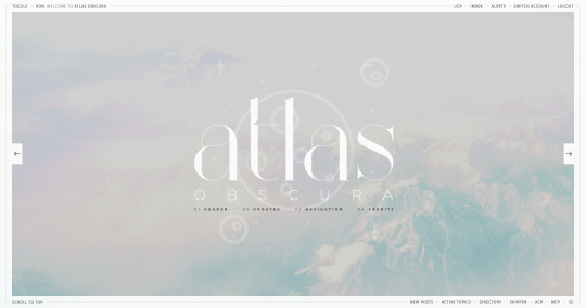
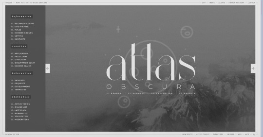
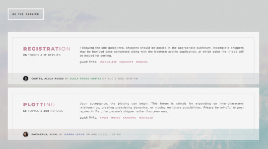
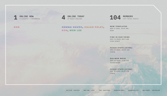
ATLAS OBSCURA (60$)
ATLAS OBSCURA is a fully flex skin optimized for Chrome but has been adjusted for compatibility across Firefox and Safari. A low contrast, dark background is recommended. A live preview can be requested at any time through my support discord. PURCHASE HERE: https://ko-fi[DOT]com/s/740013f3a4 WEBPAGES HERE: https://ko-fi[DOT]com/s/07654e42a0 TEMPLATES: https://ko-fi[DOT]com/s/020489ee5a
Includes:
light/dark toggle sidebar that auto transitions to a module for mobile custom forums, topics, memberlist, posts (optional larger post avatar with sticky) tabbed, popup application profile member group colors set up across the skin css variables set up for images, fonts, and colors for ease of editing guest to member links on login for easy navigation various indicators for messages/alerts customized tooltips tabbed header basic post template with all basic styles (bold, italics, h1 through h7, blockquote, hr, lists, etc)
Files:
full xml file html templates xml file easy to import field set json file general installation guide pdf skin specific instructions with member group prefix/suffix codes and user fields
Policies:
credit must remain intact and unchanged you may not claim my codes as your own at any point, nor may they be used as a base for other projects I offer unlimited support for bugs present at purchase
Please review the rest of my my policies prior to making any purchases: koncodes[DOT]tumblr.com/policies For questions or a live preview, you can contact me through ko-fi or my support discord: discord[DOT]gg/MXD5nDgDzq
152 notes
·
View notes
Text
Toyhouse HTML stuff
Decided to make a big post to share the coders, information and sheets i saved cuz why not. All of them are F2U, check the coders to find their other works and support them!
Folders Directories and Folder Descriptions may look the same but i know why i divided them trust me. It may also be a bit messy with other things
Useful information, tools & others
Live code - Shows you the code you're making / editing in real time. Has many variations depending on what you're working with
Icons - Little symbols / icons used as decoration
Animations (works for images too)
Folder look
Coder's Quarters
Content Warning
Content Warning (2)
Species (folder)
Coder's Quarters
CSS Cheat Sheet
Coders & Codes
Coders (Some with their freebies folders)
Pinky
ChiiAka
Icecreampizzeria
Jiko
Raccodes
Sealkitty
Vicodes
SparklyCodes
Ashecodes
Cheerikos
Aurorean
Codes
Target
Elements
Polaroids (Works as folders too)
Aurum
Air Bubble
Capsule
Seafoam
Bubbly
Little Ink
Cloud Nine
New Moon
Simple Things
Tactician
Out There
Eclipse
Amphidromic
Panels
Reload
Browser History
Cyber user
Netrunner
PhylusUI.exe
Nebula
Sunny Boxes
[P2U] Peashes
Forest
Frosted
[P2U] RED SUIT
[P2U] PARLIAMENT
BLOODSHOT
Lux
Rigor Samsa
Seaside
Lyrical
Sleek
Warriors Remind
Misty
Find yourself
F2U Code - 2.0
Watershed
Folders
Folder Directories
Story Palettes and Themes
Decay
Folder Code 2
Folder Directory
Blocked Folder Directory
Directory
Directory Banner
Fancy Folders
Custom Folders
Folder Descriptions
Story Tabs
Subfolder Headers
Cyberpunk (Folder)
Enjoy the show
Universe Folder
Landscape folder
Story folder
Labels
Setting Overview
Character Directory
Warrior Cats (Clans)
Character Directory Redux
Flat Character Directory 02
Flat Character Directory 06
Flat Character Directory 07
Kinlist (Works as folder directory too)
.05 | multi-page
CSS
[P2U] Mood
[P2U] Float
[P2U] Condensed
[P2U] Float
[P2U] Autumnal
[P2U] Gridsy
Char Emulator
NovasEnd
[P2U] Furthermore
[P2U] FULLPAGE
50 notes
·
View notes
Text
for anyone who wants to start using Obsidian for writing/plotting, here are some useful plugins I recommend:
Continuous Mode -> to open all the notes in a tab group as if they are a continuous scrollable document ("Scrivenings mode").
Date Inserter -> insert a date using a calendar.
Dictionary -> only English (US & UK), Hindi, Spanish, French, Japanese, Russian, German, Italian, Korean, Brazilian Portuguese, Arabic, Turkish, Chinese.
Edit History -> automatically saves the history of edits of a file.
Editing Toolbar -> more powerful text customization settings; MS Word-like toolbar.
Importer -> to import data from Notion, Evernote, Apple Notes, MS OneNote, Google Keep, Bear, Roam, and HTML files.
Local Backup -> automatically creates a local backup of your vault (Obsidian is local only).
LongForm -> to write long projects; lets you organize a series of notes and scenes, but it's useful even for shorter projects.
Novel word count -> display word count, page count, reading time, character count, note count & much more.
Omnisearch -> a search engine for your notes; better than the default one.
Remember cursor position -> for each note, so it makes it easier to switch between notes, move from a link to another, etc.
Smart Typography -> converts typographical symbols and punctuation marks to the correct ones as you type.
Timeline -> create and manage visual timelines.
Trash Explorer -> restore and delete files from the Obsidian .trash folder.
then just for aesthetic:
Beautitab -> create a customizable new tab view.
Style Settings -> allows css files to customize Obsidian or notes.
5 notes
·
View notes
Text
Join Telegram

Tab Design with HTML, CSS, and JavaScript
#custom tab design#tab design#javascript tabs#code#learn to code#javascript projects#html#css#divinector#frontenddevelopment#frontend
6 notes
·
View notes
Text
WIP of my Exclamation!2080 wiki
Yeah I finished three character pages today, translated them and still have so much work to do! Haven't shared with you all my hard work sooo... look what I've done already!
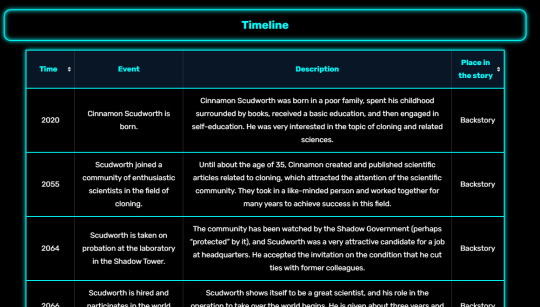
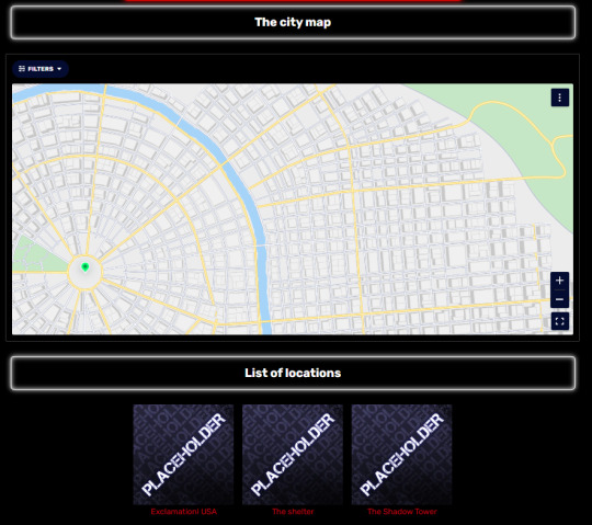
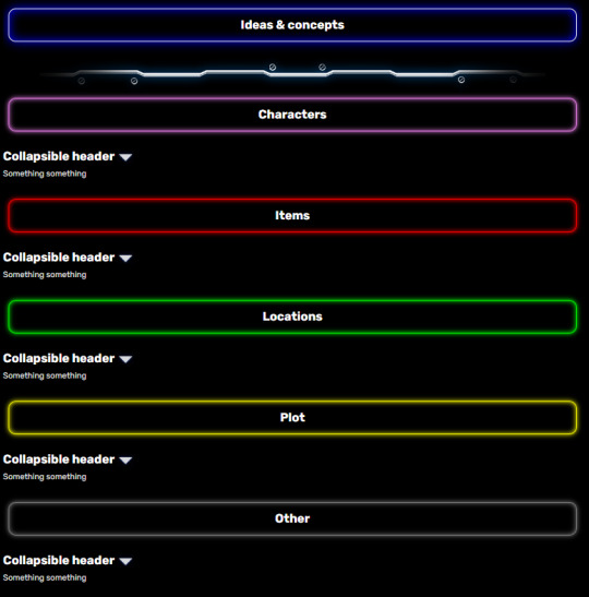
Homepage, characters page, the timeline table, locations page (with interactive map I'm still working on), gallery (with tabs! and other content), Ideas and Concepts page (for uncategorized things like side-story ideas, episodic characters, cool items and other stuff)
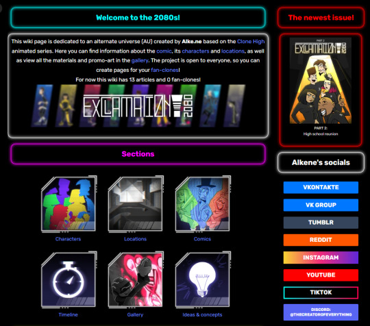
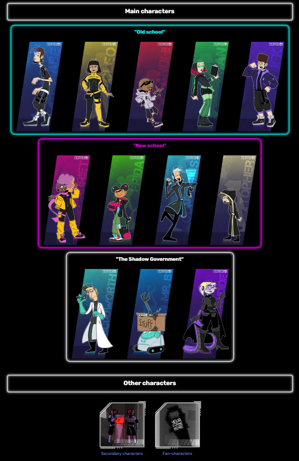
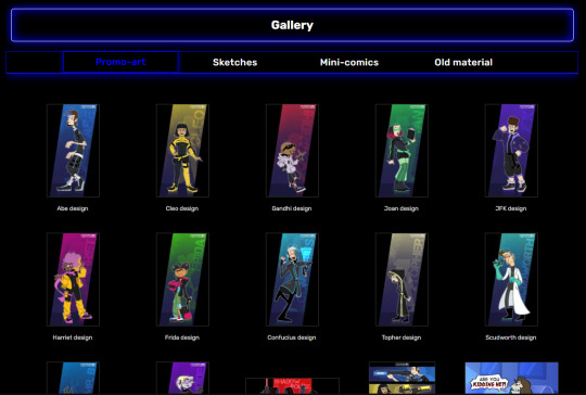
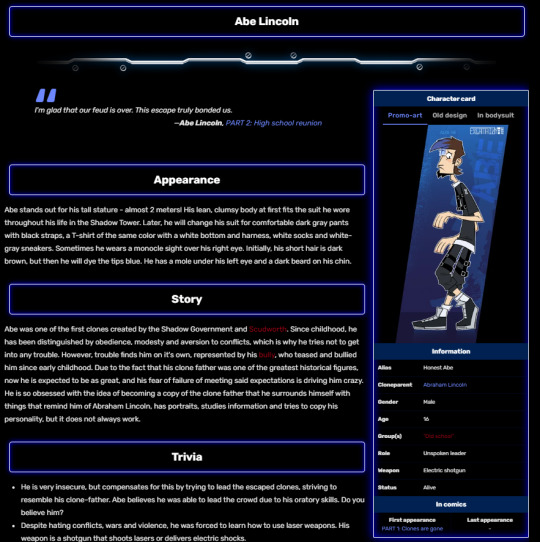
For now I've got Abe, Cleo and Gandhi pages on my wiki, but there will be more soon! I hope. Here's the preview of how the character page looks:
You can check it all on my Wiki! And it's RU version, если вы говорите по-русски, как я :D
ruwiki gets updates earlier obviously!
BEFORE YOU VISIT, please turn on "desktop site" or whatever it's called in your browser, if you're on mobile. Mobile wikifandom SUCKS, and it's hard to customize, so I decided to not spend my time and energy on it. Thanks! HTML and CSS rules!
ALSOOOOO for english speakers... If you find any errors in my text, you're free to fix them, since it's not my first language and I'm not sure if i'm good at it 😭
ok enjoy!! Hope you find my AU interesting, I'm working REEEEEALLLYYY hard on it as you see
#clone high#clone high au#custom wiki#exclamation!2080#wiki fandom#yeah look how good i am at web design#haha jk#it's so raw atm but i'll fill it with more information i swear#but at least the site looks good and i had fun writing the code (i cried and had meltdowns)
15 notes
·
View notes
Note
Hello! I ran into your skin Fading echoes and was curious if you had any tips for coding a main forum that is hover/tabbed for the rp section like that? I've been searching everywhere for something similar, or even tips on how to start that style. I saw one waaaaaay back in the day and fell in love. I'm an amateur skinner with big dreams, so if you have any advice or sources that would help learn to make a main forum body like that, I'd love to have them!
Sure! I can't claim that the method I used for Fading Echoes was the most efficient, since it was my one of my first attempts actually getting tabbed forums to work - on a skin I planned to sell, no less - but hey. If it works, it works.
I would like to also mention in advance before I explain these convoluted methods that Niobe & FizzyElf have a script resource for tabbing forums and categories. I didn't come across this until MUCH later, after I'd already sold Fading Echoes, which may be a better and more efficient method than the ones I'm about to explain.
The "Style" of Skin
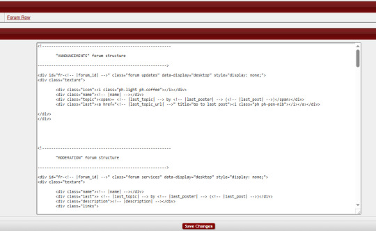
First things first: typically, when you're making a skin for a Jcink forum using HTML Templates, you're expected to only put one type of markup/structure per template and the system then repeats it for every instance where that structure is meant to occur - i.e. you only write a single forum row structure, and that structure is repeated for every forum, etc.
For example, we have my WIP "Kingdom of Calamity" skin, which has the same forum row style in every category, each of them identical to the last and the next:
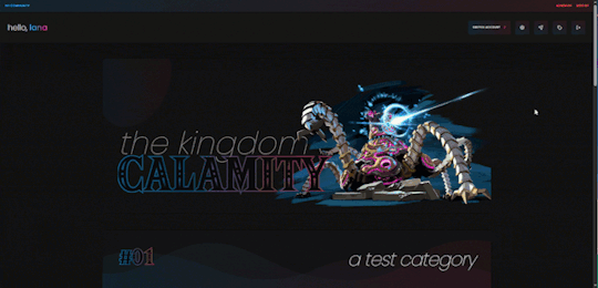
(Where you can see all the structures are identical when viewed from the index, and there's only one set of markup in the Forum Row template for the skin.)
When you mention skins "of that style" in your ask, I'm assuming that you mean skins with a highly customized index like Fading Echoes, where every category has a different layout for their forums. In these instances - a custom index where forums in certain categories are going to have a drastically different structures from one another, and isn't something manageable with CSS - I give each of them their own markup.
This means that you'll have multiple sets of markup for each different structure you want, for each different template. This is less important for the Category Headers, and more important for the Forum Rows.
As an example in this case, take my WIP "Garden of Dreams" skin: it has a different layout for its forums in each category, and even the layout of each forum per category wildly varies from one another-
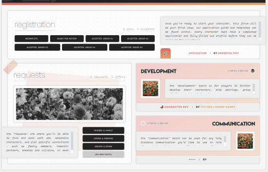
If you look under the hood of the skin inside of the HTML Templates - specifically, the Forum Rows - you'll see that I have a lot more markup here than a normal skin calls for:
This is because for each different forum that's going to have a different structure or layout, I'm writing completely new markup for it.
That's the general "gist" behind skins with custom indexes or ones done in this style: we're not using a single markup style with hard-coded elements (though that can also be done) but customizing each category and each forum to its exact placement on the index and in the skin.
To do this, I do two things:
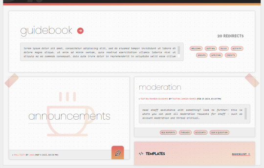
First, slap IDs on fucking everything, and I mean everything. You can see in my screenshot the first few forums (for "announcements" and "moderation" respectively) that the first attribute on those containers is an ID for "fr-(ID variable)". I also have IDs on the category for "cat-(ID variable)". I've started to make it a habit in my newer skins to put an ID variable on anything and everything I can get my grubby little raccoon mitts on in the skin, up to and including even the body element and anything within that such as categories, forums, post containers, profiles, etc.
That sets you up for the second thing, which is setting all forum/custom containers to "display: none" with a style attribute. I do this to prohibit any and all structures from displaying by default in every category, and potentially mucking stuff up when their styles, size, or formatting isn't compatible with the new/other/different category and surrounding forums.
These two steps, when combined, make it so you can selectively chokehold any elements on your index and wrestle them into submission with CSS - making sure they're visible where they need to be, and hidden where they don't need to be.
(And please, for God's sake, make sure your ID's are unique to only that container/element. That's a mistake I made often in my earlier skins that could have saved me a lot of grief: CLASSES are for repetition and grouping. ID's are not.)
Tabs on the Index
So, I can admit that I've never experimented with a hover on the forums before - mostly, because I still consider complex hovers and transitions to be my arch nemesis (although, it is on my list of things to eventually master) and I can't imagine that hovers are so different that the information provided above wouldn't be helpful in some manner. So, do as you will with that.
Tabs, however, can be accomplished in a variety of ways. In general, I consider there to be two separate ways to get tabs on something:
Using Javascript/jQuery/some type of script to trigger events for clicking.
Using radio button inputs and CSS to control display, also for a click or selection event.
They're both means to the same end, in some regard: you click on something, usually a button. That button controls what shows or hides. It's just the inside stuff that changes.
Funny enough, using a script of some sort is going to be what I consider the more "beginner friendly" option, and it's what I used for the tabs in Fading Echoes. In fact, I used this script in specific, which is a tutorial one from W3 Schools, and I just modified it to use the forum stuff instead of city names. It's important to keep in mind that for Fading Echoes, I also had unique Category Headers (new markup) for every single category, as well as unique Forum Rows like discussed above. I put the "tablinks" (the buttons/labels used as tabs) inside of the category markup, and I just created a new forum layout for the IC/RP forum containers as the "tabcontent". That make it so the tabs only displayed in that category, and specifically only worked for the forums with a corresponding ID number.
There are also other scripting methods of doing this, like Noire's script that I mentioned at the start of this. And that one, if memory serves, wouldn't force you to make multiple different category types like Fading Echoes did.
The method of radio buttons/inputs is also possible to use, though it does require you to have a good working understanding of using radio buttons for toggles - because if you don't understand what's going on with :checked attributes, you may not understand how to write your CSS in order to select the correct forum to display. I've done this method only once, on my vaguely "House of Night" themed skin that I'm still working on, and while it's a little buggy in some regards, it's also very much functional!
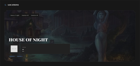
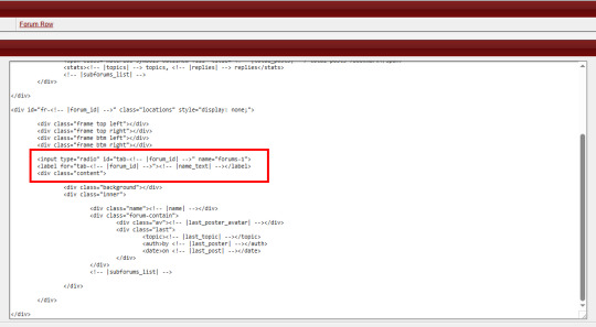
Here, I just made a second forum row structure (the other forums all use the same type of structure) and put the input/radio button inside of the forum, along with it's label, and corresponding elements for the forum. Then, the toggle - or which forum is displayed when you click on the tab - is controlled via CSS, as is the case with most input-based tabs like this.
Full disclaimer, the "little buggy" part I mentioned is that I had to use jQuery to get the correct tab to select when the page first loads, before a user clicks on any tabs. Otherwise, it was trying to select the first radio button/label combo on the page, which was technically in another category for a forum that had that "display: none" property set on it. (Remember, each forum structure you put in your "Forum Rows" HTML Template will get used for every forum being displayed. By putting IDs on them, we're just hiding them from showing with CSS, but they still very much exist on the page.)
If you've never worked with CSS tabs before, I have a few versions on my portfolio site that are considered "base" templates you can play around with:
Basic HTML & CSS Tabs
Basic HTML & CSS Accordion
Basic HTML & CSS Checkbox Toggle
I'd highly recommend getting used to them as a template for a post, to make sure you're really grasping how they work and the CSS selectors at play, before you try putting them into a skin.
I hope that helps, and as always, I'm willing to answer any coding questions people might have - not just stuff related to my work, but also general "how does [X] work" or "how do you do [Y]" - provided that I know the answer. I'll be the first to admit that I'm very much self-taught, and not a professional. I don't know everything, but I'm a Google search away from learning at least one new thing.
4 notes
·
View notes
Note
Hi ! I would like to buy your arcane pattern, (and really all your work is AMAZING, I have put several in my favourites perhaps there will be other purchases) It's for use on Forumactif, for roleplay forums, are the HTLM/CSS compatible with all versions phpBB2, ModernBB etc ? I've never bought templates before sorry if my questions are dumb lmaoo ! Thanks for your answers
Hello! Thank you so much 😊 And no worries, to clarify Arcane is a google doc template! Should you choose to purchase it, it'll provide a zip with an exclusive link to the google doc where you can duplicate the template and customize it for your personal use! It's not code (HTML/CSS) but you can always customize the gdoc and link it via forum roleplay (with the share function turned off) if that makes sense?
I recently also tried to clean up my store tabs to better organize the different things I offer. Just ensure you're in the appropriate sections & read through the description for the things you're looking for. Feel free to let me know if you have any further questions and I'm happy to help. ❤️
2 notes
·
View notes
Note
hi!!! i love for custom blog theme,, do you have a link to the code or creator 0:?
ya!
so my theme is actually a heavily modified version of redux edit #1 by lopezhummel (current url: holyaura). i always remind users that most tumblr themes are old and that you'll need to replace all instances of "http://" in the code with "https://" so tumblr will save the theme. i had to do it with this one
these are the modifications i made to the theme. i edited this theme over the course of at least a year or so and don't quite recall how i did all of these things. but to the best of my ability:
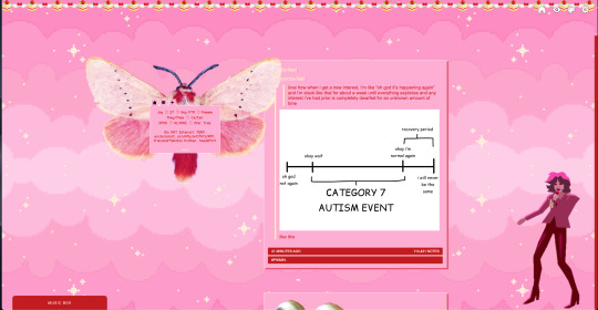
i moved the "left side img" to the right side of the screen. i also made this element "responsive" so the image will never get cropped when you resize your screen. this was a bitch and a half to figure out and i truthfully do not remember how i did it
i deleted the text in the drop-down navigation so it appears as a little line that is otherwise not noticeable. this type of theme, the "redux edit," used to be very popular because having a drop-down menu let you cram a bunch of links that lead to sub-pages on your blog. i've done away with my sub-pages, but i still like the format of the "redux style" tumblr theme, for its minimal UI and for its customization options.
i separated my mobile description from my web description for formatting reasons. basically, most elements in tumblr themes are connected to specific text fields and toggles. i simply went to the section that was connected to my blog description and deleted it. the web description has to be manually typed inside of the CSS/HTML editor when i want to change it. whereas my mobile description is whatever i type in the "description" box of the normal tumblr theme editors.
i added code someone else made ("NoPo" by drannex42 on GitHub) which allows you to hide posts with certain tags on them. i did this to hide my pinned post, as it looks bad on desktop.
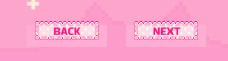
i replaced the tiny pagination arrows at the bottom with images that literally say "next" and "back" because the arrows were far too small/illegible. i know they aren't centered in the container i'm not sure how to fix that lol
i added a cursor

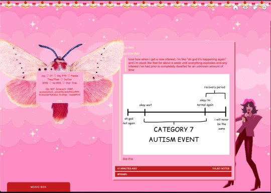
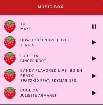
i installed a working music box ("music player #3" by glenthemes), and then added music by uploading MP3 files to discord and then using the links of those files as the audio sources. iirc i also had to make this element responsive and i aligned it so it would sit on the left side of my screen. i made the "album art" for each one the same strawberry pixel art
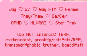
the moth is just a PNG i added and then moved around so it was behind my sidebar using the options that came pre-packaged with the theme
if you want something like the strawberry shortcake decoration at the top (called "banner" in the theme) your best bet is to google "pixel divider"
theme didn't support favicon so i added that in so i could have a little heart
ALSO:
this theme is. really weird about backgrounds. any background that i have ever set for it, i've had to do weird shit in photoshop. like making the background HUGE, mirroring it, etc. - because it would crop the image weird, or there would be a gap where there was no image. idk man, it's haunted. i'm sure there's a way to fix this but i am NOT tech savvy enough. anyway, patterns are probably your best friend. and if you DO want something that isn't a pattern, it's going to take a lot of trial and error. but i love this theme so i deal with it 😭
the sidebar image and the floating image do not scale. if your image is 1000 pixels, it will display at 1000 pixels. you'll either have to edit the code so that the theme scales the image for you, or resize any images before you add them
my white whale of theme editing (aside from the Weird Background thing) is that i cannot get infinite scrolling to work. i have tried every code out there. all of them break my theme. it makes me sad because like. i have music there for a reason. the idea is that people would listen to it while they scroll. unfortunately, the way it's set up now, the music will stop every time someone clicks "next" or "back" 💀
anyway sorry for rambling but i hope you enjoy the the theme and customizing it in the way that you want to!
24 notes
·
View notes
Text
ive been on cohost on-and-off since november, and i think im going to stick with it (famous last words, i know, but i am genuinely enjoying my time there, meeting some nice people and enjoying the posts that come across my dash)
home page
my blog
general observations, differences between here and tumblr (both good and bad), and caveats under the cut
the ability to use html and css in posts is fantastic, and while i do sometimes miss being able to change the formatting with a simple highlight like on tumblr, the added abilities to customize more than makes up for that. i've only used it a bit myself, but plan to use it more going forward, and you can get some fantastic shitposts on your dash because of this. note that only posts are hyper-customizable. blogs themselves aren't as customizable as on tumblr (think the default/mobile theme here)
i think their pro-privacy, anti-algorithm, anti-numbers philosophy is admirable. it's not perfect-- funding is a continual trouble, although they have plans for making it sustainable.
as with all smaller websites, it is a bit of an echo-chamber and has its share of drama and controversy.
the fewer number of people also lead to there being fewer good posts than on here, especially if you have niche interests, but my dash is still quite active, and i have to check it at least once a day to keep up-to-date.
if you edit your original post, all reblogged versions of the post are updated as well.
it has a comprehensive cw system built into posts, more reminiscent of mastodon than tumblr. there is discourse about its use or over-use, but on the whole i think this is a big improvement.
i (thankfully) haven't run into anybody or any post that required blocking or silencing or muting yet, but the options are there and thorough.
related, there is a no-nonsense attitude towards bigotry. i havent run into any bad eggs myself, but from what i've been given to understand they are sniped more or less as soon as they're discovered. there may be moderation issues as the website expands (this is one issue where places split up into smaller groups like mastodon have benefits) but as of right now, it seems to be working just fine, and better than tumblr.
there's no general within-post search for the sake of privacy and to limit harassment opportunities, but unlike tumblr, the tag search is functional. in addition, all posts with tags you've bookmarked show up in a separate, single tab on your dash, in proper chronological, non-algo'd order, which is a good way to discover new people to follow and posts to reblog. this is similar to "your tags" on tumblr, but unlike tumblr, i trust it to work
i haven't used this yet, but sideblogs are able to comment, ask, like, follow, etc, separately. no more "follows from [main url]"
in general, i like the vibes better than pillowfort, the other tumblr replacement site, and its a much more satisfying tumblr replacement than mastodon, because, well, its not like twitter (although i do like mastodon for other reasons).
there are some odd things that differentiate it from tumblr that you have to get used to at best, and can be extremely frustrating at worst:
notes cant be viewed per-post. they're all under your notification tab, chronologically listed. this hasnt been a problem for me, but i understand that this can get messy if you have a lot of followers/notes
if you are not OP, you cannot view others' reblogs. i've found that this is mostly fine, but it does mean you cant dive into the notes to see if anyone has added anything you'd like to reblog instead of the version on your dash. changing this is one of the most requested features. it doesn't seem to conflict with the site's anti-numbers ideals as long as it only lists contentful reblogs (those with additions), so i'm hopeful it will be added.
OP is not notified of tags on reblogs. all comments that are towards OP and not towards your followers belong in the comments. unlike other things in this list, this isn't a downside so much as a neutral difference that has taken me a long time to get used to.
the comments are generally important. reblog chains are still used, but comments (replies) are more functional than they are on tumblr, with proper ability to reply in comment threads and a better UI. they are used more often on cohost than on here, especially if you want to start a convo with OP and others viewing the post. as far as i can tell, everyone can see every comment, unlike the reblogs.
photoset layouts are not as flexible as on tumblr
no DMs
discovery hasn't been a big issue for me as someone who is primarily a reader/viewer (if anything, the functional tagging system and unified bookmarked tags tab makes it easier), but ive heard that for creators it can be frustrating
i am under the impression that pillowfort is the place to go for specifically fandom posting. more fandom people have been joining cohost though, especially since a bunch of tumblr people joined a couple weeks ago.
i realize this isn't exactly a hard sell, but want people to be aware of potential downsides before creating an account. despite these things, i really do urge you to check it out if youre interested! it's a good place :)
9 notes
·
View notes
Text
"I cant switch to firefox because..."
"It's too much effort to switch"
If you install firefox, it will ask if you want to import your browsing history, bookmarks, saved passwords*, and in a as of october of this year your extensions as well.
*dont use your browsers built in password manager. they're very much not as secure, even firefox's. read about passwords here
You can't import cookies for security reasons, but external tools can do that for you (try to avoid this. if you do have some data you need moved over, usually websites have their own "export data as file" option)
Everything else that you may need to fully complete the switch will come up naturally over time, the initial setup can be half an hour, or if you're happy with how it is at the start, less than 5 minutes.
"They don't support [website]"
Firefox is entirely up to date on current HTML, CSS, and Javascript standards. Theres a bunch of websites that compare all the features that firefox supports compared to chrome and stuff and they're often just, wrong? I've used some MANY of the features that firefox supposedly doesn't support. Plus they're constantly updating it for added support of new and old features. anything they refuse to add is due to security reasons, and nobody uses those features anyway.
In my experience i've never had to switch to chrome to avoid a website breaking. Sometimes it was because of an extension* but thats a very easy fix. Firefox has profiles built in and really good troubleshooting features.
*(stop using privacy badger/possum, please, it's built into firefox now, most of all privacy addons are completely useless because firefox already does it for you!!! ublock is safe tho i love u bbg)
If a site tells you "switch to chrome to see this site as intended" they're lying, and you can use a user agent switcher to trick them into thinking you're on chrome
"i need chrome for work or school"
i'd say 4 times out of 5 you don't, they say you have to use it but in reality it's just that they have better control over what you can do with it.
My high school had a shit ton of extensions automatically installed on chrome, including some shit that was literally spyware, it reported to teachers and staff all of your tabs you have open at any given time, and they could force shutoff tabs and force things open. They had absolutely no control or ability to monitor me when i switched to firefox, and there werent any problems that arose from it.
You can also just use chrome for school/work and use firefox for your personal web browser. separate your work life and personal life, you can do this with two different firefox profiles as well.
"I don't like change"
The only thing that's different about firefox in a day to day usage is the bar at the top, which is entirely customizable. Right click, customize toolbar, and you can mess around with it to make it the same layout as chrome. you can also get rid of those weird empty spaces to the left of the search bar they add by default for some reason. mozilla pls fix. You can further use themes to make it even look even more similar to chrome, I did that with my school profile to differentiate them.
When I switched, there wasn't anything I missed, I didn't have any of the "ugh i dont like how [blank] is in a different spot", or "ugh they dont have [this]". it just worked. It's a web browser, it works and does everything it needs to be. I didn't miss chrome at all, nothing felt different and the adjustment period to the new browser was LESS than what i felt when chrome updated the design in 2018.
"I have no reason to switch"
If you care about privacy at all (which you should), i could list hundreds of reasons why you should switch. Google removed "don't be evil" from their code of conduct for god sake lmao. Every new change they do is a ploy to get as much data from you and feed you as many ads as possible.
The dumping of Manifest V2/dynamic filtering not only makes most adblockers useless, it makes any sort of content blocking worse. Blocking trackers, malware, intrusive and annoying website features, these are things ublock does for you which chrome is doing its best to get you to stop doing. They want you to be exposed to predatory ads and malware so they can get more money.
If you have issues with ram usage and performance issues, firefox includes a lot of (lesser known) features to monitor RAM and CPU usage. While it seems as it may use more RAM, it automatically releases it when more ram is needed by other programs, effectively using less. It also uses much less ram in total in cases where there's 10+ tabs open.
Firefox can automatically block sites from auto-playing videos whenever you go on them
As mentioned firefox has so many more customization features than chrome, allowing you theme and move around everything to your hearts content
While on desktop, Chrome and Firefox are very close in functionality, on mobile, Firefox is working to add full extension support to mobile, it already has a small catalogue of extensions you can use, such as uBlock Origin. It has all of the desktop privacy features as well.
Firefox, only has about 3% of the market share. Other than that, chromium controls over 70% of all browsers, with apple controlling over 20%. The less people use firefox, the more control TWO companies have on the very act of using the internet. The Mozilla Foundation is a fully non-profit organization, with full ownership over the mozilla corporation, they don't have shareholders, and prioritize an open, safe, and private internet. Don't let them die.
"but what about..."
there's probably other reasons but the last of my advice:
you can have multiple browsers at once, install firefox and don't get rid of chrome. try firefox, see if there's anything you don't like, and try to fix it, and whenever you feel the need to, you can go back to the browser you already had.
17 notes
·
View notes
Text
I want to like Tumblr.
I’ve been using Tumblr as basically my only social media. And my main takeaway lately has been that I wish Tumblr didn’t suck so much as a blogging platform. I wish it was a viable option to use as a long-term personal blog. It does a lot of things right. Being able to customize all the HTML and CSS of your template is good, and it makes posting lots of different types of things really easy. But it also wants to make sure everyone who visits your blog knows they’re on Tumblr, and ideally, turn them into Tumblr users. Which is unfortunate. Especially because, as far as I can tell, paying for premium (formerly ad-free) doesn’t remove that Tumblr promotion from your blog. I don’t think paying to use a custom domain does, either. And if you’re paying to use a custom domain on your Tumblr blog, I’m pretty sure you don’t want Tumblr branding on it. You can kind of work around this by just using CSS to hide those promo elements. You just run the risk of them making a change that makes them visible again on your site. And you shouldn’t have to run that risk on your own site. But unfortunately, your Tumblr blog isn’t really your own site.
Another issue with it not really being something you fully control is you can’t fix issues that are caused by Tumblr. This, for example, drives me crazy. This issue alone would prevent me from ever using Tumblr as the primary home for my site/blog:
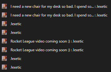
That’s my browser tab history. As you can see, every listing is in there twice. Which means if you’re browsing my blog and then click into a post, read it, decide you want to go back to the homepage and hit the back button in your browser… nothing happens. You have to click back twice for every page you want to go back. I refuse to have my blog have such an obvious flaw in the user experience.
I have a feeling things will only get worse the longer Automattic runs Tumblr. Forcing you to pay to use your own domain is straight out of the WordPress.com handbook. It’s unfortunate, because if Tumblr would just leave your custom theme alone it would be a great place to blog and have built-in social aspects. But they don’t want your custom theme to interfere with them getting new users. And that makes it not really a place for your personal blog, but kind of just another social network.
2 notes
·
View notes
Note
hi!!! I loved ur hometsuck kids theme sm it made me want to go back into coding after so long(^^; I wanted to know how u learned it and if u have any tips for newcomers. Ty !!
oh holy shit this is ask is SO SWEET :,) thank you so much anon and i’m so happy to hear it made you want to get back into coding! we seriously need a tumblr theme renaissance. what i would give to see people coding and sharing/reblogging themes like the older days on tumblr. life could be dream.
i learned html and css from making my own tumblr themes as a kid! i think tumblr themes are literally such a good introduction into learning front-end development. BUT to be fair i also took a few programming classes and was a big coding nerd in school and that definitely helped me become a lot more comfortable with making themes from scratch and adding custom script. if you are interested in learning javascript, learnjavascript.online is a great source for starting out and getting some practice!
i think a great way to get your bearings is to look at some base themes and poke around at the code just to familiarize yourself with some of the tumblr-specific syntax. @theme-hunter has a great database of themes to look at with some tutorials for beginners compiled here. i think the best way to learn how div blocks function and what you are capable of changing is by playing around with preexisting code and seeing what you can create. i did this until i was comfortable enough to make a few base themes of my own from scratch that i can go back and reference when starting a new theme or coding project.
tumblr also has a list of their block elements online with some introduction to custom themes, which is helpful to reference when styling the features built into each tumblr blog like title, descriptions, posts, notes, etc.
as far as tips for newcomers, here’s a few things top of mind:
google is your best friend, seriously, i can't tell you how many times i am googling the most rudimentary of things because i'm always forgetting little syntax things. chances are, if there's something you want to achieve with code there will be someone on stack overflow with some advice, or a tutorial on codepen or w3schools that you can use as reference.
troubleshoot with inspect element! i usually build my code straight into the tumblr theme html and css on a sideblog, save, and then keep a tab of that blog open that i can refresh and inspect element to look for errors in the console. i think firefox works the best, but i would recommend always loading your blog in a few different browsers since there is css syntax that is specific to mozilla or chrome (eg. custom scrollbars or pure-css animations)
there are lot of browser extensions that can make the coding process easier! i recommend eye dropper for pulling and matching hex codes. i also use fonts ninja a lot for getting accurate weights and names for custom fonts. a few more that come to mind are window resizer and css viewer (chrome/mozilla) if you want to check those out!
happy coding!
11 notes
·
View notes
Text
Life Update
First thing first, I finally learn HTML language. It probably will come in handy for my future college seasons. Next thing I wanna learn is CSS and some web design. Second, I reset my phone, that's why I haven't online for months. It feels great having so much storage left. I can fill up with only my important apps. Third, I am dual booting windows 10 and Linux mint. Yes, you read it right! but, why? My windows takes so much memory that I can barely open anything. 1 tab of browser and my memory became full. In Linux I can multitasking freely, keeping my focus in learning programming HTML and anything. OH AND ALSO I CAN PLAY YOUTUBE IN 1080p YAY. With unlimited customization, I can create my own desktop environment to my liking.
2 notes
·
View notes