#data visualisation graphs
Explore tagged Tumblr posts
Visit Tumblr Blog
Explore Tumblr blogs with no restrictions, modern design and the best experience.
Last Seen Tumblr Blogs


Fun Fact
70% of Tumblr users say the Dashboard is their favorite place to spend time online.
Text

Elevation profiles of Muni bus routes, an interactive visualisation on the SF Chronicle, in a news story about the 67 Bernal Heights, a bus that's not as impressively varied as the 36 (which climbs Twin Peaks) but which does go up a steeper path.


See also: the very flat 25 Treasure Island. That's what creating an island from landfill gets you.
#image#bus#bernal heights#twin peaks#san francisco#visualisation#data#chart#graph#graphic design#muni#sfmta#buses#public transport
1 note
·
View note
Text
Doing the maths: Grian's failure at getting a mending book
lots of talk about maths and probabilities below the cut! but there's a graph and simple explanation at the end if you want to get the gist of it and are bad at maths.
(I am still young and learning maths, critique/advice always welcomed)
What are the odds of getting a mending book in Minecraft?
(I am assuming Grian has been doing all his fishing with Luck of the Sea 3)
The probability of a mending book is actually a bit annoying to estimate. The Minecraft Wiki lists fishing up an enchanted book as 1.9% chance. This is for ANY enchanted book. The Minecraft wiki talks about how the chance of an enchantment being selected is calculated. Mending has a weight of 2. Using the table, mending has a probability of 2/135.
However, Grian is looking for any book with mending, not just a pure mending book. Additional enchantments are calculated in a different way, involving RNG, which means it won't be as easy to model. Due to this reason, I'll just be using the odds for a pure mending book throughout.
TLDR: a mending book has a 0.028..% chance (2/135*0.019*100)
Grian's Data
According to this screenshot, Grian has used a fishing rod 5679 times. This number may not be fully accurate, as it includes the times he's fished other players, rather than just fished for items, but it is a good estimate.
To help visualise this data, with a median waiting time between catches of 17.5 seconds, Grian has spent over 20 hours fishing so far! He may have a problem.
Is this statistically significant?
Hypothesis testing (p-value approach):
H0: p = 19/67500 (the null hypothesis - he has no mending books because of chance)
H1: p < 19/67500 (the alternate hypothesis - he has no mending books due to different odds)
5679 trials, 0 mending books
X ~ B(5679, 19/67500) (binomial distribution, 5679 tries with a probability of a mending book being 19/67500, where X is the number of mending books)
p(X=0) (what is the probability the number of mending books being 0)
p = 0.2021473392
Now, the point at which data becomes significant is subjective. For instance, you *could* get a million heads in a row flipping a coin, it's not impossible, but at a certain point, you can begin to say "okay there's something not normal about this". For this approach, the closer the p-value is to 0, the more evidence there is against the null hypothesis . The p-value here is far above a significance level of 0.01, or 0.05, or 0.1. There isn't a clear line between significant/non-significant, but this is answer is quite a bit far from 0
With this, I cannot reject the null hypothesis.
Personal conclusion: this is not statistically significant, Grian is just unlucky.
Are other values statistically significant?
Gem's proposed 9000: results in a p-value of 0.079... more significant than Grian's number but I don't imagine Mojang would be too concerned. As said though, it's all subjective.
I am bad at maths, what does all this mean?
Here is a graph, showing what number of mending books you might have after 5679 tries. The height of the bar represents the probability of getting that amount. The numbers at the top are the (rounded) numbers I used in my calculation
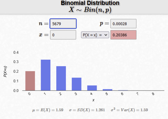
The pink column is 0 mending books - like what Grian has! As you can see, it is less likely than getting 1 or 2 books, but not too uncommon to happen.
End conclusion: Grian has bad luck. Like, not as hilariously bad as he thinks, but still bad. If he keeps going, chances are he will get a mending book, but I think he should probably stop fishing because at this point he has a problem.
#if you saw my last post no you didnt#<- misread “5679 fishing rods used” as having fully used up 5679 fishing rods#this is so much better written than my last post though. and i think the graph helps a lot#long post#locus fandom time#locus maths time#grian#hermitcraft#hermitblr#hermitcraft 10#“why the p value approach” i missed the lesson for it so this is my catch up work unironically
884 notes
·
View notes
Text

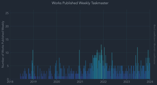
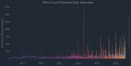


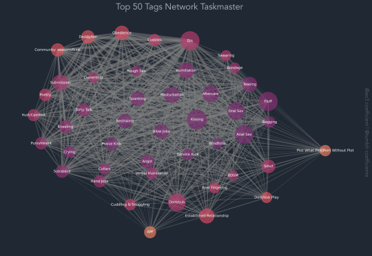
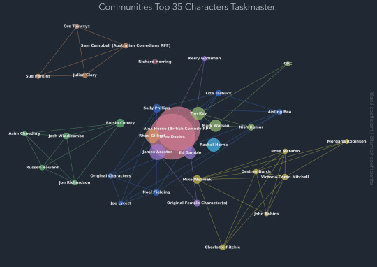
Taskmaster ao3 data visualised, see all graphs here :)
122 notes
·
View notes
Note
Now that the shining “digital humanities future” envisaged in the 2000s and early 2010s is now (probably) over, what do you think were the effects on the discipline of English Literature of trying to reduce everything to “graphs, maps, and trees,” visualisations, data sets, and pattern matching across corpora? Is there even a there there anymore?
I don't know. Did they ever find anything new, anything truly paradigm-shattering, anything we didn't understand before, anything we really need to know about anything that matters? I'm not talking about the strictly historical-sociological work, the how-many-English-novels-were-imported-into-Meiji-era-Japan or how-many-Bibles-were-printed-in-colonial-America or how-many-books-did-the-precursor-to-the-National-Library-of-Moldova-contain-in-1889, which is fine as far as it goes, but does belong to history and sociology rather than to literary criticism, though it may of course inform literary criticism. As far as anything claiming to help us with the hermeneutics, though: did anything come of it? Did they ever answer Elif Batuman's objection from 2005—
In 2001, I enrolled in a seminar taught by Moretti on this subject, entitled “Lost Bestsellers of Victorian Britain.” The idea was to identify the formal devices that might have been responsible for the initial success and subsequent failure of these books. It was a great seminar, although not one distinguished by its humanness, or by the quality of the reading. Coelebs in Search of a Wife, The Mysteries of London, The Woman Who Did: these proved to be the kind of mirthless and dismal productions that made you want to take your copy of the Princesse de Clèves and go hide in the Rhine. There was, however, one exception: Edward Bulwer-Lytton’s Pelham, or Adventures of a Gentleman, from the lost genre of the “silver fork novel.”
“On entering Paris,” Pelham relates, “I had resolved to set up ‘a character’: for I was always of an ambitious nature. . . . After various cogitations as to the particular one I should assume, I thought nothing appeared more likely to be obnoxious to men, and therefore pleasing to women, than an egregious coxcomb.” A young man goes to Paris determined to be “an egregious coxcomb”—now that’s a premise with some life to it.
One day I mentioned Pelham in self-defense to my advisor in the Slavic department, who was forever making fun of me for taking this class on Lost Victorian Bestsellers. “There’s this one book,” I said. “It’s really good.”
To my surprise, my advisor knew all about it. “Oh, well, Pelham,” she said. “Sure. Pushkin loved Pelham.”
As it turns out, Pushkin’s love for Pelham actually resulted in his writing one and a half chapters of a novel called The Russian Pelham—and incorporating certain features of Lytton’s “egregious coxcomb” into Eugene Onegin, an antihero who gets up at dawn, takes an ice-water bath, and spends the rest of the morning practicing his pool shots. Pelham was, in a manner of speaking, big in Japan; it wasn’t lost at all, at least not to Pushkinists. This discovery made me reconsider the theoretical project of reading the 30,000 lost Victorian novels. After all, it had taken all my willpower to get through just six of them—and then, the only one I liked turned out to be one that I might have encountered anyway, through Pushkin—i.e., through the canon.
—or Nan Z. Da's critique of 2019—
Not only has this branch of the digital humanities generated bad literary criticism, but it tends to lack quantitative rigor. Its findings are either banal or, if interesting, not statistically robust. The problem appears to be structural. In order to produce nuanced and sophisticated literary criticism, CLS must interpret statistical analysis against its true purpose; conversely, to stay true to the capacities of quantitative analysis, practitioners of CLS must treat literary data in vastly reductive ways, ignoring everything we know about interpretation, culture, and history. Literary objects are too few, and too complex, to respond interestingly to computational interpretation — not mathematically complex, but complex with respect to meaning, which is in turn activated by the quality of thought, experience, and writing that attends it.
—in a way that would convince a layperson, autodidact, reader-to-save-one's-soul?
When I used to teach an intro-to-the-English-major course, I would start with J. Hillis Miller's On Literature as a theoretically informed but less cynical alternative to Eagleton's intolerably smirking Literary Theory, which was popular with other instructors of the same course. Miller historicizes literature qua imaginative writing as beginning in part not only with print culture, Protestant individualism, the rise of the nation-state, the rise of the middle class, etc. but also its institutionalization in the modern research university. Divided as it is between Wissenschaft and Bildung, roughly science and humanities, the university does designate a "scientific" element to literary studies (philology, textual criticism, stylistics, the history of the book), but the broader point of such studies was always Bildung, acculturation, the training of the citizen. The ideological basis of this training, and the desiderated citizen supposed to emerge from it, has altered over time, and with it the concept of "the best that has been thought and said" assigned to effect said citizen's acculturation. But if we lose this telos then we lose the rationale for literary study in the first place. The reduction of literature in the normative sense—the best that has been thought and said, for all the socially contested definitions of "best"—to the whole body of written fictions, and the reduction of this body to a system of Darwinian combat accessible in its pattern only to computational analysis, as if the results of such notional combat were themselves quantitative and not qualitative in nature, as if one could do a value-free analysis of novels in the same way one can do a value-free analysis of butterflies, is to cede the authority of literary studies, which can only be premised on the aesthetic charisma of its object, to the social and finally to the natural sciences, and to an outdated mechanistic 19th-century idea of the natural sciences at that. No, as Batuman points out, the value of the canon, revise it how we will, and there would be no point in revising it if it did not matter to individual and collective Bildung, remains the only satisfying warrant for the continuation of academic literary study. A science-envying reductionism, like a baptism guest who tactlessly proposes that the infant is only a bundle of meat and bone, only destroys the occasion.
4 notes
·
View notes
Text


William Playfair the Scottish engineer and political economist was born on September 22nd 1759.
I read one article about Playfair that describes him as "a kind of Forrest Gump of the Enlightenment" perhaps a bit harsh, I would say he was a bit of a polymath, another source in my opinion is more accurate, Playfair is without doubt to many of you out there "the most famous man you have never heard of" he rubbed shoulders with the era’s many giants, switching careers at the drop of a hat, and throwing himself headlong into history-changing events, from the storming of the Bastille to the settling of the American West.
William had a lot to live up to, his brothers were architect James Playfair and mathematician John Playfair, his father passed away when he was 13 and it was left to John to lead the family and his education.
After serving his apprenticeship with Andrew Meikle, the inventor of the threshing machine, William Playfair became draftsman and personal assistant to James Watt at the Boulton and Watt steam engine factory in Soho, Birmingham then seems to have just wander from one trade to another, the way Gump wandered through life, so you can see where the analogy comes from.
William, was, during his adult life, (takes a deep breath) a millwright, engineer, draftsman, accountant, inventor, silversmith, merchant, investment broker, economist, statistician, pamphleteer, translator, publicist, land speculator, convict, banker, ardent royalist, editor, blackmailer and journalist.
Okay they are not all jobs, but they do put you in the picture a wee bit on the character of the man I think.
Most interestingly in my opinion was his time as a spy in France during the Revolution and was on the scene during the storming of the Bastille. He even helps trigger the first major political scandal in the newly formed United States, a land speculation gone bad involving Washington, Hamilton, and Jefferson.
To go into all of this man's adventurers would take too long, instead I will just tell you that the one thing he did, that has been a part of all your lives, in one way or another, is he invented the graph. Before William invented the graph you had to read through pages of statistics to find things out, the graph, you "get it" in a glance.
In 1786, he published "The Commercial and Political Atlas" , a compendium of bar and line charts representing different European countries’ imports, exports, wages, and other trends for which he had the data handy. As the man himself explained, “Men of high rank, or active business, can only pay attention to outlines… It is hoped that, with the Assistance of these Charts, such information will be got without the fatigue and trouble of studying the particulars.” he went on “No study is less alluring or more dry and tedious than statistics, unless the mind and imagination are set to work,” in the book’s introduction.
His old boss Watt, was sent a copy of the Commercial Atlas for review, and wasn't impressed, called the book “mere plummery” and its author “a Rascal.”
To finish I must say that he was a rather humble man and actually gave credit for the invention to his brother writing, "John taught me to know that whatever can be expressed in numbers, may be represented by lines,” Playfair wrote much later, in the introduction to one of his books of diagrams. “To the best and most affectionate of brothers, I owe the invention of these Charts.”
He was never a success in his lifetime and was seen as a ditherer by Watt.
William Playfair died in 1823, in poverty and relative obscurity, banned from any good society. Slowly, over the next century or so, the supply of readily available data grew—as did the the public’s appetite for it. Bar, line and pie charts began trickling into newspapers and textbooks. Two hundred years later, as we barrel forward into the Information Age, you can’t click a link without stumbling upon some kind of data visualisation.
The next time you come across a graph, remember, like many other notable inventions in our history, take pride in that it was the work of a Scot that gave us these easy to read information "pictures".
You can find more on William Playfair here https://www.atlasobscura.com/.../the-scottish-scoundrel...
6 notes
·
View notes
Note
📊
please : )
boring answer is it depends on what kind of data you want to visualise. real answer in my heart of hearts i fuck with bar graphs
3 notes
·
View notes
Text
My eternal mood.
#digital art#illustration#artists on tumblr#art#drawing#funny#graph#I hate people#no more fucks to give#aesthetic#redbubble
8 notes
·
View notes
Text

Incredible data visualisation in today's FT Alphaville. I didn't tilt this. They did. This is the recommended viewing orientation of the graph according to the Financial Times' dedicated markets and finance blog.
#vertical moves reflect changes in sterling's broad effective exchange rate horizontal moves are changes in the eur/usd rate... basically#tbc it's a blog where they have fun don't be too rude
3 notes
·
View notes
Note
Brilliant race analysis as always, I really like how you keep things concise and to the point, but you're also very thorough. And I also appreciate the discussion of real data, rather than made up "fan propaganda material". Also love the graphs, they visualise the information perfectly.
I really wish I could just link all your race analyses and post them as a reply to any uneducated Instagram comment that disses Charles' performance, as there's, unfortunately, a lot of those.
Thank you so much for the love and support <3
F1 tempo is one of my favorite websites. I could spend hours there(I mean I do, but sometimes I just mess around there for fun) it's so useful to get explanations for what happened and why it happened that way. It's so useful for pinpointing areas a driver is doing well or struggling on and also to highlight a car's performance.
I appreciate that. There isn't much to be done, people will say what they want, and if they are wrong then that will eventually become obvious. I don't know what goes on on Instagram but it's probably not worth getting bothered over. The car, data, and driver always speak for themselves eventually.
It's a good reminder to have fun, and try to base things on data.
11 notes
·
View notes
Text
I sort of want to mock up some reblog tree visualisations now, I'm just imagining a version of tumblr where the reblog graphs aren't just like gimmicky alternatives to the regular list of reblogs. There are so many cool different ways of displaying hierarchical data like reblog trees, especially in an interactive environment like this.
I think in an ideal world it'd be more compact than the current reblog graphs, and have the same options for which reblogs you can see as the current reblog list. Depending on which representation it might also be useful to collapse branches, and be able to return to the source post or the reblog you're currently viewing.
33 notes
·
View notes
Note
Just listening to the season finale episode and you asked about if people work in data visualisation want to reach out. I wrote my thesis in climate economics/econometrics and now work all day with data so I have experience making graphs. If you are still looking for someone, I would be very happy to make some graphs about the podcast!
"omg I need to write this down, I still haven't posted any data from season 2. it's on my low-stakes Fun Fandom Stuff to-do list"
—shannon
(tysm for reaching out!! —G)
2 notes
·
View notes
Note
Thank you for all your help with this! your solution for the project totals worked perfectly :D
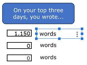
As for the difficulty deleting projects, thanks again for looking into it. I’m using Google sheets, and when I delete a project - any of them - the top stats sheet starts looking like this:

(The clipped words image was already like that) The chart sheet otherwise deleted the data just fine, but looks like this:

And totals like this:

The 2024 word count in yearly comps has that same REF image instead of a number, and the chart instead says ‘Add a series to start visualising your data’. In totals and comps data the information for the deleted project also shows the REF message, unless I manually delete that column as well (idk if that’s an issue but best be thorough). Daily graph and chart remove the data fine, and if I delete a project that has its own sheet it’s replaced with the add a series message, which I assume is supposed to happen. I haven’t noticed and other adverse affects.
(Seriously, thank you for helping me so much. You’re amazing, and even if you don’t find/know a work around for this you’ve been a huge help!)
Ah, okay, I seeeeeee. So, anywhere you see that #REF! message, it's because it's trying to reference information that's not there any more. In this case, you did the right thing by deleting the project column from the Totals sheet! If you delete a project column in the Daily sheet, you also need to delete its corresponding columns in the Comps. Data and Totals sheets. This is because both of those sheets pulled information from the deleted project column in the Daily sheet, and they'll still be trying to fulfil a formula that no longer has the necessary information to work.
Once those columns are deleted, follow the instructions for deleting a series from a chart on page 7 of the instructions booklet, and delete the project's series from the Totals chart.
Something you could do in the future, instead of deleting project columns from the Daily sheet, is to hide them (right-click on the letter above the column and choose "hide column" from the drop-down menu). Choosing this method means that a) you don't need to delete any project columns elsewhere, and b) "adding" more columns, should you ever need them, becomes a matter of unhiding the column. The only change you'll need to make then is deleting the project series from the Totals chart, as explained in previous paragraph.
(And yes, deleting a project column will affect its corresponding sheet, if it has one. Pages 23–24 of the instructions explain how to make a new project-specific sheet, and you can follow those same instructions to link the sheet to a different project column, if you want to. Otherwise, feel free to hide/delete the sheet.)
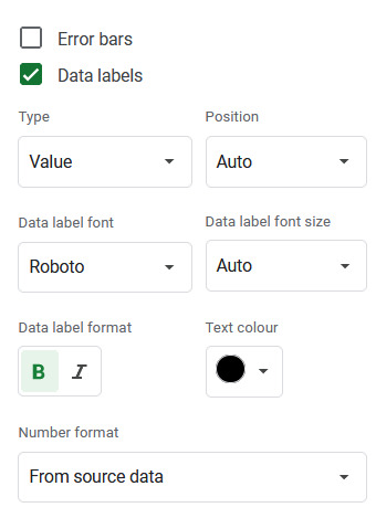
However. I noticed that for some reason, removing any data from the totals chart converts the previously-invisible line for the totals into a stacked column instead. To fix that, right-click on the chart and select "Chart style" to open the Chart editor window. Then, under the "customise" tab, scroll down and click on the option that says "series". Pick "Totals" from the drop-down menu of series, and change where it says "column" to "line" and set the line opacity to 0 (Shown in the left image).
Below this section, there is a list of three tick-boxes labelled Error bars, Data labels and Trend line. Click the box for Data labels, and make sure the text colour is set to black. You'll then get a number for total words written that month appearing above the stacked columns. (Shown in right image)

Fixing the Top Stats sheet:
In the case of the current streak counter, the issue is in two places: with the formula that counts the current streak:

and the formula that decides whether to say "to date" or "as of yesterday":
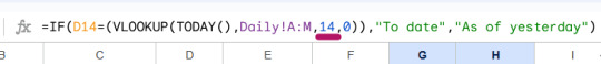
I've underlined the bits you'll need to change. You can find more details on how to do this and how it works on pages 9–10 (Top Sheets explanation) and 18 (how the streak counter works) of the instructions document.
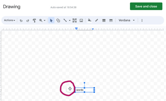
also. if those squashed "words" textboxes are annoying you (they would drive me nuts lol), I think the problem is that the text box isn't set to resize itself with the text (even though I thought i did that...). Try clicking on the box, then on the little three dots symbol and choose "Edit" from the menu that appears. When the Drawing window opens, select that icon next to the box (circled), and choose "Resize shape to fit text".
8 notes
·
View notes
Text
“the air We make“
Konstantin Kim, Leonard Kern , Julian Heinen
We are located at the threshold of a new reality, an era of clear hyper interdependence and planetary scale computational capabilities mixed together with uncertainties of anthropocene and approaching scarcity of resources. Can technical ingenuities evoke in us a new understanding of the milieu and playfully help us overcome the growing sense of futility?
CO2 in a scale of a single room is measured by sensors, data is then sent to the machine, which represents it in a Cartesian coordinate system with planting seeds into hydroponic system and ensuring their growth, keeping water levels intact with a reacting watering apparatus.
Temporary adjusted for measuring interior spaces, each time a level of CO2 is crossing 600 ppm (complaints of stiffness and odours), the machine plants a batch of seeds within a stripe. Each stripe of hydroculture is a day’s worth data and each water basin contains two weeks of CO2 measurements.
Over time the planted bar grows, representing its CO2 content. Day by day, a grown CO2 graph is created visualising the measure air quality.


2 notes
·
View notes
Text
As charts proliferated, so did their sophistication. Today, newspapers such as The New York Times employ sizeable teams of data visualisation experts. Many of the data graphics they create are interactive visualisations that allow readers to explore multiple facets of complex data sets and observe patterns in the relationships among multiple variables. Well-designed data graphics provide readers with deeper and more nuanced perspectives, while promoting the use of quantitative information in understanding the world and making decisions. But there is a downside. Our educational system has not caught up. Readers may have little training in how to interpret data graphics. A recent Pew Research Center study found that only about half of Americans surveyed could correctly interpret a simple scatter plot. In particular, individuals without a college degree were substantially less likely to be able to draw correct conclusions from the graph. This is a problem in a world where data graphics are commonplace. Another problem is that while data visualisations may appear to be objective, the designer has a great deal of control over the message a graphic conveys. Even using accurate data, a designer can manipulate how those data make us feel. She can create the illusion of a correlation where none exists, or make a small difference between groups look big. Again, our educational system lags behind. Few people are taught how to spot these manipulations, or even taught to appreciate the power a designer has to shape the story that the data tell. We may be taught how to spot logical fallacies and how to verify claims from questionable sources. But we are rarely taught anything about the ways in which data graphics can be designed to mislead us.
Carl T. Bergstrom & Jevin D. West, Calling Bullshit: The Art of Scepticism in a Data-Driven World
5 notes
·
View notes
Note
Hi I have a couple of questions about the study. I'm not from and English speaking country nor is English my first language. Is your study only focused on English speaking people's experiences or can I also submit my answers? I'm also wondering a bit how the data from the study will be used? How many people will see the data and how long it will be stored? It seems you ask in detail about queer people's names and even record our voices so I feel that data security is really important here. It's possible that I'm the only trans person or one of the only trans people in my country with my chosen name. I'm wondering how compromizing it would be for a person like me to partizipate?
Hi, thank you for the questions! I'll try my best to answer them.
Do you have to be a native English speaker?
No, you do not! A lot of my focus will depend on what kind of data I get: if I get a large sample of native English speakers, I might compare their name choices with non-native English speakers for example. That will become clear only once I'm looking at the results in detail. I've kept the survey as 'inclusive' as possible for this reason, so you're welcome to submit your answers as a non-native speaker! :)
How many people will see the data?
The raw data will only ever be seen by me, since I'm the one analysing it. While I might consult our statistics expert at the university for how to build graphs out of some of the data (there are a number of single and multiple choice questions, for example, which lend themselves to visualisation) and I will discuss my findings with my supervisor, all the actual direct work is being done by me. And obviously I'm not going to sell the data or anything, that would be EXTREMELY bad conduct for a researcher.
In the thesis itself I'm trying to determine trends first and foremost, but I might use some names as examples, so they will appear in the text. But they will not be attached to the entire 'dataset' from that respondent in that case.
How long will the data be stored?
The data will be stored only as long as I need it - aka until I've received my grade for the thesis, which will (hopefully) be in a few months. After that, I will delete the survey and associated data from the site.
Finished master's theses are stored in the university archive for five years (beginning with the end of the year in which I receive my grade, which will - again, hopefully - be 2024). After that timeframe, select theses may be kept around - in that case, they can only be accessed with the written consent of the author. There's also the possibility of publication (which I have no plans of doing at the moment), which also requires my written consent.
The voice recordings are on a voluntarily basis; they are not mandatory, so you can complete the survey without them if you want. I ask for the pronunciation of the names primarily because it's not always possible to intuit it based on spelling, and since part of my analysis is phonological, having clear data would be useful here. I won't be keeping the recordings around - as soon as I've transcribed the name pronunciation, they're no longer needed. They will not be shared with anybody; only I will listen to them.
How compromising is it to participate if my name is rare?
If you're worried about the possibility of being identified based on your name or other information you've provided, you can leave me a note at the end of the survey (there's an open text field for comments) and tell me not to use your name as an example! That's no problem at all.
-
I hope this helps! Let me know if you have any other concerns!
6 notes
·
View notes
Text
Today my prof complimented my data analysis and my friend from class complimented my graphs and charts and said my article flowed well. The whole time I was making all those graphics, I was convinced that I should have been doing something else, that I was in an ADHD rabbit hole just picking away at excel and google maps because I'm obsessive, and telling myself "I'm just not cut out for journalism" at every turn. Fuck maybe I'm not shit at journalism. Maybe it's just me being dogshit at time management for ADHD reasons. I'm actually a decent writer I think. & I'm good with making those visualisations. And I have the potential to become the ultimate Excel Wizard
#personal#four and a half years into my journalism degree... i better be decent at writing hahaha#i should get that girl's phone number since she doesn't have social media?? we're similar people we should be friends outside of class
3 notes
·
View notes