#datastoryteller
Explore tagged Tumblr posts
Visit Tumblr Blog
Explore Tumblr blogs with no restrictions, modern design and the best experience.
Last Seen Tumblr Blogs


Fun Fact
Tumblr is available in 18 languages.
Text
Hey students, if you have a choice of presenting your information in tables or graphs, choose the graph. Want to know why: 🔽
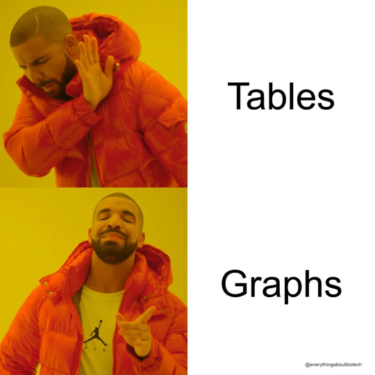
Graphs showcase trends, relationships, and key takeaways in a format the mind grasps faster than rows and columns. When you need to drive home critical data or demonstrate complex connections, graphs speak volumes.
Focus the spotlight on what matters most. Eliminate distractions with clean axes, labels, and legends tailored to the story you want to tell. Guide the viewer's eyes towards revelations, not footnotes.
But don't abandon tables altogether. Sometimes specifics and precise figures need the clarity tables allow. Use graphs to pull out patterns and messages, then turn to tables when the raw numbers themselves hold meaning.
With intentional design, graphs grab attention and spark "Aha!" moments. Tables serve as vital references to ground insights in accuracy. Together, they become a powerful communication duo.
The right balance drives home your data-driven point quickly, clearly and credibly. Let purpose guide your mix of visuals. Whether tables or graphs, let the numbers speak.
👉Do you agree with me? Let me know in the comments.
#scicomm#science communication#science#Infographic#DataViz#GraphicRecording#Sketchnotes#VisualCommunication#VisualThinking#DrawingExplanation#InformationDesign#DataStorytelling#VisualLiteracy#VisualNotes#GraphsRock#VisualizeThis
14 notes
·
View notes
Text
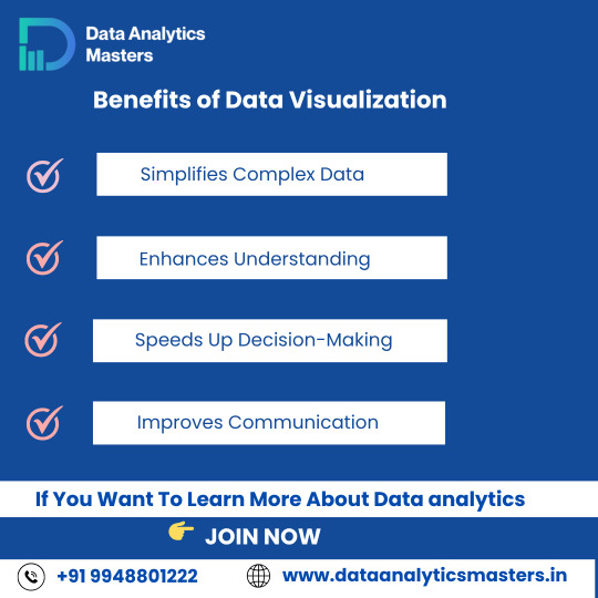
📊 Benefits of Data Visualization
Struggling with too much data?
Data visualization helps you:
✅ Simplify complex data – Easy to read
✅ Enhance understanding – Clear insights
✅ Make faster decisions – Take quick action
✅ Improve communication – Work better with your team
Start mastering tools like Power BI, Excel Dashboards, Tableau, and more!
✅ Why Choose Us?
✔️ 100% practical training
✔️ Real-time projects & case studies
✔️ Expert mentors with industry experience
✔️ Certification & job assistance
✔️ Easy-to-understand Telugu + English mix classes
📍 Institute Address:
3rd Floor, Dr. Atmaram Estates, Metro Pillar No. A690, Beside Siri Pearls & Jewellery, near JNTU Metro Station, Hyder Nagar, Vasantha Nagar, Hyderabad, Telangana – 500072📞 Contact: +91 9948801222 📧 Email: [email protected] 🌐 Website: https://dataanalyticsmasters.in
#DataVisualization#VisualizeData#DataAnalytics#PowerBI#Tableau#ExcelDashboard#DataStorytelling#DataScience#BusinessIntelligence#LearnAnalytics#AnalyticsTraining#DataSimplified#ChartsAndGraphs#Dashboards#DataAnalyticsMasters#TechLearning#UpskillNow#HyderabadTraining#OnlineDataCourses#SimplifyWithData
0 notes
Text
The Role of Data Science in Healthcare and Diagnosis
Data science is changing many areas, and healthcare is one of the most important ones. Today, healthcare uses data science to help doctors find diseases early, make better decisions, and create treatments that fit each patient. Hospitals, clinics, and researchers have a lot of health data, like patient records, test results, and information from devices like fitness trackers. Data science helps to understand all this data and use it to improve health and save lives.
Why Healthcare Needs Data Science
Healthcare creates huge amounts of data every day. Each patient has a medical history, lab tests, prescriptions, and other information. But this data is often spread out and not easy to use. Data science helps by analyzing this data and finding useful patterns.
Using tools like machine learning and statistics, data scientists find important information that can help doctors and nurses make faster and better decisions. This means patients get the right care at the right time.
How Data Science Helps Healthcare
1. Finding Diseases Early
One of the biggest ways data science helps is by spotting diseases early. Doctors use data science models trained on thousands of medical images and patient data to find signs of diseases like cancer or heart problems before they become serious.
For example, some AI tools can look at breast cancer scans and find tiny changes that a doctor might miss. This helps catch cancer early when treatment is easier and more effective.
2. Predicting Health Problems
Data science can also predict which patients might get sick or need extra care. Hospitals use this to plan treatment and avoid emergencies.
For example, data models can predict if a patient might develop a serious infection like sepsis. If the model alerts the doctors early, they can start treatment sooner and save the patient’s life.
3. Making Treatment Personal
Every person is different, so one treatment might not work for everyone. Data science helps by studying a patient’s genes, lifestyle, and past treatments to suggest the best medicine or therapy for them.
In cancer treatment, for example, doctors use genetic data to choose the drugs that will work best for a patient’s specific type of cancer. This approach is called “precision medicine.”
4. Helping Doctors Read Medical Images
Reading X-rays, MRIs, or CT scans takes time and skill. Data science uses AI to help doctors by quickly analyzing these images and pointing out problems.
For example, AI can find small lung nodules on a chest X-ray, which could be early signs of lung cancer. This helps doctors make faster and more accurate diagnoses.
5. Finding New Medicines
Creating new drugs takes a long time and costs a lot of money. Data science can speed up this process by predicting which chemicals might work as medicines.
During the COVID-19 pandemic, data science helped researchers understand the virus and find possible treatments faster than ever before.
Tools Used in Healthcare Data Science
Healthcare data science uses many computer tools to do its work:
Python and R: These programming languages help analyze data and build models.
TensorFlow and PyTorch: These tools help create AI programs that learn from data.
Tableau and Power BI: These help make charts and graphs to show data clearly.
Cloud platforms like AWS and Azure: These provide places to store and process big amounts of data quickly.
Together, these tools help doctors and data scientists work as a team to improve health care.
Challenges of Using Data Science in Healthcare
Even though data science is very helpful, there are some challenges:
Privacy: Patient data is very private. It must be kept safe and only used in the right ways.
Data Quality: Sometimes data is incomplete or wrong, which can lead to mistakes.
Understanding AI: Doctors need to know how AI makes decisions to trust it, but sometimes AI is hard to understand.
Fairness: If data is biased, AI might make unfair decisions that hurt some patients.
Healthcare providers, data scientists, and regulators must work together to solve these problems carefully.
What the Future Looks Like
The future of healthcare will rely even more on data science. Some examples include:
AI assistants helping with mental health support.
Wearable devices that monitor health and alert doctors in emergencies.
Hospitals using data to manage patient care and resources better.
Digital models of patients that test treatments before trying them in real life.
As technology improves and more data becomes available, healthcare will become faster, safer, and more personal.
Conclusion
Data science is changing healthcare in many good ways. It helps find diseases early, predicts health risks, personalizes treatments, helps doctors read medical images, and speeds up drug discovery. These improvements come from using data and technology together.

#data#datascience#datastorytelling#machinelearning#bigdata#analytics#technology#informationtechnology#ai#datainsights#dataanalysis#datavisualization#predictiveanalytics#dataengineer#businessintelligence#deeplearning#dataanalytics#storytellingwithdata#pythonfordatascience#datajourney#mlmodels#cleandata#datascientistlife#datamakesdifference#dataisthenewoil#datasciencetools#techblog#futureofdata#insightsfromdata#datadriven
0 notes
Text
In an age of overwhelming information, turning raw data into actionable strategies requires clarity, precision, and intentional design. This article discusses the process of creating specific, measurable, achievable, relevant, and time-bound goals that correspond with data analysis. It highlights common pitfalls, underscores the necessity of a comprehensive data dictionary, and focuses on insights centred around the audience. Utilising frameworks such as PIQPACC and RRV helps readers derive meaningful insights, question assumptions, and ultimately convert information into effective strategic decisions.

View On WordPress
0 notes
Text
Unlock SEO Secrets: 2025’s 3-Step Formula to Turn Dry Stats into Stories Google Loves

Why Data Storytelling Is Your Secret Weapon in 2025
In an era where 90% of online content is ignored (HubSpot), data storytelling isn’t just a buzzword — it’s a non-negotiable skill for marketers, analysts, and brands. Why? Because raw stats alone don’t persuade, but stories do. By 2025, content with data-driven narratives will dominate search results, earning 3x more organic traffic than generic listicles (SEMrush). Ready to turn spreadsheets into stories that stick — and rank? Let’s dive in.
Want the full breakdown? Read the full article
#DataStorytelling#SEO2025#ContentMarketing#AITrends#DigitalStrategy#DataViz#SEOTips#MarketingTrends#2025Trends#DataDriven#StorytellingMatters#ContentCreation#BigData
0 notes
Text
Enhancing Travel Services Statistics in Eswatini: Insights from ITC Day 3 Training

Mbabane, Eswatini — 16 April 2025 By: Thabiso Njoko
The third day of the International Trade Centre (ITC)’s specialized training on Travel Services in Eswatini brought together statisticians, trade experts, and data professionals to deepen their understanding of trade intelligence through robust data handling techniques. The session emphasized fostering African trade integration by strengthening statistical capacity in travel-related services.
Kickstarting with Coffee & Concepts
After a quick Q&A recap of Day 2, things got serious. The morning dove straight into sampling techniques, using real-world case studies from Spain and France to explore how countries collect data without a complete business registry. The solution? Smart sampling — think stratified methods, population frameworks, and creative workarounds.
“We don’t have to count everyone. We just have to count smart,” one participant noted during the group exercise.
Building Better Data: Processing & Precision
Next came the data processing phase, where participants learned how raw survey responses turn into reliable national statistics. It’s more than just crunching numbers — it’s about linking records, correcting errors, and identifying those wild outliers (like the accommodation provider who over-reported by 100x — ouch!).
Tools and techniques covered:
Regression and ratio imputations
Nearest-neighbour donor methods
Automated editing software (yes, robots helping with stats!)
From France’s donor-clustering method to New Zealand’s COVID-era imputation models, the global examples made it clear: no two countries do it the same, but everyone’s working toward the same goal — better data for better decisions.
Imputations: Filling in the Blanks
If you’ve ever skipped a survey question, you’ve contributed to one of the biggest challenges in statistics: missing values. Day 3 tackled this head-on with exercises on how to handle non-response. Do you adjust the weights? Impute values? Go back and ask again?
Participants learned about:
Longitudinal imputation (filling in today’s blanks using yesterday’s answers)
Weighting adjustments to account for non-responding units
And most importantly — choosing the right method for the right situation
Making Data Speak: Dissemination & Metadata
Stats are only as useful as people’s ability to understand them. The final session explored how platforms like OECD’s Data Explorer, ITC Trade Map, and Eurostat make data accessible through strong metadata and sleek design.
“Where is the wisdom we have lost in knowledge? Where is the knowledge we have lost in information?” — T.S. Eliot, as quoted in the final slide.
A reminder that stats aren’t just about counting tourists — they’re about informing policy, supporting business, and building a stronger future.
Wrapping Up with Smiles (and Certificates)
After hours of exercises, discussions, and plenty of “a-ha!” moments, the day ended with a certificate ceremony. Shoutout to the ITC team — especially Christophe Durand and Katerina Blanchard Joklova — for making data training engaging and hands-on.

Final Takeaway
Whether you’re a tourism officer, a data geek, or just curious about how numbers shape our economy — this training was a powerful reminder that behind every statistic, there’s a story.
And in Eswatini, that story is just beginning.
Lets Connect: Discord | Telegram | Linkedin | X
#MediumWriters#DataStorytelling#WhatMatters#InformedOpinions#MediumAfrica#MediumVoices#ThinkPiece#tourism statistics#internation trade centre#travel data#eswatini#workshop#CreativeEconomy#DesignMeetsData#CreativeAfrica#CultureAndCommerce#ArtOfData#StorytellingWithData#DataAndDesign#CapacityBuilding#DataSkills#KnowledgeIsPower#LearningThroughData#SkillUpAfrica#ProfessionalDevelopment#AfricaRising#EswatiniInsights#AfricanTrade#RegionalIntegration#TourismInAfrica
0 notes
Text

Your data has a story. VADY’s context-aware AI analytics helps you read between the lines—spotting patterns and insights others miss. Discover smarter, deeper, more actionable data-driven decisions powered by VADY’s next-gen AI.
#VADY#NewFangled#ContextAwareAIAnalytics#AIpoweredBusinessIntelligence#VADYAIAnalytics#DataDrivenDecisions#HiddenBusinessInsights#SmartDecisionMakingTools#AIDataMining#EnterpriseAISolutions#VADYBusinessIntelligence#AIForExecutives#BusinessInsightEngine#EnterpriseAIAnalytics#DataStorytelling#VADYDataAnalyticsSolutions#UncoverBusinessInsights#AIWithContext#AIInDecisionMaking#StrategicAIforBusiness
0 notes
Text
Advanced Data Storytelling: Engaging Audiences at a Deeper Level
Advanced data storytelling goes beyond charts and dashboards to create compelling narratives that engage audiences emotionally and intellectually. It combines data visualization, context, and storytelling techniques to make insights more relatable and impactful. AI-driven tools personalize stories for different audiences, while interactive visualizations and immersive experiences (AR/VR) enhance engagement. The future of data storytelling focuses on real-time, dynamic narratives that adapt based on user interaction and evolving data trends Read More..

0 notes
Text
What is Snowflake? A Game-Changer for Enterprise Data Management
Snowflake is an innovative cloud data warehouse that eliminates data silos and enables real-time analytics. Unlike traditional databases, it offers elasticity, automated scaling, and multi-cloud compatibility. With AI-driven insights, Snowflake empowers CXOs to make data-driven decisions. Know more:
Want to optimize your business intelligence strategy? DataStoryHub helps leaders unlock Snowflake’s full potential. Explore now!
0 notes
Text

The Basics of Data Visualization | Why It Matters in Data Science
Data visualization is the art of representing data in a visual format, using graphs and charts. It eases the interpretation of complex datasets, enabling the viewer to recognize patterns, trends, and insights more quickly. In data science, data visualization enables a better communication of findings to allow for better decision-making. This form of communication comes into play by presenting information so that there is minimal space between raw data and useful insights. Data visualization tools also enable data scientists to easily identify outliers, relationships, and key metrics so that the overall analysis process is sped up while increasing audience engagement.
Importance of data visualization in data science
Data visualization is an integral part of data science as it involves translating data into a visual representation so that users can perceive the data being analyzed and report their insights. Different aspects of the importance of data visualization in the modern-day can be described as follows: Transforms data into its simplest form: Complex datasets are generally made easily understandable with the help of different visuals, such as graphs and charts, so that any pattern or trend can be easily laid out in front of the audiences. Unveils trends and patterns: This reveals the hidden insights like correlations or an anomaly-inducing trend, which serve as a precise basis for prediction and anomaly detection. Helps in exploration: Such interactive visuals are never short of discretionary privilege to dig deeper into the data, thus enhancing insights. Partial facilitating communication: Support is provided in the interpretation of complex findings to non-technical stakeholders and thus better decision-making. Supports better decision-making: A visual representation lets the decision be made quickly and correctly through informed integration of key insights. Facilitates storytelling: Data visualization tells a story that impresses, thus rendering the data relatable and actionable. Indicates areas for improvement: The visual nature of metric tracking makes it easy to pinpoint where issues exist and where improvements are necessary.
Interactive Dashboards: Tools such as Tableau and Power BI offer purpose-based dashboards so that users have the autonomy to explore their data and derive insight from it.
Benefits of Data Visualization in Data Science
Faster Data Processing: Visuals get processed faster compared to text or numbers when presented to the human brain. Enhanced Communication: This aids data scientists in presenting analytical insights in a way that the non-technical stakeholders can easily understand. Better Decision-Making: Has helped businesses to firmly base their decisions on the data. Find patterns and outliers: Visuals make the process of spotting the trends and anomalies in data much easier. Promotes data exploration: Interactive visualizations allow thorough exploration of data.
Data Visualization Tools: Simplifying Insights
Data visualization tools support converting data sets that contain high complexity into interactively clear visuals, allowing businesses to sift through data and uncover insights speedily to make quick business decisions. They offer the functionality of automation of chart-making; they pull data from data sources; they feature dashboards; and they provide templates.
Tools:
Tableau: Powerful yet user-friendly analytics.
Power BI: Microsoft’s tool for seamless reporting.
Looker Studio: Free tool for interactive dashboards.
QlikView: Intuitive data exploration.
Matplotlib: It is python based visualization, mostly used in data science
Plotly: Supports Python, R, and JavaScript.
Benefits:
Better Decisions: Easily identify trends and patterns.
Improved Communication: Present complex data clearly.
Efficiency: Automate visualization and reduce errors.
Real-Time Insights: Stay updated with live data.
Conclusion:
Data visualization is the approach that bridges the gap between raw data and insights. Transforming complex datasets into easy-to-understand graphs, charts, and dashboards allows faster data interpretation, clearer communication, and sounder decision-making. More fundamentally, data visualization creates the means to explore the underlying trends and patterns in the data and articulate a successful visualization-based narrative with it. It not only simplifies complex findings for non-technical stakeholders, but it's also a strong enablement to act on data-driven insights for businesses. The likes of Tableau, Power BI, and Matplotlib allow for the easiest process of visually appealing and interactive data representation. Suffice to say, data visualization is the lifeblood of modern-day enterprises and data scientists; a clear lens to cut through the unwieldy nature of big data empowers much smarter and more far-reaching decision-making..
1 note
·
View note
Text
Key Challenges in Data Storytelling: Tips to Overcome Them
Explore the main challenges in data storytelling, such as data complexity, quality issues, balancing narrative, engaging the audience, and skillset gaps. Learn strategies to tackle these challenges effectively.

0 notes
Text
Best Graph Making Tools

Follow @everythingaboutbiotech for informative and useful stuff ✨
#DataViz#DataVisualization#Graphs#Charts#DataGraphs#GraphDesign#Infographics#DataAnalytics#ChartTypes#BarChart#PieChart#LineGraph#GraphSoftware#ExcelCharts#TableauViz#DataStorytelling#FlowChart#OrgChart#Data#Analytics#Numbers#Statistics#DataScience#BigData#Dashboard
9 notes
·
View notes
Text
Top 5 Tools for Data Visualization in 2024

Discover the top 5 data visualization tools for 2024, empowering you to turn complex data into insightful visuals. From AI-powered platforms like AI Swades to cutting-edge software solutions, these tools enhance clarity, creativity, and decision-making. Ideal for professionals and enthusiasts, they simplify analytics while offering dynamic, interactive visual experiences. Explore the future of data storytelling today.
0 notes
Text
In business analysis whether you’re juggling stakeholder demands, facilitating workshops, or crafting documentation, efficiency is key. To thrive in this high-stakes environment, business analysts (BAs) need more than just technical expertise; they need smart strategies to streamline their workflows and maximize impact. This blog provides hacks that can elevate your game as a BA.
#BusinessAnalysis#BAHacks#EfficiencyTips#Agile#ProjectManagement#StakeholderEngagement#Prioritization#Automation#Kanban#DataStorytelling#VisualTools#ContinuousImprovement#TechSavvyBA#RequirementsGathering#ProcessOptimization
0 notes
Text
𝗨𝗻𝗹𝗲𝗮𝘀𝗵 𝘁𝗵𝗲 𝗣𝗼𝘄𝗲𝗿 𝗼𝗳 𝗗𝗮𝘁𝗮 𝘄𝗶𝘁𝗵 𝗣𝗼𝘄𝗲𝗿 𝗕𝗜 𝗢𝗻𝗹𝗶𝗻𝗲 𝗧𝗿𝗮𝗶𝗻𝗶𝗻𝗴 𝗮𝘁 𝗡𝗮𝗿𝗲𝘀𝗵-𝗜𝗧!

Enroll now : https://nareshit.com/courses/power-bi-online-training
Course Overview
Naresh IT offers top-notch Power BI training, both online and in the classroom, aimed at equipping participants with an in-depth grasp of Microsoft Power BI, a premier business intelligence and data visualization platform. Our course delves into crucial facets of data analysis, visualization, and reporting utilizing Power BI. Through hands-on sessions, students will master the creation of dynamic dashboards, data source connectivity, and the extraction of actionable insights. Join Naresh IT for unrivaled expertise in Power BI.
Learn software skills with real experts, either in live classes with videos or without videos, whichever suits you best.
Description
The Power BI course begins with an introduction to business intelligence and the role of Power BI in transforming raw data into meaningful insights. Participants will learn about the Power BI ecosystem, including Power BI Desktop, Power BI Service, and Power BI Mobile. The course covers topics such as data loading, data transformation, creating visualizations, and sharing reports. Practical examples, hands-on projects, and real-world scenarios will be used to reinforce theoretical concepts.
Course Objectives
The primary objectives of the Power BI course are as follows:
Introduction to Business Intelligence and Power BI: Provide an overview of business intelligence concepts and the features of Power BI.
Power BI Ecosystem: Understand the components of the Power BI ecosystem, including Power BI Desktop, Service, and Mobile.
Data Loading and Transformation: Learn the process of loading data into Power BI and transforming it for analysis and visualization.
Data Modeling: Gain skills in creating data models within Power BI to establish relationships and hierarchies.
Creating Visualizations: Explore the various visualization options in Power BI and create interactive and informative reports and dashboards.
Advanced Analytics: Understand how to leverage advanced analytics features in Power BI, including DAX (Data Analysis Expressions) for calculations.
Power BI Service: Learn about the cloud-based service for sharing, collaborating, and publishing Power BI reports.
Data Connectivity: Explore the options for connecting Power BI to various data sources, including databases, cloud services, and Excel.
Sharing and Collaboration: Understand how to share Power BI reports with others, collaborate on datasets, and use workspaces.
Security and Compliance: Explore security measures and compliance considerations when working with sensitive data in Power BI.
Prerequisites
Basic understanding of data analysis concepts.
Familiarity with Microsoft Excel and its functions.
Knowledge of relational databases and SQL.
Understanding of data visualization principles.
Awareness of business intelligence (BI) concepts and tools.
Experience with basic data modeling and transformation techniques.
Course Curriculum
SQL (Structured Query Language)
What is SQL?
What is Database?
Difference between SQL and Database
Types of SQL Commands
Relationships in SQL
Comments in SQL
Alias in SQL
Database Commands
Datatypes in SQL
Table Commands
Constraints in SQL
Operators in SQL
Clauses in SQL
Functions in SQL
JOINS
Set operators
Sub Queries
Views
Synonyms
Case Statements
Window Functions
Introduction to Power BI
Power BI Introduction
Power BI Desktop (Power Query, Power Pivot, Power View, Data Modelling)
Power BI Service
Flow of Work in Power BI
Power BI Architecture
Power BI Desktop Installation
Installation through Microsoft Store
Download and Installation of Power BI Desktop
Power Query Editor / Power Query
Overview of Power Query Editor
Introduction of Power Query
UI of Power Query Editor
How to Open Power Query Editor
File Tab
Inbuilt Column Transformations
Inbuilt Row Transformations
Query Options
Home Tab Options
Transform Tab Options
Add Column Tab
Combine Queries (Merge and Append Queries)
View Tab Options
Tools Tab Options
Help Tab Options
Filters in Power Query
Data Modelling / Model View
What is InMemory Columnar database and advantages
What is Traditional database
Difference between InMemory Columnar database and Traditional database
xVelocity In-memory Analytics Engine (Vertipaq Engine)
Data Connectivity modes in Power BI
What is Data Modelling?
What are a Relationships?
Types of Relationships/Cardinalities
One-to-One, One-to-many, Many-to-One, Many-to-Many
Why do we need a Relationship?
How to create a relationship in Power BI
Edit existing relationship
Delete relationship
AutoDetect Relationship
Make Relationship Active or Inactive
Cross filter direction (Single, Both)
Assume Referential Integrity
Apply Security Filter in Both Directions
Dimension Column, Fact Column.
Dimension table, Fact Table
What is Schema?
Types of Schemas and Advantages
Power View / Report View

Introduction to Power View
What and why Visualizations?
UI of Report View/Power View
Difference between Numeric data, Categorical data, Series of data
Difference between Quantitative data and Qualitative data
Categorical data Visuals
Numeric and Series of Data
Tabular Data
Geographical Data
KPI Data
Filtering data
Filters in Power View
Drill Reports
Visual Interactions
Grouping
Sorting
Bookmarks in Power BI
Selection Pane in Power BI
Buttons in Power BI
Tooltips
Power BI Service
Power BI Architecture
How to Sign into Power BI Service account
Power Bi Licences (Pro & Premium Licences)
Team Collaboration in Power BI using Workspace
Sharing Power BI Content using Basic Sharing, Content Packs and Apps
Refreshing the Data Source
Deployment Pipelines
Row Level Security (RLS)
#PowerBI#PowerBIDesktop#DataVisualization#DataAnalytics#BusinessIntelligence#PowerBIAI#DataStorytelling
0 notes
Text
Step Into the Future of Data Analytics! 🚀⚡ VADY’s AI-driven competitive advantage empowers businesses to optimize performance, automate workflows, and make smarter choices. The future is AI, and it’s here today!
#VADY#NewFangled#FutureOfAI#AITransformation#BusinessAnalytics#DataDrivenPerformance#AIPoweredStrategy#SmartDecisionMakingTools#AIBusinessIntelligence#TechForEnterprises#AIforDataInsights#NextGenAI#AIinDataScience#AIRevolution#DataAutomation#AIAutomatedInsights#ConversationalBI#AIMarketTrends#DataStorytelling#EnterpriseAIAutomation#AIinGrowth
0 notes