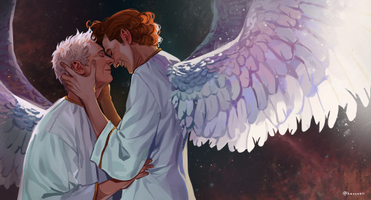
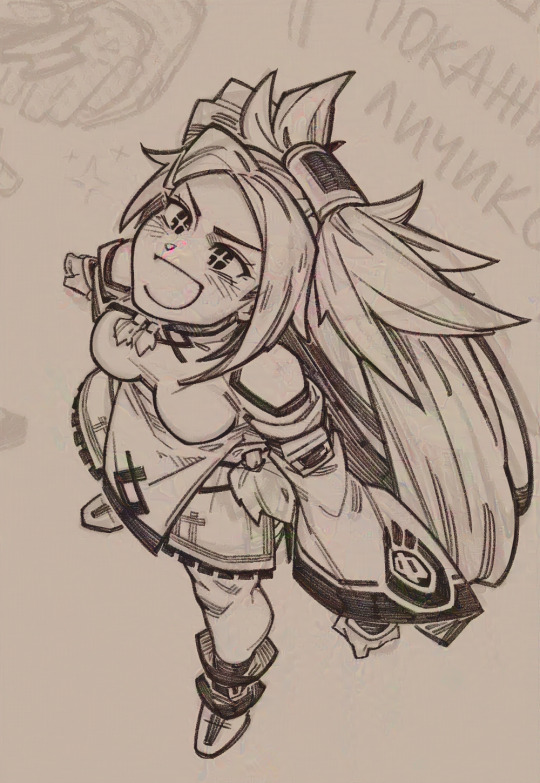
#didn't really do the 'painterly' style this time
Text
yippee yippee yippee more ocs!!!
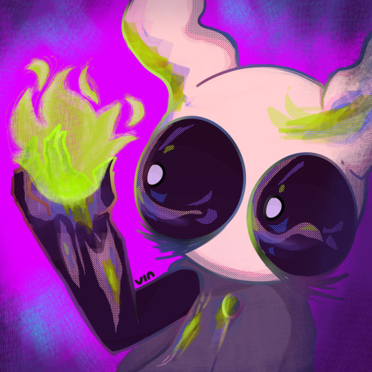
'char', a hollow knight oc
#didn't really do the 'painterly' style this time#or whatever it's called. looks... crisp#sorry if you really liked that style :( i'll bring it back next drawing i swear!!#oc#lu's canvas#wrylu#my oc#hk oc#hollow knight#hk#hollow knight oc#ocs#hollow knight art#hk art#art#illustration#my art#my artwork#artwork#my illustration#digital art#digital artist#digital artwork#digital drawing
66 notes
·
View notes
Text
the Spirited Away theatrical adaptation
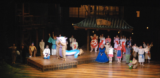
today I went with @birdfriender to see the stage production of Spirited Away, produced by Toho, currently on tour in London.
and like. holy shit??
you might say how the hell could you adapt a film like spirited away to stage. the answer is: incredibly inventive stagecraft, puppetry, costumes and especially choreography.
I was completely blown away by how this play flowed across the stage. set transitions were masked with lighting to direct attention, with the descending screen, with the rotating central platform that managed to function as nearly every part of the bathhouse. stairs, rotating bridges, creative use of size to indicate perspective (like the tiny train that circles the stage), and just the way the crew would move the props with a flourish -
but also the puppetry, like man! the way characters like Kamaji, Yubaba's giant head (used only at moments of intense emotion), and No Face would be operated by entire teams of puppeteers - it was extraordinary. the puppetry director was Toby Olié who's worked on a million different things including War Horse and you can really see them applying all these tricks accumulated over the years...
the show is remarkably faithful to the film; a few scenes are slightly abridged but every sequence I remembered was there and deliver with style. where it does need to pause and breathe, like in the famous train scene, it does. and like... it is fascinating to see an adaptation from animation to theatre. seeing how Mone Kamishiraishi (Chihiro) would stumble and bumb into walls just as she would under the pen of Shinya Ohira. or how a memorable sequence in the film could be represented symbolically: a collapsing pipe as a string of segments pulled on a string, a flower garden by dancers in flower outfits.
some of my fave sequences involved wooden panels carried by dancers, choreographed so the characters would weave between them, or they'd rotate to represent elevators on different floors. it was also fascinating to see how they'd symbolically represent things it would be impossible to stage, often representing fluids with fabric sheets. a transformation could be shown with actors swapping places with a flourish. at other times, it feels like stage magic tricks are in use, like a flash of light drawing your attention to a rope that was there all along. sometimes the puppeteers will be on stage, wearing simple beige outfits that mark them as not being 'present' as they manipulate the soot sprites and frogs and so on.
they also made effective, sparing use of a large projector screen, which descended at certain points, primarily for the driving scene at the beginning and the train scene. this actually didn't use scenes from the movie, but more of a soft, painterly style applied over... probably animated video? hard to say with the blurring, could be live footage. it reminded me of the use of similar screens in the later YoRHa plays, although it was a minor element here.
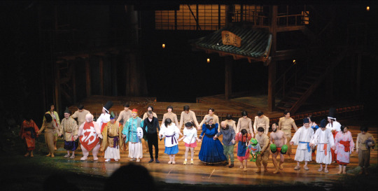
we weren't allowed to take photos (i took this one during the final bow anyway) and I would have been too busy watching to take them anyway, but this teaser shows briefly a number of the coolest setups. still, it's so much more when you see the whole thing flowing along without interruption.
youtube
and it was very interesting to me looking at this kind of show - big stage, directly homaging an animated film - from the eyes of someone who knows a lot more about film and animation than I do about theatre.
compared to film, you simply do not have closeups; the closest thing is when the puppeteers bring out the segments of Yubaba's giant floating head, but this is used sparingly. so everything is basically a long shot. however, because the acuity of a human eye is much greater than that of a camera, even from near the back of the theatre you can make out a lot of details that you wouldn't be able to make out with an equivalent camera shot. this allows compositions where there is loads going on at stage at once, with the eye being drawn to different areas by lighting and movement.
I do feel like there are definitely things to learn for animators from this kind of stage choreography. so many times I thought like, wow, that's so clever. like how chihiro riding haku was shown by splitting the dragon puppet into segments and putting her on the shoulders of one of the puppeteers.
and everything was done with such style too. if something shuffles off stage, you know it will be done with a wiggle and a flourish. small things but they add so much.
presumably because this seems like an incredibly involved show, there are multiple performers for each major character: four Chihiros, and three Hakus, Yubabas, Kamajis and so on. I'm not sure the exact lineup tonight beyond Chihiro. the exception is Kaonashi (No Face), who is played only by Hikaru Yamano, who gives an incredible performance, sidling and flexing around the stage in all sorts of strange ways that really get across the character's whole deal despite literally performing under a white mask and concealing robe. it's kinda amazing.
another fantastic casting is fundoshi dancer Yuya Igarashi as Kashira (the stack of three big heads that serve Yubaba, and speak only in wordless grunts). he basically has his real head as one of the three, and he has two more heads on his hands, and moves them around in incredibly energetic and funny ways. it's a brilliant way to interpret this, somehow feeling perfectly appropriate to have a buff guy in a red loincloth moving them around.
Yubaba's actress tonight would have been either Mari Natsuki or Hitomi Harukaze; either way she did an incredible job, it was really cool seeing a more human-proportioned version of the character and she brought a lot of energy and authority to the role.
the whole cast did a fucking amazing job honestly. I wish I knew more about theatre acting so I could comment more specifically on the tricks they were doing, but you definitely felt Chihiro's emotions
the production is in Japanese; English subtitles were shown on two screens on either side of the stage. the translation was on the 'honorifics included' end of that scale, but absolutely clear and idiomatic. the format worked - it was generally not hard to follow the action and glance at the subtitles, even though they were further away than they would be in film - and it definitely filled the theatre. I really hope this leads to more Japanese theatrical productions going on tour like this. wish i'd been able to see the Totoro one a few months ago.
definitely this kind of theatre must depend on a fairly obscene budget of the kind that only comes to biiiiig properties like, say, an adaptation of a beloved Studio Ghibli movie (one family turned up in cosplay) - there's a lot to be said for less extravagant staging. at the same time... this really was something.
i gotta go to the theatre more
151 notes
·
View notes
Note
Several things: -LOVE your art, it’s amazing! Especially the one with Crowley and Aziraphale under the umbrella - which software do you use? Your art always look SO gorgeous (cheeky quote from GO right there lol) - how did you get so good at drawing?And thank you for encouraging other people to keep drawing and being so kind as I sometimes can’t help but compare my sketches to others and feel silly, but I guess it’s just a learning curve… Thank you so much for bringing your art to the world!😊
Thank you so much!!
I use Clip Studio Paint for drawing and Photoshop for small adjustments!
2. Haha thanks! Honestly...it's the hyperfixations. I managed to improve a lot in just a year because I've been drawing SO much cos there's so many shows and movies I became obsessed with that I wanted to create art for. So by drawing a lot I just naturally improved. For example these two Illustrations are just a year apart:
I actually didn't actively try to improve, it's been a while since I did proper studies (I just don't really have the time for it between freelancing and art school), it just happened.
But I can absoluetly recommend going on YouTube and look for some art tutorials if you actively want to start improving! There's some channels that helped me so much back then:
moderndayjames
Incredible shape language and super insightful tutorials on all kinds of topics! I learned so much from him.
Ahmed Aldoori
So many awesome tutorials on so many different areas of art. Love it.
Marco Bucci
Incredible tutorials on color theory and understanding how color works in general! Learned SO much from him!
Sinix Design
The OG tutorials I began learning from. I watched his videos religiously as a teen. I adore his painterly style and adopted it in some way, haha.
Ethan Becker
This dude sometimes drops these tiny art tips that just completely blow my mind and that I adopt immedietly. He's super entertaining but also such a great teacher.
And I can also recommend checking out this book by James Gurney if you want to get better at colors!
And for anatomy I highly recommend the Morpho books!
But improvement doesn't only come from drawing a lot. A lot of the time I don't draw for a while and just study the world and artists around me and suddenly I improved when I get back to drawing. Don't ever overwork yourself to the point that you don't enjoy what you do anymore. Take breaks and listen to your body!
I learned to try and not compare myself to other artists, which helped a lot. Through conventions and social media I made so many lovely artist friends and realized how we're all struggling in a very similar way. A lot of us don't even really know what we're doing most of the time, haha. But we help each other out, it's such a wonderful community. I think when you're not actively part of the community it tends to feel like other, more successful artists are some kind of art gods that have perfected the craft and never struggle. But believe me, all the artists you admire go through rough times all. the. time. Sometimes what they do feels easy and natural, other times (more often than not) it feels like you have to try and learn how to walk all over again and you start to doubt your abilities. I personally go through that so many times.
So what I'm trying to say is that instead of comparing yourself to the artists you admire, learn from them instead. Ask questions, befriend fellow artists, study the artists you enjoy and just have fun with it!
And finally I thought it would be fun to share some of my horrendous Johnlock fanart from a decade ago for some motivation:

I hope my answer didn't overwhelm you, but I thoight it would be nice to give a more detailed answer!
Have a wonderful day and keep drawing! :)
468 notes
·
View notes
Text
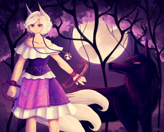
Ok the WIP I posted a little while ago is no loner a WIP yipeeeeeee I am so tired of looking at this drawing.
Artist's Notes:
THIS DRAWING IS FINALLY DONE YAAAAAAAAAAAAAAAAAAY!
Ok so this drawing was a WIP that I had had sitting around for a while, and so because I wanted to do a test run with the new face style I'm trying out, I decided to pick it back up again. Now you may notice that compared to the other version of the WIP, the shading is different, and that's because I had to change all of it to match the light source of the moon, which was.... not exactly fun (especially cuz I stayed up late at night to finish this which was tiring), but it was worth it because I am a lot happier with the shading now. Also, when I initially redid the shading on the white trim of her outfit, I ended up making them look like indiscreet white blobs that just looked... bad, so I had to fix that and I think it looks a lot better.
My favourite parts of this drawing have to be the face and the hair, though I'm not surprised about how much I like the hair since hair is my favourite thing to draw. Also the wolf, I really like how the wolf turned out, since I also love drawing animals from time to time. I also like how the background turned out.
Also, Enoko's design was a hit hard to get right, and I decided to add the white trim separating her shirt and skirt mainly because I didn't like how abruptly it changed in the original design. Also, for some reason her dress makes me think of 1800s-y southern/western clothes, which has given me the headcanon that Saki gave her these clothes when they first met. Makes me wanna draw the two of them together in very western styled clothes, I think it would be cute. I also changed up some of the colours on her original design to fit in more with the palette that I was going for with this piece. Also, I like how her tails turned out, mainly because when I was working on some of the sketch for this I tried to make them smaller, but they didn't look right so I just went "fuck it" and made them big and poofy. Also drawing her wolf ears was fun, I like drawing simplified wolf ears like that. Overall, I'd say I did a good job incorporating elements (like the bear trap hands, the tails, the gem) in a way that didn't feel like they were out of place in the piece (something I was concerned about with Enoko's design).
All in all, I wouldn't call this my best work, but I do like a lot of aspects of it. I've also noticed that I'm kinda getting a bit frustrated with certain parts of my style like the lighting (mainly the lighting), so I think I wanna try and branch back into that more painterly style that I started out with when I first started posting here while still mixing in some elements of my lineless style. Also, I need to get better with my colour values, mainly just for clarity since I kinda think that's where this drawing falls flat a little.
106 notes
·
View notes
Text
FUUUUCK i love the FG trailer so much it is a genuine piece of artistry. I only wish there wasn't such a disrepency with Norton's piercing and where he was in the mine during the explosion bc those things ruin my immersion but everything else??? Mwah. Chefs kiss.
The art style is a gorgeous mix between 2d and 3d, gives me puss in boots last wish/spiderverse vibes. The painterly style and the muted yet expressive colors really show how terrible Norton's life was. GOD I'm so ill.
The symbolism and story told is straightforward without any confusing imagery but still poetic in it's pacing. It unveils new information that doesn't contradict with past material but build on it such as Norton's coworkers harassment. You can tell what is being implied while still keeping things open for interpretation like when Norton is fighting with FG in his mind. That scene essentially confirms that a. He staged the accident on purpose and b. He *does* struggle with his conscious. This imo cements his status as morally grey (and therefore one of the best idv characters/lh)
The music!!! The tune Norton hums is also the song playing in the background. At first it's just the haunting strings before it hits the climax where Norton is fighting with FG to detonate the explosives. It turns into a fullblown choir that really hilights how low hes gotten. And when he's resurrected as FG the song just completely distorts into another song with sharp pauses in the middle... shivers every time.
The voice acting from cn/jp/eng are all so BRILLIANT. They all have a lovely deep baritone that's just so *Norton*. They translate between the langauges extremely well as if Norton himself is speaking those langauges. Wataru Hatano (JP) is a professional singer and normally his voice is at a higher register afaik. In endless banquet it does sound like hes straining his voice to sound more nortonesque when normally his voice is much clearer. In the trailer however his voice is much more fluid while still retaining Norton's huskiness. NOW I don't know if his chinese va is the same as his ingame one, nor have I heard this guy in extra material, but holy shit... holy shit. THAT'S NORTON!!! that's norton wrap it up gang. I think this guy has the deepest voice outta them all and I'm glad he didn't compromise Norton's chainsmokeresque voice for a lighter one like the fans bullied Norton's ingame VA into doing. And Norton's eng va... I NEED TO KNOW WHO THIS GUY IS HE IS SO SO SO GOOD. I think this is the same VA from COA although I feel his sound in COA has more vibrato in it but it's fine. I can't wait to hear him sing for nymph awards! I really hope hes gonna sing or at least someone that sounds like him. I cannot imagine Norton sounding any other way he's awesome. The line delivery on "poverty is the worst curse... but sometimes there are ways to make a change..." CHILLS CHILLS CHILLS!!!
38 notes
·
View notes
Text
...I just remembered I wanted to make my own statement on the AI thing. ^^;
So you've probably heard, but in case you haven't: Tumblr just sold out everyone's data to the AI trash compactors, they probably did it long before they gave us the option to opt out, and even if you do opt out they're probably still taking and using your work anyway (telling people to opt out instead of actually asking for their permission is already scummy business practice, but when it comes to AI it's functionally meaningless. :/ It's always "well, we're telling them not to use these people's data and we're hoping they'll be nice and go along with it" with no regulations or consequences if they decide to just steal everything indiscriminately...)
Despite that, I am not leaving Tumblr anytime soon. I'm looking into other sites*, but at this moment in time, I have nowhere else to go. ^^;
Besides, I still like it here. When I left DeviantArt I was already getting sick of the place, having my art stolen regularly by "fans" and paradoxically getting less and less interest in my work over time. By the time the devs turned the website into eye-blinding slop with Eclipse, I was more than ready to move on.
But I still enjoy using Tumblr. I like writing long text posts that no one would bother to read anywhere else, I like answering asks, and I like the unique sense of humor and style among the users here. ^^ It would take a lot to force me out.
Also, I can take a little solace in the fact that AI-bros do not value "low-quality" art like mine. ^^; If messy cel-shaded sketches with visible pixels ever become popular, then I'll worry, but for now I think it's highly unlikely that anyone will want to wholesale regurgitate my art.
If anything, I think prioritizing it in their datasets would only make them worse...and on that note, if you do have "high quality" detailed/painterly/semi-realistic art that would be targeted, I'd recommend 'poisoning' it with Nightshade/Glaze.
Although I heard a rumor a while back that AI is "building immunity" to Nightshade and already learning to work around it, but I'm really hoping that was just a wishful lie from the trash compactors themselves. I haven't heard it repeated since then, so I think it's still worth a shot. ¯\_(ツ)_/¯
So anyway, like the post I reblogged said, I think the best thing we can do now is to make it clear that WE DON'T WANT AI ART. We don't care how easy it'll be to instantly generate thousands of hours of mindless 'content' to look at; we don't want it.
Since regulation is lagging so far behind (wanna know why Disney's copyright hounds didn't shut this down on sight? Most likely, they're hoping to profit from it down the line) the only way to fight this right now is with individual litigation and consumer demand.
Don't support projects made with AI**; don't hate-watch them or spotlight them. Focus your energy on the millions of human artists who are still here, and need your support now more than ever.
*I've heard people mention moving to Twitter and/or Artstation: fam, you're jumping out of the frying pan and into the fire. ^^;;; IIRC, Arstation was one of the FIRST art sites to start flirting with AI, and Twitter has been selling off its users' data for several months already. Go there if you must, but don't go under the impression that it's "safer".
**Please keep a cool head when discussing AI art, and keep in mind that it used to mean something other than "mass theft". Artists have and still do create AI tools that are built on limited data sets with permission/compensation, that are used to aid them in their work and encourage human artistry (Vocaloids and DAW's, for instance) rather than stamp it out.
Until a specific word evolves into popular use for exploitative AI, we're kinda stuck with this confusion, so remember to get the facts before you speak out.
P.S. Praying every night that this is a dumb fad that will soon die and go to the same hell as NFTs. >_< Praying every morning that the influx of AI art into its own datasets will eventually corrupt itself and make it useless. >_< >_< Praying every afternoon for both at once! >_< >_< >_< Like to charge, reblog to cast, all that
34 notes
·
View notes
Text
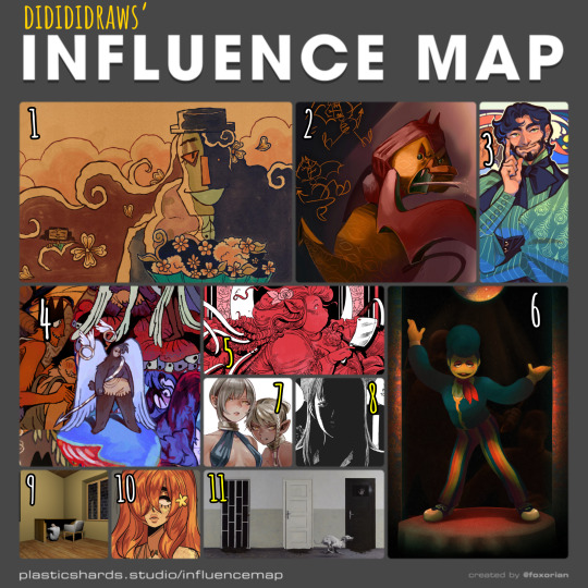
my tablet is currently halfway across the country for repairs (my brother's the most tech-savvy in my family and asking him to take a look at it was cheaper than taking it to a shop) so i haven't been able to draw lately. i've made a bunch of traditional sketches in the meantime, but none of them are presentable enough to post here, so i decided to take a trip down memory lane and fill out one of foxorian's influence maps!
below the cut are the names of the artists featured here, as well as a little bit of director's commentary on how they've influenced me :]
yugo limbo (website, tumblr, twitter) - some time last year, i realized something profoundly unnerving: i actually... don't like the art in smile for me's original release all that much? that's not to say it's bad, just that there isn't a whole lot about it outside of maybe its architecture that stands out to me. which is REALLY WEIRD, considering i wrote a whole retrospective about how much this game means to me. art-wise, however, it was only after smile for me's release that yugo limbo's art evolved in a way that really resonated with me; i love how textured everything is, i love the way they simplify clothing folds and the way that skin wrinkles around the joints, i love their love for puppets; all of those things ended up worming their way into my art style and tastes one way or another, and i couldn't be happier!! it didn't feel right to leave smile for me out of the equation entirely, though, so i chose a piece that was both related to that game and that i felt reflected a lot of what i love about yugo's more recent art.
echobsilly (twitter, tumblr) - oh god, speaking of yugo limbo - god. i fucking love echo's art so much i have no idea how to even do it justice in writing. like many people i first found him through his smile for me/limbolane fanart and animations - and those are some of his best work, don't get me wrong, but i really wanted to include one of his original designs to make a point that he's just fuckin great at art in general. character design, facial expressions, body language, composition, LIGHTING... he makes it all just. so so so gorgeous. i always liked "painterly" art styles for lack of a better word, but i think his art is what first pushed me to embrace that more in my digital art. i also like how he talks about dr. habit like he's his dead wife. i'm very proud to call him a friend these days :]
japhers (tumblr, twitter, instagram) - i first found japhers' art in high school and he very quickly became a HUUUUUGE influence on my taste in character and costume design. one of the big reasons i never fully bought into the idea that men's fashion is inherently harder to design is bc so much of his art is already dedicated to exploring fashion Without the restrictions of a gender binary in place which is to say that he's really good at drawing buff dudes in frilly outfits. i also think he gave me more confidence to draw more intricate costumes without having to worry about super dainty and clean lineart, bc a lot of his art looks like it's kinda been carved/rendered out of sketches, and it is Gorgeous.
moe suppe (website, tumblr, cohost) - another artist i found in high school, albeit originally from a long-gone instagram account. his art is what kickstarted my desire to have some Roughness in my art, some Texture. it may not have stuck to my lineart, but it Definitely stuck to my rendering. it helped that i was going through a pretty big angel/demon phase at the time, which meant i was pretty immediately drawn in by his delightfully weird worldbuilding. i should probably read fear not now that it's an actual serial...
val wise (website, itch.io, twitter, instagram) - a more recent influence, but a pretty significant one nonetheless. i featured the cover of délicatesse here because it was the first thing from him that i had ever read, but in general his grasp on the human body really blows me away given how deceptively simple his style looks at first glance, especially his faces. the way fat and hair sits on her bodies, and how much it varies from character to character... it's beautiful without being So glamorous that it feels untouchable. his costume design is also great. i recommend his comics for low fantasy/ursula k. le guin fans who are Dying to see more fat characters in leading roles. i also just found out that i am of two hearts is free on itch.io, so i'll be treating myself to that over spring break.
partycoffin (tumblr, twitter) - if you have known me for any amount of time at all then this should not come as a surprise to you. i actually wasn't going to include partycoffin in this map at first, because while welcome home has inspired me in Many creative pursuits, i didn't think visual art was one of them? i definitely picked up some of clown's love for dramatic lighting and thinner lines with just a smidge of well-placed hatching subconsciously, though.
ryoko kui - probably the most recent artist featured here? anyways i have a confession to make: i have yet to read dungeon meshi. i just know that when i saw a post compiling a bunch of ryoko kui's sketches from her daydream hour series, i was so overwhelmed with this feeling of, like… "oh, yeah, these capture almost everything i love about women as flesh and blood people. when i draw women this is the kind of beauty that i want people to see in them." of course, ryoko kui is a great character designer in general, but something about her women specifically really speak to me. the earthier color palettes and rendering also do a lot to endear her art to me.
shuzo oshimi - specifically his art in blood on the tracks. something that really stood out to me in that series was whenever the shadows would get really intense, and you'd get these big blocks of black with just the faintest bit of hatching to soften out some of their edges. it was always very effective in creating this sense of claustrophobia. i really want to keep incorporating that in my more intense pieces!
person918x (tumblr, instagram) - i don't work with 3d art often and i don't see myself doing so any time soon, but the composition of person918x's pieces is something i take a lot of inspiration of. i also love his sequential art, as someone who does a lot of dream journaling it's sick to see the exact Vibe of a dream be put to (digital) canvas. i also firmly believe that he's one of the only people out there who knows what he's doing when it comes to using generative AI in art.
oops i made this list too long so now i have to put the last two artists in a new block.
10. meatgiri (twitter, instagram) - definitely the artist i've known about the longest out of this selection. i think i've been following her since…. oh god. since i was in middle school. way before she was meatgiri, even. i think her influence probably shows up the least in my art, but there are definitely some characteristics that stuck with me for a very long time (the lil block of black accompanied by one or two lines for shading on the neck, the looser lineart making it really easy to incorporate soft curves and sharp edges, the Eyes, etc etc.) i chose this drawing of her oc juniper bc i thought it was both reflective of her current art And a good embodiment of a lot of things i wanted to emulate from her art as a young'un.
11. dragan bibin (website, instagram) - specifically his 'deimos' series. much like with person918x, it's his compositions that really stand out to me the most, and you probably know by now that i'm a sucker for high contrast. i find it interesting though that he uses high contrast to obscure more than he does to highlight... helps a lot with giving the deimos paintings that air of Quiet Unease. another thing i want to incorporate in my horror-adjacent art! manmade environments gone wrong!
#not art#influence map#artists on tumblr#yugo limbo#echobsilly#japhers#moe suppe#val wise#partycoffin#ryoko kui#shuzo oshimi#person918x#meatgiri#dragan bibin
25 notes
·
View notes
Note
your one of my favorite artists and i wanted to know if you have any tips for anyone who wants to makes drawings with colors like yours. the backgrounds are beautiful and i wish i could play with colors like that
AAAA Thank you so much Ruby 😭🫶🏻 it really means a lot.
Lots of typing below so I'll add a keep reading tab!
I did go in depth in a previous ask, where I also linked back to yet ANOTHER ask, lol. I definitely encourage you to give them a read if you'd like! :)
But of course I can definitely add some more tidbits!
Besides playing around with clip studio's built in features (tone curve, approximate color, gradient map, etc.) Taking inspiration from real life is one of my favorite things to do. ^^
In fact it's possibly one of the best places you can get color reference from, because how you interpret it is entirely up to you!
For example with the celestial crystalfly piece, I saw these flowers near a supermarket, and a really lovely color scheme near the end of a sunset. (Besides the fact that I was daydreaming about painting Lumine if she collected all of the elements FHAHDGSHA) I didn't actually color drop for this piece, because I wanted to treat it like a study, and I was painting the flowers from memory because I didn't have a picture of it them the time. I stylized it in the end but was very pleased w the result. ^^
And with this character design, I got color inspiration from a butterfly in a photography book that was on sale in Indigo.
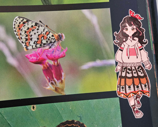
So generally my colors don't always come from nowhere!
Besides that for all pieces, I personally also like to plan colors during the sketch phase!
If you're like me and you used to follow the traditional sketch > lineart > color workflow, but once you got to the coloring part you'd get stuck, try it! Once you have a pose and character in mind, add some lighter base colors. As you work on rendering the piece, build up your base colors with darker colors (or lighter colors for things like accents and highlights)
It's probably more suited to painterly styles, but I think you could definitely find a way to make it work if you prefer clean lineart.
I hope this helps give you some jumping off points to think about!
Color is a bit of a hard area to give concrete guidance on because it almost goes hand in hand with style. You get more comfortable with it and find what works the more you practice.
And that's coming from someone who used to color/draw like this 8 years ago,,,,,
so trust me. 😭
#asks#Actually I feel like I should compile all these tumblr asks into one at some point for people to refer back to#so I might do that when I'm free.#or maybe record one of those speedpaint videos where you explain as you go 🤔
19 notes
·
View notes
Text
youtube
In a surprise move of "huh?" and "now?" and "really?" and "why?", Cup Noodle just put out a new commercial based on El Shaddai: Ascension of the Metatron... the obscure PS3/360 game from nearly 15 years ago.
(A history below...)
At E3 2010, a peculiar game trailer dropped, free from either Sony or Microsoft's big stage shows. It featured vague narration from a snazzily-dressed deep-voiced man, and gladiator combat from a seemingly airheaded prettyboy protagonist. It was barely comprehensible, but I suppose that was also its appeal...
youtube
For reasons beyond my comprehension, this trailer absolutely took off in Japan's internet culture, becoming a huge meme on Nicovideo, spawning numerous parody and remix videos.
This one was an old fave of mine, mashing up the trailer with a famous Puyo Puyo song. Also it loops endlessly, so you never have to stop watching.
There was even a goofy no-budget live-action remake of the trailer that's hit 1.5 million views...
El Shaddai eventually launched the following year in 2011. However, despite its early meme status, the game flew criminally under the radar. While it wasn't exactly a flop, and reviewed reasonably well, it just didn't quite leave the impact it probably should've.
Which is a shame, because it was one of the few genuinely ~artfully crafted~ big-shelf games for the big-boy consoles of the era. It donned a painterly style, using pseudo-cel-shading with pastel colors and a watercolor look. The story is esoteric, the environments are abstract. And it even dared to be a bit flamboyant! Wow.
It was essentially the polar opposite of where gaming culture was at the time. And as someone who was completely disillusioned with the direction games were going in that generation, it was one of the few games I really wished I could play. But unfortunately I couldn't...
...UNTIL...!!!
In 2021, a strange miracle happened. A surprise remaster of the game launched on Steam. It too seems to have flown under the radar. But it's still there, still buyable, still playable. And the port seems to be good.
A Switch version also exists if you're so inclined.
So do y'wanna talk about "hidden gems"?? Here's your PS3/360 hidden gem!! And it's available right now, on modern platforms, running well, with no strings attached!
Did I mention it was directed by a character designer who worked on Okami and Devil May Cry? Does that pique your interest yet??
Let's right the wrongs of the past!! It's finally El Shaddai's time to shine!! MONDAI NAI!!!
#El Shaddai: Ascension of the Metatron#el shaddai#cup noodle#commercial#ps3#xbox 360#steam#nintendo switch#play it#internet history#nicovideo#gaming#Youtube#writing
5 notes
·
View notes
Text
Metroid Dread, Michael Mann's Ferrari and the flimsy-ass excuses I tried to find to connect them
Sometimes it just takes some honesty to get lack of creativity out of the way.
This waiting thing I'm not new at, not at all. I've done it very often. The earliest I can remember I was eleven and Tron: Legacy was about to drop in theaters. You bet your ass I got the soundtrack the very second it entered record stores. It was an aesthetic-defining moment. The kind of stuff that alters your brain chemistry permanently. When some friends who were in Venice told me Ferrari was a bad movie I felt all kinds of stomach-churning. I don't mean to be François Truffaut-like and pretend like all movies made by Michael Mann are automatically good, but I do have insane amounts of respect for the man as a filmmaker, and after what happened with Blackhat - in short: a really good movie sorely mistreated by audiences, critics and box office revenue - I was kind of hoping in some sort of smash hit. I really needed a W, so to speak.
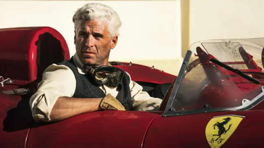
In case you guys were wondering, I kinda dig Patrick Dempsey as Piero Taruffi.
Once again it just kind of floored me for a second. It wasn't too clear-cut right away. I don't think it's one of his best - too many things just don't align: the acting feels distracted and half-hearted and the inexplicably botched adaptation/voice acting job they distributed in Italy is even worse than that laughable fake Italian accent everyone has on all the time in the original; some of the dialogue is insanely out of focus and thematically off-center in a way no other Mann movie ever allowed for; sometimes it feels like the movie itself has to take the script back onto its central theme without losing itself to agiographic intents; the photography often felt a bit too painterly for the movie to have that same electrifying visual feel as (most recently) Blackhat or (most impactfully) Miami Vice. Crucially, something still felt off in a good way. What to make, for instance, of the sunglasses symbolism that instantly connects a movie set in the late '50s with the original cyberpunk aesthetic wherein “by hiding the eyes, mirrorshades prevent the forces of normalcy from realizing that one is crazed and possibly dangerous,” like Bruce Sterling himself said? Or again the cuts to the clutch pedal and then the gear stick systematically being interpolated when someone is driving? Or yet again the sheer sense of speed, the same speed of sand slipping through one's fingers, every shot conveys? When I came out of the theater (a local monoplex, almost deserted, mostly dedicated to films d'essai - incidentally also the only theater that showed the movie without me having to go to the Big City) some people I knew asked me what I thought of it and my very honest reply was "ask me in about ten years". There's absolutely no telling what future filmmakers and film historians will make of this: everything rests on the shoulder of future Mann movies. These intuitions here, not just the communication discourse (which, once again, is pretty typical of all Michael Mann movies, starting at the very least from The Insider) but this unique omissive/breathless style of storytelling and information conveyance, might make for another cutting-edge, literally breathtaking Michael Mann thriller soon: very soon, if the voices about Heat 2 being adapted to a movie turn into a reality.
youtube
Yet ultimately at the heart of every horrifying car accident, the screaming contests, the bankruptcy threats, there sits an inconsolably pulsing heart that the movie resolves to show us exactly twice.
We were at my grandparents' for Christmas and as we drove through the town my father looked out of the car's window and saw an obituary with his last name on it. I didn't quite catch who exactly it was and how they were related to us - and rest assured they most likely were, it's an Abruzzo thing. As most of my family's deaths, as discussed on my Godflesh post, were on my mother's side, to see my father's last name on a mortuary announcement was a bit of a surprise, in that as you probably can imagine it's also my last name. It's a new experience which, in total frankness, I don't exactly hope to replicate soon.
Topically enough, right on Christmas morning my precious and beloved friends J. and A. gifted me a digital copy of Metroid Dread, a game I had basically lost any hope of ever playing. The Metroid series has always fascinated me in that, for a franchise as old and weathered and revered as Mario and Zelda, there's relatively few people - at least when I was a kid with no readily available internet access - who kept a memory of it. I first met Metroid as a middle schooler, via the Prime Trilogy collection a friend of mine had saved on his jailbroken Wii; never finished it but it stayed within me like a particularly revealing nightmare did. When I played Super Metroid at age eighteen that intro sequence burned itself on my prefrontal cortex and changed everything. It's a masterpiece that drives its main strength from the freedom to explore and delve deeper and deeper into it - and quite revolutionarily, the possibility of not doing so. To realize when enough is enough takes a special ability and knowledge of the self. To accept less than what would be enough takes either idiocy or excellently precise calculations and execution.
youtube
While preparing for this post, I annotated on my phone's notes app that "Michael Mann would make a fantastic Metroid movie that everybody would hate". I know this because something similar already happened with Miami Vice: he systematically removed almost all signifiers of the original TV series to reprocess the core concept of it into a lean, aesthetically experimental, profoundly emotional film about means of communication reshaping the way crime and crime-fighters relate to each other, and the way the individual relates to sovereign organizations. It certainly helped that Michael Mann himself, as screenwriter-turned-director-turned-producer, was the man who defined the original Miami Vice's aesthetic, and therefore was in all likelihood the most qualified to strip it down to absolutely nothing, remake it from scratch to fit a new, apocalyptic vision of a post-9/11 society of control based on telecommunication.
In discussing Ferrari with @power-chords, she immediately pointed my attention onto just how critical the figures of mass communication turn to be throughout the movie. Journalists, priests, even the movie stars the pilots are dating. Michael Mann is moving into a territory of movies not about movies, but movies about media in general, sitting at the edge of communication breakthroughs, studying the intersection between an "old world" and a modern, contemporary, fucked up world. Unsurprisingly, Metroid Fusion (and to a lesser extent Metroid Dread itself) delve into omission, falsification, breaking down of information: there's fertile grounds for Mann to work with, I think.
youtube
Most importantly, however, Metroid Dread is peak-form Metroid, combining the strength of the more exploration-based titles in the series with the thrilling combat-oriented difficulty spikes of Fusion. The new thing compared to, for instance, Samus Returns is how the game does not trivialize the enemy encounters in regular gameplay up until the very end, which by the way is nowhere close to a careless power trip. And even if it were, it'd still be more than warranted: the final boss is granted to give you unrequested cosmetic surgery to make you look like a dumbass. All the while Samus has never felt any better, movement is slick and deliberate, the 360-degree aiming is incredibly precise even taking the Joycon drift into account: and this precision eliminates almost all instances of rage-game bullshit when it comes to the EMMIs, the fighting, the jumping, the exploration, without by default trivializing any of the elements. It is, simply, a game feel miracle.
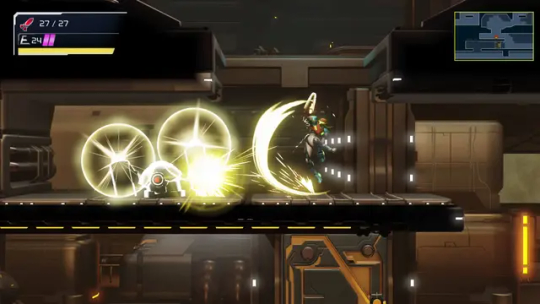
It feels about as glorious as it looks.
The deep knowledge of the gameplay mechanics of a great Metroid game is key to Mercury Steam's success with the central executives at Nintendo of Japan. Samus Returns didn't sell too bad, like most Metroid games (at least when you don't compare them to Pokémon, Mario or Zelda), but this here is just a quantum leap. All elements of the game, including the mechanical frameworks established in the 3DS game, are honed to a lethal degree: every enemy encounter, every instrument at the player's disposal turn out to be multifaceted, limited only by the player's own creativity and abilities. But the game knows how to help you, the player, hone those abilities too - it wants to be discovered. It entices you in further and further.
The game is majestic, in short. It knows itself, its players, its predecessors, even its stakeholders spectacularly well. And it is so thanks to employees who were forced to borderline inhumane working conditions, under threat to get their name scrubbed off the end credits if they didn't physically show up for work in the middle of a global pandemic.
"MercurySteam employees talk about the working conditions in the studio" - Spanish article from AnaitGames
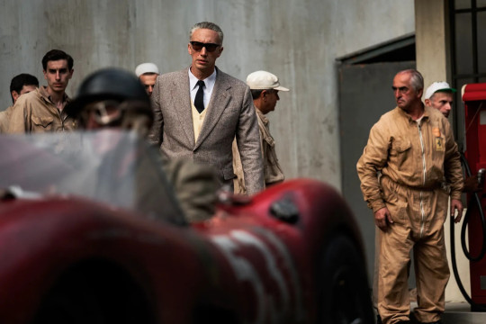
During one of the earliest scenes in Ferrari, Enzo (Adam Driver) goes to Mass in the factory's own chapel, and together with all the racing department's higher-ups he proceeds to not give a damn about the function, keeping his eye on a stopwatch instead, monitoring the times Maserati's drivers are doing on the Modena racetrack. As the execs do this, the priest starts waxing poetic: "If Jesus was born today he would not be a carpenter. He would be a mechanic, like you are," says the uncaring bastard in a long dress to alienated, broken working men, facing - unbeknownst to them - the serious threat of bankruptcy, immediate liquidation, job loss. It took this movie about thirty years to get made, being passed from one producer to the next one, from one director to the next one, with this script that sort of tries to be a biopic with all of its strengths but is fundamentally tethered to a protagonist who's, ostensibly, Just Some Guy who happened to own half of one of the most famous car manufacturing companies on Earth. But the reason he was able to do that is, like one of my teachers points out in his Letterboxd review of the movie, his entirely-too-natural knack for timing. The precision Enzo Ferrari requires of his drivers, that quite literally lethal element of exertion, precision and composure, is what is required of him too, but this doesn't make him any better than anyone else: he's not the one dying, he's not the one crashing cars. Some of his friends did. He just got extremely lucky.
Informing the very concept of the labor of love is the idea, almost the aesthetic even, of the love of labor. Gaming culture is profoundly imbued with this. Crunch, stricter and stricter timelines: these are no news to anyone who's into gaming in an even remotely active manner, and are the byproduct of a culture based around hype - a profound affection that degenerates into pretense. Enzo Ferrari fashions himself a dictator, taking charge of the communication around his brand and purposely, painstakingly reshaping flows of information to operate according to a logistical nightmare of an inner timetable. Adalgisa Bisbini (Daniela Piperno) plainly states, with the brutal honesty that can only come with old age and immeasurable pain, that "the wrong child died", right behind her son's wife's back as they're visiting the family grave. Two graves marked Alfredo Dino Ferrari sit mirroring each other in an imposing structure in the San Cataldo cemetery, in Modena. Enzo Ferrari mourns them both, unknowingly echoing his mother's feelings. It is a circle of mutually inflicted pain where everyone already feels what they're being told, and yet it never stops: labor must ensue, so that the vestiges of love can ensue. No wonder Enzo and Laura Ferrari (Penélope Cruz) can only ever fuck on top of spreadsheets.
youtube
The importance of an ashtray cannot be overstated.
#schismusic#cinema#videogames#ferrari#ferrari 2023#michael mann#metroid#metroid dread#mercurysteam#nintendo#labor#love#random bullshit as usual#Youtube#schism writing#long form content
10 notes
·
View notes
Text
Digital art done without a tablet (art progress)
July -> September
thought I'd share this comparison cos I feel like it really shows how I've improved in the few short months I've been doing digital art without a tablet!
also figured this might be a good time to talk about my process with digital art at the mo, which might be helpful to anyone who hasn't got a graphics tablet of some kind lol?
with both of these I started the drawing in my phone's notes app (I did briefly try another app on my phone but I found it wasn't as easy to use as the notes app... I might try looking for other drawing apps though so if I find a good one I may make a post about it lol) before transferring that file to my usual art program (which is FireAlpaca, in case you didn't know!)
I have to scale up the image at this point which does make the line art look pixelated, though I don't dislike it as I think it can help give it a pencil-like quality! it's not ideal if you want to create neat and smooth lines, though, so bear that in mind!
I then make the sketch background transparent (make sure to draw on either a white or light grey background otherwise this can be tricky to do!) so I can add the paint layer behind the drawing. I also sometimes add the paint layer directly onto the sketch layer if I don't want the sketch to be in the final piece (this is no different from the way I paint digitally with a tablet, though, so I won't go into great detail here)
I paint with just my mouse (specially my laptop's mousepad, rather than a separate mouse btw) which yes, before you ask, is a very tedious process lol! it takes a lot to learn how to control the mouse, and I definitely haven't mastered it yet, but like all art related things, it just takes practise!! I will say that I have yet to figure out how to do really blended paintings with just my mouse, but for the more painterly style I've been doing recently, using the mouse works a treat!
another note is that you can't really get pressure effects when drawing with your mouse or finger (which is effectively where the harder you press, the thicker and/or darker the line is), but I've just been working around it since the very first digital artworks I ever did had no pressure opacity to them lol...
idk tbh this whole thing is a learning process for me which is simultaneously frustrating and very exciting, and I look forward to seeing how I progress in another few months lol!
...
finally, I thought I'd share this drawing from 2013 I did drawing with just my mouse and a comparison to one I did recently too! I didn't use a reference with either so it's a kinda janky looking eye, but I like to think I've made some sort of improvement in these 10 years lol
#art advice#artists on tumblr#digital art#no tablet digital art#phone art#art improvement#art progress#i'm honestly really proud with what i've been able to produce even without a tablet!#i dont know whether i'll go long term w/o one since it is frustrating at times#but for now i'm really enjoying doing art this way!#i hope y'all agree lol??
15 notes
·
View notes
Text

30/30 of 30 days of Rohan 2.0
I didn't stick to dailies on this one at all but I still drew him 30 times by god...
Anyway messy bc I did that thing where I worked on a much more ambitious pic for like 2 hrs before admitting defeat and trying to bang something out really quick 😂
I am loving drawing in this abstract scribbly/sometimes painterly style I'm on lately it's really doing it for me. Believe it or not I owe my mom for the inspiration she does these kinds of effects a lot in her art :)
#jjba#kishibe rohan#rohan kishibe#jojos bizarre adventure#thus spoke kishibe rohan#岸辺露伴は動かない#岸辺露伴#thus spoke kishibe rohan drama#raideo arts#fanart#digital art#30 days of rohan 2
24 notes
·
View notes
Text
Annecy photodump 2 - museums
On Sunday, before the festival began, I went to a few of the museums around Annecy! Starting with the Palace de l'Îsle, then on to the Chateau d'Annecy and the Museum of Animated Film!


Probably the most iconic Annecy Building, it is presently a museum to both the building's own history and the industrial history of the town, which flipflopped countries a few times before becoming an industrial centre after the French rev. The Palace itself has been at various points a mint, a courthouse and a prison.

The museum is mostly captioned in both French and English. The industrial history gets a bit dry, but the downstairs section on the history of the building itself is cool.


My ticket got me into the castle too so I went up this absurdly picturesque little path...

...to be rewarded with the town skyline. Probably not quite as the dukes of Savoy saw it.
The castle doesn't tell you a lot about its own history for the most part, but it does have a couple of art galleries.

I saw a version of Peter Brueghel the Elder's Massacre of the Innocents - though apparently there's a whole bunch of different versions and this one might not be the real one? Art history is funky.
Much of the lower floor of the gallery had these big romantic nature paintings. And when I say big these are really fucking big, like very much 'this would be the whole wall if we weren't in a literal castle' big.


One thing that is really interesting to me here is that the panorama with its cylindrical projection seems to actually predate panoramic photography. Although I can't say whether this is strictly a cylindrical projection, the insanely wide aspect ratio seems to suggest it would be.

Here's a closeup, showing how a tree breaks down into individual dabbed brushstrokes which suggest the texture of leaves without getting lost in noisy detail - the 'painterliness' so beloved of shader designers. It's fascinating seeing these paintings up close like this!

I'm fairly sure this kid is a chimneysweep? Unfortunately I managed to frame this photo so the painting gets perfectly bisected by the corner of the glass box. I'm not quite sure the relationship of the sculpture and the painting.


They also have a bunch of furniture from the castle, if you like wooden boxes. They built things well chunky back then.
The upper floor of the castle was devoted to contemporary pieces. I don't seem to have taken many photos of these, but here's a bike wheel with bits of broken glass which look like mountains when a projector shines through them:

Later in the week I would go to the Museum of Animated Film! It's a bit of a walk from the town centre but well worth the trip. They had various 1800s-era gadgets that form the precursors to animated film...


...though sadly in the low light of the museum, not all my photos came out good. It's remarkable how well these devices work though! The narrow 'shutter' created by the slots works perfectly to make the images appear animated rather than spinning around. Also the illustration quality, and even general sense of motion, is remarkably sound! Like honestly they could give today's animators a run for our money!
The rest of the museum had production materials showing the full range of different animation techniques: storyboards, key drawings, cels, backgrounds, stop motion puppets, pinscreens etc. They covered the history of animation pretty damn well - go figure, it's the animation museum in Annecy of all places.


They also had a special exhibit on showing drawings from Regina Pessoa, whose films I saw as part of the Portugese animation block. These are so cool to see up close. I'm still not entirely sure what techniques she used to make this film, its style is unique.

(My main camera didn't do great in here due to the low light, but I'm learning how to control ISO to get that exposure time under control. My phone actually did a lot better.)
One thing I didn't manage to photograph was the intro panels to the museum where they defined animation. After various definitions based around e.g. constructing frame by frame, they eventually resorted to a negative definition - animation is basically any film that isn't live action. It was pretty funny reading them struggle to pin down such a broad but intuitive concept.
Next up: more movie related stuff!
10 notes
·
View notes
Text
I've crawled out of my cave after playing Final Fantasy IX for a long ass time what have I missed?
Artist's Notes:
I'M BACK BABY! A while back I made a post with a new style experimentation thingy but I ended up deleting it because it was just kind of a boring face thing, I was planning on doing more art but then I started playing Final Fantasy IX and uhhhh yeah so that game has kind of taken of my brain for the past two weeks and I am 20 hours into the game because I love it so much. I wanted to draw Vivi because Vivi is just really fun to draw ok? I've kinda been feeling really burnt out with my lineless style, mainly because of how hard it was to do lighting. I'll show one of my initial art style tests on the bottom of this post. Again, used to have it be an individual post but it was just one face so it was kinda boring, so might as well include with this one on the subject of art styles. I wanted to kinda mix some aspects of my older style with the sketchy shading lines with a more painterly way of doing the lighting (mainly in the shadows). All in all, I think that's my favourite part about this drawing, it feels nice to finally be able to do some proper lighting again, and I want to experiment even more with my lighting and rendering in future pieces. Also, part of the pant shading got kinda lost in the sketchiness, so for next time I'll probably focus on the clarity of the more sketchy parts of the drawing, since I did go with my initial sketch for the final drawing. I also gave up on the background since I had no idea what to do for it, and I didn't put too much detail into the staff as I forgot which one I gave him in my current playthrough and I didn't want to risk spoiling myself via looking up references, but that's ok I like how the singular yellow circle on it matches Vivi's eyes. Also I was having a bit of trouble figuring out how to draw his body and how to pose him, but I like how the pose turned out a lot. It was inspired by his idle animation when in a battle in game where he does a little shimmy.
Ok I need to talk about Vivi's design because I love it so fucking much oh my god-
I absolutely love how his face is just in complete shadow and only his eyes stand out, it's so cool and unique and I love how they recontextualized the original black mage design from the classic Final Fantasy games. How they did it I won't say because I don't wanna spoil the game, but someone give this poor baby a therapist because he goes through a lot. Actually, same can be said for all of the FFIX cast, they all need therapy (again, I won't spoil anything, please go play the game for yourself).
While I do love almost all the characters in the game, even though Vivi is most fun to draw, my favourite character has to be Zidane (the main protagonist of the game). He's a really fun protagonist, and they could have easily written him as a misogynistic jerk who doesn't respect women but they didn't, and I really appreciate that. He's just an overall cool dude who's a really nice older brother figure to Vivi and also just has a cool character design (who I also want to draw eventually). Initially in the game I was planning on grinding levels for Vivi to make him the tactical nuke of the party, but then that title went to a different character (who was initially multiple levels behind the group since I grinded the party in the starting area way to much before they joined, but now they are two levels ahead of everyone and have pulled the team through a lot of tough battles, again I won't say who it is because it is kind of a spoiler and the way the gameplay actually ties into their character arc is just so good omfg). Once I eventually finish the game I'll probably write a full review on here, so no spoilers until then lol
Also, I've kinda been burning out a bit with making Touhou art, which also made me a bit burnt out with Touhou stuff in general (although I will continue keeping up with the manga) so getting into other things (i.e. Final Fantasy and even Fallout since I've watched the first season of the TV show which is a whole other post for another day) has helped me refresh and given me something new to think about. I've ended up in the exact place I feared ending up, where I would start drawing fanart for it not because I wanted to but because I felt like I had to, so I'm taking a bit of a break. When I do draw Touhou fanart again I'll try to draw for the sake of myself, and to all the other artists and fanartists on this platform (and on any social media for that matter), take care of yourself and don't forget to take breaks when you need to!
(Ok part of that last paragraph was definitley influenced by the good ol' "it's 9:00pm and I need sleeb, but the message at the end still holds up, always take care of yourself)
Oh yeah, and here is that one style experiment I did btw
Man I really fell down the "Yoshitaka Amano art enjoyer" to "Final Fantasy fan" pipe line didn't I?
18 notes
·
View notes
Note
I saw that post about what Tumblr is supposedly planning to do... I found out about your art a few years ago and I love your style, and I know it's frustrating to have the threat of your work being put on AI and such, I understand the feeling as an artist too (although I haven't uploaded my art yet to Tumblr)
You don't have to answer this message, but I wanted to send this because I found out about an interesting tool that can be helpful against the AI problem that you may like: https://www.tumblr.com/does-this-look-inanimate-to-you/740926391530487808?source=share
Sorry for the bad English though, it is not my first language. I really love your art and hope I could get as good as you someday!
Thanks for your kind words anon.
I know about Nightshade and Glaze, even used the latter a couple of times, and I admire the team's efforts... BUT realistically I can't use it:
they still haven't addressed the issue with 1660/1650/1550 GPUs (and I don't have any spare money to buy a new GPU just to make Glaze and Nightshade work)
iirc the only Glaze version that worked for me was 0.0.3 and that's simply because it didn't use GPU at all; their latest "non-GPU" version on download page still switches to GPU for an unknown reason and produces the same black image error again;
I contacted them three times trying to troubleshoot this and they never replied;
I have access to webglaze, but it barely solves any problems. It has a limitation of 10 glazes per day and 40 glazes per week. This might seem like a non-issue since I post stuff once in a blue moon, but let me illustrate what the problem here is with an example - here, look at the glazed version of the screenshot with Jam that I posted on twitter:
As you can see, glaze artifacts here fuck the whole image up like some really bad jpeg compression, there's even some weird pink blob on her face. These artifacts are a common problem for artists who use clean lines and colours instead of painterly style. To be fair, you can still make it look much prettier, like some kind of a fancy texture, but for that you literally have to run it many, MANY times, like some gacha. Ten glazes are NOT enough. If I had a working app, I could run it twenty, fifty, heck I could run it hundred times to figure out better settings and image properties. I have no such opportunity, so instead I just tried sending it to webglaze one more time, got another result with a pink blob across Jam's face and opted for posting a non-glazed version.
I guess I sound like some ungrateful bitch but honestly I'm mostly disheartened that the only tools to protect my work at least somehow are just posting smaller images with 72 dpi resolution and blocking AI bros to avoid targeted attention. I'm tired. So fucking tired. And I can't even "draw for myself" and keep my work on the hard drive away from people's eyes because it's quite literally a form of communication for me. Duh.
6 notes
·
View notes
Note
All the questions you wanna anwser
(this is from an old ask game)
1. When did you start creating art?
erm idk.... 2019 or so?
2. Do you do art in any professional capacity? (Graphic design, commissions, animation, etc.)
not yet but im planning on being an art teacher
3. What are your favorite subjects to draw? (OCs, your fan faves, etc.)
anime characters..........
4. What's your least favorite part of the body to draw, if any?
hands or really any part of the body that's in perspective
5. What piece of art are you still proud of to this day? (Show or describe)


i'm not particularly proud of any of my pieces but here are some that i still really like :) (i also really like that one mari & sunny lily of the valley piece that i'm not attaching directly bc i don't wanna trigger tag)
6. Favorite and least favorite angles/perspectives to draw?
i don't really have any... what's easiest is just straight-on, but that looks boring, so I can't realistically say it's my favorite... but if it's hard then I don't like it either.... sigh
7. Who are some artists that have inspired you?
see okay the thing is. artists that inspire me seem to always have an art style that i Can't Really Replicate. like i've seen so many of those painterly-style ethereal anime girls and pieces with the most gorgeous fucking colors ive ever seen in my life and they look SO PRETTY but i just Don't Understand Them At All 😭😭
so i'd say rixypill because recently i saw one of their art pieces and the amount of relief it brought me was insane. it was a gorgeous gorgeous art piece AND it looked like something i could realistically achieve. i didn't even really realize it but for such a long time i was trying to turn my art style into Something Completely Different and idk it just made me realize that i could make beautiful art Without having it stop being My Art
8. How would you describe your art style?
pink (with guest appearances from purple, orange, yellow, and blue)
9. What's the longest you've ever suffered from artblock?
several months
10. How do you deal with art block?
i don't <3 (I do challenges with predetermined prompts, and you can add deadlines if that helps you)
11. Have you ever drawn a meme with your OCs or canon characters from a fictional media?
yeah, i think i've made mini-animatics for like 2 vines. i don't do enough art shitposting tho
12. Ever participated in a multi-artist collaboration (3 or more) such as a multi-animator project?
i mean i did like 2 meps when i didn't understand what the fuck I was doing but i don't think those can really be counted........ i've done like art telephones and 3-person art trades but nothing really outside of that
13. What kind of art do you personally not see the appeal of, and why?
i think all art has appeal if you look hard enough
14. Do you prefer to make fan content or original content?
fan content
15. Do you/have you participated in Artfight or art trades in general?
i've done artfight in the past but i don't think i'll do it again because i'm usually really busy in july and even if i'm not i really struggle with doing anything for artfight 💀 i've done a good amount of art trades tho and if any of mutuals are interested in art trading with me feel free to ask :D
16. What was something you used to struggle to draw with confidence/ease, but have now mastered?
i don't think i've mastered anything really 😭 but i'm definitely a lot better at eyeballing colors than when i first started!!
17. Your personal favorite works of art (not made by you) are...?
there are lots of really awesome works in this world that i really like and if i didn't list like 500 different artworks i wouldn't feel like i'd answered properly so im gonna sit this one out lol
18. Do you typically use filters on your art?
yeah, i use saturation filters + gradient maps + blending modes at the end of every piece
19. What's your biggest insecurity when it comes to your artwork?
i have so many 😭 i'm in the "i hate all my art" stage of improvement rn..... aside from that, i hate that a lot of my art is so boring.... like there's not a lot of interesting perspectives or actual Meaning... that's the main reason why i made ychallenge! i want to make pieces that invoke emotion & mean something to me and aren't just there to look pretty
20. What motivates/inspires you artistically? (topics, emotions, etc)
fandoms mostly! if i was doing solely originally art i'd make maybe like one thing a year
2 notes
·
View notes
Last Seen Blogs
casie-mod
Computer Assisted Social Interaction Enhancer


strapazzolli
Strapazzolli

growntoreachtkbergmannansky
Grown to reach Tkbergm Annan sky

clockwaysadmin
Updates and Other Admin Stuff for Clockways