#digital art resources
Note
ooh what brushes do you use on procreate?
your art looks so nice good !
Thank you sm!! I use a lot of different brushes, but heres a few I use most ~

I know my writing is kinda hard to read so I’ll write them here:
• 1: Greasy pencil OG • 2: soft sketch • 3: technical pen • 4: water pencil og • 5: medium nozzle • 6: fat nozzle • 7: soft airbrush • 8: soft brush
All these brushes come with procreate except for 1, 2 and 4.
1 and 4 are great for sketching and shading - link here
2: love it for sketching but can’t remember where I downloaded it from
3 (tech pen) gets you super clean lineart and coloring
The rest i use for shading: 5&6 if you want a more textured look, 7&8 for a smoother blend
Thanks for the ask ~ happy drawing ^.^
#ty anon!!!#drawing reference#art reference#procreate#digital art#akias asks#answered asks#digital art resources#procreate resources#drawing resources#art resources#ok that’s enough tags for today#^.^#so happy you like my lil piccys ^.^.^.^!!!
61 notes
·
View notes
Text

On today’s episode of “short experiment that turned into a full-blown project that will inevitably lead to even more projects”….
I started making a foliage brush set for procreate. Once I have a chance to test them out/make adjustments I’m planning on putting them on gumroad. I wanna add a couple natural looking grass texture brushes as well 🌿
#procreate brushes#digital illustrator#aquarielle#procreate painting#digital art tutorial#LEAFS#leafy#digital art resources#texture brushes#studio ghibli vibes
23 notes
·
View notes
Text

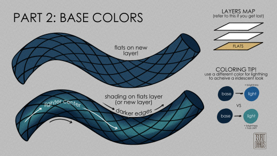
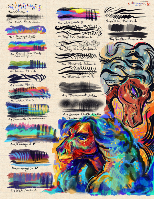
I decided to make a quick overview of what brushes I use the most. The brushes and guide are both available on my Patreon - https://www.patreon.com/muruusa
33 notes
·
View notes
Text
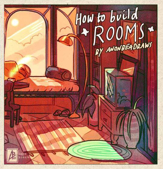
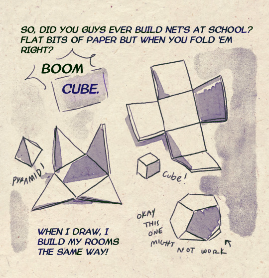
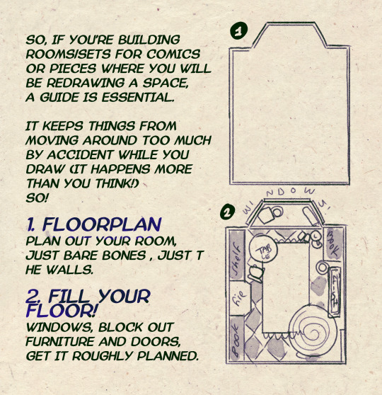
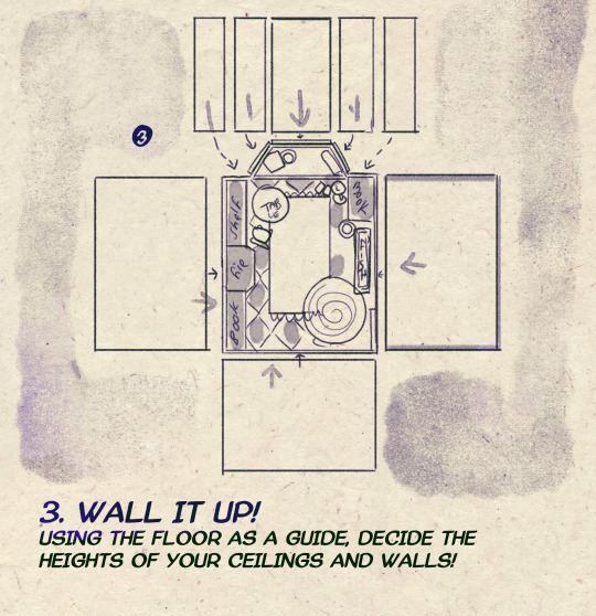
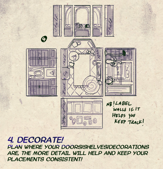
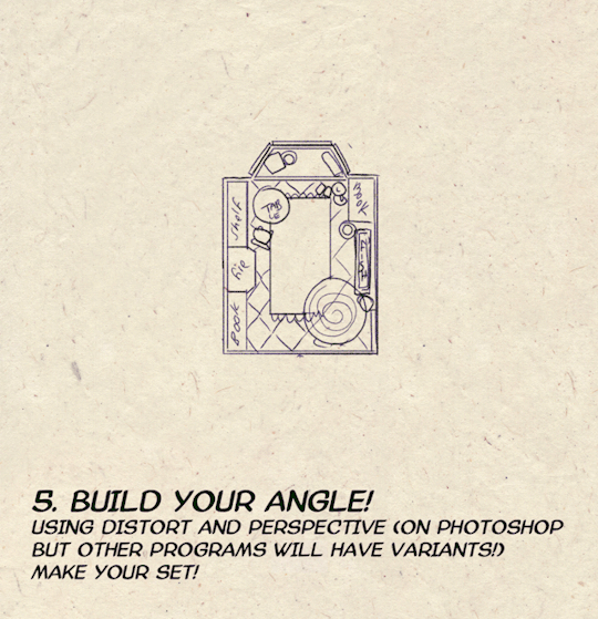
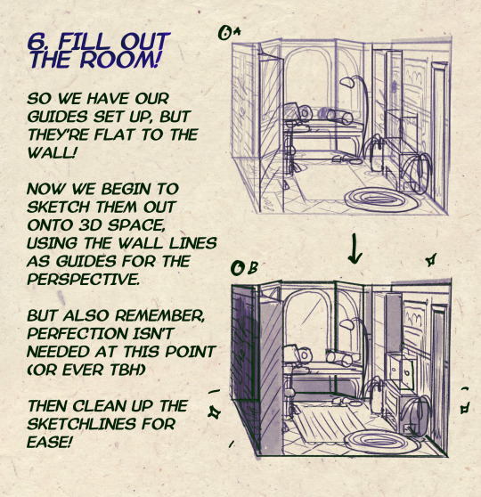

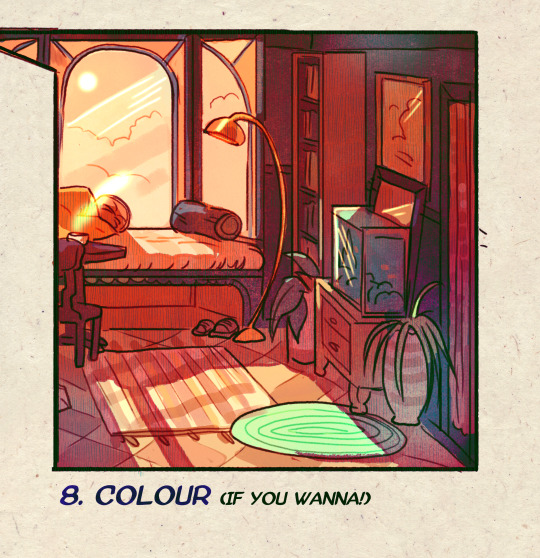
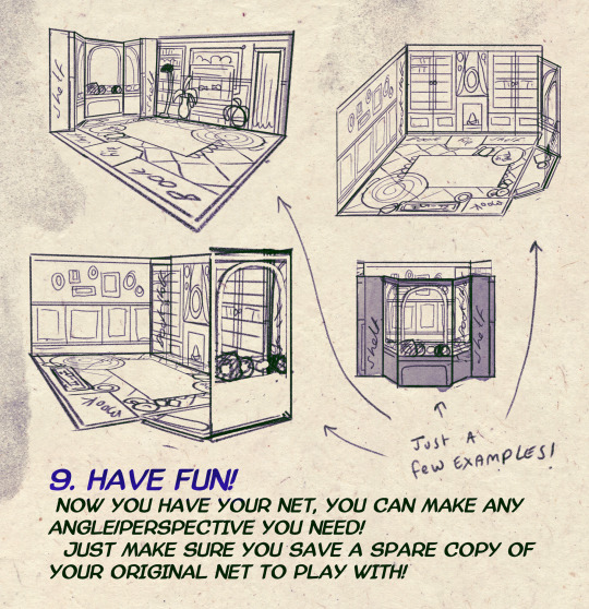
I made a Room Building tutorial! Lemme know if it helps! 🧡
Tip me here| Commission info here!
#anonbeadraws#digital#art tutorial#tutorial#room building#room design#illustration#gif#digital art#digital tutorial#art help#art resource#let me know if it helps!#tried to make it as simple as I could
35K notes
·
View notes
Text
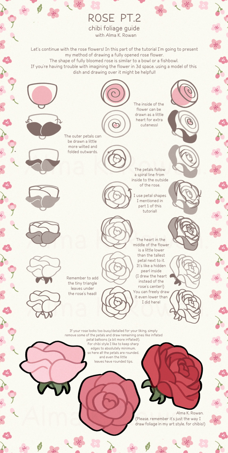
Chibi foliage guide: Rose (pt.2)
#how to draw#art tutorial#almakrowantip#tutorial#art resources#chibi flowers#digital art#chibi flowers guide#chibi foliage#chibi rose#rose tutorial
12K notes
·
View notes
Text
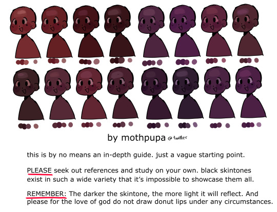
some mid to dark black skin swatches i made for twitter. again this isn’t a tutorial by all means, just a brief visualization and I still highly encourage everyone to do their own research 🫰 i included cool undertones as well since they’re left out often
4K notes
·
View notes
Text


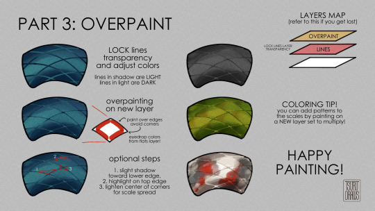
getting back into painting my dragon bois more so a lil tutorial for how i paint scales!
#art tutorial#art tips#snakeskin#art guide#how to draw#how to paint#scales#scale#snakes#dragons#no but have fun this is just how my brain does it#digital art#clip studio paint#tutorial#art resource#tsurudrawsart#tsurutips
11K notes
·
View notes
Text
Procreate Resizing Tip by Mikestockings
3K notes
·
View notes
Text
Head Advice #1: Everybody’s head is the same size.
Okay, not really, but basically. There’s a reason you don’t have to know your head circumference to find a sunhat. We all have pretty similar head sizes, especially from the visual distance we usually draw characters.
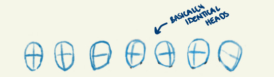
The only exception to this is babies or children under 10. Those guys definitely have smaller heads! (But did you know our skulls are already over 90% their full adult size by the age of 5?)
Different style choices demand different proportions, but in general, it’s good advice to pick a head size, and stick with it!
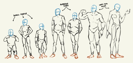
Head Advice #2: You can use head size to indicate a character’s size.
Big characters don’t look like average sized people scaled up. And you can’t just scale down to get a small person!
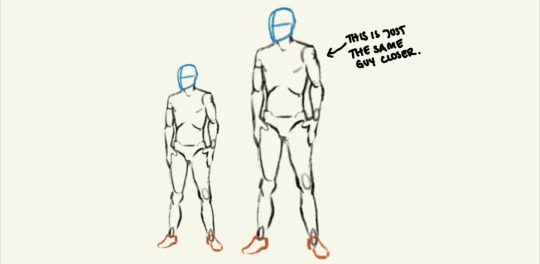
You can make a character look very big and tall or very very small — even if they are standing alone in a vast white nothingness — just by how how they are proportioned! The most important proportion (in my humble opinion) is their head size. Look me in the eyes and tell me you can’t tell which of these characters are big and which are small.
Head Advice #3: Don’t go shrinking anyone’s head.
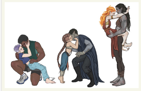
The most common head sins I see happen when an artist is trying to indicate (body) size difference in a couple, and use their heads to do it. The result is an image that looks something like this:
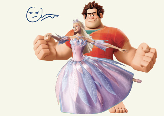
If you don’t want your lovers to look like they belong in different animated tv shows, don’t go shrinking anyone’s head! Use their bodies (hands and feet and bellies and muscles) to show off their size differences.
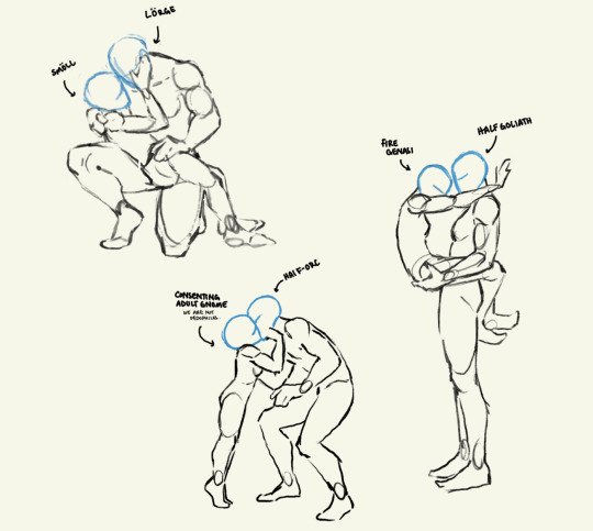
Anyway, that’s all. Having fun giving head. I mean doing head. I mean drawing heads.
#art#artists on tumblr#fantasy#character art#digital art#art advice#art resources#art ref#character design#I just haven’t seen anyone explain this#art is a journey#we all start somewhere#dnd characters#‘cause that’s what I draw#long post
7K notes
·
View notes
Note
May be a stupid question, but why do you paint things in different colors before starting to paint? Like, in the crowley plant timelapse you painted crowleys body pink and the plant blue, why didnt you use a green base color for the plant already? And in the angels piece if I'm not mistaken you also changed those colors to different tones multiple times before starting to actually color it properly. Is it just a way of "separating" different areas of the piece before painting or is it something that actually helps with the coloring for some reason? If its the later, can you explain?
Not a stupid question at all, I get asked this a ton! I'll try to explain it as best as I can:
(I work with Clip Studio Paint btw, I'm not sure if this works in other programs)
So when I'm done with my lineart
I use the bright colors to seperate each important object and character. Each of these colors is on a different layer below the lineart.

It helps me keep everything organized!
After that, I add a folder on top of the layer with each bright color and add a clipping mask to that folder. Now, the folder is clipped to the layer with the bright color. That way, everything I now add into that folder will not go outside of the bright color area.
Which looks like this:

(the clipping mask icon is in the left corner highlighted blue)
My next step is to now add all the actual colors to the character. Each part (skin, hair, jacket, pants etc.) gets a seperate layer. Which looks like this:


And when I'm done with that I can yet again go back to my beloved clipping mask and add a layer on top of every part and add clipping masks to add details (like shadows and highlights)! That way you don't have to worry about drawing outside of the area.
It looks like this:


I just like using this method cos everything's more organized. I used to not do it for the longest time and coloring was always a bit of a pain, but ever since I do it like this it's been way more fun!
And why do I use bright colors? Using bright colors in different shades just helps me get a clear picture of all the different parts of my illustration before I start getting into details. It also helps me see if I accidentally missed a part later on since bright colors shine through quite easily! I also choose the colors randomly since they don't really matter, that's why I didn't use green for the plant.
I hope this explanation helped you out and didn't confuse you even more! I'm always happy to explain my process!
Have a wonderful day, anon!
642 notes
·
View notes
Text
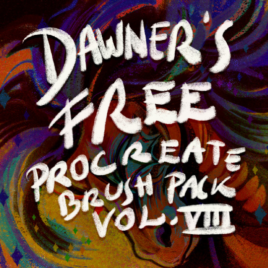
New free Procreate brush pack!
Get it here!
#brushes#brush#brush pack#procreate#resources#free brushes#free brush pack#free procreate brushes#digital art#digital drawing#procreate brushes#digital assets
919 notes
·
View notes
Text

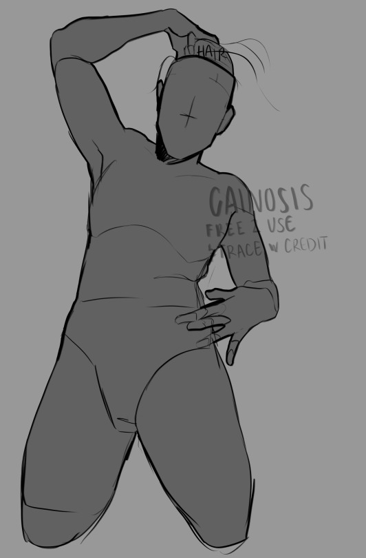
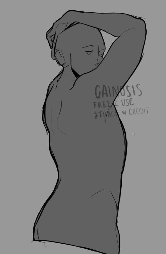
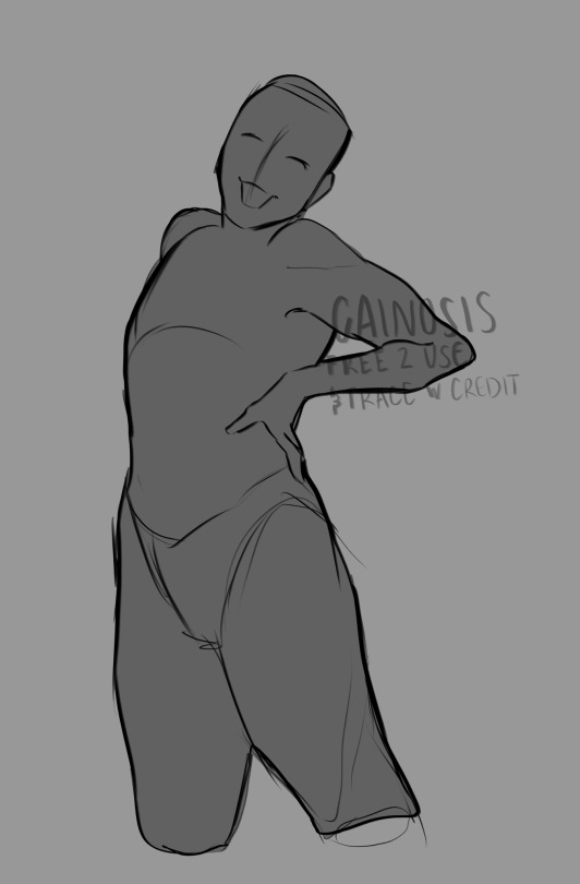
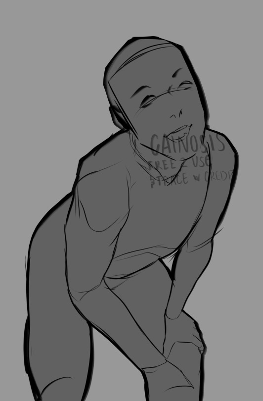


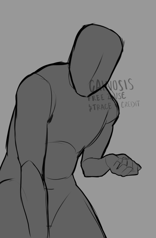
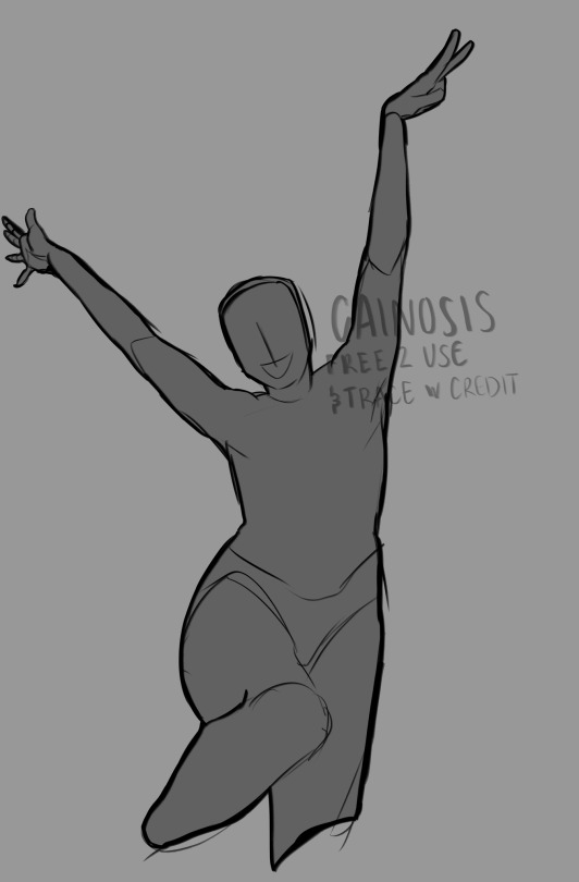
forgot i exist here also here r more poses
#draw your oc meme#artists on tumblr#digital art#art reference#art pose reference#art poses#draw your babygirl in this#draw your characters#pose reference#art help#anatomy#anatomy reference#art resources
1K notes
·
View notes
Text

Into the confessionary a little spider walked
Mind not quite there
Quite lost
Memories scrambled around, confused
Pain flaring up, things that shouldn't have been said out
Siblings falling apart
Guilt over forgotten acts
#cotl shamura#shamura cotl#cotl#my art#fan art#digital art#Although nowadays Shamura sees the other ex-bishops as family#its not a lie to say that at first they took them in out of convenience#Kallamar once begged for his life when he was no more than a young god#round eye of his crown looking into Shamura's eyes#whispering things#Shamura initially took them all in out of convenience#They were the God of Wisdom and War they knew that to win the one they were in they needed resources#powerful ones#A many legged creature once walked into their web -terrified of the world and what it had become of it#a newborn god -harbinger of bad luck- was found in the middle of a dead plain#one with an anger immense enough to consume the whole world was given a reward- and then a task#and the one who looked for a purpose proved himself useful#They initially took them in out of convenience#and then war ended#and things changed for the spider#they took them all in out of convenience#something never said out loud#something they were all aware about but refused to speak of#the truth spoken into the wind stung more than they all thought it would
202 notes
·
View notes
Text

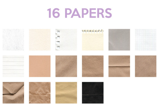
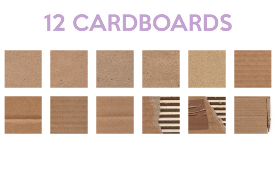
A TEXTURE PACK FOR DIGITAL ARTISTS
I want to stop relying so much on resources downloaded from the internet and start creating my own tools, so I've spent the last few weeks scribbling with every art supply I could find and hunting for nice pieces of cardboard.
I'm proud to present:
14 colored lines
10 black lines
16 papers
12 cardboards
All A4 size!
Even though they can be used by themselves, these are the raw materials I'll be editing, combining, and experimenting with to create even more textures. I encourage you to do the same!
→ Download it for free or pay what you want
↓ Texture previews below the cut


227 notes
·
View notes
Text
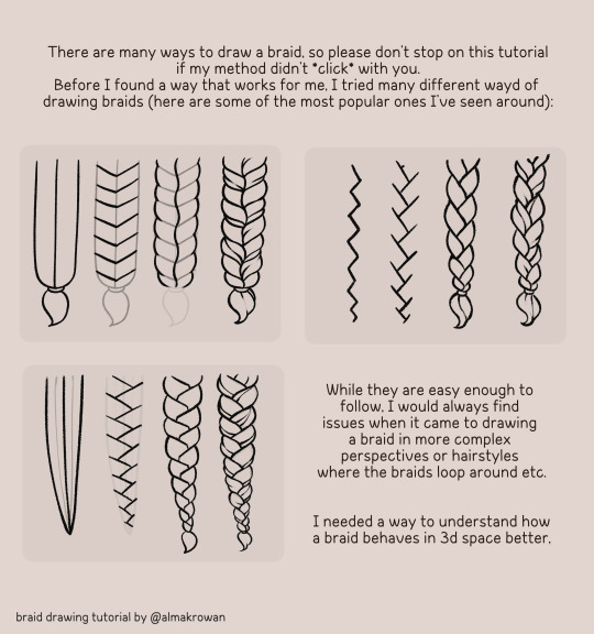
So I posted a silly doodle yesterday on twitter and now people think it was a tutorial. So I got upset and made an actual tutorial so noone says I halfassed the yesterday's one 😡😡😡
Here you go:
~How I draw braids~ 🩷🙏
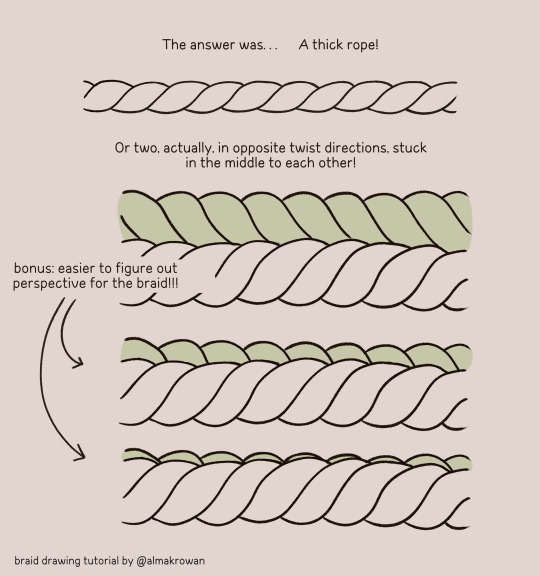
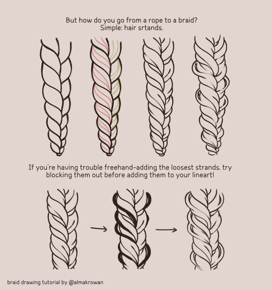

#almakrowantip#how to draw#tutorial#art tutorial#digital art#art resources#artists on tumblr#I draw non-chibi stuff too!!!#now#this is a TUTORIAL#not like that random yesterday's post#ugh
3K notes
·
View notes
Text
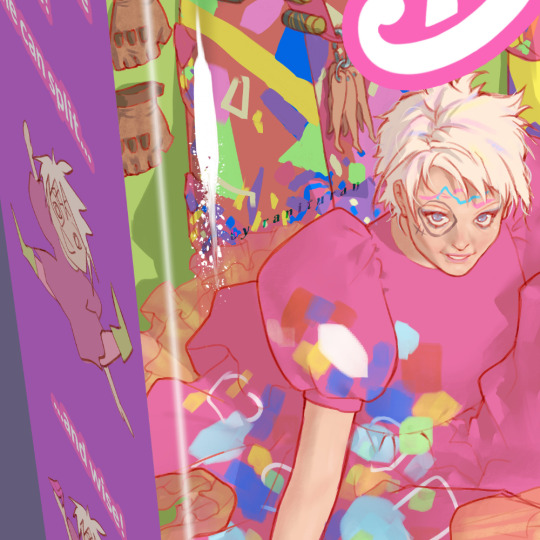
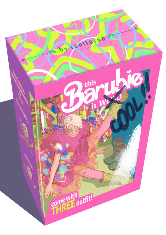
Anyone wish to have The Weird Cool Barbie with her own box and outfit?
I never had Mattel's Barbie, like, the original Barbie. I only had the knockoff Barbie that comes with cheap plastic body and yellow-corn-like hair, so having this specific Barbie with details and outfit just like in the movie would be a dream come true 🥹❤️
#weird barbie#agent of chaos#but actually knowledgeable#resourceful#and wise#we need her backstory#not to mention her house having great view of the barbieland#kate mckinnon#is dope af#barbie#the barbie movie#barbie 2023#fanart#digital art#illustration#yes I purposely mangled the name Barbie to avoid trademark and or copyright lawsuit from Mattel
889 notes
·
View notes
Last Seen Blogs

djsammyrock
Cyberjamz Radio/Records
can-you-love-me-again
Ti porto via con me
lord-pigeon
Punished for scalie crimes
writingshiren
Are you lost?
papuigna
♾Infinite♾