#download tutorial
Explore tagged Tumblr posts
Visit Tumblr Blog
Explore Tumblr blogs with no restrictions, modern design and the best experience.
Last Seen Tumblr Blogs


Fun Fact
Tumblr Inc. has $15.1M in annual revenue.
Text
What is the best and safe YouTube to mp4 converter for Windows PC
1. SameMovie VideoOne Downloader Pros: Clean UI, supports HD/4K downloads, fast speed, no ads, can download entire playlists & metadata. Great balance of ease of use and performance. Cons: Some advanced features are in the paid version (but worth it if you're a regular user).
2. 4K Video Downloader Pros: Good for batch downloads, subtitles, and high-res videos. Cons: Free version limits downloads, sometimes buggy updates.
3. yt-dlp (Command-line tool) Pros: Extremely powerful, fully customizable, works with many sites. Cons: Requires technical know-how, no GUI unless you add one.
4. SnapDownloader Pros: Multi-platform, fast, supports tons of websites. Cons: Paid after free trial, UI isn’t the most intuitive.
5. Online tools (like y2mate, SaveFrom) Pros: Quick and browser-based—no installation. Cons: Ads everywhere, limited output quality, not secure for regular use.
#youtube downloader#video downloader#download youtube videos#streaming tools#tech tips#digital tools#download tutorial#yt downloader#save youtube videos#software comparison#video saving tips#content creator tools#streaming hacks#media downloader
1 note
·
View note
Text

IF YOU CAN'T ENABLE CC 🌸
Sul sul ^^
After today updates, I wasn't able to enable CC again. It doesn't matter how many times I closed and launched the game.
So I remembered that this had already happened to me before.
If you're going through the same problem, this is how you can fix it:
🌸🌸🌸🌸🌸🌸🌸🌸
HOW TO ENABLE CC AGAIN:
1- On the game home page, in the bottom right corner of the screen, you can see what the current game version is. After today's update, mine was: 1.108.318.1020. Launch the game and check the number that appears for you.
2- In your game folder (Documents>Electronic Arts> The Sims 4) you'll find a file called "GameVersion". There will be a number.
The number in that file has to match the current game version number.
When I opened mine, it was "1.107.151.1020". So I just updated it to "1.108.318.1020" and saved. Then when I launched the game I could enable CC again.
Note 1: There's a "space" before the number in "GameVersion" (as if it were a paragraph). Keep that space. Change the numbers exactly where they are.
Note 2: If you prefer, before changing the number, make a backup copy of "GameVersion" just in case. It won't harm your game, but it's better, just to prevent and make it safer.
💎 If you want a tutorial video, I made one about it some time ago. You can watch it here :)
🌸🌸🌸🌸🌸🌸🌸🌸
ALSO IMPORTANT AFTER UPDATES:
Remember to delete "localthumbcache". You can find the tutorial here.
🌸🌸🌸🌸🌸🌸🌸🌸
I'm currently checking my CC to see if they're still working.
If anything, I'll let you know :)
I hope it helps you if you're having any problems :)
Happy Simming ^^
3K notes
·
View notes
Text

Quick Guide: Stay Safe While Downloading Sims 4 CC & Mods
I just published a quick guide to help you download Sims 4 CC & mods safely. ⚠️ From trusted sources to spotting red flags. Keep your game clean and secure! 😊
Read it now
#avoid malware in sims 4 mods#how to avoid malware sims 4 mods#how to download mods safely sims 4#patreon sims 4 cc download#safe sims 4 cc creators#safe sims 4 download sites#sims 4 cc best practices#sims 4 cc community guide#sims 4 cc download checklist#sims 4 cc education#sims 4 cc folder structure#sims 4 cc mod manager#sims 4 cc mod security tips#sims 4 cc mods support guide#sims 4 cc protection#sims 4 cc safe download#sims 4 cc safe hosting platforms#sims 4 cc safety guide#sims 4 cc safety tutorial#sims 4 cc virus warning#sims 4 cc zip file tips#sims 4 custom content security#sims 4 custom content tips#sims 4 mod folder organization#sims 4 mod malware prevention#sims 4 mod safety#sims 4 mod safety checklist#sims 4 modding guide#sims 4 mods antivirus#sims 4 script mod warning
281 notes
·
View notes
Text
TUTORIAL
How to FIX CUSTOM EYELASHES after update 1.108.349.1020 The Sims 4
YOU NEED:
Sims 4 Studio @sims4studioofficial
Blender (I use Blender 2.79)
Instruction manual:
Opening the eyelashes that need to be repaired in Sims 4 Studio

2. Go to the "Categories" section - Item "Outfit Type" - "Eyelashes"

3. Click "Apply to All Swatches" - Click "Yes"

4. Now we need to assign the correct color to the Vertex in Blender. Go to the "Mesh" category and export the eyelash mesh

5. Open the Mesh in Blender and switch to the "Vertex Paint" mode

6. Select the display mode "Wireframe" or press the "Z" key

7. If the eyelashes are broken, they will have the wrong color. Now we need to assign the correct color

8. Click on the palette icon

9. Go to the HEX item and enter the color code. Color Number: 007F3F

10. After you entered the color code. Click "Paint" - "Set Vertex Color"

11. After that, the color of the eyelashes will change. Save the file and close the Blender

12. Go back to SIms 4 Studio and import the mesh

13. Saving the package file

14. Checking the result in the game
718 notes
·
View notes
Text
hello!
#i tried#its been two years forgive me#twas fun#i guess if u call trying ri download n run softwares and finding tutorials for the past six hours only to rely on my old gif intuition fun#do i hate rhe colourinf? of COURSE#the quality? yes#but its fineee#its only upwards from here#btsgif#annietrack#usersky#dailybts#userdimple#userkelli#raplineuser#pjmdaily#what WERE THE TRACKING TAGS#userines#esmetracks
272 notes
·
View notes
Text
throws this at high speeds
#wreck it ralph#wir turbo#turbotastic#turbotime#turbo#flash animation#not a replication I mean actual flash . please do not ask me for a tutorial#because your only answer will be “just download the program”#I despise this creature#miss construction#I procrastinated so hard on this#shakes treat bag#wir
253 notes
·
View notes
Text


3D CAS Room Replacement - Christmas🎄
Converted from Sims 4, credits to Ellcrze who's not in the sims community anymore from what I read. You can find the Sims 4 version here
This will replace the default CAS Room. Haven't figured out how to extend that to Create a Pet/Create a Bot yet. Have to work on geostates and things and I don't wanna get into all that 😅 The background for those is just a blue background. You can only have 1 CAS Room at a time.
Since the Christmas tree has transparency, it will conflict with some hairs a little in CAS because they both use transparency, but it's fine and not an issue.
Credits
Thanks to @mspoodle1 @nectar-cellar and @greenplumbboblover for helping me and answering my questions
Download

#ts3cc#s3cc#download#tutorial still coming for this soon#just a lot of trial and error#I was gonna do an advent calendar but I don't think I can commit to releasing something everyday lol BUT I'll try 😊
308 notes
·
View notes
Text
IT'S DONE!! I DID THE THING!!!:D
@ubtendo Just for you<333
NSNNSNSNS HOPE YOU LIKE IT!! And sorry for the shitty quality. This wouldn't have happened if only I have a PC:(
BUT I STILL HOPE U GUYS LIKE IT!!💕💕
(And you can also watch it on my TikTok lol)
#Gir Says#That took me a while...#More than I thought#It actually was bc I was fighting with fucking CapCut for it to download#But it won't let me:(#So I had to screen record thta shit#And that's why it looks SO shitty#I'm sorry<///3#I also had to watch a Tutorial for using AlightMotion#Cuz I literally DON'T KNOW SHIT about the app#Once Upon a Witchlight#OUAW#OUAW Torbek#OUAW The Other#OUAW The Duke#OUAW Gorebek#ENA Dream BBQ#ENA BBQ#ENA OC#ENA OC Trend#My Videos#Idk what else---
111 notes
·
View notes
Text
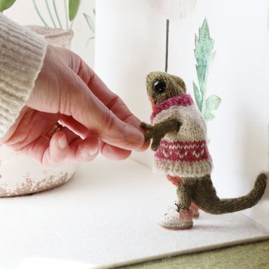
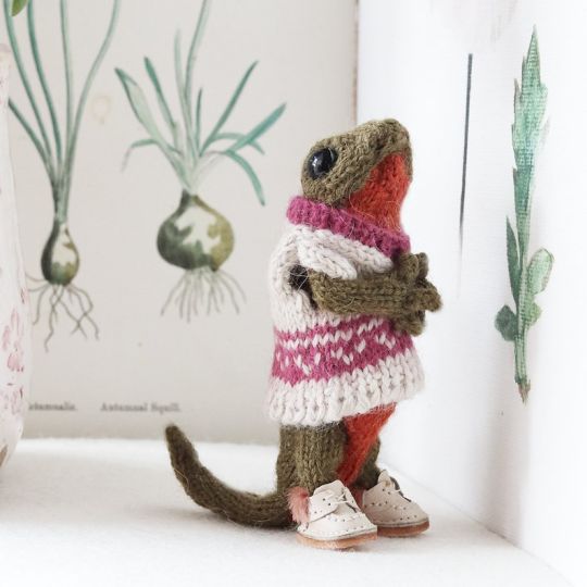
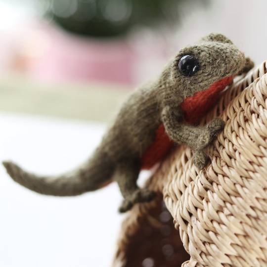
Newt Knitting Pattern by DotpebblesKnits
#DotpebblesKnits#newt#knitting pattern#knitting patterns#knitting pdf#knitting download#knitting tutorial#pdf download#pdf pattern#pattern pdf#craft#diy
590 notes
·
View notes
Text
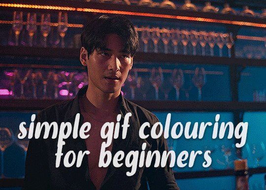
✨ Simple Gif Colouring for Beginners ✨
I wrote up my basic gif colouring process for a friend recently, but a couple of people here mentioned they'd also find it helpful! so, as requested, this is a beginner-friendly walkthrough of the way I colour my gifs :) it's aimed at brand new gif makers with no prior experience with photoshop or photo editing.
when I first started gif making I found colouring and photoshop in general suuuper daunting, so I've tried to simplify everything here as much as possible. hopefully this will be relatively easy to follow and not too intimidating!
a couple of things to begin with:
I'm only talking about colouring here - this is not a full gif making tutorial. I've linked to some of my favourites of those here!
I personally like to make bright, 'clean' looking gifs with vibrant but natural colours, so that is the style of colouring this tutorial is geared towards. most of gif colouring is subjective and about personal taste - the only thing that I'd say is possible to get wrong is skin tones, which I talk about a lot in this guide.
as I mostly gif Thai dramas, most of the advice is geared towards colouring for East Asian/South East Asian skin tones - but the techniques should be fairly universally applicable (and here are some tutorials that talk about gif colouring for other skin tones).
I'm not an expert! I'm not claiming this is the best or the only way to colour gifs - it's just how I do it.
this post is very image-heavy. if the images aren't loading (or the gifs are running slowly or cutting/looping weirdly), then try viewing the post in its own tab (rather than on the your dash or someone's blog) and refreshing the page.
okay, full walkthrough beneath the cut!
contents:
1. intro a. natural gif colouring goals b. very very basic colour theory 2. super simple colouring (the essentials) a. curves b. selective colour (and skin tone correction) c. hue/saturation d. saving and reusing colouring e. another simple colouring example 3. other adjustment layers a. brightness/contrast b. levels c. vibrance d. colour balance e. channel mixer 4. troubleshooting a. curves b. saturation 5. fin!
1. intro
the colouring part of gif making can be super overwhelming, especially if (like me when I first started!) you're completely new to photoshop and/or have no experience with colour theory or photo/video editing.
if you're opening photoshop and making gifs for the first time, I highly recommend getting used to making a few basic, uncoloured gifs to begin with. just to practice, rather than post anywhere (though you can always come back and colour them later if you want) - but it'll make the rest of the process much easier if you're already beginning to get used to working in timeline mode of photoshop. give yourself a bit of time to practice and get a feel for things like how many frames you tend to like in a gif, where you like to crop them for the best loop, what kind of aspect ratio you like etc* - so that you're not trying to navigate all of that for the first time on top of everything else!
* frames: for me between 60-90 frames is ideal, but 40-120 frames is the absolute min-max I'd personally use in a normal gifset loops: for the smoothest loops, try to avoid cutting someone off mid-movement or mid-word if possible. aspect ratio: for full-size (540px) gifs, I tend to go for either 8:5 (slightly 'skinnier' gifs), 7:5, or 5:4 (particularly big, thick gifs lmao)
✨ natural gif colouring goals
part of what can be so daunting about starting gif making is not knowing where to start or what you want to achieve. this is definitely something that gets easier with practice - the more gifs you make, the more you'll get a feel for what kind of look you like and the more instinctively you'll know how to get there. it also helps to see if any gif makers you like have made "before and after colouring" posts - these can help with getting a sense of the kinds of changes made through gif colouring. here's one I made!
in general, I like to make my gifs bright and 'clean' looking, with vibrant but natural colours. these are the things I'm usually hoping to achieve with colouring:
brighten dark scenes
remove muddy, yellowish lighting or filters
saturate colours
correct any skin lightening filters or overexposure
make lighting and colours as consistent as possible between gifs within a single gifset, especially gifsets featuring gifs from multiple scenes/episodes/videos
this guide is focusing on natural colouring, but of course there are many cool ways to make stylised/unnaturally coloured gifs. imo you'll need to master these basics first, but if you want to learn how to do things like change the background colour of gifs or use gradients or other cool effects, then @usergif's resource directory has loads of super helpful tutorials!
✨ very very basic colour theory
[disclaimer! I don't know shit about fuck. I do not study light or art. this is just an explanation that makes sense to me exclusively for the purposes of gif making.]
the primary colours for light/digital screens are red, blue, and green. having all three colours in equal measures neutralises them (represented by the white section in the middle of the diagram).
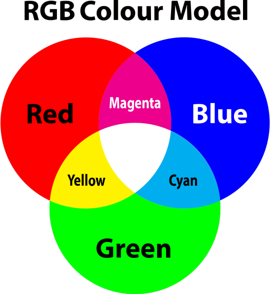
so to neutralise a colour within a gif, you need to add more of the colour(s) that are lacking.
in practice this usually means: the scene you want to gif is very yellow! yellow is made of red and green light, so to neutralise it you need to add more blue into your gif.
it can also mean the reverse: if you desaturate the yellow tones in a gif, it will look much more blue.
looking at the colour balance sliders on photoshop can make it easier to visualise:
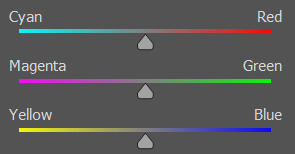
so making a gif more red also means making it less cyan.
removing green from a gif means adding magenta.
taking yellow out of a gif will make it more blue.
tl;dr:
neutralise yellows by adding blue (and vice versa)
neutralise reds by adding cyan (and vice versa)
neutralise green by adding magenta (and vice versa)
2. super simple colouring (the essentials)
starting with a nice sharpened gif in photoshop in timeline mode. (these are the sharpening settings I use!)
some scenes are much harder to colour than others - it helps to start out practising with scenes that are bright/well-lit and that don't have harsh unnaturally coloured lights/filters on. scenes with a lot of brown/orange also tend to be harder.
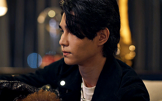
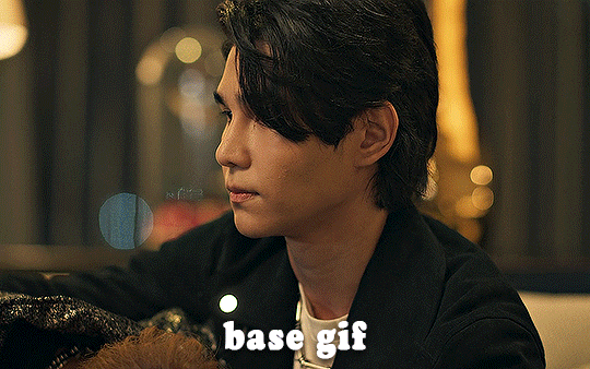
I usually save a base copy of my gif before I start colouring just in case I end up hating it, or find out later that it doesn't quite fit right into a set and need to redo it etc.
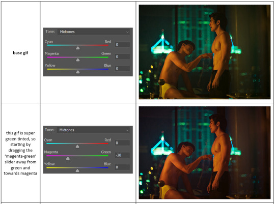
so here is my base gif!

it's an okay gif, but it has a bit of a yellow tint to it that I want to reduce.
colouring is easiest to do in adjustment layers, which can be found under layer -> new adjustment layer - or for me they are here:
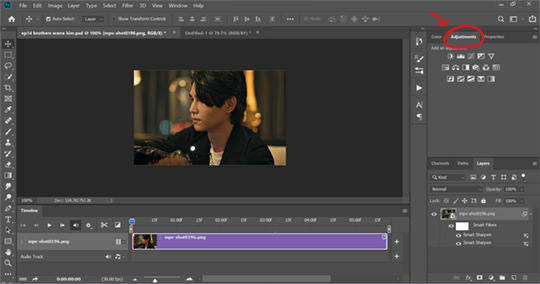
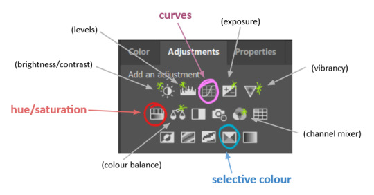
there are lots of different types of adjustment layers that do lots of different things - but for me the absolute essentials for colouring are curves, selective colour, and hue/saturation.
I also use brightness/contrast, levels, exposure, vibrance, colour balance, and channel mixer sometimes, depending on the gif - but I use curves, selective colour, and hue/saturation on every single gif.
✨ curves layer
the first thing I always do is a curves layer. when you first open one it will look like this:
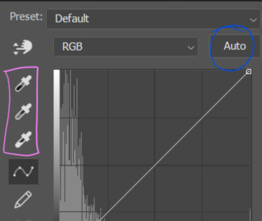
first I usually click the ‘auto’ button, just to see what happens. sometimes it makes a big difference (it usually brightens the gif a lot) - but on this gif it didn’t do much.
if it had made the gif look nicer then I would have kept it and added a second curves layer on top to do the rest of these steps.
the next step is selecting the white and black points with the little eyedropper tools.
the bottom eyedropper lets you pick a white point for the gif. click somewhere super light on the gif to see what happens - for this gif, I clicked on the lampshade on the left. if it looks weird, I just undo it and try somewhere else - it usually takes a few goes to find something that looks good.
here's what that did to the gif:

then I pick the top eyedropper and use it to pick a black point by clicking somewhere really dark, again playing around until I find a black point that looks good.
here's what the gif looks like after picking the white and black points:

this can take some experimenting, but you can make super easy drastic changes to your gif just with this. in this case, the curves layer took out a lot of that yellowy tint.
and this is what the curves graph looks like now:
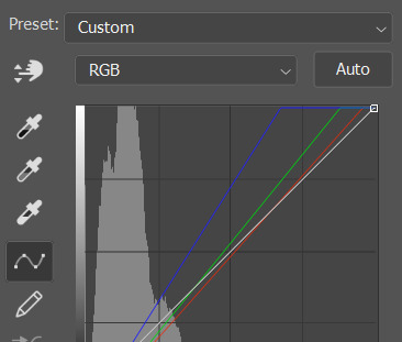
you can click and drag those lines to make further changes if you want - I usually leave them alone though. the colours of the lines indicate which colours have been changed in the gif - for example, you can see from that steep blue line on the graph that blue has been added to neutralise those yellows.
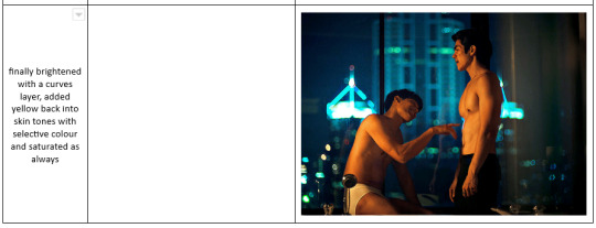
next I usually do another curves layer and just press the ‘auto’ button again to see what happens. usually it brightens the gif a bit more, which I like.
‼️if nothing is working: usually with a bit of fucking about a curves layer works well - but sometimes you can’t find a good white and black point anywhere, and instead your gif turns wacky colours and nothing looks good. this happens more often with very heavily colour tinted scenes :( the troubleshooting section at the end goes over some options, including starting with a levels layer instead.
✨ selective colour (and skin tone correction)
skin tones are made up of a mixture of yellow and red.
removing yellow (or adding blue or red) to a gif will make the skin-tones too red - and removing red (or adding cyan or yellow) to a gif will make the skin-tones too yellow.
adding blue to this gif with the curves layer took out the yellowy tint, which I wanted - but it also took the yellows out of Kim's skin tone, which I don’t want. so I need to put yellow back into the skin tones specifically - without putting it back into the rest of the gif.
selective colour layers let you select an individual colour and adjust the levels of other colours within that colour. you can change how yellow the green shades are, or how much cyan is in the blues, for example.
I need to add yellow back into the red tones to correct the skin tones on this gif. this is the case for most gifs in my experience - the vast majority of the time, unless a scene is very heavily tinted in another colour, a curves layer will add blue/remove yellow.
in the 'colors' dropdown, select the 'reds' section and drag the 'yellow' slider higher - this will add more yellow into just the red shades within the gif.

the amount of yellow you need to add back into the reds depends on how much yellow was taken out of the gif initially - I just play around with the slider until it looks right. if you're not sure, it helps to have some neutrally-coloured (not white-washed!) reference photos of the people in your gif to compare to.
here's the result. Kim's skin is a lot less pink toned and much more natural looking:
✨ hue/saturation
this adjustment layer lets you adjust the hue and saturation of the gif as a whole, and also of each colour individually.
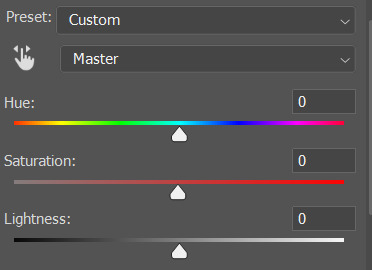
I don't use the hue or lightness sliders unless I'm trying to do something more complicated with the colouring.
clicking the dropdown menu that says 'master' lets you edit the saturation of each colour individually. this is useful if your gif is still super tinted in one colour.
I thought the yellows on this gif were still slightly too bright, so I switched to the yellow channel and desaturated them slightly. (remember if you do this then you need to go back to selective colour and add more yellow into the red skin tones to balance out the desaturation!)
then I increased the 'master' saturation of all the colours to +5:
I usually find the right amount of saturation is somewhere between +5 and +12, but it depends on the gif.
‼️if the gif feels undersaturated, but the saturation slider isn't helping/is making the colours worse, try a vibrance layer instead.
done!
✨ saving and reusing colouring
you can copy and paste adjustment layers between gifs to make your colouring even across each of your gifs for one scene - so if you're making a set of multiple gifs of the same scene, or you think you might want to gif the same scene again in the future, you can save it as a psd so you can reuse the colouring again later.
each gif's colouring will then still need tweaking - different cameras/angles/shots of the same scene can still start out with slightly different colouring.
I recommend uploading the gifs as a draft post on tumblr so you can see what they all look like next to each other and catch any inconsistencies.
✨ another one! (speedrun!)
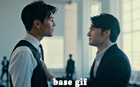
HI KEN!
the white point for the curves layer was in the window behind them.
the curves layer removes the muddy yellow tint, but again it makes their skin tones (especially Ken's) very red toned, which is adjusted by the selective colour layer.
3. other adjustment layers
imo many many gifs can be coloured really nicely with just those three adjustment layers, but some need different adjustments.
✨ brightness/contrast
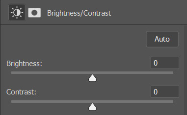
pretty self explanatory!
I personally usually avoid using the 'brightness' slider because I rarely like the effect - I only tend to use the 'contrast' one.
the 'auto' button is sometimes useful though, especially if you’re struggling with the curves layer.
✨ levels

levels alters the white and black points of the gif, like curves - but unlike curves it doesn't also alter other colours.
use the sliders beneath the graph to alter how dark/light the gif is. you can slide the black slider further to the right to make the blacks darker, and the white slider to the left to make the whites lighter.
levels is a good place to start if your curves layer isn't working.
(I'm going to hit the image limit for this post lol so here are some screenshots of a table I made to demonstrate this rather than actual gifs. sorry!)
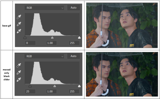

on both sides, I dragged the sliders up to where the big jumps are on the graph - this is usually a good place to start!
✨ vibrance
vibrance... makes the colours more vibrant. it's more subtle than saturation.
it's really helpful for gifs that feel grey. sometimes adjusting saturation just makes the greys kind of weirdly tinted, but a vibrance layer can fix that.
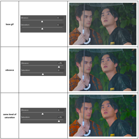
vibrance is much more subtle!
✨ colour balance
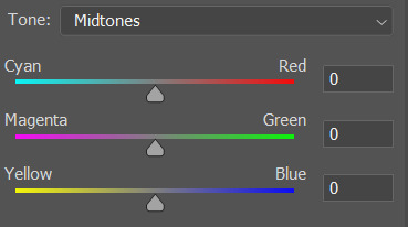
colour balance affects the overall balance of colours within a gif.
it's good for scenes with heavy tints.
I tend to stick to the 'midtones' dropdown, but you can also alter the colour balance within the shadows and highlights if you want.

✨ channel mixer
I avoided channel mixer for such a long time because it scared me. but it's great for scenes that are very heavily tinted in one colour.
basically, it works with the levels of red, green, and blue within a gif. you select an output colour and then play around with the levels of the colour you selected within each other colour.
kind of the reverse of selective colour?
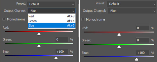
so in the 'blue' channel, the levels of blue are at 100%, and the levels of red and green are at 0% - but you can impact how much blue is in the reds and greens and blues.
this tutorial explains it well - but imo the best way to get to grips with channel mixer is just to play around with it a bit (sorry)
(when I made this guide for my friend, I also made a slightly more complicated gif colouring walk-through that included using channel mixer. there isn't space to include it within this post, but if anyone is interested I could always upload it as an 'intermediate' gif colouring tutorial - lmk!)
4. troubleshooting
‼️curves
usually with a bit of fucking about a curves layer works well - but sometimes you can’t find a good white and black point anywhere, and instead your gif turns wacky colours and nothing looks good. this happens more often with very heavily colour tinted scenes :(
for example, with this base gif:
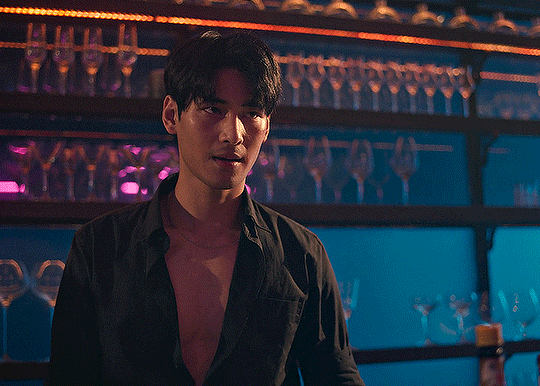
using many of the brightest points as a white point turn it wacky colours, like this:

yikes :(
some options for these cases:
try brightening the gif first with the 'auto' button on the curves layer or with a levels layer. having a brighter gif to start with can give you better options for picking a white point.
try finding an alternate, whiter/brighter white point. look for places the light reflects - on this gif, using the light on Porsche's cheekbone works well as the white point. it also helps to find places that would be white if the scene wasn't tinted - the lightest part of a white shirt is often a good place to start, for example.
skip the curves layer, and instead use a levels layer to alter your white/black points, and colour balance or channel mixer to balance the colours.
‼️over/undersaturation
if your gif (especially the skintones) is looking a little washed out or lifeless, it might be undersaturated. boost that saturation - or if that's not working, try a vibrance layer.
oversaturation is often easiest to spot in the mouths and ears of any people in a gif. if the mouths are looking unnaturally, vibrantly red, then you've gone too far with the saturation.
5. fin!
and done! I hope this was coherent helpful to somebody.
if there's anything that I've missed or that doesn't make sense pls feel free to shoot me an ask or a message and I'll do my best to help! I've also collated a bunch of additional reading/resources below.
happy gifmaking 🥰
✨ some links!
photoshop basics by @selenapastel
gifmaking for beginners by @hayaosmiyazaki
gifmaking guide for beginners by @saw-x
dreamy's gif tutorial by @scoupsy-remade (includes instructions on how to blur out burned-on subtitles or annoying video graphics)
beginner's guide to channel mixer by @aubrey-plaza
how to fix orange-washed characters by aubrey-plaza
colour correcting and fixing dark scenes by @kylos
does resampling matter? by usergif
how to put multiple gifs on one canvas by @fictionalheroine
watermarking using actions by @wonwooridul
resource directory by @usergif
#i got a couple of asks about this so i figured i'd type it up as a post#it's been sitting in my drafts for a while now though i'm so sorry omg.#i had to replace my laptop and it took me a while to get round to downloading photoshop on the new one#but i hope this is helpful!!#gif making#tutorial#photoshop tutorial#colouring tutorial#coloring tutorial#gif colouring#gif coloring#photoshop resources#gif tutorial#gif resources#userbunn#uservik#darcey.txt#darcey.gif#usergif
896 notes
·
View notes
Text
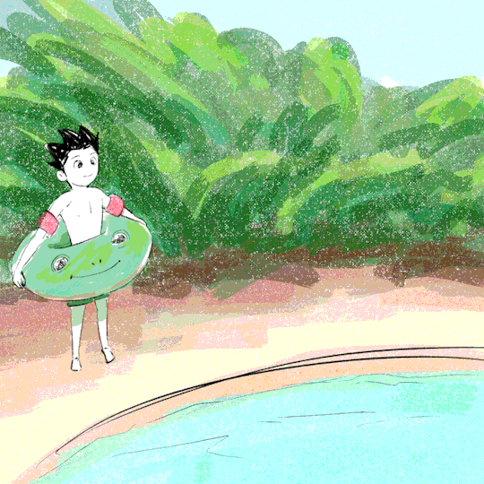
Frog floatie Gon☀️
#downloaded an animation software but didn't watch any tutorials#really showing my hubris with this one#he cute tho#gon freecss#my art#art#fanart#digital art#gif#animation#marosii art#hxh#hunter x hunter#greed island challenge#greed island server
227 notes
·
View notes
Text
Nucrest Cocoa Hoodie V2 for teenagers
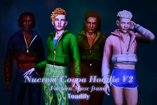
The @nucrests cocoa hoodie version 2 for teenagers, previously made for adults which was recently updated.
It doesn't have any of the original swatches because I made the original as a sort-of collab with @geminipixels , who did the TS4 presets while I did a castable version, and to give it presets I would need to reconvert it from scratch. Though I do have ideas - I would make them hue-recolorable for example.
Download simblr.cc / SFS (acted up, will be added) / Mediafire

About the hoodie
For teen male sims
Sensible specular map (near-black with shiny zipper), blank normal map.
4 presets with 4 combo's of multiplier-mask, 4 channels each.
Enabled for everyday, sleepwear, athletic, outerwear (with accessory tops) and career
Fat, fit, thin morphs
All LODS: 4537 F - 3374 V / 2098 - 1428 / 891 - 698
Custom Thumbnails


Made with
Blender 3.6
Affinity photo
Adobe photoshop
TSRW
S3PE
Meshing tool kit.
I wrote down my whole work progress, right here! Hopefully it can function a bit as a tutorial ♥
@katsujiiccfinds @eternalccfinds @wanderingsimsfinds @pis3update
#florian pistache#andres bardem#sims 3#ts3cc#downloads: me#downloads: cas#downloads: clothing#ts3#sims 3 cc#s3cc#clothing TM#ts3 cc tutorial#cc tutorial
69 notes
·
View notes
Text

I didn't expect to write another guide so soon, but this one is a simple set of text instructions and I've also provided the fix itself as a download- the method is really just documented for posterity.
After a few false starts, I've finally hit this error on the head. If you haven't taken the plunge to only using .package installs, this was the last unsolved issue I knew of them having ;)
Download + Guide Here
Download contains a fix for (hopefully) every Store counter and cabinet, please let me know if you find one I missed.

I will release an update with the other MDLR objects- sectional sofas and swingsets- as soon as I've rounded them all up and had a chance to fix them.
#i have an unhealthy attachment to the ts3 store items#expect a hundred other uploads related to them#the sims 3#ts3#ts3 store#ts3 cc#ts3 tutorial#ts3 download
136 notes
·
View notes
Text
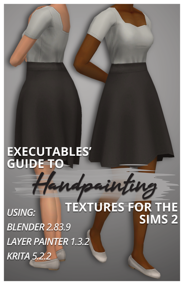
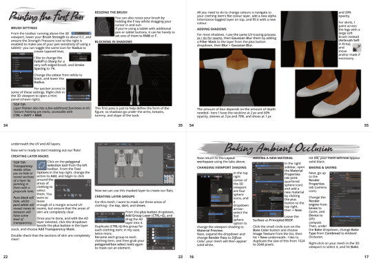
Executables' Guide to Handpainting Textures for The Sims 2 | Download PDF (67 pages)
Have you ever wondered how to paint clothing textures from scratch?
I've been using paid software like Milkshape, Photoshop, and 3D Coat Textura to texture Sims 2 models for years, but I've managed to translate my process to completely free open-source software!
I've broken down the entire process from start to finish for complete beginners (who may never have made a clothing recolour package before), but more experienced CC creators can skip around as needed using the PDF bookmarks.
You don't need a graphics tablet– but you may want one once you've played around with this! :)
The clothing shown on the cover is also downloadable through the document.
Hope this inspires you to make something! :D
#The Sims 2#TS2 Download#Tutorial#PDF#If you'd prefer video format tutorials let me know! Everything is already captured :)
317 notes
·
View notes
Note
I LOVE this set and i was wondering if you could pls explain how you did the text, including how you added texture to the ripped text and the highlighting/circling/etc of words? thank you for posting your beautiful gifs 😊
thank you!! 🥺 & of course! (photopea tutorial)
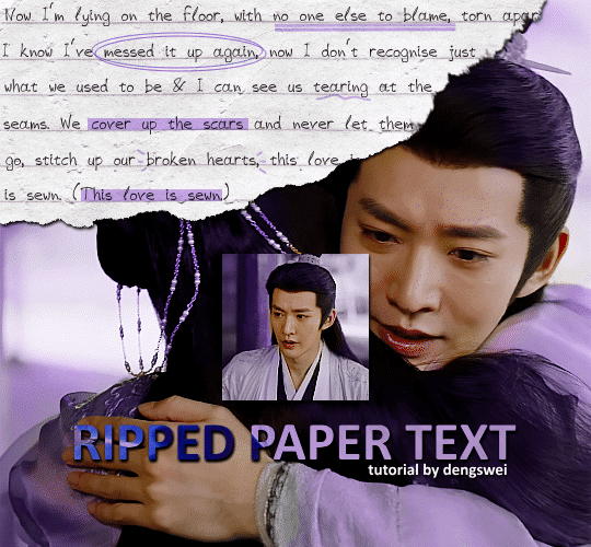
the majority of the texture for the ripped paper effect i can't really take credit for it's on the paper it's self all i did was make the paper white (because the texture was yellow) and used curves to darken the texture), i got the texture from one of photopea's templates but it seems their whole template section has changed drastically and no longer has like anything i used to see before ???? so i'll just share both versions here:
(original & my edited version)
for the ripped parts i just played around with this brush set in the plugins
once i decided which of the paper brushes to use i had a new layer and used it where i wanted, so top left in the gif above, i clip masked the paper texture (and the adjustment layers as well) onto it so you get that ripped effect (if you don't like or want to add to that you can always use the brush tool again (or the erasure tool) set as the paper brush to add or remove sections i did this a lot when i realised certain words i wanted to show weren't on there (also changing the size of the paper brush when wanting to add a little bit or take a little bit away was a massive help)
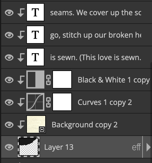
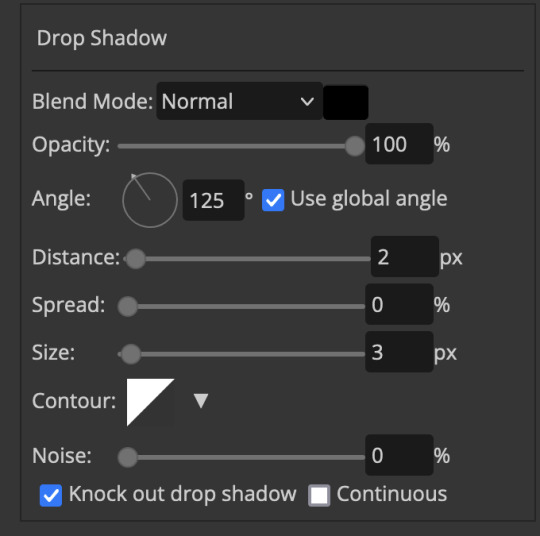
i also always add a drop shadow to my paper textures, the settings i used is mostly the same EXCEPT for the angle for all of the ripped paper (it's also my text drop shadow settings) because depending on how the ripped paper looks you might have to change the angle
also i know in the screenshot below it's on but make sure the use global angle is off if you're going to have multiple different angles of drop shadow in your one gif (so if you want your paper texture on 125° but anything else on 60° the global angle needs to be off but if you want them the same then you can keep that on, which is why it's on for me because the angle is the same for both the text & the ripped paper) (and by text this isn't the text on the ripped paper, there isn't any drop shadow on the text itself there, just to clarify this was for my "ripped paper text tutorial by dengswei" text)
as you can see i also clipped my "handwriting" text to the paper layer this is so it stayed on the paper rather then going onto the gif itself (and it saved the fiddly part of masking it away & it felt more authentic this way too)
i found for me it was easier to seperate the text line by line so i knew exactly which part of the text was on which and if i wanted to change anything either it being a typo, changing the paper texture, or wanting a different word on a different line it was easier that way because it didn't end up messing up all of the text (though you don't have to do it that way, it's just what worked for me here)
font i used was: vag-handwritten (a default photopea font)
all of the next part needs to be above the text on your ripped paper:
for the highlighting, circles, and the lines it's pretty much all the same, i chose the colour which matched the gif (so say purple), for the highlight used the rectangle select & colour fill tools and set that to multiply & then played around with opacity (for most of my highlighting it's set to 50%), for the circles it was the same except the circle shape tool (no fill just stroke) set to purple, set to multiply, with 100% opacity (i found the circles looked better with 100% on some gifs depending on what colour i used), & then duplicated it once or twice and then just moved each circle to where i thought it looked best & the double lines is also the same using the line tool, set to multiply, & playing around with the opacity, & positioning them where i like
for the squiggly lines, the hearts, the 3 small doodle lines at either side of a word, & any other doodles i had on there i doodled them myself with my drawing tablet (you probably don't have to use a drawing tablet i just found it easier that way) using the free pen tool and then did the same thing set it to multiply and played with the opacity
if the colour you choose looks too dark or too light with it set to multiply either try a lighter/darker colour, try out something else like lighten, or screen, or increase/decrease the opacity more (i found i had this issue with the yellow being hard to see on the white paper so i used a darker yellow and kept everything at 100% opacity rather than 50%)
hope that helps! and please if anything is confusing or you want to ask any more don't hesitate to ask i know i ramble on a bit and it can sometimes get a bit confusing 🤣 or if there was anything i missed feel free to ask again 🥰
#replies#edwinas#mine | tutorials#gifmakerresource#photopeablr#photopea tutorial#photopea tutorials#gif tutorial#gif tutorials#usergif#tutorial#tutorials#photopea has so many great default fonts i just spend hours searching through them i barely download fonts now 🤣#i hope i didn't miss anything#also i don't know why the paper textures & my screenshots posted this way i had them side by side#okay they're side by side on mobile but not desktop ??? but mobile doesn't have the read more okay
125 notes
·
View notes
Text
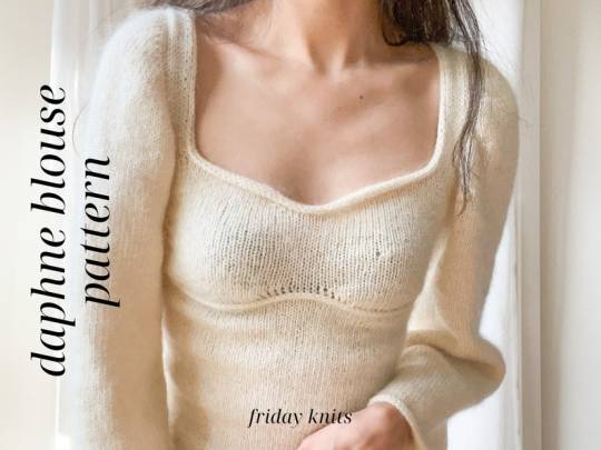
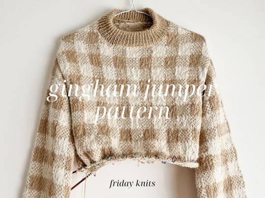
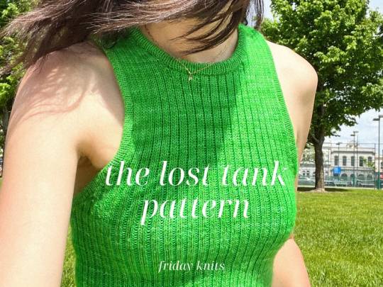
Knitted Tops and Clothing PDF Patterns by FridayKnitsDesigns
#FridayKnitsDesigns#knitting#knitting pattern#knitting pattern pdf#pdf pattern#pdf download#knitting pattern download#knitting tutorial
187 notes
·
View notes