#edits tutorial
Explore tagged Tumblr posts
Visit Tumblr Blog
Explore Tumblr blogs with no restrictions, modern design and the best experience.
Last Seen Tumblr Blogs


monsterlegendsgoldgemsgenerator
[[[FREE]]] Monster Legends Gold Gems Generator 2024 wITHOUT HUma
1 post

Fun Fact
In 2020, 27% of US Tumblr users had an annual household income of over $100,000.
Text
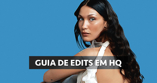
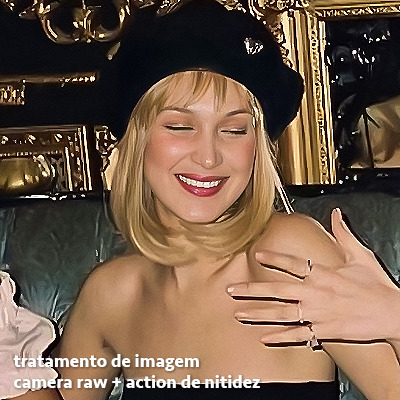
GUIA COMPLETO DE COMO EDITAR FOTOS EM ALTA QUALIDADE (HQ)!
oiê, bem vindos(as)! à pedidos, estou trazendo um tutorial bem abrangente sobre como editar fotos no geral para icons, headers, etc., em alta qualidade. neste guia/tutorial trarei dicas, truques e informações gerais sobre o que é preciso para editar em hq. lembrando que o conteúdo deste guia é sobre como eu edito, a maneira que funciona comigo e meu progresso e aprendizado ao longo de quase 12 anos editando icons, ou seja, o que contém neste guia pode — e deve — ser adaptado à sua maneira e ao software de sua preferência. aproveitem e se divirtam!
nota: este tutorial está bem longo, então, se possível, veja este guia pelo pc/notebook!
O QUE VOCÊ VAI ENCONTRAR NESTE GUIA
softwares necessários com links para download;
onde e como baixar as fotos para as edits;
métodos de edição e passo a passo;
como melhorar a qualidade de uma foto;
como salvar a foto corretamente para postar;
dicas de actions e outros resources.
clique em “continuar lendo” para ver o tutorial.
1. SOFTWARE
photoshop
eu recomendo fortemente o uso do photoshop cc na versão mais recente, ou outra versão com camera raw ou filtros neurais suportada pelo seu pc ou notebook.
você também pode usar o photopea como alternativa (eu particularmente prefiro o photoshop pois acho que as edits ficam com mais qualidade). se você preferir o photopea, algumas dicas desse guia poderão não funcionar devido à falta de algumas funcionalidades que o photopea não oferece (ex: camera raw, galeria de filtros, filtros neurais e outros).
eu uso a última versão do photoshop (atualmente, a versão 25.5.1) e uso a versão paga (obrigada adobe pelo desconto de estudante!!!!!), mas vou deixar alguns links para você baixar o photoshop gratuitamente caso você não seja estudante e/ou não tenha condições para assinar um plano.
atualmente eu uso um mac mini 2014 para editar, mas sempre usei windows, então, as dicas e os links valem para os dois sistemas operacionais.
links
macos: 1, 2 & 3.
windows: 1, 2, 3 & 4.
2. BAIXANDO AS FOTOS
galerias de fotos
muitos artistas têm fansites com galerias de fotos e você pode achar facilmente digitando no google: “nome da pessoa + gallery”.
o artista que eu quero não tem galeria própria e agora? tranquilo, ainda temos galerias de fotos de famosos variados como hqdiesel, hqsource, hq-pictures e até mesmo o theplace.
em último caso você pode usar o gettyimages e usar um removedor de marca d’água ou um site como o gettyimages downloader.
instagram
para artistas estrangeiros que tenham apenas instagram e/ou não tenham fotos em galerias de imagens, eu recomendo o instagram pessoal da pessoa.
você poderá fazer o download das fotos com extensões de navegadores como o image downloader for instagram (para firefox e google chrome), ou sites como o saveig, o snapinsta ou o igdownloader.
eu recomendo baixar pela extensão do navegador, pois ela baixa a foto direto do site do instagram no computador, diferente dos sites que você precisará ir foto por foto, copiar o link e colar no site para fazer o download.
mas, caso a extensão esteja indisponível, com algum erro ou pare de funcionar, o site é uma excelente alternativa (só precisa ter mais paciência).
nos sites para baixar fotos do instagram, geralmente eles dão a opção para você escolher o tamanho da foto. você deve sempre selecionar a resolução maior da foto (acima de 1000px é o melhor).
pinterest
em casos extremos de artistas low profile, sem instagram, sem aparições públicas, sem galerias de fotos, nadica de nada, eu recorro ao pinterest.
porém, é preciso ter muito cuidado ao fazer download de fotos do pinterest, porque são muitas fotos repetidas e muitas com baixíssima resolução e qualidade.
se você for baixar fotos do pinterest, escolha a foto com maior resolução (imagens maiores que 500px já são ok para editar icons), e depois de baixar a foto, eu recomendo fazer um tratamento na foto para melhorar a qualidade dela, como vou ensinar.
3. EDITANDO
3.1 importando a foto no photoshop
apertando ctrl+o ou cmd+o uma guia vai abrir no programa, onde você vai até a pasta onde a foto foi salva. selecione a foto e clique duas vezes nela para abrir.
3.2 cortando a foto nas dimensões desejadas
muitos tutoriais de edições de icons sugerem que você copie a imagem e cole ela em um documento novo já do tamanho da sua edit, mas eu não recomendo essa opção, pois ao redimensionar a foto com a ferramenta de transformar (ctrl+t), ela dá poucas opções para manter a qualidade da foto e se você não souber o que cada opção faz, poderá perder a qualidade da imagem. então, eu sempre faço o recorte na própria foto para não alterar muito a qualidade dela.
aperte a letra c no teclado para abrir o atalho da ferramenta de corte. (se o seu photoshop for alguma versão do cc, eu recomendo que você marque a opção para usar o modo clássico de corte, assim fica mais fácil e você tem um controle maior sobre a ferramenta!). para fazer essa alteração é simples, vá no ícone de engrenagem, clique e marque a opção “usar modo clássico”.
para fazer icons, você deverá cortá-lo usado dimensões quadradas, ou seja, 1x1, e para headers 15x5. você pode mudar as dimensões na caixinha da ferramenta de corte.
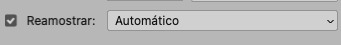
3.3 redimensionando a foto
nessa parte você precisará prestar atenção, pois ao redimensionar a foto, você poderá perder ou ganhar um pouco mais de qualidade na foto, e para isso você usará uma opção chamada reamostrar (ou resample se seu photoshop estiver em inglês). deixe a opção marcada para usar as definições.
3.4 explicando as definições do reamostrar e qual definição usar de acordo com o resultado que você quer
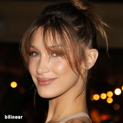


bilinear: a melhor opção para redimensionar gifs, mas para fotos não é tão bom pois dependendo da foto algumas partes ficam nítidas, outras mais suaves e se você for aplicar action de nitidez, pode ficar com um aspecto de “craquelado” com as bordas granuladas, o que eu pessoalmente acho que fica um pouco estranho.
bicúbico mais suave (ampliação): como o nome já diz, ele deixa a foto mais suave, ou seja, os pixels “craquelados” e granulados da foto ficarão mais suaves. é uma ótima opção tanto se você for aplicar actions de nitidez ou actions mais desfocadas e mais suaves.
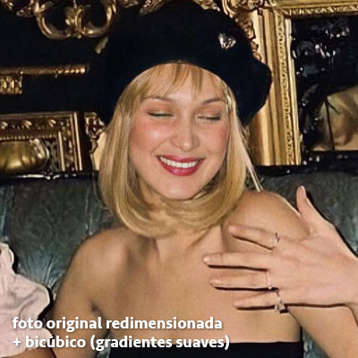
bicúbico (gradientes suaves): pode parecer a mesma coisa do bicúbico mais suave, mas esta opção além de suavizar a imagem, cria um “desfoque iluminado” nas transições das cores da foto. é a melhor opção para fotos sem muita qualidade e principalmente se você for usar actions suaves e desfocadas, sem muita nitidez.
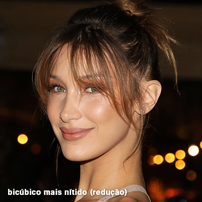
bicúbico mais nítido (redução): acentua os pixels e as arestas nítidas da foto, ou seja, essa definição redimensiona a imagem mas preserva a nitidez da foto. se você usa actions de nitidez que não tem desfoque nas configurações, essa é a melhor opção de reamostra. (mas cuidado, se sua imagem ficar muito nítida com essa definição, você precisará usar outra opção. caso contrário, quando você aplicar a action, a edit poderá ficar muito exagerada e/ou com aspecto áspero.)
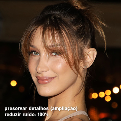
preservar detalhes (ampliação) com redução de ruído: esse em especial é ótimo para quando você precisar redimensionar uma foto para deixá-la maior sem distorcer tanto a imagem. você pode ajustar a redução de ruído para deixar a foto mais suave, sem perder muita qualidade. (obs.: essa opção não deve ser usada para redimensionar imagens muito pequenas, por exemplo de 200x200 para 400x400, ou a imagem vai ficar muito distorcida. ela deve ser usada quando a diferença de pixels não é muito grande, por exemplo, você cortou a foto e ela ficou no tamanho 370x370, aí sim você pode redimensionar para maior sem perder muito da qualidade. então você pode ir ajustando a qualidade com a porcentagem da redução de ruído).
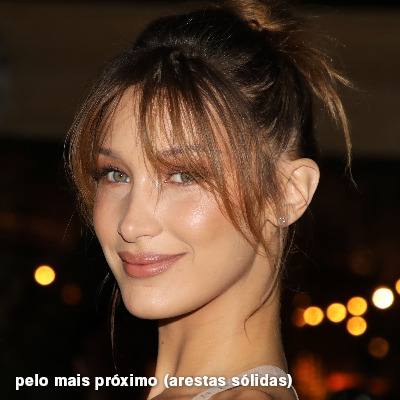
pelo mais próximo (arestas sólidas): essa é uma opção traiçoeira, pois não fica bem em quase nenhuma imagem (a menos que seja um pixel art). essa definição redimensiona a imagem e mantém os pixels nítidos, ou seja, a foto fica menor mas tudo nela que tem aspereza vai prevalecer. é muito usada para redimensionar pixel art, pois preserva as bordas ásperas. pode ocorrer de ficar boa em uma foto aleatória mas não será possível aplicar action, ou a imagem ficará exagerada.
3.5 aplicando a nitidez depois de redimensionar
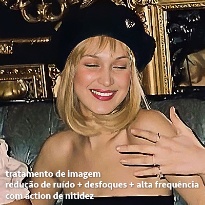
depois de escolher a foto, baixar, redimensionar de acordo com o estilo da action da sua escolha, está na hora de aplicar.
eu fiz duas versões para mostrar como fica com cada tipo de action:
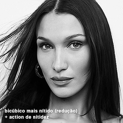
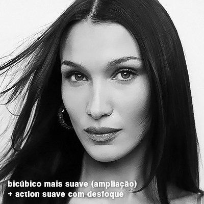
assim, os dois icons tem uma alta qualidade usando actions diferentes, graças a remostragem ideal para cada tipo de action :)
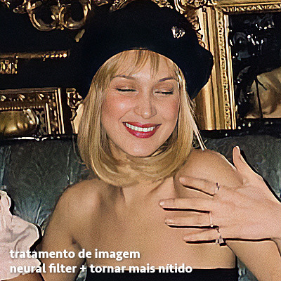
4. TRATAMENTO DE IMAGEM PARA MELHORAR A QUALIDADE
nesta parte, é muito importante que você tenha baixado uma versão do photoshop com neural filters e/ou com o camera raw, mas caso você não tenha, tudo bem também, vou ensinar como fazer uma melhoria na foto de três jeitos: com camera raw, com neural filters e com desfoques. a melhor forma vai depender de quão ruim está a qualidade da sua foto. em geral, apenas fazendo ajustes no camera raw você já tem um ótimo resultado na maioria das fotos.
camera raw
se seu photoshop tem o filtro do camera raw, ele vai estar em filtro > filtro do camera raw...
tudo que iremos fazer será na aba de “detalhe”, ali você deve dar mais atenção ao ajuste de redução de ruído, pois é ele que vai remover o ruído da imagem e melhorar a qualidade dela.
vá mexendo nas configurações de redução de ruído até que a foto fique mais suave. ajuste também o detalhe e o contraste da redução de ruído.
essa parte será mais no olhômetro mesmo, pois as configurações vão variar de foto para foto, mas eu recomendo muito você mexer também na nitidez para não deixar a foto tão desfocada, mas nada muito intenso para não interferir na action que você irá usar.
eu mexo também na redução de ruído de cores, porque dependendo da foto, algumas cores estarão saturadas ou com muito ruído. só cuidado para não colocar um número muito alto, pois esse ajuste pode tirar a saturação da sua foto e deixá-la apagada.
enfim, aqui está uma comparação da foto original com o tratamento feito com o filtro do camera raw e depois já com a action de nitidez aplicada:
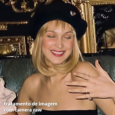
e essas foram as configurações que usei nessa foto em específico:
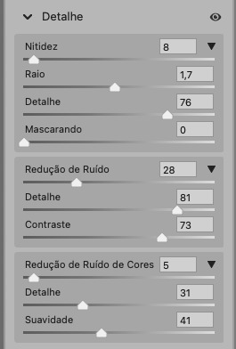
como eu disse antes, as configurações irão variar de foto para foto, a depender da qualidade de cada uma e de quão ruim a foto está, mas com essa configuração básica, você já vai conseguir melhorar algumas fotos.
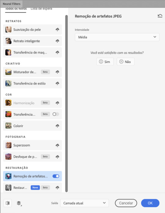
neural filters
se a versão do seu photoshop vem com neural filters (ou filtros neurais), ele estará em filtro > neural filters...
irá abrir uma janela com vários filtros mas o que a gente irá usar vai estar em “restauração”, com o nome “remover artefatos jpeg”. se precisar, faça o download do filtro.
eu recomendo usar a intensidade sempre média, a menos que a foto esteja muito ruim, aí você usa a intensidade alta. mas em geral, a intensidade média ou baixa já dá conta do recado.
a saída deve sempre estar na camada atual, ou seja, na camada da foto selecionada.
assim:
e aqui está uma comparação da foto original com o tratamento feito com o neural filter e depois já com a action suave com desfoque aplicada:

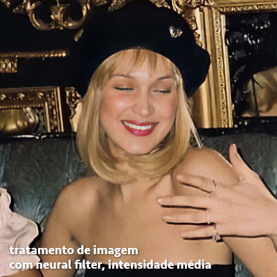

a opção do neural filter é uma ótima alternativa ao camera raw, o único contra é que ele deixa a foto com uma textura áspera, e quando você usa uma action de nitidez eles ficam muito visíveis e acaba não ficando muito legal.
porém, um bom jeito de contornar isso é adicionando ruído na foto. eu uso o efeito de granulação do camera raw para adicionar ruído no icon (você também pode adicionar o ruído em filtro > ruído > adicionar ruído..., mas eu prefiro o camera raw pois ele dá mais opções para ajustar o granulado do jeito que eu preferir).
no primeiro icon abaixo, dá para perceber a textura áspera que o neural filter deixa depois de melhorar a foto e adicionar nitidez; já no segundo icon eu mostro como eu adicionei o ruído e contornei esse defeito.

as configurações de ruído que usei no camera raw foi 12 de granulado, 35 de tamanho e 20 de aspereza.
lembrando que, se você for usar uma action de desfoque e/ou remoção de ruído, não será necessário adicionar a granulação, pois a própria action já vai suavizar a textura do neural filter (a menos que você queira adicionar o ruído, claro).
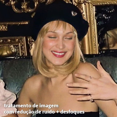
redução de ruído + desfoque
caso a sua versão do photoshop não tenha nenhuma das opções de camera raw ou neural filter, caso você use um photoshop mais antigo, photoshop portable ou prefira usar o photopea, essas alternativas podem ser úteis.
mais uma vez, irei me basear no olhômetro, de acordo com a foto e irei ajustando as configurações de acordo com o que eu quero e acho necessário.
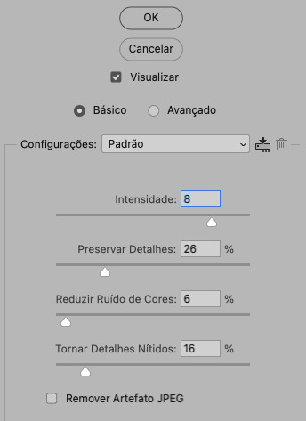
vamos começar com a redução de ruído! ele está em filtro > ruído > reduzir ruído...
na janela de redução de ruídos você verá alguns ajustes que são: intensidade, preservar detalhes, reduzir ruído de cores e tornar detalhes nítidos e vou explicar cada um para que você possa saber ajustar eles de acordo com sua foto:
intensidade: o número de 1 a 10 irá definir a intensidade da luminescência, a intensidade do filtro e o quanto da imagem você quer preservar ou extinguir, sendo 1 o mínimo da intensidade do filtro e 10 o máximo;
preservar detalhes: o número digitado irá definir a porcentagem de detalhes a serem preservados. quanto maior o número, maiores serão os detalhes mantidos na foto, como ruídos, manchas e outras aberrações da foto;
reduzir ruído de cores: o número digitado irá definir a intensidade e reduzir o ruído cromático, ou seja, vai reduzir as aberrações cromáticas, como por exemplo, fotos que distorcem as cores. preste atenção na porcentagem inserida, pois quanto maior o número, menos saturação sua foto terá e poderá ficar com aspecto de foto envelhecida;
tornar detalhes nítidos: o número digitado vai definir a porcentagem de nitidez para restaurar pequenos detalhes da foto. quanto maior a porcentagem, maior vai ser a intensidade dos detalhes da foto. preste atenção na porcentagem inserida, pois se a intensidade da nitidez for muito alto, vai afetar a sua action, seja ela de nitidez ou de desfoque.
sendo assim, para a foto usada eu fiz estes ajustes:
obs.: se você for um usuário mais avançado do photoshop, poderá explorar a opção avançado, que possui as configurações básicas para melhorar a foto e também as configurações para remover ruído das cores primárias (vermelho, amarelo e azul) individualmente. mas, mesmo se você não for um usuário expert, eu recomendo você dar uma olhada nessa opção e explorá-la, mexendo nas configurações e ir ajustando e aprendendo, pois o resultado poderá ficar ainda melhor nos ajustes avançados.
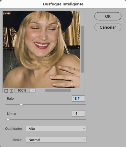
aplicado a redução de ruído, vamos partir para o desfoque! eu estarei usando o desfoque inteligente antes do desfoque de caixa. você vai achá-lo em filtro > desfoque > desfoque inteligente...
na janela que abrirá, você verá os ajustes: raio, limiar, qualidade e modo. vou explicar eles:
raio: vai determinar o tamanho da área que será considerada para o desfoque. quanto maior o número, mais detalhe serão preservados;
limiar: vai determinar a diferença dos pixels entre si antes de serem alterados pelo desfoque.quanto maior o número, maior será a área em que o desfoque será aplicado;
qualidade: vai determinar a qualidade e intensidade do desfoque. ao escolher a opção mais alta, mais partes da foto o desfoque atingirá;
modo: vai determinar o traçado das linhas de bordas que o filtro identificar. o modo normal aqui é o ideal, pois os outros modos “somente arestas” e “sobrepor arestas” irão identificar somente as bordas da imagem.
sendo assim, esses foram os ajustes:
após o desfoque inteligente, partiremos para o desfoque de caixa! ele está em filtro > desfoque > desfoque de caixa...
(você também poderá usar o desfoque gaussiano a depender da foto, mas para esta em questão, o desfoque de caixa funcionou perfeitamente)
a intensidade do desfoque de caixa, assim como do desfoque gaussiano, é medida em pixels e o mínimo é 1 pixel, e para icons é uma intensidade forte, então eu coloco o número mínimo (1, no caso) e depois de clicar em OK e aplicar o desfoque, vou em editar > atenuar desfoque de caixa... e ajusto a porcentagem de acordo com a foto. nessa foto deixei a porcentagem em 33% e ficou ótimo.
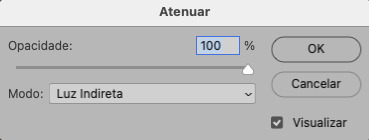
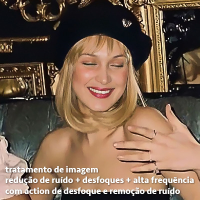
no entanto, infelizmente, por não ser o melhor método para melhorar a qualidade de uma imagem, ela ficará um pouco desfocada demais. mas podemos contornar isso usando o filtro alta frequência para devolver um pouco da nitidez e detalhes na foto. você encontrará esse filtro em filtro > outros > alta frequência...
o filtro de alta frequência, assim como os desfoques, é medido através de pixels e quanto maior o número, mais detalhes passarão despercebidos, ou seja, menos detalhes e menos nitidez sua foto terá. eu recomendo em torno de 2px se você quiser mais detalhes e em torno de 5px se você quer mais suavidade.
a primeira vista esse filtro parecerá estranho e distorcido, mas dará tudo certo, você só precisará mudar o modo de mesclagem. para isso vá em editar > atenuar alta frequência e mudar o modo de mesclagem para “sobrepor” ou “luz indireta” se você quiser que fique mais suave. se preferir, poderá também ajustar a opacidade para os detalhes ficarem mais ou menos intensos.
assim:
assim fica o resultado sem o filtro de alta frequência e com o filtro:

sendo assim, fica a seu critério usar o filtro ou não.
aqui está a comparação das fotos com o tratamento de redução de ruído + desfoque com e sem o uso das duas actions:
5. SALVANDO A EDIÇÃO
e chegou a melhor parte: salvar a edição para postar!
seja a edição um icon, uma header, ou qualquer outro gráfico estático (edições não animadas), a melhor opção é sempre, sempre, SEMPRE, salvar no formato PNG!
o formato jpg ou jpeg não preserva a qualidade original como o formato png preserva. então, sempre escolha esse formato ao salvar suas edições estáticas!
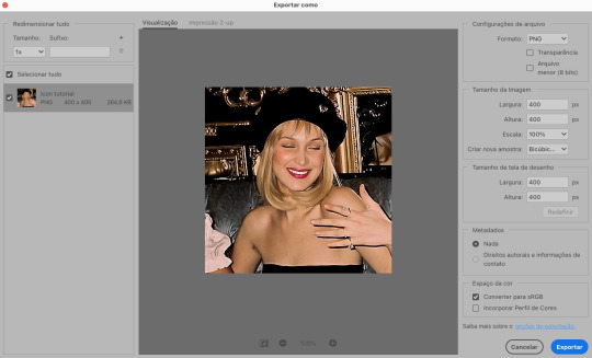
a melhor forma de salvar uma edição em alta qualidade é exportando ela. sendo assim, vá em arquivo > exportar > exportar como...
em “configuração de arquivo”, selecione o formato PNG e desmarque a opção “transparência” se sua foto não é uma imagem com fundo transparente; em “tamanho da imagem” deixe como a altura, a largura e a escola como estão, apenas mude a opção em “criar nova amostra” para BICÚBICO AUTOMÁTICO; e em “espaço da cor” marque a opção CONVERTER PARA SRGB, porque assim, independente da calibração do seu monitor, a foto ficará com as cores originais e não sofrerá alteração.
assim:
no entanto, se você tiver um pc ou notebook lento, ou apenas não tiver paciência para salvar sua edit em exportar, você pode salvar no modo normal, indo em arquivo > salvar como... OU arquivo > salvar uma cópia..., no entanto, se você for usar essa opção, não esqueça de marcar a caixinha para “incorporar o perfil de cores srbg”, essa opção geralmente fica na parte de baixo da janela que abre quando você vai salvar a edição.
6. ACTIONS & RESOURCES
para facilitar pra vocês, todos as configurações de filtros usados neste guia, estarão disponíveis para download em uma pasta de action. para fazer o download é só clicar aqui: ★. já a dupla de actions usadas (a de nitidez & a de desfoque suave) estarão disponíveis para download na lista de dicas abaixo.
dicas de actions de nitidez – premium & gratuitas (free)
lovie potion by @loviestudio [premium]
action #26 by @harupsds [premium]
action #25 by @harupsds [free]
01 action by @harupsds [free]
cherrie by @loviestudio [free]
action #11 by @miniepsds [premium]
face action by @miniepsds [premium]
crispy by @nebulies [free]
scarlett by @l-agallerrie [free]
eight action by @peachcoloring [premium]
bubblegum by @hisources [free]
kendall by @hisources [premium]
hekate by @hisources [premium]
sharpen by @l-agallerrie [free]
#01 action by @buntterflies [free]
dicas de actions “suaves” – premium & gratuitas (free)
teddy bear by @loviestudio [free]
action ten by @peachcoloring [premium]
caelestis by @miniepsds [premium]
fleuriste by @hisources [free]
angel by @loviestudio [free]
action #13 by @harupsds [premium]
action #12 by @harupsds [premium]
wild action by @hisources [free]
outras actions – premium & gratuitas (free)
denoise action effect — remove o ruído das fotos sem perder muita qualidade by @loviestudio [premium]
photopea quality action — action para melhorar a qualidade da foto no photopea by @loviestudio [free]
exclusive hq actions — um conjunto com as actions que foram usadas neste tutorial by @girasois, @loviestudio [free]
denoise and sharpen actions — conjunto de actions para melhorar a qualidade da foto automativamente by heavnsent
7. BÔNUS: DICAS EXTRAS
a adobe cc learn tem muitos tutoriais que você pode dar uma olhada e aprender muito mais sobre o photoshop e outros programas da adobe!
o youtube é outra fonte incrível para você aprender edição no photoshop, lá você encontra tutorial para quase tudo de edição de fotos e muito mais! se você entende inglês, eu recomendo muito os canais piximperfect e brendan williams tutorials.
para fonte de inspirações, o tumblr é o lugar certo! se jogue nas tags para se inspirar e nos blogs de photoshop para ver muito mais tutoriais e muito mais resources.
o blog @looksgreat infelizmente não é mais atualizado, mas você ainda pode encontrar muitos tutoriais sobre quase tudo de edição, e o melhor, todos os tutoriais são em português!!
ainda recomendo outros tumblr brasileiros de resources e tutoriais: @miniepsds, @harupsds, @peachcoloring, @gmfioart, @colour-source, @l-agallerrie, @wasirauhlpsds, @hisources, @opulenceps, @sunshinepsds, e @loviestudio; e no deviantart: jungrainsoul, rockjealous, heavnsent, aureangels e rohdossantos.
8. CRÉDITOS E INFORMAÇÕES
crédito colorings
off hearts + whimsy by @miniepsds ♡
informações
antes de tudo eu gostaria de pedir desculpas pelo tamanho deste guia, mas eu quis abranger o máximo de dicas possíveis para vocês e deixar o tutorial super completinho.
em segundo lugar eu gostaria de agradecer todo o carinho de vocês, isso me motiva muito a continuar. obrigada, de coração!
enfim, é isso! minha ask estará sempre aberta para dúvidas, sugestões, pedidos e mensagens fofas (sempre com educação e respeito, claro)!
#tutorial#photoshop tutorial#tutoriais#tutorials#resources#hq tutorial#tips#useful#ptbr#adobe photoshop#photopea tutorial#tutorial tips#dicas#dicas de edição#dicas de actions#guia completo#guia#guia de edição#guia de edits#edits tutorial#edit tag#masterpost#long post#editing tips#icon tutorial#header tutorial#hq edits
162 notes
·
View notes
Text
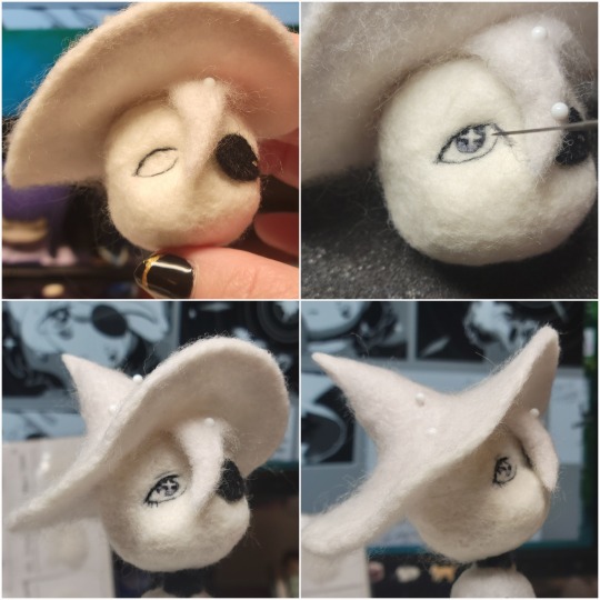
Needle Felt Siffrin Build Log: (oct 6 - nov 20, 2024)


Credits goes wholely to @insertdisc5 for creating ISAT and siffrin's design! I am just here to attempt to make cool fanart (and get more people to play isat.. my devious plans are going great so far :3) As always, this isn't a tutorial- it is just a log about how i go about approaching a sculpture and I hope this collection of resources can help others make their own sifs!!
PSA: this has some spoilers for endgame CGs/sprites on my references image board ( also might see it in the backgrounds of my process pics). And bc this is needle felting, you will see some sharp needles! beware!
my inspiration was the intro cutscene where Sif eats the star, so my main goal was to adhere to the style of ISAT as closely as possible while transfering it to 3D space. And I knew i also wanted to try making the cloak for stopmotion purposes, so my process was tailored towards having control over the fabric with wire inlaid within the cloak (more on that later).
I ended up not sticking eyebrows on top of siffrin's bangs lol but anyways, first order of business is Gather Reference! v important. pureref is free and an awesome program. I also do some sketches to visualize the pose and important details i wanted to include in the sculpt.
behold the isat wiki gallery page! tawnysoup wrote an awesome ISAT style guide that absolutely rings true in 3d space too!! adrienne made a sif hair guide here!! (sorry i couldnt find the original link, but it's on the wiki). It says ref komaeda hair so that's what i looked at, along with other adjacent hairstyles! I also like doing drawovers on in progress photos to previs shapes n stuff to get a better idea of the end result.
Also if you're like me and struggle with translating stuff into 3D space, take a look at how people make 3d models and figurines! sketchfab is also a great resource! I looked at the link botw model by Christoph Schoch here for hair ref. (I used Maya, but there's a blender version too ! you can pose characters too if your model has been rigged!)


Face:
Started off blocking out the main shapes of eyelids and iris, and then filling in the colour details in the iris and the star highlights before moving onto adding thin black outlines and eyelashes. I didn't take many in-progress photos cause i kept ripping stuff out to redo them many many times, sorry!! This eye took about 3 hrs bc i just wasn't happy with it!! Sometimes it do be the vibe to give up, go to bed and see how it looks in the morning (more often than naught, it looks fine and it was the "dont trust yourself after 9pm" speaking)
The Mouth:
Couldn't decide if i even wanted to add a mouth as per usual with all my humanoid sculptures.. but i did some drawover tests first to see what expression i liked and to try to visualize it from multiple angles. (I was also testing the placement of stars on the hat brim here)

And then I redid the mouth like 3 times cause the angle just wasn't right (this went on for about the course of a week yay!)
Hair: woe baldfrin be upon ye
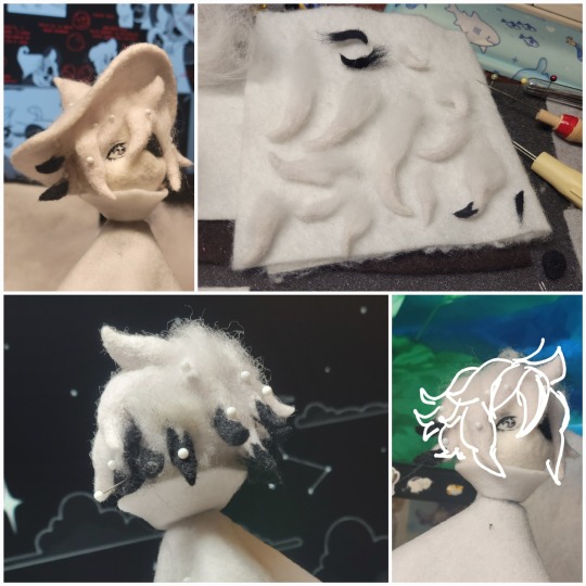
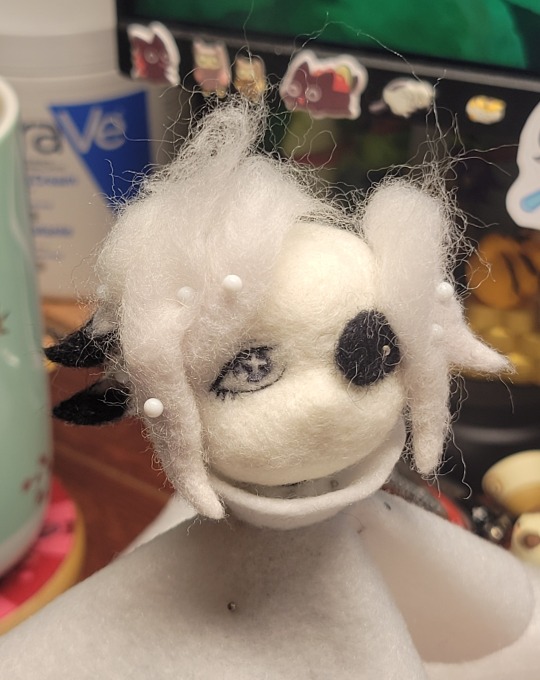
I made the hair strands individually first, and then since Sif has some of the hair at the back dyed black, i covered some of the tips with black wool (manually) (I think it would go much faster if i just took a marker to it, but hahaha i love pain and detailing!! )
And then the rest of it was positioning strands with sewing pins layer by layer, always looking at it from different multiple angles- sometimes tailoring the angle or swoop of individual hair flippies. At one point I thought the back looked too cluttered, but the hat covers a lot of it anyways!! yay for hiding mistakes! (imo this is a similar process to how cosplayers style wigs, but on a smaller scale and the same level of time consuming)
As always, look to your reference for guides, and I always do a whole bunch of drawovers over in progress photos to ascertain what was working and what wasn't.
Hat:
A trick to get a super pointy tip, make another tip seperately while keeping the connection point unfelted, and then combine the two to make super pointy hat!! (this also helps if you made the hat too short and need it to be taller. ask me how i know)

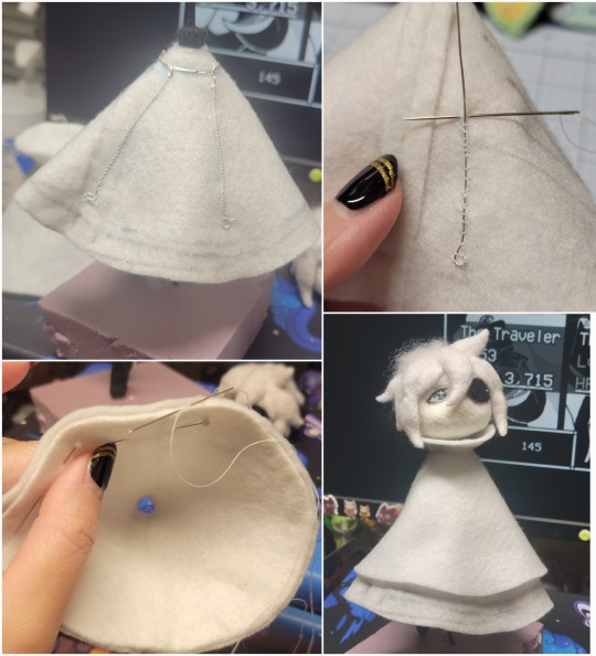
The embroidery on the hat brim was done in a hoop and then invisible stitched to the felted top portion. Technically you don't need a hoop but it helps keep the fabric tension, so you avoid puckers in your embroidery. You can also use iron-on stabilizer if your fabric is loose weave or particularly thin. this is the tutorial i used for the stars embroidery! particularly the fly stitch one, french knots, and the criss-cross stitches. highly recommend needlenthread for embroidery stitches and techniques! i learned all my embroidery from this single site alone.
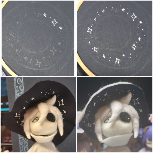
For fabric, I think I used a polycotton i had in my stash,, unsure of the actual fiber content bc i bought it a long time ago. I used DMC Satin floss which was nice and subtle shiny but frayed a lot so it was kind of a pain to stitch with... but keep a short thread length and perservere through it!! After the embroidery was done, I folded up the raw edges and invisible sewed it to the top portion of the hat.
General shape:
Ok general structure of the body is this: wire armature body covered with black wool -> cloak lining & wire cage -> edge of lining is invisibly sewn to the main cloak at the hem -> head

Don't be afraid to mess around with the pattern, it's essentially a pizza with a slice taken out of it to form a steep cone shape!! Use draft paper before cutting into felt to save material! (i think i made like 3 cloaks before i was happy with the shape lol).
You can also hide the seam of the cloak and collars by gently messing up the fibers of the felt with your fingers or a felting needle btw! you can also sandpaper the seams according to Sarah Spaceman in this vid (highly recommend them for their in depth cosplay/crafting builds holy smokes), though since sif cloak is at such a smol scale, I just blended the seam with my felting needle.
For the lining wire cage section, I sewed in wire around the cloak, so the main rotation point is at the top neck area under the collar. These paddles are used to keep whatever pose I need the cloak to be in for stopmotion purposes. Then after the wire is done, I invisibly sewed the lining to the cloak at the hem (same technique as the hat brim to the lining there).
In hindsight, I should've used a thinner fabric for the lining, but i only had sheer white in my stash so had to go with double felt, thus resulting in a really bulky lining but oh well!
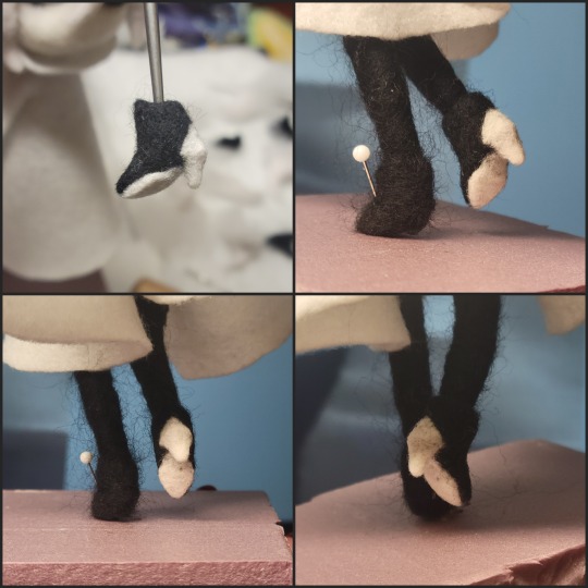
Heels:
started with the general boot shape, then tacking on the diamond shape heel stack and also diamond shape sole bc we're committed to the bit here. I skewer the boot onto the armature which also conveniently hides the connection point into the base to keep the whole thing upright and also I can rotate the boot to tweak the angle if needed.
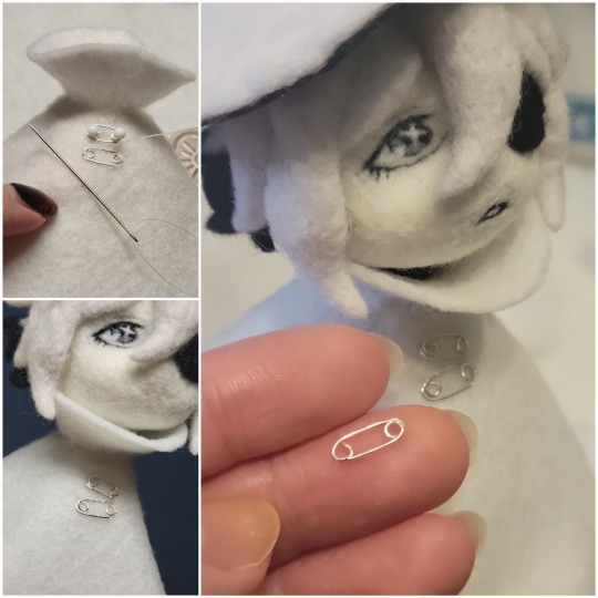
Pins:
I kinda just trial and error'd jewellery wire with pliers into the pin shapes. They're itty bitty!! had a whole bunch of fails before i got two nice ones. A hot tip is to use needle nose pliers and wrap the wire around the tip to get a smooth circle shape!
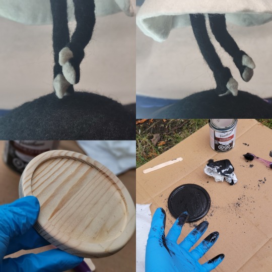
Base:
I smoothed out the edge of a circular wood base with a dremel, and then used wood stainer to get the black colour. It ended up kinda looking like I took a sharpie to it, but whatever.... now i have a whole ass can of black wood stainer........ I then made a rough mountain of black wool and stuck the feet armature in. And now he's standing!!
Normally at this point when I'm done felting everything, to get a smooth finish, I'd take a small pair of scissors and carefully snip away any flyaway fibers, but this time, I just left them fluffy cause i think that's what sif would do :3c
Photoshoot:
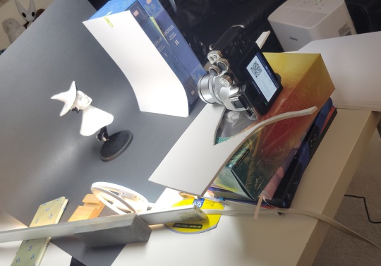
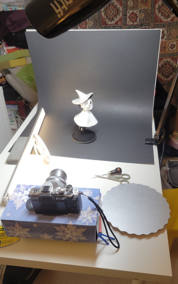
Normally I do shoots using daylight but it was winter so the sun was nonexistent. So I broke out the home lighting setup aka dollarstore posterboard for a nice smooth background, and then hit it with the overhead Fill, side Fill 2, and Rim light, and use white paper/posterboard for bounce light if one side feels too dark. But if things are overexposed, you can move the light sources away until the harshness dims down. I'm using a Olympus mirrorless camera (handed down to me by my sibling so i dont remember the model exactly), which can connect to my phone as a remote so I can avoid shaking the camera when i take photos. Pretty nifty for stopmotion purposes! (yes my camera stand is a stack of notebooks, a tissuebox and some eva foam under the lens, don't judge me)
Stopmotion animation:
I'm still figuring stopmo out on my part, but my process was straight ahead animation ... move the cloak a cm, take a pic.... move another cm, click.... and repeat until i get a version I was happy with. My ref was the cloak animation from Gris (beautiful game btw). The 2d star animation was also done straight ahead using procreate, exported in png with a transparent background, and finally stitched together with the stopmotion footage in photoshop.

My turnarounds are also stopmotion! also secret hack, the turntable is a fidget spinner sticky tacked to a cake platter.
And i think that's all! i mainly wanted to share how I go about thinking about taking a 2d concept and moving it to 3D. I also didn't go in depth into how to actually do the needle felting bc I don't think I''d be very helpful I'm a very good teacher by telling yall to just keep stabbing until it looks right (i'm self taught for this hobby),,, if anyone wants it though, i can share a bunch of tutorials and other felters' process that helped me learn more needle felting!
Hopefully this was helpful to someone! Feel free to send asks if ya got any questions or if anything needs clarification! Or show me your works! I love seeing other people's crafts :3
here have a cookie for making it this far 🥐
#in stars and time#siffrin#isat#isat siffrin#isat fanart#needle felt#soft sculpture#know that i am devouring all the nice words yall leave in the tags/comments of my posts :holding back tears:#I hesitate to call this a tutorial bc this is just how i fumble my way through crafting anything lmao#the only reason I know how long I worked on a project are timestamps on wip photos and however long the day's video essay or letsplay is#sorry time is immaterial when i get into crafting mode#reason why this log is so late is bc after i finish a project i'm perpetually hit with the ray of 'i dont ever want to look at this again'#hence why photos never get edited#AND THIS POST SAT IN MY DRAFTS FOR 2 MONTHS DUE TO BLOODBORNE BRAINROT SORRY#done is better than perfect!!!#sorry i dont control the braincell#sorry for using a million exclaimation points! i am not good at this.. conveying my anxiety in written form!!! my toxic trait
842 notes
·
View notes
Text


i got it!
(og panels below!!)
HAPPY BIRTHDAY SIFFRIN!!! <- i say, scheduling this to post at midnight september 2nd. it’s his birthday somewhere!! and also loops birthday but look i had a deadline here. don’t ask why This of all things is their birthday art. i make normal choices!!!
also. somehow this entire thing only took 4 and a half hours??? insanity. i literally started this Today. thats how it Gets Me i suppose. anyways!!!! here’s the og panels!! no colored version this time, i didn’t think it’d fit the scene. also i didn’t want to render 3 colored panels.


#marshdoodles#isat#in stars and time#isat spoilers#shoutout to the 2 people on discord who immediately wished to be the tutorial sadness when i posted this#honestly . i get it.#we were out all day today and i STILL managed to get this done somehow#i dont think i can call myself a slow artist anymore#part of me wanted to make a happy birthday edit of this in the same vein as the merry christmas edit but#it is. 10pm. and i am sleepy#no cake for him
2K notes
·
View notes
Text


God, I'm jumping in the deep end It's more fun to swim in Heard the risk is drownin', but I'm gonna take it I'm gonna take it 💕
#bucktommy#bucktommyedit#bucktommy gif#vicki's gifs#911edit#adventures in gifmaking#baby's first lyric gifset! lol#dailykinley#loafrunners#911 spoilers#my gifs#911 abc#buck x tommy#bucktommy kiss#evan buckley#tommy kinard#tevan#*gifs#the 20 tommy fans#lyric edit#lyric gifset#lyric gif#911 7x04#911 8x11#911 8x06#911 8x15#gracie abrams lyrics#huge shoutout to abi (tommykinard) and her gif tutorials <3#the coloring is not exactly matching but this is the best I can do rn lol im new to this haha
449 notes
·
View notes
Text


Backing up some stuff from my ipad and I stumbled on the pieces of this Ylfa video I never finished, and... tbh I should, I still like this!! (2023)
#artists on tumblr#dimension 20#d20 neverafter#ylfa snorgelsson#TWO ART POSTS IN THE SAME NIGHT??? UNREAL#(working on smth silly and procreate dreams apparently eats gigabytes of memory for fuel)#(I remember being frustrated trying to edit the video but the actual art is still cool.... maybe we'll like.#look up a tutorial and finish it out!!!)#pic#fanart#babiest girl
539 notes
·
View notes
Text

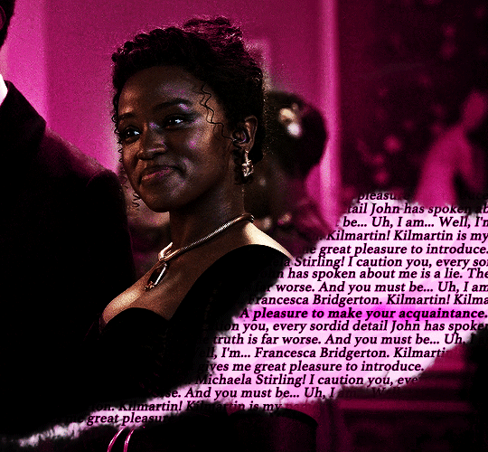
"On first meeting, Michaela presents as a devilish charmer: quick-witted, fast talking, always with a joke. But beneath that exterior is a perceptive, kind, loyal soul. She'll very rarely let you in that deep though, because Michaela knows she doesn't fit into what's expected of young ladies and is afraid of being scrutinized too closely. Crack her exterior even deeper and you'll find a well-concealed sadness about the fact that she hasn't been able to find the right romantic partner with whom to share her loyalty and love." – Michaela's character description // insp. x x x x
MASALI BADUZA as MICHAELA STIRLING BRIDGERTON (2020 - ) 3.08 | "Into the Light"

#tvedit#wlwedit#bridgertonedit#michaelastirlingedit#perioddramaedit#bridgertonblr#dailybridgerton#wlwsource#wlwgif#dailytvwomen#dailyflicks#filmtvcentral#cinematv#cinemapix#useroptional#filmtvtoday#userbbelcher#chewieblog#*m#*gifs#*100#bridgerton#michaela stirling#this doesn't look at all like I planned and even if I went in a different direction I'll put the insp set it needs more appreciation <3#those 30 seconds really got me by the throat asjkdgh can't wait to know more about her <33#edit: added another link it was in my drafts so idk how I forgot to put it here but anyways bless the talented ppl who makes tutorials <3
538 notes
·
View notes
Text

brain rotting about how fucked it is to be a darkner again lately. how do you care about being abandoned by your gods if they never seemed to care that much about you in the first place
#my art#deltarune#rouxls kaard#utdr#this isn’t really what i had in mind when i tried first making this and im still really unsatisfied with how it looks but i need to just#stop and decide when something’s finished haha. i really wish it looked better but im not sure how to begin fixing it so it is what it is#also sorry that im trying to make genuine things with the blue thing. i know its stupid to try making something serious with him 😅#ah edit to the tags also to clarify this is in part based off of a hc i have that rouxls was the tutorial guy before the puzzles were.#rather useless job when there isn’t anyone who needs that guide
749 notes
·
View notes
Text
is this anything
#hi rtc fandom please accept me as one of your own#someone has probably done this before but oh well#i've been teaching myself how to use capcut by editing the rtc slime tutorial#and come to the conclusion that i will never use capcut again#ride the cyclone#rtc#ocean o'connell rosenberg#noel gruber#bagel thoughts
962 notes
·
View notes
Text


jagged, crystalized and pixelated tumblr banner masks!
for the 2 anons that asked!
okay to repost, just dont claim as yours. and free to use (its what they were made for, duh!)
keep in mind gifs dont mesh well with translucent colors if youd like to use these with them :0
#🌫️ i know what you dread | creations#anonymous#carrd resources#rentry resources#rentry#web graphics#rentry tutorial#rentry inspo#rentry gif#rentry decor#rentry graphics#rentry template#image masks#edit resources#editing resources
1K notes
·
View notes
Text
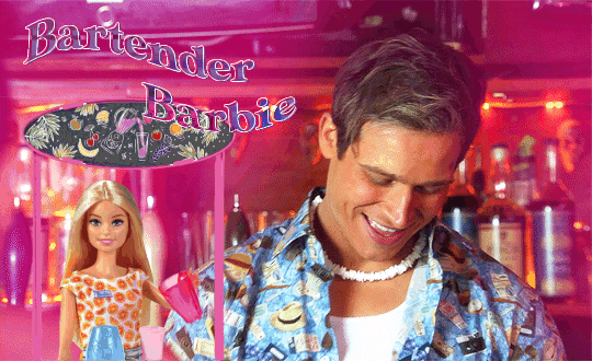
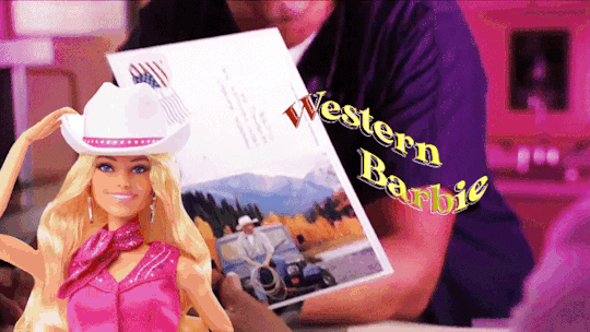


+bonus
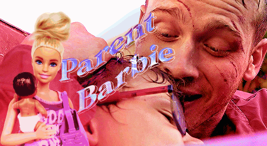
This Barbie is... Evan Buckley
#be nice this is my first gifset that i made using photopea#and i saw like three tutorials only lmao#evan buckley#evan buck buckley#christopher diaz#buck and chris#911 fox#911 on fox#911 abc#911 on abc#911 edit#911 edits#911edit#my edits#my gifs
3K notes
·
View notes
Text

It is really funny to me just how full of cope the vim documentation is
#those keys are fully arbitrary with vanishingly small mnemonic value and you fucking know it#to be clear: vim is literally the only thing I use for text editing#but my partner is learning how to use it and we have been dunking on the quality of its tutorial for hours
359 notes
·
View notes
Note
https://www.tumblr.com/pupsec/777071487795478528/messing-around-with-layouts-and-shit?source=share HOW DID U DO THE COLORINGGGGGG I LOVE ITTT CAN U SHARE PLEASE AND TYY
edit one: removed typing quirks for easy reading since a lot of yall like it. thank u for 110+ notes :)
edit two: ty for ~150 notes. i fixed more typing errors
hi! i am happy you liked it 💗💗😭😭
unfortunately it's something i cannot share because, well, it's something i worked a lot for.
it's not that i dont encourage inspo/asking for help, it's just that with experience you find a style that's unique to you and expresses you!
however, here are some really good overlays i reccomend using for a similar style!
remember to grayscale all of them before you apply a blending mode! that's what i mostly do, no pressure.


example:

if you want a tutorial for how to use blending modes and stuff, and how to mess around with filters, do let me know!
#♡̵ ⠀⠀・ ⠀⠀pupsec ⠀⠀ᜑ⠀⠀💗꣒#♡̵ ⠀⠀・ ⠀⠀edits ⠀⠀ᜑ⠀⠀💗꣒#♡̵ ⠀⠀・ ⠀⠀requests ⠀⠀ᜑ⠀⠀💗꣒#♡̵ ⠀⠀・ ⠀⠀resources ⠀⠀ᜑ⠀⠀꣒#rentry#rentryblr#rentry resources#rentry stuff#rentry graphics#rentry icons#rentry overlays#rentry png#rentry overlay#overlay#overlays#pngs#editblr#editblr resources#editblr help#editblr stuff#editblr tutorial#tutorial#rentry tutorial#editing tutorial#hyacine#hsr#hsr hyacine
196 notes
·
View notes
Text
How do you clip GIFs onto masks?
[PT: How do you clip GIFs onto masks? /END PT]
Right click on your mask layer, click Select Pixels.
Click the Folder icon and then the Raster Mask icon on the bottom right. This should create a new folder.
Duplicate your gif into your project, either by clicking and dragging it into it or by right clicking and duplicating it into your project.
Simply put your gif into the folder that you made earlier and adjust it as needed. (make sure you have the WHOLE GIF FOLDER selected and have AUTO-SELECT OFF! otherwise it'll only edit one frame)
Export it as a gif and you're done.
You CAN do this with images that have faded borders, but it is important to note that gifs will make masks with any fading solid if you export it as a gif. Exporting it as a webp will keep the fading, though.
#𐐪 tutorials and help.#𐐪 from praysia.#𐐪 by praysia.#photopea#photopea tutorial#edit help#editing help#rentry resources#masks#rentry masks#how to#how-to#photopeablr#photopea resources#editblr
362 notes
·
View notes
Note
¿oodrías hacer un tutorial de cómo difuminar el marco de las fotos tipo así, por favor?

holii, ahí te grabe uno. no se si me explique bien, pero de esa manera es muy fácil para mi. solo le pones filtros a una foto de color, los que le puse son para difuminarlos (depende del gusto de cada uno de como ajustarlos) luego le pones la foto arriba y con la flechita de al lado del candado la superpones y ya esta.
(ignoren lo de capcut 💔💔)
si no quieres que la foto quede tan visible, por así decirlo, le bajas la opacidad (lo marcado en rojo)

espero que te sea de ayuda. cualquier duda que tengas, puedes escribirme por aquí o por mi ig 👊🏻!!
#fakeland#rp moodboard#tropical moodboard#kpop moodboard#tropical#kpop#moodboard#random moodboard#argentina#brasil#my edit#photo edit#editblr#edit#short bios#kpop bios#messy bios#messy icons#messy layouts#messy moodboard#instagram#tutorial
236 notes
·
View notes
Text


Hello guys! Today ill make a tutorial on how to use psds! Dont be scared, its really easy and very fun too!

First, open photopea with the image you wanna use. click “File” and press open, after that, you open your files and select your psd!


Great! Now we have the psd! But what do we do with it…?
well, first you need to check that youre on the right layer: Make sure youre selecting your psd folder before doing anything here!

great! Now click “layer” and after that, “duplicate into”

Now make sure you change it to the name of the project you wanna apply the psd to!


Enjoy your edits!
Feel free to send in an ask if you have any questions or something wasnt clear enough! Im always happy to help. See ya!

#⌗ 🍦 ⊹⁺ Marking what is mine#rentry decor#photopea psd#psd#psd tutorial#editing resources#edit tutorial#rentry inspo#editblr#rentry resources
461 notes
·
View notes
Text


Hey look it's my first manga animation. Digging these out from 2020 for @marshmallowgoop!
Fun fact I made the top gif as part of my first semester learning after effects. Immediately decided against making an MMV for my 30 second final. Just the prep work is so time consuming.
#dcmk#motion graphics#my gif#my edit#I honestly don't know why the white in the first gif is darker#and why I'm just noticing it now#I'm 99% sure this was the first time I animated an ink splatter with shape layers#that tutorial is ingrained in my soul I've made so many ink animations
184 notes
·
View notes