#example font
Explore tagged Tumblr posts
Visit Tumblr Blog
Explore Tumblr blogs with no restrictions, modern design and the best experience.
Last Seen Tumblr Blogs


Fun Fact
Tumblr has a 66 index score for customer satisfaction in the US.
Note
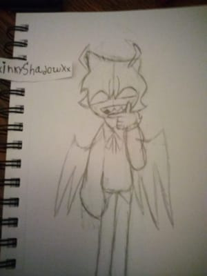
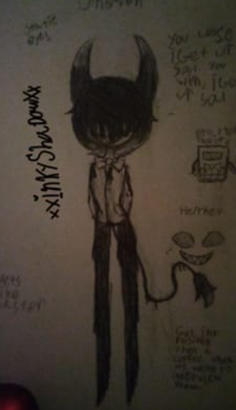
WHEEEEZE
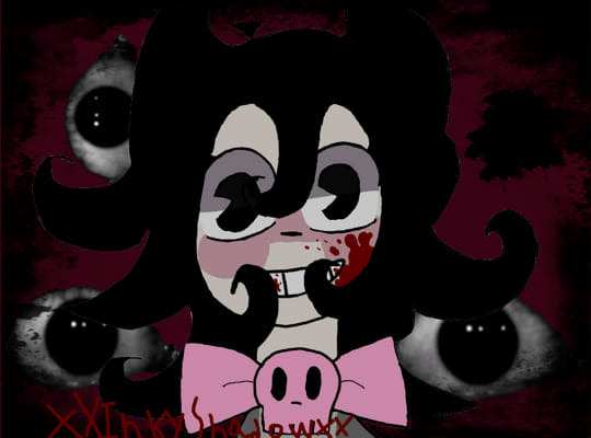
Ofc the body is welcome too, That’s shadow Milks body he needs it XD Lmao

Yeah, the body needs it too (maybe more because he was left working his bottom off).
Thing is, guess he is very possessive, so much he won't even share with himself XD. You would expect them to get along because they are literally the two halves of the same cookie! But nooooo he had to throw all rationality outta the window when around y/n and act like a territorial chihuahua even against himself!
Thankfully, y/n, like a good mediator, reminded both that they shouldn't fight, that they are one and the same, that it's really stupid they are fighting each other, that there is space enough for one more cookie... or the two halves of one. totally not threaten to throw them both out their room so they could sleep and none would get any more cuddles for the night (y/n x good night sleep is OTP fight me)
Previous part (part 2):
#crk x reader#cookie run kingdom x reader#shadow milk cookie x reader#shadow tako#tako milk#everyone gets cuddles yay#i'm a bit jealous of smilk there#you can cuddle and get cuddles at the same time#it's like double cuddling! that's overpowered#both head and body can feel what the other feels like if they were one#like for example if the head bites the body's leg the head would feel it too#i don't know about everyone else but i find this weirdly cute :)#love me some funky fonts lol#i can't draw folds for the life of me dang it :(#reader x good night sleep OTP#hadaldemon answers#hadaldemon art
353 notes
·
View notes
Note
Hi, probably a silly question but how much would it be to get like… just a little gremlin guy as a commission? They are like, the best think known to man, and I’m just curious if that’s possible
Aaaaa using this (very old) ask as an opportunity to show my updated commission sheets !!!! ✨ I do draw gremlins yea !


Updated the link on my pinned post too ! Added mecha to the ok list because hey, I know I will suffer and have the time of my life simultaneously if I ever get asked to draw one
#Commissions#I did draw gremlin comms in the meanwhile I'm sorry I answer this ask so late and I'm sorry if it was the sameperson that did a gremlin com#aaaaaaaa#And I want to be able to draw cool adult art so bad hhdhf#I'm so admirative of one particular artist for that and I want to achieve similar aesthetics/vibes#Example arts are a mix of comms - personal art and some I did for artfight#I'm no graphic designer and I hate doing that in general so the comm sheets may look a bit wonky-#Id rather write everything by hand than spend 100 years looking for a font and fight with the text editor
106 notes
·
View notes
Text
yearly urge to rewatch vnc is hitting... people love comparing noe/vanitas to the most random pairings and its lowkey appalling to me. no way you read abt vanitas, 'a kind child', who would sacrifice his own boundaries for his little brother and be tortured and experimented on in his place, vanitas who became bitter and closed off in continuously failed attempts to maintain some sort of boundary and defense against others, vanitas who when faced with Noe, his closest friend, and the prospect that Noe was going to cross the one line vanitas told him not to and swore he would kill noe if he did, could only sob and shake and collapse right on noe, knife right above noe's throat, barely able to get out 'whats wrong with me? why can't i kill you? i just can't' you didn't watch that and think of getou/gojo youre lying
#no hate to sato/sugu thats just an example...#but someone made a post like 'these ships are all the same just different font' and included vanoe like actually vanoe#and vnc in general has really interesting themes of cycle of abuse and consent that almost everyone on here seems to be oblivious too#please give them their flowers vanoe is NOT just any other ship.#vanoe#vnc spoilers#vanitas no carte
40 notes
·
View notes
Text
ppl on twitter r weird idk bc a lot of the “tumblr prose” they shit on are just,,, examples of prose poetry? i agree w criticisms ab writing that can be too flowery or whatever while lacking actual substance in order to seem more “profound.” still, refusing to be analytical beyond the obvious surface level bc it’s “too dramatic” or “not that deep” just stifles a stylistic kind of artistic expression while adding fuel to the rampant problem of anti-intellectualism. like ya cringe, but cringe imo will always be preferable to whatever soulless ai shit people keep spreading around.
#like let’s be forreal for a second if the tumblr prose was written in an italics serif font yall would be busting everywhere#not to mention most of the posts yall use as examples r from like 2010 or something and shitposts of course they’re dated#just random thoughts idk if this is coherent english isn’t my first language#thoughts#writing#prose#tumblr prose#prose poetry#poetry#nyxposting#yall sound like that lady on the subway who was shitting on girls who like pomegranates idk#writeblr
37 notes
·
View notes
Text
the tumblr blog search original posts option is like my white whale......i truly think thats its the best thing ever. it appears once every blue moon and then it disappears again. why are they doing this.
#theres a reason why i tag all my original posts i like seeing people's original posts and I truly do think that being able to categorise#posts tagged ace attorney and original posts tagged ace attorney (random example) is the best!!!!!!!!#clearly staff can do it but i font get why they cant commit to it apparently.#Al's ramblings#i took a screenshot this time because the first few times i saw it and then it disappeared i thought i was hallucinating
16 notes
·
View notes
Text

Producer 08 by Dedf1sh (©℗ 2013 goodlooking)

#splatoon 2#dedfish#dedf1sh#acht mizuta#octo expansion#art#graphic design#ltj bukem#goodlooking#The original “Producer” series actually lasted until the seventh rendition with Producer 07 by Big Bud!#Dedf1sh continuing the legacy of goodlooking records would be hilariously accurate. I might make a few songs for this cover#When designing this I also realised that the font and positioning of the Producer logo and the general designs of the covers#changed a BIT over the run of these albums#For example#The font for the artist text in Producer 01 (LTJ Bukem) looked kind of funky before they changed it to the expansiva-esque one#Producer 05 also does not list LTJ Bukem as a member of goodlooking records#it just says “rarities” which I carried over!#Producer 03 Producer 06 and producer 07 all have all the text and logos in the bottom left corner (probably because the subjects are#in different places) and the font for Big Bud's artist text on Producer 07 is this strange barely readable 2020's y2k esque font#cool stuff!!
50 notes
·
View notes
Text
Switching to Linux hot take:
Recovering windows users shouldn't switch to a "windows-like" DE. Give them something totally alien like GNOME or Budgie. Likewise, we should recommend ex Mac users KDE or Cinnamon.
Reason: Linux is not the same as those OSes. Its imitations of their interfaces are incomplete, so it will feel like a knockoff.
A new GUI paradigm sets Linux apart in the mind and encourages learning. Then once the user is proficient in customizing their desktop, they can bring back the features they valued in those systems.
#have you ever tried PearOS#as someone who occasionally uses a Mac. its bad#KDE skin with the barest veneer. but basically no research#for example. the macos default terminal is an 80x24 box with exactly 1 titlebar#meanwhile PearOS keeps the Konsole default which is tons of buttons and drop down menus. and the font it way too big#ugh it just. feel is all wrong#this is also true of WinFX btw#mir rants#linux#Linux take#desktop environment
118 notes
·
View notes
Text
do not compare your art styles over the past few years at 3am


Tw for blood and eyes under the cut
A few more i found and either remember being really proud of or really like now


im gonna do a little reblog of this one and add even more of my old art that lowkey went kind of crazy
#THE FIRST ONE IS KILLING ME OH MY GOD THE FONT😭😭#5YRS OF PROGRESS🔥🔥🔥#art#the absolute best examples i could find from each year#art journey#TW BLOOD
22 notes
·
View notes
Text
im seeing that poll about learning cursive in school a lot on my dash and as a vietnamese im kinda bewildered bc what do you mean you cant read cursive?? because to us cursive is for capital letters only! the rest are normal letters. so ig our normal written letters are the american cursive, and our "computer" letters are your normal letters?

↑ these are the fonts we learn in school. The left are our normal letters, the right are our cursive. Oh and the thing is, these are the only fonts we actually taught a school, the "typing" font is just what we imitate from printed books. In elementary school we have "good handwriting competitions" where the participants write in the above fonts and are graded on how close it is to the table above. its like boring calligraphy
#unrelated post#my thoughts#almost all of us are taught these in elementary school and as we grow up our writing style changes#i for example have a mix between the ''computer typing'' and the traditional font above#mostly the typing. but i sometimes write in normal letters inbetween for funsies. i switch between 2 types of s the most i think#i was a good writing participant once! or more like the teacher put me in the trained team for the competition#i think it was not bc my handwriting was good but bc i was an excellent student grade-wise and they dont have better choice
82 notes
·
View notes
Text
kinda want to get my haymitch/thg tattoo BEFORE SOTR but also kinda wanna wait until after in case there's something in particular in SOTR that will make me want a certain detail added / want it on a certain body part / etc?
#probably doesn't make sense but idk#i know i want 'stay alive' but im unsure about placement/font/color/other details#so i kinda wanna wait until SOTR to see if something in particular sticks out to me about that book and influences me#(for example - right now for color i'm leaning towards purple bc it's SOTR color but if what if it's revealed that haymitch has a favorite#color that is not purple? then i'll want it in that color! what if we learn a quirk about his handwriting? i'll want that as the font!)#thg#the hunger games#sotr#sunrise on the reaping#haymitch abernathy#and they said speak now
10 notes
·
View notes
Text
I’m rereading PJO because the new series is coming out on Disney + and I wanted to refresh my memory and I was thinking about Percy earlier and how this kid has so much nerve, like the audacity this kid has, dueling a GOD, the god of war no less. And the way he can almost never keep his mouth shut. Always making silent remarks, making enemies out of being you do not want to make enemies out of. Like, wtf? Idk if this is bravery or stupidity? Probably a bit of both, and that got me thinking, you know who this loudmouth, sassy, sarcastic little shit reminds me of???
Guess.
Neil Fucking Josten.
Oh my gods.
Like.
I remember when I first read aftg, I thought, “huh this Neil kid reminds me of someone” and I could never figure out who, now I know, it’s PERCY JACKSON
They are the SAME character in a different font.
The sassiness? The sarcasm? The nerve? The impulsiveness? The recklessness? The bravery? The stupidity? The quick thinking? The inability to keep their mouth shut? The undying personal loyalty??? To the point it’s a fault????
Even the inner monologues are similar.
No wonder I’m so attached to both of them.
Anyway, just wanted to share my thoughts
Thank you, and goodnight
#percy jackson#pjoverse#pjo fandom#pjo disney+#aftg#aftg neil#neil josten#percy jackon and the olympians#same person#different font#that’s literally it#vega’s shit show#if y’all want some examples let me know#I can find them#goddamn#anyway#I have midterms on Thursday and Friday#wish me luck#fic: make up your mind#andreil#andrew minyard#aftg is basically my religion at this point#late night rambles with a star
95 notes
·
View notes
Text
i keep making covers for fics and then struggling to write them…a new kind of torture
#if anyone ever needs a cover for one of their fics lmk i got you#not that my covers are like stunning examples of graphic design or anything but i like picking pictures and fonts LMAOAOA#roadkill cover my beloved…#this post inspired by the cover i just made for my completely unwritten karasu one shot though KFJDIDJSN IT’S SO GOOD I LOVE IT#m’s thoughts
9 notes
·
View notes
Note
Hiiii ! Hope this blog isn’t dead — I just wanted to ask what the differences were between posts that are tagged Oekaki and Not Oekaki — does it depend on the forum it was posted on, or the art style? It’s a little confusing to me since I haven’t heard this term before. ^^
Hi, the tags "oekaki" or "not oekaki" are how we categorize which pieces were drawn on an oekaki using the java applet drawing programs. Oekakis were online message boards that provided onsite drawing programs for you to draw on, which was often the next most accessible drawing program at the time next to MS Paint.
For the time period we focused on, the only available java applet drawing programs on oekakis were OekakiBBS (basically superceded by PaintBBS), PaintBBS, and ShiPainter. They all had little their little quirks and techniques that are visible on finished drawings drawn on an oekaki. If we can tell from these quirks that the drawing was likely drawn in an oekaki applet, we tag it as Oekaki.
Cy
#asks#for some examples: a canvas size that is square and is in a multiple of 100#most oekakis default canvas sizes were 300x300#and most people would only make it bigger if they planned ahead#other tips off are the font because they only had one font available#colors that values are all multiples of 5 because fine grained color choice was annoying to do#writing out the RGB values of a color instead of hex because oekaki applets cant color pick and we have to remake the colors in applet#lots of dithering because oekakis had their own dithering tool#1 pixel thick biezer lines having extra pixels instead of being smooth b/c its implemented differently than MS paint or other programs#a lack of anti aliased lines because pixel was easier and the programs smoother options were very streaky and hard to use#this is just off the top of my head#no pen pressure for 99% unless you were the weirdo who used shipainter AND had the plugin that allowed pen pressure
16 notes
·
View notes
Text
Maybe I should actually learn how to use fontforge...
7 notes
·
View notes
Text
Halbarry Week Bingo!
We're trying something new this year! This is entirely optional, and just for fun for anyone who's looking for another way to interact with Halbarry Week!
Have some tropes you're expecting or hoping to see based on the prompts? Are you trying to find something for each prompt? Is there an art style or storytelling method you want to throw in as a wild card? Here are the 2024 prompts, and we've included a sample card in the Google Drive link below if you're looking for more ideas!
Please keep Bingo squares to your own actions/reactions (comment on a story; laughed out loud; 🥺) and the work's content (celebrity AU; only one bed; art is a comic). Remember that the creators are your fellow Halbarry fans who are also here to enjoy a fandom event :)
We suggest filling out your card before the Week starts on the 5th. Post your completed card through August 19th, or send a DM that you got Bingo, and we'll give you a shoutout in the wrap up post! Any creations posted, and comments/kudos left through the 19th are fair game!
An example Social Butterfly card is below, where we've included some suggested squares for interaction with Halbarry Week creations. We've also got a version for lurkers looking to stretch themselves, and completely blank versions so anyone who'd like to can participate! See the Google Drive link below for all the templates!
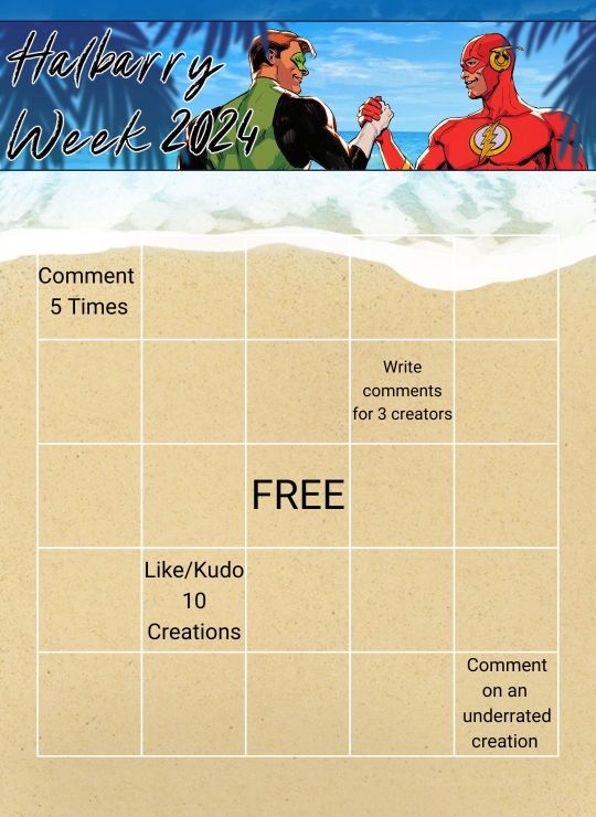
Templates are available as .jpg and .png so you can download and edit them in your image editing software of choice!
#halbarry#halbarry week#halbarry week 2024#We'll post a reminder to post your bingo cards on the 12th!#creators are welcome to participate too!#really interested in seeing what predictions people make!#I used the Roboto font#for anyone who cares about that sort of thing for their own cards :)#based the lurker card on being one for most of my life#will neither confirm or deny whether my fics will check off squares on the example card
15 notes
·
View notes
Text
Hmmm I will Not Be Doing That
#“Use AI to make these thumbnails (words and color) stand out better”#*Looks at the example*#*it messed up the logo#changed the colors and font#and made the words bigger*#I Can Do That Myself
4 notes
·
View notes