#getting back on my reading grind!!!!
Text
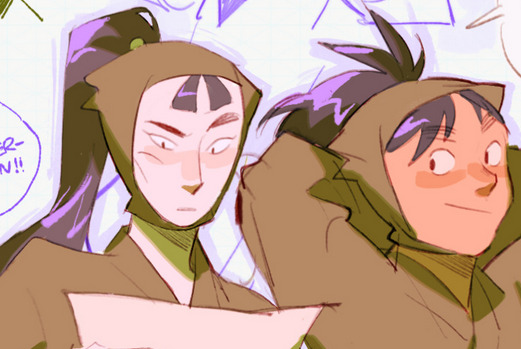
book review: yellowface by r.f. kuang
overall rating: ★★★★★/5
literally it was so good; i couldn't put it down once i opened the ebook on the plane. originally i was reading the vegetarian by han kang, but the ebook download didn't finish (it ended suddenly on a random page), so i started this one!!
synopsis: (cw: anti-asian racism) athena liu is a very famous author. her college friend june hayward is not a famous author (her first book flopped big time). athena suddenly dies and june finds athena's latest unfinished manuscript. after various edits (including to her own name, now "juniper song"), she publishes that manuscript as her own. the story follows the rest of june's story with this new book
this book was literally so good. every other sentence was just this white woman saying some microaggression (author makes it v obvious that she's wrong in a funny way). i was on my flight back home and i just read this book for ~3hrs w/o stopping. kinda feel bad for the guy sitting next to me who saw me make this "shocked but about to start laughing" face i always make lmao
i've always liked kuang's writing! i read the poppy war by her, and it was really good too (started the second book that trilogy but school kept me busy) ((might re-read))
one little thing is that i saw this tweet a month ago that said "it sounds like kuang has an agenda and is just using these characters as a vessel" which doesn't make sense since that's all that fiction writing ... is. alas, sometimes june acted so comically racist that i felt that tweet bounce around in my head, but there's nothing we can really do about that
pls read! and support ur local libraries. this review was sponsored by the libby app /j
#literally it was so good#eee#there were also ppl reviewing it saying that the premise is unrealistic#which first of all#it's not#(there was a recent scandal where an author pretended to die; published a book 'post-mortem'; and then 'magically' came back to life)#so#i feel like rebecca can write about this <3#dash reviews#book#getting back on my reading grind!!!!#tumblasha#actual ihouse#also beware bc there are 'mit' jumpscares in there#two (2) times
6 notes
·
View notes
Text
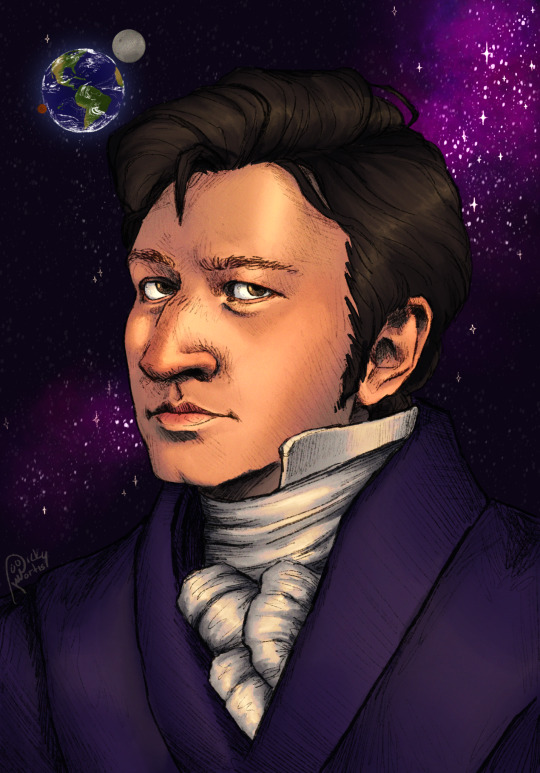
A portrait of Sir John Herschel because I‘m normal about Pulp Musicals
#yall don’t understand this took so long- amongst the five different versions this went through it took a total of 22 hours#and it’s finally done#god I love sir John Herschel#truly THE guy ever#it’s crazy because I started this way back in the beginning of April and finally picked it back up on Wednesday right before they announced#pulp 4 which I’m so fuckin excited about by the way#oh my god it’s going to wreck me I’m so pumped#and now I gotta get ready for pulp fortnight#but yeah I really wanted to draw him and I wanted to try something more elaborate that some of my typical stuff#I was going to do the shit where artists do the shading in greyscale and then overlay the flat colors but I decided fuck that#because I like to enjoy drawing and as I found out I DO NOT enjoy that#also for some reason doing realism and drawing curt is SO much harder than what I typically do#it took sooooooo long to get him down and make it actually look like him#oh hey fun fact about this drawing before I do my fun fact- I used a screenshot of Duke as a reference for this#ok now for a real fun fact#fun fact: Asteroids can sometimes have moons and rings of their own#alright now I’ve got a billion other drawings to go work on because the grind never stops yall#sir john herschel#john herschel#pulp musicals#the great moon hoax#the brick satellite#the ghost of the antikythera#Curt mega#my art#god yall I love pulp musicals#I’m so insanely pumped for pulp 4 it’s going to be the raddest thing ever#EVERYONE WHO IS READING THIS NEEDS TO GO LISTEN TO PULP MUSICALS PRONTO /nf#PLEASE (its on Apple Music and Spotify)
133 notes
·
View notes
Text
The Remains of the Day, Kazuo Ishiguro
#the remains of the day#kazuo ishiguro#i actually feel the opposite#mornings are my favorite part of the day#maybe tho bc work doesnt let me enjoy sunsets anymore#anyway gotta get back on the reading grind#gotta lock in#mine#studyblr#studyspo#dark academia#light academia#booklr#writing#chaotic academia#literature#classical academia
149 notes
·
View notes
Text
it is officially the one year anniversary of hz episode 16, aka THE spinel pokemon episode, therefore!
a redraw of my very first (08/01/23) digital drawing of spinel (*'▽'*)

plus cool overlay hehe

i can't believe it's been a whole year since he got his big episode ∑(゚Д゚) i don't think i'll ever be as excited for any episode as i was for 16
here's to another year of this freak !! maybe he'll actually show up soon outside of a 5 second appearance that sets up him being suspicious just for it to be forgotten for months
og under cut! (old art alert)

#pokemon#pokeani#anipoke#pokemon horizons#pokemon hz#pokemon spinel#spinel pokemon#pokemon explorers#my art#rambling moment up ahead my bad#honestly i've been pretty demotivated when it comes to making hz stuff#i've seen complaints abt hz stuff that VAGUELY resembles the stuff i make (keyword vaguely)#and it. reallyyyy got to me despite the fact that it probably isn't about my stuff at all and that i'm overthtinking it!#but it did stump me for a while until i remembered. Who Cares#my target audience is mostly myself so!#making content for your own enjoyment is much more fun (and easy) than trying to cater to anyone else#life lessons with hershey#which means i am back on that grind! maybe (school starts Very Soon)#anyways! if you read all this i swear i am not usually this much of a loser i've had character development!!#/e wave byebye#sidenote i wanted to make smth bigger since hz16 changed who i am as a person#for the worse i just got way more annoying about spinel after it#BUT..! i had to get this done in one night since i'd be dragged away from my computer until after the ep's anniversary
50 notes
·
View notes
Text
Gonna do two cause I haven’t done them in a while. And because I want to encapsulate the whole goth family

- @Alonesomes, Crybaby
Do I even have to say it or can you see the vision?
This is just very Mihawk. I mean he lives by the blade ever meaningful relationship he has (except perona) is defined by it and he one day hopes to die by it.
You get the sense that he is more sword than person that Yoru is probably his soul made physical form.
And

(I swear I couldn’t find a credit for this anywhere so if you have an idea please let me know)
But yeah this is very Perona and Zoro. I can imagine Perona just telling Zoro all her fears like her deepest fears that she’ll never really belong anywhere and Zoro dumbass that he is will just be like “well you’re here now aren’t you” and down a bottle of absinthe. Like he just has the bluntest form of reassurance it’s honestly so nice. And if Zoro (maybe after he loses his eyes or just after a really bad day) feels like what if l he won’t even beat Hawkeyes what will that make of him then and perona would laugh in his face and tell him he’s still young and the old man’s just gonna keep getting older so who knows maybe sim for his bad hype. And then she’ll paint his nails.
Like they just feel like they would never actually, out loud in the exact words, reaffirm each others dreams or dismiss their fears but Zoro will let Perona paint his nails and do her share of the chores and Perona will make stitch up his cuts and make him a snack and they’ll know.
#I love these emotional stunted idiots so much#you’re honor they are siblings! and that’s their dad#I think it’s interesting that Perona is Mihawk’s only non sword fighting related relationship#I think it add to my belief that Perona represents the more parental protective role of Luffy and Shanks#one piece#quoteoftheday#quote of the day#I mostly do these for myself because I read quotes and I have thoughts but I’d like to be consistent and I haven’t been lately#wil try and get back on my grind💪🏿#goth fam#one piece goth family#goth family#dracule mihawk#hawkeye mihawk#zoro#roronoa zoro#Perona#ghost princess perona#perona one piece#op#one piece thoughts#poetry#poetry quotes#book quotes#siblings
31 notes
·
View notes
Text
heyyy mutuals sorry i disappeared off the face of the earth!! i almost failed like 3 of my classes so. had to get that worked out. but it’s fine now so im back:3
#note i am not a bad student i just made a few mistakes😞😞 i swear i normally get good grades#getting back on my lord of the flies grind in time for the people to start reading the book in school😼
15 notes
·
View notes
Text
every day i struggle to make choices
#i should invest into some kind of education but cant make up my mind#mostly because options suck#i cant do trades unless my body sucks less which is sad because id love to be an electrician#cant even think about getting a pilots license cuz im not passing the med cert#i think id rather die than be a med assistant actually#working clinics at all makes me nervous tbh but probably where im headed in the short term#surgical tech would be cool but i cant do a Real program while working full-time#which is what limits most of my choices#i need to find more paid training programs i guess#if i had to pick a miserable but fulfilling job id go into education itself#but the teaching profession has always been in a downward spiral esp as of late#i dont want healthcare because i hate seeing dysfunctional glorified murder machines grinding around and around endlessly#acute care sucks id rather be in an icu for function but then im depressed because our patients are always dying#it was better as a phleb but this hospital doesnt have phleb and like i said im nervous about clinics#but i need to fucking commit to outpatient phlebotomy i think :/#the most fun ive had at a job ever#i wish i had more widely applicable skills but i cant be an emt/para even just for the training#because half of it is unpaid and the other half you pay for#and again#a job NOTORIOUS for being exhausting dangerous and traumatizing#if i was 17 again and wasnt escaping the tar pit of my mother id go for an english degree and i wouldnt even regret it#thinking about school in terms of a job i have to have forever vs for the sake of learning is so different#id like to know everything. i wanna read and write forever. and do research and have real technical skills that help people#im still riding off of the high of getting 5 ccs off of an oncology patient who desperately needed a port#they were able to run like seven tests off of it#i had to use a couple ped tubes#she only had to get poked Once and barely noticed it bc the doc team came in and im so happy i made her admission that muvh easier#labs are so miserable#checking back on the blood and seeing all of the results came through made me more pleased than anything else in the world
12 notes
·
View notes
Note
how do you get your colors to look so nice and your lineart so red and vibrant? i love it
omg anon thank you!! 😭 im going 2 be honest I am Not Great with color theory... but i like having my sketch pages look cohesive to me...
BUCKLE UP this is going to need a readmore bc i like talking.
I always sketch in neon colors it's a habit i picked up from an old teacher but I'll think of a color usually on a whim and draw with that. and then if i want to draw something else ill pick another color that i think goes well with the page. usually most of my color schemes r analogous (colors right next to each other on the wheel)

yanked this from recent dunmesh post; i kept most of my colors within the pink/red/orange range.
i wouldn't recommend doing everything in monochrome or analogous palettes though because it's sort of a guilty crutch of mine XD.
sometimes when im coloring ill change the layer mode of the sketch. color burn gets you either very very bright or very very deep colors depending on the color of the flats underneath. multiply and linear burn do the same thing but they're a lot tamer and generally always return darker colors. im sure there's some technical bits behind this though. ill either color my lineart afterward to compliment the color of the flats, leave it as is, or mess with layer modes if i feel like it. my favorite trick is color burn + linear burn + some combination of two lineart layers and just fiddling until i get a nice burn effect.
mithrun was done with crimson red on color burn.
coloring... like 999% of this is relative color which is like. kind of the idea that colors look different when placed next to each other. if you eyeball it a bit it's pretty noticeable.

what i used to do a bit ago was i would fill in the area i wanted to color with one big mask of color, make a new layer that has a clipping mask down to the flat layer of color, and then draw my actual flat colors. the color of the mask helped me pick my flat colors bc if I picked a color i think stood out too much next to the mask i could kind of just adjust it until it looked a little more cohesive.

old ish drawing next 2 a canon reference. i ignore local color a lot...mea culpa....but my overall color palette here was a light pink, so the shirt here is actually a desaturated pink? or violet i believe. if you shift sort of that purple color far enough into the gray area of your color wheel it can take on a blueish or even greenish hue. it being next to a lot of warm pinks/fuschias helps.
a neat thing that kind of helps is that if you desaturate or saturate certain colors they can kind of take on a certain hue? not sure if this makes sense. sort of how orange here turns tealish blue the grayer it gets. so if im drawing something that's predominantly orange and i have a blue color i can just take an orange color and desaturate it until i get a color that sort of looks like blue. and that way it kind of looks more harmonious? at least to me XD
shading. i don't apply serious lighting to a lot of my drawings, but a helpful bit is that the shadows tend to be the opposite of whatever color the lighting is? i try to think first about the "mood" or the main color i want to go for in the drawing and then i pick a shadow color opposite of that. so for here, i wanted the lighting to be a coolish magenta so the shadows r lime green. if there's anything off i fiddle around until i get something i like. the shadows on the skin here were too green initially so i shifted them a little more orange.
there's a "band" of color going on between the transition of the shadows to the light. generally this could be for a lot of reasons and i tend to use it differently (core shadow? overexposure? etc etc). but this is a color post so ill try not to go too off track.
but generally digital doesn't "mix" colors the same way traditional colors do if you use RGB (cmyk is a bit better with this but is kind of a pain to get used to), so to make blending a little less muddy, i sometimes add an intermediate color to smooth things out a little. for example, mixing digitally blue n yellow tends to get you gray, but generally, blue + yellow makes green, so if im making a blue->yellow transition ill slap some green color in the middle so it flows a little better.
I do a lot more cel shading nowadays. if you've been on here for a while earlier this year i have another style of coloring but it's not really accurate to how shadows really work so i wouldn't recommend looking at it. it's mostly to add zest and texture to the underlying flat colors.
coloring your lineart does a TON to helping your colors look vibrant, though its like the garnish on a dish to me (same with shadows). i think it's good to try and play with your flat colors and try to make sure those look in order first before adding flourishes. usually ill leave it a dark, saturated color that again matches my overall palette but sometimes i go in and color them by alpha locking my lineart layer and picking a color that matches the flat colors underneath? not sure how to explain it properly.

i used a darkish purple for shuro's ponytail to match the dull red of the flat colors (more relative color! trying to simulate a black/brown while keeping the pink palette there) but a lighter crimson for laios's blond. the light was this super intense like blush pink so i thought it might be cool to add this neon salmon red in the areas of that light to really give off that vibe of a very bright intense rim light.
sometimes you could also tweak with gradient maps or color balance, which adjusts hue based on how light or dark a color is. these r fun to mess with as a final touch but i need to watch using them because they can become crutches real fast XD but those are also just tools to help you. in the end just developing a good sense of how color works and how you want to use it is the best place to start.
LONGASS ramble but yeah. tldr just kind of train ur eye for color and look at what you like best. which is unhelpful and a little sucky but it really is just observation and practice and maybe some personal zest.
happy drawing!
#SORRY THIS IS THE SIZE OF CANADA I YAP A LOT#i like being thorough when explaining myself a lot XD but i think the easiest way to get good with this is just repeat practice n observing#and figuring out how stuff behaves in certain situations and what you like to do and blahblahblah#if you have artists u like that do this well looking at how they use color might be cool#...i feel this entire post is just putting my entire thought process on blast LOLLL.#“eyeball it out” -> study some actual fundamental stuff and or intake new info or art -> apply it back to just eyeballing it out#i dont think i have a natural sense for some basics#but i dont think im naturally one of those people who grind out studies all the time and breakdowns either#i guess i just kind of like knowing the mechanations behind why to do a certain thing or how stuff works and then figuring out#how that translates into what i know nerd emoji#james gurney has a good book on color and light#if you like reading. but its very informative!#quirinahscreams#ask#anon#this is mostly just me talking about how i draw i dont think this is meant to be educational or informative XD um
12 notes
·
View notes
Text

Firepox just doesn't have the same ring to it
Bonus:

#is this something#sorry if quality makes it hard to read#just looking thru some jesper chapters trying to make sure the quotes were right is causing me literal mental illness#also reminding me of inej and jesper's friendship and kaz and jesper's more messed up friendship and jesper and matthias's budding friendsh#which was cut tragically short#also reminding me how much less focus wylan gets in the series as a whole at the detriment of his character lol lol lol#saw the sticky notes i made for the bfwp my brain is back on the grind it has marinated i am ready to write this stupid fucking thing#if leigh bardugo won't write sufficient information about wylan then i fucking will#rn though jesper on my fucking brain.#jesper fahey#kaz brekker#six of crows#soc#tgt#six of crows memes#soc shitpost
20 notes
·
View notes
Text


Rae rae and her bae bae
#raven#rachel roth#garfield logan#beast boy#dc comics#my art#reading these comics helped me get back into the traditional grind#pencil sketch
17 notes
·
View notes
Text

working on another 5+1 fic (this ones already 10k and i'm only at the 1st part). any billy batson fans in the chat.
#ill be back to my nicktoon grind soon i swear#if you want to read this fic when it comes out tho#it's inspired by a natural progression by starkvenger on ao3#i couldnt get it out of my head and immediately had to work on a fic about it#anyways yeah#literally changed my discord pfp from benny (tlm) to dick (tlbm) in celebration of writing a batman fic LMAO
2 notes
·
View notes
Text
have managed 2.6 hours of work being available to me in the 4 hours sitting down TRYING to work i’ve spent at my fucking computer and my paycheck may be suffering but you know what isn’t? chapter 24. positively COOKING on the new chapter + hoping to be done at this pace by wednesday
#pointy objects#ohhhhhh its all happening (writing) (NOT getting paid)#the first half of the chapter gave me more trouble than i was expecting (i was expecting this there was a lot less in the outline compared#to the latter half) but im well outlined and SOLID and soooo excited ITS HAPPENING CHAT!!!#will also be of relatively-respectable length. no 17k word surprises so hopefully beta reading is not too time-crunchy#BACK TO THE GRIND I GO 💪💪💪 (unpaid) (although tbh pointy objects should be my Real job. more valuable than the slop i do now)
2 notes
·
View notes
Text
feels weird to not have much to post, i feel like i basically disappeared off social media compared to how i used to post but. there is simultaneously so much going on (things that are boring/heavy and not fun to post about) and nothing at all going on (i have not been able to play anything very much and havent been watching anything besides random documentaries i stumble across), leading to me having nothing to say lmao
i did finally write down a bunch of hypixel worldbuilding headcanon junk instead of having it only be word-of-mouth between me and ark lol. only 1700 words, i can do better 👍 it was literally only about admin magic, what exactly it means to "hack," what a server is, and limbo kjgfhk. i might make a big post about the limbo section one day :]
#things that arent worth having their own post bc it's boring normal life stuff#I LOVE MY JOB!!!!!!!!! i've only worked one day but i had a lot of fun#and i like my coworkers. im scared of tomorrow tho bc my manager who has been guiding me around isnt gonna be there#so second day in and im already on my own DFGHKJG it'll be fine.........#also I GOT MY DESK ORDERED LETS GOOOOOOOOOOO. SOON I WILL BE BACK ON THE GRIND I WANNA PLAY SKYBLOCK SO BAD#i've only been able to play on weekends or at ark's ;-; pain and suffering i need somewhere to sit#also fun fact. remember how the house was full of mold. well there was ALSO a gas leak for the past couple weeks#my existence is a miracle#im blaming all past behaviors on this. im normal now dont worry 👍👍👍#i think i already mentioned this but my snes power cable is missing and i need a new one Pain And Suffering#on the brighter side of my old games. i found by gbc! AND THE BATTERIES STILL WORK SOMEHOW LMAO#i can finally do a miserable gen 2 shiny hunt yippeeeeee#trying to find my gameboy copy of tetris attack but i dont see it anywhere 😔#uhhhh yeah that's about it i guess. been busy with sorting out work stuff and money problems and Everything Else#currently taking care of health stuff i havent done in years. time for dentist today wahoo#gonna try to get an eye exam soon. it's been like. a decade-#im not sure my vision is still 20/20 im having trouble reading some things digitally#billboards are fine. electronic ones are not those are just smudges#i dont know enough about eyes to know what that could be#chat
16 notes
·
View notes
Text
actually you should always go for it because even if it doesnt turn out the way you wanted at least you tried and now know instead of living your life with what-ifs!!!!!!
#i got onto the positivity side of insta and im loving it godbless love#so i didnt get with my crush. thats ok!!! we're in 2 different stages of our lives and i wish him the best 😛🫶#ill find someone when the time is right and just enjoy my own life for now#anyway i need to read some percabeth fics its been 4 months i miss my bbgs 🤭#i also havent written in those few months so i gotta get back on my grind#esp with summer coming up godblesssssssss#excited#post#erics tag#in another universe we're happy together but in this one im just happy i tried
3 notes
·
View notes
Text
Got bored hunting might be getting back into the orv obsession HAHA
#💭 — ⌗nervo rambles . ★#I forgot I left off in a pretty tense moment#I think??#catching up on the few episodes I missed of the Webtoon and then FINALLY reading past chapter 10 of the novel 😭😭#I didn't read it for like 42 days apparently#my gallery is gonna be a bunch of kdj again 💔💔#I should probably be trying to clean out my storage and gallery but we get back into the orv grind 😼😼
4 notes
·
View notes
Text
grgrhgahahh i wanna read more pokespe but i cant do it on my phone and im not unpacking my stuff until the morning
#this is not a real issue i am plenty entertained rn and also am going to be going#to bed soon anyways. i just am rlly in pksp mood#im in a pkmn mood in general lol ive been reading reguri fics as previously stated#but also i got back into legends arceus earlier today which i havent played in TWO YEARS. which is crazy#and man i fucking loveee playing pkmn i rlly hope they make the next#mainline game not half baked. i didnt get scarlet and violet bcuz of that :(#i had a playthrough of it in the bg but. its not the same#it makes me sad that im not up to date like i dont know any of the new#pokemon i dont know anything about SV's region or characters or story#i want to though. maybe ill get around to actually sitting down and watching a playthrough at some point#i also want to get caught up with pokespe in my reread so my first#experience w SV might be thru spe. which is weird to think about#thats never been the case for me with a pkmn game before#i mean. in terms of just being familiar w the game not playing it myself#i have not played every mainline pkmn game lol#my first one was pokemon pearl. which i never beat. but after that i#got alpha sapphire which i was CRAZYYYY obsessed with. i played that game to the bone til there was#literally nothing left to do other than grind to lvl 100 for the hell of it#pokemon moon is INCREDIBLY special to me for a number of reasons#mainly that it was my first pkmn game that i ANTICIPATED. i remember watching the trailers#over and over. every time they dropped new info i was eating it up. i remember when the starters final evos#were finally revealed i was so excited. and ofc the INSANITY that was the red and blue reveal. good times#but yes i similarly played the shit out of moon til there was nothing left to do. and it was the first one#where i was INCREDIBLY invested in the story. i cared and still care about the alola casrt#soooooo much they were literallyyy my friends. i drew them sooo much. and ofc lillie was one of my#most specialest little blorbos ever. i was in LOVE with her as a kid. it was serious#anyways and then i played pokemon sword which i also love dearly. i beat the main game but i#actually still havent finished the dlc.... but i also care very deeply about the galar cast and drew them a lot as well#and thats all not mentioning from my years long obsession with pokespe lol. but anyways yes#serena.txt
6 notes
·
View notes
Last Seen Blogs

thefandomsfuckedmeup
I Feel Attacked
thefandomsfuckedmeup
I Feel Attacked

scarjogotyourtongue
Scarlett Johansson ♡

mycatsusedtobethenewromantics
ivelovedyou3summers

morganas-destiny
morganasdestiny