#hue and saturation
Explore tagged Tumblr posts
Visit Tumblr Blog
Explore Tumblr blogs with no restrictions, modern design and the best experience.
Last Seen Tumblr Blogs


Fun Fact
25% of US internet users with an annual income of $80-100K use Tumblr.
Video
youtube
Discover the REAL Power of Photoshop 2025's Hue & Saturation Update! #sh...
0 notes
Text
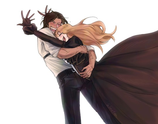
His ass was NOT listening (but he still did phenomenal!)
#team rancher#shipping#solidaritek#rancher hungry hermits stream#guys this was literally so hard to do on god#my first time using clip studio and my first time drawing something again with my non-screen touch pen tablet in literally over six years+#every line was ham handed STRUGGLE and I don’t know any key shortcuts by heart and had to look up stuff like#’where is hue and saturation’ and ‘how to zoom in on canvas’#I felt like I was a billion years old#but I WILL RELEARN and unlock all the possibilities of PC art and ranchers was perfect to force me to TRY#my art#tango tek#solidaritygaming#video#animatic#kinda
1K notes
·
View notes
Text
I just want them to be happy T_T
#limbus company#project moon#my art#lcb heathcliff#lcb catherine#cathycliff#first thing on my new tablet!#colors are soo saturated there and have a lot more red hues#it was kind of a whiplash when i saw how dull and yellowish-green it was on my phone and monitor#anyway i have a lot of cathycliff doodles can't wait to clean them up a bit and post them#turns out it's really fun and a lot easier for me to draw on screen tablets
773 notes
·
View notes
Text

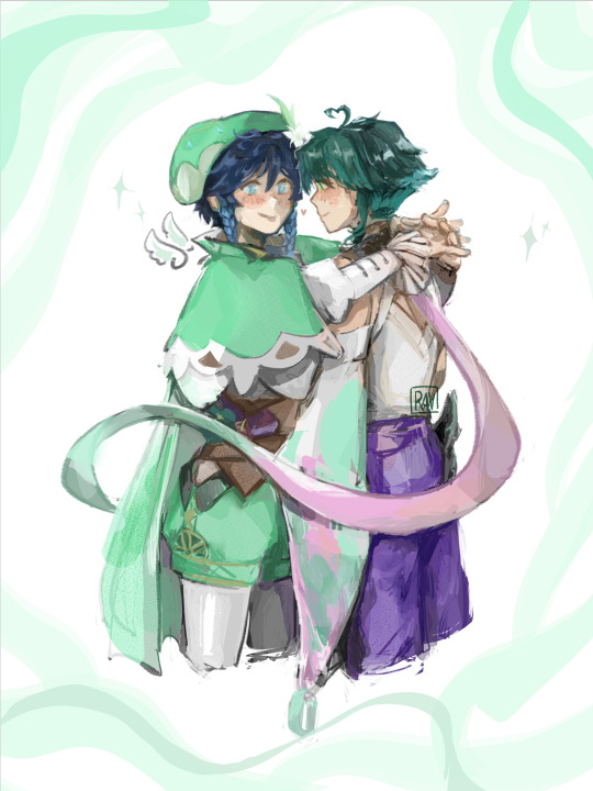
merjune
#every so often i fill a canvas with hyper-saturated pink or red#like nearly to the point of neon#forgetting that the laptop (for final image checking before upload) does NOT have the ability to display RGB at that intensity#which makes the hue-fixing process interesting & difficult because of your propensity for#shrimp colours#(she's based on a betta fish though)#jester lavorre#mermay#critical role#draws#the urge to do aggressive and peculiar things with colour again
285 notes
·
View notes
Text

Another drawing inspired by Kiki's Delivery Service <3
#I had lots of fun with the procreate tools on this one#i was messing with the hues; saturation; AND brightness!!!#very cool ive never done that before.#and the colors present!! With the graph thingy idk what it's called#mdzs#mxtx#grandmaster of demonic cultivation#wei wuxian#wei ying#lan wangji#lan zhan#wangxian#kiki's delivery service au#lan wangji looks so not lan wangji...#who is this stranger...
271 notes
·
View notes
Text
I think 90% of my gripes with how modern anime looks comes down to flat color design/palettes.
Non-cohesive, washed-out color palettes can destroy lineart quality. I see this all the time when comparing an anime's lineart/layout to its colored/post-processed final product and it's heartbreaking. Compare this pre-color vs. final frame from Dungeon Meshi's OP.


So much sharpness and detail and weight gets washed out and flattened by 'meh' color design. I LOVE the flow and thickness and shadows in the fabrics on the left. The white against pastel really brings it out. Check out all the detail in their hair, the highlights in Rin's, the different hues to denote hair color, the blue tint in the clothes' shadows, and how all of that just gets... lost. It works, but it's not particularly good and does a disservice to the line-artist.
I'm using Dungeon Meshi as an example not because it's bad, I'm just especially disappointed because this is Studio Trigger we're talking about. The character animation is fantastic, but the color design is usually much more exciting. We're not seeing Trigger at their full potential, so I'm focusing on them.
Here's a very quick and messy color correct. Not meant to be taken seriously, just to provide comparison to see why colors can feel "washed out." Top is edit, bottom is original.
You can really see how desaturated and "white fluorescent lighting" the original color palettes are.
[Remember: the easiest way to make your colors more lively is to choose a warm or cool tint. From there, you can play around with bringing out complementary colors for a cohesive palette (I warmed Marcille's skintone and hair but made sure to bring out her deep blue clothes). Avoid using too many blend mode layers; hand-picking colors will really help you build your innate color sense and find a color style. Try using saturated colors in unexpected places! If you're coloring a night scene, try using deep blues or greens or magentas. You see these deep colors used all the time in older anime because they couldn't rely on a lightness scale to make colors darker, they had to use darker paints with specific hues. Don't overthink it, simpler is better!]
#not art#dungeon meshi#rant#i'm someone who can get obsessive over colors in my own art#will stare at the screen adjusting hues/saturation for hours#luckily i've gotten faster at color picking#but yeah modern anime's color design is saddening to me. the general trend leans towards white/grey desaturated palettes#simply because they're easier to pick digitally#this is not the colorists fault mind you. the anime industry's problems are also labor problems. artists are severely underpaid#and overworked. colorists literally aren't paid enough to do their best#there isn't a “creative drought” in the anime industry. this trend is widespread across studios purely BECAUSE it's not up to individuals#until work conditions improve anime will unfortunately continue to miss its fullest potential visually#don't even GET ME STARTED ON THE USE OF POST-PROCESSING FILTERS AND LIGHTING IN ANIME THOUGH#SOMEONE HOLD ME BACK. I HATE LENS FLARES I HATE GRADIENT SHADING I HATE CHROMATIC ABBERATION AND BLUR
2K notes
·
View notes
Text


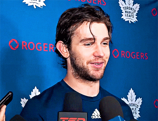

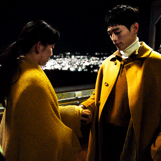
Maple Leafs Media Availability 25.04.08: Joseph Woll
#new colouring and new gif size who dis#leafs#joseph woll#e.gif#i'll always complain about how yellow the lighting is because they made me jump through hoops to make them look less jaundiced every time#bless the hue/saturation and selective colour filters am i right gang#nhledit#hockeyedit
292 notes
·
View notes
Text

oh, to be taken care of
#cabbage draws#little witch academia#diakko#mine#I.MISS.MY.GF#shes just busy lol#and im busy#so well#wow i did this like 2 hrs#longer than i expected but faster than what i thought it would be#im so rusty at drawing lmao#i learned that i grasp 3d better#due to sculpting#but damn it is still a skill i must learn#i still cant color im so sorry about this mess lmao#i tried learning color theory but by god i cannot wrap my head around it#for some reason#i know the opposites the tertiary the complementary the meanings hue value brightness saturation etc#but i cannot put it into practical#when i learn how to color its going to be over for yalls#lmao#obligatory post when i have time cause i will probably disappear for months again
204 notes
·
View notes
Text
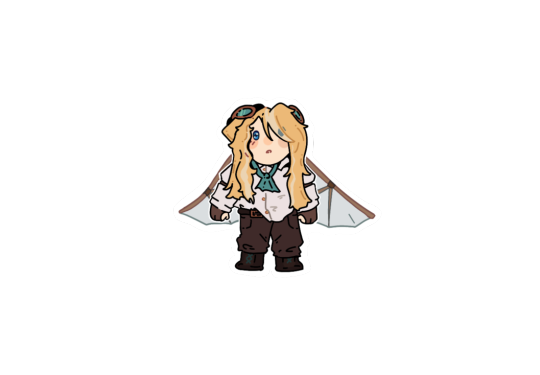
screenshot redraw but the screenshot is um. really blurry lol 😅 but. empires false!

#been rewatching her empires season :3 and just. am i very predictable irt characters i like? yes. but am i happy? yes!#paranoid steampunk amnesiac… save me paranoid steampunk amnesiac#falsesymmetry#falsesymmetry fanart#empires smp#empires s2#empires false#my art#undescribed#also! quick design notes:#e!false has *slightly* wavier hair than her sister and also grows hers out more#also has the lighter streaks in her hair whereas hc!false’s hair is darker + more saturated + cooler hue-wise overall#also i am choosing to ignore both her suspenders and also the fact her shoes are lighter than her pants#though in my usual art style i think I’d keep the suspenders lol. just didn’t know how to fit them into this style 😅
214 notes
·
View notes
Text
Me trying to work on a cover art for my villain Donnie AU and it got out of hand so fast. Next comic part coming soon though :]
#rise of the teenage mutant ninja turtles#rise of the turtles#rottmnt#rottmnt fanart#save rise of the teenage mutant ninja turtles#rise of the tmnt#rise donnie#villain donnie#Aon Au#i am working on the next part but got distracted#might have bullied the procreate hue/saturation slider for this#also hopefully by next comic update ill have a masterpost ready to make it easy to find everything heh#thanks for all the love by the way
2K notes
·
View notes
Note
how do you turn your black line art into coloured line art? trying to get a feel for it but i'm struggling in determining what's the most effective method
i USED to do it by hand but then i discovered this lovely little thang, an auto-action for clip studio paint that just. does it for me. i've been really enjoying the black outer-lines and colored inner-lines lately, so how i've been doing it is like this: 1.) use the auto action on my flat colors layer to create a dark + saturated clipping layer 2.) move the newly created colored clipping layer above my lines....coloring them. i usually spend time tweaking these colors w/ hue + saturation adjustments and manual touchups, but for the sake of a visual tutorial in gif form i didn't here outside of re-adding the white to the eyeshines.

3.) select the line layer and expand the selection by two or three pixels. 4.) reselect the colored lines clipping layer. 5.) use ctrl+x to cut the now selected out edges of the colored lines, showing the black lines underneath

and then from there i'll sometimes add more outlines/drop shadows/ect or change the black to just a very dark saturated color, based on the Vibe. i hiiiiighly recommend clip studio paint + it's awesome auto actions forever because of how much time it saves (also also how fun they are to use)
#tutorial#ask#i hope dis helps i may have overexplained#its rlly just#for me at least#use auto action and tweak it from there#if u do it Manual Style i recommend just coloring the whole layer in a darker and more saturated version of whatever color is most#prominent on the character/object/whatever and hue sliding it from there.#sometimes i go with bright and saturated lines. sometimes i do rlly dark lines. smtmes every part of the piece gets diff lines based on the#color around it#experiment and have fun w it
167 notes
·
View notes
Text

UNDERCOVER HIGH SCHOOL언더커버하이스쿨 (2025)
#kdrama#kdramaedit#kdramagifs#kdramadaily#korean drama#ship inspo#undercover high school#tvedit#tvgifs#usergif#dailyflicks#seo kang joon#jin ki joo#yellow#userxlh#tuservic#tusermona#userharumi#userlab#*#i dont even know what this is i didnt start this gifset like this and i ended up here#i know a hue saturation layer hates to see me coming
123 notes
·
View notes
Text
first attempt at using a graphic tablet wooo :P
#genshin impact#genshin fanart#xiaoven#xiao#venti#venxiao#ravidraws#of course i had to draw them immediately duh#but i was struggling so muchhh.... i need to get used to it and to csp#ive been drawing with my fingers for so long that i forgot how to do it with a pen#the wonders of having opposable thumbs#but the struggle didn't end there oh it did not#ive spent the past forty minutes trying to understand why the colors look dull on my pc yellowish on my iphone and saturated on huawai#i gave up but i have also come to the conclusion that (as many thing are) its all apples fault bc seriously why is my iphones screen yellow#i can deal with the saturation being off but the hue?????? it just pissed me off so bad you have no idea#also i remembered why i hate drawing xiaos hair and got mad at the pen as if it was its fault lol
58 notes
·
View notes
Text

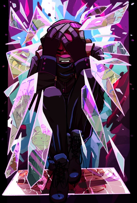
i like her. not sorry
#my art#hollow knight#monomon the teacher#hk monomon#hk monomon the teacher#the drawing process for this was wack to be honest#instead of drawing in my colours like a normal person i split the hue saturation and value into their own separate layers and then-#layer noded them together. might be a good strategy for getting good art out quickly; though#also the ID might be a little lacking because it’s real late at night and i need to go to bed; so please let me know if something should-#-be added!!!
280 notes
·
View notes
Text
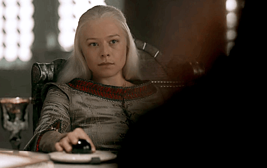
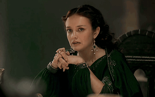
ma'am we're in public, calm down
#rhaenicent#rhaenicentedit#alicent hightower#alicenthightoweredit#rhaenyra targaryen#rhaenyratargaryenedit#house of the dragon#houseofthedragonedit#hotdedit#corporalicentedit#corporalicentgifs#tusergabriela#userclarissa#i was working on how to use hue/saturation feature and i like how this turns out
365 notes
·
View notes
Note
not a request buuuut how do you color your drawings like. the way you do it. how do you decide colors? how do you do tones and stuff and. it’s hard to explain sorry 😞 i just really like the coloring
i didnt know how to explain it so i opened iMovie
#gamezz.txt#I’ve tried to write how i color but tumblr keeps crashing on me :( it’s frustrating because every time I bring up good points#and end up forgetting everything ive written by the time it crashed#i use a main color (usually orange) shade with a color opposite to that. start shading with a dark color.#add colors of all different hues and saturations. blend them together. and idk I forgot everything else#AHH maybe i will do a longer explanation when i can think clearly
965 notes
·
View notes