#i . don't know if the font in the screenshot is too small if so i apologize
Text
August poem !!!!!!!!!!!! I literally wrote this in ten minutes and read it over a grand total of one (1) time so I'm sure it's ehhh but I don't care. I kind of see it as a companion piece to this poem from back in June.
Transcript under cut !!!!!!
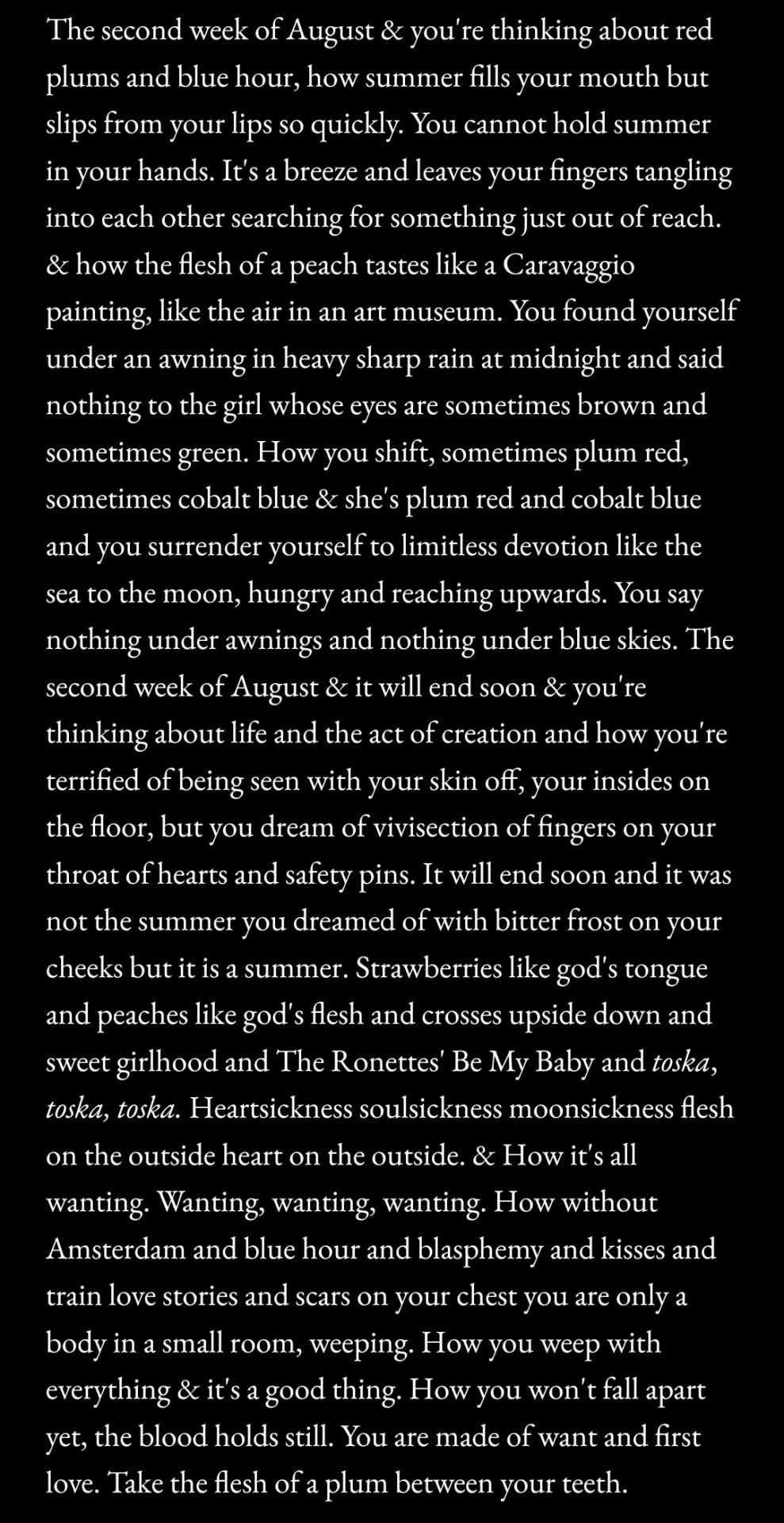
The second week of August & you're thinking about red plums and blue hour, how summer fills your mouth but slips from your lips so quickly. You cannot hold summer in your hands. It's a breeze and leaves your fingers tangling into each other searching for something just out of reach. & how the flesh of a peach tastes like a Caravaggio painting, like the air in an art museum. You found yourself under an awning in heavy sharp rain at midnight and said nothing to the girl whose eyes are sometimes brown and sometimes green. How you shift, sometimes plum red, sometimes cobalt blue & she's plum red and cobalt blue and you surrender yourself to limitless devotion like the sea to the moon, hungry and reaching upwards. You say nothing under awnings and nothing under blue skies. The second week of August & it will end soon & you're thinking about life and the act of creation and how you're terrified of being seen with your skin off, your insides on the floor, but you dream of vivisection of fingers on your throat of hearts and safety pins. It will end soon and it was not the summer you dreamed of with bitter frost on your cheeks but it is a summer. Strawberries like god's tongue and peaches like god's flesh and crosses upside down and sweet girlhood and The Ronettes' Be My Baby and toska, toska, toska. Heartsickness soulsickness moonsickness flesh on the outside heart on the outside. & How it's all wanting. Wanting, wanting, wanting. How without Amsterdam and blue hour and blasphemy and kisses and train love stories and scars on your chest you are only a body in a small room, weeping. How you weep with everything & it's a good thing. How you won't fall apart yet, the blood holds still. You are made of want and first love. Take the flesh of a plum between your teeth.
23 notes
·
View notes
Text
This is my online accessibility (especially image descriptions) masterpost, which I update periodically whenever I find a new resource or guide. I worry this has the side effect of looking overwhelming in scope, so if you're learning about IDs and/or Tumblr-specific accessibility for the first time, I recommend you start with the first five starred posts. All post titles are clickable links!
*Why and how to write image descriptions (with examples linked)
*Accessibility on Tumblr for new users (has templates, also talks about how to tag for flashing lights to accommodate photosensitive folks)
*I see an image and want to describe it: a step by step guide
*Fanart-specific and Tumblr-specific advice for image descriptions
*How to describe screenshots of tags
Why a short ID is always better than no ID
I want to make my posts more accessible, but can’t write IDs myself: a guide
Google Doc full of template descriptions for memes
Online image to text converter
Describing skin tone and describing hair (heads up that the posts themselves are undescribed and were written with fiction writers in mind; potentially still very useful)
How to remember to write descriptions (spoiler: by putting yourself in situations where you see descriptions more often)
Related, a Google doc of described blogs (almost all the blogs linked earlier in this post have tons of described posts and resources too)
(In my opinion, writing IDs is easiest to learn by doing — but especially if combined with watching other people do so. So follow some described blogs!)
Why not to put image descriptions in small fonts/italics (also, some non-definitive thoughts on IDs vs alt text, and why "both" actually makes sense as an answer in many cases)
More on IDs vs alt text from a visually impaired Tumblr user
Alt text vs IDs vs Captions with examples
Brief Intro to Transcripts/Video Descriptions
The People's Accessibility Discord sever (a very friendly community for crowdsourcing image descriptions)
How to make your blog's colors visually accessible - one of the easiest thing on this list!
Other easy things: show love to artists who describe their work, edit descriptions into your original post when someone provides one in the notes, and copy-paste inaccessible (eg, small text or italicized) descriptions as plain text when you reblog!
Lastly, and maybe most importantly, how to continue writing image descriptions while avoiding burnout.
Let me know if any of these links break! I personally don't describe nearly as much audio/video (got those audio processing issues), so this list is sparse on those resources, but if anyone has good guides/blog recommendations for that too, feel free to add on!
554 notes
·
View notes
Note
kasperia character journal please? 👀
Hi Romeo! Sorry this is a lil late (days later edit: now a lot late), time kind of stopped functioning for part of Friday, hahhh . Anyway some good luck on this one being the only one I have screenshots from while my laptop hangs between this world and the next! (days later edit: it's actually dead forever) Anyway, this was admittedly a bit of a cheat because it is a tabletop character journal, but it's a WIP to me and I like working on it. Counts!
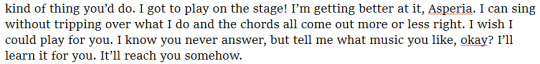
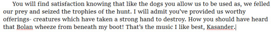
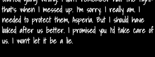
Anywayyyy. I don't think it's actually been said on Tumblr at this point, but Kasander and Asperia are two parts of a dissociative identity disorder system (I don't know if this is too jargon-y an explanation...?). Not the only two, but the two who interface the most with the outside world and in some ways have the strongest feelings about "Asperia's" life. In tabletop, their journal is how they communicate with one another to mitigate the effects of losing time and to get some sense of coordination with what they're doing. On a meta level, it helps me track what each of them knows about game events and how they feel about each other (and any other alter who adds something to the journal). Relationships within the system aren't really something that generally makes sense to externalize into regular RP. The journal is a helpful way to develop that running self-exploration side plot without derailing what's happening in session.
It's been a really fun exercise in character voice. I love writing epistolary type stuff- Carmen's mission report character journal was one of my favorite parts of playing her back in 2019- so it's been very relaxing to me. Excited for our hiatus to end to gather more material for it. I've gotten a little off track from some original plans though- one significant concept I'd had going in was that Kasander's parts of the journal are written as direct letters to Asperia, while Asperia's were supposed to be written as a diary as if the other pages didn't exist. Stubborn willful ignorance from someone struggling to come to terms with their reality. Unfortunately, it's very fun to write things that are a little bit more communicative ^^;; I'll probably have to rewrite pieces of recent parts of the journal to be a bit more in line with that intent before adding the next chunk to our party's notes drive. Not a lot room to develop the twins' relationship over time if there's not much distance between the start and the end, after all.
With that said, some of the direct exchanges are very fun. Pros and cons.
It's also fun to think through what's tracked and what's omitted (intentionally or unintentionally). Kasander loves describing the cultural experience of a location but carefully skips mentioning having actually spent money on things. They're always on thin ice with the funds. Asperia keeps (mildly exaggerated) accounts of personal achievements but completely skips over failures, especially failures that involved injury to the body. She needs to communicate a sense of superiority- something that certainly works when Kasander apologizes profusely any time the body is hurt under their care.
(yeah it seemed like a good idea at the time to use a more "handwritten" font for the final thing but I've been having A Lot Of Regrets)
I unfortunately don't have a screenshot, but the journal has also had one small addition from Paracelsus as well. It's just a to-do list of ways to organize and restock the crafting supplies. Very typical of them. Asperia thinks he wrote it, like everything Paracelsus writes.
Also fun to get to work in some in-world explanations for things that raise some meta questions, like not having some items that I need for my character concept (I ran out of starting equipment budgettt). This bit is also consistent with the pattern that Asperia avoids referring to Kasander by name.

How common the two of them actually sabotaging each other's possessions is has yet to truly be established, but it is an aspect of what the party thaumaturge refers to as their "feud."
Pros over BG3: they are aware of and communicating each other, and they didn't have to have five near death experiences for it to happen. Yay!
Cons over BG3: lot more hostility from Asperia persisting past that point. Kasander did in fact ruin their life a little.
#I feel like this has a silly amount of explaining shit that has nothing to do with the actual thing. a thing that was itself a cheat. sorry!#on me for never finishing the character info post I meant to a month ago#at any rate 'asperia coping poorly' is a consistent theme between pf and bg3. asperia exists to excel in one environment#and it's a good thing that asperia excels in that! they've done a lot to make sure the system has survived all these years.#but being removed from that environment is hard. and so much of asperia's existence has always hinged on filling the gaps#being 'asperia' completely#knowing beyond a shadow of a doubt about kasander is terrifying.#still: they exist to protect one another. they always have.#is this still a tag game or is this now an ask game... god#tag game#ask me emithing#kasander#asperia#paracelsus#(mentioned. counts.)#baneschosen#sorry if you were searching for ye olde gate game it's uhhhh in a different ask. I've given up on posting them all at the same time#in favor of the goal of 'post them whenever so the anxiety doesn't win'#this draft was written in entirety a bit ago and I'm not fidgeting with it anymore. hopefully it's semi-coherent if not... whoops?#scheduled post#I think I lost the plot on how long these were supposed to be and this is way longer than it should be
10 notes
·
View notes
Note
hiiii mel <3 i’m.. thinking of starting to write for nct.. mostly jaemin.. and i more or less have an idea for formatting but it’s been a really long time since i’ve had to do graphics for fic’s (like the banner and stuff!) and i was wondering if you had any tips for that? like where to find good pictures (solid backgrounds seem like the best choice for not clashing with the lettering, a problem i ran into unfortunately…) and also is there any particular place you get your fonts from? if you aren’t comfortable answering that (or any of this!) then that’s totally ok and feel free to just give general advice or ignore this completely :]
now i leave you with renjun… https://www.instagram.com/reel/C117-m9JGuo/?igsh=aXI1YmZ6M2YycHg1
hiii! under the cut!
so you've already got a good idea with using solid backgrounds for fic headers to make it easier for the text to show up! i source pretty much all my images from the groups/idols' official social medias. i just caution you not to take screenshots of say, instagram uploads, because this will degrade the quality of the image. either download it from twitter or wherehaveyou, or from an updates account like neocatharsis or wayvment here on tumblr! another word of caution: DO NOT DOWNLOAD TEASER IMAGES/PHOTOSHOOT IMAGES FROM CONTENT CREATORS WHO MAKE EDITS TO THE IMAGES, SUCH AS CHANGING THE COLORS, UN-WHITEWASHING, ETC., WITHOUT THEIR PERMISSION. THAT IS THEFT FROM OTHER FANS. updates accounts like neocatharsis and wayvment simply reupload the original images posted by the entertainment company/idol in the exact same form without making changes to them. editors make alterations to the image and that new image is their own creative work, separate from the original one posted. you need the editor's explicit permission in order to use their edited version as a fic header.
i do all of my editing on my phone for my fics (except for the thin section dividers that i use, which i make in pirated photoshop cs6 so i can get specific dimensions, 540x2 pixels, and make the gradients super quick in a way that i know how to do. there may be a super easy way to do this w an app on ur phone too, that's just how i know how to)
anyway, if i have a photo that i really like, that i just knowwwww matches with the image of the guy in the fic in my head or smth, that i just rlly want to use but has a busier background, sometimes i'll use the portrait editing settings on my phone to blur the background a little bit and that makes the text a lot more legible (i have a samsung but im 99% sure iphones can do this too)
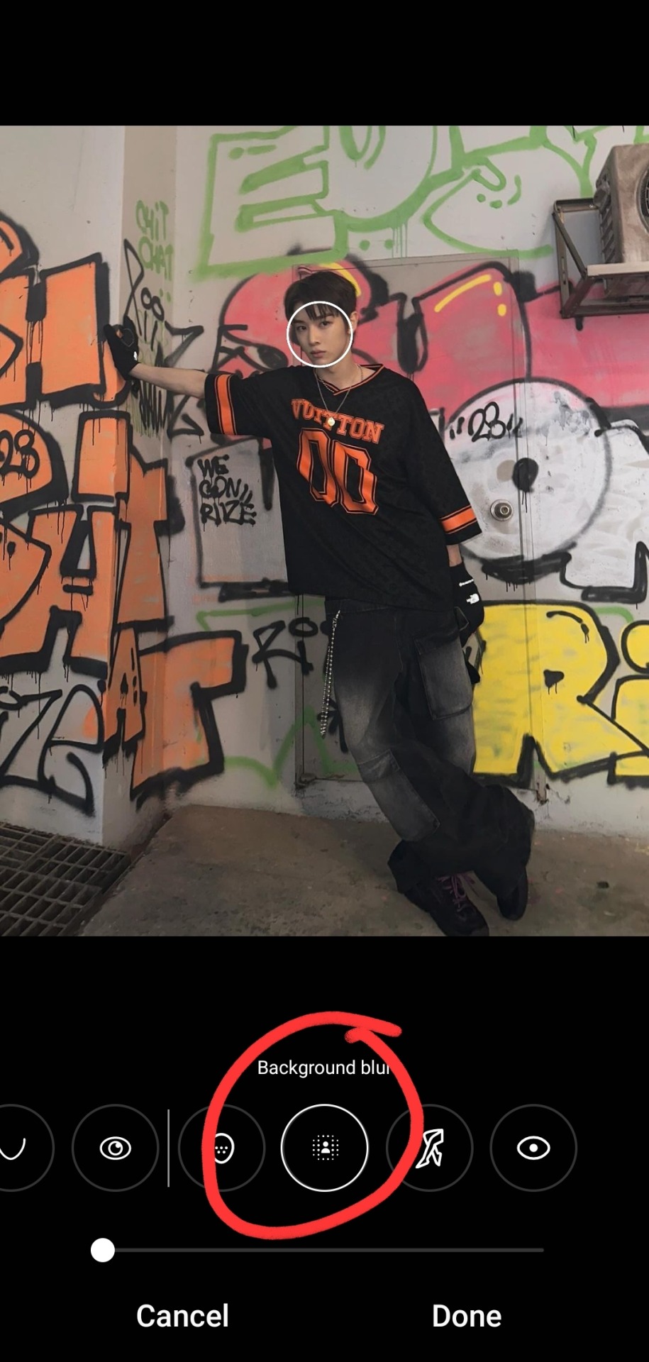

i typically don't bump it past 1 or 2, or the edges of the blur start looking a bit harsh, and i find that i don't really need more than this for the text to pop against the background anyway!
as for putting the text on the photos, i've the used the app phonto for years! it's completely free, doesn't put any watermark on your photos, comes with a bunch of fonts pre-installed, isn't super ad-heavy (it has a rlly small banner ad all the time at the top, and only shows u a skippable 10s ad when u save a finished photo), and you can download fonts from the internet to install straight into the app!

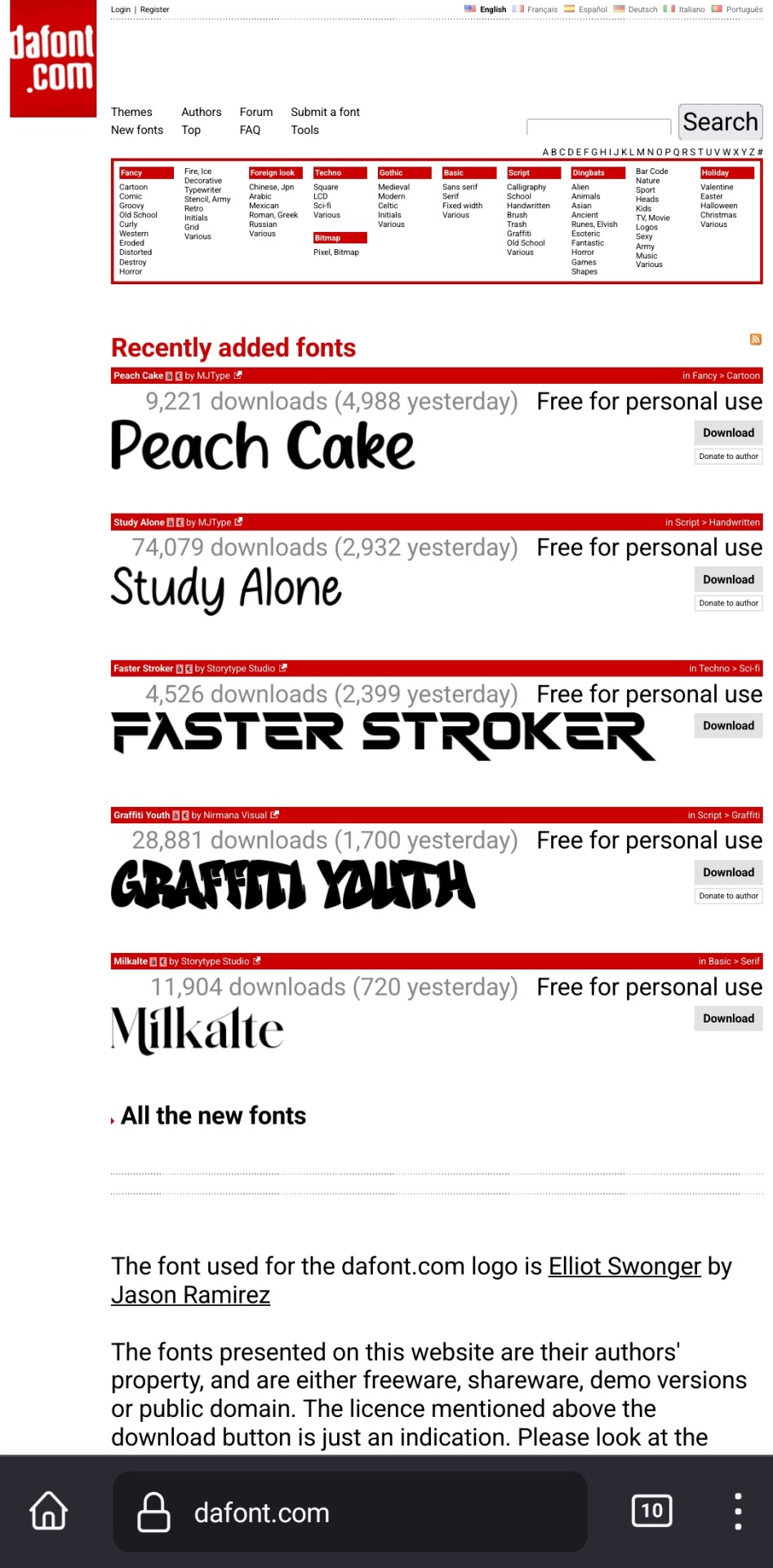
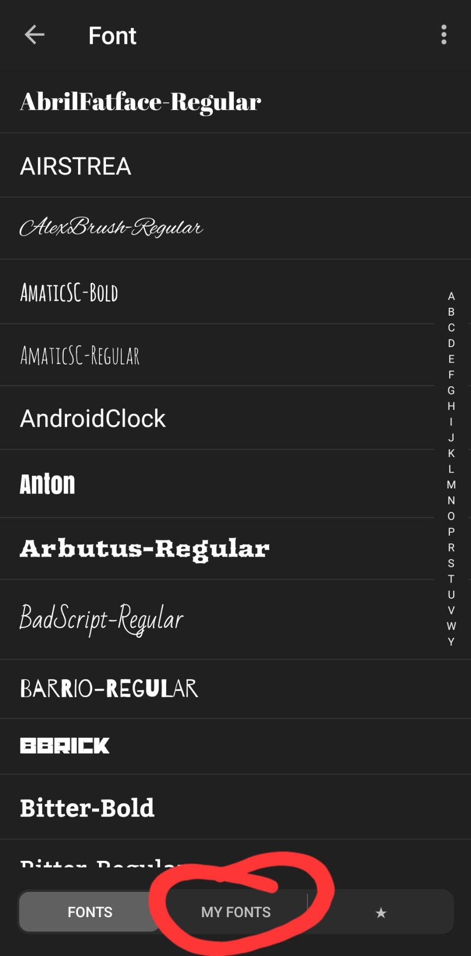
my favorite free font website is dafont.com, i literally will spend hours just browsing on there looking at fonts to download lmao. anyway here's how i find fonts for stuff and download, install, and use them with dafont and phonto:
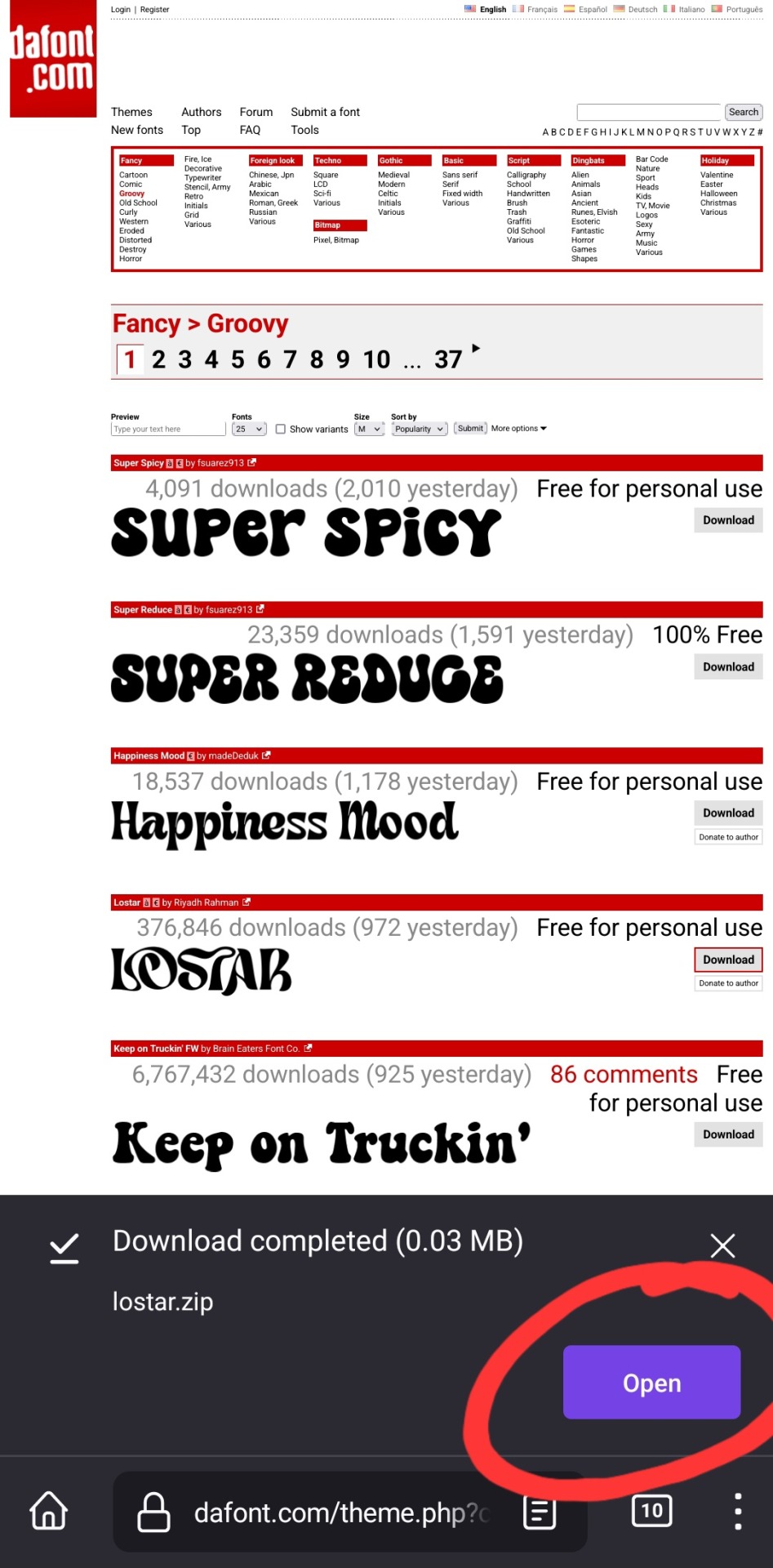
once you have phonto downloaded, open dafont.com
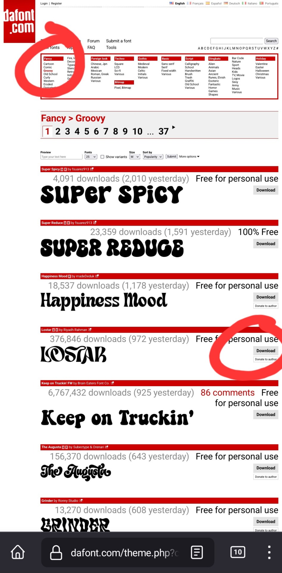
up at the top, it has a bunch of different categories of fonts. for this example, i chose fancy > groovy, and then on this first page, i liked this font called "lostar" (there's also a search bar up there, but it only searches font names, not kinds of fonts, so if you're looking for a groovy-feeling font and you searched "groovy," only fonts with the word "groovy" in the name would come up)
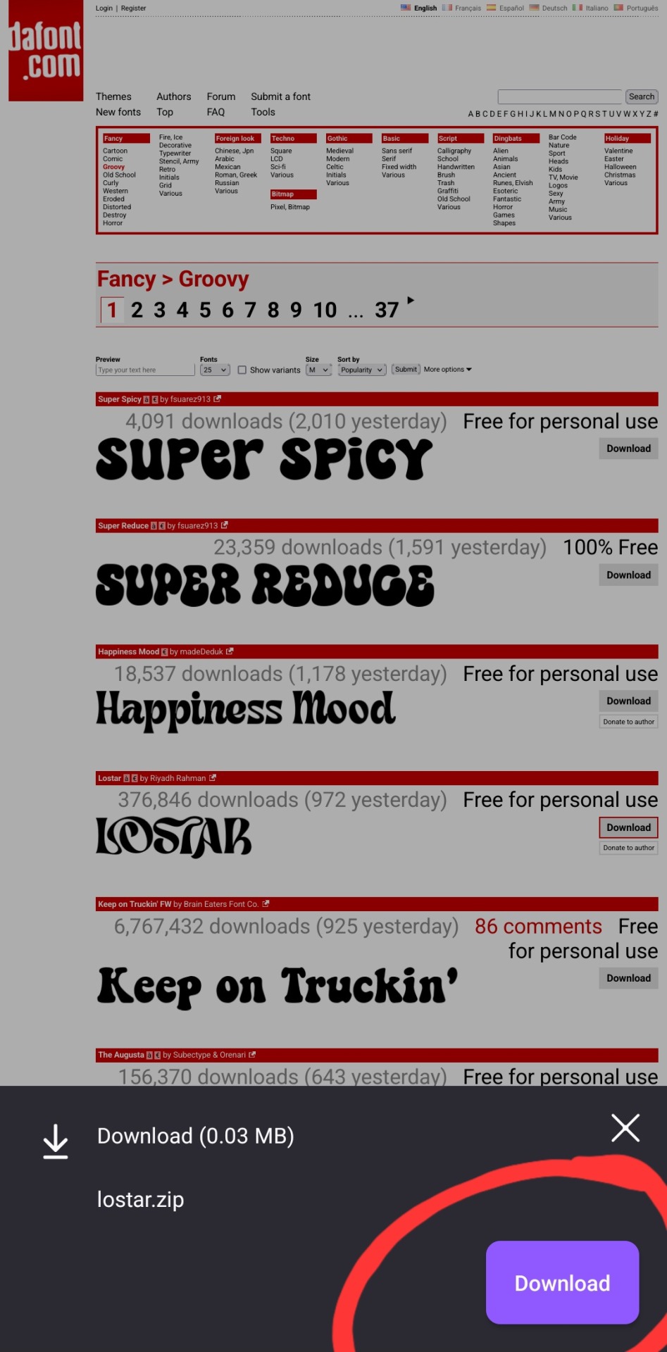
i then press download, and open in my browser (i use firefox btw, which is why it looks like this lol). make sure you're opening the .zip file with the phonto app (it opens directly into into phonto on my phone, you may have to choose to open the .zip file using the phonto app from several options, instead of your phone's file explorer or some other app on your phone)
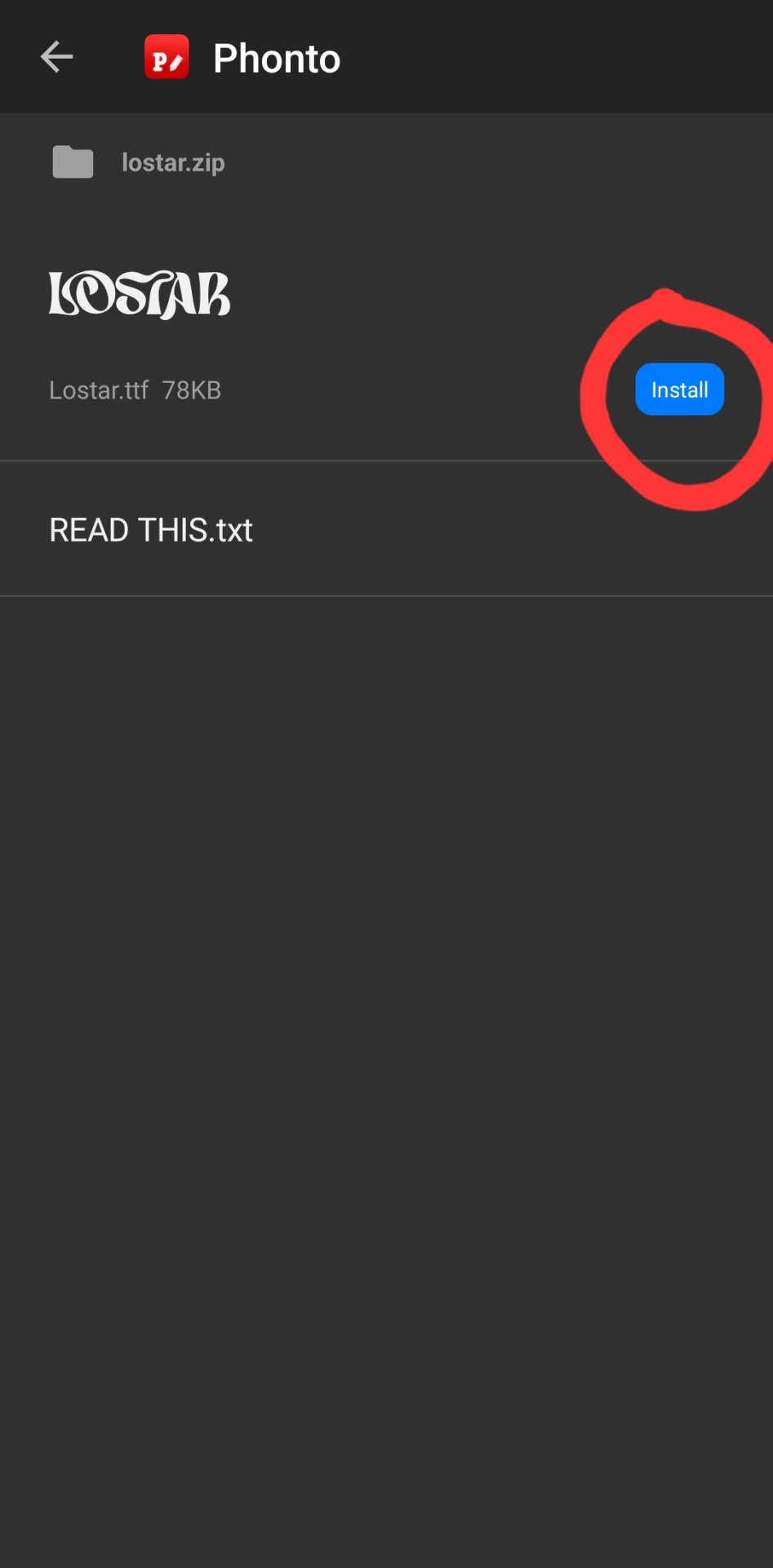
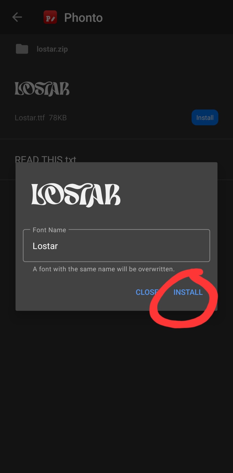
in the phonto app, you have to click install, then install again (it gives you the option to rename it, but i just keep the original font name bc why would you rename it?).
that READ THIS.txt file is a message from the font maker, it's the personal use license for the font (most of the fonts on dafont.com are free for personal use ONLY, and these .txt files that are contained in the .zip files are notes from the font makers telling u what u can and can't use the fonts for. generally, as long as ur not a business, u should be good this is not legal advice, please read them. also there's usually little thank you notes from the font makers in here as well!)
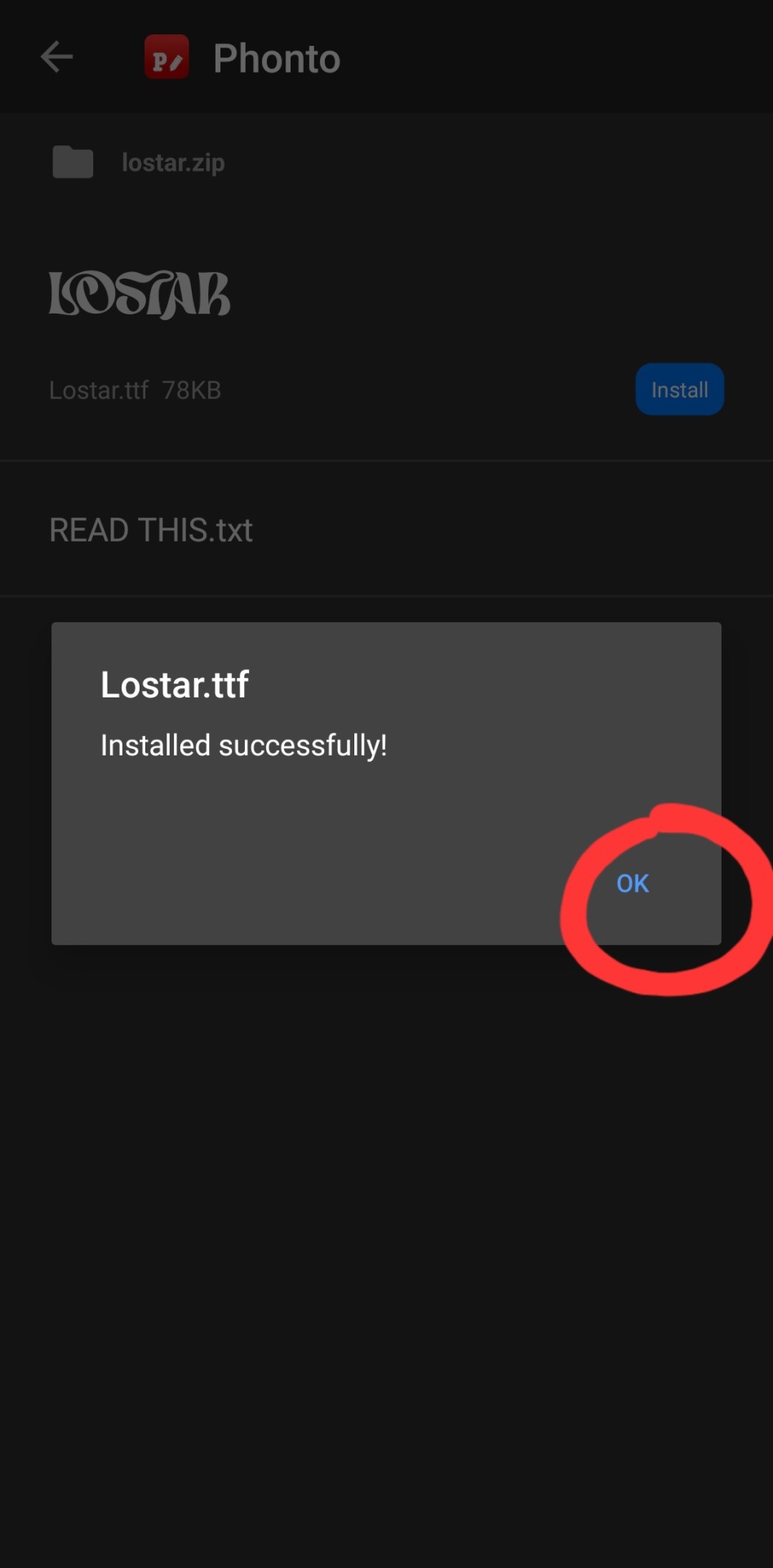
click ok.

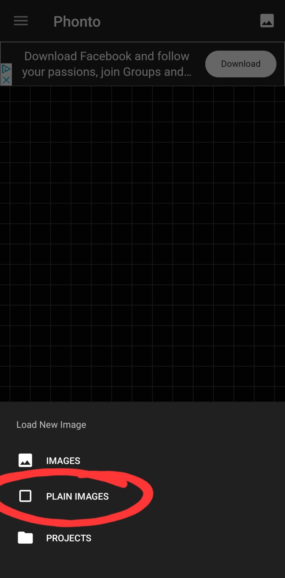
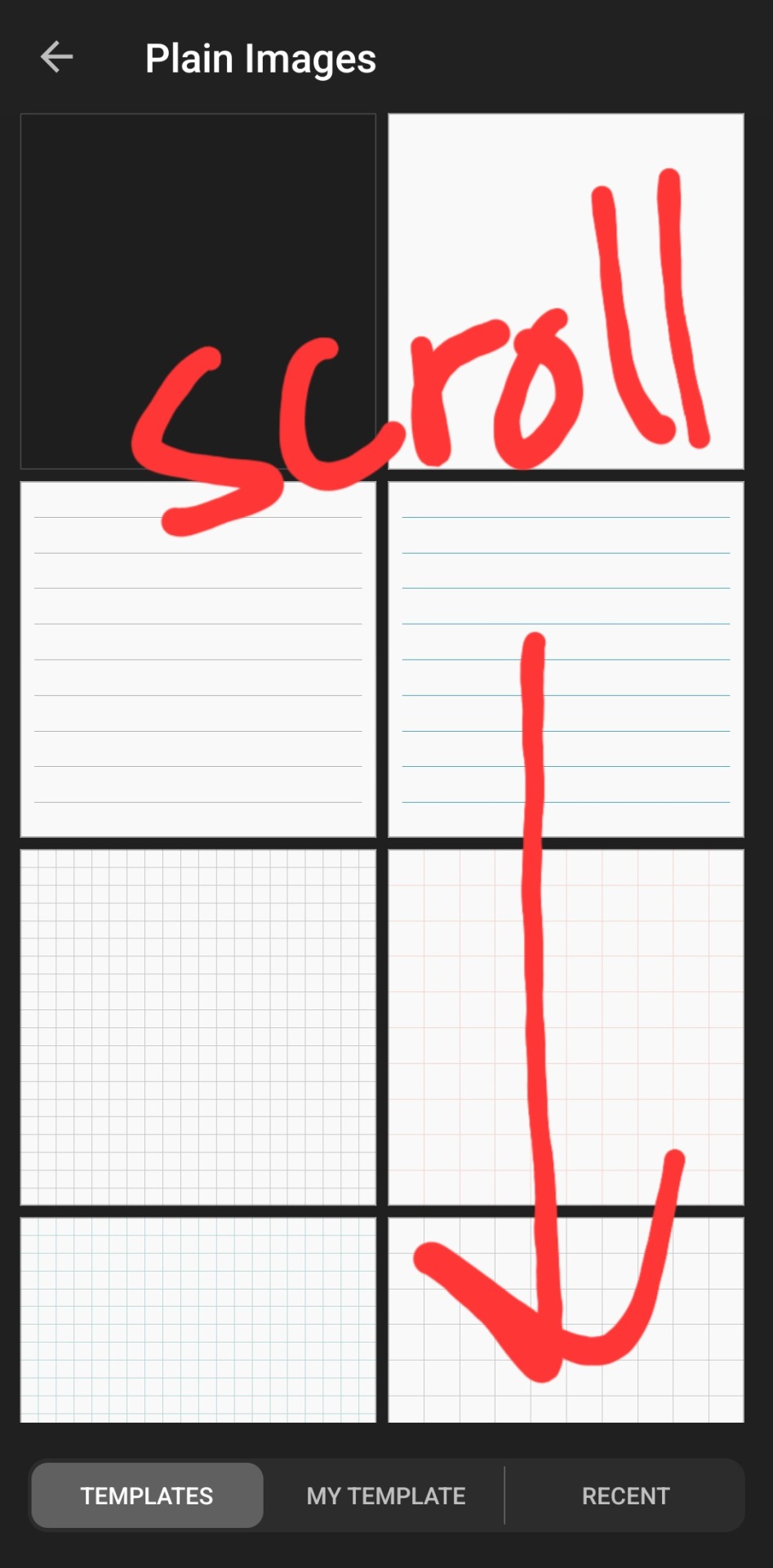
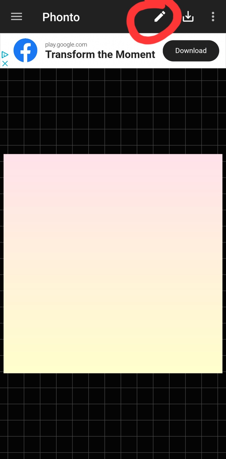
then you've got to slap some text on an image. you can choose an image from your camera roll, use one of their plain images, or open a pre-saved work-in-progress. for this example i used one of their premade gradients to make it easy
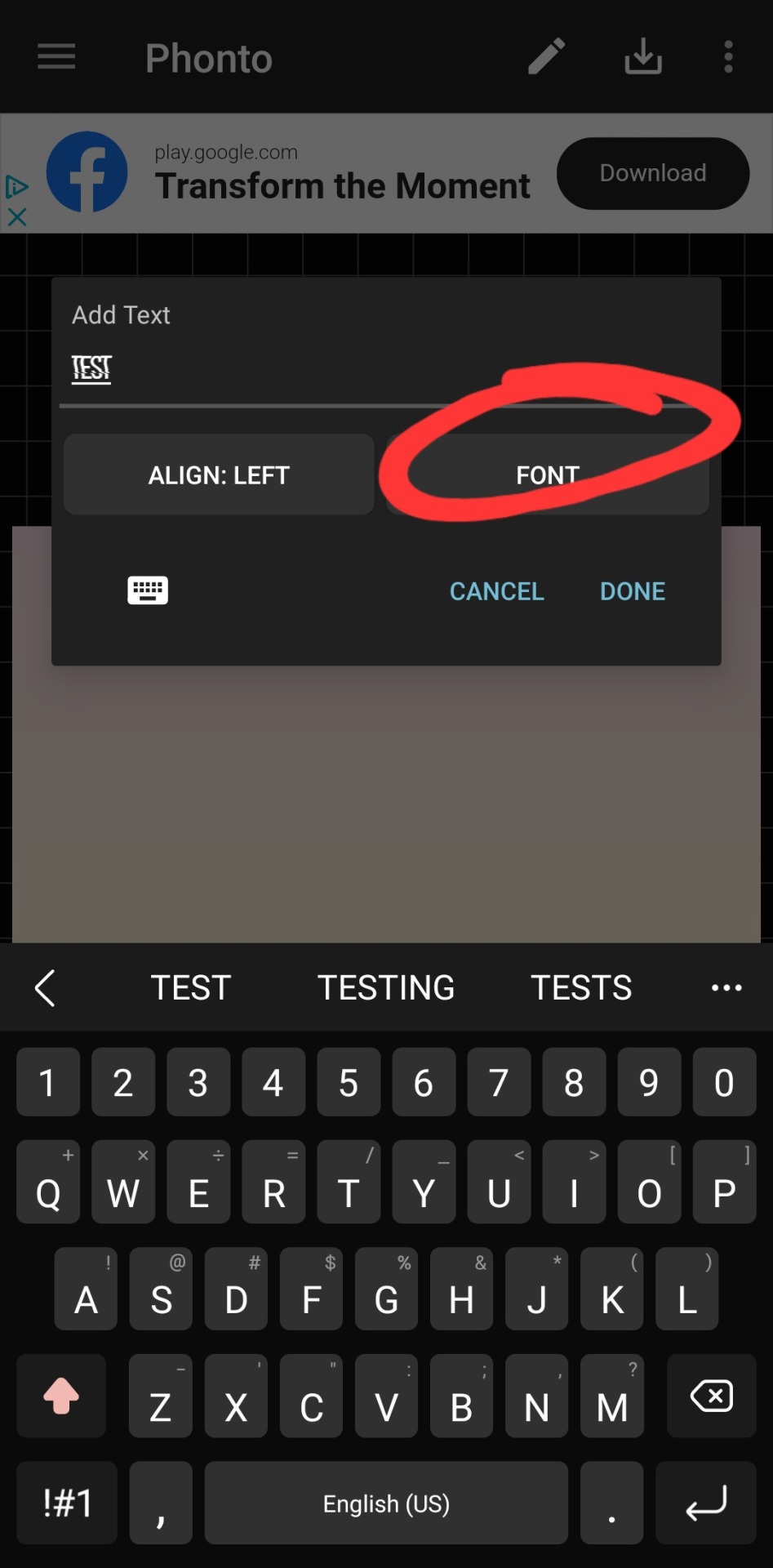
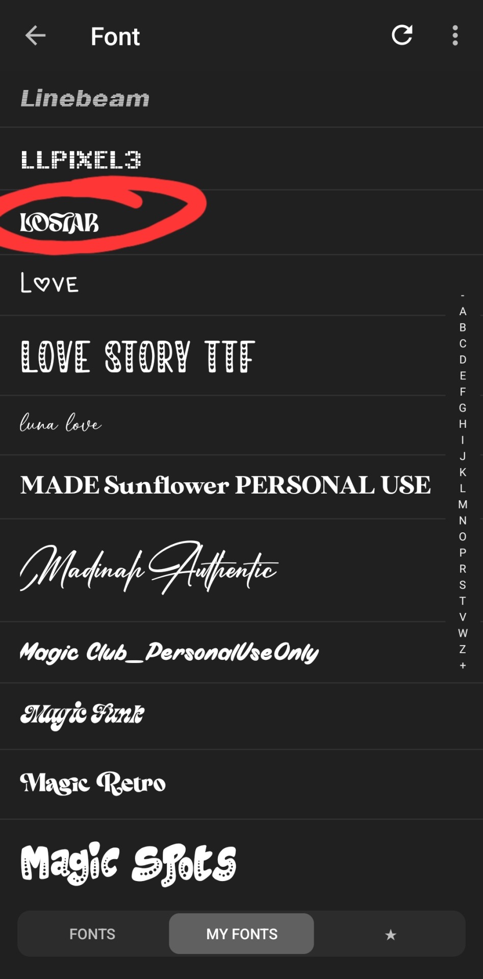
type whatever it is you want, click font. the left tab is the pre-installed fonts, the middle tab is the fonts that you've downloaded from elsewhere. here's the lostar we just got!
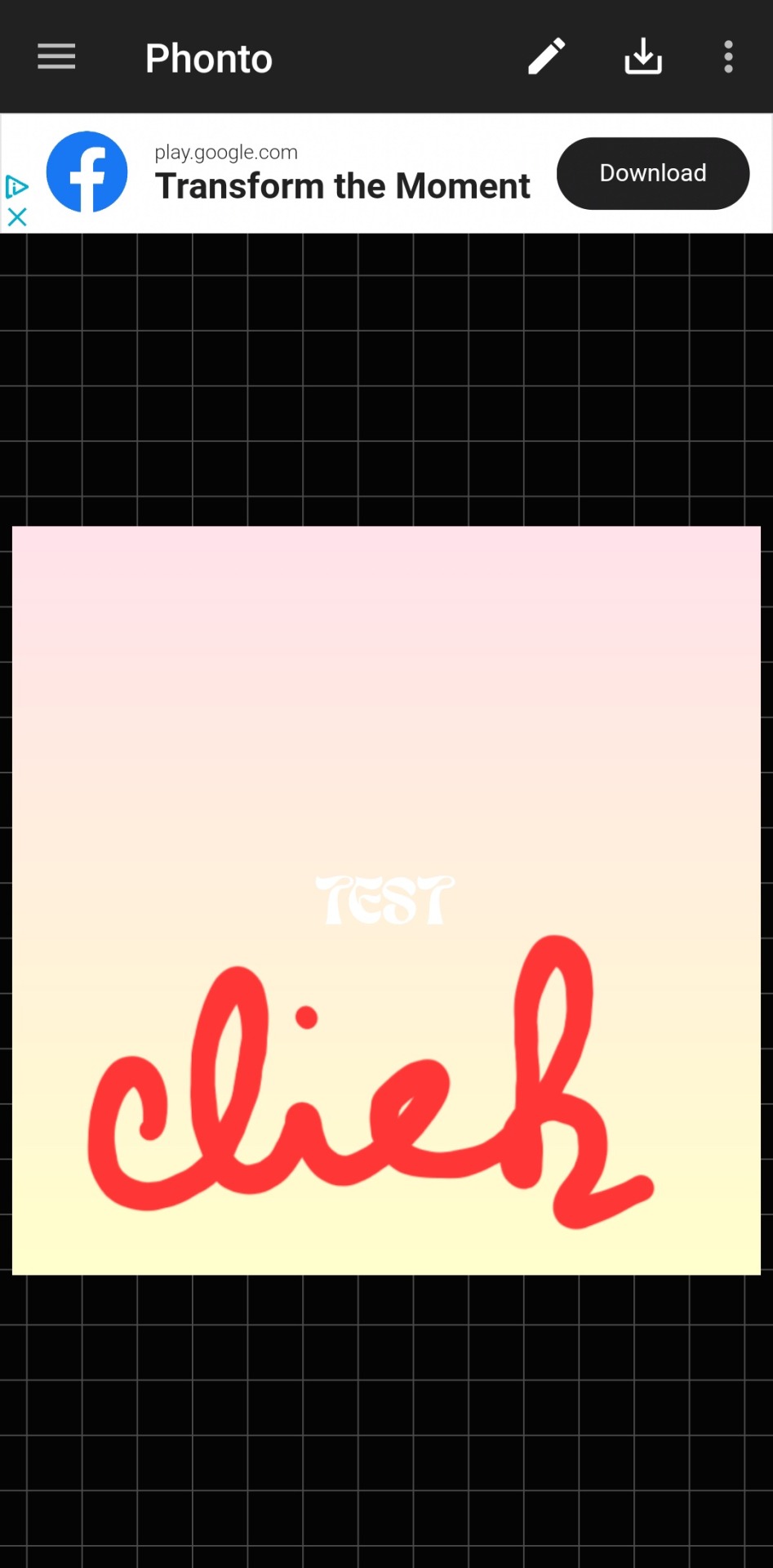
oh can't see it.
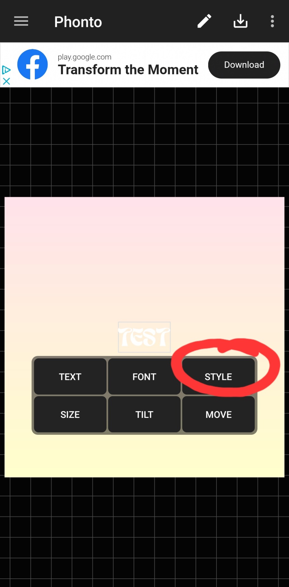
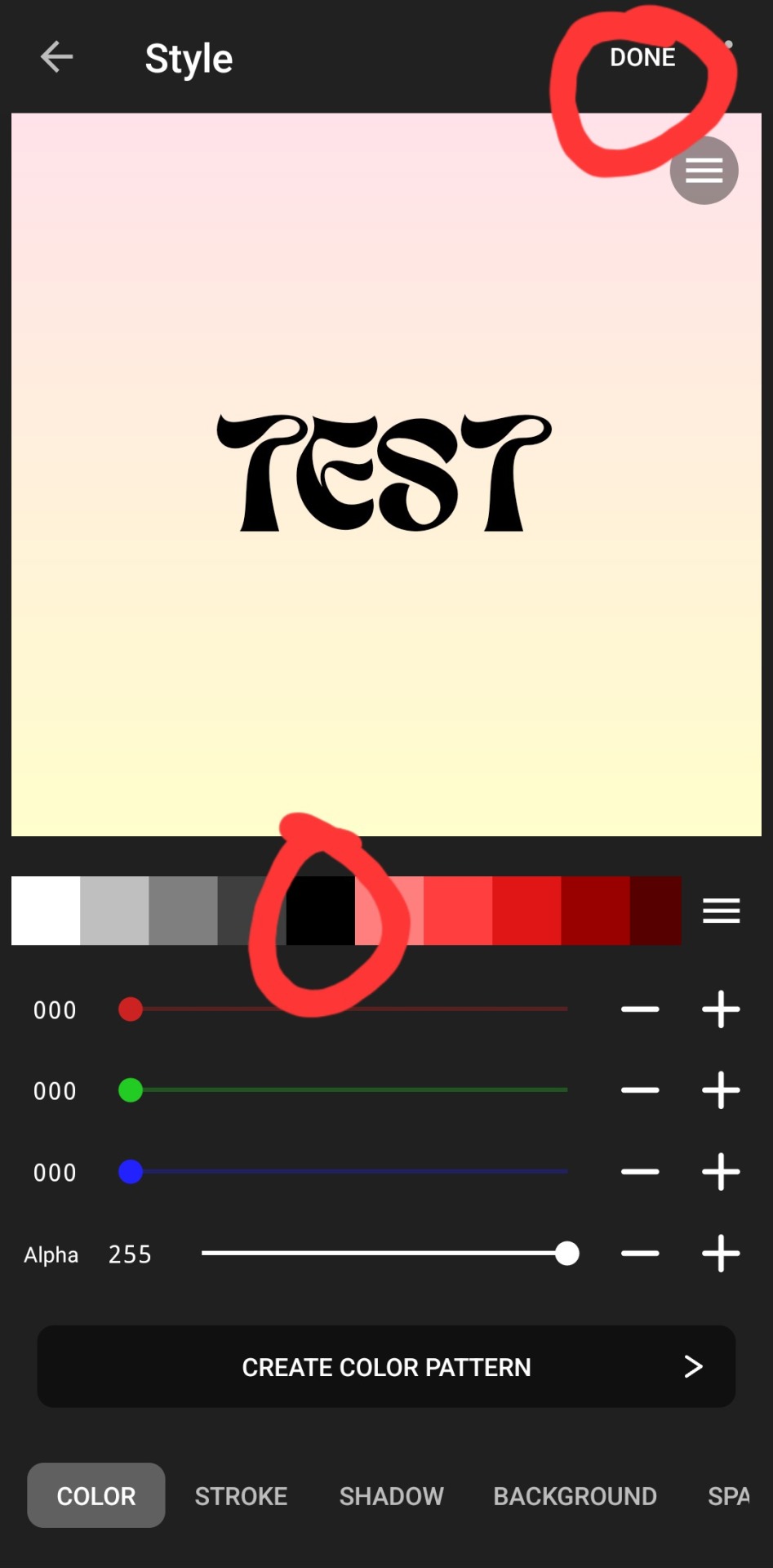
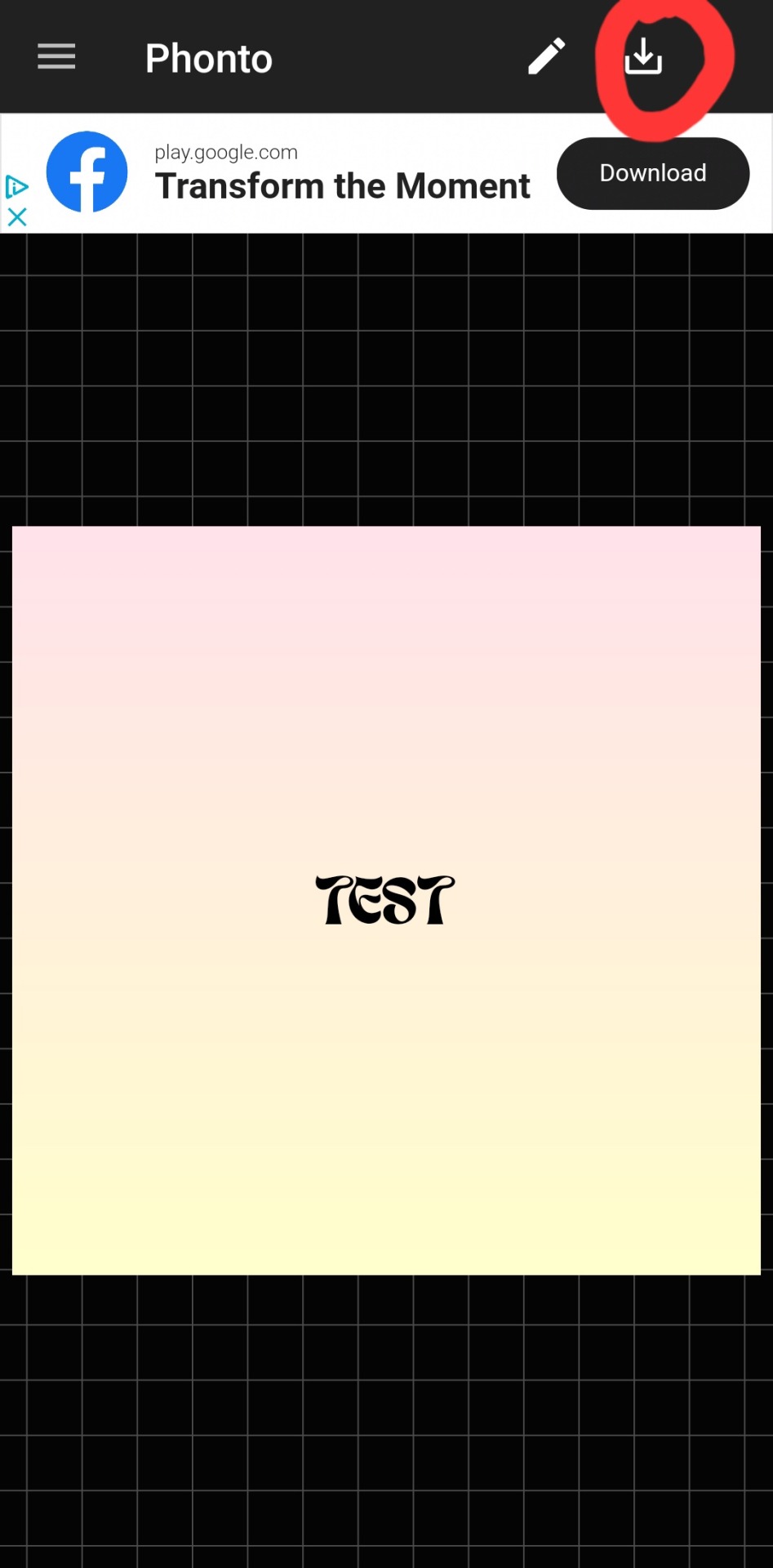
there we go! how fun! i'll probably use this in a fic header in the future. download button in the top right.
#hope this was helpful!#i don't mind sharing this stuff#i didn't invent fic headers or dividers or literally any of this lmao#answered#anonymous#talk#text#mine#writing tag#i suppose.....since its about my fics.........sorta...idk dude#also the renjun cheekies 😭😭 thank youuuu
3 notes
·
View notes
Text
Since I discovered that the corneas of both my eyes were malformed, this explains many of my vision problems and the strange things I saw.
I'm trying to put less stress on my eyes and give up many aesthetic things to help my eyes read better (for example I have to give up some custom fonts because I can't read them if they are too small)
And this is another reason why notion trackers for TS3 and TS4 will be slow to arrive. For now I don't have the mind to work on them (also because I have other problems and the desire to do so is zero)
I'm trying to adapt to the defects I see, such as that I see things slightly doubled, but I get nervous when I see screenshots on Tumblr of simmers that use Reshade presets with the blurred effect on purpose, I can never understand if it's Reshade or my eyes 😃
And it also bothers me a little when, despite knowing about my problem, people get nervous because I can't immediately see clearly what they want to show me.
Before I knew it I joked that I was an old woman who had vision problems and needed glasses, but now that I know that there actually is a problem I feel like I'm playing the victim by remembering it but it bothers me that people get angry about a problem I can't do anything about.
4 notes
·
View notes
Note
Between my ADHD and perfectionism, I'm on the struggle bus over here. I am very visual, so I like using screenshots for inspiration. The problem is I'm a reactive writer (if that makes sense?). I cannot write a scene and then create the screenshot; I write based on how the gameplay goes based on an overall "theme" and then create dialogue from the photo. Who else does this? Any tips on how to start documenting my dialouge on screenshots and differentiating the character's? Thank you for coming to my crazy ted talk.
It does make sense and this is the way A LOT of what I call gameplay-driven storytellers around here write their stories! I used to in the past and still do whenever I get hit with occasional inspo to post a little gameplay.
To document the dialogue and make it clear who’s talking, there are a few methods you could try:
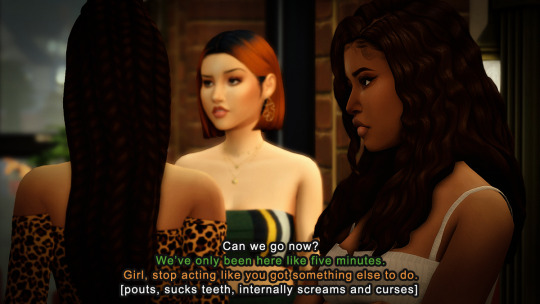
*pics are from a random scene in my story with some random dialogue slapped on top.
Method 1:
Use one font color for all sims but include the sim’s name at the beginning of each line.
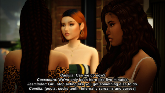
Method 2:
No names but a different font color for each sim. You could go about this a number of ways. Most people choose one dedicated color for each sim, so like white for their main sim always, yellow for any secondary sim on/off camera, then red, blue, green, and whatever other color for any other sims. Back when I was posting a captioned story, I made each sim's font one of the main colors in their outfit so that if you weren't sure who was talking you would hopefully make the connection. Second pic for reference.
Method 3:
Color choices are up to you, but you can have the text float near the speaker, in the order the line is spoken, so from top to bottom.
Your font choices are endless, but I would recommend sticking with something that's easy enough to read. I wear my glasses exclusively when I'm on my PC (they keep falling off my face so I don't wear them when I'm doing other things--I know I need to take care of this, lol) so if I step away and try to read pics with words on them when I just so happen to browse the mobile app, I usually can't cause they're too small. It's your call tho and up to you what you decide, but something to keep in mind.
I hope this helps!
23 notes
·
View notes
Text
so I made a language
well technically i've made kind of a bunch of languages
and probably already have a very old post about one of them
but here's another one. I call it Pinõcyz. I started working on it in February of 2020.
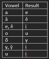
PHONOLOGY

I don't want to get too deep into the evolution I did on this, but to illustrate a little of that, I'll explain what's going on with the vowels and /z/. Basically, in most consonants where the modern language lacks a labialized pairing, i.e. /m l q/ and others, the labialized consonant simply unrounded. Historical /ðʷ/, though, merged with /z/ instead, yielding contrasting /z zʷ/ preceding /ɛ ɵ u ɔ/ and contrasting /ɛ ɵ u ɔ/ and /e ɨ ɯ o/ following plain /z/.
I realize also that I've sort of doubled the explanation of this in the notes maybe?! and left a note about the romanization in this screenshot that I deleted the romanization from because I want to display it separately. I'm not going to replace this screenshot a fifth damn time. :D
ORTHOGRAPHY
The Pinõcyz language is written primarily with the Tewrinnal /teɣrinːal/ script. It's an abugida.
...For a language with eleven vowels and fairly complex syllables.
You know, very much not the normal simple, open syllables that such a system usually operate best with.
So just what the hell is going on here?
Well, every character has an inherent vowel /ə/. To represent other vowels, diacritics are used, and to represent, for example, a single-consonant coda, another diacritic is used to mark that there isn't a vowel. For example:
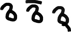
/mə me m/
There are six regular vowel diacritics:

/nɨ ni no na ne nɯ/
But, we also have to handle four more vowels somehow, and the labialized consonants where they're distinct.
That's all handled with one diacritic, marking both for labialization on the consonant and, where relevant, these different vowels.

/nʷɵ nʷi nʷo nʷɔ nʷɛ nʷu/
So that helps with those things. But what happens with a consonant cluster, or a geminate? Those are weird, right?
Well, the script uses a longer diacritic for that. Let's use the name of the script as an example:
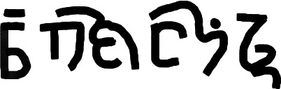
/teɣrinːal/ (It's written from right to left.)
So, couple of things going on here. First, that second chunk is /ɣri/. The glyph for /ɣ/ doesn't need the null vowel diacritic (shown here on final /l/) because it's marked with this tie bar that shows it's part of a cluster in the same syllable as /ri/. And second, that third chunk is /nːa/. Marking geminates via this tie bar is one of several uses of this other glyph, the null-consonant.
We also have to handle initial vowels.
And diphthongs.
So what's going on here?

/ə ɨ i o a e ɯ/
Here's the null-consonant glyph, and every vowel on it. These don't take the rounding diacritic; for geminates, said diacritic will appear on the consonant glyph proper.

/qaj teu/
Diphthongs are written as though the first component forms a simple syllable with the consonant, but then with the null consonant immediately following.
Alright.
So here's all the base glyphs real fast:

/∅ m n ŋ p b t d k g q/
/t͡s d͡z t͡ʃ d͡ʒ r l j f v s z/
/ʃ ʒ x ɣ h ð ɬ/
And one last quick note, /zʷ/ is represented by the glyph for /ð/ with rounding diacritic. Here's an example, in the form of a common given name:

/zʷɛzi/
Last but not least, the script has a couple of punctuation marks:

In order, something between the role of a comma and a semicolon; a marker for the end of a sentence; and an exclamation and imperative marker. These are small and appear next to the bottom of the last glyph, much like a period or comma might.
I don't have a font of this yet, and even if I did I'd have some trouble getting that to function well on Tumblr. So I'm going to briefly explain the romanization that I tend to use.
For the non-labialized consonants I have:
/m n ŋ p b t d k g q t͡s d͡z t͡ʃ d͡ʒ f v ð s z ɬ ʃ ʒ x ɣ h r l j/
⟨m n ň p b t d k g q c ż č ǧ f v ð s z ł š ž x w h r l j⟩
For the vowels I have:
/i ɨ ɯ e ə o a/
⟨i y u e õ o a⟩
The other four vowels and the labialized consonants are handled with diacritics on the characters for the vowels. So,
/ɛ ɵ u ɔ/
⟨ê ŷ û â⟩
and to mark that the preceding consonant is labialized, i and o also take circumflex, î and ô. The result is that ⟨w⟩ represents both /w/ and /ɣ/, and ⟨j⟩ represents both /j/ and /ɥ/, and obviously, for example k, g, r represent both plain /k g r/ and labial /kʷ gʷ rʷ/, and so on.
And because this doesn't handle labialized z, I have /zʷ/ ⟨ź⟩, and for example ⟨zê⟩ /zɛ/.
This probably isn't anything close to an ideal system, but it's what I settled on in 2020 and I don't think I want to change it. It's weird, but it's phonetic, in a sort of weird roundabout way.
So let's get into the grammar.
We'll start relatively simple: word order is verb-subject-object, with descriptors that follow what they're marking except for some in the animate class that are derived from verbs (more on all that later), and placement of other things like indirect objects and relative clauses varies in a couple of ways.
Also, subject pronouns often, but are not required to, drop entirely.
NOUNS
Whether a noun is considered animate or inanimate has some impact on case markings and other things like that. In general, people, certain concepts, feelings, anything divine, weather phenomena, time, animals, some tools, injuries or illnesses, fire and water, and plants food items considered spiritually important such as tea and many herbs are animate; other nouns are inanimate. Certain shelled sea creatures are also inanimate.
Case markings carry a plural marker and information related to definiteness within them. Animate nouns are considered definite by default and so have an indefinite article that incorporates into the cases; inanimate nouns are considered indefinite by default and so incorporate a definite article into their case markings.
Pinõcyz has split-ergative alignment based on animacy. Animate nouns take the (unmarked) nominative case as subject and the accusative case as object; inanimate nouns take the ergative case as subject and the (unmarked) absolutive as object. All the case markers except the ergative appear as suffixes; the ergative, though, is a particle that precedes the noun. There's a lot of wonky historical reasons for that, a bit beyond the scope of this.
Here's a table of the regular forms:

Where I have something in parenthesis, what sounds occur at the end of a noun determine whether it's present. For the vowels (i.e. most of them), it drops if the noun has a final vowel, and for the definite singular inanimate dative, that l is present if it's a final vowel and gone if there's a final consonant. There are other effects that the final consonant can have but they're often less predictable than this.
I'll explain the ablaut more when I get to verbs since it's more relevant there, but the definite singular inanimate dative does trigger ablaut, and the inanimate singular definite genitive triggers ablaut in nouns with a final vowel, where the y is dropped.
POSSESSIVE CONSTRUCTIONS
The possessor is marked with the genitive case and precedes what it marks. Examples: Tuštez bylen "Tušte's cousin", ðandaz manõn "rapids", lit. "river's teeth"
ADJECTIVES
Here I'm using "adjectives" as a sort of catch-all term, there's not a separate class of adverbs. There are, however, separate sets of animate and inanimate descriptors. These come in the form of a few adjectives that can simply be used for either sort of noun, i.e. izy "also", or in the form of separate, often derived forms for animate nouns, i.e. ðakan rõr "the stone nearby", but šõrõr celiż "the nearby ash tree". Many animate adjectives are derived more recently from verbs, and those ones precede what they describe, unlike the others. The new verb-derived animate adjectives are still often transparently related to one of several verbs. For example, šõrõr here has incorporated šõ "to have" as a prefix; wâðrata "dry" takes wâð "to be" as a prefix, and so on.
Except for a few exceptions, animate adjectives may not be used for inanimate nouns and vice versa, i.e. šõrõr ðakan here would be ungrammatical.
ABLAUT
I'm going to take a second before I get into the rest of this to discuss ablaut in more detail.
Sometimes, but not always, an i or e vowel remains in a suffix that triggers ablaut. This was universal before some of the vowels were eroded, but is now a bit trickier to predict if the vowel has been lost. Historically (read: before vowel length was lost, a bunch of final vowels got eroded, and a bunch of other things happened), a long i or e in the final syllable triggered fronting and raising of the vowel in the preceding syllable. How that expresses in the modern language is roughly reflected by this table:
Most of the time, labialization was retained through this raising, so sê "to float" > sîż "they (inanimate, plural) float".
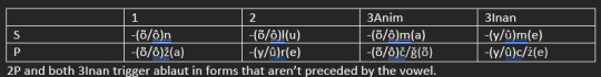
Some verb endings including tense markers and subject agreement trigger ablaut.
VERBS
Oh boy these get messy. Alright, I'll start with the tenses. I'll give an example sentence or two with each, and I'll explain the personal agreement after that.
Simple Present: unmarked. Deals in ongoing actions, states, things like that. Example: Symvinan "I'm thinking".
Habitual: -čin if the noun has a final consonant; -ǧin for a final vowel; in final plosives, the č metathesizes into the word like CVčCin. Triggers ablaut. Deals in actions that the subject carries out often or habitually. Examples: Łezeǧinõn manõnxaz "I often swim in the river"; Wêličkinõm dõz ðažgaňna "She often moves my pans".
Imperative: -žǧin for final vowel, -ščin basically otherwise; rarely -šõčin with final clusters. Triggers ablaut. Commands, things like that. Example: Biliqščin żŷknõ! "Prepare the boat!" (Fun note: żŷk "boat" is an animate noun; that's the accusative case.)
Future: -ðem, VðCem metathesis with final plosives. Deals in things that will take place in the future. Triggers ablaut. Examples: Bigimðemõǧ yquddiz bêdêkkuinan "They will gather the king's council"; Taxe beðqemõl "Therefore you will flee".
Conditional: -sõn if final consonant, -zõn if final vowel, VsCõn metathesis for final plosive. Deals in possibilities, uncertainties, etc. Example: Boňgestõnõn żen Lagruisyn "I might mail those to Lagrui".
Subjunctive: -õð for some final consonants, -ôð for others; -ð for final vowel; metathesizes with final stop VðõC unless it's in a cluster. Expected, preferred, "ought to be". Example: Kalyðõl "You ought to sleep".
Past-habitual: -šał with final consonants, -žał with final vowels; metathesizes VšCał with final plosives. Things the subject used to often or habitually do. Example: Kyużêžałõn ðembawynxaiz "I used to explore among these ruins often."
Optative: -kî for final consonant, -gî for final vowel. Triggers ablaut. Deals in things desired or hoped for by the speaker. Example: Erõmjeqqîl nida "I hope you return early". (In this example the consonant was absorbed into the final q on the verb root.)
Pluperfect: -łyš, metathesizes VłCyš for final plosives. Final consonant in the suffix retains labialization when vowels follow. Deals with actions completed by a specified or implied time period. Example: Dîrzynłyšôč "They (animate, plural) had taken ill". (Final consonants in the root form will have lost labialization, but they retain it when, like here, a vowel is introduced via a suffix.)
Experiential: -šai for final consonant, -žai for final vowel, VšCai for final plosive. Marks an experience that has happened at least once without respect for time, and is repeatable. Example: Sylezunčaiž wâðger waišqalnan "We have survived some large floods". (This example shows fortition of the fricative immediately after a nasal, a common sound change.
Now let's look at the regular forms of the person endings.
Most often, these will retain the vowel before the suffix consonant, but that is not always the case, sometimes you lose it and keep the one after, and it's not predictable in a way I can describe neatly here. For final vowels in the root or the TAM affix, typically no vowel is retained after.
Here's where things get WILD.
PASSIVE VOICE
The passive voice renders the agent of an action as an oblique and promotes the patient, so that it's focused a bit more. The passive is derived from an auxiliary verb that takes the tenses and the verb agreement, giving a qir- prefix. Then the verb is incorporated after that, and then -(u)z prefix, where the u drops if the z is allowed to form a final cluster with the final consonant or the verb has a final vowel. Then the agent of the action takes the ablative case. Example:
Qiršõmrenõnżõ Madriz lezgammuðgõż "Madriz was stabbed by an impostor". (This sentence is sus. Also note the fortition, z > d͡z after that nasal.)
ANTIPASSIVE
In ergative constructions, it's often more appropriate to de-emphasize the agent. In these cases, an antipassive construction forms, basically the passive construction but with the oblique-marked object in the allative case. This shows up mainly in relative clauses, but can form in fully independent sentences for emphasis reasons. Example:
Qiršymqamżõ pera Varasyn "An apple hit Vara"
An active-voice rendering of this same sentence would be Qamšym gõr pera Varanõ; the ergative particle here lends a degree of emphasis that is not always useful. Some speakers even consider it ungrammatical to form a sentence with the accusative on the object and the ergative on the subject, though that's far from universal and is mostly a hard-and-fast rule only in relatively conservative dialects. (For the most part, variation among dialects is beyond the scope of this post.)
MEDIOPASSIVE
The mediopassive construction handles both reflexives and certain intransitive sentences where the subject is not necessarily interpreted as the agent, such as "I fell". It derives from an old auxiliary verb ša- which takes any tenses and the subject agreement, but in this case the main verb, marked with the experiential, is not fused to the end of that. Examples:
Šan kadynčai "I fall" (fortition after the nasal again); Šamom dewšai "He has washed himself".
CAUSATIVES AND INDIRECT OBJECTS
A causative will usually take the form of the cause oblique-marked, taking the ablative case; an indirect object is typically marked with the dative case unless circumstances suggest something else. Typically, an animate oblique will precede the verb and an inanimate will follow the entire clause, but this is somewhat flexible for the purposes of emphasis. Examples: Taraðõd sybêkužõn Jŷddenõ "I met Jŷdde because of Tara" (causative); Kitronyz šŷllalõ leðõn żŷknõ "I'm building a boat for Kitron's clan" (indirect object).
NEGATION
Negating nouns and adjectives is done with a suffix -riq; this does not trigger ablaut. Example: cymanõnriq "nonexistence, void". In nouns this is primarily a derivational method.
In verbs, there is a negative auxiliary, jan in root form. It takes personal agreement, preceding the main verb, and the main verb takes tenses. Here's the forms of the negative auxiliary:

In passives, antipassives, and mediopassives, the negative auxiliary takes root form and precedes the verb construction as a particle.
Examples:
Jan šan kadynčai "I did not fall"; Ne vreita grõn teta "The candle isn't burning".
QUESTIONS
The interrogative terms are:
qa "who"; hud "what"; jõl "where"; tõr "when"; wal "why"; ðam "how"; gy "which one", also a general interrogative; jezyn "to where"; jeðõd "from where". They usually precede the verb, with the exception of gy when it precedes a noun, i.e. Jenin gy tynnanõ? "Which sumac tree am I looking for?"
RELATIVE CLAUSES
The interrogative terms also function as relative pronouns.
If the noun of the relative clause is animate:
Subjects, direct objects, and indirect objects can be relativized without any extra trouble, simply constructing the clause out of an interrogative and then the verb and relevant noun. Examples:
Subject- Kasran kêdynõ qa bašqõm "I see the dog who ran"
Object- Gy bûriðemõl ňaňlõ qa ðõkasran? "Will you wait for the man who I forgot?"
Indirect object- Wâðõm pinõ qa daxõn luz qarut "That is the person who I gave your money to"
For obliques, genitives, and objects of comparatives, it's necessary to use a passive. Examples:
Oblique- Jenižǧin sadynõ jeðõd qirmomrenõnżõ Nabi lezgammuðgõż! "Find the knife with which Nabi was stabbed by an impostor!"
Genitive- Gy činõl riżalnõ qaz qirõmjeniz rênnan Dargoðõd? "Do you know the shrub whose leaves are sought by Dargo?"
Object of comparative- Dalqamõn ainan jeðõd šoðõð qirčinõnfilz "I playfully hit the nonbinary person who I am sung better than by"
Yeah, Pinõcyz has a word for the act of hitting someone gently in a humorous or flirty way, it's dalqam.
If the noun of the relative clause is inanimate:
Only absolutives may be relativized. Example:
Absolutive- Qiršõngaduz wegrizxaiz jõl kerkożżynčõm verraw "I was given birth to in the city which the king declared war against".
For all other sorts of relative clauses, antipassives must be used. Examples:
Ergative- Vreitašõn ludan hud qiršõmfaisqõ Balzasyn "I burned the arrow that killed Balza" (that -z suffix here is metathesized into the verb and devoiced, and we have a following epenthetic vowel)
Indirect object- Kasran eigu jezyn qirčinõmdaxuz xâż lenasyn "I see the clearing to which the tide gives water"
Oblique- Laxõždõn ðaka jeðõd qiršõmmaxnaz ewa "I broke the stone with which the shellfish hunted"
Genitive- Šommom qâra huż qiršymžac mez rênnażi "The basil that lost its leaves has died."
Object of comparative- Jenimon reňkum hud qirčinõnjanjaz han dõsyn "I have found the needle that is longer than me" (lit. "grows more than me")
A FEW TRANSLATIONS
I feel like translating some stuff, just to show a bit of the feel of it with either some familiar texts or maybe some stuff I decide to write for this. Again, no font, so I'll have to rely on my weird handwriting for this.
The One Ring inscription:
Verreðym gi grõn uda że cy, jeniðym gi że;
[verːeðɨm gi grən ɯda d͡ze t͡sɨ | jeniðɨm gi d͡ze]
rule-SUBJ-3S.Inan one ERG.DEF ring 3P.Inan all | find-SUBJ-3S.Inan one.DEF 3P.Inan
"One ring shall rule them all, the one shall find them;
Bêlašõðym gi grõn uda że cy, ta heqalxaz gŷšqamõðym że
[bɛlaʃəðɨm gi grən ɯda d͡ze t͡sɨ | ta heqalxaz gʷɵʃqaməðɨm d͡ze]
gather-SUBJ-3S.Inan one ERG.DEF ring 3P.INAN all and evil-LOC imprison-SUBJ-3S.Inan 3P.Inan
"One ring shall gather them all, and shall imprison them in evil"
Mordor jejaxtaz jõl xalzunõǧ tawna
[mordor jejaxtaz jəl xalzɯnəd͡ʒ taɣna]
Mordor territory-LOC where reside.3P.Anim shadow-P.DEF
"In Mordor land where the shadows live."
A few quotes from Goncharov and its promotional materials:
Jaqym grõn rêǧi Napolisyn
[jaqɨm grən rʷɛd͡ʒi napolisɨn]
come-3S.Inan ERG.DEF winter Naples-ALL
"Winter comes to Naples"
Ai fiłatõš syganõn; so, fiłacõnõn uri lun ðam qirčinymfiłac yaň sadusyn
[aj fiɬatəʃ sɨganən | so fiɬat͡sənən ɯri lɯn ðam qirt͡ʃinɨmfiɬat͡s jaŋ sadɯsɨn]
O lover apologize-1S | look love-COND-1S only 2S.ACC REL.how ANTP-HAB-3S.INAN-love\ANTP boot knife-ALL
“I’m sorry my dear, I can only love you the way a boot loves a knife.”
Kamassõnõl mainõ Napoliðõd žaz dajersyn qarrêðdõ Mâskõvaxaz ňaňňyz qa zazõðõǧ hud fiłatõǧ lun vaðdõd
[kamasːənəl majnə napoliðəd ʒaz dajersɨn qarːʷɛðdə mɔskəvaxaz ŋaŋːɨz qa zazəðəd͡ʒ hɯd fiɬatəd͡ʒ lɯn vaðdəd]
trace-COND-2S path-ACC.DEF Naples-ABL 1P.GEN home-ALL childhood Moscow-LOC man-GEN.P REL.who say-SUBJ-3P.Anim REL.what love-3P.Anim 2S.ACC blood-ABL
“you could trace a path from Naples to our childhood house in Moscow with the blood of all the men who’ll tell you they love you”
I'll probably do art and shit with this conlang at some point, and not just LOTR and Goncharov brainrot.
Enjoy!
#conlang#neography#why am i like this#goncharov#i am the flavor of dumb bitch who cant get goncharov out of my head so I translated quotes into my conlang#one is even from the movie poster what the fuck#is my trans ass becoming a film bro#i thought i stopped being a weird asshole in college#this is a cry for help
10 notes
·
View notes
Note
hey harper!! sorry if this is a little random but i was wondering if you could share what kind of settings you import your gifs from photoshop with (if you use it?). :-) i'm getting into gif making myself but i'm kind of a newbie and since your edits always look rly good, i figured i'd ask. tysm. <3
Sorry this took a little bit to get to - I was really Going Through It yesterday. So I'm really bad at explaining things properly, but I'll try to explain it the best I can. I've pretty much been using the exact same method since 2017 so it might very well be outdated for most people but it works for me. I'm using a cracked version of Adobe 2020.
For the purpose of this, I'm making a gif of a Hawke I might potentially play with if I find myself wanting to play DA2 (usually pretty unlikely - a lot of my attempts at DA2 these days die in the prologue or act 1) and finally see Carver content + do the Merrill romance. I'm going to put this under a cut because it includes screenshots.
After importing the video, first thing I do is work on cropping it down to both the dimension I want and what parts of the footage I want to do (that little middle bit in this case on the TL in this case.)
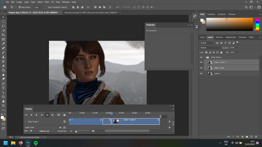
Then once I've done that, I right-click on the bit I want and chop the duration down to 2 seconds (or occasionally 2.25) and slow down the speed of which that part of the video plays to 60% - my ideal speed but I sometimes will go 55% if it ends weirdly at 60% or has a hard cut to another angle. Do this as many times as needed for however many gifs there are going to be in the set.

Delete the bits of the footage from the timeline that you aren't going to use, trim it down to the dimension you want (in my case, I like it to be 540px in width.)

Now I think this might be where I differ from others, because I think this is where people export it - but I prefer to colour it here rather than do each layer individually. I tend to use the same few actions which have turned into my bread and butter: colour balance, selective colour, brightness/contrast, vibrance and curves. Sometimes exposure if it's needed. Colour balance is the real MVP, especially for games like Dragon Age and Mass Effect where lighting is all over the place or very predominantly one colour (e.g. Orzammar being very Yellow). (Don't ask me how to sharpen - I don't know how to do it and at this point I'm too set in my ways to learn how.) Generally speaking with colouring I prefer to keep it as close to the original as possible but Nicer. Just play around with it and see what you think looks nice.
After that, I go to File -> Export -> Save for Web (Legacy). Make sure the looping option is set to forever. Let it run through a few times to make sure it isn't wonky (also, see all those colours you see on the side? I tend to colour pick from those for gradient text so matches the gifset - I use this HTML text colouriser to generate the gradient.)
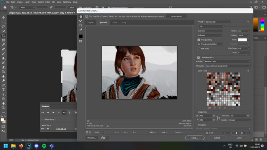
If you're happy with it, hit the save and send it to the appropriate folder.
Generally speaking, I try to keep it under 5MB a gif but certain games really dislike that, especially since I tend to prefer 540px ones as it allows me to use bigger font sizes - I can't do small font any more on gifsets - especially on text heavy ones like my Pathfinder gifs; I'm so prone to missing typos.
Speaking of subtitles, actually - I then open the gif into Photoshop so I can access each frame individually and then make sure I have the top layer selected on the sidebar, not on the timeline. Then add a new layer with the font option with the dialogue for the gif. My subtitles now tend to be around the 16-20pt, Calibri + bold and italic with outer stroke in black for the outline to make it more visible (to access Stroke: right click on the subtitle itself -> blending options)
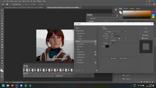
Once I'm done with that (including proofread for typos, making sure it's aligned properly), same thing: File -> Export -> Save for Web (legacy). I'm fairly sure this isn't how others do it, but it worked for me and this is how I taught myself back in 2017.
Also - this is Florence (Flora), I guess.
2 notes
·
View notes
Text
#JakeReviewsItch
Airships: Conquer the Skies
by Zarkonnen
Price (US): $24.99
Included In: Bundle for Racial Justice and Equality
Genre: Strategy, Simulation
Pitch: Build airships. Build cities. Conquer the world.
My expectations: Despite its slightly underwhelming art style, my first impression is very positive. It looks almost like my beloved SimTower, except the tower is a floating war machine bent on world domination. I can tell you right now that if I can name the pilot, she's going to be Wendy O. Koopa.
My big worry is not with the game, but with me. I am currently being weaned off of one prescription and replacing it with another. My brain is mush. I'm look at screenshots covered in tiny text and numerous numbers. I don't know if I can handle anything too complicated today.
Review:
My fear that Airships: Conquer the Skies would be too complicated for my feeble brain was unfounded. Thanks to smart layout and clear indications of what issues require attention, it only took a few minutes for me to find my bearings.
That’s when the trouble began.
The trouble: I’m committed to reviewing a new game every day. I don’t have space in my life for a new addiction.

The tutorial focuses on combat. Learn to fly a ship. Learn to fly a ship within range of an enemy, and let the crew fire away until your target drops. Learn to modify a ship. Build a ship from scratch—engines, fuel, crew quarters, safety features, reinforced hulls, and every weapon in your budget—and see how it does.
Got all that? Now let’s talk tanks.
An hour-long tutorial is usually enough to drive me away from any game, but most of that time is spent playing, and it’s a blast.
I started the main game, expecting more of the same, with a little connective tissue between battles. I was wrong.

Combat and ship-building are only slivers of this grand strategy game. Research! Diplomacy! Town development! And it’s all shockingly intuitive.

+ As dense as it is massive, and yet it's the most intuitive, approachable grand strategy game I've ever played.
+ Researching new parts and building for a purpose within a budget is RollerCoaster Tycoon-level addictive.
+ Randomly generated scenarios (that can be tailored with a million options), 100-ish different starting perks (I lost count), scenario editors, importing and exporting designs, mod support, and multiplayer that's as cooperative or competitive as you want it to be—this game is infinite.
+ Memorable music. The right level of bombast for a friendly game of world domination.
– Even with the UI bumped up to the largest setting, the text is a little too small, especially with the difficult typeface. Still, props for including UI scaling and a dyslexia-friendly font.
– The default keyboard shortcuts are... They're all over the place. You can remap them, but there are so many. WASD moves the view, which makes sense. I wish they'd stuck the most useful commands on nearby buttons, but instead, it was up to me to figure out that swapping M and E makes life easier.
– Hotkeys aren't necessary. The whole game can be played with mouse (although hotkey shortcuts are listed beside everything that can be clicked, making text even harder to read). Action scenes can be paused, so quick action isn't required, but the in-game mouse speed is slower than my Windows setting. Maybe I could dig into a config file and change it, but y'know, I'm used to my mouse moving the way I like. Why change it?
– Even playing at double speed, idly waiting for money to accumulate and vehicles to be built can drag on for a bit too long.
🧡🧡🧡🧡🤍
Bottom Line: If Airships: Conquer the Skis has been an overlooked part of your Itch library since you got the Bundle for Racial Equality and Justice in mid-2020, download it right now, even this isn't your genre. I think you'll be surprised. I know I was.
I can't give that kind of blanket recommendation at full price, but for the right person, we're talking about hundreds of hours of quality entertainment for $25.
#JakeReviewsTwitch is a series of daily game reviews. You can learn more here. You can also browse past reviews...
• By name
• By rating
• By genre
#JakeReviewsItch#Computer Games#Video Games#Itch.io#Review#Indie Games#Zarkonnen#Bundle for Racial Justice and Equality#Strategy Games#grand strategy#War#Diplomacy#Airships#Steampunk#Tanks#City Builder#Civilization#Civilisation#Airships: Conquer the Skies
0 notes
Text
Accessibility masterpost
Lately, it's been nice to see a bunch of people starting to transcribe their works so I've decided to compile a bunch of things that I know about accessibility!
Image, Video, and Gif Descriptions:
A form of accessibility that transcribes all forms of images, gifs, and videos for people on the vision-blindness spectrum!
If you can't transcribe images yet or haven't quite learned how then try looking for one in the notes of the post or check the post for alt text.
The main starter for image descriptions is "[Gif/Video/Image Description:" and then describing the main details in the image.
Some examples:
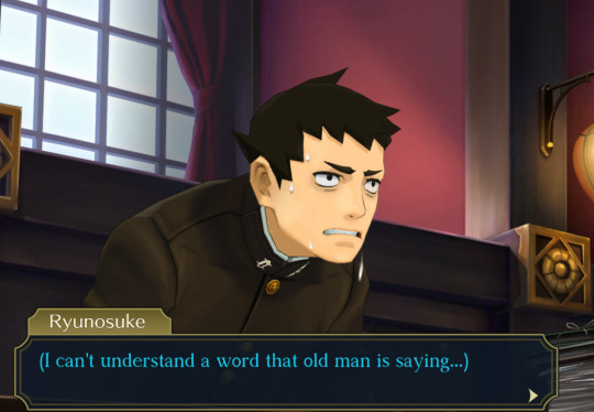
[Image Description: a screenshot from The Great Ace Attorney, showing Ryuunosuke hunched over and sweating worriedly behind the defence desk. He thinks to himself, "(I can't understand a word that old man is saying...)." End Image Description.]
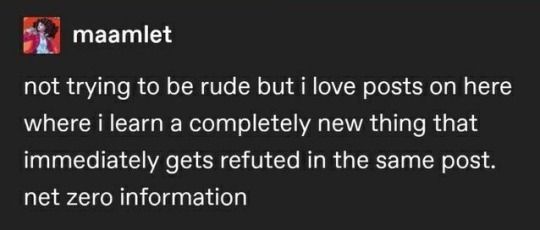
[ID: a post by maamlet that reads, "not trying to be rude but i love posts on here where i learn a completely new thing that immediately gets refuted in the same post. net zero information." End ID.]
Do not write your IDs in italics, coloured font, or small print as not everyone uses screen readers, and it may make it difficult for them to read; Don't put them under a cut, and don't use subjective language whilst writing them too! Doing so only makes disabled people go through hoops once again just so they can get accessibility.
Another note is that, yes, even things you don't like or agree with should still be transcribed. Some links!!:
Why you shouldn't put IDs under a cut, or use subjective language, and some more accessibility links! And here is another one detailing more on image descriptions.
Alt-Text:
Another kind of image/video/gif description, however, is only visible to screen readers! When writing alt text, make sure it's concise and short, and don't put in "ID: an image of x. End ID." since it's going to be read out as, "Image: ID: an image of x. End ID." An example:

How the alt text should read: [Image: a solid light pink banner.]
Plain text:
For posts written in italics, in small print, in leetspeak, or in a certain colour! They can be extremely difficult and straining to read. Writing them is extremely simple. For example:
I could listen to this song for hours
[Plain text: "I could listen to this song for hours."]
Another example!:
This is my favourite character!
[Plain text: "This is my favourite character!"]
Trigger Tags:
Mainly self-explanatory. Tag basic and more common triggers (like blood, violence, war, unreality, etc), and also less common triggers as well (if asked I think!). Some other things I can think of is tagging videos with no sound as "soundless," as some videos with no sounds may be paranoia-inducing (particularly to HOH/deaf people from what I've heard).
TLDRs:
People learning English or ADHD havers (etc etc) may struggle to read long paragraphs worth of text. Adding a TL;DR can be a bit difficult, but you only need to grab the main focus of the long post, and maybe along with some additional details.
Eyestrain/Flashing tags:
Self-explanatory. Tag flashing gifs or videos with "tw eyestrain" or "tw flashing." Aside from that, having blog themes that don't cause eyestrain (such as having a bright red theme with white text, or having very bright themes in general!).
Tone Indicators:
Most of us know that they are, but for those who don't: they're meant to convey tone for neurodivergent people mainly or people who may have trouble picking up on tone through text! Here's a carrd that has a lot more information, and can probably explain a lot more.
128 notes
·
View notes
Text
Hello, TOH fandom, I am here once again to talk about accessibility!
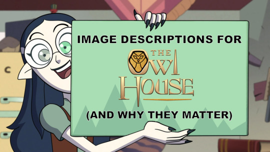
[Image description: a screenshot of Lilith Clawthorne excitedly holding up a sign, which has been edited to read: "Image Descriptions for The Owl House (and why they matter)" in all caps. End description.]
Image descriptions, like the one I just used above, are exactly what it says on the tin: descriptions of the content of an image included to make the image maximally accessible.
Blind and low-vision people who use screen readers, people who rely on increased font size in-app or in-browser to read text, and neurodivergent people who have trouble interpreting elements of an image (for example, expression) all benefit from image descriptions.
And all images on the internet should be accessible regardless of topic, of course, but I've recently been trying to spread awareness in the context of The Owl House specifically because it's a show with multiple disabled and/or neurodivergent characters! In fact, Principal Bump is canonically low-vision with a service animal to help him in that regard — and I'd argue that making content about disabled characters accessible is extra, extra important!

[Image description: a screenshot of Principal Bump with his palisman Frewin removed from his head, revealing the scars over Bump's eyes. Frewin is in staff form, smiling, and Eda looks on from the side. End description.]
I know it's within this fandom's ability to make our posts about the finale as accessible as possible — and I know that because I've already seen a decent increase in described posts over the course of Season 3! I've seen more artist-described posts especially, which means a lot to me, and even more to a lot of other people, too <3
So, on that note, how to write an image description? It may seem intimidating, especially if describing someone else's post or fanart, but honestly, there's no definitive "rubric" to follow, just a list of general guidelines:
Indicate where the description starts and ends, with "end description" or "end ID".
Place the description immediately under the image, not under a read-more (this allows people who rely on IDs to experience the post the same way anyone else would, whereas read-mores are inconvenient, especially if OP changes their URL)
Minimize caps lock, italics, bold, and strikethrough, which can be hard to read and/or troublesome for screen readers. Generally, it's just best to transcribe in lowercase without particular effects, then indicate in the transcription if something is emphasized.
Likewise, don't put descriptions in Tumblr's special small text. It's difficult to read and inaccessible to many.
Don't make jokes or add commentary in IDs. If an image is meant to be humorous, obviously it's fine to phrase things in a way that tries to capture that, but it's not the place to add your own jokes, nor is it the place to declare subjective qualities like "this art is beautiful".
Descriptions can vary in length, but if one is getting long (if you're describing a comic, for example), then be sure to break it up with paragraph breaks.
Specifically, while I've heard that too many breaks (ie, every sentence) are annoying for some screen readers, long walls of text are conversely difficult for people with visual processing problems to parse. So, it's good to strike a balance.
With regards to length and amount of detail, it varies by personal preference! Most images don't need a whole small essay, but there's also value in describing certain small and symbolic details, subjective as it is.
Speaking of which, if you're the original artist, then you are automatically the expert on what you wanted the image to convey — the nuances of expression and body language, which details are important and which details are not — and for that reason, I love seeing artist-described works!
Below the cut: more on describing Owl House images specifically, on IDs versus alt text, and other possible questions!
When I transcribe TOH related posts, there's a few other guidelines I use, though these rules aren't as immediately important as the ones above. I generally start by indicating the type of image we're dealing with (a screenshot? fanart? a photo of a cosplay?), then mention what characters are depicted.
Unless I'm describing something long, like a comic, and relying on summarization, I usually mention which character designs we're dealing with (is Lilith in her dramatic black dress from Season 1? or is she in her low-battery shirt?). If it's fanart and the artist has come up with original outfits to put the characters in, I'll summarize those too.
(This is the other reason I love seeing artist-described works: because I, personally, am just kinda bad at describing fashion lol.)
Now, I'd like to go over some other questions that I've either encountered before, or anticipate:
What about alt text? Doesn't that accomplish the same purpose as image descriptions?
In a lot of senses, yes, so alt text is certainly much, much better than no description! However, remember that not every person relying on descriptions is necessarily someone who uses a screen reader every day, or uses a screen reader period. Some people do in fact read the descriptions themselves.

[Image description, identical to alt text: a screenshot of Luz Noceda from Season 2, smiling and blushing. End description.]
As you can see above, alt text takes an extra click (or tap) to access. In general, it's also prone to displaying walls of text, and — as far as I know — sometimes just doesn't show up if the Tumblr app isn't updated enough. (Not to mention that, in my opinion, making image descriptions visible to people who don't use them is an important part of spreading accessibility awareness in the first place!)
On the other hand, I've heard some people who benefit from descriptions say they actually prefer alt text, so I'm not going to come out and take a hard "absolutely no alt text ever under any circumstances" stance by any means. But, long story short, this is the reason that in my own posts, I almost always defer to in-post descriptions — the only exception might be if I'm writing a meta post, and functionally describing the images in the text anyway.
I've seen that sometimes you use [ ] brackets and sometimes you don't. Is there a reason?
Basically personal preference. I use brackets in posts like this when I have a lot of non-description writing, and want to make it extra clear where the description ends and the non-description begins. If I'm just captioning some fanart in a reblog and not adding any commentary, on the other hand, I leave off brackets because they're pretty redundant.
I'm nervous about describing images, but I still want to help make the fandom more accessible. Is there anything I can do?
Well, my first piece of advice would be to start small! Hell, start with just making sure you include a description whenever you post an image with just text, like a screenshot of a reply or someone's prev tags. You can build up little-by-little from there!
(My personal accessibility journey went from describing only tweet screenshots whose text I could just copy, to describing simple memes like cat pics, to deciding it was important to at least describe fanart of disabled characters like Eda, to finally describing almost every post I reblog. Trying to make that jump without any of the intermediate steps would've been overwhelming, but at this point, it all feels natural to me.)
But secondly, I would encourage showing some love to artists who describe their pieces! Queue up some described fanart, especially artist-described stuff, and help normalize it!
Get into the habit of checking the notes for descriptions (go to reblogs and filter by comments only) before you share! If someone describes your art, copy it into the original post, so the version of the thread reblogged directly from you will be accessible too! (And if you want to make some little tweaks, no one will be offended.)
You can also look into making your blog theme accessible, such as making sure the font size is large enough (and ideally sans serif, for readability). And if you feel more confident with describing audio, then writing transcripts of audio is always incredible as well, to help out those who are deaf, hard of hearing, or have auditory processing disorders!
I've heard that AI is able to describe images for screen readers pretty well these days. Are descriptions still important/going to remain important as the technology advances?
Well, let me say first that I'm very glad this technology exists, for sure! But I'm of the opinion that human described (and especially artist described) captions are, at least generally speaking, still going to be the gold standard for the foreseeable future — AI doesn't have the context we do for our art and our fandoms; it's much less likely than a fan of the show to pick up on what's an important or symbolic detail.
Are there actually people who need image descriptions in cartoon fandoms? I mean, the source material has such a visual component!
First off, blind and low vision people do in fact watch things like TV, movies, and plays — ever notice the "audio description" option to add narration to a given show in a streaming service? That's there to provide basically the real-time equivalent of image descriptions.
And, second, I'll leave you with this — don't you think a lot more disabled people would participate in fandom if fandom were more accessible and accommodating to disabled people in the first place?
279 notes
·
View notes
Text
Surprise for @missn11! Here's a transcription of the scene with Noah's Dad if you have the pink sweater. I tried screenshotting the whole thing, but it's over 100 screenshots! So I thought I'd go for a transcription and a few choice ones.
He was standing in front of me in a casual outfit. He looks younger like this. And...cute? How should I reply? [player choice between "I-it looks good on you. You look nice." and "Well..It's not bad."]
Alex: I-it looks good on you. You look nice.
Noah: Do I? I should wear this kind of thing more often.
Alex: Don't you need to wear a suit while working?
Noah: I mean, at least when I meet with you. You will see me again, won't you?
Alex: ...? Is there a reason for us to see each other outside of work?
Noah: No, there isn't...But, we can make one...
Alex: But why did you change?
Noah: Um. Well... Because I think I shouldn't look so obviously like an agent...?
Alex: What do you mean?
Noah: You'll see. Come on, let's go.
What's this? Will he get in trouble if his identity as an agent is revealed? Puzzled, I followed Noah. He seemed nervous for some reason. A reason that I found out soon enough. It was because--
Student 1: Hey, Noah! What brings you here? You said you're too busy to reply to any of my texts!
Noah: Sorry, sorry. But I really didn't have the time. Long time no see, guys.
Student 2: Wow, look who's here! It's our Noah who got into the CIA, isn't it?
Student 3: How is work? Do you really shoot a gun like they do in movies?
Noah: That's all confidential, you know? Stop asking me. And please move away! I need to see my father!
This is why he said he shouldn't look like an agent, isn't it? Because his friends would cling to him even more if he did...
Student 3: Who's this, by the way? A boyfriend?
Noah: Oh, well...[small font] I wish, but...[end small font]
Alex: Hi, I'm his colleague.
Student 2: Whoa, then you must be a CIA agent, too! That's cool!
Student 3: Wow, you seem so young. When did you become an agent?
Alex: Ah. That's confidential...
Noah: Hey, hey! Don't bother Agent Miller!
A sweet daily life. Lots of friends. A peaceful world without bloodshed or violence. The things I couldn't have even if I tried all my life--Noah had it all. With that thought crossing my mind, the sight of him was...dazzling.
What if Hailey and I had lived in this kind of environment? If we'd grown up like that, no personal tragedies or misfortune. Would we be living better lives?
Noah: I-I'm sorry, Agent Miller. We are delayed so much, aren't we? We're almost there, so--is there a problem?
Alex: Sorry?
Noah: You don't look so good.
That's when Noah's hand touched my cheek. And, without thinking, I--[player choice between "Push his hand away" and "Don't push his hand away."]
I don't push his hand away.
Alex: ...Does my face look that weird?
Noah: Yeah. So, please, let me help you feel better. I don't know why, but you look so sad right now.
I raised my head with a bitter smile. I grabbed his hand on my cheek and pulled it forward.
Alex: I thought about Hailey. I wondered whether we would have grown up bright and happy if we were raised in this kind of environment.
Noah: Why...You are perfect as you are! Why do you think that? It hurts to hear you talk this way. So, don't say that kind of thing in front of someone who cares about you!
Someone who cares about me... Yeah. Young has always been this kind of person. For 7 years, the whole time... But, perhaps, because of that--I hurriedly took his hand off me.
Alex: Thank you. For comforting me.
I didn't want to get used to this warmth. More so, if it's something I can't keep. Listening to my pounding heart, I tried to think about something else. Now--it was time to focus on work. We walked through the hall of the humanities department building and arrived at a professor's office.
Noah: Dad! I'm here!
Professor Young: ...Hm? Look who's here! It's my son! How come you're here without calling ahead? And who is this you're with? Is this the guy you said you play chess with?
Chess...Is he talking about the virtual chess we played as a code?
Noah: D-dad! You shouldn't say that kind of thing so carelessly!
Professor Young: Why? I'm just talking about my son's pastime! You know, he never talked about what he liked or didn't like before. But, after joining the CIA, he was so happy about getting a friend to play chess with.
Alex: Did...he? That's good.
Noah: W-why are you telling him this? You are so...!
Professor Young: Haha! Anyway, what brings you here, son?
Noah: Well...There's something I want to ask you about.
Professor Young: Yeah? Anything for my son. So, what do you want to know?
The childlike smile disappeared from Noah's face. Noah showed the Arte to his father.
Noah: I need to find out the components and the compound formula of this drug. As soon as possible.
Professor Young: ...I've never seen anything like this. Also, if I'm to analyze this in the university lab... Do you have an official letter of request from the CIA?
It seems he can't do it without a warrant or an official letter...What should I do? [player choice between "Tell him the truth according to the CIA Code of Conduct" and "Lie to him despite the punishment I might get."]
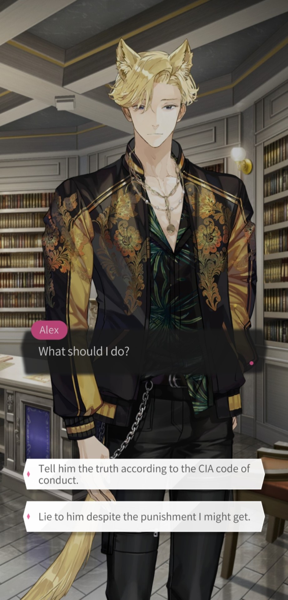
Alex: That drug was used to kill a man. That's why we would like to verify whether it can be created privately. We have yet to inform our superiors. So...
Noah: Agent Miller...
Professor Young: If so, I'm afraid I can't help you. All labs are occupied with other projects right now. In order to stop one of the projects to analyze this, I need an official letter that requests cooperation.
Noah: Is there any other way to analyze this? This is really important.
Professor Young: Hmmm...I know someone who knows this kind of stuff really well. But, it's far from here. You'd better leave as early as possible.
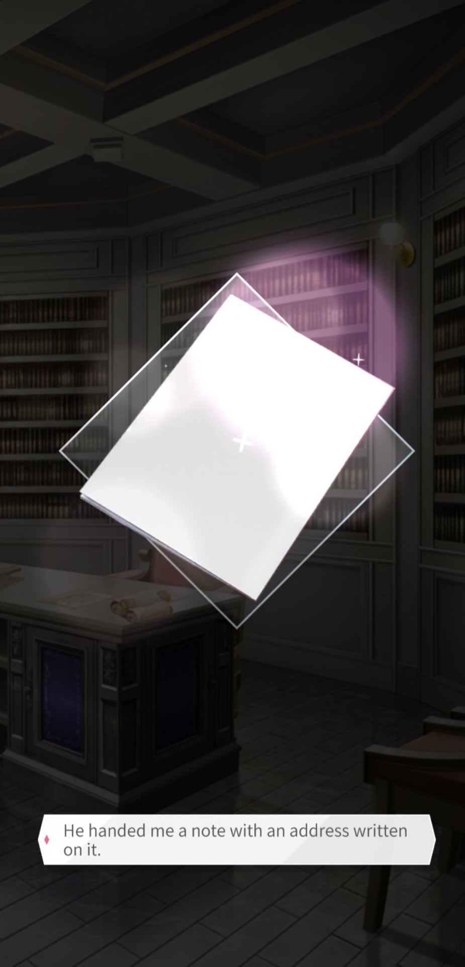
He handed me a note with an address written on it.
[end transcription]
#cinamon games#maybe: interactive stories#kill your boss#noah young#text post#the gayer you are#the more you win#and that's why I love this game
10 notes
·
View notes
Note
Because it's fun for the creator? I, too, have brain fog from chronic pain and clinical depression. But you know what? It's okay that people want to make fake screenshots! If they offer a transcript, I'm elated! If they don't, that's okay too.
*sigh*
I don’t know if you are the previous nonny or another one but please let me elaborate since I feel my original intention is getting lost.
1. I don’t want to police how people present their content.
The way you reacted sounds to me like you got angry about my plead and my reaction to the previous nonny answer for some reason.
I want people to consider how they present what they wrote. There is not a single week without multiple reblogs of posts where people ask each other to interact with the contents of writers, artists, poets etc.
Post about how comments and reblogs make a creators day and how shitty Tumblr is when it comes to showing these things to people outside your followers.
Accessibility is one way to get more people into interacting with your stuff because more people are able to enjoy it. That’s it.
That is what I want people to consider.
That’s why I said please don’t use screenshots. It was an ask, a plea, and not an order.
2. I don’t know how we went from screenshots to fake screenshots.
There is a difference.
I mean the screenshots that were clearly made from the word processors document and posted. Often with blurry fonts and tiny fonts because the person tried to get the full text on the screenshot.
(I know it is not always small or blurry but there is a high amount of those)
Fake screenshots are usually done with the help of some sort of graphic program like Photoshop or sometimes as simple as Canvas. Hence, the name fake screenshots
With these sorts of “screenshots”, you can adjust font and font size to make it better readable so it is at least readable for people who aren’t visually impaired and whose issues are more on the cognitive side.
3. A lot of creators also have fun with banners, moodboards, playing around with the font, and font color options they get when they are on mobile or other things. I also use these methods because they are fun (just as you stated) and sometimes I just feel playful.
There are so many ways to have fun with your own work.
Final conclusion:
I don’t say people can’t have fun with how they present their content.
I don’t police how people present it.
I want people to think about how they present their content and how it affects others, plus how it might affect how many people read/notice their content.
That is all I intended.
2 notes
·
View notes
Note
Hey Sophie I have a doubt in Photoshop 😔 can we copy paste the logo from a pdf and copy paste the font too? I need to make small changes in a pdf but I don't know how to, and I don't have photoshop too 😔
im not very knowledgeable so take all i say with a grain of salt 😭
well if u want to open a pdf file in ps u can import it but idk whether it’ll be rasterized or if ull still able to modify text and stuff….also idk what u want to modify! so to answer ur individual questions:
for the font - it depends if u have the font downloaded in ps bcs i dont think u can paste a font in ps, but u can paste the text and then apply the font u want. tbh it shouldn’t be an issue bcs usually more basic fonts are already in ps (in my experience), but u can check beforehand
for the logo - i dont think u can paste a logo unless u have it as a png image with no background. so what i would do is take a screenshot of the logo in the pdf file -> paste the screenshot on ps -> select and cut the logo to make it a standalone png image so that u can use it however u want!
0 notes
Text
'You Will Never Walk Alone' - documentary film

1. Planning/Filming
Jagoda had some film maker friends in Poland so we got them to record footage of the protests, people raying, the ant-abortion propaganda, and whatever else was happening at the time in Poland involving the new abortion laws.
Once we received this footage it felt like we were finally in a good place to start officially bouncing around ideas and thinking about the narrative we wanted. Through various meetings with Sana, she suggested the idea that Jagoda should play more of a prominent part in the documentary than we had originally intended - especially because it was her voice we would be seeing throughout. At first we were uncertain, as we feared having her seen throughout might take away from the topic and seem to centred around her, rather than the crisis as a whole. Nevertheless, we went on to film various bits and peaces involving Jagoda (i.e. her painting the symbols you see at the end of the doc, her around Edinburgh, etc.)
In the end, I am so glad we went for the decision to have her more present in the doc, as I feel it makes the voice over feel far more emotionally driven and heightens this feeling of helplessness due to seeing Jagoda in Edinburgh and far from the protests happening in Poland.
2. Editing Footage/Sound/Colour
Laura did such an amazing job of editing our documentary! She was so efficient with it and was great at taking in any notes and feedback given to her from both Sana/Leo, and Jagoda and I. I am so happy with our combination of archive footage and our own personal footage, as well as the screenshots of social media, as I feel this mix of various formats makes the documentary far more interesting and diverse, and gave it a nice balance.
Once we had picture lock, it was my turn to edit the sound. Unfortunately, we had quite a struggle with exporting the project from Laura's laptop to mine. Solving this problem shaved a number of days off of the amount of time we had left to edit sound and colour grade, which was disappointing as I felt I maybe didn't have enough time as I would have liked to experiment with different sounds. In the end though, I am very happy with what I managed to accomplish in the time I had considering I ran into issues with sounds randomly disappearing, on top of learning how to use the software for the first time! Throughout the sound editing process, I would send my drafts back and forth to Jagoda, Laura, and Leo, who would give me really helpful feedback. (couldn't have done it with ought you guys :) )
Once the sound was locked alongside the picture, it was sent off to Jagoda to colour grade.
3. The Crit
Jagoda, Laura and I couldn't have been more pleased with the feedback we received from Sana, Leo and the rest of the class during the crit. We went into it slightly nervous to hear what people had to say, but everyone was so enthusiastic and kind about our work!
Here are some examples of what was said:
"i dont even know what to say, i loved this film! my main critique is a small thing about the typing sounds behind the date 'october 22nd' they didnt sync and i think even if they had they wouldn't be necessary, i also wanted to share that i loved the shot at the end with the umberella and subtitle about 'a bloody revolution' and i want it on my wall"
"I was impressed at the balance between the informational parts and the personal parts. I loved the bit where all of the instragram posts popped up. It was powerful and informative."
"What an incredible film. All of these elements are so striking on their own but the relationship between all of them together is so, so so powerful. I cried throughout. The sense of urgency established by that switch from old-distant-archive to the social media notifications is brilliant. Jagoda's voiceover is so touching and her delivery of it, too. Something that stands out for me is the titles; I think the horror style of them is still great but the font just takes me out a bit. I also think the symbols don't need to be explained - I also think there's power in knowing and not being told. Like the ability to recognise these symbols is a testament to the experience? Idk, like "if you know you know"
"I am blown away. It was like watching something straight off of VICE !! I like decision to avoid music, I think it really grounded the film. The way Jagoda's voice over established the culture and the dramatic shift to talk of revolution at the end is incredibly powerful"
"This was a very powerful film. It really portrayed the female experience incredibly powerfully. I love the decision to have most of it be in polish and think it would have maybe be more impactful to have the entire film in polish? My only notes is i think the edit could be tightened up a bit to be more concise. I think the sound design could have been utilised more to really up the intensity of the riot and protests so we can hear the sound of everything we are seeing (sirens etc). I also though the credits could have been slowed down a bit and have the screen academy logo move at the same speed as the rest of the credits (although I think that wasn't you) Overalll it's fantacstic, moving, important and powerfull. Absolutely something to be proud of."
Along with all of these lovely positives, there was also some - I wouldn't say negatives? - constructive criticism! (that sounds less harsh) This includes:
The typing sounds I added over the words 'OCTOBER 22ND 2020' should be accurately synced with the speed at which the letters appear on screen.
People didn't seem to be keen on the font as they felt it was too 'horror-like' for our documentary. I personally both agree and disagree with this feedback. Part of me completely sees what they mean, as it may be a tad too 'in your face', which takes you out of the doc, since Jagoda's voice over is pretty soft and I didn't go too over the top with sound. on the other other hand, I like that it gives our doc that edge, since I feel as if the subject matter is pretty brutal and this scary font adds to that. Although it could be seen as a little out of touch so I am happy for us to change this.
The edit could be tightened up and made to be a tad more concise.
The sound design could be more intense - especially over the protest sounds as they were a bit lacking considering how busy and 'loud' the shots looked. When editing the sound, this did cross my mind, but I was scared to go too over the top with sound incase it was overbearing for Jagoda's voice over. However, now that I know people feel this way I will be more confident with the sound when going back into it in future.
The credits can be made longer so they move up screen slower, as now they are too quick for people to read them easily.
The voiceover's should be a bit louder.
Overall, I am super proud of what we managed to achieve when taking into consideration the time constraints, technical difficulties we faced, the fact we weren't in Poland to make a documentary ABOUT Poland, and of course... covid.
Thank you so much to Jagoda, Laura, Sana, Leo, and to the class for their kind words :)
0 notes
Last Seen Blogs

undyinwxnchester
𝕌𝕟𝔻𝕖𝕒𝕕

josuekvdg476
HPV Positive Treatment blog 8499

stud-hard
In love with knowledges
mxze-runner-blog
M A Z E | RU N N E R

wind-however
Untitled