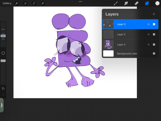
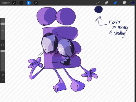
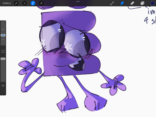
#i did most of it on 1 layer and the rendering is more detailed than usual
Explore tagged Tumblr posts
Visit Tumblr Blog
Explore Tumblr blogs with no restrictions, modern design and the best experience.
Last Seen Tumblr Blogs


Fun Fact
The average Tumblr user visits about 67 pages every month.
Note
Do you have any advice on how 2 not overwork a drawing? Over-detailing my art (to the detriment of the final result) is a big weakness of mine, and ive been working on it lately, but simplifying my art is way harder than I thought itd be. I keep getting stuck in a mentality that less detail = less effort, even though all my struggling should prove that isnt true lol. & I almost always like my simpler drawings better, even though that makes me feel kinda lazy…as long as it’s fun tho, right? [1/2]
I’m asking here bc one of the things I adore about your work is how confident and striking your paintings feel. I really admire the way colors and shape language interact in your art…I always want to keep looking to see what I can find hidden in the details, but they don’t take away from the main focus of the image. How do you manage to strike that balance? [2/2] (sorry for the long question lol)
honestly this is still something i struggle with at times! but some things that have helped me are:
- identifying which parts i tend to overwork the most. for me thats faces so i have made it a conscious habit to render faces last. that way i can match my level of face rendering to the rest of the piece.
- working on all parts of the painting at once. some artists are able to work on a painting from section to section. this is not me, regardless of detail level. jumping around all over the place keeps me from focusing too hard on one section above others. i even take this one step further by working on 2+ paintings simultaneously but there is something wrong with me for this one i'll admit.
- staying zoomed out for as long i can. this goes in hand with the previous point but when you're zoomed out its easier to lay down the biggest/primary color blocks without the temptation to detail. once the main color blocks are nicely balanced its easier to pick out a few points of interest to add spots of detail to, and restrain myself to them. (easier said than done! but i try!)
- getting comfortable with backtracking / deleting overworked sections and layers. this might seem scary but this has saved my ass more times than you might think. i always save a version of my drawings before i merge everything / start rending so i can always copy over earlier sections if needed.
- cold turkey removing details from the equation for a while. i did this more from necessity than choice, because i was struggling with my health a few years back and had zero energy to sink into art for long hours. but looking on the bright side it helped me realize what details are/aren't necessary and how to build my features from big -> small. this progression of my patho art shows pretty well how i introduced details back into my work over time.

but yeah! sometimes i do still find myself creeping a little too close to overwork territory for comfort, even with all these safeguards in place. in that case i have to accept that not every piece i put out will be my 'best' and that perfection has no place in art. that's not the point of it!
simplifying forms isn't easy, the same way abstract art isn't lazy. but with all things it can be learned with enough practice. and if you decide at the end of it all that you still like drawing a lot details, it might be a matter of readjusting how / where you implement them. best of luck <3
224 notes
·
View notes
Text
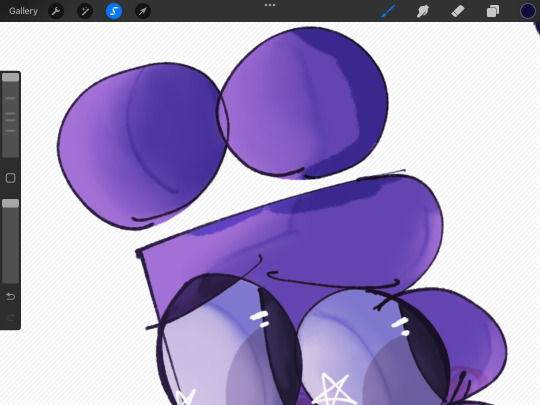
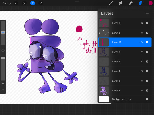
kind of halfassed rendering tutorial
below cut . just for someone offsite i just wanted to upload images as an example and tumblr would be easier
ok so we’ve got our flat colors. drew Yoshka really quick just for this

now we take a dark, saturated color that would either 1. Make sense for the surroundings
or 2. Make sense for the character.
putting 2 here because it’s awesome and whimsical and also sometimes i want to do smth fully rendered but don’t want to do a background.
whatever art program youre using, it probably has Blend Modes—not sure if that’s procreate specific language or not. But whatever. if it is, then it’s basically where youll find layer settings like Add and Hard Light and such.
typically for me it doesn’t really matter what blend mode i use, i just go through them and pick whichever one looks best with the color pallet.
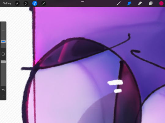
now, what i do for the shading is i determine where the light is coming from, and then start working on the shading. its fine for it to be a bit messy at this stage, and you can add and erase details whenever you want really
i refine the shading a bit more here, and add more details. also, i mostly shade the eyes as i would with any other round object, EXCEPT for the pupils, which i shade as a flat object. it just looks better.
now that i’ve done that, i start blending the shading. I don’t know what else to say here really. its just blending.
great! now that im done with that it’s time for one of my. Personal favorite parts about shading. The darker more saturated thin line. Whatever it’s called. Just grab a darker, more saturated version of the color that you were using for the first layer of shading and set it to whatever blend mode you want. For me, i almost always set it to the most saturated one, as I like to work with bright colors a lot
cool. just draw the thin lines. i dont know what to tell you
and blend them. Slight note, but if you use colored shading then it’s always good to put the shading and lighting ABOVE it. Other wise it just looks kinda weird imo
anyway yeah. just do this wherever you want really. Blend them as much or as little as you want
now make a new layer. Again, just set the blend mode to whatever you want really. Also, i would like to note that i lower the transparency of the shading AND lighting layers. you will not get the same effect at maximum opacity.
basically this is just to add. More shading to areas that need it. or just whoever it looks cool really!!!!!!!bro this is object show fanart not art school tje lighting doesnt. Need to make sense.
anyway yea just blend it againnnnnnn obviously
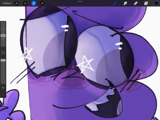
oh yea i also reallh like to add these. Triangle things to the face. yknow the ones. I think the look neat. add more depth.
i also add slight shading and blend it really heavily around/in the eyes, so it looks like theyre actually. Inside the skull.
OKAY COOL time for lighting isnt that awesome. Grab a really saturated But also. Lighter . color that either fits with the environment or the character color pallet. put it on a blend mode that makes it. Lighter. Don’t put it on like Hard Light youre not gonna light anything with that
uhm basically just do the same thing you did with shading minus the little dark lines
also very very optional but this little line on the eyelid looks awesome esp if your art style has it. So that the eyelids are darker than the rest of the body/face. It looks like eyeshadow which is great if that’s what you’re going for
PUT THE LIGHTING. ON THE LITTLE FACW TRIANGLES. it looks great and awesomeeeee trust me
AND LASTLY. MAKE THE LINE ART LIGHTER ON SOME PLACES. IT LOOKS COOL. AND OVERALL IUST INTERESTING. I DO THIS FOR EVERYTHING BUT ITS ESP IMPORTANT HERE IMO. I ALSO USUALLY LIGHTEN IT FOR PLACES WHERE IT MAKES SENSE TO.
ok. that is all hope this helped
7 notes
·
View notes
Note
Your digimon designs are so freaking cute I want to squish them!!! 😍 How did you learn to draw them so well? I swear everytime I've tried to draw a digimon they look like a pokemon knock off. 😅
Thank you!! I want to squish them too... <3
Personally, as someone who was a Pokemon artist first and then started drawing Digimon, the best way to draw Digimon distinct from Pokemon is to pay attention to their unique shape language.
A lot of classic Digimon have a more rugged appearance in their official art compared to most Pokemon designs (at least past Gen 1). Their muscles are more defined, their mouths are more jagged and their claws are bigger.
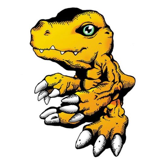
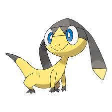
Compare Agumon to Helioptile, both yellow lizards. Helioptile is smooth, friendly and gentle, while Agumon is bulked out like he hits the gym every day.
That's not to say there aren't cute Digimon and tough Pokemon... but you can see a difference in how cuteness and toughness is rendered between the two franchises.
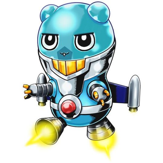

Modern Digimon may not be as bulky or tough as classic Digimon, but the designers employ unique motifs to separate their designs from Pokemon and other collectible monsters. For example, giving Digimon gear or clothing. Espimon's spy suit, jetpack and red tummy button are design elements you would not see on a Pokemon, even a Future Paradox Pokemon
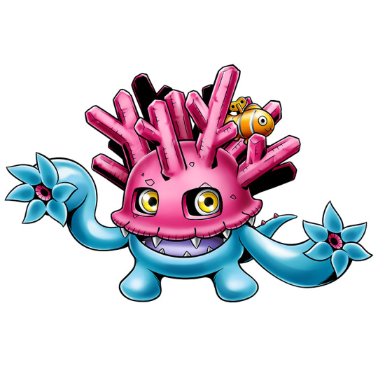

Digimon are frequently more detailed than Pokemon designs. Sangomon shares a lot of similarities with Corsola, but its official art really emphasizes its texture, from its rugged coral helmet to its shiny cnidarian-esque body. The addition of a wind-up toy clown fish adds a layer of whimsy. You wouldn't confuse one design for the other.
Those are some of my thoughts, I hope they help! If you're looking for a great place to start learning more about Digimon shape language and motifs, Wikmon's Visual List of Digimon is highly recommended. You can view every Digimon with official art in a alphabetical gallery.
17 notes
·
View notes
Text
Behind the canvas: Painting 'Finally getting that drink'

This is a post about some of my thoughts while painting Rugan's pin-up for this month. Some technical ideas, rambling and mild nudity below the cut.
Inspo and references
The pin-ups of Gil Elvgren are on the left, and 'Elspeth Resplendent' by Anna Steinbauer is on the right.
Elvgren is one of my favourite artists and I spent some time looking through a book of his collected work to see what ideas I could take for this pin-up project. The things that jumped out at me were:
The women felt like 'subjects' rather than 'objects'. There's some implication of hobbies, an inner life. They're often in the middle of doing something when they're captured on the canvas.
The subjects know they're being looked at, and they are taking it as an opportunity to flirt (signalled through eye contact, coquettish facial expressions and body language). It feels like a conversation between viewer and viewed.
Parts of the body may be exposed, but the eye is drawn back and forth between the subject's face and more titillating parts of the image.
I knew that I wanted to show Rugan in a similar setup, then; in this case, he's halfway through dinner and then catches sight of the viewer. His eye contact and smirk are flirtatious and mirror what you see of him in Act 1.
I initially wanted the pose to mirror Elspeth's in this beautiful Magic the Gathering planeswalker art by Anna Steinbauer, whose work I am obsessed with. Since I started taking art seriously, it's been my goal to paint for MtG, so I often try to study from artists whose illustrations I admire.
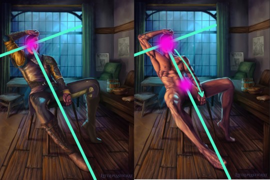
However, I didn't want to copy her pose or the composition of the piece. Don't get me wrong, I'm not above doing this - but I felt it just didn't work with the subject. The horizon line (shown in red) is very low. This is a gnome-level view of Elspeth. And I didn't want to place the viewer at the eye level of Rugan's penis.
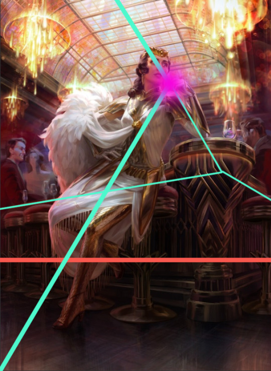
I kept the composition similar in some other aspects though - there's still a T shape (pale green) that draws the eye to the focal point (pink). I did some sketches where Rugan is leaning forwards/sideways in the same way as Elspeth is, but I feel that this final leaning-back pose demonstrates more dominant body language and allows me to paint the musculature of his torso in more detail. This acts almost as a 'ladder' that draws the viewer's eye up and down between the two focal points of the nude variant.
Painting
I've already said quite a lot on a post that was supposed to be short, so I'll keep it brief here and write more about the painting of Gortash and Raphael (February and March respectively).
It's been quite a while since I've tackled such a detailed painting, so I had to do some research/studies to remind myself of some helpful rendering rules:
Veins beneath pale skin might look blue, but they're actually just a desaturated version of the same colour. There are other parts of this image where the veins are particularly lovely. I'll leave that to your imagination.
2. Highlights on leather are not as saturated as you'd expect until you get to the most reflective part of the material. Also, a good texture brush can work wonders.

3. I try to use as few layers as possible when painting, but I remembered the importance of putting design detail on a separate Multiply layer. Multiply allows the layer to modify/darken the layers below, so you can more easily add detail that follows the shape of the object. For example, the body hair or the snake's head going over the chest. If I were painting traditionally, I'd have had to put in a lot more effort. With Multiply layers, it's one colour. Nice! I got a great tip from @dustdeepsea about the blue-ish tint that tattoos, particularly older ones, can get. I felt like this massive tat is not something that Rugan has had done recently, so I added a Gaussian blur as well.

Well, if you got this far, thanks for reading! This is a great way for me to reflect and record what I've learned from the painting. I want to paint sexy stuff, but I also want to keep improving as an artist!
Keep an eye out for updates on my next pin-up, who will be Lord Enver Gortash. Time to practice using my hair/fur brushes 🥵🥵
#rugan#digital painting#digital illustration#illustration#pin up#male pinup#bg3 fanart#bg3#painting diary#male pin-up#male pin up
45 notes
·
View notes
Text
Sorbet Spring (7/13/25)

finally finished this up after too long. i had many many draft files and iterations, but cause of that i didn't record a time lapse </3 i'll use what i can
this was a commission for a good friend of mine of her very lovely char lyla :) she's pretty!! she wanted a piece based on one i did for myself a year ago:

but with some obvious thematic changes. she also requested i make it "eye candy" color-wise, which was both exciting and intimidating. whether or not i succeeded is up to you.

first sketches! premise was simple enough: character peaking from some cherry blossoms, with tail breaking the frame similar to the leaves in my original piece. she also asked to incorporate bamboo, which i used as a sorta filler for the background.
the process from here became very spliced and messy. i was really busy irl and didn't have much time to use my pc, so i did some color planning on my phone. at the same time, i was trying to get some lines down. i redid it a lot... dunno. just took a while to be happy with!

some more sketches and the first couple runs with the lines. she looked off-putting... and her hair was NOT good. the blue sketch on the right is what i ended up going with, and thankfully i think the final render looks better than that sketch too.
i tried slapping some colors on at this point, but it was dumb and the colors arbitrarily chosen. the lines weren't even close to finished. initially i wanted to use a lot of grey in a cool contrasty way to make the colors REALLY pop, but it wasn't jibing with me. the first color pass actually used a good deal of grey:

based on the swatch in the upper left. i don't think this one was necessarily bad, but it also wasn't that great either. funnily enough i think the final actually ended up looking most similar to this iteration, even though i didn't actively reference this one while rendering.

some more junk. i didn't really end up using highlights like that at all in the end. for this one, i did like the greenish blue and magenta combo, but it felt too similar to the last illustration i did and i didn't wanna totally repeat a palette. lotta weird choices that didn't fit in at this point too, like the yellow and blue.

bounced back toward idea 1. there's probably potential in there somewhere but i didn't feel like finding it.

i did this one on my phone. i also think this one was fun, but again too similar to my last piece. the main bits i took from this were the greens and purple in the BG, the colorful hair, and particularly that dark, yellow-green on her sleeves. i decided that was my weird challenge color to work in, and i did! plus some unused swaps in the upper left again.

reworking the line art and sketch... again... i had a lot of issues with her hair for some reason. it's very fluffy, but i had a hard time conveying that in my style for some reason. i also added all the fun details on her clothing, and totally redrew her left sleeve. i totally underestimated the detail for her clothes (and... basically the entire piece) SO many times. i spent a lot of time on this. i planned things very poorly methinks.

painty time. it was a lot of fun to slap a buncha colors in her hair. the palette i was basing things on at this point was this guy:

i like these ones! something about the muddy green and yellow intrigues me.

this was the base background layer that i painted all the plants on top of. i won't lie there was approximately zero thought put into this. all i really need to make sure was the greens on the left and pinks/purples on the left.

this was solely so the highlights would look vaguely right. it works alright.
from there it was just a lot of rendering and filling in the blanks. i am officially done drawing cherry blossoms until next season, why does it take so long to draw little blobs? i dunno! here is the final again for good measure.
hooray! lastly i'll snip my favorite areas of color, too.

some fun desaturated tones. i think my favorites in particular are the grey-ish purple cherry petals in the upper right.

i like the very back grey/green/blue transitioning into the purples and pinks. the blue plants are fun too, and the falling cherry petal is yummy. reminds me of wildberry flavored things :p

i really like the blues against the green background and very distant yellow bamboo! another palette that i wouldn't normally think of or use. you can also see my challenge color on the sleeve there. i was happy it fit in as well as it did. especially with all the bright pastels everywhere else.

rainbow hair. the painting itself definitely could've used some work here but the colors were fun.
that's all! not a super interesting one really. i ended up spending a LOT more time on this than anticipated so i was frustrated at a few points, but it was one of those pieces where you gotta just walk away eventually. i actually think this one might be better for it, too. it was nice to do a proper illustration commission for once but i'm geared up to do personal projects again! just gotta finish one more commission first...
3 notes
·
View notes
Note
oh and a few things before i forget,
1, that remus fic was AMAZING!! i usually don't really read cowboy fics but wow that was so good!! can't want to find time to read pt2
2, what's the inspo for the nightingale arena? i sorta visualize the clock layout from the 75th hunger games but the trees moving but not being trees sorta confuse me when i was first reading through it😭 like girl i need you to over explain the arena to the nitty gritty details pls😪
3, how was regulus able to initially volunteer for reader the first time when they're opposite genders? like since he volunteered, did they have to pick another girl to go in? or did they just have 2 boys go into the games that year😭
- 🦇
dalia analyses: The Nightingale Q/A + arena breakdown
a/n: yes, i used this as an excuse to yap non stop !!
first of all, i’m so glad you enjoyed the remus fic—especially since cowboy aus aren’t usually your thing! that means a lot. part two will be waiting for you whenever you’re ready to dive back into that messy little trio and their filthy-stained tension <3
now, onto your questions, which i absolutely loved:
The Nightingale Arena:
this question is probably my favorite to answer, not because it’s easy (it’s definitely not), but because it’s one of the most layered parts of nightingale—a structure that’s less of a location and more of a living, breathing antagonist.
for tone and imagery, the scene that truly inspired the visual was from the original snow white, where she runs into the enchanted forest. the trees bend toward her, clawing with branches, shadows stretching like fingers—dark, disorienting, alive. that’s the heartbeat of the nightingale arena; the trees move. this is a great visual!
you’re so right to note that it feels “clock-like” at times, but it’s not the same as the 75th arena from canon. that comparison is actually part of the misdirection. while i hint at a clock-like mechanism later on, the truth is far stranger and darker: it’s not a clock in form—it’s a clock in behavior!
the arena in nightingale was built not just as a death trap, but as a sentient battlefield—a kind of enormous, living organism functioning like a warped chessboard. in chapter of only blood remains, this realization crystallizes for the reader. she begins to understand that the forest around her isn’t just alive in a metaphorical sense. it’s aware, it adapts, and like any living thing, it can be pushed to its limits—and potentially killed.
the arena’s “clock” comes into play through timed shifts and escalating traps. rather than literal wedges like the 75th, each quadrant of the forest harbors a distinct threat, and the blood rain functions as the marker between “hours.”
every time the sky bleeds, it signals a new timeline, one where the arena becomes increasingly hostile. this “blood rain” doesn’t just fall—it contaminates every water source, rendering survival more brutal with each cycle. and with every hour, the traps intensify, the terrain mutates, and the very ground you stand on may betray you.
once the blood starts to fall, everything shifts.
let’s break that down:
the arena: breakdown
at first glance, it’s just a massive, endless forest. but beneath that surface, it’s a labyrinth of timed horrors. there are multiple danger zones woven around the central cornucopia, each of them connected to a phase in the arena’s “clock.” every time the blood rain comes, the traps intensify and the layout shifts—as we saw with the explosion scene that flipped the terrain like a maze. someone standing north could find themselves south ( which is how reader, dorcas, regulus, and evan lost each other)
there are roughly six distinct zones we’ve seen so far:
1. the haunted forest
a hallucinatory zone soaked in fog that dredges up memories and delusions. it’s psychological warfare—one that disorients and isolates; grief becomes a weapon.
2. the shack zone
a deceptively quiet quadrant lined with decaying wooden shacks. filled with poisonous flowers, grasping trees, and toxic stillness. survival feels easy here—until it doesn’t.
3. the wolf mutts
located directly beside the blood forest, and crucially: they only emerge after the blood rain begins. they’re engineered horrors—feral, fast, eerily human. their timing isn’t just mechanical—it’s ritualistic, like they’re drawn out by the blood itself.
4. the blood forest
the darkest part of the arena. pitch-black trees. unnatural silence. and yes—literal rain made of blood. the rain contaminates every water source, rendering survival harder with each passing hour. it’s the arena’s way of bleeding into the tributes, forcing them to drink from its veins.
5. the shifting zone
not a fixed area, but a mechanic triggered by explosive shifts. the arena rearranges its own layout mid-game. it’s chaos incarnate, and no map can keep up with it. its purpose is to disorient tributes so they land somewhere unknown; someone safe might end up in a danger zone.
6. the death eater trap (central cornucopia)
a capitol-engineered nightmare disguised as mercy. mid-Games, survival supplies are dropped at the cornucopia—but they’re surrounded by Death Eaters. we get little detail from the reader’s perspective, as she’s poisoned and delirious, but what we do know is enough: regulus goes-alone. and doesn’t return for hours. he fights through them—capitol agents masked as magic, brutality laced with strategy. it’s never clear what he sees there, only that he returns changed.
symbolically…
the arena becomes an extension of the Capitol itself: beautiful in form, monstrous in function. it seduces, traps, punishes. and the blood it spills isn’t just tribute blood—it’s its own. and when the reader realizes that—when she understands that the forest is alive—she also realizes that anything alive can die.
and so she sets it on fire.
-
once finals are over (pls send strength lol), i fully intend to try and draw the arena out, down to the cornucopia and its traps. same goes for regulus’s arena in the 65th games, which we haven't seen in fragments so far—but which plays a massive role in the story’s future. we know he was the youngest victor the capitol has ever seen, but we don’t yet know how he won. who else was there? was it rigged because of his last name? or were there alliances among the ancient houses that shaped the outcome? those are questions that will be explored in depth very soon.
3. volunteering rules
this is one of the more significant deviations between nightingale and the canon panem system. in this universe, i wanted the reaping structure to feel a bit older, darker—more rooted in the idea of legacy, politics, and manipulation rather than just population control.
i’ve been reading crimson rivers recently (pray for me) and one of my favorite things there is how their reapings run from ages 12 to 25, and how gender doesn’t matter. it inspired me to push my own system in a similar direction.
in nightingale, gender is not a restricting factor for volunteering. regulus was able to step forward for her because the system allows it—though it did result in the selection of two male tributes afterward, meaning that year’s games had an uneven gender ratio.
again, part of what makes this story’s world unsettling is how flexible the capitol is when it benefits them. if the audience is entertained, rules can bend. if a black son volunteers to sacrifice himself at age 14? even better. it’s propaganda dressed as mercy !!
a/n: nothing i love doing here more than yapping nonstop. truly, this dalia analyses series is self indulgent to the core !! 🦇i love you for giving me a chance to talk. i cant wait to see what more theories u have, and i hope this answered ur questions <333
6 notes
·
View notes
Note
i have so many questions like how did you do the hair cards ? how do you apply them? did you do the UVs in Zbrush? how was the retopology for the pants, especially around the folds? what program do you use for retopo? was sculpting the mesh of the sword and texturing it super hard??? i'm impressed with your work i need to learn so much more
Hi! this is a great tutorial going over the type of hair cards I used for this project: https://www.artstation.com/artwork/xD0bPm
to simplify the process universally: 1. analyse your references and determine which type of strands make up the hairstyle you want to do 2. generate the textures in a program of your choice, I simulate the hair strands in Maya using x-gen and bake the opacity and normals onto cards in Substance Painter where I also do a simple diffuse and roughness map (think normal high to low poly workflow) 3. apply the textures to your cards in your 3D program and start placing them on your character in layers, starting from the lowest 4. set up a shader in your rendering program of choice and frequently test your groom, I'm using marmoset toolbag 4! I did the Retopo/UVs for everything in Maya since that's the program I was taught and most comfortable in, I don't think Zbrush is great for UVs but with plugins Blender comes close to the utilities Maya has!
Most of the retopology was based on the topology of the underlying body mesh since it's mostly tight-fitting items that need to deform exactly the same way to avoid clipping. The folds took a while to retopo and it's again mostly the same topology as the body underneath but adding detail/faces by using the cut tool along the flow of the folds without disturbing the overall edgeflow! :)
The sword was less sculpting than you would assume, I've started making my own IMM brushes to use for ornaments and similar things so it's mostly just placing things around and making it look good together! I found that doing ornaments that way leads to a cleaner result and it's easier to iterate, compared to attempting to sculpt that level of detail
The textures of the sword are still sort of early in the process, the bake is doing a lot at the moment and I want to add more signs of wear and damage to the metal as well as the hilt
Thanks for the questions! I love talking 3D so feel free to hit me up if you want more explanations, just keep in mind that I am a recent grad so there's a lot of things I myself am still learning!
6 notes
·
View notes
Note
🖍
📚
🙌
🌊
🙊
ask game
im very interested in the answers
That's a lot of questions lol but I'll do my best: 1. It's a bit complicated. Other than like very basic stuff required for school assignments, I first did digital art using a mouse in late 2020, but only really did so semi-consistently (more than once a month) for a period of 2-3 months in 2021. After that, I went back to drawing stuff very rarely, (I basically didn't draw for all of 2023). Now, I got my first drawing tablet for Christmas this year, and have been drawing fairly consistently (mostly 1/week) since then, so idk. 2. Depends on the piece. For characters, I usually have 2-5 lineart layers (head, body, any other objects/details, sometimes separate hand layer), plus 1-2 color layers and sometimes a shading layer (most of the time I do this on the color layer, but it depends). However, I did try doing a sort of background piece (dorm room for a TTRPG character of mine) that has probably about ~70 layers because I made 2 for each object in the room (lineart+color), and it's still not finished. 3.
4. Like 90% of stuff. Most types of clothing, 3/4 profile faces, any kind of natural background, proportions, fur, any kind of shading/rendering, portraying motion, etc. I am fairly new to a lot of art stuff, so most times I'm drawing stuff I have to learn how to draw that stuff as I go. Sometimes I can pick it up quickly, but a lot of the time I just end up pivoting towards something I can actually draw.
5.
2 notes
·
View notes
Text
I ramble for too long about my art (The post)
(Drawings here)
Thanks again to Nunki and Nov so much for pulling me out of art block 😭💕 I had so much fun drawing all of this and experimenting with poses and colors, etc. that I wouldn't have tried before this!! i'm so sorry this took like 2 months to finish there was lots of stuff going on but I finally finished it and i'm very happy how it all turned out. I made this post just to go through my thought process LMAO
DAY 1: Early SMP Days
This one was inspired by the "he asked for no pickles" meme and how in an early dsmp stream c!dream (in full enchanted netherite armor) asks c!george (half iron/diamond armor) to protect him with a crossbow while they go to l'manburg
At first this one was gonna be a quick drawing but then i got too invested into drawing the armor that it got out of hand and suddenly i had spent 2 days on that 💀
Also all the other drawings were gonna be like this one, a bit simple than what i usually do, but i got too invested x2 and ended up rendering(?) more the rest of drawings
C!dream is c!george's baby, like the cc's dynamic 👍
DAY 2: Objects of Affection
THE SHIELD DEMONS GOT ME 👹👹👹👹 also c!gnf keeps the mask even though it's a bit broken :3
C!gnf is a bit dirty because he doesn't shower, also he sleeps on the grass sometimes, he doesn't get sunburnt because XD protects him from that, also c!sapnap is the one that finds him like that and brings him back to kinoko
I think this is the drawing with most layers only because it was for setting the lighting
This one set the bar of how many details can i put on the next drawings haha got too silly and flew too close to the sun
DAY 3: Worship/Devotion
Inspired by religious imagery in renaissance paintings, they're very pretty and detailed and ohgggg i thought that aesthetic fit XDNF's dynamic ^_^
When I finished the drawing i added a canvas texture so it looked like the mentioned paintings' texture
The pose was so complicated but thankfully i hid all the weird anatomy under capes and hair(?) 🤭 and I have a mirror right next to my computer so i used myself as reference for the hands
The halo around c!gnf's head could be a reference to the headcanon of georgeeeHD existing and being another dsmp deity or also hinting at george's "destroying the smp" stream and how powerful and crazy insane he is!!! also the reflection of XD's halos on his eyes, they worship each other i think, xdnf makes my tummy hurt /pos
DAY 4: Visions/Dreams
Inspired by my weirdcore demons :3 i love that aesthetic so much
I did the error pop up on this custom generator!!
Saved a lot of time by making c!dream faceless since it would be covered by the pop up anyway, but it can also be symbolism for c!gnf not remembering his face or something crazy
I again used myself as reference for the hands i'm so cool and epic
Also I used a tutorial on how to make the vhs effect/chromatic aberration on paint tool sai and added grainy texture on the background for more spice :3
DAY 5: Reunion/Post-Nuke
I reused an old sketch of c!dnf side profile for this one, hashtag work smart not hard 😎 except i polished it and changed some stuff and now it looks way better than the old version
The concept was happy reunion, they're happy to see each other!! c!dnf good ending, i say in tears.
c!gnf touching the c!dritties :3 jk he's feeling his heartbeat, he can't believe he's real!!!
I had so much fun drawing the blood on the bandages and c!dream's scars, please zoom and admire them, it took so long,,,,
DAY 6: Roleswap
My demons..... my beloved rs au..... the posts i made some while ago were based on this drawing, i have a tag on my blog now for that au
RS!dnf wear matching chains!! also the concept for this drawing was that someone interrupted their make out session :3
Symbolism moment!! I like to draw characters with nail polish of the color it represents them, in this case green for dream and blue for george, but for this au, their colors are swapped: green for george and blue for dream, it symbolizes how their roles (king/knight) on that story are different and don't match with the canon. storywise, they're so in love they wanted to keep each other on themselves somehow so they exchanged nail polish colors
DAY 7: CC Roleplay/Cosplay
Sisyphus would be proud of me (<- almost gave up before drawing this), unironically i got demotivated when i finished day 6 so i took a break and then i went insane with this one
The concept was c!dnfies wearing cc!dnf outfits, dream specifically has so many outfit options but I ended up choosing the famous "dteam in madrid" outfit plus a cat beanie, and I couldn't find a fortnite jesus poster for george's shirt so i just found a silly cat pic and yeah ^_^
Thank you random twt user for the idea 👍
And that's it! I probably forgot to say some stuff more but i started to get anxious this post would be too long. Again thank you so much guys for being supportive over the wips i showed you and also being insane about c!dnf too 😭 <3
7 notes
·
View notes
Text
My top movies of 2023
Of 103 new releases I saw this year, these were the best (and, below, the worst and the most befuddling):

10. PERFECT DAYS: Snatching beauty from the mundane is easier said than done, and easier rendered with shlock than sophistication. Wim Wenders pulls it off in this gorgeous story of a Tokyo toilet cleaner who’s attuned to the world with poetry and hard-won wisdom.
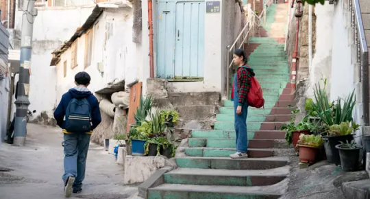
9. JOYLAND: One of many luminous shots tracks a backup erotic dancer driving home a giant cardboard cutout of his transgender frontwoman — as close as he’ll come to holding her hand in public. In this vivid Pakistani family drama, social strictures squeeze men, women, and everyone in between.
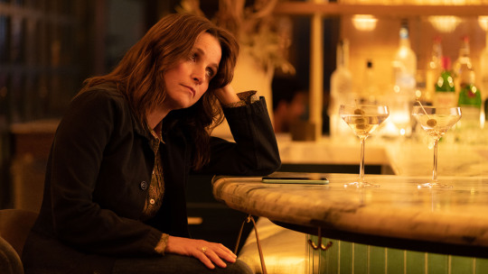
8. YOU HURT MY FEELINGS: Ordinary human relationships get so complex they make your head spin in Nicole Holofcener’s talky, thorny, funny study of the hard truths and sweet lies that populate every day. “Can you shut up and keep talking?”
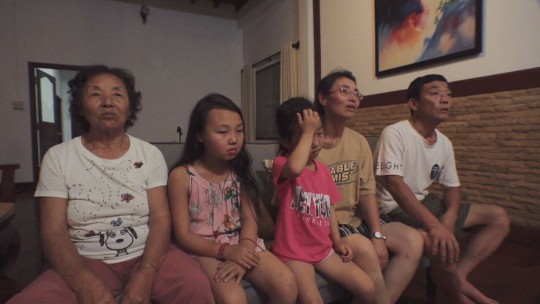
7. BEYOND UTOPIA: This pained and profound documentary about North Korean defectors contains some of the most remarkable footage I’ve seen, inside one family’s treacherous attempt at escape. We see so scarcely into the journeys of millions of people fleeing disaster all around the world each year. Here is a beam of light.

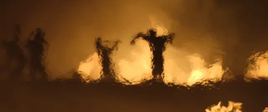
6. FOUR DAUGHTERS: In this extraordinary, line-blurring documentary, a lively and haunted formal innovation unspools the story of a Tunisian family, and the moments when playing a role — mother, daughter, wife, citizen, goth, rebel, Satanist, zealot — becomes all too real.

5. BARBIE: I went in skeptical: all this just to sell toys? One of 2023’s lessons is to trust Greta Gerwig no matter what. Too many Barbie partisans damn it with faint praise as simply a fun movie (and it deliriously is). But Gerwig layers in the emotion of innocence lost and the moral rectitude of interrogating our consumerist inheritance: ballast for the fantasia.

4. ALL OF US STRANGERS: Andrew Haigh’s London ghost story has some twists up its sleeve, which makes the forthrightness of its emotion all the more bracing. Death, of course, makes strangers of us all. Love collapses the distance.
3. KILLERS OF THE FLOWER MOON: A whole movie told through Robert De Niro’s eyewear: the chessboard reflected in the glasses of the King; the riding goggles that make him look like an owl, portent of death. One of a million details that add up to a masterpiece in Martin Scorsese’s dramatization of the clash between two worlds and two ways of being.

2. OPPENHEIMER: Now I am become death, destroyer of worlds. This is the bomb.
1. PAST LIVES: The brilliance of Celine Song’s play on inyeon is not just the wisdom of its story of love, immigration, and divided selves, but their aching visual illustration in a climactic tracking shot that moves through emotional time. Greta Lee is marvelous. Sometimes I cry just thinking about it.
Honorable mentions: MAY DECEMBER … POOR THINGS
More superlatives:
Least favorite movies: DICKS: THE MUSICAL … WONKA … MEMORY … CAT PERSON … WHAT HAPPENS LATER
Best leading actor performances:
Bradley Cooper, MAESTRO
Paul Giamatti, THE HOLDOVERS
Cillian Murphy, OPPENHEIMER
Petri Poikolainen, THE BLIND MAN WHO DID NOT WANT TO SEE TITANIC
Andrew Scott, ALL OF US STRANGERS
Best leading actress performances:
Aunjanue Ellis-Taylor, ORIGIN
Lily Gladstone, KILLERS OF THE FLOWER MOON
Greta Lee, PAST LIVES
Julianne Moore, MAY DECEMBER
Emma Stone, POOR THINGS
Best supporting actress performances:
Emily Blunt, OPPENHEIMER
Nimra Bucha, POLITE SOCIETY
Claire Foy, ALL OF US STRANGERS
Taraji P. Henson, THE COLOR PURPLE
Rosamund Pike, SALTBURN
Best supporting actor performances:
Robert De Niro, KILLERS OF THE FLOWER MOON
Robert Downey Jr., OPPENHEIMER
Ryan Gosling, BARBIE
Glenn Howerton, BLACKBERRY
Milo Machado Graner, ANATOMY OF A FALL
Best cameos
Kaitlyn Dever in GOOD GRIEF
Colin Firth in RYE LANE
Audra McDonald in ORIGIN
Margot Robbie in ASTEROID CITY
Gene Simmons in THE DISAPPEARANCE OF SHERE HITE
Miscasting couch
Jerrod Carmichael in POOR THINGS
Joaquin Phoenix in NAPOLEON
Margaret Qualley in SANCTUARY
Chris Tucker in AIR
Shailene Woodley in FERRARI
Best musical moments
Unwritten above the Sydney Harbor in ANYONE BUT YOU
I’m Just Ken in BARBIE
Piano rendition of Maneater in NO HARD FEELINGS
Japanese karaoke rendition of House of the Rising Sun in PERFECT DAYS
Murder on the Dancefloor naked ending to SALTBURN
Most unhinged moments
THE BURIAL: Jamie Foxx adds up 13 + 11 to equal 26
M3GAN: Children cheer enthusiastically for roasted chestnuts
PASSAGES: The homework assignment for a class of roughly 10-year-olds is writing like two sentences about what they did that weekend
RED, WHITE & ROYAL BLUE: The president’s son and the prince have a romantic dance-floor stare into each other’s eyes when everybody else drops to the floor during Low
SANCTUARY: Christopher Abbott orders a Belgian waffle with passion fruit jam from room service in Denver
Best character name: Amos Klobuchar in THEATER CAMP
Best dog performance: Messi in ANATOMY OF A FALL
Best mention of Brown (tie): Using a Doritos bag as a condom in FAIR PLAY and roofie-ing the chancellor to get admitted in DICKS: THE MUSICAL
Most distressing depiction of a villainous queer Politico reporter who hangs out at coffee shops in Shaw: RED, WHITE & ROYAL BLUE
Best hard-charging student newspaper with a pretentious Latin motto: THE TEACHERS’ LOUNGE
Where the movies took me this year:

0 notes
Text
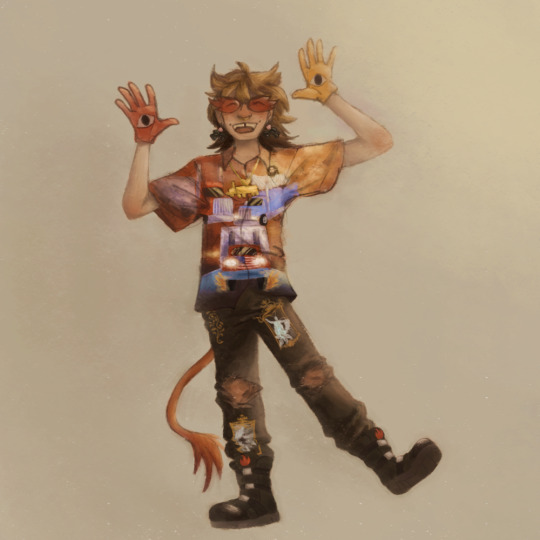
Ratparty in the Two Trucks outfit by @/flyingfish1234
#this took me 6 1/2 hours#and frankly im quite proud#i did most of it on 1 layer and the rendering is more detailed than usual#icys art#ratparty
3 notes
·
View notes
Text
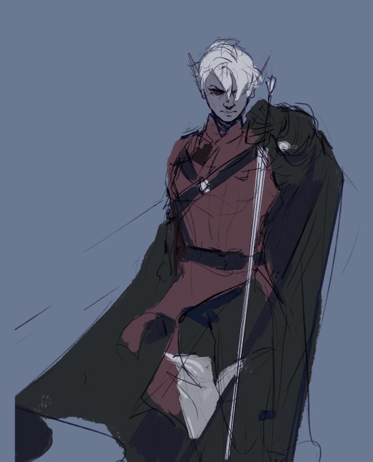
Hey y’all, here are some process stages for one of the more recent illustrations I did!
My sketches have never been very detailed. I remember being inspired for a pose while scrolling through pintrest and just threw some lines down on a page. I think more about the general pose and feeling I want more than the worry of anatomical correctness because I know I’ll fix it as I go.
In the next stage I establish stronger more contrasting colors and start to define the form of some shapes. The anatomy is still bad so at this point I’ll start to use the warp tool to move things around and adjust proportions. I also end up using the selection tool to cut various parts of the figure apart in order to put them back together in a way I like (I do not recommend doing this lol the sooner you can establish a solid foundation the better because it’ll save you a lot of work as you go. I just have a really hard time seeing my mistakes until I have something visual to work off of.) I alternate using the warp tool and selection tool and painting again and again until I get something relatively presentable like what I have at stage 3!
At this point all I have left are color adjustments and tweaking some small details. I usually don’t make such drastic color changes at the end of my work because I’ll have found my desired pallet through rendering. However with this one I wasn’t yet sure if I wanted a strong blue bg to contrast the orange of Lucéena’s eye or if I wanted the eye itself to be the main point of color. I knew I wanted the eye to stand out so I thought it was worth trying some things. That’s also why I decided to leave some parts messy in the final piece. I wanted the most well-rendered area to be Lucéena’s face to bring attention to that new shines eye she has.
I hope this was interesting and insightful!
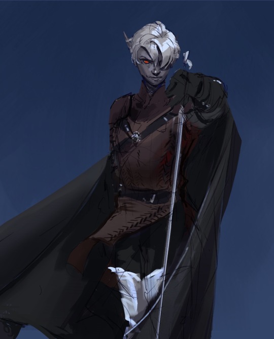
With every illustration, I start off with a loose sketch. At this stage I’m not worried about perfection, my lines are more to serves as composition guides so I know where things will roughly go. If there are parts of the illustration that I know I want to put a lot of detail into (such as the face) I will often give that part more time. Then, I jump into colors by laying down flats behind the lineart and then beginning the process of refinement with a new layer on top. At this stage I would have 4 layers, 1 as the bg color (the blue expanse), 2 as the flats of the character, 3 as the line sketch, and 4 as the rough detailing. After this the number of layers I uses depends on how much of the illustration I want to preserve from itself or how many layer filters I end up using (to tweak color and lighting). Still, my illustrations always start with these 4. Once I get to a rendering point similar to stage 2 I start worrying more about the “correctness” of my structure and how I can make the anatomy more realistic. To do this, I like to duplicate then merge all of my layers, excluding the bg layer. Now I have my character one one whole layer and the expanse of blue on another. I have the individual layers still on hand if I want to refer to my og sketch but at this point having them all as one is easier to work with because to tweak the anatomy of a character I usually cut them up into parts and move/warp them to be more precise. Is this the most effective method? Probably not, but I rely a lot on the warp tool to get the exact shapes that I want. And seeing shapes for me is a lot easier when I have some color and value to work with. (I’m not a very “line visual” person if that makes sense XD) The rest of my process is a combination of rendering and adjusting details with the warp tool. At the very end I did some color adjustments (seen between stages 3 and 4) to see if I could get them closer to the initial feel that I wanted. Because I drew this to showcase Luceena’s new magic eye I wanted that to be the focal point of the illustration. So not only is that the place I put the most detail into, it’s also where I wanted the most color to be. I thought that having a blue bg would contrast nicely with the orange of her eye, but I ended up desaturating the whole piece and let that one note of color stand by itself. Lucéena also received her eye in the Shadowfell so the grey, drab vibes ended up fitting perfectly!
#art#digital art#wip#art process#dnd#dungeons and dragons#I was asking some friends for their thoughts on the desaturated version (never be afraid to ask for a second opinion!)#and we joked that this was Lucéena’s villain look because I don’t usually make her quite so angry#she has a resting bitch face tho so I mean this is prob what she loks like all the time lolo#I think her hair is kinda growing out since I first established her design#it didn’t always cover her face so much I think??#what is consistency let me draw my self-indulgent character traits#which means that all of my characters have to have long hair or at least long bangs so that it can be sexily flung over their face#in the heat of battle#and i love givig luceena in particular messy hair because thats a Vibe
69 notes
·
View notes
Text
Castlevania Season 4 - My Thoughts

So we return, for the end Well, the 'end', there's possibility for expanded universe stories they say but for our current trio this is how we finish it
I've just binged it all so it's fresh in the mind, so I'm gonna look at the ups and downs of it all
You can also look at my review of season 3 if you'd like
Spoilers for Season 4, Watch it and get back here
So yeah, another great season, it had its downs but a lot of it had its ups too, which we will get to soon - but first let's get the negatives out of the way
What wasn't so good Nothing is perfect, and while a lot of these will be negatives they are mostly small negatives, stuff I felt could've been done a little bit better.
Saint Germain's heel turn could've been hidden So Saint Germain turning bad under the deception of death was a good way to establish conflict and pull back the rebus thing he mentioned in Season 3. But I kinda wish we didn't immediately know that he had broke bad, like we could've been super sly and coy about the fact that he's back and this time encountering Alucard only to be the orchestrator, like imagine the shock we could've had with learning what he was doing in the Castle then getting the flashback which drove him to it.
The rules of the ring change Last season Hector made the foolish decision of trusting Lenore, and while he got to bed a sexy vampire it had cost him all his freedom and the ring would prevent Hector acting against the coven of four sisters. But come this season it turns out that Hector was easily able to scheme against the sisters and invite the downfall of Camilla. Was a bit weird to establish that last season only to ignore it in the next.
The Patented Slow Start Castlevania has had a bit of a knack for starting slowly and Season 4 kinda did the same, things only really kicked off halfway through. Now of course we had to establish things; Trevor and Sypha being exhausted, the plans to resurrect Dracula, Alucard taking in the village and whatnot but we did linger on it a bit too much.
Striga's 'Day Armor' doesn't get enough time Striga took an ambush like a champ with a specialized armor that allowed her to fight in daylight. It was awesome and striking and looked absolutely badass...but that's the only time we saw it. It was just a shame really, granted it ended up that this was Striga's only time to fight, but we could've then used it for other characters, like the ambush dude who had his armor picked apart by the trio, or the Slavic vampire, just felt we could've done more with it.
CGI is sometimes a little shoddy The animation quality was mostly excellent, but that made it very glaring when some of the 3D rendering kinda hit an uncanny valley. I think the one that was most iffy was when Varney jumped into the mirror and then the mirror fragments just kinda wiped into the ground - even though Isaac's mirror tore a hole in the air - it was just a bit off-putting at times.
Couple of things left behind So when we ended it felt like we wrapped a lot of things up...except 2 things. One, where is Saint Germain's unnamed kickass lover? We caught her silhouette just walk away so we know she wasn't killed by Death, she's just 'out there' now. We also never got back to Targoviste, whose survivors must be wondering how to function since Sypha their only hope kinda disappeared on them, they'll also learn that their royals are dead, so it would've been nice to wrap that up.
Our heroes decide to use weapons sparingly In terms of arsenal we knew that our trio had a lot. The weird thing is that in some fights they just wouldn't use what would've been handy to them. There's of course Chekov's god dagger - which we didn't get too much explaining on - but Trevor would often just not use his Morningstar or Vampire Killer at times, even against two vampires, Sypha also seems to have forgotten how to use her wind magic or used her ice buzzsaw extremely sparingly and now Alucard can suddenly have bird wings...which could've been useful in prior fights.
We still lacked intelligent Night Creatures, and the badass vampires were underused So I still feel like it was very missed that the sentient night creatures of Season 1 didn't return still, especially since they were death's creatures. The one's dialogue with the priest is still among Castlevania's best and it's a shame we missed out on seeing more of it. In addition, the Ambusher's squad of vampires looked pretty cool, but like Dracula's council ended up just being swatted away after one fight, the same can be said with the Slavic vampire that was rolling with Varney. They didn't even get the pre-battle slaughter that Dracula's council did, Godbrand got more than these guys and that's a shame.
We don't get Bloody Tears or the Full Opening So the music was good, but we didn't get Bloody Tears again. For the final chapter of this saga it would've been better than using the opening song when the trio were together. Speaking of the opening song, we could've had the full length opening that we loved to see, small stuff but it would've elevated it.
Sypha is pregnant, because...because! So Sypha being pregnant is sweet, but it wasn't really needed aside from the throwaway 'trefor' joke which Alucard did better. Also that baby has gone through a lot, it's not like Sypha's been skipping in a meadow these past few weeks. Also they really gloss over how Trevor knows this and she doesn't
Some of this could've been done in a Season 5 This is more the fault of Netflix I'm guessing, since it does feel like after Season 3 we had much more to tell, but it did feel like some of the characters skipped a load of development. At the end of Season 3, Hector was beside himself in the fact that Lenore enslaved him, Isaac was still very bent on killing everything, Camilla is soaking in her genius and Alucard is more closed off than ever, but in Season 4 Hector is much more content and now has some legitimate connection to Lenore, Lenore is treated as sympathetic, Isaac is eating berries with a new outlook and Alucard decides to rescue a village because they asked, also he has a shield now. It does feel like half of what Season 4 had could've been in a Season 5, and then Season 4 could've built between having the growth be showed; Lenore feeling left out and confiding in Hector, Isaac deciding to bury the dead and rebuild the city, Trevor and Sypha having some friction in their relationship and Alucard not helping someone in need and then regretting it. As I said, this is probably not the show's fault, they were likely told that Season 4 would be it and they had to make do with it but in a vacuum it would've been nice to have had a little more build.
What was Awesome about it So I could easily just say 'the rest of it' but I guess I can afford to be a little more detailed.
Great Animation Aside from the CGI at times the animation was a top grade of excellence. I mean I watched the current My Hero Academia episode which really was pushing its budget and still I'm impressed by this animation, the artwork and settings were excellent too.
Downside: You're turning into Trevor, Upside: You get a strong warrior woman as a love interest While Alucard could've used some more time to go from emotionally scarred by 'the twins' to sympathizing with the town's plight, his character dynamic with Greta was great. Greta herself proved an excellent late addition being both a capable fighter, a strong independent leader and someone who was more than just an Alucard love interest. If you don't like strong women you're doing it wrong basically, and Alucard realising how he's turning into Trevor was some lightheartedness to Alucard combatting his loneliness and depression.
The Dialogue remains just as enthralling as the combat One of Castlevania's great strengths especially in seasons 1 and 3 were their use of gripping dialogue, the philosophical confrontations of different parties envelop the characters in greater depth thanks to the excellent script, primarily for Isaac and his chat with the bug man. The Slav Vampire also had a fantastic monologue.
Characters remain complex After four seasons it would've been easy to make some characters one dimensional, including the side villains, but Castlevania kept with the morally grey. The psycho noble clung hard to her delusions but her motives remained pure, as much as she was someone on the heroes' side she also infuriated Sypha, Saint Germain was driven to evil out of desperation but he still believably made amends in the very very end, Striga, Lenore and Morana were all on the side of the villains but had doubt about the scope of Camilla's ambition and made them consider their very nature. Simply put, it bodes well when characters have struggles that affect their motivation.
Layered Scheming 'Bring Back Dracula' was a simple premise, but the show did really well in connecting the channels between 3 plot areas, Trevor and Sypha learned of the plot by continually walking into scholar vampires attempt it, in Season 3 it was via a Night Creature in Isaac's name to start it all too, this connects to the Hector & Isaac story through Varney who schemes with the former to enact the plan, but this also connects to Alucard's story thanks to Saint Germain also plotting too. It was a clever way to entwine all three separate stories which would eventually bring things together.
Action still kicks a lot of ass Castlevania has good action? In other news water makes things wet. But still we got some great brutal action we've come familiar with in Castlevania. It could've been easy to go overboard like other shows had, which'd zone in on one thing like gore or nudity but Castlevania remained consistent in their action, looking for new lengths of creativity that never pushed its bounds. Of course building up to the final battle where we took it up a notch for the crescendo. Also I continue to call her Sypha 'Fatality' Belnades because god she kicks ass.
Isaac and Hector grow up It could've been easy and satisfying for Isaac to just roll up to Styria, take his revenge on Hector and leave, acting in both anger and mercy. But instead the characters grew beyond it, Isaac finally decides to heed what the shopkeeper and ship captain were saying rather than the crazy witch, Hector accepts his fate but works to try and make amends his own way. When the two finally cross again we see that both have accepted their humanity and instead of working for someone else they look to seek their own happiness, they forgive humanity in a way and it saves themselves. Their understanding to 'let Dracula rest' also grants them payoff from being Dracula's loyal commanders.
Camilla goes out swinging Where was this Camilla hiding huh? Brutal, Lightning powers and a crimson sword, I mean the wardrobe seems to be a bit less than last season and not battle-suited but dammit did Camilla grip you in her scenes. Her desperation and madness in taking over the world set her up to her downfall where she was betrayed and overwhelmed by Isaac's forces, but rather than let him have the satisfaction she kills herself. It could've easily fell flat because Camilla had just been sitting around like a vampire Cersei Lannister last season and end up proving her frustrations right by having a man take her life but instead she took control of her life and went out strong.
The bittersweet ending of Lenore At the end of season 3 the scheming Lenore claimed herself 'the diplomat', but having been shelved and fonder of Hector than usual it opened the door to explore her own grasp of control. The theme of enduring being prominent in this season for all the arcs we had. We learned the tragedy of Lenore's situation though, as a child of war diplomacy was her escape, she isn't comfortable with peace or total control, she can only live for conflict. While she does like Hector, she ends up valuing her own freedom in the end; and though we could've given more time to earn that sympathy we still accept it as she decides against a quiet life of surveillance freedom with Hector - ironically as Hector has lived under Camilla's captivity - and instead chose death. It was a much more poetic death than gruesome as well, after mulling how she mourned her sister because she understood the nature of greed she elected to make a choice rather than live without making any, looking at the sun for once and getting one last banter with Hector before immediately fading to dust. In a show that almost prides itself on hypergore and graphic deaths, this one was perhaps the most tranquil deaths of the show.
Striga and Morana overcome the greed Which leads to the final two of the four sisters. Camilla consumed herself with greed and died fighting for it, Lenore had no greed but also had no freedom so chose to die in order to be free, but lovers Striga and Morana were not in Styria for Isaac's attack, they were on the outskirts fighting and seeing the struggle firsthand. Their conflict over how they agreed and disagreed on certain aspects of the fight was intriguing, with the intermission of Striga on a tear in her swanky armour to tilt the tone to Striga's side of the argument. A Soldier and a Politician, both agreed though that Camilla's ambitions only worked on paper, so when confronted with their castle overrun and their sister dead it became a matter of duty or survival. Instead of dying in a good fight, Striga looked past her desire of battle and agreed to follow Morana in living, and Morana gave up any political power she could have under an empire to be a mercenary. They didn't overreach, and it spares them their lives in a surprising conclusion where the 'bad guys' still kinda get to live happily ever after.
The ReHumanization of Alucard Alucard has always been a fan favourite, but in the world of Castlevania he still acts as an outcast. While helping the village and getting close to Greta helps bring out some positive emotions in him, it's his dedication to saving the people that gives the show some of its lightest moments, especially when he toys with the kids. In a way it's what he wanted from the twins, but they had lived to not trust and wanted to kill rather than survive, and he grew a community out of it. Allowing the town to settle is the ultimate payoff for Alucard too, because it fulfills his mother's dream, now there are people who know the knowledge that his father did.
Bringing the old band together We all knew that Trevor and Sypha were gonna reunite with Alucard sometime near the end, I mean it's a shame they ditched a city that cannot organize themselves but they were kinda needed in the castle. What's best is that the moment came in it was like they never left, perfectly in sync and bantering off each other, when they fought the top level vampires it was their teamwork and synergy which made them overcome - which is great battle narrative too because alone they were getting beaten. It's just the stuff you love to see.
Trevor is tougher than Death The final battle being Trevor vs Death was a proper Attack on Titan-esque boss fight, just peeling away at the enemy and trying not to get hit. As well as a feast for the eyes it proved to be an entertaining climax - in spite of the limited info we got on the magic 3-piece dagger - and in a way it paid off Trevor's character journey. When we first met him he was an outcasted drunk that wanted nothing to do with the world let alone his family, but now he's here fighting death to save innocent people, his half-vampire buddy and his pregnant speaker magician girlfriend, being willing to give his own life for something bigger than himself, and succeeding...thanks to Saint Germain who owed him a favour and one very clever unsung hero of a horse. To tell you the truth when I saw the trailer I was expecting Sypha to have died and Trevor to be pulling her out of hell by fighting death, but this still worked really well and was perhaps a bit more logical to the canon they set.
Death is temporary, Dracula is forever With all the attempts to revive Dracula one had to work eventually. But back at Season 3 I'm sure we all thought about what would Dracula's reaction be anyway. I mean, yeah he's dead but his wife is there, you really wanna be the guy who ripped him from his wife a second time? It worked though because the people loyal to Dracula never truly understood his grief, they only wanted to further their own agendas through him. So when Dracula does come back in the final scenes with his wife, we see that Vlad Tepes is no longer the vicious killer he once was, not for now anyway. Reviving Dracula may make people think that Trevor and Sypha's actions in Season 3 and 4 were worthless because he still revives but you do have to remember that they do still save a few lives and make a few less night creatures. In addition if they want to expand the universe long into the future they can bring Dracula back in older and disillusioned again if they see fit.
He has many faces, but you still know him At about episode 8 I was really ramping up to tear into the Alchemist and Varney for being practically useless characters, but then the show went and hit me with a great twist by having both characters being guises of Death itself, the proper big bad of the season. It was a fantastic twist which validates the characters, because it was super suspect that the alchemist know where the girl was and said you can't look at her rebus, and that Varney felt like a beta Godbrand but still managed to slither away from the fights. His design was excellent too, the crown was really menacing.
A Surprise Happy Ending! Like, could any of us imagined that? The fight ends, Trevor and Sypha live happily to make a family, Alucard has his friends, a girlfriend and a community that appreciates him, Isaac has his own kingdom, Hector doesn't get the girl or a finger but he still has his freedom, Striga and Morana have each other, it mostly wrapped up very neatly and was earned, a satisfying end which closes the chapter on our trio.
Conclusion
It is sad to see great shows end, Castlevania's use of anime-style animation with gore and a strong voice cast has done extremely well, especially for a show who only got 4 episodes for a first season. It did feel like Netflix didn't give it a chance, but it pulled it off big time and escaped Netflix's cancel hammer long enough to bring a satisfying story, and one can hope we see more of this style and universe either in more Castlevania stories or even the rumored Devil May Cry adaptation.
#castlevania#castlevania anime#castlevania netflix#castlevania s4#castlevania season 4#castlevania spoilers#trevor belmont#sypha belnades#alucard#dracula#adrien fahrenheit tepes#vlad tepes#saint germain#isaac castlevania#hector castlevania#camilla castlevania#lenore castlevania#striga castlevania#morana castlevania#greta castlevania
48 notes
·
View notes
Text
IT'S BEEN 84 YEARS. LET'S TALK ABOUT NETFLIX'S SHADOW AND BONE.
8.7/10 ⭐️
spoilers for everythingggg under the cut! i'll be discussing its merits as an adaptation vs as a show, characters and plots, and the overall aesthetic and magic/world.
SHOW VS ADAPTATION:
i say this as someone who knows all the books very well and has been in the fandom for nearly a decade, so i'm biased. but. s&b functions better as an adaptation than as a standalone show. alina's plot moves so well, and satisfyingly renders so many iconic scenes and sites from s&b. the worldbuilding is also pretty easy to fall into, with a forgivable amount of voiceover/infodump. and, hurting budget aside, i mostly liked this visual interpretation of the gv.
(sidebar: the in-universe racism... doesn't work. i tried to view it in good faith but imo it was very heavy-handed. if it was framed like, "wow it's a SHU WOMAN saving the world!!!" it might've been better, but it's just racism without recompense. and it's a terrible look to make other characters of color racist. i just. why?)
as for the crows, however... i'm just not sure how strong they'll be for new viewers? i totally understand why they were included, and i really like certain connections the show made between the two series. it was a great decision to introduce the druskelle in the first Cut scene, and showing nina as a ravkan spy.
the new crows stuff felt in character, but i think the show is at its height when it sticks to the books. the first couple episodes switching between tgt and proto-soc gave me whiplash, but luckily it got more organic as it progressed. if i didn't know and love all the crows before going in, i wouldn't be that invested in them based on season 1. aside from a couple fantastic scenes, it really felt like the writers were trying to make fetch happen for like 4 episodes before they figured out what to do with everyone. plus, ravka is such a different vibe from ketterdam--tonally, sartorially, technologically, etc they didn't totally feel like the same world. it was pretty jarring. although i prefer the duo to the trio, s&b is alina's story and she is That Bitch who walked so the crows could fly. so i didn't hate their inclusion but the shoehorned content did at times disservice both plots, imo.
CHARACTERS:
way too many, which is yet another consequence of smushing everyone into one season.
MAL/ALINA/DARKLING: first and foremost, and i PROMISE i'm not saying this just to be a hater, but there needed to be less malina. i'll be the first to say that show!mal really has what book!mal wants. the new pre-fold scenes were so good. li and renaux have amazing chemistry, and their laughter over stolen grapes was a highlight. his stag plot was also good. THAT SAID, there were way too many keramzin flashbacks and malina parallels like.. 🤢🤢why do they want us to love mal so much. for what. they only needed the teacup scene but they clearly thought they were doing something with micro-aggressions and that meadow shot they showed like 6 times. knowing mal's original character, and how they scrubbed his show counterpart almost to the point of flawlessness, he's just never going to be my fave even though i do respect what they did with him. also, why were there like 5 fake deaths for this dude? boring.
the darkling was great. ben barnes knows what the fuck he's about, and he funneled manipulation and charisma into every scene. as for the backstory: at first i really wasn't feeling it, but i eventually did warm up to it and i'm so glad they showed it because oh god the cut and the creation of the fold were SO FUCKING ICONIC. also, love love love the baghra development. WE LOVE TO SEE OLD WOMEN/MOMS WHO AREN'T "EVIL"/"CORRUPTED" BY THEIR MAGICAL POWERS!!!!!!! BITCH! it didn't have to be 12 minutes long though.
i honestly don't have much to say on alina. jml was excellent in her role and very true to the book. without her book narration she feels much more consistently written.
TRILOGY CHARACTERS: i really felt the lack of genya and zoya. genya's character and actress are perfectly layered and effective, even though their roles are relatively minor. i'm so looking forward to her razrushost moment, but i wish they'd laid more groundwork for it. (and i hope throw out the wig and just dye her hair next season.) also like. WHY KEEP THE IRRELEVANT MEAN GIRL/DARKLING THIRST PLOT FOR ZOYA??? AFTER ALL THE EFFORT THEY PUT INTO IMPROVING MAL? they sacrificed so much for malina at the expense of other characters. finally, it was interesting how they decided to kill marie. i love the tailor magic flex. but also they clearly just did that to emotionally manipulate us and connect the crows so. hm.
CROWS: speaking of! the crows storyline felt a little like filler. honestly i wish they waited to roll crows into later seasons. i'd prefer little foreshadowings about them, a la the druskelle cameo or the references to nina and matthias. introducing the crows so soon makes the ice court heist feel less special. the recruitment was super tight and pragmatic, so this felt a little fluffy/fanservicey. kaz also comes off as sooooo old again. especially without the vulnerability of his book counterpart, he just seems like a 40-year-old in a 20something body.
i was pleasantly surprised to find jesper my favorite crow. like wow.... second amendment rights for jesper fahey only!! i like all the crows but book!kanej are my faves by a long shot. they felt a bit stiff tbh, like the actors were a little uncomfy with each other and/or their exposition-heavy lines. however, the one scene that felt EXTREMELY kanej to me was when they killed that dude in the church holy fuck oh my god. WE STAN AN ANGSTY BATTLE COUPLE WHO ARE BOTH DEAD INSIDE. highlight for sure.
and i actually kinda loved helnik? i know helnik is controversial for very valid reasons, but i thoughy their dynamic was fantastic and they were among the strongest performers. it was much less overwhelming than the constantly interweaving kaz/inej/jesper imo. they need to fire their location scout though. those green screen mountains and beaches were um. interesting.
aesthetic and magic:
i really hope they get a bigger budget for costumes, cgi, and sets next season! the keftas are serviceable, but they look a little cheap at times. i will also never forgive ANY of the crows' hats. it's mostly just a personal aesthetic thing but god i fucking hate them. the darkling was best dressed, but in general i liked the ravkan look more than the kerch. why were the crows always in the most elaborate getups? why couldn't they just chill in their waistcoats??? they never seemed relaxed in the way alina and co did; the clothes never felt worn or broken in.
favorite sets: the darkling's room, the crow club, all the grisha tents, the matthias/nina ship, the church where inej killed the squaller, outdoor fountain where they told the story of the black heretic. the lighting was almost always right for each scene, and there was so much detail in every one of them.
THE MAGIC WAS SO COOL! my greatest beef is alina's light--it often looked so fake, and it washed out jml. oftentimes it was fluorescent or blue, and it was used as a forcefield or orb. it's supposed to be sunlight bro. what is so hard about that? the darkling's magic looked good, other than the fold. i've always imagined the fold more like a huge black fog rather than a literal wall. so that was a bit game of thronesy, but not terrible.
and can we talk about the amplifiers? amplifiers are my personal favorite gv lore but season 1 barely gets into them. they never mention the bear zoya slew, nor do they establish the unique strength of the stag, sea dragon, and firebird. BUT THE ANTLER COLLAR FUSED INTO ALINA'S SKIN WAS SUPER DARK AND MACABRE AND I KINDA LIKED IT? ALTHOUGH I HAVE TO WONDER HOW TF IS SHE GONNA SLEEP???
if you made it this far, thanks so much! that's all i have for today.
23 notes
·
View notes
Text
Conquest
Part 1
Peter Pan x reader fanfiction
You had been friends with Peter for years. That was if you could still call yourselves friends. Granted, you were extremely close growing up, but that was purely due to your parents being friends and them having this fantasy of you both growing up and falling in love. As if.
You had known Peter almost all your life, which is why, sitting here now, you knew exactly what he was up to. You watched as he scouted out the room, as he had done so many times before. His green eyes flickered with dangerous amusement as he notices a bunch of girls eyeing him up and giggling uncontrollably. It would have been almost too easy for him to approach the girls and walk out with one (or more) of them, but you could tell from the look on his face that he wasn’t here for an easy night. He was here for a challenge.
Peter always loved games and growing up, you were almost always at the brunt of them. So much so, that you had finally had enough and decided to once and for all completely cut him out of your life. You were about to turn away and get on with your job, waitressing at Granny’s diner, when you saw the sudden change in Peters aura. You followed his eyeline and unsurprised to you, your eyes landed on a pretty blonde girl, not much younger than yourself, sitting alone in a booth. You could almost see Peters mind whirling, deciding on the best course of action. He began to approach her cautiously, taking a strategically packed book out of his bag and feigning innocence, dropped it to the ground.
You rolled your eyes, watching as the book slid along the diner floor towards her table. You were already well aware of the move he had decided to use. It had gotten pretty easy to tell after watching them all being played out on several occasions. You scoffed, knowing exactly why he had chosen this move. The book would allow him to approach her, whilst also grabbing her attention. The facade of vulnerability and embarrassment would then allow her to drop her guard and feel sorry for him, ensuring he had less of a chance of being rejected. As he kneels before her feet, he will make her feel like she is in the superior position and holds all the cards, but you knew the truth. The book will then come into play again and will allow her to initiate the interaction by questioning him on the book he is reading. This is his way into a seemingly innocent conversation.
As planned, she offers him a seat in the booth across from her. They talk some more, still using the book as the main topic of conversation. You watch as he flips through the pages, before innocently asking to move to sit next to her, as to “better show her something in the book.” It was all a ploy of course, as soon as he sits next to her, it wasn’t long before his arm was across the back of the booth, followed by her hand on his arm as she giggles playfully. He smiles sweetly towards her, but you knew his smile was far from what it seemed. As she looks away shyly, you witness the tilt of his lips, as his smile shifts briefly into a dark smirk. The sign that he was well aware that he had captured his next conquest, or as you like to see it. His next victim...
“Earth to Y/N!” Your friends hand waving in front of your face, finally pulled you back to reality, “What’s so important that you can’t even respond to your best friend?” She follows your eye line and smirks “Peter? Seriously? I thought you didn’t care about him anymore?” She questions you.
You turn to face her and scowl “Never again insinuate that I have ever cared about Peter Pan. What I do care about however, is the endless number of girls who are tricked by his fake persona and end up with their hearts broken.”
She nods in understanding “Yeah you’re right, but you can’t exactly blame them, he does put on a good show.”
You roll your eyes at your friend, as she begins to check out Peter. “Don’t you get falling for his tricks!” You exclaim.
She smiles mischievously at you “I won’t, but there’s nothing wrong with checking him out. He is the hottest guy in school after all!” You scoff at her comment, before she continues “Plus, I don’t think his tricks will work on us.”
You tilt your head in confusion at her “And why’s that?” You ask.
She smirks at you “Because thanks to your time spent behind enemy territory, we are fully aware of all his tricks, therefore rendering them useless against us!”
You let out a laugh “I think you might be onto something there.”
You stood at your locker in school the next day, waiting eagerly for your best friend to show up, politely greeting others as they pass. You stood on your tiptoes, trying to scout her out in the crowd of students, when suddenly a tall figure stands in front of you, blocking your view. You look up curiously to greet whoever has just entered your personal space, when you’re greeted with a pair of mischievous dark green eyes. Your smile instantly falters, turning into an annoyed glare “Can I help you with something Pan?”
He smirks down at you “Pan hmm? What happened to Peter? Or Petey? Oh how I miss our little pet names for each other love.”
You glare at him harder “Don’t call me that.”
He leans against the lockers, wrapping his arms around him cockily “What shall I call you then love?”
“Y/N. Or better yet, don’t call me at all.” He lets out a dark laugh, as you turn and begin walking away from him.
He soon catches up and begins walking along side you “Seriously Pan, what do you want?” You tried to act as annoyed as possible, but secretly part of you was intrigued as to why he was trying to talk to you after 4 years of not saying a word to one another.
“I thought maybe we could hang out some time, we did used to be best buds after all.” He playfully elbows you in the side, just like he used to do when you were kids. However, due to him getting a lot bigger in the four years you hadn’t been friends, the force of it caused you to stumble. You were about to fall straight into the lockers next to you, when suddenly Peters strong arms were wrapped around your body, holding you in place. You couldn't help but be engulfed in his familiar scent. He had always smelt like the forest, but now there was something else there, something dark and tempting.
You were stunned for a moment, before pulling yourself together and forcing yourself to back out of Peters arms. He smiled down at you gently, trying to apologise for knocking you over with his eyes. You were about to thank him, before you realised what he was doing. You mentally cursed yourself. You couldn’t believe you had almost fell for it! You had seen this done before. Peter “accidentally” bumping into a girl and having to save her by wrapping her in his muscular arms. You scoffed and glared up at him “Why in hell would I ever hang out with you? We haven’t been friends in years and for good reason.” You looked deep into his eyes and could have sworn you saw a flicker of hurt. You almost eased up, before once again remembering how Peter liked to play. This was most definitely an act “Just leave me alone.” You once again turned your back on Peter, allowing yourself to get lost in the crowd. Thankful that this time he didn’t follow.
You met up with your best friend at her house after school and went into detail about your run in with Peter earlier that day.
“Maybe he just misses you? You guys were close when you were younger, you used to do everything together!” Your friend suggested.
You began pacing back and forth “Misses me?” You think it over in your head “Definitely not. It doesn’t take someone four years to realise they miss someone. Plus Peter has way to much pride, he would much rather watch me die than admit he misses me. He’s after something.”
“After something? Like what, help with his homework?” Your friend once again chimes in.
You stopped your pacing to look at her “No way, despite his demonic personality, he is actually quite smart.”
“Well, you know him better than anyone, what do you think he’s after?” Your friend asks.
You sit beside her on the bed and let out a long sigh. “I have no idea, and that’s the problem. Peter likes to pretend he’s unpredictable, but I almost always know what he’s thinking or how he’s going to act. But honestly, this time I’m stumped.” You admit.
You made your way home, your mind still trying to comprehend the events of your earlier encounter with Peter. You hated how much he was invading your thoughts, but you couldn’t help yourself! It had been so long since you had spoken, since he had even looked in your direction. The whole thing was too confusing.
You opened the front door to your home and dragged yourself inside, wanting nothing more than to eat your dinner and go to sleep. Dinner was already being laid out on the table in the dining room and you began to feel a lot better after seeing the impressive spread your mother had put on. “Hey mom! This looks amazing, I’m starving.” You were about to sit at your usual spot at the table when your mother steps in front of you.
“Not so fast!” You look up at her questioningly. “We have guests coming over.” She stated plainly. “Now go upstairs and get changed into something nice.”
You roll your eyes at her but do as she says. You didn’t need to ask who the guests were. You could already tell from the wine on the table who was coming over, it was your parents and Peters parents favourite drink after all.
You quickly changed out of your jeans and into a nice skirt and top. Even though Peters parents would come to your house at least once every few weeks for drinks or a quick catch-up, you knew your mother expected you to make a bit of effort when they were coming over for dinner, as in her words “It’s only polite.” Plus you didn’t mind dressing up nice once in a while.
After brushing through your hair and applying a small layer of mascara, you made your way downstairs. You could hear laughter coming from the dinning room, signaling Peters parents arrival. You walked into the room and was just about to greet them, when you are stopped in your tracks by a pair of dark green eyes boring into you. Peter was seated opposite your usual space, smirking slightly at your shocked appearance.
“Y/N dear! How are you?” Peters mother asked, dragging you out of your shocked state. You quickly look away from Peter and smile warmly at his mother, responding politely.
You make your way over to your seat and cautiously sit down, trying to avoid Peters overwhelming stares. Luckily your parents were too invested in their conversation to notice the uncomfortable silence between the two of you. You try to focus on what his parents were saying, acting as if you were invested in their conversation, when really your mind was reeling out of control.
It had been years since Peter had last stepped inside your home, let alone come over for dinner. He was always invited of course, except his parents always gave some lame excuse he had given them as to why he couldn’t attend. But now, after what had already passed between you at school, he suddenly decided you and your family was worth his time?
Anger and confusion began to build inside of you. He was definitely after something. And you were determined to find out what.
You didn’t speak one word to Peter throughout the whole meal, but you could feel his intense stare on you the whole time, almost daring you to get lost in his eyes. However, as your friend had said to you yesterday at Granny’s diner, thanks to your knowledge of Peters moves, you were impervious to all of his charms... or so you thought.
You made your way upstairs after dinner, Peter following closely behind. You had hoped to be rid of him, but thanks to your mother insisting you show him hospitality whilst they have a few more drinks, you were now stuck with him.
You hold open the door to your bedroom, allowing the enemy access to your most sacred space. You sit down on the edge of your bed and watch Peter warily as he begins to make his way around your room. “It’s changed a lot since I was last In here.” He states, finally breaking the deafening silence.
You nod slowly “Yeah well, it’s been quite a few years...”
Peter turns around suddenly, his dark eyes landing on you “Four to be exact.”
You nod once again, honestly surprised that he had remembered.
“It looks nice...” he continues “Much better than before. Glad to see you no longer have those awful childish posters.”
You glare up at him “At least my room was never full of barbies.” You defend yourself.
Peter smirks at you, amused at your defensive attitude “I think you’re well aware they were action figures, not barbies.” He walks towards you and sits on your bed, leaning back to make himself comfortable “But I think you’ll find my room has also changed quite a bit since you were last in it.” He looks you up and down suggestively “You’re always welcome to come over and see.”
You stare at him in disbelief. Was he really trying to flirt with you?! You quickly grab one of your pillows and fling it over at him, hitting him squarely in his face.
He grabs the pillow and moves it away, laughing darkly “Do you really want to start this love?” He threatens.
You grab another pillow, ready to defend yourself “I thought I told you to call me Y/N?” You state angrily.
He lets out a small smirk “Actually love. I think you’ll find you asked me not to call you at all.”
You launch another pillow at him, fed up with his flirtatious wit, except this time he was ready with a counter attack.
Soon enough pillows are being flung back and forth between you, which suddenly results in a full blown war. You were about to attack with another direct hit to Peters face, when you all of a sudden stumble and fall forward into him. You land hard against his chest, your body lay across the top of him. You were engulfed once again in his rich scent, the smell almost drawing you in, tempting you to take in more.
“Y/N?” Peter suddenly whispers, his warm breath tingling your ear “Are you okay love?”
You pull back suddenly, shocked at your own sudden dark thoughts aimed towards Peter.
You straighten up, avoiding his intense gaze. “Yes, I’m fine. Sorry. I fell... I didn’t hurt you did I?” You pull yourself together and risk a glance in his direction, tying your best to keep yourself composed.
“I’m fine love, as long as you’re not hurt.” For a moment he almost seemed genuinely worried, and you could feel yourself open up to him. That was until you could see him holding back that devilish smirk. You couldn’t believe it. He thought he had got you.
After spending the entire day wondering why Peter had suddenly approached you, it never once crossed your mind that you may be his next conquest.
Well two could play that game...
#peter#peter pan#Peter Pan Fanfiction#peter pan fandom#peter pan imagine#ouat#once upon a time#once upon a time fanfiction#pan once upon a time#Once Upon A Time fandom#Robbie Kay#robbie kay imagine#robbie kay peter pan#robbie kay fanfiction#fandom#fanfiction
36 notes
·
View notes
Text
How I Digitally Paint like a Scenic Artist/Designer
Aka: how I did this and put my degree to good use.
LONG POST WARNING
Step 1: Research.
First off, get to your image search. If you are going to be using Google, you may want to type “-pinterest” in the search to eliminate the countless boards.
I had to figure out clothing that is vaguely late 1800s. I found a multitude of reference images that were fancier clothes- but I wanted to find images of clothing for kindred across all social classes. Photographs from the era and paintings are your friend. They will more accurately showcase what was worn.
After Fashion research comes location research. The 1890s in America is known for the rapid industrialization. Factories were getting bigger and work days were getting longer. But, I wanted the moonlight to be cascading into the place, illuminating the scene. This means I needed to find a structure that had skylights or let sunlight in. And the best images I found? Slaughterhouses. Fitting, huh?
The same rule for fashion still stands- if you can find photographs or paintings from the era- they’re better. There are tons of places still standing today from the 1800s. But today, they look WAY different. Ya know, Abandoned! So just be sure to take this into consideration if you search “abandoned slaughterhouses” or go trespassing like I did.
Lastly, pose research. Finding the poses for a fight scene can be tedious. So, I enlisted some help from a few fight choreographers and stunt men. You can record their fights and play them back at quarter or half speed. You can also get a mirror and flop on the floor a bunch. I did both. This lets you see the action/motion lines you are going to replicate in the drawing. Heres how we initially did fina’s pose:

And sometimes you have to go back and get a clean shot. I ended up using this pose for the axe.
Step 2: Set up and Background!
When you open a new file, set it to the dimensions and resolution you want. I was working at 600. Usually, I’m working at 300-350. You can always reduce resolution. Its hard to prevent fuzzy lines if you increase it later.
I cannot stress the following enough:
You work background to foreground. Big Shapes and areas to little shapes. Work your way forward. What this means is you need to fill in as much space as possible first. Then build your details. I prefer working as follows: Big Solid tones, Soft shadows, Dark Shadows, Highlights, then final blend. Once you finish this, put an overlay on top. This knocks everything back and helps create the illusion of depth. See this at work with the video below or here
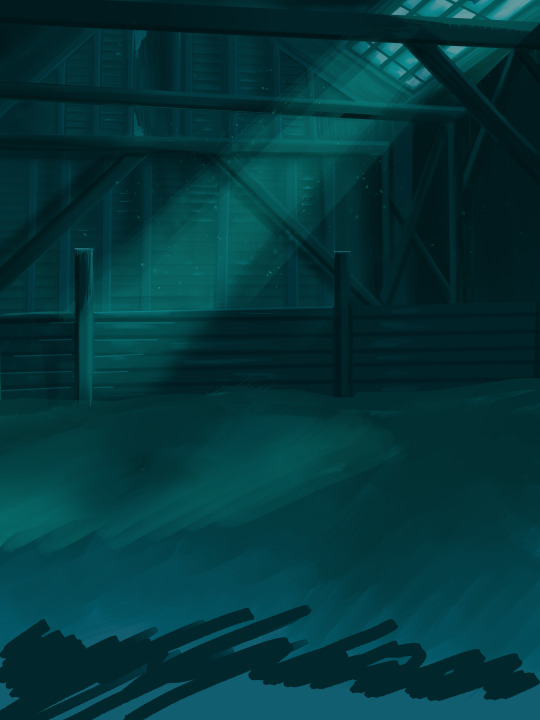
Step 3: Figure Drawings + Composition
Utilize that research and images you collected to pose your characters. I create subfolders for each set of figures. Organization is important here. This will help keep you on the right layer and prevent the eternal digital artist struggle of “Fuck that was on the wrong layer!”
Even after you move on to lineart and shading, Keep the sketch layer as a reference. You may need to see what youre original notes/ figures looked like as you do the lineart and shade. Don’t be afraid to move them around and alter the composition rn. You want to be able to make changes. Make notes! Detail light sources!
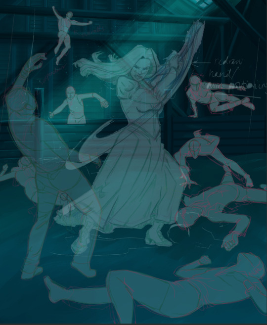
I’m about to through out some art jargon:
You want to think about asymmetric balance. The easiest way to achieve this in an eye-pleasing manner is to use the Fibonacci spiral. Yeah. This boi:

Place your figures and actions in a similar sequence to the spiral and the viewer’s eye tends to naturally follow it. This is sometimes called the Golden Ratio in the art world.
Doesn’t need to be perfectly on the spiral. You can break it- but its an excellent tool to plan how things move in the piece.
Step 4: Lineart
Once you got things sketched- its time to do the lineart. I’m using clip studio paint’s standard brushes. Nothing fancy. I often switch between the G-pen and the For Effect Liner. Mapping and Turnip are for thicker lines.

Usually I set these pens to a specific thickness depending on where I’m drawing.
My background figures are lined at 0.05 thickness, the midground is .1 to .2, Fina is .3 and the foreground is .4. I set my stabilization high to help keep my lines smooth. Stabilization 100 means there’s a significant delay between where the pen is and the cursor. I like the stabilization to be at 20 for freehanding and at 50 ish for outlining. Dont become completely reliant on the stabilization though. Good and smooth lineart is drawn from the arm not the wrist. Your range of motion is severely limited if you only move your wrist. Practice moving from your elbow and you’ll be surprised how much smoother your lines get.

Once I finish lining the figures, I usually go around it with an outline. This does three things:
1. Solidifies the figure and cleans lineart for paint bucket tool. More on that in the next step.
2. Its a stylistic choice. Helps give it that comic book feel with a heavy outline.
3. Pushes figures forward or back in the composition. Thicker outline helps denote that a figure is farther forward than another. My background figures have no outline to push them away
Step 5: Digitally coloring
For each figure you are going to select outside the lineart.
Create a new layer under the lineart
Invert the selection. Paint bucket. You should now have a solid shape of the figure under the lineart. Do not deselect.
Create a new layer above the one color. Title it solid colors. Paint in thick, solid tones. I like to use the mapping pen and turnip pen to color in my solid tones: skin, clothing, hair, etc.
After that, deselect. Create a multiply layer if you can. If your program does not have a multiplier function, Pick a tone you want to use for shadows and lower the opacity (usually 30-40% I like to use lavenders or blue tones). It will not be as vibrant, but you can edit it in post. Select off of the solid colors layer. I like to start with skin tones. Use the airbrush tool to create soft shadows. You don’t want to create harsh lines on this layer.
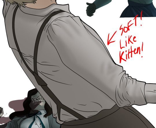
Then repeat this process with harsh lines.
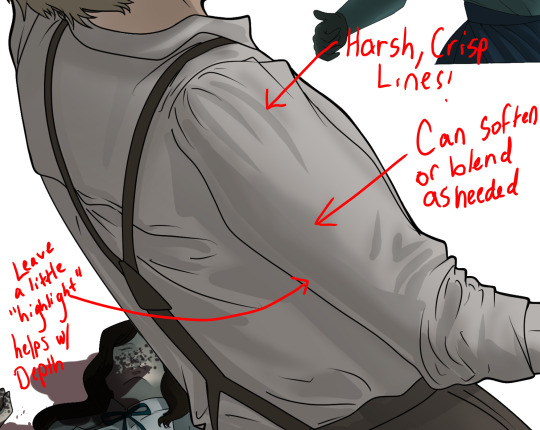
Then knock it all back with an overlay. If you dont have the ability to create an overlay, you can again drop a solid color and lower the opacity, but you’ll have to mess with the color balance/ brightness/contrast to let all the hard work come through.
You’re going to repeat this for every single figure. Here’s a few color theory tips though.
Your overlay colors should be darker (not more vibrant) in the foreground and lighter (avoid using pure white) in the background. This helps with the depth of the piece. Things closer tend to be darker (not always true, depends on lighting)
You can choose to use color theory to aid your shadows. Instead of choosing black or grey for shadows, choose a complimentary color. I used a lot of green for this piece, I used red for really dark shadows. Its not that black drains color- its just loses some depth if not used carefully.
Keep your colors consistent. Helps unify the piece. You can strategically break the consistency to draw focus. For example, Fina is the only figure with a true blue overlay. This helps her stand out from the other figures who have reds and greens.
Step 6: Touch Ups and Final Renderings
Now comes the most tedious part. If you’re like me, your computer fans have been whirring for the last few hours trying to render this monster of a file. If you havent already, SAVE FOR THE LOVE OF ALL THINGS GOOD

These are the last four layers I have for the entire piece. Here, I am trying to create effective and believable lighting. This kind of work I have only been able to achieve in clip studio or photoshop. You can do it with normal layers, but choose your colors CAREFULLY. Stay away from pure white. Carefully utilize your knowledge of light and shadow to create soft highlights. Harsh lines tend to be a stylistic choice for me. The final layer, subtract, dulls out harsh red tones. I used this as a final overlay to help put everyone and everything in the scene. Without it, things are a little too green and skin tones are a little too blushed for vampires.
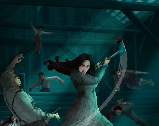
The challenge here is I want to tone down the red, but not lose the vibrancy of the blood. So, shift it to a blue. This also helped reinforce the “nighttime” effect. Its only a slight change.
Final thoughts:
Whenever you finish something, its important to reflect.
1. I am so FUCKING PROUD OF MYSELF. This is easily one of the most complicated pieces I’ve done in a while- and I’ve made 16′ tall faux stained glass. Brag. Let yourself feel awesome cuz you just made something awesome.
2. I timed myself on the piece. I could have easily spent another 7 hours on it. But its important to know when to stop messing with it. Partially for budget reasons but also when you get down to the details you can make yourself go insane. Theres also a ton of detail work I lost cuz of overlays or its just too small to notice. Fina’s face? hard to see cuz its not close enough.
3. I needed to take frequent breaks for this piece. That was good. Resting and stretching was very important. That is one of the reasons why I was able to work so fast.
4. I started doing more digital art in April 2020. I have to say, practice makes perfect. I practice drawing and digital painting for at least 3 hours a day.
That discipline has allowed me to improve so rapidly. So- I don’t wanna hear shit about I can’t possibly get this good! Or I couldn’t even draw a stick figure! BULLSHIT. You can. Get yourself some free software like Krita or Autodesk sketchbook and start playing!
And thats what I got! Thanks for coming with me on this long post!
28 notes
·
View notes