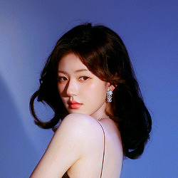
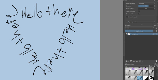
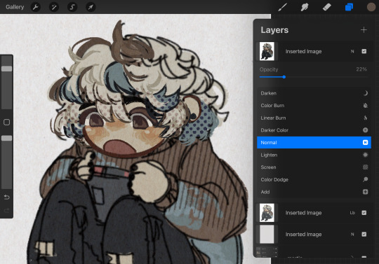
#i downloaded new brushes in photoshop
Text
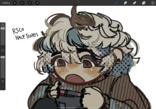
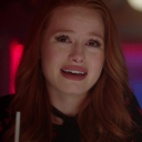
Dr. Ratio illustration (Honkai Star Rail)
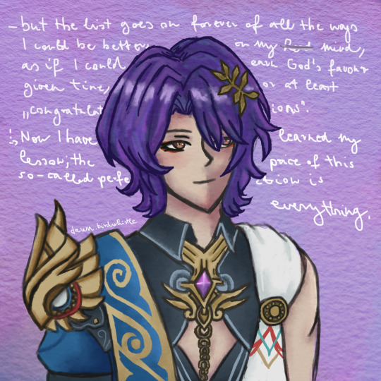
The quote is actually song lyrics from One by Sleeping At Last ^^
As Ratio wishes to be recognized by Nous, I felt it was fitting. And the other line may be a reference for
someone else 👀 perhaps...
#dr ratio#hsr dr ratio#veritas ratio#hsr#dr ratio fanart#honkai star rail fanart#honkai star rail#digital artwork#digital art#fanart#my art#digital illustration#artists on tumblr#illustration#anime style#sleeping at last#song lyrics#enneagram 1#dawnbirdwhistle#i had so much fun making this#i downloaded new brushes in photoshop#and wow#it's like modding a game for the first time#a completely different experience :0#anyways#i am an enneagram 9w1#fun facts with Dawn ig#so I somewhat relate to this song too lol#i left the mistake in on purpose btw#hope you enjoy
21 notes
·
View notes
Text
How do people do thin line art 😠and make it look good!!! what brush do i need!!!!!!!!!!! I'm insecure about my line weight guys😢
#every month or so I download a new brush and it helps for like a little bit and then it sucks!#lately I just rage quit the lineart and start doing lineless#if anyone has clip studio or photoshop brush recs that would be appreciated though......
7 notes
·
View notes
Note
hiiiii adam sorry if uv been asked this before but what brushes do u use.. 👁️ 👁️ ur art always has such a nice texture

i haven't been asked that question yet but i pretty much only use default krita brushes :) that pencil brush is my best friend i would be sooo lost without her.... ink-7 is great for filling in larger areas and more solid color, chalk just adds that little extra texture on the edges and marker is like default round brush but. softer :)
#i once downloaded a bunch of new fancy brushes to use#because i missed my old pirated photoshop and getting used to krita took some time#as you can see i ended up. not using any of them. only default krita ones<3#ask
9 notes
·
View notes
Text
guess who got an apple pen and procreate in the post xmas season! … no not you, V, I did
#my husband started a new job and they give everyone deep apple discounts… i got a pen for $50 when theyre usually $100+!#but. anyway lol. i haven’t done digital stuff since#i had a cracked photoshop and wacom tablet pre-2011…..#procreate is a pleasant surprise to use.#im not much of an artist but its been so fun to get into it and doodle. i need to download some more brushes n stuff#stomping in a glass house
8 notes
·
View notes
Text
got a drawing tablet! cannot for the life of me get the pen pressure to work. tired. wip

if anyone has a pirated photoshop cs5 or cs6 for mac.... lmk... gimp is doing my head in
#using a lil intuous bluetooth small...#first time using a tablet in YEARS#i use to borrow my cousins intuous so i have some knowledge#but that was on a different computer#with photoshop#and with a different tablet#so very similar but not the same#i think i could get to like gimp but it wont recognise my tablet and i cant figure out how to get it to recognise it#cuz i think that would fix the pen pressure issue#i like using the pixel brush .#i even tried to use the paintbrush to see if that was my issue!#spoiler alert!#it wasnt!#could just grab my old laptop with photoshop on it#can i email photoshop to myself and download it on my new computer?
0 notes
Text
Chiho Saito’s 1999 Revolutionary Girl Utena Original Illustration Collection
IT’S HERE. IT’S DONE. IT’S FINISHED. NOW…IT’S YOURS. Happy Holidays, my friends.
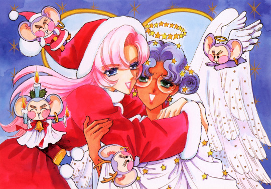
Vanna here! I have posted some already about this project, and the responses I got, public and otherwise, have been absolutely incredible. Y’all have been reblogging and hyping this before it even finished…I haven’t felt so encouraged about an Utena project since the musicals! (Yes, streams soon, I promise.) You can read the other post to get more details, and catch my post here with more details about the process if you’re interested. The long and short of it?
This is the first artbook I ever scanned. I did it in 2001. In Photoshop, using multiple scans per page that took hours to process. But it was 2001. A half megabyte file that was 1250px wide was considered extremely hardcore and impressive. That’s just always been the business I’m in when it comes to Utena art, you know?
It’s now the latest artbook I’ve scanned, and so much of the process, and effort involved, is unchanged. What has changed, is the result. Welcome to your new desktop background. Your new phone background. Your new poster print.
What I’ve done here is attempt to create definitive digitized images of Chiho Saito’s work as offered by this book--I have removed the print moiré of the original scans, and used my literal decades of experience to try and tease out as much information from them as possible. Without being physically in front of the original artwork (which is a thing I’ve had the great fortune to get to do) this is The Most Chiho Saito you are ever going to get. I’ve tried my best to make sure there is a way to get it that works for everyone:
Do you just wanna scope 'em out? Look at some disaster gays? Grab your favorite one or two? This is the path for you! Check out the ‘compressed’ (not very) 10k ‘web friendly’ (not really) copy at the Bibliothèque, the media archiving wing of the Something Eternal forums at Empty Movement*. All the following links are also available from here.
Do you want these copies? All of them? Don't just grab them individually, friend. This batch is 375MB and can be downloaded as a zip of the individual files here on our Google Drive.
Do you like digital archiving? Are you looking for a copy that preserves the archival quality of the effort but sits nice and comfy in a single file? This is for you. A minimally compressed 10k, 513MB version worked into a PDF is now up, shiny and chrome, on the Internet Archive.
Do you like the idea of the minimal compression, but want the individual files in a zip? Yep I did that too, here's the drive link.
Are you looking to print these in a larger size? This is probably the only reason on Earth you’d ever want them, and yet a bunch of you are going to go straight for these. Here are the zero-compression JPG full size copies, most of them are 15k across, like simply a ridiculous size. Pick your fave and download it from our Google Drive!
I am genuinely really proud of this work.** I was able to tease out so much new detail from these…her incredible layering techniques, the faintest brush of her highlights, and the full range of her delicate hand at whites and blacks… details commonly lost in digitization. I sincerely hope you find something here that you’re looking for, as an artist looking for inspiration, as a weeb looking for a desktop, as an archiver excited to see incredible 90s manga artwork saved forever in the digital realm. I feel like I have already said so much about them, and could keep going, but you know what? This work speaks for itself. Enjoy, use, explore, and definitely tell us what you think!
We love y’all. ~ Vanna & Yasha
* AHEM ASTERISK AHEM
You might be wondering what any of that is. Something Eternal? Biblewhatawhat??? EmptyMovement.com? You might even have done a double take at the word ‘forum.’ And you should!!!
I have a confession. This artbook was my ‘side project’ as I worked on this, *the main project.* For a couple years I’ve been banging around with a new domain, and originally I had other plans for it, but Elon Musk ruined my Twitter and Discord is well along on its way to enshittification, and well….we joke on the Discord a lot about ‘reject modernity, embrace forums’ and you know what? We’re right. So Yasha and I are putting our money where our mouths are once again, and doing something insane. We are launching, in 2023, a website forum. Obviously, this is not the official ‘launch’ per se, but I cannot announce the artbook without directing you to the forum, since it sits on the attached very cool gallery system. Oops! Told on myself. Another post more focused on the forum will be forthcoming, but if you are just that motivated to get in right away, you absolutely can! (This will help stagger new arrivals anyway, which is good for us!) If you would rather wait for the ‘official’ launch, by all means that’s coming, including a lengthy screed about how and why we’re doing this. In either case, remember: this is a couple weebs trying to make internet magic happen, we are not website developers by trade. Give us grace as we iron things out and grow into this cool new website thingie…hopefully along with some of you! :D
If you do join up, naturally, there is a thread about this project!
** If you like this kind of content, consider helping us pay for it! We do have a Patreon! If you’re wanting to use these in some public-facing distributive way, all we ask is for credit back to Empty Movement (ohtori.nu or emptymovement.com, either will work.)
I would like to say ‘don’t just slap these files on RedBubble to get easy money’ but I know that saying this won’t effectively prevent it. Y’all that do that suck, but you’re not worth letting it rain on the rest of this parade. :)
#revolutionary girl utena#utena#rgu#sku#empty movement#chiho saito#90s manga#digital archives#manga aesthetic#shoujo kakumei utena#utena art
2K notes
·
View notes
Text

GRID + TORN PAPER + RAINBOW LAYOUT TUTORIAL
(yeah, i'm sorry, but that is the title i came up with)
Hi everyone! This tutorial was requested by an anon, and we're going to make a gifset like this. You need, as usual, basic gifmaking skills and basic photoshop knowledge, but i'll try to explain this as easily as possible!
You'll also need a torn paper brush, which you can download here.
And here are the links to download the fonts used in my gifset: x, x
Okay let's start!
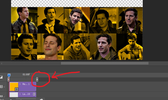
→ First you're going to create a new canvas, and it will be 540x540 px. Make sure to click on create video timeline (if you dont have a timeline, go to window > timeline. We'll leave this canvas there waiting for us :)

Then, onto our first gif. We're going to make the small square gifs first. All i do is resize the image and make it 120 px high, and you'll see why in a moment.
Make sure to remember the number of frames of this gif!! All the gifs we're going to put in the same canvas should have the same amount of frames.
Okay, so we have our first small gif:
As you can see it's a smart object, and I added some brightness, but so far that's all. You can sharpen it, but i like to sharpen until i've colored it. Now onto the important part:
Most of the gifs i worked with were mostly blue (aside from the skin color), which is recommendable, because you can create lots of colors starting from blue, using the hue/saturation adjustment, or camera raw filter. I also recommend you to use a gif that doesn't move a lot, so it'll be easier to color the background:
For the tutorial, we have our predominantly blue gif, but we are going to make it yellow, which is the opposite color, so it's the hardest to get. I hope you can see how i manipulate colors, and do it yourself :)
Here, you can use camera raw filter (filter > camera raw filter) to turn the blues and purples greener, like this:
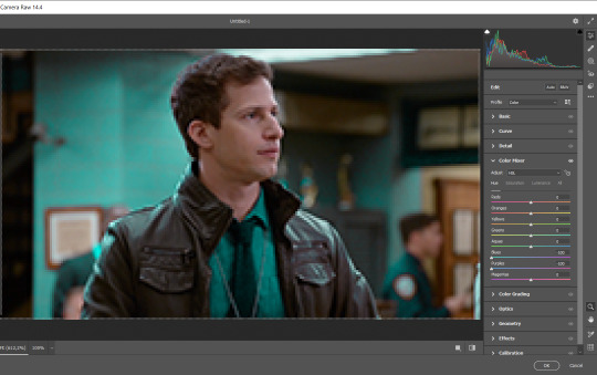
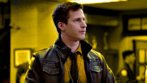
And click ok to exit the camera raw filter. Then, we're going to use hue/saturation (image > adjustments > hue/saturation) to turn it yellow:

Since it was cyan, i changed the cyans, but if you got a much greener result you'll have to use green (duh, right? i dont know i just dont want anyone to get confused akjsdhs)
And you can also add a selective color adjustment to make those yellows more yellow:

The reason i don't directly use hue/saturation is cause it might look ugly and lose quality, or it wont pick up all the colors i want it to but they're also very small gifs so if you wanna do that, do it :)
I sharpen it until this point, but if you already have that's okay.
Now we're going to color the background! For that, you just add a new layer, and set the blending mode to color.
Then you'll use your brush, set it to 20px and 0% hardness, and pick the color you're using for this gif, you can use the eyedropper tool. This is why it's important that the gif doesn't move a lot, so you can color the bg like this:
I colored carefully around the edges, and that's the result. In some gifs from my gif set I colored Jake's jacket too because i was too lazy, but this looks cleaner :)
You might want to select the color layer and the gif layer to convert them both to a smart object, just to make everything easier. So, be careful, because after that you won't be able to change anything!
But let's say you have a scene that you want to include, and it moves too much and has no blue and it's going to be a nightmare to color it.
Well, don't worry, you can! Simply, instead of manually coloring everything, you can just choose to add a gradient map to it (image > adjustments > gradient map), like this:
And this is the result:

Just remember, it has to be the same amount of frames as the other ones!
You repeat the process, until you have 10 small gifs. I made around 5 manually colored gifs, and 5 gifs with gradient for each gif. That's a confusing sentence but i hope you get it.
We are going to start pasting the small gifs on our first canvas.
(You can paste them one by one but i did this so you can see my 10 gifs)
You're going to create a square that has to be 108x108 px, using the rectangle tool. You can remove the default white background.

And you may be wondering, why did we not just crop the small gifs into those dimensions? Well, you can do that, but to me it's much easier this way, because sometimes cropping isn't accurate, or it's tedious.
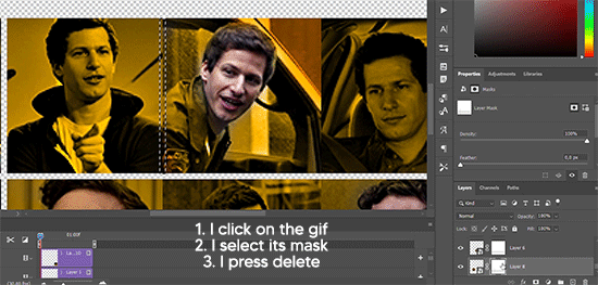
Place the small square on top the gif you're going to crop, right where the face of the character is (or whatever objects you're giffing), and while holding ctrl, click on the square. It will select it:

You're going to create a layer mask:

And then drag that layer mask to the gif:

And voila! It's now the same size as the small square. Once that's done, right click on the layer and convert it to a smart object, because we have to remove that mask. Make the square layer invisible, and start placing your gifs where you want them:
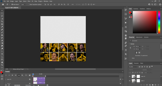
You're going to repeat that process with the rest of the gifs, and then place them all together. Don't forget that if you're making the first gif, they will all be at the bottom of the canvas, if it's one of the middle gifs, one row should be at the top and the other one at the bottom, and when you're making the last gif, they should all be at the top. Here we're making the first one, so they will all be at the bottom:
If you forgot to check that all the gifs had the same amount of frames, you can fix it here, just make sure no gif is past this little guy:
Okay! Now, to create the gutter, we're going to add a layer mask to each small gif, so that we can cut some of it.
The gutter has to be 4 pixels, (i recommend you to REALLY zoom in). What i do is make sure the width of the gutter takes 2 pixels from the edges of the gifs, since they are all together. As you can see in the image above, there's no a single empty pixel between the gifs.

This is a close-up of what i'm talking about. I select two pixels from each gif, and go all the way down to create the gutter:
(I hope I'm not over or underexplaining)
I usually use this tool when i have to make so many selections:
But that was just an example :)
(Another way you can do this, is by changing the size of the small square from the beginning and make it be 104x104 px, but i don't know why that seems more complicated to me ajsdks)
Anyway, this is what we have so far:
Now we're going to create the big gif. Its normal dimensions are usually around 1920x1080, unless you have different dimensions and have to crop it, but whatever it is, we're going to resize it and crop it to be around 550 px wide, and 400 px high:

We'll do the same thing of adding an adjustment of gradient to it to make it the color we're using. For this, i usually add a brightness layer before, because sometimes the gradient is a bit dark.
And using a 600px brush with 0% hardness, you can add some "light" on a new layer, like this:

Selecting all the layers, right-click on them and convert them to a smart object. Again, be careful, because once its a smart object, you wont be able to change any of it!
Then we paste our big gif on the canvas with small gifs, and add a layer mask to it. Using the torn paper brush at 600px, remove some of the gif to shape it like the torn paper. Make sure you're using black, otherwise it won't work correctly:
To make the effect better, add a layer UNDER the big gif, and using the torn paper brush, with the same size, you can paint under it:
Yeah, I covered some of jake's face, but that's how it supposed to look so the effect works!
And finally for the text! I used Granesta, at 150 px, and at -10.00º to make it a bit askew.
We're going to double click on it and give it a color overlay, set to normal, and give it a solid shadow if you want, then place it right here on the corner:
But as you can see, it's too big for the gif. So we're going to add a layer mask to it, and again, shape it the same way that we did with the gif. Make sure they're exactly the same shape, like this:

And that's it! This is our final result:

As always I'm sure there are easier ways to do many of these things, this is just how i do it but if you know an easier way to do it, go ahead. I hope this was at least understandable enough so you can apply the logic of it any way you want :)
If you have any questions you can send me an ask and i'll clarify!
If you found this helpful i'd really appreciate it if you left a tip on my ko-fi!
Happy giffing!
#will i ever learn how to properly explain things 😭#tutorials#uservivaldi#userraffa#userbuckleys#userhallie#tuserheidi#usertina#userfern#usersole#usercera#userzaynab#userisaiah#usernik#userpriyas#usertj
266 notes
·
View notes
Text


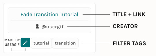
RESOURCE DIRECTORY 2.0 + HOW TO NAVIGATE USERGIF
Hello! We hit 10k followers! I want to take this moment to thank all our wonderful followers and the talented members of usergif! We created this blog less than 2 years ago and are constantly blown away by your support and beautiful creations. As a thank-you, we're proud to announce our new and improved resource directory!!! Shout out to arithemes' custom page which allowed us to create a more streamlined and organized directory for everyone to use. Under the cut, you'll find a guide to help you find exactly the resource you're looking for on our blog. Happy gifmaking! :)

THE UPDATED DIRECTORY
All resources are in alphabetical order first by the creator's URL (at the time of entry), then by the resource's title. Each title is a clickable link that'll redirect you to the original post. Beneath that, you'll find the creator's URL and the resource's relevant filter tags:
As always, whenever I add new entries to the directory, you'll see the last date listed on the right side of the blog here:
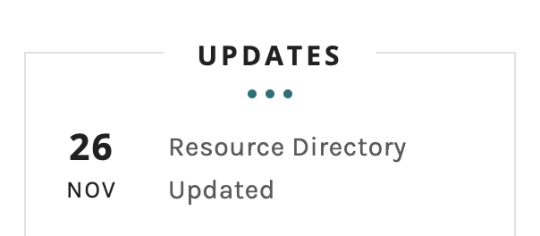
If you don't see one of your recent tutorials listed there, please be patient. I update the directory on a monthly basis, but only add resources that have already exited our queue.
THE FILTERS

Please note: the Source section has exclusive filters, meaning you can only select one at a time. In the Type and Effects sections, you can select as many filters as you want. However, if you select 2 filters in one section, like "animated" and "blending," it'll show results for any resource with either of those tags, not necessarily resources that include both of those tags.
Here's a breakdown of how we categorize our resources:
Source:
↳ all: posted by any creator
↳ usergif: posted by usergif
Type:
↳ all: click this to reset filter selections
↳ action: pre-recorded photoshop functions that can be replayed
↳ basics: non-effects-related resources to help new gifmakers get their feet off the ground (please remember usergif is not a resource for beginner-level gifs and focuses on intermediate to advanced gif effects. however, we thought it would be helpful to keep some basic resources available)
↳ brush: various brush shapes like ripped paper edges or intricate textures
↳ fonts: names and links to fonts or font packs
↳ template: pre-made, downloadable layouts and designs
↳ texture: overlays that add a different finish to a gif such as Ben Day dots (retro comic dots) or glitter
↳ tutorial: any post that provides an explanation for a gif effects process
↳ other
Effect:
↳ all: click this to reset filter selections
↳ animated: an effect that applies movement to an element such as rotating text or wiggling shapes
↳ blending: aka double exposure, this effect combines two or more gifs layered on top of each other
↳ color: specifically for color manipulation, an effect in which the original colors are completely different (e.g. a blue sky colored to look pink)
↳ glitch: an effect where color channels are toggled and layered over the original gif to give a flickering effect
↳ layout: multiple gifs on one canvas like a collage (e.g. hexagon layout) or poster-style templates
↳ overlay: an added element layered above a gif (excluding text) such as a shape, another gif confined to a shape, a texture, etc.
↳ transition: an effect that stylizes the passage from one scene/clip into another, such as a fade, glitch, linear wipe, or motion blur transition
↳ typography: any kind of stylized text added over a gif (does not include basic captions)
You can find examples of all these gif effects via their respective tags on our Nav!
THE SEARCH BAR

This search bar functions the same way as the search bar in the upper right corner of our main blog and the search function on Tumblr's mobile app.
Tumblr search allows you to generate results using keywords found in the body of the post or the tags. So, if you're looking for a post but can only remember it having the word "rotoscoping," you can type that in either in the directory's search or blog's search and find any post on our blog that mentions the exact keyword "rotoscoping."
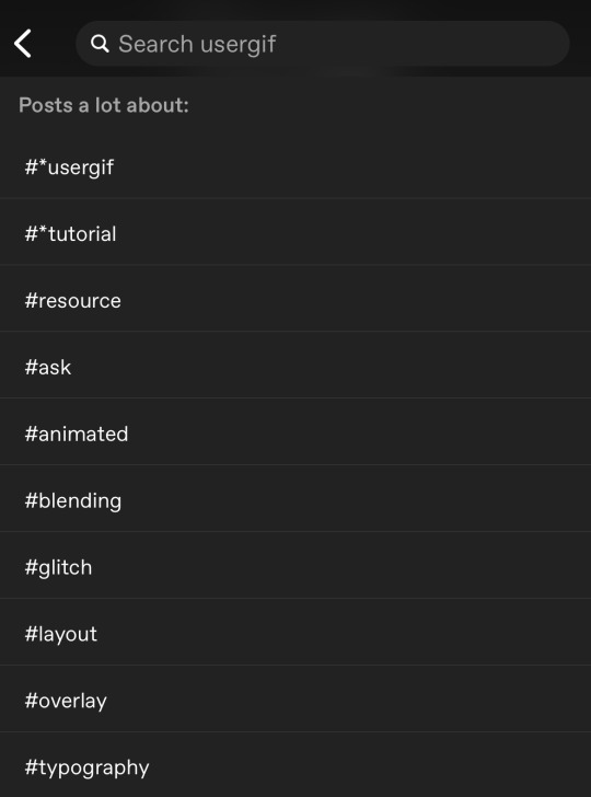
THE NAV & TAGS
Tags function differently from search keywords as these relate to exact words and phrases found only in the tags, not the body of the post. Our members use tags to categorize original posts and reblogs. Some of our most frequently used tags are listed on our Navigation Page and saved in the mobile search function pictured below:
But if you ever want to quickly navigate a tag, simply add /tagged/word to the end of our url to find that tag! For example, if you want to see all the posts we've tagged as a #tutorial, just go to usergif.tumblr.com/tagged/tutorial.
BROKEN LINKS
Whether it's due to a creator frequently changing their url, the absence of an automatic blog redirect, or my own mistakes when coding the directory — you may stumble upon a broken link. Here's what to do:
If a creator has changed their username but their blog doesn't automatically redirect you to the new blog, check if they listed their new user name in the title of their old blog like I did:
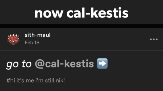
In this case, simply replace the url you landed on with this new url. For example,
https://sith-maul.tumblr.com/post/692130400398704640/how-to-make-an-animated-google-search-overlay-a
→ would become →
https://cal-kestis.tumblr.com/post/692130400398704640/how-to-make-an-animated-google-search-overlay-a
However, if you can't figure out the creator's new url or in the case that I messed up the link due to human error, feel free to send us a message so I can help find the source or correct the mistake!
WHERE TO FIND THIS INFO AGAIN
If you ever need to access this guide while using the directory, simply click the "i" button here:

And that's it! We hope this revamped directory is a lot more efficient and helpful. Thank you again for all your support and for helping us reach this follower milestone!
#*usergif#*usergifdirectory#completeresources#usershreyu#userace#uservivaldi#userbecca#usertreena#userzaynab#alielook#usernanda#userhella#userelio#useraish#userabs#tuserabbie#tusermona#usersmia#tuserlucie#usercats
258 notes
·
View notes
Note
hi, your latest edit for thgweek24 is absulutely stunning and i thought if i can ask if you can make a tutorial about the ripped gifs/paper effect? if not, that's okay! have a nice day <3
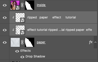
RIPPED PAPER EFFECT TUTORIAL
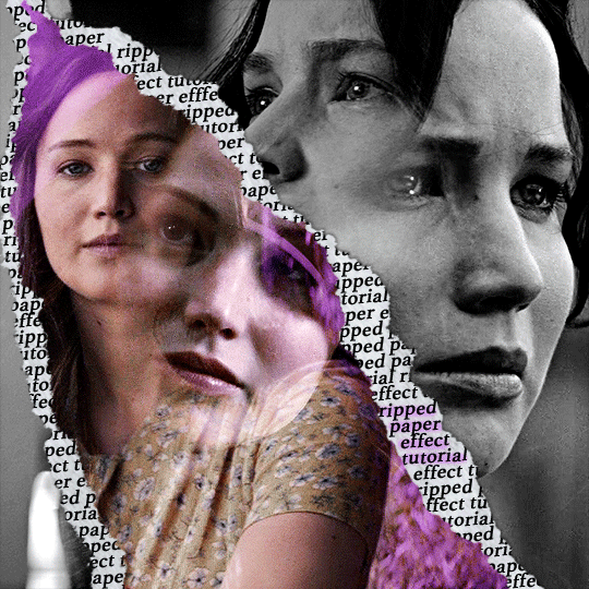
hi! thank u :D (thgweek set referenced)
below the cut are the steps that i took to create this effect. this tutorial is very screenshot heavy and assumes some basic knowledge of photoshop and giffing.
i do my best to try and explain my process so hopefully this is helpful! if you have any questions, please don't hesitate to ask.
STEP 1: Choose and arrange your two gifs
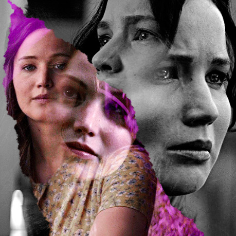
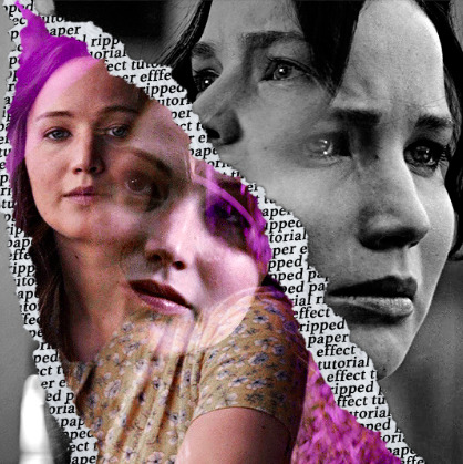
with this specific use of the ripped paper effect, there's one gif on the "outside" of the rip and one on the "inside." in this example, the outside is the b&w and the inside gif is the colored:
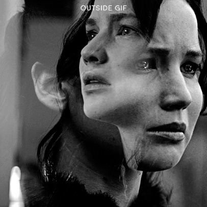
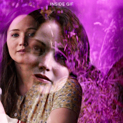
for me, the outside gif determined the positioning of the inside gif and the position/direction of the rip. as can be seen, outside gif has a lot of space on the left. therefore, i knew i was going to position the subject of the inside gif more on the right so i could create the rip without hiding too much of the b&w gif.
next, you want to arrange the inside gif on TOP of the outside gif. your layers panel should look like this:
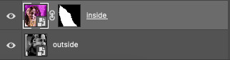
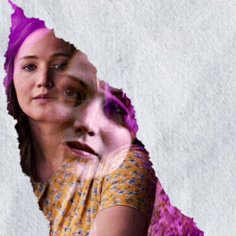
STEP 2: Creating the ripped effect
here comes the fun part! in order to create this effect, you're going to need torn paper brushes. here and here are some packs you can download (w credit to owner).
next, create a layer mask on your inside gif. you're going to use the brush of your choosing as an ERASER. then, you can play around with the size and angle of the eraser to create the look you want. this is what the gif and the layers panel now look like:
STEP 3: Adding the paper
in order to add the paper around the edges of the inside gif (where the text goes), you now need to download a paper texture. i found mine on google by searching "paper texture png."
place the paper png IN BETWEEN your outside and your inside gif. this is what everything should look like:
now, similarly to what you did in the previous step with the inside gif, you are going to create a layer mask on the paper layer. using an torn paper brush as an eraser, you will erase the paper, creating the shape you want.
be sure to leave enough room for whatever text you want to be on the paper. also, i suggest making the rips of the paper different from the rips of the inside gif so it looks more organic.
here is what my gif looks like after erasing the paper:
optional: add a drop shadow on the paper layer (right click -> blending options... -> drop shadow)
STEP 4: Adding the text
first, you want to identify the space where you will have room to place your full quote within the paper. if there are no spaces, you can always use your brush/eraser to modify the layer masks.

next, add a layer on top of the paper layer (and below the inside gif). select the text tool and start typing your repeated text!
because you can see which text is hidden by the inside gif and what is on top of the paper, a shortcut i use is the "tab" button and only type words that will be seen.
type the repeated words around the quote you want highlighted:
now, in order to contain the text within the paper, convert the text layers into smart objects. then, create a clipping mask on both layers (right click –> create clipping mask). this is what your layer panels should look like:
with that, your gif should now look something like this, with the text contained inside the paper:
STEP 5: Highlighting the quote
as you can see, it just looked like a bunch of words. so, in order to highlight the quote you carved out in the previous step, add a new layer below the layer of the quote you want highlighted:
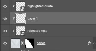
now, use a round brush (softness around 10-15% and opacity at 70-80%) with the color of your choice to highlight the words you want.
and there you have it!
i hope that this made sense and was helpful! if you have any questions or clarifications, please don't hesitate to ask :)
151 notes
·
View notes
Text
Updating... The Tattooer (ver. 3.4)!
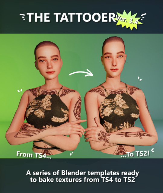
Finally! Took me a while, huh. This is the updated version of the Tattooer project. It skips some steps, making the workflow much, much faster! Huge thanks to @applewatersugar for his
suggestion on how to bake textures while preserving the transparency. This is kind of a repost of the original Tattooer post, but it actually has some new stuff and a few changes here and there, so please take a look if you want to learn how to use this new version.
This is a series of Blender template files already set up to quickly bake textures from The Sims 4 to The Sims 2. The different Blender files will allow you to:
-Bake body textures from TS4 to TS2 (Female)
-Bake body textures from TS4 to TS2 (Male)
-Bake body textures from TS4 (Female) to TS2 (Male)
-Bake body textures from TS2 (Female) to TS2 (Male) [Bonus!]
-New! Bake face textures from TS4 to TS2 (Unisex) [Bonus!]
-Bake head textures from TS4 to TS2 (Face + Scalp) (Unisex) [Still experimental]
Check the file names to see which one is which, and the resolution of the baked texture it will give.
Everything you see in the render above was 100% converted using those Blender files.
Download here! SFS / GD
Update: Version 3.4.1 (27/08/2023) Fixed some issues on the shoulders for the AF-body-4t2-1024 and AF-body-4t2-2048 templates. Now the top straps on most converted underwear/swimwear should look right.
Update: Same version (13/12/2023) As requested, added a new spanish version of the included pdf guide!
These templates were made mainly to bake and convert tattoos, but there’s more you can do with them if you get creative. I have to say, these are NOT perfect. Results may vary depending on what you are trying to convert, so! With that in mind, this is all the stuff you will be able to convert almost seamlessly from TS4 to TS2:
-Tattoos.
-Other body details such as body hair, scars, freckles, supernatural/occult details…
-Body painted underwear and swimwear, as well as some other clothing that’s mostly painted on the body.
-Socks, stockings and maybe leggings.
-Even skintones! In some areas they will look weird, so I recommend editing and blending them with other existing TS2 skins.
-Makeup, eyebrows and beards. In the old version this was just a proof of concept, but now I’ve added a new Face file template which gives some pretty decent results!
-Hair scalps. Very useful when converting some hairs! Although keep in mind part of that texture might also need to be baked on the face mesh, you know, that hairline makeup stuff.
Got your attention? Nice! Editing some of the textures from TS4 to match the UV mapping in TS2 using a 2D editing program can be incredibly hard. That’s where texture baking in Blender comes to the rescue!
You will need to download Blender, at least version 3.4, but you could always use a newer version. It is only incompatible with versions older than 3.4.
-You can download Blender for free here.
-You will also need Sims 4 Studio to extract the original Sims 4 CC textures you want.
In the first version of these Blender files, there was a necessary step using Photoshop, but that’s no longer needed. However, there’s still a tiny extra step which requires resizing the newly baked texture on some of the high resolution templates, so you might need a 2D editing program like Photoshop. More on that later.
So, before we begin, let’s clear out some questions you might have. What the heck is this texture baking thing and what does it do? Well, let’s imagine you have a video projector and point an image into a blank wall. Then you pick up some brushes and start painting and copying that projected image in that wall. Texture baking is kinda like that when it comes to 3D models. You align two models and match them as closely as you can in shape and form, and once you adjust some parameters and values, Blender does the rest for you: it will give you a new texture for a new model with a different UV map. These files I’m sharing have everything already set up, so it’s a matter of plopping in that Sims 4 texture and you will get that new texture for TS2 in just a few clicks.
This tutorial assumes you know literally nothing about how to use Blender, so if you feel uncomfortable with it, worry no more! This will guide you with pictures showing where you need to click and explaining what is happening. For Sims 4 Studio and Photoshop the process might be a bit less detailed, but still this should be pretty beginner friendly. For this tutorial, I will use some tattoos as an example (properly credited at the end of the post). Alright, enough with the rambling. Let’s get started!
·EXTRACTING TEXTURES IN SIMS 4 STUDIO:
First things first, you will need to extract as pngs all the textures you want to convert from TS4 using Sims 4 Studio. It should be pretty straightforward. Just open the packages and export the Diffuse textures. Keep them organized in a folder for easy access.
·BAKING THE TEXTURES IN BLENDER:
PRELIMINARY STEP 1: CONFIGURING BLENDER’S GRAPHICS SETTINGS:
Open your preferred Blender file depending on what you’re going to bake and the desired resolution (in this example I’m going to use the AF-body-4t2-1024 file). Before we start messing around in Blender, there’s one thing you should set up. It is a onetime step, and once it’s done, you won’t need to do it again. So, does your computer have a dedicated graphics card? If you don’t know or you’re not sure, just skip to the next step. Configuring Blender so it uses your graphics card instead of your CPU will make the baking render much faster, so it is recommended you set it up correctly.
If your computer has a dedicated graphics card, click File (1) > Preferences (2) > and on the window that pops up click System (3) > and select CUDA and make sure your graphics card is there and tick it (4). I have an Nvidia Graphics card but your case may vary. Once you’re done, click on the tiny button on the bottom left corner and Save Preferences (5).
PRELIMINARY STEP 2: CHOOSING THE RENDERING DEVICE:
Click on the tiny camera button on the right, called Render Properties (1), and on Device (2) select GPU Compute if it’s not already selected. If you’re not sure if you have a graphics card or not, just select CPU. Then select the Material Properties tab (3) and Save your changes, either by pressing Ctrl + S, or clicking File (4) > Save (5). You might need to do this second step with the other Blender files, but once you have it done and saved, you won’t need to do this again. Okay, time to get into the good stuff!
·STEP 1: LOADING YOUR TS4 BASE TEXTURE:
In the Material Properties tab, click the folder icon that says Open (1) and on the window that pops up, navigate through your folders and select your first texture. To navigate easily, the 3 buttons on the top right (2) are for the display mode. They will show your files in list mode, vertical and horizontal, and the one on the right will display the file thumbnails, pretty useful if you want to easily preview your textures here. The icons on the left side (3) will let you go one folder back and forward, go to the parent directory, and refresh the folder in case you just dropped something new in there. Double click on the image you need and that will load the texture into the Sims 4 body model, named “ts4 body”.
·STEP 2: SETTING UP YOUR SELECTION AND BAKING THE TEXTURE:
On the top right of the screen, you will see the names of the 2 models in the scene. Hold the Ctrl key in your keyboard and left click on the “ts2 body” model (1). If you did it correctly, you should see “ts2 body” in a yellowish orange color, and right down below, “ts4 body” should look more like a red orange. If not, try again by clicking first on ts4 body, and then while holding Ctrl click again on ts2 body. Then switch to the Render Properties tab by clicking the tiny camera icon (2) and click Bake (3). Depending on your screen resolution, you might need to scroll down a bit with your mouse to see the Bake button. Wait a few seconds for it to finish. You will see the progress percentage down on the bottom of your screen. Don’t panic if you notice your computer fans start ramping up, that’s completely normal! As I said in the beginning, using your GPU will bake the textures much faster than the CPU.

·STEP 3: SAVING YOUR NEW TS2 TEXTURE:
Once it’s finished, switch to the UV Editing Mode by clicking “UV Editing” on the top of your screen. And there it is: your new texture! You might have to scroll up your mouse wheel a bit to zoom in and see it in all its glory on the left side of the screen. We’re still not done yet though. You need to save it to yet another new folder (always try to keep your stuff organized!).
You can save it by pressing Shift + Alt + S, or clicking on Image* (1) and then Save As… (2). That will pop a window where you’ll need to navigate again and save it somewhere. Give it a proper name (3) and hit Enter to save it… well, Enter doesn’t always work for me for some reason, so if that happens just click Save As Image (4). And that’s it! You’ve successfully converted your baked texture. Congrats!
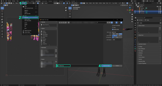
·STEP 4: GOING BACK TO STEP 1:
Alright! If you’re done with your textures, you can close Blender without saving and call it a day. But let’s say you want to keep baking other swatches. In order to go back to step 1 and start the process once again, click Layout (1), go back to the Material Properties tab (2), select “ts4 body” (3) and click on the folder icon (4) to open and load your next swatch.
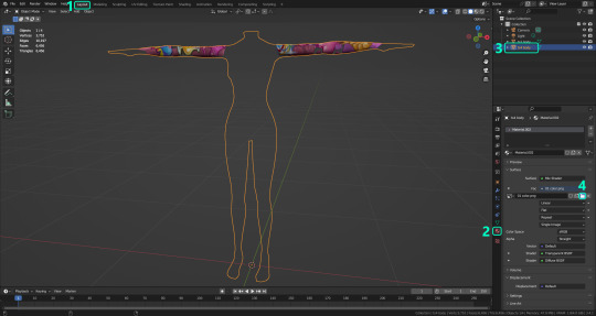
Then it’s just a matter of repeating the process from step 2. When you’re ready to move on, close Blender without saving. If you see a small check telling you it will save some images, make sure you uncheck it, so you will be able to use it again in the future from the starting point with no issues. I don’t think it really matters if you accidentally save your progress in these files, but I like to keep it clean and fresh so I can do the process where I left it from the beginning next time I open it. And in case you mess up and save somewhere, you can always just delete the .blend file and download the template files again.
In case you’d like a video tutorial on how to use these files, the amazing @platinumaspiration recorded this fantastic video showcasing the process! You can watch it here.
One final note: some of the baking .blend files save the textures with a resolution of 2048x2048 pixels, as clearly stated at the end of their file name. That’s way too overkill, because TS2 only properly supports up to 1024x1024 for most of its textures and you should always resize your final product to that max resolution (or lower if needed). I just made those 2048 versions because there might be some really tiny and slim details on some tattoos that might look a little too blurry when baked into a 1024 resolution texture, so for those cases use that if you want and then resize them using your 2D editing software of choice.
In Photoshop, in the Resample mode of the Image Size menu, there are a few options to choose. For the fine details, I like the Nearest Neighbor (hard edges) option, which, even if it looks a bit pixelated, it still preserves most of the texture and quality.

For anything else, I would just directly bake them using the 1024 versions in Blender (512 for the face and scalp).
And for the folks who feel comfortable playing around in Blender, this is just the beginning! Texture baking opens a LOT of possibilities, so feel free to move stuff around and edit the models to your liking! If you notice the baked textures look warped or stretched somewhere, or don’t like where some textures are placed in the S2 body, poke around that area moving stuff and then give it another try. The main objective of the baking process is keeping both overlapping models as close in shape as possible. You may also edit and save new copies of the templates, or make new ones from scratch using mine as a reference (keep a close look on those Baking settings and values, I think they work pretty well) and share them if you want to. Go ham, do whatever you want with them! I still have plans on making templates to convert body textures from Sims 3 to Sims 2, but for now it’s not on my priorities, so we’ll see when that happens.
Whew! Hope none of this was too confusing. Need help or have any issues with these? Please ask/message me here and I’ll be glad to help when I’m able to!
Credits for the CC used in the render demonstration:
-Skin by Sims3Melancholic.
-Eyes by Northern Siberia Winds.
-Eyebrows by PeachyFaerie.
-Tattoos by xtc.
-Top by SerenityCC.
And the Tattoo I used for the tutorial can be found here, by ValhallanSim.
Last but not least, a huge thanks to all the people who somehow contributed to make this project and update possible, either by doing initial testing, finding issues to fix, or teaching me new Blender tricks to make the workflow way faster and easier. So thanks again to @elvisgrace @moyokeansimblr and @applewatersugar on Tumblr! <3
And thank you for reading! Hope you have fun playing with this (not so) new toy hehe.
#tattooer project#tattooer update#ts2 tutorial#ts2 resources#ts2 blender#ts2 overlays#ts2 texture baking#4t2 conversion tutorial#this took me so LONG to update#im really sorry for the delay :(
302 notes
·
View notes
Note
your icons are soooooo so cute honestly!!! i wanted to ask if there's any way you can make a tutorial on how to make them? of course if you want, if you don't want to, that's okay :)
Hi! I really appreciate that you like my icons, thank you so much! 💖💖💖🥹
It's been a long time since I've done a tutorial so I hope I can explain it well haha
So I will explain how i go from the original picture and the final icon below:
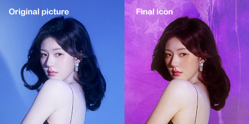
I'm using Adobe Photoshop 2024 but you can use other versions too!
First, I create a 250x250px document and apply a random color fill layer to be the background color of the icon, you can do it by going on Layer > New Layer Fill > Solid color (the color in this moment doesn't matter because I change them later according to the picture I choose to edit).
Then I place the picture I want, adjust the size to make the subject on the center and apply some smart sharpen:
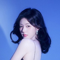
I apply some adjustments to try to color correct if the original picture using Levels, Selective Color and Color Balance to get something like this:
If you want to know the exact adjustments settings I used on this picture you can download the psd here.
To remove the background, I do the hack where I go to the Properties panel (Window > Properties) and click on the "Remove background" option. It's not always that I will get a perfect result but I think it makes easier for me to adjust the little details such as hair and accessories, etc. And I do that using the Lasso tool (shortcut L).
Now, with the background removed I pick a color that I think will match the icon in the Color Fill layer that I created before. To make the background more "fun" I like to add a Gradient Fill layer (Layer > New Layer Fill > Gradient) with a color that might go well with the one I picked earlier to make a smooth and light gradient.
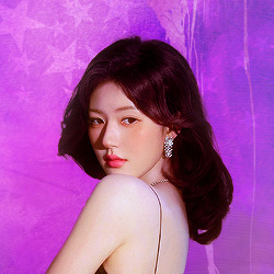
My result until now:
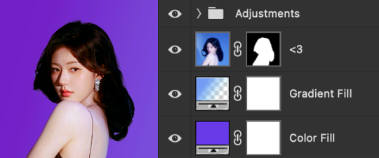
Now it comes the fun: adding textures! I like to add some textures to make the icon more lively and I usually download them on deviantart or on resources websites. You can download some cool textures here, here and here. On this part I really test a lot of textures with different Layer blending. There are a lot of different blending options so you can try as much as you want.
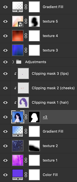
Other thing I like to do is add a clipping mask above the subject layer when I want to color something specific in my picture such as the hair, the clothes or even applying some "fake" blush on the cheeks. I do this adding a new layer, then using the shortcut option (or alt) + command (or ctrl) + g to make it a clipping mask and then using the Brush layer to color what I want. For the blending mode I usually use Soft Light and sometimes Color if I want the color to really stand out.
And in the end I will have something like this:
And my layer tab will be like this:
For using on the dashboard I usually resize it to 100x100 to make it look more sharper and defined but it's really a choice, you can already start making your icon using the size you want, I just prefer doing on 250x250px because i'm used to.
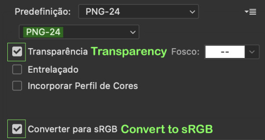
To save it I use the shortcut shift + option (alt) + command (ctrl) + s to save it for web with these settings:
And that's it! Sorry for not going to deep in each step but I guess you can get the feeling when you try making your own icons! Is really about trying different methods and things until you became satisfied with your result.
74 notes
·
View notes
Text
Krita tutorial the way I know it.
Basics: What is where.
Gimmicks.
Specific advice on specific tools.
Basics: What is where.

Upon opening the program this is what you're met with. First of all, must comment: The layout is HEAVILY editable so you can just drag menus anywhere you want, even leave them floating amidst the sheet you're drawing on.
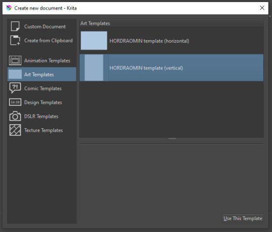
You can create custom art templates, I have two o'mine here as both have my signature background color.
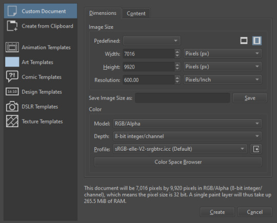
As well, you can edit the custom document settings, as in what size you want it, what resolution, even the initial content of the image. As well you can create from clipboard: Just copy some image from your browser and Krita will recognize it (useful for making meme edits lol).

Now, once you have your file, I will show you what is where.
Brushes:
Brushes are easy to edit and there are tons of free bundles to download online. I myself only got one bundle, Jackpack (bit hard to find now due to original source being lost, it is still available but bit tricky to come by).
There. Are. Tons.

Some of these are my custom brushes for calligraphy in neography, you might even guess which ones. You can edit existing brushes, make new ones from the ones you've edited without changing the original, and all sorts of stuff (more below in the third chapter).
There are numerous packages of brushes once you enter Krita, but only one/two are available when you first open it. To unlock them all, click here:
And make sure all bundles are dark gray in color (example of both dark and light below).
Now Tools Options: those will pop up depending on what tool you're using.
Symmetry: Fun stuff. You can drag the lines depending on how you need them and then center them back to the center of the screen if needed.
Gradients and Textures also have their tools options, you can play with those to get the feeling what they can do (more in third chapter).

The Filters tab is useful too. Blurring, motion blurring, color mapping, artistic filters and all that: Quite fun.
Gimmicks.
Krita allows you to customize your workspace freely. Floating menus, tabs, anything you want. It has quite many drivers at that-
To access the workspace templates, go to Window and choose Workspace.
Krita allows for copy-pasting any image onto the sheet. Though, for me it sometimes crashes if I accidentally copy-paste text into it without choosing the Text tool first.
The software allows for both raster and vector work. It is basically Photoshop sharpened to be used by artists primarily.
There are some interesting mechanics regarding the Eraser (default bind E).

You can use it with any brush, allowing for textured erasure/quick work. Good for sketching.
You can use it on gradients (given there's a transparent point on the gradient preset).
There's a Multibrush tool:

People say Krita is good for animation but my brain can't wrap around it yet honestly @~@.
The keybinds:
B - Brush tool.
E - Erase tool option.
M - Mirror (useful for checking accuracy from a new angle).
Ctrl - Color pick (when used with brush or other color-using tools).
Shift+L.Mouse+drag - Changes the size of the brush by dragging left and right.
Ctrl+E - Merge layer with the one below.
Ctrl+G - Group selected layers.
Ctrl+A - Select whole sheet.
Ctrl+Shift+A - Deselect everything.
F - Bucket tool.
G - Gradient tool.
Ctrl+S - Save document.
Ctrl+Shift+S - Save As document.
Ctrl+N - New document.
Ctrl+O - Open document (will be seen in a new tab on top of the sheet).
Ctrl+C - Copy selected layer or selection.
Ctrl+X - Cut selected layer or selection.
Ctrl+V - Paste copied/cut layer or selection.
Q - Multibrush tool.
R.Mouse - Interesting thing: Opens up a quick selector for brushes and colors you've already used in the piece.
1 - Zoom 100%.
2 - Zoom to fit the piece vertically.
3 - Zoom to fit the piece horizontally.
4, 5, 6 - Turn 15 degrees (4 and 6) or undo the turning whatsoever (5).
Ctrl+I - Negative filter applied to layer.
Ctrl+U - Color editing on the layer.
Ctrl+Y - Soft proofing mode (for color mistakes and stuff like that, mostly annoying for me tbh).
Ctrl+T - Transform selection/layer.
Ctrl+R - Square select tool.
Ctrl+J - Lasso select tool.
Honestly you can just hover your mouse over tools and see their shortcut binds, as well. Or edit them in Settings.
Specific advice on specific tools.
Brush:
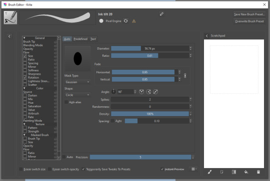
Brush editor is a great tool for making custom brushes, and it even has a sratchpad to test them out. Lots of settings, but no need to be afraid; Most of them you might never use on purpose.
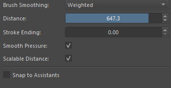
Use Brush Smoothing for great and pretty lines in lining pieces or making calligraphy.
Gradient:
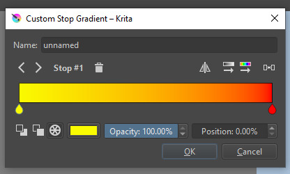
The four icons to the right top are:
Mirror gradient.
Arrange by lightness value.
Arrange by color value.
Space the stops evenly.
Click the gradient to add a new stop. The three things to the left are:
Make the stop use Primary Color.
Make the stop use Secondary Color.
Make the stop use a fixed color.
248 notes
·
View notes
Note
hello! i'm not sure if you remember me, a while ago i asked about digital art and if it's possible to do on an ipad or something similar. i was really grateful for your response and i got an ipad over christmas! i didn't realize how expensive the pencils were though and was only able to get one recently. now that i have all of that, i download the first art program i saw (ibispaint x, i don't know how good that is) and feel super overwhelmed by everything, all the tools and brushes and i have no idea where to begin. i know this is a super broad topic, but i don't know if you have any advice for a beginner hoping to become a digital artist? or know of any resources? thank you so much in advance and no worries if this topic is too broad to really get into properly!
Oh hey!! Congrats on getting an iPad! And yeah, shopping for the pens is a big pain in the butt, but I'm glad you finally got it all setup!
So most of the advice I'm gonna give you is very basic, starter advice that can apply to virtually any digital art software, as the vast majority of them are built with the exact same base tools, they just vary in their intended purposes which means they may differ in more advanced settings and what they offer beyond the basics (ex. Photoshop has more colors than Clip Studio because it's built for editing high quality photos whereas Clip Studio is meant to emulate comic art, but Clip Studio offers more in the way of comic-creating tools such as specialized rulers, 3D material support, built-in screentoning, etc. and all of the software available will tend to have different brush engines, meaning it doesn't always 'feel' the same to draw in one software as it does in another).
Your bestest friends:
Layers! This is the biggest pro to going digital, because now you can work with layers! So anything you draw on each layer is preserved and can't touch or affect whatever's on the other ones :3 You can find the layers tab in Ibis Paint X in the bottom right, don't be afraid to make a bunch of them and mess around with what you can do. Play around with the different blending mode settings (in Ibis Paint it's the menu that's labelled 'Normal' in the layers popup) especially Multiply, Color Dodge, and Overlay, as those three are the most commonly used to make coloring more efficient and give your art some extra pop.
Lasso/marquee/magic wand tools! These are basic selection tools that allow you to select an area within the layer you're working on, so that whatever you paint won't travel outside of that area. The Lasso is a free draw tool, the marquee tool is typically 4 sides by default (so squares/rectangles) and the magic wand detects and selects a closed area with one click! (just note that by default it's only on the layer you're on, so if you use it on a layer that has nothing, it will typically select the entire canvas).
Alpha locking! This is a simple button setting you can click to 'lock' the layer you're working on, which basically means that whatever you've drawn on that layer, anything you add can't travel outside of that drawing. So if you want to quickly shade something without going outside the lines, alpha locking is your solution!
Clipping groups/layers! This is a bit more advanced but is basically an even better version of alpha locking that you can use in conjunction with it. Clipping layers are basically additional layers that , when you click the 'clipping group' button, 'attaches' that new layer to the layer that's below it. It performs the same function as the alpha lock by preventing whatever you draw on that layer from travelling outside of it, HOWEVER it comes with the added benefit that it's on an entirely different layer, meaning you can erase and mess with whatever's on that new layer as much as you like and it won't hurt the base layer. It kinda follows the same logic as animation cels !
Masking! Y'know when you're doing a traditional painting, and you put down tape to cover the area so you can paint over it and later remove the tape and everything underneath is untouched? That's basically what masking is! Once you put down a layer mask, using the erase tool on it will 'erase' whatever the mask is applied to, and using the brush will make it magically return! This may sound silly at first, but I find masking is especially helpful if you want to erase something on the layer you're working on without it disappearing forever! It's also really helpful for comic work because you can mask whatever's outside of the panels and voila, nothing you draw will travel outside of those panels!
Stabilization! I don't know how extensive Ibis Paint X is with offering stabilization tools, but many digital art software comes with it and it's a LIFE SAVER for new digital artists adjusting to the feel of digital art. It essentially 'slows down' the output of the ink on the canvas which helps a lot with getting cleaner lines in fewer tries. It's not quite as big of a deal when drawing on iPads because obviously you have more control by default by drawing directly on the screen, but it can still be really helpful when you need to pace your hand ahead of the actual drawing tool to pull cleaner lines!
That's pretty much all I can think of for now! But here are some other commonly asked questions:
1.) There are so many brushes to choose from, which one do I use?
The round brush is small but mighty. Virtually anything can be painted with it, it's simple, but malleable, especially when you start messing around with the hardness and opacity settings. Don't get too lost in the sauce with the brushes that are available to you, it can be very easy to get overwhelmed by all the options and variety. Some artists still work purely with just round brushes, some artists have custom brushes they like to use to speed up their drawing process or achieve certain textures. Play around with them, but don't get too stressed about which one you use because there's no wrong answer, the right brush to use is the one that gets the job done ! <3
2.) What canvas size should I use?
It depends on a variety of factors such as whether or not you're planning to print, where you're going to be posting it, etc. By default I like to work on 8.5 x 11 inch canvases (standard printer paper size) at 350 dpi, which if you want to make that canvas in Ibis Paint X, means you just have to make a canvas with a pixel ratio of 2975 x 3850 pixels! Just note that the lower you go in either pixel count or dpi, the lower the resolution, so it's typically encouraged you work at a minimum of 300 dpi (but you usually don't have to go any higher than 600) to ensure you don't wind up with any blurry low res JPG's/PNG's.
3.) Should I export my final drawing as JPG or PNG?
This is usually just up to personal preference, but like the canvas size, it depends on what you're using the image for. You can always export as both, the biggest difference between them is that PNG is lossless meaning you won't experience image compression like you will with JPG, BUT you're also going to have much larger image sizes. JPG is often fine for any standard posting, PNG is typically recommended if you want to have a drawing with a transparent background for printing (as JPG can't do transparent backgrounds) or if you just want to have a really high res image file for sharing outside of social media sites (as social media sites like FB/IG/etc. will typically compress the hell out of your images anyways)
Here are some other super helpful resources as well if you need some visual and/or audio guides:
Sinix Design - How to Learn Digital Painting (Beginners)
Marc Brunet - The Beginner's Guide to Digital Art
Skynix Art - 50 Digital Art Tips in 5 Minutes
One thing I also like to do is watch speedpaints of digital artists as it can really help pull back the curtain on what they're doing (or at least, it can help you see what they start with which can help you better picture the process of turning a blank canvas into a finished work of art!) And though I don't do it as often, if there's an artist whose work I REALLY like, I'll try and find their actual work files (many bigger artists sell them on their crowdfunding sites/Gumroad/etc.) so that I can actually break the drawings apart layer by layer for the purpose of analysis. Of course, all that is something that you'll grasp better over time as you learn the tools and learn to recognize what artists are doing in their own workflow, so don't worry if you don't glean a whole lot of info from the "big guys" right away, you should always be referencing artists who are higher along the skill ceiling from you but not too high that they're using techniques and tools that are outside of your realm of understanding.
Other than that, just try to have fun, don't stress too much about it, and save often!!! Part of creating art is learning to be at peace with the process, so don't stress too much if it takes you a while to get adjusted to the layouts and tools - at the end of the day, digital art is another medium entirely, so it's not uncommon at all for traditional artists to need a lot of practice to 'switch' to digital, because they both utilize different tools and techniques. Be patient with yourself, always be on the hunt for new resources and guides and references, and don't be afraid to experiment and make mistakes (the best part about digital art? Mistakes don't cost you any paint or materials!)
Good luck!! And congrats again! 🥰
57 notes
·
View notes
Note
Hiya! Hope this message finds u well :3 I absolutely love your art; found you from insta! Quick question also; I’m not sure if you’ve answered this before, but which brushes do you use for ur digital art? I love the textures they’re so crunchy (endearing)!! Have a lovely day!! :D
hello!! here's a little brush tour ft. this half rendered martin.
also, a great app for ipad artists who really want to dig into texture is art set 4. i swear by it and i've been using it for about two years. none of my more recent art uses it, but that's just because i'm experimenting with my process rn
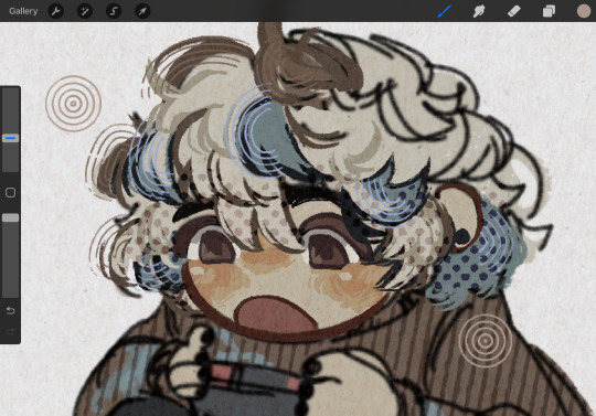
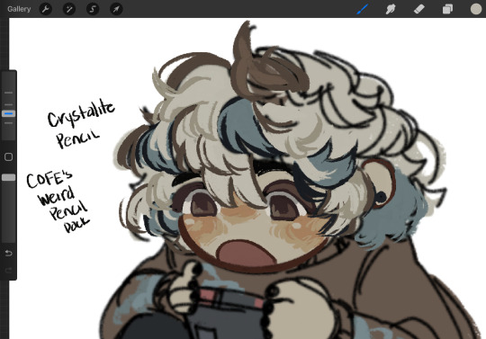
so here's a list of my most used brushes lately, and there will be links to all of them at the bottom of this post.
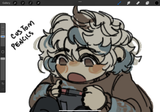
the two labeled "custom pencil" are both my own personal modified pencils (both sourced from the 6b pencil) but the narinder pencil and the vanilla 6b pencil are both very similar to them. i use these two for sketching and flat color specifically, and if you do specifically want these two brushes then i'd be happy to upload them somewhere for you to download, but they're not really necessary for texture
i also use G&B halftone brushes sometimes! but i greatly prefer the RSCO sample pack, and i cannot find the link to the G&B brushes no matter how hard i google, and pretty much any halftone brush set will do the same job
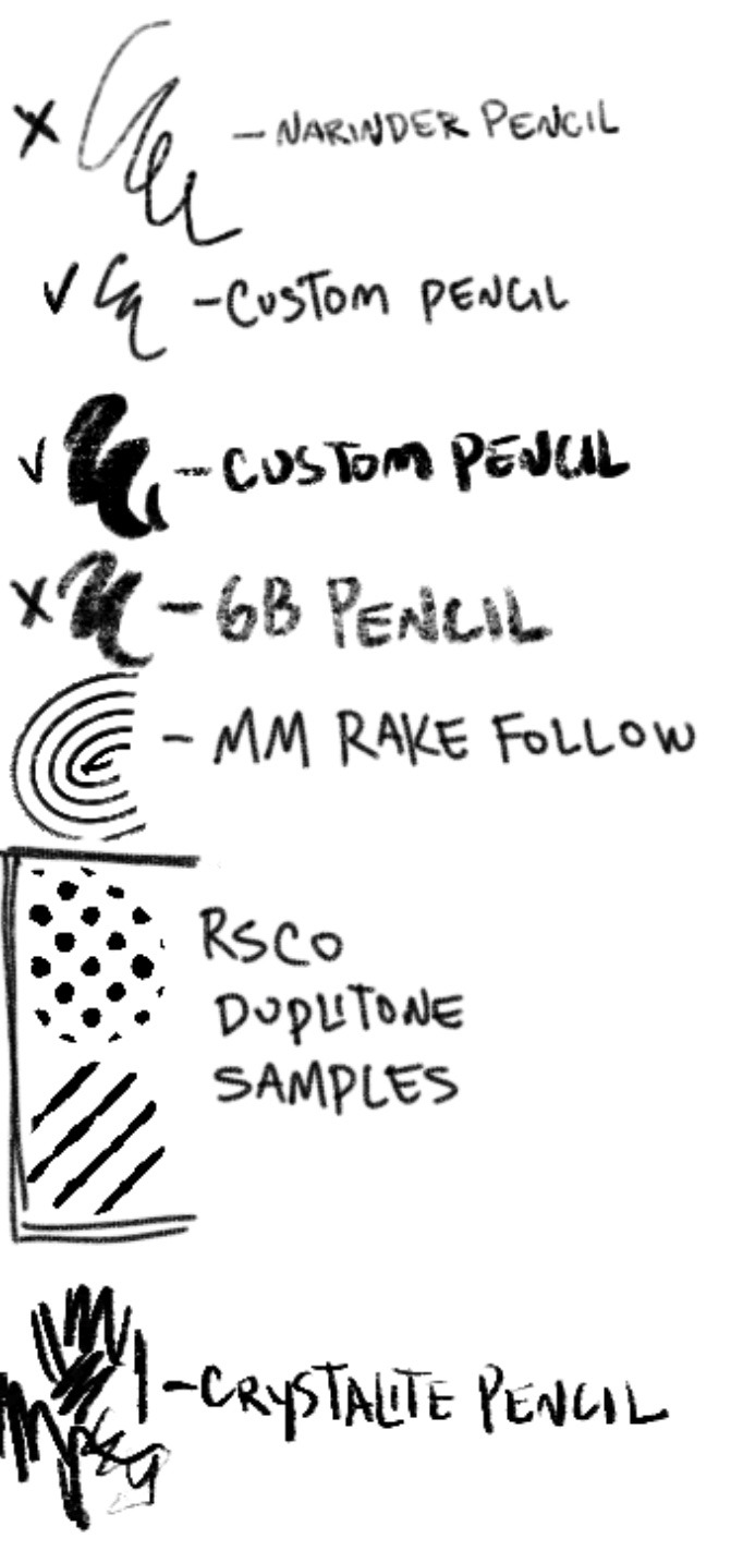
and here's what they look like in practice!
(i like to set these halftones to color burn. color burn is my most used blending mode, even for shading)
and then i hit "copy all," paste, and duplicate it. so you should have two layers of just your entire canvas. then import a paper texture
i'm partial to the set i'll link down below, my favorite is #5. you should absolutely check out the rest of the free texture packs on their website if you're wanting to diversify your texture process btw, all of their stuff is fantastic.
to use that texture, your layers should look like this!
on the layer set to the linear burn, i also like to go into the adjustments menu and bump up the brightness until all of the colors are at similar values to what they were before. and the normal layer on top is just to control the intensity/opacity of the paper texture!
after all of that, sometimes i'll go in with brushes like MM rake follow, or more from COFE's weird pencils, on top of all of those layers for finishing touches.
definitely play around with it, try new free brushes all of the time (i heavily recommended subscribing to Manero. they have a lot of free stuff and it's all fantastic) and see what works for you <3
here are the links to the brushes in this post, as well as some extras! some of them are paid and some of them are completely free. + it wasn't mentioned here, but i use the tatyworks linen fabric brush for blending! for any of the paid brushes, i'll try to link some free alternatives
paid brushes:
alternatives to paid brushes:
free brushes:
extra goodies:
#procreate art#procreate brushes#art tutorial#artists on tumblr#digital art#digital artist#art recommendations#art resources
49 notes
·
View notes
Note
How do you get your lighting so scrumptious in edits?
Lighting tutorial under the cut (it's long lol) I use photoshop + topaz clean btw :)
This will be our starting pic!! I use @hazelminesims photoshop action (all in one) to get the smoothening and overall base done first.
First step to colograding is using the 'Camera Raw Filter' in photoshop and adjusting the tint and curves tools. I generally like a greener, more cool toned color for pictures.
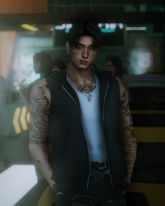
2. Now for the shadows on the sim! I make a new layer, set to 'Multiply' and use a soft brush at around 25-40% opacity with the color Black. I generally will add shadows to the parts of the body that are being 'covered' (neck, side of the nose, forehead, insides of arms and clothes). *If you use reshade/ gshade and have the mxao filter on, mimic where that filter adds shadows and either enhance it or add it in photoshop!*

3. In a new 'Multiply' layer, I do the same thing with the background. I darken the elements in the back to emphasize that my sim is in the forefront of the shot. TIP: don't add shadow to the light sources (neon signs, lights in the background) ! We actually want to enhance those.
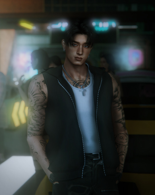
4. Make a new layer, set to 'Pin light' at 100%. Grab a soft brush and highlight those light sources in the back. You can go crazy here, just take the Eyedropper tool to color match the highlights you want to emphasize. It might look a bit much right now, but we can tone this down by decreasing the layer opacity, Gaussian blurring the layer, and erasing any excess highlights if we want.
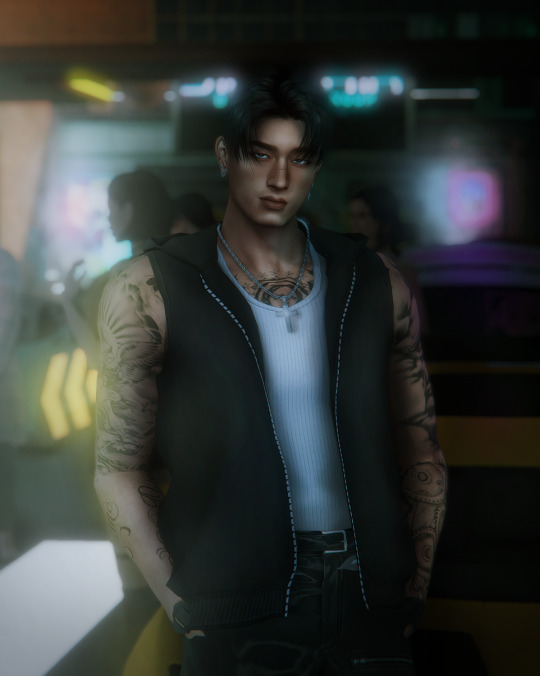
5. Now we add highlights to the sim. I make a new layer, set to 'Soft light' at 100% opacity, and with the white color, I highlight the sims body and clothes. (Now we want to add light to the 'raised areas' such as the center of the forehead, nose bridge, chin, chest, and arms). I also like to highlight any jewelry (necklace and belt buckle).
On a separate new layer, set to 'Vivid Light', I changed the brush colors to the ones in the background light sources (I used blue, yellow, and purple.) I'll go over the outlines of the sim's body with these colors (shoulders and arms, hair, side of face and neck.)
If you ever feel like you've gone overboard, just lower the opacity of the highlight layers and Gaussian blur them!
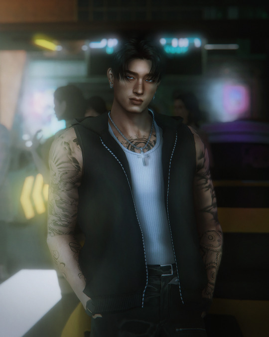
6. After you've messed around with the highlights, add the finishing touches. Usually once I merged all the layers I would go over with the Dodge and Burn tools to enhance the contrasts even more. I also recommend downloading and using LUTs for photoshop (I just use any free ones I find online).
88 notes
·
View notes
Note
For those recent outdoor posts, which types of brushes do you use to get that blended level of high detail for all the plant life?
I started playing with these new brushes
207 notes
·
View notes
Last Seen Blogs

howcomethishappened
Life Is Short. Do Whatever YOU Want.

frumpkin
frumpkin
swetercutuie
TSPARKLE

somethingisone
Beautiful

lifeistooshort-choosehappines
BE KIND TO YOURSELF.