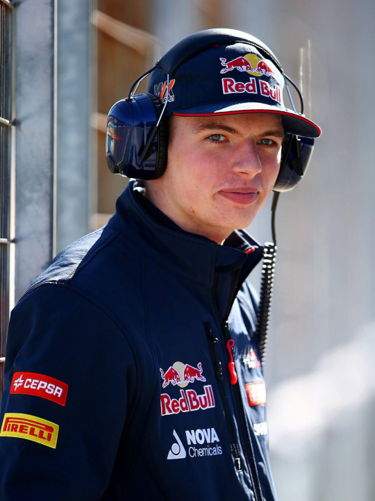
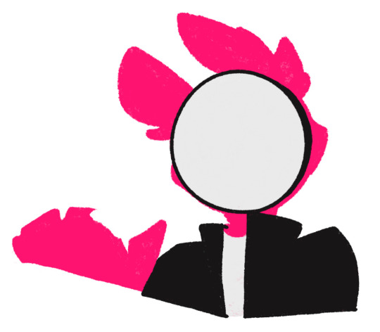
#i just know that the colours r going to be so much more satured on mobile n its pissing me off already
Photo
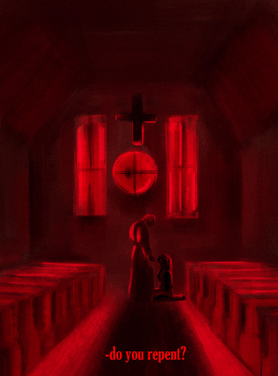
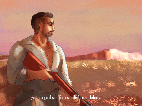
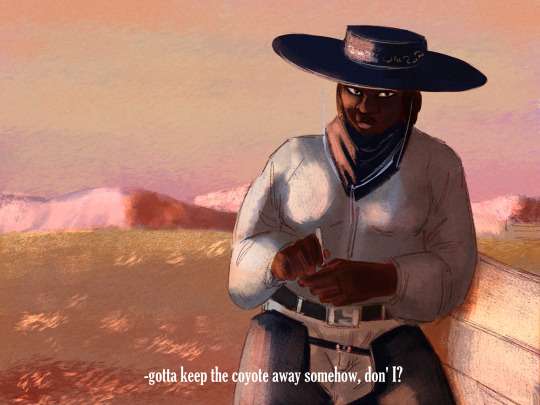
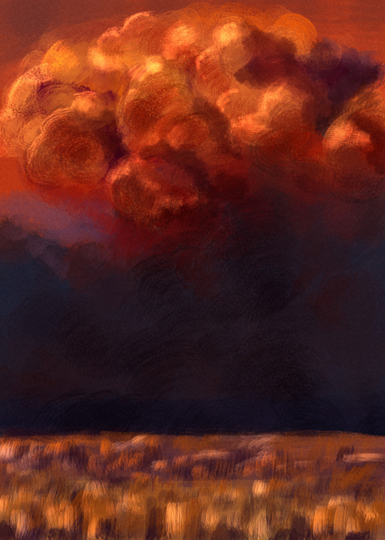
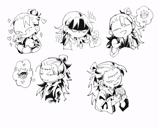
don’t look at me, I’m trying to do backgrounds for my horror cowboys (and I’ve figured out the noise layer thing after over a year be proud of me!)
#simon ghost riley#john soap mactavish#juliette regard dione#ghostsoap#ajekyllsart#horror cowboy au#i just know that the colours r going to be so much more satured on mobile n its pissing me off already
121 notes
·
View notes
Note
hello hi!!! grfhvhghr i am in love with your artwork so much you cant believe-- i wanna ask if you have any tips on how you lineart and colourpick?? no pressure to answer tho, have a great day/night!! again, love your art <33
hi!! thank you for your kind words!! since i got asked about these a lot, im answering this for all the other ask asking about lineart and colour tips too! You can see some previous post here.
also i could only give out tips that work for my drawing style - which is heavy lineart / colours pop up the line (believe it or not it's American comic book style. ppl cant understand why my art doesnt really look like usual anime/ Asian webtoon style, even though it is still clearly anime / Asian webtoon style, but when i told them it's because im drawing these by studying American comics, no one believes it either lmao.
i do study but i do my own things too, so most of my art inspo is really unexpected to ppl, but they r really where i learn things from, cuz i dont even go to art school TT_TT).
Changing the brush size will help you achieve thick/thin lines better without having to put pressure on your wrists. Keep your hold relaxed and let bigger brush size give you the thick strokes.
I like messy sketch, to me the sketch is just an outline shape to fill details in when i do the line, it also gives more freedom to wriggle as i draw! cuz i dont really plan out everything from the start, just wing it as i go, so a lot of my work is actually very spontaneous.
that leads to this point: when you do the lineart you should start deciding which colour style you want from it to adjust the details amount. the ink shadow blocks in my art aren't there randomly, i adjust them to best complement the shape language and colours.
for piece where i want the line/shadow to...idk hit (?), the colours are almost flat with textured brush adding depth to them, so the inking is the shading, thus there are more details in the lineart / ink blocks.
for the video above and piece like this where i want the colours to be clear and pop out, the use of ink blocks are minimized and i do the shading during colouring process. but! the ink blocks can still make some places pop very nicely! just use in moderation!
when doing the base it's good to keep the colour on the left side of the colour wheel (low saturation), but as you do shading and lighting, try to spread out evenly so it won't look washed out.
toggle around with hue and saturation slider as you go! the key is always adjusting! you're making hundreds of decisions at once, being conscious of your choice in why a line or a colour should be in a certain way will help improve your process a lot! (i think you can tell which art i turned off my brain and just draw for stress relief ........ which is also a valid way to draw and sometimes the result might surprise you! but for more serious stuffs i try to be aware of most of the move i make. it's problem solving, yeah?)
i find that one way to keep your art from appearing too...yellow in the end (which is sth that haunted my ass for a long while) is always aim for cold tone, so if you accidentally make it warm either way in the end it won't be too warm (and yellow :cry:)
well that's all the stuffs i can think on top of my head. sorry i can't give more advice on colour picking cuz it's sth i don't really know how to give advice on???? i think my colours now are still pretty lame haha........ if there are still any questions i'd gladly answer within my ability, though im very slow to answer ask ( i do read and be happy at all of them tho!)
#art tip#ask#anon#albi’s art#ALSO I AM SERIOUS ABOUT THE BRUSH SIZE THING SAVE YOUR WRISTS NOW. TODAY. DONT LET IT HURT THEN TRY TO FIX IT LATER#aughhhhhhhhh *rub my wrists*
297 notes
·
View notes
Text
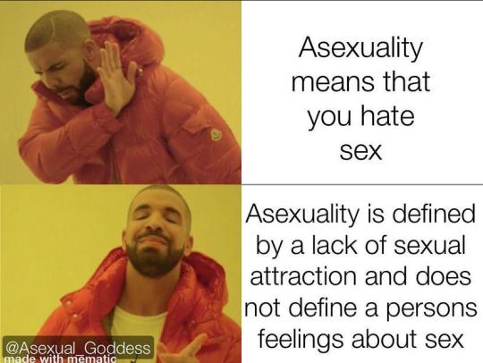
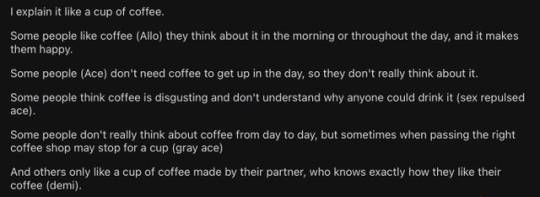
My Aroace Journey
Teacher during Sex Ed: You'll all feel sexual attraction at some point.
Me, years later, still waiting and panicking: Where is it? *manic chuckle* Wh... Where the hell is it...??
I've only really celebrated Valentine's Day once (aside from exchanging cards with my class in elementary school), so I'll contribute to the aromantic awareness that's been trending on Tumblr by sharing my experience of how I found out I'm aroace.
I first heard of the term "asexual" in an LGBTQ context in September or October of 2020 because of Alastor's sexuality being officially confirmed. "Very interesting! Can't be me," I thought.
I got into researching and asking reddit anyway. I think I determined that I'm ace later that year in October.
In April of 2021, the thought of me possibly being aromantic as well struck me. I hated that thought, telling myself, "I've already had one thing taken away; why do I have to lack something else?!"
(I want to clarify that lacking sexual and romantic attraction doesn't make someone any less of a person.)
Once I accepted that I'd probably never fall in love, I ironically got into a romantic relationship in July and determined that I'm demiromantic. During that relationship, I experienced waking up looking forward to messaging them each day, seeing the world in more saturated colours, and even properly enjoyed my first Valentine's Day date. I'm forever grateful for all of that.
The relationship lasted a little more than a year before I fell out of love (that doesn't mean I don't still love them; I'm just not in love anymore). A year after the breakup, a friend suggested that I could be cupioromantic. I joined the subreddit and described my situation, to which someone recommended I check out r/lithromantic.
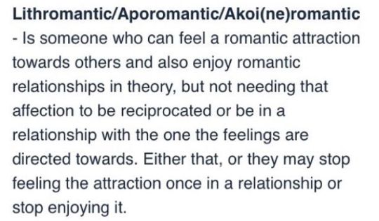
I spent a long time feeling like I'd gotten robbed of something again ("Why can I even fall in love if that's going to be taken away after it's returned?"), but I eventually accepted my orientation despite still getting sad about it every now and then.
I speculated on another part of my identity from January to February of 2024. I'm not comfortable saying what it is yet, but I will say that a big part of that ordeal was spent worrying about how my identity would affect other people, which is ridiculous; your identity is part of you; not anyone else.
I only told two people because I felt disgusting for the thought even having crossed my mind randomly. I don't know why, since I'll always speak in favor of people who identify that way. But I still felt that way, no matter how much I reassured myself. No matter how much those two friends reassured me.
I came to the conclusion that it doesn't apply to me (though I'm not putting it completely off the table).
That brings us to now. I'm exhausted. (^ ^ ;) I'll end this off with some memes I saved up while I was still in the closet. Happy Valentine's Day!


#aromantic#aro#aroace#asexual#demiromantic#lithromantic#questioning identity#lgbtq community#long post
37 notes
·
View notes
Note
hey I love your edits and I was just wondering what you use/do to edit your photos? Not to copy, just in awe!
omggg thank you anon!!! the fact u want to know at all means so much 😭💓 especially when theres so many people posting edits that have a much better understanding of how to edit photos than me!!! (may i direct you to the amazing @yesloulou and her gifs..) ask me anything im happy to share and for u to copy my techniques (??) send me any other questions u have if i dont answer them i cud talk abt this all day .. 🫶🫶
so! i use the mobile version of lightroom when im editing photos quickly e.g. on race day, and tbf, its my main editing app. if that doesnt click with u, theres also snapseed which is a google editing app that i also used for a while until i realised lightroom was free (a blessing 😭). I also sometimes use photopea as a rip-off photoshop if i want to do more crazy stuff 🤪🤪🤪
first thing is crop the image if it needs it. i have a preference for portrait photos, just bc i prefer the way they look when posted. i use all sorts of ratios, but my favourites are 3:4 and 5:4 just bc i think they work best with driver portraits! (hot tip: the rule of thirds is soooo helpful!! find a metaphorical 'line' through the photo and line that up with one of the thirds) (lightroom produces the grid automatically when u crop xxx)
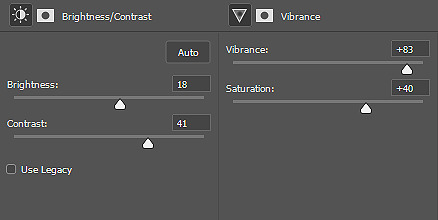
the next thing i do with a photo is correct the lighting and colouring. there are plenty of tutorials online and i can go more indepth if u want, but i tend to favour lower contrast with low highlights (bc i hate when u lose detail in highlights. the bane of my existence). its usually the first thing i try, but if it looks horrible i'll try different things. to correct colouring, i use the tint/temperature sliders (im still learning how to intuitively use these rather than messing around and going hm. too purple right before i post). since most of the photos i edit r taken by super talented F1 photographers i rarely have to use curves, but sometimes i do! so i do that as well before i get into the meat of it if needed 😌
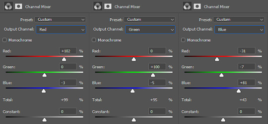
then i adjust the tint/temperature & vibrance and saturation until i'm getting the vibe i want (e.g. i love making max photos cooler toned). then i use colour mix to change anything specific about colours in the image (i most commonly use this to make daniel/charles' skin less yellow and more red toned, to soften any redness or to make max's blush pink). then i colour grade!
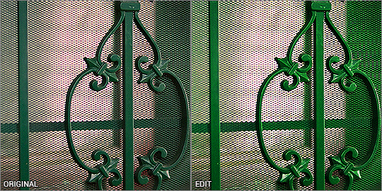
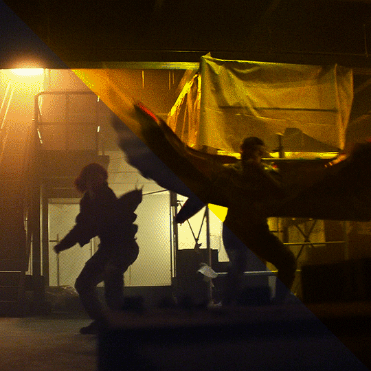
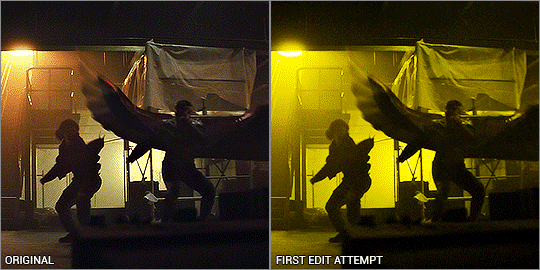
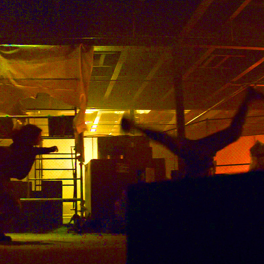
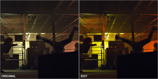
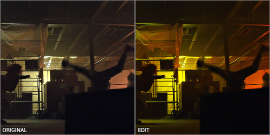
after that i decide whether the image needs sharpening, extra texture or dehazing, and then i add grain! i prefer a rough, understated grain so that you dont lose loads of the detail from the photo. here's some examples of before and afters of some of my more complex edits:
-> this one was lighting correction and colour correction! i also used curves im pretty sure 😭
-> exposure and contrast changes and colour changes/grading (can we appreciate this photo.. wow)
-> made photo brighter (pretty sure i lowered the highlights..) n changed the temperature of the photo
i hope this helps!!!! if anyone wants me to do like a proper adjustment by adjustment type thing send me an ask and i will do!!! thank you so much kind anon 💖🫵
#ahhhhh anon ur so sweet i hope this is comprehensive?? sorry if i went overboard 😔😔😔#beth answers#lovely internet people
14 notes
·
View notes
Note
hello!! u r a master of this so i just wanted to ask: how does different colours of line art affect the vibe of the piece? i really love your art so much 🥺
hi! thanks for your kind words! i've been sitting on this ask thinking how to answer, since lineart is something i do pretty infrequently (usually i go lineless) but i'm happy to give insight the best i can!
i think it really depends on the other colours in the piece - it’s ultimately just another colour in the mix, so it interacts with vibe the same way other colours do:

it helps to consider the rest of the palette... like i might match warm tones with warm lines, or have red lines in a red/black/yellow colour scheme. i personally like one line colour for more illustrative pieces - especially saturated colours, for that playful quality:

some favourite examples of this are the osomatsu-san and shin-chan openings. black lines are also really cool for bold, stylised looks!
for more painterly or anime-esque things, making lines a darker shade of the surrounding colour can help soften the image/lift the colours:

i find i do this in drawings with more rendering, to aid with that painterly feel. i don’t know if lineart colour swings vibe so much as accentuates it - it really depends on the other visual elements in the piece and what you’re trying to achieve!
this is obviously a very basic breakdown and by no means a set of definitive principles (going to put a disclaimer here and say again that i don’t do lineart very often)... still, i hope this answers your question a bit!
51 notes
·
View notes
Text
Colouring rainbow gifs
The lovely @buckiecap and @djarsdin requested a tutorial of some gifs from this TFATWS rainbow set.


My colouring process is kinda chaotic and it always depends on the gif itself. These three gifs will highlight the similarities and differences in how I colour my rainbow gifs.
You’ll need some understanding of basic gif making and adjustments. I use Photoshop 2021 but I imagine these processes will still work in other versions.
Some basic tips:
When doing rainbow sets, once I've got my base gif ready, I always make a hue/saturation layer on saturation +100 so I can see what colours I'm working with. I just keep it hidden so i can check how my colours are doing throughout the editing process.
Also something to stick at the back of your mind: you want your final gif to be as “monochromatic” as possible - make sure your final palette will be only black + shades of whatever colour you're targeting. This is not only to make the gif as colour-focussed as possible, but it also helps with saving your gif under 10mb. That saturation +100 layer I always keep hidden at the bottom of my gif so I can keep an eye on what colours are present.
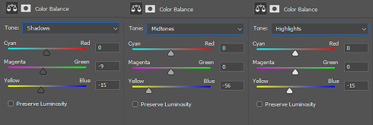
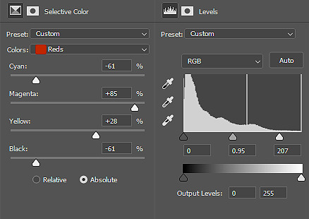
It’s also helpful to understand how RGB and CMYK colours work and what to add/subtract when you want to bring out a certain colour. A good example of this is with Colour Balance:
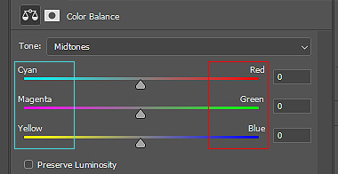
You’ll notice the colours on the left are Cyan, Magenta and Yellow (CMYK), while the other side is Red, Green and Blue (RBG). So if you want more cyan in your image, you’d push the bar towards cyan, but then you’re compromising the reds. In Selective Colour adjustments, the panel is reversed.
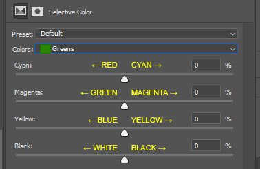
This knowledge is absolutely necessary when you’re doing any adjustment, so keep this in the back of your mind as I work through the tutorial.
Green gif - Eli's door
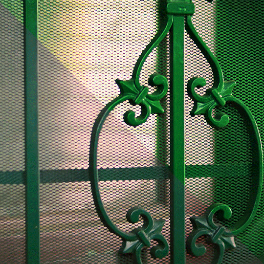
So I start with my hue/saturation on saturation +100 to check what I’m working with here. This gif of Isaiah's grandson opening the door has green, yellow and red as the dominant colours, and I can see a bit of cyan on the right. I’ll keep that hue/saturation layer hidden as a reference.
Normally when I make gifs I start with a curve or levels layer to get any unwanted hues or create a more visible scene. But in this gif, I'm pretty happy with the colours, so I'm just using a simple curves adjustment, because I want to have whatever is behind the door as the ‘background’ and the door frame is the ‘foreground’, so only a slight adjustment is needed here.
Since the colours are already prominent, I'm going to make the green more visible and vibrant. I do this by using selective colour in the green colour to make the green stand out. When thinking of CMYK adjustments, you might think that Magenta -100 would work, as that normally pushes the greens, but I find that this makes things grainy and patchy looking, as you can see here:
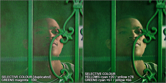
Instead, I’m enhancing cyans and yellows, and only pushing the magenta back just a little bit towards green. I’m not sure why green specifically does this, but it’s useful to know this when you’re colouring.
With the yellows, I want to push those more as well, since the amount of yellow usually influences the green-ness of the gif.. I'm also going to max yellow too since that will also make the green pop, but I also have to be careful not to distort the skin colour too much. I also want to balance the skin tone with a little redness so he doesn’t look like he has jaundice (skin tone will be explored later in the gif process)
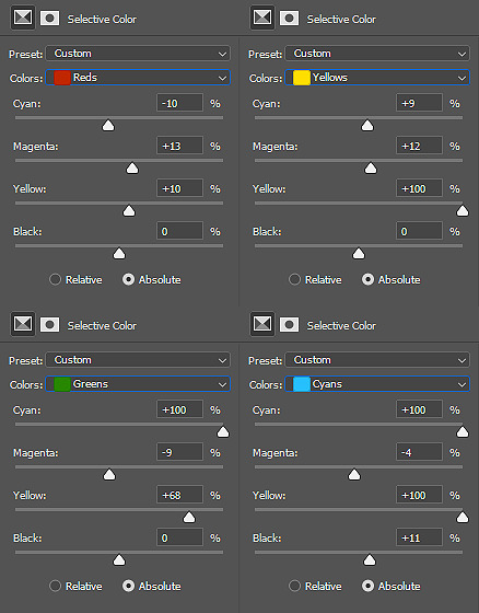
I've added another selective colour layer on top of that, only adjusting the greens just to make it pop a little more. Don’t be afraid to use more than one selective layer, this can really bring out vibrant colours if you use it right.
Just to get some more depth, I add a colour balance layer, again just subtly pushing the cyan and yellow up and not playing with the green too much. Then my usual last layers are with a vibrance and brightness/contrast - I’m usually quite generous with contrast so I can bring out the different shades and it makes things a little more vibrant too.
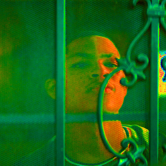
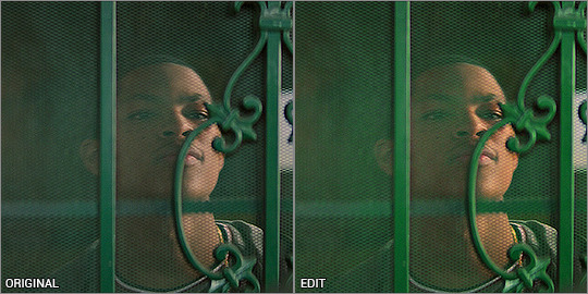
This next step is really important when colouring people with dark skin - you want to lower the redness from their skin so they don't look unnaturally orange, as you can see here:
There is a fantastic tutorial here about colouring dark skin tones and avoiding the orange-washed look, and I recommend all gif makers to take note! It's difficult especially when doing rainbow gifs, and it takes some practice. I do this with a hue/saturation layer, and specifically targeting red and yellow and reducing saturation. I might need to play with selective colour or colour balance to get it right. Luckily Eli doesn’t move around too much, so I can use a mask to adjust only his face.
And that’s the end product! now just ignore me as I re-upload the green gif in my set so you don’t see such a horrible jaudiced skin tone sldkfjsldkf
Yellow gif - Karli vs Sam
I'm gonna be completely honest here - this gif was very tricky to do. I actually have about three different versions of it. At first I thought "this is the yellow gif so I'm only going to have yellow tones", and did selective colour to get rid of any traces of green AND red, because I didn't want any orange at all. It ended up looking quite dull:
I mean.. yeah it’s yellow........... but it’s kinda boring. So I deleted all adjustments and watched the raw gif, and noted the orange light contrasting with the pale light. The raw gif itself already had some beautiful lighting - why get rid of it? It depends on what you want, but I like my rainbow gifs to have a different colour there to contrast with the main colour.
Starting off with a hue/saturation layer with saturation 100+, I can see there are clearly yellows and reds and a bit of green on the ceiling.
I thought the contrast of the orange and pale lighting was too good to mess up so I started with that. My first layers are vibrance and brightness/contrast to exaggerate the silhouettes and bring out the colours that are already there.
I added a channel mixer layer to narrow down the colours. I wanted to fill the white bits with yellow, and with channel mixer I’m able to manipulate colours into something else while still looking natural and blended. I won’t be doing too much colour manipulating here so the settings are very minimal. I don’t know how to explain it but it just takes a little fiddling to figure out what works for your gif. You’ll notice the white reflections on the ceiling are now a solid yellow colour:
Next is a colour balance layer. I'm basically trying to bring out the yellow out. This is really just trial and error. I added a bit of magenta to bring the depth of the orange colours in the darker shades:
Now for selective colour. I'm often adjusting all of these while hiding/showing the hue/saturation layer I have kept at the bottom. This time, I’m aiming to subtract the reds and bring it down to a warm orange, and I do that by bringing it towards cyan/away from red, and away from magenta/towards green.
Then I max out the yellows so it becomes the most dominant colour. I've also manipulated the green to make sure it is excluded from the gif - again, checking with the hue/saturation layer at the bottom, while keeping my eye on the ceiling and other places where I’ve noticed green lurking about. I don’t want any unwanted shades ending up in the final colour table.
Finally, I finish with yet another vibrance and brightness/contrast layer, just because I like things bright and vibrant!
And there it is! The orange is still there and adds a contrast, but you can tell that the main colour is the yellow. This gif seems very straightforward but I assure you, it took me quite a while to get this one right. This gif was a joy to work on because Sam was so very extra in this fight sequence lolll
Pink gif - suspicious mechanical grenade? idk
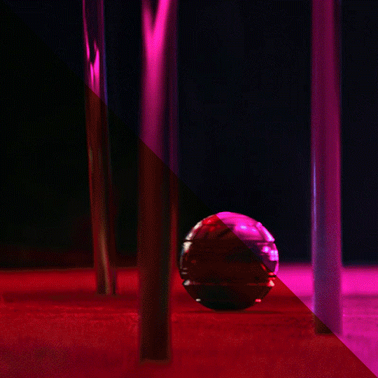
While this gif may look simple, it actually took a couple of tries before I got the colouring right. You'll notice when the ball activates, there is a bright green light that highlights the gas released and it reflects on the chair legs and carpet.
At first I tried this with the above mentioned selective colour method - which I thought turned out okay but it didn't sit with me right. Notice the reflection of the blue light on the carpet - it definitely isn't blue and more like a green-orangey kinda colour, and it doesn't look natural at all.

So I re-started from the beginning and had a look at what I’m working with, starting with hue/saturation at saturation +100. I can see that the original gif has red and green as the dominant colours, with yellow bits blending the two on the carpet. That’s what I was having issues with the selective colour - so I’ll be doing it differently.
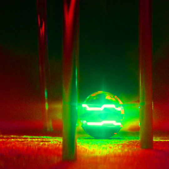
Enter: channel mixer. I’m gonna be honest............. I have ZERO idea how the channel mixer really works! It’s all a matter of trial and error, but I’ll try and explain my process step by step.
I normally start in the blue channel (again - no idea why, it just works for me). I start with the reds, and I know if I go over 0, it will push the reds towards cyan, which will get it more purple-y:
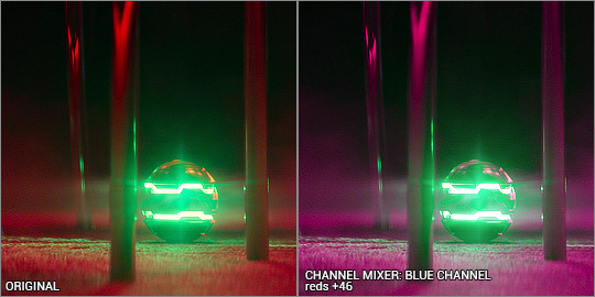
Ooooh looking good!!! then I want to push the greens towards magenta, so that needs to go over 0 as well:
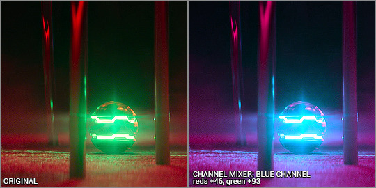
Woohoo! It’s already starting to look good. The green light and the way it blends into the red/pinks have all been completely changed into the cyan hues, so there’s a perfect reflection you can see on the carpet! Yay! I had a fiddle with the green and red channels but nothing too drastic. Here are the settings:

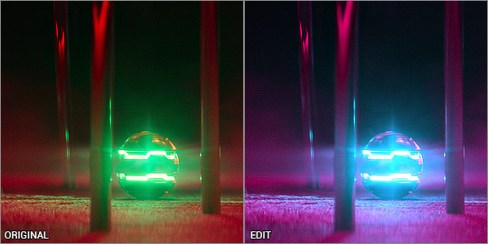
Even with just the single adjustment, I was already pretty happy with it and only did a few touch ups: I added a selective colour layer to bring out a more pinky-purpley colour, then a levels layer to brighten things up. It might seem very backwards to add a brightening tool at the end, but I didn’t want to mess up the original colour shades because I liked having the dark shadows lit up by the ball’s light.
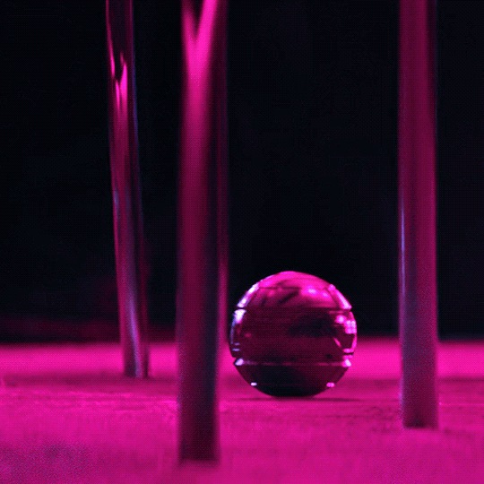
And that’s it! Only three adjustment layers, but it took some time to play with the different adjustments and what worked best. Channel mixer can be really intimidating but it works like a charm when you manage to figure it out.
the end!
Finally I have to give credit to some amazing content creators and their brilliant colouring tutorials that have made such a huge impact in the way I edit. Some brilliant guides include:
this colouring tutorial by @favreaus
this colouring tutorial by @inejz-ghafa
this colouring tutorial by @meliorn
I hope this tutorial has been helpful! I’ve tried to explain myself as best I can, but let me know if you’d like any clarification or have any questions. I’m still learning how to do things, and honestly most times it’s just randomly clicking things until something works out!
#gif tutorial#coloring tutorial#rainbow gif tutorial#gif editing#completeresources#dailyresources#chaoticresources#allresources#photoshop tutorial#fyeahps#dailypsd#**mytutorial
264 notes
·
View notes
Photo


I WAS TAGGED BY @hobeah TO DO MY FAV THING AKA STUFF RELATED TO GIF MAKING AKA STUFF RELATED TO COLOURING SO !!!!!!!!!!!!!!!!!!!!! before/after colouring ✌️
i decided to show my prev ones (1st and 2nd gifs) too bc i still have psds ALSO I APOLOGIZE FOR THE UGLI LAYOUT AND HOW EVERY GIF HAS DIFFERENT DIMENSIONs AND IT JUST DOESNT LOOK RIGHT BUT I CANT just redo im too excited to do this and its middle of the night so plz dont throw hands ok :( this is not sth huge i could do a lot better but im too hyped rn i cant wait for tomorrow
looking at my older colouring im like 😃 wtf this is kinda extreme and yeah cuz i used to use gradient with one transparent side lmao T_T djksfksdf and that one weird solid colour layed that made everything purple-ish and yellow-ish more saturated somehow in a certain blending mode idk why dont ask i thought it was pretty
3rd and 4th ones r same psd that i use nowadays i use it pretty much almost everywhere around 85% of my content is with it but ofc i adjust some layers if there is a need
i do it from scratch if there arent too many colours/colours r too simple/lighting is too dark/performances/psd doesnt help (for example last gif with taehyung from concert)
how do i describe my current style hm skin tones less green not tooo yellow but more red/magenta + solid blacks + fade + cyans if there r blues + less greens + highlights arent white too + whatever my mood is
im tagging in whatever order @jung-koook @taeyungie @jjoon @lifegoesmon @flipthatjacketjiminie @everythingoes @kkulmoon @joenns @syubb @jjeongukie @jiminslight @vjimin @tearuntold @namgination @hopekidoki @minhope @jiminswn @hobibestboy @yoongi-bts @oncupid @jinvant @yoonqiful there should also be @/jinv :/ i just know that i forgot 85964605 ppl but my mind is out rn T_T also tagging myself as always just in case to check the notifications @eternal-bangtan
also wanted to say that there r so many ppl on this site that feel colours in a such an incredible beautiful way whenever i see those pretty things it makes me scream ofc and it inspires me to go and try to experiment to do sth with colours T_T im very grateful for all the talented ppl those who i tagged or not yall r very cool thank u for being a creator <3 not ONLY THOSE WHO MAKE GIFS TOO THIS IS ABOUT EVERYTHIGN ACTUALLY also thanks those who spread creations and write nice tags and appreciates <3
271 notes
·
View notes
Note
no see i wanted you to keep going its great!!!! haha. and yeah same about being on here w her and leaving then coming back lol. what was your old url i may have followed you??? and i feel like i know the poetry you mean and while i am white that is absolutely insane to hear because i also read it as being about his blackness????? did white bandom really manage to whitewash that??? like maybe its because (unlike a lot of ppl on here it seems like) i have real life black friends around me all the time and grew up with black folks but i find it strange even still if just from a critical thinking perspective djdjsjxjsj. like i am pea brain but STILL wtf lol. anyway... re: the photoshopping.... what is his actual skintone? im kind of confused by the photos you posted in regards to the editing bc i just really don’t understand saturation etc rip. ANYWAY feel free to ramble more i literally adore learning about it. like i dont need more whitewashed pete content i want who he really is. it makes my heart so full i love him so much 😢
im glad you enjoy hearing me ramble about this haha!!! i had a couple urls that i was known by. i was deadnarrival, soulpunkboxes and diykordie at various points in time, although the last one was the one i deactivated under. i went by just mellie at the time, although now i go by dils more often (though mellie is still my name and is short for my full first name, amelia)
wrt the poetry, its possible that people didnt so much as miss the blackness as much as they didnt feel qualified to bring it up at all?? and while its fair to not discuss it, it was really alienating for no one to even mention race at all. i wasnt friends with any black fob fans at the time, the ones i knew of had moved on bc they felt kind of unwelcome, which is pretty common in all subcultures, so i was just like reading people talk about how sad and emotional it was like he was some kicked puppy and then reading this poem full of tangible anger and resentment and frustration and a desire to fix the world and a desire to not be part of whats broken and it was like. damn. yall just see sadboi shit?? wild.
ANYWAY to address your questoon about skin tone, to tldr, saturation is how bright a colour is. 100% saturation is pure colour, while 0% saturation is pure grey, so lowering the saturation makes colours duller. exposure is the amount of light a photo, so low exposure makes a picture look too dark, and high exposure makes it look too bright, and can make everything look white, or at least much lighter. so lowering the saturation makes colours duller, raising the exposure makes the image paler, doing both... ya.
but here are some pics where petes not edited or isnt super pale!!! as a rule of thumb on the red carpet or next to people who are darker than him pete will probably look darker. black fob fans pass these around like currency lmao. these are mostly early pics bc theres definitely more later ones but these are what i have saved.

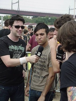


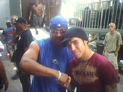
that last one is a super special rare pic of pete when he was in arma playing cards outside of a convenience store. his melanin is POPPIN.
something that compounds this is that a lot of filters on social media like insta and snapchat are live action whitewashing. like itll be like "beautify✨" and then you r 5 shades lighter and your nose is slimmed down.
13 notes
·
View notes
Note
Hii✨✨hope you are well. Have you done a mini review of fine line , the same you just did with hs1? I liked your review and I agree with most of it, so i'd love to read your thoughts on fine line, and how it compares/improves from hs1🤩
thank u, u r so kind. i hadn't so i will now! (also this gave me the opportunity to go back and listen to it in full which I admittedly hadn't done in a while and god it was needed <3333.)
slim pickings but fine line is definitely my favorite album of his because although i think the fun of self-titled was getting lost in that tangle of (sometimes) conflicting emotions and sounds that made a point to stray from his manufactured pop history, there is something so refreshing about listening to a single streamlined story of a relationship coloured by a mix of rich throwback pop rock sounds that i think were diverse enough to keep it interesting but cohered well because of a really strong pop backbone. i also think each song really cleanly explores a new face of that relationship which makes for a fun experience.
i definitely like that he's more vulnerable in this album, letting for some striking lyrical moments (crisp trepidation, parents gallery, and kissing in the kitchen like a dancefloor my beloved <3), and the atmosphere is much much more vivid bc of how much more specific the sound is for the mood of each song. you know, sweeping synths of adore you, bubbly acoustics of canyon moon, psychedelic electrics of she, rising n triumphant arrangement of fine line, euphoric trumpets and harmonies on wms etc etc (rather than the soft vs hard rock dichotomy of self titled). but i think there's still space to trim the fat (the late ballad of falling feels sparse, unspiring, and behind his time), tighten the delivery (hone in on his personal voice, which i think he DID begin 2 develop on this record, but could shape more), and saturate each moment with intent (some places fell little flat, when there was potential 2 be more (golden)).
anyway overall there's room to improve (always) but it's definitely a step up from self titled. at worst it's a bit boring, at best sunlit and alluring <3. personal highlights for me were sunflower vol 6, adore you, cherry, she, canyon moon!
6 notes
·
View notes
Note
wahhhhh how are you literally so good with colors?? /lh If you ever open commissions/do commissions I would absolutely love to know your rates and will totally buy something form you omg
I don't plan to do commissions (in the near future), but ahhhh thanks!
A new thing I'm having fun playing with is slapping the JS&B Pink with a Cyan overlay!
Play around with the opacity of the overlay, slap on a dark-ish purple multiply, and it's literally done.
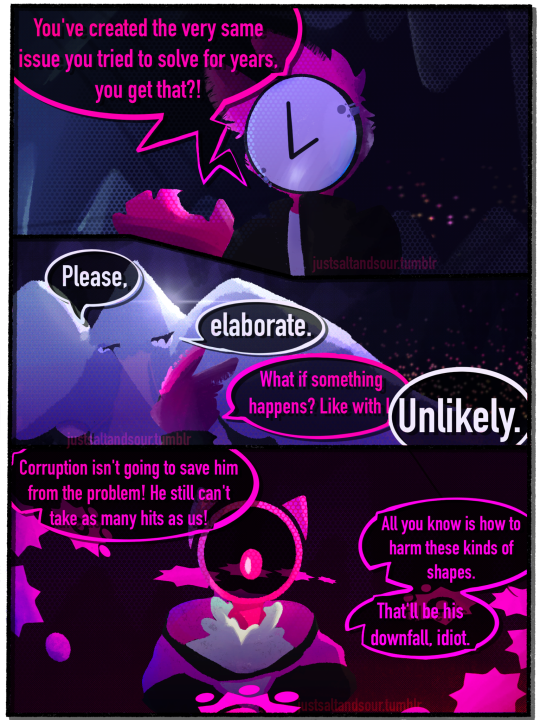
My favourite thing to do is just keep the colour palettes not too crazy, and go all out on the filters.
(Tree really has only two colours in the most simplified form, white and rlly light blue. Chronos goes with a White > Black > Pink vibe. I didn't really add any pink to his clothes, at least for what you can see here. He also kinda got this nice "Light colour, middle colour (pink), dark colour" without having to make a desaturated grey grrr bark bark.)
GRADIENTS! GRADIENTS R ALSO FUN !! It helps while I'm fucking around with colours but I don't wanna make too drastic of a change.
(chronos' most simplified design has just 3 colours, everything else was just overlays and multiplies.)
Whatcha gotta do is just kinda,,, play around with the colours (and the saturation/blending mode!! the bottom red part of the comic was used with a blending mode that I never used before (and probably used incorrectly) but it looked cool so it stays) until it gets something you like.
The lamps in the two bgs of the comic originally gonna be more multicoloured, but it ended up looking out of place, so I made it stick to warm colours, to still give an Aesthetic.
Another thing to add is the transparent colour in the text bubbles, it all depends on the bg for that. If it's white on a dark background it stands out, and vice versa.
Another thing that makes the colours work, the pink on Blixer's clothes is slightly more blue than the one for his body colour. It sets things apart and makes it look sooooooooo much better imo.
Anyways thanks bestie u unlocked a part of my artist skills.
might make a comic after this teehee /lh /hj
17 notes
·
View notes
Video
youtube
In this installment of Great Albums, we’re back to talking about albums nobody’s ever heard of! You might not know who Zaine Griff is, but you’ve probably heard of a guy called Hans Zimmer, and Zimmer is the real mastermind of this record: a masterpiece of New Romantic synth-pop made long before he made his name composing for the big screen! Not to mention contributions from Ultravox’s Warren Cann, YMO’s Yukihiro Takahashi, and even Kate Bush. Find out all about it by watching this video, or reading the full transcript below the break!
Welcome to Passionate Reply, and welcome to Great Albums! Today’s installment is going to feature an album that is most definitely towards the obscure side--but, like most of the more obscure artists and albums I’ve talked about, I think this one is every bit as good as the classics. Zaine Griff’s Figures is not only a forgotten album that I think deserves more acclaim, but also an album that, in many ways, feels like it could have been a huge success in its own time.
Zaine Griff grew up in New Zealand, and moved to Great Britain in the 1970s in the hopes of pursuing a career in music. His debut LP, 1980’s Ashes & Diamonds, would mark him as one of the many artists straddling the musical landscape in the aftermath of glam, in the long shadow of David Bowie. With keen visual panache, a suave way of slurring when he sang, and the requisite killer cheekbones, Griff fit in perfectly with the so-called “New Romantics,” as stylish and sophisticated as Visage, Ultravox, or Japan.
Music: “Ashes & Diamonds”
The real turning point in Griff’s career was his being “discovered,” so to speak, by Hans Zimmer and Warren Cann. Cann had already become a figure of some renown, as the percussionist for the aforementioned Ultravox. Despite his tremendous fame today, Zimmer actually had much less to show for himself at this point, aside from a somewhat dodgy stint in the Buggles. While geniuses in their own ways, neither of them were necessarily natural frontmen, and Zaine Griff seemed like the perfect missing piece to fit into their pop ambitions.
Even setting aside Zimmer and Cann, Figures is actually full of recognizable talent, and I think it may have the single most stacked list of album credits I’ve ever seen in my life! You’ll also hear contributions from Yellow Magic Orchestra’s Yukihiro Takahashi, backing vocals from Linda Jardim, who was also the soprano on the Buggles’ famous “Video Killed the Radio Star,” and a guest appearance by none other than Kate Bush. That’s really a lot of clout going around, which is one of the reasons I’m so surprised this album went nowhere. Anyway, that aside, the most dominant sonic footprint on display here is certainly that of Hans Zimmer. Zimmer is credited with producing the album, and his dynamic, expressive, perhaps “cinematic” work with digital synthesisers is surely the driving force behind Figures’s sound.
Music: “Fahrenheit 451”
It’s easy to imagine “Fahrenheit 451” is the thumping theme to some delightfully 80s adaptation of Ray Bradbury’s classic novel. Its theme of lustful but dangerous romance is a constant throughout the album, most notably on tracks like “Hot” and the haunting closer, “The Beating of Wings.” The song’s tense and dramatic mood is well bolstered by those soaring synths, courtesy of the Fairlight CMI. One of the most distinctive sounds of mid-80s synth-pop, the soft, breathy tones of the Fairlight hadn’t yet reached full saturation when Figures was made--Zimmer was an early adopter of this particular musical revolution. You might be surprised to learn that “Fahrenheit 451” only saw minor distribution as a single, exclusively for the French and Belgian markets. I think that sort of mismanagement on behalf of Polydor really shafted this album. Its lead single was actually its title track.
Music: “Figures”
The title track of Figures isn’t the worst song I’ve ever heard, but I do think it just might be the worst song on this album. With a strident, stabbing synth riff and a somewhat sparse and anemic soundstage, the title track is not particularly exciting, and also not particularly representative of what the rest of the album sounds like, with no indication of the lush and vibrant textures that dominate tracks like “Fahrenheit 451.” It also has less lyrics than the other tracks, and offers Griff little opportunity to demonstrate his pipes. Thematically, though, its imagery of wispy and mysterious personas, flitting in and out of substance in a world where appearance and identity are trifling and ephemeral, is something that resonates strongly with the album as a whole, as one might surmise from its title also being used for the album. “The Vanishing Men,” another song that easily feels like a better single than “Figures,” handles the same sort of subject in a more playful and upbeat manner.
Music: “The Vanishing Men”
The titular “vanishing men” are quite clearly the life of the party here, and in the world of this track, the insignificance of true identity is portrayed as an invitation to experiment and have fun with it--though not without a slight hint of danger as well. Perhaps it’s a good metaphor for the curated aestheticism of the New Romantic movement, decried by some as “style over substance.” New Romanticism really didn’t have much time left by the time *Figures* came out, being so strongly associated with trends in fashion that were on their way out by this point. Even Ultravox would find themselves pivoting towards more of a pop rock-oriented sound for their final classic lineup LP, 1984’s Lament. I can’t help but think that the changing landscape of musical trends is part of the poor reception of Figures, which is such a consummate New Romantic album, which basks in the full flush of the movement’s prior penetration into the mainstream. As stated above, “The Vanishing Men” is all about the glamour of mutable identity, but other tracks on the album seem to assign this theme a bit more weight, as in “The Stranger.”
Music: “The Stranger”
The titular character of “The Stranger” is described as “a stranger to himself,” but also “no stranger to anyone else.” This track seems to be more focused on the negative aspects of fashionable persona-play: losing the dignity and security of a true form, the people around you seeing through your charades, and becoming trapped in an existence defined by arbitrariness and artificiality. I’d also be remiss not to mention this track’s winsome pentatonic synth riff, which helps create a mercurial and ambiguous mood. It might be interpreted as a nod towards the rampant Orientalism of New Romantic music, which ran with the early 80s verve for all things Asian, and wasn’t shy about appropriating “Asiatic” musical motives like pentatonic scales to evoke mystery and wonder. Griff and friends’ use of such here is relatively subtle, though, and perhaps a bit more tactful than how many of their contemporaries approached other musical ideas associated with the East.
The unforgettable cover of Figures is as dramatic and infused with capital-R Romantic sentiment as the music contained within. Above the text relating the artist and title, which uses a V for a U for a touch of the classical, we see Griff splayed dramatically in a pond of lilies. With sharp makeup that emphasizes his lips, and a diaphanous, blousy top that turns translucent in the water, he seems to be the perfect tragic hero of some lost work of Shakespeare’s--complete with another flower stylishly pinned to his chest. As I mentioned before, Figures is an album that rides the wave of New Romanticism particularly hard, and I think its cover is yet another symptom of those sensibilities.
Speaking of Shakespeare, I can’t help but want to compare this image with a famous painting of one of Shakespeare’s best-known characters: Ophelia, by Sir John Everett Millais. Painted in the early 1850s, Millais’s Ophelia depicts the moment where Ophelia, driven mad by Hamlet’s romantic rejection of her, drowns herself in a river. It’s exactly the kind of story of wild, passionate, and doomed love portrayed on tracks like “Fahrenheit 451.” Ophelia is also associated strongly with flowers in the text, and features in a particularly memorable scene where she doles out various symbolic blossoms to members of the royal court. Besides the affinity of subject matter, even the composition of Millais’s work resembles the cover of Figures, contrasting its subject’s pale skin with the dark and murky natural surrounds, and emphasizing the drapery of their wettened attire. Ophelia is often considered the definitive masterpiece of the short-lived art movement, the “Pre-Raphaelite Brotherhood,” who, as their name implies, sought to recapture the intuitive, colourful, and emotive power of art created prior to the High Renaissance. Not unlike New Romanticism, the Pre-Raphaelite movement would crumble after only a few years, but not without leaving behind a trail of masterpieces that would continue to inspire future artists and admirers, far removed from their own time.
After the release of Figures, Zaine Griff remained involved with Hans Zimmer and Warren Cann, and, as the supergroup “Helden,” they embarked on an even more ambitious musical opus together: Spies, a sort of synth-pop oratorio about immortal Nazi super-spies falling in love in a futuristic dystopia. Spies is about as out-there as it sounds, and brings the flamboyant musical excess of Figures into a suitably theatrical setting. It’s also got nearly as star-studded of a cast as Figures, featuring not only Zimmer, Cann, and Jardim again, but also Eddie Maelov of Eddie & Sunshine as a mad scientist, and the enigmatic French electro-cabaret chanteuse Ronny, in the role of a super-computer with a sultry female voice. Griff portrays one of the titular immortal spies, known only as “The Stranger”--which, of course, begs comparison to the track of the same name on Figures, and prompts the question, to what extent was Spies already in the works when *Figures* was being written and recorded?
Music: “The Ball”
We all know the rest of the story for Hans Zimmer, who began working with music for film in the mid-1980s, such as the queer cult classic My Beautiful Laundrette. But Zaine Griff obviously never became a household name. Despite being finished in 1983, Spies never got to see an official release, as it was a bit too out there for a label to take a chance on at the time, and it would probably be lost media today if it weren’t for a vinyl bootleg that’s thankfully fairly easy to find online. Griff decided to retire from music shortly after this, and recounts a story of having walked past an extremely talented street musician, and having a sort of epiphany about just how hard it was to make it in music. After all, if a true virtuoso could end up busking on the street, how fair and rewarding could the industry possibly be? Disillusioned with the world of pop, Griff returned to his native New Zealand and got a day job as a golf instructor. More recently, though, he’s also released several new solo albums in the 2010s, surprisingly enough, and attempted to push forward into some very contemporary-sounding pop rock. The world is, of course, a very different place nowadays than it was in the 20th Century, and particularly in the world of music distribution, so perhaps it makes sense that our brave new world has room in it for someone like Zaine Griff to return.
My overall favourite track on Figures is probably “Time Stands Still,” which I think is perhaps the most accessible, pop-friendly track to be had on the album, and the one I would’ve released as the lead single had I worked for Polydor. With a big hook and simple, repetitive lyrics, it’s a true pop song through and through--though, if an artist releases a commercial-sounding album in the woods, and nobody is around to buy it, is it still really “pop?” Anyway, I also love this track’s delightful outro, imitating a skipping record to represent a freeze in the flow of time...though I admit it’s a lot less harrowing to hear when listening digitally! That’s all I have for today--thanks for listening.
Music: “Time Stands Still”
#music#great albums#album review#album reviews#zaine griff#new romantic#ultravox#warren cann#hans zimmer
8 notes
·
View notes
Photo

was asked for a colouring tutorial sooooo (under the cut for more)
so assuming you know how to make a basic gif (tutorial here) here’s my way of colouring gifs.
so, as we know, i mainly gif the preds, which includes horrible amazing yellow, which can sometimes make colouring take a long time and be super frustrating. i decided to gif shea, and as you can see, the video has a slightly yellow tint to it. we'll get to fixing that.

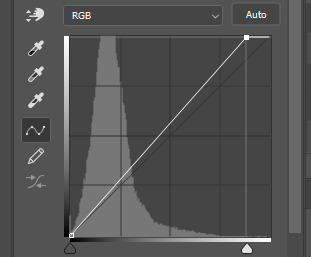
the adjustment layers i start out with are curves, levels, exposure, colour balance, hue/saturation, selective colour(s) and vibrance. i know that seems like a lot, but the first 3 are just used for lighting, while the others are used for colouring.
curves & levels are kind of hard to explain; they're basically a more confusing way of using the brightness/contrast layer. but with curves, to brighten the gif i move the line upwards, and move the button at the bottom to the right to increase the contrast. i don't try and go too overboard with my first layer, because i know i still have the levels and exposure to do.

with levels it's almost the same thing, where moving the tick that is closest to the right to the left, will brighten the gif, but the tick in the middle makes it lighter/darker. i usually don't touch the tick that's closest to the left because it changes the contrast and i already covered that with my curves layer.

next is exposure. usually i don't play with this much, as the gif can be already bright from the other layers. but the exposure option makes the whites brighter, offset changes contrast, and gamma correction makes it lighter/darker. also, sometimes people will lower their exposure on purpose to give it a darker look.

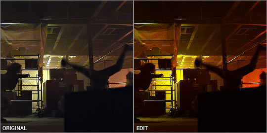
this is the gif after the lighting adjustments:

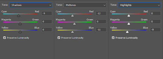
so next up is colour balance. this is what will change that weird yellow tint. there's 3 options: midtones, shadows, and highlights. i honestly don't know too much about how it works, but basically-- shadows changes the hue of the darkest colours in the gif, highlights the whitest, and midtones in the middle. then within those options, there's another 3 options of changing the hues. cyan-red, magenta-green, and yellow-blue. usually with most gifs i'll add blue, to cancel out any yellow. for this gif specifically, here are my options.
midtones:
cyan-red: +7
magenta-green: +1
yellow-blue: +17
highlights:
c-r: 0
m-g: +2
y-b: +23
shadows:
c-r: -14
m-g: -6
y-b: -2
honestly, colour balance is still something that confuses me, and i know for people starting out it's like what the fuck is this, but it's kind of something that you play around with and figure out yourself.
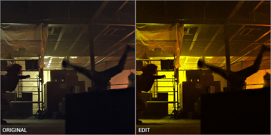
here's the gif with now the colour balance layer added:

next is hue/saturation, which is pretty self explanatory, for this i did +10.
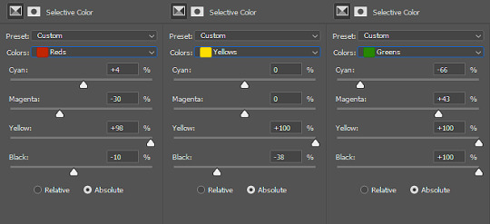
after that is selective colour, which is lowk my favourite part lol. usually i'll have multiple layers of this. so with my first layer i play with the neutrals section in black, and for this i did +6. this basically is the equivalent of the midtones layer in colour balance, where it takes the middle-slightly darker colours in the gif and makes it lighter/darker.
after this i add a new selective colour ontop of that first one, and go to the yellows section. usually i have to play with this section a lot (rip) since the preds have those... eccentric jerseys.
selective colour has 4 general options: cyan, magenta, yellow, and black. this kind of coincides with the colour balance, where, if you go negative/left on the cyan section, it'll make that section more red, left on magenta goes green. left on yellow will make it kind of pink for some reason, and black makes it lighter/darker.
usually for the yellow section, in the yellow option, i'll slide yellow to the left but then slide black to the right, and cyan to the left. you can see an example of this here. however, for this gif i had:
cyan: -38
magenta: 0 (i don't touch this at all in yellow)
yellow: +23
black: +32
then i go to the reds section. unless dealing with a team with red jerseys, red is mostly about skin tone. in the reds section, i had:
cyan: +13
magenta: 0
yellow: +5
black: +6
next onto blues. since the blues were minimal here, i wasn't too precise with my colouring here.
cyan: +22
magenta: 0 (in blues, making magenta in the negatives will make it more of a teal.)
yellow: -21 (making it more of a vibrant blue)
black: +36
next is whites/blacks/neutrals. for these i usually only touch the black option.
for whites, moving the tick to the left will make the whites brighter, and to the left duller/smoother. i don't play with this too much, since it will look weird. for here i had -5. then, since the brightest parts of the gif look a little yellow, in the yellow section i had -20 to make it less yellow in the face.
for black i only had +2 in black. usually this will make the background darker, and i thought this was pretty dark already. again, usually don't play with this too much because it can look weird.
neutrals i had +5. i explained this earlier :)
please keep in mind that this is my colouring for a white person. if i were giffing a poc, my selective colour section as a whole would be, most likely, completely different. especially in the yellow, and red section, where you're dealing with someone's skin tone. consider the effects you're putting on that person's face and make sure it is not white-washing.
finally, i had the vibrance layer which is lowkey a fancier hue/saturation and i only had +4.
so here is the final gif and before/after:


i know that was a LOT, so feel free to come to me with any questions!!! i hope this was helpful :)
17 notes
·
View notes
Note
Just wanted to tell ye that your edits are just amazing holy Any tips for beginners? - Witch of Blood anon
Thank you that means so much to us!! As for any tips.... Well i dont know about mod Dave but i tend to try and mimic the style pesterquest/ homestuck already provides me! (though recently i started going nuts and add my own little changes!)
As for the colouring i tend to go for a unsaturated colors (unless asked for more saturated ones) since thats what the styles tend to go for!
And for me the hardest part would be the shading i guess? I dont usually follow the shade dave with dark red/ shade john with dark blue rules since i want the edit to pop to the eye (??? dont know how to explain) so i usually just use the way i always shade (just multiply the shading layer and go with a bright purple over red, bright red over pink, bright blue over grey, etc etc.)
I tend to do the sketches first (unless its not a detailed request like just a change of hair color and stuff like that) and then lineart and yada yada!
And idk thats all that comes to my mind rn! I hope any of these tips r helpful (probs not lol) Mod Dave will fill later with their tips doe so keep an eye open for that (;B
34 notes
·
View notes
Photo

A Dirty Shame (2004, dir. John Waters) might be the least sexy movie about sex I have ever seen. That's not necessarily a bad thing.
John Waters' final (as of yet) movie is full of pure, unadulterated camp and somehow, even in spite of Waters' pervasive stuck-in-the-50s aesthetic, it feels so distinctively 2004. For the entire movie I feel like I'm laughing at things that I shouldn't. It gives me the same feeling that Tom Green's misunderstood postmodern masterpiece Freddie Got Fingered does -- intentional, visceral uncomfortability. For example, the infamous scene closing the first act where Sylvia (as played by Tracey Ullman) participates in an old folks' Hokey Pokey circle, climaxing (yeah, I know) with her squatting and sucking a bottle up into her pussy -- I felt outright wrong for laughing as hard as I did, in a way that none of Waters' other movies make me feel. When Divine eats dog shit, or licks bannisters, I'm laughing because it's straight up hilarious. When Sylvia tries to force sex on her taxi driver, I'm laughing because it's so blatantly uncomfortable to watch. I don't know how much of it is intentional, but knowing John Waters it just has to be.
I realize now that I should (make an attempt to) get into the plot of the movie a little bit. The movie concerns a Baltimore neighbourhood split down the middle between sex-crazed "perverts" (although the movie, in very 2004 fashion, also puts gay people and bears into this category; not because it's "perverted" or wrong, but because conservatives hate it) and the moral-guardian Neuters, who resent sex and everything related. Sylvia, a Neuter, hits her head on accident and is turned into a sex addict, joining a sort of sex cult led by Ray Ray (played by the incredible Johnny Knoxville, who doesn't get nearly enough credit as an actor) that seeks to find a never-before-done sex act. Sylvia is placed as a sort of Messianic figure in this cult, each of whose members have their own kinks (dirt-worship, age-regression, etc.). Meanwhile, the Neuters plan to drive the perverts out of town by some means.
Eventually Ray-Ray's sex cult progresses to full-on home invasion, around the same time as the Neuters' "pro-decency" rally, where a crowd of milquetoast white folks shout "No more tolerance! No more tolerance!" in an oddly poignant reflection of American conservatism. The film culminates in a bizarre, incredible climax which is somewhere between a zombie film (from the Neuter's perspective) and Leninist motivational agitprop (from the Sex Addicts' perspective): The Ray-Ray vanguard takes over the town, spreading their cause throughout the entire town.
And then David Hasselhoff's airplane turd drops onto the head of Sylvia's until-now-Neuter husband. That's a thing that happens in this movie.
At the movie's eleventh hour, a bunch of surreal shit starts happening and the final sex act is discovered: headbutting one another violently. Everyone starts fucking. The trees start fucking. I can't even begin to explain the rest of this. Some real fuckin' wild 2004 CGI shit starts happening, is all I can say.
One of the weird things about A Dirty Shame is how completely sincerely Waters plays certain scenes here. A scene where Sylvia and her daughter discuss their sex addictions is played like a coming-out scene straight outta Love, Simon. Actually, the entire film is played almost completely straight. There's a shocking lack of cynicism and irony here.
Anyway, as far as visuals go this has very classic Waters stylistic choices: lots of handheld shots, very saturated colour (which gets radically desaturated when Sylvia is knocked back into Neuter-dom), and a general air of B-movie exploitation about it. There's a few incredible ideas here, though, like the recurring flashes of words being spelled out against the shots ("W-H-O-R-E", "H-A-R-L-O-T", etc.), and the psychedelic collage of old film that gets used whenever Sylvia suffers a head injury, which reminds me of some of the later work of Guy Maddin. There's also a few major missteps, like the absolutely dreadful CGI squirrel in the car crash near the beginning of the movie, and the uncanny prosthetic used for Ursula Udders' fake tits -- which, again, is intentional. Once the last third of the movie rears its head, the visual style just goes bonkers with low budget mid-2000s CGI, which fits so beautifully into the intentional-trash aesthetic that John Waters has so carefully cultivated over his entire career.
Jesus Christ, what a movie. I laughed, I cried, it was better than Cats.
This movie? It really, really fucks. This movie fucks.
13 notes
·
View notes
Text
All the houses I’ve lived in
1. 94 Queens Rd, New Lambton, NSW
My parents current house since 1989 and the house I’ve had sex with the most people in. A regular two storey house opposite bush on a nice street with neighbours that don’t talk to you (perfect). 3 bedrooms and 3 bathrooms with air con, a big fireplace, pool and massive garage. Lovely, but I don’t expect to inherit it so the attachment must remain minimal.
2. 11 Cobb Ct, Annandale, QLD
Okay formative toddler years were spent here. A tropical style bungalow with the lowest ceilings you’ve ever seen and even lower hanging ceiling fans (take off your shirt with caution). A massive pool constantly populated with cane toads year round that saturated the yard with chlorine every time a cyclone blew through. More floor space than is necessary for anyone. Horrible, angry neighbours that hated children. Short walk to shops, no air con despite Townsville being the armpit of the country. I spent almost all of time sitting on a Big Bird beanbag watching Sesame Street and screaming in abject terror every time there was a toad sitting in the toilet bowl (which was worryingly frequent).
3. 27 Woodrose Cres, Sinnamon Park, QLD
Literally the ugliest house I’ve ever seen in my life. Gaudy, over-tiled, far too big for any family, nothing but white tiles everywhere and not a tree, nor plant, nor weed in the backyard, just grass the colour of hay. Who in Brisbane requires an attic? Who requires THAT many bedrooms? What the FUCK is that suburb name? This house we thankfully lived in for no more than 7 months but good God what a relief.
4. 45 Clarence Rd, Waratah, NSW
My grandmother Bessie’s house. We lived there for a year while I was in pre-school and while my parents house was being renovated. Absolutely fascinating house that each grandchild loved to visit. The most bizarre things were to be found there. First of all it was a regular 2 bedroom home with gaudy wallpaper and a 1950′s kitchen and bathroom, plenty of living space etc. BUT the bizarre flat that was downstairs under the house that was built for my great-grandmother to inhabit was like stepping a 1950′s motel room. Pea green bathroom, pink kitchen, rising damp, mouldy wallpaper, dust upon dust upon bugs upon discarded venetian blinds. Oh my goodness it was amazing down there. It smelled like a nursing home. PLUS under the house was this enormous space all covered in dirt and other crap and trinkets and sheets. ZERO light penetrated this space and therefore was the best place to crawl around and get spooked. The laundry, also under the house, had high ceilings that were stained a Jackson Pollock amount of colours from years of laundry and rising damp and rain leaks AND leading from under the cupboards in the kitchen upstairs was a laundry chute that led all the way down to the laundry WHICH smaller grandchildren could actually fit into and snake their way down to avoid the prying eyes of older cousins during games of hide and seek. Until you were too big to fit. Like I found out one day. Not an easy search and rescue mission, I’ll tell you that. OH AND the back bedroom had some creepy as shit naked dolls with no hair and meth eyes that rolled back in their head along with like strange 60′s childrens paraphenalia and tiny trinkets that I later found out were things like ACTUAL jewels from Scotland and vintage broken Rolex watches. Also I remember sleeping in that room in my mothers childhood single bed while she slept next to me in another, while my father slept next to my grandmother in a separate single bed in her room (why??). Later after she died, new owners bought the place and my mother met them after a few years and asked if they thought the place was haunted to which they replied an unequivocal “YES”, my mother then asked if they left dishes out in the sink of a night, to which they replied “.....yes” and Mum was like “Well that’s the culprit, my mother would NEVER allow that” and the look of understanding coupled with genuine fear cements the fact that my grandmother was and is a motherfucking force to be reckoned with, alive or dead.
5. 7/58 High St, Randwick, NSW
I moved to Sydney! Why? I don’t know! My partner was doing a degree at UNSW and I went with him because I was 21 and couldn’t stand my parents any longer so I buggered off. Now. This apartment was a second floor walk-up in a WW1 era building opposite a hospital and BEHIND a Coles loading dock. Plus there was a screaming autistic Arabian child downstairs and the loudest dog you’ve ever heard next door. Serene. Peaceful. Damaging to the psyche. We lived with my partners brother which was fine, but that place not only had no heating nor ceiling fans it also had no flyscreens. I didn’t even have my own set of keys. I shared ONE set of keys with my partner for two years. Fucking ridiculous. Yes, the food nearby was good. Yes, I commuted back to Newcastle most weekends to keep my casual job. Yes the neighbours were fascinating, ranging from the American guy across the way who never ever closed his bathroom window and gave me many shows of his frankly monstrous penis, to the chainsmoking nurse below who had a permanent frown despite living across the street from her work, to the Koreans downstairs who constantly cooked delicious barbecue while pretending to not speak English, to the gorgeous gay couple who lived above us who could add a new synonym to the dictionary to define “unfriendly”. We got out just before the new light rail was to begin construction right outside our building, but regardless, because of all the noise that surrounded that place before that, I now can sleep through the sound of a fucking jet engine roaring right next to my face.
6. 145 Wilson St, Carrington, NSW
Back to Newy! Okay so this was the first house we even Googled when looking for a new place back in Newcastle, and weirdly, we got it!. It was a tiny cottage in a harbourside suburb that was across the the street from wheat silos that are literally the size of Windsor castle. The day we moved in, a representative of the Port Authority knocked on our door and told us that if we ever heard a particular siren, that it meant the silos were on fire and an explosion was imminent and that we would have about 10 minutes to evacuate before half the city was Hiroshima-ed. Lovely welcome. We heard that siren (or a siren at least) about 50 times in the 2 years we were there. Pretty alarming, as it were. Anyway, the house was literally 3 rooms and a kitchen, 2 tiny cubicle afterthought bathrooms, and a nice big back deck. Now I was happy there, it had everything I needed, it was pleasant. I had a good garden going and I really learned to cook there. Carrington is where my family is originally from, and it was easy to walk everywhere and I loved the history of it. However, our landlord was a Chinese lady called Winnie who could not have misunderstood the concept of landlord responsibilities less. Any repairs or things we needed, she was not just unavailable but actively apathetic. It was like pulling teeth to get her to even communicate to the property manager in even basic English in regards to anything we required. Our neighbours on one side were a lovely couple with 2 babies but they had a dog called Trippi that would bark whenever someone in the opposite hemisphere coughed, and on the other side were a couple in their 70′s who were both suffering dementia, constantly screaming at each other and who also had two elderly dogs that would bark whenever someone nearby inhaled. For two years I heard literally nothing except Matt’s piano, Trippi barking, the other dogs barking, the neighbours angrily SCREAMING at one another, wheat silo alarms, screeching train tracks and coal tankers blasting their horns as they entered the harbour. Again, seasoned professional, can sleep through anything.
7. 46 Garden Grove Pde, Adamstown Heights, NSW
Alright, so two friends of mine, also a couple, were living in a tiny half house situation and also wanted out of their place, so we decided to all move in together, into a place that was much larger and that we could all collectively afford. So we found this lovely large house with 4+ bedrooms so that we could all have our own space and get on rather well. And it worked out! My partner and I had a great big bedroom, Matt had his own study, we had a library, a music room, and my friends had an enormous bedroom downstairs plus a huge bathroom/laundry AND there was 3 tiers of yard that we grew all sorts of vegetables in, plus it had a driveway that looped around (I would call it a plantation driveway?) so heaps of space for everyone. It was great, plenty of space for guests which we had a lot of, plenty of outdoor areas for entertaining, it was wonderful. But unfortunately my friends relationship ended and an old friend took one of their places for a year (also fine) but eventually it turned out that the place was getting sold and after literally months of surprise inspections and open houses we’d all had enough and decided to move out separately. Now this so far has been my favourite place. It was 10 minutes to work, everyone had their own space and we lived, I think, pretty well harmoniously together. But nothing good lasts so now...!\
8. *** Kings Rd, New Lambton, NSW
From Queens Rd to Kings Rd! We found a gorgeous house right near a train station that I am currently in and pretty happy with. For the first time I have ceiling fans again plus air con and FOUR bedrooms that I barely know what to do with. Currently I’m sitting in my study surrounded by all my books with the fan on typing this out and it feels good to have my own space for a change and actually have trouble furnishing a house as opposed to making concessions about what I keep and what I can’t. I’ve planted a veggie garden, I have my kitchen the way I want, and the house has been renovated, re-carpeted, painted and made livable for a modern couple. We have spare space for guests (or a spare room for me when I don’t want to wake up Matt when I go to bed at 3am, but that’s the sleep pattern of a shift worker) and overall I feel good about it. Finally. I’ve been looking for a good home to just COME HOME to for ages and for a long time I haven’t really felt that. My last home was lovely, but honestly 3 tiers of gardens to maintain and roommates (though they remain dear friends) are just not what I want to deal with anymore. Actually not even that, I’d be fine with roommates, but it’s just nice to feel like I have MY house and it’s mine to come home to.
Anyway, apologies for this long post, and I know barely anyone will read it, but I started this blog TEN years ago so and I don’t have a print journal to write all of this stuff in, so I might as well talk here. HOUSES! If they’re not haunted, then where’s the drama we so desperately crave?
3 notes
·
View notes
Note
Can you teach me how your colour palletes fit the genre of your art so perfectly please??
oh man this is the BEST ask ever, you’re SO sweet and im VERY obsessed w/ colors ok lemme think (disclaimer: i am very not qualified 2 talk abt this)
when im coming up w/ art ideas, the color palette is usually one of the first things thats solidified in my head, often times before even the content. but i’ll try to walk you through my process a bit!
ok so one of my favorite things 2 do w/ colors from the get-go is have one specific shade rly stand out. you can scroll through my blog a bit and see that! rly often i’ll have some super dark colors, with one rly vibrant color intermixed. u can even see it in my icon a bit! one rly good way to come up w/ something impactful in that way is complementary schemes

(aka opposites)
then if you make one light and the other dark, it becomes even more striking

alright as for mood and stuff idk how to words but i’ll try to describe how i view it
something like the aforementioned dark/light vibe is usually very striking and heavy, i suppose. i probably wouldn’t use it w/ fluffy ship art and stuff though i totally have
basically it’s what you’d think - lighthearted stuff can have lighter colors, or overly saturated colors or pastels, whereas something dark and #edgy could lean toward blacks and blues.
as for specific colors to use though, i usually think about a combination of two things - the actual subject, and the meaning or connotation of the color. if you dont know much of anything about the later (dw me neither) thats okay, you probably already have an idea w/o even knowing it!

to explain how the subject matter plays into it we can use

blues blacks and whites are already a kind of chill, sad palette, so if we rly wanted to accentuate that,

we could literally just. Make It Bluer
but if we wanted to make it look happy

overlay layers r ur best friends!!!
anyway, i hope this helped a little bit! again i’m really not qualified to talk about this, and all of it is stuff i’ve picked up on from my own experience. but that’s how i think of color!
#art#answers#text#tutorial#color#lmAO IDK WHAT TO TAG THIS AS#thank u again anon for asking!! i rly hope this helped a little sorry its kind of incoherent
226 notes
·
View notes
Last Seen Blogs

optimus-prime-freedom-fighter
I love Optimus Prime

options-tradings
Options Trading

reakndd
food glorious food
allthingscle
All Things CLE

opposite-massive
r/CuratedTumblr refugee