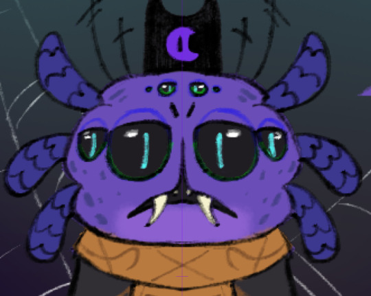
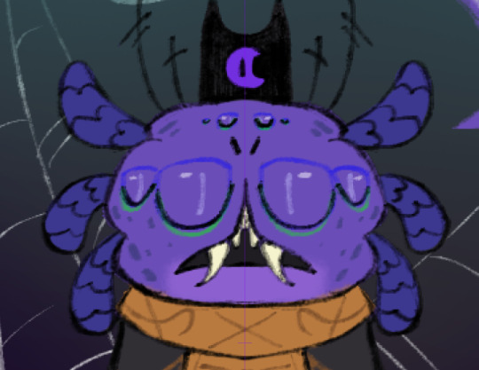
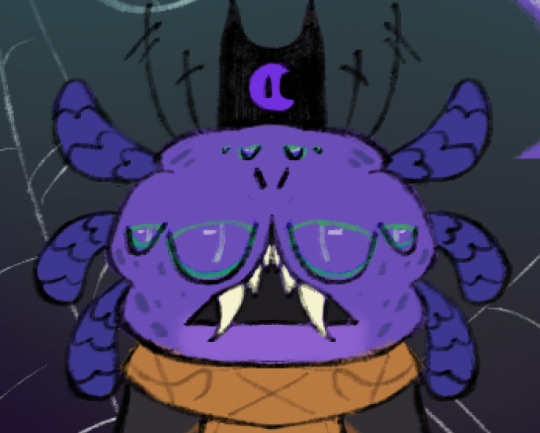
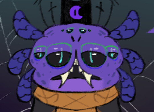
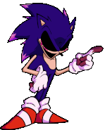
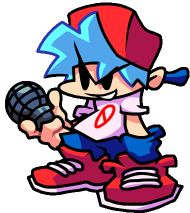
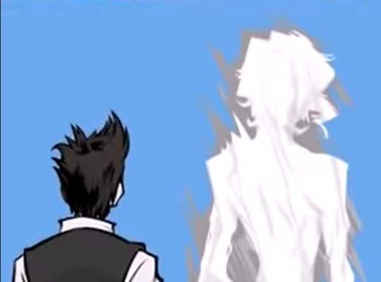
#i just might need to make more animation frames for the sprites
Text
Rotating Lance in my mind to Maxwell the Cat
#i have been coding and stressing about finding a job all day#my mind is broke#but I've added Sky's animals#and 4 new maps#and fish#and forge#and artifacts#heart events?#uhhhhhhh#don't worry about it#I may or may not have deleted everything I had and started iver again#bitting the drywall rn#I'll get there#i just might need to make more animation frames for the sprites#maybe#we'll see how I'm feeling later ig
2 notes
·
View notes
Text

Set breakdown time! Next up: Niko's room.
As before, I've circled the points of interest and numbered them to make them easier to talk about. Cool? Cool. Let's do this!
1: Niko's mom's name! This part is her and Niko's surname. The kanji are 佐々木.
佐 – sa, meaning help or aid
々 – an iteration mark. When you see this, basically it means "exactly what the last one said, one more time." So another sa meaning help or aid
木 – ki, meaning tree
It's really neat that they picked a last name for her that doubles down on her role in the narrative. Just like Niko is there to support and help other characters in whatever way they seem to need, her surname hammers it home by including 佐 not once but twice.
2: Riza (リザ) Niko's mother's given name. Somewhat odd here is that it's written in katakana and not kanji. Without getting sidetracked too much (you can pop over here to read more if you're interested) most Japanese people write their names in kanji.
Katakana seems like a bit of a strange choice here, unless a) Niko for some reason doesn't know the kanji for her own mother's name (weird, given that she's in high school) b) her mother is a foreigner (a possibility; foreigners usually write their names in katakana) c) the set designer/whoever prepped the letters didn't know the appropriate kanji for "Riza" (seems unlikely, given how accurate all the rest of this is) or d) some sort of personal habit. An interesting side note is that her letter to Niko also puts Niko's name in katakana.
3: Cutesy stationery, used for marking your place in a document or book
4: A cute blue purse!
5: Watermelon! Judging by the shiny material and placement near the other bag, I'm going to guess this is another purse
6: Niko's clothes :>
7: Pink luggage
8: Lots of instant noodles
9: A rice cooker
10: Rice vinegar
11: This girl LOVES her some plants
12: Probably food items…? The one on the right looks like it might be a five-pound bag of rice, but I don't recognize the brand
13: Lots of unwashed dishes
14: A toaster oven
15: Chopsticks
16: A cute octopus pillow. I think I saw someone mention that it's from Ikea :>
17: She often leaves dirty dishes sitting on the bedside table
18: A painting of what seems to be a skyscape
19: Brightly colored pillows
20: Metal art in the shape of a moon
21: A decorative window hanging
22: More plants :)
23: Candles
24: Her tv
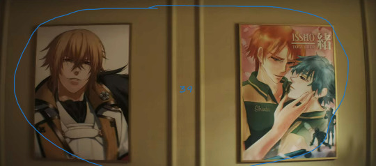
25: Cute pens with pompoms on the end
26: Regular tape
27: A cute cat statue
28: Marble Pop Ramune, strawberry flavor. Ramune is a type of soda that's a popular festival drink in Japan. It's sealed with a glass marble and you have to pop the marble down into the little catch basin before you can drink it.
29: Anime wall décor
30: Fruit jelly cups. In Japan, small gelatin based snacks like this are popular. They're tiny, about an inch tall, and you eat them in just one or two bites.
31: Niko's laptop. She has stickers on it
32: Washi tape! It's decorative Japanese tape, often with bright colors and patterns, used for crafting.
33: A lot of cute magnets, including the bunny one, which serves double-duty as a kitchen timer
34: Niko's grocery list. The only thing on here that's here because she wants it is strawberry ice cream. The rest of the items, licorice tea, manuka honey, and Epsom salts, are all natural remedies. She's been trouble-shooting how to get rid of the effects of the sprites. She knows she's sick, but not why
35: Cutesy craft supplies! Sequins, glitter, and pompoms
36: More washi tape!
37: Niko's manga collection. She is that particular brand of organizational mess that does not put her numbered volumes in order. She has made an exception for the series that makes a complete picture when you line them up, though
38: More plants :)
39: Manga posters! Issho is one of the series that she has on her shelf
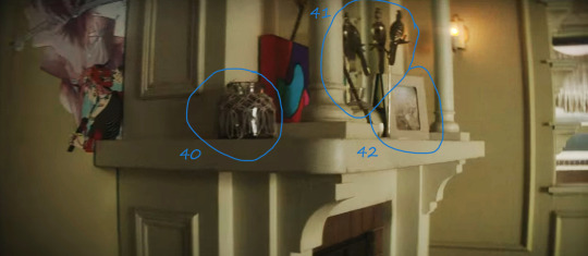
40: A decorative jar
41: Little metal bird sculptures
42: What seems to be the only framed picture in her room. The angle is wrong to see what the photo is, but it's interesting that they added just one in here. Maybe it's her family…?
154 notes
·
View notes
Note
I got the whole Snowdin movement bunch (all except for NMM!Clover back walk because my weakness for insignificant details has cursed me to have to try and learn some coding in order to make it exist in game should it ever get to that point)


Honestly the toughest part was getting the colors, a lot of these I just ripped straight from vanilla Clover
THANKFULLY I do not need to do this for the Dunes Caves or Steamworks as those seem to be a filter (which is actually what the Flowey Fight Clover is but shhhhhhhhhhh) that gets put on Clover and Martlet/Ceroba respectively (they do not appear on the massive Clover Chart so that's why I think they are filters) Don't know why it's just Snowdin that gets special sprites, maybe because then they'd have to put a filter everywhere in Snowdin which might get crowded and messed up in those rooms with shade? Idk, I wasn't on the dev team
Don't you just hate it when you notice some details you messed up when it's too late? On the side runs, some of Clover's freckles disappear for a few frames. Thankfully it's on the run animations, which are too fast for it to be a noticeable inconsistency (did you know that when Clover's head faces towards the screen for those two frames in their run animation, that you can actually see their other eye?

It's actually really hard to notice since both the eyes and outline are dark colors and also it's for only two frames while moving. It seems I'm not the only one who's a sucker for tiny and very likely insignificant details. The more you know. Also I brought this up as a whole "See? It won't be noticed. Probably." thing)
YOURE DOING ALL THE COLORS TOO???? YOURE CRAZY FOR THAT ONE HELLO!!!!
youre blue now!! thats my attack!!!! i think u did a great job translating the funky snowdin colors onto clover bc they are just kind weird for no reason GDJFJD
i looove the amount of little tiny details the dev team put in uty…. its like a drug to me
35 notes
·
View notes
Text
The Art of Asset Reduction: VNConf 2024 Write-Up
youtube
This is a write-up for my Visual;Conference 2024 talk on asset reduction: presentation of scenes with reduced art labor.
I will discuss how to reduce production requirements via various methods of asset presentation and staging, walking you through case studies of existing visual novels.
This talk will guide you to answer the question: How do I fulfill my project scope without asset bloat?
This is an art talk that assumes you have already scoped down your story and have created a list of scenes that you need. This is not a talk about scoping down your game's story.
You have scenes you need to make. How are you going to make them (and with style)?
Abstraction
Cut-ins
Reduce
Reuse
-
I. Abstraction
I start off with abstraction as a reminder that visual novels are a combination of visual and novel (amongst other aspects)
Abstraction
Abstraction is a strong tool for bringing focus to the writing, highlighting ambiguity and setting the mood with colors.
Examples I mentioned in my talk include:
Black screen
Solid colored screen
Sky BG
Of Components
The mood-setting power of abstraction also extends to scenes with characters, especially CGs.
As again, abstraction draws focus to what you choose to emphasize: the characters.
(FLOWERS -Le volume sur ete-)
They are gay.
Thank you for coming to my VNConf talk.
-
You can similarly abstract characters.
(Lachesis or Atropos)
Consider representing irrelevant characters (e.g., NPCs) as silhouettes. The reader can fill in the details within the shapes themselves.
Silhouettes are especially great for crowd scenes where you want to draw focus to the main characters.
This will be a recurring theme:
What do you really need to draw?
-
II. Cut-ins
One common not-quite full screen piece of art you'll see in many visual novels is the cut-in.
The cut-in typically consists of the:
Item/focus
Frame
And is often for topics such as objects or small animals, which may exist in the scene but may not be within the same frame of reference as the background and sprites.
The separate framing informs the players that the item is "separately framed."
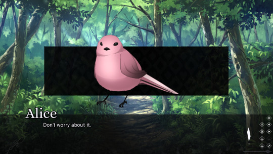
(Who is the Red Queen?)
For example, this small bird is not huge and would not be the size of a character's head even had a sprite been on screen.
The Foreground-Backdrop Heuristic
Cut-ins make strong use of what I refer to as the "foreground-backdrop heuristic."
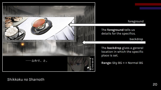
(Shikkoku no Sharnoth)
A general backdrop informs the reader of a broad location or scene (especially if characters are present). Then a more specific foreground (the cut-in) informs the reader of the specifics.
As the foreground cut-in is in a different frame, the pairing of the two helps create a mental model of the space in the reader's mind.
Cut-ins can be used for:
Backgrounds (mix and match foregrounds with a backdrop)
Reduced CGs
Presenting existing assets in a different frame of reference
CG variants
Try tackling your visual presentation in a layered, comic book-esque fashion with cut-ins!
Just be careful about clutter.
Whether you want to go for the layered cut-in style, the 3d stage cinematic style, or a combination of the two, make sure you have a vision before you jump in.
SD CGs
I had to make an obligatory mention of SD "super deformed" CGs in this talk, so here it is in the write up as well.
(Grisaia: Phantom Trigger Vol. 1)
SD, chibi. However you call these, they're great for playful scenes that might require more art than your classic sprite-background combination.
What SD CGs do best is that they:
Fulfill the role of a CG
Are easier to draw than fully rendered non-chibi art
Can be distributed to different artists to reduce artist workloads due to style difference
Just keep in mind that a simplified CG is still a CG and thus may lack reusability.
Consider what scenes really need a CG.
-
III. Reduce
Now, consider asking yourself: "Does what a player does not see need to exist?" (mostly applicable for games with opaque UI)
Yet, what you need to draw is what you need to draw. How can you reduce the work in what you need to draw?
One option is:
Palette Limitation
You've heard of gray scale games, but don't forget about other ways of limiting your palette to reduce workload.
Dramatic, mood setting color power
Less rendering work
(Sona-Nyl of the Violet Shadows)
A similar idea can be applied to NPCs for a more detailed take on silhouettes.
-
IV. Reuse
Lastly, please remember to be economical and reuse assets as necessary. One of the great joys of cut-in BGs, for example, is reusability.
I had to give an obligatory mention to CG variants in my talk, such as:
(Fatal Twelve)
However, overall, you never know when you'll want to use various components of your art elsewhere such as intermixing CG and sprite art.
Please keep your working layers if possible.
Other reuse examples:
UI (especially in episodic games)
Gameplay (e.g., Kogado's rhythm game)
Consider asking your programmer to work on a framework to reuse, reducing repeated code work.
-
Conclusions
All in all, you can make your game.
And it doesn't need to be hellish on your budget or timeline.
If you take anything away from this talk, let it be to:
Prioritize reusable assets
Maintain aesthetic; avoid clutter
Display important scenes
Do not scope up; aim for a set goal
A scene can be presented in many stylish ways, some of which will suit your workflow better than others.
So, go on. Make your game!
-
Interested in my works? Find me on itch:
And check out my newsletter:
-
VNConf 2023 Talk Write-up:
#visual novel development#vnconf#visual novel#vn#vndev#development guide#devlog#game development#talk write-up#gamedev#indiedev#this talk is also a yuri visual novel recommendation (kind of)#lachesis or atropos#shiei no sona-nyl#fatal twelve#grisaia phantom trigger#shikkoku no sharnoth#flowers visual novel#who is the red queen?
52 notes
·
View notes
Note
I've been wondering how you do your animations?
i animated them on clip studio paint! they are 17-18 or so frames, give or take, so to make a little gif like them you don't need ex
i don't think i'm completely qualified to explain how to animate in clip studio paint (and honestly. you do not need clip studio paint for this), but i wish to point out that every separate moving part, if you want them to move differently from the body, needs its own folder to be independent. in the case of the talk sprites, it's their eyes, mouth, crowns, as well as extra appendages (i'm using shamura's as an example, so their pedipalps)
i animated the blink on 7s. it's a bit of an odd frame rate, but it works
for the blink, simply drawing an open eye and closed eye works, but we can add some extra frames in between to make it more interesting. i will go over what i did to do so
it consists of 5 unique frames
first is the wide open eyes. just draw them how you normally do
next is this about to close eye. i have put onion skin on so you can compare the previous (blue) and next (green) frames
frame 3 is the actual close. you don't need to animate every step of closing, because that will make the movement feel slow. i'm not an animation student but from what i have picked up as a hobbyist, less frames in between makes the action look faster because your brain can fill in the rest!
frame 4 is still closed-eyed, but extended down a bit. this will make the part where their eyes open squish a bit before they bounce. it adds tension to the movement and makes it more interesting
and the last unique frame is this half-lidded look. just opening their eyes again. this movement is a bit slower, so we add another frame
from here, i insert frame 2 and frame 1 to the end to make the full blink! if you want another reference, look at this drawing made by crowne prince. this image comes from a video that goes into a lot more detail, as well as including eyelashes
the mouth i animated on 5s. i needed motions that always looked like talking so i am sure there are better lip sync guides out there. the mouth does not need to move quickly, so the frames change little by little as they move, opposed to the blink
you can also see it in action in this gif i made of my sona. though in this gif, there is an extra frame between the starting eye and the lidded eye, an extra bounce after opening. i did not do this for the bishops but if you want a little more oomf in your blink, you can add the extra frame
the blink is not on loop. for the entire animation, they blink once. because constant blinking is a bit unnatural, unless they got something in their eyes! but each of the bishops blinks at a different time :)
frame 1, i referenced the original game sprite because that's an easy starting out point

for frame 2, the mouth is wider, again bringing the tension and bounce properties into this movement

frame 3 is smaller than frame 1, it is getting ready to close
frame 4 gets closer

and frame 5 closes!
and this animation is on a consistent loop. 1>2>3>4>5>4>3>2>1 and repeat
and each of their extra appendages (if applicable) are different. but in general they had 3 unique frames. a resting position, an inbetween of going up, and a high point. then it would come back down. depending on the swiftness of the movement, i might skip a frame (kallamer's ears, for example). but since shamura is generally more relaxed, they move slower and more consistently
again i am not an animation student but i hope this was insightful
100 notes
·
View notes
Note
Hello!
I'm creating a GDQ break channel as a coding exercise and I couldn't help but notice your Mega Man one is incredible. I was wondering what, if any, tools you used to work with sprites and 2D animation in general. I'm new to PIXI and animation as code in general so any tips would be greatly appreciated! Thanks!
Hey, thank you so much! I didn't know much about PIXI before either, so when I started the Mega Man channel, it was mainly just reading the code of the other channels that do something similar to what I did, and seeing how it works there. For me, that channel was Corvimae's T-Rex Runner channel, it's a fairly simple one with a bunch of examples of working with 2D sprites in PIXI!
(For others seeing this post: Here's a link to the channels on the break screens on Games Done Quick streams - they are open-source, and anyone can make their own. If you're up for a small coding project and have a neat idea, and want to contribute to the GDQ stream layout, I highly recommend it, it's a lot of fun!)
For sprite animations using frames, one tool that really helped me is Texture Packer. It allows you to take all your seperate sprite files and put them all together into one atlas, so you can access them via references like mySpritesheetVar.textures.coin instead of having to manage all of the texture objects and offsets yourself.
That makes sprite animations a lot easier: To create something like the walk cycle, I just loaded all of the frames as seperate layers in GIMP (or whatever image editor you prefer) and aligned all the layers so they lined up like they should when the animation plays. From there, you can export each layer as a seperate file, with all the empty space still around them. These can then be added to Texture Packer, which will take care of trimming off all of that transparency, but it will also make sure everything is aligned just like you set it once the atlas is loaded!
You'll have to manually define the animations in the JSON file after exporting it (which is just an array of the file names of the seperate frames). But after that, you can simply assign the animation to any AnimatedSprite object by using a reference like mySpritesheetVar.animations.walkCycle and PIXI will take care of everything. (Don't forget to call the play() method to actually start the animation - that had me confused at first.)
As for animations involving sprite movement, in most cases, you should be able to keep it simple, and just move objects by a constant amount each frame. It's easy to set up, ensures that everything always lines up correctly, and there's often no need for more complicated approaches (especially for a retro-styled channel, where most things move in straight lines anyway).
Most of the objects in the MM channel do something like this, such as the shots moving at a constant speed. There's also no need for proper collision detection for objects like them - taking pickups as an example, I just compare their X coordinate against a constant value to see whether it is close enough to the left side of the screen to be collected (which also helps to make sure the items can never be jumped over).
But since the channels are based on games, one tip I can give is to try out a little bit of physics-based animation - if the movement of your sprite works the same as the one from the original game, you can get good-looking results fairly quickly! Jumps, for example, can be done by setting an upwards vertical speed for the sprite and then applying gravity to it every frame, to get a really nice jump arc.
For this kind of movement, since you are trying to replicate a game, there's a lot of similarities to code you would write for games. The main difference is that there's no player input, the jumping is instead controlled by donations and timers. So, looking up platformer physics tutorials might help with implementing these animations - to see how the physics behind the movement work, and how you can apply them to the sprites here!
If any questions come up about how something in the MM channel works, feel free to drop me a chat! Looking forward to seeing your channel :)
6 notes
·
View notes
Text
Cloud's FNF GIF Making Tutorial
Hello there, have you ever wanted to make FNF GIFs like this for example?
Well, your in luck, because in my personal guide, I'll teach you how to do so.
This is for desktop users by the way, I don't know how to do this on mobile.
1. Getting Started
You'll need the following program to make your GIFs. I personally use.
Spr2PNG (Highly Recommended | Automated, Simple Process)
Java (Needed for Spr2PNG to work.)
EZGif (Needed for GIF Making.)
But there are other options such as FnF-Spritesheet-and-XML-Maker but I personally use Spr2PNG as that is more simple.
To download Spr2PNG, first go to the releases tab and click on the Latest release you see, then click the zip file to download it automatically. You'll want a ZIP Extractor like 7-Zip, which I recommend, but WinRAR is another good option.

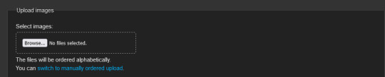
Now, once you have your programs, you'll want to download the FNF mod you want to rip the sprites from, like for instance; VS Sonic.EXE, or basically any other FNF Mod and download that either from GameBanana or GameJolt, depending on where it is.
2. Ripping the Sprites
Okay, now, to make the GIF, you have to rip the sprites. To do this, go to your FNF Mod that you downloaded and go to either mods\images\characters or assets\shared\images\characters. It depends where all the [charactername].xml and [charactername].png files of that character is located so you might have to do some digging around in the mod files. But once you find those, you want to copy & paste them into a separate folder, I recommend creating one to store all your ripped sprites at, aswell as your gifs.
3. Making the GIFs
Okay, now that you have your sprites ripped from the mod files. You'll want to open SprToPNG.bat or SprToPNG.jar. It doesn't really matter what you choose to open. It should show a small window that says “Select XML or PNG Files to Open” and you'll want to locate the files you ripped from the mod files. Please keep in mind that the .png and .xml files of that character must be in the same folder together otherwise it won't work. Just double-click on either file, again, it doesn't matter. Then, SprToPng will do the rest and separate the animation sprites into one folder that is named after that character, aswell as all the sprites.
Now, click on the folder of the sprites that you want to animate, it might say "Idle Dance" or any of the character poses, aswell as the special animations if the character has them. There should be some PNGs that are ranging from 0000 to random, depending on how many animation sprites that animation has.

Now, open EZGIF.com and click on "GIF Maker" and then click on Browse and then locate the separate PNG files of the character. A good tip is that you can select the first PNG with 0000 and then the last by shift-clicking, just click the first png and then the last one with shift-click and it'll select all the following PNG files and then select "Open". It might take a couple of seconds, depending on the file but it should show all the PNG Sprites in order.

Set the delay time to either 4, 5, or 6. You want it to act like how the actual in-game sprites would. If it's too fast, increase the delay time, if its too slow, decrease the delay time. Optionally, you can set the last PNG to 30, then select "Don't Stack Frames" so the sprites don't overlap over each other and make it look ugly.
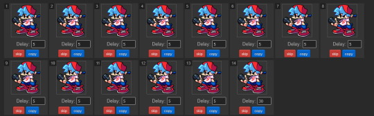
I'll show two examples, one with "Don't Stack Frames" on and off.

On the left is with it on while on the right is with it off. You see how on the right the sprites are behind the ones that are displayed? Yeah, you don't want that. So I highly encourage and recommend you to turn on "Don't Stack Frames" on.
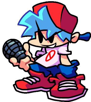
Now, select "Crop" and then scroll down and select "Trim Transparent Pixels around the image" as this will remove any transparent pixels we don't want, while also reducing the file size, either a tad bit or a lot, depending on the sprite.

And once you're done, click save, your sprite should look like this!
Now that you made your Sprite, you can upload it to the Funkipedia wiki to help out with pages and such that need sprites.
Fin.
Feel free to leave any suggestions in reblogs or comments, they'll really help out. Also, make sure to reblog this so more people know how to make GIFs in the future (on desktop or laptop).
4 notes
·
View notes
Text
I wanna start writing about the games I play so here's a little review on Clock Tower. "Review" in the sense of looking back on it, not in the sense of like. IGN 8.9/10.
I first played Clock Tower on an SNES emulator in middle school with friends. One of them said it was the scariest game he'd ever seen (watching it on YouTube instead of playing it himself). We'd hunch around a computer and sort of try to figure out how to play it. Now that I've played it myself in twenty twenty four, I can see why it was such an uphill battle.
I played the game (again with friends) at first blind, and after about an hour of trying and failing to grasp it I looked up a guide. Turns out, there are a bunch of intricate (and semi-random) systems in place that more-or-less obscure the path towards completing the game. Rooms that shift locations, items that might not be in the same place between playthroughs -- it's an interesting method to increasing playtime, but not something I think makes the game more engaging. I think the designers wanted the search for the true ending to require trial and error. But (in my mind) trial and error really only work if the results are deterministic, and the fact that they aren't makes playing the game multiple times confusing.
Despite the clunkiness of the gameplay (and not to mention the kind-of-thin story), Clock Tower nails presentation. The house is gorgeous and the sound design is probably my favorite from any game of its generation. The footstep echo and the scissor noises stand out especially. And the music! The music rules! I'm not knowledgeable enough with music stuff to know if it's technically impressive on the hardware, but I haven't played anything from this era that sounds anything like it. The only problem with the music is that it makes it too obvious when you're safe -- it only plays once scissorman isn't pursuing you, and so it's all too clear when you're safe.
Speaking of scissorman: he's the most engaging part of the game by far. His appearances are effectively shocking and his pursuit of Jennifer feels dangerous. At least, it feels dangerous until you realize you just need to mash the "panic" button on him and you can win pretty consistently. But some of his scares are brilliant. When he topples the doll in that weird mannequin room, or when he crashes through the ceiling in the garage -- it was cool and felt true to the horror movies that clearly inspired the game. One friend I was playing with agreed with me that it felt a lot like Suspiria, which is a cool movie and it's cool to play a game in the same vein (lo and behold, the game's director has said that Clock Tower was made in homage to Suspiria's director! Wow! Intertextuality!).
The game has some other 1990s game weirdness going on. Needing to stand still for health regeneration, bizarre actions you need to take to solve puzzles with seemingly obvious answers, but honestly (and I say this as someone who played with a guide) I found a lot of that stuff to be kind of charming in the way that a lot of old games are charming. I especially loved the character portraits and sprite CGs (made by digitizing photos of real people! that's so cool!). There's a sequence where Mrs. Barrows (one of the antagonists) lifts her face up to catch more shadows and look more menacing. It's only a three frame animation but it absolutely rocks.
I feel a little bad for having played this game with a guide since, incidentally, playing with one meant I missed some content. However, I'm fairly certain I wouldn't have finished it without one thanks to my thin patience for unneeded slowness, something this game has in abundance. It was definitely worth the revisit, and I'll happily espouse the impact this game had on me as a kid. I'm excited to see what the upcoming remake ends up looking like, and if they'll change anything about the original.
If you made it to the end of this, thank you for reading! I'll probably do more of these going forward since I had fun with this one and it made me think more seriously about the game and how I felt about it.
edit: typo lol
2 notes
·
View notes
Note
I wonder if Joshua is supposed to be naked in Angel Composer form but we can't see it or we turn into dust.
Shorter musing: The SR says that "as the being in the Underground with the highest vibe, lesser Reapers are incapable of perceiving him". From that it sounds like adding or removing clothing probably wouldn't change that. Although, adding larger, more noticeable items like a cape or a tall hat might make him more noticeable, it might also make it more difficult to perceive the details due to the silhouette becoming more confusing. The Animation seems to show more clothing makes you more "intense" and therefore more visible, while the games point to the (suggestion) clothing being optional.
It's probably already difficult to focus on a hazy/glaring/glowing smudgy figure, so the Composer might try to alter their form to make it easier for the person to perceive them.
Longer musings about the Angelic/Composer form, spoilers from TWEWY and NTWEWY:
In the game, one can infer clothing from the game sprite as if there's a front (half) of a jacket and a (dress) shirt. Then underneath the clothing you can make out the base human shape at times, like the arm and neck. The sprite is the same during the flashback in both the DS and FR versions.

(...He got taller between games? Did he put on platform shoes? Is he floating? Or did Kitaniji change his shoes? Mysteries!)
Then in the secret ending it points to "glowy humanoid form". In the FR, they redrew the front facing sprite. It's not just a larger and unblurred dissatisfied face like the DS game, but it's drawn in a similar way like how the legs and the back were in the DS (and Final Remix) versions. Although there's less or no clothes, it's still not quite...human. "Pieces" spike off the body more clearly and he's gained pointy shoulders.


The Animation points in the opposite direction of the game's secret ending. With Hanekoma, we can see the feet and pants still look well defined after he has reached full vibe frequency and takes off. In the flashback, even though he's a little blurry, you can tell the area around the ankles and feet are a little too wide to not be pants. Especially when you compare it to his arms, which are so thin you can almost see through them. If Joshua is wearing the same outfit as his downturned self, then the thinnest parts are his bare arms.
Therefore, when the fiery Animation Angelic/Composer form has clothes, you have a better chance of seeing him. Hmm.
Definitely more in the game, we get a clearer picture of Joshua in the secret ending when Hanekoma is around. Since Hanekoma can perceive Joshua, so maybe we, through him, can see better as well. And perhaps Joshua doesn't need to obscure himself around those who know his true form. Those that can actually handle it.
There's also a potential orb form, but it could be the Universal Form For Changing Planes. In NEO we see a pillar of light when Hazuki presumably ascends up to a higher plane. Do pillars of light work just like orbs? Was the pillar just a fancy display to hide the orb form or is it a replacement or alternate method? Mysteries.


(Maybe good on Rindo for covering his eyes there. Hazuki was looking on the edge of being really bright for a second.)
If the Higher Plane has less physical, less defined forms, I like to imagine their forms less restricted and less expected to be human like. Want to be a cube? No problem. A floating Mr. Mew cat head? Done. It's just another way to express oneself. If you're going to be working with Reapers and Humans, then the Angel should be comfortable with a human body and follow enough human customs to blend in. If Angels can only come from humans ascending, then it can be a return to familiarity, comfort and/or nostalgia for some.
I like to view the sprites as a freeze frame as if their form is always shifting, pulsating, oscillating, glowing, especially with how it's drawn in the FR Secret Ending. This was one attempt, with just the aura shifting around, and here was a second attempt (eye strain warning) of the head and shoulders included, but that was mostly just playing with layer effects.
In summary, who the heck knows! It seems more clothing might make it easier for lower plane beings to see him. If there's not enough "layers" we might miss him if we're just on the verge of perceiving him. And I imagine if he's too bright, too "dense", he might be painful to look at. Thanks for the ask!
#asks#ask#twewy spoilers#twewy#ntwewy#ntwewy spoilers#neo the world ends with you spoilers#the world ends with you spoilers#sanae hanekoma#megumi kitaniji#the composer twewy#whoops i rambled a bit but i don't think i've put together something like this before???#i love going through the anime screenshots are they're labeled variations of COWARDS. good times
7 notes
·
View notes
Text
December Game Dev Progress
Hey everyone, I hope you had an awesome December and a great new years!
This month I've been feeling kinda bleh, with that and it being the holidays I've tried to take things a bit slower.
Game Features
Camera Rework
Changed how the camera works, took out the smooth zoom and made the Camera only exist at rounded x/y value of the Player. This fixed the weird scaling issues when zooming where you'd see things being 1 pixel wider or taller than they should be and the sprite wobble glitch when you stop moving.
Snow Rework
Changed how Snow and Wet Sand are generated and stored when Culled
I'm now storing them in a ds_map and a ds_list, so I can check a ds_map cell to see if there isn't snow there already for creation, and use the ds_list for quick searching for an existing one to destroy when removing them.
Very important to remove BOTH entries when I remove one!
I'm also now checking against the AI collision map that Goblins and Animals use to see if they can move into an area. This saves me making a another whole check list of things, but since Grass isn't in the AI collision map, I've just made it so Snow can spawn under it for consistency.
I'm going to have to do something about how much Snow can exist at once though, since it's eating into the frame rate. Figuring out how to merge them into one object might work, or drawing them all at once with depth sorting maybe?
HMM! Reworked Weather to be localised?
This will save me loads of frames by not covering the whole island in snow. If necessary I can have multiple spots, and maybe even have them move?
I guess the trick now is figuring out how to make it less square, I do have them set up for random width/height.
I can probably use the shape system from the world gen that makes the rocks and trees etc, so it'll use the square but only place snow if it's in the circle of the square. This wont work with random sizes though, I'll have to have the shape in an array for each width/height variety so that's no good really.
What about having it move?
I like this but I think I need a cloud, seems weird just appearing out of nowhere?
Not quite a cloud but it'll do for now as proof of concept
Reworked the shape/size and changed the angle of Rain!
Also reworked how Snow and Wet Sand despawn, they now have life which decreases based on correct weather, their distance to weather cloud and the season! So for example, Snow melts faster in Summer!
Rain now waters Crops and Plant Pots in a specific area!
Slight issue with the Wet Sand despawning here, forgot the divide the coords by 16 to get the ds_map cell position!
Saving/Loading
Got Snow saved!

Also Weather and Time are now saving!

Update! New Weather system saves! :D
Slight graphical glitch there, I was had the code the sets up the Particle system being loaded AFTER the system was started :S FIXED!
Item Gifting
I reused the Players Inventory screen and also updated the Chatting system to get this working right. Goblins will have likes and dislikes but for now their response is random.
I'm going to add emotes to the portrait and a heart meter to the UI box, like with Pets!
Like so! I actually just used the exact same UI, just moved some things around and added a condition to get menu options based on if NPC or Pet. :D
New Things!
(no more images because tumblr wont let me, check out the same post on Patreon for the full thing: https://www.patreon.com/posts/75431590 )
Lemon Trees
Along with Lemons from the trees, you can also make Lemonade!
I was working on a better tree design, but here's bigger Lemons in the meantime!
Free Cam
No idea what this will be used for, maybe just cutscenes? But it's set up now!
There was a some more stuff I was working on but got distracted trying to track down a bug where something was trying to access outside a grid. Never found what :|
Also fixed a bunch of problems I made for myself with the Minimap where it wasn't updating properly. Turns out I'd changed the surface cleanup code from
surf = -1; surface_free(surf);
to
surface_free(surf); surf = -1;
while the second version makes logical sense, seems it doesn't work that way.
I hope the new year is treating you all well.
Thank you so much for your support and help this past year it's really meant a lot to me and helped me so very much to keep going.
Keep being awesome everyone! <3 <3 <3
12 notes
·
View notes
Text
TIME FOR DA FOLLOW UP ON MY ASSET TALK
Right now, I’m thinking each “Adventurer” character gets:
Pose 1: halfbody pose with at least 4 expressions
Pose 2: variation of pose 1 (arm up, head tilt, etc) with at least 4 expressions
Faceset: The expressions in Poses 1&2 sized down to fit in a faceset.
Sprite: 4-directional, 3-frame walk sprite
Static Battlers: 1 frontview style, & 1 variation for sideview (usually just changing the eyes and/or head so they’re looking to the side).
Currently still deciding on:
Animated sideview battlers (ASB): rpg maker mv-formatted, 3-frame battler motions. could be used in any engine though, of course.
I need to start working on these assets so I can see how long each part takes. Especially the ASBs, as the amount of time they’d take is what’s worrying me about that asset. Like I dont wanna be holding up Adventurer pack releases TOO much for the sake of making ASBs.
I also need to figure out how many characters I want to have per pack. I know that getting early access to these characters separately, as they’re created, would be one of the bigger benefits of joining the patreon. But I dont want people who don’t want to, or cant, subscribe to patreon to be kept waiting toooo long.
6-8 characters seems to be the standard size for packs like these, but I might have to hit the 4-6 range…
NPCs take less assets to be complete, so they could possibly have 8 or more per pack. Still, I have to come up with the designs in the first place, which takes time.
Monsters will vary greatly in amount per pack. I’m planning on starting with a “general” monster pack that could fit in most fantasy rpgs (so anywhere between 30-50 in that pack), then making smaller, more specific monster packs from suggestions/voting on patreon.
3 notes
·
View notes
Text
Boopy's dumb thoughts on Pokemon Violet
It’s MY blog – and MY birthday – and I get to talk about the latest Pokemon release over a month after it came out because I want to!!!
Feel free to ignore, agree, disagree, leave your own thoughts, tell your friends you love them, eat a nice meal, etc, etc.
Spoilers for the game! Also not bothered to proofread lol
Ok so I’m gonna start off with the stuff I didn’t like very much. Gonna try keep it brief because I otherwise really enjoy the game and a lot of my takes are common in the fandom
I have seen CGI from 2002 power rangers specials that look better than this game
Frame rate is crunchier than gravel sometimes
Honestly,it’s embarrassing that a game from 2022 looks and runs this badly
Especially since PLA released earlier that year, and while not perfect, it ran much better
SV definitely needed an extra year or two in the oven
I hate how most houses can’t be entered and that most shops are menus
Wish you could pet your mons again, not just wash them
WHY IS PUTTING BREAD ON A SANDWICH SO DIFFICULT
In the options at the start of the game where you’re asked by someone (might be Nemona, can’t remember) what dream you have, why can’t you answer with ‘be a trophy spouse for a hot champion’?!
Steven should cameo in this game (I will NOT debate this)
Really miss the catching mechanic from PLA, woulda worked amazing here
I love that Pokemon is going in a more genderfluid direction when it comes to character customization (and NPCs too)
But I wish there was a skirt option for the unifotms (and not just for the f! mc, for everyone!)
Also the uniforms are so ugly… please let us change out of em soon gamegreak!
I actually… don’t like Penny that much
Out of the trio, she’s the least like a friend
She’s also the least interesting member of Team Star
And she’s kinda mean :/
AI Turo (AI Sada in Scarlet) saying the real one actually loved Arven in the end felt like a complete lie to me – I couldn’t believe it not one bit – ruined the story a bit honestly
Ok, now it’s on to the positive stuff
Wish Miraidon would make a funny honk noise like a clown car
also i have mad beef with ed sheeran so his somg being included was NOT appreciated
ARVEN
Man I just love this guy
Hence why you can now request him!
The enemies-to-best-friends arc is amazing!
He’s fun and passionate and caring and a bit of a tsundere and I love him!
And his Mabostiff? Precious boi!
That whole story with him and his doggy had me tearing up by the end
And the stuff with his dad was heartbreaking
I love Nemona too!
Such a fun rival!
She’s a quirky tomboy with a great design
Lowkey love that she’s from a rich family
I love how she’s basically obsessed with you
The animation of her ponytail is so pleasing
Her and Arven debating who was the better friend was lowkey hilarious
Any game with a cooking mechanic is automatically top-tier
I have made some RANK sandwichs and it’s so funny every time
The absurdity of the Clive/Clavelle thing had me dying istg
IRON VALIANT
I R O N B U N D L E
Paradox Pokemon in general honestly, brilliant idea all around
Loved Area Zero, especially the deeper you got
It was so sparkly!
I loved the designs of most of the towns
I loved Artazon, Porto Marinada and Cascarafa the most
Your home is so cute!
Terastalization is fun and dumb and I love the goofy, sparkly hats
The ghost tera-hat being the gen 1 ghost sprite is great!
Tera-raids are great craic!
Loved playing online with friends
It was so fun to travel together!
Love the face/hair customizations
Especially since you can customize right away and don’t have to wait until you reach the first salon like two hours in!
I don’t think there was a bad mon this gen
Here’s some Pokemon I really liked
Clodsire
Fuecoco (the whole line actually)
Fidough & Dachsbun! (probs my faves)
Greavard!
Goldango (silly lil cheesestring man)
Miraidon
Lechonk
Smoliv
Toadscool
Klawf
Tatsugiri
Tandemaus and maushold
Bellibolt
Brute Bonnet
Cetoddle (baby!)
The dogs in this game are peak, gonna do a dog-only playthrough someday
The Academy is amazing!
I enjoyed the lessons and the teachers!
The fact that the Home Ec teacher is an extremely buff guy is amazing
Love the Psyduck librarian
And the Gengar who did the night duty!
Loved the gym leaders so much too!
Larry, Grusha and Ryme are probably my favourites
Iono’s gym test was so funny I loved it
The designs of the human characters this gen were PEAK
I want Dendra’s outfit, Eri’s outfit, Grusha’s outfit, Katy’s outfit, Miriam's outfit, Sada’s AND Turo’s outfits
I am a big baby, so I loved skipping basically all the battles with random trainers lol
Man that ending with the AI Turo reveal and fight was so fucking sick omg
I enjoyed every single path in this game
Great music
The final cutscene of The Way Home was… so good
Riding on Miraidon was so fun!
Clavelle asking what Cheugey meant was unreal
I like the idea of champion being an official rank, and multiple champs existing
Yeah, the graphics aren’t great, but damn some of the areas in the game are still so beautiful
I loved how the sky looked and changed too
In case you forgot
I R O N B U N D L E
Ok so in summary, this game has serious issues that really should not be present in such a recent game HOWEVER the characters and story were amazing, there were some awesome Pokemon, and it was super fun and enjoyable to play.
10 notes
·
View notes
Note
hello! i stumbled across ur profile looking for one piece pixel sprites and was wondering how you made yours or where you found them? ive found some of the sprite sheets online but im having an awful time attempting to put them into gifs myself 😭
Hi hi!! ♡
I'm currently working on making sprite sheets myself for all the games to have on my wiki but haven't finished and put out most of them just yet (-ω-、)
I'm ripping them myself though which if you wanted to do as well, you can find the games and emulators pretty easily. I use Jasc Animation Shop 3 to pull the individual frames of each sprite attack/action and then I just put them into GIMP and make sure they're all the same size. Both Jasc and GIMP are free to download and use (though Jasc is a lil.. temperamental). Luckily, if you just want to use the sheets you've found thus far, you just need GIMP and patience to cut out each one and align them.
If you wanted a bit more step by step then I could do that, it just might take a sec but let me know if that's what you were looking for :3
Hope this helps!
1 note
·
View note
Text
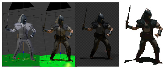
A while back I wrote a blog on how I'd make a soulslike using retro hardware, I'm gonna repost it here :D

Yeah, so the twitter post where I first explained my idea was my most liked/shared post by like a factor of ten. Since there was so much interest, I figured I might as well make a mockup in Unity. Look what you made me do.
Here’s a link to the build, and the controls are detailed on that page too. For the full effect, I’d also recommend using JoyToKey or a similar program to convert controller inputs to key presses, because I was too lazy to implement key rebinding for a mockup. See the itch.io page for suggested bindings.
Also, if you (yes, you!) want to continue this work, the zip file for the build also contains inspiration art, models, game data, and source code. It’s low polish code and almost nothing is systemic, but maybe it’s a springboard for someone who wants to push this project farther. I’d love to see it. The work that I have the rights to (i.e. everything except the inspirational art) is hereby released in the public domain.
Findings
Animation
The first and most noteworthy thing I’ve discovered while implementing is that there were more animations than I anticipated. Like, I figured there’d be a lot, and there were more than that. As of right now, there are 532 player sprites, each at 100x100 pixels, giving us roughly 6.4 mb of sprite data. (assuming indexed image format and smartly cropping fully alpha 8x8 blocks)

Bruh
One of the things we could to further shrink these is to run-length compress them, and also reuse tiles. I considered writing a python script to go over all 8x8 tiles within all sprites, and saving them in a massive lookup table. Then, it would go through all sprites again, replacing the tiles in the sprite with any similar tiles. This would mean, say, the thigh tile from one animation might be the cloak in a different frame if the pixel colors and shapes were sufficiently similar. However, I decided not to because it doesn’t actually have any savings on modern hardware, only on tile based renderers.
I could have also hand deleted specific entire frames of animations and reused similar enough ones - just by eye - but I also wanted to include all of the animations in the data that I distributed, just for the sake of it all being there for anyone who might need it, for whatever reason. I think these techniques might get the total data down to 50-60%, but that still means a ton of data just for the main characters sprites.
I could also cut the animations in half by simply making the character designs so that the left-facing animations can be reused for the right-facing animations, but I felt that put a lot of constraints on enemy design and combat readability, so I didn’t pursue that either.
Turns out tons of animation variants work better on skinned 3D models (which is why I’m pitching my next souls game on the Nintendo 64. Hit me up Bandai Namco!) I chose to do one player model with no costume changes and just a boring sword. Any variants like clothing, weapons, or equipping a shield would have completely blown the animation data budget.
Framerate
You’ll also notice the game runs by default at a low framerate, 15 frames per second (The quality can be changed with the - and + keys during runtime if it causes discomfort). I did this for two reasons. One, it made the animations, which run at a consistent 10 frames per second, feel much more in line with the sprite movement and the camera rotation. Plus, it might accurately simulate the game running on actual hardware; making the game run a quarter at SNES framerate might be required for the “high-fidelity graphics” on show here. (Who knows if the hardware would actually allow that without awful artifacts though, ha). But throttling framerate is a tried and true tactic for better visuals.
Environment
Another thing that surprised me is the amount of reuse on environment assets I was able to get. I was ready to put together a bunch of textures for the walls and floors, but I finished up what I wanted to achieve and found I’d only used 20 64x64 textures. I think the real game would benefit by focusing on unique tilesets to give each zone or level a special feel, and I think that’d be within the budget of a real game.
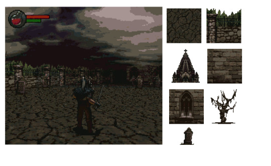
Environment took about 20 textures total
I also quickly abandoned the differing-heights-of-walls idea I talked about in the first blogpost. The requirements of the way walls are rendered described in the post made certain arrangements of walls impossible, and those were kind of the only level designs I wanted to use. That’s confusing, here’s some drawings to explain what I mean. Basically, having shorter walls in front making a visually tiered level with hedges that obscure the walls behind them just isn’t possible using that technique.

The rendering technique causes gaps where there would be walls behind walls.
While we’re on the topic of environment, I guess I skipped over the way we’d have to z-sort sprites to allow walls to layer correctly over them, and for sprites to draw back to front. That’d be a performance issue too probably.
Palette and Rendering
One of the big wins I had was the palette I set up, I felt it was super moody and conveyed the tone I was going for. It felt muddy and sad and tired. It had pops of blues and greens, but even then they muted and melancholy. To achieve this look, there were three mechanisms here. First, all the sprites and environment textures were palletized to those colors. Then, in-game, I used a fog effect to fade the world to black. Finally, a post processing shader took any pixels outside the gamut and palletized the final game render, so every pixel displayed is within that palette.

The palletization is most noticeable in gradients, where it slightly changes the tone of colors. In a cool retro way, I think.
To create the sprites, I was kind of forced to do it by rendering 3d models (blender files included in the data!). This was due to time and money. As mentioned previously, I would have loved to dress up in costumes and downscale, pixelate, and rotoscope real pictures, but that costs stuff. Also, I’m sure hand-pixelled sprites would absolutely look more appealing, but like I said above, there were just so many animation sprites. The upside to hand authoring is you can have more control of implied movement during animation, and therefore probably fewer frames. All said, I don’t dislike the rendered results, it has a bit of a Diablo 2 look to it, but I wish I had been able to experiment with different techniques, mostly for fun.
I remember loving to see these render breakdowns in gaming magazines and websites back in the day
I think if I had lower-resolution-better-looking sprites, fewer animations using the techniques described above, and designing levels so as to not have to z-sort sprites, it just might be able to run on SNES. Just maybe. A commenter mentioned it might actually run on GBA, and I could see it being possible. Shoutout to the most impressive 3D gba game ever.
One final design note I liked: The ducking mechanic was inspired by Super Mario World. I felt that was a nice homage, and there wasn’t enough buttons for more soulslike interactions like parrying, so it felt like it was a good choice with some mechanical depth with the limited inputs I had available. And, this game being simpler is alright by me - we are theoretically in the realm of before King’s Field.
Summary
So there it is. I said I didn’t have time to implement it, and I did anyway. This is all your fault.
But for real, I really enjoyed tinkering with this, and I’d love to see anything that gets made out of this idea. Hoped you enjoyed reading this!
3 notes
·
View notes
Text
Cosmigo promotion eraser

When should I throw out my kneaded eraser? At a certain point, it becomes entirely unusable, and that is when it becomes light grey. After using the graphite pencils, charcoal pencils, dust, etc., the eraser starts to change its color. You should throw away your kneaded eraser when it turns into light grey. When should I throw away my kneaded eraser? Geddes Mash Ups Scented Kneaded Erasers – Best for Kids.June Gold Kneaded Rubber Erasers – Budget Choice.Prismacolor Eraser, Kneaded Rubber Eraser – Best Eraser for Charcoal.You can usually rely on Faber-Castell to provide excellent art supplies. Faber-Castell Colored Kneaded Art Eraser.It is usually made of a grey or white pliable material, such as rubber (though it can be found in many different colors, ranging from green, blue, hot pinks, yellow, and many other colors) and resembles putty or chewing gum. … If you also experience that with your eraser, you’re good to go! What is a kneaded eraser made of?Ī kneaded eraser, also commonly known as a putty rubber, is a tool for artists. You can make a kneaded eraser out of pretty much any solid eraser that you have, even the one on the end of a pencil, just by rubbing it on a piece of paper to create crumbs and then kneading the crumbs together into a putty. In future, I will leave them a bit longer, but it really does work. When I took it out the eraser had taken on enough moisture to erase on my newsprint without ruining it. I dampened a washcloth and stuck the pencil along with the cloth into a zipper bag and zipped it up tight and left it for a few hours. … You simply knead your kneaded eraser and the medium will fade into the eraser. Although kneaded erasers do not wear away like other erasers, they can become saturated and unable to absorb any more graphite or charcoal. However, they are ill-suited for completely erasing large areas, and may smear or stick if too warm. They absorb material from the surface of the paper. Most erasers leave behind little bits of rubber when they’re used kneaded erasers do the opposite. Do kneaded erasers last forever?ĭo Kneaded Erasers Last Forever? While kneaded erasers can be used for years if they are correctly cared for, this doesn’t mean that they’ ll last forever. This does the trick unless your eraser is older and dried-out. It will wash off the surface layer quickly enough, but you might have to go back and do a second pass. Start by putting soap onto the eraser and rub it into the surface. Similarly How do you make a bendable eraser? How do you fix an old kneaded eraser? Do this a few times until the eraser piece is warmed up and softer to the touch. Pull the piece of eraser between your fingers as if you are playing with a piece of gum or making taffy and stretching it. GraphicsGale also has many pixel-art specific features to help you create your work quickly and easily, including palette control, selectively erasing colors, and tools for quickly replacing and trying new colors.Hereof, How do you soften a stiff kneaded eraser? GraphicsGale's export options are flexible enough to be compatible with any workflow.Ĭreate work from scratch, or use GraphicsGale's TWAIN imaging support to import images from your scanner, camera, or other TWAIN-supported devices. Output your animation frames onto a single sprite sheet, output each frame to its own image file, or export the entire animation as a single. Onion skinning allows you to see both previous and next frames while your draw! Use multiple layers to make drawing and editing your art easier! Preview your animations in real time while editing sprites - No need to stop working to watch your animation! Powerful tool for spriting and pixel art.
0 notes
Text
Blog #3
Beginning of jump animation
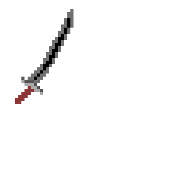
Sword animation- yet to be coded into game to function.
Finished jump animation (in photoshop)
Final version (may be subject to change)

Modifications to tile map. Deathboxes added to cover spikes so that the player instantly dies. (may change later)

As of the 30.9.22 my job list now looks like this
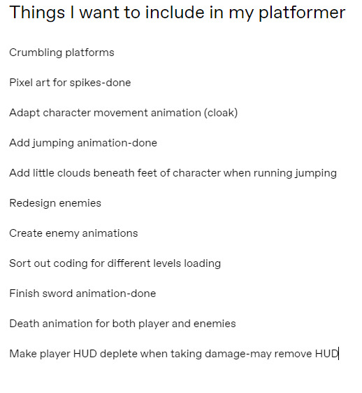
This list may expand at any given time.
The jumping animation proved difficult to me as I hate animating legs. And pixel ones at that. Though my ability to animate and draw in pixel art has significantly increased since me joining this course.
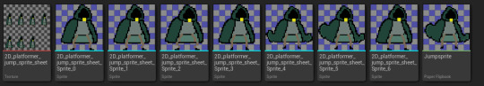
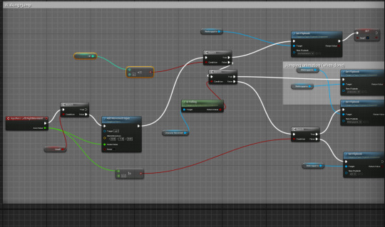
Additional coding to add jump animation. The animation is heavily supported by booleans that tell the code whether the jump input is true or false. If true the animation plays, if false, nothing happens.
Action shot of jump animation (screenshot only includes one frame)

I arrived at college at 2:35 due to a work meeting. This would mean that I have missed out on possible advancements on my project. I will ensure that the lost progress will be redeemed.
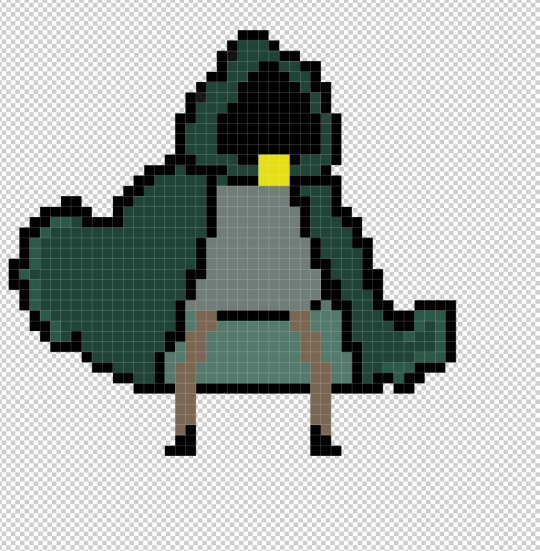
I began the development of my death animation. I had already planned how this was going to work with the golden jewel that sits at the bottom of the hood cracking and bursting before the character dies. I haven't planned the character dying yet though I guess I can improvise.

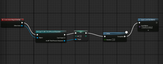
I had to recreate the blueprint for a teleporter due to the blueprint not existing on my current project.
With my death animation i decided to scrap the process in which the yellow jewel shrinks as it takes up valuable time in which the character dies. I want there to be time in which the character dies after the jewel shatters meaning there are vital frames available.
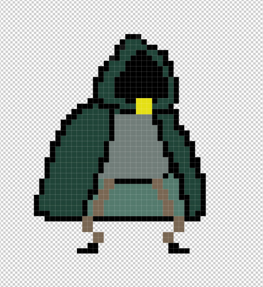
Finished the development of the death animation. I had the idea that my charcater was just a shadow in a cloak that was being contained by the jewel, the jewel breaking would result in the character dying.

First attempt at trying to make camera follow and then stop once it reaches the edge of the tilemap.

Previous attempt (not finished) at trying to make the camera follow
Today might be the last day I get before playtesting so I set myself a list.
To-do list:
Fix walking bug, walks depending on how hard you press movement keys- keyboard problem
Fix no clipping on edges of platforms when next to another tile- not fixed just replace platform edge with a flat platform to prevent no clipping- now fixed had to change hitbox
Add sfx
Revamp bandage collectible into coin (change sprite not code)
Possibly finish camera actor coding with Jake (difficult, MUST BE WITH JAKE)
Possibly resize tile map and character so character is bigger-may not be possible, change camera settings
Fix character now sinking into the platforms after attempting to resize hit box-done
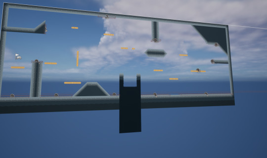
Adapt tilemap to include ramp transition into a pillar. smooth edge darkness so it looks smoother, Ramp that merges into ground
Add checkpoints
Add death animation
These are the objectives with all hopefully being accomplished at some point. Check one of my posts to see how I have accomplished these.

I completed my 2nd an 3rd levels on my tilemap. When creating the third I realised I would need to update my tilemap to make the design look more clean. The new teleporters I coded help massively by dropping the location you want it to teleport on another teleporter that is set to none meaning it is a one way teleporter.


Our group was given a task to rearrange a HUD in a way we thought it would work. Here's mine.

To begin turning my health collectible into a coin I had to design the coin in photoshop. I decided to scrap the health bar and HUD as of now I do not intend of changing damage with everything being an instant kill. Here's the coin.
Before we begin playtesting I had to set up a google form with 10 questions.
To avoid the camera drifting off the map I made another tilemap that was one solid colour. This makes the first level look tidy when you first spawn in.

This is the code used to delay the reload level time. This allows the death animation flipbook to complete.
Additional code that allows a boolean to let the code know whether death is true or not which bars any movement input. Without this code you would be able to move left and right whilst the animation is playing out which is the opposite of what I want to do.
I had to resize and rotate my coin collectible so I didn't need to each time I imported it. This will help all the coins staying the same rotation and size.
I deleted the camera actor 2 and changed it so the default character's camera was activated automatically. This meant that the custom camera actor code became irrelevant

The game now looks like this:

The camera boom still needs to be added. Camera boom has been added and applies lag. This is a satisfying fix to my camera problem as I have to accept the camera lag to work as how I wanted the camera to function as it was too difficult and took too much time.

Teleporter now has a beta design for playtesting. The teleporter may not become animated due to the limited time left on this project.
I decided to use an image and drag it into photo shop to pixelise it for a background due to the limited time I had left.

0 notes
Last Seen Blogs

sakshisingla
Fitsroot
vmniest
𝐥𝐞𝐠𝐞𝐧𝐝𝐬
faeriekit
writing and librarianship

litte-baby-girl
CookingGirl

vodkaprosib-blog
Unbetitelt