#i used a color palette
Text
aaand after so long, i finished it!

sir lancelot drawing abt him being a falconer, as it definitely fits him since he's a knight and such!!!
i tried some new things and used a color palette heehee
#art#sonic the hedgehog#sonic#sonic art#satbk#sonic and the black knight#sir lancelot#satbk sir lancelot#sir lancelot sonic#falconry#sir lancelot is a falconer#i used a color palette#procrastinated on this drawing for waaay too long#art experiment
21 notes
·
View notes
Text
I jumped in the river and what did I see?

black-eyed angels swam with me
#caption is just a radio head song#i'm not that creative#what's he looking at oooOOoOo#ANYWAYS ramblings in the rest of tags ->#this was so fun actually! i'm surprised i'm not too tired#...yet#i used a color palette#only had to use a couple references#and of course one for the pose#i suck at poses#and a few for the expression actually#i still suck at expressions. i am so stubborn i refuse to use a reference#but i took this one a bit more seriously ig#i know how i interpret this#but i'm curious what others think :)#our art#my art#hunter toh#toh ttt#thanks to them#toh thanks to them#the owl house#toh fanart
85 notes
·
View notes
Text

loop!
#lupin#lupin iii#lupin the 3rd#lupin the third#why are there so many#lupin tags#god#ok#hes gay#or whatever#i used a color palette#so hes ketchup and mustard now#:3#art#my art#lols#LUPAWWWNNN
14 notes
·
View notes
Text
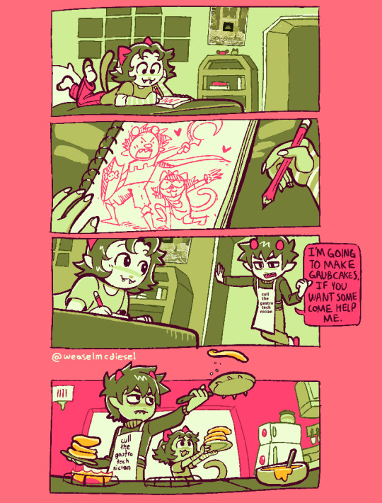
i was being so so so real when i said id make more katnep comics
#but this one isnt funny. >:)#it's SWEET#my art#fan art#homestuck#karkat#karkat vantas#nepeta#nepeta leijon#katnep#karnep#nepkat#i am not used to limiting my palette im still experimenting!#i hope the colors i chose arent stupid i think theyre nice#if no one can tell what's in the poster it's the miniature tigers album poster#idk i thought maybe shed like it idk#also if it's hard to read kk's apron it says#cull the gastrotechnician#ummm this is an au where they live together uhhhh and also trolls have beds ¯\_(ツ)_/¯#idk
5K notes
·
View notes
Text
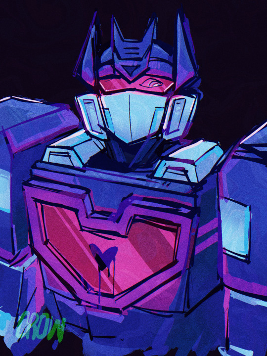
#soundwave drawn using a color palette picked from the Muse album simulation theory#i love wacky synth and this album is wacky synth and awesomeness#GIVE IT A LISTEN ITS FIRE#break it to me and thought contagion specifically#transformers#maccadam#art#maccadams#idw transformers#soundwave#tf soundwave
2K notes
·
View notes
Text

Professor Dekarios sketches 💖
#gale dekarios#bg3 fanart#gale of waterdeep#i am soft for a nerdy wizard#my art#idk what he wears to work but i used the symbol of illusion#and made the color palette warmer than his godsona
5K notes
·
View notes
Text

breezy
#appa#atla#avatar the last airbender#pixelart#pixel#pixel animation#rly wanna pixel doodle more often but hobby management is a Challenge lately#but anyway i have a big folder of aseprite canvases w/different palettes loaded in#so i'll be using these to experiment w/limited color
2K notes
·
View notes
Text
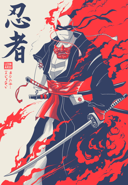
Have some Replica Leo for Round 2 of the @tmntfashioncompetition! This time the theme is: "Traditional Garment." I’ll be up against @villainleoau and I’m nervous cuz that’s a STELER crew and some of the most talented artists in the fandom (also their fashion sense is off the charts)!
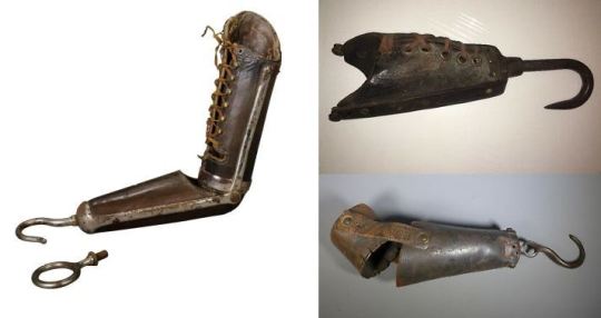
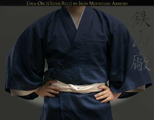
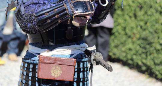
For the art I decided to lean into some traditional Japanese attire and a prosthetic more befitting of the era. Originally I was just going to have Leo's missing arm be covered, but if he wants to be truly capable with a katana he'd need something to help keep the sheath affixed when removing his sword. This is especially necessary for duels, since the speed and pressure applied from the drawing of the sword are imperative. I imagine he has several more varying tools he can screw onto his arm in the little side pack. Also note, the Kanji means "ninja" or "ninpo" and the finer hiragana text is the infamous "You are not alone" line. I had a lot of fun with this one, trying to decide if maybe I should put it up for print.
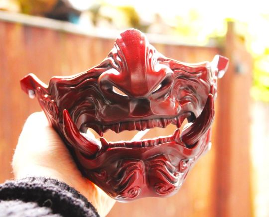
Some of my inspo under the cut:
#yes I know he’s wearing attire more akin to samurai than ninja#pretend he’s under cover#blending into his surroundings#blind spots#all that jazz#I’ll be honest I wanted to do three colors because I didn’t want to take the time to render him fully#but I’m pretty happy with the outcome#should use a minimum color palette more often#tmntfashioncompetition#traditional garment theme outfit#fashion propaganda#traditional fashion#rottmnt#rottmnt replica#replica#TMNT#Leonardo#kathaynesart#rise of the teenage mutant ninja turtles#unpause rise of the tmnt#save rottmnt#unpause rottmnt
2K notes
·
View notes
Text
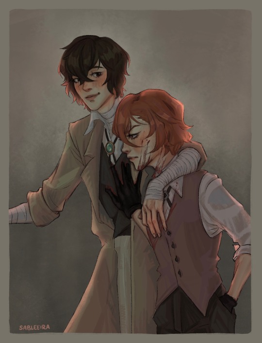
simply another excuse to draw chuuya with blood on his face
#muted color palette for once yippie!!!#completely changing up my workflow because I use a new brush#soukoku#bsd fanart#bungou stray dogs#bsd dazai#bsd chuuya#osamu dazai#chuuya nakahara#bsd#my art#no thoughts went into this. just vibes
1K notes
·
View notes
Text
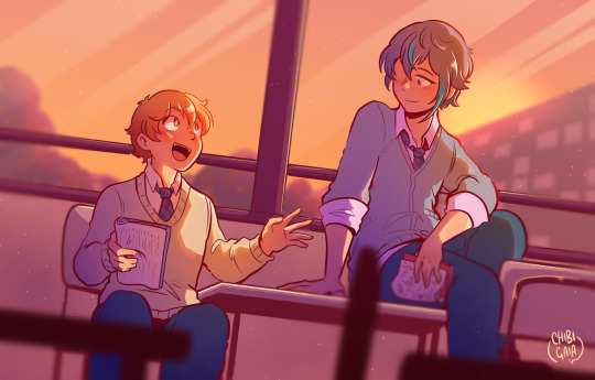
talking about the next show!
#project sekai#ruikasa#tsukasa tenma#rui kamishiro#cgart#this is!!!! from last month!!! help#i havent had the time to draw and color smth just for myself in weeks#also srry for using the same palette twice in a row for wxs lol#when im tired i tend to lean toward sunsett-y scenes#because theyre fun to color
1K notes
·
View notes
Text


Hey tumblr what do we think of this?
#outing myself as a 2012 onceler fan#im as sad about it as you are dont worry#at least i got to use my old onceler color palette#also this exists because me and a friend on the insane mv have a radiostatic roommate au and its literally all i can think about#hazbin art#hazbin hotel#hazbin hotel fanart#vox#hazbin vox#alastor#hazbin alastor#i fell for the fucking tv#radiostatic#my art#the onceler#onceler
2K notes
·
View notes
Text
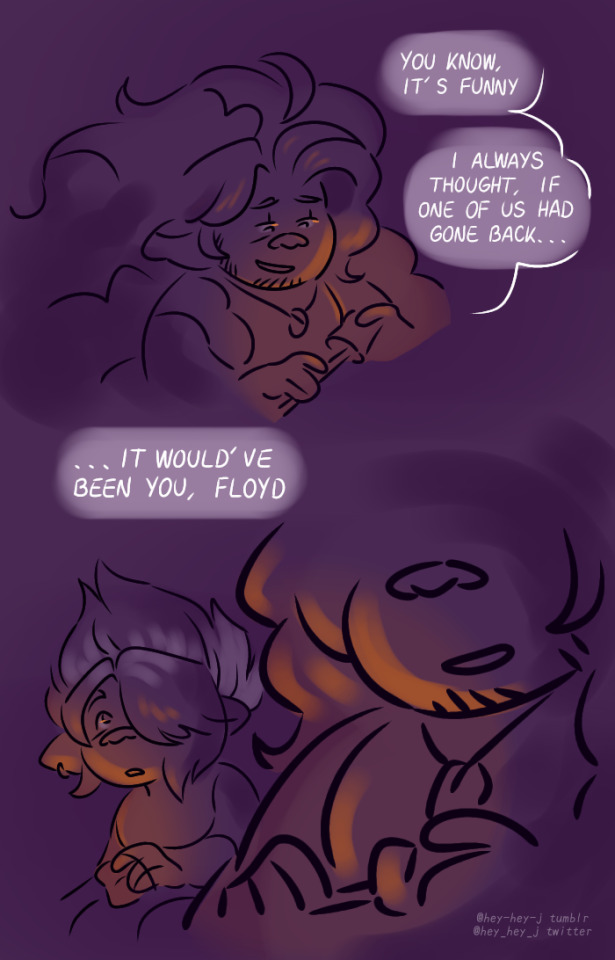
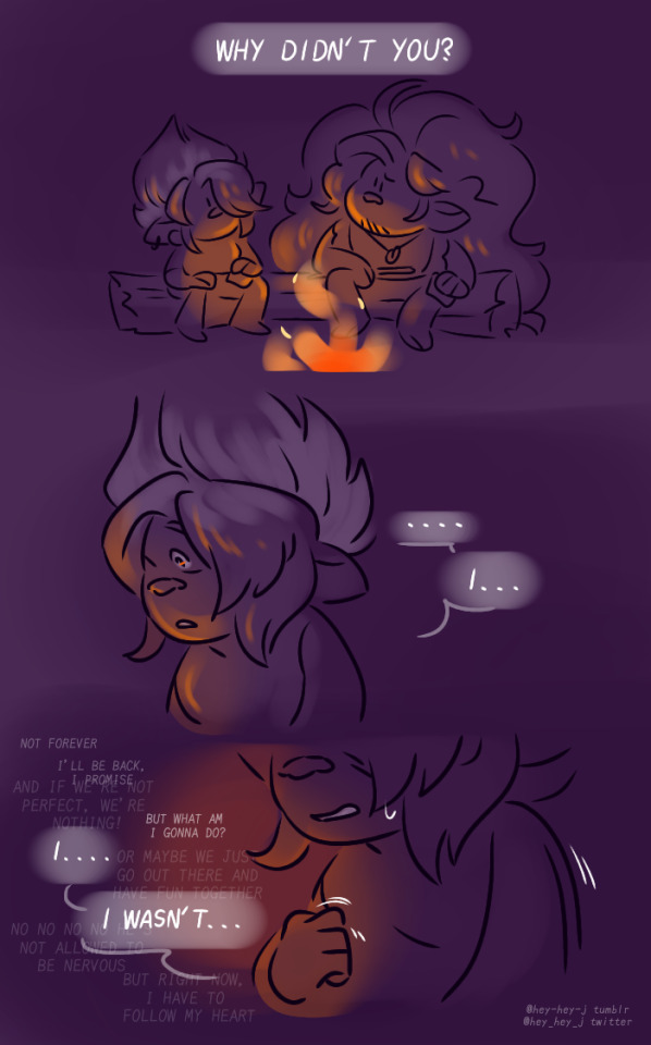
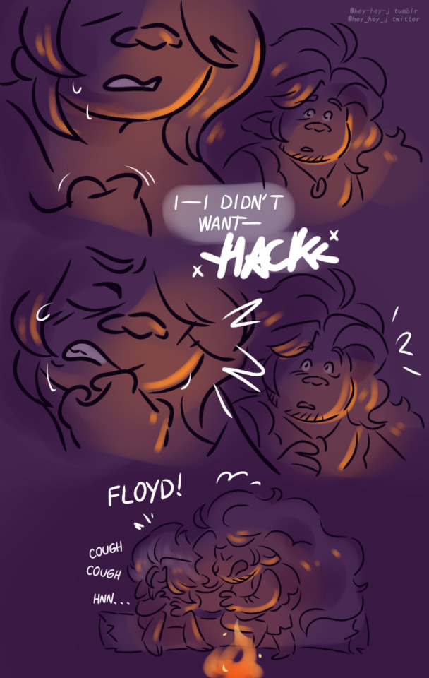
a literal metaphor
(★ my Kofi) | (★ commission info)
#my art#trolls band together#dreamworks trolls#trolls fanart#trolls floyd#trolls bruce#trolls#is floyd bad at expressing himself or am i using vagueness as a crutch? the world may never know#anyway how are we feeling about this color palette lads#i'm trying to branch off from the blues i usually use
898 notes
·
View notes
Text
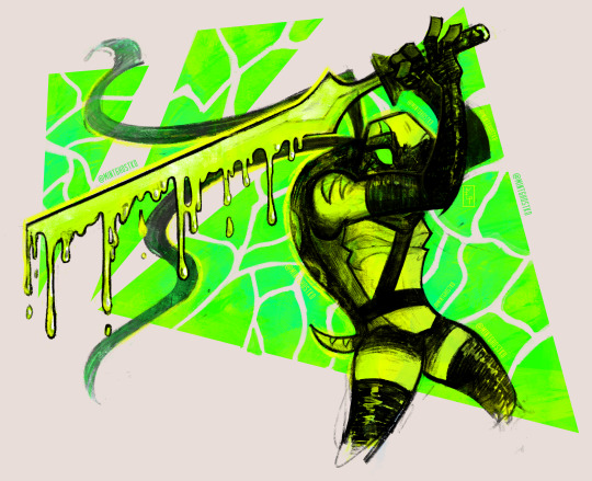
Empyrean!
Empyrean Weeping’s Leo was the first thing to cross my mind when I saw this prompt so of course I had to draw him (^^ゞ I just think the way empyrean is used in this au is really really (two reallys) cool :)
Empyrean Weeping belongs to @cupcakeslushie and the original Rise August prompt list was made by @sariphantom :)
#rottmnt#rise of the tmnt#rise of the teenage mutant ninja turtles#rise august art challenge#rise august 2024#rise august#rottmnt leo#rise leo#rottmnt leonardo#rise leonardo#hamato leonardo#leonardo hamato#save rottmnt#save rise of the tmnt#save rise of the teenage mutant ninja turtles#unpause rottmnt#unpause rise of the tmnt#unpause rise of the teenage mutant ninja turtles#artists on tumblr#my art#art#illustration#doodles#mint draws#eye strain#yes i do know its september :p#empyrean in EW is super interesting#there's something so unsettling about the way it can twist people and crack even the strongest of wills#very cool :)#using these sort of neon color palettes is always so much fun
940 notes
·
View notes
Text
I think 90% of my gripes with how modern anime looks comes down to flat color design/palettes.
Non-cohesive, washed-out color palettes can destroy lineart quality. I see this all the time when comparing an anime's lineart/layout to its colored/post-processed final product and it's heartbreaking. Compare this pre-color vs. final frame from Dungeon Meshi's OP.
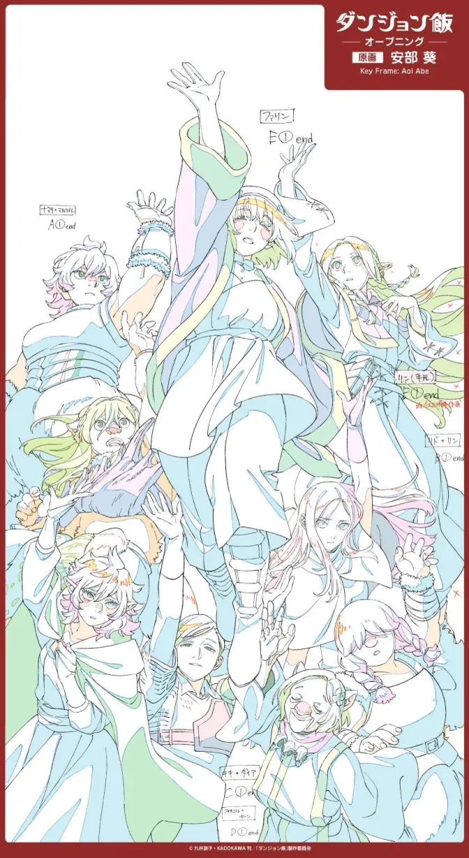
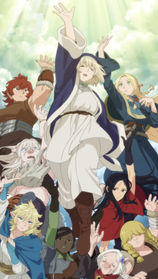
So much sharpness and detail and weight gets washed out and flattened by 'meh' color design. I LOVE the flow and thickness and shadows in the fabrics on the left. The white against pastel really brings it out. Check out all the detail in their hair, the highlights in Rin's, the different hues to denote hair color, the blue tint in the clothes' shadows, and how all of that just gets... lost. It works, but it's not particularly good and does a disservice to the line-artist.
I'm using Dungeon Meshi as an example not because it's bad, I'm just especially disappointed because this is Studio Trigger we're talking about. The character animation is fantastic, but the color design is usually much more exciting. We're not seeing Trigger at their full potential, so I'm focusing on them.
Here's a very quick and messy color correct. Not meant to be taken seriously, just to provide comparison to see why colors can feel "washed out." Top is edit, bottom is original.
You can really see how desaturated and "white fluorescent lighting" the original color palettes are.
[Remember: the easiest way to make your colors more lively is to choose a warm or cool tint. From there, you can play around with bringing out complementary colors for a cohesive palette (I warmed Marcille's skintone and hair but made sure to bring out her deep blue clothes). Avoid using too many blend mode layers; hand-picking colors will really help you build your innate color sense and find a color style. Try using saturated colors in unexpected places! If you're coloring a night scene, try using deep blues or greens or magentas. You see these deep colors used all the time in older anime because they couldn't rely on a lightness scale to make colors darker, they had to use darker paints with specific hues. Don't overthink it, simpler is better!]
#not art#dungeon meshi#rant#i'm someone who can get obsessive over colors in my own art#will stare at the screen adjusting hues/saturation for hours#luckily i've gotten faster at color picking#but yeah modern anime's color design is saddening to me. the general trend leans towards white/grey desaturated palettes#simply because they're easier to pick digitally#this is not the colorists fault mind you. the anime industry's problems are also labor problems. artists are severely underpaid#and overworked. colorists literally aren't paid enough to do their best#there isn't a “creative drought” in the anime industry. this trend is widespread across studios purely BECAUSE it's not up to individuals#until work conditions improve anime will unfortunately continue to miss its fullest potential visually#don't even GET ME STARTED ON THE USE OF POST-PROCESSING FILTERS AND LIGHTING IN ANIME THOUGH#SOMEONE HOLD ME BACK. I HATE LENS FLARES I HATE GRADIENT SHADING I HATE CHROMATIC ABBERATION AND BLUR
2K notes
·
View notes
Text


Their names are actually Shmipper and Smabble, I didn’t know
#Shmipper#shmabble#gravity falls#gravity falls fanart#bill cipher#henchmaniacs#keyhole#keyhole gravity falls#the book of bill#Little Comic lmao#I love using set colour palettes#get like three colors and build off of that
1K notes
·
View notes
Photo
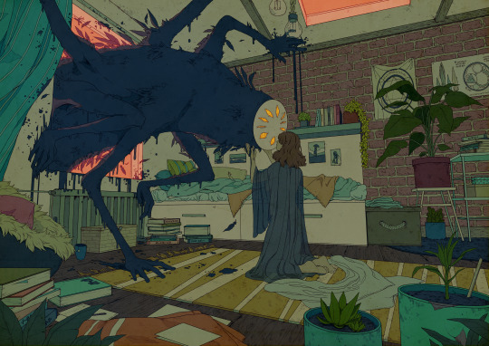
On the final day, I come to you
#artists on tumblr#this one took forever in between work#just let myself use all my favorite colors yet again#this kind of palette...#i just like it#i want to draw more of these creatures too#not a furry not a monster fker#a secret third thing#eldritch gods hit me up#anyone else starting to feel the weight of winter?#december is rough
19K notes
·
View notes