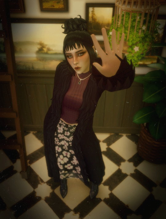
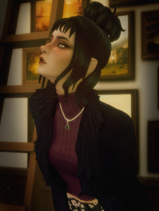
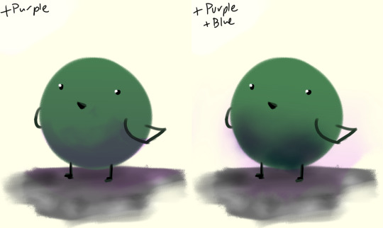
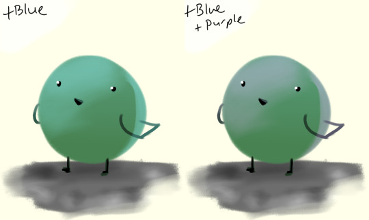
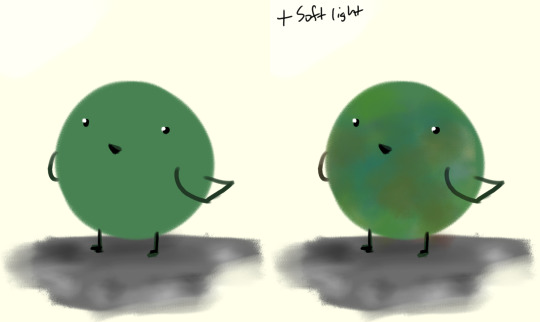
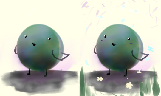
#i was messing around with coloring in photoshop and these are fun! I usually stick to greens and reds but i added a pop of purple
Photo
𝔅𝔢𝔩𝔞 𝔏𝔲𝔤𝔬𝔰𝔦'𝔰 𝔇𝔢𝔞𝔡
#i was messing around with coloring in photoshop and these are fun! I usually stick to greens and reds but i added a pop of purple#oc: frances#my sims#ts4#sims 4#simblr
135 notes
·
View notes
Note
How do you get your gifs to look like that? The quality is amazing. Do you have any tutorial video suggestions, maybe?
Thanks in advance
OH WOW i genuinely still struggle with making high quality gifs, so i’m so touched that you think they look good!! i learned everything from tumblr tutorials, so sadly, i don’t have any videos to share
but! i’ve always wanted to share my process, so here it is, if you’re interested (or if anyone is, really!)
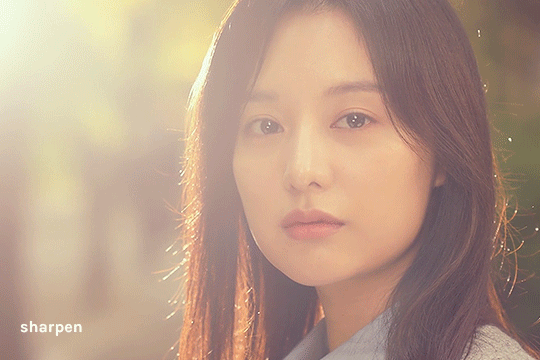
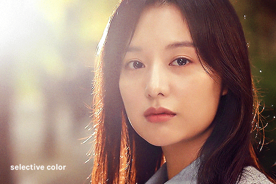
i’m constantly changing up my sharpening settings and coloring process, but here are some processes/tutorials that i (mostly) stick to nowadays, with this gif as my example:

i chose a difficult gif to color because that’s how universal this process is for me (usually)!!
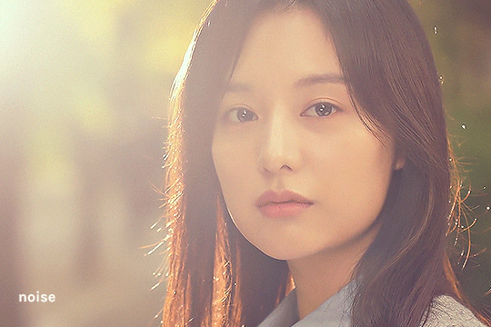
base gif
load video into frames, cropping, resizing
this is all standard, so i'll just share the tutorial i follow: lizzo @ tumblr (steps 1-7)

sharpen smart object
i forgot where i got this, but essentially i use the basic Sharpen command then lower the filter’s opacity (25-50%). here’s where you can adjust smart filter opacity btw:

it doesn’t look like it does much, but i usually use this to finely sharpen the gif (by changing opacity) since i try not to mess with the Smart Sharpens
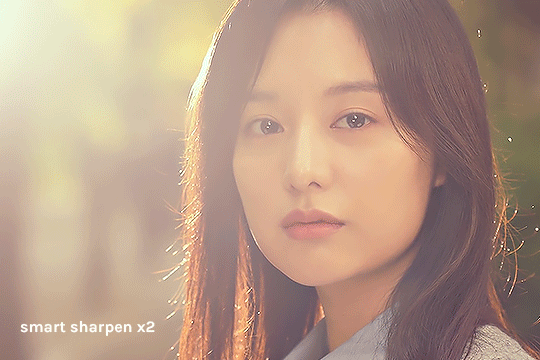
smart sharpen x2
from buckysbarnes @ tumblr, here are my changes:
Smart Sharpen 1: 500%, 0.3 px, reduce noise 20
Smart Sharpen 2: 20%, 10 px, reduce noise 4
these settings look good for this show, but i sometimes change the opacity of these filters for different shows
if the gif is smaller (268px wide), i would reduce the opacity of these filters to 50%
noise
my favorite thing, i can’t live without it now!!! thank you to cuddlybitch @ tumblr for sharing this technique; i use option 2 with these settings:
intensity 10; contrast 50; grain type soft; opacity 25-50%
base coloring
yay it’s the fun part!!
brightness/contrast
honestly, i just press Auto and let photoshop do its thing! i’ll adjust from there, and i rarely ever adjust this
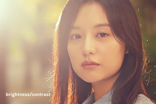
photo filter
deep blue, preserve luminosity on, then i play with the density (maximum 50%)
in this gif, it’s at 32% because it’s very yellow
i sometimes add other filters depending on the mood i’m going for (usually yellow or cyan)

levels
this usually makes or breaks the gif! i start by pressing auto:

then i adjust:
move highlights (rightmost arrow) to start/rise of the histogram to its left
move shadows (leftmost arrow) to the start/rise of the histogram to its right
i adjust midtones (middle arrow) based on the general brightness i want for the gif

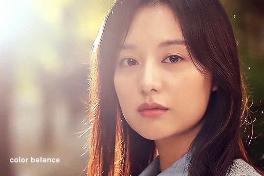
color balance
i generally like my highlights more blue, but this entirely depends on the gif! i just play around until it looks more neutral
in this gif, i added more cyan & blue to the highlights and more cyan & yellow to the midtones/shadows
vibrance x3
i follow this tutorial from s-k-y-w-a-l-k-e-r @ tumblr (just the part about vibrance/saturation)
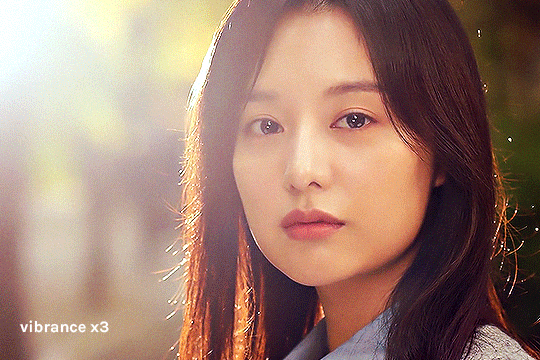
in ths case, i removed the color burn/color dodge layers because it was a little too saturated
i just kept the vibrance +50 layer

hue/saturation
in this layer, i eliminate colors that don’t really add to the gif to reduce colors and increase the quality! i check where the colors are in the gif by increasing saturation to +100, then reducing it to -100 if it seems negligible. here’s what each color looks like

obviously, reds/yellows/magentas are important, but greens/cyans/blues could be removed
i also reduced reds and yellows -10 because it was a little too saturated there

selective color
first, i adjust the black level of each color to adjust the contrast of colors (not the cyan/magenta/yellow yet)

and when i feel like it, that’s when i add subtle changes to the colors
in this case, i only touched red, magenta, and white
vibrance +25
i usually add a little vibrance +25 at the end for fun haha

additional coloring
this is where i do all the gradients & text layers, but i think the base coloring is always more important!

once again, we started from this
to this
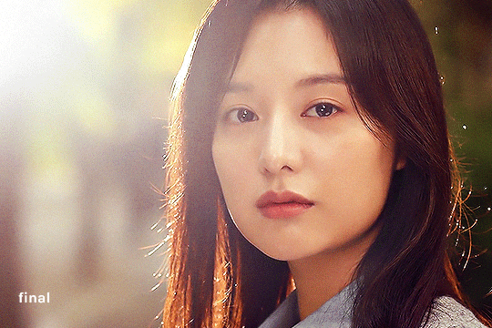
…… and that’s it!
there are probably ways to make it more efficient and use less layers, so i’m still constantly playing with these! this process also tries to preserve the original colors as much as possible, but i’m also able to wildly change colors with photo filters/color balance/selective color, if needed
hope this is helpful to you or to anyone!
#ask#hiswonderfulworks#tutorial#gif making#gif tutorial#forever grateful to everyone who's ever posted a tutorial online#so i swear i'll never gatekeep this stuff#y'all are great <3
39 notes
·
View notes
Text

ahh sorry anon I don’t dabble much in watercolors except for sketchbook stuff/journal things I literally just add water and paint fhfj but there’s a couple of channels/artists I can point you to who work with watercolors! :0
Atelier Sentô
Mateusz Urbanowicz
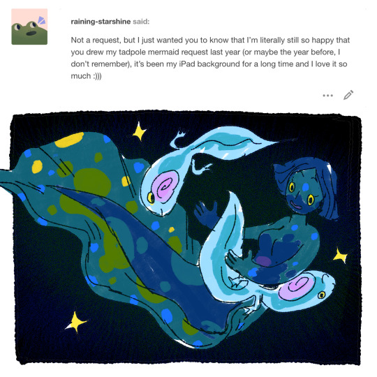
@raining-starshine !! :0 awwh shucks thank you/glad you like it so much! (I’m still really fond of that one ahaha)

nAY I neither own/worked on at all nor possess digital copies I am just a big fan of it because creepy body horror ocean eldritchy things hECK YEAH I would also love to read it (I don’t think it’s even out yet ahaha) but I can direct you to the creator/artist and the faq:
https://www.indiegogo.com/projects/longharbor--2#/faq
https://www.instagram.com/mirabal.art/
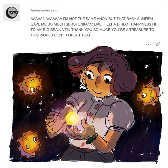
omg thank you I’M GLAD IT MADE YOU HAPPY fhhfjdf

@dishesoap YES splendid FEESH ahahah actually been a couple of asks for them so 👀
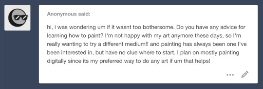
hello! and ooh trying out a different media is pretty fun/exciting; honestly it’s totally fine to kinda just go for it and mess around? there’s no like... ‘correct’ answer haha but hmm the one thing that’s sticking in my brain is keeping an eye on values/greyscale.
for example #1 has clear simple values and it makes the picture read clear! if you look at #2 you can see how there’s basically no value contrast and as a result it makes the picture feel a bit flat. #3′s just a different example of #1 and you can see how different values help make it more interesting as well as define like..the focal point/what is most important or aka the area you want people to look at. (not saying that #2 is incorrect either haha if that’s what you’re trying to convey)
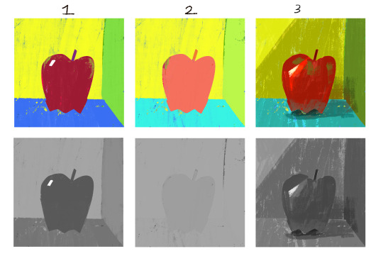
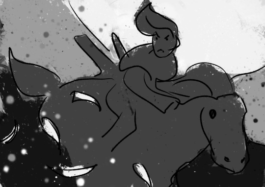
here’s another example but in a full painting!

grouping similar values can help with your painting, and focal points are usually areas that have the highest amount of contrast (sparkle/light rays against the black background). usually it helps a lot if you start out with greys and then overlay/paint over but most of the time now I go straight to color and just check the values while I’m working with the handy turn-to-greyscale shortcut in photoshop.
there’s a channel on youtube by Marco Bucci and he has a lot of really helpful videos about painting and light and colors if you wanna check that out.
also it might be a bit much to dig through but I have a faq and an art ask tag that has some more art info from previous asks. hope that helped a bit; sorry for covering just one area haha usually general ‘how to’ questions are hard to answer because it’s so broad and more specific ones are a bit easier to figure out so if you have specific qs feel free to ask. :P
#saturday asks#mermaid#sweet potatoes#art ask#woOF sorry for the word barf#also my animation/vis dev classes are showing pffhfhdjfjf#general how to art questions makes my thoughts bounce around like a bunch of atoms ahahah like oh shit should I cover this or this or this#but values are pretty heckin important sO#no merm today my brain is pooped
480 notes
·
View notes
Text
Entry #1


For this project, I had to come up with a six-word story or use one from the internet or use one from song lyrics. I decided to take the song lyric route because I already tend to create mental visuals based on songs I listen to daily. I decided to use two Mariah the Scientist songs titled "Note to Self" and "Impalas & Airforce 1's." These songs are two personal favorites from her, but anyways more focus on the project. Initially, for "Impalas & Airforce 1's," I envisioned more of a pop-art style and then a different picture from another angle, so you could actually see the face of the person looking out the window to further express the emotion of the lyrics, but I couldn't find one on the site that personally matched what I had in mind, so I worked with what I found. I then came up with the design pictured after just messing around and seeing what I liked. As I mentioned earlier, I wanted a more pop-art type look initially, but since I had to make some changes, I decided to add a gradient map over the whole project to add a sense of unity to the whole design and give it that galactic, otherworldly feel.


For the second story, I used the song "Note to Self." I wanted the picture to convey the feeling of eroding and whatnot, so that explains the skull. I wanted to have a picture where the face of a person somewhat melted off and then revealed the skull, but of course, there was nothing remotely similar on the site, which wasn't a surprise. So, I decided to play with the changes and use just a picture of a skull to still stick somewhat to my original idea. I played around in photoshop and added the mosaic effect because I felt like it added to the idea I was attempting to convey and then added a gradient map again this time to unify the colors.
Overall, this was a simple, yet fun project and it honestly has me considering putting more attention/effort into graphic design because I usually disregard it and focus more on video editing.
In the textbook, while reading the section/interview that immediately caught my attention was "Stefan Sagmeister On Being Self-Motivated" because I know that I can sometimes struggle with being self-motivated. In the interview he said he "[has] found that it is not so helpful to talk about things [he has] not tried yet, as the act of talking about it removes some of [his] desire to actually do them" which was a true word of wisdom because I tend to talk myself out of not doing something new due to overthinking it or fearing I'll fail even though it is something completely new to me.
2 notes
·
View notes
Text
gif tutorial pt.2
here’s the first part to this with a base coloring if you’d like to check it out
now i’ll show you how i made my s3 and s4 gifsets
the hardest part for me usually is finding the right scenes, since we want our gifs to look somewhat consistent
i recommend stuff with blue tones, just cause it’s the easiest to manipulate, no need to mess around with skin tones and such, but any scene is fine really, if there aren’t people in the shot, or if there’s little movement, it’s fairly easy to get the colors right
so imma start out with this gif i made with the same method i showed in the first part

but i want those blues to be a different color
there are numerous things you can achieve this with, i’ll show you a couple i use here and there
so firstly our best friend is the selective colors. just put it on top of the other one
you can play around with the blues and cyans however you want


boom, we have purple


this’ll give you like a mellow green, you can use another selective color layer to make it pop

----------------------------------------------------------
another way to do it is the hue/saturation layer. i feel like it’s pretty self explanatory, just select the colors you wanna change and play around with the hues


if you drag it the other way you get a yellow-y tone

----------------------------------------------------------
so we have this gif from the first part of the tutorial, but I’m not a big fan of those green tiles in the back

so option 1 is to use either of the layers from above, but instead of the blues, we’d have to mess with the yellows/greens
but it would also mess with her skin tone and we don’t want that, so this is where masks come in. you know those white little tiles next to every layer you have
the way it works,is that the layer affects parts of the gif that are white
so we select the mask, paint over maze with a black brush like this


and tada, ugly tiles are gone
little handy trick, if you right click on the mask and select refine mask, photoshop will help you get a cleaner selection
you might have trouble with this if there’s a lot of motion in the gif, obvs the mask is not gonna stick to your subject
another option is a simple transparent layer and the brush
this is cool too if you wanna erase something or someone from the background for example
i just hid my coloring for a sec, and with the eyedropper tool (i think the shortcut is “i” if you can’t find it) i selected the orange color from the archway, painted over the tiles, and set the blending mode to Color

i basically got the same effect

----------------------------------------------------------
you might have to use a combination of these sometimes, and it can get frustrating, but keep practicing ^^
i hope this helped and if you have any questions just hit me up!
have fun giffing guys
41 notes
·
View notes
Text
how to do skin mock-ups in photoshop

so, you want to learn to mock your skins up in photoshop before you start coding them? well here is lolita to help you figure out how to best plan your skin! this was a tutorial requested by @thefattesthansolo so give dallas a shout-out 💓 the image up top is what the skin looks like fully finished and at the bottom of this tutorial is an example of what the end result mock-up looked like. so if you’re ready for a straight-forward tutorial then click on that ‘read more’ button and let’s get started.
so first and foremost, i’m sure some of you are asking “why mock up a skin in photoshop (or your choice of image editors) before going in and coding it?” the answer is simple: it helps you get an idea of how you want things to appear before you actually start the coding process.
as anyone that skins knows, it takes a long time to do as such. skins themselves can take weeks to months to get down perfectly and its usually a lot harder to go right in and start coding with nothing in mind than to have a game-plan. i started mocking my skins up in photoshop, first, so that i could have proof that the ideas were mine and to cut back on the cries of theft. you have a date on your documents, so if someone starts whining you’re copying them you have proof that you are not. but as i coded more i began to realize that its super, super easy to get a good picture in your mind if you’re able to just play around with layers in front of you--its like instant gratification. instead of taking hours to move this piece of code and that piece of code around, you can just use a document to get things at least somewhat close to how you plan them.
some of my mock-ups are less impressive, and sometimes i only get so far before i decide i want to code. however, i will usually go back and start mocking up the other pieces of the skin (forums, stats, etc) and lately i’ve been mocking up entire skins because it makes the process super easy. now i’m sure you’re all telling me to shut up and get to the tutorial, so here it is!
STEP ONE
a generally crucial step, the first thing to do is pick out your images and your color scheme. this is the same as if you were going to actually code a skin. two great places that i usually find all my images are PEXELS & UNSPLASH. once i have my images for my background (if you’re using an image that is) and banner, i open up my new document THE SIZE OF MY OWN RESOLUTION. this is a step that’s pretty important, but i have a SMALLER RESOLUTION THAN MOST. if you have a resolution larger than 1280x800 then it might be best to start with that rather than doing something larger because its always a pain when a site scrolls horizontally. regardless of what you do, open your blank document and i, personally, take a screencap of what the top navigation in my browser looks like and i throw that in there at the top of the document. it helps me figure out sizes!
STEP TWO
so, now you’ve got your blank document. throw in whatever you’re doing for your background after you edit it how you like it. you can rename that layer as well so, and if you want to be even more organized, rename every layer after that so you know which part is which. the next thing i work on is the main wrapper; everything is dependent on whether you’re using a sidebar or not. obviously the size of your wrapper is going to depend on the sidebar’s size. usually i aim for around 980px for a wrapper and about 200px for a sidebar--i adjust as i go. HERE IS WHAT IT LOOKS LIKE AFTER THAT.
STEP THREE
what follows is the banner, which is the main focal point of the skin. none of the dimensions i use are really perfect, per se, save for the banner itself. that i always want to resize to the size i’m actually going to use. when it comes to doing borders and padding around things, that’s always just kind of something you just need to eyeball and if its not perfect it doesn’t really matter. what’s important is getting it set up to an aesthetic you like and adding all the information you need to add. along with the banner you may want to mock the navigation up now; ie, if you’re doing the navigation that sticks at the top of the board when you scroll. HERE’S WHAT WE’VE GOT SO FAR. from there it all depends on how you want to lay out your information. other than those few things, i don’t really do anything “to scale” per se; i take the rectangle tool, make new layers, and start drawing out boxes to sort my information into. this is where it becomes much less a science and all about your creativity. HERE ARE MY BOXES ALL LAID OUT.
STEP FOUR
so now you’ve got your boxes all laid out, think about what you’re adding where. in this respect, its the same as just coding them in there; but always remember what your coding prowess is. its a lot easier to mock something up than it is to code it and some things you’ll draw up won’t really work when you go into the coding phase. so always sit and think “can i code this like this?” and if the answer is ‘no’, try something else. but always be willing to experiment, of course. there’s a lot of things i design that i need to find workarounds for because they just won’t work like i want them to. so HERE is what my mocked up skin looks like so far, after i’ve added my top navigation. again this is not an exact science. just like actually coding it, you’ll find flaws and you’ll change things but this is a GREAT guideline for when you actually start coding. now, finally, HERE is what it looks like with everything added into the banner.
END NOTES
this is where i stopped mocking things up for this particular skin, but this isn’t usually where i stop. like i said, i’ve had whole skins i’ve mocked up from top to bottom, but sometimes when the muse strikes, you just have to go for it and start coding! sometimes things will fall into place on their own, sometimes they won’t and then you can just go right back in and start drawing things up again.
what’s really important to remember is that your sizes aren’t going to be perfect for everything. what you really want to make sure are close to the size you want are the wrapper, innerwrapper, sidebar, and banner. those are going to set the whole size chart for your skin; the banner especially should be close to how you want it. other than that, for me at least, its a lot of just drawing things in and seeing how they look. and, since you’re using an image editing program, you can resize things in a snap and move them all over, so its very handy to make working mock-ups.
and, again, i’ve found this to be really, really helpful when you want to design a skin but don’t want to spend hours messing around with code only to have things not falling into place properly. it beats a lot of the frustration and overall i actually have a lot of fun seeing my skins coming to fruition through images alone; it sets a really good, positive vibe when i finally go to start coding.
i hope this is helpful to even just one person and everyone is welcome to come to me and show me anything you mock up! i’m proud of anyone that even so much as thinks about coding; its a difficult process sometimes but i can be fun if you enjoy doing it. if anyone has any questions, feel free to send them my way! 💓💓💓
47 notes
·
View notes
Note
Hi! From the gif-making questions list,19 and 47! I want to give gif making a try and your CR gifs leave me in such awe, they're beautiful! Rather than being intimidated I will THROW MYSELF AT YOUR FEET FOR KNOWLEDGE.
YAAAAS! MORE GIF MAKERS! I highly encourage you to give it a try. It’s a lot of fun :D Let me know if you need any more help or have any questions.
19. What is your gifing process like?
So, if we’re talking plain software, I use Quicktime’s screen recorder to record any video that I want to gif straight off my screen (saves me the hassle of downloading whole CR episodes and using dodgy Youtube downloaders), and then I load those videos into Photoshop CC, where they’re automatically converted to gifs.
Creatively, the process is a little more complex. I have to have a clear idea of the final set before starting or the whole thing becomes a mess. So, I usually transcribe the scene I want to gif and break the text up into chunks to know how many gifs there’ll be and how I will arrange them (how many double panels, triple panels, wide gifs etc.). That helps me figure out how many I can mess around with by substituting additional video material or merging scenes together or whatever.
If I decide to make one of those cinematic sets (like this one) then this is where I spend the most time: hunting for the perfect shot to put in. My go-to websites for that are free stock video libraries (like pexels) and youtube.
And then comes the actual designing. The first gif always takes the longest because you’re committing to a specific visual/color palette that you’ll have to stick with for the rest of the set. I do all my coloring individually (which you shouldn’t do… I just don’t like using psd’s) and load the final gifs into a draft on Tumblr to check how it all fits together as I go along.
That’s basically it :) There’s a little technical faffing around with file sizes right at the end, but since Tumblr upped the gif size limit, that part has gotten considerably easier (even if the 8mb limit is a lie).
47. Any advice for novice gif makers/people who want to start making gifs?
Don’t get discouraged if it doesn’t immediately turn out the way you imagine it. Gifing is very much learning by doing and the more you do it the better the final results will get.
Be observant. Look at how other people do their gifs and try to figure out what makes them work. Font? Coloring? Do they use very few frames? Is it slowed down? There is a lot of stuff happening in gif sets that our eyes take for granted, but that you need to be conscious of when gifing.
Not to get philosophical here, but… a gifset tells a story. Is there a punchline? A final sentence that you’re working towards? It’s good to keep that in mind as you go along since you can easily get lost in the style/look of it all and lose sight of how it will make people feel in the end.
2 notes
·
View notes
Text
All My Fault 9
By: SassyShoulderAngel319
Fandom/Character(s): DC, BatFam - Damian Wayne/Batman
Rating: PG-11 (minor sparring---nothing too violent)
Notes: (Masterlist) Tim’s the genius of the family for a reason...
Tag List (Open): @batboys-and-other-messes @nanna-the-batmum @probsjosh @welovegroot
Ch 1, Ch 2, Ch 3, Ch 4, Ch 5, Ch 6, Ch 7, Ch 8
^^^^^
The rest of the family—except Cass who was still out of town—found me and Damian in the parlor hours later, still going over dresses with Damian’s arm still around my shoulders. We’d narrowed down the designs to my top five and were going through color options, Damian coloring in the line-art of his designs with his tablet.
“—can’t wear a white dress!” I was saying when Bruce and Tim stuck their heads in. “It’s a gala, not my wedding! What happens if someone spills red wine on me? Plus white’s just… no. I can do cream or gray or silver but not white. Not for something like this.”
“Hey guys,” Tim greeted.
“Oh hey! How was the meeting?” I asked.
“Boring. So… Is something… going on?”
“Hmm? No. We’re just going over design and color options for my outfit for the charity ball.”
“Oh. Huh. That’s not what I meant. What’s with the arm?”
“She couldn’t see as well with my arm in the way, so I got it out of the way,” Damian said distractedly, not looking up from where he was coloring in a ballgown with a gray shade that he added some sparkle brush to, scribbling, “silver” off to the side in the same color.
“Oh. Okay. Right,” Tim said, ducking out of the room.
“Afternoon,” Bruce said before also ducking out and shutting the door behind him. Damian and I glanced at each other with lowered eyebrows. I shrugged and went back to looking at his tablet.
“Okay, I like this one, but I don’t really think a ballgown should be silver, you know? Like, wearing silver would make me look like… Cinderella or something,” I said as though Tim and Bruce hadn’t interrupted.
^^^^^
Tim pointed through the door where Damian and Cloudy were still talking. “We gonna talk about something going on between them?” he asked quietly.
Bruce turned his head to look at the door, listened to his ward say something about Cinderella to his son, and then turned to look back at his third-eldest son. He paused for a moment, putting his thoughts into words. “Nothing to talk about,” he said. “Nora wasn’t blushing at any point. She can’t lie very well. If there was something about their relationship that they were hiding from us, she’d blush when she tried to hide it.”
Tim glanced between his adoptive dad and the doorway where his little brother and now-younger sister-figure were talking about colors on evening gowns the same way most people talked about the weather.
He shrugged. “Okay. I just didn’t know if the arm-around-the-shoulder thing had any extra implications,” he remarked before strolling off for his room to change out of his suit.
Bruce went down to the Batcave.
^^^^^
“—absolutely certain? We can have all five of them made and then you can wear them to other events,” Damian said.
“And overwork some poor seamstresses before a rather short deadline? I don’t think so,” I said. “I'm fine just having one made. And I think I want them to make this one.” I tapped the one I liked the best on his screen—making the cursor flare and then vanish. “Although…” I pinched the corner of Damian’s tablet and tugged it. “May I?” I asked.
“What are you doing?”
“Color change,” I said. Damian passed me the tablet without resistance. “Thanks,” I added. I dug through the tablet, dropped something into his Photoshop, used the eye-dropper to select a color, deleted the thing I’d added, and colored in the dress. I passed the tablet back to Damian and leaned against his side again so I could still see. “Better?”
He scrunched his eyebrows. “Wwwhy did you choose that color?” he wondered.
I shrugged. “I have my reasons,” I said. “Okay. I’ve been sitting down way too long.” I patted his chest and pushed myself to my feet. “I'm gonna go box or bench or something. Wanna join?”
Damian shrugged. “Sure. Let me go change. Now that Drake’s back maybe he’ll let us spar against him and get used to the new inverted height difference.”
I smirked. “That’d be fun.” I swung around the doorframe to the parlor on one arm and went jogging for my room to put on my workout clothes.
The reason I colored the dress the one I chose? The reason I didn’t tell him?
It was the same color as his eyes.
Figured if I didn’t want to match his black tie, I might as well match his eyes.
Plus, even though my eyes were brown, when a bright light shone into them, a greenish ring around the outside edge could be seen. Wearing green sometimes made that ring easier to see.
I changed fast, pulled my hair back into a tight ponytail, and went off for the Batcave, stopping on the way at Tim’s room. “Hey Timbo,” I greeted, poking my head in.
“Hi Cloudy. What’s up?” he replied distractedly.
“Wanna come spar with me and Damian? Work off some of that meeting-boredom energy?”
“That sounds suspiciously like you have an ulterior motive,” Tim joked, spinning around in his desk chair to look at me, arms folding over his chest and raising one of his eyebrows. I sighed dramatically and leaned against his doorframe.
“Okay, you caught me,” I relented sarcastically. Tim smirked at my theatrics. “Damian and I want to get used to fighting with the inverted height difference. Last time we were really in the field together, not counting this past patrol, he was more than half-a-foot shorter than me. Now he’s just over a foot taller than me. Wanna be our opponent?”
Tim thought for a moment. “There was a time I would immediately jump at any chance I could get to beat up that brat,” he remarked. “But now… sure why not? I could blow off some steam.”
I smiled. “Thanks bro,” I said. “Meet you downstairs.”
“See you in a minute.” Tim got off his desk chair as I pulled his door shut so he could change.
I headed downstairs to the cave.
“Ready for this?” Damian asked as he picked up a wooden sword. He had on a thin black tank top and athletic shorts. It looked very attractive on him. Really accented his powerful build. I blinked and shook the thoughts out of my head. Not the time. I cracked my knuckles and stretched.
“Ready as I’ll ever be. It’s been a while since I sparred against Tim,” I said.
“What’s going on?” Bruce asked, looming out of the shadows.
“Oh we’re going to spar against Tim,” I answered.
“Two against one? That doesn’t seem fair,” Bruce said.
“We’ll go a little easy, B,” I said. “We’re mostly just doing it to get used to fighting with our new height difference. I'm used to Damian being shorter than me.”
“I see. Perhaps I should join,” he said.
Damian and I exchanged a glance. “Well we were going to ask Jay when he got back…” I began.
“Father,” Damian also began.
“Don’t you two start telling me I'm too old, now,” Bruce warned, almost jokingly. It was weirder when he used lighter tones than when Damian did. “I already get it enough from Jason and Dick.”
I scoffed. “Pfft! C’mon, B. You know Jason does it in jest,” I said. Bruce cocked an eyebrow. “Okay, okay. You can be on Tim’s team. But if you need to tap out…” I just shrugged. “We won’t blame you.”
“I'm not that old, Nora,” Bruce admonished.
“Well if you think you can handle it I'm not going to tell you otherwise,” I replied, clapping his shoulder and crossing over to the training mat where Damian was swinging his fake sword around, preparing to fight against Tim’s staff.
Tim came running down the stairs moments later. “I'm here!” he exclaimed breathlessly. He wore a T-shirt and athletic shorts, spinning his staff around in a quick warmup. He and I stretched so we wouldn’t tear anything—Damian had already stretched while I’d been changing and doing my hair, apparently. Bruce started to stretch too. “No way! Are you gonna be on my team?” Tim asked him.
“I always am,” Bruce said.
Damian liked his sword, even if Bruce rarely let him use it, Dick had his escrima sticks, Jason his guns and knives, and Tim his staff. I didn’t usually use many weapons. Not even batarangs. Tim had taught me a little staff and Dick a little bit with escrima sticks, but I still usually just used my own two hands as much as I could.
This was going to be interesting.
Damian and I faced off against Tim and Bruce on the training mat. Tim spun his staff around his hands and twirled it around his back. Damian spun his sword to loosen his wrist. “Ready kids?” Bruce asked.
“If you think you can handle it,” I replied, trash-talking with a smile.
“Oh it’s on,” Tim replied playfully. I laughed and cracked my neck.
Tim attacked first.
Damian caught Tim’s staff on his wooden sword while I ducked under a haymaker of Bruce’s, spinning around on the ground to knock one foot out from under him.
Unfortunately, Damian was standing too close with a stance too wide that I wasn’t used to and I caught his ankle too.
He fell on top of me—knocking the wind out of me. He leapt off of me almost immediately and shot to his feet, launching himself at Tim. They fought staff-on-sword, leaving me to deal with the original Batman on my own. Which, even with him being nearly a decade older than the last time I sparred against him, was really hard. I got a few good licks in but mostly took more hits than I dealt.
Until I cried out as a bruise from patrol the night before got hit.
Damian’s hand wrapped around my shoulder and forced me behind him with enough force that he nearly shoved me to the ground had I not been light on my feet and used to the motion—from Jason and Dick. It was a move we used to practice when we wanted to trade opponents.
I caught Tim’s staff in my hands as he swung it toward Damian and yanked, throwing him off balance. He recovered fast, though, and jabbed me in the gut with the end of his staff. “Oof!” I grunted, wheezing and retaliating by getting in close enough to jab him in the solar plexus with my elbow—and leaving myself vulnerable to another attack.
Which swiftly came in the form of a staff across the back. I stumbled away from Tim, coughing and trying to get my breath back.
Damian managed to fend off both Tim and Bruce at the same time for a good fifteen seconds before I reentered the sparring match.
It was easier than I thought, adjusting to his height. I hadn’t fought side-by-side with Bruce much when he was Batman and he was the closest to Damian’s height, but I had fought near Dick and Jason a lot. What was an extra three inches when you’re ducking under an attack from an opponent for your partner behind you to parry it? Adjusting to his weapon use was harder. Jason would sometimes just shoot someone when I ducked out of the way—nonlethal shots, usually, but a bullet was smaller and faster than a wooden sword.
Bruce tapped out first. “Not because he was tired,” though. He said he had “important business” to attend to. Damian, Tim, and I all exchanged a glance as Bruce left the training mat. Tim swung his staff.
Damian caught the end of the staff with one hand before it could strike my shoulder.
Damian and I went a little easy on Tim when he was alone. Not too easy though. Tim was vicious when he needed to be. If we went too easy he’d beat the snot out of both of us. But Damian and I were both also good fighters. If we both gave 100% we could seriously injure him. So we didn’t.
Technically we weren’t training. Just adjusting what we already knew. So we went only a little easy. Easy enough that we wouldn’t hurt Tim much while it was 2-on-1, but giving it enough effort that we didn’t get the snot beat out of us.
That didn’t mean I didn’t get several good whacks from his staff through. Because I did. I’d definitely end up with bruises.
I was the next to tap out. “Okay boys,” I said, panting, sweating, sore, and really tired. “I'm done. I'm gonna go shower.” I gave them a weak thumbs-up and stumbled up the stairs and out of the cave.
Next
#All My Fault#Chapter 9#All My Fault Chapter 9#Damian Wayne#Damian Wayne Imagine#Damian Wayne FanFiction#Robin#Robin Imagine#Robin FanFiction#Batman#Batman Imagine#Batman FanFiction#BatFam#BatFam Imagine#BatFam FanFiction#DC#DC Imagine#DC FanFiction
32 notes
·
View notes
Note
Do you have a tutorial or guide or anything on how you do colors because all of your pieces have such nice colors and lighting Seriously, the use of colors in your art isn’t something I’ve seen very often; I was wondering how you choose them & how you get those effects with the software? Thanks so much is advance if you choose to answer this :)
Thank you ;;;_;;;!! I do, but I think it needs a revamp.
I’m going on a very long ramble.

(Heads up! I’m not professionally trained, I have just watched and read a lot of tutorials and deviated from there with my own thing. Unless it has something to do with color blending modes, there is a good chance that I am using a silly fake term for many of these concepts. Also, I use Krita, but everything here should also be done possible on Photoshop, Medibang, GIMP, and I believe Clip Studio Paint. Autodesk Sketchbook and MyPaint don’t have filters like color balance, sharpening, etc. and I don’t know of an easy way of changing the saturation of a painting on SAI and FireAlpaca easily since I’ve never used SAI, I’ve only used FireAlpaca once in a blue moon, and searching for either doesn’t give a “one click” option that doesn’t require undos... but everything about color choices/lighting/color filters/blending-modes-that-aren’t-saturation should stay the same.)
There’s as many ways for things to be beautiful as there are birds in the world. But that’s too many birds, so its good to have a process that you try to follow. This is kind of an ideal setup, but I think this is how streamlined I wished I paint. (I usually bop between consolidating colors and adding detail, continuously, for all eternity until i give up and smash that post button blindfolded. I’ll explain what this means.)
So color wise, I try aim for two things: good value blocks and balance (cohesion), and interesting hue variation (jitter).
------
Setting the Ringabel painting with the saturation at 0%/setting the colors on grayscale, then simplified:


These blocks of different colors both provide structure to the painting, and also add to the composition. The thing I want people to notice most - Ringabel’s beautiful, luscious hair that he lovingly tends to every morning (and his face I guess) - is the area with the most contrast. There are logical-ish subdivisions between each part of the painting and I want to preserve these chunks of logical blocks throughout the painting process, or swap them out for Even Better Blocks.
Even then, I want there to be visual interest and a balance of values around the entire piece, which is why I added lighter glitter around areas that aren’t interesting enough to have real detail. No one is going to stare at that area too hard, but without it, this dynamic painting feels too empty.
Also, if I were to do the painting from the ground up again from this thumbnail, I’d also include gradients, to aid in carrying the eye to the focus having a better base to build on.
This also makes it easier to play with the lighting before getting to the meat of the work!

----
If we take Ringabel to max saturation, you can still see a bit of the value blocks, but there’s just a lot of colors slapped around everywhere:

I like this effect because it squeezes the maximum amount of visible interest out of a block of color as possible while still keeping the cohesion. And it’s not too hard to do - when you shade your painting, use two different colors instead of just one. When you add lighting, use two different colors. When you have a blob of color, slap some random color on that blob using a softlight blending mode.
If there’s a concentration of color around an area and there’s an unbalance, add that color on the other side of the painting, to balance.
I like to call this jitter.
----
Let’s talk about cheating really quick:
“I kinda want mess up the colors but in a way thats kinda consistent”
“This is too bright.“
“This is too dark.“

“There’s not enough contrast!! >:(“
“Too much !!!! Contrast!!!!“

“THIS IMAGE WAS SUPPOSED TO BE PURPLE“
There is magic in the filter list. Jump in and have fun! (And fix your stuff.)
----
And.... that’s the philosophy.
Keep big chunks to stay organized
But have randomness to be fabulous
No shame in fixing mistakes.
----
So from that, actual painting process for Ringabel on a Horse (clop clop). Here’s the thumbnail, which I drew before I knew how horses worked:
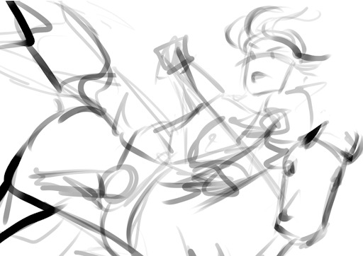
Then we choose hues. This will change over the course of the painting; I ended up with Green, then Red, then Yellow, then blue?
Then, allocate the colors in this way -
Dominant Lighting, Secondary Shading
Secondary Lighting, Dominant Shading
Rim light, another light source
Random random pops of color. because why not.
And pop them in this order:
Base/lineart
Initial color
Random colors (literally any color on the wheel) - Softlight/overlay - introduce jitter
Area Light 1 - (1) - Softlight/overlay - cohesive light
General shading - (2) - Multiply - cohesive shading
Detail shading - (1) - Multiply - jittery shading
Rim light - (3) - jitter - Softlight/overlay/COLOR DODGE - cohesive, out of left field light
Area light 2 - (1) -Softlight/overlay/COLOR DODGE - cohesive light
Detail - ;;_;; - FIX YOUR MISTAKES, C L E A N
Consolidate - (All 4) again to fix colors from the detail portion
GLITTER - (All 4) - jitter, glitter
Filtering - :D
The idea for 4-9 is that we have a balance of detail (jitter) and cohesion that we need to upkeep, and we need to strike a balance between adding cohesion and removing detail, and vice versa. Usually, I repeat those steps over and over and over and over, trying to get it just right. I tried to keep it simple here for the sake of the tutorial and my own sanity.
And now we do the thing.


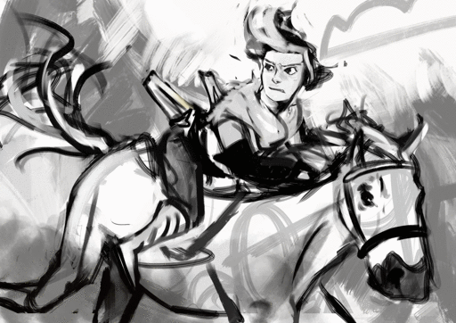
Thanks for sticking around, and have a fantastic day!
#tutorial#art tutorial#digital painting tutorial#painting tutorial#sorry this took so long#thank you for the request#and have a good night!#hotvivitea
19 notes
·
View notes
Note
do you have an idea of a checklist for learning how to create digital art? like i know practice is essential, but i don't really know where to start or where to go from there. thanks so much xox
I think I can toss some stuff out here that might be of use. Assuming an artist learning digital art starts from the beginning–owning a tablet & drawing program but not knowing how to use them–here’s an inconveniently long list of stuff that could help them.
TL;DR: 1, mess around till you’re used to drawing digitally. 2, study and create ad infinitum. 3, a bunch of tips that are pretty hard to TLDR so you should probably just go over em. Step 2 is basically what you asked me NOT to tell you (“practice”!), but unfortunately it’s all I know how to do :,(
1) If you own a tablet that you plug into your computer (i.e., you don’t draw directly on the screen), feel free to spend a few weeks or even a month+ just getting used to it. When you first start out, it’s really freaky drawing in one place and seeing things appear somewhere else, but trust me in that you won’t even notice the disconnect after a few months of consistent digital drawing. I’ve been painting digitally for about 2 years now, and it’s actually slightly easier for me to draw digitally than traditionally. [If you have a cintiq, or you use an iPad with Procreate, or something similar, then you probably don’t have to spend as much time in step 1.]
Keep in mind that it doesn’t matter how good you were with traditional drawing when you start digital; the mental disconnect you have will make it very difficult to think about proportions, values, edges, colors, etc. You’ll probably notice yourself making mistakes that you wouldn’t normally make on paper. Don’t worry about them, just keep drawing as you usually would. Digital you will catch up to traditional you in time.
For now, get used to blending colors, drawing somewhat steady lines that go in the correct direction, and fooling around with brushes and brush settings. If you come across a brush that you like (easy to work with + pleasing results), it may help to stick with it as you continue to learn. Digital doodles and sketches are good for this stage; though try to keep doing traditional work so your base art skills don’t atrophy.
If you’re just starting out with Photoshop or Sai or Krita or whatever software you’re using, you’re gonna be intimidated by all the funky buttons and settings that you first see. If it makes you feel any better, I use maybe 0.1% of the tools that Photoshop offers me. When you start, all you need to worry about is the brush tool and control-z, maybe the eraser too.
2) Do studies as well as pieces from imagination. You can move into step 2 as early as you please; you don’t have to wait until you think you’ve become “skillful” at digital drawing (in fact, this step is what will probably help you become the most comfortable with digital). It’s alright if your colors are icky looking and your values are off (tip, occasionally turn the saturation of your drawing to 0 to check the values), because as long as you keep studying reality and appealing art & continually learn from your mistakes, you’ll get better.
Always remember to study or at least appreciate the qualities of art you enjoy. It’s the same thing that people always tell writers–you have to read a lot to write well. You probably shouldn’t shield yourself from the influence of other artists; while you may think that this action would help you develop artistically in the manner most true to yourself, in reality the vast majority of the process of learning art will be honing in on what you find visually pleasant so that you may, in turn, express your artistic taste in your work. If you look at other people’s art, you can pick out tiny aspects of it that you like and incorporate that into your style. It’s a bit trickier to build a style without the “help” of other artists, though you can always turn to nature for help. On that note, I also recommend referencing nature as much as you can, because we as human beings are sort of wired to find natural designs, colors, and structures beautiful. Look at nature for the universally beautiful, and look at art for the subjectively beautiful (i.e., enjoyed uniquely by you).
If you find yourself getting burnt out pretty quickly, then just paint/draw simple and small things for period of half an hour to 1 ½ hours a day (and switch back to traditional). You can spend this time mapping out proportions, creating thumbnails of values/colors, drawing linework, or whatever. Add complexity to your pieces as the months go by, and if you already have a decent foundation in drawing aim to create somewhat finished pieces after maybe four months to a year. Please note that the second part of that sentence was something I completely made up out of my head, because I’m trying to quantify pretty unquantifiable concepts such as a “decent foundation in drawing” and a “somewhat finished” piece of art. If you find it unrealistic, or just too easy of a goal, disregard it entirely. It can take you half a decade to learn to make finished digital art, or you can get it down in a couple months.
3) Fun fact, there’s not really a step 3 as you stay in 2 forever, always studying and creating. But there’s a few other things about digital art that you ought to know, so here they are:
• If your computer doesn’t make a fuss about it, I’d recommend working on a decently large canvas (at least 3000 by 3000; I personally prefer 6000 by 6000). You’ll get less defined edges and colors if you go below 1000 by 1000, from my experience.
• If you have a tablet with pressure sensitivity (you probably should otherwise digital painting is kinda hellish), go to your brush settings and set ‘transfer’ to ‘pen pressure.’ This is what makes it possible to blend.
• If you’re having trouble matching colors while studying, you can always color pick the ref (in photoshop: bring the pic into PS and use the eye dropper tool) and compare its colors to your colors. Some people add too much red to their skin tones, some people draw their highlights with overly desaturated colors, some people make trees and grass in their landscapes too green; whatever the case, take note of and correct errors that you consistently make.
• Get used to using the transform/warp/liquify tools (liquify is technically a filter but you get what I mean). They’re lifesavers for fixing proportion mistakes that you’ve only noticed 8 hours into a piece.
• Give layers a shot. I only work on one layer, but I’ve heard from people who divide their piece up into multiple layers that they’re damn useful (until you draw on the wrong one).
• Flip your canvas horizontally every once in a while to make sure stuff hasn’t gone awry.
• Screw around with color modes; they can do some really fancy things that are difficult to duplicate with normal digital painting, let alone traditional. On the topic of colors, don’t be afraid to use somewhat desaturated colors (near the center of the color picker square in PS). There are some very aesthetically pleasing color combinations that you can make out of somewhat dulled colors.
• If you’re using PS, bind ‘step backward’ to control Z, not ‘undo.’ This is under keyboard shortcuts. Set up a bunch of shortcuts that are the most convenient for you–personally, I only keep my left hand near the lower left region of my keyboard (my right hand is away from the keyboard and off to the right, drawing on the tablet), so I have all of my necessary shortcuts in that area.
This was a bit longer than I expected, but I figure that someone out there can get something out of it. Cheers to you, if you do.

#asks#digital art#art tips#art help#aesthetic#black and white#illustration#beauty#how to#artists on tumblr
9K notes
·
View notes
Photo
Supply Recommendations for Graphic Design Students
Hello! It’s been a while since I’ve posted something like this... so bear with me! It was requested by an anon that’s entering a university as a Graphic Design major, so here are some supplies I recommend and why! (I may do a spoken and visual extended version as a video, so let me know what you guys think!)
(disclaimer: this is my opinion and I haven’t tried everything in the world, so if you have your own recommendations definitely reblog and say so in your caption! I’d love to check out your favorite supplies!)
Categories include:
Day-to-day supplies
The Big One$
Projects
Some Fun and Fancy Stuff
DAY - TO - DAY SUPPLIES
Sharpie pens and markers
Cheap-ish
Reliable
You can find them basically anywhere
Great for black and white abstractions/sketches with different marker thicknesses
They also have pretty colors for note-taking!
X-Acto Knife
Cuts in a straight line
Replaceable blades
In most art and office stores and even in places like Walmart
If you cut something sticky and ruin your blade, just replace it!
Goes with a ruler to cut in a straight line
Masking Tape
Holds things down without ripping it
Keeps prints rolled up
Keep one with you or at home
USB Drive
Always have a USB drive ready for use!
Turn in files, take files to the printer, or even just taking files to a different machine to work on is always a possibility.
If you make it a habit to keep it on you, then you won’t forget it on the days that really matter.
Noise canceling headphones (or at least ear buds)
Rowdy classmate ignorer
Helps blast music in your ears to help you focus
Marshmallow buds that go in your ears works best for this
A drink that makes you happy
That morning coffee before a 9AM studio 3-hour class, or that water bottle during an afternoon session can really help you out.
Helps keep you going!
I know it sounds small, but your mood definitely affects your productivity!
A sketchbook (any kind will do!)
Literally, can by any paper quality, based on what you usually draw with or sketch with (like to use marker? Either have an extra page behind it or get marker paper)
Any price, any color, any size (try to aim for letter-size/A4)
Make sure it fits with what you usually carry around (backpacks can hold a 9″x12″, but purses would carry a Moleskine size or smaller)
Have 15 minutes before English starts and you thought of something? Take out that handy dandy sketchbook! Bored in said English class? Handy dandy sketchbook strikes again!
Notebook for notes
More than just for typical note taking!
Good for recording feedback
Track any last-minute changes to projects or deadlines
To-do lists will help understand what’s due next class and not get super anxious!
Metal cork-backed ruler
A great companion for that X-Acto knife!
Cork back helps not slide around
Metal means you can’t accidentally carve off the edge (like you would a plastic or wooden ruler)
Found in most art stores and can get pricey for bigger ones, but if you take care of it then it’ll last forever
Make sure to get at least two sizes (a longer one for trimming cover sheets for 16″x20″ mounts and a smaller one-foot ruler for trimming business cards and smaller things like that)
Post-it notes
Great for making notes on things that you don’t want to directly mark.
Good for just keeping in mind anything you don’t want to forget (especially if you stick them to your laptop, they’ll be hard to miss).
Prisma Markers
These art markers are my personal favorite.
You’ll hear all kinds of brands, preferences, and prices.
Copics are nice and are very aesthetic, but they’re also about $7-$8 per marker. Concept markers from Jerry’s Artarama are very cheap at about $2 per marker, but the colors on their caps are sometimes misleading, and Prisma Markers are a happy medium at about $4 - $5 per marker.
They’re at most art stores
For me, they’re a happy medium price-wise and I like working with them. (Concept markers maybe I’d get the black because it’s cheaper)
Binder clips
Keep sketches and randomly sized and trimmed papers together
I prefer binder clips over paper clips because they can hold more and group things nicely
You can also hang things with these if you want on a thumbtack
Hair Ties
Keeps hair out of the way when creating mock-ups that include glue and X-acto knives
Rolls things up
Groups things up (markers and other utensils)
Cheap and effective!
Rubber bands are a little meaner, especially to hair or trying to get them off a long paper roll.
Circle Tool
Basically, something that makes perfect circles.
This can either be a circle template, a compass, or some other device that you find that makes different sized circles.
You can go cheap on these
The Toolbox
All these little things that I keep mentioning to bring with you need to be contained somewhere!
I like putting what I’m using for a current project in a toolbox and bringing that to school.
I suggest going with something that’ll fit in a backpack or that you don’t mind carrying around.
Really only carry it if you think you’ll need it.
You can carry a smaller version of typical tools (pens, pencils, markers, scissors, x-acto, etc.) and leave the rest at home, too.
The Baggage
Not the emotional kind, but the one that carries all of these crazy supplies I’m recommending.
In university, you don’t have all of your graphic design classes in one day (I would hope), so having a typical backpack works fine for the smaller supplies.
If a project is due the next day and you’re planning to work at the school and you need to bring everything, then I highly suggest a rolling backpack!
Don’t kill your back!! Messenger bags only work if you’re not bringing much, otherwise, do a backpack (or a rolling one).
THE BIG ONE$
Laptop
Almost all graphic designers will tell you to use a Mac, but of course, not all graphic designers can afford one.
If you can afford a Mac, I’d recommend it.
If you can’t afford a Mac, go with a cheaper alternative, but not TOO cheap. It still needs to last 4 years and run all of your programs.
Wait until you actually need to buy one (that way you can get the latest models or earlier models at cheaper prices).
External Hard Drives (BACK EVERYTHING UP!)
I would even say have at least two (current semester and archive(s))
You never know when previously mentioned laptop may die, malfunction, or wipe everything.
Keep a back-up for sending to competitions, putting in portfolios, and just for safe keeping.
KEEP IT ORGANIZED. You need to know what you have and don’t have so you don’t “double save” something in two separate folders.
A decent phone with decent camera quality
Nowadays most people do have this phone already on them, but if you’re one of the low-budget phone holders, then I highly suggest to get a higher quality phone.
Picture taking for process photos can actually be done with a phone camera if it’s good enough, you can just fix things up in photoshop.
Having a decent phone will let you also use helpful and productive apps such as camscanner, schedule makers, and Adobe apps
Raising your mood with a higher quality of life will help raise productivity!
If you can’t open snapchat without it force closing then you miss out on your friend’s lives or whenever they get an update on a project and you don’t. Social media can honestly be helpful sometimes as people post their process online!
Drawing tablet
Wacom works well enough for me!
You don’t have to go super expensive with all the bells and whistles for this... you just need something that draws.
These can get a little pricey (mine being at $90 and I got one step-up from the cheapest one at the time)
You don’t absolutely need a tablet, but it is very handy.
If you don’t do illustration often I would not recommend it.
You can also hold off on getting a tablet and just hand-draw something, scan it, and fix it in whatever program (or vectorize/image trace in illustrator and mess with it that way)
PROJECTS
Tracing paper
Helps trace things when abstracting
Covers mounted work with a protective sheet
I prefer the rolls, but they’re way more expensive than the 9″x12″ pad (maybe not per foot, but it’s initially more expensive)
Spray mount/Adhesive spray
One way to stick two things together
You need a lot of space and throw away paper under what you’re spraying
You’ll definitely get all of it everywhere (which is good if you want to make sure corners don’t stick up on a mounted piece, but it’s bad if your garage floor is suddenly sticky)
Liquid cement
Another way to stick things together and is a little more forgiving.
Elmer’s brand is the one that I have, and basically, if you mess up or “over-glue” something, you can rub the excess off (like you would the typical white Elmer's glue).
When you’ve rubbed it off, it basically becomes those little gray things that erasers produce that you can just brush away.
It comes with a designated brush attached to the lid on the inside (super convenient) and it’s easy to apply and store (smaller bottle than the adhesive spray can).
Portfolio case
For when you’re carrying larger pieces from one place to another (such as a mounted piece or a large editorial) like turning in your final presentation of your project.
You can get a big fancy one if you really want to, but at least get the bare minimum to carry something from one place to another without it getting folded or wet. (especially you commuters/bus-riders)
SOME FUN AND FANCY STUFF
The big paper cutter
Even I don’t have this one, but whenever I use the one at school or at FedEx it makes trimming things down so much easier!
You line it up, you drag the blade across, and then you’ve got a perfectly straight line.
Again, if you can afford the money and space for it I recommend it, but my school provides one for us.
It’s kind of one of those things that you don’t NEED if you have an X-acto knife, but it speeds things up a bit
High-quality camera
Similar to the phone concept... taking nice photos of your work is always a plus.
The camera I would reserve for mock-up photos for submitting pieces or getting photography for an editorial work.
Someone in your class ought to have one that you can borrow (and maybe even the program will offer one to borrow), but it’s always good to have your own things.
Also, being able to stage your own photos instead of photoshopping mock-up templates always feels more authentic and looks better in a portfolio. (you’re not the only one looking up Photoshop mock-up templates in the design world)
Light table
You can either buy one or make one (easier than you think)
Very helpful when you’re tracing!
This is the most useful when you’re doing abstractions or you’re trying to refine hand-drawn ideas.
You can make one with a shadow-box frame and some LED lights.
Again, not necessary since programs might actually have some at school that you can borrow.
A second monitor
Web design!
Programs like Brackets do live-preview, so when you code the changes apply immediately to a chrome preview window, so seeing the changes as you code is helpful!
Putting up inspiration or just other documents to keep in mind on the other screen makes things easier to work with.
Fancy keyboard with custom keys
This one was actually a recommendation from my boyfriend (who is a tech geek).
Basically, there are keyboards that you can map shortcuts to specific keys on the keyboard.
There are some shortcut keys that you’ll use a million times in a project and if you feel that a function key being assigned to it would be easier instead, and you have money to splurge, this is the keyboard to go with!
This is totally unnecessary, but could be lots of fun and helpful!
iPad and Apple pen
Digitally drawing on a tablet with a stylus can be good for digital note taking or just drawing in general (as an alternative to the drawing tablet).
My professor uses his for sketch notes (which is always fun) and sometimes I see people doing illustrations straight into the tablet or just concepts.
Sketching concepts digitally allows you to put down ideas quickly, but also be able to save them without having to worry about scanning or taking pictures of the drawings.
Another splurge option that obviously has other uses than this, but is completely unnecessary.
MORE Prisma Markers
Remember when I said Prisma Markers before?
You really only need a basic color set and maybe a gray set. Any more than that then you’re falling into a fun and fancy category for supplies.
They’re not the cheapest things in the world, but using markers definitely brings your sketches up a level versus pencil or black and white sketches.
It’s also good for making preliminary color schemes and other illustrations.
Have several blacks because those are usually the first marker to go dry.
That’s all I got! I hope that helped and I’m sorry it was so long, I tried to condense... but I’ll make a visual/audio version that might be easier to digest!
#mine#masterpost#masterlist#recommendations#stationery#supplies#graphic design#designblr#artblr#studioblr#studyblr#design#allythemaster
473 notes
·
View notes
Last Seen Blogs
aralisjpeg
aralis jimenez

rec-library
The Rec Library

gagandhawan210
Untitled

anazzal
Untitled

sggadis
SGGADIS