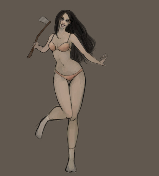
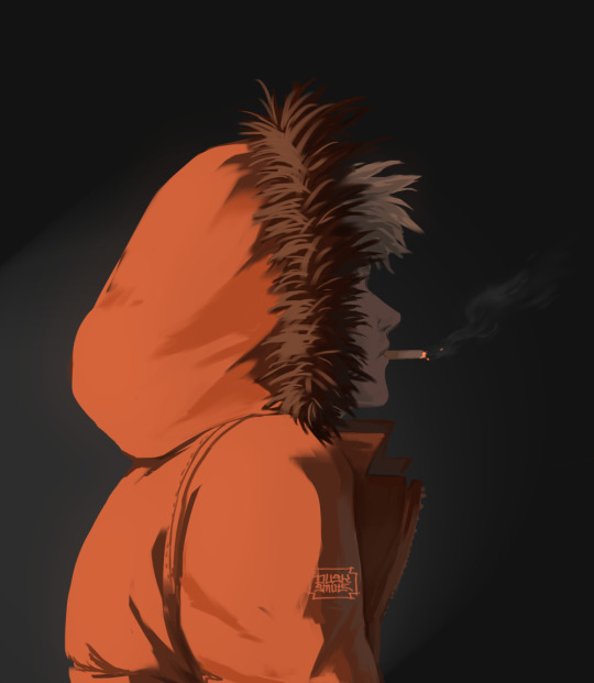
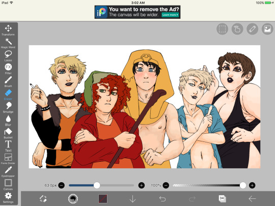
#i’ll see how this lineart works out in my usual style
Text
Everyone playing FE7 on NSO has gotten me thinking about Them again… here’s a lil sketch of Ninian for you
#fire emblem#watercolor#sketch#elibe#ninian#ninian fire emblem#i feel the elinini vibes strengthening#as though that hasn’t been my mode for like. six years#but it’s reintensifying#also i’ve had the idea of ninian with pale eyelashes and hair that verges on platinum blonde#but it’s been a bit of a struggle to fully implement?#i’ll see how this lineart works out in my usual style#by uh. drawing her with eliwood. what else would i do
23 notes
·
View notes
Note
I love you’re comics! Would you ever to a tutorial on how you make them?
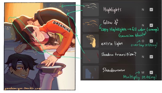
Thank you! Here’s a quick speedpaint if that’s okay? My comics are pretty much this same process but just replace the colors with gray values and screen tones. I don’t know how in depth you were looking for but…
Basically, if I really have no clue what I want, I start with roughs. But usually I plan things in my head before I even get going, so most times it’s straight in with the lineart, seeing as my style is pretty rough anyway, means it doesn’t have to be super clean. The biggest roadblock is plotting locations for the text bubbles (I can get too excited detailing and then don’t want to place them over spots I end up liking lol 😂).
I’ve been doing this long enough, I have all my colors labeled and ordered by now. You can see grays are at the top since I use them the most.

After I color the base, I’ll add some light shadows, and then just throw down some screen tones where I think look nice or for some texture variation.


I’ll type up the dialogue as I draw out each panel, and often don’t plan ahead for that. Like, I know what ideas need to be conveyed in that particular update, but most times, the dialogue goes through several work throughs as I’m drawing, before I’m happy with it. Then at the end, I’ll read through and look everything over one last time, to make sure it more or less makes sense.
And then it’s pretty much ready!
And not to keep throwing it out there, but I do post WIPs on my patreon! 😊
#ask slushie#rottmnt#my art#rise of the teenage mutant ninja turtles#rise of the tmnt#slushie rambles#slushie art
289 notes
·
View notes
Note
squeezing Toby like a rubber chicken so hard rn, drop the list of brushes you use to render or the crackoon gets it
I’ll explain which ones I use for each process in my drawing:
Sketching
I use “big pencil” for sketching, as it must helps me to get loose with my drawing and not feel like I’m trying to make things perfect. For hair, I use “Hemp”.
I also use “Aggie” (my own brush) within certain moods… it usually results in similar looking styles like these
This my oc btw. (Same person… in each drawing lol. Her story varies.)
Coloring/Base Colours
I use the “Flat Brush 1” or “Round Brush” for blocking in colors, and then go in with “Colour Block Brush” (my own brush) to put in tones like tan, blush, eye colours, blah blah blah.

This is what a base looks like when I’m done. (This artwork is a bit touched up, but all in all, it’s how my base artworks look. The reason it looks finished is because I might have changed the lineart colour or rubbed some sketch lines out.)
Rendering
For rendering, I like to go into finer details, and use the “Brush Pen 1”, but when I feel like that brush is getting boring or too uniform, I switch it up by using the aggie brush, or the colour block brush… which idk why, but it helps me render when I change brushes slightly.
You can see here, I used it a lot, BUT! if you ever feel like it made your artwork look “plastic” or flat, you can simply blend things with a smudge brush that is textured. The one I always use is “Gouache 1” for blending and smudging, it works wonders for me, and gives me that nice texture but at the same time it isn’t too overwhelming.
The other brushes in the pictures are kinda just there for me to have by my side in case I need them or get bored, but all in all, the ones I listed are my main bitches.
If you want my brush sets, lmk, and I’ll email the files to you. I ain’t a gatekeeper ✊🏼
Hope that helped.
Toodles.
68 notes
·
View notes
Note
Can you do a tutorial on how your art process is done I’m about to quit on Art everything I make fucking sucks .
hey anon !! My art process is almost non existent cause i haven’t been able to stick to One definitive way and i don’t want to cause i think its limiting. I still have a long way to go for improving my skills and learning new things and figuring out different styles !!
Heres a quickk drawing showing what my “main” process is

This is something i generally have stuck to for most of my posted drawings (i can post things specific to some drawings on a separate reblog ^^ im just to lazy to get pictures of em for examples rn)
Doodle !! I cant visualize shit, and usually have a very vague idea of what id like to draw Or just nothing at all. So I doodle messily with expressive gestures till’ i find something that sticks
choose one final concept/sketch and clean it up a lil so i have a way better idea of what im getting myself into
Base colors cause i hate doing lineart. So i just go straight into colors casue its fun and i like fun!! Right on top or on a diff layer it doesnt matter. I color pick with my eyes and put base colors or anything i think it would be cool. No pressure and it can messy cause I’ll clean it up and figure shit out later
fuck around and find out (rendering ig)—> i cant explain it super well or definitively. I just layer and throw colors on top till im satisfied or Done with it. I flip my canvas a bunch or check my values to make sure the results come out to look more coherent regardless of the mess of color
Im just a simple person and cant handle something that requires too many steps or things that havta be done Just right so this works for me atm. This may not be your jam but finding a process in that works for you through trial an error is just a part of art. Do what works for you!! I think experimenting is so important even if it sucks in the end
(more Words / “advice ?” under cut)
I have so many shitty drawings and sketches and even colored things that outweigh the tiny bits of art i decide to show off
I totally get that creating art can get really discouraging at times; not getting the results you want when you want them no matter how much effort you put in just sucks, but it won’t always be that way :] even if it takes you 10 years to find your groove and see improvement or 2 years, it’ll happen. I find that i’ve only improved when i actively didn’t give a fuck about how my art looks and only cared that i was having fun through it all, and thats hard cause perfectionism is a bitch and its hard to get rid of. You could improve with studies and daily practice for sure but moving towards improvement can be as fun and light n breezy as you want to make it, like taking a break to explore different hobbies or changing up mediums or fucking around and experimenting with it can help !!! Allow ur art to be bad; cause fuck it, at least you made something and thats really really cool. Once you cut urself some slack it’ll be easier to improve upon your skillset and slowly but surely get to where you want
Sorry im a bit tired idk if this is coherent so heres a more direct thing i’d like to say:
Maybe ur art isn’t where you want it to be rn and ik it can kill ur motivation to keep going at it (i’ve experienced this feeling a lot and im sure so have many others). But you gotta ease up on urself and stop worrying about results so you can allow yourself to experiment and have fun!! And its hard getting into that mindset but you gotta keep trying and you’ll find it getting easier
#Im So so sorry if this is nonsense. Its late and i wanna answer this b4 i forget#Ill add on to this more coherently if i rmb later and i have the ability to think more clearly#But yeah. If you really really like art and wanna keep it as a hobby. Loosen up and have fun#Maybe all you end up drawing doesn’t hold up to your standards#But to fix that just let go of the standards!!#You can challenge yourself and set expectations for urself After you learn to have fun and find a process that works#Sorry if im repeating myself im bad with words#But hope this helps a bit :] if you still feel like quitting art anon; take a break for an indefinite time and come back to it when u want#I find that that’s helped me out when im in art ruts#Asks#But im just an amateur artist in it for the love of creating so what do i know#Do what u want forever and let urself make bad art and give some time to grow :]
7 notes
·
View notes
Note
Ohhhh! I’ve always loved your art!
Do you have any tips? (Any will do!)
Tysm!!!! I’ll share some tips that have helped me improve over the years!
- USE REFERENCES! Using references are a great way to help you practice and study anatomy! Eventually you’ll be able to imagine a pose with accurate proportions in cool angles bc you understand how the body is shaped!!! (Pintrest is really good for this)
- Try to push yourself. At times it’ll feel like your art is getting stagnant, personally that’s when I find something in my art if feel like could use improvement (rn I’m working on shoes, backgrounds, and lighting!) and then try to do a full piece focusing on those areas. It’ll be refreshing and rewarding in the long run!
- Get involved with a community! Many many MANY times I will look at moots or friends artwork and love their style, or their takes on characters, or little flourishes they add to their art. It’s a great way to get inspiration and it makes your brain think a little bit on how they go about the process, and how you would be able to replicate it!
- YOUTUBE TUTORIALS!!! There are so many channels out there that provide real FREE advice from professional teachers and artists! Utilize them!!! ( Winged Canvas is a great channel that I watch frequently!)
- Switch up your brushes every now and then! You’d be surprised how much a brush can affect the style of a piece, experiment a bit! Here are some of the main brushes I use if you’re curious ^^

- Flip your canvas every now and then! It really helps you to see imperfections more clearly!
- And lastly, Trust the process. Many times for me when I get to lineart or base colors, I feel like the piece isn’t looking too good, and that can be demotivating! Try to stick with it, because usually it will start looking way better once you have some rendering on it. However, if you’ve been messing with a piece for awhile and it still isn’t turning out great, take a step back and comeback to it later, or try to start again. (Usually my second passes are better than my first idea, it’s okay if the first one doesn’t work out!)
6 notes
·
View notes
Text
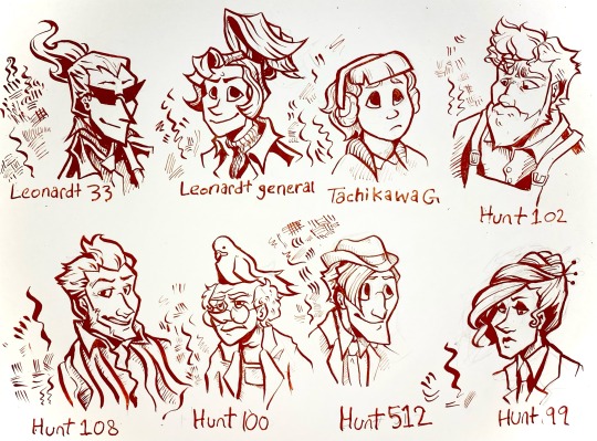
I’ve been drawing with dip pens lately so I did a nib study using my ghost trick redesigns.
for anyone that’s interested here’s some notes on the nibs under the cut.
Leonardt 33 - Easily the one of the most flexible pen nibs I have. Technically this is designed for calligraphy, specifically spencerian, so the sideways movement isn’t great and there’s little control when doing hatching. Really dramatic swoops with high pressure that aren’t entirely appropriate for character portraits but I kinda dig what it did to Sissel’s hair. Will probably use it for special effects like fire and smoke and stuff.
Leondardt 33 - This one is actually intended for drawing so naturally it has a fairly consistent line weight with a low flex. The hatching marks are kinda scratchy but not in a bad way. Would probably work really well for continuous contour and styles of lineart that are more sketchy, loose, and dynamic than my normal character art style. Would prob use for larger pieces or figures closer to the camera cause the line weight is generally a bit too thick for the usual size I work with.
Tachikawa G - This is a nib made for drawing manga specifically and it’s really easy to use for drawing. Some of the calligraphy nibs really take some thought and careful motor control to look good but this one was forgiving. I see myself using this a lot for really casual art. It was kinda hard to do hatching or filling with this one tho, which was kinda surprising. Very gentle line variance, makes really clear shapes. You can see in the other characters than too high flexibility can make it hard for the brain to turn lines into form so this really mellows it out. Prob best to use this nib to block out the lineart then hatch/fill/detail with others.
Hunt 102 - this is a speedball job made for mapping and oh my god do I love this nib. It’s just so 👌👌👌 on the details??? the line variance perfectly matches the brushes I use on photoshop and it’s just. mwah. it holds onto literally so much ink despite being so tiny. interestingly hatching is unstable but two or three lines together seem to be just fine. Kinda sad that jowd’s hair is a little hard to focus on cause of the variance but with a little practice I can prob find ways around that cause I already know I’m gonna love using this nib for heads and faces. Filling is a bit patchy but otherwise I think this is gonna be my go-to detail nib. (also no jowd isn’t in overalls that’s supposed to be an art apron but with only like the top portion showing it’s hard to tell.)
Hunt 108 - ok this is Supposed to be a drawing nib as well as a calligraphy nib and it does mimic brush strokes but I’m pretty heavy handed so it’s hard Not to make those super thick lines. Not bad with details and has enough control to make thickening up the outline super easy, but really easy to mess up. This nib did Cabanela dirty by flexing a bit too much when I was doing his mouth so I had to correct it with a white pen. Spreads the ink too thin in areas for solid filling. I can see this working really well with mixed media, like with watercolor, and once I get some more colored ink I’ll use it for coloring.
Hunt 100 - idiot stupid rat bastard of a pen nib. ok the art looks fine right? can’t be that bad, right? it took me so long to make that because the ink just. wouldn’t come out. so this nib is another mapping nib and it’s super delicate so it breaks really easily. I broke my first one bc I’m heavy handed, so I ordered another like ‘ok I’ll be more careful with this one’. it broke again. I don’t even know how. Ideally I’d use it for small spaces or reeeally fine details but I can’t even get it to work long enough to try. speedball can meet me in the pits.
Hunt 512 - A calligraphy nib that’s actually really easygoing to draw with. There’s not much line variance, so the hairlines have a lot of control. Makes for really good hatching. Also does really great long, thin lines. Sideways movement is kinda meh but it does the job. Definitely the cleanest looking of all them, tho the lack of variance makes it a bit boring to look at. Gonna use this one for shading and textures or for drawing on really rough paper.
Hunt 99 - like the first nib this one is really dramatic, and it’s supposed to be a calligraphy nib, but it has a lot more weight control than the hunt 108. Also the fine lines are easier to control. A lot of ink comes out so it might not be great on paper with risk of bleeding, and it takes a while to dry compared to others, but it would be good for filling since it can cover a large opaque space while having good control over the shape and points. Could also use for different warping/texture techniques.
Other notes:
I used smooth illustration Bristol for the paper, since ink looks more vibrant and swooshy on it and also some of these nibs can Only be used on smooth paper.
Also used terracotta India ink, which is kinda on the thick end but still looks good. matches with the colored lineart in Ghost Trick lol
got all of my pen nibs from Paper & Ink Arts cause u can order a nib for like less than a dollar fifty each. You can also get paper, nib holders, and ink for a good price too.
if u wanna start with dip pens PLEASE prepare your nibs before drawing. stick them in a potato for like 10 minutes. please trust me on this you will have a bad time otherwise.
ok thanks for reading through my Very Indulgent experiment.
#ghost trick#my art#idk maybe this is a bit unconventional for fanart#but I think a lot of ppl only ever post super polished art and not the experimental stuff#which gives ppl who want to start drawing the idea that every drawing has to be a finished one#and that everything you post has to get likes#sometimes art is about the journey#. . . ok my cat just died so maybe I’m being all maudlin and philosophical to cope but still#this is also here cause I could find jack shit useful reviews for pen nibs#so Hopefully this can help ppl that want to try dip pens but don’t know how#feel free to reblog if you want to reference or share the info on nibs lol#character design#traditional art#nib review
65 notes
·
View notes
Note
Could you (please, please, please) show how you draw wangxian? Like their body proportions or what you use for drawing?
Hello!
Wow I’ve never been asked that question before! I’ll try to answer the best I can.
First, what I use for drawing:
I draw on procreate, and the brushes I use can change. I have like 3 brushes I use for lineart, and as for coloring, I go wild! I don’t even remember what I use for each drawing (except for comics where it’s really just cell shading).
I do my linearts with a pen brush (mostly for comics), with a 6B pencil brush (most of my drawings) or pen set on low opacity if I want something messier. I usually tend to color lineart.
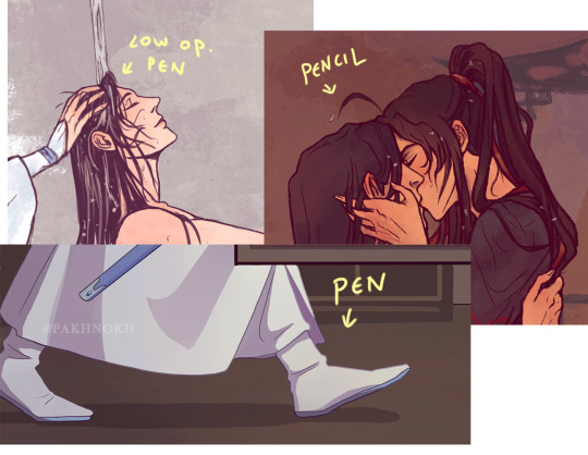
As for the characters I draw, I base my wangxian on donghua/manhua design, like proportions, hair style, clothes etc…. though I tend to the manhua’s one (especially Lan Wangji’s older style in the manhua, anatomically/facial structure speaking)
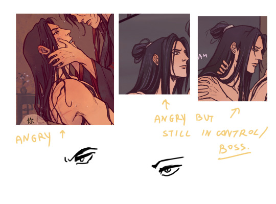
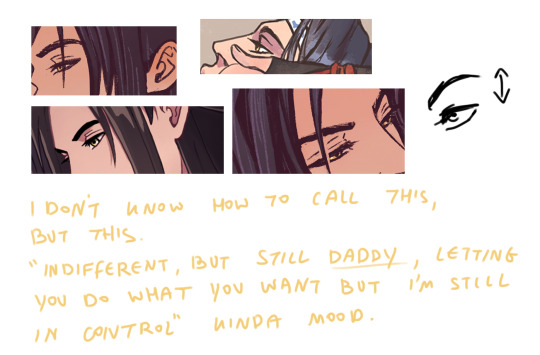
When I draw wangxian, the style can really change according to the mood of the drawing. For example, if the piece is really leaking with stupidity, I can even make lwj totally OOC with these kind of faces:
However back to the normal narrative setting, lwj is mostly restrained while most of the gestures are from wwx’s part.
Anatomically speaking, I draw lwj more masculine. He’s taller than wwx, more built, and his face features are sharper. Drawing his expression, I mostly try to reflect all of his feelings through his eye’s/eyebrows.
I draw wwx with softer features, but I don’t really like making him feminine. I guess my style of him changed the most throughout my 1 year being in this fandom, because before MDZS I really tended to draw more “manly” men, so in my first works he looks sharper and more built, and lately I started drawing him thinner, and softer, but I still try to avoid too feminine features. His style of drawing really depends on the role he plays in my work. Is he a gremlin? Is he a badass? Is he coquettish?
There’s something else I do occasionally, especially since the protagonist is wwx, and we mostly know more about him and his feelings than those of lwj. To be honest, as opposed to wei wuxian who’s really an open book with all his actions and all his “roles”, lan wangji is somewhat of a mystery. We see his actions and reactions through wwx’s eyes. I guess that is what sometimes makes me “hide” lwj’s face, of parts of it.
But I sometimes also love drawing a rather angry expression on lwj because it’s what wwx said he loves seeing on him isn’t it? Hehehe. I just really love expressing lwj’s state through his eyes/eyebrows, especially since he’s a block face type of guy.
That’s it I guess? I hope I could answer your question and to share my way of seeing wangxian.
If you want to see sketches, wips and full process videos, you can also check out my patreon where I share those!
382 notes
·
View notes
Note
How do you paint so flawlessly digitally (at least I hope it's digital, and I'm not making a fool of myself here...)? I like to draw and I like how my art looks with lineart, but I always end up hating what I make when I go painterly in my digital art, even tho I go with a painterly style in traditional? What's your secret?
of course, feel free to give me a short/non-answer. This all sums up to say that I think your art kicks ass and it's always a joy to see, even tho idk what Metro 2033 is 😌
Hello!!
First of all, thank you so much for your kind words, it really makes me happy to read messages like this :·))
Then, sorry for the delay of the answer, I figured it would be more efficient to actually draw a little tutorial on how I paint digitally, because for me visual representation is key for learning art (I see and I reproduce to build my skills).
So, here we go for a little explanation! (I use Photoshop but it can be applied to most art softwares of course!)
First of all, I’d like to point out that I stopped doing clean lineart to paint, because it restricted the workflow more than anything, so a basic sketch is more than sufficient!
To add the color base, I usually start with a dark and desaturated (but it can be any color really) background layer.
Then between the sketch and the background layer, I lay the colors I want, in a semi-flat, semi-gradient way : I use a brush that has pressure opacity (mine has a little texture and grain but a basic round one works just as well) so all the colors mix well with the background color. Never hesitate to use the color picker tool to get harmonious colors overall!
I finalise this step by tweaking the shadows, some color details I want...
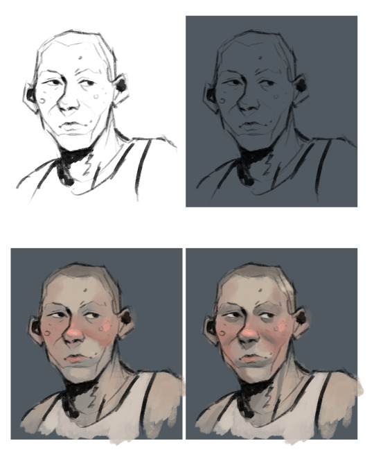
Then starts the rendering process : I create a new layer on top of everything and then I use mostly that pressure opacity brush coupled with the color picker tool. The key is to keep the shapes and volumes of your drawing while very slowly (but not entirely) getting rid of the messy lineart.
What I love to do is draw on top of the lineart with a slightly lighter shade of it that I get by painting a bit transparently over it (you can see it on the bridge of the nose, the underside of the jaw, the strong shadow under the chin...). I always try to keep similar colors if I bring new ones on the drawing (redder nose or cheeks are just a tad more dark and sturated already existant reddish tone).
When I feel like I’m happy with the level of rendering, I add then the details : little lines for the hair, skin texture (scars, spots, facial hair...), eye color, and then like the interior of the ears and stuff, cloth texture... whatever!
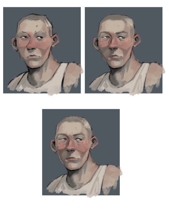
And then it’s the magical process of tweaking with the adjustments!! I usually go kinda heavy with them because photoshop has really nice ones, but I’ll show you the ones I use all the time.
Brightness/Contrast : lowering the brightness and boosting the contrast de-flattens your picture
Vibrance and Saturation : makes those greyish colors more alive
Levels : I use them instead of the color balance but both are good for adjusting the colors!
And then I like to add a creamy background on another layer on top of it all to delimit where the subject stands. But if a whole background is already part of the illustration skip this step haha!
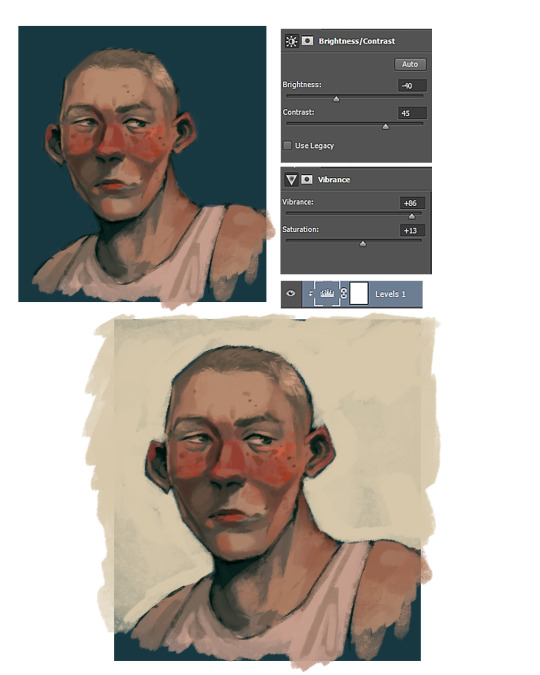
And there you go, now you know all my secrets for paintings!! Hope it was useful to you and to everyone who reads this :·))
Thank you again for the ask <3
(ps : Metro 2033 is a franchise based on a really good book (the one i base my art on) that i recommend you to read :•))
324 notes
·
View notes
Note
as an artist, i really look up to you and your art! i love it very much! but i have a different problem, and that's comparing my art to others'. Not necessarily yours (although i must admit i do it sometimes), but overall comparing myself to others. it's really hard to try to stay focused on my art, when there are so many talented artists out there! People who have everything i struggle with mastered, and i just wish i was like that sometimes.
i know i'm probably not the only one who struggles wth this, and most of the time i'm rather learning from these artists i look up to most, but sometimes comparison gets the best of me.
is there any way i could overcome this?
hi anon!!
I’m so glad you brought this up as, yes, every artist struggles with this. Even if they’re not public about that struggle, they most likely do. This is something I struggle with alllll the time.
At the end of the day, there are always going to be artists a couple steps ahead of us. they’ve already managed to “master” certain techniques that we want to achieve so badly. And yes it can be super stressful seeing that because it’s like, “how did they do it? I want to do that.”
The good thing is, you’re already heading down the right path in regards to comparison: turn the comparisons into a moment of learning. Study that artists work, watch their time lapse videos if they have any to get an idea about their techniques and what they do to achieve their results, save their art into a folder so you can come back to it when you are in need of inspiration.
Now, this mentally ^^ can take a bit to get to. And the best thing I can tell you is to be patient with yourself. This is a mindset that isn’t ever gonna go away, but it is definitely a mindset you can change and mold so it can help you instead of making you feel discouraged.
I will say though, there are gonna be days where this mindset just won’t cut it lol. Some days our brains are just out to get us. If that’s happening and you’re feeling more discouraged than inspired? Take a break.
I will forever say this in any art advice I give to people as sometimes: just doing nothing is the best thing you can do for yourself, your art, and your creativity.
Or as this author put it:
“Creative people need time to just sit around and do nothing.” - Austin Kleon, Steal Like an Artist: 10 Things Nobody Told You About Being Creative
(I had to read his series of books for a class, 10/10 recommend)
Last night I was trying to color these portraits that I managed to crank out in a very short time frame (something I don’t usually do so I was quite proud of myself for it). But then it felt like I completely forgot how to do lineart and color??? I tried to find some inspiration on Pinterest and Instagram, and even though I managed to achieve that route, it still wasn’t helping. No matter what I tried nothing looked right. So I went “Oh well. Guess I’ll try again tomorrow.” Because I could feel myself starting to get discouraged, which in the end no matter what I did I wasn’t going to make good art.
Just remember that art is meant to be enjoyable and an outlet to have fun in. The moment it starts to feel discouraging, or it’s weighing you down, or it feels like you’re at a roadblock and you can’t find a way through it, that’s just your bodies way of telling you that it’s time to take a break.
And please just remember that your art is forever going to keep growing and changing. You’re never going to get to a point in your life where you’re like “Oh. I’ve did it. I’ve gotten the art style I want! I don’t have to keep trying anymore I’ve mastered it all!”
My friend Luz, (luztapia on Instagram), is a perfect example of this. She’s managed to have a great outreach on Instagram and a beautiful art style, but if you scroll on her page you’ll see that she’s still working on her style. From the time I first met her a few years ago compared to now her art has changed drastically. Even artists that we look up to are still trying to learn and master things in their own time.
I know this is a lengthy response but I do hope it’s able to help you and put your mind at ease in some way! And of course if you have any other questions or in need of any advice please always feel free to send them here :)
9 notes
·
View notes
Note
hI!! i love your art and was wondering if you could make a tutorial showing how you paint stuff? only if you can! it's just really pretty !!
hi nonnie! thats very flattering !! i’m sorry i dont think i’ll be very helpful bc i’m a mega noob as well :D but i’ll try my very best <3
my process is very tailored for speed instead of quality (oops soz LOL) so i do suggest this for if u have short doodle breaks ⬇️⬇️⬇️
thumbnailing (for comics) -> lines (sketch who?) -> bucket tool/color drop in the base color -> color in the lines -> one multiply layer for a “base” shadow (in the vid below its purple!) -> one (1) render/paint layer a.k.a lawless no man’s land
full rendering process & more general painting tips below the cut‼️
NOTE: i’ll be focusing more on traditional/fundamental tips for stylized art because i’m sure there’s a much more effective way in digital. I truly do only use one normal layer for render... i think this is bc before i made this blog, my only prior experience in drawing is middle school art class, so all i know is traditional painting on one layer.... pray i can answer this again in the future with something smarter lmao
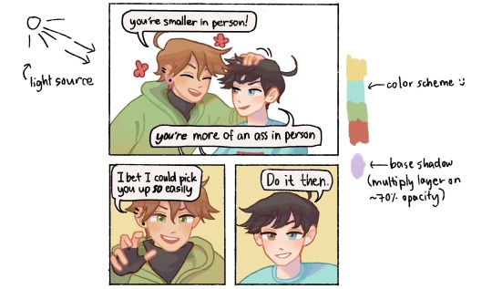
🌺 MY PAINT PROCESS
1. Choose a color scheme!
It doesn’t have to be set in stone like below, but i at least keep in mind the color range i’d like to use depending on what i want to convey (ex. soft pastels for soft fluff, or warm colors for happy vibes). I try to be as limited as possible for base colors because I tend to go ham when painting, you’ll see later AHAHA
2. Base coloring + Base shadow
Base -> bucket tool in the color scheme (I know other artists are against this but when i discovered the bucket tool in digital art I immediately divorced manual coloring i’m sorry i loved you tho bae) (this is why my style and lines are simplistic as they are, so the color drop works!)
Base shadow -> in theory, warm-colored light creates cool-colored shadows and vice versa. because i’m a fluff addict i mainly use warmer light, so i like using blue/purple as the shadow. generally u can’t go wrong with complementary colors!! (yellow light & purple shadows / orange light & blue shadows).
I make a new multiply layer (decreased opacity just bc i like things soft okay) and clip it on the base layer, then block in the areas i think would get blocked from the light.
3. Color in the lines!
for simplistic styles i swear this works wonders. i just clip a layer to the lineart and manually color the lines with a darker but more saturated version of the base color. it just tends to look more dead i guess with low saturation lol (ex. u can see above i use both peach and red or pink for lines of skin, i guess it implies the blood under the skin too. or something :D)
4. RENDERRRR
when i’m not in a rush i just paint things completely (and mindlessly), but here are the things i almost always do:
line the shadows with a saturated color! i’m not sure this is common but i love it lol, in almost all my doodles just check the shadows—on the edges, there’s bound to be a wild color :D (usually its the light color, shadow color or a color scheme color but sometimes i’m just like boY do i loVe piNk)
my art major friend told me about saturated colors on desaturated bases and my life was changed forever lol. u can see below even when my base is very grayyy, my rendering is very gay :D ❤️🧡💛💚💙💜
make the shadows darker where i think they should be darker. usually i can just colorpick from that darker, saturated lineart color!
if it’s a more realistic piece i usually make the highlights lighter, but in simple doodles i find it unnecessary, and i dont like how light/white it looks :( i tend to just make the areas exposed to light more saturated
color in the rebound light~ in reality there’s usually not only one primary light source, at least there’d be secondary light from where light bounces off objects. in art we just emphasize that! so in large shadow areas, or in areas close to other objects/colors, i like to ‘splash’ other colors on
yeah this part is less intuitive for beginners and u have to learn a grasp on the concepts over time, like for lighting and structure. values can be more important than color, so i do suggest learning shading first before coloring, but only if u like (u can always be like me and just pull up references when u dont get how the light would fall on some materials :>). i have more general paint tips below! don’t give up okay, i believe in u nons, we’re all still in the eternal learning process together ( •̀ᄇ• ́)ﻭ✧
5. OOOOHHH SHINY ✨🤩
this step is just me being mesmerized by how easy it is to play with lighting in digital. i play around with the layer settings (multiply for shadow, overlay for light, and often try out the other settings too!). my favorite effect is the highlight glow thing, where u just make a copy layer of the highlights below the original layer, and blur it slightly so it looks like glow ✨✨🤩 overpriced acrylic could never
6. COLOR ADJUST / EDIT
Truthfully i usually skip this step, but my more pro friends really vouch for it!! i think definitely an incredible thing with digital is that u can edit proportions and even color after you’re done. i think they usually use like the curves adjustment layer in photoshop until they get colors they like, but for me, well, in a reaally diligent day i like to slap on the “auto” fliter in the iphone’s photos edit button lmaoooo
🌺 GENERAL PAINTING TIPS
learn basic theory: i think theres free courses everywhere online, but heres a few things u might like to have a basic understanding of: color, perspective, shape language, lighting, composition. don’t sweat it too much tho, it should be fun to explore the concepts!
and for drawing hoomans: proportion, gesture, expression, and veery basic anatomy. i find that overall forms are so much more important to learn than like detailed anatomy bc u can always look it up lol
but remember, u mostly want to learn the rules so u know better ways to break them :)
uuuuse manyyyyy referencessss every time u draww!
^this includes other people’s art — when u see good stuff, figure out why u like it and apply it to ur own art
get feedback!!!!
draw tons!!! brainrot helps !! ;D
aaand thank u for coming to my ted talk! sorry for the ramble nonnie, i hope u got something out of this lol
#VERY LONG POST ALERT‼️#thanku for enabling my rambliness nons#thanku for asking <3#love u anon#demi rambles#untagged#art advice#art tips#art tutorial#art#painting#i’ll update this as i go bc lord knows im also just a noob
182 notes
·
View notes
Photo

Here’s some process inks for a new Limiter drawing.
Expand below for images and blabbing about the steps so far.
I usually delete sketch layers as I go, but I wanted to keep a record of each step in my current process. Looking back through older art for F-ST pitch materials made me realize how much my digital illustration style has evolved since then.

1. Thumbnail - I’ll do bunches of these until I can nail down the concept. Done small (but at the correct dimensions) so I can move quick and focus on composition shapes.
2. Roughs - Refined sketches for the lines, blacks, and colors. Basically a proof of concept. Also the stage where I’ll pull in references. I shot photos of my hands for this. The idea is to get all the hard problem solving out of the way as early as possible in the process so when I’m inking the lineart I can just flow. Every problem gets harder to fix the more refined the artwork gets. My sketch here was pretty clean, but that’s not always the case.
More of my illustrations get abandoned at this phase than any other, because my vision for lighting/environment exceeds my actual coloring abilities right now. Might not always be the case so I wanted to mention it. I have so many roughs for Limiter illustrations I hope I’ll be able to finish someday. I’ve shared these before, but here’s a snapshot of the view of unfinished illustrations I’m met with when I open my Limiter folder:
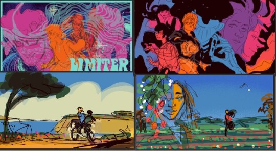
3. Lineart - I up the dpi of the canvas, merge all my sketch layers together, and ink lines on top of them. This doesn’t have much shading in the colors, so only inked over the black and white sketches, but that depends on the demands of the piece.
4. Filling blacks - Just paint-bucketing in all the blacks. Here I’m using a lighter color to see the outlines and make sure I’m getting everything, since there are a lot of abstract areas. Usually I do this directly on my lineart. I had some ambition to do some color effects in the black areas for this piece, so I set my lineart to a Reference Layer (in Clip Studio) and filled them separately.
5. Final blacks - Matched the color to the lineart. Didn’t do much editing here, but this is another ‘proof of concept’ stage where I’ll often go back and tweak things that aren’t working in the composition.
6. Flats - Laying in the flat colors. Because of some color effects I’ll be doing on top, I have one layer for the figures and one for the background. For more simple illustrations I’ll just flat on one layer. My coloring style is simple and generally flat, so layers don’t do much other than increase my file size.
And that brings us to here! Sometimes I ink my sparkle effects in the lineart (like with my traditional comic work), sometimes I lay them on top (seemed easier for this piece). I converted the whole thing to black and white to try and problem solve why the sparkles weren’t doing it for me. Sometimes just focusing on values can really help -- both because it focuses only on the effect the elements have on the overall composition and because it feels less intimidating to make a change without having to tweak all the colors.
Seeing it like this made me realize it was the textured, radial lines that are throwing me. I want the light to be emanating out from Mars’ head, not coming in at the edges like that.
Time to go back and finish this! Thanks for reading.
56 notes
·
View notes
Photo

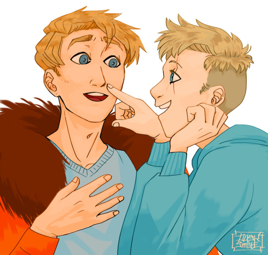
Characters: Tommy and Wilbur
Time: 5 hours
SPEEDPAINT!
This wasn’t intended as ship art but if that’s what you want to take it as, go for it. If you just like the brotherly duo, that also is fine. I just wanted to draw something cute.
I usually draw more serious things so dropping everything to have fun was nice. This was a one-day make (from drawing to editing the video) and I honestly, adore it. Maybe I’ll do this more often. It certainly was less stressful than everything else I do.
However, I do have a bone to pick with some of it – as I always do with my art. It was supposed to look like Wilbur was pulling Tommy’s face closer but it didn’t translate very well so Tommy’s head is a little strange. And, I desperately wish I had done better on Wilbur’s hand. But, otherwise, I think it looks good. Much less issues than I usually see in my work. :)
My Process (for anyone curious):
1. Construction – figuring out the poses and composition. I usually don’t film this part and didn’t for this video. It can… sometimes take a while. This is the struggle step I don’t like showing because of how pathetically long it can take me to figure things out.
2. Sketch – Sometimes I can cut this into multiple steps depending on how much I need to do. This was a simpler drawing so I only had the one you see when the video starts.
3. Color Theory – I’ll start by eye-dropping colors straight from the reference (their skins, in this case). Then, I go through with overlays and filters to change the saturation and color skew so things harmonize better. Minecraft skins tend to clash a lot when you’re trying to make colors work. That’s why you’ll see the video go grayscale often. Pictures look better if the values contrast each other. So, I check them often. Usually, I draft the shading here too.
4. Lineart – I tend to lean for thicker lines but recently was upset with the way my drawings were turning out so I tried to keep these ones more regular. I think it worked. I was very happy with the lines this time around.
5. Base Colors – Using the colors I figured out in the color theory step, I just transfer them over in a neater fashion.
6. Rendering – To make things less flat, I’ll go through with detail. In this piece, I actually totally forgot this step at first, which is why I go straight into shadows and highlights for some reason. I completely blanked. I go back later and add it, though.
7. Shadows and Highlights – This step can either be really quick or really, really long. I went for a simple cell-shading style for this art so it was fast. Other times, the shading process can take hours alone.
8. Background – If I’m doing a background, it usually happens after I make the foreground. It uses the same steps as listed previously.
9. Touch-Ups – This consists of my signature, outlines, coloring lineart, yadda-yadda.
My Programs:
Paint Tool SAI ver. 2
#tommyinnit#wilbur soot#wilbur soot fanart#tommyinnit fanart#sbi#sbi family dynamic#family dynamic#cute#fanart#tombur
48 notes
·
View notes
Note
How do you ink and color? Any tips? I love your art! 💜🖤
oh shit i got this ask months ago and forgot to answer
inking: god i hate lineart so much. the trick is to not do it 😂 unfortunately, i still find myself spending hours on lineart all the time @_@
the biggest thing i’ve found is making your lines varied in thickness. it adds to the interest. i also try to make my outside line thicker than my inside ones to break up the figure from the background. don’t be afraid to skips some lines and imply them with shading instead. i will color over my lines at the end to make them not as strong, but i’ve learned to still keep some lines black for extra emphasis.
^ here’s one of my older pieces that i’ve been considering redoing. it has very little line variation, ALL the lines are colored so there’s no solid black, and there’s very little hard contrast in shading values. overall, it looks flat and uninteresting and if i had the time i’d redraw this one.
this is a more recent example of lineart that i think works a lot better. the characters are really well defined with a strong outline, but the inside lines aren’t harsh and distracting. you can see i recolored the lineart in kyle’s hair to be a dark red, and in some places it blends with the shadows to imply areas with more highlights. stan’s pants don’t have and lines in them, just the outside shape and pockets.
you can see in this wip what the lineart looks like before i do all the shading and fancy stuff. stan’s pants look totally flat and straight until i start shading.
a lot of the time though i won’t even do lineart, especially if it’s a big scenic piece. the more zoomed out less detail you can convey, and lineart takes up a lot of space.
^ this piece is an example where i do both, lineart and no lineart. the mirror image of kyle isn’t the focus, and i honestly didn’t feel like going in and drawing exact lines because they’d probably look fucked up anyway. i typically don’t put hard lines in backgrounds because it would take FOREVER and just be distracting.
the one thing you do have to be careful of with lineless art is contrast. hard lines are good contrast that show you what you’re looking at, and without them your image can blend together.
here’s part of a painting i did last august, when i was first experimenting with lineless styles (full image on my NSFW twitter). can you tell what’s going on here? i sure as fuck can’t. there’s no contrast, and it makes all the skin tones blend together in an unintelligible mush.
contrast has always been one of my biggest weaknesses as an artist, so i’ve been trying to improve over time. here’s a more recent lineless drawing:
this one works because it had high contrast. the highlights are really bright and the shadows are really deep. you can still make out the facial features too, but there’s no ‘lineart’ layer’. everything was painted on in the same layer.
-
-
coloring: oh my god i love coloring. it’s my favorite part of drawing and the reason why shit takes forever. a lot of the same stuff from before comes into play, like contrast. you can also portray some really interesting moods based on colors if you’re being stylistic, but also pay in mind to your environment.
i always color my background first. in fact, a lot of the time i’ll do the entire background before coloring a piece. the environment establishes your light levels and light source, and it’s typically easier for me to tweak colors on a figure than the ones in the background. in the above example with kenny, the background is a mostly solid black with a beam of light from the left. i picked kenny’s colors to fit in this environment.
it’s also important to use references.
you can see in this wip i’ve got a reference image for how light from a TV looks against figures and the way their shadows are cast across the wall. it also helped me figure out what colors to use in this situation.
a lot of coloring is just trial and error to see what works. i usually start with a flat base color and add value to it. if you put all your colors on different layers it’s really easy to change them quickly.
here’s an example:
i got my base colors down and here i can see the skin tone is blending with the background, so i lightened it up for better contrast
i typically shade the skin first, then clothes. you can see here i did a dull skin tone with a bright colored shadow. this adds more contrast and interest. i always try to avoid doing dull shadows where you shift toward black. black shadows are really uninteresting and they can make your piece look muddy. i’ll typically shade with an orange, red, blue, or purple.
the final piece has a really bright highlight on it coming from behind. this just adds more visual interest and contrast. you can also see i’ve gone back into the pink shadows and added an even lighter, brighter peach value in places to show reflected light. this also gives the darker pink shadow an added outline effect, because it touches the base skin tone but looks lighter within.
^ this one’s a good example of light and shadow (full image on my NSFW twitter lmao). there’s not a lot of color because it’s dark out, so everything had to be conveyed in values. there’s hard light across the stomach and then a shadow over the chest, but there’s still light being reflected up into stan’s face that lets us make him out. the rest is deep shadow and unimportant, so it’s all black.
that’s the other part, color and value determine where your eye is gonna look, so consider that when drawing.
^ consider this piece i drew like a year ago. it has a lot of blues and reds, and originally i was going to make stan’s guitar blue. i don’t have the wips anymore, but it didn’t stand out and it didn’t look right with the image. after a lot of playing around i went with yellow because it’s bright, it breaks up the image, and it adds another color to the piece to balance it out.
the same thing happened when i was working on the cover image for What They Say About Us.
you can see in this really early wip that i’d blocked in the colors and butters is totally naked. for one, i was like “damn that kid is WAY too naked in this image” and he also blended in with stan and cartman. additionally, there was a lot of warm colors on the left, a lack of color on the right, and an overall lack of blue.
first change i made was throwing a shirt on him and it made a huge improvement. the image looks much more balanced now and he’s not super distracting with his naked-ness.
other than that, coloring is just picking your base colors, blocking in shadows, adding highlight, and cleaning it up. if you wanna improve, look at photo references. look at other people’s art and examine how they use color and value. practice practice practice. have fun with it. the most fun i have coloring comes from figuring out interesting textures like the pharaoh headdress or kenny’s leather jacket.

i find stock photos like this and study them to see how the light works
other than that, the rest is just playing around, seeing what works, and making things up as i go!
70 notes
·
View notes
Note
Hiya Red! I love your art; it's so bouncy and simple and fun to look at while still having the details and structure to look really cool. I've been drawing more lately and I was curious if you've ever had any style envy. I'm pleased with what my style looks like and it's still trying to settle, but sometimes I look through other people's art and think "man, I wish I could do that." I try to approach it as things to learn from by seeing what aspects I like, but I struggle to work through it alot.
I’ve definitely experienced that! Moreso when I was younger and a lot worse at art - I’d see people’s style and try to emulate it, failing because I didn’t have the base level of technical skill to produce the effect I wanted. That frustration drove a lot of my artistic development. It’s lessened as I became more comfortable with my own style - to an extent. The last time I experienced style envy, I was watching Howl’s Moving Castle and it was a bad scene. The characters were fine, well within my comfort zone, but the backgrounds physically hurt me. I’ve specialized in lineart and crisp cell-shading - proper painting has evaded me, and painted backgrounds with that degree of complexity were on a whole other level. I look at the cell-shading tricks I’ve developed to make halfway decent foliage in my comic backgrounds, I look at what Studio Ghibli does for every single shot, and I weep internally that I’ll never have the attention span to do what they do.
Fucking hell. Unnecessary, that’s what that is. That shot is less than ten seconds long.
I think ultimately style envy comes from the feeling of “I couldn’t do that”, and that feeling lessens the more art you do. Regardless of your personal style of choice, there’s a base technical skillset in all visual art that boils down to “how effectively can you put what you’re envisioning down on the page”. Even if someone’s art style is very different from your own, you can still look at it and see how they did it. Seeing art from this analytical perspective sidesteps the envy and goes straight into practicality - what are they doing, what can I learn from this, how could I make this work for how I work? Why couldn’t I do that? What do I need to learn to become capable of doing that?
Right now most of my personal style envy flareups come from visual complexity. Ghibli movies make incredibly complex, vibrant background shots that are then never reused, and I look at that and think “I couldn’t do that” - not because I couldn’t physically paint it (although I couldn’t, I can’t paint for beans) but because I literally couldn’t force my brain to make such a detailed image with so little payoff. The ADHD brain gremlins would complain nonstop. I can draw complex character poses all the livelong day, but static environments are like kryptonite. When I see something that does them really well, I get that envy pang because no matter how technically skilled I become, I won’t be able to do anything like that. (Or will I? As I get faster, complex art seems to bore me less, so maybe I’ll become more comfortable with ludicrously complex environments - or maybe I’ll figure out more shortcuts to produce the illusion of complexity with minimal work)
Style envy is a legitimately useful impulse if you can identify what, specifically, is provoking it. Is it the crispness of the lineart? You might need to build up some muscle memory so your own lines become smoother and more confident. Is it the vibrant colors? You might wanna play around with highlights and shading to get a feel for that kind of visual flair. Intricate shading? Might need to familiarize yourself with how light interacts with 3D objects. The thing that pings the envy is usually the thing your brain wants to get better at - it’s just a matter of figuring out what that is.
94 notes
·
View notes
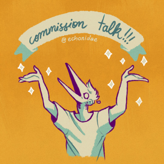
Text
let’s talk commission stuff!
hey folks !!
so i’ve been reorganizing myself to get commissions back on track, and i’ve got some things i’d like to get your input on, if it isn't too much trouble !! ;v;
it’s a long one, so under the cut it goes sdfghghj
a slightly too long tl;dr because apparently this is a 10min read (i'm so sorry): commission revamp on the works! no date for it yet. gonna be easing myself back with just icons for a while at first (no date for that either thoug, not yet), then the revamp will be in full swing with all the other commission options, and the pricetable for them will be changed in the future as well.
some questions:
1) i’m rethinking commission types, is there anything you’d like to see as a new option?
2) considering i tend to open only a handful slots every batch, i'm thinking about implementing a waitlist (with a bit of a twist: it's split between Current Batch and Next Batch; a little more complicated than a regular ol' waitlist, allows me to get through some of the waitlist queue as work gets done). would that interest you or is it too much of a headache? 100% open to suggestions!
3) i’m organizing a board on trello for commission stuffs !! any suggestions or specific things you’d like to see there?
so! it’s already been over a year since i last opened commissions and i’d very much like to get back to them ;o; it’s been way too long! i miss working with you folks aaa
i don’t have a reopening date yet, but i’m planning on opening only icons for a while to ease back into the process. later on, i'll open the other commission options too. you see, i’m working on a full revamp of the whole thing, including the terms of service and that info image with the examples (because looking back, i think it no longer really represents my current style and how i really do commissions in terms of just... plain old rendering and polishing), so i’ll be working on new drawings and a new layout too, and all that good jazz :D
for full disclosure, along with this overhaul of the terms and such, i will be updating prices too c: i’m still working on the new values though, since i need to figure out what commission types/options the overhaul will have. which brings me to the first question here: what would you like to see as a commission option? for reference, here’s the og options:
(hoo i need to redo those examples *sweats*)
also, one more thing i’d like to note about this revamp situation: there isn’t a whole lot that’s changing really haha it’s just been a long, long time since i last did commissions, so i’m reviewing terms and i might change stuff that’s become outdated, or that needs clarification. if you’ve commissioned me before, the process itself is still the same so no worries! once the revamp is out, i’ll point out anything that has changed too c:
in regards to price changes, those first icon-only batches will be in their original price, and the new prices will only take effect once the revamp with the other options is out. it will be quite a while before until that, but if you have any concerns, feel free to message me any time ! either way, i’ll keep you folks posted !! i guess i also could post the new prices before implementing them, if that helps!
so, moving on!
now to the waitlist situation <:3c as in, i’ve never had one, a while back someone asked if i did, and now that i’m reorganizing things, i’m wondering if it would be good to implement one :3c feel free to send any questions !! or suggestions!! i'm all ears!!!
usually i only open a handful of slots for each batch, right, and once they're all claimed, the commissions are closed until all the slots are finished. folks who missed the slots have to wait until the next batch, and sometimes those batches take a while to come back, and i usually just message those who missed the opening once the new batch is announced.
what i'm thinking for the waitlist is, i'll open it along with the batch of commissions, and limit it to a specific number of spots or close it by a specific date, whichever comes first. to apply for it, people would just need to send the form and i can tell them immediately whether or not i can draw their request, and then they'll be placed on the waitlist in the order they’ve been accepted c: pretty standard stuff.
here’s the important bit: that list is basically split in two. the first handful of people on the list, corresponding to the amount of slots for the current batch, will be reached out to as i finish working on the claimed slots, and then anyone else on the waitlist will be contacted shortly before the next batch. if, by the time the list closes, not all the opened slots have been claimed, folks on the list will simply be moved up the queue accordingly c: all of it would be discussed individually, of course, and very well disclosed in the commission info!
there are other points to it as well: anyone would be able to request a spot on the next batch's waitlist instead of the current one, and anyone can leave either list at any point. folks who had already claimed a slot when it first opened would only be able to apply for the next batch's waitlist (to give everyone a chance of getting one), and people on the list, either for the current or the next round of commissions, can be skipped up to a limit if they're unable to continue the order once i get to them.
oh and, before i forget, with the waitlist in place, i think i’d no longer be able to put slots on hold as i used to (as in, before paying the first invoice), as it’d be unfair to folks on the list. in that case, the person would be placed on the list as well if they want to, and contacted as soon as possible : )
also the "up to 2 slots per person" thing would be on thin ice too haha
anyway, this is kind of what i intended to do back then, with reopening slots as work gets finished, but never got around to. i want to make sure i don’t swamp myself with work, but also have it so that folks who want slots have a good chance of getting them, whether for the current batch or the next, as there's only so many slots i can open and work on at once, and time zones and irl things are to be considered too for anyone interested c:
it also makes it easier for me to keep track of messaging folks about new slots and such, and the list would be made public and easily available for consulting too : D more on this later!
so how's this looking? i've never done waitlists before and barely knew how they're supposed to work before starting to reorganize things, so please do feel free to voice your thoughts !! i’m 100% open to suggestions !!! do you think this system would work out for you? any concerns? if anything is unclear feel free to point it out, i'll do my best to explain the process or change stuff that doesn't quite work!!
so!!!
now to the very last thing i wanted to talk about ! trello!
i’m making a little trello board for updates on commission stuff! my commission info page here on tumblr and on deviantart both have this little section for updates on each slot’s progress, but i admittedly didn't do a good job keeping them updated (and constantly updating two things in different places just. kinda sucks.), so i’ve been diving into trello to unify that update section in one place and keep things nice and organized and transparent : ) it would be super useful for keeping track of the waitlist too, if that becomes a thing, or for updates on commission status and such!
so far i’m only testing things out, so it’s looking like this right now (sorry for the tiny image!):
(the board is lying btw, commissions are very much closed haha)
(also if it’s basically unreadable, here’s the upload on sta.sh)
with all those little lists, the “available slots” and “sketch” and “lineart” and whatnot, i would be moving the card along the process : D and adding the appropriate labels, of course
this way i can have those halfsteps labelled too (working on/halfway through/finishing), since there’s only so many colors i can use without making it confusing (and tbh i’m already not too thrilled about color labels as it is, but it beats typing each individual status, and i’d imagine it’s more readable for folks consulting the list as well)
i really like how this looks so far in terms of organization but i’m unsure if the horizontal scrolling is anything but annoying, specially to folks on mobile (with the way i divide my screen on desktop, it certainly isn’t ideal either), so if you have any experience with that, feel free to let me know your thoughts!! there are a thousand different ways to organize this, and this is all a work in progress too c:
so! anything specific you folks would like to see on trello? i know this is a fairly common tool for commission queues and info and such but i’m super new to this platform, so please feel free to send suggestions! ♥
anyway yeah! that’s it! ;0; !
i’m sorry for the super long post, i’ve just been thinking about a lotta stuff haha i feel like i don’t interact a whole lot as it is, and since commissions are very much a team effort, i do want to get input from you folks on it c: it’s good to get a fresh perspective as well!
thank you so much for reading this far !! let me know your thoughts !!! :D
♥
#oh boy.txt#:3c#;;yeowline#the word batch can be found 28 times in this post#waitlist is present 24 times#slot = 32 times (28 being the plural)#commission? 46 times#phew!#also!#doodlesketch stuff#eye strain#for the art there haha
7 notes
·
View notes
Note
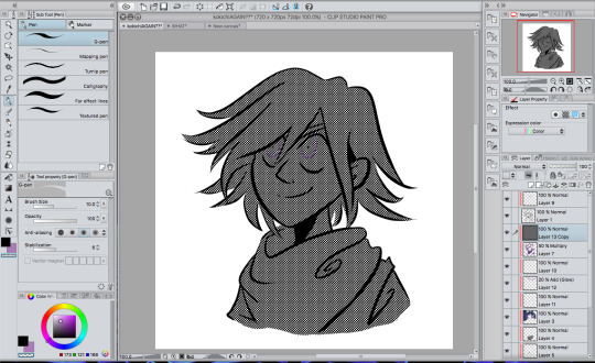
Your simplified Danganronpa drawings are so cool, I wish I could make stuff like that! How do you do it?
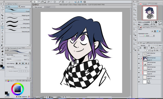
hello! so the funny thing about that is that I don’t really divert that much from my normal style–I just add a few things to it to make it more danganronpa-y. I, coincidentally, am weirdly good at style imitation, but I can show you how I did it!
I’m using kokichi as my victim because I can’t stop drawing this bastard:
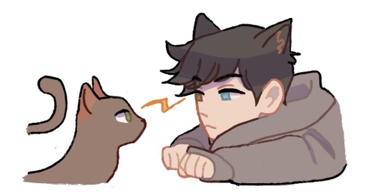
these are the lines for my normal style, more or less. they’re usually a lot more connected, but y’know, it’s a tutorial and I’ll probably just fix them as I go along. also I didn’t use a sketch so that’s something.
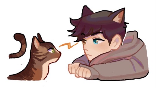
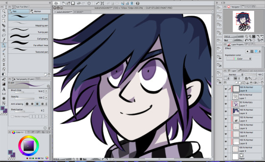
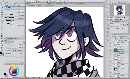
flat colors and a couple lineart adjustments. cool, cool. danganronpa colors are like really desaturated and all the characters kind of look like ghosts (ironically). to add to the authenticity, make the colors look as much like the in-game colors as possible. kokichi’s character art makes him look like he has highlights, so I gave him those rather than just solid purple hair.
ugh okay first you have to shade it before you do anything else give me a second

THERE it’s kind of sloppy but it’ll have to do
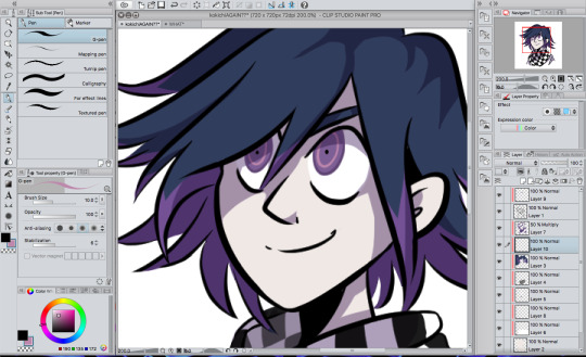
you’re probably going to want to use a shadow with a cold color to go with the desaturated colors. I used that color you can see in the color palette in the corner because that’s more or less my default. since this is a stylistic imitation tutorial and not a coloring tutorial I won’t go into detail about how I shaded it and how I use clipping masks to color. just have a time, man.
the most important thing, naturally, is the eyes. danganronpa’s just got this eye thing going on. now let’s actually get down to business.
first, color the outline of the eye with a color somewhat darker than your eye color like so:
oh god I have to move his pupils
okay take a lighter color that you probably also stole from a ref and saturated somewhat and THROW that circle in there
congrats. you have danganronpa eyes.
you’re going to want to make sure that the eyes are pretty even. like, the circle inside is in line with the outline, and the pupil is in the dead center of that circle. otherwise the eyes are probably gonna look pretty wonky. I had to move his pupils for a reason. you’re gonna have to pay close attention to what direction the iris is facing.
next order of business, the ‘hair shiny’. see, this was a weird thing for me to incorporate because I hadn’t done this since I was like 14 and I have a knee jerk reaction to it, but anime be like that.

fwoop
this color is actually very close to the one I used for the circles in the eyes, just more blue-shifted. you’re not just going to leave it like that, though.
set it to add (glow) at 20% opacity and you’re good to go. (I don’t remember what the photoshop/sai equivalents are). I erased lines in it because I’m extra, but you don’t have to do that if you don’t want. you can mess with the effects on this part because I’m pretty sure I made it much less visible than the danganronpa style does.

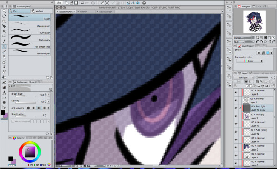
now, the BIGGEST thing you can do besides the eyes is probably the texture, since we’re imitating the character art style.
you’re going to need a small checkered texture. like, this blinding abomination.
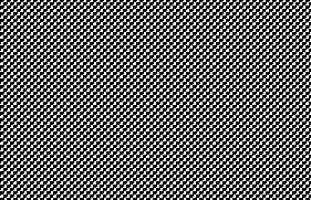
ow. fortunately, we’re changing the opacity REALLY low so it’s not going to hurt to look at. if you’re using clip studio paint like me, it comes with textures built into it. color a whole area and click the button with the checkers on it that you see on the top right.
it should cover your canvas with blinding chaos and your eyes will start screaming. before you go blind, make sure it’s set to a checkered style and navigate to the ‘layer’ tab at the top and hit rasterize to turn it into a normal layer. now that it’s a normal layer, changing the opacity will only make the colors lighter, rather than change the texture itself (that’s a thing that happens).
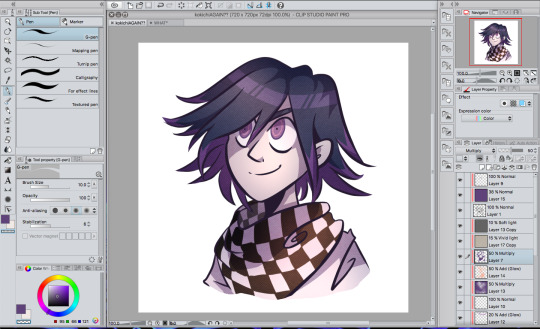
anyway, turn your opacity ALL the way down to 10% and set it to soft light, and your canvas will go from looking like this monstrosity…
… to this!
okay you actually can barely see that at all with this crappy screenshot without leaning super close to your screen. look, it’s THERE, I promise.
next you’re gonna wanna find a rugged texture of some kind. like, gritty paper or something. I have this one texture that I use a LOT and have been using it since before I even played danganronpa. put it below the first texture layer, turn the opacity down a whole bunch and just mess around with it, honestly. in that picture that I drew the other day, I have it set to vivid light at 15% opacity, but honestly, you can just see what works for you.

now it looks like this! again, this probably isn’t super visible because of the image size, but you’ll see.
now give me a second to add the rest of my shading that has nothing to do with the danganronpa style.
yeah!!! if you’re wondering what I did, I threw on what could be described as “cloudy shading” because you basically just toss on a whole bunch of airbrushing in the color of the shadow in one layer and a bunch of airbrushed lighting in another. it smooths out the drawing a lot and gives the coloring a lot more variety! it’s pretty serotonin-producing, honestly. (thank you tobin for teaching me basic color theory so my shading/lighting looks better)
oh yeah, I also added just a bit of a purple hue to the lineart to go with kokichi’s whole purple aesthetic. changing lineart color doesn’t always work, especially when drawing characters with different color themes, but it did work this time around, probably because it’s just kokichi.

here’s the close-up!
446 notes
·
View notes
Last Seen Blogs

peterbigdickparker
i’m just here for the thrill


ugoodraul
ugoodraul.com

historyoftheworldpodcast
The History of the World podcast

froggy-was-here
Froggy