#i'm too lazy to make a tutorial
Explore tagged Tumblr posts
Visit Tumblr Blog
Explore Tumblr blogs with no restrictions, modern design and the best experience.
Last Seen Tumblr Blogs


Fun Fact
28.6 is the average number of monthly visits per US mobile user.
Note
You've inspired me to make my own genetically accurate cat picrew, would you mind sharing how you made the tabby gradient? 👉👈

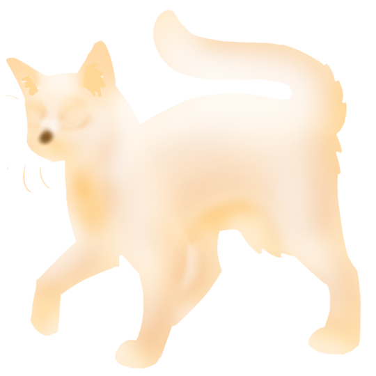
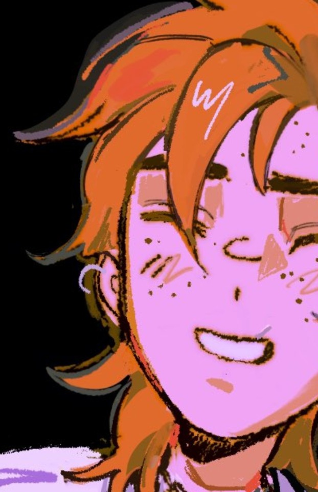
here's what the individual layers for tabby shading 2 & 3 look like, they're pretty much just orangey colour airbrushed onto the undersides with a more white colour around the toes, muzzle, around the eyes etc. the majority of it is something like 40-60% opacity
this is layered on top of the base colour to make the complete gradient, so make sure you test out how it looks on every colour
#honestly I should redo them they're really janky on chocolate/cinnamon due to me not thinking/testing hard enough when I was making them LOL#would also like to reorganize that section in general#to be named agouti instead of tabby shading#I'm just lazy about it because then I'd have to rewrite the tutorials too lol
19 notes
·
View notes
Text


Doing random stuff with my color changing brush. Most of the birds I drew are real, look up Brandt's Cormorant, California Quail, and Cedar Waxwing. And I'm improving with water droplets, yay! I'm terrible with digital art, I know, but at least I'm improving.
#my art#doodles#digital art#random stuff#practice makes progress#birds#quail#cormorant#leaves#rain#nature#why do so many species of cormorant have the most beautiful eyes?#neotropic cormorant has the most beautiful blue-green eyes#man i miss birding#i'm too lazy to look up art tutorials#even though they would be useful
7 notes
·
View notes
Text
lately it's been me and the edeka salad bar against the world
#i'm always too lazy to make lunch for work and i need sth to keep my energy up during the afternoon tutorials i have been cursed with#those falafel balls and the feta make sure i don't fall asleep in class
5 notes
·
View notes
Text
How to take screenshots and edit (when it's just not your thing)

Alright-y!
So, I have over the years learned how to use reshade and to edit my pictures. I am really not a natural on these things, so this is very much to help others who are as aesthetically challenged as I am. I have to have certain "rules" to follow, because I can rarely just see if a picture will turn out well or not.
We all need to realize where I started. We're talking using FRAPS to take screenshots and then running holy colours batman! to get some sort of effect.
Now, I'm not one to buy fancy stuff and to pirate certain programs isn't really my thing either. So we mend and make do!
Also, I am by far very good at taking screenshots and edit, but I have learned things and hope that it might be useful for someone!
A word on light
One thing I've learned is to work with is light. Where the light is is where the focus will go. This doesn't mean that a person has to be in the spotlight, but if they aren't - try to make that a more conscious choice. I am no pro at this, but I have to say that some of my favorite screenshots are where the light is just good. It focuses the eye or it just give a vibe.


(and yes, for some reason all of my faves are of Agnes, which is a bit annoying since Amanda is my fav-character, lol)
This is also where reLight comes in handy. Yes, it's behind a paywall but there are ways that you will have to figure out yourself.
Great tutorial here on reLight by @pictureamoebae! (if you want to really understand reshade, do check out their tumblr. So many helpful tips and tricks!)


Posing
Posing is fun! I don't fully story-tell with my sims, most of it is gameplay. But I do like to pose for family pictures or to enhance something that is going on.
What you need is Andrew's Pose Player and Teleport Any Sim or Wicked Whims.
Now, I haven't figured out how to use WW for children and younger to pose, so I use both. And I like @ts4-poses to find poses. Eventually, you'll find your favorite creators and can follow them directly.


Angles and vibes
Here's a trick. Work with angles. I am a master of pictures with zero vibe, just a face. Those can be ok, and sometimes that's what you have - but try to angle your shot a little.
Or add clutter, focus on that and let something out of focus happen in the background.
Or just go higher, take the screenshot from above.
Or don't focus on your sim at all, focus on something else that adds to the story/post.


Take the screenshot
The light is good, the angle great, the poses are in place and now, we need to take the actual screenshots.
I am a huge fan of reshade, I use version 4.9.1 because that works for me and the presets I use. No need to update reshade unless it becomes too old.
It can be really difficult to to find a preset that you like. I mostly use birdie by @monasims, tawhay by @windslar and paperbacks by @literalite. But I have tried many.
I like this youtube-tutorial on how to make your own preset, which also helps if you wish to modify one that you've downloaded. I do always recommend learning how to use ADOF and CinematicDOF to help focus the image on what you want to capture. I also strongly recommend @pictureamoebae's Foundation.
To take pictures, use the tab-key to leave the UI behind and use Q and E to go down/up in your game and then the mouse to angle. I use print-screen to take my screenshot, but that's something you set up when installing reshade so that's different for everyone.
And now you have your screenshot and it's time to open an editing program. Cheap as I am, I open GIMP.
Let's edit!
I don't use many steps. Since I can't use fancy photoshop actions I have to make all the steps by myself and well - I am human and therefor lazy.
Resize and start to think of a post
First things first. I cut my pictures to work for the tumblr ratio. I actually don't resize them smaller anymore - because when I change layout on my tumblr I just feel as if it messes it up. Now, I don't have a huge screen and my screenshots aren't massive, so it's not necessary either.
My images will be 1017x1017, 1525 x 1017 or 678 x 1017.
Once this is done, I also try to look at how they will go together. If I want a post of just squares I need to have an even number of images. Sometimes I want a landscape image as a sort of heading, or one in the middle with squares around it. It depends on what I want to convey.
This is by no means something that comes natural to me - I am aesthetically challenged after all. Sometimes, I just have 5 images and have to make do.

Resized
Topaz Clean
Yup, it's awesome. No, it doesn't come with GIMP. Yes, there are ways to work around this. You will have to find those ways on your own.
But I have to say, it does makes wonder for the images. I have completely stolen @sojutrait 's settings because I really like her style and therefor - I copy. I have added a bit more sharpening, but otherwise it's completely hers.

Topaz Clean:ed
Curves
Curves my beloved! I use curves for two things! Take out the yellow (aka increase the blue) and to brighten/darken the image!
I do sometimes matte the image too and here's a good tutorial for GIMP users on how to use curves in GIMP (for a matte look)

Less yellow/more blue

Brighten the brights (but I did not brighten the darker parts)
Layers, curves and increase the light where needed
Now, remember that we need light? Sometimes, a screenshot just doesn't have the right light. So I duplicate the layer, use the free marking tool around what I wish was brighter and put that on a new layer.
Then I use curves to lighten the layer with what I want to brighten and to make darker the layer with what I want to put less focus on (here's an ok youtube video on the subject).
Below, you can see the effect on my images.


Sharpen
Pretty basic. I subtly sharpen the image again. Even if I use the sharpening in topaz clean I do like to add an extra touch before it's time to save and move on.

So sharp!
PSD and UI
I do like to use psd's now and then. I mainly use @windslar's psd-collections and @deathbypufferfish's Build-a-Sim Icon Pack.
It's mostly to help give some info about the post or when my sims age up and I want to show their traits.
I do use the UI-info sometimes. If I do, I go into Game Options in the game > Accessibility > UI-scale and just drag that up a bit. Then I copy/paste that part onto the image I'm using.


Done!
That's pretty much it. Thing is, to post good edits you have to actually take good screenshots. As annoying as it is, it's like cooking: it all comes down to the ingredients. I hate cooking Yes, editing does help but I think my main journey has been to learn to take better screenshots from the start.
The picture below is from resized to done.
Hope this might help someone! I will probably learn more and more as I continue to post, but this is where I am so far in my journey!
151 notes
·
View notes
Text
ask from over on cohost that i wanted to crosspost over here!!
hi!!! i'm assuuuuming you're talking about the effect in this one?

i'm using something called parallax mapping!! i know most people know what parallax is and how it works in the realworld but im just gonna demonstrate it real quick just so i dont have to keep going "ok now imagine how parallax works"
so imagine you have two windows. in the middle of the window on the left, there is an Orb. it is directly in the middle of the window. the window on the right also has an Orb, but this one is pushed backwards outside the window quite a bit. now if you look at the two windows, and turn them, you get this:
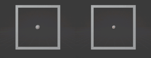
for the first window, the Orb stays basically in the center of the window. but in the second window, if you turn the window right, the Orb "looks like" it's moving left
parallax mapping is essentially taking this assumption, that if you change the angle you are looking at an object, the further away an object is, the more it will move in the opposite direction. i will spare you on the matrix math involved but you can get the exact relation you need by getting the Tangent Space View Direction. you dont need to understand the math behind this to use it
so, lets go back to the window example, how would you make the same effect, but with just this 2d texture of the Orb?

what if, whenever the object it was attached to turned right, you just moved the texture to the left, by X amount, where X is how far into the window the orb is. you would essentially be cheating god and "faking" the parallax. it would look like it's moving like it's far out of the window, but really, it's still a 2d texture. it would look like this:
i was too lazy to make the shader and record another gif but i dont need to because functionally it would look almost identical because when you turn it right the Orb moves left
again, you can just Know the right direction to push the texture in based on the current angle by getting the Tangent Space View Direction. ok another example. what if you had a black and white noise texture, like this
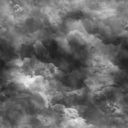
now what would happen if, instead of moving the whole texture X amount. you moved each pixel a proportional amount based on how bright it is. a 100% black pixel would not get moved at all, and a 100% white pixel would get moved the furthest along the Tangent Space View Direction. a pixel thats right down the middle would move half that distance etc etc. well it would look something like this!!!
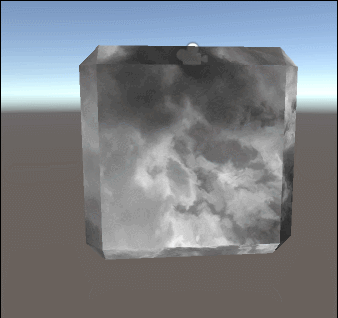
thaaat's the basics behind it!!! it's also used for effects like faking room interiors through windows with just a 2d texture in biig cityskapes and the like

you can see how the cube example looks kind of like an ice cube with the distortion, that's Not intentional and how parallax mapping artifacts. i do not care about it, because i make crystals. but some people do care about it, so you can use parallax occlusion mapping, which is like parallax mapping but a step up
here's some more reads on it if you are interested!!! https://simonschreibt.de/gat/windows-ac-row-ininite/ https://www.patreon.com/posts/playing-with-29753575 https://catlikecoding.com/unity/tutorials/rendering/part-20/ https://halisavakis.com/my-take-on-shaders-parallax-effect-part-i/
903 notes
·
View notes
Text
Ok! I've finally decided to put together a (somewhat) comprehensive tutorial on my latest art~
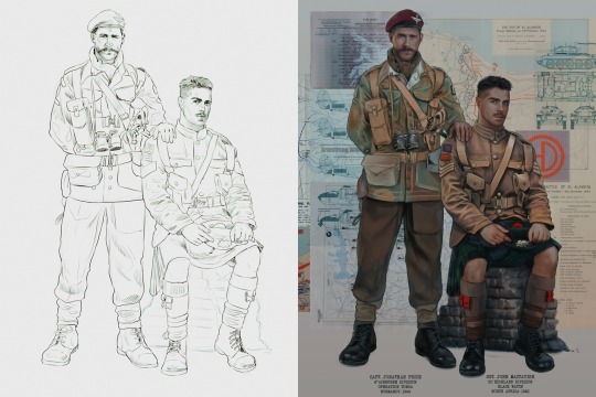
Please enjoy this little step-by-step 💁♀️
First things first--references!
Now I'm not saying you have to go overboard, but I always find that this is a crucial starting point in any art piece I intend on making. Especially if you're a detail freak like me and want to make it as realistic as possible 🙃
As such, your web browser should look like this at any given point:

Since this is a historical piece, it means hours upon hours of meaningless research just to see what color the socks are, but...again. that isn't, strictly, necessary 😅
Once I've compiled all my lovely ref pics, I usually dump them into a big-ass collage ⬇️
(I will end up not using half of these, alas :'D)
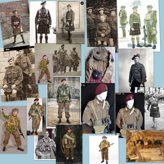
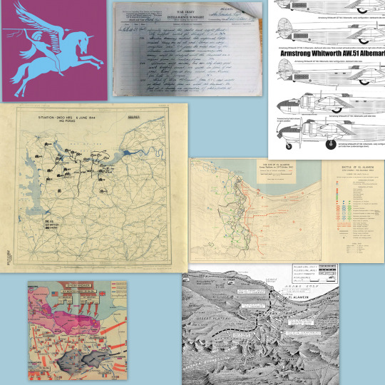
Another reference search for background material, and getting to showcase our models of choice for this occasion~
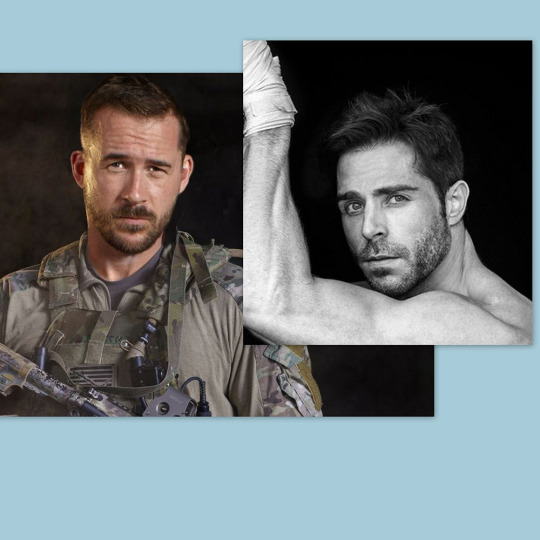
When picking a reference for an actor or model, the main thing I keep in mind (besides prettiness 🤭) is lighting and orientation. Because I already kinda know what pose I'm gonna go with for this piece, I can look for specific angles that might fit the criteria. I should mention that I am a reference hound, and my current COD actor ref folder looks like this:
Also keep in mind, if you're using a ref that you need to flip, make sure you adjust accordingly. This especially applies to clothing, as certain things like pants zippers and belt buckles can be quite specific ☝️
Now that we've spent countless hours googling, it's time to start with a rough sketch:
It doesn't have to be pretty, folks, just a basic guideline of where you want the figures to be.
The next step is to define it more, and I know this looks like that 'how to draw an owl' meme, but I promise--getting from the loose sketch above to below is not that difficult.
Things to keep in mind are--don't go too in-depth with the details, because things are still subject to change at this point. In terms of making a suitable anatomically-correct sketch, I would suggest lots of studying. This doesn't even have to be things like figure drawing, I genuinely look at people around me for inspiration all the time. Familiarize yourself with the human form, and things like weight, proportions, posing will seem a little more feasible.
It's also important at this stage to consider your composition. Remember to flip the canvas frequently to make sure you're not leaning to one side too often. I'm sure something can be said for the spiral fibonacci stuff, which I don't really try to do on purpose, but I think keeping things like symmetry and balance in mind is a good start ✌️
Next step is just blocking in the figures. Standard. No fuss 👍
Now onto the background!
It's frankly hilarious how many people thought I was *hand-drawing* these maps and stuff 😂😂 I cannot even begin to comprehend how insanely difficult that would be. So yeah, we're just taking the lazy copy and paste way out 🤙
I almost always prepare my backgrounds first, and this is mostly to get a general color scheme off the bat. For collage work, it's really just a matter of trial and error, sticking this here, slapping this there, etc. I like to futz around with different overlay options until I've found a nice arrangement. Advice for this is just--go nuts 🤷♀️
Next, I add a few color adjustments. I tend to make at least 2 colors pop in an art piece, and low and behold, they usually tend to be red and blue ❤️💙There's something about warm/cool vibes, idk man..
Now we move on to coloring the figures. This is just a basic block and fill, not really defining any of the details yet.
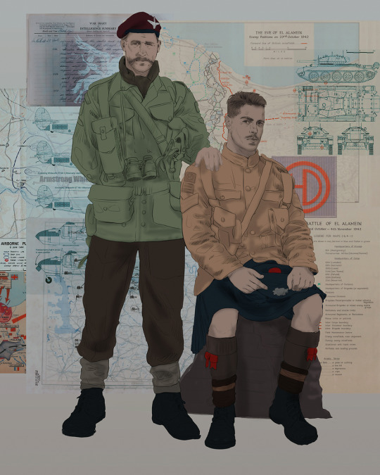
Next, we add some cursory values. Sloppy airbrush works fine, it'll look better soon I promise 🙏
And now--rendering!
I know a lot of beginner artists are intimidated by rendering, and I can totally understand why. It's just one of those things you have to commit to 💪
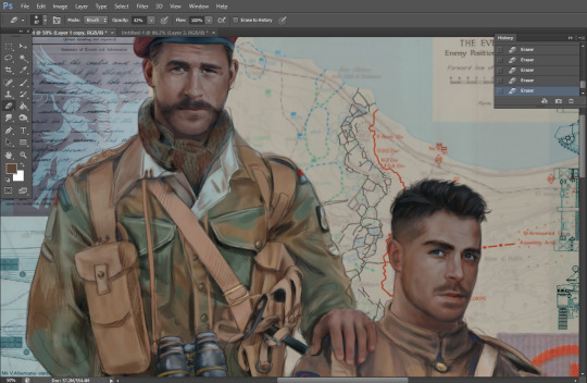
I've decided to show a brief process of rendering our dear Johnny's face here:
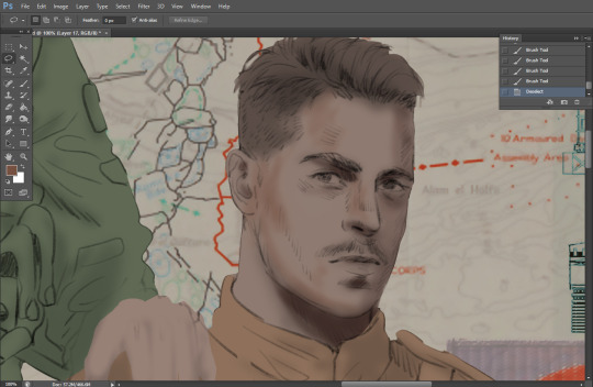
Starting off, I usually rely on the trusty airbrush just to get some color values going. Note--I've kept my sketch layer on top, but feel free to turn it on and off as you work, so as to not be too bound to the sketch. For now, it's just a guideline.
This next stage may look like a huge jump, but it's really just adding more to the foundation. I try to think of it like putting on make-up in a way~ Adding contours, accentuating highlights. This is also where I start adding in more saturation, especially around areas such as ears, nose and lips. Still a bit fuzzy at this point, but that's why we keep adding to it 💪
A boy has appeared! See--now I've removed most of the line layer, and it holds up on its own. I'll admit that in order to achieve this realistic style, you'll need lots and lots of practice and skill, which shouldn't be discouraging! Just motivate yourself with the prospect of getting to look at pretty men for countless hours 🙆♀️
I'll probably do a more in-depth explanation about rendering at some point, but let's keep this rolling~
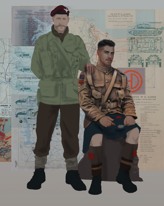
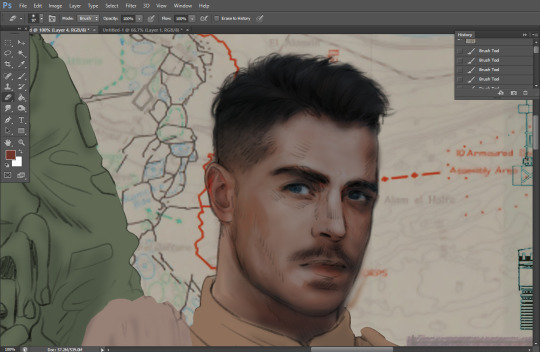
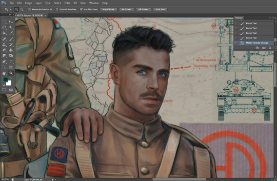
Moving forward is just a process of adding to the figures bit by bit. I do lean towards filling in each section from top to bottom, but you can feel free to pop around to certain parts that appeal to you more. I almost always do the faces first though, because if they end up sucking, I feel less guilty about scrapping it 😂 But no--I think he's pretty enough to proceed 😚
They're coming together now 🙆♀️ Another helpful tip--make sure you reuse color. By that, I mean--try to incorporate various colors throughout your piece, using the eyedropper tool to keep a consistent palette. I try to put in bits of red and blue where I can
Here they are fully rendered! Notice I've made a few subtle changes from the sketch, like adjusting the belt buckles because I made a mistake 😬 Hence why you shouldn't put too much stock in your initial sketch~
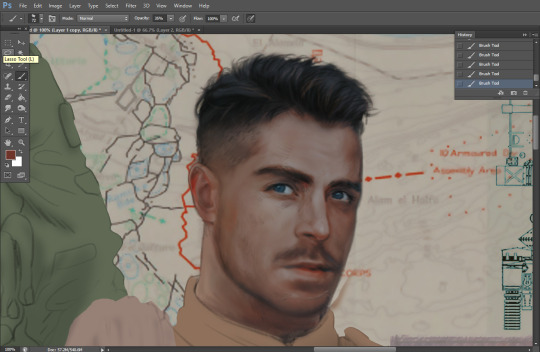
The next step is more of a stylistic choice, but I usually go over everything with an outline, typically in a bright color like green. Occasionally, I can just use my initial line layer, but for this, I've made a brand new, cleaner line 👍
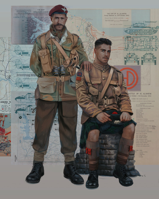
And the final step is adjusting the color and adding some text:
Tada!! It's done!
All in all, this took me the better part of a week, but I have a lot of free time, so yeah ✌️
I hope you appreciated that little walkthrough~ I know people have been asking me how I do my art, but the truth is--I usually have no clue how to explain myself 😅 So have this half-assed tutorial~
As a bonus, here is a cute (cursed) image of Johnny without his mustache:
A baby, a literal infant child !!! who put this wee bairn on the front lines ??! 😭
Anyway! peace out ✌️
#tutorial#my art#art tutorial#since people have been asking#I remembered to save my process from this latest work~#enjoy 🙆♀️
1K notes
·
View notes
Note
Hi, could you please tell me how to do this slanted layout? the-borgias*tumblr*com/post/695485491217334272/one-chicago-appreciation-week-day-one-favorite
Hi, Anon! I'm sorry this took me a few days to answer but I struggled making this tutorial (not because the process itself is difficult but it is difficult to explain it properly.) Anyway, here's the gifset Anon is asking about. I hope this is easy to understand and I also included a .psd file of the layout :)

PSD FILE OF THE GIF ABOVE & TEMPLATE
What you'll need:
Basic Photoshop knowledge (I use Photoshop 2023)
Basic knowledge on how to make layouts (here are a couple of tutorials: x x)
Basic knowledge about layer masks (tutorial)
STEP 1: Make a basic layout
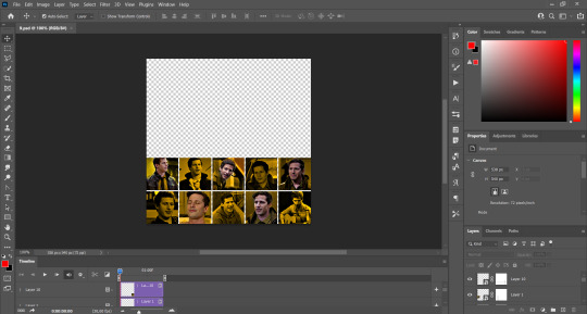
You can do pretty much any layout you want but for the sake of the tutorial I tried to recreate the same template I used in that gifset. I'm assuming you already know how layouts/templates work so I created a 540x540px canvas and went to View > Guides > New guide layout. I used these settings:

And this is how my canvas looked like:

Now I pressed (M) to use the Rectangular Marquee tool and create the rectangles I wanted. This is my end result:

STEP 2: Tilt the layout
This is actually pretty easy. First we're going to select all our layers. I paired mine in groups so they looked like this:

Once we've selected all of them (groups, layers, whatever you're working with) press Ctrl + T. Your canvas should look like this:

And we're going to tilt it by changing the angle to -2.00 in here:

Now our layout is slanted! But as you can see we have transparent spaces we need to fill. I don't know if this is the easier method to do it but I use the Polygonal Lasso tool (L). I'll use the first orange box as an example:

As you can see I use a ridiculously big zoom so I can be as accurate as possible but it's basically impossible to create a perfect box, so this will work. Once we have selected our desired shape we'll use the Brush tool (B) to paint in the layer of our original orange box:

You have to do this with every box so it's a bit tedious but that's the way I did it 🤷♀️ This is the end result:

STEP 3: Place the gifs (using Layer Masks)
But now, how do I know which size my gif should be? Our initial measures won't work because our final boxes are bigger so here's what I do. I'll select the Polygonal lasso tool again and make sure I select a little bit more of the box I'm measuring, like this:

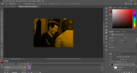
It's a little hard to see it but the dots are just a little bit bigger than the orange shape. To be more accurate, my original box was 178x87px and the shape I selected is 174x100px. So I'm going to make a 174x100px gif and place it right above the background, like this:

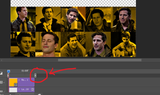
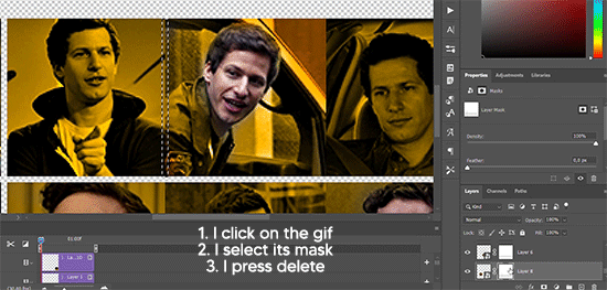
Now we're going to select the layers of our gif (I'm assuming you're working with a Group because it's easier) and click Ctrl + the orange box. You should see this in your canvas:

And now create a layer mask in your gif group (if you don't know how to do it check out the tutorials I liked at the start of the post.)

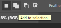
Now you can delete the orange box. And, once again, you have to do this with every box and write down the measures (and remember that all your gifs must to have the same number of screencaps!)
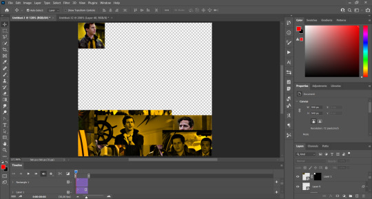
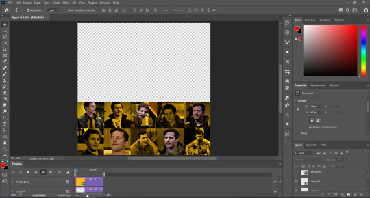
I hope y'all don't mind that I didn't create 8 different gifs lmao I was too lazy so I just used a big gif as a background and made 4 small gifs. This my end result:

For the background I merged the remaining boxes and used that to create the layer mask. I'm not going to explain it since I believe it's much easier if you check out the psd file.
And that's pretty much it! It's the same as making a standard layout you just have to be careful with your gif measures. Oh and also see how my gifset shows those white marks between the gifs under a dark background?

Well, that can't be avoided since we aren't working with straight lines (you can see the same effect in the 2nd gif of this set, different layout but also not straight lines) so we'll just ignore them.
I hope this was helpful (I lowkey feel like this tutorial is a mess) and if you have any questions feel free to ask :)
#ps tag#tutorial#resources#usershreyu#userelio#userhella#alielook#userabs#useraish#uservivaldi#tuserju#tuseruta#tuserhol#tusermels#userroza#quicklings#userbunneis#userhann#tusermona#usertj#userbuckleys#usertina#useralien#userchibi#userrobin#larlies#tuserheidi
241 notes
·
View notes
Note
could you share how you paint hair and skin? your art is so nice to look at
thank you so much!
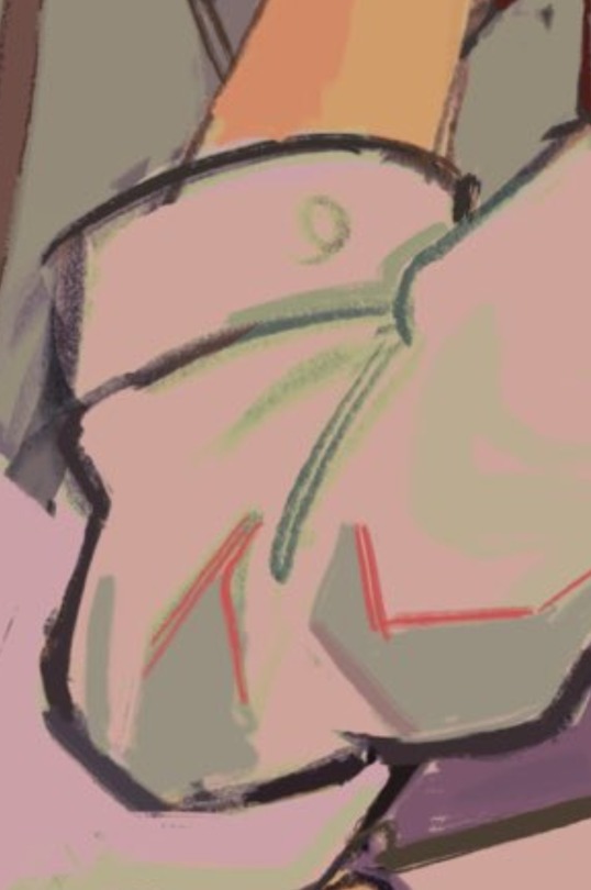
maybe one day I'll make a more detailed post with screenshots as I render... but honestly my painting process is really pretty simple. I usually use a textured brush or something with hue jitter turned up 1-2% to put down base colours, and then I go in with a medium hard airbrush for shadows and for adding warmer colours where blood flows (nose, ears, cheek, around mouth sometimes, eyes).
after that i merge all my layers and basically draw on top of everything. bunch of refining details and texture and LOTS of cross hatching. hatching is a really good way to transition between colours i find!!
(another tip I use for skin rendering is adding gradients within shadows, anddd ofc I add hatching when I do that too)
I wish I could offer more technical advice but I really don't know what I'm doing in the slightest I just throw colours on there and hope for the best😭 I guess other good things to keep in mind for skin are the planes of the face (im rly bad at this one, but basically just look up planes of the face on pinterest and use that as a guide for shadows and form) as well as hard vs soft shadows!!
im also. Not good at this one. So don't take my word for it but i guess it's good to have a variety of shadows that end harshly vs shadows that are softer and blend in more? if that makes sense? you just need to think about 1. what is casting my shadow 2. what is it being cast on (or idk maybe its not. that's just kinda what I do) and render from there!
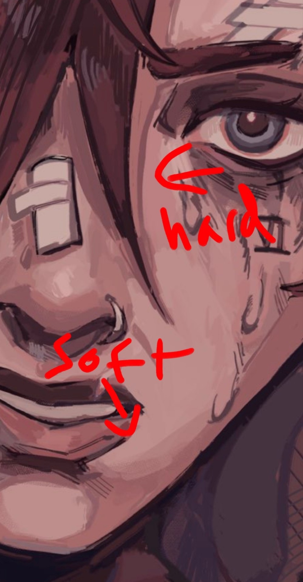
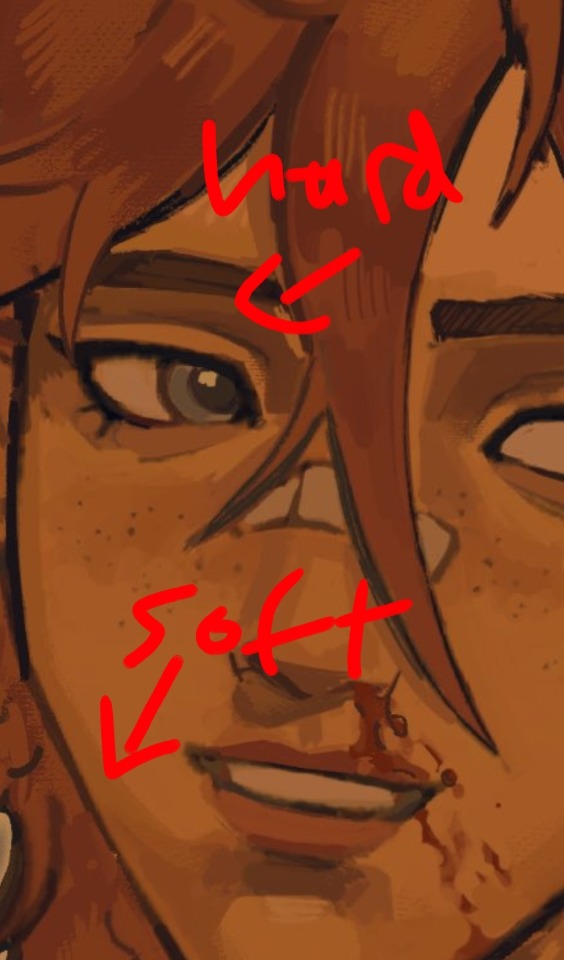
I like to outline my harsher shadows but thats rly just cause I love to outline everything. OOH THATS ANOTHER THING. use harmonious colours and outline shit it looks soooo good.
i do that shit all the time.Like don't be shy about grabbing colours that don't make sense being in your drawing. it's a drawing who gaf if vi arcane's hair is outlined in turquoise. NOBODY! and it looks fire!
for hair I just bullshit it and add hatching I really don't have a clue how to draw hair. I guess figure out where the hair strands are coming from and then draw them coming out from there (This is some real expert advice here damn) and then add shadows underneath the hair tuft clump things ?? no clue. someone make a tutorial for me im kinda the one that needs it in this situation.
uh I hope that helped at all!! Please watch YouTube videos and stuff by actual professionals take everything I say with a grain of salt because seriously I don't know how to do any of this I probably should study art more but I am LAZY
#art#digital art#art tutorial#painting tips#digital painting#art tips#tutorial#artist#ask#art advice
124 notes
·
View notes
Text
Ace Trappola Shared Lines

Tutorial: Let's get goin'!
Level Up 1: Woah, that's felt pretty good!
Level Up 2 / Buddy Level Up: Yay, level up ♪
Level Up 3: I gotta surpass all the others even more.
Level Max: Yo, this feels awesome. I bet even helping a certain magicless someone'll be easier at this rate.
Vignette Level Up: Hahah, guess things like this can happen time to time. I always thought your type wasn't really my bag, but maaaybe it is. Not!
Spell Level Up: Think I could take on the Housewarden with this power? ...Ack, what I said stays between us ♪
Friendship Level Up: Looks like a pretty snazzy room, but I bet you’ve just swept all the trash under the furniture! …I’m kidding, I’m not gonna go look for any, so don’t kick me out!
Friendship Level Max: Hey, can I put something in this guest room, too? I bet I’ll be coming around a lot more often, and it’s a pretty big room, so I can have a little space, right?
Uncapped: Ehhh, don'tcha think you're putting too much on my shoulders? ...Well, whatever. Guess I'll just have to keep on doin' my best!
Groovification: I'm gonna keep on showing you how cool I can be, so keep on watching.
Lesson Select 1: Which class are ya taking? Hurry and choose one already. Doesn't matter to me, I can sleep through any one of them.
Lesson Select 2: Look atcha, all excited... Ah, right, fine, I'm coming! You don't need to pull that hard.
Lesson Select 3: Make sure you're keepin' an eye on Grim between classes, too, Prefect. He was gettin' a scolding from the professor for trying to run off again the other day.
Lesson Start: Let's get this done fast.
Lesson Finish: Doneee! Augh, I'm sleepy.
Battle Start: Okay, I’ll get this done fast.
Battle Won: No excuses, it’s my win.
Trouble 1: Whaaat, you’re gonna take their side over me?
Trouble 2: …Yeah, you’re right, I got a little heated there. My bad.
GIFT CALENDAR 2023: “How will you be spending the day?” Today? Well, it’s snowing outside, and I got no club practice, so maybe I’ll check out on my streaming service a movie or show that catches my eye. I can stay warm and cozy in my room, all while munching on some snacks. Don'tcha think we deserve lazy days like this sometimes?
Birthday Login Message 1: Hey, Prefect. Do you know what today is? Today is not an Unbirthday… It’s Ace-kun’s birthday! That means I’m the star. I wonder what I should have you do for me.
Birthday Login Message 2: Hey, Prefect. Don’t you have something to say to me? …The quiz? Aah, the magical history one. I already said I studied for it. …The cafeteria’s new menu? Yeah, that looked so good, didn’t it? I mean, hey! …Oh, what, you did remember. C'mon, aren’t you supposed to say Happy Birthday first thing? Well anyway, thanks!
Birthday Login Message 3: You came to celebrate me? …My birthday is tomorrow, y'know. Aren’t you a bit early? …Pfft, I totally gotcha! I’m just kidding. Did you get all panicky 'cause you thought you got the wrong date? Ahaha, my bad! Thanks for remembering my birthday.
Birthday Login Message 4: Oh, and here you are. You came to celebrate my birthday, right? That’s totally obvious. I wonder what I should ask you to do for my birthday~ …Ah, I feel like eating at a restaurant I’ve never gone to before. Don’t worry, I won’t pick a place that’s way too expensive or anything. Let’s just enjoy ourselves in a restaurant where we don’t need to mind any rules or manners.
Birthday Login Message 5: Oh hey, did you come to celebrate my birthday? Nice timing, we just finished morning basketball practice! My clubmates all wished me a happy birthday, too. Jamil-senpai said it as soon as he saw me, and by some miracle, Floyd-senpai gave me a very normal birthday greeting. I’m sure glad he was in a good mood~ Oh, hey. We should hit the Mystery Shop between classes. …Hm? Why’re you tensin’ up? Huuuh? C'mon, I didn’t say nothing about treating me, now diiid I? Hehe, see you later~

Requested by Anonymous.
#twisted wonderland#twst#ace trappola#twst ace#twst translation#mention: grim#mention: yuu#mention: jamil#mention: floyd#mention: riddle
126 notes
·
View notes
Text

GRID + TORN PAPER + RAINBOW LAYOUT TUTORIAL (yeah, i'm sorry, but that is the title i came up with)
Hi everyone! This tutorial was requested by an anon, and we're going to make a gifset like this. You need, as usual, basic gifmaking skills and basic photoshop knowledge, but i'll try to explain this as easily as possible!
You'll also need a torn paper brush, which you can download here.
And here are the links to download the fonts used in my gifset: x, x
Okay let's start!
→ First you're going to create a new canvas, and it will be 540x540 px. Make sure to click on create video timeline (if you dont have a timeline, go to window > timeline. We'll leave this canvas there waiting for us :)

Then, onto our first gif. We're going to make the small square gifs first. All i do is resize the image and make it 120 px high, and you'll see why in a moment.
Make sure to remember the number of frames of this gif!! All the gifs we're going to put in the same canvas should have the same amount of frames.
Okay, so we have our first small gif:
As you can see it's a smart object, and I added some brightness, but so far that's all. You can sharpen it, but i like to sharpen until i've colored it. Now onto the important part:
Most of the gifs i worked with were mostly blue (aside from the skin color), which is recommendable, because you can create lots of colors starting from blue, using the hue/saturation adjustment, or camera raw filter. I also recommend you to use a gif that doesn't move a lot, so it'll be easier to color the background:
For the tutorial, we have our predominantly blue gif, but we are going to make it yellow, which is the opposite color, so it's the hardest to get. I hope you can see how i manipulate colors, and do it yourself :)
Here, you can use camera raw filter (filter > camera raw filter) to turn the blues and purples greener, like this:
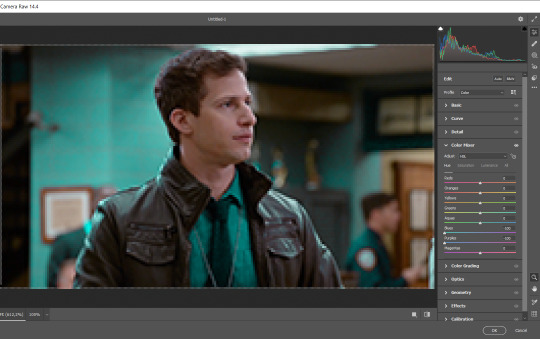
And click ok to exit the camera raw filter. Then, we're going to use hue/saturation (image > adjustments > hue/saturation) to turn it yellow:

Since it was cyan, i changed the cyans, but if you got a much greener result you'll have to use green (duh, right? i dont know i just dont want anyone to get confused akjsdhs)
And you can also add a selective color adjustment to make those yellows more yellow:

The reason i don't directly use hue/saturation is cause it might look ugly and lose quality, or it wont pick up all the colors i want it to but they're also very small gifs so if you wanna do that, do it :)
I sharpen it until this point, but if you already have that's okay.
Now we're going to color the background! For that, you just add a new layer, and set the blending mode to color.
Then you'll use your brush, set it to 20px and 0% hardness, and pick the color you're using for this gif, you can use the eyedropper tool. This is why it's important that the gif doesn't move a lot, so you can color the bg like this:
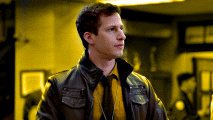
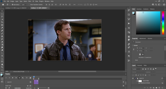
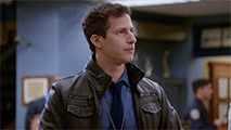
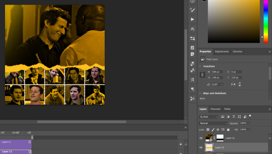
I colored carefully around the edges, and that's the result. In some gifs from my gif set I colored Jake's jacket too because i was too lazy, but this looks cleaner :)
You might want to select the color layer and the gif layer to convert them both to a smart object, just to make everything easier. So, be careful, because after that you won't be able to change anything!
But let's say you have a scene that you want to include, and it moves too much and has no blue and it's going to be a nightmare to color it.
Well, don't worry, you can! Simply, instead of manually coloring everything, you can just choose to add a gradient map to it (image > adjustments > gradient map), like this:
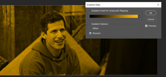
And this is the result:

Just remember, it has to be the same amount of frames as the other ones!
You repeat the process, until you have 10 small gifs. I made around 5 manually colored gifs, and 5 gifs with gradient for each gif. That's a confusing sentence but i hope you get it.
We are going to start pasting the small gifs on our first canvas.
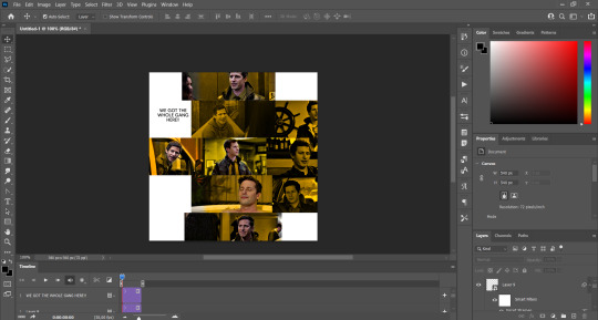
(You can paste them one by one but i did this so you can see my 10 gifs)
You're going to create a square that has to be 108x108 px, using the rectangle tool. You can remove the default white background.

And you may be wondering, why did we not just crop the small gifs into those dimensions? Well, you can do that, but to me it's much easier this way, because sometimes cropping isn't accurate, or it's tedious.
Place the small square on top the gif you're going to crop, right where the face of the character is (or whatever objects you're giffing), and while holding ctrl, click on the square. It will select it:

You're going to create a layer mask:

And then drag that layer mask to the gif:

And voila! It's now the same size as the small square. Once that's done, right click on the layer and convert it to a smart object, because we have to remove that mask. Make the square layer invisible, and start placing your gifs where you want them:
You're going to repeat that process with the rest of the gifs, and then place them all together. Don't forget that if you're making the first gif, they will all be at the bottom of the canvas, if it's one of the middle gifs, one row should be at the top and the other one at the bottom, and when you're making the last gif, they should all be at the top. Here we're making the first one, so they will all be at the bottom:
If you forgot to check that all the gifs had the same amount of frames, you can fix it here, just make sure no gif is past this little guy:
Okay! Now, to create the gutter, we're going to add a layer mask to each small gif, so that we can cut some of it.
The gutter has to be 4 pixels, (i recommend you to REALLY zoom in). What i do is make sure the width of the gutter takes 2 pixels from the edges of the gifs, since they are all together. As you can see in the image above, there's no a single empty pixel between the gifs.

This is a close-up of what i'm talking about. I select two pixels from each gif, and go all the way down to create the gutter:
(I hope I'm not over or underexplaining)
I usually use this tool when i have to make so many selections:
But that was just an example :)
(Another way you can do this, is by changing the size of the small square from the beginning and make it be 104x104 px, but i don't know why that seems more complicated to me ajsdks)
Anyway, this is what we have so far:
Now we're going to create the big gif. Its normal dimensions are usually around 1920x1080, unless you have different dimensions and have to crop it, but whatever it is, we're going to resize it and crop it to be around 550 px wide, and 400 px high:

We'll do the same thing of adding an adjustment of gradient to it to make it the color we're using. For this, i usually add a brightness layer before, because sometimes the gradient is a bit dark.
And using a 600px brush with 0% hardness, you can add some "light" on a new layer, like this:

Selecting all the layers, right-click on them and convert them to a smart object. Again, be careful, because once its a smart object, you wont be able to change any of it!
Then we paste our big gif on the canvas with small gifs, and add a layer mask to it. Using the torn paper brush at 600px, remove some of the gif to shape it like the torn paper. Make sure you're using black, otherwise it won't work correctly:
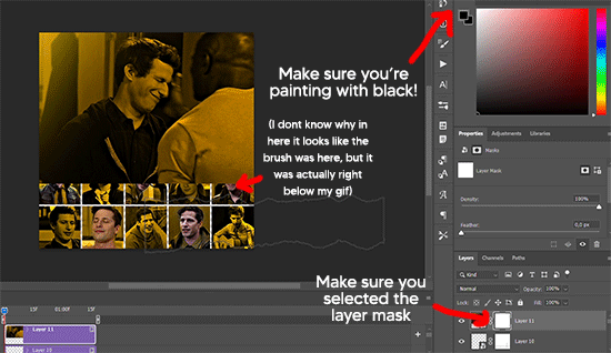
To make the effect better, add a layer UNDER the big gif, and using the torn paper brush, with the same size, you can paint under it:
Yeah, I covered some of jake's face, but that's how it supposed to look so the effect works!
And finally for the text! I used Granesta, at 150 px, and at -10.00º to make it a bit askew.
We're going to double click on it and give it a color overlay, set to normal, and give it a solid shadow if you want, then place it right here on the corner:
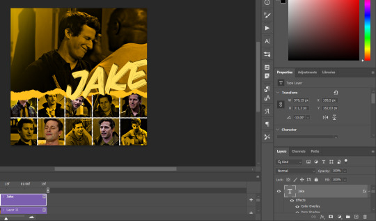
But as you can see, it's too big for the gif. So we're going to add a layer mask to it, and again, shape it the same way that we did with the gif. Make sure they're exactly the same shape, like this:

And that's it! This is our final result:

As always I'm sure there are easier ways to do many of these things, this is just how i do it but if you know an easier way to do it, go ahead. I hope this was at least understandable enough so you can apply the logic of it any way you want :)
If you have any questions you can send me an ask and i'll clarify!
If you found this helpful i'd really appreciate it if you left a tip on my ko-fi!
Happy giffing!
#will i ever learn how to properly explain things 😭#tutorials#uservivaldi#userraffa#userbuckleys#userhallie#tuserheidi#usertina#userfern#usersole#usercera#userzaynab#userisaiah#usernik#userpriyas#usertj
404 notes
·
View notes
Text
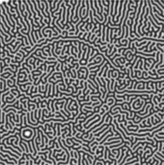
how to make cool blobby turing patterns in photoshop
i'll preface with i learned the basic loop from skimming a tutorial on youtube, but as someone who prefers written tutorials i'm sure many would appreciate one! also, the second part of this is some of the visual effects i figured out on my own using blending modes and stuff.
i'm using photoshop CS4 on a mac so some buttons and stuff might be in different places on windows and newer photoshop versions but all the actions are the same. my canvas is 1000x1000 pixels.
UPDATES (i'm hoping these'll show up whenever you open the readmore?)
it's possible to do something similar in krita using this plugin, made by the love @arcaedex
it's also possible to do this in photopea, a free browser alternative to photoshop! the results are pretty much identical.
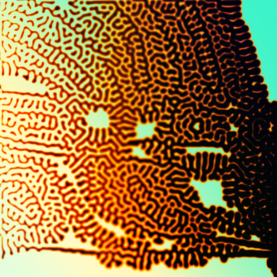
FIRST off you wanna get or make a black and white image of some kind. it has to be one layer. can be noise, a photo, a bunch of lines, whatever. here's mine, just some quick airbrush lines:

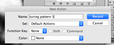
now find the actions tab. idk what it looks like in newer versions of photoshop but you probably won't need to dig!
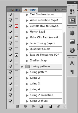
hit the little page thingy to make a new pattern. once you hit 'record', it'll record everything you do. the little square 'stop' icon will end it.
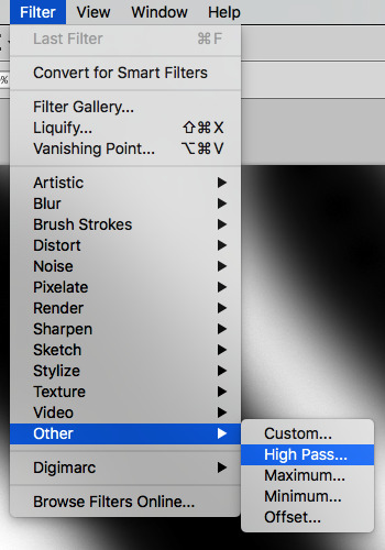
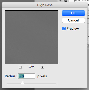
now you want to do a high pass filter. you can mess around with the radius to change the size of your squiggles, but the tutorial had it set to 6. experiment!
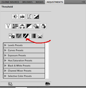
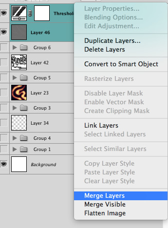
now add the 'threshold' adjustment layer. i use the adjustments tab but i think there's also a dropdown menu somewhere. keep it at the default, 128. merge it down. (control or command + E or you can right click it like some kind of weirdo)
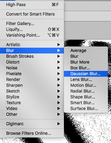
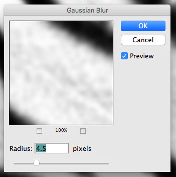
and finally, the gaussian blur! the radius of this affects the shape and size of your squiggles as well. i like to keep it around 4.5 but you can mess around with that too.
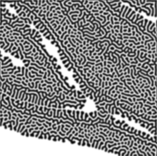
after that, hit 'stop' on the action you're recording, and then repeat it a bunch of times using the 'play' button, until you have something you like, like this:
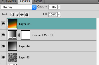
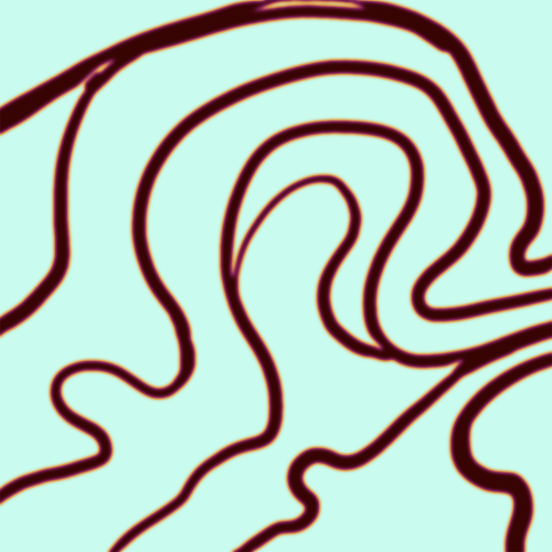
WOW!! that was fun!! and only a little tedious thanks to the power of macros. anyway, here's some fun layer blending stuff i like to do. it's with a different pattern cause i made this bit first.
anyway, using a black and white gradient (or a grey base that you do black and white airbrush on), make a layer with the vivid light. this will make the blobs look thicker or thinner.


then, for cool colors, do a gradient map adjustment layer over that:

and finally, my best friend, the overlay layer. just using a gradient here bc i'm lazy, but feel free to experiment with brushes, colors, and blending modes!

NOW GO. MAKE COOL SHIT WITH THE POWER OF MATH. AND SEND IT TO ME
also these are not hard and fast rules PLEASE mess around with them to see what kind of weird shit you can make. here's a gif. as you can see i added some random airblush blobs in the middle of it, for fun.
933 notes
·
View notes
Text
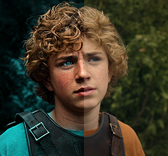
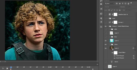
The silent art of gif making
The gif above has 32 layers plus 6 that aren't shown because this is part of a larger edit. I wanted to share it to give everyone a glimpse of the art of gif making and how long it usually takes for me to make something like this. This one took me about an hour and a half but only because I couldn't get the shade of blue right.
I use Adobe Photoshop 2021 and my computer doesn't have a large memory space (I don't know what to call it) so usually most of psds get deleted because I'm too lazy to get a hard drive. It doesn't really bother me that much because I like the art so when it's done, it's done. Off to somewhere else it goes.
Here are the layers:

Everything is neat and organized in folders because I like it that way. I prefer to edit it in timeline but others edit each frame. There's a layer not shown (Layer 4 is not visible) and it's the vector art. Here it is:
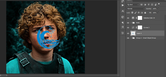
Now it is visible. I don't plan to make this a tutorial, but if you're interested I'd love to share a few tricks about it. I'm pretty new to the colors in gifmaking but the rest is simple to understand. Here, I just want to show how much work it takes to make it.
I opened Group 2 and here's the base gif. I already sharpened and sized it correctly but that's about it. Let's open the base coloring next.
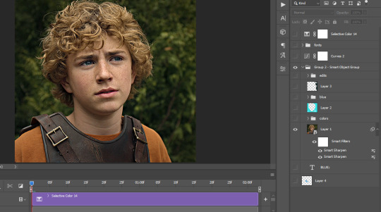
Yay! Now it looks pretty! The edits are in Portuguese but it doesn't matter. There's a silent art of adding layers depending on how you want the gif to look but you get used to it. The order matters and you can add multiple layers of the same thing (for eg. multiple layers of levels or curves or exposure).
This was pretty much my first experiment with coloring so I don't know what I'm doing (this happens a lot with any art form but gifmaking exceeds in DIYing your way to the finished product) but I didn't want to mess up his hair, that's why the blue color is like that. Blue is easy to work with because there's little on the skin (different from red and yellow but that's color theory). I painted the layers like that and put it on screen, now let's correct how the rest looks.
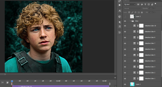
I was stuck trying to get the right teal shade of blue so yes, those are 10 layers of selective color mostly on cyan blue. We fixed his hair (yay!) we could've probably fixed the blue on his neck too but I was lazy. This is close to what I wanted so let's roll with that.
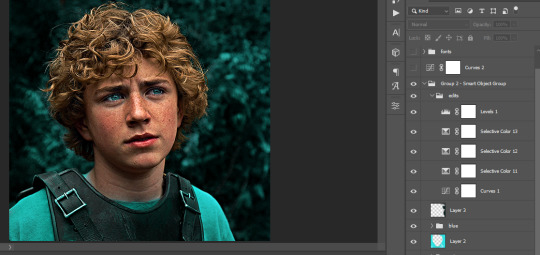
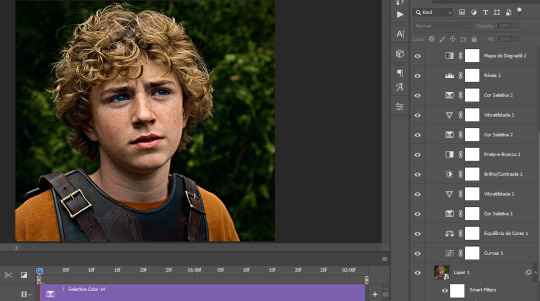
BUT I wanted his freckles to show, so let's edit a little bit more. Now his hair is more vibrant and his skin has red tones, which accentuates the blues and his eyes (exactly what I wanted!). That lost Layer 2 was me trying to fix some shadows in the background but in the end, it didn't make such a difference.
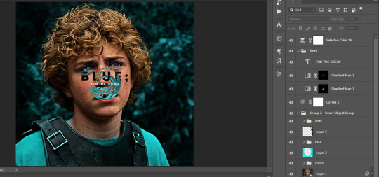
This was part of an edit, so let's add the graphics and also edit them so they're the right shade of blue and the correct size. A few gradient maps and a dozen font tests later, it appears to be done! Here it is:
Please reblog gifsets on tumblr. We gifmakers really enjoy doing what we do (otherwise we wouldn't be here) but it takes so long, you wouldn't imagine. Tumblr is the main website used for gif making and honestly, we have nowhere to go but share our art here. This was only to show how long it takes but if you're new and want to get into the art of gif making, there are a lot of really cool resource blogs in here. And my ask box is always open! Sending gifmakers all my love.
#gif making#gif tutorial#resources#completeresources#y'know what that post yesterday got me into this#i love creativity so i send all my love to gifmakers#this is HARD#my tutorials#tutorials
913 notes
·
View notes
Note
how do u draw teefers like that
okay sticking the rest of my explanation under the cut because it's long but woooo mini-tutorial for cartoony teeth by someone who doesn't know how to explain things hope you're ready
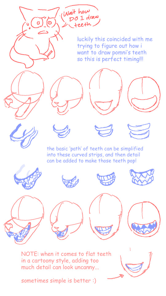


things that i was too lazy add in but i think are still important:
NEVER be afraid to use references... if you can't figure out what you want, and googling stuff doesn't help, you can even go make faces at yourself in a mirror for a minute.
if you're not drawing in a realistic style, know when to add detail and know when to skip it. you don't usually need to outline each individual tooth unless the focus is on the mouth itself or you're going for a creepy effect... see the uncanny comment in the first slide
okay that's it uhhhh remember i'm not a professional? i just draw silly guys for fun don't take this as law or anything!!! have fun with it!!
#this was very much an excuse to put my thoughts together before i try to draw pomni going apeshit#i'm used to drawing animal teeth so drawing sharp teeth in a flat face is throwing me off... like where they go if no muzzle#anyway i think i've mostly got it now? still gotta figure out how her jaw works but hopefully you can benefit from what i've got so far#my tutorials#my art#ask response#chompni
438 notes
·
View notes
Text
(alright take two—)
HAPPY (BELATED) ANNIVERSARY!!

I FINISHED WOOOOOO!!!
(like 11 hours later apparently, Donnie's hand killed me—)(and everyone else too I guess)
My wack sleep schedule attacked again but I'm done now (I hope, I always go back to edit erk)
Here's the no text version!
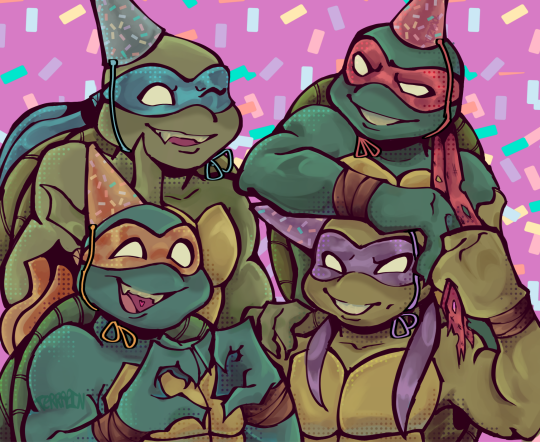
I'm actually really happy with this, love when I actually sit down for a while and draw something and it turns out nice (cause I actually work on it) but digital art is very hard. And I'm very lazy. I feel it's a bit wonky in places but I'm tired and I love it anyway.
I have more things planned, I wish I could get easier tutorials on making comics cause I never just jump into things without exhausting all my options cause ✨perfectionism✨ but I will make them cause If I don't they will take all the space I have in my brain. There's not much left so I must hurry.
Oh you're still here? Cool!
Here you go, sillied it a bit up for ya!
Anyway bye!
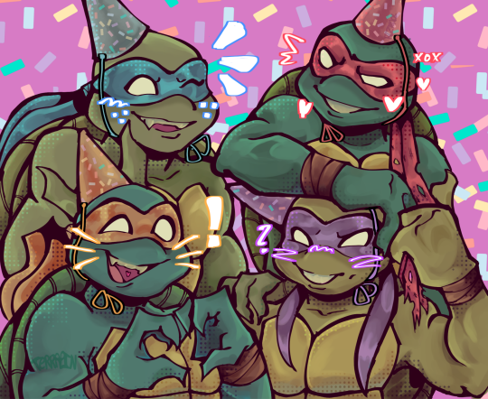
#tmnt#tmnt 2003#tmnt 2003 mikey#tmnt 2003 donnie#tmnt 2003 raph#tmnt 2003 leo#tmnt art#tmnt 2k3#tmnt anniversary#my art#my post#terrapin-posting#added ID!#hopefully good enough to describe it well#image description in alt
345 notes
·
View notes
Text
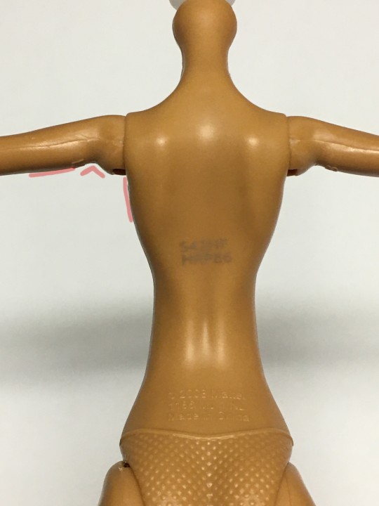
Tutorial: MH Creepro neck and Arm fix

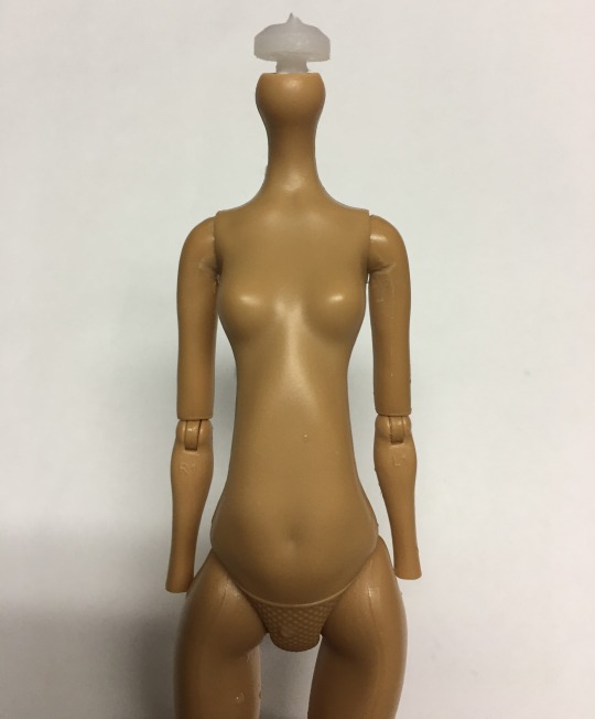
Posting this here because I keep getting questions about how I've been fixing my MH Creeproduction bodies to look a little less janky! Most people already have these techniques in their arsenal (and can definitely do a better job than me) but I keep getting questions on Twitter about how I manage to fix mine so I figure I'd just post a tut on Tumblr that I can link to lol This is an add-on to my previous post about the neck issue with both waves of Monster High Creeproductions in addition to another issue where the Creepro arms cannot lay flat against the sides of the body. Tutorial below!
Supplies Needed:
-Shitty creepro body
-Some sandpaper, I've been using 320 grit
-Boiling water We're going to start with the neck since that one is pretty quick.
This is the neck peg to start with, compared to an original G1 neck peg- the section we're concerned with is the circular peg right above the neck hole:

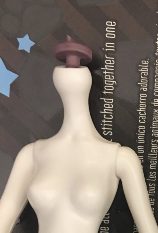
(Creepro on the left, original on the right) the Creeproduction peg is significantly thicker, which is causing the head to sit lower on the neck and cause the vinyl to deform. We're going to fix that by sanding the underside of the neck peg until it's much thinner, but not quite as thin as the originals (since original g1 dolls frequently have loose necks lol)
First you'll want to cut out a rectangle of sandpaper and fold it in half; this is both to make the sandpaper less flimsy and also because the folded edge is good for sanding nooks and crannies.

Now you're going to sand all around underside of the circular neck peg shown here, until that whole circular peg is thinner:
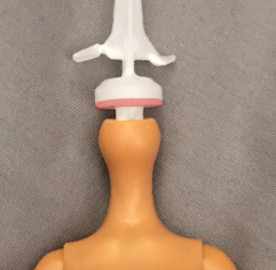
Make sure not to use the folded edge of the sandpaper for this part of the tutorial, we don't want to accidentally carve into the "stem" of the neck peg and cause it to snap. I like to sand off a bit, try the head on and then sand off a bit more if it's still not sitting as high as an original MH neck would. Make sure you're heating the heads prior to removal or you might break the neck peg. And also chop off that stupid hook on the top of the circular peg, it does nothing but cause misery lol This is typically what it looks like when I've sanded it as much as I need to for most dolls:

(after on the left, before on the right) Some characters have heads that sit much higher on the neck originally (like Spectra) so I'll sand off a lot more for them, but ymmv.
Now onto the body!
So, this is the Creeproduction body as-is:
This is the flattest I can get her arms to her sides. Some creepros can get them flatter, but not by much. Original G1 body arms already tend not to lay flat enough in my experience, but Creeproduction bodies are even worse lol We're going to fix that with sandpaper and boiling water! Provided below is an illustration of the general places that we are going to sand:

The notch under the ball joint of the arm, the area directly below the armpit and a tiny bit of the round area on the underside of the upper arm. We're going to sand a little off of each section.
For the notch in the arm, you're going to use the folded edge of the sandpaper to carve out the notch until it's a bit deeper than previously.
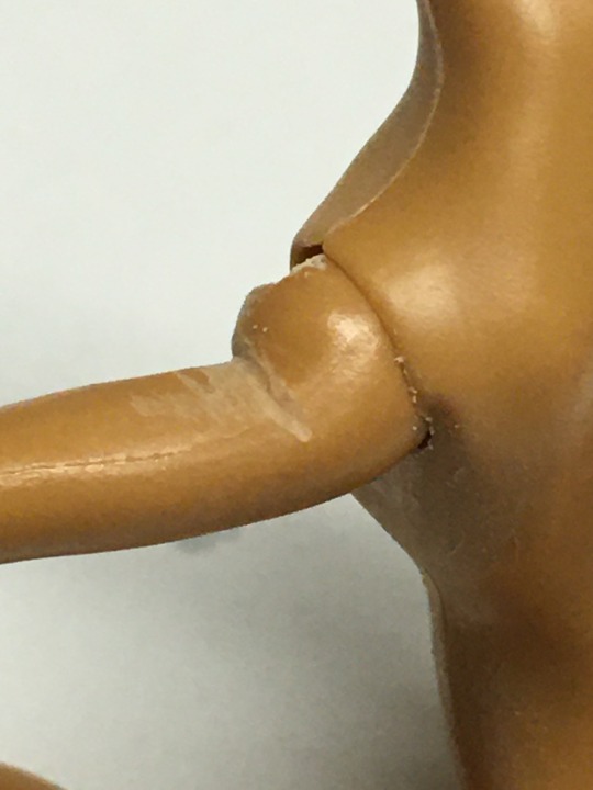
No, it's not pretty! Thank you for noticing lol
Next we're going to sand the armpit area, using the other edges of the sandpaper because we don't want to dig into the arm at all accidentally:


As well as this rounded area of the arm , not too much but enough to make it just a little flatter:
I left it raw to better show exactly where I'm sanding; most of the visible sand marks will disappear after washing but you can clean it up more with a finer sandpaper when you're done if you want. I'm just too lazy to do that lol
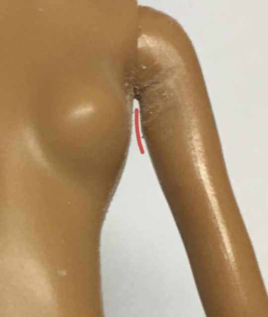
After all of that, your arm should sit more or less like the arm on the right (left unsanded for comparison)

Much better, but not quite there yet!
Modern G1 bodies have vinyl upper arms that are easy to manipulate with heat, so in order to get them as flat as possible we're doing to boil and reshape them. I like to boil my water in the microwave, and then dip the entire upper torso into the water until the arms are super pliable. At this point I will pull them out, pinch the arms right up against the body with my thumb and forefinger and then run them under the tap until they set. Your final result should look something like this:
And that's it! Hope that helps lol
Some shoddy before and after photos lol:


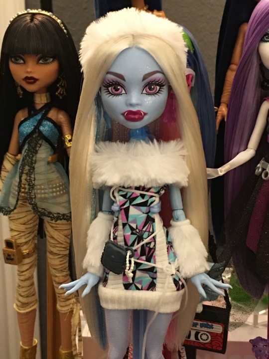


(Spectra was also rerooted lol)
157 notes
·
View notes
Text
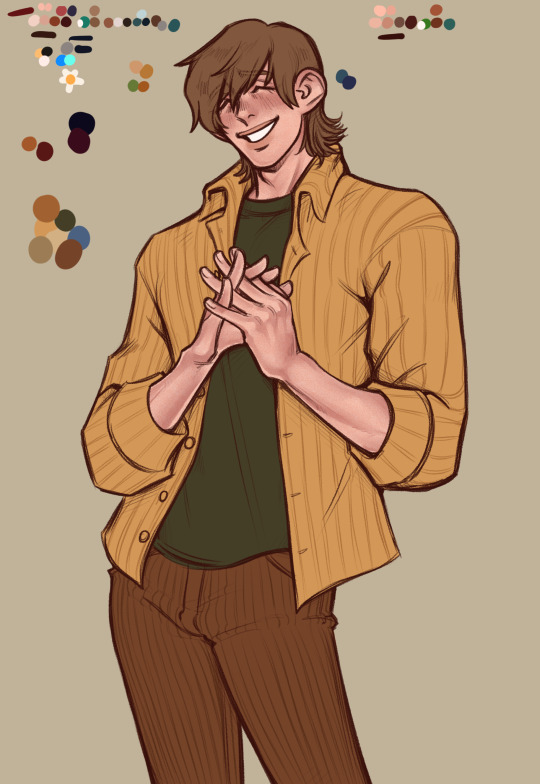
My art process, more or less
Hey, so a lot of people have asked me before to share some of my art process. So when drawing a recent quick personal piece I decided to finally take screenshots as I went to make a write-up. This is the artwork:
And below the cut is all the steps as I drew this. I wasn't counting the time but I think it was something like ~5 hours between two sessions.
This is less a tutorial and more just showcasing how I draw. You know how writers sometimes call themselves a planner or a pantser? I'm a pantser with art. When I try to plan stuff out too thoroughly I get stuck in the mindset of like, it HAS to be one way and I can't improvise. Improvisation and pivot is kind of essential in how I draw, and I recommend everyone trying to not be so rigid when drawing if you can help it. I'm kind of all over the place and winging it through most drawings so I hesitate to call it a tutorial as I feel it would be hard to follow for beginners. I can only manage to draw this way because I already have some classroom training, thousands of hours and artworks under my belt, and a pretty strong sense of visual recall that gives me a good sense of how to eyeball proportions and the like. Okay, disclaimer done, let's jump in I guess
I had an idea to draw my OC wearing a layered shirt combo that I saw in a cat video and I thought suited him. You'll see the snippet I took of it in the corner of the canvas throughout, but that's where the idea spawned. I began with just trying to get the basic gesture and flow of the pose. I was constructing it from my head, as I most often do (I don't recommend this, but I am usually too lazy for finding pose refs)

I flip the canvas and use the lasso tool all throughout and just continue to push and pull on the body shape and gradually add more substance to it until I'm satisfied with the undersketch
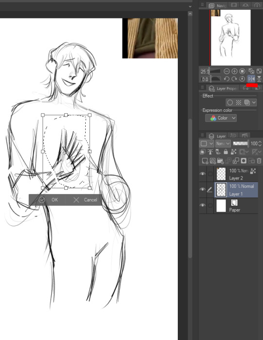

Once I feel like the undersketch is what I want it to be, I lock the transparency and reduce the opacity to 15%. You could also just change the colors on it if you'd prefer, but I've done that and then drawn on the wrong layer too many times lol so I prefer to just lower opacity. Then I make a new layer at 100% opacity and start to draw the clean sketch on top.

I'm making changes to the pose and expression as I go, as you can see I ended up shifting his head away from where it's positioned in the undersketch

I achieve some of the effects in my art, especially the line weight, through setting the colors to transparent and continuing to use my sketch/line brush so that it now acts as an eraser but maintains the same texture and size as my brush strokes. I use it to cut away excess lines, and also add transparency to stuff like having the eyebrows be a suggestion beneath the bangs

I redrew parts of his face, neck, and hair several times and questioned what I was doing with my evening (normal part of the process) and eventually ended up with this:

I realized the hands were way too vague in my undersketch so I went back to it to try and figure out the hand pose better

And here's the finished hands. Well not really finished, I continue to mess with line weight later, but this is basically their final form
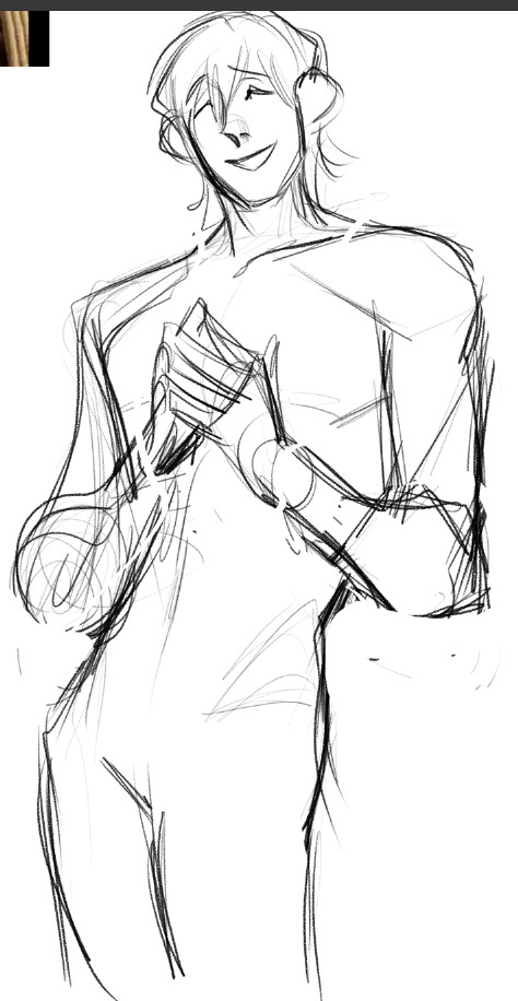
And this was basically the finished "lines" (it's still a sketch to me because I use this rougher brush, but people always refer to it as line art. So I guess it's line art), with the undersketch on and with it off


Of course I took one look at the art above and said "something's wrong" lol but I was in a bad mood and it was late so I went to bed. I came back the next day and began tweaking it, using my beloved lasso tool to adjust his face somewhat which helped a lot

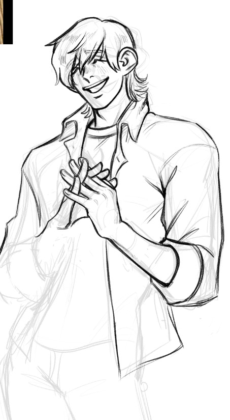
I then proceeded to add some more line weighting, adjusted proportions further, and toned down the folds on his jeans because there was WAY too much focus on them lol. Side by side to show the differences:

Okay now we can start colors. And I know this is the thing you're all here for, the skin rendering. Well, sorry to burst your bubble, but it's mostly just magic with textures and layer modes! I make a flat color layer for the skin base, and three layers clipped above it (clipped meaning, they lock to the alphas of the base layer). The first layer clipped above is set to 100% opacity with a normal layer mode. This is for color variations on the skin like blemishes, freckles, lips, tattoos, hickeys, and in nude works, nipples and genitals. In this artwork though, it's just his lips.

The top-most skin layer (three above the base) I set to 40% opacity and hard light mode. This is important, but can be adjusted. You can use multiply or soft light if you want, or adjust the opacity, really mess with it. But this is fore the texture on the skin. I use a custom airbrush that simulates skin pores, and I use a saturated orange color and dust it all over his skin
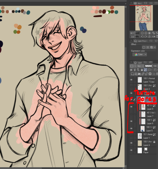
Next is what I normally like to call blush but it's all over, so it's really like. Definition? People call it rendering and I suppose it's kind of like that but in my head I'm just being lazy to make my flat colors look better and not have to actually do proper shading on the piece! But this is below the pores layer (so it's two layers above the skin base) and it's also set to 40% opacity, hard light. Again, use your discretion and play with it. I use a dark red color for this, it leans slightly pink but it's still fully red I'd say. Like a wine red I guess? And I just start defining shapes of the body, and deepening it in areas that actually would have a lot of blood flow (like the cheeks or ears)

I basically do it like this: I use the same brush that I use for blending when I am doing actual rendering (it's just an oil brush with a chisel tip that I got off the assets store, though it is currently unavailable last I looked) and I block out the area darkly. Then, I swap my color to transparent once again and I use that to carve out the midtones. I use a light touch so I can blend it out really nicely but I do leave some hard edges where it feels appropriate.


So satisfying, so beauteous (★ ω ★) Then I just add in the rest of the colors, putting them in their own layer so I can easily edit them later.

And edit them I did. What is this color scheme?? Whack lol I color picked the shirts from the video I was referencing.. and realized I didn't like it. So I tweaked the colors to better match Mal's earthy color scheme. I also colored the lines by locking transparency on the line layer and coloring over it in a deep red.
Lastly, I made some little edits to line weight, gave him his fuzzy arms (essential, and also? Charm point) and used a deco brush from the clip studio assets store for the background. Here's the finished artwork:

And here's the deco brush, if you wanted to download it:

#art process#art tutorial#art stuff#art resources#art tips#idk man idk how to tag this#long post#cass art
33 notes
·
View notes