#it’ll look more natural when i add the background and it isn’t contrasted to the stark white bc
Note
Hi! I hope I'm not bothering you, but I love your mood board edits and was wondering if you could explain how you go about making/colouring them? I see lots of places to find gifs but turning them into a set is so hard. Thank you in advance!
hi! first of all thank you so much and second of all it’s not a bother at all! i am happy to give some of my own tips even if my explanation probably isn’t super helpful. i won’t give like a ps tutorial but below the cut (since i included example gifs, it’s VERY long) is my process for my latest jily aesthetic:
i keep track of all my ideas/sets in a spreadsheet (which i won’t show bc there’s a lot of info i’d have to blur/black out) but i always have a list of what scenes i need to gif/what gifs i’m editing and where i’m getting them from. i also include a couple extra ideas in case the gifs i have planned end up being too hard to color or don’t fit in the set. i’ve found it’s best/easiest to start w the list bc there is literally nothing worse than spending hours on a set and then not being able to complete it.
as for actually finding the material, i have a pretty healthy number of scene packs saved in my giffing folder, esp. for things i know i will gif frequently. most of the time i will peruse youtube, vimeo, and instagram for any aesthetic scenes. i also have a lot of gif packs saved specifically for the purpose of making mbs (usually i mix my own gifs w gif packs), if you msg me i’m happy to direct you to some gif packs i use regularly or you can check my #resources tag. a couple tips for finding material:
always opt for download when possible, i used to screen record and the difference when i switched to downloading was astronomical. (it’s easy to lose quality and esp if you’re on mac, quicktime duplicates frames so either you have to manually delete those extras or you get sort of choppy gifs when you load them into ps.)
always use 1080p or better, 720p will work in a pinch for 268px or 177px gifs since you can make up some of that resolution loss with sharpening, but don’t go any lower than that, just love yourself.
for pale sets, look for the right colors. i tend to look for scenes w high color contrast especially if it features poc so it’s easier to color without whitewashing, ie if the subject is a person then i look for light colored or blue/green/violet/white backgrounds. it’ll make your life wayyyyy easier. this also means if you’re making a set try to find scenes with already similar lighting bc you won’t have to work so hard to make it look cohesive.
here’s a quick rundown of what i do before coloring:
import all frames and save all the files in a folder together!!
play around with frame delay so all the gifs are moving at about the same speed, usually keep it between 0.03-0.05s
crop and resize gifs (i use 268x145 most of the time)
convert to timeline
when it comes to coloring it can be really hit or miss, i’ve recently gotten back into my groove but i was having sooo much trouble earlier this year. in general, don’t stress yourself out!! sometimes it’s easier to just find a new scene/gif (hence my list of extras!) than to try too hard to fit a gif into your set. i color all my gifs by scratch (ie no psds) but i tend to follow the same pattern, i’ll explain using these gifs/psd as an example since then i can also explain how to fix white-washing:


first off when you’re coloring gifs with poc always always always make a layer mask so you can compare the edited and unedited skin tones directly! i use the marquee tool to make a selection in the middle of the character’s face, select the folder of my adjustment layers, and hit ‘add vector mask’ (the third button from the left on the layers panel, it’s a white rectangle with a circle in it).
i almost always begin by using hue/saturation layers to highlight and delete certain colors. here i highlighted red and raised the lightness on yellow by a lot since it’s a very yellow scene. then i use a combination of brightness/contrast, levels, and curves layers to brighten the scene. here’s what i have now:

i add a gradient map set to black/white, change the blending to exclusion, and lower the opacity to between 5-10% (depending on the scene) to lighten the contrast further:

then i add back a little depth with selective color in neutrals and blacks:

now i have two main goals: 1. add contrast between the background and the subject, and 2. brighten the scene into a pale gif. to do this, i use color balance to tweak the color of the background, taking out the yellows. this step works best if there’s at least some shade difference between your subject and background, otherwise isolating the two will be impossible. here’s what i have after adding color balance:

i use hue/saturation to selectively highlight the background color. in this case i chose to adjust magenta and used the color picker (the first eyedropper on the left) to identify the exact shade i wanted to lighten. now i have a fairly neutral background and a colorful subject, which gives a sort of pale effect:

and now i use a curves layer and a selective color (white) layer to brighten further:


before i go further, i start fixing white-washing. keep in mind that some variance is normal since you are naturally changing the lighting of the scene; this gif shows it rlly clearly bc of how yellow and dim the lighting is, so some lightening is to be expected. however, both because the vector mask shows a lot of whitening and because i’ve giffed dev patel before and have a general idea of what he looks like in this type of lighting, i know what needs to be fixed, so i go back in under the psd/adjustment layers with a combination of selective color (red and neutral) and hue/saturation layers to darken his skin again:

now that some more contrast has been added in, i can go back to working on the psd and use curves and selective color to play around with the background again:

i use another hue/saturation layer and a black/white gradient to tone down oversaturation:


usually i leave those layers on top, so if i want to make any adjustments (like lightening the background more), i go in under those two. in this case i tweaked the whites and reduced the contrast a little to get this:

again, you can see his skin tone has changed from the original, but variation is to be expected given how much brighter the room is, the fact that i took out a lot of yellow lighting, and the brightening effect of the computer screen in front of him. some other things to keep in mind when coloring:
when you add layers to correct white-washing, you’re likely to end up with overly red/orange skin tones (red-washing). this can be fixed by upping cyans in the reds, desaturating/darkening the reds, or adding b/w or desaturation later on.
when in doubt, it’s better to be darker than lighter (the issue with white-washing is that it promotes colorism, and there is nothing inherently wrong with a darker skin tone) but really. just put in the effort to color poc correctly.
when changing the lighting a lot it helps to look at pictures of the subject in natural/bright lighting, since you get a better idea of what their normal skin tone is.
don’t try to squeeze all your selective color layers into one. you’ll get less grainy gifs if you separate them out and work one by one.
TURN OFF NIGHT SHIFT/NIGHT MODE! yes i KNOW it’s bad for your eyes (especially if you’re like me and gif at night, when the lighting outside isn’t changing every 20 seconds) but your gifs will look VERY different under f.lux or night mode compared to daytime screens. especially if you’re giffing at different times of day, blue light filters can really change the way your coloring appears. best to keep it consistent.
my sharpening settings vary depending on what i’m giffing but in general i do two layers of smart sharpen (500% with radius between 0.2-0.4, 10% with radius at 10px) and then gaussian blur at 2.5px and adjust the opacity so it’s somewhere between 15-20%. i try to strike a balance between smoothing out the graininess from selective color, and sharpening details like clothes and hair. here’s what i ended up with for the gif above:

then i rinse and repeat for the rest of the gifs in the set! i tend to start with the gifs that i know will be hardest to color, which is usually the darker ones (coloring is limited by how much i can brighten the scene) and those that include poc (again, limited by how much i can brighten and adjust the scene’s lighting without white-washing). then i check set cohesion as i go, using those first few gifs as benchmarks. once i have all 8 (or 9 or 10) gifs, i play around with composition and try to balance and vary the subject, colors, and composition of gifs next to each other. i go back and make a couple of adjustments here and there according to what i observe and what i think might improve the overall appearance.
and that’s pretty much it! i hope this was helpful, if you have other questions feel free to message me and i’d be happy to help/troubleshoot. happy giffing!
#Anonymous#*#resources#answered#sorry this was sO long but i hope it helped on the coloring end#tbh i exceeded my own expectations with the dev gif lol#yeahps#completeresources#chaoticresources#tutorial#coloring tutorial
54 notes
·
View notes
Note
hi! i've always loved your hnk panel redraws and recently i've been so inspired by them that i've tried my hand at coloring some panels too! if you don't mind me asking, do you have any tips?
oh i certainly do! some of these are a bit generic/art related but they’re definitely useful in this case too. I’m adding a read more because unfortunately it got a bit long but here you go:
1) Get to know your tools!
Since you weren’t very specific, I’ll assume you aren’t too familiar with art softwares (and if you are, you can just skip that part it’s not That deep). I’ll start with the basics; I know this is obvious, but please bear with me, because understanding how your program works WILL make you a lot more efficient.Here are quick descriptions of some features I think are very useful - I use Clip Studio Paint, but I believe most programs have equivalents. If you don’t know them, please experiment with them, they’ll come in handy!
- Locking transparency :
Locking the transparency of a layer means only the parts where something is already drawn can be modified. Basically, you can recolour something that already exists in a rather precise way.
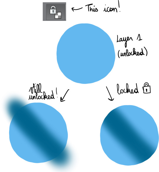
This is very useful for gradients, which I’ll talk about a bit later.
- Clipping layers :
This gives the same result as locking a layer then drawing over it, but the difference is that you use more than 1 layer ; one as the bottom layer, defining the part of the canvas you can draw on, and the others, clipped on top, where you’ll draw. This can be more practical than locking transparency, because if you have a lot of details to add, doing everything on a single layer may make things more difficult.

I use this a lot when I shade, but just like gradients, I’ll bring that up later.
- Layer settings :
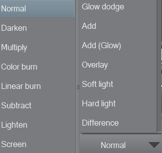
These options change the way the colours on a layer blend with the colours below. As an example, addglow is pretty good for colouring very bright light sources or for adding highlights on gems :

Basically, using those isn’t a necessity, but they’re still pretty useful so I’d recommend experimenting with them whenever you feel like it!
- Magic Wand :

Not the most complicated to use, but damn it’s really useful. It allows you to make selections based on the colours you’re targeting, so basically, if you need to colour an entire area a certain colour, you can just select it from the original panel, go on the layer where you’re colouring, and colour nothing but the part you selected. That’s about it!
There are lots of others, but these are the main ones you need to know about when you’re getting started.
2) Colouring stuff
This is where it gets interesting! I guess! I’m not too good at just coming up with these kind of tips, so I’ll illustrate with some colouring, hopefully it’ll help you out?
I usually colour in 5 parts : 1) Preparing the panel(s), 2) Applying flat colours, 3) Adding gradients, 4) Adding shading, 5) Finalising with details.
I always prepare pages in the same way: first, I use the magic wand to select everything i do NOT want to colour ; the frames around the panels, the speech bubbles, the sfx, etc. Once they’re selected, I copy them, and paste them on a new layer. Then, I select the original layer, and turn it transparent so I can colour below while still keeping the lines. To do that, I go in Menu > Edit > Change brightness to opacity (in CSP at least, it depends on your program tho but most of them support this, I think!).
I end up with something like this :
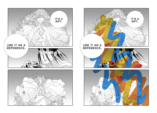
Two layers, one on the bottom with the semi-transparent page, and another on top, with everything that I don’t plan on touching. On the page on the right, you can get an idea of what it looks like when you add a layer below these 2 and draw on it.
Now that I’m done with the panel, I can start adding some (flat) colours.
I think it’s a good idea to start with the background, because it’ll help you figure out the feeling you want to give the panel.
The airbrush is a pretty good tool for gradients btw, just make sure you use a brush that is big enough so the transition in colours looks natural.
Next, I add a new layer, and colour the shape of the characters (and here the vessel as well), so it stands out from the background. It’ll make colouring less complicated, since the lines will be clearer.

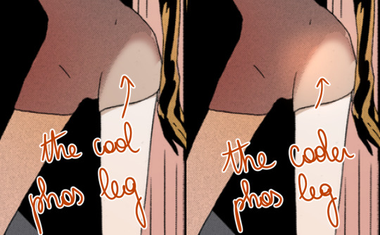
As you can see, I was kind of confident, so I directly added a gradient. The bottom of the panel is a bit “darker”, because I wanted the main light source to be the reflect on Phos’….. head thing?
Here’s something kind of important about your choice of colours : if you’re colouring an area that is already shaded in the original panel, I would recommend taking a colour that is more saturated than it should, or else the colour may end up looking dull because the original shading will make it darker.
Next, I do more flat colours. Nothing too fancy, and pretty much everything is on different layers. The clothes are left uncoloured because the background colour already fits, so it’s okay honestly
Then, I added some gradients using clip layers :
As a reference, I used some overlay layers for Dia’s hair, and some addglow layers for Phos’ alloy.
I mean it when I say gradients are important! They make your colouring feel more complete even when they’re barely visible. quickly coloured bortz for reference, assuming tumblr won’t compress the colours too much:
the bastard on the left has nothing but flat colours. They’re nice, but when you’ll have shaded everything, chances are it’ll look kind of …. i dunno, like something is missing? So yeah, gradients : good, though i would recommend you keep them in the same tone as the base colour. I’ll talk about this a bit more later if i don’t forget.
Ok! next:
I felt like golden colours weren’t quite fitting the mood, so i added a layer with blue on top of it to make it colder. It’s at 40% transparency, so you can still see the colours behind well enough. Some parts were slightly erased because i liked the idea of these parts being lighter (you can see it a little bit around phos’ neck, or above dia’s knees : these parts are yellower than the rest of the pic)
I added some shading! Nothing too fancy. also not to sound like some gradient-freak but you can add some of those in shading as well, it’s usually a nice touch.

After than, I added some lightings, which are on a layer clipped on the original manga panel (so basically only the black parts of the original image changed colours, and the colouring work I did on the layers below wasn’t really affected, if that makes sense?)
The red lighting is the obvious one (it’s an airbrush, and i used an eraser to clear the part near Phos’ head so it looks like it’s coming from above/behind them and not from themself).
There is another lighting at the bottom, which is grey/blueish, to contrast with the warm colours on the top of the pic. it also kind of looks like smoke but yeah
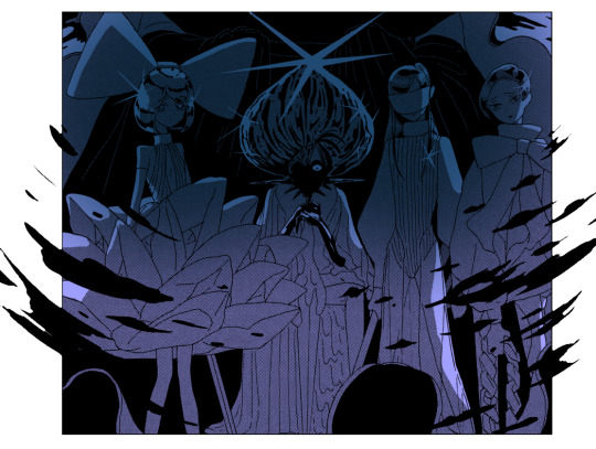
Now the panel is mostly done, and I’m starting the “details” part.
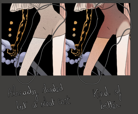
Something I find really bothersome in the manga is the *original* shading : while it’s always really good, colouring under it will leave some grid of pixels on top of your colours, so to counter that i just colour on top of the grid by colour picking and painting on a layer above the manga layer.
It’s a bit tedious but it has a texture that makes it look like a painting. The downside is that the colours can be altered since you’re colourpicking from something with an irregular pattern, but it can end up making your panel look less boring, honestly, it just depends on what you’re aiming for!
I end up with something like that :
And then it’s just. Whatever man. I added a black border and some highlights, sparkles, etc, it’s the kind of things you do when you’re basically done.
For the technical aspect, I’m not sure I have a lot more to add. If you want some advices for picking colours, tho…
3) General colour stuff :
These are just recommendations! Licherally these are mental notes i came up with ever since i’ve started colouring, so they’re kind of personal and if you don’t follow them you’ll be fine, i suppose. But so far they’ve been useful to me so consider them whenever you’ll be colouring something:
- Do not use pure white! Unless it’s for something CLEARLY meant to stand out, such as the frame of your pages, a speech bubble, sparkles, or a light source/something very shiny. If you’re just colouring something that is not meant to draw attention, use some other shade of white, but not the #ffffff one if you see what i mean?
- Same about pure black, to be honest.
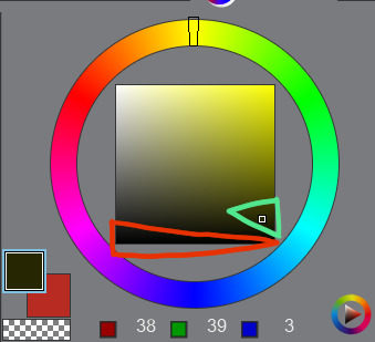
The shades circled in red tend to look “emptier” than the ones circled in green (here the hue of the colour is yellow but it works with most colours). It doesn’t mean you can’t use it, just, use it sparingly or it may make things look dull I think? I would recommend trying a few shades before taking a decision.
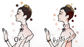
- Sometimes adding highlights where the shading starts can make the transition look smoother:
- Even if a panel is already shaded in the original page, I would recommend shading it again, because the manga shading is a black shading and shading a coloured drawing with black usually doesn’t look that good. (hence why i said something about using saturated colours in shading earlier).
- Even if a panel isn’t shaded in the original page, consider shading it anyways, even if it’s just a very light shading. It’s worth it :o)
I’m running out of things to say oh well
#i didnt mean to write so much. it just happened i hope it's not a pain to read#also i hope it was clear but if it wasnt. (points @ my inbox)#whenever people tell me theyre getting into panel colouring i go... [powercry emoji]... its really fun and honestly i dont see that many#ppl into it so i get really enthusiastic ? thats it#personal#asks
117 notes
·
View notes
Text
Roses and Regrets
A/N: Thanks to @yourtrashyfangurl for selecting the prompt from here!
She hasn’t talked to Percy in two weeks.
She’s acutely aware of the fact too. You’d notice if one of your closest friends suddenly stopped talking to you. Well…not that suddenly. If she thinks back, the distance had been growing between them as unspoken tension lingered in the background and unsaid words grew heavier.
But even then, the off-kilter feelings and friction between them seemed to have come out of nowhere. It just doesn’t make sense to her.
But everything is like that with Percy. Nothing ever really makes sense. He is like a whirlwind of emotions and half-sentences and loose puzzle pieces.
A honk shakes her out of her thoughts, as she catches sight of Luke’s car outside. It’s a shiny silver, very clean, and he gets out of the car to open the door for her, offering a smile and a single white rose.
It’s very nice.
He tells her she looks beautiful; she blushes, and they talk over a quiet radio and arrive at a nice restaurant. And from there they follow the beats of a date: dinner, sweet smiles, dessert, a kiss good night.
She sighs when she shuts the door, a pleasant smile on her face. It’s been a nice day, no tensions, no fighting, no whirlwind. A good time with nice company and she feels calm for once.
Fishing out a vase, she puts her single white rose in water. Simple and perfect. She thinks maybe she’s finally got what she wants.
-.-
Luke makes sense, she realizes while walking in the park (she’s supposed to be jogging but has absolutely no motivation to do so). She can understand him, his actions, his goals, his personality.
As if on cue her phone rings. It’s him, of course, calling exactly when he said he would.
She picks up and he’s polite and charming, asks her how her jog is going, and chuckles when she tells him it isn’t and it’s nice to feel comfortable.
Her mind harkens back to Percy (without her permission, she might add) and how by now he would have made a teasing comment about her getting out of shape if she continued on like this (even though his homemade cookies that he always brought over were the problem). But even though he’d obviously be teasing, it’d annoy her enough to make her jog twice the distance she would’ve just to prove a point.
Even just thinking about it has her a little worked up and she shakes him out of her mind. Luke is asking her about dinner and she readily agrees, finally admitting defeat on her jog in favor of going home and getting ready.
Dinner is nice, as is everything with Luke, and by the end of the night she gets another white rose and a sweet kiss to show for it.
When she gets home, she puts the white rose next to the other and they sit there next to each other, pristine and perfect.
She goes to sleep with a smile on her face.
-.-
“We don’t have to go if you don’t want to,” Luke says as they’re debating going barhopping over the weekend. A lot of her friends are going, and it’ll probably be fun but…
“It’s not that I don’t want to go, I just…I don’t know!” She’s frustrated—she hates being indecisive—but bars and parties aren’t that much her thing so she’s on the fence about it and…
Luke puts his arm around her and continues in his calm voice, “It’s alright, Annabeth. We’ll do whatever you want.”
It’s such a stark contrast to what Percy would do. By now, Percy would have declared his opinion and would probably be pushing her towards going to the event with that stupid wide grin on his face.
She huffs at the thought. She tells Luke she doesn’t want to go.
So, they don’t. She ends up with another white rose and goes to bed mostly content with her decision.
The next day all her friends have posted about how fun the event was. She stares at her white roses and thinks it’s probably alright.
-.-
A week later she’s hoisting up groceries to her apartment, huffing and puffing by the time she gets to her door.
She makes a face as she sets the bags down and toes off her shoes. She hasn’t been out of breath like this in a long while, especially since she’d been building up a better tolerance for cardio through her daily jog—
Except…she hadn’t actually jogged in weeks.
Her frown deepens as she puts the food away. She needs to get back into the habit, but she doesn’t know why she stopped in the first place.
Her phone dings with a notification that Piper has posted something on Instagram. To fulfill her best friend duty, she immediately opens it up to like it.
The post is about the bar hop event that she missed and features a grinning Piper, Thalia and Jason all holding microphones, captioned with “never sang Eye of The Tiger better!!”
She likes the picture and comments a heart emoji, but her frown isn’t going away. She really should have gone…she just…
She’s frustrated again. It’s been like this for a while now, everything seems kind of off and she can’t put her finger on why. And she’s frustrated more often than she ever wants to be.
She sighs. She’s just had a bad run of it, it’ll be alright. She’ll get back into the swing of things.
Lost in her thoughts, she doesn’t realize her frown has settled on the white roses sitting prettily in the water.
-.-
Luke drops her off at the coffee shop she’s meeting Piper at. The smile she’s been faking slips away and the frown settles back on her face as she aimlessly fiddles with the with today’s— of course—white rose.
“Hey Beth!” Piper is one of two people in the entire world who can call her that. She tries not to think of the other person.
She gives her best friend a hug. “Hey Pipes.”
“What’s with the white rose?” she asks, dropping her bag to the floor as she sits down.
Annabeth shrugs. “Luke gives them to me.”
Piper raises an eyebrow. “Why?”
She shrugs again. “I don’t know, to be nice?”
“But you don’t even like white roses?”
It’s true that she had once declared she didn’t care for white roses and would carry red roses instead at her own wedding. Granted, that had been a few wineglasses and years ago, but she supposes it still rings true.
She shrugs for the third time, suddenly anxious to get away from the topic, and sets the flower down a little ways away. It’s bright against the dark wood of the table.
She turns towards Piper and asks her about Jason.
-.-
It’s two am and she cannot call asleep. Her mind is spinning with way too many thoughts and she can’t turn any of them off. One thing just leads to another and another and another until sea green eyes fill her mind and she’s thinking about Percy.
It’s been a month and now in the darkness of night she can admit that she misses him. She doesn’t even know why. Everything was a mess with him, nothing made sense, it was all complex and chaotic emotions. He pushed her buttons, pulled her away from comfortability, and it was a constant whirlwind.
With Percy it was all breaking down and coming undone and an almost roller coaster kind of rush. She swears he’s insane but—
But she still misses him, despite all that.
She curses his name, turns over, and tries to block out the memories of hearts beating fast and the strange freedom that came with screaming in the rain.
-.-
She’s ready early, because Luke always shows up on time, looking aimlessly out the window for signs of the shiny silver car.
Her gaze naturally lands on the vase of white roses, still looking pretty and pristine, and suddenly they’re making her frown instead of smile. They’re suddenly too elegant, too perfect, and it makes her stomach churn.
It’s such an intense emotion and it comes out of nowhere and—
It doesn’t make sense.
Strangely enough, the thought makes her smile. Things not making sense? She’s used to that, used to figuring that out, used to it because Percy—
Percy motivates her to jog when she doesn’t want to (because he knows how she hates herself for it afterwards if she skips out). Percy pushes her towards new experiences that might be a little out of her comfort zone (and it’s those experiences she remembers the most vividly). Percy is a mess, he’s rain and screaming, puzzle pieces that don’t quite fit and a rollercoaster she didn’t know she missed.
Percy doesn’t make sense.
And Percy is everything she nee—
A honk breaks her out of her thoughts.
Percy is late.
The beat up, messy, blue Prius is a sigh for sore eyes. He doesn’t get out of the car to let her in but invites her in by turning up the volume and belting out Rick Astley’s Never Going To Give You Up.
He offers a wide grin, telling her she looks absolutely stunning, and a few seconds later she’s screaming along to the lyrics with him.
She’s jogged everyday for the past week, they’re on their way to some event downtown that she’s not sure of, but Percy’s look of excitement is everything.
As quickly as he had turned it up, he lowers the volume suddenly, and when she turns to look at him questioningly, he’s just staring at her.
It’s a little uncomfortable and completely out of left field and of course it doesn’t make sense.
But she’s used to it, used to figuring it out.
So, it doesn't take her long to figure out the look of love in his eyes.
-.-
She sighs when she shuts the door behind her. It’s been a great day, she has tingling lips and a smirking Percy in front of her to show for it.
His next kiss causes her to lose all brain functions and she wonders if maybe she’s the insane one. Her hands let go of her stuff and it falls to the floor as she tangles her fingers in his hair.
It’s messy and wild and she feels the whirlwind inside of her. She never knew she could feel this much.
They stumble further into the apartment, giggling and happy. It’s been a long time coming.
And on the floor by the door lay shoes, a purse, and a single red rose.
A/N: Thank you so much for the prompt! I hope you liked it and this little fic (with a hint of The Way I Loved You by Taylor Swift) fulfilled what you were looking for when you chose the prompt Roses!
#percabeth#percy and annabeth#percabeth oneshot#writing prompts#ask#thanks for the prompt#percabeth au#fanfiction#thank you again!
57 notes
·
View notes
Note
Just curious, how do you edit your makeup pics & what do you use?
hgghg I’m sure most people are more professional and know how to use photoshop or whatever, but I use just my computer’s own built-in editing tools in the photo viewer, since you can do stuff like contrast, warm colors, etc. If I need to blur something or do anything a little more detailed, I use that free website ribbet.com, which I’ve literally been using since middle school lol
(rest of post under read more since it got a little long ) ...
------
As for “how”, I don’t know what you mean.. Are you asking like what specifically I do? Let me know if you meant something else! Generally, not much, mostly I just always make it a little sharper and make the colors warmer. Sometimes with costumes, I’ll also edit small things, like if a color shows up less vibrant in a photo than in person, or if I messed up a line or something, For example -

Photos above are from a costume I haven’t posted yet lol (at least not at the time of drafting this). I edited the contrast and sharpness a little, made the colors warmer (the original ones are fine, but my brain is just like ‘Everything Must Be Slightly Orange Always’ hgh, I guess it’s a personal aesthetic preference), and the most major thing is I used the tinting tool on ribbet to draw over the black lines and purple shadings in my makeup faintly on a low opacity, because in the original picture I felt like they weren’t vibrant enough. Like the hair is a VERY bright purple, and the black in the clothing I have on is really black, so in comparison, the faintly purple eye-shadow colors and dull black eyeliner don’t look like they match the rest. I went over them a little just to make the black more black and the purple more purple, etc.
Usually it’s stuff like that, where I’ve taken the photos/already removed the costume, THEN I realize something like my dark hair has been showing from under a white wig, or there was a smudge on my face the whole time or a color shows up weird, etc. and I’ll try to edit it. Sometimes I also edit my eyes since I can’t afford contacts/am afraid to put things in my eyes lol

I think there’s a paid option on ribbet to do this, but I just do it with their free options by using the seasonal Halloween tools, going over the colored part of my eye (the iris?? whatever’s around the pupil lol) with “Ghoul eye” on white setting, then the same with “vampire eye” on white setting, then once that part of my eye is light enough to be colored in, I can use the normal ‘hand tint’ to color it. But if you have light eyes naturally, you could maybe just tint them right away without having to do the effort of making them like white first lol. It’s obvious and doesn’t look realistic, but I’m usually going for a fantasy aesthetic anyhow!

And for outfits I do the least. I up the sharpness/clarity/contrast and make it warm just like everything else, blur the background, and make sure that my face isn’t showing (use the collage tool on ribbet to do multiple pictures). For example

Anyway! Really I just like to make things more vibrant and warm and clear (since photos straight from my camera the colors look a bit more dull/cold than I feel they are in real life and etc., also just stylistic choice), and I may blur backgrounds/color over it to hide objects in the background, or do random misc. edits like that. If you were looking for more of a tutorial or something, I don’t think it’s needed since I don’t really know how to do anything extreme. Pretty much anyone can adjust a contrast slider or draw blur over a background lol.
Sometimes I do wish I had the skill to do more fancy stuff like changing my facial features or smooth baby skin or having a different face shape, etc., especially when going for more fantasy/alien looks or something, but I’m also not really too inclined to learn I guess, since I’m afraid of it affecting my self perception. I already get frustrated often because stuff will look cool in the mirror but then doesn’t show up that way in pictures, or an idea itself will be cool but then I hate it once I do it, or I feel like one of my facial features (that can’t be modified with angles/makeup alone) ruins a certain look, etc. I’d be hesitant to learn/get accustomed to more advanced editing, since I feel like altering too much digitally would make that disconnect even worse, and I’d post costumes even less because I’d be more discouraged about them all the time lol. I’m even weird about changing makeup colors/making colors more vibrant like mentioned above unless it’s like absolutely necessary, since I feel like otherwise I’d just be setting up a standard for myself that I obviously couldn’t achieve naturally, and again, it’d lead to me just feeling like shit whenever I put on costumes and they don’t look right, which I don’t need more of ghghjg.. BUT yeah! Rambling aside lol..
Just use whatever you have on your computer’s photo viewer, or ribbet.com can be good for other things as well! Though, I’m pretty sure it does reduce the quality of your pictures when you save them lol, so sometimes I over-increase the sharpness to make up for the fact that once I save it it’ll probably be a bit blurry. But they have actually a lot of cool features for a basic free editing thing, like you can add stickers, and do different effects, draw on it or hand tint things or etc. It’s neat to play around with. I don’t know, I couldn’t entirely tell what you were asking but hopefully that answered it or was helpful in some way lol!!!

#long post#I sound like I'm promoting ribbet photo editor but I promise I'm not gyhgh it's just what I use but I don't think it's very different#than any other free photo editor you could find online or something#Really I just use it because I'm used to it and it's easy to make collages and a few other free sites I've tried to make collages on#are hard! So with outfit photos I usually want to do like three photos in one and ... ribbet allows this easily.. thank god#I tried to use one free photo thing that was so weird and complicated and you couldn't rezise of adjust the collage etc. etc.#*or adjust#I could manually make collages in firealpaca ( the free art program I use) by importaing all the pictures and lining them up next to#each other or whatever which WOULD allow me to save them without the image quality going down but like... wow... hashtag Effort#I Would Like Things To Be Easy Pleabse#replies
7 notes
·
View notes
Text
I ESPecially Like You
Description: One day Jaehyun walks in on his classmate, Taeyong, performing an exorcism.
!highschool au
!psychic au
A/n: Hey guys! This is a high school au Jaeyong fic. Hope you enjoy. Also cross posted on AO3 and AFF. Enjoy!
Chapter 1: The Beginning
The ongoing lecture fades into the background, as Jaehyun glances at the clock, eager for class to end. He’s bored, very bored, so bored, in fact he’s resulted to doodling on the corner of his textbook to pass time.
He’d never been a numbers guy, let alone a math person, but here he is anyways, sitting through calculus. Jaehyun didn’t plan on taking the class, considering he barely passed pre-calc, but it was his mom who convinced him to register.
“It’ll be good for your college applications,” she said, “You need to take a harsh course load”.
When he refused, she retaliated with incessant nagging, until Jaehyun eventually caved. She didn’t know the reason he was so hesitant was because it meant removing the class he actually wanted to take: Art.
He hasn’t told her, or anyone really, that he wanted to go to art school. It just didn’t seem like a feasible option, especially when his mom was dead set on his premed pathway. He tried to drop hints, like alluding to RISD’s prestige or talking about the vast career options available for creatives, but each time he gets the same reply. “You can’t make money as an artist, and it’s a dying career. You’re better off as a doctor.”
To that, he scoffs. If anything doctors will get replaced by robots, making med a dying career. But begrudgingly, he listens to her and adds calculus to his course load.
Now sitting here, as the teacher blabbers about derivatives, Jaehyun really regrets the decision. He doesn’t feel like paying attention, instead focusing on his drawing, which is beginning to look less of a doodle but more so a full out sketch. He’s adding contrast to the shadows when his mind drifts to the anime he started last night.
Mob Psycho. A story about an ordinary middle school boy who has special ESP powers.
It occurs to him that he’s an ordinary boy too. Maybe not in middle school but high school should be a fair substitute. What if he actually has powers that have laid dormant in him the whole time? What if, right?
Jaehyun wonders if he concentrates hard enough, maybe he could activate hidden abilities and make time move faster. It’s an immature delusion, but he’s desperate and bored enough to try.
First he clears his mind, before clenching the muscles in his arm, summoning this strange tension that spreads to his fingertips. He points his middle finger at the minute hand, and in one swift motion, moves it up.
As expected, nothing happens. The clock still beats its regular rhythm, continuing it’s dreadfully slow descent to 3pm. He sighs, dropping his hand in defeat. The only thing Jaehyun learns from class was that he has a bad case of eighth grade syndrome.
♥
When the bell finally rings, Jaehyun rushes for the door, only to be blocked by the lanky senior, Doyoung.
“Move” he wails, trying to squish through. But the other boy doesn’t budge.
“Where do you think you’re going”
“Home” Jaehyun retorts, again trying to squirm his way out.
“Oh no you aren’t” Doyoung chuckles. He yanks Jaehyun’s collar, and drags him out into the hall. The brunette tries to free himself, but Doyoung’s grip is firm. “Remember, you still owe me one.”
Jaehyun lets out a low whine. “Please not today”. More than anything, he wants to go home. The day, though mundane and ordinary, felt absolutely draining. What he needs to do right now is plop onto his bed, play his phone games, and recharge before spending the rest of the evening catching up on the wasted calculus lesson.
Unfortunately, the older boy isn’t at all sympathetic. “Lot’s of work to be done,” he says, completely ignoring Jaehyun’s plea, “It’s nearing exam season, so the student council is especially busy. You’re going to help us with the mountain of paperwork piling on my desk.”
Doyoung pinches his nose bridge, as he lets out this frustrated sigh. “I swear it never ends. Just when I think I’m done for the day, the administration needs us to do more.”
To this, Jaehyun can’t help but to feel sorry for the elder.
He’s weak, always has, at rejecting people’s requests, especially Doyoung’s. During freshman year, they shared a class together; the older had forgotten to take his mandatory art credit the year before, which resulted in being placed in a lower grade. The other boy, though irritatingly uptight, had grown to become one of Jaehyun’s best friends. So as much as he’s craving to rewind at home, he’d rather not have Doyoung work till death.
“Okay fine” he concedes.
Doyoung’s taken back, clearly not expecting Jaehyun to agree. He lets out a grating laugh, causing some heads to turn towards them, before his lips settle into a small smirk. “Good boy.”
Jaehyun groans at the reply. “Don’t make me change my mind” he warns, but with no resolution to enforce his words.
♥
By the time Jaehyun finally leaves school, the sun was beginning to set. Orange and purple hues spread across the sky, expansive and continuous like the sea. Slowly, the bustling town begins to retire: with shops flipping their open signs, cats returning to their homes, and children abandoning the park swings.
The walk home gives him mixed feelings. It’s strange seeing the once lively streets desolate. But at the same time, the emptiness is calming, giving Jaehyun the luxury of silence.
He’s about to reach the end of the block, when he hears this loud crash coming from the alley up ahead. It’s followed by a gruff yelp, and the sound of explosions, like those dramatic booms you hear in action movies.
An ominous feeling travels across Jaehyun’s body, causing him to shiver. He should probably turn back now and take another route, whatever's going on sounds like trouble. For all he knows, it's a gang fight or a mugging. He backs away, ready to run away, before he hears this shrill scream.
It’s a woman, and she sounds distressed.
This was probably a signal for him to get the fuck away, but Jaehyun can’t move. Not when someone’s in trouble. Every instinct in him is telling him to withdraw, but he doesn’t break. Instead, he takes a deep breath, before forcing himself to run up to the alley. His feet feel heavy, a sign of his body’s resistance, but he goes through with it anyways.
He’s standing near the entrance, expecting some grand crime to be occurring, but only to be greeted by darkness. But the screams are still ongoing, sounding even more twisted and pained than previously.
Jaehyun takes another step, when he notices something.
There, at the very back of the alleyway, is this boy wearing a red jacket, his face is covered by the hood. His arm is outreached, while his hand is bent in a way that looks like a claw. Jaehyun’s eyes trail up to the direction the boy’s facing, before he sees it.
The source of the eerie noises, also the most disgusting thing Jaehyun has ever seen: a tall, black figure, with what seems like human hands sticking from its sides. The thing suddenly leaps at the boy, but only for him to suddenly disappear, causing the monster to miss and slam right into the floor.
The boy in the red jacket then appears out of nowhere, before raising his arm, positioned in the same way Jaehyun had earlier in class, and flicks his wrist. This causes the black figure to be flung up: and when the boy moves his wrist down, accordingly, the figure is hurled back down.
The thing momentarily stops moving, clearly worn out by the battle that’s transpired. Jaehyun watches, absolutely shocked, as the boy walks over to the figure while muttering something Jaehyun can’t make out, lifts his hand and snaps.
The disgusting creature vanishes. Gone. Vamoosh.
Jaehyun blinks hard, several times, but the thing really did disappear. He barely has time to process what had just happened when the boy in the red jacket lets out a satisfied chuckle, and bends over to pick up a blue backpack that was leaning against the brick wall. At some point during the fight, the hood had fallen off, revealing matching bright red hair that messily spikes all over the place. But in the dim lighting, Jaehyun can’t make out the boy’s face.
“Oh shit there’s garbage all over you” the boy mutters to his backpack, as he picks off the unwanted remnants that litter the bag.
It doesn’t strike Jaehyun that he’s been standing there in utter silence the whole time until the boy, who had been walking towards the exit, suddenly stops in his trail when he sees Jaehyun.
As a final departing gesture, the sun travels to where their standing, finally illuminating the murky alley. Nature exposes the boy, thrusting him away from the mask of darkness, revealing a very familiar face.
“Lee Taeyong?” Jaehyun exclaims.
It’s him alright. That unreal beauty and insanely sharp jawline could only belong to one person.
Taeyong lets out a brief gasp, before suddenly, he dissipates into thin air.
“What the fuck..”
Jaehyun looks around, but there’s not a trace of the other boy, just an emptiness and large garbage bins nestled at the end of the alleyway.
Bewildered, Jaehyun pinches himself. Hard.
“Ow”
#jaeyong#jaehyun#taeyong#jung jaehyun#lee taeyong#fanfic#fanfiction#nct fanfiction#highschool au#high school au#markhyuck#johnten#johnny seo#ten#mark lee#haechan#kim doyoung#doyoung#nct127#nct dream#nct#neo culture technology#psychic au#superpowers
32 notes
·
View notes
Text
If you care about the environment, back Warren. Not Sanders.
I’m not an American, I’m a Brit. But what I’m about to say here is valid across all countries. It’s not your fault if what I’m about to say comes as a surprise to you, the main stream media have collectively failed to challenge and inform you about it.
A while back, Bernie Sanders posted this:

This is entirely accurate. Climate change is a major issue, and we need a competent strategy to deal with it.
Bernie also posted this:

This is disingenuous. Yes, we need to transform our energy systems, but there are many ways to do that. Some fall more to the ‘pragmatic’ side, similar to the UK’s stance (use gas to end coal, while building nuclear and offshore wind). Others are on the ‘purist’ side, such as Germany (No more fossil fuel capacity, phase out nuclear, wind and solar).
Bernie is a purist, and that’s bad.
This is the Vermont Yankee power station:

Built in the 1970′s, it produced 70% of Vermont’s (Bernie’s home state) electricity. It received an extension to run into the 2030′s but was shut down in 2014 due to being undercut by cheap gas power.
The US reactor fleet has a 100GW capacity, and produces 20% of the countries power. It is their largest source of carbon free power. By extending the plant licenses, a common and highly regulated practice, most of them could run safely into the 2030′s, 2040′s and, in some cases, 2050′s.
Many older reactors though suffer from a financial double whammy. On one side is cheap natural gas electricity, on the other is subsidised renewables. Providing financial assistance to keep these plants open is one of the cheapest ways of stopping more emissions.
Bernie Sanders opposes any license extensions, any financial help, and any new nuclear new build.
This is a NuScale SMR

It is a mass producible small reactor that is passively safe. It CAN’T melt down. It’ll be cheap, easy to build, and has been privately financed by a set of US companies. It is one year away from passing through the US licensing requirements, with the first plant planned for operation in 2026-2027.
Under Bernie Sanders plans, a decade of work and investment, and a potential critical tool in the fight against climate change, will be dealt a hammer blow.
But that’s not the only problem with Bernie:

The US shale revolution dealt a hammer blow to coal, allowing the country to meet the Kyoto protocol targets without even trying. Not only is it a vital transition fuel (until the last coal plant is shut down), but it’s got a strong future in a carbon neutral world.
This is a prototype Carbon Capture power plant

Like the Nuscale SMR’s, it’s a project that’s been ticking along in the background, pushed on by private backers. It uses the Allam Cycle, named after it’s inventor, to produce electricity at the same efficiency as current gas stations, alongside pipeline ready pure CO2.
I repeat, it’s carbon capture and storage at the same price as current electricity. This is a monster of a game changer, with the first commercial plants planned for 2022-2024.
Bernie Sanders, though, is opposed to CCS in all forms. Like nuclear, he calls it a false solution.
But couldn’t we run on renewables regardless?
Even if you feel concerned at a climate activist throwing away some of our best tools, you might feel that their drive towards the solution more than makes up for it. After all, you can run the country on wind and solar, can’t you?
Well, you can. But it’s nigh on impossible to do so.
Despite what climate activists tell you, the wind isn’t always blowing everywhere:

Above is a graph showing the change in wind production from season to season. Below is a closer look at how wind production across Europe (I couldn’t find one for the USA) can nosedive at the same time. Madrid is as far away from Helsinki as New York is from Los Angeles. Even across a continent, the wind isn’t always blowing everywhere.


Solar, meanwhile, varies everywhere according to the seasons. In northern latitudes such as the UK, a solar panel might produce ten times more power in the summer as in the winter. Even in California, solar in the summer can produce 1.5-2X what it does in the winter.
Which, in southern desert states, is good. They need little heating in the winter, and aircon in the summer. Big desert solar arrays at low latitudes are a good source of energy. Less efficient, inherently badly optimised and far more expensive rooftop solar further north (where you need lots of winter heating) are about as useful as Mao’s backyard furnaces were at making steel.
But what about batteries?
I’m sure many people will now talk about storing power. However, the idea that we can economically do this (similar to the idea that the wind is always blowing) is probably one of the most successful bits of fake news ever spun. Let me illustrate.
This is Vogtle units 3 and 4:

With a project cost of $17 billion, renewable energy enthusiasts like to paint it as a perfect example of the failures of modern nuclear.
This is Tesla’s Big battery:

Costing $50 million USD, Renewable enthusiasts like to paint it as a triumph of renewables.
The big battery stores 129mwh of electricity, which equates to $387 per kwh of storage. Or, $0.387 billion per Gwh. For $17 billion, you get 44 Gwh of storage.
Vogtle will produce that same amount of energy in just over 18 hours.
Even if you use the most expensive, finance inclusive, cost for Vogtle, it will still fill the equivalent storage potential in 29 hours.
To run a fully intermittent grid, we’d need days if not weeks of storage. Or, we could spend a fraction of that money on nuclear power, and be done.
But what about pumped Hydro?
Again, let’s use a sense of scale to explain how much you’d need. Something big, like this:

Lake Erie and Ontario are separated in elevation by 99m. Assuming you use dams and locks to turn them into a giant upper and lower reservoir, how much energy could you store?
By draining 1m of water from the smaller Ontario, and pumping it into Erie, you could store 4,600GWH of electricity.
The US uses around 2,740 per day on average. So you’d have a viable short-term store for the entire country. It wouldn’t be seasonal storage.
The equivalent storage using batteries would cost over $1.38 trillion. This is enough for 81 Vogtle plants. They would have 194GW of capacity, and produce 4196GWH a day.
Using Nuscale SMR’s at the current quoted price (which could come down if you get a dedicated assembly line going) you could get 328 GW of capacity.
What about seasonal storage?
In countries with winter heating seasons, you need a reliable source of energy or people will freeze and die. Even with Nuclear, you’re at the peak of energy requirements, so it’s uneconomical to build to that point.
Instead, you can use biogas, biomass and waste to energy. Stockpiling your fuel throughout the year, you can burn it when most needed. Even better, in many cases you can convert existing fossil fuel plants.
Credit where credit is due, Bernie Sanders is pro bio-energy (as opposed to some (even purer) greens). At the same time, he is anti-waste to energy.
So what is the point of this?
The point is that we can’t simply add ‘Wind, solar, batteries’ and get an energy system that works. There are serious technological limitations and economic realities. Long term energy storage is incredibly cost prohibitive. The wind doesn’t always blow everywhere. In any case, if we only have a short time to stop emitting carbon, why shoot your biggest contributor of green energy at the same time?
Germany lost a decade due to its closure of its reactors, and still has some of Europe's dirtiest electricity. Had they closed the Lignite plants in North-Rhine Westphalia instead, they’d of cut their emissions while opening up giant pits like the Hambach mine for conversion into pumped storage sites. I’ve done the calculations, they could run the country for half a day on that level of storage.
In contrast, France is the only developed country to turn a dirty grid into a clean grid. They did it decades ago with nuclear, but there are those in power who want to shut reactors down early. They don’t care that they can build out renewables anyway, and export the extra energy or use it for transport. They care more about killing nuclear than saving the planet.
This is why Warren is better than Sanders.
Elizabeth Warren wants a green new deal and medicaid for all, just like Sanders. Unlike him, she’s open to keeping the US nuclear fleet going. She’s open to new reactors and CCS. Both have a plan and a drive, but hers is open to more options and focuses on what the real enemy is. Bernie is a purist. Purism sounds good. But wherever you look, it’s the pragmatists that have always performed better.
I care strongly about the environment and global warming, which is why, if I could, I’d vote for Warren. Because you can’t say that global warming is the biggest threat we face and then throw away our best tools against it.
#politics#us politics#climate change#green energy#bernie sanders#elizabeth warren#wind power#energy storage#nuclear energy#maths#greennewdeal
7 notes
·
View notes
Text
Thoughts on Fruits Basket 2019 Episode 7: “Spring Comes”
Therapist: “Hatori’s backstory episode isn’t real, it can’t hurt you”
Hatori’s backstory episode: *happens*
Me, crying: *shocked-pikachu.png*
Anyway, this was another really great episode. This is the part of the story where it really becomes clear how dark the story is going to get in the long run, and I think they nailed it.
Thoughts under the cut. [Spoilers for the whole manga]
As I was hoping, this episode combined chapters 10 and 12 together, leaving chapter 11 to be adapted in the next episode. I think they’ll spend the entire episode on that chapter, since the next part to adapt after that would be Haru’s intro, which is completely unrelated to the new years part aside from him having a short scene with Shigure in it. So I think they’ll just leave his whole intro bit for episode 9.
Funnily enough this is another case of the reboot’s pacing and structure being very similar to the 2001 anime. I think the Hatori backstory episode in the 2001 anime was my favourite episode of the whole thing, and I’ve always felt that the way they paced it out flowed a lot more naturally than it did in the manga. So I’m happy that the reboot had the same sorta idea and just combined the two Hatori chapters together. It’s not really a huge deal, but especially after seeing two alternate takes on this part that make the same decisions in how they alter the pacing, it really feels awkward that the Hatori part in the manga gets pretty much interrupted halfway through by the new years chapter.
But this episode definitely wasn’t a 1:1 copy of the 2001 anime version of it, that’s for sure. For one thing, some stuff near the end was changed so that they could incorporate the sequence from chapter 12 where Hatori sees Kana walking by with her friends, which the 2001 anime cut out. Which leads into one of the more subtle but cool things this episode added, which was that we got some cameos from characters who don’t even appear in the 2001 anime at all. On the note of that scene with Kana, we see Mayu walking with her and their other friend, which wasn’t even the case in the manga. I really liked that addition, though, since it helps give a little bit more build-up for the fact that she’s friends with Kana.
Similarly, we also get an even more subtle cameo appearance from Kureno, who doesn’t even show up in the manga until like chapter 50. It was so subtle I didn’t even notice him until I saw people point it out. I think it was a really good choice to add that little tease of him this early on, though. I’d always kinda wished that the manga could have had a scene like this where we see Kureno with Akito before we know anything about who he is.
I can see why some people are sad that they changed that whole scene with Akito, though. The scene of her in the window looking at Tohru was pretty iconic, and I’ve always loved it. But I also really love this new version of the scene, as a sort of alternate take on it. It gives us a look at Akito that, by this point in the anime, we haven’t seen yet. There’s the whole deal with us also seeing Kureno in the car with her, but it’s also the first time in the reboot that we see Akito wearing a masculine, western-style outfit. I think it’s also interesting how the way the context and framing of the scene was changed made Akito seem more petty and childlike, if that makes sense. In the manga version of the scene, she comes across as being super composed and ominous and in control, but here we just see her sitting in the backseat of a car someone else is driving, wearing an outfit that she looks like she doesn’t want to wear, and she looks smaller than she usually does, especially since the camera is angled down toward her from Tohru’s POV. It still feels ominous and uncomfortable in it’s own way, and you still get the impression that Akito is someone who Tohru should try and avoid ever meeting properly, but I think it’s really fascinating how the relatively small changes in framing help to expose the more nuanced and vulnerable side of Akito as a character, showing that in her own way she’s just another person bound by the curse, keeping up an outward image she doesn’t want, and keeping a specific person around her at all times out of possessiveness and loneliness.
Come to think of it, on top of the fact that we don’t see Kureno until around chapter 50, I don’t think we ever saw Akito wear that specific outfit until around chapter 100 when the big gender twist reveal happens. Up until that point I think she only ever wore either her kimono, or her black turtleneck.
On the topic of changes, I think the only other notable one is the flashback to Akito hurting Hatori, which isn’t all that different from either the manga or the 2001 anime, but still a bit different. In the manga we never actually see how exactly Hatori’s injury happened, and in the 2001 anime we see Akito directly smash Hatori’s face with a vase, but in this version we see her pushing Hatori into a mirror when he tries to restrain her after she attacks Kana. The 2001 anime version of the scene was really good in it’s own way, but I’m fine with the reboot doing it differently. I actually like that in the reboot it feels more accidental than intentional, with Akito pushing Hatori into a mirror instead of hitting him with a vase. We at least still got the bit with her attacking Kana to make it clear that she’s willing to get directly violent with people. The fact that there were like five mirrors in the room was a bit odd, but it did give us that cool shot of Hatori restraining Akito and us seeing it reflected in all the different mirrors.
Other than that the episode was a pretty faithful adaptation of the manga. It didn’t even have to rearrange too many things, aside from having the end of chapter 10 happen after the end of chapter 12. They did have to change the context of the stuff taken from chapter 12 a bit, since in the manga that happens after new years, but it all flows together really naturally anyway.
Before I forget, I also wanna say that this series still has some fantastic background art, and this episode really showed it off by giving us some different types of environments to what we’d seen before. The winter-y atmosphere of most of the episode was really wonderfully done, and they were contrasted nicely with the vibrant and warm flashbacks to Hatori and Kana’s relationship. A lot of the series in general takes place in the same overall set of locations, and the manga never really put much emphasis on how the backgrounds looked, so it’s nice to get stuff like this in the reboot.
Even though Hatori and Kana’s whole deal is the big centerpiece of this episode, I’m not entirely sure what to say about it. It’s just one of those times where it’s not like I’m able to give my first impressions on it, since this is like the third take on this bit of the story I’ve seen, lol. So I just naturally end up thinking about it more in terms of how it compares to the manga and the 2001 anime, than how it is in and of itself, if that makes sense. It still fucked me up even the third time around, but still.
I do still think this is one of my favourite bits of the whole story, though. It’s pretty iconic, in a way, since it’s the first time we get this sort of big backstory sequence for a supporting character that delves into the darkness of the Soma family. It’s one of the parts that I think sticks with people most, and for good reason. It’s pretty much impossible not to feel bad for Hatori by the end of it all.
I tend to dislike the ‘side ships’ in this series, for a variety of reasons, but I’ve always had a soft spot for Hatori and Kana. I guess it helps that they’d already broken up by the time the series starts, and so it feels natural that their relationship is only really focused on in two chapters early on.
Anyway, I’m curious to see exactly how the next episode will be adapted, since as I said before, it looks like it’ll just adapt chapter 11, which means it’ll almost certainly have a fair bit of original material to flesh it out. The 2001 anime also took that route with it, and I ended up not really liking the result, but I have faith that the reboot will handle it well, since I really liked how they fleshed chapters 5 and 6 out into their own episodes.
Personally, I really want them to find a way to actually show off the Soma family’s new years festival, since we never really get to see it properly in the manga. It always felt like a missed opportunity that we basically only ever saw the zodiac members in their dance outfits in colour pages. So I’d really like to actually get a scene showing Momiji’s dance.
I think it’d also help things out a bit if they add some scenes to include a bit more build-up to the scene where Hana randomly shows up to confront Yuki and Kyo about their decision to leave Tohru alone on new years.
And with how the reboot’s handled it’s original content thus far, I wouldn’t be surprised if we get a whole flashback to Tohru spending new years with her mother, which would be really sad.
We’ll see how it goes, I guess. Either way, this was a really fantastic episode. It’s fun seeing new fans get more and more aware of the fact that they’re in for some serious drama and emotions in the long run, lol. I said before that I can’t really have a fresh reaction to this part [or really anything in the reboot that’s not original material] since I’ve already read the manga, but I’m glad that new fans seem to really like this episode.
#murasaki rambles#fruits basket#this was a very fitting episode to watch late at night in the start of winter lol
16 notes
·
View notes
Text
Comfort in Silence
Prompt: Gentle soul
Setting: Canon
Pairing: Kacchako
Summery: Their rescue mission didn’t go well. Ochako won’t let Bakugou handle the aftermath alone, not this time.
A/N: I’m so nervous about posting this! It’s my first Kacchako ficlet, so I hope you all like it. Let me know if I’ve tagged everything okay, I’m new to the fandom.
Bakugou didn’t do crowds when upset.
Various missions and team building activities enlightened her to the blonde’s perplexing behaviour. Their latest mission set an example of murphy’s law. Everything that could go wrong, happened. Deku true to himself cried for those he couldn’t save.
Bakugou initially reacted in the way he knows best, an explosion of anger. The years had tamed his fiery temper somewhat, in traumatic circumstances he failed to hide his true emotions. Needless to say, the objects surrounding him didn’t come out unscathed.
In the age of heroes and quirks, mother nature is a still a force to be reckoned with add villains to that scenario and the outlook turned dire.
“Fuck off Kirishima,” he spat, not bothering to turn his head. Typical.
“I said-“
Angry red eyes met her own as his head snapped around. Ochako felt her heart thumping on her rib cage, raw emotion palpable on his rugged face. Katsuki’s rage isn’t to be taken lightly.
Not that she’s scared of him.
Ochako, sensitive to the emotion of the people close to her, felt the anxiety deep within her classmate as if it were her own. Combine that with her own sadness, and she was close to breaking down. Again. Skin feeling hot and clammy, she rubbed her forearms wincing at her suit catching raised hairs underneath. She needed to remember to put in a lining request to the costume department, a creature comfort but necessary.
“Tch, what the fuck do you want?” His low, rough tone breaking her train of thought. She wasn’t here to think about clothing alterations. Managing to give a sad smile, she watched his lips form a snarl, his eyes searching.
He hadn’t told her to piss off yet.
Progress.
“I felt like fresh air.” A half-truth, they both knew she didn’t have to use the residence roof for that. Holding his angry glare, her body defiant in its stance she dared him to challenge her. Crinkles formed on his brow, a growl rumbling in the air as he bit back a retort. Instead of choosing to jerk head around, giving her his back.
Manners didn’t exist in Bakugou’s vocabulary. What you see, is what you get, pleasantries be damned. At first, it was perplexing behaviour, but after dealing with manipulative ways of villains, she sees it as a virtue. It needed polishing to be palatable for the public, however, Ochako is sure his passion will shine through. No one trained like Bakugou, she frequently witnessed his insane training programs.
Deku looked up to him, striving to be like him for a reason. Bakugou’s focus and instinct in battle, his body moving in a way that made her throat feel dry. In their match, his efficiency made her cry in frustration but he never looked down on her. Not once. After she declared her intent to battle despite the odds, after she fought tooth and nail, he accepted her wholly.
Cowards had no place in his world, only those who fought with their entire being deserved to fight him. Katsuki didn’t see her for her background or her gender, respecting resolve and power in battle.
It was a fight that opened her eyes to the young man in front of her. He is more than an angry, aggressive exterior. The expletives and violent reactions a cover for a teenager who cared more than he was willing to let on.
Hence, not buying his current act.
Tension contorting the muscles in his back, black muscle shirt melding to the slick skin. He had fought hard, parrying blows, and performing acrobatics during combat that rendered her breathless. It hadn’t been enough. Even with the support of pros, there had been casualties, some teetering on the edge of death.
It’s heartbreaking to try so hard and fail.
It wasn’t a complete loss, but they didn’t win either.
The school taught them to prepare for both, that they couldn’t save everyone. A war between good and evil meant innocents will get caught in-between. Human shields, hostages, bait, all common tactics used by villains.
Sighing she stepped forward, gripping the stone wall to pull herself up. She couldn’t use her quirk again yet, she had overdone today as it was. Muscles aching, she shifted her legs to dangle off the edge. Vertigo wasn’t an issue when she didn’t have her quirk activated, her father owns a construction company, heights and vertical drops didn’t bother her.
Glancing away from her swinging feet she paid attention to the blond beside her. His posture taut and upright, gaze fixed straight ahead. Unable to stop herself, a giggle escaped her mouth at his screwed-up face. It truly is a remarkable sight. At her tinkling laughter, his lips quirked, head whipping to the side to avoid eye contact. Scoffing, his hands balled into fists flinching as sore skin stretched over his knuckles.
Ochako frowned, noticing his wince her eyes drawn to the movement. Inhaling, she covered up a gasp, knowing Bakugou wouldn’t take kindly to overt fussing. His quirk also bore consequences for overuse. Reaching with both hands she cupped his fist, uncurling his fingers one by one, biting her bottom lip in concentration.
She didn’t want to hurt him. Successful in her attempt to relax his hand, a smile graced her features. Placing their joined hands between them, she kept her own resting on top. His skin felt rough but warm, a contrast to her soft flesh. No doubt an adaptation to the abuse his quirk handed out. She didn’t mind, calloused skin meant hard work and dedication in her family.
Looking up, she found Bakugou in an unguarded state of incredulity. Emotions flashing across his face as his attention darted from their hands to her eyes. Shrugging she squeezed his hand, turning to focus on the view in front.
If Bakugou wouldn’t accept comfort from the teachers or the other classmates, she would do her best. Ochako knew actions spoke louder than words to the boy by her side. Sometimes silent company when contemplating thoughts meant more than a fleeting “It’ll be all right”.
#kacchako#katsuki bakugou#uraraka ochako#bnha fanfiction#boku no hero academia#bnha#my hero academia#mha#katsuki x ochako#bakugou x uraraka#kacchako fanfiction#Comfort in Silence#ficlet#my fanfics#fanfiction#fanfic#my writing#sorry for any mistakes#i'm fed up of editing for now#i'll probably look over it again tomorrow
391 notes
·
View notes
Text
[Part 1] Tracks 3-7 of Love Yourself: Tear
I’d planned to post about MAMAMOO some time ago, but after watching a ton of BTS videos, I can’t help but feel like I need to know what they’re all about (lol).
RM from BTS recommended a very specific listening order for this particular album and emphasised that there’s a story from tracks 3-7. So here goes. I’ll be listening to the songs first without referencing the lyrics, then I’ll go back and look at the lyrics in Part 2 of this instalment. Here, I’ll just ramble about any interesting musical choices I find. Post continues under the cut.
Track 3: The Truth Untold
I’m already feeling feelings. There’s a very interesting progression from a lower to higher vocal register from the first verse to the chorus. Singing “show you me, give you me” and “I still want you” with that desperate feeling is gut-wrenching. Second verse: Jimin’s voice stands out, and in the bridge between Verse 2 and the chorus, I can quite clearly hear who I think is V. The contrast between the light and dark tones of both Jimin’s and V’s voices is very very fascinating! I’m wondering what that high-pitched ‘boop’ sound is. (I’m also trying to remember which artist uses a similar effect quite often in their more ‘broody’ songs. Troye Sivan? I have to go back and check.)
Ah! When the instrumental layering arrives, it’s glorious. It’s not too overpowering but just enough to make you feel emotional. The drop at the end is an interesting choice. It probably would’ve ruined the mood of the track if it came earlier, though. Ending with “I still want you”. Stop tempting the waterworks, man.
Overall, a pretty subdued song. Emotional, and probably super sad. I don’t understand Korean, though. So they could be singing about happiness, satisfaction and redemption or something and I wouldn’t even know, lol. Title says otherwise.
Track 4: 134340
What do the numbers mean?!
OH that intro is cool! It reminds me of those lo-fi hip-hop playlists people listen to, just to chill. Or elevator music! From the get-go, it sounds slightly... sultry? Suga’s rap (? I think?) is always a jolt. The sudden low register adds to that sultry atmosphere, actually. LOL. I like the flute in the background a lot. It lends this song that jazz vibe. Verse 2: That fade in contributes to this old-style vibe too.
Again, the contrast between high and low tones is interesting. And the wave sound with J-Hope’s (???) rap. Trippy. I’d totally chill out with this song playing in the background. I’m trying to remember (again!) what artist this vibe is reminding me of. But I’ll update the post when I do remember.
Oh, the song is over. That was abrupt.
Track 5: Paradise
Same lo-fi hip-hop vibe as before. I’m really enjoying the percussion in this song. The beat is trippy! Verse 2: I’m really enjoying the rap! Amazing flow.
This song sounds like it’s in a major key but for some reason, I’m getting minor key vibes here. *checks*: F major. This sounds like one of those songs about longing, maybe? Like someone’s trying to get the other person back LMAO, but like, in a cool way. (Hi, Harry Styles.)
Again. The bridge is here. I love Suga’s rap. So cool. This track closes with a lot of English...? Fan chant alert. Is this a crowd favourite? Hahaha.
I’m realising that these songs seem really short. Do they tail off at around the three-minute mark? *checks*. Oh, they don’t. But then why do these songs sound so short?! Am I hallucinating?
Track 6: Love Maze
BTS seems to really like vocal distortion and making voices sound distant. The guitar riff that starts in the middle of the first verse is really reminiscent of some other songs I like! The vocal transition is smooth. Whoever’s coming in with those high notes in the chorus is doing a great job.
Judging by the key, this sounds like one of those dreamy love songs, lol. Reminiscing about young love or something.
The beat is coming really naturally to me. I can’t help but snap my fingers to this. I’m realising here that they’re levelling up the vocal layering with each song. In the third track, there isn’t much vocal embellishment, which gives it that raw emotion... But here, the layering makes this seem like a serenade. Which gives me warm fluffy feelings. Moving on!
Track 7: Magic Shop
I love the guitar plucking. Arpeggios, anyone? (I haven’t touched a piano in ages and this is giving me flashbacks.) TwT AND THE HIGH NOTE IS AMAZING, listen to that damn SMOOTH change in register! Woah!
I find it interesting that the chorus always seems to be placed very high in terms of tone. Is this to cater to majority-female fans? (Is that offensive?) Either way, it seriously shows off the vocalist’s skill.
The very beginning of the second verse is interesting. It sounds choppy, so there’s a sharp contrast from the chorus. Also, I’m enjoying the vocal-rap-vocal-rap sequence here. It’s very obvious where in the chorus the fans are supposed to sing lmao.
As for the bridge. Pretty standard house music-style beat progression. And I’m really enjoying that high-pitched thing that comes before the vocals! Again, gives this song that dreamy vibe haha.
And that’s it. That’s tracks 3-7 of the album. Overall, I’d definitely listen to these songs just to chill (and Magic Shop to hype up, but not too much, you know?). It’s a welcome deviation from what seems to be BTS’ more popular, hype songs. Do they listen to a lot of R&B?
In terms of the presence of any... musical storyline, we seem to go from sad, to sultry, to more upbeat and then finally a freaking stadium hit or something. I guess if this is a love story, things get better as the story progresses.
Anyway. Next post will be about the lyrics to these songs. We’re finally coming to what RM is actually talking about. It’ll probably take some time for me to break it all down, though. /loud sigh
0 notes
Text
The Sprawl: Part 3

Ok let's just get this over with.
Part 1 Part 2

Chapter 3 opens with O'Malley in the hospital and-
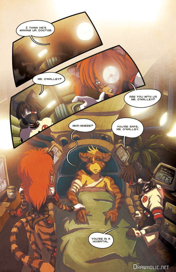
WHY?
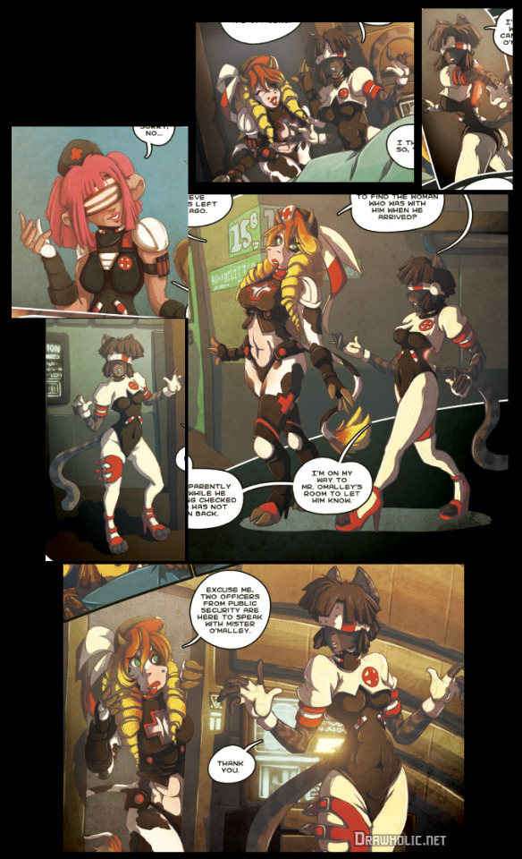
WHY ARE THE NURSE/DOCTOR UNIFORMS BONDAGE GEAR??? I know some stuff is weird cause ~future~ but oh my god. For fucks sake not only does that look uncomfortable to work in it's also probably highly unsanitary especially when you consider almost everyone has FUR. Just imagine one of them performing surgery on a patient and shedding their god damn fur into the open wound thanks to all the random patches of skin just open for no reason. Yeah let me just be on my feet all day tending to patients in fucking stilettos. Seriously, this isn't what you'd expect to see in a futuristic hospital, this is something straight out of a kink scene. Sterile and comfortable work uniforms? Nah, fuck that, lets just put them in straight up bondage gear. And of course it's just the girls.

Also why are some of them blindfolded? Are those supposed to be visors? How can they see when operating and tending to patients? Those visors are solid. If anything they look like it’ll hinder their work, not help it. Why are their gloves fingerless? That defeats the purpose of wearing medical gloves. I feel like I’m losing my mind.

Anyway, at least O’Malley went to the hospital instead of just wandering around wounded and pretending it’s all good. I mean he still leaves pretty quickly after waking up but whatever. Also looks like Sibo took his car so injured O’Malley has to get a cab back to his apartment. Dick move, Sibo. Why is that a dick move you ask? Well aside from the obvious she just goes back to his apartment anyway.
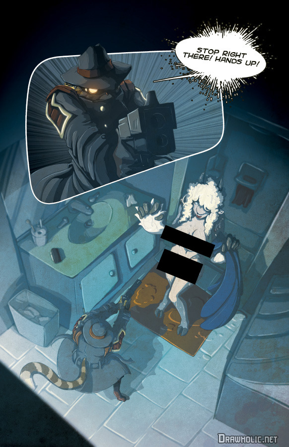
And also decides to take a shower while she’s there because we apparently haven’t filled our fanservice quota yet. Despite O’Malley’s apartment being literally above what is essentially a strip club. I wish I was joking. Anyway, after putting on some clothes Sibo explains that the reason she ditched O’Malley at the hospital was because she felt it wasn’t safe for them both to stay there. She also explains that the car just drove her back to the apartment cause self driving cars cause future but I still think it’s a dick move.
So they decide to get some rest and O’Malley has an ominous dream before waking up screaming. Also there’s just cops in his home now.

Sibo apparently ditched him again and the cops want answers about the shit that went down in chapter 2 because things don’t add up on their end. So O’Malley is pissed cause the cops don’t believe him and suspect him as having done something to the now missing Sibo. He goes around asking people about, presumably, Sibo for a bit before getting dragged into some kind of swat vehicle, beat up, then just dumped out in the rain somewhere else with his previous wound now reopened. And right when it looked like things couldn’t be bad enough there’s an explosion and-
Yeah that was all just a dream too. So O’Malley wakes up for real this time and turns on the news to see reports of a totally relevant explosion having happened in another area of the city before he goes and checks in on Sibo. And yup, she’s missing so he runs off to try and find her only to get hung up by a crime scene investigation downstairs at the strip club.
O’Malley runs to the garage complex to his car and is greeted by some freaky shit (including someone holding up Sibo’s severed head) which made me think all this was once again just ANOTHER dream but no, he comes back to reality in his car so I guess just the freaky shit in the garage was a hallucination I don’t even know anymore it feels like inception up in here. So O’Malley is losing his mind and who should call him in that moment but non other than Sibo asking for his help and talking about the danger orb and the ARnet. Naturally O’Malley rushes off to go save her and when he gets there he’s greeted by more carnage.
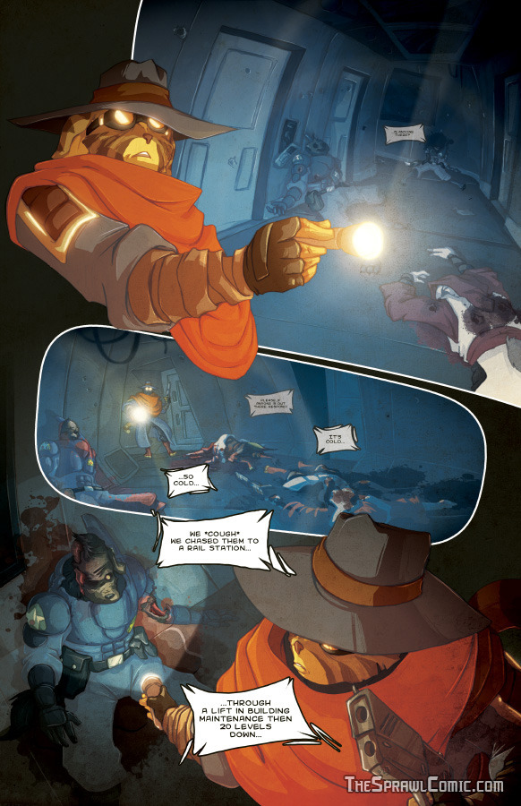
A cop that’s somehow still clinging to life fills O’Malley in a little on what happened and O’Malley goes down to the rail station and hops on a train. The following train scene I gotta say is really good. In contrast to O’Malley’s earlier inner monologues there’s absolutely no dialog or exposition or anything in this scene and I feel like it’s better for it. It lets just the visuals do the talking and it’s really solid.
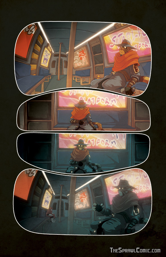
After jumping off the train O’Malley comes across the cultists again, this time with the danger orb, and this is where the comic kicks it back up to 11 because this next scene is actually pretty intense and hey i gotta give credit where it’s due.
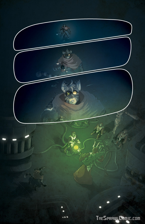
So O’Malley tries to fight off the cultists and free Sibo but the cultist summon some kind of nasty creature through Sibo and alas our poor new protagonist is overwhelmed and left to be found the same way he found that cop.

And here's where I have to take a moment to retract something I said in part 2 of this review. See, at the time of writing part 2, chapter 3 of the comic wasn't finished. Anyway, when I said golden boy Getta was gone for good I was wrong. Because here he fucking is. Back for more at the end of this chapter.

I don’t know how to feel about his appearance anymore because he was shown to know more than he let on but he just left so abruptly. I mean this could also be someone else but come on, who else would it be but the golden boy?
And because I took so damn long to write part 3 I’m just gonna quickly sum up what’s happened in chapter 4 so far. Basically shit’s going to hell in a hand-basket and there’s robots now. The robot designs look really cool. Oh and our friend the hour counter makes another appearance and I don’t care enough to do the math this time.
In conclusion:
The fetishy bullshit isn't doing the comic any favors. Or, well, considering how popular porn is on the internet maybe it is, but it certainly isn't doing the STORY any favors. I think this is honestly the most disappointing thing about the sprawl. I actually like some of the male characters designs and clothing but most if not all the designs for the female characters so far are questionable at best. Seriously the main concern for the design of the women in this comic is obviously for sex appeal and it’s distracting in a bad way.
The coloring and shading is actually generally really well done. It sets the tone really well and different places have different lighting, it’s good. It's just a shame the lines and anatomy are so shoddy. It does get better as it goes but it still feels like the weak link, especially the facial anatomy.
Honestly the backgrounds are the better parts of the art. Which seems a little backwards. Generally speaking most comic artists I've seen start with drawing characters and the like, and usually don't do backgrounds as much until they start actually making the comic pages (even then they leave out backgrounds many times in the panels). This, however, really goes out of its way to show just where the characters are at any given moment, and while what's happening isn't always clear, the backgrounds are almost always there. I have to give it credit. Aside from some perspective weirdness here and there the backgrounds are really good.
The more I think about it the more I feel a vast majority of chapter one could have been skipped entirely and the small important bits turned into a prologue. The story could have started with chapter 2 and almost nothing would change. It could have easily just started with Getta packing up the orb surrounded by corpses. That would have been WAY MORE EFFECTIVE than the endless bullshit that comes up long before anything actually interesting happens. Because with that RIGHT AWAY you would get mystery, arguably one of the most effective hooks any creative work can have. What happened here? Who are those people? Who is this guy? What's that orb? BOOM. Instant intrigue. A lot of this is more confusing than mysterious. Now don’t take that as me wanting everything explained. I get it’s supposed to be a mystery and we’re supposed to question things and have stuff slowly revealed over time but that’s not really what happens here. Yes things get revealed but there’s not enough established before those reveals for it to hold too much meaning to the readers. There are parts of this that are genuinely good and I would enjoy if it weren't for the parts that take me out of it so fast I get whiplash.
I wanted to like this, by all rights I should have liked this comic, it has many elements I’m a fan of. This story could EASILY be fascinating and mysterious and terrifying, it's just a shame those elements have to share the spotlight with heavy handed tropes, pacing problems, nonsensical leaps of logic, and tits. In the end a lot of it just left me like

I hope it gets better honestly. Shit’s really going down now so who knows. But damn those first two and a half chapters were rough.
There, I’m done, I’m free.
-Raccoon
1 note
·
View note
Text
Randomizing Photo Shoots to Stretch My Creativity
I am a fan of light (honestly what photographer isn’t?). Hard light; reflected light; dappled light; low-key light; colored light — I love it all. Light makes or breaks not only my images but my mood. I’d venture to say that light is sandwiched between “belonging” and “safety” on my hierarchical pyramid of needs.
As a photographer, I have spent years exploring different ways to shape and capture light. These past few years I was fortunate to experience an extended period of hyper-productivity once I had a dedicated studio space of my own (no more basements!). Because I was sitting in a studio every day with nothing but time on my hands, it felt like a sin to let it go to waste. I began shooting almost daily — sometimes even two or three times a day — just photographing friends (or flowers if scheduling prohibited a portrait), all the while exploring light. It was glorious.
As of late, however, my need to explore studio lighting has waned. I still have the drive to create, but I find myself at a place where I am uncertain how to proceed. Light exploration no longer alone satiates my creative needs. There’s no more mystery in the discovery for me. It’s time to push my limits again. I need to get outside my head and my go-to techniques. But how does one simply pull themselves up by their artistic bootstraps? I need something to force my creative hand.
After a great deal of thinking I decided that randomizing my shoots would be a fantastic way to surrender control and get into some new creative territories. My thinking is that the more constraints I am forced to work within, the more creative I will need to be. It’ll force me to work in new ways (meaning innovation, hopefully) to pull off an image that I’m happy with.
The solution that I came up with is a short, randomized list of letters that I offer to my subject when they arrive at my studio. What they select will determine the specifics of how I must execute the shoot, thus turning them into an accidental art director of sorts. Here’s what my subjects a presented with at a shoot:
Circle one:
1. A/B/C
2. A/B
3. A/B/C
4. A/B/C/D/E
Only applies if you answered B-E on number four:
5. A/B/C/D
6. A/B/C/D/E/F/G/H
They have no idea what the letters represent, but this is what the letters determine for me:
1. The location of the shoot: (A) shoot in studio; (B) shoot at an indoor location (not studio); (C) shoot at an outdoor location
2. The color grading that I can use in post: (A) images will remain in color; (B) final images will be converted to black & white
3. Lens choice: (A) 16-35mm f/2.8; (B) 85mm f/1.2; (C) 100mm f/2.8 macro
4. Lighting: (A) natural light; (B) one strobe; (C) two strobes; (D) three strobes; (E) four strobes
5. Lighting modifiers: (A) bare flash; (B) soft box; (C) snoot with barn doors; (D) spot grid
6. Colored gels: (A) no gels; (B) red; (C) orange; (D) yellow; (E) green; (F) cyan; (G) blue; (H) magenta
For the trial run of this, I brought in Pilar, a friend and frequent collaborator. We shot three looks. For the first look, Pilar selected the options B, A, B, C, B, D. This determined that I needed to shoot at an indoor location (luckily my studio resides in a huge warehouse with plenty of great indoor locations), with my 85mm lens and two lights. The lights were to be used with softboxes, and I need to incorporate yellow gels (a color I rarely use by itself). Fortunately for me, the color grading choice fell in favor of retaining the color, allowing the soft yellow light to remain in the final images. In post I decided to add some subtle blue notes in the tone curves in order to complement the yellow light.
For the second look, the randomized creative direction dictated that we were to shoot in my studio with a 100mm macro lens, using one light with softbox, and no gel, with the final images again remaining in color. I decided to carry over the blue color grading from the first look to the second, creating a bit of unity between the two scenarios.
Side note: I can’t remember the last time I lit something so simply that wasn’t shot for a client. My default is to over-complicate and never replicate, which is an impossible standard to live up to. This exercise could prove to be really helpful for my brain as well as my image-making process.
For the third look, fate decided that I was to adhere to the following parameters: studio shoot; wide-angle lens; must use four lights; cyan gels; spot grid; final files are to remain in color. Four lights?? I typically use two, or maybe three at the max. After a bit of brainstorming, I decided to use two cyan-gelled lights to create a cyan background to mimic a clear sky (a rare thing in Columbus these days). I added a cyan-gelled light with a softbox on my subject (two-stops underexposed), and a spot grid on her face, mimicking bright sunlight.
I was happy with the trial run but wanted to keep pushing. A week later I brought in Emily, another frequent collaborator of mine. This time, between each scenario I changed the order of the questions to prevent her from figuring out what each choice represented.
We shot four looks. Her selections ranged broadly in location (studio, indoor location, and outside), lighting (everything from window light to four lights), and lens choice (literally every single lens I own). Somehow she managed to select black and white for the color grading in all four scenarios.
This time my task was to figure out how to unify such a broad range of locations and lighting setups. These restrictions led me to look for textures and patterns to unify the four looks.
My first look was with four lights, one of which needed to be gelled green, though it would be later converted to black and white. I knew that if I used the green light was a soft fill, I could later decide to raise or lower the luminance of the green channel in post to brighten or darken portions of the image.
We returned to the studio to regroup and figure out the next scenario. The second look was to be shot with natural light outside. How would I unify images that were harshly-lit in an industrial environment with those shot in soft outdoor sunlight? The sun was going in and out of the clouds, meaning I couldn’t rely on shadows to carry the shot. I put Emily in front of a fence covered in vines in order to get some nice contrast shapes. Lucky for me, on our way back inside the sun popped out for a moment, so I had her stand under a fire escape to incorporate some hard shadows.
The third look was to be shot in studio with available light and a wide-angle lens. Now that I had a hard light/shadow theme going, I really needed to get innovative to tie this look in with the first two. I have a 4×8’ v-flat that I painted black on one side and left white on the other. I started by having her stand in front of the edge of the black side, with the white backdrop on the left side of my frame. Then I had the idea to close the v-flat around her, sandwiching her in the black part, with the white side facing the camera. The contrast of black and white with her garment really brought the images together. Since I had to shoot with my wide angle lens, I needed to stay far enough away from her that her features didn’t distort.
For the fourth look, I needed to incorporate cyan (not so different from the green), a spot grid, and shoot in studio. For the sake of cohesion, I decided to use the v-flat once again, this time placing her in the middle. By showing the top of the v-flat in the shot, it mimicked the shape of an open book, which I kind of liked. I lit the whole the model and v-flat with a cyan-gelled softbox (a stop underexposed). I lit her with a spot grid. I lit the backdrop behind the v-flat with a third, unmodified flash.
At the least, these tests have been fun. I love a good challenge and it’s exciting to see what randomness will ensue. On a more macro level, these tests are pushing me into new creative territories and out of stagnation, and I am here for it.
About the author: Nick Fancher is a Columbus, Ohio-based portrait and commerce photographer. You can also find more of his work and writing on his website. His popular books can be purchased on Amazon. This article was also published here.
source https://petapixel.com/2019/03/06/randomizing-photo-shoots-to-stretch-my-creativity/
0 notes
Text
Randomizing Photo Shoots to Stretch My Creativity
I am a fan of light (honestly what photographer isn’t?). Hard light; reflected light; dappled light; low-key light; colored light — I love it all. Light makes or breaks not only my images but my mood. I’d venture to say that light is sandwiched between “belonging” and “safety” on my hierarchical pyramid of needs.
As a photographer, I have spent years exploring different ways to shape and capture light. These past few years I was fortunate to experience an extended period of hyper-productivity once I had a dedicated studio space of my own (no more basements!). Because I was sitting in a studio every day with nothing but time on my hands, it felt like a sin to let it go to waste. I began shooting almost daily — sometimes even two or three times a day — just photographing friends (or flowers if scheduling prohibited a portrait), all the while exploring light. It was glorious.
As of late, however, my need to explore studio lighting has waned. I still have the drive to create, but I find myself at a place where I am uncertain how to proceed. Light exploration no longer alone satiates my creative needs. There’s no more mystery in the discovery for me. It’s time to push my limits again. I need to get outside my head and my go-to techniques. But how does one simply pull themselves up by their artistic bootstraps? I need something to force my creative hand.
After a great deal of thinking I decided that randomizing my shoots would be a fantastic way to surrender control and get into some new creative territories. My thinking is that the more constraints I am forced to work within, the more creative I will need to be. It’ll force me to work in new ways (meaning innovation, hopefully) to pull off an image that I’m happy with.
The solution that I came up with is a short, randomized list of letters that I offer to my subject when they arrive at my studio. What they select will determine the specifics of how I must execute the shoot, thus turning them into an accidental art director of sorts. Here’s what my subjects a presented with at a shoot:
Circle one:
1. A/B/C
2. A/B
3. A/B/C
4. A/B/C/D/E
Only applies if you answered B-E on number four:
5. A/B/C/D
6. A/B/C/D/E/F/G/H
They have no idea what the letters represent, but this is what the letters determine for me:
1. The location of the shoot: (A) shoot in studio; (B) shoot at an indoor location (not studio); (C) shoot at an outdoor location
2. The color grading that I can use in post: (A) images will remain in color; (B) final images will be converted to black & white
3. Lens choice: (A) 16-35mm f/2.8; (B) 85mm f/1.2; (C) 100mm f/2.8 macro
4. Lighting: (A) natural light; (B) one strobe; (C) two strobes; (D) three strobes; (E) four strobes
5. Lighting modifiers: (A) bare flash; (B) soft box; (C) snoot with barn doors; (D) spot grid
6. Colored gels: (A) no gels; (B) red; (C) orange; (D) yellow; (E) green; (F) cyan; (G) blue; (H) magenta
For the trial run of this, I brought in Pilar, a friend and frequent collaborator. We shot three looks. For the first look, Pilar selected the options B, A, B, C, B, D. This determined that I needed to shoot at an indoor location (luckily my studio resides in a huge warehouse with plenty of great indoor locations), with my 85mm lens and two lights. The lights were to be used with softboxes, and I need to incorporate yellow gels (a color I rarely use by itself). Fortunately for me, the color grading choice fell in favor of retaining the color, allowing the soft yellow light to remain in the final images. In post I decided to add some subtle blue notes in the tone curves in order to complement the yellow light.
For the second look, the randomized creative direction dictated that we were to shoot in my studio with a 100mm macro lens, using one light with softbox, and no gel, with the final images again remaining in color. I decided to carry over the blue color grading from the first look to the second, creating a bit of unity between the two scenarios.
Side note: I can’t remember the last time I lit something so simply that wasn’t shot for a client. My default is to over-complicate and never replicate, which is an impossible standard to live up to. This exercise could prove to be really helpful for my brain as well as my image-making process.
For the third look, fate decided that I was to adhere to the following parameters: studio shoot; wide-angle lens; must use four lights; cyan gels; spot grid; final files are to remain in color. Four lights?? I typically use two, or maybe three at the max. After a bit of brainstorming, I decided to use two cyan-gelled lights to create a cyan background to mimic a clear sky (a rare thing in Columbus these days). I added a cyan-gelled light with a softbox on my subject (two-stops underexposed), and a spot grid on her face, mimicking bright sunlight.
I was happy with the trial run but wanted to keep pushing. A week later I brought in Emily, another frequent collaborator of mine. This time, between each scenario I changed the order of the questions to prevent her from figuring out what each choice represented.
We shot four looks. Her selections ranged broadly in location (studio, indoor location, and outside), lighting (everything from window light to four lights), and lens choice (literally every single lens I own). Somehow she managed to select black and white for the color grading in all four scenarios.
This time my task was to figure out how to unify such a broad range of locations and lighting setups. These restrictions led me to look for textures and patterns to unify the four looks.
My first look was with four lights, one of which needed to be gelled green, though it would be later converted to black and white. I knew that if I used the green light was a soft fill, I could later decide to raise or lower the luminance of the green channel in post to brighten or darken portions of the image.
We returned to the studio to regroup and figure out the next scenario. The second look was to be shot with natural light outside. How would I unify images that were harshly-lit in an industrial environment with those shot in soft outdoor sunlight? The sun was going in and out of the clouds, meaning I couldn’t rely on shadows to carry the shot. I put Emily in front of a fence covered in vines in order to get some nice contrast shapes. Lucky for me, on our way back inside the sun popped out for a moment, so I had her stand under a fire escape to incorporate some hard shadows.
The third look was to be shot in studio with available light and a wide-angle lens. Now that I had a hard light/shadow theme going, I really needed to get innovative to tie this look in with the first two. I have a 4×8’ v-flat that I painted black on one side and left white on the other. I started by having her stand in front of the edge of the black side, with the white backdrop on the left side of my frame. Then I had the idea to close the v-flat around her, sandwiching her in the black part, with the white side facing the camera. The contrast of black and white with her garment really brought the images together. Since I had to shoot with my wide angle lens, I needed to stay far enough away from her that her features didn’t distort.
For the fourth look, I needed to incorporate cyan (not so different from the green), a spot grid, and shoot in studio. For the sake of cohesion, I decided to use the v-flat once again, this time placing her in the middle. By showing the top of the v-flat in the shot, it mimicked the shape of an open book, which I kind of liked. I lit the whole the model and v-flat with a cyan-gelled softbox (a stop underexposed). I lit her with a spot grid. I lit the backdrop behind the v-flat with a third, unmodified flash.
At the least, these tests have been fun. I love a good challenge and it’s exciting to see what randomness will ensue. On a more macro level, these tests are pushing me into new creative territories and out of stagnation, and I am here for it.
About the author: Nick Fancher is a Columbus, Ohio-based portrait and commerce photographer. You can also find more of his work and writing on his website. His popular books can be purchased on Amazon. This article was also published here.
from Photography News https://petapixel.com/2019/03/06/randomizing-photo-shoots-to-stretch-my-creativity/
0 notes
Text
20 Stylish Bohemian Shower Curtain Ideas You Will Love

Are you in poor health and tired of seeing a monotonous bathroom every single day? in spite of everything, it's just a bathroom, proper? it is now not a few space that you just should give so much of attempt and time with. Yeah, you think so? reassess. This time, call to mind how a lot time you spend to your toilet. (I certain spend a while in mine. Mostly because that may be the place i get to suppose without getting bothered.) How so much is it used whilst you have visitors, family, and friends over? How much your teenagers (if you will have) stayed in there to do their trade, would possibly it's potty, pee time or their most favourite thing to do, bathtub time?
See, the bathroom isn't one thing you just overlook because you and your family get to make use of it extra continuously than you thought you do. you will have to take care of its cleanliness and the atmosphere that you just need it to have. Like making it more enjoyable and fascinating on the related time. for those who are the type of person who wants to make your toilet pop in the highest and handy means possible without spending an excessive amount of, this checklist is correct for you. You do not have to decide to any lengthy-term design like portray or redo your whole space just to reach that spa-like atmosphere all of us desire to have in our toilet. So, what can you do? All you need to do is to provide it just a little time and maybe spend just a little money too otherwise you will even do it your self if you've gotten the equipment and skills to do so. Let me assure you that what you're approximately to look will give your rest room an instant makeover with a global-impressed or eclectic look that is trendy and chic. Are you excited to grasp extra approximately it? Stay studying to see those gorgeous 20 Stylish Bohemian Bathe Curtains I rounded as much as get you began.
Photograph: https://www.etsy.com/listing/566876423/hippie-boho-shower-curtain-non-compulsory-tub Let the hippie in you are taking over and make this colourful bathe curtain take the highlight for your toilet. Its beautiful colours might look absolutely gorgeous in a neutral house, and the over-sized feather pattern is perfect so as to add interest and texture in your toilet.
Picture: https://www.wayfair.com/bed-bath/pdp/grove-hill-sierra-shower-curtain-gove1028.html This copper shower curtain is an ideal addition in your tropical-impressed bohemian rest room. Boho look speaks about nature and how stunning it is like this gorgeous curtain with not anything however gorgeous, rich earth colors. Its elegant colorations may take any rest room designs a notch and its wave-like development and stripes are positive to add texture and punch to any space.
Picture: https://homedesignlover.com/rest room-designs/bohemian-toilet-designs Add a chic bohemian vibe with this shower curtain embellished with black pompoms on best growing a perfect and fun distinction towards its white base. This edgy accessory will glance superb in any toilet interiors.
Photo: https://lauralhome.com/collections/shower-curtains/merchandise/ikat-bloom-shower-curtain if you are looking for a daring punch in your toilet, go for this ikat-impressed shower curtain. It has unique and playful styles with captivating cushy colours that talk bohemian in each experience.
Photograph: https://www.anthropologie.com/save/risa-bathe-curtain Every Other curtain that showcases an elegant eclectic look and enjoyable styles and colours guaranteed to brighten and give that bohemian vibe to any rest room house.
Photograph: https://www.jossandmain.com/mattress-tub/pdp/hutcherson-bathe-curtain-hohm6305.html i love how this white crisp curtain exudes sophistication. It has cascading ruffle border that add the appropriate quantity of texture, style, and fun to any area. this will look great in the event you need to succeed in a white-on-white space with a romantic hippie touch.
Photograph: https://www.pompomathome.com/merchandise/vintage-crochet-shower-curtain Create an wireless bohemian-feel straight from the 70’s in your rest room with this pretty antique bathe curtain with beautiful crocheted hammock valance and comfortable tassels in different heights. this may glance fab either on a white interior or as a distinction to a miles darker colour scheme bathroom.
Photo: https://www.lushdecor.com The usage of plants and other herbal components as decor in a bohemian area is a must. when you don't seem to be into including real vegetation to your toilet area, then this tropical-inspired shower curtain is the precise are compatible for you. this may instantly create a boho vibe that lavish greenery brings.
Picture: https://www.bedbathandbeyond.com Create a soothing yet fashionable bathroom with this charming bathe curtain. Its unique trend of medallions and elephants with an exhilarating backside fringe give stunning distinction and an instant bohemian makeover.
Picture: wayfair.com A nod to the hippies of the 60’s and 70’s, this pretty tie-dyed shower curtain may come up with that wireless pop of hippie vibe to your area. that is a super choice if you happen to wanted to go bold to your toilet but used to be just undecided.
Picture: https://www.lushdecor.com/merchandise/darla-shower-curtain i really like how this shower curtain seems so dainty and candy. it is filled with gorgeous texture that you can see in such a lot boho areas. this may increasingly lend a chic and romantic look in any bathroom.
Photograph: http://nestinteriordesigngroup.com in the event you are one with the skills and have a sense of creativity this bathe curtain will encourage you. i am positive you can love to know the place to get that gorgeous bathe curtain you spot that may be so trendy with loads of texture that boho spaces crave. alright, i can tell you. it is a repurposed chenille bedspread, lovely isn’t it?
Photo: https://www.anthropologie.com/retailer/georgina-bathe-curtain Make A Selection an exciting accessory like this bathe curtain to take your bathroom as much as a distinct stage. Rows of subtle flower petal ruffles adorn the top creating a charming look. This bathe curtain might supply a chic, romantic bohemian contact that is refined and relaxing in any area.
Picture: https://laurenconrad.com Give your toilet a contemporary bohemian vibe with this shocking bathe curtain from Lauren Conrad. Its cushy cool hue is sure to liven any area and its beautiful ruffles be offering personality and a amusing texture that adds sophistication to its simplicity.
Photo: https://www.jossandmain.com/mattress-tub/pdp/kendricks-bathe-curtain-bfbg1076.html For people who love everything about oceans and seas this bathe curtain is for you. This coastal-impressed bathe curtain will supply an ocean botanical sanctuary to your toilet. Its comfortable colours be offering tasteful contrasts whilst its playful image trend brings hobby and character to the whole house.
Picture: https://wallsneedlove.com/collections/shower-curtains/merchandise/bohemian-map-bathe-curtain Bohemian taste is large in travels and journey and an elegant map shower curtain is a perfect approach to bring that boho vibe on your bathroom. it'll provide your space an eclectic vibe that may be each unexpected and strikingly fascinating.
Photograph: https://lauralhome.com/collections/bathe-curtains/merchandise/herbal-hotel-shower-curtain This captivating bathe curtain with a southwestern trend on a wooden background provides a bold bohemian accessory to any toilet space. Its cushy color palette and beautiful contrasting main points guaranteed to offer your area whimsy that all boho areas exude.
Photo: https://www.pompomathome.com/collections/tub-collection/merchandise/caprice-bathe-curtain If you wish to have to give your area a feminine bohemian vibe in an wireless, glance no further. This bathe curtain with ornate embroidery and classical cotton lace in a soft aqua shade will come up with that bohemian makeover in no time.
Picture: https://www.jossandmain.com Provide a recent and edgy glance to your bathroom space with this amusing and cool bohemian shower curtain. Its ruffled-tier from most sensible to backside can be a perfect have compatibility for any bathroom area that wishes style and texture.
Photo: https://www.denydesigns.com/products/khristian-a-howell-une-femme-in-blue-bathe-curtain Create a relaxing and dainty bohemian space in your rest room with this subtle yet bold shower curtain in a female soft sunglasses of purple, lavender and cream blooms on a calming muted blue base. This bathe curtain will glance surprising in gentle colour schemes spaces. Choosing a bohemian shower curtain to take the middle level in your bathroom space is one among essentially the most stylish and trendiest tactics to head if you are afraid to dedicate on any long-time period adjustments to your home. you'll modification each time you convert your mood or would really like to achieve a special look.
This world look that would be edgy and chic will provide your area the unique flair in an wireless. it might amendment the whole vibe into a amusing, kick back yet inviting setting. the colours we've got showcased as of late are most commonly muted and cushy however with great distinction and really attention-grabbing styles that might lift a dull mood. i am hoping i used to be able to ignite your enthusiasm to appear into this beautiful eclectic taste. These unbelievable bohemian bathe curtain designs may look more boho than it already is in the event you include crops into your space. More plants in different heights would not only upload attraction but it may also clean the air you breathe. Allow me know which of those beauties in the listing could you most likely use. I would love to listen to from you.
Read the full article
0 notes
Link
While much of the tech industry has grown bearish on the volatility of cryptocurrencies, enthusiasm for its underlying technology remains at an all-time high. Nowadays we see -blockchain" cropping up with impressive frequency in even the most unlikely startup pitches. And while blockchain technology does have genuinely interesting and potentially powerful use cases, it has enormous drawbacks for consumer applications that get little mention in media coverage.
My background is developing virtual worlds similar to Second Life - MMOs where users create, build, and usually sell their virtual wares to other users. In principle, blockchain should be my holy grail, enabling user-to-user micropayments without a middleman. But it's not that now, and it probably won't be for a long time. Here's why:
Blockchain cannot be everything it aspires to be at the same time
As it stands, blockchain is caught between three competing objectives: fast, low-cost, and decentralized. It is not yet possible to make one chain that achieves all three. Fast and decentralized chains will incur a high cost because the storage and bandwidth requirements for historical archiving will be enormous and will bloat even with pruning. Aim for fast and low-cost, and you'll have to introduce a bank-like authority (-Tangles" are a proposed solution, but not yet fully understood).
At high volume, a good credit card processor can settle a typical $2 transaction for somewhere around $0.10. Some of the largest online game economies manage more than a million user-to-user transactions per day, instantaneously, with no fees. And yet, I can name half a dozen startups trying to inject an expensive and slow blockchain into this very problem.
Blockchain is a customer support nightmare
For most consumers, losing a password to an online service is a mild inconvenience they've grown accustomed to, since typically, it's quickly fixed by requesting an email reset, say, or talking with customer service.
Blockchain wallets and their passwords, by contrast, are tied to a file on a user's hard disk and are absolutely critical to users trying to access the blockchain. By their very nature they have no recovery mechanism. -You lose your password, you lose everything" is an awful user experience for mainstream consumers and a nightmare for companies attempting to build their service on a blockchain. If you use a hosted service, the risk of theft or sudden loss of assets is very real, with central targets and limited traceability.
Let's say you're trying to run an online game or other consumer service where purchases are made on the blockchain. How do you handle refund requests? How do you even verify a loss? How do you handle theft or purchases financed with stolen cards? A company could, of course, create a blockchain master override with a recovery protocol, but that would totally defeat the purpose of using a system that's supposed to be decentralized.
Which takes me to another problem:
Blockchain adds frictions to an already seamless process
Nothing about blockchain applications is easy for consumers right now. Everyday users accustomed to making digital and online payments would have to be trained to make blockchain purchases, learning to apply the right mix of paranoia and caveat emptor to prevent theft or buying from shady dealers. Irreversible pseudonymous transactions do not lend themselves well to trust and integrity.
Compounding this is the speed and the transaction fees involved. Most public chains have settlements measured in minutes - unless you're willing to pay high transaction fees. Compare that to the 2-10 seconds for a saved credit card transaction customers are accustomed to in the age of fast mobile interfaces and instant gratification.
Privately operated chains have the potential for custom mixes of settlement times and fees - but all will be subject to the competing objectives described above. If developers lean too far one way or another, they open themselves up to everything from denial of service attacks to having storage and bandwidth problems.
Consider the recent CryptoKitties fad. It's a fantastic case study of where things can start to go wrong when you put consumer activities into a blockchain. It congested the Ethereum network almost single handedly, and the company had to raise transaction costs significantly to overcome the resulting lag. This whole activity was only a fraction of the size of many medium-sized online consumer services, let alone the truly big ones.
These points only scratch the surface of what it'll truly take to make blockchain ready for a mass market. Assuming we reach the point where millions of people are using blockchain-based services every day, businesses will face ever-expanding storage requirements to maintain and access the chain for auditing purposes. Ethereum's blockchain is growing by well over 50 gigabytes a year now, a size that's already too massive for immediate access - and it's destined to keep growing.
As I said at the start, none of this is meant to suggest blockchain isn't a worthwhile technology. And there are some early attempts underway to address the problems I've raised. But to become truly viable, blockchain tech is going to need fundamental improvements that require thousands of minor changes - or, perhaps, a radical rethink of the key ideas.
A good starting point is to honestly reappraise what problems blockchain can solve - and to look at whether those problems could be addressed in much more practical, proven ways. Many blockchain enthusiasts were first excited by the idea of cryptocurrency after reading about it in Neal Stephenson's Cryptonomicon. But there's a big difference between how inspiring it might have appeared in a great science fiction novel versus how it works in actual practice. After all, Second Life was originally inspired by the Metaverse from Neal Stephenson's Snow Crash. But having handled hundreds of Linden Dollar payments and issues from hordes of excitable furries, I can assure you that doing business in an actual Metaverse also didn't quite turn out the way we imagined.
Adam Frisby is CEO and lead developer of Sinespace, a Unity-based MMO and social VR platform.
http://ift.tt/2Ij35GV
0 notes
Text
Why blockchain isn’t ready for primetime
http://cryptobully.com/why-blockchain-isnt-ready-for-primetime/
Why blockchain isn’t ready for primetime
While much of the tech industry has grown bearish on the volatility of cryptocurrencies, enthusiasm for its underlying technology remains at an all-time high. Nowadays we see “blockchain” cropping up with impressive frequency in even the most unlikely startup pitches. And while blockchain technology does have genuinely interesting and potentially powerful use cases, it has enormous drawbacks for consumer applications that get little mention in media coverage.
My background is developing virtual worlds similar to Second Life — MMOs where users create, build, and usually sell their virtual wares to other users. In principle, blockchain should be my holy grail, enabling user-to-user micropayments without a middleman. But it’s not that now, and it probably won’t be for a long time. Here’s why:
Blockchain cannot be everything it aspires to be at the same time
As it stands, blockchain is caught between three competing objectives: fast, low-cost, and decentralized. It is not yet possible to make one chain that achieves all three. Fast and decentralized chains will incur a high cost because the storage and bandwidth requirements for historical archiving will be enormous and will bloat even with pruning. Aim for fast and low-cost, and you’ll have to introduce a bank-like authority (“Tangles” are a proposed solution, but not yet fully understood).
At high volume, a good credit card processor can settle a typical $2 transaction for somewhere around $0.10. Some of the largest online game economies manage more than a million user-to-user transactions per day, instantaneously, with no fees. And yet, I can name half a dozen startups trying to inject an expensive and slow blockchain into this very problem.
Blockchain is a customer support nightmare
For most consumers, losing a password to an online service is a mild inconvenience they’ve grown accustomed to, since typically, it’s quickly fixed by requesting an email reset, say, or talking with customer service.
Blockchain wallets and their passwords, by contrast, are tied to a file on a user’s hard disk and are absolutely critical to users trying to access the blockchain. By their very nature they have no recovery mechanism. “You lose your password, you lose everything” is an awful user experience for mainstream consumers and a nightmare for companies attempting to build their service on a blockchain. If you use a hosted service, the risk of theft or sudden loss of assets is very real, with central targets and limited traceability.
Let’s say you’re trying to run an online game or other consumer service where purchases are made on the blockchain. How do you handle refund requests? How do you even verify a loss? How do you handle theft or purchases financed with stolen cards? A company could, of course, create a blockchain master override with a recovery protocol, but that would totally defeat the purpose of using a system that’s supposed to be decentralized.
Which takes me to another problem:
Blockchain adds frictions to an already seamless process
Nothing about blockchain applications is easy for consumers right now. Everyday users accustomed to making digital and online payments would have to be trained to make blockchain purchases, learning to apply the right mix of paranoia and caveat emptor to prevent theft or buying from shady dealers. Irreversible pseudonymous transactions do not lend themselves well to trust and integrity.
Compounding this is the speed and the transaction fees involved. Most public chains have settlements measured in minutes — unless you’re willing to pay high transaction fees. Compare that to the 2-10 seconds for a saved credit card transaction customers are accustomed to in the age of fast mobile interfaces and instant gratification.
Privately operated chains have the potential for custom mixes of settlement times and fees — but all will be subject to the competing objectives described above. If developers lean too far one way or another, they open themselves up to everything from denial of service attacks to having storage and bandwidth problems.
Consider the recent CryptoKitties fad. It’s a fantastic case study of where things can start to go wrong when you put consumer activities into a blockchain. It congested the Ethereum network almost single handedly, and the company had to raise transaction costs significantly to overcome the resulting lag. This whole activity was only a fraction of the size of many medium-sized online consumer services, let alone the truly big ones.
These points only scratch the surface of what it’ll truly take to make blockchain ready for a mass market. Assuming we reach the point where millions of people are using blockchain-based services every day, businesses will face ever-expanding storage requirements to maintain and access the chain for auditing purposes. Ethereum’s blockchain is growing by well over 50 gigabytes a year now, a size that’s already too massive for immediate access — and it’s destined to keep growing.
As I said at the start, none of this is meant to suggest blockchain isn’t a worthwhile technology. And there are some early attempts underway to address the problems I’ve raised. But to become truly viable, blockchain tech is going to need fundamental improvements that require thousands of minor changes — or, perhaps, a radical rethink of the key ideas.
A good starting point is to honestly reappraise what problems blockchain can solve — and to look at whether those problems could be addressed in much more practical, proven ways. Many blockchain enthusiasts were first excited by the idea of cryptocurrency after reading about it in Neal Stephenson’s Cryptonomicon. But there’s a big difference between how inspiring it might have appeared in a great science fiction novel versus how it works in actual practice. After all, Second Life was originally inspired by the Metaverse from Neal Stephenson’s Snow Crash. But having handled hundreds of Linden Dollar payments and issues from hordes of excitable furries, I can assure you that doing business in an actual Metaverse also didn’t quite turn out the way we imagined.
Adam Frisby is CEO and lead developer of Sinespace, a Unity-based MMO and social VR platform.
Blockchain
0 notes
Text
How to Draw Birds: Draw Realistic Animals
Nuthatch I by David Kitler
Wherever you live, you likely don’t live alone. Not when you consider the birds in your backyard or the pigeons on the sidewalk or seagulls cawing at you if you live along the coast. Birds are a constant companion for many of us and yet we can forget to explore them in our art. Take birds as your subject matter and you discover the fun of color and texture … and attitude!
Here David Kitler shows us how to draw a bird with a ton of attitude in just ten steps. And when you are done with that, you’ll be ready to add luscious paint, which is where the Essentials of Painting Birds comes in. You’ll learn how to create beautiful paintings of realistic birds in impressionist natural settings that are full of color and void of complications. It’ll be easy and it’ll be fun. Enjoy!
Draw Realistic Animals
Nature artist David N. Kitler shares easy techniques and expert tips on how to draw birds.
Red-Breasted Nuthatch (graphite and acrylic, 12×9)
I’ve always been intrigued by nature’s intricate details. It’s this complexity — combined with the subtleties of mood and environment — that I attempt to capture in my drawings and paintings.
I tend to travel to where my subjects live so I can observe their behaviors and interactions within their natural habitats. While on location, I also gather as much reference as possible, from photographs to actual specimens — fallen feathers, fur, grasses and the like. Back in the studio, I’ll look through all the reference I’ve gathered to decide which of my experiences I want to depict at that particular moment.
I then prepare my initial idea on a separate piece of paper and transfer it to a board so I can preserve my original experience and enjoy developing it once again. These drawings that I make for my paintings I call preliminary sketches, and they have by definition an unfinished look — no background, parts of the subject that fade off and undefined edges.
I’ll show you the techniques I used to create one of my preliminary sketches enhanced with acrylic washes in the following demonstration. My choice of subject — a red-breasted nuthatch — wasn’t dictated by the bird’s pose or an interesting light source.
I simply chose it because it reminds me of the experience of being in the woods on a cold winter’s day (the shortest day of the year), when the birds and I were the only creatures around. I should also mention that the nuthatch is a tiny bird (4 inches from beak to tail), but I decided to draw it larger than life to better showcase the species and its beautiful markings.
1. Draw the basic shapes
I view my world as a series of shapes and forms — mainly circles, squares, triangles and cylinders. As an initial exercise (on the lower right of the sheet), I drew the bird in its most basic shapes to show you how I see it.
Tip: If you start to look at things in terms of basic shapes, whether your reference is three-dimensional (an object) or two-dimensional (a photo) or simply in your imagination, you’ll notice that replicating those simple shapes in either a larger or smaller size is an efficient way to begin a drawing.
I develop those basic shapes a little further, as I’ve done with the drawing in the center of this photo. For a painting, this is as far as I’d take the drawing before transferring it to a board, where I’d continue “drawing” with a paintbrush. For this exercise, I’ve finished my piece as a drawing.
2. Focus on the eye
In this instance, I’ve decided to start the drawing with the nuthatch’s eye. This area is usually the most important element in my pieces. It’s the place I aim to have the most detail, contrast and crispness, in an effort to help the viewer connect to the animal in the drawing or painting. After drawing the eye’s basic shape, I blocked in the surrounding areas to ensure proper placement and proportions, using an HB lead in a mechanical pencil.
Keeping in mind that viewers will be drawn to the area with the most contrast, I used a 9B pencil to fill the pupil’s bottom half, which will be the darkest part of the bird. Next, in order to incorporate the reflection of the surrounding trees, I used HB lead in a technical pencil to push some of the graphite from the pupil area in order to suggest tree shapes. Finally, using 4H and HB leads, I pulled out radiating lines to fill in the iris.
3. Complete the eye
Working with a mask — in this case, the holes at the edge of an old computer printout — I used a white eraser to remove the top half of the guideline I’d used for the pupil. I then used a wood dowel, sharpened to a point, to burnish the different grades of graphite.
Next I proceeded to fill in the rest of the iris and reflections by using very sharp pencils in a mixture of pencil grades, applied in tiny circular motions and burnished again with the pointed dowel.
Remember that, in order to get a better feel for what the finished eye might look like, you’ll need to have an approximate value established around the eye. Therefore I started to add the fine lines surrounding the eye to represent the bird’s eye ring and adjacent feathers.
4. Lightly render the body
I started working on the areas around the eye by drawing short lines made with mechanical, technical and wood-cased pencils and using pencil grades in the middle range (3H–3B). I then added an overall coat to the bird’s body using 4H marks — without applying a lot of pressure — to indicate things like feather barbs, markings, toe scales and beak texture.
Tip: At this stage, you should focus on the direction and length of each mark, and you should use curved strokes for the beak, toes and other features to suggest their form. For feathers — and fur and scales — always work from the tail toward the head so these elements appear to overlap as they do in nature.
5. Add a darker layer
Next I switched to a medium-grade pencil (HB) and added a second, darker layer of graphite.
Tip: Drawing over some areas, such as a branch, is less difficult than trying to avoid them or preserve them intact. By doing this, you’ll maintain continuity from one side of an obstacle to the other. As I don’t apply a lot of pressure when drawing, these unnecessary marks can easily be erased later.
6. Complete the finishing touches
Finally I used an eraser to re-establish the branch’s edges and then added more tone to finish the branch, as well as the bird’s toes and claws.
Tip: It’s easier to draw the feet first and then to draw a branch that fits your drawing.
As this is a preliminary sketch, I concentrated only on the most important areas and deliberately faded off parts of the image in my design. I left the tail, which is pointing away from the viewer, lighter and unfinished.
Usually the final thing I do to my preliminary sketch is to add a few washes of acrylic paint to places I feel are important focal areas. These sketches with acrylic washes are a popular way for beginner collectors to upgrade from reproductions to originals. Here’s what you can do.
7. Lighten the eye
One thing I needed to do in preparation for adding color is to lighten the eye. I took a piece of tracing paper, cut out an eye-shaped hole and used a white eraser (you can also use a kneadable one) to remove some of the graphite by dabbing, not rubbing.
8. Apply washes to the pupil
The eye is where I want the main focus, so I started with the pupil. First I mixed a small amount of color — in this case, black. I took some paint with the brush and then touched the brush to a piece of paper towel to wick off most of the paint. This left me with a dryer brush and a small amount of pigment.
Tip: The key here is not to wet the paper excessively, which might warp it. I used this technique throughout, applying thin washes of transparent colors, allowing each layer to dry before applying the next. As the paint in the jars isn’t diluted enough, I thinned it with water to increase its transparency.
I completed the iris by adding thin brown washes, mixed from my primary colors, to the bottom half of the iris, and a bluish purple color to represent the reflected sky. I left the white of the paper showing through to evoke clouds.
9. Apply washes to the body
After adding some color around the eye to frame it, I turned my attention to the rest of the body. I added an overall “coat” using browns, oranges and blues to indicate feathers and markings.
Tip: At this stage, you should focus on the direction and length of each mark and use transparent/diluted layers, allowing a lot of the paper to show through.
10. Decide how far to develop the piece
Part of the fun at this point is deciding how “unfinished” you want the final piece to be. I chose to block in some areas further, while leaving others—the tail, branch and lower foot—without any paint. In a few areas, I also applied more pencil over the paint.
Sign the “finished” work
Many artists have trouble recognizing when a piece is completed and hesitate to carry out the final step: signing the piece. The signature is the only thing that marks the completion of this type of work, so this exercise is a good one for experimenting with different stopping points. When I had accomplished my desired end — what I thought was an interesting look with this sketch — I went ahead and signed it.
In conclusion
I hope that this article prompts you to look at your experiences and sketches in a new light. These tips and techniques are useful whenever you’re drawing any type of wildlife. Maybe you’ll share my two primary objectives: to bring the wild within reach of those who haven’t had the opportunity to experience it for themselves, and to provide a permanent reminder to those who have.
Naturalist and artist David N. Kitler’s work has received many awards, including first place in the Animal Art category for The Artist’s Magazine 2007 Annual Competition. He has taught classes and workshops throughout North America for more than 15 years. To view his online gallery, read more art tips and learn about his DVDs, visit www.davidkitler.com.
This article appeared in Artists Magazine. Click here to subscribe to The Artist’s Magazine today!
The post How to Draw Birds: Draw Realistic Animals appeared first on Artist's Network.
from Artist's Network http://ift.tt/2ztVcw8
0 notes
Last Seen Blogs

bonhomiamadrid
Bonhomía arquitectura

midlifecrisisinlakeforest
I'm here...now what?

superpowereddelusions
Don't you tell me my business, Devil Woman.

gacougnol
Gacougnol