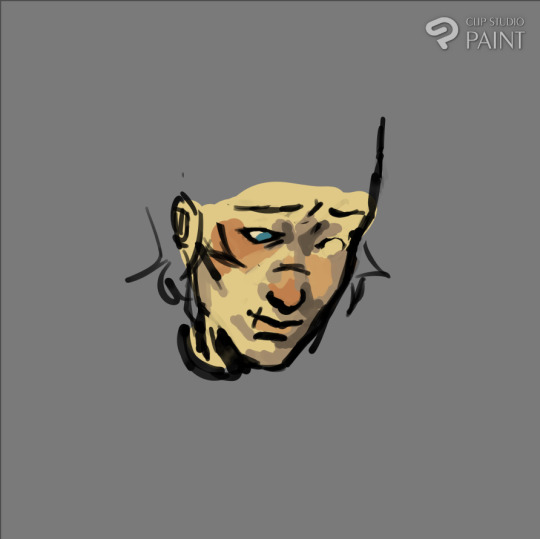
#it's all the colour and hue variation i think
Text
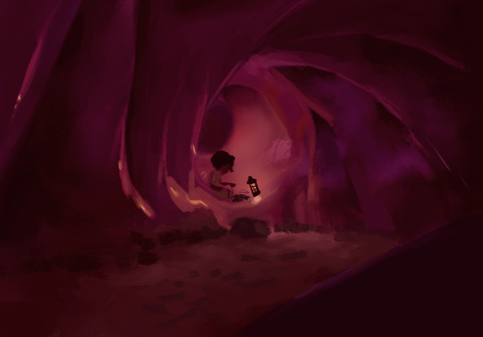
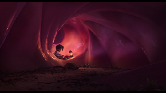
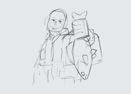
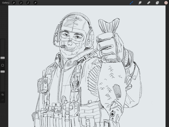
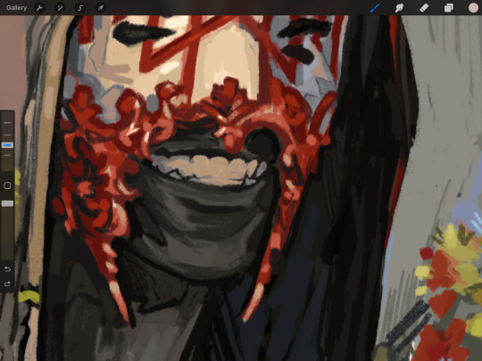
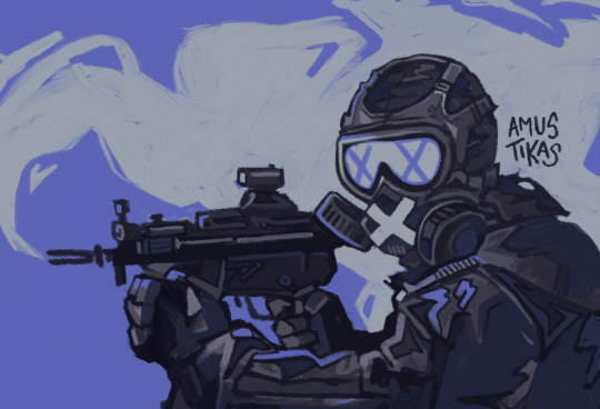
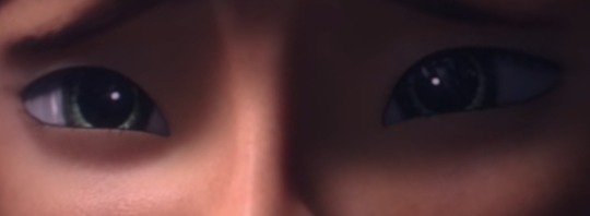
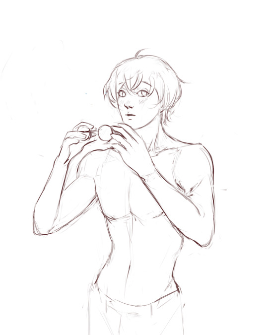
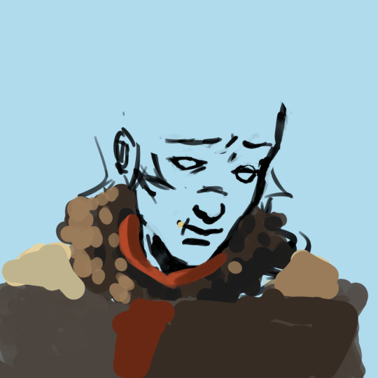
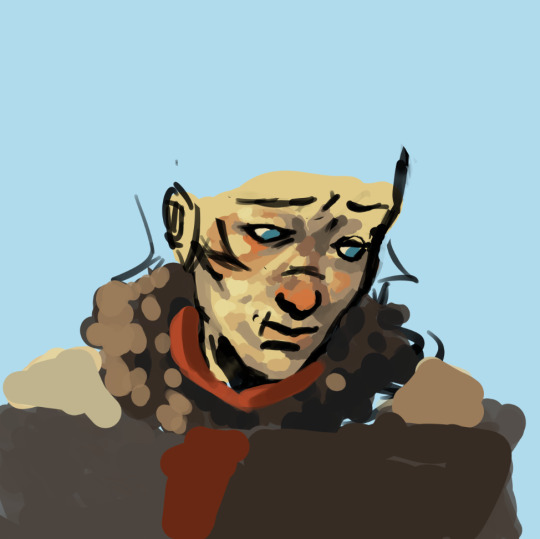
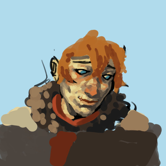
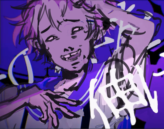
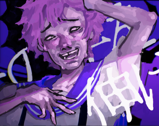
second study of a shot from the sea beast! i didn't realize how tough this one would be 😪 i was gonna give up 75% through! but i told myself to just get the rough of everything in and this is what i managed 🥹
#it's all the colour and hue variation i think#this lost some when i adjusted the values in photoshop (which i never do but this time i counted it as part of the painting gbskdfshf)#but that's ok lol it's all so subtle anyway it was just driving me up the wall aaaaa#listened to the entire soundtrack of six :') gosh bless#~1hr time weirdly but it felt soooo long lol i was suffering from beginning to end#painting practice#art stuff#the sea beast
21 notes
·
View notes
Note
hi!!! <3 I love your art so much <3 your style is soo good, especially your coloring, it's so pleasant to look at <3 also, mind if I ask what kind of software and brushes do you use? The texture of the sketches, lineart etc. look so nice and I was wondering if there's something like that it Photoshop. Have a great day! <3
Hello!! Thank you for your sweet words!! <3
I work on procreate and mostly just use these two basic ah default brushes. I am sure photoshop equivalents exist for both of them out there somewhere!
And since I work a lot with these two I thought I would give ya some extra insight into how exactly I put them to use :)
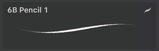
The 6B Pencil brush has got to be my all time favourite brush and I use it for literally everything!
From rough sketches..
to lineart..
to colouring and details.
This brush is quite pressure sensitive, so you can achieve many different variations of size in one stroke by changing the amount of pressure you apply by hand. Through it all, it maintains it's relatively rectangular shape and brings with it soft grain like texture.
Come to think of it, I think I drew this whole next piece with only the 6B Pencil, start to finish. I think it really goes to show that in the end, it's not really about what brushes or software you use, but about how you make them work for you and how much fun you have while creating. I find that the drawings I have the most fun with end up being my favourites in the long run.
And to me, the 6B is just a damn fun brush to use!
It is perfect for adding silly little shapes and lines all over the place :)
And the other brush I find myself coming back to is Salamanca from the Painting category.
I use it for filling in bigger areas of colour and just colour blocking in general. I like it's subtle canvas texture and the fact that it is not entirely opaque by default, which allows for interesting variations of hues.
But that is not all! I like to size it down to use it to add details and colour to my portraits. I find that it's softness works really well on faces and it's transparency makes it easier to bring in variations of colour.
And would you look at that! More shapes and lines! It's really all I know how to do haha
At the end of the day, I try to just enjoy the process of drawing as much as I can :)
I find that young digital artists often put a lot of emphasis onto finding the correct drawing software and brushes. And while that is important, I find that it is equally as important to throw caution to the wind sometimes and to just try out new things and to not care so much.
I mean hell, people create masterpieces in MS Paint!
My drawing process usually boils down to simply trying to ensure art stays something fun for me, and these two brushes have helped me achieve that over the years.
Hope this has been some help and not all pure gibberish!
193 notes
·
View notes
Text
Painting Chiss Skin
Before I start this, I’m just going to say that I attempted to do an in depth version of this part and then stopped and did dot points because it was too overwhelming.
A lot of what’s in here can be applied to different body parts. Some of it may also be applied to traditional art, but most of this is for digital art. This post focuses on faces. Eyes and scars will be another post that'll hopefully follow this one relatively quickly.
Picking colours (and some other tips)
> Experimenting is good!
> There’s blood beneath skin and it’s going to show through at different intensities based on what your lighting is doing. I’m assuming Chiss blood is red, so I usually make any blush on my Chiss purple. (Red + blue = purple. Basic colour mixing thingz, you know?)
> The fairer the Chiss’ skin is, the more vibrant you can be with that purple blush in my opinion.
> Temperature, colour, and intensity of light determines what the skin looks like.
> Having black shadows on a coloured artwork is a good way to flatten the whole piece; when I paint shadows on a Chiss face, I go for a dark blue or purple and blend it with what’s already on the canvas. Playing with layers and their opacity function is also good.
> Laying down a base blue before starting with the rest of the colours is good. You can see that I did that in the speedpaint I’ve attached to the end of this post.
> This website about colour zones will help.
> This website about colour blocking will also help.
References
> I find a face reference of an actor I want to Chiss-ify. Then I have my blue skin reference, which is usually one of the Na’vi from Avatar.
> I use the Na’vi because there’s a lot of images available with variation with temperature of light and quality of light to observe.
> Make note of the colours that appear in their flesh as light interacts with it.
> Warm light will have pink that transitions to purple, then to blue as shadow starts to come back in. I’ve put Ar’alani next to the reference I took inspiration from (link here) for comparison.
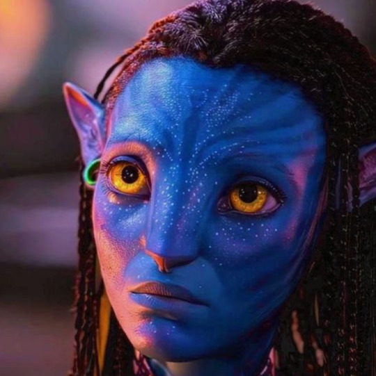

> You want to go and paint your reference as it is, except blue. When you get to adding highlights and shadows, look at the Na’vi image and see what colours appear in that light.
I think that’s pretty much all I do when I paint Chiss. Here’s a speedpaint of Thrawn with Lee Pace as a face claim if that helps somewhat :3
(Ignore how I erased his uniform; I could NOT be bothered with that sorry).
Also, Here are some artworks that helped me when I was figuring this out. I’ve done a bit of analysis that might or might not be helpful. Take what you like from it.
Magali Villeneuve
instagram
In my opinion, Villeneuve’s Thrawn portraits are the best official artworks of him that we have right now. They’re my main go-to for inspiration. The lighting plays across the skin in a way that gives it a fleshy, warm, alive feel. Even the colour zones are present, which gives it that extra bit of depth. If you can’t see them, that’s fine; it takes a bit of time to get used to looking for them.
Rod Reis
The first of Reis’ Alliances cover is also up there with good official Thrawn art we’ve had fairly recently, imo. His style is different to Villeneuve’s, but he follows the same processes with the colour zones and how the skin interacts with the environment around it. The shadows aren’t flat or black; they have colour to them that adds more dimension to the portrait. There’s also that hint of purple-blue blush around his cheeks with more yellowy-blue tones on his forehead and more blue tones around his jaw and chin (again, colour zones are present :3). The light is cooler than Villeneuve’s in the Chaos Rising Portrait, which you can see in the lighter teal hue on the right side of his face. Cool light usually brings out the lighter blue tones in the skin (that’s just what I’ve noticed, though).
And that's it! If anyone has questions, feel free to ask them :3 I'll try and get this eye post out soon <3
#thrawn#ar'alani#grand admiral thrawn#admiral ar'alani#chiss art#thrawn art#art with hydro#hydro rambles#painting aliens is hard but you don't have to suffer in silence#magali villeneuve#rod reis#art study#chiss#chiss ascendancy#star wars#star wars art#Instagram
94 notes
·
View notes
Text
Had issues with layout in the ask post so here's the rest!
However 1 artist comes to mind for now and that's Murata Yusuke; I'm rereading Eyeshield21 (again lol) and each time his art makes me go "wah so damn good".


From colours, to how dynamic and alive pieces can feel, to lighting/shading, to textures, etc. Lot of the pieces also have this feel of mundanity in it which I really like, and I also how at time I feel like I'm there as well. I love the mixture of realism in lighting/shading (and at times anatomy) with the manga/comic style!
The last image also was a bit of an inspo for my latest Luffy art!
As for tutorial, I might elaborate in another post at some point (cus it's quite a broad thing to go about). Like I've mentioned before, I'm soaking up things along the way! Which includes things like colour theory, lighting/shading, composition, etc. But I personally don't recommend forced research/practice; art needs to be fun after all, take things at a time but it might be nice to try something new with each piece, however how subtle.
I can recommend Saito Naoki's YT channel! I watch his 'whimsical correction' videos during lunch at times haha - Each 'correction' (more like professional advice) has a certain goal/theme which can be improved upon, which can be story wise, appeal, anatomy, etc.
--
Anyway, some advice I have for now are kinda my 'cheats' will follow now! [Disclaimer: these are things that work for me and are by no means the 'correct' way of doing things. So if I say things like "avoid this", it's something I personally do.]
My strength lies I think mostly in my lighting/shading at this moment!


My flats aren't bad or anything, but I feel like it really comes alive after shading. And the first thing to do is to establish where the light source is. Try to avoid 'pillow shading', work in bigger shapes and don't be afraid to do so. Working digitally, I can recommend to take a big brush and just put it very roughly on your character. You have the means with digital art to easily erase parts that are too much and to refine shapes afterwards.
One cheat is bouncing light.
(This was a Multiply mode layer set back to Normal mode for sake of visibility.)


You gotta have a bit of understanding of volume of where to apply it, but it's light that's been reflected by e.g. the ground back up again. This little variation in shading can add a lot. Note that it's better to go from the OG shading colour and sliding it on the colour wheel (hue) to be either warmer or cooler and then sliding in the square/triangle (saturation and value).
More examples of bouncing lights:


It depends how intense the light is reflected; the more, the harsher the contrast is compared to the OG shading colour.
Second cheat is 'light terminator' and 'substance scatter', not sure if it's really the correct terms but oh well.


This reddish tone (again on the Multiply shading layer) is kinda the border line from light to shade. It's reddish on skin (if you have red blood haha) but you apply it on other things with other colours too!


Make sure you don't overdo it and put it everywhere, also note if you use harsh or blended brush strokes, maybe even both for variation! Try it out and see what works best for you!
--
That's it for now; this took more time out of me than planned 💀 you better appreciate this anon! /jk
My main motto regarding art is "fck around and find out". This mindset also helps with keeping art fun!
#hopefully it wasn't too overwhelming lol#this became kinda lengthy after all#with 'cheat' I meant something quite easily achieved to add an extra oomph to your art btw#ask kawaii
48 notes
·
View notes
Text
@that-one-i-think told me to talk about Tu’La in my rewrite AGES AGO and I’ve been hunting for my actual already-made Tu’La docs but idk where they went.
So.
This is a bunch of clothes stuff. Because. I can.
Tu’La has a lot of access to pigments. There’s a lot of colourful plants and beetles and rocks and such, so colour plays a very large aspect of the culture.
Especially in Meif’wa cultures, as a lot of Meif’wa come from areas like Rainforests, where colour discourages predators, or desserts where shiny clothes and smothering your skin in clay (which tends to stain it the colour of the clay after a certain amount of time) helps to protect you from the sun and heat.
Tu’La is a very varied region in terms of geography, and because of this has a large variation in cultures, but colour remains rather prevalent throughout. Clothes will often be dyed a myriad of bright colours, with colourful and shiny embroidery, and not only as a display of wealth but of patriotism. Their colour and overall flamboyant style of dress is very particular to their culture, and when multiple other regions have been colonised, or have lost large amounts of their cultures as the result of wars, it’s something that Tu’Lans tend to be very proud of.
It’s not uncommon for Tu’Lans, and especially Meif’wa to dye their hair and fur also. Some hues can be achieved using hair-specific dyes and clays, but others are achieved by using wool dye and similar materials to get bolder colours. This is actually a practice that can be also found in Ru’Aun though it is far less common, and those in Ru’Aun tend to lean towards darker, more muted shades.
The sun is a very significant religious symbol in Tu’La and always has been, from even before Menphia. It’s a typically quite hot region, and so many older religions have worshipped the sun, often thinking that they could appease it to be more gentle. Part of the reason their clothes tend to be very shiny is to reflect the sun to keep cool, but another is to pay an odd homage to it, as it’s very ‘in vogue’ to have as much of the sun visible on your person as possible, whether it be depictions of it or just actual sunlight reflecting off of your clothes.
There are some religious groups however that believe so strongly in the ideal of the sun that they refuse to wear colourful dyes. This is a very small amount of very… evangelical fundamentalist sorts. They will only wear fabrics that are sun-bleached, and nothing else. They will put mixtures into their hair to allow it to bleach easier in the sun. And such.
Anyways this was all done to justify all of the Meif’wa having colourful hair and KC’s addiction to the colour pink. Also bc I love colours RAHHH
23 notes
·
View notes
Text
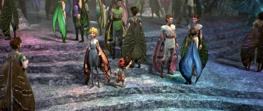
I've looked at some Strange Magic screencaps today and I've been thinking about the differences between male and female fairies. You know, like a normal person does in their spare time. The general difference between the two is visually obvious. Female presenting fairies have iridescent looking wings with little to no patterns (other than the black and white pattern lining Dawn's wings like those of a monarch butterfly). Male presenting fairies have more neutral coloured wings with markings and lines and spots on them.
Because of how unpopular and generally small the fanbase is I couldn't find anything concrete as to why that is the case. I've seen a single concept art depicting the male fairies as moths although the wings do not match the final design in the movie. The Fandom wiki dubs them all to be butterflies though as a whole I do not trust what Fandom says. You could also argue that they're different because it's Disney and Disney loves its stereotypical gender differences. And of course searching through interviews showed me nothing as of yet.
However, even whilst having nothing to support this, I have an idea as to why they look so different.
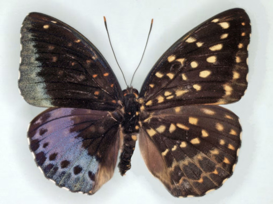
Something I have never realised, and now refuse to let slide, is that butterflies show sexual dimorphism. Their wings are different between male and female members of the species which could explain the different wings in the film (other than it being a cartoon made for kids and the fact it's not that deep). Most often these differences are small, like a particular small pattern change or slight variation in the hue of the wing colour. However, certain species show very strong dimorphism:
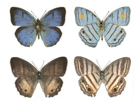
^ Males of the species are blue, females are brown (Images taken from this article on FloridaMuseum)
Which is sort of what is going on in the Strange Magic movie, only reversed with the females having the more vibrant colours:
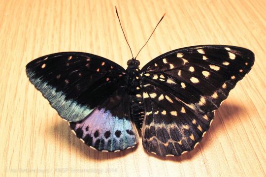
^ I think the differences are best seen in butterflies that show both female and male wing patterns (Images taken from this article on Washington Daily). And if anyone is interested, the condition is called Gynandromorphism (wikipedia page)
In this case, it's possible that all fairies have butterfly wings. And yeah, I would have gone into way more detail but I kind of got tired by the end if you can't tell by the way I'm cutting it short. I think the way they fly also resembles butterflies more than moths, buuuut they also fold their wings flat on their backs with is more accurate to moths than butterflies. Either way, sexual dimorphism is my go to theory now.
#strange magic#I don't know what else to tag#It's literally only strange magic related#toonce offtopic#and yes essay writing has made me reference everything..#also#I'm sorry Strange Magic is younger than the fnaf games?#This movie came out in 2015???#also also I might add to this post later
28 notes
·
View notes
Note
Something about my drawing feels off , i only got into digital drawing few weeks ago and I'm stuck at the same point and lost .. any advice?
mmm okay first of all this is really good- first impressions-wise, the proportions and anatomy look very solid so there are no major glaring issues so to speak
if you were to ask me, what i think this artwork needs is that sort of 'volume' or depth that most beginner digital artoworks lack. You can achieve this sort of volume in two ways depending on the style you are going for: either by improving the lineart, or by treating the lines just as part of the sketch and painting over them for a more.. ''painterly/rendered'' look
if you want to keep the lineart in, what i suggest is adding some "line weight" so that the artwork doesn't look so flat. What i mean by this is to thicken the lines where body parts would naturally overlap (like the neck and shoulder, the nostrils area, the corners of the mouth as well as the tip of the lips etc) and where shadows would normally be for the illusion of volume. After that, i'd also add more shadows and color variation in the colouring layer so that the skin looks more lively and again, for that volume. You can do it with some dark blue or orange on a multiply or an overlay layer, just experiment a bit with colors and blending modes.
If you want a more messy/painterly look (which is more down my alley or in line with my artstyle), what i'd personally do is i'd create a new layer on top of everything and just paint over the lines with broader strokes and a darker color in an attempt to add some volume to the shapes and to make the artwork look more cohesive and less "digital" because at the moment, i can tell that it is made up of a Lineart layer, then a Colouring Layer below, that very religiously follows the lineart layer and then maybe a layer on top of that for the other colors and the hair. This is a very common digital art process and a good one to keep in mind but a little secret i can give out that i've noticed in 80% of the artists who have this sort of drawing process is that they will always, always merge everything in one layer at the end and adjust things as they go. They will not keep the layers separated and just never revisit them in the process, despite what it may look like. There will always be something that needs fixing and they will fix it as they go so i suggest doing the same and being a bit more "freeform" with your layers
Anywayss, besides that, I'd also introduce some color variation like in the previous method. As a general tip, try to move the color slider around and don't just shade with a darker variation of the base color. I like how the hair is painted and the shine and everything, it looks very good and everything is pretty much set in place, i'd just render it even more, make it More voluminous. It's just missing a little pop a color: i'd add some blueish gray hues in the brown hair and for the purple hair i'd make it more rich by adding some deep dark blue hues and some faint yellow highlights (bc purple and yellow are complementary colors blabla) As for the shape, think of the hair as chunks of volume that reflect light and that are also affected by gravity.. or as spaghetti if u like flat hair like me bsjsjd
That's all i could think of; Again, it's very good and promising considering you started just a few weeks ago, so keep going at it! I hope it was at least somewhat helpful and that i wasn't being too technical with the wording (and that it made sense)
#i hope it didn't come across as mean or something#i have a bad habit of being pretty blunt with my words#and upseting people#the artwork is really nice and pretty but i was asked for critique so i pointed out some parts that could be improved#you don't even want to know what my art looked like a few weeks into digital art lmfao#this is 10x better#keep at it op!#and again hopefully i didn't offend with anything don't take it to heart you don't have to listen to me do what u want#ask iztea#if there are any typos no there aren't
52 notes
·
View notes
Text
Fake Plastic Trees (M.H Sneak Peek)
An aspiring florist, a problematic rockstar and a meet-cute straight out of "Nottinghill". What could possibly go wrong?
Here's a small Sneak Peek of my up and coming Mini-Series, "Fake Plastic Trees"! What do you guys think of it? Also, fair warning, this isn't really proof-read... Enjoy!
Matty was stressed out. First of all, he had just finished recording with the band and was starving after not eating the whole morning. And second of all, he was in desperate need of a gift for his dear Mum.
Hurrying down the streets of the quiter part of London, his eyes darted around in search for a florist.
He stopped in intrigue as he read: Fake Plastic Trees — and below it, windows full of blooming, fresh flowers and plants. How ironic, he thought to himself as he giggled and walked across the road, into the small boutique.
"Hello! Welcome to "Fake Plastic Trees". If you need any help, let me know." a voice rung out, in tune with the chiming of the bell that announced his entrance.
Matty bid a quick hello and thanks, before browsing around the store. He quickly realized how helpless he actually was, overwhelmed by the amount of selection the store offered. Flowers and Blossoms from everywhere, with exotic names and appearance, some looking to be straight out of a Sci-fi movie.
"Don't think I would go for those if you're looking for a Mother's day gift." Matty heard a voice speak behind him, slightly startling him.
"Hm?" he hummed out and turned around in confusion.
"The orange lillies you were looking at. Beautiful, I know. The meaning? Not as much..." she elaborated with a grin on her face.
He opened his mouth to ask further, but was quickly shut down when he saw who was speaking to him.
Gleaming eyes, a crooked smile, slightly freckled skin leading to a pierced nose and a small dimple on the upper-left cheek. She looked like the first day of spring, with a septum piercing.
His brain short-circuited as he kept closing and opening his mouth, blubbering out a "Why?" after an embarassingly long wait.
"To keep it short, it symbolises hatred and disdain. So, unless you have a complicated relationship with your Mum, not my first choice." she explained with a small laugh at the end because of his antics, he really seemed out of it when he first caught sight of her.
"That's definitely not the type of vibe I'm going for... Anything you would recommend?" he chuckled out in slight embarassment, a rosy hue dusting his ears.
"Maybe another colour variation? Pink lillies for example! They symbolise femininity, admiration and love, often the one between parent and child." she ranted excitedly.
Seeing someone talk about something they genuinely loved was one of the most adorable things in Matty's eyes. He could listen to her going on and on about the mysteries of the flower language all day, if it meant seeing that grin and dimple.
To be continued...
#matty healy fanfiction#matty healy fic#matty healy fluff#matty healy imagine#matty healy x reader#the 1975 fanfic
31 notes
·
View notes
Text
The Happy Mask Salesman's design makes me wonderfully crazy, and I have to talk about the way my brain processes it because it's a big part of why I love him so much.
[Analysis is under the cut]
——————————————————————–——
The first detail I'd like to point out would be the color theory.
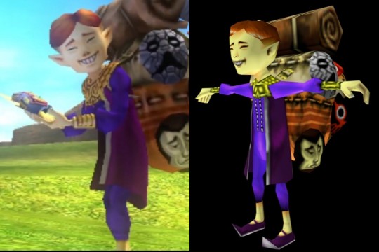
He has the bluer purple on both his tunic and trousers, or the whole piece if you consider it a jumpsuit (I personally don't draw it as a jumpsuit, but I do admit that it might be the most game-accurate interpretation), and it gives him a very direct foundation and center for the outfit's base.
The vest and shoes are a darker magenta, however, which adds hue variation while staying analogous with his tradmeark purple shades, and the light grey is a value used to balance the more saturated purples as an accent.
The golden accessories are a complimentary (opposite) color to purple, which Nintendo seems to be very adept at in general (cough, Splatoon, cough).
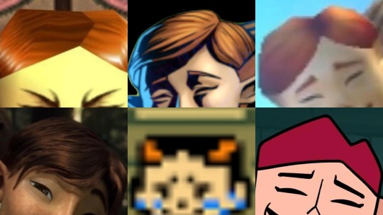
Of course, we can't forget his hair. Whichever specific shade you see it, it's always agreed that the color is at least somewhere along the ginger spectrum. The red, orange, auburn, etc. hues are analogous between the contrasting gold and purple, adding a transitional color to link them.
His skin serves the same purpose with the varied addition of having a lowered saturation and a lighter tone to aid the grey in balancing the depth of the color of his clothes and hair.

Though we unfortunately have no canon answer to what his eye color is, Ember Lab's creative decision to make them green may have been the best choice from a design standpoint because it balances out the purple in his clothing and makes his face stand out more.
The distribution of color in this design as a whole is pretty genius to me, as well.

His hair, being the only part of him that's that ginger color, directs the eyes upward to his face, while the main, deep purple is focused on the direct center.
The gold is arranged widthwise across the center, most heavily on the neck once again to direct the eyes upward while also distributing down to both of his wrists for balance on either side, almost like a scale.
The magenta and grey both run lengthwise down (and wrap around) the center and sit in mostly horizontal detailing at the bottom of his legs like the base of a pillar.
It's not something I added to the example image or spoke about before, but his white teeth in his smile are another aspect that is, of course, very eye-catching for his face and important for his design.
There's also the topic of the geometry.
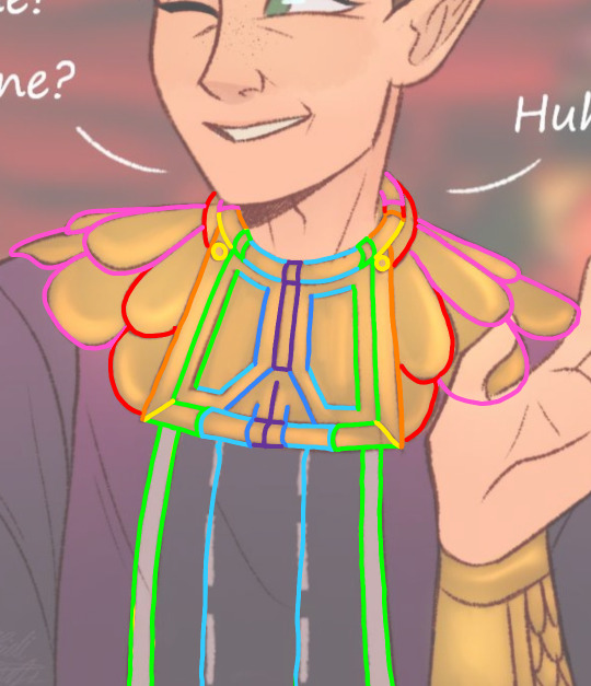

I'm using my own art as an example because this is the way I interpret it, but the first image is just a breakup of how the edges of each section line up with one another in a way that fans out from the center, and the second image is the addition of marks measuring the estimated centers of each section.
Looking closely, you quickly realize how his gorget makes everything line up geometrically, and as a whole, the design is entirely symmetrical apart from the way his hair is parted, which adds all the asymmetry needed to make him feel natural, albeit incredibly well-groomed and organized.
The color of the inner edge of his vest and the the soles of his shoes is the same as the two rows of stitches running down the front of his torso, which gives the otherwise separately-coloured pieces of the outfit a common detail to link them as a set.
(At one point, I think I had an exact estimation for the number of stitches in each row, but I think I started ignoring it in my art to save my sanity. I know it's on my cosplay, though.)
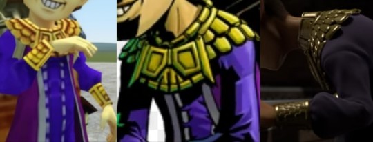
His gorget and bracers also have a matching scallop pattern (though it seems to be debated on whether the scallops of the bracers face up or down), which adds an additional sense of uniformity.
The majority of details follow the lengthwise median, and everything suggests an overall polished feel and a balanced center of gravity. All in all, it's a fantastic design. I've seen so many wonderful takes and artistic adjustments on it, and I've even made my own, but the character designers at Nintendo really popped off with this one.
#happy mask salesman#loz happy mask salesman#the happy mask salesman#legend of zelda#loz#legend of zelda majoras mask#majora's mask#majoras mask#zelda majora's mask#loz majoras mask#the happy mask salesman headcanons#the legend of zelda majora's mask#loz majora's mask#loz ocarina of time#legend of zelda ocarina of time#oot#zelda oot#zelda ocarina of time
52 notes
·
View notes
Note
Hello! I am a beginner artist and I love ur art!! Super pretty and the colors are very tasty. Do you have some tips? I'd love to see your art process!
HELLO ANON!! first of all i am very honoured that u would ask me this because 90% of the time i feel like i have no idea what i am doing and like im still a beginner artist myself DSDSJDF. i would love to share some stuff i learnt and some stuff about my process (regardless of how messy it is sdfhsj)
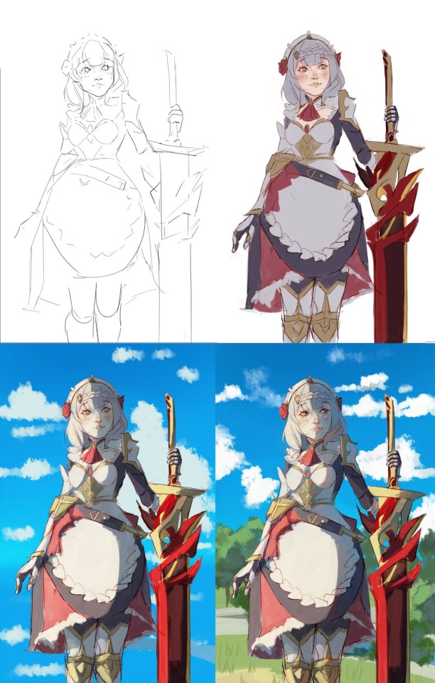
(final piece)
here's an old example of my process i found! while the steps sometimes look different for other pieces, i feel like this is a good demonstration of how the basic structure looks.
1. the sketch - this is where i'm mainly figuring out how i want the piece to look. i was redrawing a screenshot for this piece so it looks a LOT neater than what a lot of my other sketches look like, for example, here's the process of me figuring out my recent drawing of haise:


(final piece)
in the first two steps, i was mainly working with showing myself what the piece was going to be. the last one was where i used references/technical knowledge to try and show whoever will be looking at it what the piece was
2. cleaning up the sketch + base colours. these two usually occur simultaneously because i will get bored cleaning up the sketch midway through and want to start adding colour LMAO. on a more practical note, sometimes putting down the base colours and having a better idea of what the finished product will look like might make it easier to refine things.
a note: cleaning up for me doesn't mean doing lineart. it mostly means erasing any overly messy lines on the sketch and redrawing small parts to make it look tidier where needed. i often leave it 'messy' at this stage, too. like here:

(final piece)
3. light/shadow. this is my FAVOURITE part because it's where the piece starts pulling together. the method i used in the current piece was putting a multiply layer over the colours folder and filling in where light would be obstructed. after that, i used a luminosity layer to put in some bright sunlight. marc brunet has a great way of explaining it by advising to pretend that the light is the camera and you're behind the lens. this is such a good way to block in average light/shadow values! sometimes this looks a bit crazy because everything is still so messy but that is why we have...
4. rendering. this is where i fit all the remaining pieces of the puzzle together. i'll refine the colours a bit more -- e.g. colouring in the eyes, -- and fiddle a bit with the shadows to add some more variation to the hues/value. this is where i think a lot about light and shadow theory and try and make it look more realistic. marco bucci saved my LIFE with his videos about ambient occlusion and ambient light (part 1 / part 2) -- essentially, what i keep in mind the most is that if a plane in shadow is facing the sky (or is open to any other form of light that isn't the direct light source) it will contain ambient light. it is SUCH a game changer when you add it to your pieces, trust me, even if youre lazy about it. if needed i'll pull up some references to make everything look good!
5. rendering... part 2? honestly this step kind of blends with the last one as i tend to do it simultaneously. i basically clean up all the messy lines from before by painting over them! with the majority of the colours i need put down, i can just eyedrop them and paint over anything that's needed. this also comes in with the light/shadow, where, if i need a more subtle hue for either/or, i will eyedrop it and brush it in.
some further notes:
i very rarely use references during the first stages of my sketch. i think it tends to look quite stiff and unnatural if i rely too hard on the. and i personally prefer the creative room when the idea is still being conceived. references come in when i can look at what i have down on the canvas and have a fairly decent idea of what i want, including pose, composition, etc. it's essentially a first draft to guide me to where i want to go with the piece. it's when i'm done with this that i bring out references, and even then, they don't necessarily have to be the exact pose -- i'll usually get a couple of pics which show what i need to double check and keep them up as a guide. by the end of the 'sketch', i usually have a basic construction of what i need to continue, even if it's messy.
i use very soft brushes when putting down colour because it allows for more hue variation. like i said, i enjoy eyedropping and brushing in colours afterwards, so this really helps!
layer modes are ur friend! i try not to rely on them too hard during rendering because i like the freedom of painting over but they're very useful when you're blocking in your initial colours
sometimes, when i feel like i want to try something new with my art, i'll keep pieces that inspire me up in front of me. i have two of sui ishida's art books and sometimes i'll just flick to a page that oils the Art Gears in my brain and keep it open while i draw. i don't necessarily reference it, but i like having it there so i can glance over every once in a while. i don't usually make a conscious choice where i'm like "ok i want to render skin the way he does" but it's more like. my brain knows what it likes in his art and it'll try and push that part of my art in a similar direction.
honestly the best advice i have is that art is very much based on vibes. everytime i've tried to think too much about it, to do things 'correctly', to rigidly stick to art theory, my art has not come out nicely. i think the technical parts of art are important to know and understand but i also think it's important to let your knowledge come through naturally when it is needed instead of pressuring yourself to do things 'right'. tbh you probably already know that but it's something i forget a lot so maybe it serves as a helpful reminder?? sedsfhsl
ANYWAY SORRY THIS WAS SO LONG! i hope i covered what you needed and if you need anything else/want me to expand on anything feel free to drop me another ask ! <3
make sure to look after yourself and trust yourself and ENJOY!!! art is about having fun!
81 notes
·
View notes
Text
Yellow Varieties
Welcome to this the sixth entry in Cool Colours. Yellow is wonderful and represents rather a unique case in this series' exploration. To look at the word at first glance, you would be forgiven for thinking that our word yellow has no links to Latin whatsoever. You would be both right and wrong, however. There is a link and a rather neat and unusual one. The word yellow is more closely connected to German 'gelb'. But it doesn't look like that either, you say. So, here is a brief glimpse at this lovely colour name's history. It stems primarily from the early German word 'gelwaz', to which the Italian 'giallo' is also related. Both stem ultimately from the Proto-Indo-European (henceforth PIE) word 'ghel-' which meant 'to shine'. Now PIE, is now widely believed to have been an early, now extinct language, from which most European languages and Sanskrit were all born. Now, here comes the Latin link. Latin is also descended from PIE and its word for pale yellow, helvus, comes from the same parent stem as German 'gelb'. So, it is linked to the word, it is just a relative that evolved slightly differently. Also, if you read the Latin helvus, pronouncing the 'v' as a 'w' (as many argue it should be) the connection with our 'yellow' becomes clearer.
Our trip through the colour yellow does not stop there. I have three further Classical terms for yellow for you that bequeathed us words in English. Let us start with Latin.
Have you ever read that you should get more of the vitamin Riboflavin (B2) in your diet? Well, the 'flavin' part of the word comes from the Latin flavus, meaning 'yellow', often a golden or reddish shade of yellow. 'What's a vitamin got to do with 'yellow'?' ,you ask. Well, the flavins are a group of organic compounds, from which Riboflavin is derived, and their colour is, you've got it, YELLOW. They are very important to life. So green might be life, but it appears yellow is, too.
Could your hair be described as 'fulvous'? No, it does not mean it is voluminous (full-vous, get it? Never mind). Again, this rather old-fashioned and probably forgotten word comes from another Latin word for 'yellow', this time fulvus, which denotes a brownish, tawny yellow. It was often used to describe lions.
Lastly, can I ask you if your daffodils betray a xanthic hue? So, we head over to the ancient Greeks for our penultimate yellow word of today. The Greek word ξανθος (xanthos) could denote hair that was blonde or even auburn, so again it can denote a reddish gold.
Crocus is our final shade today. Now, we see crocuses that are pink, blue, and yellow, but Greek word (κροκος) originally referred to the saffron plant, which yields a famous rich yellow colouring. There is even rather a sweet instance of it being used in a Greek text to describe the colour of egg-yolks.
The bright, cheerful colour yellow therefore, not only has a great etymological (i.e. word family) history, but it also has many different variations in Classical terms. EGG-sellent! Okay, there's a reason I'm a classicist not a comedian. I hope you enjoyed this instalment. See you on the next one.
#yellow#proto indo european#gelb#riboflavin#flavins#xanthic#xanthos#tawny#auburn#fulvous#golden#crocus#saffron#words#derivatives#latin language#ancient greek#etymology#word families
167 notes
·
View notes
Note
May I ask how you shade skin? No worries if not!! Im obsessed w the way you render
Well thank you very much, I'm flattered. Sure, I'd be happy to try and share my skin routine with you!
I think one of the main things I began doing a while back with painting skin that's really helped it look more lively is diversifying the colours you can see on it. Adding various warm and cool tones can really help emphasize any shading! I'll use my Klavier and Daryan illustration to show what I mean as I still have a layered version.
Above are the boys with a 50% grey base layer. Notice the hints of blue, red, and yellow about the skin that can't be seen on Daryan's jacket, for example? That is what I'll be referring to!
I'll typically start with basic skin tones for the character (above) and on two separate layers begin to paint on some variations of red, orange and/or yellow (layer 1) and blue, teal, and/or purple (layer 2). I typically already have the opacity on these layers down, but just to kinda show you the types of colours I may use and where I place them, this is the kind of monstrosity I create:
In my experience, Yellow is a good neutral zone addition, Red is great for places with a lot of blood flow like cheeks or fingers, and Blue is good for areas that may not get full exposer to the light source(s). I was first taught a real simple gradient down the face of yellow (brows), red (cheeks/nose), and blue (chin, jawline) for faces. Then as you get more comfortable with slapping them on the canvas, go a little wild with it and start intermingling the colours like adding blue on the eye lids or red on the lips, for example.
For Layer 1, or our warm red/orange/yellow colours, I typically set the layer style to something like a Multiply and lower the opacity to 15-30% depending on the skin tones and image's lighting.
For Layer 2, or our cool blue/teal/purple colours, I do a highlight layer style with Overlay typically being a nice safe pick. For this layer I generally stay around 20-45% opacity. After you have that all set, you'll get something like this:

Which is thankfully not quite as jarring as the other version haha. From here, I start shading normally! I typically use 2-5 shading and highlight layers, depending completely on the lighting of the piece. For skin specifically, I try to keep a smooth gradient or matte look to these areas with a soft brush and blending. Back lighting and colours from the surroundings generally seem to bounce off skin well so I tend to utilise a lot of that too.
In the end I wind up with the top(which I now realise was a pretty bad example image to use as they are in a SPOT LIGHT I'm so sorry) and also added the version without the extra colours for comparison(bottom):


I know it's nothing SUPER noticeable in this piece if you're not looking for it, but that's also the point! It's a little bit of flavour without being a distraction. I've personally really enjoyed the overall look of the skin I've painted since incorporating this.
On the other hand, when it comes my single layer paintings (using my recent painting of Beanix as an example,) I couldn't really tell you my process besides throwing colours at the canvas and seeing what sticks. I still try to incorporate the "sway my colour towards yellow here, change the hue to a bit more blue there," but there isn't much method to my madness outside of that. Just have fun with it!
I hope all this gave you some insight or helps in the slightest! If I didn't answer the right thing, you have any other or more specific questions regarding how I paint skin, feel free to ask them at any time. I'm happy to help where I can.
#art tips#art#digital art#wip#tutorial#mav speaks#ginyia#mavsart#I was originally going to do a whole time-lapse of that Beanix picture but I forgot to record the very end. :')#glad to still get to share the beginning with yall. Thanks for the question!
153 notes
·
View notes
Note
re: apricots and mercy, tbh i think tazmuir sometimes just does whatever she wants with descriptors heedless of what sense it makes when you actually sit down to examine it (see also: cam's short swords/daggers, whatever's going on with the bone corset, etc) but fruit knowledge and variation aside, i think this passage from during dios apate minor is probably the clearest / least metaphorical description of mercy's hair color:
“The Lyctor at his left was combing out her hair—it tumbled in a heavy mass around her shoulders, that curious heart-of-a-yellow-rose colour, that pinkish, reddish, goldenish shade that was not entirely appealing.”
still unhelpfully includes a flower comparison and three different colors mixed together, but does confirm there's some sort of pink going on in addition to the yellow/orange implied by all the fruit. (her hair is called "pinky-reddish" later on). personally i imagine it something like a rose gold / strawberry blonde
this does still constitute blonde and not, like, pinkette to me. the only solid colors (even wrt roundabout metaphors) that tamsyn doesn’t use -y or -ish on (which read to me as a descriptor of undertone) are peach which is debatable in hues, ‘rose’ gold, and yellow. that woman is a strawberry blonde imho and gideon just does not understand because it’s a rareish occurance and mercy is middling between ginger (herself) and, for instance, coronabeth (golden blonde). but this is just me using occam’s razor here
8 notes
·
View notes
Note
if youre comfortable sharing, whats your rendering process? what are some ways you learned? your art is very yummy
HSHSHHSHS hello!!!!!!!!!! first off omg,,,, thank you so much,,,,🤭🤭
secondly!!!! heres my attempt at a rendering process explanation. uhm. warning ive never really been asked to explain it before please bare with me
BUT. here goes. this'll probably be ungodly long apologies
so when i render my biggest rule is basically Do Not Blend Ever. what i do is do my sketch, then flats, then basic placement of blush/shadows+darkest parts/etc and then i go in and just colourpick the inbetweens+place them between colours in small strokes until the changes in colour don't look too sharp/jarring
here's some examples of the process;;;
(still a wip but HSHSHHS) so i work on 3 layers primarily (sometimes i do the hair+items that cover the face on another layer, too, though they might end up getting merged):
^ with just the sketch layer n flats / and then with the render layer added
i go in with a bigger brush to block in colour variation on the face on the flats layer and then paint over that, as well as over the sketch, with smaller strokes on a render layer- i never do lineart lol, and any "lineart" thats visible is just the sketch peeking through. I try to rely on colour and shadow to create shapes and boundaries instead of lines though this isn’t a hard and fast rule.
i also try to stick to the same pallette the entire drawing- once the flats and shadows are first roughly blocked in all the other tones/midshades/colours are basically just inbetweens picked directly from the drawing. Just me zooming in real close till I can see the pixels and colour picking where they sort of mix. (any smaller shifts in hue/tones are just colours with saturation slightly turned up or down, usually) im also not sure if this helps but i use the Sol brush from the clip studio assets store for literally everything from sketch to render, which is basically just a slightly soft opacity brush which ive deluded myself into thinking helps give my art a softer look. idfk if it does or not.:)
I like to use really saturated blush and for shadows I usually use two base colours; a warmer one and a colder one- a warmer one for smaller shadows and shadows near light and then colder ones for planes more in darkness. Also, usually, at the very end of the drawing I’ll add a layer that’s just fully yellow with colour burn or linear burn or multiply turned on and the opacity turned low just to make everything warmer.
(a little thing I like doing for shadows sometimes is never making them reach the edge of the plane; the actual edge is usually a slightly lighter shade and it sort of looks like stylised bounce light that would probably not be there but anyhoo)
but yeah,,,, Never Blend But Make It Look Almost Blended. I’ve been doing it forever,,,,,, and I really like the almost shiny feeling it gives things:)))
And where did I learn. Ough. A lot of what I do I figured out through trial and error and just drawing a bunch (IM SORRY THATS REALLY NOT HELPFUL) but some sources I looked towards were sinix design and bluebiscuits on YouTube!!!!! Sinix has a really good video on rendering skin which is where I sort of took my principles from and ran. And bluebiscuits was a huge inspiration for me when I started trying to render things beyond flats!!!!!!! They’re also where I found the sol brush, lol. Also just,,, the impressionist movement as a whole is a massive inspiration. The use of light and shapes to create form is just,,, omg. Especially Claude Monet in particular. (and for the basics of drawing I learnt from my aunt!)
and honestly, just observing people. A lot of the time when I’m watching a movie or on a walk or even just talking with someone I tend to start looking at their face, and the different planes, how light hits it and how shadow interacts with it, where the shadows are harsher/softer……….people are wild man
I really hope that made sense!!!!!! I’ve never tried explaining it before and honestly, I’m not even really sure how I do it. I just sorta. Switch off and start drawing, yk? BUT I HOPE IT HELPED!!!!🫶🫶💞💖
in case that was all utter nonsense here’s a speedpaint that’ll hopefully demonstrate my process;;
I also have straight up screen recordings of me drawing but. I don’t think anyone wants to sit though that
thank you for the ask!!!!!have a nice day/night and SORRY THAT ENDED UP THAT LONG
7 notes
·
View notes
Text
My Favourite Anthony Looks: The Best of the Rest
Now that my top 10 favourite Anthony Looks is complete, I will finish up with five looks that didn't quite make the top 10. In no particular order here are the best of the rest.
Season 2, Episode 2: Before the Soiree

This look is one that we see on Anthony in several scenes, the first being when he gifts the horse to Edwina, and then again when he talks to Benedict at the club and asks for a poem, however I have chosen the scene just as Violet, Colin and Eloise were leaving for the Soiree to add to my list of favourites, because it is slightly dressed down with no jacket and sleeves rolled up. Anthony's look is the standard dark trousers, white shirt, and white cravat, with a dark blue waistcoat that is embellished with gold detailing. The detailing on his waistcoat gave the look of stars, and when the light caught it in the darker evening scenes it almost sparkled. Anthony's waistcoat colour and design is reflected in Kate's dress at the Soiree, which we see interspersed with the scene of Anthony getting the poem from Benedict, connecting them as Benedict reads his poem.
Season 2, Episode 1: Anthony's 'interviews'

In the montage where Anthony is conducting 'interviews' for a wife we see him in dark colours, a Navy blue jacket, a greyish blue waistcoat, and an indigo blue cravat. Having Anthony begin the season in darker hues was a deliberate choice by the costume designer, in order to show that Anthony was taking his responsibility to settle down seriously, reflected with the serious way that Anthony approached finding a wife.
Various episodes: Anthony's Formal Wear


This is not just one look as such, but rather a variety of looks that are so similar I can't choose just one, nor can Iist them all separately, it is Anthony's formal looks. Anthony wears very similar clothes for formal events, usually consisting of black trousers and jacket, with a white shirt and cravat, and a gold or white waistcoat. We have seen Anthony in variations of this look in both season 1 and season 2, at everything from the presentations to balls, to the wedding in season 2.
Season 2, Episode 8: Anthony and Gregory

In the scene with Anthony and Gregory we see Anthony in the same clothing from earlier in the episode when he first finds out Kate had woken up, and again when he went to visit Kate, but again I have chosen this scene because again we see Anthony in a partially undressed state, showing not only that this is his home and he feels comfortable here, but that he doesn't feel the need to be formally dressed around his family. Anthony is again wearing black trousers and a white shirt, this is paired with a dark indigo cravat and a lighter blue patterned waistcoat. The dark indigo cravat is something we have seen previously in the season, especially earlier on, but usually paired with darker coloured waistcoat, so I think the lighter blue of Anthony's waistcoat represents Anthony realising his love for Kate, and being open to that love.
Season 2, Episode 5: The Lake

I could not do a list of favourite looks for Anthony without including his 'Darcy moment'. This is very much an indulgent choice, but who can overlook seeing Anthony in a transparent white shirt, Kate certainly couldn't! What we see here is Anthony beginning the scene dressed in his usual daytime wear of a dark jacket and cravat with a white shirt. As Anthony goes into the lake we see him beginning to strip off, he removes his jacket (and maybe a waistcoat), then his cravat, before emerging from the lake in his transparent shirt. This could be seen as a metaphor for Anthony's journey - stripping away the emotional layers to leave himself emotionally bare before Kate.
17 notes
·
View notes
Note
Hey, Hey! I wanted to draw some stuff for your fic, but I had a question. Do you have more details on how Michael, Gabriel, and Raphael look? I know Gabriel has some fem-characteristics and Michael seems to be the largest of the angels. No pressure tho!
Okok, I’ve actually had someone ask me about their appearances before so I’ll just post my response to them to give you a guideline, and if you had anymore questions just let me know duckling. The format of this is: there will be a number w/ a question they asked, and below that I answer it. (The questions came from @the-stress-express if you wanna check out their WIP)
Anyway, here u are:
1. Are Micheal, Gabriel, and Raphael kind of like copy-paste versions of Lucifer? Like, do they have Lucifer’s red cheek spots? Do they all have white ass skin like Lucifer?
- I imagine they all have white skin, and that Rals has the cheek spots, but Micheal and Gabriel do not. They’re kinds copy and pasted, but with a bit of variation in body structure (Rals being more rounded, Micheal a tad bit more square). And also while I’m here, I’ll say that Raphael is a little bit taller than Luci (probably just under Charlie’s height) and that Gabriel and Micheal are the same height, and quite a bit taller than their two brothers.
2. What kind of hairstyles, textures, and hair colours do they have? I’ll probably take some creative liberty, so don’t feel too pressured for detailed explanations, but I want to hear your designs so I can make it accurate to your vision. Also, I’ve heard theories that Micheal’s hair is a lot like Lucifer’s but idk if you are having that there.
Okay, we’ll go through this character by character.
Micheal - Same blondness as Lucifer, but perhaps a little shorter. Maybe a little fluffier at the top? Idk. No real big picture ideas.
Gabriel - Long, silky, straight dark brown hair. It comes down to about his mid-back/chest area, and it’s all like flowy and elegant and pretty well maintained. Shiny probably too
Raphael - Pretty much a mix between the others. Kinda like Lucifer’s style, but curlier, and with a similar brown hue to Gabriel’s (tho a little bit lighter). Again, no real preference other than that, go wild!
3. Eye colour. I remember you stated that Micheal has gold eyes, but what about Gabriel and Raphael? I feel like you mentioned it at some point but I forgot.
I honestly can’t remember what I said either, but I’ve been picturing Raphael with green eyes, and Gabriel with something more greyish-blue hued? I think. Idk if that reflects in what I’ve written but that’s what my brain had decided they look like now.
4. Did you have specific designs for the 3 angels’ robes? Or does it matter what they look like? If it doesn’t matter to you I’ll just let creativity take over there.
Not really. Just that Micheal’s are white/gold, Gabriel’s are a pretty pale blue, and Raphy’s are a pale, rich green (with the green being more on the blue side than the yellow). I struggle w/ outfits so I usually just don’t put much thought into them.
5. I will obviously include Raphael’s beautiful hummingbird wings. So do Micheal and Gabriel have specific wing styles? And furthermore, we know Lucifer had 6 wings bc he’s a former seraphim. I forget but, in this fic, are his brothers seraphims too? I feel dumb for asking but whatever lmao.
Yeah, they def all have six wings. I imagine Micheal’s looking more eagle-like, and… idk about Gabriel. It might be cool if he had more of a “pigeon-y” shape to them as a fun little correlation to his messenger status, but idrc. Do what you think looks best
#hazbin hotel lucifer#lucifer hazbin hotel#fanfic#hazbin hotel fanfiction#lucifer fanfiction#fanfic content#i love luci#lucifer#fanfiction#hazbin hotel#what time is it
19 notes
·
View notes
Last Seen Blogs