#logo rebranding
Text
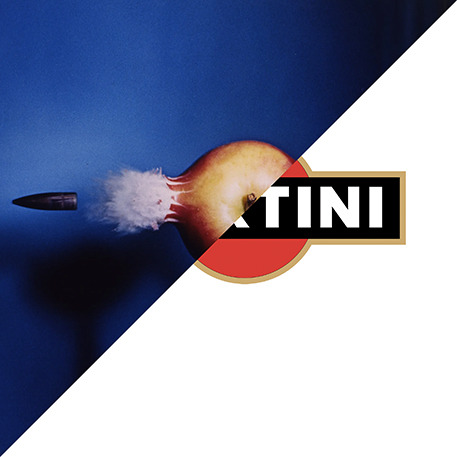
Harold E. Edgerton, Bullet through Apple, 1964
VS
Robilant Associati, Martini & Rossi, logo rebranding, 1995
#apple#Harold E. Edgerton#photo#photography#logo#martini logo#red circle#ball and bar#ball#bar#robilant associati#Martini & Rossi#martini#campari#logo deign#logo rebranding#brand identity#brand
43 notes
·
View notes
Text
they really said 'happily phoreverafter' and fucked off... good for them
#see. theyve frozen me in time. bc does life really go on if theres no dapg upload? nooo#(i joke but also. it was like my advent calendar for December. in telling me days were passing)#i hope theyre doing lovely and enjoying their time#and theres only a tiny piece of me thats terrified of them seeing all the yter quitting videos and suddenly having a crisis#no. they wanted to do this. they wouldnt have done it otherwise. it wasnt a whim. it wasnt decided lightly. they did a wholeass rebrand#both logo-wise and content wise#dnp#c.text#dan and phil
173 notes
·
View notes
Text
#Twitter#Elon Musk#so the latest thing is that Elon Musk is changing Twitter's name to X#just X#ALSO#when he posted this info#he said 'we may rebrand as soon as tomorrow IF A GOOD ENOUGH LOGO IS POSTED TONIGHT'#so . . . no planning at all#can you imagine working for this guy?#the true hell site is Twitter's office
151 notes
·
View notes
Text
saw a bunch of drawings someone did where they drew spamton looking exactly as he does in-game and they were all great. i love his canon look and it's fun when people draw him like that
but for a brief moment i imagined what it'd be like if every artist drew him just like he looks in the game and i kind of hated it. it made me cognizant that i love that everyone has their own unique way of interpreting and drawing things. not just spamton but everything. i think i'd go crazy if everyone just drew things the same way
every artist out there having their own unique spin on life, on characters, on the world, is the best thing about art to me. the fact that it's an extension of yourself. that's why i keep posting even though i feel down about it, cause what i give out to the world will never be the same as anyone else and i want to share that with others. no one can do it like me. no one can do it like you either. that means everything to me
the funny thing about this being spurred from drawing spamton exactly the way he looks in-game is that even all the people who've done that have inklings of their own style in their drawings. the fact that you often can't take the you out of your art means everything to me
#harvey's new text tag#i think that's why the idea of a corporate artstyle and logos rebranding to all look the same really bothers me/#all those things that exist to maximize the amount of people it appeals to by making it nothing special at all/#it sucks the life out of me/
25 notes
·
View notes
Text
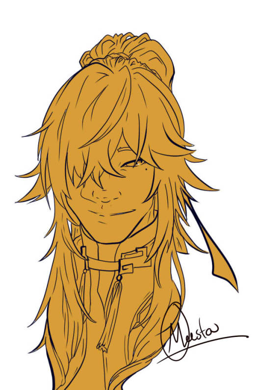
Listen man, the concert went HARD.
Maybe I'll color them one day- if it strikes my... funny bone...
#hsr fanart#HSR#jing yuan#imbibitor lunae#dan heng#sampo koski#hsr blade#honkai star rail#hsr jing yuan#hsr dan heng#hsr sampo#my art#I don't have my logo anymore it's on my old computer#I'll get it back one day#Maybe it's time for a rebrand#the problem is that drawing is hard for me to do these days#The joys of depression o7 o
36 notes
·
View notes
Text


I initially wanted to make this a comic, but honestly, I’m already so late for starting my year on April LOL I felt like making a text post for at least most of the changes would be easier on me 😅
#mews magical texts#yes i gotta update all my tags too... eventually#sighs updating usernames is so tiring#new username#new logo#rebrand#rebranding#or something
7 notes
·
View notes
Text

As you may have heard, I'm rebranding. Formerly AnScathMarcach/Scámarca Productions, now SammyJ Studios.
It's a long story, but my immediate future plans are to establish a real, registered business as a Sole Proprietor, contracting, and working with real clients.
That being said, it took a looong time for me to be willing to let it go, but I no longer wish to identify as an edgy pirate OC that I made when I was 13 as a love interest for Jack Sparrow. Can you imagine having to explain that to a real-world client?
I've been embarrassed to have to explain to nearly every single person what "Scámarca" means and why I called it that. Then there's the people who make fun of the word "Scam" in it, or the "Scat" in Scáth. The amount of people who I could meet who actually speak Irish and would understand it are pretty much nonexistent.
So, I've decided to completely rebrand. Here is my new logo that will be seen on all my future artworks. I'm VERY fond of it.
6 notes
·
View notes
Text
If you don’t like the new twitter App Icon, you can use the shortcuts app to create your own custom icons

22 notes
·
View notes
Text
The award for greatest sports rebrand of all time goes to the Atlanta Braves' MILB affiliate (formerly the Rome Braves)

They play in Rome, Georgia, and their mascot is now an emperor penguin dressed like a Roman emperor. Literally perfect rebrand
10 notes
·
View notes
Photo


A short period in a body of tidal water when the water is completely unstressed, and there is no movement either way in the tidal stream...
#YOU GUYS WE'RE IN THE VIBESY AMERICANA PHOTOSETS ERA AGAIN#this place has rebranded as much as jimmy mcgill#current era logo with the SW in the river... no wonder he needed a moment#fic inspo#eighty-six years#my fic
64 notes
·
View notes
Text

Thank you! 🙏
#zara#clothing#suits#brands#luxury#logo#rebrand#business#artists on tumblr#entrepreneur#identity#graphic design#minimalism#modern#street wear#new york#california
15 notes
·
View notes
Text

why are established brands so insistent on making themselves completely generic and unrecognizable
11 notes
·
View notes
Text
After a while of inactively because of a rough start to the year I have rebranded as Faux Frog 🐸
I also plan to be more active with my work and hopefully will be able to attend a lot more print fairs and market!

I will make sure to post updates once dates are confirmed so that all who are interested can say hello and look at my work 👋✒️
#art#artist#illustration#character design#comic#character art#graphic novel#queer artist#queer#logo#rebrand#print stall#small business#frog#knight#robot#cyborg#cartoon#animation
6 notes
·
View notes
Text
Bandai Update Even More Tamagotchi Original Shells with New Logo
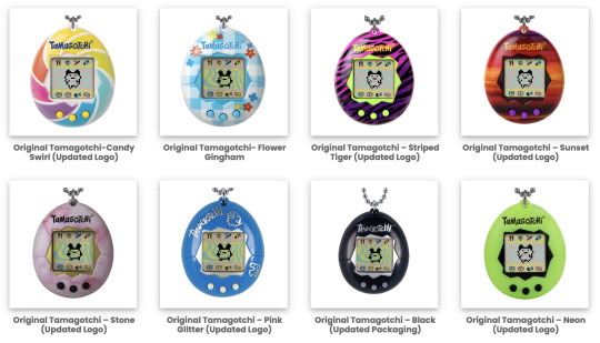
They’re getting refreshed! Bandai Namco US has just recently updated the official Bandai website where you can find Tamagotchi products, including the Tamagotchi Original. Not only have they listed the three new summer Tamagotchi Original shells that we just love, but they also updated several Tamagotchi Original shells.
The updates are merely to the logo feature on the shell. Bandai Namco US has updated several, if not, most, Tamagotchi Original shells to now feature the new logo. Goodbye, old logo! It looks like these older Tamagotchi Original shells are still in production, and have just gotten a refresh.
#tamapalace#tamagotchi#tmgc#tamagotchioriginal#tamagotchi original#original#tamatag#virtualpet#bandai#rebrand#logo#refresh
19 notes
·
View notes
Text


Here it is! We got a crisp 11x17 poster of all the logos that I designed for INKTOBER X LOGOTOBER this year. These things turned out so clean! They're up in my Etsy now if you want to grab one for yourself or as a gift for someone!
•••
https://www.etsy.com/listing/1612789281/logotober-2023-poster?click_key=c2f64b2d8d34837a33881f7adf6f1c8077aa7bcc%3A1612789281&click_sum=13b7520a&ref=shop_home_active_1
#taylor hicks made this#illustration#design#inktober#logotober#logos#logo designer#logo poster#cool logos#paster art#y2k#branding#rebrand#ddr#mercantile#stay frosty#kitty#trigun#anime#video game#coffee#travel#soul glo
7 notes
·
View notes
Text
Milap Cosmetics: Redefining Beauty, Empowerment, and Elegance

Milap Cosmetics, a leading beauty brand, has recently unveiled its brand-new logo, signifying a remarkable chapter in the company’s journey. Rooted in their unwavering commitment to beauty, empowerment, and timeless elegance, the logo is a true reflection of the brand’s core values. The process of creating this iconic symbol began with meticulously hand-drawn sketches, which were then digitally refined to achieve a flawless design, epitomising perfection and grace.
The essence of the new logo lies in its seamless blend of femininity and tradition, capturing the epitome of elegance and timeless allure in a single stroke. The focal point is the word “Milap,” thoughtfully broken down into individual letters, each symbolising a profound aspect of the brand’s essence. These letters stand as a representation of Milap Cosmetics’ dedication to providing exceptional beauty products that embody the spirit of the brand.
Directors Sachin and Keshav Chadha expressed their pride and enthusiasm for the new logo. They believe that it encapsulates not only the brand’s journey but also their goals and the deep bond shared with their cherished customers. At its core, the logo epitomises the grace and elegance that lies within each individual, encouraging them to embrace their uniqueness and inherent beauty.
Milap Cosmetics has always been committed to enhancing the natural beauty of individuals and products alike. Their exquisite range of high-quality beauty products empowers people to embrace their distinctiveness and radiate confidence. The logo is a celebration of the brand’s growth, built upon the unwavering support and trust of their patrons, motivating them to continually deliver excellence while honouring diversity.
The new logo marks a significant milestone for Milap Cosmetics, representing their unyielding commitment to upholding the highest standards of quality while fostering inclusivity and diversity. As a brand that celebrates individual beauty, they recognize that beauty comes in various forms, and every person deserves to feel beautiful in their own unique way.
Behind the creation of the new logo lies a labour of love from the entire team at Milap Cosmetics. Starting with hand-drawn sketches, every stroke was thoughtfully placed to capture the brand’s essence. These sketches were meticulously brought to life digitally, ensuring every detail was refined to achieve the perfect design. Countless hours of dedication and creativity went into shaping the logo, making it a true representation of the brand’s values and vision.
Looking ahead, Milap Cosmetics envisions a future where beauty is synonymous with empowerment and individuality. They aspire to continue crafting innovative and top-notch beauty products that cater to the diverse needs of their customers. Beyond being a beauty brand, Milap Cosmetics strives to be a source of inspiration and confidence for everyone embracing their products.
In conclusion, Milap Cosmetics’ new logo marks a significant milestone in their journey of redefining beauty, empowerment, and elegance. It embodies the brand’s core values, unwavering commitment to quality, and celebration of individual beauty. As they continue to grow, evolve, and adapt to the ever-changing beauty industry, Milap Cosmetics remains steadfast in providing exceptional beauty products that uplift and empower individuals, while embracing and celebrating the beauty that lies in diversity. With their new logo leading the way, Milap Cosmetics is ready to embark on an exciting and empowering future, inspiring beauty enthusiasts worldwide.
This post was originally published on: Apppl Combine
#apppl combine#ad agency#brand revamp#branding#Rebranding brand revamp#Milap#Milap Cosmetics#new logo#Rebranding
2 notes
·
View notes
Last Seen Blogs

bbcparty-la
BBC Party LA

fiendish-clown
art acc

cutiehal
cutie pie

mrlivertown
Livertowm

igiveradiohead
Mus Duzel