#mine: tumblr dashboard palettes
Explore tagged Tumblr posts
Text
Palettes For Tumblr III
I'm back after a long while with some more dashboard palettes for Tumblr. You can use these with the Palettes for Tumblr addon. Just download the file and import the .json file using the addon. Screenshot in case you need help:
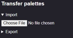
Anyways, onto the Palettes!
Miami [⬅️ Click to Download]
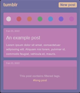
Hazy Mauve and Purple Tones. Full previews:
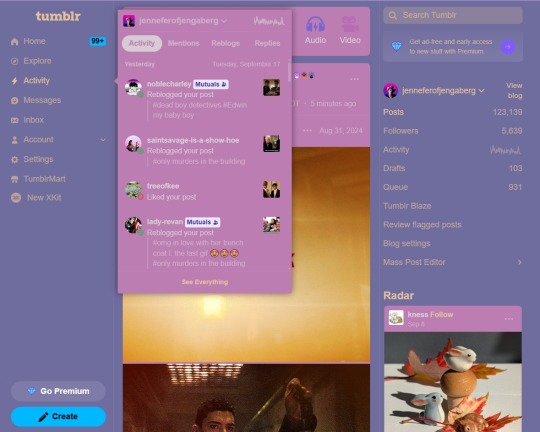

Robin's Egg [⬅️ Click to Download]
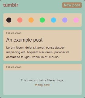
Robin's egg blue and tan. Full Previews:
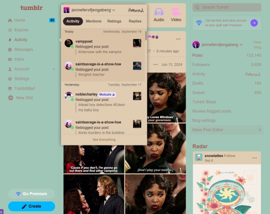

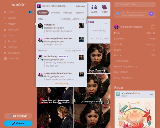
Terracotta [⬅️ Click to Download]
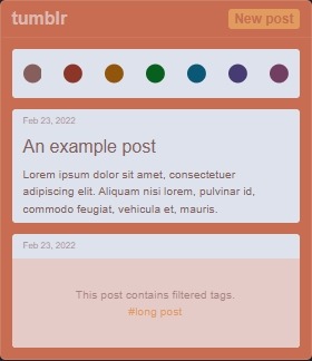
Soft orange clay and gypsum white. Full Previews:

Pls like or reblog if you download!
9 notes
·
View notes
Text
literally THE reason i love tumblr sm. the customization capabilities. the goth/rave color palette is definitely the cutest one on mobile 💜 i wish the halloween palette was available for mobile tho :/ it’s so pretty 🎃🧡


0 notes
Text

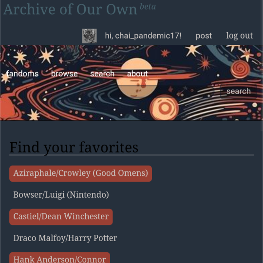
ao3 skin that i made!! (copy code under "keep reading")
it's a messy combination of pieces of code from other people's skins and my own changes
the header image is NOT MINE! it is "Pattern Galaxy Space Planets Vibrant Linear Universe" by Arncil on Redbubble, which i just used as an example for an image you could use!
here are some of the skins that i can remember using as part of this, but i've been building it for years so forgive me if i forget some:
Shortening long tag fields by Xparrot (on ao3)
Slim Shaded by AO3 (on ao3)
Lily Garden by tealtiam (on Tumblr)
AO3 Tag category coloring! by ao3css (on Tumblr)
come back here to my tips or leave a comment if you need some help customizing the code!
Background color: #26303C
Text color: #CBC6C3
Header color: #46626D
Accent color: #993F33
steps to create a new skin using this code:
log into ao3 account
go to dashboard >> skins
click "create site skin"
make sure TYPE is "site skin"
add a unique title
copy all code below
paste into field 'CSS'
click on "use wizard" at the top
copy and paste the four colors written above into their corresponding boxes
click SUBMIT
click USE
how to customize this skin:
FONT SIZE: at the very top of the code, change the "90%" to be bigger or smaller to change the font size within a fic
MAIN COLORS: to change the main colors, select "use wizard" when editing the skin and replace any of the four hex codes under "Background color:", "Text color:", "Header color:", and "Accent color:"
SECONDARY COLORS: find all hex codes within the code and change those numbers as you like! i changed all colors to match with the color palette of the header photo that i chose to make it feel cohesive
TAG COLORS: towards the end, the "relationship", "character", and "freeform" tags alternate three colors to make them easy to separate. in this skin they are all very similar, so you can change those to be whatever colors you like!
HEADER PHOTO: find the link towards the end of the code right before the warning tags and replace it with a link to any photo you like! it loops, so you don't have to worry about sizing or anything
FONT: i'm unsure how exactly to do this, but the in-fic font is currently set to Georgia Serif, so i suppose just go find that and replace it with your preferred font!
BORDER STYLES: wherever you see the code "border-style:", replace the word that comes after it with one of these options: none, solid, dashed, dotted, double, groove, ridge, inset, outset, or hidden
WARNING TAGS: at the very end of the code is a list of words or phrases that, when they appear in the tags of a fic, are highlighted in a contrasting color so that they are easy to avoid if necessary. you can add or remove those tags however you like, or change the warning color!
COPY AND PASTE ALL CODE BELOW
#workskin { font-size: 90%; } li.blurb .tags { max-height: 7.5em; overflow-y: auto; } #header { min-height: 0; } #header a, #header fieldset, #header ul.primary, #header ul.primary .current { border: 0; background: 0; } h1 a img { height: 50px; border: 0; } #header .landmark { clear: none; } #header ul.primary { background: rgba(0,0,0,0.65); border-bottom: 1px solid rgba(0,0,0,0.75); } #header ul.primary, #header ul.primary .current, ul.primary.actions a, #header ul.primary .current { color: #CBC6C3; } #header ul.primary .current, #header #search input, #header #search input:focus { background: rgba(0,0,0,0.25); color: #CBC6C3; box-shadow: inset 0 0 3px #131A2A; border-color: #131A2A; } .actions, .actions input { text-transform: lowercase; } blockquote.userstuff { font-family: "Mido", "AUdimat", "Ostrich Sans Rounded","Lucida Grande", sans-serif !important; position: relative; background: rgba(0,0,0,0.1); padding: 2%; border: 1px solid rgba(0,0,0,0.15); box-shadow: 0 0 2px rgba(0,0,0,0.4); } blockquote.userstuff:after { content: "\201D"; right: 0; top: auto; left: auto; } body, .userstuff { font-family: Mido, Georgia, serif; } .heading, .userstuff h3, .userstuff h4 { font-family: "CabinSketch", Georgia,serif; } #main .heading { color: #CBC6C3; } #inner .group, #inner .heading, fieldset, .verbose legend, table, table th, col.name, span.unread, span.replied { outline: none; background: transparent; border-color: #131A2A; border-style: double; box-shadow: none; border-radius: 2em; border-bottom-right-radius: 0; border-top-left-radius: 0; } #inner .group .group .group, col.name { border-style: double; border-color: #CBC6C3; box-shadow: 0 0 2px #000; } #inner .bookmark .user.module, #inner .wrapper { border: 0; border-radius: 0; border-top: 3px double #bbb; box-shadow: none; } .filters { font-size: 90%; } .toggled form, .dynamic form, .secondary, .dropdown { background: #fff url("/images/skins/textures/tiles/white-handmade-paper.jpg"); } a.tag, a.tag:visited, a.tag:link { display: inline-block; padding: 1px 3px; margin: 2px 0px; border: 2px solid #46626D; border-radius: 5px; } .commas li:after { content: ""; } h5.fandoms.heading { color: transparent; } .favorite a.tag { border: none; } .tags li.relationships:nth-of-type(3n+1) a.tag { background-color: #1d3954; } .tags li.relationships:nth-of-type(3n+2) a.tag { background-color: #264663; } .tags li.relationships:nth-of-type(3n+3) a.tag { background-color: #305475; } .tags li.characters:nth-of-type(3n+1) a.tag { background-color: #214154; } .tags li.characters:nth-of-type(3n+2) a.tag { background-color: #294c61; } .tags li.characters:nth-of-type(3n+3) a.tag { background-color: #31576e; } .tags li.freeforms:nth-of-type(3n+1) a.tag { background-color: #234e54; } .tags li.freeforms:nth-of-type(3n+2) a.tag { background-color: #2a585e; } .tags li.freeforms:nth-of-type(3n+3) a.tag { background-color: #316269; } .tags li.freeforms a.tag:hover, .tags li.characters a.tag:hover, .tags li.relationships a.tag:hover { background-color: #26303C; color: white; } #header .logo { display: none; } #header ul.primary { box-shadow: none; padding-top: 30px; padding-bottom: 30px; background: #FCC191 url(https://i.pinimg.com/564x/8c/bc/ae/8cbcae1760dc88ae8730566337a5d2eb.jpg); background-attachment: fixed; } li.blurb a.tag[href*="suicid"], [href*="suicide"], [href*="Suicide"], [href*="rape"], [href*="Rape"], [href*="consentual"], [href*="Consentual"], [href*="non-con"], [href*="consent issues"], [href*="Kidnapping"], [href*="kidnapping"], [href*="Canibalism"], [href*="cannibalism"], [href*="Cannibalism"], [href*="Dove"], [href*="dead dove do not eat"], [href*="murder"], [href*="Murder"], [href*="harm"], [href*="self harm"], [href*="Harm"], [href*="Torture"], [href*="abduction"], [href*="asphyxiation"], [href*="blood"], [href*="Blood"], [href*="death"], [href*="Death"], [href*="gore"], [href*="Gore"], [href*="incest"], [href*="Incest"], [href*="trauma"], [href*="Trauma"], [href*="torture"] { color: #000000; font-weight: bold; background-color: #993F33; }
928 notes
·
View notes
Text
I wish tumblr were more customizable
I've gotten the old dashboard (Mostly) back thanks to Pixiel's stuff and Stylus (for firefox; For Chrome) and I've edited everything to make it cooler and to compensate for the shitty-ness that I am still unable to change (custom dasbboard palette which allowed me to add the background). My edits are far from perfect and sometimes the custom background clips into the blogs but at least it's somewhat mine. At least I have some control over it.
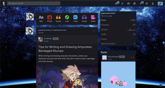
Idk it'd be nice if I could just move the dashboard a little more to the center and change the stuff on the side to have pictures that I WANT to show pinned, and some other stuff would've been cool as well.
I mean, I thought the whole point of tumblr before was for it to be your own customizable space. Scrolling through Stylus options I can't help but lament the various personalized dashboard options that just... don't exist anymore.
Idk, one of the greatest bits about tumblr was the customizable blogs for me. They looked really cool and drew me into the website in the first place, after all what other popular social media allowed you to change your own space so easily like that?
And now It's forcefully changing your space into...twitter.
It's just... It's not good you know? anyways.
32 notes
·
View notes
Text
Tumblr life tips:
(please imagine these as like, tumblr loading screens. Thank you!)
You make mutuals faster when you change your name/icon less. The easier it is to remember + spell your username, the better people will remember you.
If you block the tag for something, (say, #dogs) do yourself a favor and block the same word in filtered post content. There are plenty of posts about dogs not tagged with anything, and the posts that mention dogs that you'd actually like are slim to none.
Send the people on your dash asks when you can. If you see an ask meme during your daily scroll, send something in! Its the tumblr version of small talk.
If you want to have a slightly more serious conversation with a mutual, you can't go wrong asking about their headcanons. 99% of people will jump at the chance to geek out, and the 1% that really aren't in the mood today can simply delay or delete the ask.
If you are already having a bad day, you should take the time to go in #anti your ship and block the people that bash the ship. You probably won't want to encounter any of those people in the wild, unless they are the rare breed thats civil about things.
Don't wait until tumblr becomes unfun to block the current discourse. The moment you see figurative clouds on the horizon that you don't like, get tag blocking!
https://www.tumblr.com/dashboard/crushes is a thing where you only see posts from the dudes you RB from the most often! I set it as my tumblr bookmark so I'll see the posts I'm the most interested in first.
Block annoying people, even if you agree with them on the current issue. You'll find something else to disagree on later, and you already know they aren't a fun person to disagree with.
If you see a shitty ass take, only reblog with a "WTF" if they are the first person in the reblog chain. Else, the guy you dislike won't see it but the first person in the RB chain will. That helps nobody.
If the person you just blocked is still everywhere, filter their username in filtered post content.
Tumblr Savior is basically a tumblr modpack. Look into downloading it as soon as possible if you have not already.
Also theres a firefox extension (idk if its on chrome, switch to firefox anyway it eats less ram) called Palettes for tumblr where you can make tumblr any colors you like! Mine is a nice warm sepia! :)
Please add your own tips I need to get better at tumbling.
72 notes
·
View notes
Text
rethinking my tumblr, I suppose + new tagging system!
From this entry onwards, I will begin to implement a new and consistent tagging system inspired by what Vylet Pony has done for her tumblr. The basic gist is that:
#ss.spiel will be used for any of the rambles that I make, such as this one
#ss.saga will be used for new uploads, whether it be new YouTube videos or music
#ss.art will be used for drawings that I make
With that out of the way, what exactly do I mean when I say “I’m rethinking my Tumblr”?
Find out after the break.
Well, very recently I’ve come into grips that my main audience — the people and fans that most interact with me — are all on my YouTube. I wouldn’t really expect an awful ton of them to have twitter or tumblr or bsky accounts for regular use, and so for those platforms, I mainly maintain a presence in there to promote my works and to make connections with mutuals and friends. I also mostly exert a lot of my focus on creating YouTube videos, while on tumblr I just kinda reblog cool things.
It’s for these exact reasons why my tumblr page has been looking VERY different lately. The dashboard design for my page has a new colour palette. My Mint Kirby profile picture — by the talented clownpalette of whom I’m very thankful — is swapped out for Minty Juniper, my ponysona (for clarity’s sake, this is NOT a complete rejection of the Mint Kirby character that I’ve kept up for 5 years). And finally, as I mentioned in an earlier entry, the Twitter aesthetic I had for my blog became dated and bloated and that’s what prompted a simpler overhaul of ScoutSunset.tumblr.com.
All of these changes (well, maybe “almost”, since the PFP change was mostly done out of a whim) reflect a change of strategy for my tumblr presence…or rather a removal of strategy. I’m now more concerned with making my tumblr more personal than trying to make as much impressions on here as possible.
I may somehow have a post of mine pop off randomly, and that’d be OK. But I know where my audience is and where my focus lies upon. That being said, I do appreciate this site — it was fun executing the blog’s new look the way I preferred — and the small interactions I can get from time to time, and I especially appreciate the friends, followers and fans that have stuck around thus far! I hope this entry wasn’t too intimidating and that you understand. I love y’all.
,,—.—,,
2 notes
·
View notes
Text
someone asked for a link to dashboard unfucker so im taking the time to show everyone how to make your dashboard look like a stylish user extension from 2014
heres dashboard unfucker
and heres the stylus extension that lets you customize your dashboard
its not the same as back then because the 2014 dashboard was infinetely cuter and less minimalistic but it will do. now your dashboard can look cool like mine

6 notes
·
View notes
Text
Finally some good advice.
To be clear, I like this change and I will be leaving feedback to say so -- for me the large amount of literal empty space on the screen has meant that I couldn’t keep the window I had Tumblr in full-screen because it would give me a headache. Now it has more even, unmoving text on both sides of the screen, better visual hooks, and the dimmer colour palette available as a default helps with eyestrain.
People are absolutely framing this in a way where users like me with my particular sensitivities don’t matter, and shouldn’t have this option available. That I also should go back to a dashboard that actively aggravated my migraines unless I modded the hell out of it with userscripts. This one, I barely just need to tweak the contrast, I didn’t even realise how much of an issue I had had with that until the pressure was suddenly gone.
More options is better, and the way we get more options is by explaining our needs to the developers better. If the new layout causes you problems, it’s in your and mine best interests for both of us to tell how this change affected both of us.
EDIT: the feedback option is here:


So I think the best strat here is for the users who did get the new layout to just stop using the desktop version of the site for a while, like a week or a month or however long their 'experiment' is supposed to last, while the users who didn't get the new layout should keep using the desktop version like normal or, perhaps, use it even more than usual.
My guess is that they're doing basic A/B testing on the new layout to see if it would boost engagement: the userbase is split roughly 50/50 between the 2 versions and they are going to be comparing the engagement data between the 2 groups of users to see if it's worth it switching everyone to the new layout or not.
Basically, if you got the new layout and don't like it - don't use it. If engagement metrics of group B (new layout) are lower than those of group A (no change), the experiment will be considered a failure and they will have to reverse the change.
If your tumblr suddenly looks like twitter - it's a sign to log off and go touch some grass! (or just use the mobile app since that engagement data isn't relevant to this particular experiment)
#signal boost#like I *REALLY* lost it when this started being represented as 'bad for disabled people'#like am I not disabled??? do my migraines not count because I don't have Twitter War Trauma?
20K notes
·
View notes
Text
Has anyone else’s Tumblr dashboard gone pitch black? Mine has and I don’t know how or why...or even what to do to get it back the way it was. Could this be a Tumblr glitch?
UPDATE: Figured it out by looking in the settings. Click on Color Palette and it gives you color options to choose fro,. On the laptop/pc app, it gives you 12 different color options, on iphone it gives you 6 I believe.
2 notes
·
View notes
Text
Palettes For Tumblr Part II
Made a few more color schemes for Tumblr. You can use these with the Palettes for Tumblr addon by @april. Just download the file and import it using the addon.
Aladdin [⬅️ download here]
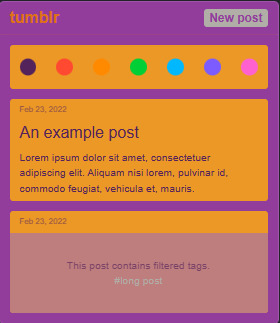
Colorful scheme with jewel tones. Full preview:
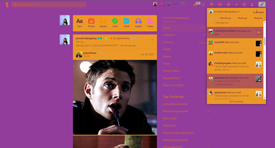
Calm [⬅️ download here]
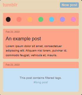
Light theme with neutrals and pastels. Full Preview:
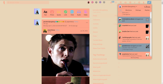
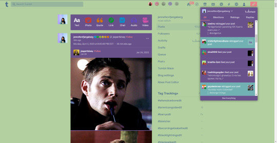
Garden Gnome [⬅️ download here]
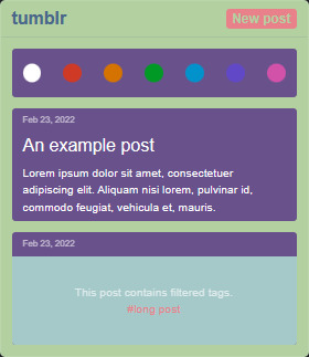
Spring theme with a bit of whimsy. Full Preview:
Pls like or reblog if you download!
19 notes
·
View notes
Text
Anyone else annoyed as fuck that the Infinite Scrolling on Tumblr can’t be turned off now?
I preferred having pages for multiple reasons.
1) It’s easier to find stuff (especially on your Likes page)
2) If your dashboard automatically refreshes when you have infinite scrolling, good luck in finding where you were before.
3) I don’t know about your guys’ computers but mine can’t take having 100+ posts loaded all at once without lagging and shit. It just gives up on loading the gifs after scrolling for like 3 minutes.
-
Not to mention now whenever I search something I have to manually change it to list form instead of block form EVERY SINGLE TIME.
-
It was so much better before, let me have my own choice of options please. i.e., list not block and pages NOT infinite scrolling.
It was fine before, If someone wanted Infinite scrolling they could leave it on, if they wanted the Block style posts when searching they could have it and only have to select it ONCE. Why take away the pages option? What good did that do anyone?
Was it a mistake made when adding the new palette feature? Will it be fixed? I HOPE SO

90 notes
·
View notes
Text
So... Idk why but reblog or tell me which palette your tumblr dashboard is in.... mine is in Cybernetic
11 notes
·
View notes
Text
Changes with the new Dashboard
Here’s what I’ve noticed til now
1) Some XKit extensions aren’t working anymore, for me most notable I’m currently unable to block posts. Though I’m pretty confident the people behind XKit are gonna fix that sooner or later.
2) The font is noticeably larger now (not sure if that’s Tumblr itself or XKit) but I like that.
3) You can change the colour palette, but I’m not gonna try that out. Old Blue is still working so I’m gonna keep that.
4) When you go to your posts (not directly on the blog but via that person-icon) the first post you see is the one you pinned. You’re also able to pin posts via desktop now.
5) The activity lightning bolt now gets the numbers just like the Dash, Chat and Message icon when you’ve got a new notification - a change I honestly like a lot.
6) For SOME people, the XKit icon has disappeared. I say some because mine hasn’t.
7) Apparently it’s gotten more difficult to send asks to dash-only blogs (see this post for reference.)
If anybody notices more/different changes, feel free to add them on here!
11 notes
·
View notes
Note
Hi, can you do a tutorial on how to do these aesthetic? I think it's so beautiful but mine get so horrible, or if you do not think it's bad, do you have a psd of them to train?
Hello nonnie! First of all thank you so much, you’re very kind. 💖
I’m sure your edits are beautiful and as long as you enjoy making them that’s all that matters. Don’t judge them based on the amount of notes they get. If you’re happy with your creation, then you’ve done a great job. If you’re not so happy, then keep practising and keep making things and one day you certainly will be. 😊
I’m sorry but I don’t think I would be able to make a tutorial for my aesthetics. You can browse my photoshop ask tag here and see what tips I already gave to other people. And here are some important things I always keep in mind when making aesthetics (or any other edits). 😊
dimensions: I cannot stress this enough - dimensions of your canvas are very important. If you make your edit too small, it will look blurry and low quality. Always keep in mind that the width of tumblr dashboard is 540px, so never make it smaller than that. Personally, I use 800 x 720px canvas for six framed aesthetic. Which means that each of the pictures is 400 x 240px.
pictures: Do not use low quality pictures in your edits, even if it should be only one out of six frames. Always resize your picture in photoshop by using “image size” and then drag them onto the canvas, never do it manually.
pinterest: is a great place to find pictures for your aesthetics. Take your time browsing boards and making your own ones. Here and here are some pinterest recommendations.
colouring / psd: Learn how to use psds / colourings, they bring out the colours of the pictures and help them match. Honestly, right colouring makes an edit look 100 % better and for me it’s a make or break element. Here or here you can browse some nice psds.
colours: That being said, don’t overdo it with the colours. Try not to use more than 2 or 3 and try to keep your colour palette in mind when you’re putting together your pinterest board. Here I talked about my colouring process in more detail.
feedback & inspiration: If you’re stuck or you don’t feel sure about something in your edit, it’s always good to get a feedback from someone else or browse someone else’s creations. Join some networks or fandom families and use discord to ask the fellow members what they think. Create an inspo tag on your blog or a folder in your computer and browse it if you need to find some inspiration.
Here I gave some other photoshop tips (some are the same but explained in more detail), if you want to take a look as well.
If you have any other questions feel free to send me another ask or a private message, I’ll be happy to help you out. I hope you have a lovely day and good luck!

30 notes
·
View notes
Text
Phylophe’s 100 Followers Lucky Draw!
So I should’ve written this a while ago but somehow this humble little blog of mine has reached 100 followers! I know it’s not much but I really appreciate each and every one of you who follow me.
I don’t do much fanart, I reblog a wide variety of posts, I sometimes shitpost, and I do the thing where I disappear for a while and then spam the hell out of your dashboard with reblogs. Despite all this (or because of this?) you’re still sticking with me, and I would like to say thank you!
Now… I want to show my appreciation, as well as get some feedback, so I’ll be opening 3 art request slots, but by lucky draw. The prizes are a limited-palette drawing (probably on the sketchy side) like these ones (I also do landscape, still-life and abstract, if character art isn’t up your alley). The conditions to enter the draw are:
You must be following me. Reblogging or liking of this post is NOT necessary.
Send me an ask answering the following questions (NOT on anon of course!):
What made you follow my blog initially?
What are the tags that interest you on my blog?
What would you like to see more on my blog?
(Optional) Anything you’d like to ask about/comment on?
To the friends I knew before I got this tumblr blog, I’d love for you to enter but in the lucky draw I’ll be prioritising the people I met on tumblr first. I hope you understand and I love you guys for being my first fans.
I’ll announce the winners in a week or a fortnight or a month or… you know what I’ll make another post when the deadline closes in (because I’m actually worried that no-one will even see/read/be interested in this haha). Thanks again to everyone and good luck!
17 notes
·
View notes
Photo
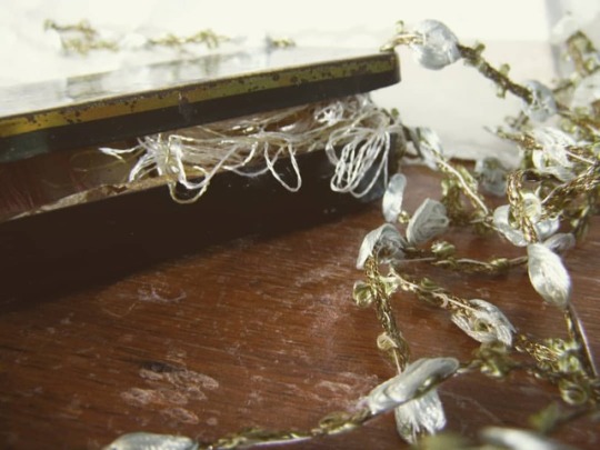
When I turned thirteen I decided, out of nowhere, that my favourite colour was green, so I did what any sane person would do. That was to paint my room lime green. The colour was so bright that when the morning sun poured from the windows, the room would light up as beautifully as a radiation hazard. My family got to buy the terrain where my house stands now because my mother had a special eye for opportunities. I don’t remember how it looked when my parents bought it the first time, but I’m guessing how empty the grass field would look. The only treasure the place had to offer was the wall of sick elms; a dead soil; and the biggest pine tree any child of the age of five have ever seen. My father designed the house. I didn’t take much, and soon we moved from a little urban apartment in the middle of the city to no-where in the countryside. Two years ago, after more than fifteen years of never touching the house, my parents decided to make a main house make up. We got the entrance redone, because the original design was barely used. We fixed some of the things to do. My mother bought herself so many ‘House re-designing ideas’ magazines she could as well print the entire Pinterest dashboards for the same price. From all this, she got to inform herself that the fashion colour palette working right now was a Nordic Cold/Warm style. So she came for help to the person with self-induced daltonism, showing me four colours barely different, she asked which one was better. It didn’t matter what I answered, it was never enough. She came the next day, still with the entire Pantene colour panel, and three more similar colours. At the end, if she followed my advice or not, I can’t tell. The colours look still similar to me, but the house was finally painted. The green walls of my old room were repainted with Nordic palettes. Meanwhile, I painted mine blue. #colours #design #green #fashion #vintage #house #photooftheday #instafollow #writer #writerslife #writersnetwork #writersofinstagram #writing #iamwriting #writingblog #blog #tumblr #update #writingupdate #writepromotion #writingcommunity #bookstagram #story
#writerslife#vintage#writepromotion#writersofinstagram#writingblog#blog#update#green#writersnetwork#story#design#instafollow#fashion#photooftheday#house#iamwriting#bookstagram#writingcommunity#writing#writingupdate#writer#tumblr#colours
0 notes