#neil gailman
Text
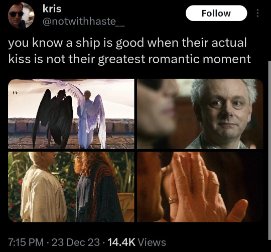
#good omens#good omens 2#gomems#go2#aziracrow#ineffable husbands#cute#lgbt#neil gailman#twitter#x#crowley#aziraphale
4K notes
·
View notes
Text
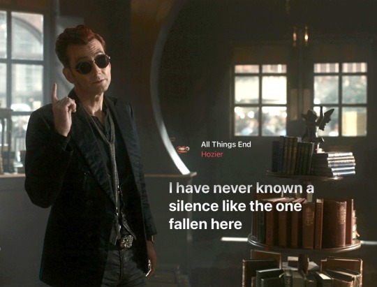
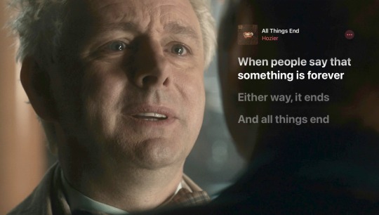
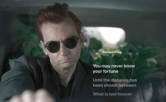
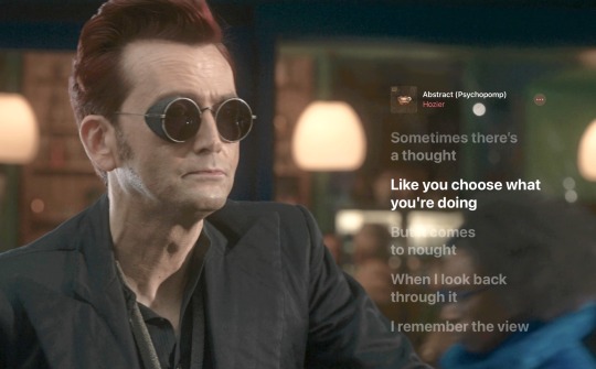
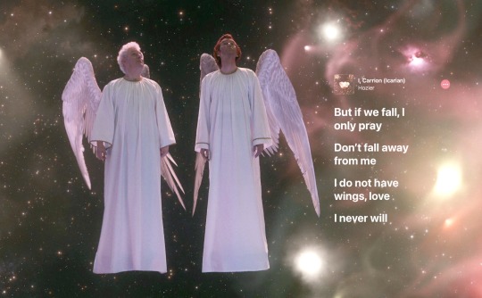
thank you hozier
#love#beautiful#photo#photography#trend#david tennant#otp#good omens#michael sheen#aziracrow#ineffable husbands#neil gailman#all things end#hozier#unreal unearth#song#lyrics#lyric quotes#lyrics parallels#good omens 2
2K notes
·
View notes
Text
In other words : WAIT AND SEE
(It’s not so long anymore)
1K notes
·
View notes
Text
I haven't even listened to it, but if I see even a single Good Omens edit to the Tortured Poets Department from any of you then there will be no family vacation to Alpha Centuri, do I make myself clear?
14 notes
·
View notes
Text
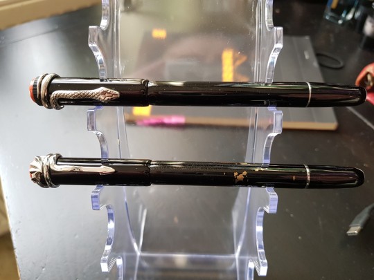
Comparision: MB Rouge et Noir vs. Majohn F9
Hello there, I'm currently basking in my 5 minutes of fame off having my snake fountain pen ask answered by Neil Gailman.
Since I am currently, as @thegrimshapeofyoursmile said, fame let me introduce myself.
I am Sibi, I am a writer of fantasy, historical fiction and everything queer under the sun - and I collect fountain pens.
Recently I finished editing a novel that was a lot of hard, rewarding and enlightening work. Neil's posts on creative writing and him encouraging people in his asks cheered me up a lot during the first round of editing.
And then there's the fact that I named the pen Crowley for obvious reasons.
It was my holy duty as an elder tumblrina to be all parasocial about it.
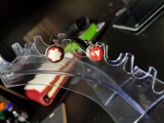
The pen I was - and still am - so chuffed about is a Montblanc Heritage Collection Rouge et Noir Serpent. (They also have a Spider one).
(Yes. It is that expensive. No, I am not rich. I earn a decent wage and have disposable income which I can - and did - save up. I am pissed that our economy is so nightmarish that this is genuinely a privilege.)
A few folks reblogged the ask claiming the pen was a Majohn F9.
Fair enough, Majohn specializes in copycat designs and the F9 is a copycat of the Rouge et Noir (they also did one for the spider themed one). They make nice pens.
I own a F9 myself. It was this pen, in fact that convinced me to save up and reward myself for a MAJOR milestone with it. That milestone being having finished that novel.
Considering all the mix-ups, I thought about comparing the two of them and make a list of how to tell them apart. The F9 is a rightfully popular pen and I really don't want people to try and find the pen they saw in the Neil Gailman ask, then die of shock at the price tag. Neither do I want people to order a F9 and then be disappointed that it doesn't look like the snake pen in the Neil Gailman ask, then not give it a chance just because of that.
Sooo here we go!
I got my F9 about two years ago and I love it. However, the paint quickly started to chip due to friction with other pens, so I kept it at home. (I since then updated my pen roll.) Since then, the paint has developed tiny bumps and bubbles and has a rough feel to it. Probably deterioration. At least the chipping should be no issue with proper storage, that was my bad.
The Rouge et Noir is my first modern MB all others are vintage flea market finds, so it remains to be seen whether the resin will act the same. I never heard anything about it, so I honestly doubt it would happen. (Cause let's be real, we would make a huge and justified stink about it)
Sizewise: no difference. Same length, same circumference. The MB cap screws nicely on the F9. Vice versa not so much, the grip section of the f9 is a bit thicker and the cap is actually a little larger than that of the MB. Serious kudos to Majohn for sneaking in subtle differences while keeping the overall proportions the same.
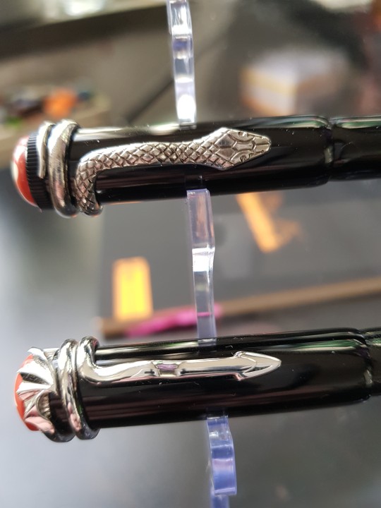
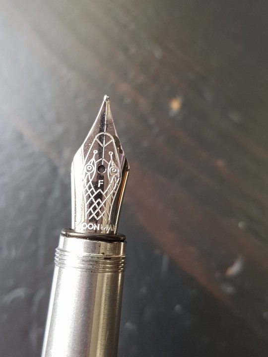
The clip is the biggest visual difference, with MB putting in a rather detailed snake, whereas the F9 sports a beautiful, stylized dragon with a wing on top. I know people who specifically prefer the F9 because they like dragons and the F9 is a beautiful, subtle dragon pen. Also good on you, Majohn for sidestepping the Montblanc Crest on the finial.
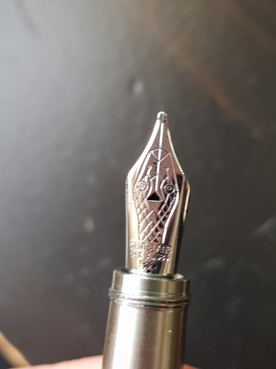
The snake design on the nibs is exactly the same with the only differences being the shape of the breather hole, the size mark on the Majohn and the individual brand markers (and the fact that the grain on the tip is flattened on the upside on the MB which . If your main argument for a pen is the snake on the nib and the snake on the nib alone - stop reading now and get the F9.
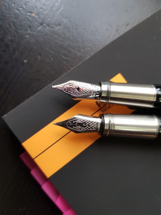
(I do think the MB nib is a hint bigger though and it looks like it was molded with the snake design while it is etched on on the F9 nib.)
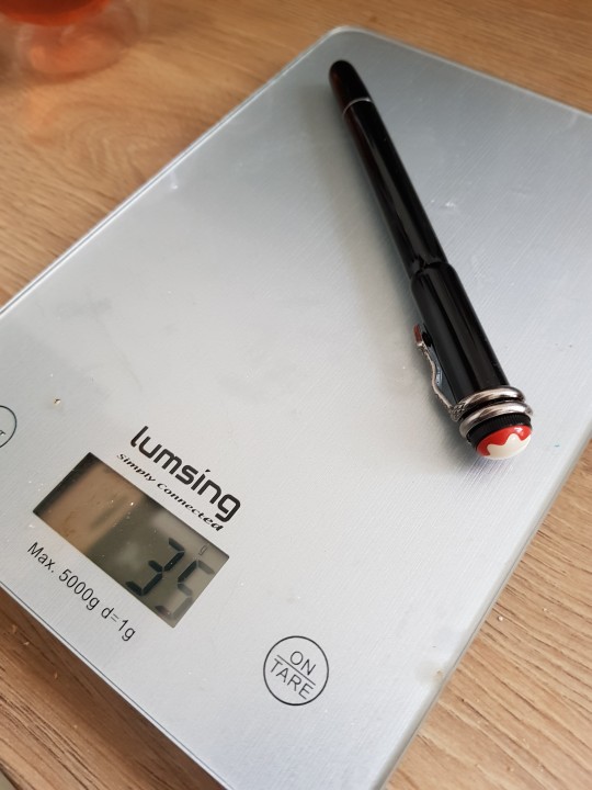
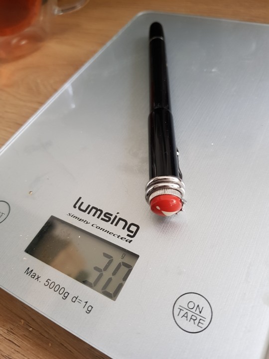
Weight wise - even fully inked, with 30g the F9 is significantly lighter than the MB who clocks in at 35g after having been inked and in use for about 8 pages of writing. Some people don't like heavy pens, so that's a consideration to make.
Now the big question: how do they write? I inked them up with Diamine's Bloody Absinth, tried them and... Well, both are lovely. I bought the F9 with a fine nib in stainless steel, it is perfect for little notes in the margins or a detailed doodle of my bored coworker. The nib is quite stiff, s no line variation. The inkflow is quite juicy and it writes without issue or scratching. Good. Pen.
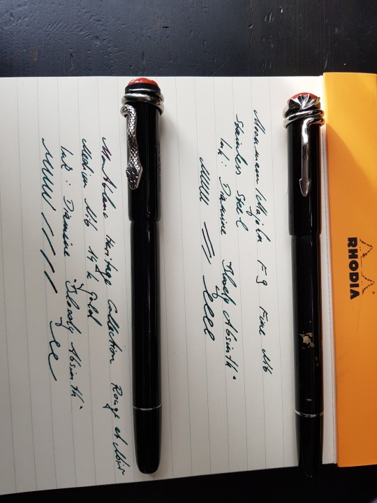
The MB comes with a 14k gold nib that has a beautiful stinginess to it (not that my pettiness gets much use out of it). Since I have developed a love for broader nibs when writing I got me an M and I do not regret it. Especially when you like sheeny inks a broader nib and the ability to get a little variation in the ink flow make your writing just POP. I am utterly in LUST with this.
So... which one would I recommend?
Honestly, they are both great. If you have the Rouge et Noir as a grail pen, you chosen well and I wish you good luck hunting one down. But... this pen will not be an everyday carry. It will spend its days in my showcase or on my desk when I write short stories. It will be treasured and cherished (and insured) for it's own artistic merit and the craftsmanship that went into it, but also for the achievement it stands for. (And yes, also because I call him Crowley.) This is an 800 dollar pen. I will NOT take that to the office. Or anywhere near my family.
If you want a fancy looking everyday carry pen with a cute snake on the nib - go for the F9.
(I bet similar conclusions can be made about the spider themed Rouge et Noir and F9)
But also... have me being a happy little gremlin about having gotten my grail pen.
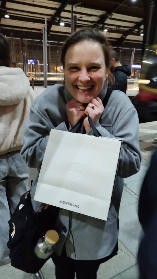
(Also I will definitely not buy any pens this year. Let's focus on and enjoy what we have r.n.)
#neil gailman#neil gailman asks#fountain pen#montblanc#majohn f9#rouge et noir#writing#editing#milestones#good omens#crowley
4 notes
·
View notes
Text
"you get what everyone gets, a lifetime" yes yes ik she didnt actually say that but i love the quote and this panel sooo


#death#vertigo#dc#comics#vertigo comics#dc fanart#death of the endless#the endless#the sandman#neil gailman#goth
4 notes
·
View notes
Text

#fan art#quick doodles#my art?#dream of the endless#dream#sandman#neil gailman#rereading for the 50 time#morpheus#the sandman#first time drawing him#many mistakes#please forgive me mr gaiman#doodles#stupid messed up doodles
27 notes
·
View notes
Text
Book 38 of 2022!

⭐⭐⭐⭐
The Sandman, Vol 1: Preludes and Nocturnes
An occultist attempting to capture Death to bargain for eternal life traps her younger brother Dream instead. After his 70 year life imprisonment and eventual escape, Dream, also known as Morpheus, goes on a quest for his lost objects of power. On his arduous journey Morpheus encounters Lucifer, John Constantine, and an all powerful madman.
What Did I Think?
A review on Neil Gailman and “Sandman” feels a bit pointless but nontheless here it is! I wasn’t a fan of the art style but I think this was a fairly common art style for the time period this was written in. Also, while we’re on time periods, I thought it was impressive how diverse it was and how rare that probably was to find.
I read this because of the TV show (which I still haven’t got around to watching yet, I’m unsure if I should finish the comics first or just start watching the TV show anyway). I really enjoyed a majority of it. Some parts were a bit dull for me, and others were so imaginative and creepy. I can’t wait to eventually get to the other comics in the series.
Prompts:
Popsugar - “ Book Featuring a Parallel Reality”
52 Book Club - “Audiobook Narrated by the Author”
#the sandman#neil gailman#vol one#preludes and nocturnes#comic books#80's#books#booklr'#books and libraries#diverse reads#book#bookwitch#bookworm#reading#currently reading#2022 reads#popsugarreadingchallenge#52bookclub#52bookclubchallenge#prompts#readingchallenges#book reviews
1 note
·
View note
Text
Neil Gailman antes de Sandman
#the sandman#neil gailman#HQ#quadrimhos#graphic novel#anos 90#90s#portuguese#bom dia#90s nostalgia#vintage 90s#minissérie#resenha
1 note
·
View note
Text
some dreamling, is that the ship name ? anyway its Hob and Morpheus(aka dream, aka Dream Of Endless, aka King of Dreams, aka King of nightmares, and whatever other names he damn has)
#the sandman#the sandman netflix#sandman#Morpheus#is it#lord morpheus#?#hob gadling#hob x dream#hob x morpheus#dream x hob#morpheus x hob#I dont know what other tags to use ?????#if this somehow gets to Neil Gailman and he sees it#no you didn't
132 notes
·
View notes
Text
I JUST SAW A TIKTOK STATING THAT THEY GAVE CROWLEY SNAKE EYES AS PUNISHMENT BECAUSE SNAKE EYES CAN'T SEE STARS AND I'M THROWING MYSELF INTO A LAKE JIHVHVHVJ
8 notes
·
View notes
Text

GOOD OMENS 2 SCREENCAPS, HD VERSION
links here
#love#beautiful#photo#photography#trend#david tennant#otp#good omens#michael sheen#aziracrow#ineffable husbands#Neil gailman#terry pratchett#twitter#screen#screencaps#screenshots#good omens 2#beauty#drive#stars
29 notes
·
View notes
Text
Should I forward my next therapy bill to Neil Gailman? I mean she's gonna ask why is my hair red now, and there's honestly just one correct answer.
"Oh, Crowley. Nothing lasts forever."

#good omens#good omens s2#ineffable husbands#i obviously kin crowley#this will be forever my villain origin story#neil gailman watch ur back#you owe me some therapy#quite gentle and romantic my ass#aziracrow#aziraphale#crowley
13 notes
·
View notes
Text
all these american famous people tweeting about the Brazilian elections are nice and all but it’s really getting on my nerves the way they keep saying “we have to vote to preserve the environment and the amazon rainforest! the fate or the world rests in the hands of brazilians” like the climate crisis is somehow our fault for electing a tyrant when we know for a fact tha the US military & the mega corporations which are almost all located in the GLOBAL NORTH are the biggest problem here
it also gives “i dont care about the people in this country i only care about this piece of land that benefits me specifically” vibes AND theyre not even openly supporting the non fascist candidate? they’re just saying some vague “preserve democracy and go vote! it’s important to vote!” shit
#ramble#dont get me wrong if it gets any marvel fans to vote for lula i'll thank them#i just need to vent and this election is STRESSFUL#also this is mostly about the marvel actors btw some others were talking about defeating fascism directly#like mark hamil bc of course#and neil gailman#also bc of course
9 notes
·
View notes
Text
Exclusive Interview: Neil Gaiman & Allan Heinberg on their approach to The Sandman's LGBTQ+ characters
Exclusive Interview: Neil Gaiman & Allan Heinberg on their approach to The Sandman’s LGBTQ+ characters
This Friday, August 5th sees the launch of the visually stunning and thrillingly expansive season one of The Sandman, based on Neil Gaiman’s award-winning DC comic book series. Although the first issue hit newsstands back in 1989, it has taken decades to see a screen adaptation realized. “For 30 years, people who weren’t me tried to make Sandman movies”, Neil Gaiman—who wrote the original comics…

View On WordPress
#allan heinberg on gay characters in the sandman#allan heinberg on lgbtq characters in the sandman#DC Comics#dc comics the sandman#gay#gay film#James Kleinmann#lgbt#lgbtq#lgbtq characters in the sandman netflix#lgbtq film#LGBTQ Netflix#lgbtq netflix series#LGBTQ TV series#mason alexander park the sandman#neil gailman on queer charcaters in the sandman#neil gaiman#neil gaiman and allan heinberg the sandman interview#neil gaiman on casting mason alexander park as desire#Neil gaiman on lgbtq characters in the sandman#neil gaiman the sandman#neil gaiman the sandman netflix#Netflix#netflix sandman#netflix series#netflix the sandman#nonbinary#queer#queer charcters in the sandman#sandman netflix interview
3 notes
·
View notes
Text


Neil Gailman :

#good omens#aziracrow#ineffable husbands#ineffable boyfriends#aziraphale#crowley#good omens fanfiction#aziraphale x crowley#crowley x aziraphale
2K notes
·
View notes
Last Seen Blogs
harisen-poke
harisen'book

castellocoffee
CastelloCoffeeCo

wordsandart21
Words and Art
cerebraldischarge
random crap from a dying artist

devoteebloodbag
The blood is the life.