#non cursive
Explore tagged Tumblr posts
Visit Tumblr Blog
Explore Tumblr blogs with no restrictions, modern design and the best experience.
Last Seen Tumblr Blogs


Fun Fact
Tumblr was created by web developers David Karp and Marco Arment.
Text

6 {ahhhhh}
I yawned
Diesel Power
Yup
Gump Trumped Guppy
You may have VOTED for (e)
Parenthesis well education!
Now go back to all
Everything I stated
On
For(e)
Yeah
After election
You all play Stoo-pid
GrandTheftAudio
KLF
WhattimeisLove
!!!!
Don’t know & still fucked
I’m cursing
Not in cursive
#wordsbymm#words#writing#non cursive#co and Ed national#war machine#vent#thoughts#news today#mmybsdrow#putin#save ukraine#easy hastags
0 notes
Text

Fanart for @imperialkatwala and @polynomialpandemic’s Fic! (Btw go read it on Ao3, it’s really good <3)
non-writing one beneath the cut:

#Hopefully it’s legible akajajaahj but anyways#lu fandom#linked universe#art#lu art#linkeduniverse#Lu legend#lu hyrule#lu fanfiction#my art#fanart#lu fanart#lu fic#I included the handwriting and non handwriting version but I like the cursive one better#Without it the art looks kinda empty#Also GOOD LORD how does anyone draw metal???
202 notes
·
View notes
Text

Hrmm...you SMELL and SOUND like one of us. But you're dressed differently...like that Outsider...
Oh! Ummm...*koff* ...coincidental tastes in fashion??? Mine being way better?
#fanart#sketch#Gloomwood#Doctor#Huntsman#HuntsmanDoc#HuntsDoc?#based on a Reddit post I saw about Huntsman being part of the next Research Update#looked legit. ngl#Huntsman serum would allow you to mingle with other Huntsman#and also show you where hidden beast enemies are hiding#in a way that looks like Huntsman have a unique sense of smell? maybe???#like I said. looked legit#but I've seen ULTRAKILL lies on Reddit#so just gonna take it with a pinch of salt and just have my own headcanons about it#considering you can gib Huntsmen/Woodsmen it only makes sense that you can craft serum to transform into these goobers#I should know about the gibbing since I kept a couple severed heads of them for shits and giggles#and a foot because I was curious about what I could do at the research lab#and it wouldn't let me research it#soooo yeah...random severed foot and two heads sitting around in a room at the Emerald Eye#I'M A SANE NORMAL PERSON. I SWEAR!#wanted to put the text into the image but it wouldn't fit because of my shitty non-cursive handwriting#wondering if I should have given Doc more visible hair. 🤔
9 notes
·
View notes
Text

mildly interesting form for Ruler of the Ephemeral Flow in my Director’s Rift AU.
other forms for these other dumbasses /aff will come soon.
#cookie run#cookie run ovenbreak#timekeeper cookie#time balance department#croissant cookie#director croissant cookie#ruler of the ephemeral flow#our timekeeper is called ‘stf’#timeless love#non-canons after this tag#pocketkeeper#early riser!croissant#endless cupid#Director’s Rift AU#☕️the beast creates#cookie run au#au#mirrorship#loveflow#yes ‘implied’ (outright stated) loveflow is here#they should kiss#ec is a little stupid it’s ‘blows’ not ‘throws’ silly#also I’m imagining her carefully writing ‘pppbbbbtt’ in her fancy cursive handwriting
15 notes
·
View notes
Text

call it hyperfocus or something idk 😭🙏 guys i learned cursive
#i did this all in about 1 and a half days 😭#like non stop 😟#this is so that one song from hamilton#cursive is unreasonable hard and i should have learned this shit in elementary fr 💔💔#someone pls save me
2 notes
·
View notes
Note
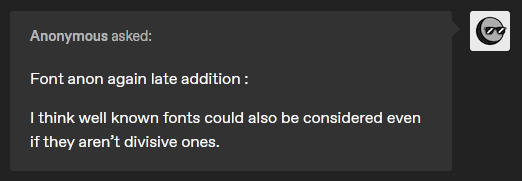
Font anon again! Thanks for indulging me. Yes it is the fic where SF!Papyrus is Palatino. It’s one of my favs. I agree with Serif as a last name because it’s funny.
I’m going mostly off vibes. You completely nailed what I was going for with UF! Papyrus (you are definitely the right person to brainstorm with and have great insight.) My original font search prioritized fonts people complained about, sticking to the theme of Comic Sans and Papyrus being “annoying fonts.” If you can think of any other ones I’m down to hear them.
Here is my list of names:
Courier
Helvetica
Trajan
Bradley Hand
Gentona, Avenir
Calibri
Verveine
Corsiva
Frutiger
Bodoni
Vivaldi
Zapfino
Rockwell
Amadeus
Clarendon
Arvo
Avenir
Casion
Cooper
Didot
Carrington
Anviers
Fontin
Fertigo
Harrington

*waves hand at you* nOOOOO WORRIESSS and thank you for the clarification ;D!! I'm always here for indulgence owu!! And thank you! I'm glad you like my take on things haha! (ANNOYING FONTS LETS GO!!!!)
This is a fantastic list :o!! I pulled up all the fonts in your list in another window for maximum ponderance lol.
I stuck my thoughts under the cut because as usual it got long (and for some of them I'm spitballing more than anything) but hopefully it's of some help ^^!
Swap!Papyrus: Hands down (haha), he suits Bradley Hand visually- the font is like Papyrus (font) but more loose and scribbled- it has more curves and thus has a more laidback kind of vibe, which is why I think it'd suit him... but also I'm losing my mind at the idea of calling him Bradley (derogatory) (/lh).
(I'm also biased though. I used to use this font for writing when I was younger LMAO. You know how people say to write with Comic Sans? I did that with Bradley Hand.)
Swap!Sans: I reckon he'd fit Cooper.
Round, bold, a little bit 'childish' when compared to other fonts, but infinitely more put together than Comic Sans. It also makes me think about comics like Archie or Garfield, which used similar rounded fonts for their titles! Cooper (font) feels so... cartoony to me, y'know? Also it makes me think of Sly Cooper just namewise lmaooooo
Underfell!Sans: Ok. OK. Listen I don't think this font suits him BUT!!! Fontin would be REALLY FUNNY just purely because I think he'd have the time of his life making jokes about "Fonting". Like: "ey! i'm fontin' here!" type of jokes which would get old so so so quickly. Do you see my vision.
If Carrington was less... curly-cursive I'd say it'd suit him purely for the potential visual association with like. the typeface you might see at a stereotypical tattoo parlour or something. IDK it makes me think about tattoos and motorcycles.
SAYING ALL THAT THOUGH: I think he could suit Rockwell! It makes me think of titles and bold headers, also cowboy westerns and Very Masculine and Cool products lol. Except... Rockwell is usually used with Uppercase, Title case or Sentence case. Purely lowercase Rockwell feels inherently cursed to me. (Like truly, what are you doing if you're using Rockwell in lowercase. That's committing a violence.)
Swapfell!Papyrus: Weirdly enough, I reckon I could see him with Corsiva or Fertigo? (Which... looks strikingly similar to Fontin. Huh!)

(Fertigo on the LEFT, Fontin on the RIGHT)
IMO, Fertigo feels more laidback due to the curling tips (which still come to sharp points). The way that the ends of "strokes" get flicked gives it a sort of lazier vibe.
BUT the font choice here also depends on your interpretation of SF!Pap!!
If you want to have a font that's underrated and everywhere?? GO Calibri. It's used as the default font for Microsoft, and is designed to be very easy to read. This is particularly befitting of the interpretations of SF!Pap where he's well versed in computers/electronics and/or doing spywork. His presence is not actively noticed, but he's always there! Alternatively, if you wanted to name him after a serif'd font, similar to Calibri, one of the fonts from your list, Caslon, has a somewhat ubiquitous presence, and also feels a little rougher/crunchier than stuff like Calibri or Fertigo.
Other notes:
I know you already decided on a name for him, but Trajan is also a really good alternative option for UF!Papyrus imo. Similar Roman-Commander vibes except even more explicit LMAO. Plus, it's a solely uppercase font, which is even more fitting.
Didot... if you swap the 'i' for a 'd' and vice versa, you get 'idiot' which is simply ripe for the teasing, but I don't think it fits any of the skeletons lol.
I would have suggested Arial as an option due to it's former prevalence, but honestly that name (+Verdana) have like… cemented themselves in my brain as 'fan-made skeleton' fonts ajbhjsmhjmdh (no shade whatsoever to anyone who uses them ofc, but MAN are they used a LOT.)
#i considered the fells having serifs and the non-fells having no serifs but mmm i think that puts a lot of restrictions on the options#additionally i feel like sf!gold bross fit script/cursive font names for some reason#zapfino and vivaldi for wine and coffee maybe...#velwy.txt#inbox#anon#i feel like i need a tag for these sortsa posts at this point lol#mindmortar#get it? because. headcano- *the mindmortar goes off and i m shot offscreen*
22 notes
·
View notes
Note
✒️💙

send me a ✒️ and I'll handwrite your url and a message for you
transcription in case my handwriting is illegible: hi, tj! where do i start? firtst: you're amazing! i love talking to you, you're really fun! second: your talent, your gifs are so pretty every time! idk, i'm bad w/ words, but i'm really happy to be your moot! ily <3
2 notes
·
View notes
Text
sociolinguistics secret: it is impossible to learn how to "talk proper." the prestige speakers are constantly innovating new ways to differentiate themselves from non-prestige speakers, because the reason they discriminate on a linguistic basis has nothing to do with some notion of correctness and everything to do with social hierarchy.
#learn grammar learn spelling pronounce words in a way that those around you will understand#but the idea that non-prestige speakers can educate themselves out of classist discrimination i'm really really sorry but that's not true#the issue is the discrimination and the class system it actually has nothing to do with the literal linguistic tokens/shibboleths#i'm not saying that we should just throw out grammar class or phonics or etymology in schools#cursive can stay too#but i think they should stay because they challenge the mind and are INTERESTING#not because of some idea that it'll help with discrimination#it's really sad and really unfair but no amount of grammar class can make up for systemic issues i'm so so horribly sorry#linguistics#sociolinguistics#i said i wasn't going to say anything but i couldn't help myself#prescriptivism#classism
10 notes
·
View notes
Text
So I know I’m not good at drawing especially robots but here is Quintaton, Megatron and Kiloton’s fan child i made
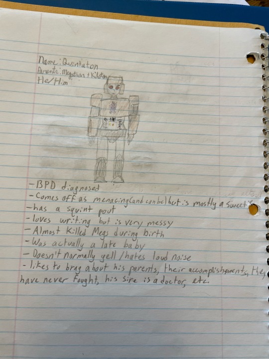
#transformers#megatron#kiliton#kilotron#kilomegs#ship child#traditional art#tried my best#forgot to write in non cursive for a sec#my bad#wyrms art tag
13 notes
·
View notes
Text

@pqnnier 's handwriting tag, they call me philip ii
Tagging felipe iv @cparti-mkiki and carlos ii @tatiejosie , @alliluyevas @nebylitsa @oldfritz
#If the two of you post i WILL post the philip felipe and carlos comparison#Notes to the opera populaire#Also my non-American is showing i have NEVER been taught cursive and i dont know what print is I'm assuming normal handwriting???#Anyway good luck lmao i always love a chance to show off my crap handwriting
3 notes
·
View notes
Text
I think the most painful part of baking is trying to read cursive
2 notes
·
View notes
Text
2C

#results#that is totally normal cursive i don't know what you mean#it doesn't need to be legible because the possibilities for what it could be are few#i was trying not to play favourites before but GO 废话 THE LAST MANDARIN SONG STANDING. you alone must represent taiwan now#actually feihua and lullaby are the only non-english songs remaining now at all which is unfortunate and also why i'm rooting for them#also i know 废话 looks wrong. it's because my keyboard uses simplified chinese characters so traditional are hard to type#just take my word for it that they have the same pronunciation and meaning#you don't have to read my tags by the way this has just been where i put my commentary
4 notes
·
View notes
Text
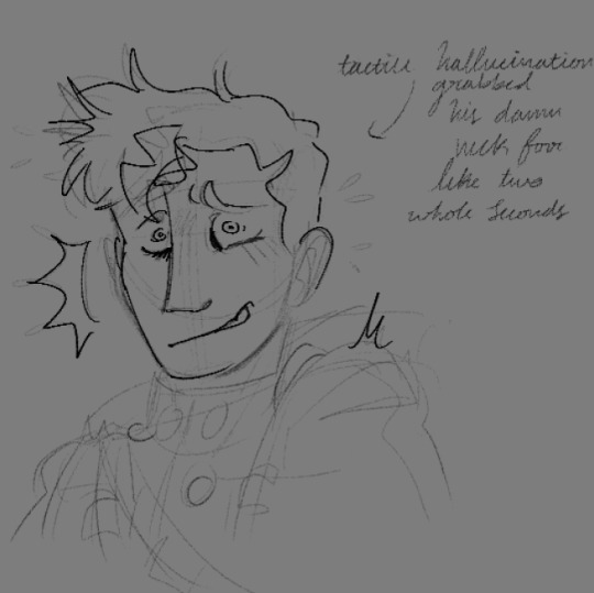
sometimes the horrors cause u to make silly faces. speaking from experience
#fisherman's art#non-canon art#warren armstrong (oc)#wips#i too have just felt my leg get grabbed n shriveled up like i had been shot#shit's uncomfortable!!#also ft my usual handwriting bc i did not feel like forcing myself to write in print#apologies to the bitches who cannot read cursive. i see you and i have chosen not to Care. so sorry
2 notes
·
View notes
Text
man why does my handwriting look like a serial killer's...
0 notes
Text

The Research Diaries of S. Sunkavally, p434.
#non-shivering thermogenesis#thyroid hormone deficiency#vitamin B12 deficiency#tapeworm#lactic acidosis#fatigue#monosomy#mental retardation#chromosomal abnormality#tropical rain forests#nucleotide imbalance#monosomies#diabetes#deformed infants#satyendra sunkavally#theoretical biology#manuscript#cursive handwriting
0 notes
Text
I mean... *My* cursive is slower than my print, because when I don't put in the extra effort it's illegible.
One of my biggest gripes about it is that it is taught so people can "write faster" but when people write fast, most of the time their handwriting suffers for it.
Op mentions being able to read a grand parent's letter, and that's a nice sentiment, but truthfully even though I know what cursive letters are *supposed* to look like and therefore *should* be able to read it, most cursive is indecipherable to me.
On one hand I understand not teaching cursive in school anymore, because it actually is slower than regular handwriting and almost everything is typed on a keyboard now anyways.
On the other hand, so much of our (even recent!) history was written in cursive, and having a whole generation of kids who can't read letters written by their grandparents, momentos saved by their great-grandparents, or even photo albums from theur immediate family seems like a dangerously quick way to detach us from previous generations.
And on the third, related but slightly malformed hand, I feel bad that yet another form of small, everyday art that brings joy in the middle of mundane tasks, which celebrates personality and individual style and self-expression, is about to fade into obscurity because it wasn't efficient enough for today's world to put up with.
Like... if we continue to whittle away the small arts out of every day life, what's going to be left except stark, ruthless pragmatism?
Maybe writing a grocery list is less mundane when you get to feel elegant for a moment. Maybe you're a little more proud of what you write when you see it flow together like a painting
61K notes
·
View notes