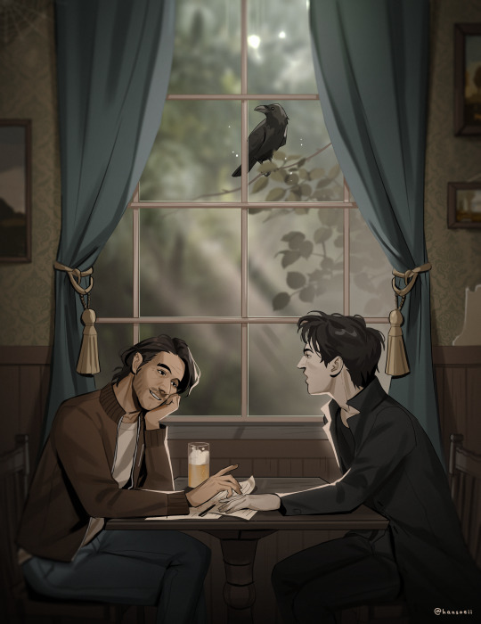
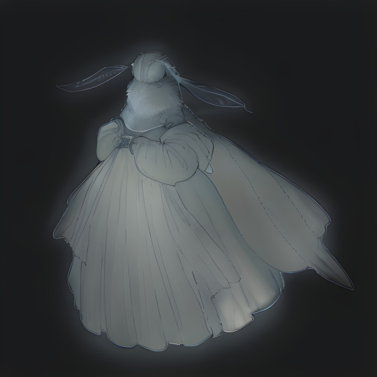
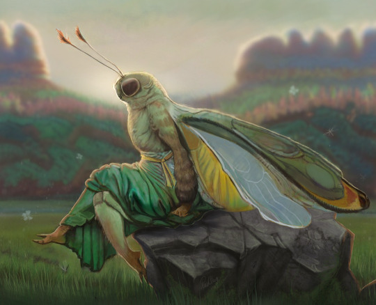
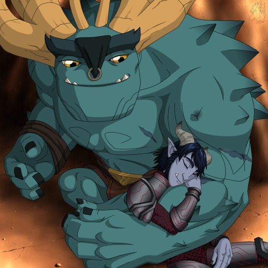
#now with improved anatomy and shading
Photo
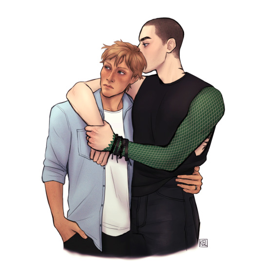
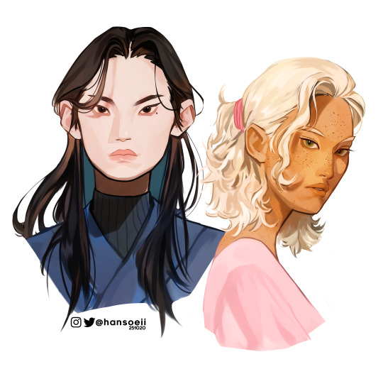
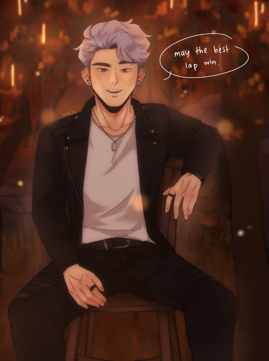
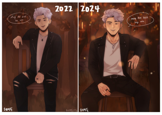
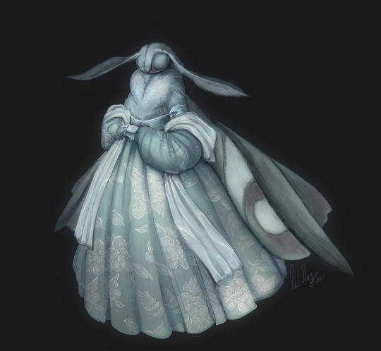
remastered my first pynch after finishing the trilogy :’)
#pynch#adam parrish#ronan lynch#the raven cycle#the dreamer trilogy#trc#tdt#my stuff#patch notes:#added sweetmetal to arm and sweet metal to fingers#now with improved anatomy and shading#added more detail to eyes#tried to make ronan's face less cute and made his clothes and hair darker#+other tiny fixes no one but me will notice lmao#it's funny that ronan ended up w so much stuff on his left arm while the right one's bare#i don't think it's said in text which arm the scars and bracelets are on but i chose left for composition when i first drew this
174 notes
·
View notes
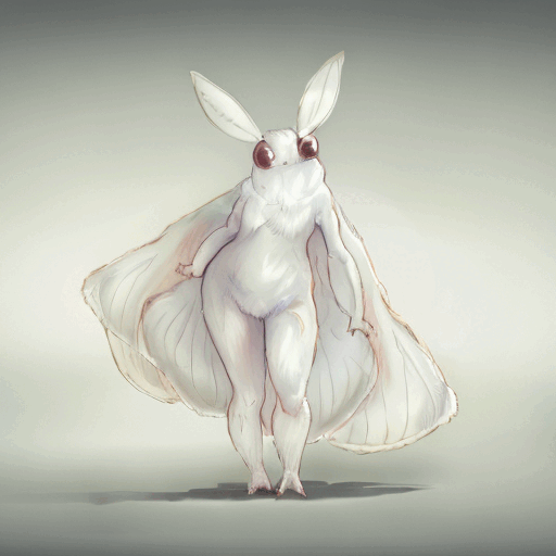
Photo

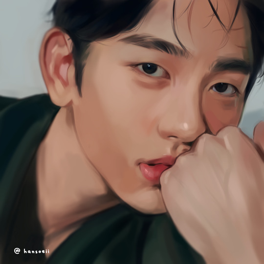
“To know you is to love you.”
#one punch man#OPM#fubuki#psykos#fubukos#psybuki#fubuki x psykos#psykos opm#fubuki opm#carma art#take my heart dont lose it... listen to your heart#do you know how fucking long i spent downloading glaze for this#or uhhh drawing it in general#worth it. this is my lockscreen now. every time i look at it i want to cry. like in a good way. WAHHHHH#everything i draw gets a massive improvement from the last#probably because i was taking a life drawing class at the same time#something about drawing naked people constantly makes you better at anatomy and shading. who knew.#10/10 do recommend. take a life drawing class if youre an artist (and not a perv)#color work has always been my weakest point and im taking a painting class next quarter. none of u are fucking ready for me
198 notes
·
View notes
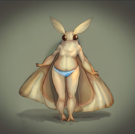
Text

Day 31/October 31: Halloween || Death || Costumes
never forget the skeleton had hair
#ITS ONLY LATE IF YOU ACKNOWLEDGE ITS LATE#of COOURSE halloween week had to be my busiest week#if it isn’t clear they dragged his skeleton back up and used it as halloween decor#ignore the shading and lighting and skeleton anatomy and pumpkin and path i actually have no idea how to do it#i was bullshitting my way through it all i slapped shorts on him cause i didn’t want to figure that out#i dont love it but i dont overly hate it so call that a win win#TUMBLR DELETED ALL MY TAGS WHAT THE FUCK#i dont remember any more of them#anyways end of morrotober guys it was fun thank you morrotober for hosting#even though there were like 4 or so of us consistently participating#what do i do now#ive fully committed to being back so ill do more probably#but i can only do shitposts unless otherwise given clear instructions#morrotober was good for me tbh i was forced to do more art this month than i ever did in my entire life and i think im improving#im experimenting at least thats good#i think im developing a style i like using bright as fuck contrasting lighting#and a MORRO DESIGN finally after all these months#ninjago#lego ninjago#morro ninjago#ninjago morro#morro wu#morrotober 2023#morrotober2023#morrotober#jellos scribbles
30 notes
·
View notes
Text

....................run

#needed to do a full-body of him for the first time in literal ages#even though i hate shoes#this is actually technically a redraw of a drawing i did like two months ago that was so bad i never posted it#but lemme tell you. the visible improvement in my anatomy and expressions and shading in just two months is insane#now i just need to stop drawing this shit in my lined notebook!#tales of#tales of zestiria#sorey#sorey (toz)#wyvern art tag
8 notes
·
View notes
Note
Hello! Hope you're having a great day/night! I absolutely adore your art, you are one of my favourite artists. I love the way you shade and do backrounds. Also everytime I get into a new show I immediately see your art for it??
I was wondering if you had any advice on drawing more realistically (backrounds, anatomy etc) but still keeping a style?
Hey hey!
Thank you so much!
I have a pretty good understanding of facial structures, because before I got into drawing more semi-realisticly, I heavily focused on realistic portraits. Here are some example, these are from around 2019!
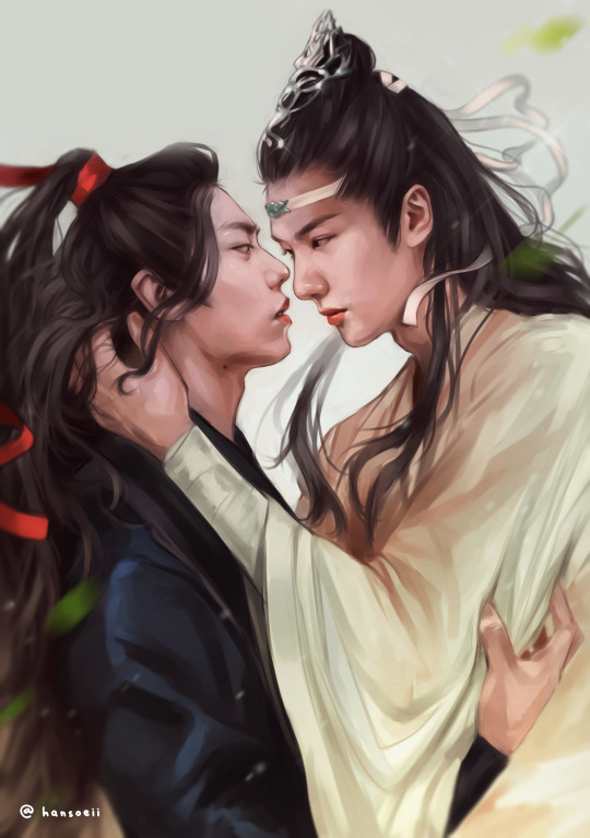
(yes, I was really into danmei and kpop back then, haha)
I just always loved drawing/painting faces and it was all I did. But at some point I realized that I wanted to do more than that because just portraits felt super restricting. So it took me around 2-3 years to somewhat find my style. Thought it would be fun to show a little timeline! Advice will follow afterwards :)
2020
I began working on my OCs in 2020 and since I didn't have an exact reference to work off of, I struggled a lot. My art from this year is super wonky.
2021
Still wonky, but the Lokius obsession was the jumpstart into finding my style! My work from this year is all over the place haha, I was experimenting a lot.
2022
This first ofmd piece is pretty much the first drawing where you can see where my style is gonna go, which I think is pretty cool! This is the year I made the biggest progress cos I was drawing SO much. These two pieces are only six months apart. The one on the right was the first time I gave drawing a background a proper go, too! It was a good year.
2023
And this is where I am now! I'm still constantly learning and improving, but I'd say I have a style you can recognize now!
Now here comes some actual advice, haha:
What I highly recommend you to do is to study your favorite artists as much as you can! I have like 5 A4 sketchbooks all from 2020 that I filled with sooooo many studies, where basically all I did was look at artists I like and copy how they draw stuff, to try and figure out how to stylize certain things. Some of my favorite artists are Ami Thompson, Velinxi and TB Choi. But I also liked to just scroll through pinterest and study all the art I came across that I liked! For example, if I saw a really great drawing of a pair of pants I would copy it many times in my sketchbook and try to learn how they stylized the folds. Doing this for a prolongued period of time will naturally improve your own work! It'll be difficult at first, but you gotta push through, it's gonna be worth it!
I also highly recommend studying unique faces to try and avoid the same-face syndrome. Find some cool looking people and try to draw them as simple as you can! Maybe even draw a little timeline where you first draw them as cartoon-y as you can, and keep going until you end up with a more detailed, realistic drawing. Maybe in the middle of it you find a step that feels the most fun to you, so you can try to build on that! It's a great way to figure out what kind of style might be the best for you.
Here are some cool faces I found on pinterest!
I have a pinterest board with many more!
One REALLY important part of learning how to draw all kinds of things is to understand forms and shapes and how to manipulate them. I have so many pages in my sketchbook filled with just shapes that I drew from all kinds of angles without any references.
This is a great video on it:
6 Ways to Draw Anything by Proko
Learning how to do this is so crucial! Young artists often think they first have to learn all kinds of detailed anatomy before doing anything else, but all that's gonna do is make you tired and hate drawing. Shapes are where it's at! Once you understand how shapes work and which ones to use for certain parts of bodies or objects, drawing is gonna get so much easier! Once you understand them, you can get into details such as muscles and bones!
And honestly the most important point is to just absolutely love what you're doing! I wouldn't be doing this if it wasn't for the fact that I get extreme hyperfixations on certain media that turn me into some kind of beast where I can suddenly draw 10 detailed illustrations a week, haha. Just be passionate about what you do, find something you REALLY love and go crazy!
I really hope this was somewhat helpful! My inbox is always open if there's any more questions :)
#responding to these has made me realize how much I love helping you guys out#it's genuinely really fun and I just hope it's actually helpful haha#my art#art advice#art resources#ask#anon
444 notes
·
View notes
Text
timeline of me trying to draw the same thing for several years straight
Figured I'd go through my own old attempts at Joy Ang's style and review them publically; not only would it probably help someone, I get to giggle at how bad my old art used to be! Onwards.

This was attempt no. 1, and it SUCKED. Thin neck, absolutely no chest, overdid AND underdid all of the shading, didn't even get Toad's colors right, FORGOT THE NOSE RING. Beautiful, beautiful stuff.

Attempt no. 2 was significantly better, although the anatomy was deeply fucked and the eyes were massive. There are definite improvements over the other one, but overall the line quality remained poor and the anatomy was horrific.

ATTEMPT NUMBER THREE. This one was so much closer than the other two, but still a swing and a miss overall. The eyes were once again oversized, the shading was patchy and still didn't match Joy Ang's style, and the head was perhaps too angular. There are still a lot more things about this that I like, though, and we can only go up from here, right?

WRONG attempt number four SUCKED. The lines were awful and the face was too short and narrow. I kind of like how I did the bottom jaw, though. Portrays the snout being narrower than the end of the face. Let's try this again.

AUGH oh god those scales why are they so small. And, I see we have reached the opposite problem we had before, with the eyes being TOO small now. Also too far down. <3 Let's take a break from this, for a few months, and then try again.

And, for reference of where we are now, this one. It has its own dedicated post, but I figured it needed to be in the timeline, too.
something something practice makes perfect something something. okay carry on with your day. let me know if you want me to do the same thing with mike holmes' style, there's... actually a lot more attempts for that one
212 notes
·
View notes
Text
Charlie demon form but shes furrybait (cw: nakey furry)
(I mean. Its not like full on fckin porn but it is furry ass so)

:PP i was playin with line art shi and adeeed coloe but ya i got too lazy to add shade n lightin so uhhh im gonna flash you now hahah vvv 😝

Uh. I swear i was like. Tryina practice like, muscular bodies. An uh, anatomy + poses. It jst so happened to turn into... rhiss. Im not a frury tho so. But like, Vaggie is totally a monsterfucker. Like, no debate im not srorry. She jst gives monsterfcuker bruv idk whata say

Theyre sobsillyt ueeggessuiao i feekaing love them they have rotten my brain i cant take it anymore
I also was suffering from artblock for WEEKS. I think tiktok is to blame cz THE DOPAMINE. its so addicting and each time i tried to draw i jst coupdnt and i went back to tiktok like bro... and the first thing i draw when i escape art block? FURRY ASS. YES. im glad to be back hell yesss.... and idk i rhink i did preeetyy good. And i probably improved my art or somethn cz like wowweee i love my art lately 😍 (or maybe im past the "i haye my art" phase( no im not))
#hazbin hotel#art#fanart#artists on tumblr#digital art#chaggie#hazbin hotel charlie#hazbin hotel vaggie#charlie morningstar#charlie x vaggie#charlie hazbin hotel#i love charlie m#hazbin charlie#vaggie#vaggie x charlie#vaggatha#hazbin vagatha#vagatha#hazbin hotel chaggie#hazbin chaggie#varlie#fallenstar#rainbowmoth
118 notes
·
View notes
Text
redraw of this piece!! i mentioned in that post that i would redraw it at some point and ig that time is now! (i meant to post this before id2 came out but i got really busy so y'know lol better late than never)
i like to think i've improved! still can't draw chairs though haha
side by side comparison under the cut + rambly artist commentary(?):
i still have a long way to go in learning proper anatomy but i think the new pose looks a lot more natural and comfortable! also ~sexier~ perhaps
i tried to make the bg look closer to the actual cg they used in the book, i am arguably better at doing backgrounds now i think! i used to not put a lot of thought into it and just blocked out random shapes and called it a day (okay, i still do that now lol but i put more care into it now !! i try to make the shapes a bit more distinct and actually plan and sketch it out rather than draw some blobs and hope for the best ldkfkhsl). also more colour range(?) to give it a bit more depth!!)
i'd also like to add that i think i'm also better at figuring out compositions now, idk how it is for y'all but when i look at the original my eyes can't help but just fall to the centre, bc there's no focal point(?) or anything that's visually interesting for the eyes to land on. plus with the way it's structured, my eyes just naturally fall to center (+ bottom half bc the skin showing through the rips are bright in contrast to the black) >_> in contrast, in the redraw your eyes are automatically drawn to the face bc it's arguably the most interesting thing on the canvas and thus acts as the visual anchor of sorts (plus there is enough contrast with the background to make cas stand out instead of blend in)
even though i cringe looking at the og i can't help but to also feel endeared bc this was one of the first immortal desires fanart i ever did and also one the first of my posts to do really well! i never expected to get that much attention since i was only posting casually but it really warmed my heart reading all the lovely comments and motivated to draw more :D
it's also really fun seeing how much my art style and techniques have evolved! i don't think i use any of the same brushes i used to use for my old pieces anymore now haha. i also watched the timelapse for the old one and am honestly kind of in awe at how my different my drawing process used to be!!
i still have a lot to learn (esp in terms of anatomy, lighting, shading etc.) but i'm happy with where i am rn! the great thing about being a hobbyist is that there isn't really any pressure for me to improve quickly so i can just take my time haha (except maybe from imposter syndrome but that's neither here nor there)
i think i could've drawn his face and expression a bit better but i think this is a satisfying enough redraw for now!
btw, these are just my thoughts! i am not an art student so the things i said might not be technically correct but this is how i make sense of things in my brain
#once again i didn't draw gabe and jade but i did that on purpose this time lol#love them but cas is the focus of this piece so i want him to shine!!#fun fact i was at my late grandma's place when i drew the original; and she had these big ass dining chairs right#i took photos of me sitting on one of those chairs for reference so the chair in the og drawing ended up being big too lmao#anw i haven't read book 2 yet so no spoilers pls !!!!!#i will read it tonight#i bought the 24hr vip pack just for this lol#playchoices#choices id#choices immortal desires#immortal desires#choices fanart#fanart#cas harlow#my art#hydn.jpg#forgive me if this is extra rambly it's midnight and the adhd is adhding
122 notes
·
View notes
Text

(Click the image for better quality)
Yipeeee that Keiki and Mayumi fanart I posted the WIP of is finally done woooo- This piece was a very experimental one that I'm kind of OK on. Maybe because I've just gone insane looking at it for so long and I'm my own worst critic lol.
Artist's Notes;
So I've once again been playing around with my rendering style, mainly because I have been wanting to improve my lighting for a while now and as I was just scrolling through Tumblr, I saw some of the official art for that one webcomic-turned-animated-TV-Show Lackadaisy and was immediately inspired. I also have seen a technique a few times in the past where the lineart and shading are merged together, so I've been meaning to try that for a little while.

I did some experimentation on this one sketch of Keiki I posted in my sketch dump and I really liked the results of it, so I carried those over to this piece.
I ended up scaling up Keiki and Mayumi from the original WIP because I felt like they were both getting lost in the composition, and I'm glad for that because I think it works a lot better. I'm not a fan of how Mayumi's sword turned out at all, but it's not really meant to be the focus of the piece so eh. Overall, I think I could do better with my colours, probably because with Keiki and Mayumi's colours, I did them flat in greyscale and then used a brush on the overlay blend mode to colour all of them over, after which I changed the base layer for their colours from white to yellow and then lowered the opacity so it all went together better. I also decided to use gradient maps for a lot of the background elements, mainly to experiment with getting in my values first to make them pop out more. I ended up finding a really nice sky gradient on Clip Studio Paint that I really liked, and that kinda helped to establish the colour scheme of the background a lot. I think the whole "start in greyscale then colour" thing really works better with painterly styles rather than more illustrative ones, and while it is good at making sure your values are more readable, I honestly don't think I have the skill level to pull that off yet. Honestly, I think I've been looking at this drawing too long or maybe I added too much to it, but I wish I could've made the colours less monochromatic, but I'll just save that for the next piece I do.
I do love how the flame (...well it's more of a weird space rift than anything in this piece) and the lighting turned out, those were fun to do. I was initially struggling with the flame and how Mayumi is positioned in front of it before realizing "Oh wait! This is a weird abstraction of a weird creature! I don't have to follow the laws of anatomy!" and just dislocated it's flamey bottom jaw from the main body. I also changed the colours of it since I was really not liking how incredibly bright it was when it had lighter colours. Again, the gradient maps served the more painterly style of the flames well.
I also love how Mayumi turned out. I could do her sleeves better but that's more of just me needing to study how those types of sleeves fold in that position more. I'm also very happy with the posing, the technique I used for that was taking photos of myself in the positions I wanted, blocking in the silhouette and then modifying that by adjusting it to my lines of action that I drew on top of the original photos, and then sketching over the silhouettes and drawing in the shapes of the hands overtop of the photo if I needed to get the fine details right. As for what I do to take the pictures myself, I use a tall chair I have, prop up my phone with a phone stand, put on a ten second timer and scramble to get in position. Yes, I did have to use a bunch of thin markers I had to try and get the hand positioning on Keiki's pose right, yes I do have a fake sword that I used to get the positioning of Mayumi's arms and hand right, the sword was for an old Halloween costume from several years ago. I really like how both Keiki and Mayumi turned out in this drawing, I'll have to play around with these designs for them more in future drawings.
Also, if you wanna know why I draw buildings like that, when I watched Fantasia 2000 as a kid (One of the Disney movies where they make really beautiful animations to classical music) the way they drew the buildings in the first few sections Rhapsody in Blue segment (the jazz one with the cities) changed my brain chemistry and now whenever I need to draw buildings really quickly, I refer back to that. Since the buildings aren't really the main subject, I didn't put much thought into them.
As you can tell I am very tired of this piece, mainly because I made things harder for myself by overcomplicating the process compared to what I usually do, mainly with the whole "starting in grayscale then adding colour." I'd honestly just prefer having a black layer set to colour that I can just toggle on and off when I need to see the values, but it was good to experiment. And that was mainly the point of this whole drawing, to experiment. I'm definitely going to have to play around with this new style I'm going for, mainly because I liked how it turned out a lot in the augmented Keiki sketch, and also because I want to find ways of making it suit my style more. I also really want to keep experimenting with my lighting like this, it's very fun. Last but not least I am never starting in greyscale again because dear god I do not like the workflow it forced me into. I don't have a problem with the method itself it's mainly just a skill issue lol.
If you wanna read my headcanons for these two, I put them in my WIP post, so you can read them there if you want to. The more I look at this the more I prefer the simplicity of my WIP. I might go back to this and just take away the fancy colours and effects to see what it looks like without all of that stuff and reblog this post with that drawing, but for now, I don't think I can look at this drawing again for a while.
#touhou project#art#fanart#touhou fanart#touhou 17#wily beast and weakest creature#keiki haniyasushin#mayumi joutougu#haniyasushin keiki
114 notes
·
View notes
Text
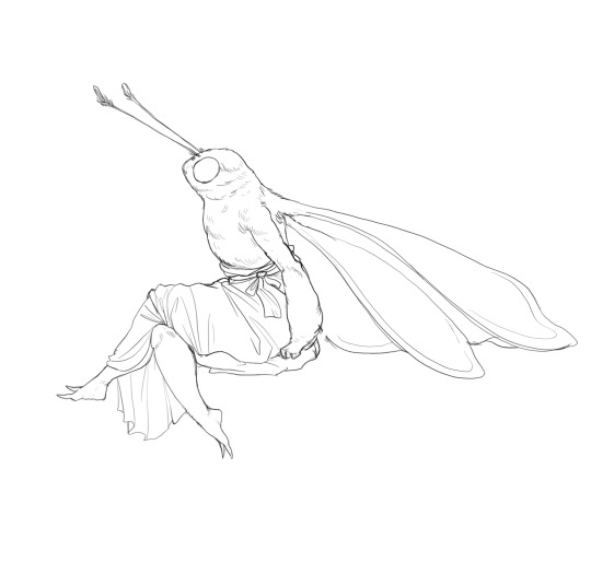
NEUROSLUG NEUROSLUG NEUROSLUG
Ahem.
So, I spent the last day force-feeding Stable Diffusion my art to teach it the concept of an anthropomorphic insect. As a result, I have a working LoRA that imitates my coloring style fairly decently and it can kinda do bug anthros. Emphasis on "kinda", it still needs a lot of iterations to be able to maintain proportions on it's own. However, it does quite great when provided with a simple line drawing as a quideline.
Here are some examples I whipped up in like 2 hours.
Input image:
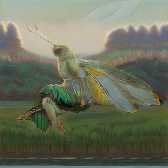
AI's pure output:
After touchup:
There was quite a bit of touchup on this first attempt with the generation serving mostly as a rough under drawing, but then again I didn't stress the network with details too much.
Then I tried squeezing more definition out of it.
Attempt 2:
It can be quite competent when I supplement it with styles it knows well. I only used 30 of my own images to teach it, so it might be a little starved for examples at the moment. Adding "Bob Eggleton" seems to knock some sense into it for now.
Okay, still images are working, now let's bash Neuroslug against some animation.
For something named Stable Diffusion it's not the most stable, huh. I'm still pleased with the result though, it's pretty cute. And while trying to make it cute I learned a little thing.
AI art isn't art. It's a mixture of alchemy, gambling, detective work and demon summoning it seems. And a bit of just art.
What I mean by that is that it can attach very unexpected meanings to words. Since I trained the AI on just anthro insects, it follows their defined anatomy quite closely. Specifically, they do not have breasts. As a result, adding "with big boobs" to the prompt changed the shading style and colors but not the actual anatomy.
And so, most of my prompts have this lovely phrase just to improve the colors.
'Kay, time for the freak show.
At some point during testing the machine decided that my moth isn't decent enough and put panties on her suddenly.

Now that's a booty

Look at those eyes
They have seen things
As you can probably tell these have no sketch to guide the result.

It's still bad but it's got the right spirit.
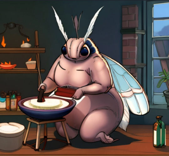
THICC
Surprisingly cute even if janky.
Looks better than it has any right to
Now I'll crawl back into my hole to play with settings for an indeterminate amount of time.
I'll publish my mini-me for you all to mess with once I deem it stable enough.
#slug's experiments#anthro#insect#moth#wooo i'm giddy#all the things I can do now#It's like i was gifted double length days to make stuff#with this i can make comics in painterly style that would be too time consuming otherwise
355 notes
·
View notes
Note
Can we get a review of Gelert? I personally think baby Gelert got a better deal being converted.


Gelerts are basically dogs to the Lupe's wolves, but while basic Lupes are pretty much just normal wolves, Gelerts are a bit more distinct due to their long tails and ears, which flow forwards over their heads instead of backwards. This gives them an interesting visual element right off the bat that makes them stand out. (They've always reminded me of Whippets or Greyhounds due to this, though their main body anatomy is closer to a Labrador.) It's a simple design, but an effective one.

I generally think Gelerts benefited from customization, gaining a subtle pair of eyebrows and less fur on top of their heads. Most important is the smoothing of the ears; originally, the Gelert was known as the Polypup (as in polygonal) and the "pointy-ness" was a selling point (no pun intended). While the right angles were kind of interesting, the ears never matched with the tail and they always kind of felt broken to me, so I'd say smoothing them was a good call.
The only cons to the converted versions are that they have a really messed up tiny hind haunch that looks worse the more you stare at it.
Favorite Colours:


Maraquan: I really like how the Maraquan Gelert plays around with the regular ears and tail by making them into tentacles, which feels very natural. The purple and green palette works well, the spots and underbelly add just the right amount of detail, and the additional fins flow nicely.
The only disappointing thing about it is that the converted version doesn't look half as good as the UC/styled version. The original design had a beautiful, natural flow to it, while the converted version is posed really strangely and has no flow whatsoever (not helped by the awkward foreleg placement). On the plus side, the shading improved greatly, but that just makes me wish we had the styled version with improved shading and highlights.


Baby: Baby Gelerts are really cute, leaning fully into the puppy aspect instead of being weirdly humanoid like some baby pets. They're basically just the same thing as a regular Gelert but smaller and more condensed; however, not only do they now have a collar and more head fur, but the ears also flow backwards instead of forward, kind of like how some puppy's ears don't perk upright until later in life. Very cute!
There's a UC/styled version for this one, but unlike Maraquan, I agree with the asker that it looks way worse. The shading is practically non-existent and the expression and face are really off-putting. Plus, the converted has the benefit of being able to remove the collar if desired.

Mutant: Another Gelert design that adds tentacles, but this time it's done in more of a slimy horror-y way instead of a sea creature way. The concept is obviously strong and the neutral palette works well, with brown paws and a lighter underbelly for contrast and black spike accents. My only nitpick is that I kind of wish the tail and the ears were the same color.

While mutant was redrawn for customization, the design itself thankfully didn't change at all, just the pose. That said I wouldn't mind getting some styles for this one in the future, just because the alternate poses are fun.


BONUS: Instead of going for a standard ninja look, the Stealthy Gelert opts for an assassin look, and by that I mean it's a Hot Topic mall goth teenager who's watched too much anime. The design is really fun and the hooks on the ears and tail are just the right amount of absurd. The base color also looks good.
64 notes
·
View notes
Text
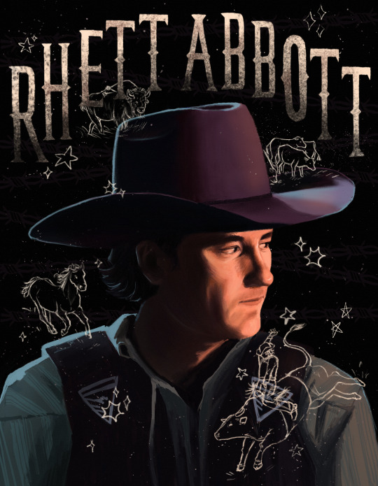

amelia county's very own: rhett abbott !!!!!
details + me yapping under the cut :>


After 87 years I finally finished!!! Definitely the most realistic and detailed portrait I have ever done. Loosely inspired by flesh.png on instagram. I love their portrait work and the doodles they include in the background!! I wish I could have been more adventurous with the colors like their work is but alas I lack the color theory knowledge.
It would be fun to try another portrait with less shadows. The dramatic lighting is fun but would be nice to focus on hue and less on value and then try to combine the two in a later piece ? dawg idk what I'm doing
Also I just realized I flipped the bison so it fit better, but now the arrows are on the wrong side I think. whooppss
Also the colors look so different on my computer 💀 I don't know how to fix it. If you can't see it, I just want you to know that there's also barbed wire in the background too.
Also cowboy hats are so hard to draw they are the bane of my existence.
N E ways, hopefully I will be more active here. I just got swamped with finals, summer class, and working and I'm also about to visit family for almost the entirety of September and then school is gonna start up again but I will try my best!! I just get overwhelmed and self conscious sometimes even though its literally not that serious 💀
I'm already working on another Rhett portrait and Rhett in the heat stroke trend (from twitter? I think) and I got some Bob doodles that are basically finished !! I also sketched out some Harrison and Miles doodles but idk how I feel about them.
I would also love to draw some stuff based on fics but no promises as I am the world's slowest drawer �� and I still need to improve my anatomy, coloring, perspective, stylization, shading, line art, composition, and design skills 😃👍 all my ideas are too ambitious for where I'm at rn rip
Nevertheless I stay motivated and will do my part reading fics and drawing pictures 🫡
oki das it thx for reading :>
#i need to move on from this fr#every time I look at it I see something I wanna change 💀#rhett abbott#aka pookie bear <3333
45 notes
·
View notes
Text
He was so tired after combat training, he fell asleep right then and there.
Well, I guess you have to sit like that until he wakes up again, Draal... XD
Too bad those two never met. Pretty sure Draal would have loved his new troll brother ^___^
-----SORRY! LONG, INSIGNIFICANT TEXT INCOMING!-----
So I am back into my regular drawing style again. That seems to be all I can really do and it made me realize that I am stuck. My skills didn't improve for quite a long time now, despite having watched several drawing tutorials. Especially on composing, coloration and backgrounds, because those always were my greatest weaknesses. The only things I'm kinda good at is anatomy, cell shading, expressions and a little bit of character design.
I do digital art for almost 15 years now (before that it was only traditional drawing), but I believe nobody would think that by looking at my works. I really started to feel embarassed after seeing so many genius artists here on tumblr and instagram, that are only 18 or 19 years old and whose works are putting mine to shame. Yeah, I know I am by far not the only person experiencing this. But it doesn't change the fact that I am, for so many years now, struggeling really hard with not achieving more with the thing, that is and always was my life. That one and only thing I thought I was really good at. But "good" will never be enough. So maybe it is finally time for me to leave the "great" to those who have a chance and to stop uploading my drawings for good. I will still need some time to finalize this decision, but I'll make sure to let you all know.
Sorry for this sentimental flood of words. I want to thank everyone who did like my works. I enjoyed all of your likes, funny hashtags in reblogs and kind comments I recieved over the years. I would have left a long time ago, if you guys hadn't kept me going. So much appreciated!
Artwork(c)KaliyaKarnage
Characters(c)Dreamworks
#fanart#trollhunters#tales of arcadia#toa#netflix#jim lake jr#troll jim#draal the deadly#draal#never meant to be#personal post#i'm tired#maybe i'm getting old#kaliya talks#my art sucks
77 notes
·
View notes
Text
Had issues with layout in the ask post so here's the rest!
However 1 artist comes to mind for now and that's Murata Yusuke; I'm rereading Eyeshield21 (again lol) and each time his art makes me go "wah so damn good".


From colours, to how dynamic and alive pieces can feel, to lighting/shading, to textures, etc. Lot of the pieces also have this feel of mundanity in it which I really like, and I also how at time I feel like I'm there as well. I love the mixture of realism in lighting/shading (and at times anatomy) with the manga/comic style!
The last image also was a bit of an inspo for my latest Luffy art!
As for tutorial, I might elaborate in another post at some point (cus it's quite a broad thing to go about). Like I've mentioned before, I'm soaking up things along the way! Which includes things like colour theory, lighting/shading, composition, etc. But I personally don't recommend forced research/practice; art needs to be fun after all, take things at a time but it might be nice to try something new with each piece, however how subtle.
I can recommend Saito Naoki's YT channel! I watch his 'whimsical correction' videos during lunch at times haha - Each 'correction' (more like professional advice) has a certain goal/theme which can be improved upon, which can be story wise, appeal, anatomy, etc.
--
Anyway, some advice I have for now are kinda my 'cheats' will follow now! [Disclaimer: these are things that work for me and are by no means the 'correct' way of doing things. So if I say things like "avoid this", it's something I personally do.]
My strength lies I think mostly in my lighting/shading at this moment!


My flats aren't bad or anything, but I feel like it really comes alive after shading. And the first thing to do is to establish where the light source is. Try to avoid 'pillow shading', work in bigger shapes and don't be afraid to do so. Working digitally, I can recommend to take a big brush and just put it very roughly on your character. You have the means with digital art to easily erase parts that are too much and to refine shapes afterwards.
One cheat is bouncing light.
(This was a Multiply mode layer set back to Normal mode for sake of visibility.)


You gotta have a bit of understanding of volume of where to apply it, but it's light that's been reflected by e.g. the ground back up again. This little variation in shading can add a lot. Note that it's better to go from the OG shading colour and sliding it on the colour wheel (hue) to be either warmer or cooler and then sliding in the square/triangle (saturation and value).
More examples of bouncing lights:


It depends how intense the light is reflected; the more, the harsher the contrast is compared to the OG shading colour.
Second cheat is 'light terminator' and 'substance scatter', not sure if it's really the correct terms but oh well.


This reddish tone (again on the Multiply shading layer) is kinda the border line from light to shade. It's reddish on skin (if you have red blood haha) but you apply it on other things with other colours too!


Make sure you don't overdo it and put it everywhere, also note if you use harsh or blended brush strokes, maybe even both for variation! Try it out and see what works best for you!
--
That's it for now; this took more time out of me than planned 💀 you better appreciate this anon! /jk
My main motto regarding art is "fck around and find out". This mindset also helps with keeping art fun!
#hopefully it wasn't too overwhelming lol#this became kinda lengthy after all#with 'cheat' I meant something quite easily achieved to add an extra oomph to your art btw#ask kawaii
48 notes
·
View notes
Note
Any tips on how you started drawing/getting better at drawing? I draw but I'm still a beginner and would like to improve. I love your work!
hi!
so i’ve always been drawing as long as i can remember. like ever since i was a little kid it’s just been a big part of me. However, i only started really practicing and improving around last summer/fall! The first thing i did was get a sketchbook that i took with me to school and just. Drew whenever i could. I wrote a list of the teachers who yelled at me for drawing in their classes, i should look for it lol
Also, practice. It doesn’t have to be consistent, even doing some studies once a week helped me alot! I’d suggest using pinterest, that helped me a lot too! I know a lot of people recommend youtubers for art, but I just never really watched those.
Now the kinds of studies I do:
Coloring - since I do traditional art, I use alcohol markers and colored pencil, but use whatever you want! I spend a lot of time looking at older artists, such as Leyendecker and Rockwell, because their understanding of shapes, colors, and shading is really good. (If you use markers, i recommend doing a swatch sheet so you know what colors to use, and get an extra paper to test colors)
Anatomy - I use websites such as lineofaction.com and pinterest for references. It’s important to learn a lot of different body types, though you might want to master a more basic form before moving onto more complex ones. Understanding muscles, fat, and skeletons is also good for drawing poses with less reference
Style - this one’s a little more broad. I collect work from artists I like, put it on one big page, and try to figure out which parts of their styles I like. I could try shading like one artist, doing lines like another, and stylizing expressions like someone else! My own style is a frankenstein’s monster of all the artists i love :D
I’m not as good as I’d like to be at backgrounds/animals, so those are areas I need to work on. Remember that progress is not linear, and no one can tell you your art is bad! All art is good because it helps you get better :)
Let me know if you have any more specific questions, I’d love to answer them <3 - Lee
22 notes
·
View notes
Text
Looking for Art Advice
Not really my usual post, but I am looking for some advice regarding my art since I've found myself really not liking my art lately.
Now, go easy on me here, this is something I am, admittedly, a bit sensitive about but I really do want to make more solid improvements to where I am happy with my artwork as well. Now, for any artist out there that can give me some good advice, feel free to pop it in the comments or hop into the inbox, whatever you prefer. <3 I'll put some examples here or my more recent works


These are all pieces done over the course of the last few months, the top ones being the most recent. I'm pretty happy with the way I did prove in anatomy, but I find it hard to do shading at times, and especially hard when it comes to rendering skin. I started to paint to try and fix it and progress has been done but it's just so slow RAAAh
Second thing I'm finding a bone to pick with, with myself, is that I'm a bit in a struggle with finding an art style I'm most comfortable with. One one hand I really want to do these more realistic faces and such, but that can be really hard or it sometimes doesn't match the rest of the character, and on the other hand I really like this Genshin/Honkai-ish style. I'm a bit hard on myself in this area, I suppose that's due to me being a victim of "if you can't draw realistic you're not an artist" bs lol. Overall I do love many styles and I'd love to know to draw in so many of them but that's a bit unrealistic 😭
But anyway, whatever advice you may have for me, I'll welcome it with open arms and try to take whatever I can for it so I can improve. Thank you for your time <3
Here's some more examples, sketches edition


#-stories of old#art#digital art#art advice#artists on tumblr#honkai star rail#hsr#genshin impact#jjk#Jujutsu kaisen#jjk fanart#oc#attack on titan#attack on titan oc#fanart#jiaoqiu#jing yuan#dr ratio#tumblr has sort of become my safe space so :p that's mainly why I'm posting it here and not on twt/ig#advice#probably going to delete this after I get some feedback#jiyan#Wuthering waves#Wuthering waves fanart
30 notes
·
View notes
Last Seen Blogs

hes-thinks
Welcome To My World

mocha-irish007
Simple Enough...
lesdoublesll
Bertholdt Hoover Supremacy

wrexkinghxvoc
ariel