#obsessed with the design
Text
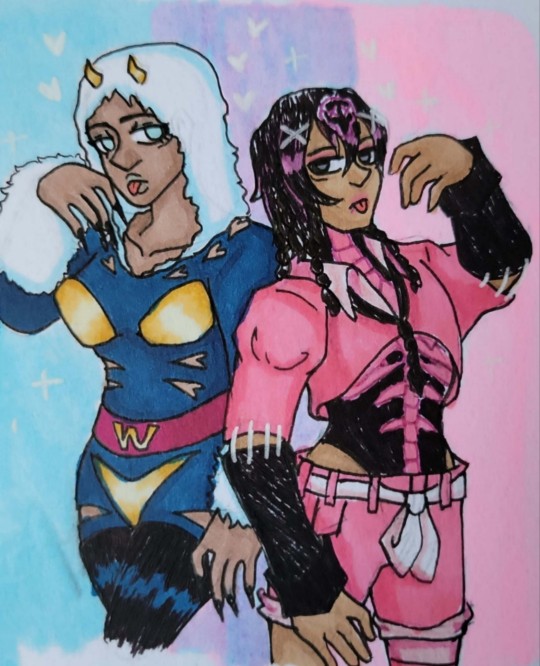
♀️Weather Report and Persephone [oc] genderbend!♂️
Fem Weather report design made by @chloesimaginationthings ⭐️
#jojo bizarre adventure#jjba#stone ocean#jojo weather report#genderbend#chloesimagination#jojo bizarre adventure oc#jjba oc#jojo oc#stone ocean oc#part 6 oc#original character#oc#oc x canon#my art#cherrysodabear#obsessed with the design#shes so pretty augh#hope i did her justice 🩷#tall girlfriend for the win..#shes only a few inches taller LMAO#but still hella strong ouh..
142 notes
·
View notes
Text

i won't even lie this is sick as fuck and a great end for the wildes of exandria collection
19 notes
·
View notes
Text
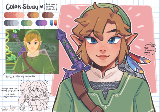
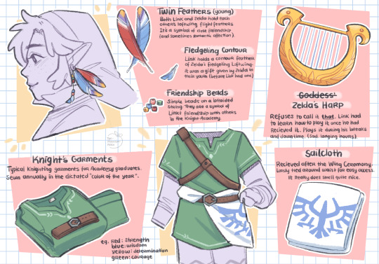
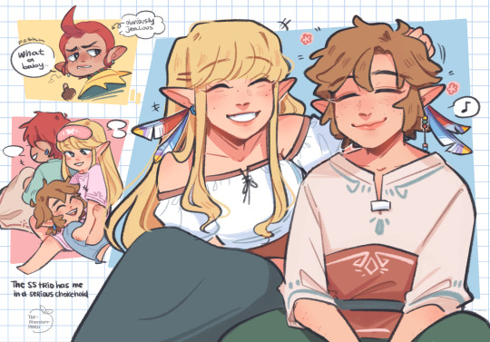
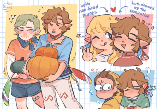
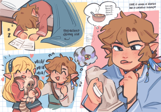
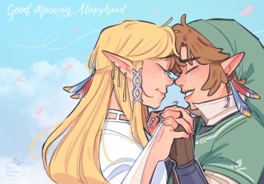
skyward sword… yeah <3
Crimson Loftwing
↻ ◁ || ▷ ↺
#exploding the entire Skyward Sword ost with my mind#thinking a lot about SS lately#I could fill your dash with how much art I make of this game I’m so so obsessed with it#I did some character design stuff and misc doodles for funsies so I post here#feels so nice to make art for a game I loved so much as a kid#still top 3 loz games idc#I hope younger me is happy haha#okay please stop rambling#the legend of zelda#legend of zelda#skyward sword#tloz#loz#loz ss#skord#ss link#ss zelda#ss zelink#link#zelda#zelink#groose#fi#fledge#pipit#zelda art#nintendo#art#artists on tumblr#my art
4K notes
·
View notes
Text


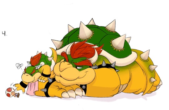
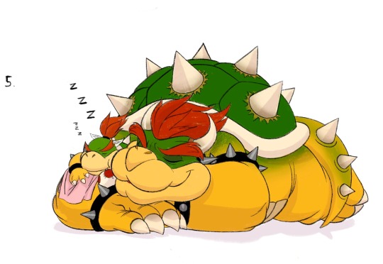
Silly quick lil comic about Junior having a nightmare and dad being an excellent sport because I thought the idea would be cute
#I’m literally obsessed with them you don’t understand#I adore them#he’s a good dad#my art#fanart#art#sketch#character design#drawing#animation#illustration#drawings#Super Mario Bros#Mario movie#bowser#bowser junior#bowser jr#comics#I literally think about them constantly and in my mind this is a hundred percent canon#I love me a man who’s intimidating on the outside and soft inside
9K notes
·
View notes
Text
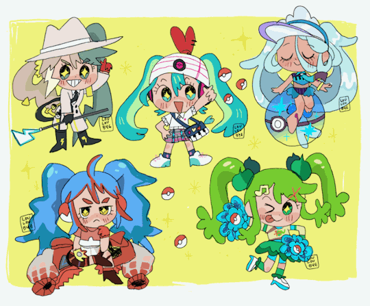
pokemikus
#miku#project voltage#pokemiku#hatsune miku fanart#pokemon#vocaloid#初音ミク#hatsune miku#im obsessed with these miku pokemon designs#illustration#digital art#louloudraws
5K notes
·
View notes
Text
Hell yeah
#my posts#my art#guilty gear#guilty gear strive#aba guilty gear#aba guilty gear strive#ggst#ggstrive#I love her new design so much#i’m obsessed#she’s so crazy and fun
2K notes
·
View notes
Text
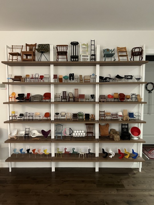
“My friends mom collects miniatures of designer chairs and these are some of them 😫” via twitter
#I’m absolutely obsessed with this I cannot stop zooming in on different little chairs#i think the appeal is beautiful expensive unique things. but they are not functional they are instead tiny and cute#photography#furniture#design#aesthetic#homes#items
19K notes
·
View notes
Text
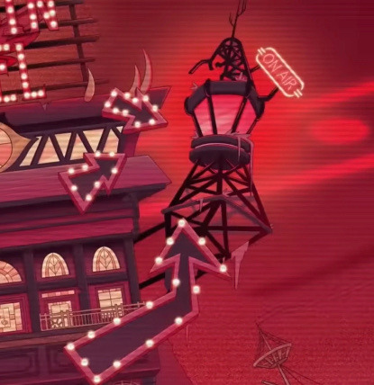
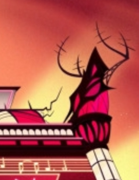
Something I haven’t seen people talking about is just how different Alastor’s radio tower is on the new hotel. Like the original one looks like a point of pride. He put the neon “on air” sign, all the arrows pointing towards it… it looks strong and sturdy, despite being haphazardly attached to the hotel. The new radio tower looks significantly more sinister. It’s attached to the hotel, sure, but in the process it’s ripped out the railings and seems like it’s trying to rip itself out of the hotel just as much as it’s grafted on to it. The antennas or whatever sticking out the top look more like barbed wire or a warning to stay away.
Idk just thought the difference was interesting. I imagine it has something to do with alastor being all put together and seemingly on top of his game in Season 1. I assume this new unhinged tower is a reflection of the alastor we’ll meet next.
#hazbin hotel spoilers#I have just been obsessed with this little change since I saw the new hotel design#it also just. sticks out like a sore thumb amongst the rest of the hotel#it just does not look like it belongs at ALL#and I wonder if that was the point?#is this alastors attempt to remind himself not to get attached?#or is it just one more thing that he’s losing control of#hazbin hotel#alastor
2K notes
·
View notes
Text
I think 90% of my gripes with how modern anime looks comes down to flat color design/palettes.
Non-cohesive, washed-out color palettes can destroy lineart quality. I see this all the time when comparing an anime's lineart/layout to its colored/post-processed final product and it's heartbreaking. Compare this pre-color vs. final frame from Dungeon Meshi's OP.


So much sharpness and detail and weight gets washed out and flattened by 'meh' color design. I LOVE the flow and thickness and shadows in the fabrics on the left. The white against pastel really brings it out. Check out all the detail in their hair, the highlights in Rin's, the different hues to denote hair color, the blue tint in the clothes' shadows, and how all of that just gets... lost. It works, but it's not particularly good and does a disservice to the line-artist.
I'm using Dungeon Meshi as an example not because it's bad, I'm just especially disappointed because this is Studio Trigger we're talking about. The character animation is fantastic, but the color design is usually much more exciting. We're not seeing Trigger at their full potential, so I'm focusing on them.
Here's a very quick and messy color correct. Not meant to be taken seriously, just to provide comparison to see why colors can feel "washed out." Top is edit, bottom is original.
You can really see how desaturated and "white fluorescent lighting" the original color palettes are.
[Remember: the easiest way to make your colors more lively is to choose a warm or cool tint. From there, you can play around with bringing out complementary colors for a cohesive palette (I warmed Marcille's skintone and hair but made sure to bring out her deep blue clothes). Avoid using too many blend mode layers; hand-picking colors will really help you build your innate color sense and find a color style. Try using saturated colors in unexpected places! If you're coloring a night scene, try using deep blues or greens or magentas. You see these deep colors used all the time in older anime because they couldn't rely on a lightness scale to make colors darker, they had to use darker paints with specific hues. Don't overthink it, simpler is better!]
#not art#dungeon meshi#rant#i'm someone who can get obsessive over colors in my own art#will stare at the screen adjusting hues/saturation for hours#luckily i've gotten faster at color picking#but yeah modern anime's color design is saddening to me. the general trend leans towards white/grey desaturated palettes#simply because they're easier to pick digitally#this is not the colorists fault mind you. the anime industry's problems are also labor problems. artists are severely underpaid#and overworked. colorists literally aren't paid enough to do their best#there isn't a “creative drought” in the anime industry. this trend is widespread across studios purely BECAUSE it's not up to individuals#until work conditions improve anime will unfortunately continue to miss its fullest potential visually#don't even GET ME STARTED ON THE USE OF POST-PROCESSING FILTERS AND LIGHTING IN ANIME THOUGH#SOMEONE HOLD ME BACK. I HATE LENS FLARES I HATE GRADIENT SHADING I HATE CHROMATIC ABBERATION AND BLUR
2K notes
·
View notes
Text

A mycelium is a network of fungal threads or hyphae. Mycelia often grow underground but can also thrive in other places such as rotting tree trunks. A single spore can develop into a mycelium. The fruiting bodies of fungi, such as mushrooms, can sprout.
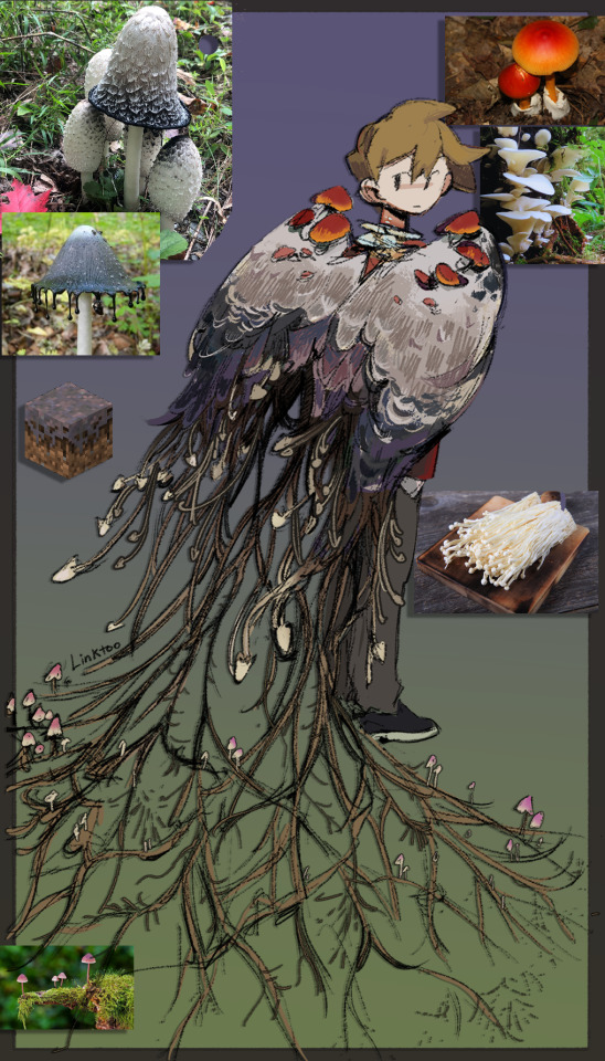
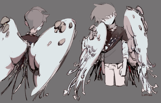
was testing out mycelium resistance grian designs :3
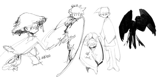

#grian#mycelium resistance#hermitcraft#my art#Linktoo art#mcyt#seriously have been obsessed with drawing this design for the past few days#tw body horror
7K notes
·
View notes
Photo
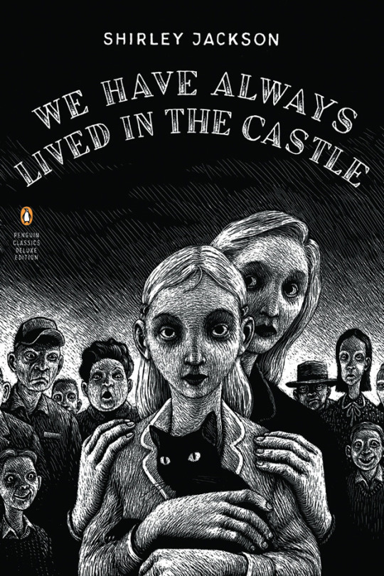


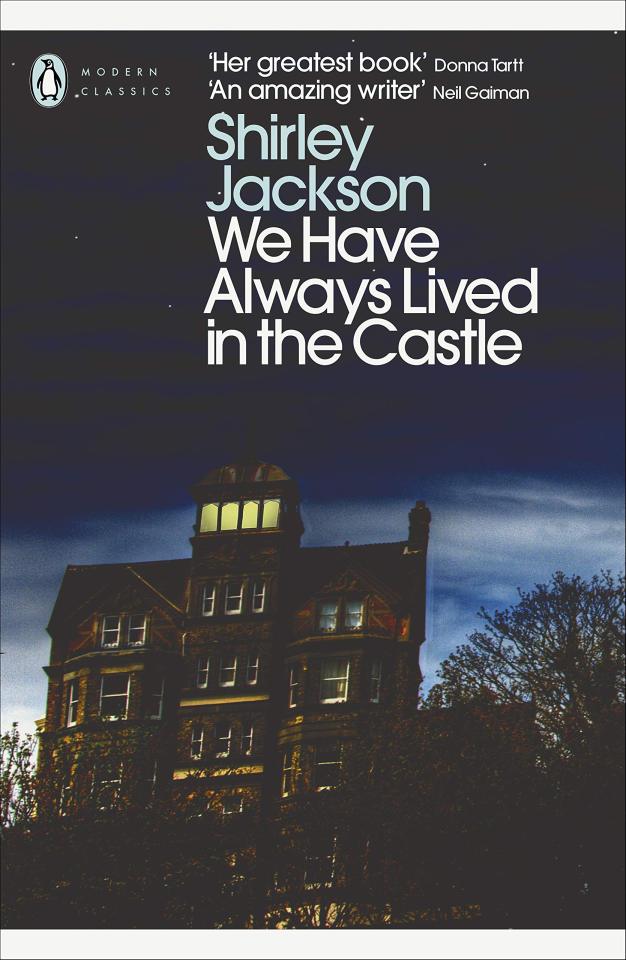
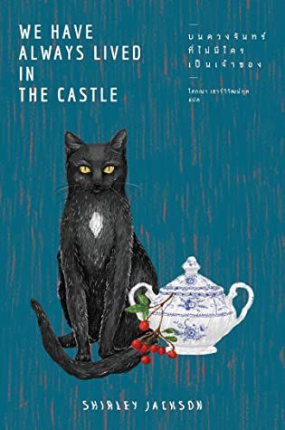

We Have Always Lived in the Castle by Shirley Jackson: English covers
#we have always lived in the castle#shirley jackson#book covers#book#literature#I own the first one and I love it#almost gives you a claustrophobic feeling#but most of these slap so hard#I'm obsessed with the second one and Merricat wearing the table cloth#and the design of the Blackwood gate#the first on the third row was the original 1962 edition
7K notes
·
View notes
Text
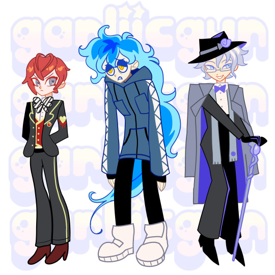
girlboss, gatekeep, gaslight (in that order)
#twisted wonderland#disney twst#riddle rosehearts#idia shroud#azul ashengrotto#currently obsessed with this game and its cute lil character designs#riddle isnt my fav but him and floyd are my favorite designs to draw#the heart ahoge is soooo cute#garliicdraws#ALSO yes i didnt do riddles dorm uniform ok...... LOOK AT IT im not bothering
1K notes
·
View notes
Text

We interrupt your regularly scheduled program to bring you: this guy
#atlas.art#artists on tumblr#mcyt#hermitcraft#hypnotizd#I'm gonna be so real with y'all right now. I don't even watch hypno#i'm just obsessed with this cunty little pose he's pulling in the new banner askjfshdhb#and i designed him a few months ago when I was drawing all those headshots of the hermits. so. y'know. might as well use it lol
1K notes
·
View notes
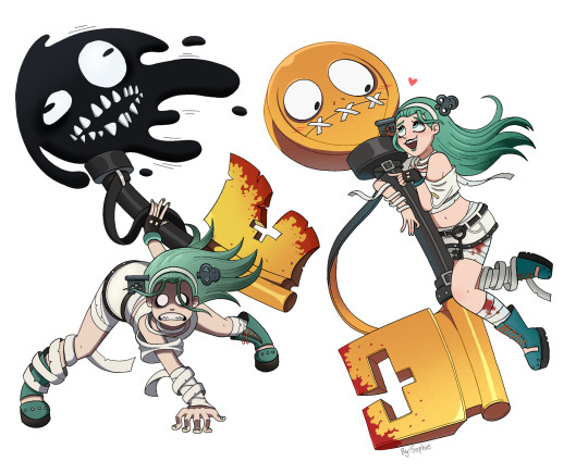
Text
Hehe

#when I saw the the image in glitch's newest twitter post THIS idea popped up in my head immediately#I had to badly doodle it I had to#this is how I keep myself from obsessing over the fact that we are 99.9% getting cabin fever labs lore next episode/s I am very not normal#about that plot line I am very very not sane about it#I actually love drawing in paint so much it's very fun#murder drones#uzi doorman#md uzi#serial designation n#md n#he is a plush dog there but I guess it counts#biscuitbites#n x uzi#enzi#nuzi#if someone did this before me shoutout to you bestie keep up the great work! and if someone didn't- keep up the great work! YOU. KEEP IT UP.#YES I AM DIRECTLY SPEAKING TO YOU. KEEP BEING COOL AND TAKE CARE.
2K notes
·
View notes
Text

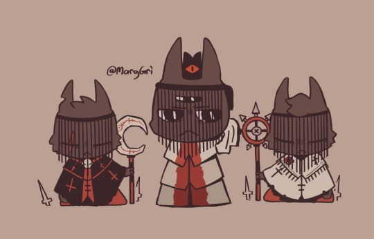
Bishops! Now in pocket size!
14K notes
·
View notes
Text
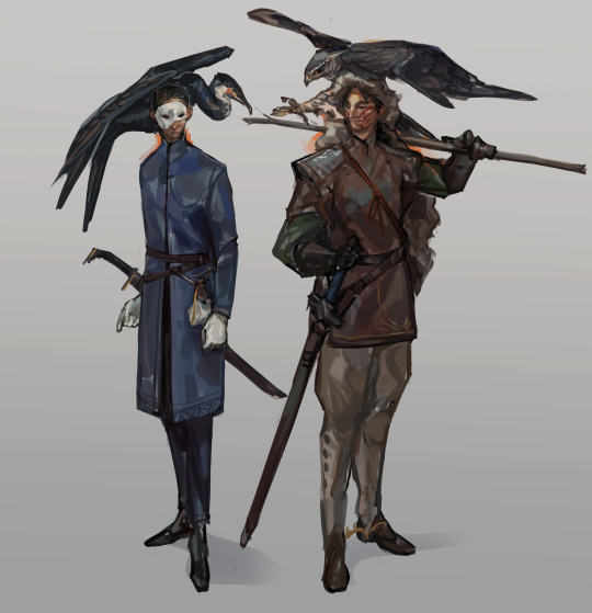
the imperial accountant baru cormorant, and the duchess of vultjag
#the traitor baru cormorant#the masquerade#baru cormorant#tain hu#my art#fan art#character design#i recently rediscovered my literacy#so i read this whole series in two weeks and i think it's both kinda phenomenal and very flawed#but fundamentally just very interesting in almost every aspect#i had a great time#not gonna apologise for the niche fan art lol#utterly obsessed with baru btw#character of all time
2K notes
·
View notes
Last Seen Blogs
nuro-does-art
The Angst is in the Details
qhenix
Muse

boylikermenlover
boys!! men, even

manetarts
manet
wshurtfest
Wolfstar Hurt Fest 2023