#responsive grid css
Explore tagged Tumblr posts
Visit Tumblr Blog
Explore Tumblr blogs with no restrictions, modern design and the best experience.
Last Seen Tumblr Blogs


Fun Fact
The Tumblr office adopted Tommy, an 11-year-old Pomeranian.
Text
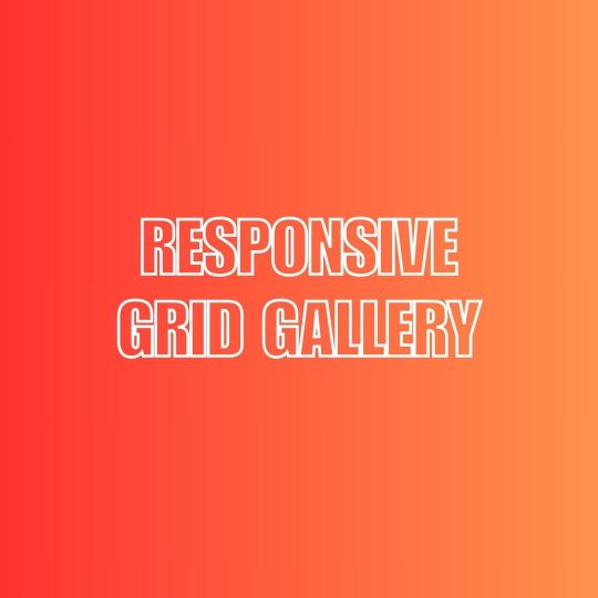
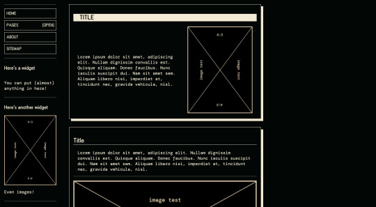
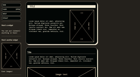
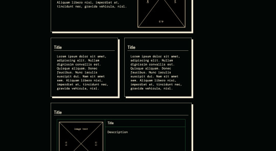
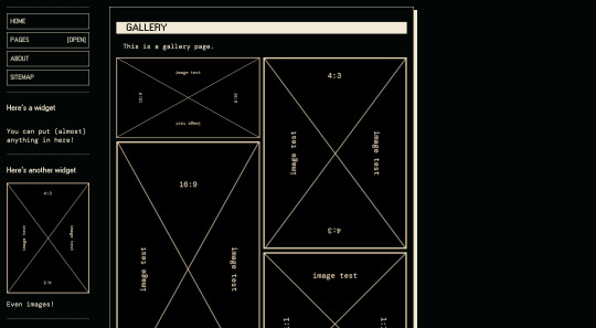
Responsive Grid Image Gallery
#responsive image gallery#responsive grid css#html css#learn to code#css3#frontenddevelopment#divinectorweb#image gallery css#responsive grid image gallery
1 note
·
View note
Text
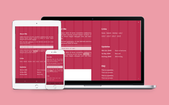
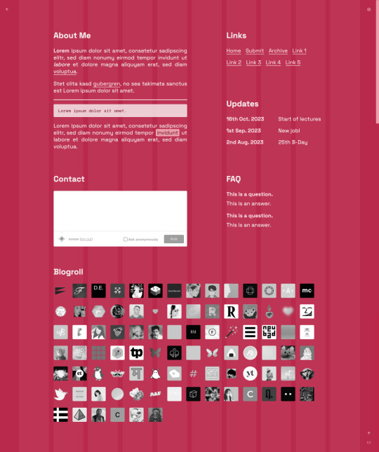
Vivale
Page 50 by @eossa
A responsive grid-based all-in-one page inspired by Pantone's color of the year 2023, "Viva Magenta".
For more information, please follow the source link or click here.
Grab the code here: buymeacoffee | ko-fi | payhip
#eossa#tumblr page#aidpaidcontent#support content creators#responsive#css grid#minimal#all in one#all in one page#pantone#viva magenta#blog#my codes#my pages#page 50#p50 vivale#price: prm
9 notes
·
View notes
Text
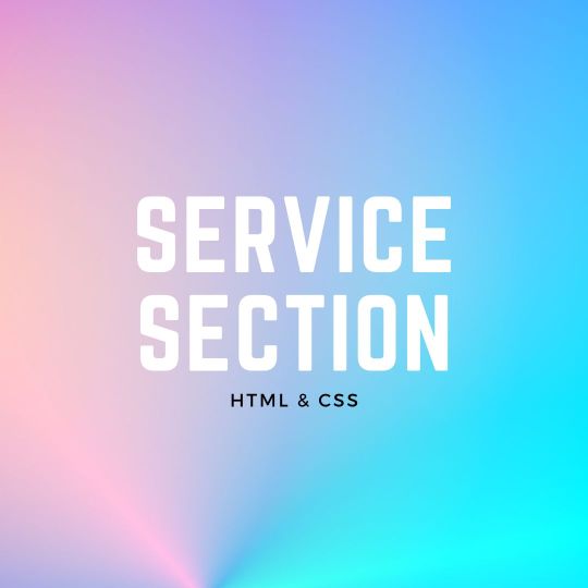
Responsive Neumorphism Service Section
#service section design#dark neumorphism#css neumorphism#responsive web design#html css#codingflicks#learn to code#code#frontend#html#css#css3#frontenddevelopment#webdesign#css flexbox layout#css flexbox grid
5 notes
·
View notes
Text
La propiedad display en CSS: Desde lo básico a los diseños más avanzados.
La propiedad display determina el tipo de caja que un elemento forma y cómo se comporta dentro del flujo del documento. En otras palabras, indica si un elemento se mostrará como un bloque, una línea o si se ocultará por completo. Valores de la propiedad display La propiedad display admite varios valores, cada uno con un comportamiento específico: Valores básicos: block: Crea un bloque que…
#block#caja#contenedor#CSS#CSS3#desarrollo web frontend#Diseño web#diseño web adaptable#diseño web moderno#elemento#elementos HTML#Flexbox#flujo del documento#Grid#inline#inline-block#layout#maquetación#posicionamiento de elementos#propiedad display#responsive design#tipos de display#valor display
0 notes
Text
Responsive Layouts: Flex, Grid and Multi-Column by Abdelfattah Ragab
Welcome to the book “Responsive Layouts: Flex, Grid and Multi-Column” In this book I explain the three best-known responsive layouts: the Flexbox, the Grid and the Multi-Column layout. Flexbox is a one-dimensional layout that only works in one dimension at a time, either horizontally or vertically. The grid layout is a two-dimensional layout that distributes the elements horizontally and vertically at the same time. The multi-column layout is a special layout for magazines and newspapers, where the text should flow in columns with spacing, rules, etc. I'll explain all the properties and their values and how they affect the distribution of elements on the screen. So let's get started.
Available on https://shop.tredition.com and https://www.amazon.com

0 notes
Text
coding themes where you can't control the html is kind of enriching actually
#花話#css grid and flex properties doing a lot of heavy lifting here lol#but also stuff like :has() and :not() doing perhaps even more when it comes to making layouts responsive#n rearranging items when other modules are introduced into the frame#anyway been coding a dw theme from scratch for funsies basically n i have to consider how it looks on the various#different pages with all the different modules that can be turned on n off hehe#n also have to consider how to keep it responsive for mobile layouts n stuff... is a fun challenge in selectors
0 notes
Text
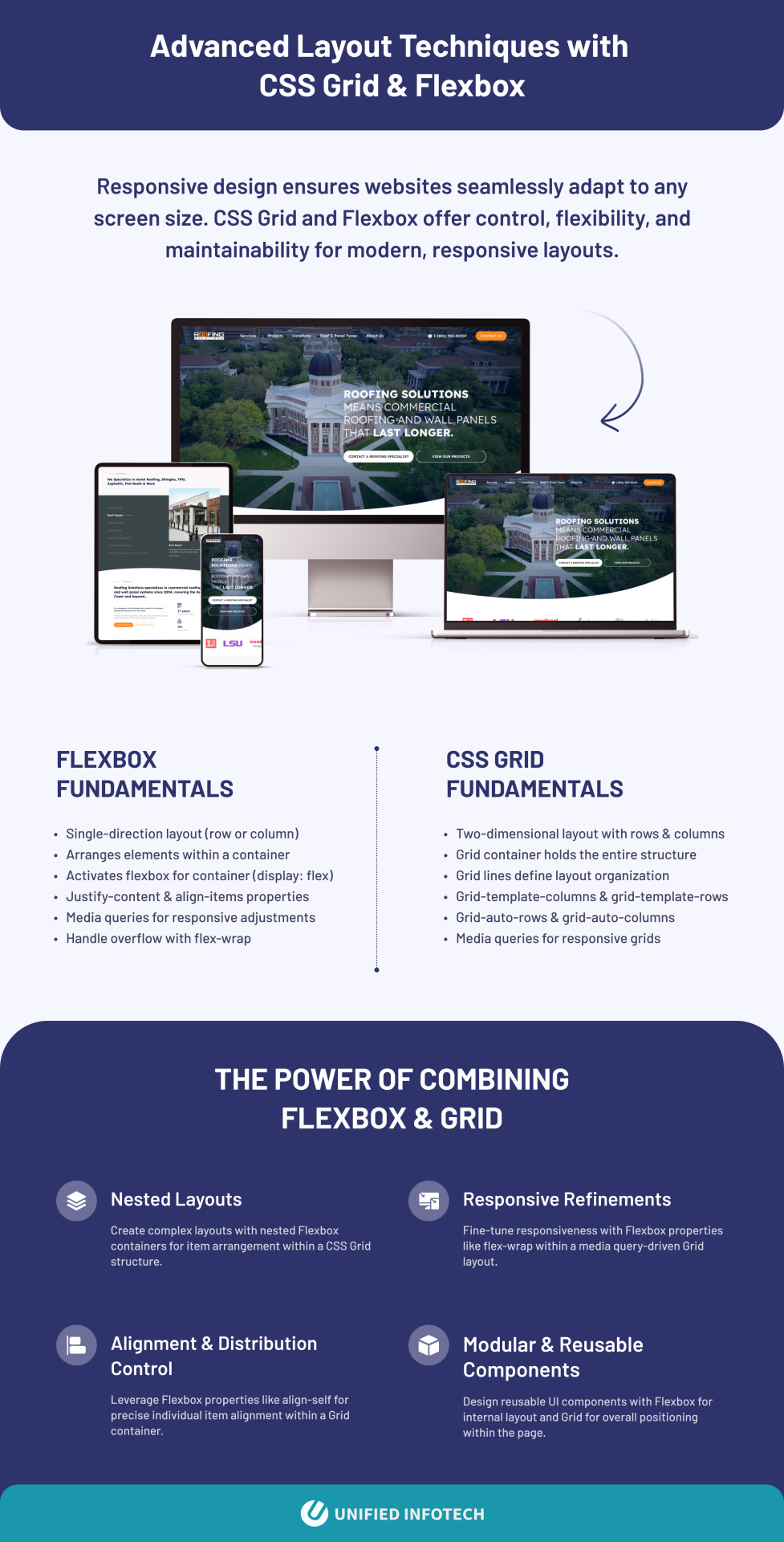
Responsive design ensures websites seamlessly adapt to any screen size. CSS Grid and Flexbox offer control, flexibility, and maintainability for modern, responsive layouts.
Flexbox Fundamentals
Single-direction layout (row or column)
Arranges elements within a container
Activates flexbox for container (display: flex)
Justify-content & align-items properties
Media queries for responsive adjustments
Handle overflow with flex-wrap
CSS Grid Fundamentals
Two-dimensional layout with rows & columns
Grid container holds the entire structure
Grid lines define layout organization
Grid-template-columns & grid-template-rows
Grid-auto-rows & grid-auto-columns
Media queries for responsive grids
The Power of Combining Flexbox & Grid
Nested Layouts: Create complex layouts with nested Flexbox containers for item arrangement within a CSS Grid structure.
Responsive Refinements: Fine-tune responsiveness with Flexbox properties like flex-wrap within a media query-driven Grid layout.
Alignment & Distribution Control: Leverage Flexbox properties like align-self for precise individual item alignment within a Grid container.
Modular & Reusable Components: Design reusable UI components with Flexbox for internal layout and Grid for overall positioning within the page.
0 notes
Text
Resource: Responsive Web Design
Starter kit basically.. for those working on jcink skins. Viewport plus using media queries, css variables, grid, and flex will ease the process of making responsive skins but I advise keeping them in mind early on.
10 notes
·
View notes
Text

I made a website template!
It's based on my own website's design. Feel free to use it for your neocities website, or any other website. Let me know if you do!
Features:
Fully responsive, mobile-friendly design that looks good and comfortable on all devices
Easily customisable colours, fonts, background images, and layout using CSS variables
Elegant paragraph/image layouts
'Preview frame' for linking subpages or other 'fancy' links
Simple image grids
Different types of lists: arrow lists, to-do lists...
2 base themes for different flavours of the template
...and more! There's extra snippets, colour palettes, and I did a lot of work putting the manual together.
Check it out!
283 notes
·
View notes
Text

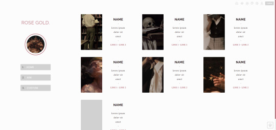

PAGE 06 – ROSE GOLD.
preview ✧ support me on ko-fi! ✧ download
▸ features
responsive layout
100x100 icon image and 120x200 character images
grid layout with room for as many characters as you’d like
easy css customization through variables for colors, fonts & other
check out the preview for all features!
▸ notes
list of credits in the code, please do not remove it!
if you have any questions or run into problems, please read the known issues & quick fixes section at the top of the code. if that doesn’t help you, feel free to send me an ask off anon or a dm, preferably with screenshots of the issue!
show your support by supporting me on ko-fi and/or reblogging my work! it’s much appreciated :)
#codingcabin#themehunter#resourcemarket#tumblr themes#page themes#nuclearcoding#page 006#slightly changing my brand sorry it might be a phase it might not be a phase. i don't care. i do what i want#anyway hello hi another oc page for youuu <333
204 notes
·
View notes
Text
AGARTHA Aİ - DEVASA+ (2)

In today’s digital landscape, a captivating and functional website is crucial for any business looking to thrive online. Full service web design encompasses a comprehensive approach, ensuring every aspect of your site is tailored to meet your unique needs. From the initial concept to the final launch, this service provides an array of offerings, including website service, responsive web design, and custom design services. Whether you’re a startup seeking to establish your brand or an established enterprise aiming to enhance your online presence, understanding the elements of full service web design is essential.
Full service web design
Full service web design encompasses all aspects of creating a website, from initial conceptualization to ongoing maintenance. This approach ensures that every detail is carefully considered to meet the specific needs of a business or individual. With a team of experienced designers and developers, full service web design offers a seamless experience that integrates aesthetics, functionality, and user experience.
One of the key advantages of opting for a full service web design is the cohesion of the website elements. Since all parts of the project are managed by a single team, there is less chance for miscommunication or inconsistency in design. This results in a more polished final product that reflects the brand’s identity while providing an engaging experience for visitors.
Additionally, full service web design allows for customized solutions tailored to unique requirements. Whether you need an e-commerce platform, a portfolio site, or a blog, a full service provider will offer dedicated support and expert advice throughout the entire process, ensuring your vision comes to life exactly as you imagined.
Website service
In today's digital landscape, website service is essential for businesses to thrive and maintain an online presence. A well-structured website serves as a powerful tool that encourages customer engagement and drives sales. By investing in a comprehensive website service, businesses can ensure that their website not only looks great but also functions seamlessly across all devices.
A key aspect of website service is the ability to optimize for search engines. By implementing SEO best practices, businesses can enhance their visibility and attract more organic traffic. This is where a reliable website service provider plays a crucial role, as they possess the expertise and techniques necessary to elevate your search engine rankings.
Furthermore, ongoing support and maintenance are vital components of a reliable website service. As technology evolves and user needs change, having a team that can promptly address issues or updates will keep your website relevant and effective in reaching target audiences. This ongoing relationship is instrumental in achieving long-term success in the digital realm.
Responsive web design
Responsive web design is an essential aspect of modern web development that ensures a seamless user experience across a variety of devices. With the increasing use of smartphones and tablets, having a website that adapts to different screen sizes is not just a luxury but a necessity.
The core principle of responsive web design is fluidity. This means that the layout of your website adjusts dynamically based on the screen width, ensuring that content remains accessible and visually appealing regardless of the device used. This approach improves usability and can significantly boost conversion rates.
Incorporating responsive web design techniques involves using flexible grids, images, and CSS media queries. These elements work together to create a layout that responds gracefully to changes in screen size, making your website not only functional but also competitive in the digital marketplace.
Custom design services
In today's digital landscape, custom design services have emerged as a vital component of creating a strong online presence. Businesses understand that a one-size-fits-all approach does not cater to their unique needs and branding. Therefore, opting for custom design services allows them to differentiate themselves in a crowded market.
These services offer tailored solutions that resonate with a company's specifics, from colors to typography and layout. By leveraging custom design services, businesses can ensure that their websites not only reflect their brand identity but also provide an intuitive user experience. This is crucial for keeping visitors engaged and encouraging them to take the desired actions.
Investing in custom design services ultimately contributes to better customer satisfaction and improved conversion rates. With a website designed specifically for their target audience, businesses can more effectively communicate their message and achieve their goals. This bespoke approach is invaluable in today's competitive environment.
43 notes
·
View notes
Text

Responsive Image Gallery with CSS Grid
#css grid layout#css grid#responsive web design#html css#frontenddevelopment#code#learn to code#html#css#css3#divinectorweb#responsive image gallery#css responsive#frontend
1 note
·
View note
Text
widowbase v3 and v4
Whooboi, there is a lot of discourse going on right now about JCINK coders. Perfect time for me to update some base skins!
For those who just want to streamline their coding process, I have updated my widowbase v3 to include a day/night theme toggle and made a few responsive tweaks to the vertical nav and sidebar. For those looking to learn how to use CSS grid and flexbox to create responsive forum designs, I added a new base, widowbase v4. This version includes some HTML templates that have a very ugly, extremely basic, but functional fluid grid layout. These templates also incorporate hidden divs (read as, display: none) that include the PHP variables frequently used inside those respective HTML templates, so you can easily delete everything I've done and start from scratch with your own. Then just delete the hidden div when you've used everything you need. Easy peasy!
For those of you just beginning your coding journey, I wish you the best of luck! It is such a fun and rewarding hobby. You are also free to rip apart any of the codes on my preview site and cobble them back together. These experiments can be a great learning tool! You are more than welcome to use any of my free resources as a base, as long as the finished product remains free. As for my actual skin bases (or template sets specifically labeled as bases), these can be used for free or paid skins. Make money or give it away, whatever works for you, just leave the credits given to resources intact so others can find out how to accomplish the same thing!
41 notes
·
View notes
Text
How to Create Mobile-Friendly Websites with Responsive Design
In today’s digital era, where mobile devices dominate web traffic, creating mobile-friendly websites has become more important than ever. As users increasingly access the internet through smartphones and tablets, businesses must ensure their websites are optimized for a seamless mobile experience. This is where responsive design comes into play. At Nividaweb, a leading responsive web design agency in Vadodara, we specialize in crafting websites that look and perform flawlessly on any device.

Here is a comprehensive guide on how to create mobile-friendly websites with responsive design:
What is Responsive Design?
Responsive web design is a design approach that ensures a website's layout and content adapt dynamically to different screen sizes and resolutions. Whether your users are browsing on a desktop, tablet, or smartphone, a responsive website delivers a consistent and user-friendly experience. This adaptability is essential for improving user engagement, reducing bounce rates, and enhancing overall website performance.
Why Responsive Design Matters?
Before diving into the how-to, let us understand why responsive design is crucial:
Improved User Experience: A responsive website ensures that users can navigate and interact with your site effortlessly, regardless of their device.
Higher Search Engine Rankings: Search engines like Google prioritize mobile-friendly websites in their rankings, making responsive design a key factor in SEO.
Increased Conversion Rates: With a user-friendly interface, responsive websites encourage visitors to stay longer and take action, boosting conversions.
Cost-Effective Maintenance: Instead of maintaining separate websites for desktop and mobile users, a responsive design simplifies updates and reduces costs.
Steps to Create a Mobile-Friendly Website with Responsive Design
1. Start with a Mobile-First Approach
The mobile-first approach involves designing the website for smaller screens first and then scaling up for larger devices. This method ensures that the core elements are optimized for mobile users. A responsive web design company in Vadodara like Nividaweb emphasizes this approach to ensure a seamless user experience on all devices.
2. Use a Flexible Grid Layout
A flexible grid layout is the foundation of responsive design. It allows website elements to adjust proportionally based on the screen size. Instead of fixed-width layouts, use percentages and relative units like ems or rems to define dimensions. This ensures that your website adapts smoothly to different screen resolutions.
3. Optimize Images and Media
Large images and media files can slow down your website, especially on mobile devices. To enhance performance:
Use responsive images that scale according to screen size.
Implement modern image formats like WebP for better compression.
Use CSS media queries to serve appropriate image sizes based on the user’s device.
At Nividaweb, a trusted responsive website design company in Gujarat, we leverage advanced tools to optimize images and improve loading times.
4. Implement CSS Media Queries
CSS media queries are essential for responsive design. They enable you to apply specific styles based on the device’s characteristics, such as screen width, height, or resolution.
5. Prioritize Touch-Friendly Navigation
Mobile users interact with websites using touch gestures, so it is essential to design navigation that is easy to use. Key considerations include:
Larger buttons and clickable areas.
Simplified menus with collapsible options for smaller screens.
Avoiding hover-dependent features, as they do not work well on touch devices.
6. Test on Multiple Devices and Browsers
Testing is a critical step in creating a mobile-friendly website. Use tools like Google’s Mobile-Friendly Test and browser developer tools to simulate various devices and screen sizes. Additionally, test your website on physical devices to identify and resolve any usability issues.
7. Ensure Fast Loading Times
Mobile users expect websites to load quickly. A slow-loading site can lead to higher bounce rates and lost opportunities.�� To optimize loading times:
Minimize HTTP requests by combining CSS and JavaScript files.
Enable browser caching and compression.
Use a Content Delivery Network (CDN) to deliver content faster.
As a responsive web design company in Vadodara, Nividaweb employs performance optimization techniques to ensure your website loads swiftly across all devices.
8. Leverage Responsive Typography
Typography plays a crucial role in readability and user experience. Use scalable fonts that adapt to screen sizes and maintain legibility on smaller devices. Tools like CSS’s viewport units (e.g., vw, vh) can help create fluid typography that adjusts dynamically.
9. Incorporate Mobile-Friendly Features
Enhance your website's usability by integrating features tailored for mobile users:
Click-to-call buttons for quick communication.
Location-based services like maps.
Fast and secure payment options for e-commerce websites.
10. Work with Experts in Responsive Design
Creating a truly responsive and mobile-friendly website requires expertise and experience. Partnering with a reputable responsive web design agency in Vadodara, like Nividaweb, ensures that your website meets the highest standards of design and functionality.
Why Choose Nividaweb for Responsive Website Design
Nividaweb is a leading responsive website design company in Gujarat, dedicated to transforming your online presence. Here is why businesses trust us:
Tailored Solutions: We understand that every business is unique. Our team works closely with clients to deliver customized designs that align with their brand identity and goals.
Cutting-Edge Technologies: We stay ahead of industry trends and utilize the latest tools and techniques to create responsive websites.
Experienced Team: Our skilled designers and developers have extensive experience in crafting mobile-friendly websites across diverse industries.
End-to-End Services: From design and development to testing and optimization, we provide comprehensive solutions for all your web design needs.
The Future of Mobile-Friendly Websites
As technology evolves, so do user expectations. Emerging trends like voice search, augmented reality, and progressive web apps are reshaping the way users interact with websites. At Nividaweb, we are committed to staying at the forefront of these developments, ensuring our clients remain ahead of the curve.
Conclusion
Creating a mobile-friendly website with responsive design is no longer optional; it is a necessity. By following the steps outlined in this guide and partnering with a reliable responsive web design agency in Vadodara, you can create a website that delivers exceptional user experiences, drives engagement, and boosts conversions.
Ready to take your website to the next level? Contact Nividaweb, the trusted responsive website design company in Gujarat, and let us help you create a website that stands out in today’s competitive digital landscape.
#Responsive web design agency in Vadodara#Responsive web design company in Vadodara#Gujarat#Responsive website design company in Gujarat#Vadodara#Website design and development company in Gujarat#India#Web design and development agency in Gujarat#Website design and development company in Vadodara#eCommerce web design in Vadodara#eCommerce website developer in Gujarat#eCommerce website developer in Vadodara#Best web design agencies in Vadodara#Web design company in Vadodara#Best website design company in Vadodara
5 notes
·
View notes
Text
Propiedades de las Cajas o Bloques en HTML y su Importancia
En HTML, todos los elementos, desde un simple párrafo hasta una imagen compleja, se representan como cajas. Estas cajas tienen propiedades que nos permiten controlar su tamaño, posición, espaciado y otros aspectos visuales. Comprender estas propiedades es fundamental para crear diseños web personalizados y atractivos. ¿Qué es el Modelo de Caja en CSS? El modelo de caja es una representación…
#CSS#css box model#CSS layout#CSS properties#desarrollo web#diseño responsive#Diseño web#Diseño web personalizado#Flexbox#Grid#Guía CSS#HTML#layout#Modelo de caja CSS#Posicionamiento CSS#propiedades CSS#Tutorial CSS#z-index
1 note
·
View note
Text
CSS Multi-Column Layout by Abdelfattah Ragab
CSS Multi-Column Layout by Abdelfattah Ragab
Welcome to the book "CSS Multi-Column Layout". In this book I will explain how you can use the Multi-Column Layout module. It is the third layout module after the Grid and Flex layout. The multi-column layout is specifically used for newspapers and magazines to create elegant and responsive columns where the content automatically fills the columns. You will learn how to create the columns and how to set the properties of rules, span, column breaks, etc… By the end of this book, you will have full control over the multi-column layout and be able to master all possible scenarios. Let’s go!
Available on https://shop.tredition.com and https://www.amazon.com

0 notes