#samebody syndrome
Note
What is your opinion on Winx Club and it's art direction?
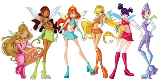
Honestly I never watched Winx Club growing up, so my frame of reference for it isn't particularly intimate. But just looking at the characters, it's clear there's a bit of Sameface and Samebody Syndrome going on.

The art style's certainly unique for a Western kids' show, and there's a nice variety of bright colors. But man, I hate to think what kinds of messages the show's young target audience took away from these designs. If all kids see in their media are tall, impossibly skinny bodies portrayed as desirable, they'll wonder why their own bodies don't match. And creators should be especially sensitive to this when they're making shows for girls, since media bombards them with a host of beauty standards to measure up to (and it's not like I'm any kind of expert in child psychology, but I'd wager the advent of social media hasn't helped matters). So it frankly didn't surprise me to learn that this show was created by a dude.

Look, I'm not saying men can't be mindful of the effects media can have on girls, nor am I saying men and boys never deal with their own body image issues. But if you're making a show with a majority-female cast, maybe consult some women about their designs-? In the credits of the first episode there are two feminine names listed as character designers (Michele Lilli and Andrea Pulito), but they appear to be outnumbered by twice as many men. (Though apparently those names can be masculine in Italian, so it's possible Michele and Andrea are men as well. Too bad their IMDB pages don't list pronouns for them.)
And according to Winx Club's Wikipedia page, after a pilot that was unsatisfying to the creator, the team hired fashion designers to revamp the characters. At first I thought this would explain the girls' proportions (it's common practice in fashion design to draw slim, taller-than-average figures with elongated legs), but the concept art from the pilot tells a different story. Even before the fashion designers came aboard, all the girls had the same tall, skinny physique.
Not that there's anything wrong with being tall and skinny- hell, I'm a beanpole myself! But when all your characters have the exact same body type, whatever that may be, it leaves out so much human variety and just looks repetitive as a result. It's boring. And on top of that, it creates a visual impression that these characters are interchangeable with little to no individuality. The girls do have their own distinct personalities in the show (I ended up watching the entirety of Season 1 for this post), but those personalities don't come across well in still images.
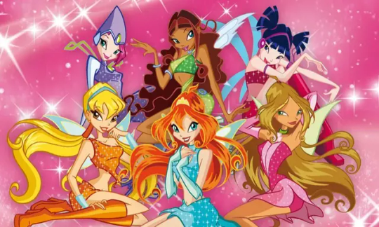
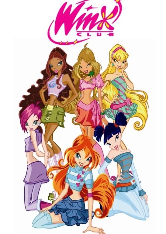
It'd help if they were posed in ways that showcased their individual traits rather than just... "feminine and vaguely playful" across the board. Where's Stella's cockiness, Flora's kindness, Musa's sarcasm, Techna's logic? I'm wondering if the fashion designers sketched out these poses as well, because they seem much better suited to displaying clothes than demonstrating character.
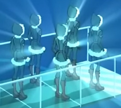
(To make matters worse, there's a point in the show where the girls look like literal clones. This screenshot where they're all wearing the same outfit really highlights just how little body diversity they have.)
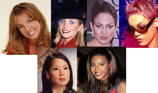
And what's bonkers about the faces looking so extremely similar is that creator Iginio Straffi based these characters on real women-? Namely Britney Spears for Bloom, Cameron Diaz for Stella, Jennifer Lopez for Flora, Pink for Techna, Lucy Liu for Musa, and Beyonce for Aisha. Here's how they all looked around the time of Winx Club's development:
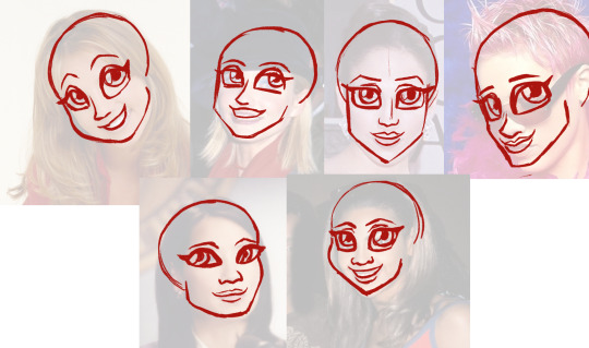
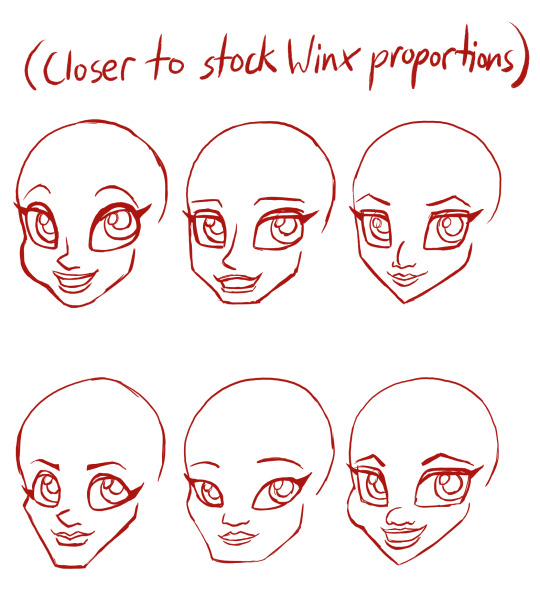
And here's how I'd use the photos as a starting point to make each character's face stand out more.

They seriously couldn't have just leaned in to what made each face unique rather than painting them all with the same brush?
I get it, drawing all the characters with the same base makes it easier to keep them on model (and I imagine it keeps things cost-effective when making toys of them). But good god, you couldn't have treated them as actual characters rather than paper dolls for the fashion of the week?
From what I saw of the show, it's fine. It's passable. I fully accept that I'm not the target audience for it, but it's not bad for what it is. Could use a ton more character development, though, both in the designs and the writing. In any case, I'm glad that present-day animated shows seem to be evolving past cookie-cutter character design.
To close this out, here's something that I absolutely should not be able to get away with:

Recognizing these poses from the DVD cover is a sign of knowledge.
Realizing I switched them around is a sign of wisdom.
#character design#winx club#critique#sameface syndrome#samebody syndrome#media#media criticism#long post#ask#phasedahmer
21 notes
·
View notes
Text
How many times do they reboot these turtles /lh
#tmnt#I know only bc of my brother playing fruit ninja (it shows some mutant mayhem game#event thing in the app)#And bc of fanart then finally looking it up to see there is a new movie#I would say stylistically rottmnt is most aesthetic#Mutant mayhem gives them sameface/samebody syndrome a bit#But Im glad they kept donatellos glasses as someone w glasses I hate when they get rid of glasses to make a character cooler!!!#mutant mayhem#I will say tho I cant watch rottmnt much bc the fast and sharp-lined animation gives me sensory issues
0 notes
Text
morally i dont know how to feel about him because its possible some things are exaggerated. aesthetically the way he draws bodies is so ugly i cant stand to look at it. twitter horny artists truly have that Brand of horny samebody syndrome
3 notes
·
View notes
Photo


Making a Sim: 2014 vs 2023
2014
this outfit was by far my fave and this swatch got used to death
that face preset was probably my default base
always had itty bitty waists and giant boobies... idk projection probably
everyone had a bad case of sameface syndrome
2023
this hair has an embarrassing chokehold on me and i use the newer black shade a lot
idk why i was so hesitant to use eyelash cc early on, they’re a necessity now
i actually try to use tops/bottoms instead of just outfits
actively trying to break my sameface (and samebody tbh) habit
6 notes
·
View notes
Text
speaking of art tips i have such a vivid memory of like 2014-2015? tumblr just scrolling by and seeing that Kylee henke is doing a YouTube art stream with a friend critiquing people's art and they were looking at a (what i hope was self submitted) sailor moon art piece and Kylee going "good thing to know is your thigh and your lower leg are the same length minus the foot" while pointing out how the lower leg portion was too long on that art piece. It stuck with me and it echoes every time i draw legs but I stopped watching the video after that because kylee took too long to explain things and i was getting bored. was in middle school i had things to do
56 notes
·
View notes
Text

lin wanyue u r my ANGEL
#fgep#female general and eldest princess#女将军和长公主#lin wanyue#林挽月#my art#doodle#i lov She....#she's been thru so much#i also drew li xian but i must've used up my smol art juice for the day bc she turned out Uglee#i can't disrespect her like that#i also gotta practice drawing buff ppl bc apparently i have sameface AND samebody syndrome
54 notes
·
View notes
Photo


i was forcibly dragged into magic kaito and as usual i have to get rid of sameface and samebody syndrome before anything else
no i have not read detective conan and no i will not be taking questions at this time
262 notes
·
View notes
Note
I love how you draw the papas so different but they all still look related? In their face shapes and eyes they’re similar but then skin tones and builds are slightly different idk I think it’s neat c:
Hi! Thanks! I’m a little worried about having sameface (samebody?) syndrome so if anyone says they see some differences, I’ll gladly take it.
On the topic of skin tones, I’m glad people actually notice and think it looks alright. I know the going consensus is that they’re (supposed to be) Italian which has a lot of range in skin tones already even within families and P3 seems to have slightly darker skin anyway but... we don’t know anything about their moms! Or what they look like! There’s no rules!
5 notes
·
View notes
Note
So in your Winx club post, you said that the poses don't reflect the characters personalities. And I realized that might be a problem with monster high too. And side not what's your opinion on the monster high designs ? ( Apology if you're not familiar with the series)
Folks I'm just gonna put this out there: Early-90s kid speaking. For a lot of kids' media that came out in the 2000s and beyond, I'd already aged out of their target audience. That's not to say I didn't enjoy the odd Spongebob, Flapjack, or Chowder, but that's probably because their humor and creativity were accessible to broader demographics. So as a general PSA, if you're wondering whether or not I'm acquainted with a series tailored specifically for children post-2001, the answer is "probably not".
That said, I do vaguely recall seeing some of these characters before (a side effect of having any kind of presence on DeviantArt, I'm guessing), but I've never had a reason to actively seek out more information on them. Now that I do, uh...

...yeah. As someone who knows nothing about these girls' personalities, their poses aren't giving me much to work with. And much like Winx Club, we have more Sameface and Samebody Syndrome going on, which feels like a huge missed opportunity since these are monster girls. There's so much potential for creativity that isn't being utilized.
I checked out the Monster High wiki for this and there are some pretty cool character concepts there. Sure, you've got the standard MGM movie monsters in the main cast, but then you've got a gargoyle girl, a yeti girl, a 15-foot-tall goo girl, and the fucking Grim Reaper's daughter??

And... and... A zombie-unicorn hybrid? Are you kidding me?

Child-me would have eaten that shit up, and even more so if the characters actually looked like monsters rather than humans cosplaying as monsters.
Look, I get it, this is a line of fashion dolls first and foremost, and reusing the same mold for everyone's faces and bodies is more cost-effective than creating a new one for every character. But if Mattel just split the difference and maybe created separate head molds for every species (as well as the two sexes within that species), there'd at least be a bit more variety. Honestly, where's the harm in making dolls with some unconventional looks? Where's the harm in showing girls their worth isn't diminished if they don't have the standard Bratz face?
Man, now I want to redesign some of these.
#character design#monster high#critique#criticism#samebody syndrome#sameface syndrome#ask#lockedwith-care
6 notes
·
View notes
Note
Hi so like I have been following you for a while and I just want to say, the way you draw people, especially women, is so refreshing! The proportions are realistic and feel weighty. For example, in the piece of final fantasy art you uploaded, it really looks like both characters have actual meat on them that is like... There. A lot of artists arms look like they're plasticky and mannequin type. Anyway what I mean is your ANAZING!! KEEP DOING YOUR THING! 😁😁😁👍👍👍
😭😭😭 Pal you’re gonna make me cry thank you SO much!!! Making characters weighty is something I’ve tried really hard to capture for the last billion years because I was so paranoid about sameface-samebody syndrome in my work and I’m so glad it’s paid off!!
I will continue doing my thing!!! drawing my meaty ladies!!! thank you for your support and i hope you have an amazing day!!
7 notes
·
View notes
Note
The way you draw bodies and shade to enhance your art always stood out to me, and that's how I know it's your art for sure. I always admired how you proportion everything and give characters a body type that would suit them. Considering how anime can be sometimes, it's greatly appreciated.
Oh yeah, anime has a serious case of sameface/samebody/cookie cutter syndrome when it comes to female casts and it’s a real shame. I’m glad I can give you a bit of a reprieve from that!
14 notes
·
View notes
Text
i kinda wanna check out an anime that’s opening popped up in my YT reccomendeds just bc the characters look p cute n it appears to be a giant mech anime?? though i’ve never rlly watched those it might be interestin?? and possibly gay?? idk the OP had a bit of it that seemed to be one o the girls flirtin’ w/ the other n shiz
n the song is pretty cute
n the protag girl is p cute though there’s some bits that make me worry bout there being fanservice
but the animation looks p good....
but i have like
60 other things on my To Watch list
but
Cute Leggy Girls n Giant Robots....
what d o
#becca babbles#the art style is p standard shonen anime style n the girls have long as heckie leggies imo#and it suffers from samebody syndrome some but can't win em all#I'll probs never get around to watching it either way so e h
0 notes
Note
Oh! Why no blonde-Kunikida?
1.) anime does wild and exaggerated hair colors for design purposes but its not like, supposed to be a realistic thing
2.) taking that into consideration, i prefer to stick on the more realistic side of things. and assuming kunikida is 100% japanese (which i do) then hes gonna have dark hair and i Cannot imagine kunikida bleaching his hair
3.) i always redesign characters to eliminate sameface/samebody syndrome, and when thats gone then i dont have to Wildly Vary the hair color to tell characters apart at a glance!
4.) i am the redesign god i do what i want
49 notes
·
View notes
Text
I’ve yet to run into a character creator that has the level of body customization I really want
even the ones that are supposedly really varied have a bad case of samebody syndrome, with only one or two base bodies to chose from and a handful of skin tones, and no matter what I do everything comes out looking like an androgynous anime child with dainty white features. and the ones that do let you customize noses and ears and chins to a decent extent have that uncanny potatohead look where it just doesn’t gel right, you can kinda see the seams where interchangeable parts have to fit together
0 notes
Text
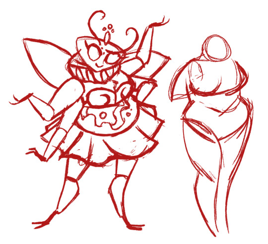
Redesigning Helluva Beelzebub
Hoo boy, roll up the sleeves for this one.
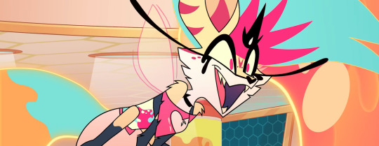
The Original
In my review of Helluva Boss 108, I mentioned that Beelzebub's character design put me in mind of how some DeviantArt kid's fursona might look. And... Yeah I stand by that statement. The most likely reason I can figure Viv Medrano wanted her to be dog-like was to make a reference to her Die Young music video, which featured an anthro wolf singing a Kesha song (for context, Kesha herself voiced Beelzebub and co-wrote a song for this episode).
But for those who are unaware, Beelzebub's traditional depiction looks nothing like this.

Really the only visual similarities the Helluva version shares with the Infernal Dictionary version are the insect wings, six limbs, and the crown thingy over the head. (At least I think that's a crown-? Kinda hard to tell on both counts.)
Bee's eyes get somewhat more insectoid later in the episode, but that feels like a cop-out. Wow, her eyes and colors changed. Totally a bug demon, right?
They had the same problem in Hazbin Hotel with Katie Killjoy, who's allegedly supposed to be a praying mantis but barely resembles one, even after her transformation.

I understand the desire for fresh takes on old figures, and taking creative liberties so the new interpretation doesn't feel generic. But the changes should at least make sense. By now it's pretty clear Viv couldn't care less about representing Ars Goetia demons faithfully, as demonstrated with Paimon, Andrealphus, and now Beelzebub. You could slap completely different names on these characters and it wouldn't change a thing. I posted this meme a while back but it's never been more relevant:
On top of that, what reason could there possibly be for the design to be this damn complex? Why did she need so many markings on her face? Why did she need so many layers of hair? Why did she need flowing goo for her hair, tail, and body, each requiring dedicated effects animation?
When it comes to a hand-drawn production, less is more. Any superfluous details on a character just make unnecessary work for the animators.
Anyway, here's what Viv has to say about it.
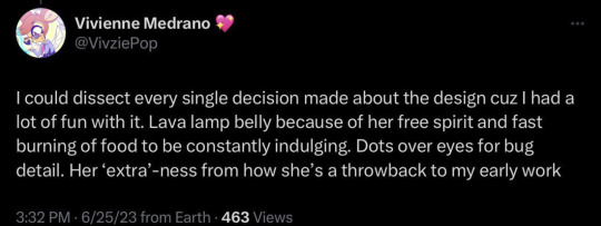
Alright, I'll admit: The lava lamp bit is a little clever. Basically it works as a regular stomach does, but on demonic steroids. But it wouldn't look so much like Viv's making this up as she goes if we'd seen Bee's stomach performing its intended function in the episode. Let her chow down on a giant piece of food (maybe that cotton candy she's been handing out-?) and swallow it, and let Loona (and the audience) see it dissolving in her transparent belly. As a general rule, if it's not shown or explained in the work itself, it's not canon. Like I've said before, Viv: Elaborate on the nuances in the story you're telling, not on social media.
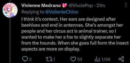
Also, "Her ears are designed after beehives"? Wh...Wha? Ma'am have you ever seen a beehive.

(Hell, even if you told me the ears were inspired by the generic cartoon beehive we're all familiar with, I wouldn't have guessed. There's a difference between being subtle and being vague.)
I can kinda see it in the overall shape, but that's a very specific design inspiration that wasn't clear at all in the design itself. Same with the "animal trainer" thing: I never would have picked up on that if Viv hadn't pointed it out. If a character design doesn't visually convey all the necessary information, it's not a successful design. Show, don't tell. There's a communication breakdown between what Viv's telling us and what Bee's design shows us.
(It's possible she actually meant "Her ears are designed after honeycombs", but even then, each compartment has a specific pentagonal shape that's not coming across at all here.)
I also find it interesting that Bee and Loona have almost the exact same body type. Of course Viv's pretty infamous for samebody syndrome, but it's actually unnerving how similar these two are.

Might this be a reference to Vortex's "type"? Is this foreshadowing a relationship with Loona? Am I overthinking this? Yeah, probably. Viv's demonstrated a clear preference for tall, skinny body types over the years, so it's safer to assume that's the explanation. It's all aesthetics. It ain't that deep. Occam's Razor and all that.
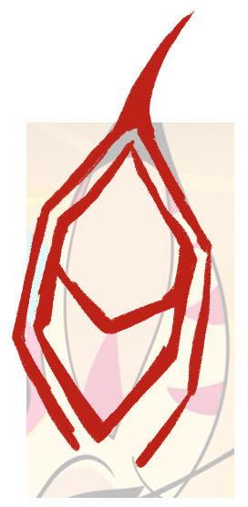
Finally, Bee how the hell does your shirt work.
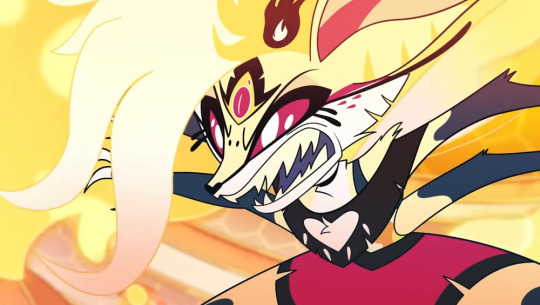
The Concept
So at this point it seems most logical to lean into the "bee" thing for the redesign, and scrap all the canine elements. As for the blobby hair and tail... yeeeah let's nix those too. We're going for a streamlined version that's easier to animate. And because I ignored the ringmaster look for my redesign of Asmodeus, it only makes sense to do the same for Bee's animal trainer vibe (what little there is) for the sake of consistency. I know this version of Hell has a circus theme with its highest-ranking demons, but there's never been an in-universe explanation for why that is.
Let's look at actual bees, then. A quick peek at Google has informed me that certain insect species have smaller, "simple" eyes (also known as ocelli), in addition to their compound eyes. In bees, this manifests as a triangular grouping of three beady eyes on top of the head.

In her Helluva Boss episode, Bee's full demon form has three eyes, which could be a reference to this triangular arrangement, plus her regular form has two spots on her forehead in addition to the third eye. So it's possible Viv actually did research for something. Pleasantly surprised on that front.
Next, the body. I've noticed that some folks find Bee's skinny body type refreshing, as the sin of gluttony is too often personified with fatness. And that's fair. That's valid. But consider this:

Imagine any Vivziepop character saying that about a chubby person. Imagine the series sending the message that fat people can be sexy too, and that they have worth outside of their appearance, enough for at least one character to consider them girlfriend material. That they're valued and appreciated regardless of this culture's beauty standards (which we know nothing about since the worldbuilding is as thin and flimsy as tissue paper, but whatever). Imagine if this show finally had a fat female character who wasn't relegated to the background. Don't know about y'all, but that would be refreshing to me. And when you take into account all the fat-shaming of a character who isn't even fat, portraying a fat character as attractive would be a nice change of pace for this show.
Now let's talk about clothing. In the episode, Bee's clothes show off a lot of her body, with a cutout crop top and short shorts. We can take a similar approach for the redesign (something that still shows off her chest, belly, and limbs, in keeping with the extroverted "party girl" persona), but that perhaps includes more queenly elements.
The Redesign
Because this is a redesign, many elements were already in place, but I still had to figure out how this character would look as a bee. Here's where the preliminary sketches came in. Lots of trial and error in this process.


Wrestling with this character's face got a lot easier once I realized I could mold it into a pentagonal shape akin to a honeycomb compartment. It took a few tries, but at last, I had a final sketch.

All that was left to do was test out some color combinations.
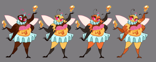
I tried a few different approaches, but in the end, this is the version I felt worked best.
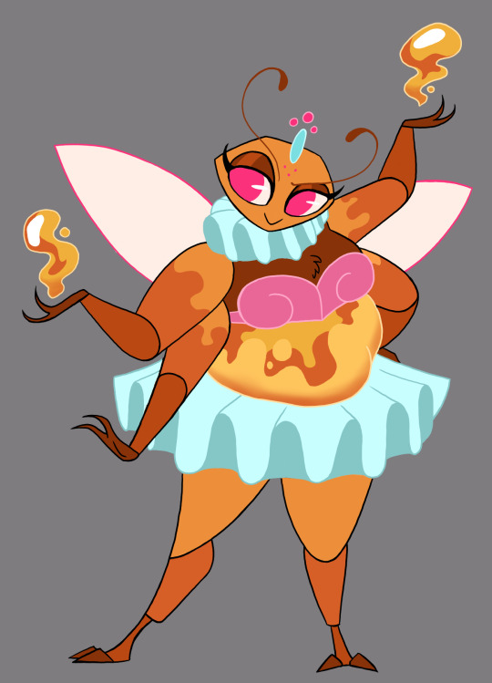
I used many of the colors from the original, but pushed the orange much harder since orange is the symbolic color of gluttony as a sin. And overall it gives Bee a nice honey-ish look rather than the generic black and yellow we already see on so many bees in cartoons. I thought the colored outlines on her clothing would add a soft, feminine touch, as well.
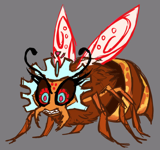
And just for kicks, here's a quick sketch of her giant form, inspired by the Infernal Dictionary drawing of Beelzebub.
Conclusion
The canon version of this character exists in the form she does for no reason than to stroke her creator's ego. "Hey guys, remember when I animated that Kesha fan video? Remember how cool that was? Wanna see me foist this unnecessarily-complex character design on other animators while I take a victory lap?" I wouldn't mind so much if Viv animated any of this herself, but she didn't. I could almost excuse this if she had no animation experience and didn't know how much work it requires, but she does. The self-aggrandizing entitlement is just off the charts. But a nonsensical design is leagues better than a stolen one, so... brownie points for that, I guess.
#character design#redesign#helluva boss#helluva critical#helluva beelzebub#vivziepop critical#body positivity#long post
641 notes
·
View notes
Note
you've stated a couple of times how sonic the hedgehog's design is visually interesting/creative, can you elabore on that and maybe put your own spin on it?
Have a nice day!
Ha, sure! I've never even played the Sonic games but I'm aware of the general pop-culture mythos around them, and I can appreciate how the characters all have unique personalities that stay relatively consistent throughout the series. I do think the Sonic characters in general have a nice variety in proportions (namely, big heads, skinny bodies, big feet) that makes them interesting to look at.

Kinda wish the designs would deviate more from that template for a bit more variety, but I guess Sonic Boom did that? Sort of? At least with Knuckles?
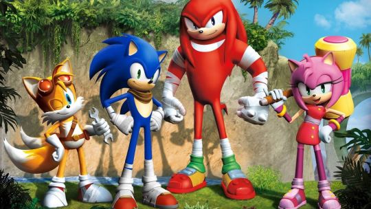
Like I get that these guys are iconic and it's in Sega's best interest to maintain that brand recognition. Of course they wouldn't want to change the designs too much. But personally if I were designing a new character for a Sonic game, I'd try to give them a different body type from what everyone else has. Samebody Syndrome doesn't count as a legitimate stylistic choice imo.
And really, the connected eyes were always a bit nonsensical and terrifying to me. It's like all the hedgehogs in this universe are cyclopses with two pupils and two irises somehow, yet the other species have regular eyes for some reason. Figure that one out.

(But apparently Vector the Crocodile has connected eyes too, so I have no idea what the logic is there. It'd be hilarious if he revealed himself to be a hedgehog in disguise.)

Enough about the cast; let's get into Sonic himself. Looking at his original 1991 iteration next to this 1930 patent drawing of Mickey Mouse, it's clear where a lot of the visual influence came from. Notice the body proportions, face shapes, oval-shaped black noses jutting out from the face, and the white gloves.

This does somewhat explain the connected-eye thing as well, except it looks more natural with Mickey since each pupil is implied to represent one entire eye, with the space around them simply representing differently-colored fur on Mickey's face.
And to reiterate what I mentioned in the shape language post, Sonic's assortment of triangles visually puts him at odds with his nemesis Dr. Robotnik, who's based on round shapes. While it's more common to see villains with triangle-based designs and heroes with circle-based ones, Sonic shows us that vice versa can also work.
If I put my own spin on Sonic's design, I'd make it look a bit more like a hedgehog, separate the eyes, and add more padding to his shoes so they hold up better to running. I also felt the tail and back spikes were a bit superfluous, so I left them out.

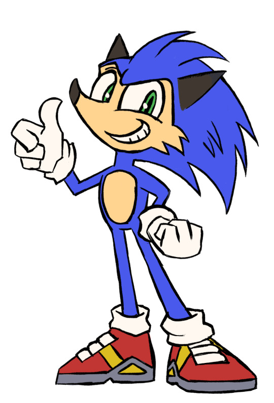
It's a first draft I'd need to explore more thoroughly, but it's a start. Thanks for asking!
11 notes
·
View notes
Last Seen Blogs