#scatterplot-official
Explore tagged Tumblr posts
Visit Tumblr Blog
Explore Tumblr blogs with no restrictions, modern design and the best experience.
Last Seen Tumblr Blogs


Fun Fact
Tumblr has been banned in Indonesia for providing people with access to pornographic content.
Note
Continued from replies,
The pigs I primarily grew up with were Petunia Poppy and Peonie and they were my own flesh and blood and older than I was, Ill have to find pictures of them, my most recent were Rhubarb and Ruby the twins we got em from a friend but had to move a few years later so we no longer have them.
tldr pigs are amazing wonderful creatures and i love my children dearly and i wish they were animals before food
AWWWWW PETUNIA POPPY PEONIE!!!!!! MATCHING FLOWER NAMES!!!!!!!!! And Rhubarb and Ruby, oh my heart TToTT I bet they were loving companions in the time that you did have them. <333
7 notes
·
View notes
Note
objectum culture is crying when your beloves screen cracks, she works but my darling mp3 is forever scarred and i feel terrible :(
on a happier note its also seeing your beloved boot up after charging them and seeing their beautiful screen glow , she supplies me so wonderfully with music and im proud to say shes been mine for five and a half years
.
18 notes
·
View notes
Text
Karam and his family needs your help!
Hello, I have another campaign I'd like you all to take a look at. Karam is in his final semester as a software engineer, but due to the ongoing events it's difficult for him to finish his studies. His mother is very sick and he needs money to help her. Please, if you can, donate to Karam's campaign so he can rebuild his and his family's life! Karam's campaign: https://gofund.me/a9d0f2d7 Karam's profile: @karamrafeek Vetted by: @90-ghost, @nabulsi, https://docs.google.com/spreadsheets/d/1-arif3YxcoUp_1IVDX3luke1F07Mk260DHV71WhJUyQ/edit?usp=drivesdk and https://www.tumblr.com/scatterplot-official/757158484586397696/httpswwwtumblrcomkaramrafeek7541962190966947?source=share
Any amount, no matter how big or small, will help! Please donate if you can!
#free gaza#free palestine#free west bank#freepalastine🇵🇸#palestine will be free#share#palestine#palestinian genocide#palestinian lives matter#save gaza#support palestine#save palestine#i stand with palestine#all eyes on palestine#palestine genocide#gaza#gaza genocide#donations#palestina#ceasefire#israeli occupation#israhell#gaza war
68 notes
·
View notes
Note
YOU FOLLOW SCATTERPLOT-OFFICIAL??????? :D 🩷
OH-
YEAH I DO!!! ^^
6 notes
·
View notes
Text
list of people who've reached out
@transparentobjectlady // gofundme // vetted by @gazavetters on row #31 of clolum a
@ahmeddani3 // gofundme // reverse image search comes clean
@Karamrafeek // gofundme // vetted on this spreadsheet on row #68 and by scatterplot-official, as well as
@tarneim3 // gofundme // reverse image search comes clean
@aboodalqedra-4 // gofundme // vetted by gaza-evacuation-funds
@yasermohammad // gofundme // vetted by 90-ghost
@majedalgherbawi // gofundme // reverse image search comes clean, allegedly vetted in a deleted post
@mahmoudayyads // gofundme // vetted by 90-ghost
2 notes
·
View notes
Text
Why Hiring a Kanban Certified Trainer is Essential for Agile Success
The pursuit of Agile transformation has become a cornerstone of strategic growth across industries. As organizations seek to streamline workflows, increase delivery speed, and enhance transparency, many turn to Kanban as their framework of choice. However, the implementation of Kanban without expert guidance often results in misalignment, stagnation, or failed adoption. This is where the role of a Kanban Certified Trainer (KCT) becomes indispensable.
Understanding the Role of a Kanban Certified Trainer
A Kanban Certified Trainer is a highly experienced Agile professional accredited by a recognized certification body, such as Kanban University. These experts are authorized to deliver official Kanban training programs, mentor teams, and ensure that organizations adopt Kanban correctly and sustainably.
They bring a structured, results-driven approach to implementing Kanban, emphasizing flow efficiency, limiting work in progress (WIP), and building a culture of continuous improvement.
Key Benefits of Hiring a Kanban Certified Trainer
1. Expert-Led Organizational Transformation
A KCT offers more than just technical expertise. They provide a strategic roadmap that aligns Kanban practices with your business objectives. Whether the goal is to improve delivery timelines, enhance team collaboration, or scale Agile across departments, the certified trainer tailors the implementation to your unique context.
They perform the following critical functions:
Evaluate current workflows and identify bottlenecks
Design customized Kanban boards and WIP limits
Educate stakeholders on Lean principles
Establish metrics and feedback loops for long-term success
2. Accelerated Learning Through Structured Training
Certified trainers deliver Kanban Management Professional (KMP) courses, Team Kanban Practitioner (TKP) programs, and Enterprise Services Planning (ESP) frameworks. These courses are globally recognized and equip teams with actionable knowledge.
Participants learn:
Core Kanban practices (visualizing work, managing flow)
Measuring lead time, cycle time, and throughput
How to evolve Kanban systems incrementally
Techniques for forecasting and capacity planning
3. Avoiding Common Pitfalls in Kanban Implementation
Without expert guidance, many organizations fall into common traps such as:
Treating Kanban boards as to-do lists rather than dynamic systems
Overloading team members due to undefined WIP limits
Failing to establish service level expectations (SLEs)
Ignoring the importance of flow-based metrics
A Kanban Certified Trainer ensures that teams understand and implement the methodology correctly from the outset.
4. Coaching at All Organizational Levels
Change is often met with resistance. A certified trainer knows how to work with executive leadership, middle management, and delivery teams to build trust and foster cultural alignment.
They provide:
Executive workshops on Agile governance
Coaching sessions for team leads and Scrum Masters
Hands-on mentoring during Kanban rollout
Retrospective facilitation to ensure iterative improvement
How Kanban Trainers Enable Scalable Agile Adoption
Cross-Team Synchronization
Scaling Agile means multiple teams working on interdependent components. A KCT implements Portfolio Kanban systems that help visualize work across programs and ensure coordination. This includes:
Multi-tiered Kanban boards (Team, Program, Portfolio)
Dependency management practices
Strategic prioritization and backlog refinement
Lean Metrics That Drive Business Outcomes
Effective Agile adoption is data-driven. Kanban trainers teach organizations to use powerful metrics that reveal the true state of workflows:
Cumulative Flow Diagrams (CFD): For identifying bottlenecks
Cycle Time Scatterplots: For forecasting and performance tracking
Control Charts: For analyzing process variability
These tools empower leadership to make decisions backed by real-time operational insights.
Sustainable Agility Through Continuous Improvement
Kanban is not a one-time implementation but a living, evolving system. A KCT introduces cadence-based practices that embed improvement in the team’s DNA:
Replenishment meetings
Daily Kanban stand-ups
Service delivery reviews
Operations reviews
These meetings create alignment, enable fast feedback, and maintain a state of readiness and responsiveness.
Real-World Impact of Kanban Certified Trainers
Case Study 1: Financial Services Firm
A global financial firm faced delivery delays and team burnout. After hiring a Kanban Certified Trainer, the organization restructured its workflow to include visual boards and WIP limits. Result:
23% improvement in delivery speed
15% reduction in team overtime
Real-time visibility improved stakeholder confidence
Case Study 2: SaaS Company Scaling Agile
As a fast-growing SaaS provider, the company struggled to coordinate across engineering, product, and support. With a certified trainer, they adopted a Portfolio Kanban approach, enabling:
Clear prioritization across departments
Enhanced release planning
Agile metrics to inform executive decisions
What to Look for in a Kanban Certified Trainer
Choosing the right trainer is critical. Look for:
Accreditation from Kanban University or similar bodies
Proven track record in implementing Kanban at scale
Strong facilitation and communication skills
Ability to provide customized training based on your industry
Trainers should also offer post-training support, including coaching, board audits, and leadership mentoring.
Investing in Agile Excellence
Organizations that treat Kanban implementation as a long-term capability—rather than a one-time event—reap significant operational and cultural rewards. Hiring a Kanban Certified Trainer is not just a training expense; it is a strategic investment in productivity, transparency, and innovation.
From faster delivery times to happier teams and satisfied stakeholders, the value generated far outweighs the initial cost.
0 notes
Text
On Wednesday this week, Jerome Corsi, Ph.D., and Andrew Paquette, Ph.D., accompanied by attorney Thomas Connors of the Mendenhall Law Group in Akron, Ohio, met with the official Ohio Secretary of State’s Inquiry called to investigate Corsi’s claims that Dr. Paquette had found indisputable evidence of secret algorithms encoded into that the Ohio State Board of Elections official Ohio voter registration database with a presumed purpose of facilitating mail-in ballot fraud.
“This apparently criminal scheme appears to be the work of clandestine rogue intelligence agents who have surreptitiously embedded themselves within the Ohio State Board of Elections to create nearly undetectable false voting records that can be certified as legitimate mail-in votes in the upcoming presidential election even though they are voted illegally,” Dr. Corsi said.
In a one-hour-and-twenty-minute meeting (originally scheduled for half an hour), Corsi and Pacquette presented to Ohio Secretary of State Frank LaRose’s office a series of voter ID scatterplots for various counties. Corsi and Pacquette told Gateway Pundit that these scatterplots revealed undeniable evidence that mathematical formulas had been secretly applied to create a cryptographic assignment of State Board of Election Voter ID numbers in Ohio, a fact previously unknown to the Ohio Board of Elections.
------------------------------------------------------------------------------
More proof of the theft of the 2020 Election.
0 notes
Note
did you kno thats theres this one person on tubmlr dot com called scatterplot official and its so cool and awesome and im so glad im hes friend
omgarsh i cant believe to learn it
did u know theres a guy on tumblr called thearomanticsnake who is so epic cool and its literally my fave?? and hes like, my bestie of all time!?!?
#i am aware thag is a refrence i dont go there but random does and they are rubbing off on me#scatters mutuals#scatter gets an ask
1 note
·
View note
Note
I am very sorry for incoming thought spiral. But it has occured to me that Mike pulls away from Eleven -or rather their relationship gets more strained- the more outwardly feminine El gets. For example you could do a scatterplot graph for the length of her hair vs how "good" their relationship is.
Its funny because her hair is also a symbol of her own self worth or self esteem. Or maybe just her idea of "personhood". Which makes it doubly interesting the almost directly after her argument with Mike her head is shaved again. The monster vs superhero argument in her head is so tragically compounded by Mike that i don't know how people want them to be together?
I fully expect her, for example, to "find herself" in v2- her hair a metaphor for the shearing away of these ideas she's clung to of what makes someone pretty or good or whole, a total full circle moment to embrace herself and all that scares her about herself where the hair, again, is pretty symbolic.
So where does Mike fit into that? He doesnt, at least not as anything but a footnote. But his story mirrors hers so well! The identity crisis and shedding ideas of conformity and what he is supposed to do or want to fully embrace "the self".
Their story arcs, their growth, their whole journey this season doesnt make sense if they get back together. If this season is about conformity and growing (up) and finding yourself, then the only logical follow through is their break up.
So even without factoring Will into this, it just doesn't bode well for mike and eleven. Will though? Byler? Different story entirely.
Again sorry I just needed to word vomit 💖
Hi!!
Don't apologize, I love thought spirals :) That is literally just my brain 24/7 LOL.
I completely agree with everything you said. This is very well explained!!
As El gets more feminine, Mike's interest in her declines. And you're totally right that El does associate her having longer hair with the idea of fullness or personhood, and she prefers herself with longer hair. I think that's partially a trauma response from having to have her head shaved in the lab, but also because she's trying to emulate the women around her, because she idolizes and looks up to them so much. I don't know how people want them together either. They're just so bad as romantic partners...I like them as friends and I think they'll always be bonded because Mike saved El's life in season 1, but they just don't work as a couple - regardless of Will being in the picture, and regardless of Mike's sexuality too. Mike & Eleven's romantic relationship cannot stand on its own.
I completely agree the only logical follow-up to their story arcs this season is for them to officially, officially break up. And I feel like based on what we got in Vol. 1, we're well on the way there.
Thanks for sharing anon :) I hope you're well! xx
73 notes
·
View notes
Text
As The Market Turns
The whims of the stock market may never be explained. If anything, over time analysts have concluded that the day-to-day data, while still subject to trends and outlier occurrences, exhibit a random walk. You could ask a drunk to walk a straight line and get as good of a prediction from a scatterplot of his steps, as any scientific forecast.
Yesterday the Dow Jones Industrial Average catapulted more than 1000 points by afternoon, eventually settling in at an increase of 829 points. Why? Because the most recent jobs report was not as grim as expected, and the economy added 2.5 million jobs in May, dropping unemployment to 13.3%. Analysts had predicted we would actually shed another 8 million jobs.
And all the stock market cowboys rejoiced, throwing their hats in the air. Heck, with the Dow at 27,110 points, we are now at 90% of our pre-pandemic high of 29,551 on 12 February. Things surely are looking good, right?
Right?
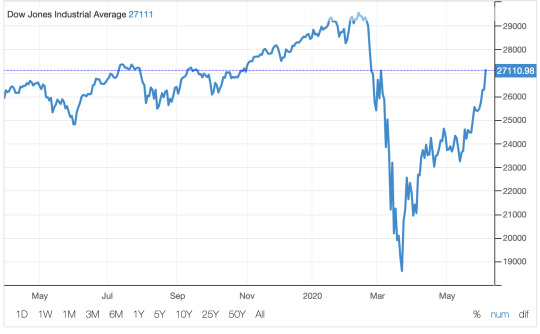
Not so fast there. Second-quarter earnings reports will be coming out soon, and I just don’t see how they can all be rainbows and unicorns, especially with retail sales getting hit so hard. Where is all of the investment money coming from? Are people scooping up bargains with all of their wealth, or--as some have suggested--are they using the liquidity of stimulus payments to buy stock? That’s false money in my book.
If anything, the stock market is giddy--or might I say drunk--with optimism, which is not necessarily a bad thing, but it’s probably not too realistic, especially when you look at the data that caused the precipitous slide in the first place.
For example, Texas reported 2080 new COVID-19 cases yesterday, its biggest one-day jump. Florida reported similarly, and California has also been knocking it out of the park. In fact, if you look at each state, the three are all on a growth trend, all the while the entire nation is finally showing some signs of flattening. We have a long way to go to get as flat as Germany, but when the three biggest states in terms of population (about 90 million total, or 27.3%) are surging, you cannot ignore it.

So why are they surging? Wasn’t the virus supposed to go into decline once we hit the warm summer months? Or can we explain away, like a Florida official tried to do yesterday, by saying the spike is a result of more testing, and--duh--you need tests to have cases? We can probably attribute the recent spikes to reopening, and the current wave is the result of some pretty heavy partying and gathering over Memorial Day weekend. The tests have been available for weeks now, so it’s not like we just had a bunch of new capabilities hit these states in the last week. As for summer temps, the virus is surging right now in Brazil and India, both with tropical and subtropical climates. If anything, summer sends the warm-weather locations back indoors whenever possible, because air conditioning.
Which is all another way of saying the celebrating over at the stock market may be a little bit premature. I don’t like to be a Nicky Naysayer, but this is still a very different place from February, and we have a long way to go.
As one of my Facebook friends pointed out during the night after I posted this graph, it may just be that governors are taking very calculated gambles, trying to balance an “acceptable” number of infections against hospital capacity, along with trying to jump start the economy. I agree to a point, because a public health problem is separate from an economic problem, even if they are related, and they can both be addressed simultaneously.
Great care must be taken lest we lose a lot of people--the lifeblood of any economy--along the way. I understand the temptation to try to manage both risks. This is a tightrope act over a 1000-foot chasm. And every one of us wants to see the economy rebound because we need jobs, we have bills, we want to retire someday. I get that. You get that.
But let’s keep things in perspective. We are not even close to February yet, even though many people are acting as if nothing happened. The rush to return to old normalcy may very well be a bit hasty. Let’s try not to be charging through the stock market like a drunk bull.
Dr “Walking On Eggshells“ Gerlich
Audio Blog
2 notes
·
View notes
Text
Sant baba ranjit singh dhadrian wale diwan

Dhadrianwale stopped congregation to avoid any deadly resistance from rivals Dhadrianwale Conflict - Defamation case filed by Rivals Radio Dhadrianwale is Launched Dhadriawale gets life threats from taksal spoksperson jassowal Bhai Ranjit Singh appealed sikh sangat on sauda saadh case. Buy Now! This Ad? sant ranjit singh dhadrian wale mp3 downloadĪdvertise here.

Mai bhago wali video, jo bhai santokh singh de likhe granth suraj parkash, da app ji ne arth kita os nu ta loka ne ik mudda hi bna lia ji.ĭhadrianwale Diwan MP3 Recordings. Thanks very much - your response is much apprecited. We wish to extend our regards to the sikh sangat who keep sending us regular feedback and requests. You can now quickly see list of mp3 recording as per your choice. On frequent demands, We are now introducing filters in audio and video sections. These mobile applications are available for Free and are regularly updated with new mp3 audio recording and video uploads. We will try our best to make that kirtan available on this website and official mobile application Parmeshardwar Dhadrianwale app for Android and Parmeshardwar-Dhadrianwale iOS app for iOS as well. Please make sure to visit more often to enjoy new videos.

This section is updated frequently with latest kirtan videos. Write us now!An afternoon gurbani kirtan darbar is also held on Sunday afternoon in case Bhai Ranjit Singh ji is present there at Gurdwara Sahib.įollowing are some of video recordings from these gurmat kirtan samagams where sikh sangat is gather in large numbers to listen to preachings of Bhai Ranjit Singh Ji Dhadrianwale. We support you! Dhadrianwale MP3 Recordings. Thank you brother and continue the good work you are doing. Thank you brother for your wisdom and teaching. I started listening to you when you came to Yuba City in The way you teach and preach has helped me so much to learn about the Gurus and Sikhi. I was so confused with the Sikh teachings because I didn't understand them. We make best efforts to put all his Dharna, Poems, Shabads and Diwans on regular basis. Parmeshar dwar brings you these official recordings on this website and mobile application as well. All his recordings are now made available only quickly after each diwan. Engine oil cap testīut he soon decided to avail these recording online for benefit of sangat. Earlier his audio video recordings were available with commercial music companies. He started doing kirtan at an early age of 16years. He has been spreading the word of sikh Gurus from last 18 years. Machhiwara Sahib 15 March Download.Bhai Ranjit Singh Khalsa Dhadrianwale is a very active, popular and influencing speaker of sikh community. Na Hum Hindu Na Musalman Machhiwara Sahib 15 March New. Sant Baba Ranjit Singh Ji (Dhadrian Wale) All Albums Songs Download Fatehgarh Panjtoor Moga 6 April Download. Parmeshar Dwar Sahib Samagam Vaisakhi Samagam G. Parmeshar Dwar on Parmeshar Dwar Sahib Samagam 5. R scatterplot heatmapĭownload Sunday Diwan at G. Download Jab Hum Hote Tab Download Charan Chalo Marg Gobind Sidhwan 8.
0 notes
Text
Week 12: November 8- Laurie Gries - On becoming rhetoric; Tufte- Visual explanations
The Importance of images, visual and statistics
This week we read very informative texts about the importance of paying attention and the detrimental end results of not paying attention to graphic information. Tufte's articles that explained the importance of reporting correctly the statistics or quantiles accompanying the images in the incident of the Cholera outbreak in London and Challenger space craft that exploded. Tufte's chapter presents two case studies in which the quality of a graphical presentation had significant consequences. The first example-a success story, is that of John Snow's analysis of the 1854 London cholera epidemic. Snow's analysis and presentation convinced the city fathers to take appropriate action to curb the epidemic. The second, cautionary, example analyzes the failure of viewgraphs prepared the engineers to convince NASA officials to postpone the launch of the space shuttle Challenger. Tufte makes effective arguments of how a tragic flaw of visual information is deadly, "had the correct scatterplot or data been constructed no one would have dared to risk the Challenger in such cold weather." Tufte implores people who use graphics in their daily professions to pay attention to detail and be meticulous both presenting and interpreting visual information in order to avoid deadly mistakes such as the one experienced by the challenger engineers.

Rhetoric as becoming emphasize the role of rhetoric in collaborative meaning making. Obama Hope image first appeared in public in Obama's first presidential campaign and it quickly took on a life of its own as it was reproduced across multiple contexts and appropriated to fit the innumerable purposes of often anonymous creators. According to Gries Obama Hope is an important example of visual rhetoric because it constitutes what she terms a 'single multiple image' that has consistently undergone and continues to undergo numerous rhetorical transformations. As a result of both its now long-term and wide-ranging rhetorical movements, Obama Hope constitutes a valuable site for intensive study of the ways visual rhetoric circulates in public culture today. Laurie Gries uses the Obama Hope image to introduce iconographic tracing by imploring Bruno Latour’s (2005) explanation of how empirical, digital research can make visible how new media images circulate and reassemble the social. He introduced ecological rhetorical model which he termed iconographic tracking thus a method that makes use of innovative digital research and traditional qualitative strategies to account for an image’s circulation, transformation, and its resultants. In order to demonstrate this method’s affordances, Latour (2005) described how to enact this method and weave in sample findings from an ongoing case study that employs iconographic tracking to trace the Obama Hope image. Furthermore he introduced a new materialist approach to explain some of the theories and philosophies that underpin this method.
Two images that come to my mind that have also received multiple rhetorical transformations though at a lesser extent are those of Marilyn Monroe and Madonna who were famous actresses and their images have been reproduced to show their provocative, feminine, sexuality and beauty. The two key figures though controversial played a role in the movement of women’s roles and expectations.

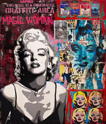


Marilyn Monroe tested the boundaries of her generation repeatedly, especially with her image that caused severe controversy during her time, showing her flirtatious portrait pushing her skirt down above her knee (black and white above). It is said to be found in any 1950s magazine, or pictured with any book or article written about her, or brightly framed and displayed to draw the public’s eye. Some of her images were reproduced as graffiti as an expressive art form. The other image above show her body instead of being covered with clothes its all covered with colorful flowers and two words sweet and love as metaphors for how provocative, feminine, sexy and beautiful she was.


Similarly, Madonna has her images drawn in unique colors and dimensions as she was at one time considered on the lower side of the cultural scale because of her erotic videos, which included controversial issues such as homosexuality. She is one lady who has tested today’s moral boundaries with songs and videos that depicted aspects of society, which were still under, mainstream cultural turmoil, this has led her to her reign as a modern day social icon.
Both women became a consciousness in the male-dominated world and as shown above their images have been reproduced in many different ways.
0 notes
Text
Shidafzan: Financial Management (Chapter 4: Financial Analysis-Sizing Up Firm Performance)
Demand, and therefore prices, are typically low during July --- often the hottest month of the year. Finally, the rally in prices tends to climax even before the onset of the coldest weather as anticipated demand is realized, refineries gear up to meet that demand, and the market begins to focus instead on inventory liquidation. For example, even though cattle prices have usually declined from March/April into June/July, they have exhibited a strong tendency to rally in early May as retail grocery outlets inventory beef for Memorial Day barbecues. However, as the industry begins to anticipate the summer driving season, demand for future inventory increases and exerts upward pressure on prices. Prices tend to be lower during the poorer driving conditions of winter. By the official opening of the driving season (Memorial Day) refineries then have enough incentive to meet that demand. To be included in either composite, a contract year must meet a strict mathematical definition: Using linear regression the absolute value of the slope of the line best describing its closing-price scatterplot must exceed a predetermined level. An effective vaccine is seen as the best hope to break the cycle of deadly virus surges followed by severe restrictions across much of the world since COVID-19 first emerged in China late last year.
The other primary petroleum product encounters a different, albeit still weather-driven, cycle of demand as exhibited in the seasonal pattern for August Gasoline. A seasonal decline may typically be punctuated by brief rallies. Soybean prices tend to decline from June/July into October's harvest, but by Labor Day the market has usually anticipated a frost scare. For example, Brazil's ascent as a major soybean producer in 1980 was a major factor in the nearly 180-degree reversal in that market's trading pattern from the 1970s. Conversely, relying solely on disinflationary patterns prevalent in 1981-1999 could be detrimental in a new inflationary environment. Recognizing fundamental events that coincide with these punctuations can provide even greater confidence in the pattern. Even trends of exceptional seasonal consistency are best traded with common sense, a simple technical indicator, and/or a basic familiarity with current fundamentals to enhance selectivity and timing of entry/exit. In addition, a Money Back Guarantee enables you to completely free up the risks of shares and enable the gauge of their performance in the market before gauging its performance in the market, which I have seen in the last few years From the best publishers have been dealt with. These may be determined arbitrarily, but best by a user fully cognizant of the consequences of that choice.
The goal of Bull/Bear patterns are to provide potential insight into when bull years may be strongest and bear years may be weakest, Additionally, potential periods where bull years are weak, or bear years are strong may also come to light. The nature of these patterns themselves may then be further examined for such things as specific time periods critical to a breakout or trend definition. The real time boutiques quotes help in comparing the prices of the various company stocks and they also provide the basis for taking the decision as to which stocks to invest in. 14) Bonds are less risky than are stocks because their return is more predictable. They walk away from the stock market with a determination to wait till the market psychology has regained its composure or never to return at all. Further behavioral study can examine both bullish and bearish market patterns. All mutual funds cover their expenses from the money under management; the management; these management expenses are public information and can be accessed at services like Morningstar.
However, I knew some investors were making a good amount of money. Probable Outcomes continues the Crestmont Research tradition of extensive full-color charts and graphs that enable investors and advisors to differentiate between irrational hope and a rational view of the stock market. To perfectly analyze a stock, investors are required to check the growth of a stock such as its past performance, and how well they do it for the next five years. Related issues involve projecting into the future with statistics, which confirm the past but do not predict in and of themselves. Of immediate practical concern to traders may be issues of timing and contraseasonal price movement. Therefore, a seasonal pattern constructed from daily prices can depict not only the four major components of seasonal price movement, but also especially reliable segments of larger seasonal trends. The seasonal methodology, as does any other, has it own inherent limitations.
0 notes
Text
Introducing Charts v3
Formally developed by SeyDesign / Nimblehost, the Charts stack has received a major update this past weekend. To check if you are eligible for a free update, you can login to your Paddle account to see if Charts is listed there. For everybody else, the latest trial version and purchase links for Charts can be found on the product page. Charts is included in the Black Friday promo.
Charts is a handy little stack if you need to convert a CSV spreadsheet file into basic line charts, bar charts, pie charts, scatterplots, area charts, meter gauges or doughnut circles. These can be useful to visually display simple data on websites or webapps. A wide choice of style options within the Charts stack allow you to customise the generated charts and graphs to match your existing theme or corporate branding.
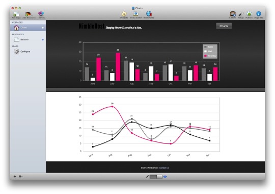
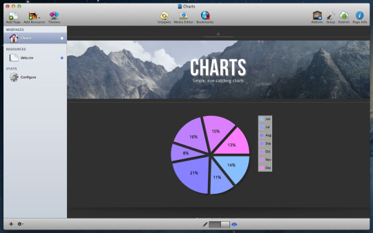
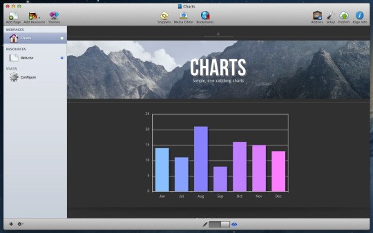
As before, the Charts stack works from a CSV file you supply. Most spreadsheet software can generate CSV files. This offers a quick method towards getting your axis labels and datasets loaded into Charts; with zero code required. Charts does all the hard work for you, to convert your CSV data into beautiful charts. You can either use CSV files added as resources in RapidWeaver or link to CSV files already stored on your web hosting account.
Changes in Charts v3 include:
Generated charts can now be previewed in RapidWeaver.
Fixed a problem that resulted in bar and line point labels missing.
Greatly improved the handling of multiple Chart stacks, when they are configured differently to each other on the same webpage.
Fixed a problem, whereby graph axis labels would always get shown on the pie and doughnut chart types, where one was not needed.
New options to specify a maximum width or height, in your preferred units of measurement (e.g. %, px, rem, vw, vh).
All colour pickers now support RGBa colour opacity.
Fixed a bug that was causing a thick black line to be rendered under chart canvases in Foundation 6.
Requested by a user, the starting angle of doughnut and pie charts can now be customised in degrees.
Updated some stack setting labels and informational tooltips, to make setup quicker and easier.
Dropped support for Internet Explorer 8 and less. These web browsers have been officially obsolete for some years. Few people use these browsers anymore. This has the benefit of greatly reducing the amount of code everybody else has to load.
Fixed a bug that caused Meter Gauges to vanish if a chart further up the page had more than 8 data points and labels enabled (yeah - I had hours of fun trying to find and fix this one)!
New background colour and font size options for chart legends.
Reorganised and regrouped a few of the stack settings, to make things easier to find.
As requested by a user, it is now possible to rotate both x-axis and y-axis ticks, on bar and line charts.
Support has been added for Area Charts. These can be accomplished by using the existing Line Chart type, and selecting the Area Plot checkbox (in Line Chart Options).
New stack icons and a few other tidbits of information required by newer versions of Stacks and RapidWeaver. Rewrote the buggy '&&' operator conditional statements.
Added the ability to toggle the chart box shadow effects on and off using a single checkbox option.
Cleaned up 'edit mode' to display less information about Charts. Important messages are still displayed if something is configured incorrectly.
New number box to change the sizing of point labels on bar charts.
Perhaps the biggest feature of all is that Charts is now fully responsive. This means that generated charts or graphs will scale-down to fit tablets and smartphones. Therefore removing the need to create multiple charts for different screen sizes. I know this has been a frequent user request for many years! Major technical hurdles had to be overcome, which meant rewriting a large portion of the underlying codebase and reconnecting all the settings. Charts will now redraw each time the screen is resized or changes orientation.
The product page for Charts has been updated with all new documentation. I have also put together a RapidWeaver 8 project file you can download. This contains several real working examples of Charts that you can experiment with. These tests work with the free trial version of Charts and the paid version.
Charts v3 will identify itself as a new stack and can be installed alongside older versions. Given the magnitude of changes, it will not attempt to convert or update older versions. This newest version of Charts has a bright orange and white icon.
Also of note, I have updated the LineGraph stack too. This one is a good option if you are only interested to making responsive line graphs (including area charts and scatterplots).
0 notes
Text
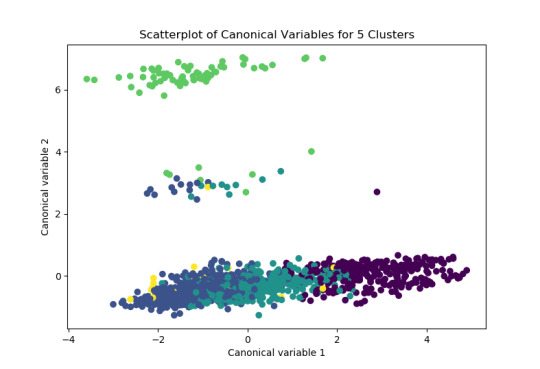
Fourth Assignment; k-means cluster analysis
This post shows the result of applying k-means cluster analysis to detect ideological/political population clusters using the Outlook On Life 2012 survey.
* A set of 11 variables which may have relation to the political or ideological position of the observed subjects have been chosen for the analysis. They are listed in the Python code.
* In addition one more variable representing the position of subjects on the “American dream” expectations has been chosen to validate the cluster division.
* As in the previous assignment, all columns data preparation and scaling has been encapsulated in the adjust_column function.
This is the Python code of the initial run:
=================================
from pandas import Series, DataFrame import pandas as pd import os import numpy as np import matplotlib.pyplot as plt from sklearn.model_selection import train_test_split from sklearn import preprocessing from sklearn.cluster import KMeans
""" Data Management """ os.chdir("D:\Documentos\Personal\Curso Data Analytics\Datasets")
data = pd.read_csv("ool_pds.csv")
#upper-case all DataFrame column names data.columns = map(str.upper, data.columns)
# Data Management
data_clean = data.dropna()
# W1_A5A: Who did you vote for? # W1_A10: How often, if ever, do you discuss politics with your family or friends? # W1_A12 Obama approval: 1 approve, 2 disapprove, -1 Refused # W1_B4 Anger about country situation: 1 more angry, 5 less angry # W1_C1C: Do you think of yourself as closer to the Republican Party or to the Democratic Party? # W1_E2A: Are you extremely [optimistic/pessimistic], moderately [optimistic/pessimistic], or slightly [optimistic/pessimistic]? # W1_E4: Were you ever willing to date outside of your racial group? # W1_H1: Society has reached the point where Blacks and Whites have equal opportunities for achievement. # W1_J1_D: [Require that an equal number of the top leadership positions in government go to women? ] What is your opinion about each of them? # W1_L5_A: [Helped in a voter registration drive ] Please indicate whether or not you have engaged in these political activities in the last TWO years? Have you... # W1_M5: How often do you attend religious services? # W1_A4: In 2008, John McCain ran on the Republican ticket against Barack Obama who ran on # the Democratic ticket. Do you remember whether or not you voted in that election? # W1_A11: How many days in the past week did you watch national news programs on # television or on the Internet? # W1_B1: How much do government officials care what people like you think? # W1_B2: How much can people like you affect what the government does? # W1_B4: Generally speaking, how angry do you feel about the way things are going in the # country these days? # W1_C2: We hear a lot of talk these days about liberals and conservatives. Where would you # place YOURSELF on this 7 point scale? # W1_D11: [The Republican Party] How would you rate: (1-100) # W1_D12: [The Democratic Party] How would you rate: # W1_E3: Some people engage in interracial relationships, while others do not. Have you dated # outside of your racial group? (Yes/no) # W1_F2: And when you think about the future of the United States as a whole, are you # generally optimistic, pessimistic, or neither optimistic nor pessimistic? # W1_F3: A basic American belief has been that if you work hard you can get ahead and reach # the goals you set and more. Is this true or false today? # W1_F6: How far along the road to your American Dream do you think you will ultimately get on # a 10-point scale where 1 is not far at all and 10 nearly there?
# subset clustering variables cluster=data_clean[['W1_A5A','W1_A12','W1_B4','W1_C1C','W1_E2A', 'W1_H1','W1_J1_D','W1_C2','W1_D11','W1_D12','W1_F2']] cluster.describe()
# Function to normalize data columns from sklearn import preprocessing def adjust_column(column): column = pd.to_numeric(column, errors='coerce') average = column.mean() column = column.fillna(value=-1) column = column.replace(-1, average) return preprocessing.scale(column.astype('float64')) # standardize predictors to have mean=0 and sd=1
# standardize clustering variables to have mean=0 and sd=1 clustervar=cluster.copy() clustervar['W1_A5A']=adjust_column(clustervar['W1_A5A']) clustervar['W1_A12']=adjust_column(clustervar['W1_A12']) clustervar['W1_B4']=adjust_column(clustervar['W1_B4']) clustervar['W1_C1C']=adjust_column(clustervar['W1_C1C']) clustervar['W1_E2A']=adjust_column(clustervar['W1_E2A']) clustervar['W1_H1']=adjust_column(clustervar['W1_H1']) clustervar['W1_J1_D']=adjust_column(clustervar['W1_J1_D']) clustervar['W1_C2']=adjust_column(clustervar['W1_C2']) clustervar['W1_D11']=adjust_column(clustervar['W1_D11']) clustervar['W1_D12']=adjust_column(clustervar['W1_D12']) clustervar['W1_F2']=adjust_column(clustervar['W1_F2'])
# split data into train and test sets clus_train, clus_test = train_test_split(clustervar, test_size=.3, random_state=123) print(clus_train.shape) print(clus_test.shape)
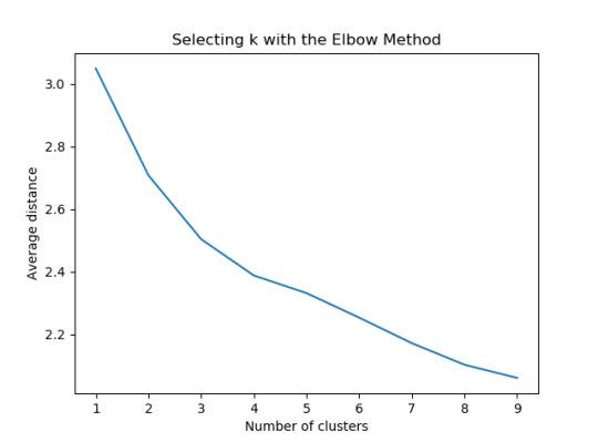
# k-means cluster analysis for 1-9 clusters from scipy.spatial.distance import cdist clusters=range(1,10) meandist=[]
for k in clusters: model=KMeans(n_clusters=k) model.fit(clus_train) clusassign=model.predict(clus_train) meandist.append(sum(np.min(cdist(clus_train, model.cluster_centers_, 'euclidean'), axis=1)) / clus_train.shape[0])
""" Plot average distance from observations from the cluster centroid to use the Elbow Method to identify number of clusters to choose """
f1 = plt.figure(1) plt.plot(clusters, meandist) plt.xlabel('Number of clusters') plt.ylabel('Average distance') plt.title('Selecting k with the Elbow Method')
# Interpret 3 cluster solution model3=KMeans(n_clusters=3) model3.fit(clus_train) clusassign=model3.predict(clus_train) # plot clusters
from sklearn.decomposition import PCA pca_2 = PCA(2) plot_columns = pca_2.fit_transform(clus_train)
f2 = plt.figure(2) plt.scatter(x=plot_columns[:,0], y=plot_columns[:,1], c=model3.labels_,) plt.xlabel('Canonical variable 1') plt.ylabel('Canonical variable 2') plt.title('Scatterplot of Canonical Variables for 3 Clusters') plt.show()
""" BEGIN multiple steps to merge cluster assignment with clustering variables to examine cluster variable means by cluster """ # create a unique identifier variable from the index for the # cluster training data to merge with the cluster assignment variable clus_train.reset_index(level=0, inplace=True) # create a list that has the new index variable cluslist=list(clus_train['index']) # create a list of cluster assignments labels=list(model3.labels_) # combine index variable list with cluster assignment list into a dictionary newlist=dict(zip(cluslist, labels)) newlist # convert newlist dictionary to a dataframe newclus=DataFrame.from_dict(newlist, orient='index') newclus # rename the cluster assignment column newclus.columns = ['cluster']
# now do the same for the cluster assignment variable # create a unique identifier variable from the index for the # cluster assignment dataframe # to merge with cluster training data newclus.reset_index(level=0, inplace=True) # merge the cluster assignment dataframe with the cluster training variable dataframe # by the index variable merged_train=pd.merge(clus_train, newclus, on='index') merged_train.head(n=100) # cluster frequencies merged_train.cluster.value_counts()
""" END multiple steps to merge cluster assignment with clustering variables to examine cluster variable means by cluster """
# FINALLY calculate clustering variable means by cluster clustergrp = merged_train.groupby('cluster').mean() print ("Clustering variable means by cluster") print(clustergrp)
# validate clusters in training data by examining cluster differences in another variable using ANOVA # first have to merge GPA with clustering variables and cluster assignment data gpa_data=data_clean['W1_F6'] # split GPA data into train and test sets gpa_train, gpa_test = train_test_split(gpa_data, test_size=.3, random_state=123) gpa_train1=pd.DataFrame(gpa_train) gpa_train1.reset_index(level=0, inplace=True) merged_train_all=pd.merge(gpa_train1, merged_train, on='index') sub1 = merged_train_all[['W1_F6', 'cluster']].dropna()
import statsmodels.formula.api as smf import statsmodels.stats.multicomp as multi
gpamod = smf.ols(formula='W1_F6 ~ C(cluster)', data=sub1).fit() print (gpamod.summary())
print ('means for W1_F6 by cluster') m1= sub1.groupby('cluster').mean() print (m1)
print ('standard deviations for W1_F6 by cluster') m2= sub1.groupby('cluster').std() print (m2)
mc1 = multi.MultiComparison(sub1['W1_F6'], sub1['cluster']) res1 = mc1.tukeyhsd() print(res1.summary())
=================================
Output description and discussion
The observations are divided into a training set of 1604 and a test set of 688.

The first significant output is the plot showing the evolution of the average distance within each cluster, depening on the number of clusters. We can see significant bend points for K=3 and K=4, so we will focus on those numbers of clusters.
3-cluster analysis
This is the result of plotting the observations (with a cluster color code for the k=3 case) in the plane defined by the two principal components resulting from PCA.
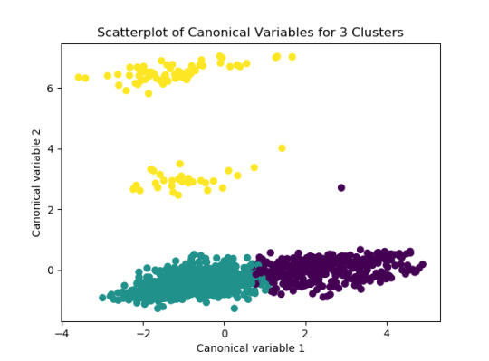
We can see that most observations lie on a continuous group along the horizontal axis, and the k-means algorithm has divided this subset into two clusters with some overlap (the algorithm does not favor elongated clusters). On the other hand, it has grouped together two other subsets, clearly separated in the vertical axis.
To interpret this graphical result, we can look into the meaning of the two canonical variables resulted from the PCA:
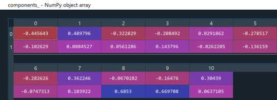
Based on the coefficients of each canonical variable (table rows), we can summarize the meaning like this:
* Variable 0 (horizontal axis) correlates most with the original variables 0, 1 and 7, which represent the vote and approval of president, and the position in the liberal-conservative scale. We can summarize it as an “ideological position” coordinate.
* Variable 1 (vertical axis) correlates most with the original variables 8 and 9, which represent the rating given to Republican and Democratic political parties, so we can summarize it as a “political position” coordinate.
The interpretation would be, then, that the observations are mostly continuous along the ideological axis, but k-means divides the longest group in two halfs which we can interpret as a somewhat arbitrary liberal/conservative division. On the other hand, the political axis clearly divides the observations in three separated groups. We would need to look into the PCA coefficients for the canonical variables and the values of these variables to interpret this division, but it is clear that the two upper groups (yellow cluster) have a smaller number of observations and higher variance, so it may make sense to cluster them together.
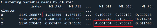
If we look at the variable means by cluster below, we confirm that cluster 2 is defined by strong political party identification, probably one subset for Republicans and another for Democrats, while clusters 0 and 1 are divided by the vote/approval behavior in the Obama election.
Validation with external variable
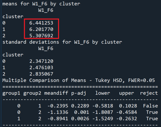
We now perform the OLS regression with the W1_F6 variable, which represents the expectations regarding the “American dream”.
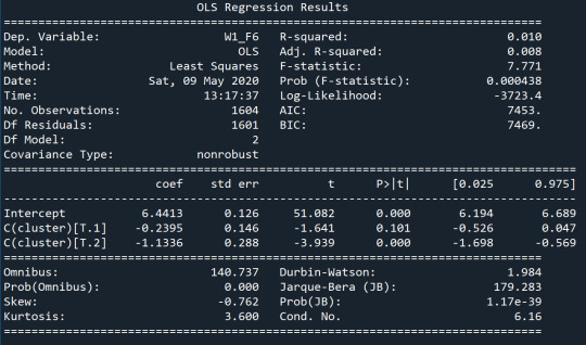
We can see that the average value for this variable is significantly different for cluster 2, which also has a larger standard deviation.
Larger number of clusters
When we select 4 as the number of clusters in the second part of the analysis, we find that it is the largest group which is divided along the “ideological” axis, not the other separated groups, which remain in a single cluster. So, in order to analyze this groups as different clusters we probably would need to use a different cluster analysis method that emphasyzes more continuity/discontinuity than average distance.

The failure of the k-means method to capture the divide in the vertical axis is even more clear with k=5, when the observations between different subsets start overlapping:
0 notes
Photo

Algorithms replace your biases with someone else’s.
By Dan Hirschman, PhD; originally posted at Scatterplot
There has been a lot of great discussion, research, and reporting on the promise and pitfalls of algorithmic decisionmaking in the past few years. As Cathy O’Neil nicely shows in her Weapons of Math Destruction (and associated columns), algorithmic decisionmaking has become increasingly important in domains as diverse as credit, insurance, education, and criminal justice. The algorithms O’Neil studies are characterized by their opacity, their scale, and their capacity to damage.
Much of the public debate has focused on a class of algorithms employed in criminal justice, especially in sentencing and parole decisions. As scholars like Bernard Harcourt and Jonathan Simon have noted, criminal justice has been a testing ground for algorithmic decisionmaking since the early 20th century. But most of these early efforts had limited reach (low scale), and they were often published in scholarly venues (low opacity). Modern algorithms are proprietary, and are increasingly employed to decide the sentences or parole decisions for entire states.
“Code of Silence,” Rebecca Wexler’s new piece in Washington Monthly, explores one such influential algorithm: COMPAS (also the study of an extensive, if contested, ProPublica report). Like O’Neil, Wexler focuses on the problem of opacity. The COMPAS algorithm is owned by a for-profit company, Northpointe, and the details of the algorithm are protected by trade secret law. The problems here are both obvious and massive, as Wexler documents.
Beyond the issue of secrecy, though, one issue struck me in reading Wexler’s account. One of the main justifications for a tool like COMPAS is that it reduces subjectivity in decisionmaking. The problems here are real: we know that decisionmakers at every point in the criminal justice system treat white and black individuals differently, from who gets stopped and frisked to who receives the death penalty. Complex, secretive algorithms like COMPAS are supposed to help solve this problem by turning the process of making consequential decisions into a mechanically objective one – no subjectivity, no bias.
But as Wexler’s reporting shows, some of the variables that COMPAS considers (and apparently considers quite strongly) are just as subjective as the process it was designed to replace. Questions like:
Based on the screener’s observations, is this person a suspected or admitted gang member?
In your neighborhood, have some of your friends or family been crime victims?
How often do you have barely enough money to get by?
Wexler reports on the case of Glenn Rodríguez, a model inmate who was denied parole on the basis of his puzzlingly high COMPAS score:
Glenn Rodríguez had managed to work around this problem and show not only the presence of the error, but also its significance. He had been in prison so long, he later explained to me, that he knew inmates with similar backgrounds who were willing to let him see their COMPAS results. “This one guy, everything was the same except question 19,” he said. “I thought, this one answer is changing everything for me.” Then another inmate with a “yes” for that question was reassessed, and the single input switched to “no.” His final score dropped on a ten-point scale from 8 to 1. This was no red herring.
So what is question 19? The New York State version of COMPAS uses two separate inputs to evaluate prison misconduct. One is the inmate’s official disciplinary record. The other is question 19, which asks the evaluator, “Does this person appear to have notable disciplinary issues?”
Advocates of predictive models for criminal justice use often argue that computer systems can be more objective and transparent than human decisionmakers. But New York’s use of COMPAS for parole decisions shows that the opposite is also possible. An inmate’s disciplinary record can reflect past biases in the prison’s procedures, as when guards single out certain inmates or racial groups for harsh treatment. And question 19 explicitly asks for an evaluator’s opinion. The system can actually end up compounding and obscuring subjectivity.
This story was all too familiar to me from Emily Bosk’s work on similar decisionmaking systems in the child welfare system where case workers must answer similarly subjective questions about parental behaviors and problems in order to produce a seemingly objective score used to make decisions about removing children from home in cases of abuse and neglect. A statistical scoring system that takes subjective inputs (and it’s hard to imagine one that doesn’t) can’t produce a perfectly objective decision. To put it differently: this sort of algorithmic decisionmaking replaces your biases with someone else’s biases.
Dan Hirschman is a professor of sociology at Brown University. He writes for scatterplotand is an editor of the ASA blog Work in Progress. You can follow him on Twitter.
61 notes
·
View notes