#scrollable menu
Explore tagged Tumblr posts
Visit Tumblr Blog
Explore Tumblr blogs with no restrictions, modern design and the best experience.
Last Seen Tumblr Blogs


Fun Fact
China blocked Tumblr because of pornography and censorship problems in 2013.
Text

SimU Online Skill Classes (BGC)

You will find a new option on your Phone and Computer for SimU, the online university where you can take Skill Classes in any subject. You can take a quick 20-40 minute class on your Phone for §5, or a longer class on your Computer for §10 with a bigger Skill boost. Instead of searching through pie menus, you will get a scrollable picker to choose the Skill you'd like your Sim to progress in. If they've maxed any Skills already, they won't appear, and any custom Skills you might own will also be available.
Includes different custom buffs and notifications once your online class is over.


⚠️REQUIRED⚠️ 🌐Lot 51's Core Library 🎮Required DLC: None/Base Game Compatible

Get help, reach out, or explore more of my creations—all in one place!

Download to C:\Users\....\Documents\Electronic Arts\The Sims 4\Mods Don't forget Lot 51's Core Library—script files must be no more than 1 folder deep.
PATREON (FREE)
#ts4cc#ts4 cc#ts4 mod#ts4 custom content#the sims 4 custom content#thesims4cc#ts4 download#ts4#ts4mm#the sims 4#midnitetech gameplay mod
1K notes
·
View notes
Text
Heart Toy major Update
So i updated the Heart toy first the updates to the Heart suite (the part that was in the previous version)
New Features and fixes:
Help Menu Improvements: The Help Menu is now scrollable for better navigation. It includes more extensive and up-to-date information to guide users through the new features and mechanics.
Total Reset Button: Added a Total Reset button to quickly reset all settings and restore the heart to its original state. This clears any modifications from heart rate, irregularities, and medications.
Critical Fail Mechanic: A Critical Fail mechanic has been added to both CPR and Defibrillation. If a dice roll resolves to 1, the heart enters SVT (Supraventricular Tachycardia) or fibrillation, adding a new challenge to these life-saving actions.
Immortality Button: The Immortality button has been introduced. When activated, Immortality disables heart stoppage due to extreme high or low heart rates, This keeps the heart going, even under extreme conditions.
Breath Hold Mechanic: A Breath Hold button has been added as a new mechanic. The heart rate rises by 60 BPM, then lowers by 60 BPM after the maximum hold time of 100 seconds or upon pressing the button again. Irregularity and PVC chance gradually increase by about during the breath hold.
Refined Heart Animations: Heartbeat animations have been refined for better realism. Now, heartbeats closer together will show less contraction, adding a smoother visual flow when observing the heart’s rhythm.
UI Refinements Almost All UI elements are not minimisable with a press of a button making observing the heart mech easier, also the zoom and size reset mecanics are now avaliable on Android in the form of buttons(rotation is still a two fingered touch gesture)
Natural Vital Calming Mechanic: A Natural Vital Calming mechanic has been added. If the heart is in a moderate zone (moderate irregularity, SVT chance, and heart rate), the heart will gradually return to baseline resting rate (60 BPM), while reducing irregularity and SVT chance to 0. Medication administration pauses this mechanic for 30 seconds, preventing natural calming during treatment.

revised pc version download link (download and unzip folder to play)
revised android apk(download onto android phone and install apk)
also now the app is only for adults due to its added parts able to access adult content!
101 notes
·
View notes
Text


NUCLEAR WINTER - $10
Nuclear Winter is a moody blue monotone skin that was previously made specially for and used on a post-apocalyptic Fallout roleplay a few years ago.
There are comments scattered throughout the stylesheet and written HTML to help you navigate what to edit (if you wish to use it as is) and what not to edit it.
This skin comes with:
- A pre-installed UserWay accessibility menu. - A collapsible sidebar that's easy to read and navigate with a pop-out login box. - A removable news section with a scrollable news ticker, wanted ad listings in the form of icons, and staff icons. Beneath these three columns is the navigation bar. - Trigger warning fields that, when filled out, precede a post to warn users of potentially triggering material within. - A main profile flush with customizable fields to help fit whatever genre of site you decide to use this skin on. This profile has a header, with places for a character name and face claim, links to noteworthy information, the forum avatar listed on the side, an OOC section, and an awards section that scrolls vertically upon overflow. - An isotope members row that allows you to sort by member names. Custom fields that can be found on this skin and modified accordingly are: age, gender, pronouns, residence, morality, height, faction, occupation, species, OOC alias, OOC age, OOC pronouns, OOC timezone, maturity/content rating, and OOC trigger warnings.
Graphics for this skin that will be auto-resized are: a 350x700px header image of character, a 350x200px avatar image, a 200x200px gif icon, and a 110x50px gif icon for the mini profile.
For the optional news banner on the index: 50x50px wanted ad icons and 40x40px staff icons.
#jcink#jcink rp#jcink roleplay#jcink skin#jcink codes#jcink code#jcink coder#jcink skins#jcink skin for sale
33 notes
·
View notes
Text

What if Minecraft had Ender Chest variants you could trim with ore the same way you do armor, but each one was its OWN unique Ender Chest inventory per color, per player! Then hypothetically there is a final, specifically, special rainbow one that is (Wither) Star Trimmed, that opens to a big scrollable menu of not just one, BUT ALL the other different colors unique Ender Chest inventories AT ONCE.
Imagine, if you had the 1 OG vanilla Ender Chest, plus a new colored variant with its own unique inventory per each currently available trimming material in the game, plus 1 for a pink variant using Dragon's breath and plus another special rainbow variant that would be 12 different Ender Chest Inventories, plus 1 that accesses them all. Think of it like subject folders in school, but your rainbow folder can pull things out of either your green science folder, *or* your yellow math folder. It would reallllly funny because you basically could get the ability to carry 8748 stacks of 64 or 559872 single Blocks in just 1 chest with the Star Trimmed Ender Chest being able to access ALL your other ender chests if it could work that way.
So like this one update, it would fix minecraft's currently broken inventory management and you could actually have a bunch of space on the player to organize a whole lotta varieties of different blocks and items, without having to waste hours running around organizing chest, and sorting your inventory. That would also be a dream come true for a builder like me who uses a LOT of different varieties of blocks/items for giant sized mega builds, and it would be cool as heck to be able to gather a plethora of resources of a giant build without ever worrying about running out of space. Also I think the expensive cost with needing an upgrade template plus the needed trimming materials, would make the trimmed Ender Chests balanced.
Anyways just a thought.
#minecraft#minecraft memes#minecraft mods#minecraft mention#mineblr#minecraft photoshop#Minecraft sprites#minecraft art#minecraft update#minecraft ideas#minecraft live#armor trims#ender Chest#update ideas#Minecraft update ideas#mod idea#mineblogging
63 notes
·
View notes
Text
Not sure where to ask this, so im posting here as well as some forums BUT:
Basically I really love using Figma for making interactive menus. I have used Figma for mocking up websites and mobile apps before at my job, and in my odd time I’ve taken to using figma to prototype and make sketches of things like UI and flowcharts for the game my friends and I are developing. And even more recently I prototyped a fully custom, nice-looking, interactive character sheet for my character in the current campaign im playing.
Now, It’s got me thinking: I would really, really love to build custom character sheets for people as a side job as its something i genuinely enjoy doing. But the problem is, figma will not exist forever and I have foreseen that it might be a pain to build someone a prototype and I am the sole person to make updates whenever their character levels, they get new gear etc and I don’t really like the idea of forcing people to make an account for a tool they wont want to learn or use outside of the prototype i send them. Additionally, Figma prototype is ultimately not ideal for more distinguished and specific character sheets as I’d like for it to be.
For example, I would love to make buttons that a user can tap to mark how many death saves they have succeeded or failed, I want the user to be able to mark for inspiration and conditions, etc. I know I could possibly feasibly make it work all inside one scrollable frame, but the way I prefer to set up the character sheets requires navigating to different frames with buttons.
What other good alternatives are there? I like to make these character sheets for mobile use (phones and tablets) so should I jump to app development? I don’t mind learning new or more complicated softwares, just as long as the software is free, there’s a free trial long enough for me to learn the gist of the software, a single larger purchase for a license for a good amount of features, or the cost for subscription is low. Is Godot a good software to use for this? My team is learning godot anyway for our game as we were discouraged from Unreal Engine.
#data diary#figma#dnd#character sheets#i dont really know what else to tag with this lol#tech help#software development#godot#mobile apps#app development
20 notes
·
View notes
Text

yooo!
All you gotta do is click on the text you wanna make scrollable
scroll threw the menu bar thing till you find “scrollable” and click what ever options you’d like enabled!


3 notes
·
View notes
Text
thinking of what I'd want out of an ideal browser and it's kind of all things like
a reliable tab sleep mode where a tab halts all activity, scripting, and updates until awoken
background tabs are put in sleep mode on default and only wake up when brought to the front
ability to set tab activity state both manually and based on site address etc
ability to mass-sleep active tabs through simple context menu
tab groups/tab islands
built in DNS/hosts blacklisting and whitelisting within the browser itself
all the necessary hooks and overrides and etc that stuff like ublock origin requires
no browser feature inherent to the browser itself should require the user to create and maintain a login account; things like tab/bookmark sharing should be able to solve in other ways like direct network or etc - no cloud shite
a kind of "temporary" tab/bookmark repository with a folder structure to let users sleep/save/etc a tab/address to via simple right click or similar
ability to unload a tab while still keeping it open, freeing up its memory and resources but requiring it to be reloaded later to be viewed
UI option to put tabs into a scrollable vertical list rather than as tabs?
basically I'd like a browser that gives the user much more control over the resource management side of things - by default tabs should only be a significant drain on resources when actively in use, and in all other cases they should have any active processes put to sleep unless explicitly permitted by the user. a background tab should never be allowed to play sound or music or do other activity without user permission, videos should not auto-play, sounds should not auto-play, etc
my thinking is that since websites just can't help themselves becoming "apps" rather than discrete websites, an ideal web browser for today would need to be just as much a task manager as a browser, able to track, list, sleep, and kill site processes as necessary and based on user input. If the websites insist on being apps, then the Web browser needs to be a lightweight operative system, with the user in control of its operation.
14 notes
·
View notes
Text
it took me an embarrassingly long amount of time to realise the player match menu was scrollable, and that there were battles i actually stood a chance at winning further down 🙃
#i kept looking at it like.... why are you only offering me options that hopelessly outrank me#tbh on my device it really is not..... obvious#im on a roll now tho#nyxtalks#magia exedra
2 notes
·
View notes
Text
Mmm so i tried to play some of that Wuthering/*/*/Waves game that came out today
Bc its a Genshin-like and hey its sort of the time of the Genshin update where not much is going on. Why not try it out?
Especially as my pathway into Genshin was "haha, lets see how bad this Chinese BOTW-like is" to "... oh no i'm actually having a LOT of fun"
And... boy i dont think i've ever played a game thats so shamelessly a rip-off of another one, and fails to carve even one iota of its own identity.....
Look, i'll admit. My play time is probably less than 3 hours. Mostly just trying to follow the main story. Until i unlocked the gacha, and tried to run around and see what the open world had to offer for a bit.
And its.... its Genshin. Its Genshin with a slightly more sci-fi skin, made by a company that isn't quite to the same standard of quality.
The combat is different, and i WILL give it the fact that its got good punch. Long term, I can see this being more interesting than Genshin's (Which i admit is a little button spammy and not very strategic anymore - especially as i ignore Spiral Abyss)
..... But its about the only system that i felt had the right level of polish? Jumping felt wrong, climbing felt wrong. I tried to do the fast climbing up a wall and the main character just went into the sprint animation. The subtitles dont scroll down when youre not in a proper "cutscene", and it doesnt seem to be scrollable, so you miss entire sentences. I dont know if you can change the dub language, since I just want to play my games in English, but if you did change your language... thats.... not great? Theres also weird pacing issues with the voice acting, where it seems like they didn't quite give the English voice lines enough time to be said, pause for breathing, and move onto the next line. It feels unnatural. Plus - some of the translation is a little odd? You get a dialogue option like "What happens when someone Overclocks" and the response from the character is "Overclocking is *thing*". Like... the option was "what happens when you do this thing?", not "what is thing (You just explained 2 seconds ago)?"
UI wise, it all felt overly familiar. Everything is in exactly. the. same. place. The pause menu is a little different, but not a huge amount. Many character systems are the same.
Overworld, the bit i explored seemed a little... empty? There wasnt really a lot i could see to do. I found a mechanic that is basically seeles..... I found a domain that had the same kind of UI going on. I found a puzzle that isnt directly ripped from Genshin.... because its the magnesis/ Ultrahand Korok block puzzles from BOTW/ TOTK....
Theres nothing i played that felt unique to this game? Maybe the echo system, which I probably havent played with enough, but i dont think that alone is enough of a draw on its own? It feels like it needs something more significant to really set it apart and let it be its Own Game.
But truly the worst sin - they gave the main character the title of "Rover". Which sure feels like "Traveller", but not. Except.... they dont put an article before "Rover". And the translators really really should have. Because Rover.... is a stereotypical dog name. "The Rover" would sound a looooooot better.
The thing is tho, i bet none of this would bother you if you never played Genshin? A game which, honestly, I do not recommend you picking up if you havent played it yet. Because youre looking at 100+ hours of cutscene just to catch up. This... might actually be a good option if you want to try that kind of game, but are daunted by the amount of content in Genshin? It needs a bit more polish but I dont think its bad. Just obviously a little lower budget, or the team isnt quite as experienced. But i cant play this game and not go ".... this isnt as good as the game that its clearly trying so hard to be???" And maybe if Genshin was a typical story-based game that just released in one go, and i'd finished it, i'd be more forgiving? Like an "oh boy, two cakes!" kind of situation? But side by side... and I can't help but compare and find this new game lacking.
#i always feel really weird posting long ass posts about viddy james like this but i wanna get my thoughts out#i keep meaning to do more of this over the years but never do#so here - have some thoughts on the latest free to play animoo gacha people are talking about#btw if youre enjoying the game thats awesome - go have fun and forget about my opinions
3 notes
·
View notes
Text
I need to redo my stylesheet but after I updated my "professional" site i wanted to try and see if I could use R to update my neocities lol (with old css + no css_
I think being able to easily make tabbed menus is my favorite part. no more SCROLLABLE SECTIONS! WHICH I THINK ARE UGLY! I have no nostalgia for them
2 notes
·
View notes
Text
You've heard of [Speaking Spanish]?
Well, HiDive has two different Apps (with different menu set-ups) and one of the versions (but not the other i checked) had English subtitles on a series where there was an uncommon but still quite recognizable English word that they bracketed with I thin [inaudible] but it's been a while. It was Lycanthrope.
Anyway, if you want your accessibility on HiDive, make sure the side menus exist and let you select "Dubs" as it's own scrollable menu. You don't need to use it, just make sure it exists.
I, a hearing person who likes subtitles just as a preference, shouldn't have to read a subtitle that's obvious nonsense, go back a couple seconds, and listen again in order to figure out what's going on. An accessibility feature should not be the most half-assed part of a professionally made production. Scripted media has absolutely no excuse for not having subtitles or having subtitles that aren't perfectly verbatim. Professional captioning services should be ashamed of the shoddy work that they put out. Captions should be treated as a part of the production, just like filming, editing, audio balancing, etc - and anything that releases with missing or bad captions should be seen as unfinished
91K notes
·
View notes
Text
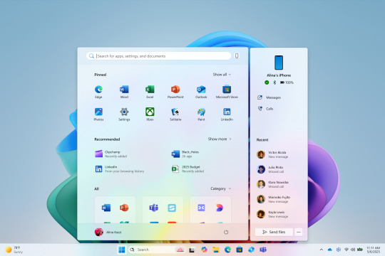
Latest Windows 11 Insider Preview Lets You Try a New Start Menu With Scrollable Interface, More Features
Microsoft recently made some changes to the Start Menu on Windows. Users can now try out the new Start Menu officially for the first time, following the latest Windows 11 Insider Preview Build release to the Dev Channel on Monday. It introduces a scrollable interface in the Start Menu, new viewing options, and adaptability to different screen sizes. There are new view options and expanded…
0 notes
Text
New Windows 11 Start Menu: Features and Customization
Microsoft Unveils New Start Menu for Windows 11 Testers Microsoft has rolled out a new Start menu for Windows 11 testers. They can experience a revamped interface with enhanced features. The updated Start menu boasts a scrollable design, new views, and increased customizability. Key Features: Scrollable Start Menu: All apps are now displayed at the top level. This change eliminates the need to…
0 notes
Text
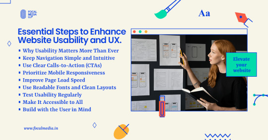
How to Make Your Website Easy to Use

Introduction: Why Usability Matters More Than Ever
In a digital-first world, a website is often your brand’s first impression. But a beautiful site is useless if visitors can’t navigate it easily. Website usability, the ease with which users can interact with your site, directly impacts engagement, conversions, and customer satisfaction. A user-friendly website isn’t just good design; it’s smart business.
Keep Navigation Simple and Intuitive
Clear Menus and Logical Structure
Visitors should find what they’re looking for within a few clicks. A cluttered or confusing menu can cause users to leave quickly.
Best practices:
Use a clear, consistent top navigation bar
Group similar pages together logically
Include a search bar for quick access
Avoid Deep Navigation Trees
Too many nested pages can frustrate users. Stick to a simple hierarchy that lets users know exactly where they are and how to get back.
Use Clear Calls-to-Action (CTAs)
Guide Users Purposefully
A strong CTA tells users what action to take next, whether that’s signing up, buying a product, or contacting you.
Tips for better CTAs:
Use action-oriented language like “Get Started” or “Download Now.”
Place CTAs above the fold and at the end of the content
Make buttons bold, colorful, and easy to tap
Prioritize Mobile Responsiveness
Design for All Devices
With mobile traffic dominating the web, your site must function just as well on a phone as it does on a desktop.
Mobile-friendly essentials:
Use responsive design frameworks
Ensure buttons are finger-friendly
Keep content concise and scrollable
Improve Page Load Speed
Faster Sites = Happier Users
Slow-loading pages can quickly lose user interest. A fast website helps retain visitors and improve SEO.
Quick fixes to boost speed:
Compress images without losing quality
Use browser caching and a content delivery network (CDN)
Minimize JavaScript and CSS bloat
Use Readable Fonts and Clean Layouts
Make Content Easy to Digest
If your text is too small or your layout is too busy, users will leave quickly. Focus on clean design and readability.
Readability tips:
Choose legible fonts (sans-serif works well)
Keep paragraph lengths short
Use white space to avoid visual clutter
Test Usability Regularly
Know How Users Interact
What you think is user-friendly might not be in reality. Usability testing ensures that your site works the way users expect it to.
How to test usability:
Use tools like Hotjar or Google Analytics for behavior tracking
Run A/B tests to see what works
Collect user feedback through surveys or session recordings
Make It Accessible to All
Inclusive Design Helps Everyone
Your site should be usable by people with disabilities. Accessibility isn’t optional, it’s part of great UX.
Accessibility essentials:
Add alt text to images
Use high-contrast color schemes
Enable keyboard navigation and screen reader support
Conclusion: Build with the User in Mind
Creating a user-friendly website isn’t a one-time task; it’s an ongoing commitment. By focusing on intuitive design, mobile responsiveness, fast performance, and accessibility, you create a website that delights visitors and drives results.
Need help improving your site’s usability? Focal Media can help you design seamless digital experiences that users and search engines love.
0 notes
Text
You can now try Microsoft’s new Start menu for Windows 11
Microsoft is now allowing Windows 11 testers to try out a new, larger Start menu that includes a scrollable interface, new views, and more customizability. An early version of the new Start menu first started showing up in Windows 11 builds in April, followed by Microsoft’s official announcement in May. Today’s Dev Channel release lets you try it out officially for the first time. “We’re making…
View On WordPress
0 notes
Text
Use Quality Source To Gain Information About Axiom
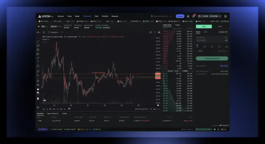
Axiom Trade is an intuitive trading platform, designed for advanced and novice traders alike, providing valuable insight and info that allows newcomers to navigate across the digital landscape with ease while positioning more experienced traders with the best chance of earning maximum profits. Also, Axiom Trade features a demo trading feature so that users have the opportunity to try trading with no risk. financial risk!
User interface design is user-friendly It eliminates complex menus and adjustments that could lead to the occurrence of mistakes. The shorter time-to-market reduces risk and frees users for making smart decision-making in trading which is essential to be successful in high-intensity online trading environments.
One of the major improvements includes an unlimited scrollable token transaction history. It frees customers from the limitation of pagination and making it easier to spot patterns and recognize opportunities. In addition, the UI has been upgraded with more informational icons as well as streamlined so that it is easier to focus on the main features that the system offers. Furthermore, our team has put in place a lucrative referral program that offers members rewards for bringing new members to the platform while maintaining constant activity levels.
Axiom offers a free, quick decentralized exchange that is powered by blockchain technology. The platform gives users advantages in markets that are volatile. It has a Turbo Prefire feature ensuring orders are completed quickly - typically within a single transaction - which beats out other DEXs which charge as high as 1.1% for trading charges along with transaction fees that are not charged simultaneously. Also, the minimum deposit is small, but there are no cost for transactions!
Users of axiom trade platform have the ability to withdraw and deposit funds in a wide range of cryptocurrency options, such as SOL - - its native token - as well as multi-currency payments as well as secure wallets to prevent an unauthorized entry. Security is the most important priority, so the team has deployed advanced encryption technologies so that users are protected from threats to their cyber security.
Axiom allows its traders to access various educational materials and tools to help improve performance. Their blog includes articles on the latest market research, technical analysis and strategies for trading; and the axiom trade team frequently updates their website with content that is fresh to keep ahead of the market.
Axiom trade provides an extensive array of investment options designed to fit the specific requirements of investors These strategies have been tried and proven to yield long-term returns. While past performance might provide some direction for future outcomes, investors must exercise their own due care prior to making a decision to invest.
vimeo
The axiom trade team has been busy developing various new features designed to improve the user's experience while using their platform. They have also revamped the scanning component to make an easier task of locating opportunities for all. The search and filtering functions been updated, but also the scanning module has been optimised to provide the highest performance. It is now possible to search tokens by name and look up pending transactions on a larger column in addition to scrolling. Scrolling is available in infinite scrolling without constraints on pagination which limit the ability to scroll. Filtering options allow traders to recognize trends and possibilities and opportunities with ease. This allows traders to find new possibilities or opportunities for investing. Customers can now share pairings with their peers by only clicking on them. It makes it easy to add a referral code. It will also give them a fee kickback every the time a friend trades, the reward of loyal customers and growing our platform! It's a fantastic way of rewarding loyal users whilst growing the overall platform!
0 notes