#shoutout to Canva
Text
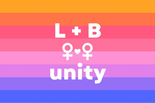
sticker design :)
i chose the sunset flag bc it’s the most widely-recognizable (and it looks pretty in a gradient)
438 notes
·
View notes
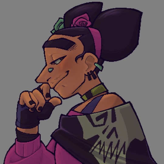
Text
a collection of bad ghoul posters vol. I


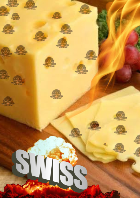

#ellie gets crafty#shoutout to Canva#ghost#ghost the band#the band ghost#nameless ghouls#sodo ghoul#swiss ghoul#rain ghoul
59 notes
·
View notes
Text

Hermitopia - the first drawing i made for @hotguycalendar's Views of Hermitcraft calendar!
and also a bit of a farewell to season 9, since this is still one of my favorite builds of the season (even if its not technically on the server lol) <3
#shoutout to my laptop for managing to run the empires world download & this canvas (over double the size of my usual ones) at the same time#im so proud of her#hermitcraft#empires smp#hermitopia#my art
1K notes
·
View notes
Text
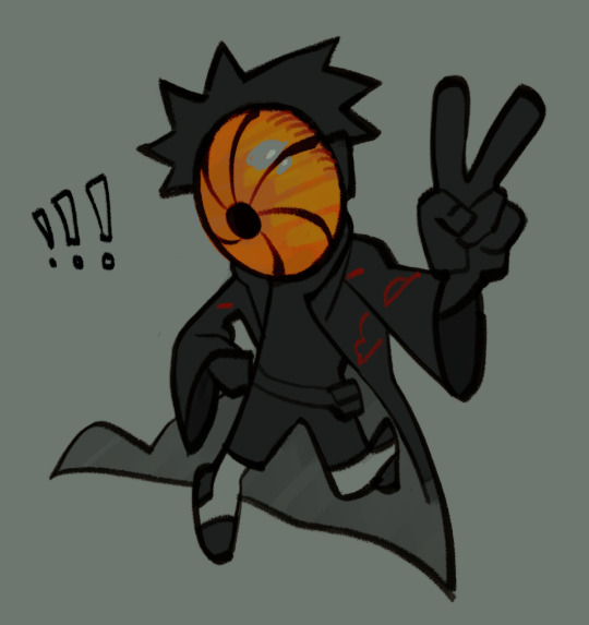
i need to put this thing in a bug jar
#my art#(its colored so close enough)#naruto#uchiha obito#i drew this in like a hundredth of the canvas a couple months ago X) blew it up n colored it today#shoutout to the several people i have subjected to me ranting about this man you guys r real ones
197 notes
·
View notes
Text
my literature class is incredibly tiny (there’s only seven people. the professor spent like all of winter break thinking it would be canceled), so what i’m trying to insinuate is: i hope we don’t turn into a tiny pretentious cult and push one of our friends off a cliff during a accidentally snowy day
#the secret history#meg’s incoherent thoughts#this is such a dumb post but it’s funny TO ME#shoutout to the dude in my comp 2 class who accidentally attended the whole lit class#because it’s in the same room with the same professor and i’m sitting in the same seat and he sits behind me LMAO#and we skipped a day due to the holiday and he forgot#you are an icon for attending the whole class thinking you just missed an assignment in canvas
84 notes
·
View notes
Text

#lol#took me a month to finish this and then 4 to post it#apollo justice#ace attorney#aa4#phoenix wright beanix mode#klavier gavin#trucy wright#vera misham#ema skye#kristoph gavin (clumsily implied)#thalassa gramarye#zack also#i loved making this#shoutout to my besties for assisting me in not getting completely lost in small corners of the canvas
2K notes
·
View notes
Text
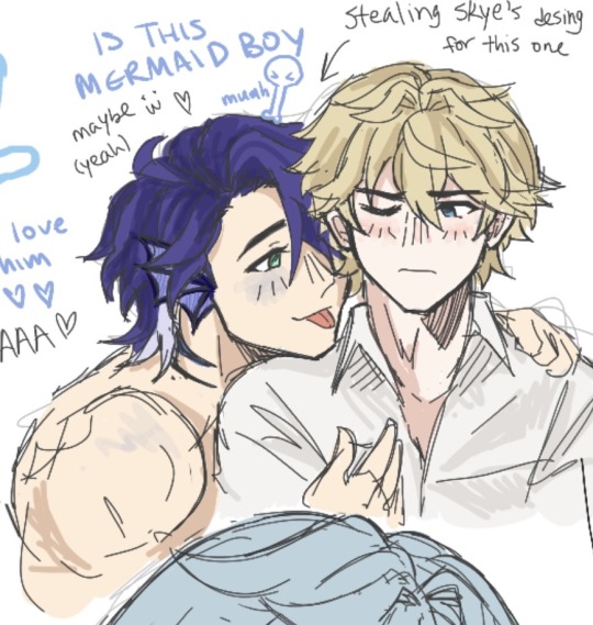
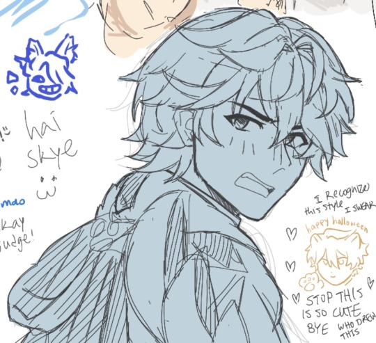
today’s aggie.io 😇
#shoutout to tumblr mutual skye loved ur part of the canvas 🤗🤗🤗#sampard#gepo#sampo koski#gepard landau#honkai star rail#hsr#sampo x gepard#gepard x sampo#mermaid sampo
143 notes
·
View notes
Text

"he's not really dead, he is over here. follow me"
original image + closeups


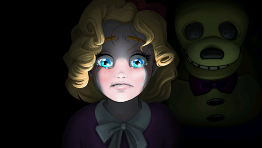
#FNAF PIZZERIA SIMULATOR FANS RISE UP#the quality has been wrecked rip#aannndddd i accidentally made the canvas too small & couldn't make it bigger rip#apart from all that I REALLY LOVE THIS#fnaf#five nights at freddys#shoutout to susie for pretty much being the only developed MCI kid 💪💪💪💪💥💥💥#pizzeria simulator#fruit mase girl fnaf#susie fnaf#spring bonnie#r7inyz scribbles#fnaf fanart#my art#digital art#lighting experiment ig???? YAY!#this was done in ibispaint ty for not crashing#ibispaint art#i STRUGGLED with her hair sm#i definitely drew it wrong 😭😭😭#but oh well i love this art#redraw#fnaf redraw#fnaf 6#omg hiiiii chica in the background i see you!!!
46 notes
·
View notes
Text
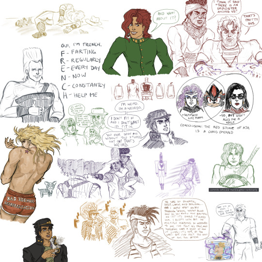
it occurred to me while backing up procreate files last night that aside from Bad Bisexual Representation Booty Shorts Dio, i never posted any of the things from this canvas i had going for sketches while watching part 3 back in 2022, which is a shame, really
#jojo's bizarre adventure#stardust crusaders#jotaro kujo#joseph joestar#kakyoin noriyaki#jean pierre polnareff#muhammad avdol#dio brando#hol horse#n'doul#oingo and boingo#terence t d'arby#alessi jjba#with a special shoutout to lisa lisa kars and shadow the hedgehog#context for the oingo boingo alessi one: i was like ''damn it must suck being an eight year old with severe anxiety in the same cult mansio#as Loser Dude Who Beats Up Children For Fun'' and then thought of that image#context for the terence darby one is that he levitates sometimes and that shits creepy in a hilarious way#also ''commits vehicular manslaughter nonbinarily'' is also just something i said on discord (about yoda actually)#but for some reason kakyoin would often end up being the one driving. and i think he should be allowed to run over some of dio's minions#i think everything else here speaks for itself#OH also the enya and polnareff ''can't stand his fake ass/me and the bestie'' was drawn on this canvas too but on hidden layers#jojo no kimyou na bouken#jojo part 3
39 notes
·
View notes
Text
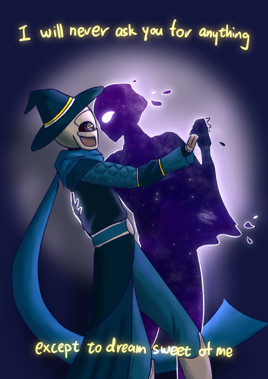
𝘚𝘤𝘢𝘳-𝘤𝘳𝘰𝘴𝘴𝘦𝘥 𝘭𝘰𝘷𝘦𝘳𝘴
#rolling with difficulty#vrla rwd#mrsn rwd#rwd starship#shoutout to fall out boy for writing lyrics that absolutely slap with no context i guess#get it. do you get it. cuz mechanites don't dream (starts sobbing)#something something the least mrsn could ask for is for vrla to remember him fondly and he can't even do that bc all his memories are gone#also yes it's a stylistic choice to draw mrsn as the starry apparition here but it's also absolutely bc the apparition is easier to draw#ITS SO FUN. i just do a white outline with a little gaussian blur then go to town on the starry background#between the astral sea and the mrsn ghost i just keep having to draw that kinda starry background and i have lots of custom brushes for it#and it's just. so much fun. just slapping colours and shinies on the canvas like a small child#the original idea i had in my head was significantly less... close contact but then i looked up couples dancing pose refs on pinterest#and got the fucking gayest reference image ever so here we are#WALAO TUMBLR MOBILE FUCKED UP THE RESOLUTION AGAIN NABEI#art I made
97 notes
·
View notes
Text

redesign credit to @humanisti-c
found this design after clawing my way violently out of a very long art block and the part of my brain that spins her around in my brain like a microwave took over
#tried some new things w blending and etc#love the shawl especially#shoutout to my fiancé who supports my CH Frida brainrot#with his much more extensive irl Frida Kahlo insight#we r shaking hands#ok ! (does a little dance and/or boogy#clone high#clone high frida#ch frida#the tag i post my art under#my dedication to only ever using a square canvas is. ASTOUNDING#goodnight yall <333
102 notes
·
View notes
Text
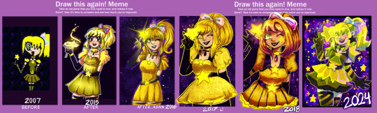
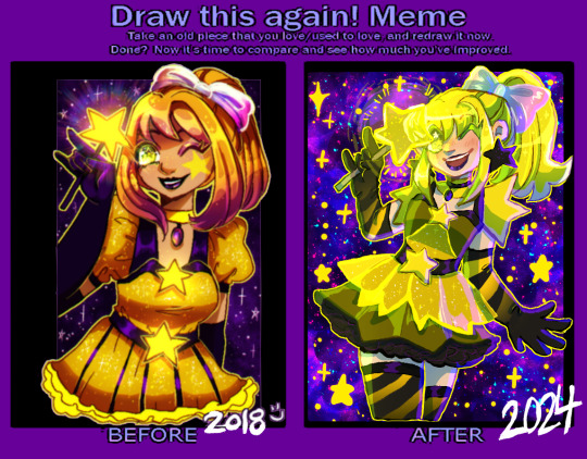
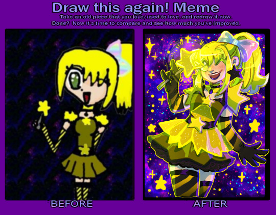
a redraw meme! I'm a little mad at myself for not doing this for a few years (I've done a few other redraws in the meantime, but...it wouldve been cool to have a bunch of years in a row! TwT)
2007 was the earliest made on gimp, a touchpad and NO pressure (obvious with the THICK CHUNKY LINES. im 90% sure I did lineart, colored over them, then lined over them again all on 1 layer...) plus the pattern fills gimp had (the stripes and rainbows, plus the repeating space background that needed a desperate scale-up...)
2015 might be the most obviously tmm inspired style wise ( and I think...this character WAS a tmm oc, actually, so this tracks. her name was star hoshiko (yes. star star.) and she was infused with star power instead of an animal. whatever that means. in my defense I was Ten 👍) and was when I was still using sai!!
2016&17 were me trying to sort of push into semi-realism, the smaller eyes, the more realistic skirt in the '16 version and more realistic hair in the '17 version, and also the first ones done in clip studio which is still my mvp program.
2018 was the furthest from the original, me REALLY pushing orangey yellows for some reason (the darker oranges let the yellow glowy parts stand out more was probably my logic at the time?) it's also funny to see that I went back to a more cartoony/anime style between 2017! the eyes got bigger again, the hair more stylized (esp with the shading/highlighting!) yet the clothes got more detailed....
2024- this time around I wanted to try and capture elements of the original design, since it seemed I was drifting further and further away from it... those very bright lemony yellows that scare me to work with sometimes, the original stripes, that BAD dark yellow for the base of the dress... I know a lot of people will prefer the semi-realism of the earlier years but I feel like the very anime style is more FUN. and I feel a lot more confident in my posing, expressions, and I just. focus more on having fun than making her pretty. that being said I did try to add little details from the previous years designs :3 doing redraws is always so nice to reflect on style and improvement!! I totally recommend doing one if you want to, a blank version is here!
also for funsies, heres how gross the flats look. man i HATE that weird base dress shade T_T u can tell I did shift it to be SLIGHTLY warmer, just a bit....the cool-toned shading pushes it back to the lemony again tho, lol
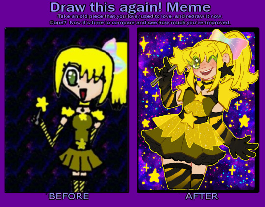
#redraw meme#improvement meme#magical girls#original#hmmm wait a star themed mew with green eyes. ....oh. a beta cara LMAO#i mean this character is not a mew anymore bc i wanted to push her star theming BUT. CMON. thats funny#also huge shoutout to past me for deciding to interprete that chunky lineart around the lips into black lipstick? thats awesome#also no dots on my shading like i do a lot lately aaaa bc the canvas was SO small it looked weird :") next year....#or ill do another redraw. not of this but i have a few other i could do :thinking:#no new stuff only remakes im just like hollywood fr. sorry 😔#also yes art just a day apart insead of queueing it like a smart person might. no patience found
18 notes
·
View notes
Text
new friendlocke violet gijinka post later today and if not then tomorrow

#im like so close to being finished i just need to add a few extra details and to finish up the last description#if i end up posting it waaaay later than intended its not bc i lied i just failed#but yeah thats basically it enjoy this awful image in the meantime#shoutout to the friendlocke discord for inspiring me to make this image now time for me to send it out into the wild where it belongs#Larkicai and Rigstey... be free#nuls nonsense#cherris canvas#not putting this in the main fl tag
21 notes
·
View notes
Text
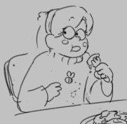
i love watercolour

#what other medium is so forgiving..... nothing thats what.#also other paints stress me tf out because if you put too much on the palette thats it its wasted. but watercolour is kind you can use it#for years after it dries ❤️❤️❤️ and you can go back and remove a lot of the pigment with just water and blotting. very awesome i think#watercolour my one love...#the only thing about it is i wish watercolour paper was as diverse in size as canvas is. it's not hard to find giant and oddly shaped#canvases at surplus stores or whatever (shoutout to my local surplus store for selling a 6ftx4ft canvas for $25 ❤️) but watercolour paper is#just like. slightly different sized rectangles#obviously big watercolour paper exists but it is much harder to come by. and of course much more expensive#i haven't had this problem yet but like if i wanted to make a very large watercolour painting i would have to tape two pieces together lmfao#rambles
10 notes
·
View notes
Text
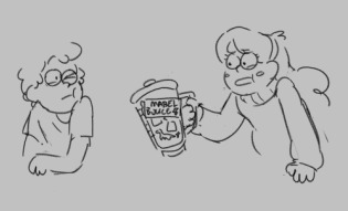
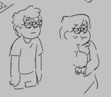
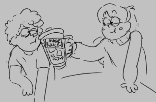
art "bloopers" or scrapped stuff I screenshotted from the timelapse
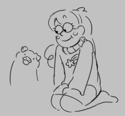
#timelapse of my canvas btw#zzzzzzs so sleepys#shoutout to avi who saw theese first hiii!!! hi if you see this#gravity falls#mabel pines#dipper pines#stanley pines#stan pines#only a little thou#.hbvcb
65 notes
·
View notes
Text
why does having a canva pro subscription make me feel like i could take on the world
#as if i could add ‘edited tumblr theme by myself!’ on a resume#anyways. shoutout canva pro#if ur reading this ooooo you wanna look at my valentines day theme soooo bad#— seb speaks
5 notes
·
View notes
Last Seen Blogs

voidnoh
❛ カオナシ (ap.)

tete-hiromi-blog
手作り石けんTë Të -テッテ-
hcstfcllen
* HEAVENLY / SIN

imtiredbuttrying
Soldier In The Lord’s Youth Battalion
darksouls2yuri
#1 DARK SOULS 2 ENJOYER