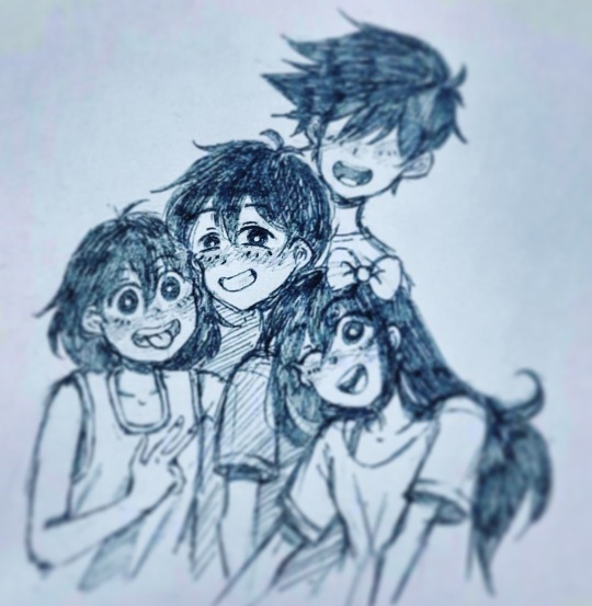
#so I redrew it in my own style!
Text

"I don't like to smile... not even in photos."
#My favourite picture in the omori gallery page#I just love how happy Sunny is here#so I redrew it in my own style!#Love him so much... it's so sad to see him the way he is in game...#also this is actually inspired by an official omori gallery art omocat made but for some reason i can post it here#tumblr is apparently too noob for that#omori fandom#omori#omori fanart#omori sunny#omori aubrey#omori kel#omori basil#my art
434 notes
·
View notes
Text

gatomon !
258 notes
·
View notes
Text


Here's my take on that onneee meme going around

#literally them#'The' is her middle name-she just places it in the front sometimes/j#barbie#barbie 2023#barbie movie#barbie movie meme#dragon's lair#this is so embarrassing#but drawing Dirk from the front was a literal nightmare#I redrew the both of them multiple times#I didn't fully realize that I had my own style of the characters is that embarrassing?#Like I did -but I didn't realize how different the proportions in the face were#when comparing to a ref
16 notes
·
View notes
Text


I absolutely love the Bug-a-Bye and Goodnight album cover.. so after a quick sketch and a wave of inspiration, I redrew it in my own style in one night 😭 I’m tired but it was so worth it!!
847 notes
·
View notes
Note
Hey,
This is my second question/ message here, the first one was massive so apologies for that lol but I hope you get to reply to it someday!
I wanted to show this to you because this page obviously wouldn't be possible without you. As I mentioned I've grown very close of your art in the past month and I couldn't help but dedicate a page to my favorite pieces.
I redrew them on my sketchbook in your style the closest I could (I hope you don't mind). I mentioned in my first ask that I really loved the Amazing Spider-Man redraw with Miles and Gwen so I kinda made it into my own fairytale from your drawing. (I hope you don't mind and btw I never posted this anywhere because I didn't want to upset you in any way because you could've feel like this was just a copy of your drawings)
The drawing with Tarboy was supposed to be Miles as the Starboy album cover but I made it too close to the edge of my Skechbook and I didn't want to alter the shape and size of the letters so It stays like that lol (I think its funny tho btw).
Oh and the "Nah Imma kill myself" was just a meme I saw on Tumblr of Miles famous quote "Nah Imma do my own thing" that I drew in a boring class because I needed a distraction and that came up to my mind.
(btw the Tarboy and Nah Imma kill myself were the first drawings of that page if I didn't finish them already by the time I started sketching yours I would definitely make a whole page with your drawings only)
Ok one last thing the little texts are songs that remind me of Miles and Gwen. They are from my GostFlower playlist.
Ok I realized I wrote way too much but I think I just can't help myself when I'm excited so sorry about that.
Thank you from the bottom of my heart for making me smile with your art they bring me a lot of happiness.
Hope you're doing well and take care!
❤️🌻🕸️
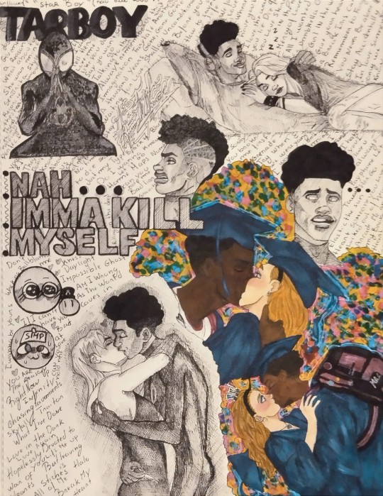
Babe, you have talent, I can see that. You’ve done a wonderful job of recreating what I’ve made and I’m flattered, it’s very heartwarming to see this. There’s so much personality in your art. If my work inspires you to create, that’s what matters. I even see a bit of Miles’ style in your work 😉 (your handwriting is super cool btw). Well done. 🙌
109 notes
·
View notes
Text
Wow, It's been a while, Tumblr
ANYways here's a bit of art :)
I decided to try out @potato-lord-but-not 's picrew! It's really good, and I redrew the picrew into my own style :)))

------------------------------------------------------------

I would SO wear that shirt and those earrings :)
Credits to Potato Lord for the picrew ofc!
201 notes
·
View notes
Note
Hiii, do you have any tips for drafting out embroidery patterns? I've got one in mind, but drafting it out and color picking is so nerve-wracking!!
[Hi!!!! this got kinda really long so I'm gonna crop it under a read more. And I honestly don't have any real training/instruction in fiber arts so this is just how I do things, and probably others do them very differently!]
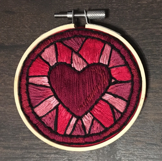
Haha so my fandom embroideries are VERY different from my non-fandom personal pieces in this respect. For non-fandom things i just kind of throw myself in like WAHOO FREEFORM LETS GO and go for a kind of messy colorful approach that ends up as things like this:
Versus my fandom stuff is way more structured and designed to fill space, be very precise, etc. So for those I do go in with a digital mock up of the design I make in photoshop, that I then color in, and then as my last step translate to thread colors.
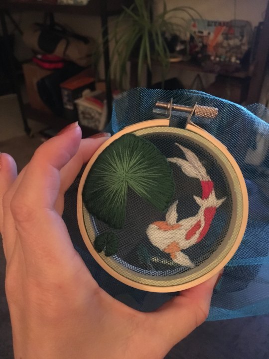
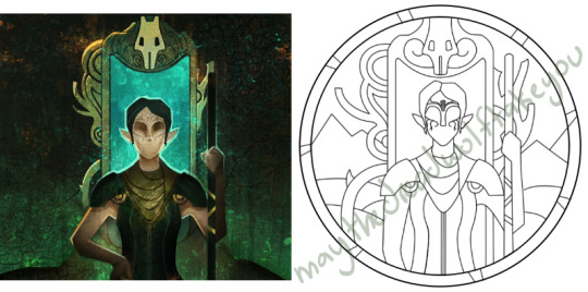
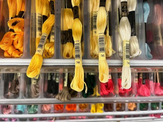
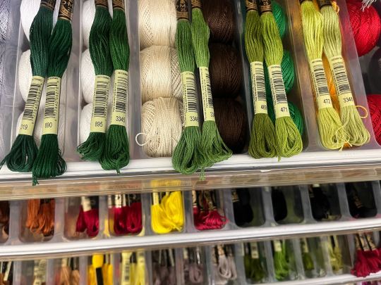
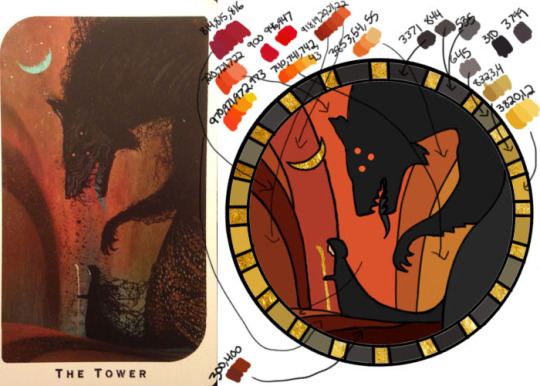
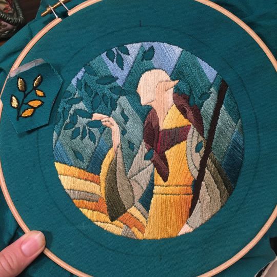
For my Dragon Age series. this has been because I'm specifically trying to mimic the stained-glass style of art you see in parts of the game like the dialogue wheels, some icons, windows, etc. The icons in particular were really easy to copy into embroidery because they already come in handy circles:

This is mostly because I have desperately wanted to pick up stained glass work as a hobby for like 6 years now. As in once every 3-6 months I put everything I'd need to start doing it into an online shopping cart and look at the price total and then sadly close the window because I just don't actually have any space I could do it in (I live in a 2bed apartment so i have no garage or yard or anywhere it wouldn't make everything else a mess or be a hazard). The day after one of those events I impulse bought and completed a floral embroidery kit from the craft store and kinda was like... ok, well, I did this once how hard can it be to use this medium to mimic the hobby I wish I could be doing? Plus, it's only like 60 cents per color! I can afford that! So I took the first design I wanted to do, the romance icon, and basically redrew it sloppily in photoshop, then freehand-copied the design onto fabric and stitched it the next day:

I learned a lot from this piece and changed my approach a little. Here you can see I tried shading in the parallel direction to my thread, which looked messy and added texture, so now I shade horizontally to my thread direction instead.
But it gave me a basic approach for turning the Tarot cards or DA Keep tiles (or any other art!) into embroidery patterns, which I couldn't copy as directly into this really smooth stained-glass style. There's a basic process I follow when doing these conversions that generally follows the same order, which I'll go through below.
STEP 1: SHAPES
The first thing I do is pick the shape of my display frame which is usually a circle, but could be an oval or rectangle too, since I hang the finished pieces on my wall to have nice way to show them off. I like to fill the whole space so knowing the size and shape of what I want the finished project to look like is a good goal for me. Since I am doing fandom pieces I want to be recognizable, I do stick pretty close to the "original" character design/art, but you can absolutely change as much as you want and freehand draw your own interpretation instead. If you're doing original art just substitute the below composition notes with "sketch out roughly what you want it to look like". I personally do my pattern drafting digitally as I find it easier, but you can do this part by hand too.
First, I keep the reference image I'm working off of open next to me while I work, and draw in the shape of my frame (here, a circle). If I'm adding in the little border to be fancy, I add a second inner circle. I keep these as their own top layer so I always know I'm working within the final "frame" and don't spend time designing any section that will fall outside it. Then I will take copies of the reference image and knock the layers down to 25-50% opacity, and start moving them around underneath the 'frame' layer until I like the way their positioning looks as a composition. Sometimes elements of a card I want to include don't all fit in, so I'll chop the section out and add an additional layer to throw in (like the background circle things in the Hermit design below). Or I'll just freehand things like adding much bigger diamonds behind Solas in my Hierophant design because I did NOT want to do 1000 tiny ones. Then once I'm satisfied with the general composition, I'll use the plain ol circular brush tool to trace out the major shapes of each element. I try to keep in mind that I can't go too small, and curvy lines are more difficult to fill in than straight ones. I usually do a rough messy version first, make it mostly transparent, and then a cleaner and more precise one over that.
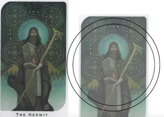


(you can see parts of the rough one on the left and the fully 'cleaned up' on the right for the Hierophant design)
Now: depending on what you are doing next with the pattern, this might be where you stop and start coloring. If you are planning to freehand your design or just trace it onto fabric (or even print it onto fabric here), there's no need to do more than this kind of lineart! However, if you are working digitally and want to create a scalable vector so you can print it at different sizes, you can use the pen tool in photoshop to trace your design and make a "work path" of the lineart. However, another note: THIS PART IS VERY FRUSTRATING AND TEDIOUS BECAUSE THE PEN TOOL WAS CREATED BY THE DEVIL TO TORMENT US. It is so so so easy to accidentally delete a line or even the whole path and not notice later on. Ask me how I know 😭 Anyway I'm not going to include a pen tool tutorial because I don't even know how to use it well and have to google or watch videos every other time I try to use it. But if you can muddle through it gets you some really clean lines that eventually look like this:

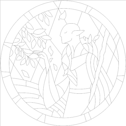
With the work path selected, you can select the brush tool/size/color and use the "stroke path" option to create lineart of the vector. Then you can save this as a transparent png file for use at different sizes and for printing and it looks so nice and clean! one of the big benefits to this is that you get really fine lines that are easier to be precise with stitching on. This is extra perfect if you are printing the design directly onto your fabric (which you can do with an at-home inkjet printer for designs under 8inches wide, as long as you stick a piece of stabilizer on the back of your fabric and cut it down to printer sheet size--this is what I do and can make another post about that process if people want haha), or if you are printing onto transfer paper like you can buy at craft stores.
This is where I end the lineart for my designs. After I have this, I move on to the next phase, which is...
STEP 2: COLOR
For interpreting my designs into thread, I start by thinking of it as flat colors first. You can't "shade" as easily with threads as you can with things like paint or brushes in digital art (though you can A Little, which I will get into), so to start color planning I pick the "main" color each section will be in the piece.

For the existing icons this was simple--I kept the same sections as the original designs, so for each I just color picked or eyeballed the color in photoshop and colored it in (but you could do this on paper with pencils, markers, whatever as well--they don't need to match your threads exactly and usually won't, it's just to give you an easy reference to follow as you go). For the tarot cards which were more complicated in coloration, I just did my best and went with what looked good next to each other, even if it was a little off the original art. It will be off more later anyway when you have to pick threads so don't stress it too much honestly. I will often make layers with different color options and turn them on/off for direct comparison to try to determine what I think looks best as well, like below where I was debating between more blue/desaturated for the background or brighter colors.

I do wanna note I have regrets about the color selection, shapes, or shading in EVERY SINGLE ONE of my finished pieces. But no one else ever comments or probably even notices! One aspect of this hobby is just learning to be satisfied with what you've made and using what you learned to get closer to your preferences next time. I'm only going back and redoing some of my designs' colors because I want to make it easier for others to choose on the patterns I sell, more than I care for just for myself. Also since I'm doing this lineart/stained glass looking approach where I go over the distinct shapes with black thread at the end, it means I get these clear delineations between sections you might not necessarily have in your own pieces, and that's ok.
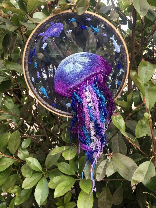
Ok right. Now while shading/coloring in detail is hard with thread, you CAN make whats essentially dithered gradients. "Dithering" in the concept of art means using 2 (or more) colors to give the impression of a third color, or to gently scale between the existing binary rather than a hard line. Think of it like blocky pixel art or gameboy game images. If you're doing needlepainting, you use really small stitches close together to get this effect, which translates to "smaller pixes"--if you look at the jellyfish in my first photos that's a very messy casual version of that. If you want a better example, I recommend looking at @ammocharis 's pieces like these in her pinned post, which are truly amazing! I simply do not have the patience myself 😂 For my stained glass style, I work only in very long straight stitches, so I can only shade in one direction and have to be a little more precise with it.
So for shading, I think about in each section which direction my threads might go. Then perpendicular to that direction I pick which side will be the light one and which the darker one. Sometimes I color this in on my pattern mockup, but sometimes I don't! Or I'll only do it for certain sections to make sure I don't forget. Like for my Tower design I only colored it as flats, and waited until I selected threads to decide how the shading would go. I am currently working on a smaller, simplified version of my Hierophant design and I did add shading digitally for that one just for fun. But it's not as important as having the flat color version you can use to quick-reference how you want your design to go while you're stitching. You might also notice I don't actually color my gold--I just throw in a stock image of gold foil for that layer so I can't confuse it with any of my yellow thread sections.

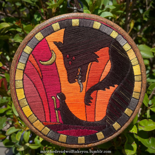

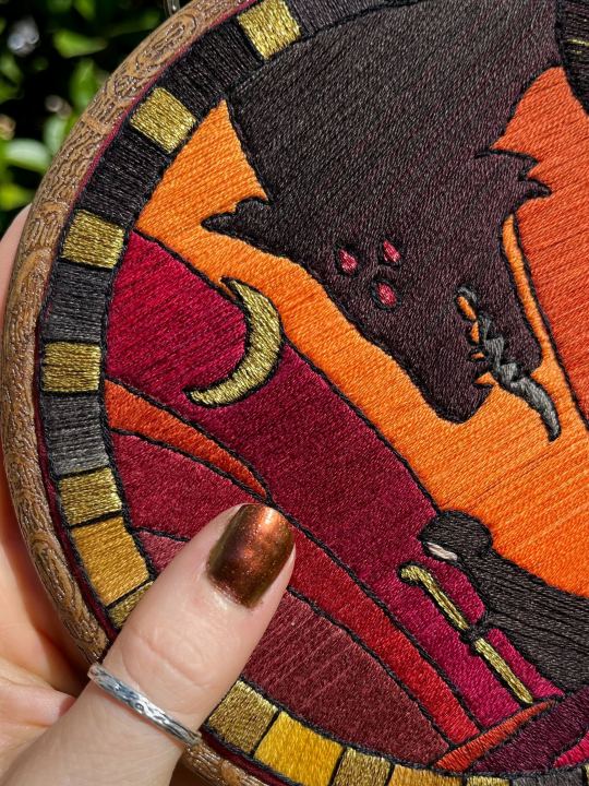
Here's a close up where you can kind of see what I mean by the "dithered" effect between colors--some are more obvious (like the red on the far left or middle orange) and others pretty subtle (dark grey to dark red on the wolf face):
Now, while I use single layers of satin stitches for this, and just alternate thread colors increasing/decreasing as I go, you can accomplish the same thing with short overlapping stitches like with needlepainting, or with clusters of french knots, or whatever else. But in GENERAL you are going to be able to trick people into seeing gradients out of dithering best when you are using the same type of stitch for that whole area. So if I was using multiple stitch types like having french knots, daisy chains, ladder stitching or whatever else for some sections, I would keep those to contrasting areas/colors. A fantastic example of using different layered types of stitching to create more intricate color/texture in an embroidery would be these incredible tarot card depictions by @hattedhedgehog, which I like even better than my own embroideries. Here's his take on the Tower card as well for comparison to mine (I'm so in love with it!!!).
But anyway, at this phase, your design is actually still digital--the above is just to explain how it translates later in the process. The next step is...
STEP 3: THREAD SELECTION
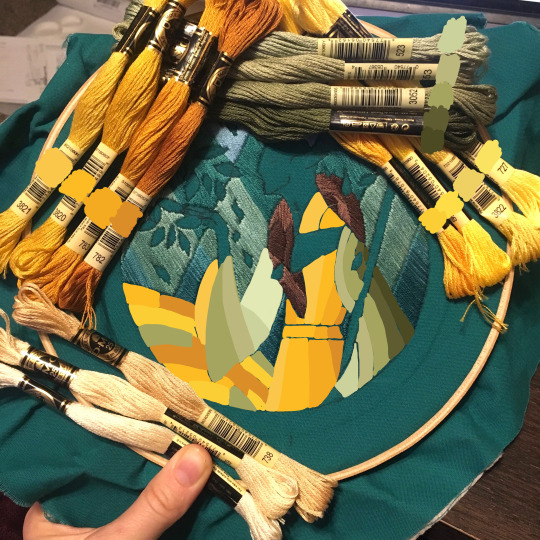
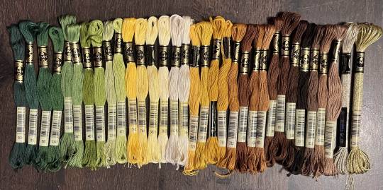
I will admit here I am not great at this part. I am constantly second guessing my thread colors, and can spend over an entire hour in the thread aisle at the craft store agonizing over choices. Really, I think this is just one of those things that takes practice and you get better at it over time. What I have had the best luck with is actually printing out a reference photo of my design/the original artwork and taking it with me. If you already have threads you can do this part at home too, but DMC alone has over 500 colors and I definitely don't even own half that so I like to torture myself by looking at them all together on the thread racks. Plus Anchor and Artiste and whatever other brands there are out there. One approach is to just sit there and pick out what you want for each section and line it all up together on top of your printout. Or in the case of my Tower I laid a bunch of options out on top of my template in the hoop to guess how they'd look in the frame.
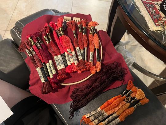
For me since I am also doing this dither shading thing, I also need 2-3 colors per sections depending on its size. Sometimes it's easy and the threads have a color just a little darker or lighter right next to them in the numerical lineup! Other times, there is no good match, or it looks too far away to shade nicely, or I want one to be a warmer or cooler tone than the other... which means a lot of standing and fretting to myself over it. I actually take a lot of photos at this stage because it can be easier to see how they will look in the end from a photo than in person to me? Idk why. Plus then after they get scrambled in my bag I remember wtf order I meant for them to go in later. But as long as you're not preventing other customers from shopping themselves, you can spend as long as you want staring at thread in the embroidery aisle and they won't kick you out unless it's closing time, so take your time.
Now, IN THEORY, you can sort of combine steps 2 and 3 by color-selecting from your threads and using that to color in the design. However I have tried this and it led to mixed success because the photoshop eyedropper brush simply isn't actually that exact (in my experience, it desaturates compared to what we actually see). And because then you have to have the threads on hand while you're coloring... which means you might buy ones you don't end up using if you don't like them. So I prefer to just use this as a refinement step where I pick threads based on the design colors, then will re-color the design a second time to match those threads more closely to be sure I like the effect.
I've even used this as a tool when I needed to adjust my color choices mid-project, by digitally coloring over over my WIP:
Or here's a design (but I haven't posted the finished piece yet bc it's a gift so shhh) I made with certain color tones initially, but after buying thread I re-did the color mockup to be more vibrant, because I liked those threads better in the store:


Once you have your thread, you can make yourself a little reference chart with the colors you intend noted on the sections you want them, like below:
(note: i didn't end up sticking to these colors because I ended up dying my own thread for several sections. And then forgot I made this entirely and picked new ones because I put the project down for a year between design and stitching. Sigh).
Or for my Solas pattern I did this in a really detailed way, which i am sorry but i have redacted because... i have it for sale now and don't wanna just give that away haha. But if you buy the pattern from my shop this is one of the files you'd get with it, for ease of reference. I do also include a text-only list of them as well.

Now I don't go to this much trouble for all my designs, just the ones I put up for sale (or plan to). You can also just make a text list of your color plans if you want. Though for fun I also have been using my scrap thread to make these little "color palette" keyrings for my finished pieces, so if I ever remake them or update their patterns I will know what the original colors were, plus I can compare what i used to other threads if I wanna change part of the design up. This step is absolutely not necessary and I'm just doing it because I'm selling the patterns now, but they are kinda fun to look at.
And don't forget.. if you start a section in a certain color and decide you don't like it, you can just cut the threads and pull them out! I did that with my original hierophant piece actually. I had an entirely different color for one row of diamonds i thought just clashed way too much with the others, so I used photoshop to paint over it with some alternate options until I found one I liked better. Then I cut away all the old threads and put in the new color. It can be a little harder to fill a piece the second time since the fabric will have stretched out a little, but as long as you're using a good stabilizer it usually doesn't move too much.
You can also just make test swatches on spare fabric to test before you add them to your real piece. I wish I'd done this for some color transitions that didn't end up looking the way I wanted, but I am simply too lazy most of the time. My exception is usually for metallic, satin, or sparkly threads, because I want to know how they feel while embroidering. But if you're really worried about a certain color or shade it's a good thing to remember you can just do.
SO yep, that's my general process for drafting patterns. I start with the shapes/design, then do my flat color version, then I pick my threads. Makes it sound easy and short when phrased like that :) But I can honestly spend 8-10 hours just on making the lineart and coloring it in. If I was better at art, probably this would be less, but I'm working with what I've got (not much) 😂 I think all aspects of this are also something that gets easier over time, but it will probably never look as bad as you worry when you start out. I think all my pieces look awkward and rough right up until I do the finishing steps and move them to the display frame sometimes.
I hope this was helpful and answered your questions!! Feel free to post/share your WIPs to ask for feedback or advice ever too :) I've only ever had people in the embroidery community on tumblr be encouraging and helpful to me, and I'm happy to answer any questions myself when I can or if parts of this were confusing
#ramblings#my stuff#my embroidery#embroidery#dragon age embroidery#calicostorms#oh god tumblr changed the alignment of all my images so theyre all huge now great#WELL I keep tryign to rearrage them to be on the same line and it is NOT working so. thats how they will look i geuss#this is gonna annoy me all night... thats what i get for expectign a Functional Website though
27 notes
·
View notes
Note
I NEED MORE TICCIWORK FROM YOU PLSSS 😭😭😭🗣️🗣️

Here ya go! I redrew a very old Ticciwork drawing, I am pretty sure you know WHICH one I am talking about. But of course my own style. And everything.
This is how my Toby and my Natalie look like. My girl Natalie is a Hispanic woman, because almost all these creepy pasta characters are WHITE 😕 they're literally soooo in love. I had fun draw them like this. I also have two other things to draw. Someone asked for Tobys reference, Ill make that soon and someone else asked me something. So I'll so those soon
#creepypasta#ticci toby creepypasta#clockwork creepypasta#toby rogers#ticci toby#ticciwork#clockwork#natalie ouellette
185 notes
·
View notes
Text
A Walk Down my Art Memory Lane!
Now that I’m thinking about my childhood Kirby art, I dug through my storage a bit and thought it’d be fun to share a few! Here are some of Baby Jojo’s drawings!
note: I was not active in any online Kirby art communities at the time and I never posted these anywhere so I made these drawings just for my own enjoyment hehehe.
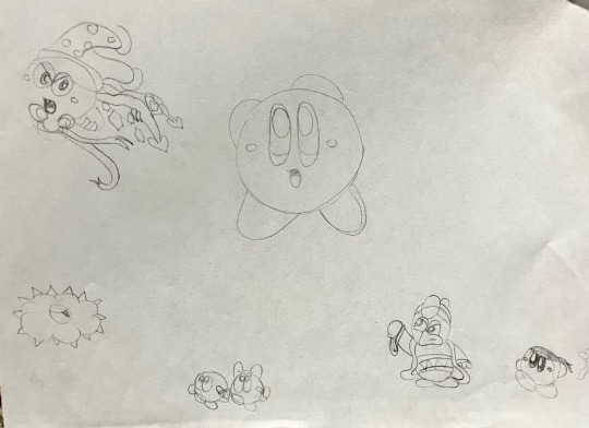

These are probably among my earliest Kirby drawings. Most likely ~2008!! I must’ve been in fifth grade maybe…? The first picture is a very rare example of pre-2022 Dedede sightings in my art. Around 2010 I became embarrassed and frustrated about not being able to figure his shapes out. So I spent the next 12 years avoiding him at all costs and instead sticking to the safer things to draw, like nice round Bronto Burts or Waddle Dees. Who knew it would take me writing an entire comic about him in 2022 to finally learn to draw him in my style!! :P
The second picture speaks for itself lol. I was the girl who googled “maskless meta knight” back when we had no fancy 3D renderings of his face. Just edits of anime screenshots and fanart of him holding his mask/getting his mask stolen and looking at you with the biggest, pearliest, white eyes. JPEG artifacts littered these images like sprinkles on a cupcake. And I would giggle and squee with every one like the baby fangirl of Meta Knight I was. :3
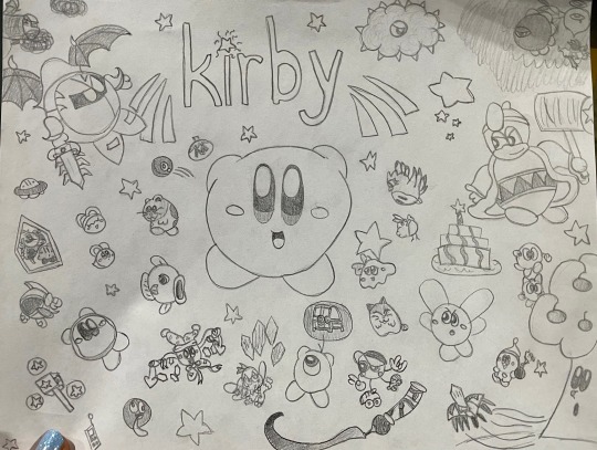
This one was probably ~2009. Very ambitious piece for me at that age. I struggled with the perfect roundness of Kirby haha. I had just gotten these cool alphabet stencils and couldn’t wait to write “Kirby” everywhere with them. This was probably the complete catalogue of Kirby characters I had the ability to draw at that time. It’s funny to think about how Magolor wouldn’t exist for another two years when I drew this.
Hmm. Maybe I should redraw this one day as a fun honor for my younger self.
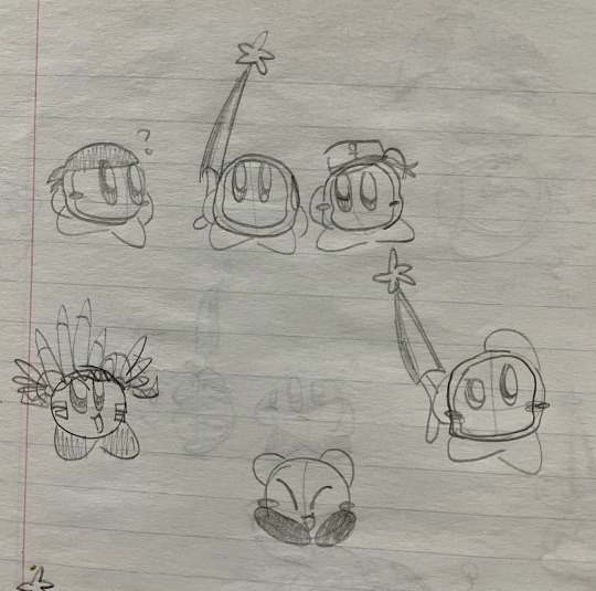
Triple Waddle Dees!! A rare but precious Sailor Dee sighting, and of course my sweet Bandana Dee. This was probably around 2011 after Return to Dreamland came out and I came to adore Bandee. :3

This is probably around 2012- some time after Mass Attack came out. I had this AU at the time where each of the 10 Kirbies from Mass Attack had their own personality trait from the original Kirby, and a permanent copy ability assigned to them. Hence the Spark Kirby having wings and a halo like in the game- where you get damaged and have to rescue the poor Angel Kirbies before you lose that life!
Also my Poppy Bro Jr OC that I don’t think I named at the time- but I redrew him recently and named him Allegro the Poppy Bro. I loved drawing his hair and his funny teeth :D
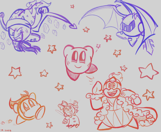
Finally, I redrew just a few of the characters from my old drawings tonight. Just doodling for fun, nothing serious. But it’s something my child self would be happy to know I could do.
Guess I’d better draw all the Dededes that Baby Jojo missed out on drawing!! Thank you to anyone who read to this point. I encourage anyone to draw things that would make their younger, baby self proud of you. ….even though I bet they already are proud of you. <3
Remember, as long as you keep drawing, you’ll improve at your pace! Just keep at it! You’ll notice that difference over the years!
#if this is interesting to anyone I’d love to share more of my childhood art haha it’s fun for me!#I can even show off my very first Kirbysona from like 12 years ago :3#very different than the bubble witch I am today hehe#irl content#jojo rambles#art#king dedede#bandana waddle dee#meta knight#ribbon#marx kirby#Kirby#kirby series#Kirby oc
69 notes
·
View notes
Text
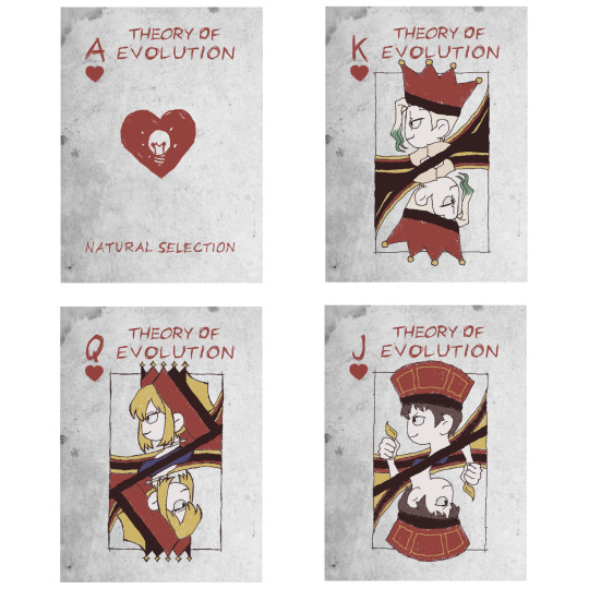
♡ Theory of Heart: Natural Selection ♡
Ace: Lightbulb
King: Senku
Queen: Kohaku
Jack: Chrome
Right now I am working on remaking Gen Carddeck ♡
I have made the Joker Card for my Cosplay by hand, but the use cardtricks, i need properly printed and cut cardboard
I still wanted to have a selfmade/sketchy style, so I redrew everything and added my own spin on the references, designs and characters on the cards ♡
#dcst#dr stone#asagiri gen#gen asagiri#cards#card deck#senku ishigami#dr stone kohaku#dr stone chrome#cosplay prop
82 notes
·
View notes
Text

Giving this picture its own post because I love Malbonte so much.
This is a redraw I’ve done before (like the Luci x MC I posted yesterday), and since done again in my updated style. I did this one a while ago; it’s the first picture I redrew in my new style.
#romance club#rc hs2#heaven’s secret#heaven's secret 2#rc hs#rc fanart#rc malbonte#rc#rc heaven’s secret 2#heaven’s secret 2#Malbonte x MC#Malbonte x Vicky
18 notes
·
View notes
Text
I've been working on the next pages of my comic, Secrets in the Shadows - for those who are new, it started as a fan comic for The Hobbit with my OCs, Sven and Leanna. It will tell everything surrounding their origins and how Bofur and Leanna's relationship flourish.
I've been thinking how I don't really want it to end up as a copy of Tolkien's work as "fan content," but more of an original story of mine. Unfortunately, it's too late for that as all of my previous pages are a little more lore-accurate. (Literally redrew Balin, Fili, and Kili coming inside Bilbo's home.) I've been really enjoying using Tolkien as an inspiration for this adventure and genuinely want to make animated series someday. But I can't really do that with the timeline and events that happen (like I can't just delete Thorin from future encounters...) So I'm sort of meeting in between...??
Secrets in the Shadows is already focusing on Leanna and Sven's emotional and physical journey and ends up crossing paths with Thorin and company at several points. That's how Bofur and Leanna have time interact. I guess the whole point of this post is that everything I post regarding this story is not EXACT or absolutely lore accurate to The Hobbit movies or Middle Earth.
Examples Below:
I will be adding places and landmarks around the land and scatter taverns here and there.
Foliage, Plants, creatures and, monsters will be added that don't exist in middle earth
Not everything said by known canon characters won't be exact and designs won't be as accurate to the movies but in a mix of my own style
Environments are slightly altered, like The Shire, will be a mix of home types, Not all underground and more trees.
I hope this doesn't end up bothering people. Maybe it can be a DLC or alternate universe version of The Hobbit. I don't like to stray from lore too much out of respect but I really enjoy making my own little story with it.
#the hobbit#lord of the rings#tolkien#fan comic#oc#comics#secrets in the shadows#sven lynwood#leanna wetherbee
29 notes
·
View notes
Note
it is so refreshing to see ppl be like normal and regular about other artists taking heavy inspiration 😐 way too many ppl start screaming and crying over it for some reason /gen
i understand why some people might! especially depending on visibility and audience, and level of heavy inspiration.
i know there was a point where ppl thought i was copying a popular artists character and i got so scared solely bc i feared people coming after me.
but i also understand bc I myself have taken heavy inspiration from others before, and also because I myself am not somebody who Sticks (or Stuck bc i dont do heavy focused style inspo stuff anymore, because, surprise! i grew and frankensteined it into my own work after i learned what i like!) with an emulated art style for long
(see: my post where I struggle naming inspirations bc my inspirations arent...extremely, consistently, visibly, immediately influential on my work.)
i like giving ppl the benefit of the doubt for that reason... I now also understand and recommend naming/mentioning the ppl who inspired you when you do so as it immediately sets that level of understanding! (like oh, its a style study/inspiration and not somebody plucking my hard work and planning to cause a scene abt it)
like even recently that person who was copying my art down to the ideas (literally redrew a personal smunker doodle comic about smthng that actually happened to me, as their sona), i decided not to intervene because well, they're young, not harming anyone or screwing me out of anything, there's a chance they learn what they need from my stuff and move on in a few months. that's how you Learn sometimes...i did the same when i was in high school, i grew and moved on art wise... no good would have come out of someone attacking me about it bc its... common !
i do like seeing how ppl are interpreted and inspired by my stuff because im curious, and have enjoyed what ive seen mentioning me directly ^_^ but ill still say the only mistake made in this specific case was getting caught ykwim? "do what you want but dont let me see it" (except i do wanna see it ykwim)
#skunk mail#Anonymous#long post#long ask#i wish it was more commonplace to like#idk. i was gonna say me copying art style in high school is no different than ppl drawing in ghibli or AT style#but it IS different bc its recognizable and easily attributed to the original creators#its not the case with people who arent established#which was my issue with ppl thinking i stole an oc. obviously since i have less followers im Stealing 🙄#but idk! everyones got the capacity to be heavily inspired like that#wish proudly naming each other and peers as inspiration was as normalized as proudly being like oh yeah of coursemy arts inspired by pokemo#i love pokemon. etc. but i do understand the difference being in the lack of recognition#and ppl understandably being really protective of their creations/work for that reason...!#especially in cases where the person taking heavy insp is getting more attention than the original creator...!
37 notes
·
View notes
Text
I was looking through my old drawings for a Mokuba drawing that my brother had asked me to do when I found a drawing of Astral as a demon slayer that I drew when I was first getting into Zexal (because Kimetsu no Yaiba was my hyperfixation at the time), I really hate how that drawing looks now so I redrew it :3

I feel like he'd be a mist breather like Mui, for some reason I feel like that style would fit him, or maybe he'd make his own? Idk I just wanted to draw him like this its not like I'm making an AU (Honestly I might if I get bored enough. Two of my hyperfixations in one? Yes fucking please!)
The Golden Rayed lily in the corner was suggested by @roseycanvas to fill the empty space ^^ (I would have drawn a sword but I couldn't think of a design for it)
10 notes
·
View notes
Note
Got a good question for u :>
Since I find ur artstyle very nostalgic, and as an artist myself (i usually draw traditionally), i was wondering on how ur art journey was like (like how u found ur style, how much u enjoyed other ppl's art + ur art, etc), basically, how would u say ur art journey was like? (u can summarize it into a nutshell if u wanna XD)
The question is indeed interesting.
I've been drawing for as long as I can remember. Both of my parents used to draw, one of them actually graduated from art school. So, this is apparently invested in me, ahahaha.
For me, drawing is almost like a "necessity". I can sit quietly, and at some point the "need" just arises to sCrIbbLe something, u know. This is just a "need" of mine; that's why I wouldn't entirely call myself an artist. But I would certainly call myself a varied creative person??? Like… There's a whole story about this topic, but it will be too long to write about it here.
Therefore, while I was a toddler and then a kid, I redrew a lot. There were a lot of coloring books that I painted, or special magazines on drawing.
I started trying to draw seriously at age ten when I got access to the Internet. I am a passionate Sonic fan, and we have a huge base of fan characters, which I naturally wanted to join back there. So I drew and came up with a lot of characters in Sonic style. Then I saw digital art of fan Sonic characters, and I wanted to do the same. I studied this topic, downloaded the necessary programs, and drew for the first time with a mouse, in addition to my traditional drawings. Then, I wanted a tablet, and my mother saw the point in buying it for me, so she bought it for me. At the beginning, I just drew Sonic fan characters of mine.
Drawing people didn’t work out for me for a very long time, although I tried. I suffered for a long time because of this. Something started to work out only in my teenage years. It somehow came out on its own, and my style formed on its own. I won’t say that there was a certain inspiration from someone.
Actually, I love other people’s drawings more than my own. In general, I have a very negative and contemptuous attitude towards myself, so to speak. I still struggle with this; it’s hard to draw something when you always don’t like what you get, hate yourself, and envy others. I really can’t adequately say whether my drawings are normal or not; I see everything in a bad light. I'm in some unhealthy love-hate relationship with myself and my stuff lol.
Consider me to love anime style, anime style of visual novels (so in love with cg art of visual novels⸝⸝⸝´꒳`⸝⸝⸝), and some cartoons.
By the way, Hazbin style is very convenient for my hand as it is close to my original style. Especially Charlie’s nose; this is how I usually draw all noses in general, so it's really comfortable.
10 notes
·
View notes
Text
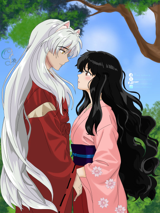
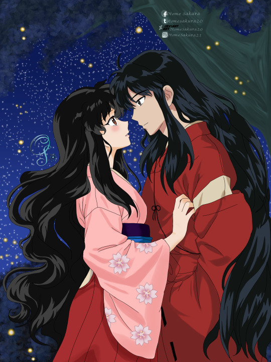

I see the best of me when I’m with you V1 V2
so this comes from a trend/challenge off of Instagram. I’ve seen other artists take generated Ai images and redraw them only to make them look better or give them life since it’s different when an actual person does it to when a computer does it. I’ve done mine and I have to say since I haven’t worked with the style of the images before it was a tad bit hard to replicate but no one can say I didn’t try as I’m still very happy with them. Of course the computer didn’t give me a very good example of Inuyasha and Harumi so I definitely transformed it and they came out my own way. I wasn’t aiming to get them to look 100% but I did things the computer didn’t do. This is the new project series I’m going to work on. 😊 here are the Ai images that I redrew from as well.
#inuyasha#inuyasha oc#inuyashaoc#inuyasha x oc#oc x canon#犬夜叉#oc x character#ai redraw#challenge#trend
13 notes
·
View notes
Last Seen Blogs

constant-state-of-self-discovery
& KNUCKLES

satanslittledream
I can’t be alone because I would kill myself

mihoyogaspace
Miho Yoga Space

babus-bell
BabuBell

kompliziertesleben
is your heart okay?