#study from refs
Explore tagged Tumblr posts
Visit Tumblr Blog
Explore Tumblr blogs with no restrictions, modern design and the best experience.
Last Seen Tumblr Blogs


Fun Fact
Tumblr was created by web developers David Karp and Marco Arment.
Text

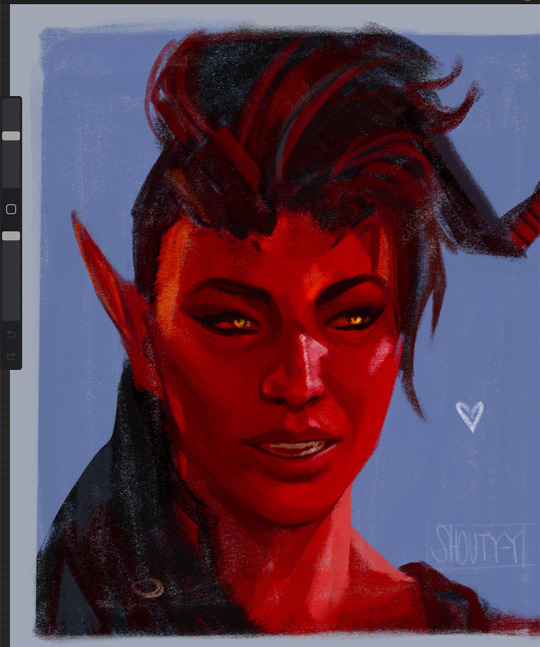
study turned into fanart
#art#artists on tumblr#character art#fanart#digital art#art study#study from refs#arcane caitlyn#caitlyn arcane#arcane league of legends#caitlyn kiramman#back study#digital painting#art practice#figure painting#arcane#arcane art#arcane s2#league of legends caitlyn
28 notes
·
View notes
Text

#this is so beautiful#i love the chinese languages and characters so much#from my understanding this would not be in a modern language that i could possibly read with standard chinese knowledge though#makes me wanna study chinese history and language history so bad ngl#language#art inspo#asia#games#peklo ref#fav
19K notes
·
View notes
Text


Another batch of practice sketches and studies.
#sketches#studies#from photo refs#practice#kooks art#playing with colour a bit more#will see where this will land
1K notes
·
View notes
Text

nooo you can keep my jacket I'm not cold.... never been cold in my life..... fr....

#new brush and shapes study turned griddlehark because of course#save your butch bring your own coat#tlt#gideon the ninth#ntn#griddlehark#gideon nav#gideon the 9th#harrow#harrowhark nonagesimus#harrowhark#harrow the ninth#harrow nonagesimus#harrow the 9th#privodoro#privodoro art#harrowhark the ninth#my art#clip studio paint#digital art#digital illustration#tlt fanart#gtn#locked tomb#tlt art#tlt au#htn#htn fanart#ref from pinterest
912 notes
·
View notes
Text
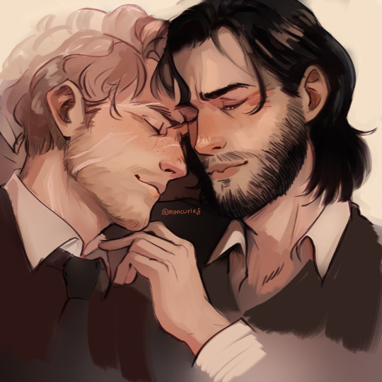
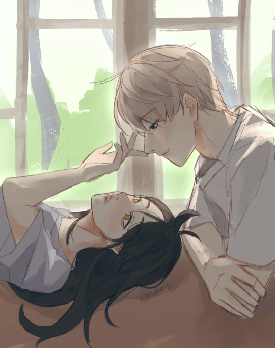
older wolfstar mess
#in my portrait study era ig#small brush from the last kierthur doodle rlly got me and its way less daunting to do close ups#plus and also i can work thru my heap of homoerotic reference pics#ive never rlly gotten to draw them grown and i do love these little guys#little wrinkles#marauders#wolfstar#sirius black#remus lupin#my art#mwpp era#the ref i worked from is of two guys in bed i cant find it anymore but yeah wolfstar in bed domestic
7K notes
·
View notes
Text

He’s being forced to read law books :(
Pose x
#ace attorney#phoenix wright#aa phoenix wright#phoenix wright ace attorney#miles edgeworth#makeing a new series of distressed lawyers from Pinterest ref#another lawyer butt? its more likely than you think#monka mumbles#monka makes art#edit: added ref image link just so that ppl can find and use it. also i just slapped my drawing over the ref cuz backgrounds hard :(#this was just a study that i turned into fanart anyways soooooo
6K notes
·
View notes
Text
#i was doing studies and then ended up painting this using the same pallette#this aint reffed tho LMAO#kidstarion#its funny how twitter has gone from the place to post scrappy things like this to the place to be Professional#astarion#kidstarion au#my art
2K notes
·
View notes
Text
Half-assed studies with my pookie <3
#my art#studies#used the screenshots from @disasteralien as ref#the way I always give up on the horns and hair lmfao </3
3K notes
·
View notes
Text

mad day out!! 🎶☀️
reference image :°D
#churro art#my art#digital art#illustration#fanart#the beatles#paul mccartney#john lennon#george harrison#ringo starr#THERES SO MANY PHOTOS FROM THIS SHOOT BUT THIS ONE is my fav one#i love the poses and the flow so much can you tell i had fun studying this? HEHE#their faces are also a treat bec you have paul looking so elegant john looking like hes having fun#and then george looks so done LMAO 😭 i love u george#also the ref image is in B/W but i colored it using other photos taken in color from the same shoot!#those outfits are just too gorgeous to not color in 😔#paul and ringo's suits are my favs! i mean cmon that yellow and blue combo is incredible!#anyways yes its another destress doodle HAHA#recently at night i just lay in bed with my cat and w a hot mug of chai and just doodle these 4 :P im like an old lady..
476 notes
·
View notes
Text

Some portrait sketches from refs 👀✍️
done on Galaxy Tab S9 if anyone's interested (yes, it is possible to draw using other than iPads!)
#art#sketch#artists on tumblr#pencil sketch#female portrait#portrait#portrait sketch#sketchbook#pencil drawing#sketching#digital art#sketches#art study#art practice#study from refs#my favourite pencil brush#my art
23 notes
·
View notes
Text
boop
397 notes
·
View notes
Text
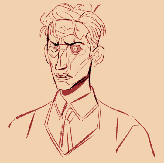
got ya
#thsi one was mostly from memory...had to go look for his specific scars/lines...and the shape of his teeth#a doodley#I LOVEEEEE his teeth#can i be paid to draw old men forever#*SPONGEBOB FLYING ICE CREAM TRUCK* THE GENERAL OLD. MIDDLE AGED ISNT OLD.#i gotta get good sevika refs so i can try drawing her soon#i dont think i can selfship with silco he wouldnt gaf about me and 2 lipless twinks interacting...angel loses wings...JDFKSGDKF#and yet in my mind im sitting on his desk rn...#before studying him i didnt realize he had grey hairs on the side burns....** *** ***** *** *****...*** **** *** ******#yes i gave him david's heart pupil and what about it. husbands collide#arcane#silco
282 notes
·
View notes
Text


did another arthur study for fun
#fellas. i fear getting into rdr2 has made me better at painting realism than being in art school ever did#this was literally supposed to be a quick warm up sketch from a few days ago that turned into a full painting study lol...#i just wanted to really sit down and figure out his features how did i end up with this. idk what possessed me#still dont think im 100% comfy with drawing him accurately without refs yet... someday ill have his face ingrained in my brain mark my word#red dead redemption 2#rdr2#arthur morgan#allyart
111 notes
·
View notes
Text
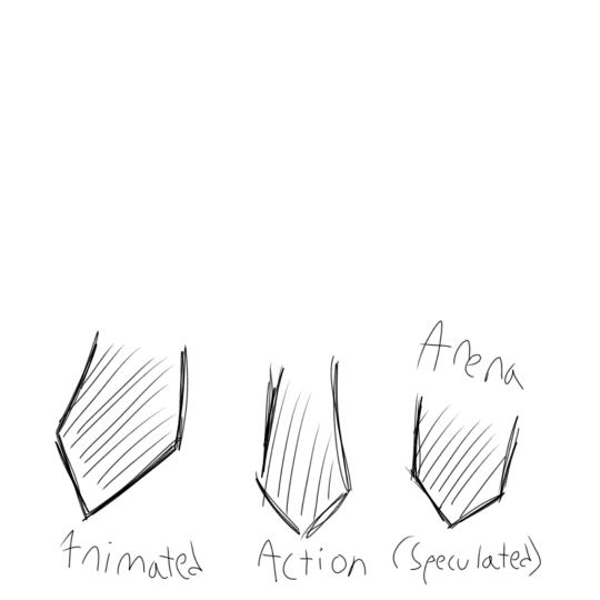
Hookfang: comparison and art study
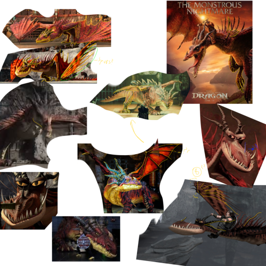
To start simply, one of the more bigger picture differences between these Hookfang's is that of grandeur. The Animated Hookfang has long tendrils, massive wings and very teeth, things that all serve to make Hookfang look scary despite his large, human-like eyes. The Live Arena Spectacular (Arena) doesn't seem to get the memo for this, instead choosing smaller wings in favour of front legs and a four-legged stance rather than being a wyvern. The Live Action (Action) seems to be a blend of both: shorter spikes, no curving spines, more spikes.
This specific set of images, alongside being a reference for the art used here, also displays one other thing: the colour difference between them! The Animated Hookfang has more orange to his design, with a more vibrant red-orange palette compared to the live action which is redder but keeps the orange underbelly despite forgoing the orange face/wings. Again, the Arena Hookfang is the outlier here, with a red pallet and yellow underbelly, as well as lighter horns and spikes.

The biggest difference overall between all these designs is the face. The Animated Hookfang has his unique eye-bulbs, while both the Arena and the Action prefer to simply exaggerate his brows. Both the Action and the Arena designs also add more of a "crown" to the back of his head, making it easier to see where the horns originate from whereas the Animated lets it be slightly ambiguous by hiding the exact spot, no doubt helping mask the fast that Hookfang's horns are flexible (see shows).
Interestingly, both the Arena and the Action as a slope to Hookfang's snout while in the animated, Hookfang's snout starts at a slight dip. Alternatively, both the Animated and Arena keep the small spikes on Hookfang's snout, while the Action smooths them out significantly.
As pointed out, Animated Hookfang is primarily diamond shapes, the Action is made of more curves, and the Arena is a mass of wrinkles. This makes the animated feel a bit more "dangerous" to the others, who use softer shape language. They manage to win the point back by having smaller eyes, though such progress is undone by teeth: Animated Hookfang has long tusks that cannot fit into his mouth, peeking over his snout from the other side. Action Hookfang's teeth has more thorn-like teeth that hide behind lips. This, while technically being more realistic in that teeth exposed usually sustain damage, also significantly reduces the fear factor- thing a saber-tooth tiger compared to other big cats. The Arena Hookfang has a zig zap pattern with his smaller teeth, the fact they remain exposed also beating the live action; as the indoraptor's (Jurassic World) appearance divulges, this is simply more threatening upon first glance than of bare lips.
The Action Hookfang also fails to present a threat when someone knows their reptile biology. A thin jaw is almost always reserved for aquatic hunters which results in a very weak jaw- one of the main reasons Dilophosaurus is debated to be a scavenger or apex predator, but I digress. Though I struggled to find a picture of Arena's jaws, they also seem to be thicker but the Animated trumps both with how Snotlout is able to almost entirely fit inside of them. Even without the biological aspect, the fact that the Animated's jaws are so much larger are enough to give off more a threatening energy.
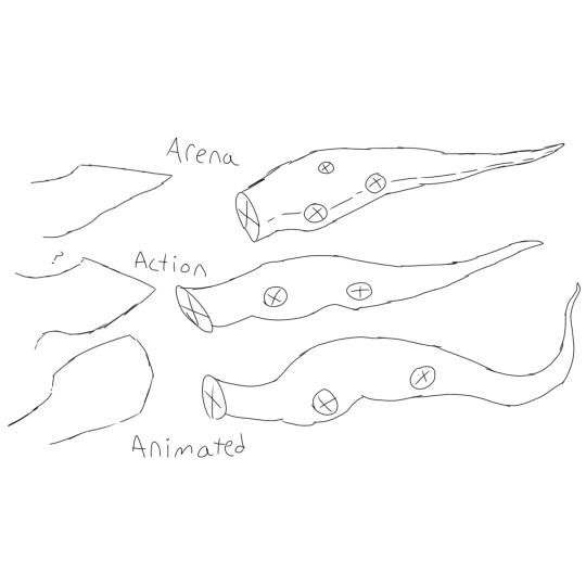
Speaking of shapes, let's take a break from the almost argument happening there in favour of posture! The Arena is the most divergent, how could it not be? It goes for a typical dinosaur stance, with a thick body, neck and tail, much shorter compared to the others.
The Action and the Animated are similar generally, though the Animated Hookfang has his legs further on his body (which is still slightly longer due to his tail), and a thinner neck.
The Arena has it's smaller wings- which have a more traditional shape in perspective of other dragons- between its front and back legs rather than at the shoulder joint. The Action's wings are, again, a blend of both, and the Animated's wings have a shorter primary wing-finger that causes the general shape to arch out before returning.
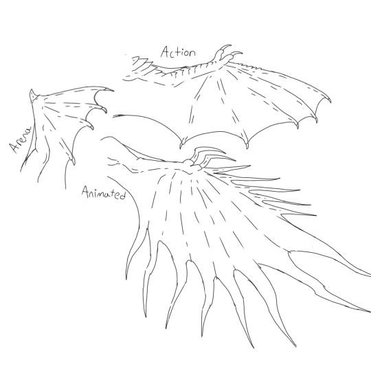
The Arena's flaws begin to reveal themselves here: they are but that of the most basic dragon, none of the spikes that at least make the other two Hookfang designs the most iconic. When one looks to the Monstrous Nightmare, the first sights are that of the face and the wings. There are four wing-fingers, each ending with a tiny claw.
The Action's wings have more flair to them, with shoulder-pad like scales, and tiny spikes running long the top of the fore-arm scales. They also follow the claws on the tips as the Arena, with eight wing-fingers as well as the two claws acting as feet resulting in a total of ten digits per arm. There's not much else to say about the wings as their shape is also rather typical of other dragons.
The most unique is definitely the Animated, as instead of a typical dip between each finger, there is a tendril. Though this is probably not very efficient for flight considering that there's not any bats that have something similar, it makes for a unique wing shape unlike other dragon. Interestingly, there is only eight wing-fingers, with the two claws and five spurs (? - Spikes? A wing spur is the spike the Arena has but I know not of what to classify these as) making a total of fifteen digits per arms.
Interestingly enough, all designs have skin connecting the upper arm to the forearm.
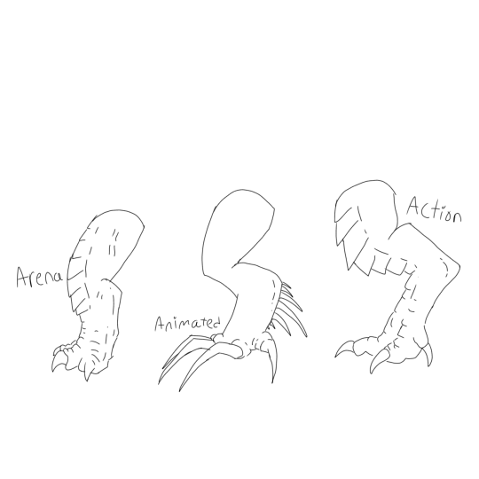
The Animated Hookfang's legs appear to be a mixture of digitigrade and plantigrade, and depending on his pose one could argue either, though digitigrade seems to be the more likely answer. He has a thin knee with larger thighs and ankles, spikes on the lower half of his leg that the other two Hookfang's seem to lack, and much larger, hooked claws than the others.
The Action's legs have spikes along the front, with a larger toe to claw ratio than the Animated Hookfang and smaller than the Arena Hookfang's. It is obviously digitigrade with a bird-of-prey inspiration just as obvious.
The Arena is different as it is plantigrade, has thicker legs and toes, small talons that do not protrude from the foot near as far at the others. It has spikes similar to the like, and its front legs (though not depicted here) have the spikes from the Animated Hookfang as well.
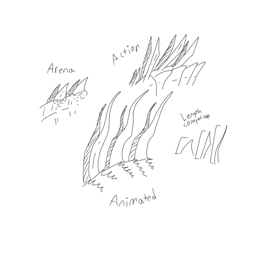
The Arena Hookfang's spikes are the furthest from the others, simple short spikes that are a tan-black colour. They are not special, and unlike the other two Hookfang's seem to sprout from smaller scales rather than larger back plates and are only in one row rather than the duality of the other designs.
The Action Hookfang has spikes that flare out near the tips, with thin plate-like scales that blend into the shoulders. Though they are much longer than the Arena's spikes, they are shorter than the sail of the Animated Hookfang.
Speaking of the Animated Hookfang, I was expecting the long, curled tendrils (they are one of his most iconic traits to me) but what I had not expected to find was that each plated scale on his back was lined with tiny spikes! This is not in the other designs, including that of the other movies, interestingly enough.
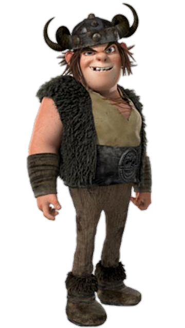

Now, to quote the rant I sent my friends upon the release of the teens in training: [Action] Snotlout is the unholy offspring of HTTYD1 Snotlout and RTTE Snotlout. I said this mostly as a joke about how features of RTTE appeared- his boots, shirt and the studs on both bracers and his belt being sired by the design- but HTTYD1 is far less in what it provides despite being the adaptation.
Sure, he has his vest, but it has the dark scale patterns of RTTE's armour. His pants are shared between both alongside his helmet. But people prefer RTTE's design anyway, right? Well, typically, but if you compare RTTE's design to all the other iterations of Snotlout, it's different. Though I'm probably looking into this too far, I always saw this as not only logical (the Edge is far warmer than Berk) but as a sort of sign of him pulling away from his father and allowing himself to dress as he wants to rather than what holds his status.
There is less logic to his Action design: the fur of his bracers and (presumably) on the insides of his boots will help with chafing, but why the random ring of fur on his boots? It offers nothing but a mess for the boy who rolls in literal yak crap. Alternatively, his fur vest fails to make him look either bold or obnoxious: the orange fur is no more than an eyesore at times, and the brighter colour that- again, assumed- lines the inside is not near as efficient as the dark colour of his original vest: black absorbs heat easier.
Animated Snotlout only wore armour that nearly everyone else did (bracers, a helmet which society demands he don, a belt which only theoretically counts as armour) and left most his skin exposed- this gave off the vibe of the "real man" type, showing off that he feels neither the cold nor that he fears being mauled by dragons.
Action Snotlout's more fortified vest and bracers get rid of such an illusion: he fears death, and he will remain protected to be safe. This is technically not out of character; Snotlout is the "logical" one, and one of the first to look out for danger ("Aren't you going to teach us first?!"/"I don't need that to know where it's going... It's coming!") but such is for RTTE.
Action (and, by extension, RTTE) Snotlout is one of logic and safety, making sure he remains safe to live another day. Animated Snotlout is a bold creature that likely gains many scars in his attempt to mimic his father.
Interestingly, the necklace Action Snotlout wears closely resembles that of Tuffnut's, seeming to continue the newer trend of making Snotlout and Tuff partners in the group. (Think the whole couple scenes thing vs. the first movie, where Snotlout and Fishlegs lifted Hiccup together at the end and Fishlegs would lean on Snotlout when he hunched over while catching his breath.)
But what of Arena Snotlout, you scream?
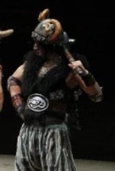
...He seems to be closer to Snotface. Still, he has his dark fur vest, his helmet, his bracers. Despite it all, I had to reread the wiki description to make sure that it was Snotlout. If I had to guess why, I would assume the beard and long-sleeved shirt to be the culprit; it provides him a "maturity" that simply cannot fit with Snotlout. Snotlout is to be immature, to be clueless and confused and yet still capable of caring for himself anyway. Where Action Snotlout pushes the inward aspects of Snotlout too far, Arena pushes his outward aspects too far, though it's slanderous to say that the Animated design doesn't leave a viewer wanting for more sometimes.
In summary:
Animated: Fearsome, hideous to look at and yet deserving of affection.
Arena: The set designers had fun, returning to what works and yet being unique still, even if the designs stray a bit too far from the movies.
Action: A weaker version, and yet still recognisable to a degree: once you've already been told and when they are in the context of their scenes. For Hookfang, I only knew it to be him because of him being a trailer poster child, and I only realised Snotlout wasn't Hiccup because of the fact several people were spamming his name with his original photo.
#httyd#hookfang#monstrous nightmare#httyd live action#httyd live arena#httyd snotlout#snotlout#art study#comparison#no salt for the actors until there is enough content to deduce if acting is proper#design critique#my art#digital art#snotlout jorgenson#httyd live salt#didnt mean to do that#genuinely#They nerfed hookfang I can't deny that#“not saying any design is better!” The humble jaw discussion:#If the art is inaccurate/looks weird I will admit that these are traced from my traditional art#I dont like irl pictures#character designs#Live arena scares me#Send help#I don't care if my bias for the original shows for it is a justified bias that nobody can deny#httyd live action salt#critique#opinion#long post#Time to do hicctooth - the pair not the ship as I never ref ships
85 notes
·
View notes
Text
Togachako Week
Day 3: Formal/Blood


#i can even draw them naked but drawing that short skirt makes me feel more insecure tbh#weird i know#but wanted to ref hori's art sooo#yeah#bnha#mha#my hero academia#boku no hero academia#tgchk#togachako week 2025#my art#togachako#ochaco uraraka#uravity#ochako urakara#uraraka ochako#uraraka ochacho#toga himiko#himiko x ochako#togaocha#togachaco#my digital art#artists on tumblr#id have try to detail background more too but#i really gotta study this time chat#i love oversharing dsgsafagffadgad#for some reason i got 50 from my own language's class#but got the full score from english#this doesnt make sense#lmao
94 notes
·
View notes
Text
Very quick sketch of the mom/child duo cuz i have some orbs to grind
#fe3h rhea#rhea fire emblem#fe3h sothis#rhea#sothis#feh#fire emblem heroes#color sketch#seibaaart#i...am still not very sure about the design??? (since i only use that one screencap from fehchannel as ref) but y ea#anyways#KAUJHDJKSAHDKJSFSHFDSKFDF#RHEAAAAAAA#ueeeee#also sothis with a saxaboom#cuz i think she will enjoy that shit#idk i still doesnt like this but i'll study their designs more ue#I GRIND FOR THE +10 AAAAAAA#A YEAR WITH 1000+ ORBS ALL FOR HER
121 notes
·
View notes