#toggle button html css
Explore tagged Tumblr posts
Visit Tumblr Blog
Explore Tumblr blogs with no restrictions, modern design and the best experience.
Last Seen Tumblr Blogs


Fun Fact
Tumblr has been providing a Korean-language service since 2013.
Text
Interactive Toggle Button with HTML & CSS 🔥✨
youtube
#toggle button#htmlcss#toggle button css#toggle switch#switcher#switch#toggle button html css#webdesign#webdevelopment#tutorials#youtube#website#programmer#coding#code#how to code#how to#Youtube
0 notes
Text
my neocities site used to have a bunch of javascript.
for example, i had a page that existed to load up chapters of various stories so that you could read all of the chapters in one page, sort of like ao3's view full work feature. because it was scripted dynamically, i didn't have to maintain a separate copy of the text, and it was actually more flexible than what ao3 offers, because you could read specific arcs, heck, you could read a specific sequence of chapters (e.g., 2-13 specifically)
another thing i didn't want to maintain by hand was header at the top of the page with navigational links, so i had a script that updates them on page load.
problem is, it kind of just feels bad to load a page, then see a visible delay before the header pops in.
i spent almost a year living like that, but i eventually stopped maintaining my html by hand, and learned the joys of the static site generator.
i didn't need the chapter loader anymore, either - i could code my site generator to concatenate chapters into a full-text page, and since it's static, it'd load much faster than make the user's browser stitch together the html every time they want to open that page.
slowly but surely, everything i might've used js for was getting replaced by simpler, faster, and easier means.
i don't make much use of it, but my site actually has discord-style spoiler text. blocks of text you can click to reveal (and the css is uses currentColor, so it works even on different themes)


i don't even need javascript for this; the way i accomplish it is a bit clever:

it's a checkbox! even if you hide the actual box, you can still click the label to toggle its state
this was something i implemented early, based on this blog post where a similar trick was used for a no-js dark/light mode toggle.
but i took this to a new height this year: i added fancy footnotes

but under the hood, it's the same principle

check box to toggle the state, then some fancy css it position it to float above the text.
but of course, if i'm doing all of this without javascript, what do i need javascript for?
and there was only one feature that stuck around. it's something that i think no one really used, but i'm attached to it.
you see, i'm notorious for writing long chapters. i could split them up, but i have particular stopping points in mind. still, i am merciful, so in my stories with consistently long chapters, i'm gone out of my way to insert break points, "subchapters" seamless into the main text.

those little roman numerals would trigger a script that reformatted the page to hide all the other subchapters, and reconfiguring the next/prev buttons so that clicking them takes you to the next section rather than the next chapter
in theory, you could read Hostile Takeover as if it were a fic with 72 chapters instead of 16.
now, this is a very complex feature. you cant use checkbox tricks to emulate this, unless you want to go crazy writing a dozen css rules for every permutation of checkboxes, or force the user to figure out an arcane system where you need to uncheck one section before loading the next
but it turns out, while i wasn't paying attention, the css committee added a crazy new feature. there are :has selectors, enabling you to style elements based on the properties of elements that come below it in the document.
the whole game has changed now.
couple this with learning about :target selectors courtesy of wonder how a couple of really ambitious ao3 fics do their magic, i had everything i need
all it took to make subchapters happen now a few simple rules

really, you only need that first line. it says "if main has a target element, hide all subchapters that aren't the target"
the other lines are convenience; they had the next/prev chapter buttons if you're in the middle of the chapter. there's a couple other rules (beside the subchap nav i added a button that takes you to the top of the page, which resets the anchor target), but overall, it was quick and painless. really, the actual struggle was teaching my site generator spit out the right html. (i spent five minutes tearing out my hair and rebuilding to no effect because i forgot i had two layers of caching. whoops)
this new approach does sacrifice the ability to make the arrow buttons do double duty, but i don't think it's a big loss when the subchapter buttons are right there, and arguably retaining the single function of each button is a win for usability.
the biggest loss is that there's no real way to style the buttons differently if they've been clicked, so you don't actually know which subchapter you're actually browsing.
(maybe if anyone i actually uses this feature, they can complain to me and i'll whip up a quick bit of js to patch it :v)
but until then, i'll take some satisfaction in delete my site's scripts entirely. in a way, that's the biggest loss, but it's one of i'm proud of
2 notes
·
View notes
Text
Solutions for web designers out there
( All animations and movement on a page should be considered for photo-sensitivity including motion sickness and vertigo. )
For animated .GIF image files:
Create a .JPG or .PNG still image version of the animations from their most important or appealing frame. That should be loaded into the HTML first instead of the .GIF.
And before we go into the optimal JavaScript interaction, let’s stick with the HTML a little more...
If you have images that are not already hyperlinked, you can instead make them link to their animated GIF version to open in a new tab (target=“_blank”). Be sure to have appropriate warnings about those links leading to the animated version of that image, right before/above the image itself for those who may be going through the page in order with some accessibility devices. (Thus, they read the warning before they interact with the link.)
Then, from there, we do the script side for this. You can store the different image file paths into your JavaScript and use mouseover/mouseout events to change the file path inside your src=“” attribute. (Here’s how you can dynamically and efficiently do this for many images and give them their own Event Listener: My JSFiddle Example.)
EDIT: I've updated the example to have a 1-second delay for the images to change into animations in case someone accidentally has their mouse over the image after the page loads in. It'll be best to also make hover/active animations optional, which will tie into the JavaScript needed to achieve the hover/active functions to begin with.
Also added a few more in-code comments for extra instruction and clarity.

Another idea with JavaScript is to have a ��toggle” sort of <button> on your page that someone can click/confirm whether or not everything on a page should animate/move or not. If you’re nicely familiar with JavaScript, you can make a more in-depth options menu for this sort of thing too!

This is also a great solution since there are web users who look at webpages either in a simplified view or blocking all scripts (like JavaScript) from your website. They could be viewing your website like this due to personal needs, or technological limitations. And so, having a still image in your HTML by default is MUCH preferred!
For CSS @ keyframe animations:
In the raw CSS file, the default value for the animation-play-state property should be paused. We have to keep simplified view users and script-blocking users in mind for moving objects and images on our webpages. So, whatever is loaded in by default must maintain this priority.
Thankfully, sticking with the CSS, we can just as easily changed the animation-play-state to running when the element is hovered (for mouse users) or active (for touch-screen users).
For sprite sheet animations:
If you’ve figured out how to make sprite animations on a web doc, then you’re already involved in the JavaScript for it and familiar with the code. Or, you're doing it the pure CSS way (see here). In which you can refer back to the @ keyframe section above.
So, here’s a general guideline that you can follow in JavaScript!
The sprite sheet element in your CSS should focus on your most important frame that you want to be seen by users on the default page appearance. Set its background-position to that frame inside the CSS.
For users who can load JavaScript on the page, set that element to toggle its animation by mouseover/mouseout or clicking.
For users who cannot load the JavaScript, the next best thing is to build the sprite animation from CSS keyframe steps().
And for most absolute safe case scenario in case of browser or device compatibility issues with any of these properties in the CSS, you could make an animated .GIF file of your sprite sheet. Make sure it's under 1Mb for users in this category who are also likely to be viewing your page from slow download speeds. With that, refer back to the section for handling image files without JavaScript.
Hopefully this is of great help, if not a starting point for accessibility ideas and considerations for your websites!
pleeeeeeeease indie web and scenecore and whatever other subcultures.... have fun and be cringe but PLEASE be careful with your blinkies. if your website has flashing lights that are on by default or that can't be turned off, then it is inaccessible to photosensitive people. if your post has flashing lights, it needs to be tagged. PLEASE. i love indie web stuff but the prevalence of unavoidable flashing lights makes me really anxious!! people have migraines and seizures! please use tags like "flashing lights" and "eye strain," NOT "epilepsy" or "epilepsy warning," and please consider making your site accessible by removing flashing lights or making them avoidable. PLEASE. make the web usable for photosensitive people.
#web design#web development#retro internet#old internet#neocities#accessibility#a11y#wk speaks#wk replies#reference#resources#guides#important#epilepsy support#disability awareness#internet safety#photosensitivity#old web#html#css#javascript
5K notes
·
View notes
Text
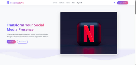
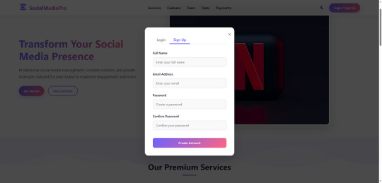
Social Media Pro — Premium Landing Page for SMM Services
Buy Now | Live Demo
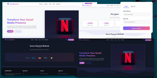
Elevate your social media marketing presence with Social Media Pro, a sleek, modern, and fully responsive landing page crafted specifically for digital agencies and SMM professionals.
Key Features:
Light & Dark Mode Toggle — Smooth switch between light and dark themes for better UX
Animated Wave Background — Beautiful, dynamic wave animations to keep your page visually engaging.
Fully Responsive Design — Perfectly optimized for mobile, tablet, and desktop devices.
Sign In & Sign Up Buttons — Ready-to-use call-to-action buttons for user authentication or redirect.
Dedicated Sections — Professionally organized sections for:
Services Offere
Key Features
Payment Methods
Team Members
And more…
Who Is This For?
Social Media Agencies
Freelance Marketers
SMM Tool Creators
Digital Product Sellers
SaaS Platforms targeting social media
Easy to Customize
Clean and well-commented HTML, CSS, and JS code makes it easy for you to adjust content, colors, or structure in minutes.

Deliver a lasting impression with a high-converting landing page that reflects professionalism and trust. Buy Now | Live Demo
#css#html#htmlcoding#html css#landing page#landing page design#landing page builder#landing pages#panel#js#javascript#javaprogramming#template#code
0 notes
Text
What Is Cross-Browser Testing? A Complete Guide for Seamless Web Experiences

In today’s fast-evolving digital landscape, users access websites from a wide array of devices, operating systems, and browsers. From Chrome and Firefox to Safari and Edge—each browser interprets your website code slightly differently. This is where Cross Browser Testing becomes essential.
This blog dives deep into what cross browser testing is, why it matters, what features it covers, and how to do it effectively—ensuring your website delivers a consistent, bug-free experience across all platforms.
What is Cross Browser Testing?
Cross Browser Testing is a type of non-functional testing that verifies whether a web application functions and appears correctly across different web browsers, browser versions, and devices.
It helps developers and QA engineers ensure that:
The UI renders consistently
Core functionalities work correctly
There are no browser-specific bugs or issues
Cross browser testing is not just about aesthetics—it’s about ensuring usability, performance, and accessibility for all users, regardless of how they access your website.
Why is Cross Browser Testing Important?
If you’re only testing your website on Chrome, you’re missing the bigger picture.
Here’s why cross browser testing is crucial:
1. Diverse User Base
Your users might be on Chrome, Safari, Firefox, Edge, or Opera, and using different devices like desktops, tablets, or smartphones. Testing across these ensures everyone has a uniform experience.
2. Browser Rendering Engines Differ
Browsers like Chrome (Blink), Safari (WebKit), and Firefox (Gecko) interpret HTML, CSS, and JavaScript differently. Even a small deviation in rendering can lead to layout breakages or functionality issues.
3. Prevent Loss of Traffic and Conversions
A buggy checkout page on Safari or broken navigation on Firefox can significantly hurt conversion rates and user trust.
4. SEO and Accessibility
Search engines value user experience. Broken layouts or slow load times on certain browsers can negatively affect SEO performance and bounce rates.
What Features are Analyzed in a Cross Browser Test?
Here are the key features and areas evaluated during cross browser testing:
✅ 1. Layout and Design Consistency
CSS rendering
Font sizes, spacing, padding
Media queries and responsiveness
Grid and flex layouts
✅ 2. JavaScript Functionality
Form validation
Dynamic content rendering (DOM updates)
Event handling
Navigation toggles
✅ 3. HTML5 and CSS3 Compatibility
Audio/video elements
Animations
Flexbox, grid, shadows, gradients
✅ 4. Third-Party Integrations
Plugins (chatbots, tracking tools)
Embedded maps or videos
Social sharing buttons
✅ 5. Performance and Speed
Load times across browsers
JavaScript execution speed
Rendering behavior
✅ 6. Security and Cookie Behavior
HTTPS redirection
Local storage and session cookies handling
How is Cross Browser Testing Done?
Cross browser testing can be performed manually or via automation tools. Here's a step-by-step guide:
Step 1: Define Your Browser Coverage
Choose browsers based on:
Your website’s Google Analytics browser report
Global browser usage statistics
Market demographics (e.g., Safari for iOS users)
Example Browser Matrix:

Read also: How Playwright Enhances Cross-Browser Testing Efficiency
Step 2: Set Up Your Test Environment
You can use:
Real Devices: For high accuracy
Emulators/Simulators: Quick tests for layout
Cloud Testing Platforms like:
BrowserStack
Sauce Labs
LambdaTest
CrossBrowserTesting.com
Step 3: Run Tests (Manual or Automated)
🔹 Manual Testing
Test scenarios using real devices and browsers, inspecting UI and performing tasks manually.
🔹 Automated Testing
Use frameworks like:
Selenium
Playwright
Cypress
TestCafe
Automation helps:
Reduce testing time
Run tests in parallel
Integrate with CI/CD pipelines
Step 4: Log and Fix Issues
Document browser-specific bugs, prioritize them, and retest after fixes.
Step 5: Continuous Cross Browser Testing
Use CI tools (Jenkins, GitHub Actions, GitLab CI) to schedule tests automatically on every build or code change.
Best Practices for Cross Browser Testing
✅ Always test on real user data (Google Analytics insights)
✅ Prioritize critical user flows first
✅ Automate repetitive tests, but don’t skip manual exploratory testing
✅ Regularly update browser versions in your testing matrix
✅ Perform regression testing after any major frontend update
Conclusion
Cross Browser Testing is not optional—it’s a necessity in today’s fragmented web ecosystem. Ensuring that your application works flawlessly across all major browsers not only boosts user experience and trust but also strengthens your brand’s credibility
As a leading Web application testing company, at Testrig Technologies, we specialize in comprehensive Cross Browser Testing Services that guarantee flawless digital experiences on any browser, device, or OS. Whether you're launching a new site or scaling an existing one, our QA experts are here to help.
0 notes
Text
The Lost CSS Tricks of Cohost.org
New Post has been published on https://thedigitalinsider.com/the-lost-css-tricks-of-cohost-org/
The Lost CSS Tricks of Cohost.org
You would be forgiven if you’ve never heard of Cohost.org. The bespoke, Tumblr-like social media website came and went in a flash. Going public in June 2022 with invite-only registrations, Cohost’s peach and maroon landing page promised that it would be “posting, but better.” Just over two years later, in September 2024, the site announced its shutdown, its creators citing burnout and funding problems. Today, its servers are gone for good. Any link to cohost.org redirects to the Wayback Machine’s slow but comprehensive archive.
The landing page for Cohost.org, featuring our beloved eggbug.
Despite its short lifetime, I am confident in saying that Cohost delivered on its promise. This is in no small part due to its user base, consisting mostly of niche internet creatives and their friends — many of whom already considered “posting” to be an art form. These users were attracted to Cohost’s opinionated, anti-capitalist design that set it apart from the mainstream alternatives. The site was free of advertisements and follower counts, all feeds were purely chronological, and the posting interface even supported a subset of HTML.
It was this latter feature that conjured a community of its own. For security reasons, any post using HTML was passed through a sanitizer to remove any malicious or malformed elements. But unlike most websites, Cohost’s sanitizer was remarkably permissive. The vast majority of tags and attributes were allowed — most notably inline CSS styles on arbitrary elements.
Users didn’t take long to grasp the creative opportunities lurking within Cohost’s unassuming “new post” modal. Within 48 hours of going public, the fledgling community had figured out how to post poetry using the <details> tag, port the Apple homepage from 1999, and reimplement a quick-time WarioWare game. We called posts like these “CSS Crimes,” and the people who made them “CSS Criminals.” Without even intending to, the developers of Cohost had created an environment for a CSS community to thrive.
In this post, I’ll show you a few of the hacks we found while trying to push the limits of Cohost’s HTML support. Use these if you dare, lest you too get labelled a CSS criminal.
Width-hacking
Many of the CSS crimes of Cohost were powered by a technique that user @corncycle dubbed “width-hacking.” Using a combination of the <details> element and the CSS calc() function, we can get some pretty wild functionality: combination locks, tile matching games, Zelda-style top-down movement, the list goes on.
If you’ve been around the CSS world for a while, there’s a good chance you’ve been exposed to the old checkbox hack. By combining a checkbox, a label, and creative use of CSS selectors, you can use the toggle functionality of the checkbox to implement all sorts of things. Tabbed areas, push toggles, dropdown menus, etc.
However, because this hack requires CSS selectors, that meant we couldn’t use it on Cohost — remember, we only had inline styles. Instead, we used the relatively new elements <details> and <summary>. These elements provide the same visibility-toggling logic, but now directly in HTML. No weird CSS needed.
These elements work like so: All children of the <details> element are hidden by default, except for the <summary> element. When the summary is clicked, it “opens” the parent details element, causing its children to become visible.
We can add all sorts of styles to these elements to make this example more interesting. Below, I have styled the constituent elements to create the effect of a button that lights up when you click on it.
This is achieved by giving the <summary> element a fixed position and size, a grey background color, and an outset border to make it look like a button. When it’s clicked, a sibling <div> is revealed that covers the <summary> with its own red background and border. Normally, this <div> would block further click events, but I’ve given it the declaration pointer-events: none. Now all clicks pass right on through to the <summary> element underneath, allowing you to turn the button back off.
This is all pretty nifty, but it’s ultimately the same logic as before: something is toggled either on or off. These are only two states. If we want to make games and other gizmos, we might want to represent hundreds to thousands of states.
Width-hacking gives us exactly that. Consider the following example:
In this example, three <details> elements live together in an inline-flex container. Because all the <summary> elements are absolutely-positioned, the width of their respective <details> elements are all zero when they’re closed.
Now, each of these three <details> has a small <div> inside. The first has a child with a width of 1px, the second a child with a width of 2px, and the third a width of 4px. When a <details> element is opened, it reveals its hidden <div>, causing its own width to increase. This increases the width of the inline-flex container. Because the width of the container is the sum of its children, this means its width directly corresponds to the specific <details> elements that are open.
For example, if just the first and third <details> are open, the inline-flex container will have the width 1px + 4px = 5px. Conversely, if the inline-flex container is 2px wide, we can infer that the only open <details> element is the second one. With this trick, we’ve managed to encode all eight states of the three <details> into the width of the container element.
This is pretty cool. Maybe we could use this as an element of some kind of puzzle game? We could show a secret message if the right combination of buttons is checked. But how do we do that? How do we only show the secret message for a specific width of that container div?
In the preceding CodePen, I’ve added a secret message as two nested divs. Currently, this message is always visible — complete with a TODO reminding us to implement the logic to hide it unless the correct combination is set.
You may wonder why we’re using two nested divs for such a simple message. This is because we’ll be hiding the message using a peculiar method: We will make the width of the parent div.secret be zero. Because the overflow: hidden property is used, the child div.message will be clipped, and thus invisible.
Now we’re ready to implement our secret message logic. Thanks to the fact that percentage sizes are relative to the parent, we can use 100% as a stand-in for the parent’s width. We can then construct a complicated CSS calc() formula that is 350px if the container div is our target size, and 0px otherwise. With that, our secret message will be visible only when the center button is active and the others are inactive. Give it a try!
This complicated calc() function that’s controlling the secret div’s width has the following graph:
You can see that it’s a piecewise linear curve, constructed from multiple pieces using min/max. These pieces are placed in just the right spots so that the function maxes out when the container div is 2px— which we’ve established is precisely when only the second button is active.
A surprising variety of games can be implemented using variations on this technique. Here is a tower of Hanoi game I had made that uses both width and height to track the game’s state.
SVG animation
So far, we’ve seen some basic functionality for implementing a game. But what if we want our games to look good? What if we want to add ✨animations?✨ Believe it or not, this is actually possible entirely within inline CSS using the power of SVG.
SVG (Scalable Vector Graphics) is an XML-based image format for storing vector images. It enjoys broad support on the web — you can use it in <img> elements or as the URL of a background-image property, among other things.
Like HTML, an SVG file is a collection of elements. For SVG, these elements are things like <rect>, <circle>, and <text>, to name a few. These elements can have all sorts of properties defined, such as fill color, stroke width, and font family.
A lesser-known feature of SVG is that it can contain <style> blocks for configuring the properties of these elements. In the example below, an SVG is used as the background for a div. Inside that SVG is a <style> block that sets the fillcolor of its <circle> to red.
An even lesser-known feature of SVG is that its styles can use media queries. The size used by those queries is the size of the div it is a background of.
In the following example, we have a resizable <div> with an SVG background. Inside this SVG is a media query which will change the fill color of its <circle> to blue when the width exceeds 100px. Grab the resize handle in its bottom right corner and drag until the circle turns blue.
Because resize handles don’t quite work on mobile, unfortunately, this and the next couple of CodePens are best experienced on desktop.
This is an extremely powerful technique. By mixing it with width-hacking, we could encode the state of a game or gizmo in the width of an SVG background image. This SVG can then show or hide specific elements depending on the corresponding game state via media queries.
But I promised you animations. So, how is that done? Turns out you can use CSS animations within SVGs. By using the CSS transition property, we can make the color of our circle smoothly transition from red to blue.
Amazing! But before you try this yourself, be sure to look at the source code carefully. You’ll notice that I’ve had to add a 1×1px, off-screen element with the ID #hack. This element has a very simple (and nearly unnoticeable) continuous animation applied. A “dummy animation” like this is necessary to get around some web browsers’ buggy detection of SVG animation. Without that hack, our transition property wouldn’t work consistently.
For the fun of it, let’s combine this tech with our previous secret message example. Instead of toggling the secret message’s width between the values of 0px and 350px, I’ve adjusted the calc formula so that the secret message div is normally 350px, and becomes 351px if the right combination is set.
Instead of HTML/CSS, the secret message is now just an SVG background with a <text> element that says “secret message.” Using media queries, we change the transform scale of this <text> to be zero unless the div is 351px. With the transition property applied, we get a smooth transition between these two states.
Click the center button to activate the secret message:
The first cohost user to discover the use of media queries within SVG backgrounds was @ticky for this post. I don’t recall who figured out they could animate, but I used the tech quite extensively for this quiz that tells you what kind of soil you’d like if you were a worm.
Wrapping up
And that’s will be all for now. There are a number of techniques I haven’t touched on — namely the fun antics one can get up to with the resize property. If you’d like to explore the world of CSS crimes further, I’d recommend this great linkdump by YellowAfterlife, or this video retrospective by rebane2001.
It will always hurt to describe Cohost in the past tense. It truly was a magical place, and I don’t think I’ll be able to properly convey what it was like to be there at its peak. The best I can do is share the hacks we came up with: the lost CSS tricks we invented while “posting, but better.”
#2022#2024#ADD#advertisements#amazing#animation#animations#apple#Art#Articles#attributes#background#background-image#Blue#border#burnout#buttons#change#checkbox hack#Children#code#Color#Community#comprehensive#container#continuous#creators#CSS#css animations#css-tricks
0 notes
Text
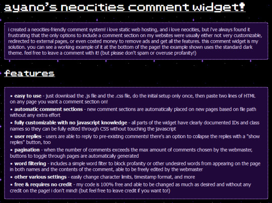
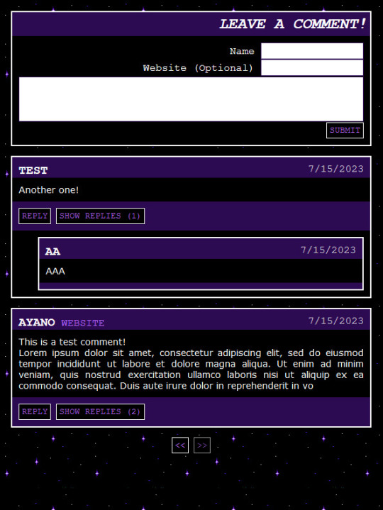
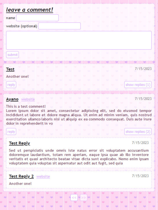
ID. first screenshot is white and lavender text on a black background and reads:
ayano's neocities comment widget!
i created a neocities-friendly comment system! i love static web hosting, and i love neocities, but i've always found it frustrating that the only options to include a comment section on my websites were usually either not very customizable, redirected to external pages, or even costed money to remove ads and get all the features. this comment widget is my solution. you can see a working example of it at the bottom of the page! the example shown uses the standard dark theme. feel free to leave a comment with it! (but please don't spam or overuse profanity!)
features:
easy to use - just download the .js file and the .css file, do the initial setup only once, then paste two lines of HTML on any page you want a comment section on!
automatic comment sections - new comment sections are automatically placed on new pages based on file path without any extra effort
fully customizable with no javascript knowledge - all parts of the widget have clearly documented IDs and class names so they can be fully edited through CSS without touching the javascript
user replies - users are able to reply to pre-existing comments! there's an option to collapse the replies with a "show replies" button, too
pagination - when the number of comments exceeds the max amount of comments chosen by the webmaster, buttons to toggle through pages are automatically generated
word filtering - includes a simple word filter to block profanity or other undesired words from appearing on the page in both names and the contents of the comment, able to be freely edited by the webmaster
other various settings - easily change character limits, timestamp format, and more
free & requires no credit - my code is 100% free and able to be changed as much as desired and without any credit on the page! i don't mind! (but feel free to leave credit if you want to!)
the other images are test comments in the dark style and in a pink style. End ID.
i made a free to use, 100% customizable comment widget for neocities users! it's really easy to install and add comment sections to any page. no more boring cbox or external guestbooks if you don't want them! and it comes with two themes to get you started!! please enjoy! you can find it here on my personal site!
6K notes
·
View notes
Text
Best Press Component Manufacturing Service in Hosur - TSK
Understanding the Press Component: A Fundamental Element in Web Development
In the realm of modern web development, interactivity plays a crucial role in crafting engaging user experiences. One of the core elements that allow users to interact with websites and applications is the Press component. From submitting forms to navigating between pages, the Press component—often represented by buttons or clickable elements—forms the backbone of user interaction on the web. This blog will explore the fundamental aspects of the Press component, its importance, and how developers can implement it effectively.
What is a Press Component?
The Press component refers to an interactive element within a website or application that responds to user input, typically in the form of a click or tap. Most commonly, this takes the shape of a button, link, or other clickable areas that, when pressed, trigger an event or action on the website. Examples include submitting a form, triggering a modal popup, navigating to a new page, or changing content dynamically.
While simple in concept, the Press component is a vital part of the web's interactive experience. Without it, websites would be static and unresponsive, hindering user engagement.
Why is the Press Component Important?
User Interaction: At its core, the Press component facilitates user interaction, allowing visitors to perform actions on a webpage. Whether it's clicking a "Submit" button, pressing a "Next" link, or toggling between different sections of content, these interactive elements are central to how users navigate and engage with digital content.
Feedback and Usability: A critical aspect of the Press component is the feedback it provides. Users need to know that their actions have been acknowledged. Visual feedback, like changes in button color, text changes, or animations, assures users that their input was successful. This immediate feedback not only improves usability but also contributes to a positive user experience.
Mobile Responsiveness: With the rise of mobile web browsing, ensuring that Press components are optimized for touchscreen interactions is essential. Press components must be large enough to be easily tappable on small screens, and they should offer smooth responses to touch gestures. Mobile-friendly design is no longer optional but a necessity.
Accessibility: An often overlooked yet crucial benefit of the Press component is its role in web accessibility. Properly designed Press components with clear labels, focus states, and support for keyboard navigation ensure that users with disabilities can interact with a website effectively.
How to Implement a Press Component
Basic HTML and CSS
The most fundamental way to create a Press component is through simple HTML and CSS. For example, a basic button can be created using the <button> tag:
<button>Click Me</button>
By adding some CSS, you can make the button more interactive:
button {
padding: 10px 20px;
background-color: blue;
color: white;
border: none;
cursor: pointer;
}
button:hover {
background-color: darkblue;
}
In this example, the button changes color when hovered over, providing visual feedback to the user.
Adding JavaScript for Interactivity
To enhance the Press component further, JavaScript is often used to add functionality. For example, you can use JavaScript to trigger an action when the button is clicked, such as showing an alert or changing the content on the page:
<button onclick="alert('Button Pressed!')">Press Me</button>
In this case, when the user clicks the button, an alert box will appear on the screen, confirming that the press action was successful.
Advanced Implementation with Frameworks
For more complex applications, many developers turn to JavaScript frameworks like React, Vue, or Angular. These frameworks offer more powerful ways to manage user interactions and state changes within the application.
For example, in React, a Press component might look like this:
import React, { useState } from 'react';
function PressButton() {
const [pressed, setPressed] = useState(false);
const handlePress = () => setPressed(!pressed);
return (
<button onClick={handlePress} style={{ backgroundColor: pressed ? 'green' : 'blue' }}>
{pressed ? 'Pressed' : 'Press Me'}
</button>
);
}
Here, the button changes color based on its state (pressed or not), making the interaction even more dynamic and engaging.
Best Practices for Press Components
Clear Labeling: Buttons and other pressable elements should have clear, descriptive labels that indicate their function. For example, use labels like "Submit," "Next," or "Learn More" rather than ambiguous terms.
Visual Feedback: Always provide visual feedback when a Press component is activated. This could be a color change, a shadow effect, or a subtle animation.
Mobile Optimization: Ensure that Press components are large enough for mobile users to interact with easily. Make buttons and links easily tappable, with enough spacing to prevent accidental clicks.
Keyboard Accessibility: Make sure interactive components are accessible via keyboard. Buttons should be focusable and activated using the Enter or Space keys, providing an inclusive experience for all users.
Conclusion
The Press component is a fundamental part of the web development toolkit. It empowers users to interact with websites and applications, triggering actions and events that shape the user experience. By understanding its importance and implementing it with care—through clear labeling, visual feedback, and accessibility considerations—developers can create seamless, engaging, and user-friendly digital experiences. Whether it's a simple button or a complex interactive element, mastering the Press component is key to building modern, functional, and responsive websites.
0 notes
Text
How HTML, CSS, and JavaScript Work Together in the Browser
In web development, HTML, CSS, and JavaScript are the foundational technologies that bring websites to life. Each plays a unique role, but they work in harmony to deliver the modern, interactive web experiences we use every day. Understanding how they interact is essential for anyone entering the world of web development.
1. HTML: The Structure
HTML (HyperText Markup Language) is the backbone of a webpage. It defines the structure and layout of content on the web, using a set of tags and elements. These tags create headings, paragraphs, links, images, and other building blocks that form the content of a page.
Example: A simple HTML structure might include a <header>, <footer>, and various sections like <div> or <section>, which house text, images, and other media.
Role in Browser: When a browser loads a webpage, it first reads the HTML to understand the structure of the page and display its content accordingly.
<html> <head> <title>My Webpage</title> </head> <body> <h1>Welcome to My Webpage</h1> <p>This is a paragraph of content.</p> </body> </html>
2. CSS: The Styling
CSS (Cascading Style Sheets) is used to style and format the HTML elements on the page. It controls the look and feel, such as colors, fonts, spacing, layout, and overall visual presentation. Without CSS, websites would be plain and unappealing, consisting of only unstyled text and images.
Example: CSS can style a heading to make it bold, change its color, and add spacing around it.
Role in Browser: After the HTML structure is loaded, the browser then applies the CSS to style the webpage. CSS can be included directly in HTML or in separate .css files linked in the <head> section.
h1 { color: blue; font-size: 2em; text-align: center; } p { color: grey; font-family: Arial, sans-serif; }
When the above CSS is applied, the heading <h1> will appear in blue, centered on the page, and the paragraph text will be styled in grey with a specific font.
3. JavaScript: The Interactivity
JavaScript is the programming language that adds dynamic and interactive elements to a webpage. It allows for actions like responding to user input, handling form submissions, and updating content without needing to reload the entire page. JavaScript can manipulate both HTML (via the Document Object Model or DOM) and CSS, allowing for dynamic changes to structure and styles in real-time.
Example: A button on a webpage can trigger a JavaScript function that shows or hides a section of the content when clicked.
Role in Browser: The browser executes JavaScript after loading the HTML and CSS, allowing users to interact with the page. JavaScript files can be included directly within the HTML or linked externally.
<button id="toggle">Click Me</button> <p id="text">This is some text.</p>
<script> document.getElementById("toggle").onclick = function() { var text = document.getElementById("text"); if (text.style.display === "none") { text.style.display = "block"; } else { text.style.display = "none"; } }; </script>
In this example, when the button is clicked, the paragraph’s visibility is toggled between “shown” and “hidden” using JavaScript.
How They Work Together
When you load a webpage, the browser follows a specific process:
Load HTML: The browser first parses the HTML document to create the structure of the page.
Apply CSS: After the HTML is loaded, CSS is applied to style the HTML elements based on the rules defined in the stylesheet.
Execute JavaScript: Once the structure and styles are in place, the browser executes JavaScript to add interactivity and dynamic behavior.
Each of these technologies relies on the other to function optimally:
HTML provides the content and structure that CSS and JavaScript work on.
CSS enhances the visual appeal of that structure by styling elements.
JavaScript enables real-time interaction and dynamic content changes, improving the user experience.
Together, they form the foundation of any modern website, creating a seamless experience from static content to visually appealing design and interactive elements.
Build Your Web Development Skills with Naresh IT’s HTML, CSS, and JavaScript Online Training
If you’re looking to master the essentials of web development, Naresh IT’s HTML, CSS, and JavaScript Online Training is the perfect course to get you started. With expert instructors, hands-on exercises, and real-world projects, you’ll gain the skills necessary to create dynamic, responsive, and user-friendly websites.
Whether you’re a beginner or aiming to enhance your web development knowledge, Naresh IT offers a comprehensive curriculum that ensures you can confidently build and style web applications.
Join Naresh IT’s HTML, CSS, and JavaScript Online Training today and take the first step toward a successful career in web development!
#htmlcss#htmlcoding#html css#html#html5#css#javascript#frontenddevelopment#programming#html5 game#100daysofcode
1 note
·
View note
Video
youtube
Neumorphism UI design toggle button CSS | CSS animation | html, CSS project
0 notes
Text
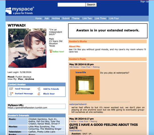
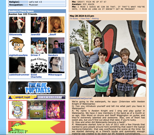
MYSPACE 1.0 THEME REFRESH (originally by conkersradfurday, refreshed by unholyverse)
live previews: 1, 2 / download (pastebin)
hi! i've been using this old theme for years now because other myspace themes don't hit the same, but i've been tweaking a lot of it for personal use. i think it's been long enough since this theme has been abandoned that i can upload something that can handle itself better on modern tumblr.
main features
asks are formatted to look like myspace comments. fun!
four custom links
myspace buttons to follow, message, or block the blog owner
a bunch of info spaces so the world can know what you're about
extra font options
functional search bar (but this is tumblr so...semi functional?)
that web 2.0 ugly goodness
other features + info below the cut
new features
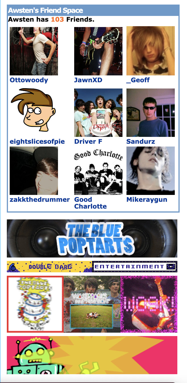
friend space - ever wanna show off your friends? now you can with the friend space to show off your top 8 9 friends on your blog. don't have enough friends? no worries, you can always toggle it off
image space - wanna put a bunch of blinkies somewhere? you'll need to have a bit of html and css knowledge for it, but you can go into the code and add as many images as you'd like. just look for the section and start pasting those images. it's a little tedious but tbh that's just the authentic myspace experience isn't it? but if that's not your thing, you can also toggle it off too.
tweaked/deleted features
had to delete the music player :( sorry but it used flash and i'm not really sure how to make a music player in javascript yet
added username input because it was annoying me that your title could be your name and it didn't make sense in most cases
deleted infinite scroll because the script was super outdated
added the ability to change the "online now!" gif. the original gif will always be in the defaults of the code.
changed the text post header font to verdana because it was impact and you could not fucking read that and it wasn't accurate to a myspace bulletin anyways
deleted the feature that force showed all the pages you made on your blog. so annoying. it will look a little weird if you have asks/submissions deactivated, but i doubt many of you using the theme will have them closed anyways
changed the dead links to redirect to the actual myspace site
extra recommended add-ons
scm music player: a customizable music player with tons of different skins and tons of songs you're able to add
unblue polls by @glenthemes: what it says basically; allows you to customize the colors of tumblr polls on your blog
cursors-4u.com: i love these dinky little cursors they're so fun. great if you really wanna lean into the 2000s aspect of the theme
cursor sparkles: what else is there to say about this they're just fun
notes
i plan on updating the theme semi-regularly if bugs are brought up and stuff (which you can tell me through my inbox)
tip: if your sidebar photo and your quote and info aren't aligning well, try using as a line break in longer sections of text or changing the sidebar photo size from 200px to 180px
hopefully i can work on extra tweaks as time goes on (such as figuring out how to add a footer image to videos, toggle tags, etc)
don't repost/claim as your own because it already isn't mine in the first place
like/reblog if you use!
update log
added a tags toggle + tweaked the video post sizes
made the "is in your extended network" status customizable to add different text. feel free to tell the world how many gas station boner pills you took
added an official theme link
917 notes
·
View notes
Text
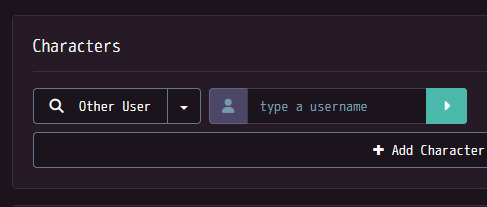
the submit button (part 1)
let's start with something simple!
at the top bar; you'll see this dropdown menu (without the multi-images button unless you have premium). but what do these even mean??
let's start with the character button.
when you hit the character button, you will be greeted by this.
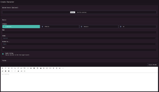
at the top, you can add an avatar to your character. you can crop the image to fit properly, and this will not add the image into your character's gallery (the images attached to a character).
next, you can choose what type of post it will be.
character: a regular character! use this for your ocs or for other misc. stuff.
html/css: avoid picking this one unless you're posting a character or user code that people can use for free or for cash! css is similar, but it adds a specific theme to your profile (you can only use css if you have premium).
resource: this is generally used for things like collections of gifs, backgrounds, props, bases, etc.!
ad: pick this if you're advertising something! such as commissions, ychs, a character for offer, a character purge (this is when someone is putting a bunch of their ocs up for offer), etc.
the name part is self-explanatory. type the name of your character in there! (or a temporary name, such as "TBN" which means "to be named".)
after this, you can add your character to a folder. we won't worry about that just yet!
now we get to privacy settings.
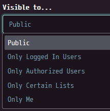
public: anyone can view this character.
only logged in users: anyone with an account can view this character.
only authorised users: any person that you authorise can see this character. you can do this by going to someone's profile and pressing the "authorise" button!
only certain lists: authorised users that you add to a list can view this character. (which you can create here!)
only me: only you can view this character.
you can add tags to characters as well to either make them show up in search results or to sort on your profile! tags are 100% optional.
then you can choose whether your character appears on the front page/in search results. do whatever makes you comfortable with this!
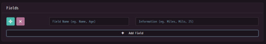
with fields you can add extra quick information to your character! such as age, pronouns, sexuality, etc.
now you can write a description for your character! i suggest you hold off on doing that until you post the character; as the submission form times out after an hour-a couple of hours.

the css and advanced tabs are not super important, but in the advanced tab you can toggle whether this specific character can get favourites/comments or not.
for designer credits, you credit who created the character. even if you designed the character, you need to properly credit the creator of the oc. if you don't know or can't remember, go to "off-site creator" and type in a fake link. this could be something like https://i.forgot.
if you credit an on-site creator, they will have to manually accept the credit! until they do that; the creator credit will say "unverified".
finally we come to upload image. as it says in the image, this is optional, but i think it's still nice to do! personally i like to upload all of my character images by date, but you do not have to do this.
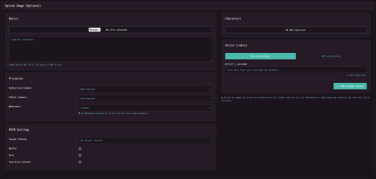
clicking on the tab shows you this. here you can upload the actual image, add a caption, change watermark settings, add warnings, other characters, and credit the artist of the image. crediting the artist works almost the same as the creator credit, but they do not have to manually accept it.
for the watermark itself, you will have a few different options. "custom" is my own watermark that i manually uploaded! i will explain that in another post.
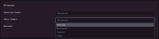
each watermark setting (on public)
full size: anyone can view the full unwatermarked image! this is best to use for refs.
watermarked: the default. your image will have a watermark on it.
thumbnail: when someone clicks on the image, they will only see what's in the thumbnail at a lower resolution.
hidden: public viewers cannot see this image.
nsfw/tagging settings (i suggest you read the rules for more in-depth descriptions and examples! properly tagging your stuff is cool!)

sexual content
anyone with their age set to <18 cannot post images with these filters.
mild sexual content: stuff like visible arousement (clothed), fetish art, anything that implies sexual activity. you could also use this for heavily suggestive art if you wanted to!
explicit sexual content: porn. anything you would classify as adults only
nudity: nonsexual nudity! visible (unaroused) genitalia goes here. nipples and butts (unless very exaggerated) do not need to be tagged.
gore: the rules officially say "Any depiction of internal organs, viscera, visibly broken bones, or freshly severed limbs or body parts"; but a lot of people also include stuff like huge amounts of blood here. whatever you feel should be tagged!
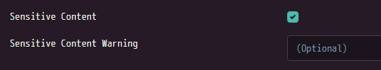
sensitive content: ticking this box lets you type in something specific! this can be used with other tags to help you describe what's being tagged.
lastly, adding other characters! the image you're uploading will attach to the character you're uploading by default. to add other characters; you press the "add character" button.
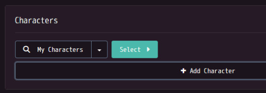
doing that makes this pop up! you should now press "select", and then navigate to the folder the character you're looking for is in so you can then click on them. you can also add other people's characters! you can also search by character id, but that's a bit tedious imo. (you need to go to the character's profile, copy the numbers in their url, and then paste them into the text box that comes up.)
here, you type a username, press the arrow, then go through that person's characters and pick the one you're looking for!
i'm gonna try to do one of these every couple days (this took me like an hour straight to do). i hope this helps and happy character creating!! :]
#toyhouse tips#the basics#long post#like very long i'm sorry i made this so long#if anyone has any corrections please let me know in the replies and i'll edit this!!
0 notes
Text
VeryUtils Smooth Zoom Pan Image Viewer is an easy-to-use JavaScript
VeryUtils Smooth Zoom Pan Image Viewer is an easy-to-use JavaScript source code for mobile and desktop that adds "pinch to zoom" or "mouse scroll to zoom" functionality to your HTML content.
VeryUtils Smooth Zoom Pan Image Viewer is a JavaScript/CSS-based image viewer designed to display product photos, maps, or any image within a custom-defined small area. It can be configured and implemented on web pages with simple copy/paste steps. It supports all major touch-enabled devices and platforms, including iOS, Android, and Windows.
VeryUtils Smooth Zoom Pan Image Viewer is a straightforward pan/zoom solution for SVGs and images in HTML. It adds event listeners for mouse scroll, double-click, and pan actions, and optionally offers the following features:
JavaScript API for controlling pan and zoom behavior
onPan and onZoom event handlers
On-screen zoom controls
It is cross-browser compatible and supports both inline SVGs and SVGs within HTML object or embed elements.
✅ VeryUtils Smooth Zoom Pan Image Viewer Key Features:
Initial Zoom level
Initial Position
Maximum zoom level
Minimum zoom level
Animation Smoothness
Animation Speed for Zoom
Animation Speed for Pan
Fit or Fill the image
Enable / Disable Pan buttons
Enable / Disable Pan Limitation
Adjustable Button Size, Color, Transparency, Alignment and Margin
Button Auto Hide and Delay Time
Mouse Drag / Touch Drag
Mouse Wheel zoom control
Mouse Cursor location zoom on mouse wheel
Mouse Double Click zoom
Border size, color, transparency
Full browser size option
Max width and height (for window resize)
Touch-enabled: This feature provides familiar touch gestures for zooming content on mobile devices.
Fully responsive: The plugin is capable of adapting to any screen size, ensuring an optimal viewing experience whether you're using desktop or mobile devices.
Cross-browser and compatible with iOS and Android: Whether you're using iOS, Android, laptops, desktops, or even an older browser like IE9, this plugin should function seamlessly.
Simple setup: Whether you're an HTML beginner or a seasoned jQuery developer, setting up the plugin is a breeze. With just a single line of code in either JavaScript or HTML, everything works automatically.
Developer API: This plugin offers developers greater control through the Smooth Zoom Pan Image API.
Multiple instances on one page: You can add multi-touch zooming capability to as many content elements as you'd like on a single page.
Zooming DIV content: Different elements such as images, text, etc., can be placed inside a DIV and zoomed.
Fullscreen toggle support: Small-screen devices often require maximum screen space. This feature allows users to toggle fullscreen mode to view content without clutter.
Adaptive image loading: Optimize load time, resources, and minimize lag by delivering the correct image size for any screen resolution.
Marker and tooltip support: Add markers, zoom to markers, or include tooltips on markers. This functionality is particularly useful for maps, floor plans, or product displays.
Mouseover zoom support: Enable zooming by mouseover on desktop while retaining pinch-to-zoom functionality on mobile devices. This option maximizes user interaction across various devices.
✅ Supported Browsers:
Chrome
Firefox
Safari
Opera
Internet Explorer 9+ (works badly if viewBox attribute is set)
0 notes
Text
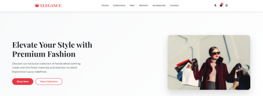
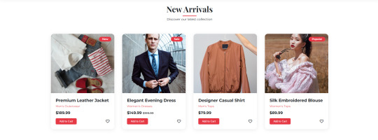
ELEGANCE - Landing Page
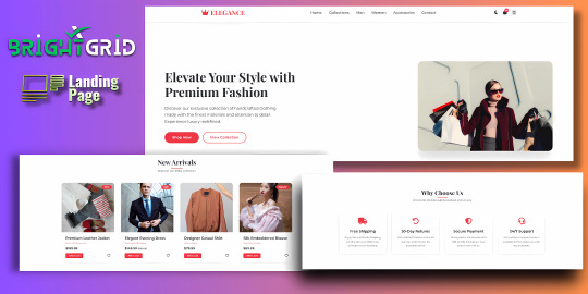
Live Demo | Buy Now
Key Highlights:
Dark/Light Mode Toggle: Enhance user experience with an adaptive color scheme.
Stylish Hero Section: Immediately grabs attention with bold typography and imagery.
Interactive Product Cards: Add-to-cart, wishlist, price tags, and categories.
Conversion-Driven Features: Includes newsletter form, feature highlights, and CTA buttons.
Responsive Layout: Fully optimized for all screen sizes (mobile, tablet, desktop).
WhatsApp Button: Easily reachable for customer inquiries.
Optional Protection Overlay: Disable copy/right-click in preview versions.
Built with clean HTML, CSS, and JS — no external frameworks — making it easy to customize and deploy immediately.
Features:
Responsive design for all screen sizes
Dark and light mode toggle
Animated hero and product sections
Product cards with wishlist and add-to-cart buttons
Newsletter subscription form
WhatsApp contact button
Protection overlay option for preview versions
Clean and organized HTML, CSS, and JS code
Font Awesome icons integrated
Google Fonts (Montserrat & Playfair Display)
Requirements:
Basic HTML/CSS knowledge (for customization)
Any code editor (e.g., VS Code, Sublime Text)
Modern web browser (for testing)
Internet connection (to load external assets like fonts/icons)
Instructions:
Unzip the downloaded folder.
Open index.html in your browser to preview the template.
Use any code editor to customize content, images, and branding.
Upload to your hosting or integrate into your web project.
(Optional) Modify protection overlay or WhatsApp number as needed.
Development Time:
12–14 hours (design + code + responsiveness + animations)
Message to Reviewer:
Hi, This is a responsive HTML landing page for a clothing brand. All assets are externally hosted (Unsplash, Font Awesome, Google Fonts). Let me know if anything else is required. Thanks!
Live Demo | Buy Now
#html#css#htmlcoding#html css#js#landing page#landing page builder#landing page design#landing pages#high fashion#panel#script
1 note
·
View note
Text
5 Udemy Paid Course for Free with Certification.(Limited Time for Enrollment)

1. HTML & CSS - Certification Course for Beginners
Learn the Foundations of HTML & CSS to Create Fully Customized, Mobile Responsive Web Pages
What you'll learn
The Structure of an HTML Page
Core HTML Tags
HTML Spacing
HTML Text Formatting & Decoration
HTML Lists (Ordered, Unordered)
HTML Image Insertion
HTML Embedding Videos
Absolute vs. Relative File Referencing
Link Creation, Anchor Tags, Tables
Table Background Images
Form Tags and Attributes - Buttons, Input Areas, Select Menus
Parts of a CSS Rule
CSS - Classes, Spans, Divisions
CSS Text Properties, Margins, & Padding
CSS Borders, Backgrounds, & Transparency
CSS Positioning - Relative, Absolute, Fixed, Float, Clear
CSS Z-Index, Styling Links, Tables
Responsive Web Page Design using CSS
Take This Course
👇👇👇👇👇👇👇
5 Udemy Paid Course for Free with Certification. (Limited Time for Enrollment)
2. Bootstrap & jQuery - Certification Course for Beginners
Learn to Create fully Animated, Interactive, Mobile Responsive Web Pages using Bootstrap & jQuery Library.
What you'll learn
How to create Mobile-Responsive web pages using the Bootstrap Grid System
How to create custom, drop-down navigation menus with animation
How to create collapse panels, accordion menus, pill menus and other types of UI elements
Working with Typography in Bootstrap for modern, stylish fonts
Working with Lists and Pagination to organize content
How to add events to page elements using jQuery
How to create animations in jQuery (Fade, Toggle, Slide, Animate, Hide-Show)
How to add and remove elements using Selectors (Id, Class)
How to use the Get Content function to retrieve Values and Attributes
How to use the jQuery Callback, and Chaining Function
Master the use of jQuery Animate with Multiple Params, Relative Values, and Queue Functionality
Take This Course
👇👇👇👇👇👇👇👇
5 Udemy Paid Course for Free with Certification.(Limited Time for Enrollment)
3. AWS Beginner to Intermediate: EC2, IAM, ELB, ASG, Route 53
AWS Accounts | Billing | IAM Admin | EC2 Config | Ubuntu | AWS Storage | EBS | EFS | AMI | Load Balancers | Route 53
What you'll learn
AWS Account Registration and Administration
Account Billing and Basic Security
AWS Identity and Access Management (IAM)
Creating IAM Users, Groups, Policies, and Roles
Deploying and Administering Amazon EC2 Instances
Creating Amazon Machine Images
Navigating the EC2 Instances Console
Working with Elastic IPs
Remote Instance Administration using Terminal and PuTTY
Exploring various AWS Storage Solutions (EBS, EFS)
Creating EBS Snapshots
Working with the EC2 Image Builder
Working with the Elastic File System (EFS)
Deploying Elastic Load Balancers (ELB)
Working with Auto Scaling Groups (ASG)
Dynamic Scaling using ELB + ASG
Creating Launch Templates
Configuring Hosted-Zones using Route 53
Take This Course
👇👇👇👇👇👇👇👇
5 Udemy Paid Course for Free with Certification.(Limited Time for Enrollment)
4. Google Analytics 4 (GA4) Certification. How to Pass the Exam
A Step-by-Step Guide to Passing the Google Analytics 4 (GA4) Certification Exam!
What you'll learn
Master key terms and concepts to effortlessly pass the Google Analytics 4 Certification Exam
Understand GA4 settings to optimize data flow to your site
Utilize the power of tags and events for effective data collection
Learn to track important metrics like events, conversions, LTV, etc. for operational decisions
Navigate GA4’s user-friendly interface to create and interpret impactful reports and analyses
Gain insider tips and sample questions to effortlessly pass the certification test
Take This Course
👇👇👇👇👇👇👇👇
5 Udemy Paid Course for Free with Certification.(Limited Time for Enrollment)
5. The Complete C & C++ Programming Course - Mastering C & C++
Complete C & C++ Programming Course basic to advanced
What you'll learn
Fundamentals of Programming
No outdated C++ Coding Style
Loops - while, do-while, for
The right way to code in C++
Gain confidence in C++ memory management
Take This Course
👇👇👇👇👇👇👇👇
5 Udemy Paid Course for Free with Certification.(Limited Time for Enrollment)
0 notes
Text
Discover 10+ CSS Dotted Menu Icons

Explore 10+ CSS Dotted Menu Icons on CSS Monster
Welcome to CSS Monster's curated collection of free HTML and CSS dotted menu icon code examples. Updated in November 2021, this collection brings you 4 new items sourced from reputable platforms like CodePen and GitHub. Dotted menu icons have become a staple in modern web design, especially in mobile interfaces where space is a precious commodity. These icons, when tapped or clicked, reveal dropdown menus, providing a compact and user-friendly navigation experience. Our collection features a diverse range of designs, each serving as a foundation for your own projects. Whether you prefer a sleek and minimalist look or a more intricate and visually captivating design, you'll find a dotted menu icon that aligns with your website's aesthetic. Each design comes with its own unique style and animation, offering versatility for different design preferences. Explore, customize, and integrate these dotted menu icons into your projects effortlessly, enhancing both functionality and aesthetics. Stay on the forefront of web design trends with CSS Monster. Happy coding! Author LotCSSCom June 17, 2020 Just Get The Demo Link How To Download - Article How To Download - Video Author HTML (Pug) / CSS (SCSS) CSS MORE MENU ICON ANIMATION Compatible browsers: Chrome, Edge, Firefox, Opera, Safari Responsive: yes Dependencies: simple-line-icons.css Author El Alemaño April 9, 2020 Just Get The Demo Link How To Download - Article How To Download - Video Author HTML (Haml) / CSS (SCSS) MORE BUTTON ANIMATION Compatible browsers: Chrome, Edge, Firefox, Opera, Safari Responsive: yes Dependencies: simple-line-icons.css Author Aske January 11, 2020 Just Get The Demo Link How To Download - Article How To Download - Video Author HTML / CSS (SCSS) ANIMATED MENU ICON Compatible browsers: Chrome, Edge, Firefox, Opera, Safari Responsive: yes Dependencies: simple-line-icons.css Author istef March 29, 2019 Just Get The Demo Link How To Download - Article How To Download - Video Author HTML (Pug) / CSS (SCSS) CSS MENU ICON ANIMATION Compatible browsers: Chrome, Edge, Firefox, Opera, Safari Responsive: yes Dependencies: simple-line-icons.css

Author @Grienauer November 29, 2016 Just Get The Demo Link How To Download - Article How To Download - Video Author HTML / CSS (SCSS) DOT MENU Compatible browsers: Chrome, Edge, Firefox, Opera, Safari Responsive: yes Dependencies: simple-line-icons.css

Author Alex October 7, 2016 Just Get The Demo Link How To Download - Article How To Download - Video Author HTML / CSS (SCSS) / JavaScript DOTS MENU ICON Compatible browsers: Chrome, Edge, Firefox, Opera, Safari Responsive: yes Dependencies: simple-line-icons.css

Author Izzy Skye August 23, 2016 Just Get The Demo Link How To Download - Article How To Download - Video Author HTML / CSS (SCSS) DOTTED MENU PURE CSS Compatible browsers: Chrome, Edge, Firefox, Opera, Safari Responsive: yes Dependencies: simple-line-icons.css
Author Kyle Brumm August 19, 2016 Just Get The Demo Link How To Download - Article How To Download - Video Author HTML / CSS (SCSS) / JavaScript DOTTED MENU CONCEPT Compatible browsers: Chrome, Edge, Firefox, Opera, Safari Responsive: yes Dependencies: simple-line-icons.css Author Kevin April 11, 2016 Just Get The Demo Link How To Download - Article How To Download - Video Author HTML / CSS (SCSS) TOGGLE MENU Compatible browsers: Chrome, Edge, Firefox, Opera, Safari Responsive: yes Dependencies: simple-line-icons.css Author Alex Coven April 22, 2015 Just Get The Demo Link How To Download - Article How To Download - Video Author HTML / CSS MATERIAL MORE BUTTON CSS Compatible browsers: Chrome, Edge, Firefox, Opera, Safari Responsive: yes Dependencies: simple-line-icons.css
Author Sébastien JEAN May 15, 2014 Just Get The Demo Link How To Download - Article How To Download - Video Author HTML / CSS THREE DOTS MENU ANIMATION Compatible browsers: Chrome, Edge, Firefox, Opera, Safari Responsive: yes Dependencies: simple-line-icons.css
Frequently Asked Questions (FAQ)
Q: What is CSS Monster? A: CSS Monster is a platform dedicated to providing curated collections of free HTML and CSS code examples, ranging from animations to UI components, to inspire and assist web designers and developers. Q: How often is the content updated on CSS Monster? A: We regularly update our content to ensure you have access to the latest and most innovative code examples. Updates typically occur on a monthly basis, bringing you fresh inspiration and resources. Q: Can I use the code examples on CSS Monster in my projects? A: Absolutely! All code examples on CSS Monster are free to use and customize. You can incorporate them into your web projects, whether personal or commercial, with the flexibility to adapt the code to suit your specific needs. Q: How can I contribute to CSS Monster? A: We welcome contributions! If you have a unique HTML and CSS code example that you'd like to share with the community, feel free to submit it to our platform. Your contribution could inspire and help fellow designers and developers.
Conclusion
In conclusion, CSS Monster is your go-to resource for discovering and implementing creative HTML and CSS solutions. Whether you're seeking inspiration for animations, UI elements, or other design components, our curated collections aim to empower your web development journey. Explore, experiment, and stay on the cutting edge of web design trends with CSS Monster. We're committed to providing you with a valuable platform to enhance your skills and create visually stunning web experiences. Happy coding! Read the full article
0 notes