#tricorn revival
Text
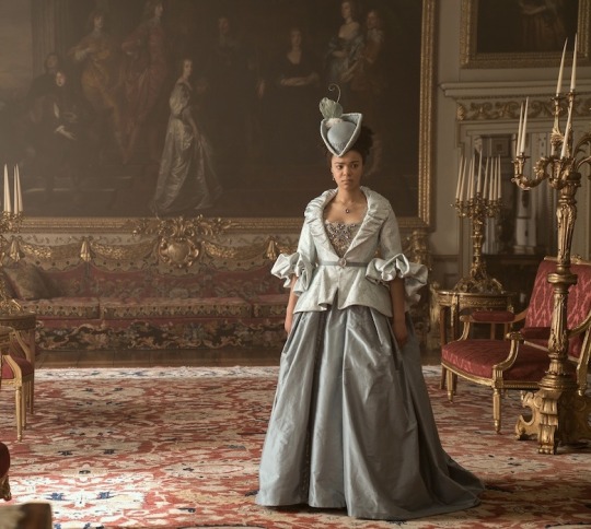
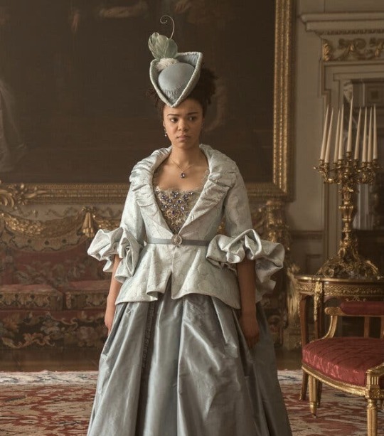


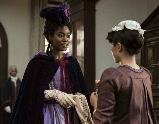


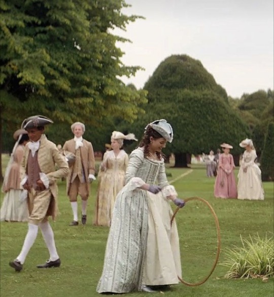

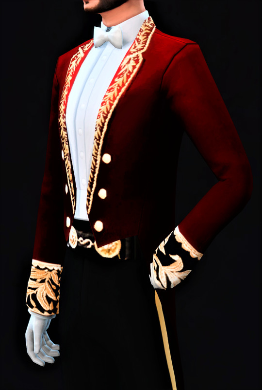
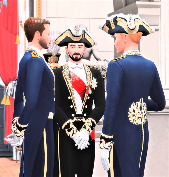
I just have to point out the absolute quality and quantity of tricorn hats in Queen Charlotte: A Bridgerton Story.
#Just a great visual story by costume designer Lyn Elizabeth Paolo that immerses you into the fashion history of the Bridgerton world.#Lyn Elizabeth Paolo#queen charlotte#queen charlotte: a bridgerton story#lady danbury#historical fashion#historical hats#historical costuming#fantasy costume#historical fantasy#historical fantasy romance#tricorn revival#tricorn hats#bridgerton
29 notes
·
View notes
Note
In which decade bloodborne set approximately? I know what this is fantasy and sir miyazaki likes to combine things from different periods but which will most likely be exact decade or multiple decades? I am starting a new hobby, creating historical garments. Today me and my friend were chatting, and i showed her edwardian combinations underwear. You can google it, such i piece of art. My friend also said how Maria would look beautiful in it. But i thought what it is too late for our lady huntress's life to wear it. So what your thoughts on period game set in?
That sounds delightful! Enjoy :)
I don’t think it’s meant to be any specific period with any exactitude. I wouldn’t look at it as a painting, anyway, where one could identify the lace and tell you what portion of the middle class wore this lace during what decade of Victoria’s reign. I think everything is very generally Victorian-adjacent, and not worth niggling over this hat is technically Georgian or this coat is technically Edwardian. The tricorne hat was supposedly falling out of favour by the Napoleonic wars, and yet it’s THE headpiece par excellence; while the Doll’s bonnet puts her a little further in the early/mid 19th. The Cainhurst silhouette is at once strikingly and bizarrely 18th century French, and also not at all. We also know BB borrows A TON from Christophe Gans’ hilarious cringefest Le pacte des loups which is much more overtly pre-(French)-Revolution in aesthetic/costumes.
So to me, there’s no hard and fast rule based on the overarching aesthetic, except maybe “Victorian-adjacent fantasy”. It feel as if the narrative team threw everything in there from Matthew Gregory Lewis’ The Monk (1796) to Stoker’s Dracula (1899) - this goes without even mentioning Lovecraft - and already we are far beyond the length of Victoria’s reign. The same goes for the architecture - while generally Neo-gothic/gothic revival, there is a ton of other European influence as well.
I made a post about this concerning Game of Thrones a little while back, which is to say some of the more brilliant art directors/costume designers will know exactly what they are sourcing overall and then allow themselves a creative freedom above that historically recognisable framework, so the visuals seem at once glaringly familiar yet not constrained to accuracy.
Tldr; you can dress ‘em up however you like.

in conclusion watch Le pacte des loups because even if it's a joke the costumes are great and Vincent Cassel is absolutely hammy in it.
•‿•
#ask#still going through the ask box#painfully slowly sorry#bloodborne#ask the art historian who is definitely not a costume historian and definitely not specialised in anything pre 20thc.
22 notes
·
View notes
Text
first spyre sidequest: pirates of leviathan
quick episode descriptions:
the daughter of storms: first d20 pvp. marcid has chased cheese into jack's house in pursuit of the daughter of storms. sunny bob and myrtle are following behind, trying to find trixie. sunny brains marcid with a hook. cheese spends the battle inside a wall full of mold, talking about oreos.
into the sternwood: first real battle. stopping a ritual in the sternwood. quitting your job by fighting your employer. excellent channel divinity. cheese finding spalding in the lake of fire. sunny beating a man to death with a mutineer's bell. a t-rex in a tricorn hat.
scramble to the ramble: splitting up to get to the ramble. sunny & bob flying. the snail lady and fast elevator. warding bond. nat 20 stealth. stimey as a communicator. jack climbing with myrtle on his back. murdering three guys in total darkness. stimey and alycon flirting. jack's revenge on clive. myrtle saving cheese from falling.
the horizon beyond the squall: marcid attacking a chimney. you wrote a whole song just to be mean to me. cheese, prince bitch. no kings for this captain. nat 20 medicine check to revive myrtle. destroy undead. beating a motherfucker with another motherfucker. bob's inflict wounds.
#dimension 20#battle episode of all time#pirates of leviathan#d20 poll#dimension 20 spoilers#d20 spoilers#feel free to add your reasoning/propaganda as you like
9 notes
·
View notes
Text
Hollow like my soul


Hollow like my soul
the beginning.
Pairing: multi - but primarily Benjamin Tallmadge/an original character of mine & Lestat de Lioncourt/an original character of mine and Lestat de Lioncourt/Louis de Pointe du Lac.
Fandom: multi-fandom crossover & my own original work. TURN: Washington’s Spies x My own original work x Vampire Chronicles by Anne Rice x the TTRPG Vampire: The Masquerade.
Rating: E - explicit. standard reminder to read tags and if you don’t like it: don’t read it.
Summary: Benjamin Tallmadge/Audrey (oc). Little Mermaid (novel) alternate universe. "We have no immortal souls; we have no future life; we are just like the green sea-weed, which, once cut down, can never revive again! Men, on the other hand, have a soul which lives for ever, lives after the body has become dust; it rises through the clear air, up to the shining stars!" - The Little Mermaid, Hans Christian Anderson
Excerpt: It was mesmerizing as there was singing, dancing, and all manner of flirtation with the blue-coated sailors and the ladies on board. Like something Lestat de Lioncourt had done to her long ago… she longed to be in it.
Then Audrey spotted him, she didn’t know his name but he shined like the sun, golden blonde queue, tricorne, blue coat and all. Oh, she wanted him, more than is sensible, more than she longed to live 300 years. She’d have him alright, by whatever it takes.

@vamptember
Chapters: 1 2 3 4 5 6 7 8 9 10 11 12 13 14 15 16 17 18 19 20 21 22 23 24 25 26 27 28 29 30
Playlist.
Archive of our own.
Link of links.
#enbylestat#fic: hollow like my soul#vamptember#vc mermay#mermay#mermay 2024#benjamin tallmadge#ben tallmadge#oc: audrey#ben x oc#lestat de lioncourt#the vampire lestat#louis de pointe du lac#vampire chronicles#vampire: the masquerade#vampire the masquerade#lestat x oc#18th century#american revolution#fan fic#fan fiction#mermaid au#bisexual#queer#lgbtq+#turn fanfiction#canon x oc#turn: washington's spies#turn washington's spies#amc turn
1 note
·
View note
Text
‘’
#harlequin harlequin if you're nice or cool or impressive in any way you may revive my obsession with the harlequin aesthetic#that would be.... nice 👀👉🏻👈🏻#diamonds and a phantom thief mask and a tricorn hat it slaps come ON
0 notes
Note
I really hope Specter Alter's substitute is just Shark getting knocked out so Specter pops out for a bit and starts throwing hands automatically until she regens.
No, but it's literally that.

Unchained 'alive', clearly Laurentina, with her tricorne hat and everything.

Unchained 'dead', the tricorne is gone and the nun hat is back, her coat opens and hangs behind her to evoke her Guard version's habit, it's very clearly Specter praying really hard at enemies to damage and slow them while Laurentina revives.
Laurentina running out of HP just makes her tag Specter in while she eats a Snickers bar, stretches her arms, and goes back into the fray.
167 notes
·
View notes
Text


Costume d'édile du Second Empire français | 1 year anniversary!
Today, September 8, or 21 Fructidor for our French revolutionaries, the blog empiredesimparte celebrates its anniversary!
I've been on Tumblr for a year now with the royal simblr community in particular. Whether you enjoy my work in its entirety, or just my characters or CCs, I thank you! I've learned a lot from all of you, and I've met some great people and blogs whose talent is literally dizzying.
I thank every member of this community for their work and kindness. Writing a story, making cc's, making collaborations, it takes time and a lot of application. I learned this as we all did when we started Simblr!
I look forward to a new year with you all. I'm delighted that you like the world of the Francesim. Thank you all, from the bottom of my heart!
Now it's time for the thank you gift!
Costume of a French Second Empire mayor
Inspired by the work of a Breton mayor, who revived the 2nd empire costume still in use in France (but unfortunately neglected). It's a costume that was worn by high French officials, embroidered with laurels. I hope it will live on through your Sims!
12 swatches
For men in their teens and beyond. It can be applied to women but is not designed for that purpose.
I highly recommend the tricorn created by @acanthus-sims which is part of the official complete outfit! Wearing a sword is a big plus.
Base Game Sims 4
DOWNLOAD : SimFileShare
Terms Of Use
You’re not allowed to :
I. Re-upload my work.
II. Put my work behind any paywalls, it’s a free content.
III. Usurp my work.
223 notes
·
View notes
Text
Masterpiece S3 General Promo Analysis: Elizabeth

Today is precisely 30 Days to the US premiere of Series 3!! My vacation ended right on time to see this slideshow of promo pictures from PBS. This Elizabeth costume is the 8th picture at the link. Interestingly enough, I didn’t see this photo used in the UK S3 promos.
Elizabeth is wearing a green wool riding habit/redingote exactly as it was intended. Women rode a horse sidesaddle, not 1 leg on each side. The outer petticoat covered the legs. This article from the Washington Post goes into more detail on how period dramas have influenced a revival of this style of riding.
Many of the 1790′s museum/art examples of riding habits have bigger collars or lapels in the back of the jacket. Elizabeth’s riding habit except for the material used and tighter fichu is fairly close to this fashion plate from Pinterest. The bodice jacket has a white inset (or stomacher piece) along the button line. That styling is more commonly found on the open skirt front redingotes.
Elizabeth’s brown felt riding hat is typical of 1790′s fashion. Feathers and flower rosettes were the most popular adornments for hats. The narrower brim and the top-hat style shape of the crown sets this style apart from the earlier thinner hats and tricorns.
This costume has elements of the transition to the Regency stylings, but most of Elizabeth’s costumes this season stick to the earlier Georgian style.
Have more Elizabeth costume questions? The Ask Box is open, but be aware questions will be screened for US Spoilers.
#poldark#poldark costumes#elizabeth warleggan#poldark costume project: series 3 promos#poldark costume project: elizabeth
23 notes
·
View notes
Photo

The early 20th century saw a revival of the tricorn (three corner) hat, once popular in the Empire era of Marie Antoinette--that's her wearing one in the last portrait. This Edwardian-era version, new to the shop and shown in the first picture, is especially tall, and quite simple in its design. Which version of the tricorn hat would you wear? ............. BTW, thank you all SO much for your input on the shop-related questions in my last two posts! Ive been swamped the last few days but have a few more opinions to ask of you! ⚘ . . . . . . . . . #tricorn #tricornhat #edwardian #edwardianera #edwardianstyle #earlycenturyfashion #historicalfashion #historicaldress #victorianfashion #antiqueclothing #edwardianhat #womenwhowearhats #hatlover #18thcenturyfashion #empirefashion #historyoffashion #historicalfashion #ladypirate #womenshistory #1900sfashion #edwardianfashion #roseleinrarities #vintagephotography #fashionphotography #vintagephotoshoot #blackbackground #piratevibes #facesandstyle #womensfashion #historylovers (at Oelwein, Iowa) https://www.instagram.com/p/B7TrSZpAbD7/?igshid=gv072p5ektdj
#tricorn#tricornhat#edwardian#edwardianera#edwardianstyle#earlycenturyfashion#historicalfashion#historicaldress#victorianfashion#antiqueclothing#edwardianhat#womenwhowearhats#hatlover#18thcenturyfashion#empirefashion#historyoffashion#ladypirate#womenshistory#1900sfashion#edwardianfashion#roseleinrarities#vintagephotography#fashionphotography#vintagephotoshoot#blackbackground#piratevibes#facesandstyle#womensfashion#historylovers
0 notes
Text
BETWEEN THE BRIDGES
A few years ago I did a feature on Manhattan between the Manhattan and Brooklyn Bridges (I call it BEMBO), but as always, there’s more to see and there are details I missed. This time of year I also begin to scout areas that would make decent Forgotten NY tours in the spring and summer. BEMBO is a curious area, full of crannies and nooks of interest. Had I been writing Forgotten New York in the 1960s, there would have been a lot more to talk about, as maybe half of this neighborhood has been razed to build housing projects, schools, and the NYPD headquarters. I was able to show some of these lost streets in a FNY post in January 2019.
Getting off the F train at East Broadway at Canal (Straus Square) I meandered west. I discussed the Mesivtha Tiferes Jerusalem Yeshiva just the other day, so I won’t repeat myself here; it’s a handsome building in buff and brown brick, and has a venerable history.
East Broadway, looking west, looking toward the Manhattan Bridge overpass, and behind it, the Municipal Building and Woolworth Building, which from this vantage look like twin spires of the same building. In the left background is #4 World Trade Center and on the right, of course, is #1 World Trade Center. In the foreground left is the relatively new 109 East Broadway, the site of a devastating fire in 2010. The building exhibits the latest trend in residential architecture, featuring a boxy design with colored metal panels and flat windows. Why do so many new apartment buildings looks like this? They’re the cheapest to build.
In FNY’s Comments section, and remarks from friends on facebook, twitter and in person, many dismiss new architecture outright, saying nothing built today matches the past. I judge each building on its merits, and part of me is happy to live in a dynamic city that can accommodate new designs. I like a city that has both a Jenga tower and a St. Patrick’s Cathedral.
Until the beginning of the 20th Century, East Broadway was known as Chatham Street, for William Pitt, Earl of Chatham (1708-1778) who was the English Prime Minister during the time the colonies were agitating for independence, but before the Revolutionary War. He opposed the Stamp Act, but also opposed outright independence, but promoted compromise that ultimately proved untenable. Many USA locales are named for him including Pittsfield, MA and Pittsburgh, PA, as well as Chatham Square, East Broadway at the Bowery.
No good way to get a picture of the Knickerbocker Post Office, 128 East Broadway near Pitt Street because of … all the mail trucks parked in front of it.
Washington Irving (1783-1859), who met his namesake George Washington while a young boy, was popular both in the States and in Europe for his essays and fiction, and was the creator of Ichabod Crane, Rip van Winkle, and the tricornered Father Knickerbocker, NYC’s mascot. “Knickerbocker,” which is fun to say, refers to NYC’s early Dutch settlers and appears frequently in NYC lore, including its NBA basketball team.
The Sung Tak Buddhist Association at 13 Pike Street was once the Pike Street Synagogue, a Classic Revival building from 1903 that housed the Congregation Sons of Israel Kalwarie, Poland. Entertainer Eddie Cantor was bar mitzvahed here in 1905. The tripartite façade, which has an arched portico reached by twin lateral staircases, reflects Romanesque and classical features.
Looking north on Pike Street, which was named for explorer Zebulon Pike, soldier and explorer (1779-1813) of Pike’s Peak fame. Along with Allen Street, which begins a block north, the road was widened several decades ago and now sports a modern bicycle path. You can walk in a straight line all the way from here to the Harlem River, as Pike becomes Allen and Allen becomes 1st Avenue.
Turning left on Market Street, I encountered one of the oldest churches in Manhattan at Henry Street, the old Market Street Reformed Church, which was built in 1819. The windows are made up of multiple panels—35 over 35 over 35. This is now the First Chinese Presbyterian Church, which shared the building with the Sea and Land Church until 1972.
The brick and stone Georgian-Gothic church was constructed two centuries ago as the Market Street reformed Church on land owned by Henry Rutgers, and after changing congregations a few times over the years, it’s now the First Chinese Presbyterian Church. It’s in the top five oldest extant church buildings in New York City, the oldest being St. Paul’s Chapel on Broadway and Vesey St.
Every time I’m in the area, I check on Mechanics Alley, which runs on the west side of the Manhattan Bridge anchorage for 2 blocks between Madison and Henry Streets. Though it has obtained a more narrow sense, the word “mechanic” originally meant an artisan, builder or craftsman, not necessarily a machinist. No property fronts on the narrow lane, but trucks nonetheless employ it despite its narrowness to avoid heavier traffic on streets like Market.
I did a pretty comprehensive post on Mechanics Alley and its history a few years ago in FNY.
Market Street contains a number of historic and classic buildings along its short stretch between East Broadway and South Street. Here’s #40 market on the corner of Madison, which still has its original entrance woodwork as well as the street identification brownstone plaques. The Market Street side looks as if it has had some ad hoc repairs done sometime in the past.
375 Pearl Street, otherwise known as the Verizon Building, a.k.a. the Intergate Center, looms at the west end of Monroe Street. Many call it the ugliest building in Manhattan, though I’ve seen far worse. In 2016 it was renovated and received a new bank of windows.
This shabby brick building at 51 Market St. was constructed in 1824 by merchant William Clark. Its original elegant doorway, with Ionic columns, a fanlight and ornamentation, has survived nearly two centuries. A close look at the basement windows shows them to be surrounded with brownstone work with squiggly lines, known in the architecture world as “Gibbs surrounds.” A fourth floor, which studiously copied the original three, was added after the Civil War. The stoop and railings, however, are not original as they were replaced in 2010. The door is festooned with graffiti, and though the house has Landmark status, its condition appears deteriorated.
Amid the Chinese-language signs on Market and Madison, at the edge of Chinatown, is this neon sign for a long-gone liquor store.
At #47 Market Street is a venerable brick building that conveniently lists the date of construction, 1886, at the roofline.
Faces peer out from the front of this Madison Street apartment. Many of these buildings, and those on paralleling Monroe and Henry Streets, were built in the 1880s, when such embellishments were found on just about every building, commercial or residential.
The undulating exterior of #8 Spruce Street, officially New York By Gehry, named for architect Frank Gehry, is the architect’s signature NYC building. Like it or not, it’s instantly recognizable from all over lower Manhattan. After its completion in 2011, it was NYC’s tallest residential building for a couple of years, but has since been surpassed by buildings like 432 Park.
The Roman Catholic parish of St. Joseph (“San Giuseppe”) was established by the Missionaries of St. Charles, an order of priests and brothers founded by Blessed John Baptist Scalabrini in 1887 to serve the needs of Italian immigrants. The present church was designed by Matthew W. Del Gaudio and opened in 1924. Shortly after the founding of the parish, the Scalabrinians were joined by the Apostles of the Sacred Heart of Jesus, who helped open St. Joseph School in 1926.
Today, St. Joseph Church is a national parish designated as an Italian and Chinese parish. The parish continues the mission of the Church of St. Joachim, located at 26 Roosevelt Street until the 1960s, which was founded by the Missionaries of St. Charles who arrived in New York City in 1889. Immediately after, Mother Cabrini was welcomed by the same church as she arrived in the United States. American Guild of Organists, NYC Chapter
Speaking of the Scalabrinians, in January 2018 I visited their former bailiwick, St. Charles Seminary in Todt Hill, Staten Island, which had been the estate of architect Ernest Flagg.
Catherine Street classics, near Madison Street.
Madison and Oliver Streets. Al Smith (1873-1944), a four-time NYS governor and failed presidential candidate, was born on Oliver, a still-existing street between the Brooklyn and Manhattan Bridges, neither of which had opened when he was born. He was one of NYC’s most popular politicians in history.
On a walk up the Lower East Side in January 2013, I encountered an anachronistic building that I either hadn’t seen or hadn’t noticed before, on Madison Street a few doors away from St. James Place. It’s a tiny two-story dormered building — however, it’s not too small that it doesn’t have two separate doors and two separate house numbers, 47 and 49. I’ve always been curious about anachronisms and survivors, being something of an anachronism myself, so I looked it up. Expecting a difficult or fruitless search, I found something by the historian David Freeland, who rote about it in 2009 in the now-defunct New York Press:
For years the house has been something of a mystery, but one glimpse into its colorful history is revealed through a small advertisement from the Spirit of the Times newspaper, as reprinted in the Boston Herald of March 2, 1853: “Rat Killing, and other sports, every Monday evening. A good supply of rats kept constantly on hand for gentlemen wishing to try their dogs, with the use of the pit gratis, at J. Marriott’s Sportsman’s Hall, 49 Madison Street.”
Rat baiting, setting rats against rats, or dogs against rats, was a popular betting sport in the 19th Century in the days before the ASPCA. The building where another former rat baiting establishment was run by Kit Burns, the Captain Joseph Rose House, still stands at 273 Water Street in the Seaport area.
Freeland goes on:
By the late 1850s, the house at 49 Madison Street had been taken over by English-born Harry Jennings, who ran it as a combination saloon and rat-fighting pit until his conviction on a robbery charge sent him to prison in Massachusetts. But later, after returning to New York, Jennings settled into a kind of respectability, winning fame as a dog trainer and, eventually, the city’s leading rat exterminator. By the time of his death, in 1891, Jennings’ clients included Delmonico’s Restaurant and such luxury hotels as Gilsey House and the original Plaza.
Apparently, there’s a comeback in everybody.
The dark shadows of January intrude on the intersection of James and Madison Streets, one of the few intersections in NYC where both street names make up a US President’s first and second name. I’m sure it wasn’t planned that way, though.
We can see St. James Church, the second oldest building associated with the Roman Catholic Church in NYC. (Old St. Patrick’s Cathedral, Mott and Prince Streets, built in 1810, precedes it.) The fieldstone, Doric-columned Greek Revival building was begun in 1835 and completed in 1837; and though it is thought to be a design of famed architect Minard Lefever, there is no evidence to support the claim. A domed cupola above the sanctuary was removed decades ago. This was the boyhood parish of Al Smith, and New Bowery, which connects Pearl Street and Chatham Square, was renamed for it in 1947.
The massive Chatham Green development, located along St. James Place between Madison Street and Chatham Square, opened in 1960, was one of the projects that eliminated much of the ancient street grid in lower Manhattan, as well as the last remnants of the Five Points slum. But on those streets were located dark, noisome and cold tenements, and Chatham Green was constructed by the City in an effort to make middle-income peoples’ lives better. As we know, that effort has had mixed results.
Chatham Green went condo several years ago, with hefty prices, somewhat belying its original purposes.
This triangular-shaped building comes to a point at St. James Place and Madison Street. As I have noted, St. lames Place, laid out in the mid-1850s, was originally called New Bowery, but the designation must have been fluid at one time, as the chiseled street sign on the building simply has “Bowery.”
One Police Plaza, along Madison Street and Park Row (both closed to regular traffic) opened in 1973, is the headquarters of the NY Police Department; it took over from the old domed HQ, now a condo conversion at Centre and Broome Streets. It was designed by Gruzen and Partners in a Brutalist style and sits near the assorted city and state court buildings at Foley Square.
The NYC Municipal Building was constructed in 1914 from plans by McKim, Mead & White; it now houses only a fraction of the city offices that oversee the functioning of the metropolis. Particularly attractive is the row of freestanding columns, the extensive sculpture work and the lofty colonnaded tower topped by Adolph Weinman’s 25-fot high gilt statue of Civic Fame.
I have happy memories of the building since on October 23, 2006 I spent a half hour with Brian Lehrer on WNYC-radio discussing Forgotten NY the Book, and temporarily, my Amazon sales jumped into the 500s (by contrast, 12 years later, I’m in the 300,000s usually).
The sculptures on the north arch include allegorical representations of Progress, Civic Duty, Guidance, Executive Power, Civic Pride and Prudence. Between the windows on the second floor are symbols of various city departments. Note the collection of plaques, among which is the “triple X” emblem of Amsterdam, Holland. Chambers Street once passed through the building and once went all the way to Chatham Square but the NYC Police Dept complex was built over its path in the 1960s. —Gerard Wolfe
The fortress-like, business-themed Murray Bergtraum High School was built at Madison Street and Robert F. Wagner Senior Place, adjacent to Brooklyn Bridge off-ramps, in 1976. It’s named for a former president of the NYC Board of Ed., between 1969 and 1971. Noted alumni include entertainers John Leguizamo and Damon Wayans.
Rose Street, once chockablock with tenements, is a curved street running under the Brooklyn Bridge connecting Gold and Madison Streets. It was named for late 18th-early 19th Century merchant and distiller Captain Joseph Rose, whose house still stands nearby on Water Street. I discussed Rose Street at length on this FNY page.
Though I continued into the Seaport area, it’s a busy weekend and I’ll wrap things up for now.
Please help contribute to a new Forgotten NY website
Check out the ForgottenBook, take a look at the gift shop, and as always, “comment…as you see fit.”
1/6/19
Source: http://forgotten-ny.com/2019/01/between-the-bridges/
0 notes
Text
How To Paint A Front Door + The Best Front Door Paint
Everyone has a front door, some people might even have 2. But we got extra lucky at the Merc and have 3 front doors! Updating your front door with paint is one of the quickest ways to bring some serious curb appeal to your house, but you have to do it the right way and you have to use the right kind of exterior paint.
Remember how we’ve talked about finding the right paint for the job and that paint is not a one size fits all type of product? When you are painting outside doors, you MUST use exterior paint. Want to see what happens when you don’t? This is at our family cabin. This door was painted with regular latex just 2 years ago. Can you see how much it’s faded and discolored? That friends, is why you need exterior paint.
Once we had our vintage doors for the Merc modified and hung it was time to get painting. We started by taping EVERTYHING off. Prep is wicked important, especially when youre using a paint sprayer.
The first step to painting raw wood is to prime it. Primer keeps the good stuff in and the bad stuff out. It preps the wood for paint and creates the best possible scenario for paint to adhere. It also helps even out the wood texture and is usually significantly cheaper than paint so it’s better to do 2 coats of primer + 2 coats of paint vs. 4-5 coats of paint.
The primer that we used is Sherwin-Williams Exterior Latex Wood Primer. It’s great if you’re using a darker color on your door (if you’re doing a lighter color you might want something with more stain blocking properties so the wood doesn’t bleed through and ruin your finish.)
The paint we used for our trim is Sherwin-Williams Emerald Exterior Satin in Tricorn Black (you can see all of my paint colors here!!) Make sure that you are painting on a breeze-free day. Otherwise you’ll end up with loads of treasures in your paint! There are some tricks to using Emerald Exterior paint. It’s very thick, which is good and also can be frustrating. We had to get a different tip for our sprayer because the paint was too thick for the smaller one. So that is lame. Emerald Exterior paint has a longer cure time than what you’re probably used to, especially if you’re only used to interior latex. This may seem like a negative until you watch the magic happen. When you spray (or roll) paint, especially thick paint, your immediate finish looks like this:
I get it. It’s textured, and freak-out inducing. BUT DON’T TOUCH IT!!! Channel every bit of patience that you have and walk away to let it dry. As the paint cures it will flatten out and dry to a smooth finish. If you leave it alone.
The day we decided to paint the front doors it was really windy and so instead of moving them out back to paint like we did with our back door we left them in place and sheeted off the opening. (This was before our interior doors were installed and we set up and entire room for painting)
A tip for painting if your door has moulding like ours, Don’t try to do it all in one pass, you’ll put too much paint on the surface and still miss parts of the trim. Instead, lower the output of your sprayer and hit each side of the moulding, then do a pass over the whole door.
Remember that texture-y up close picture above? This is what it looks like after it dries.
Have you ever painted your front door? Share your tips below!!
The post How To Paint A Front Door + The Best Front Door Paint appeared first on Vintage Revivals.
How To Paint A Front Door + The Best Front Door Paint published first on https://vacuumpalguide.tumblr.com/
0 notes
Text
How To Paint A Front Door + The Best Front Door Paint
Everyone has a front door, some people might even have 2. But we got extra lucky at the Merc and have 3 front doors! Updating your front door with paint is one of the quickest ways to bring some serious curb appeal to your house, but you have to do it the right way and you have to use the right kind of exterior paint.
Remember how we’ve talked about finding the right paint for the job and that paint is not a one size fits all type of product? When you are painting outside doors, you MUST use exterior paint. Want to see what happens when you don’t? This is at our family cabin. This door was painted with regular latex just 2 years ago. Can you see how much it’s faded and discolored? That friends, is why you need exterior paint.
Once we had our vintage doors for the Merc modified and hung it was time to get painting. We started by taping EVERTYHING off. Prep is wicked important, especially when youre using a paint sprayer.
The first step to painting raw wood is to prime it. Primer keeps the good stuff in and the bad stuff out. It preps the wood for paint and creates the best possible scenario for paint to adhere. It also helps even out the wood texture and is usually significantly cheaper than paint so it’s better to do 2 coats of primer + 2 coats of paint vs. 4-5 coats of paint.
The primer that we used is Sherwin-Williams Exterior Latex Wood Primer. It’s great if you’re using a darker color on your door (if you’re doing a lighter color you might want something with more stain blocking properties so the wood doesn’t bleed through and ruin your finish.)
The paint we used for our trim is Sherwin-Williams Emerald Exterior Satin in Tricorn Black (you can see all of my paint colors here!!) Make sure that you are painting on a breeze-free day. Otherwise you’ll end up with loads of treasures in your paint! There are some tricks to using Emerald Exterior paint. It’s very thick, which is good and also can be frustrating. We had to get a different tip for our sprayer because the paint was too thick for the smaller one. So that is lame. Emerald Exterior paint has a longer cure time than what you’re probably used to, especially if you’re only used to interior latex. This may seem like a negative until you watch the magic happen. When you spray (or roll) paint, especially thick paint, your immediate finish looks like this:
I get it. It’s textured, and freak-out inducing. BUT DON’T TOUCH IT!!! Channel every bit of patience that you have and walk away to let it dry. As the paint cures it will flatten out and dry to a smooth finish. If you leave it alone.
The day we decided to paint the front doors it was really windy and so instead of moving them out back to paint like we did with our back door we left them in place and sheeted off the opening. (This was before our interior doors were installed and we set up and entire room for painting)
A tip for painting if your door has moulding like ours, Don’t try to do it all in one pass, you’ll put too much paint on the surface and still miss parts of the trim. Instead, lower the output of your sprayer and hit each side of the moulding, then do a pass over the whole door.
Remember that texture-y up close picture above? This is what it looks like after it dries.
Have you ever painted your front door? Share your tips below!!
The post How To Paint A Front Door + The Best Front Door Paint appeared first on Vintage Revivals.
How To Paint A Front Door + The Best Front Door Paint published first on https://landscapingmates.blogspot.com
0 notes
Text
How To Paint A Front Door + The Best Front Door Paint
Everyone has a front door, some people might even have 2. But we got extra lucky at the Merc and have 3 front doors! Updating your front door with paint is one of the quickest ways to bring some serious curb appeal to your house, but you have to do it the right way and you have to use the right kind of exterior paint.
Remember how we’ve talked about finding the right paint for the job and that paint is not a one size fits all type of product? When you are painting outside doors, you MUST use exterior paint. Want to see what happens when you don’t? This is at our family cabin. This door was painted with regular latex just 2 years ago. Can you see how much it’s faded and discolored? That friends, is why you need exterior paint.
Once we had our vintage doors for the Merc modified and hung it was time to get painting. We started by taping EVERTYHING off. Prep is wicked important, especially when youre using a paint sprayer.
The first step to painting raw wood is to prime it. Primer keeps the good stuff in and the bad stuff out. It preps the wood for paint and creates the best possible scenario for paint to adhere. It also helps even out the wood texture and is usually significantly cheaper than paint so it’s better to do 2 coats of primer + 2 coats of paint vs. 4-5 coats of paint.
The primer that we used is Sherwin-Williams Exterior Latex Wood Primer. It’s great if you’re using a darker color on your door (if you’re doing a lighter color you might want something with more stain blocking properties so the wood doesn’t bleed through and ruin your finish.)
The paint we used for our trim is Sherwin-Williams Emerald Exterior Satin in Tricorn Black (you can see all of my paint colors here!!) Make sure that you are painting on a breeze-free day. Otherwise you’ll end up with loads of treasures in your paint! There are some tricks to using Emerald Exterior paint. It’s very thick, which is good and also can be frustrating. We had to get a different tip for our sprayer because the paint was too thick for the smaller one. So that is lame. Emerald Exterior paint has a longer cure time than what you’re probably used to, especially if you’re only used to interior latex. This may seem like a negative until you watch the magic happen. When you spray (or roll) paint, especially thick paint, your immediate finish looks like this:
I get it. It’s textured, and freak-out inducing. BUT DON’T TOUCH IT!!! Channel every bit of patience that you have and walk away to let it dry. As the paint cures it will flatten out and dry to a smooth finish. If you leave it alone.
The day we decided to paint the front doors it was really windy and so instead of moving them out back to paint like we did with our back door we left them in place and sheeted off the opening. (This was before our interior doors were installed and we set up and entire room for painting)
A tip for painting if your door has moulding like ours, Don’t try to do it all in one pass, you’ll put too much paint on the surface and still miss parts of the trim. Instead, lower the output of your sprayer and hit each side of the moulding, then do a pass over the whole door.
Remember that texture-y up close picture above? This is what it looks like after it dries.
Have you ever painted your front door? Share your tips below!!
The post How To Paint A Front Door + The Best Front Door Paint appeared first on Vintage Revivals.
via Mandi at How To Paint A Front Door + The Best Front Door Paint
via Jeff Donaldson’s Blog How To Paint A Front Door + The Best Front Door Paint
0 notes
Text
Paint Colors For The Merc!!
Let’s get painting now, everyone is learning how, come on and get painting with meeeeeeeee! (I literally don’t know why everytime I sat down to write this post that song pops into my head, maybe because the Beach Boys were on Full House this week? But you know, painting instead of surfing because I’m not on a beach-also no coordination.
Are you guys ready to dive into the world of painting at the Merc?!! Let me begin by saying that once the paint was on the walls it finally started to feel like our house. It’s crazy to look back and see how much it changed from when we started. This huge open room with no walls and oh so much potential! Painting is where our lives started to get really crazy. Most of the work from the subs is over, its now up to us to bring this puppy over the finish line!
When it comes to picking out paint, I could do it in my sleep, in fact I bet if you called my local Sherwin-Williams store and asked for Mandi’s usual they’d know exactly what colors and type to get. If you’ve followed VR for any length of time you know that I have my go to tried and true that I’ve used on every room I’ve gotten my hands on since 2013 (THAT IS CRAZY!!!!) So if you’re looking for the perfect white, have a seat my friend and let’s chat.
To me the perfect white is just white. Not yellowish, not bluish, not grayish, just white. Its not too bright or too dingy, its JUST WHITE. At my local store its called Mandi White (if you’re in St. George you can go into any of the stores and they’ll mix it up for you!) The formula is extra white base with 3 oz of white pigment added. After 4 years of calling it Mandi White I asked Sherwin Sensei Sam (the manager that answers all of my weird questions) if this was a real Sherwin color and they we’re just humoring me and calling it Mandi White (you know, like when someone calls you by the wrong name for so long that you can’t correct them and will eternally be Mindy when you’re around them?) This is what he said. There is in fact NOT a color with the same formula (YAY!! Who wants to start a petition to have Mandi White added to their official list of colors!?!) But the closest “real color” is Pure White SW 7005. With Pure White they add a little bit of black to the extra white base to grey it out a teeny bit. With Mandi White the white pigment does sort of the same thing, its just a touch brighter.
So back to the Merc, like I said before, Mandi White was a complete no brainer for all of the walls and baseboard. Same with using Tricorn Black for the accents. I’ve used it so many times that there are no surprises here. BUT I did venture out to a new color that I’d never used before and i’m pretty thrilled about it -dun dun dun dun dun duuuuuuun- Jasper.
Here’s a side by side with Jasper and Tricorn Black
Before we go deeper into that let me tell you why I was so drawn to it. When we were touring the Merc for the first time I noticed these green boards stacked in a back room as well as spots of green hanging out other places (like the pass through window in the kitchen). When I asked about it, the previous owner told me the cutest historical story about Southern Utah. When the pioneers had finished building the temple they ordered paint to cover the red sandstone that it was built out of. White for the walls and green for the roof. When the paint arrived there was wayyyyy more green and not enough white, so the church passed it out to whomever wanted it to paint their gates/houses and ordered more white. I’m not sure if the green paint at the Merc is temple paint but isn’t that the most endearing story?! From that moment forward I knew if I was going to use color, it needed to be green, so it was constantly in the back of my mind.
Enter Jasper. When I saw this almost black inky green I knew it was meant for the Merc. We’re using it on our front doors and kitchen cabinets, and if we’re being totally honest I wanted to use it on all of the interior doors as well but decided against it because I didn’t want to overuse it. It feels like the cabs and front doors will be the perfect amount of green. And so far that’s it! Mandi White, Tricorn Black, and Jasper. I’m sure I’ll end up with other colors once we’re moved in and the decorating begins but for now I’m really digging the historic vibe this palette is throwing off.
Tomorrow we’re talking practical application. See you then!!
The post Paint Colors For The Merc!! appeared first on Vintage Revivals.
via Mandi at Paint Colors For The Merc!!
via Jeff Donaldson’s Blog Paint Colors For The Merc!!
0 notes
Text
Paint Colors For The Merc!!
Let’s get painting now, everyone is learning how, come on and get painting with meeeeeeeee! (I literally don’t know why everytime I sat down to write this post that song pops into my head, maybe because the Beach Boys were on Full House this week? But you know, painting instead of surfing because I’m not on a beach-also no coordination.
Are you guys ready to dive into the world of painting at the Merc?!! Let me begin by saying that once the paint was on the walls it finally started to feel like our house. It’s crazy to look back and see how much it changed from when we started. This huge open room with no walls and oh so much potential! Painting is where our lives started to get really crazy. Most of the work from the subs is over, its now up to us to bring this puppy over the finish line!
When it comes to picking out paint, I could do it in my sleep, in fact I bet if you called my local Sherwin-Williams store and asked for Mandi’s usual they’d know exactly what colors and type to get. If you’ve followed VR for any length of time you know that I have my go to tried and true that I’ve used on every room I’ve gotten my hands on since 2013 (THAT IS CRAZY!!!!) So if you’re looking for the perfect white, have a seat my friend and let’s chat.
To me the perfect white is just white. Not yellowish, not bluish, not grayish, just white. Its not too bright or too dingy, its JUST WHITE. At my local store its called Mandi White (if you’re in St. George you can go into any of the stores and they’ll mix it up for you!) The formula is extra white base with 3 oz of white pigment added. After 4 years of calling it Mandi White I asked Sherwin Sensei Sam (the manager that answers all of my weird questions) if this was a real Sherwin color and they we’re just humoring me and calling it Mandi White (you know, like when someone calls you by the wrong name for so long that you can’t correct them and will eternally be Mindy when you’re around them?) This is what he said. There is in fact NOT a color with the same formula (YAY!! Who wants to start a petition to have Mandi White added to their official list of colors!?!) But the closest “real color” is Pure White SW 7005. With Pure White they add a little bit of black to the extra white base to grey it out a teeny bit. With Mandi White the white pigment does sort of the same thing, its just a touch brighter.
So back to the Merc, like I said before, Mandi White was a complete no brainer for all of the walls and baseboard. Same with using Tricorn Black for the accents. I’ve used it so many times that there are no surprises here. BUT I did venture out to a new color that I’d never used before and i’m pretty thrilled about it -dun dun dun dun dun duuuuuuun- Jasper.
Here’s a side by side with Jasper and Tricorn Black
Before we go deeper into that let me tell you why I was so drawn to it. When we were touring the Merc for the first time I noticed these green boards stacked in a back room as well as spots of green hanging out other places (like the pass through window in the kitchen). When I asked about it, the previous owner told me the cutest historical story about Southern Utah. When the pioneers had finished building the temple they ordered paint to cover the red sandstone that it was built out of. White for the walls and green for the roof. When the paint arrived there was wayyyyy more green and not enough white, so the church passed it out to whomever wanted it to paint their gates/houses and ordered more white. I’m not sure if the green paint at the Merc is temple paint but isn’t that the most endearing story?! From that moment forward I knew if I was going to use color, it needed to be green, so it was constantly in the back of my mind.
Enter Jasper. When I saw this almost black inky green I knew it was meant for the Merc. We’re using it on our front doors and kitchen cabinets, and if we’re being totally honest I wanted to use it on all of the interior doors as well but decided against it because I didn’t want to overuse it. It feels like the cabs and front doors will be the perfect amount of green. And so far that’s it! Mandi White, Tricorn Black, and Jasper. I’m sure I’ll end up with other colors once we’re moved in and the decorating begins but for now I’m really digging the historic vibe this palette is throwing off.
Tomorrow we’re talking practical application. See you then!!
The post Paint Colors For The Merc!! appeared first on Vintage Revivals.
Paint Colors For The Merc!! published first on http://ift.tt/2hUI8pL
0 notes
Text
My Fail-Proof Paint Colors for a Monochromatic Home
We all know that one of the easiest updates you can make to your house is to update the paint, right?! In fact its always the first place that I start. But, I’d be lying if I said that picking the perfect color is easy. There are SO MANY factors that come into play. but guys I’ve tested more paint colors than I care to count and today I’m dishing on my Fail-Proof hues!!
Over the last 15 years we’ve witnessed beige walls move into the grey territory and just the last few years it’s moving again into whites and blacks. It’s almost impossible to scroll through Instagram or Pinterest without seeing some variation of a modern farmhouse with white walls and black windows. Monochromatic is huge, and for good reason. It’s the perfect back drop for almost every style choice. I’ve said it for years, if you LOVE color like I do, white walls give you freedom to use ALLLLLL the colors. If you hate color, chances are great that you already are on team white walls. You just can’t go wrong. Or can you?
All of the colors below are described as white. 5 out of the 6 have White in the name, and on a wooden background they all look white.
Within every color are a whole range of undertones. These are the exact same colors on a white background! I mean, that is crazy right!?
What looks white by itself can look pink next to a truer white. So what if you want just white white? No blue, green. yellow, or gray tones. Just white. Sherwin-Williams Extra White SW 7006 is your answer. It the perfect shade of true white that doesn’t come off too cool.
Black is the exact same story. True black can be hard to find right?! My go to is Sherwin-Williams Tricorn Black SW 6258. It’s the perfect shade of warm true black. It doesn’t read blue or purple or brown just black. I’ve used it everywhere from my dining room walls (remember that?!) to the trim in our old house, to the workshop makeover at the Merc, to the doors at my in-law’s new house. Guys, trust me when I say it is THE BEST BLACK PAINT COLOR EVER.
What about everything in-between? I’ve so got you covered.
Iron Ore SW 7069 is my favorite charcoal grey. We used it at their new house in their office. Notice how great it looks with the Tricorn Black doors! (We also used it at the restaurant and have people asking about it all the time.)
One thing that we wanted when we were designing Alicia’s house was for the accent doors to feel special, so we went with a semi-gloss paint from Sherwin-Williams. But the thing we went back and forth on the most was what exactly to paint Tricorn Black SW 6258. Just the doors? The doors and casings? All of the trim work, including the baseboard? SO many options. Ultimately we decided to do the door and the casings black and the baseboard Extra White SW 7006.
Didn’t it turn out amazing!?? Huge thanks to Sherwin-Williams for sponsoring this post!
The post My Fail-Proof Paint Colors for a Monochromatic Home appeared first on Vintage Revivals.
via Mandi at My Fail-Proof Paint Colors for a Monochromatic Home
via Jeff Donaldson’s Blog My Fail-Proof Paint Colors for a Monochromatic Home
0 notes
Last Seen Blogs

amhamwrites
Amber Hamilton

acorn2006
Sarah.

internetconquistador
Internet Conquistador

ietm-service-provide-cnp
IETM Services Provider / Code and Pixels

styledbylc
Styled by LC