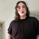
#tutorial black
Explore tagged Tumblr posts
Visit Tumblr Blog
Explore Tumblr blogs with no restrictions, modern design and the best experience.
Last Seen Tumblr Blogs


Fun Fact
If you dial 1-866-584-6757, you can leave an audio post for your followers.
Text
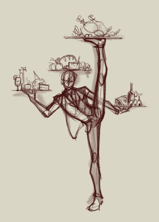
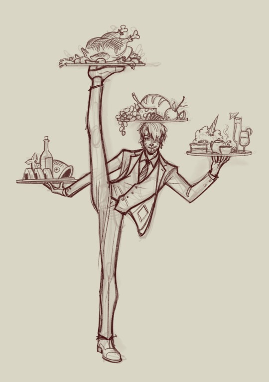
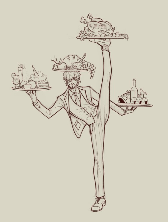
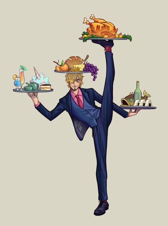
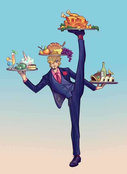
Tutorial art!! And hcs
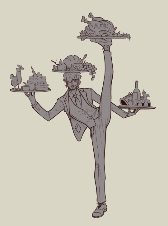
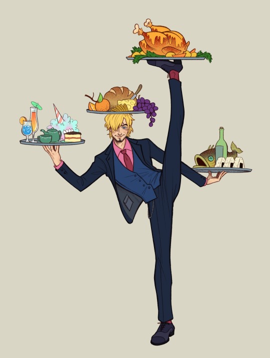
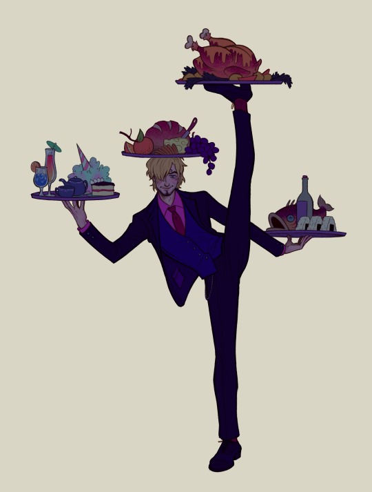
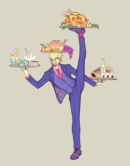
#animator vs animation#animation vs minecraft#alan becker#ava#avm#Alan Becker tutorials#tutorial blue#tutorial purple#tutorial green#tutorial black
25 notes
·
View notes
Text
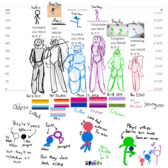
this is not a tutorial this is just me rambling
#art#art study#reference#painting#hands#digital art#illustration#bipoc#poc#black#black art#dark skin#information#art tutorial#art non tutorial#artists on tumblr#art tips#sketched this in january so its gotta leave my head someday
27K notes
·
View notes
Text
hey so i've been working on a lot of things (and also second guessing myself a lot because perfectionism) but here's some very random sneak peeks if y'all are interested!!
#and happy black history month!!#how are we already entering into the final week :((#also#i've been inspired to write some 'creating deco cc' tutorials#i saw someone ask where they could find some easy-to-follow ones on x and i thought why not???#i'm far from the best but i can do lil sumn sumn i suppose
1K notes
·
View notes
Text

Oh shit John Doe birthday... *scrounges art folder*... uhhhh... (;ŏ﹏ŏ)
#don't look at me#happy birthday John Doe#let your freak flag fly#dom!john rights#masked#malevolent#malevolent podcast#malevolent fanart#john doe malevolent#my art#i saw a high shine tutorial and blacked out and woke up with this on my tablet
444 notes
·
View notes
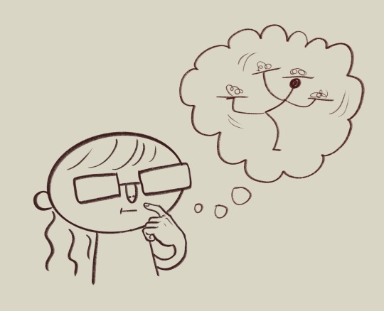
Note
i love ur expressions so much!!!!! Is it alr if I ask for u to share ur drawing process, if u don’t mind!! If you’d rather not that’s fine too :333
I can try!
now this does assume I have a consistent drawing process which I don’t, but ill share what I do most often?
So first of course I have an idea
Then I do some sketchies to figure out what exactly I want the pose to be. I dont always do this except when the pose is tricky and/or im just not being lazy that day
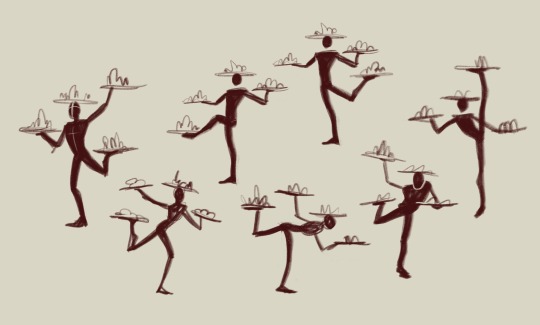
Then I go through my sketching and refining process:
I usually do two or three passes and I try and flip it at least once throughout, to help make sure everything’s balancing. For the final lines I’ll usually make them a medium red that I then set to multiply, but if I plan on coloring the lines later i dont do that and just make them black. This is also the stage when I’m scrabbling about for reference images, here are some of the ones I used here:

I usually hunt down references after I do my initial rough sketch, so I already know what im looking for angle and shape-wise in the references. Now for coloring ill fill in the whole area I’m gonna color with a gray then start putting down flats on clipping mask layers (so they dont go outside the lines)
then for quick and dirty shading and highlights I’ll duplicate the flats, flatten them into one layer, then make them darker and bluer and generally futz with it untill ive got a good shadowed color profile down. I’ll repeat the process but making it all lighter for the highlights. Then ill take both those layers, make them masks, and start painting on the shadows and highlights over the original flats.
then the very final step is the Fussing Stage where I make a new layer or two over everything and start fixing mistakes, adding new colors, adding rim lights, messing with levels, color correcting, adding details like flowers, etc. etc.
this can take a very long time or no time at all, depending on how much effort I wanna put in.
Then I slap a background on it which is usually a solid color or a gradient because im a hack and have no idea what i’m doing and ta-daaaaaa, something kinda okay!
And that is one of the many ways I “fake it ‘till you make it” my way through art!
645 notes
·
View notes
Note
How do you draw the bodies? I know you made a tutorial on how to draw the helms, but I’ve just gotten into transformers and I’m struggling with the mechs😭
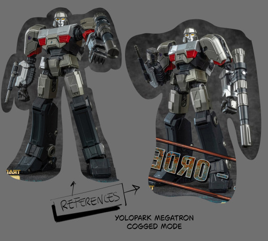
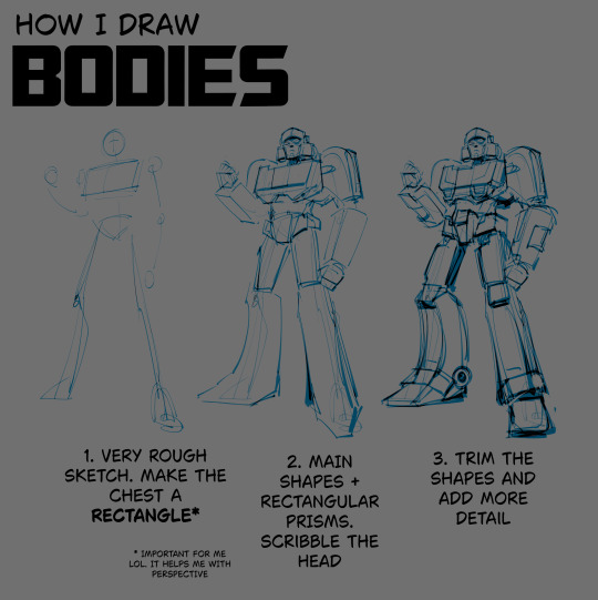
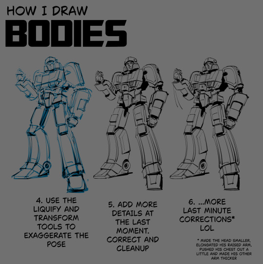
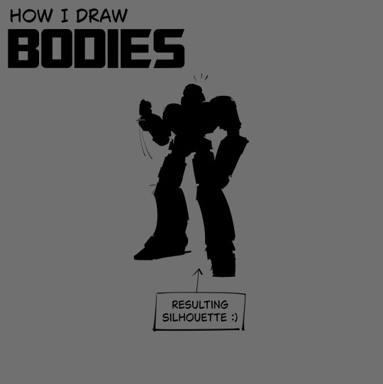
i made this in advance LOL hope it helps
#.txt#tutorial#note that i doodle the pose first and scavenge for references later. in case it matters#also sometimes i don't even get to step 6 LOL i stop at 3 and get right into coloring and rendering#i figure out the details and do corrections as i go. but that's for the stuff that doesn't require lineart#for the lined stuff i have to be more intricate. mistakes are more obvious then. at least imo#but i can cover them up in black fill most of the time mwahahahahhah
552 notes
·
View notes
Text
Transcript:
Don't give up. Don't be a quitter, a spitter.
Follow through on what you started.
Swallow.
Audio source
#gabriel ultrakill#ultrakill#thank you for the tutorial#suggestive#hes saying this while spraying cleaning supplies at my face#putting soap in my mouth for the things ive written#sorry for the next tags#no regrets#I cant stop drinking oil. I CANT stop drinking oil..#I just can't stop I can't stop drinking crude oil#I just can't stop I can't stop drinking crude oil. You know the black stuff that comes in barrels? I can't stop drinking it.#I just cant! It's TANTALIZING#its ADDICTING! It is... A DELICACY I LOVE IT I cant stop drinking oil#<- these tags + this post = the result of gabe + v1 + me being locked in a room for 5 mins#its all over the screen. and the floor. and me. the military will be arriving soon.
305 notes
·
View notes
Text
💧✨based off of this illustration by @passionpeachy!✨💧
video compression muted the colors, so here are a few stills under the cut


tiny bonus: happy pride!

#3d#blender#npr#video#passionpeachy#i actually finished and rendered this out at 2 am but i will schedule this for the morning 😴#thank you azul for letting me use your art!! it made me feel very smart figuring out how to replicate the black shading of the bubble#it's not perfect but it's my first model that wasn't made following a tutorial! so that is to be expected. very fun very charming :]
510 notes
·
View notes
Text
NICKI MINAJ MAKEUP: FAITH’S GUIDE 🎀🧁🍭


YOU WILL NEED
PRODUCTS
Primer
Baby Powder
Foundation/ Tinted Moisturiser
Concealer
Bronzer
Pressed Powder
Setting Powder
Brow Gel
Brow Pomade
Black eye pencil
Liquid Liner
Lashes
Lash Glue/ Bonding Glue
Highlight
Brown Lip Liner
Pink Lip Gloss
Setting Spray
TOOLS
Powder Brush
Concealer Brush
Bronzer Brush
Beauty Blender
Small Flat Brush
Eyebrow Brush

BASE
Apply primer all over your face
#faithtip: use a powder brush to apply baby powder all over your face
Your face will look super ashy after this step, but applying foundation/tinted moisturiser will fix this
Blend it in with a damp beauty blender - make sure the beauty blender is damp! otherwise the powder and foundation will me clumpy
#faithtip: dampen your beauty blender with setting spray for easier blending and a longer lasting base
After blending in your foundation/tinted moisturiser, apply a concealer that is only slightly lighter than your skin tone to your under-eyes
Apply some to your chin and cupid's bow
Leave your concealer to sit for at least 5 minutes
Blend well with a small concealer brush
Now apply either liquid or powder bronzer around your hairline and your cheeks and jawline
Smooth your bronzer out well with a brush
Now, use a powder puff to place loose setting powder on the areas that concealer was applied
Also apply a short line of setting powder underneath your bronzer for a clean crease
EYEBROWS
This step will be easier if your brows have a defined shape
Brush through your eyebrows with brow gel
Use a brow brush dipped in pomade, to draw a line at the bottom of your brow starting from the front of your brow to the end
Draw a similar line at the top of your brows
Fill in the space (don't fill in the very front of your brows to create an almost ombre effect)
Apply eyebrow gel on top
Then use a small brush to apply concealer underneath your eyebrows
Blend well with a beauty blender
Apply setting powder to under your brow
youtube
EYELINER
First apply primer to your eyelids
Add a small amount of baby powder
Then add pressed powder
#faithtip: First, use a black eyeliner pencil to draw out the shape of your eyeliner, then use the pencil or liquid liner to fill it in
Clean up the shape with a cotton bud or Q-tip, and use a brush or beauty blender to reapply the makeup you removed.


LASHES
Lashes that arent super heavy on the inner coners of your eye are preferred
I LOVE thick lashes but for this look make sure they're only super thick at the end/ in the middle
Select thick and long lashes/ lash clusters that suit your eye shape
#faithtip D-Curl lashes are your best friend
STRIP LASHES
But for this step apply glue to strip lashes
Wave the lashes around for a bit so the glue dries a tiny bit and feels a little bit sticky
Place them on the lash line and adjust where needed (using tweezers or fingers)
youtube
CLUSTER LASHES
Strip lashes can also be cut into smaller pieces or use cluster lashes
Dip them into glue and wipe off the excess
Use tweezers to hold the lashes
Pull the top of your eyelid upwards so you can see underneath your eyelashes
#faithtip Wipe the glue on the part you are applying to then you can dip the lash in glue again before actually placing it underneath your lash
This make the lashes more firm and secure
Make sure it is not too close to your eye as this can be irritating
Fan your eyes if you can still feel wet glue
You can add another layer of clusters for thicker lashes
youtube
BACK TO BASE
Brush the setting powder away with a powder brush
Brush the setting powder underneath your cheeks away with pressed powder
Apply highlighter to the tip of your nose, your brow bone and your cupid's bow
Make sure to keep the highlight application light and smooth it out
Spray setting spray all over your face
LIPS
Use a brown lip liner, slightly darker than/ similar to your skin tone, to outline your lips
Apply pink lip gloss to your lips
Then top it all off with clear lip gloss.
and DONE!
Watch my new video!
#nicki minaj#black barbie#makeup#cosmetics#cosmetology#makeup tutorial#black makeup#2016 makeup#black women makeup#beauty blogger#beauty influencers#makeup influencer#girl blog#black girl aesthetic#girly#black tumblr#glam#full glam#soft glam#prissy girl aesthetic#prissy#prissy girl#youtube#2010s makeup#2010s baddie#pink print#pink friday#Youtube#it girl#high maintenance
114 notes
·
View notes
Text
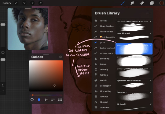
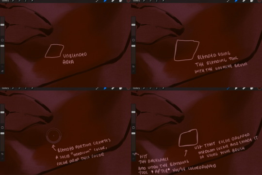
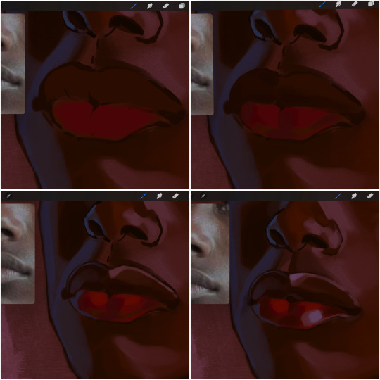
eaudera's detailed tutorial for skin rendering
okay loves i've put together a tutorial in text form detailing my step by step process of shading darker skin + the brushes and techniques I use and why I use them. you will be following along as we shade a piece together, you can find the lineart to the piece here. *turn off your true tone and night shift displays for the most objective viewing.
i wrote a lot on the preview pictures, if you find spelling errors (which you def will) or are unable to read my handwriting, you'll find the typed out version of the writing in the alt text feature.
disclaimer: i'm not an art professor nor am i academically/classically trained in art. a lot of the verbiage and techniques i'm using to teach you all here are from my current self taught and observed understanding of art, light, and anatomy
support me: kofi / ig / twt / commissions
firstly, here are my two staple brushes. you can find the second brush here, i modified it by making it larger.
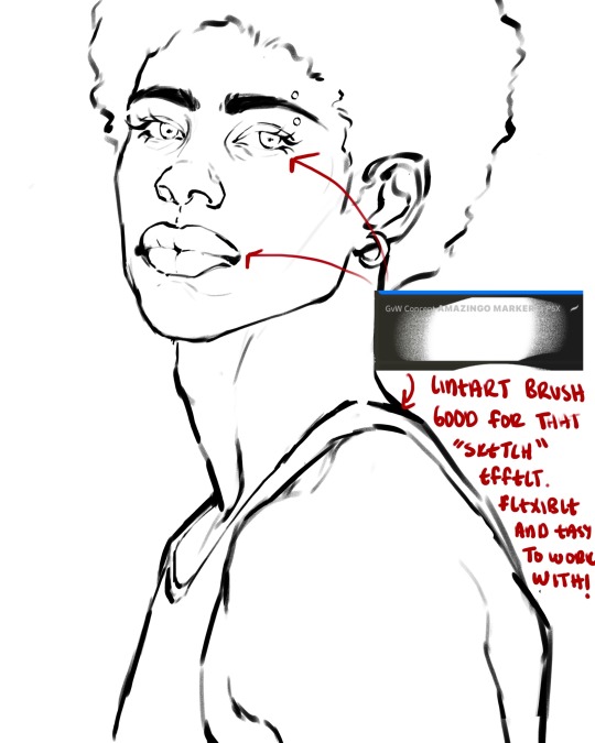
the lineart brush is very good for easy sketching and simultaneously cleaning up that sketch to produce the final lineart you'll be using in your piece. the diffusion from the erased parts/the diffusion created by lowering the pressure of your pen creates a light graphite effect which i enjoy! give it a shot.
you'll notice quickly that there are lighter strokes throughout this lineart, these are simply acting as rendering guides for me in order to remember certain placements. i erase/draw over these lines a lot.
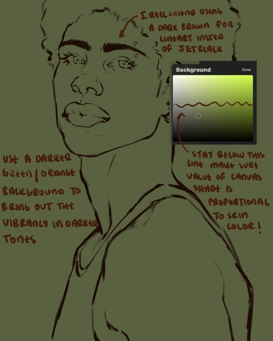
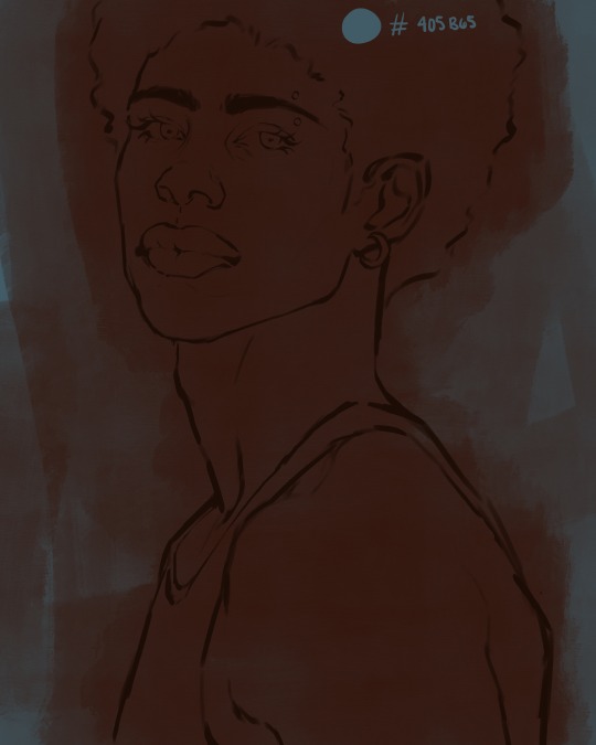
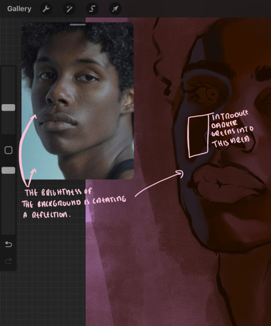
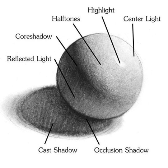
i initially learned to shade skin on a completely grey background with very slight orange undertones, and for a while this was very helpful in providing the most objective view of the base colors you're using (objective as in free of being effected by colors of different values). as you might know, using a white background for dark skin will seemingly darken the value and dim the vibrancy of your base colors, and using a black background will do the opposite. if you're using a darker skin tone, you want your canvas shade to be of a value that is proportional to your skin tone to avoid the same problems created by colors with too light or dark of a value. now if you're using a screened device to draw, you have the extra burden of screen reflections/wavering color output on different screens, so you're never really sure if the exact color you're using will be consistent across the board. priming your canvas with neutral colors will help with that. whereas priming with more vibrant colors will slightly change the undertone of your skintone (especially if you're using a low opacity brush), but it makes for a funner canvas and more creativity with your color palette imo. if you're a beginner i recommend you stay below the wavy line to avoid too light of a canvas shade.
for these same reasons i avoid keeping my lineart jet black. when you lay down the base colors under a black lineart it can look very unfavorable.
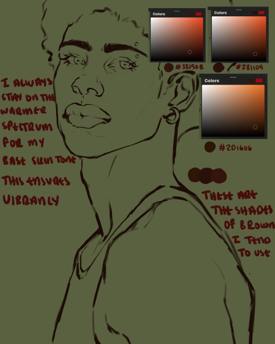
here are some skin tone variants that i tend to use the most, peep how i never wander off too far to the left of the spectrum where the reds are. i definitely favor red-oranges as compared to green-oranges for my skin tones, however, because i stay primarily on the left side of the color spectrum for my rendering, red can quickly become too much too fast. so i make sure to use a skin tone that can work very well with green-orange shadows. for this specific piece i will use the third shade (#2d1606).
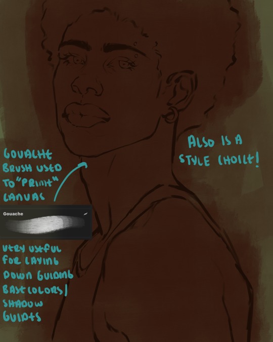
heres where the gouache brush comes in handy. i use it very loosely to "prime" the canvas almost. if you've ever done oil painting you'll realize very few artists draw directly onto a completely white canvas, though i've already primed my canvas essentially by changing the background color, i loosely shade over it with the skin tone color using the gouache brush. i find this gives me a better grasp on the composition of the piece due to increased harmony between the canvas and the skin color. it also looks really cool to me and resembles a real canvas almost.
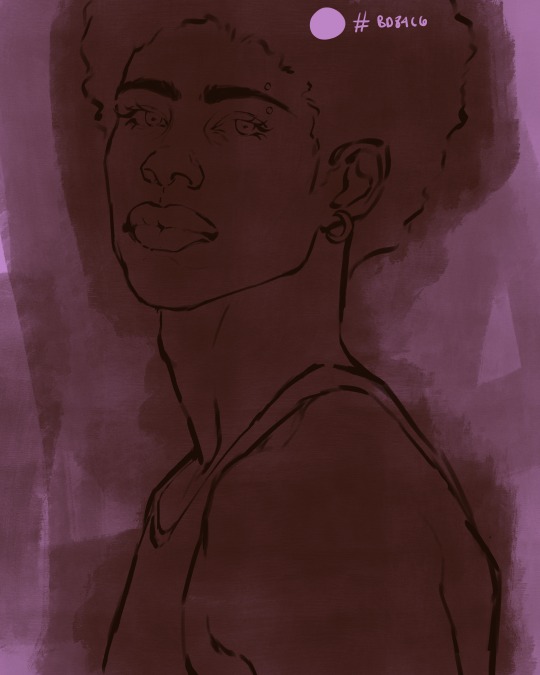
as stated before, priming your canvas with neutral colors (grey) can help give you a more consistent view of your base colors, when you get the hang of understanding the colors you most often use (i.e, how they interact with other colors), you can start using more vibrant and fun colors to color your canvas with! the gouache brush changes opacity depending on the pressure exerted by the pen, if you zoom in you'll notice patchy areas where the canvas color bleeds through the layer more prominently than it does in other areas. for some people this might throw off the consistency of the shadows, but you should be fine as long as you're using a consistently opaque brush (which we will be doing)
i know i recommended beginners use a grey canvas like i did, but since this tutorial is using my techniques i figured i'd also teach you guys how to use variantly opaque brushes to your advantage. we will be drawing on the pink canvas from here on out.
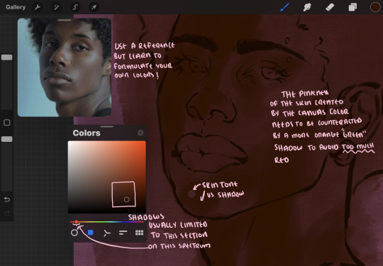
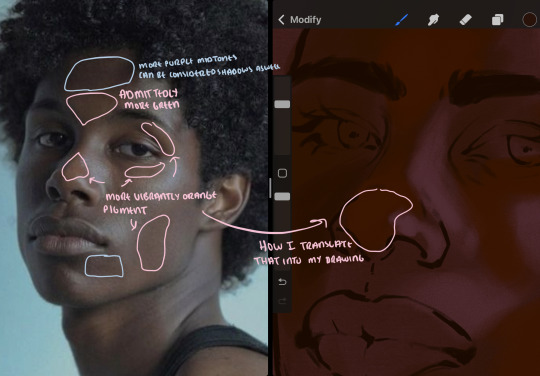
a reference is so helpful, i still rely on references to guide my shadows/lights. i'm past the point of relying on references for exact coordinates for rendering or lineart, but they are still incredibly helpful. in most references of darker skintones you come across, color dropping directly from the picture will give you very grey colors! we want to prioritize vibrancy in this case, so attempt to formulate your own colors or colordrop and increase the vibrancy :)! keep in mind i'm now using the lineart brush to shade. the diffuse/soft corners of this brush allows fewer pixels to be scattered wherever you lessen the pressure, this is perfect for color dropping medium colors to blend two colors together. you'll see how i blend colors later on.
as mentioned previously, red can become too much too fast- so i avoid monochrome rendering as much as possible by using shadows of different undertones. my most frequent combination is using a red-orange skin tone and then using a green-orange shadow.
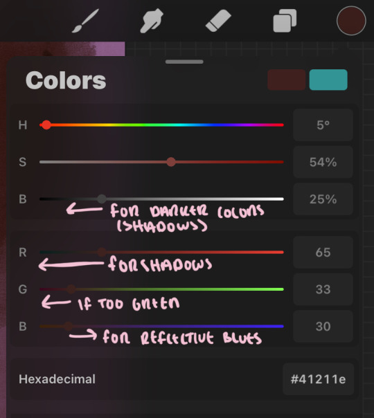
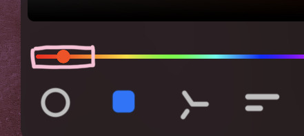
the value spectrum will be your best friend in mixing values and undertones, i use it all the time to formulate the best less saturated darker shadow that is proportional (not too dark, not too grey) to my skintone value. if the shadow is too green simply increase the magenta, if you're looking for a "reflective" shadow, increase the blue.
when i begin shading, i always slide the curser to a truer orange color on the spectrum and increase the saturation (slide towards the right) while i decrease the brightness (slide down). heres how it looks when i'm jumping between shadows and highlights while trying to keep my colors proportional (but not identical) to whats happening in the reference ^. i most often times will rely on the value tool, however.
you will notice that a lot of darker skin tones have patches of orange vibrancy, these areas are most common on the nose and cheeks. this is only a detail to pay attention to if you're going for more of a realism rendering style :)
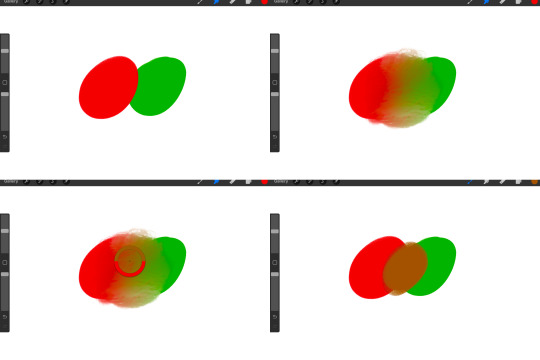
now onto how i prefer to bridge/blend colors together by utilizing the blend tool.
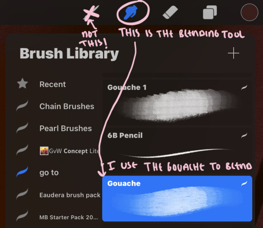
i do not like simply blurring colors in order to blend colors together, it can lead to overblending which can make your portrait look heavily gaussian blurred (think 2010 deviantart art... yea that). the brilliant thing about procreate is you can utilize brushes really efficiently, which include changing the brushes you use for blending. so in reality, artists who use the blending tool on its own can still have portraits that don't look it! there also exists plenty of brushes that have properties allowing it to blend into its surrounding colors are you draw. but in my case, the above photo is 99% of the times how i will bridge two colors together. doing this allows me to keep pretty consistent brushstrokes across the whole portrait, which i enjoy. it also gives me better control of the shapes i use in my rendering, an aspect that is pretty easy to lose when you're using the blending tool directly and solely.
in case the blending process is a bit hard too see, heres that same process recreated with different more visible colors:
now once you've placed your shadows where they generally tend to be (according to the reference photo), let's make those shapes a bit more specific and pick up on smaller details to make your rendering look more complete.
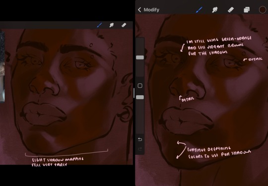
your base colors will never be as dark or as light as you need them to be when you begin rendering, making sure you have a decent contrast between your lightsource highlights and the shadows is key to capturing the essence of a light being cast on your character. it's much easier to keep building upon your shadows before rendering the highlights, i laid down the highlights only to create a guide/help me map my shadows better. do not darken the entirety of the areas affected by shadow, you'll find that shadows are rarely ever the same value, it's a gradual process affected by things like position, height, etc. so make sure the darkest of your shadow colors are preserved only in areas where the shadows are the or should be the darkest.
you'll notice i labeled some areas as "detail", adding very specific shadow placements is a detail. in the reference, the model has a pretty prominent brow bone, creating a shadow over where his eyelid creases just above his lash line, paying attention to feature details like this help enhance the rendering and its realism.
now that i've mapped my shadows i'm going to move onto to rendering my highlights and the region of the face where the lightsource is most prominent.
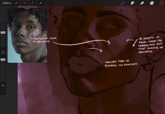
i described shadows as a gradual process earlier, this is because of the lightsource. light tends to spread when its further from the affected surface, creating a larger area affected by the light. of course, this varies depending on how intense and how close/far the light source is. in this case, the light is being casted above him further to the other side of his face, but again, remember that the face is not 2d and more prominent areas are affected more by light. it's due to this that there still exists a, albeit very minimal, shadow beneath his cheekbone. i exaggerate the shadow here for stylistic purposes, but it also helps in keeping me uphold that contrast between the highlight and shadow once again. so i refrain from blending the light into this area like i did in other areas.
midtones are the areas most unaffected by the light source, they're neither shadows nor highlights. and because light spreads, it is brighter in certain areas and darker in others. it is most easiest to blend the darker ends of the highights into the midtones of your portrait. you can emulate this by once again using your blend tool. blend the outer areas of the light and colordrop this color and use it as the darker light more proportional to the midtones. note that before i add even lighter shades to the areas where light is most concentrated, i blend what highlight placements i currently have there.
we're going to switch gears now and focus on the reflective shadow occurring on the darker half of his face.
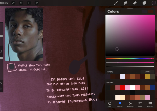
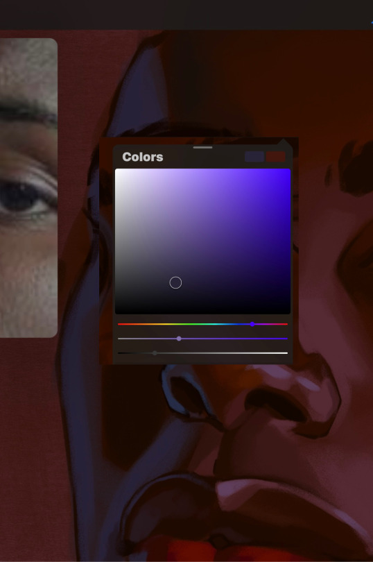
this shadow is a reflection from the lighter background the model is up against, the light being casted above him is allowing for some bounce back from his surroundings, leading to very faint light visible in areas primarily affected by shadows. hence why i'm referring to these colors as "reflective shadows".
in this case, the reflective shadows are blue, or appear to our eyes as blue. on darker skin, "true" blues (blue-purple) are not often times present. what is present rather, is a very grey tone with cool undertones/a grey tone on the blue side of the spectrum, which creates a blue that is much more proportional to the value of the skintone than a true blue. in this case i used a deeper grey on the pink color spectrum, which is more purple. this was intentional, and was done in order to create some sort of color harmony between the contrasted deep oranges im using for the bordering shadows and the blue-grey i'm attempting to emulate.
while i utilize this blue-grey, out've a purely stylistic choice, i still introduce true blues to my rendering. in fact i love using blue/purple reflective shadows in my art, it creates a stunning and colorful render. in this case, i used the blue-grey as a stepping stool to introduce that trueer blue more naturally. you'll see this happening in the second picture above, where i used a slightly more vibrant and slightly more brighter blue, and used it on areas where this reflection was more prominent (and therefore brighter).
you'll notice how the shadows that border on these reflective colors are less saturated and darker than the shadows on his chin. introduce a darker and less saturated (more green) shadow to that area on his cheek and the darkest shadow of this photo, the sunken area near his nose bridge and inner eye corner. i emphasize this line in the lineart so you can follow this shadow more accurately:
this is also a detail in my opinion and can make your portrait more realistic if you include.
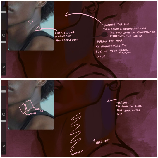
we're going to pivot to his neck area before continuing. you'll find the area of his neck with the most light is also the least vibrant, i laid down a grey base color to emphasize this detail in the portrait. afterwards i added key details. i wanted to stay at least somewhat true to the color dynamics occurring in the reference hence why i used the grey, but i'm not a very big fan of using blatant grey directly on the skin, so i made it more blue.
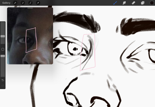
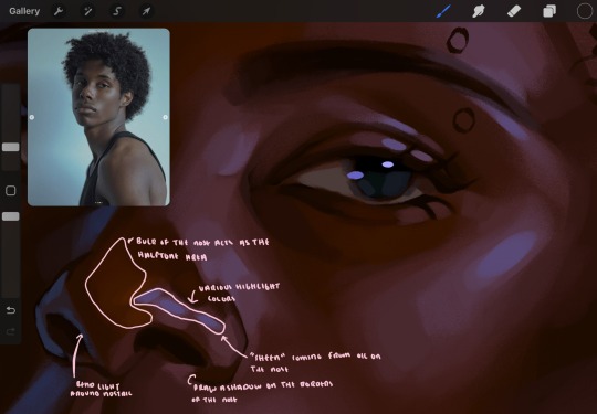
moving forward, the outer eye and the nose can be some of the most "detail focused" areas of the face when it comes to rendering. due to their more "bulbous" anatomy, light tends to curve around them in more complex ways than the flatter parameters of the face.
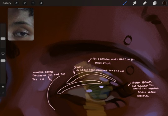
when it comes to the many creases that surround the eye, the skin folding over itself creates a very thin shadow from between the folds. the key to rendering this crease is to concentrate the blending to a very small scale, do not overblend the area because the hill created by the crease very easily captures light, creating an area where the shadow and highlight meet in very close proximity. slight blending is needed for this area, you can deepen the shadows in both horizontal corners of the eye for more accuracy. the midsection of the total eye area (eyeball and socket) tends to capture the most light, remember this is due to how bulbous rounder shapes tend to capture light from whichever direction its coming from.
this is of course the case for the nose as well. highlights are typically placed as a dot on the outermost part of the nose by artists, but highlights also spread on either side of the tip of the nose. the nose tends to collect a lot of oil, creating a sort of sheen on the upper parts of the nostril. when rendering a portrait where the position of the head is more cast to the side, the highlight of the nose changes from the bulb of the nose, to the upper nostril. in this case, the highlight spreads, causing a "half tone", or the remnants of the light on the bulb of the nose. this is the easiest place to blend highlights and shadows together. now for the shadow detailing on the nose, i'm actually drawing on top of the lineart on a separate layer. which i'll go into detail about in the next part. you want to focus the shadow on where your lineart is, the outermost part of the nose.
now were going to really detail your portrait by introducing a new layer, the detail layer! this isn't technically apart of the skin rendering, so i'm gonna keep it very brief. this is the layer you're going to render the lips, eyeballs, and eyebrows. more specifically, the purpose of this layer is to reduce the reliance on lineart. in terms of order, it goes above the lineart layer. we're going to soften and even erase the lineart in certain aspects. i use bolder/thicker lines when creating my lineart, but this can become a nuisance/hinderance when rendering.
starting out with the lips:
people w brown skin tend to have two toned lips, with the top lip resembling the same skin tone as the face and the bottom lip being redder/pinker and lighter than the upper lip. in my case, i prefer a more vibrant red for the bottom lip. once i lay down these base colors, i begin shading on the second layer.
i personally enjoy the look of a poutier lip shape, this includes emphasizing the middles of the lips as opposed to the ends. i've highlighted the shapes that this lip shape often entails. the small circles on the corner of the lip line are just pockets that occur when the mouth is closed and become emphasized by the fat around the mouth. the parameters of the lip lines do not often meet these round corners, theres often times a "double lip line", that exists around these areas. i love including that in the art, its very easy to emphasize by simply drawing a highlight from the corner of the lips along the curvature of the bottom lip towards the middle.
shadow mapping on the lips tend to go: highlight, shadow, highlight, shadow. the top lip going inward creates a highlight on the most outward part: the top of the lip. and the bottom lip curving outward thus creates a shadow on the bottom of the lip.
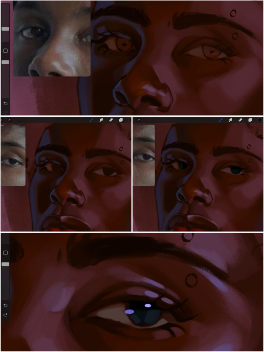
when it comes to the eyeball, i don't draw the white parts as solid white, nor do i make them too bright most of the time. they're most often times an orange grey, i also dont spread this color out if you can notice the uncolored white part of the eye. i do this intentionally to keep some of the shadows that are naturally present on the eye. very specifically right where the upper eyelid sits on the eyeball, it tends to create a small shadow that follows the curvature of the eye. this shadow is crucial, if you can see the first and second picture do not have this shadow, making the iris look more exposed and the eye appears to be held wider.
when it comes to the iris, i do very little. if i'm drawing a dark colored eye i will cover the entire iris brown, before darkening it with an almost black color. i leave the brown sides of the iris exposed to aid in bridging the values between the whiter parts of the eye and the very dark iris. this blended ring also appears on all eyes in real life. lastly, dark eyes tend to show light reflections much easier than lighter eyes. these reflections can be any color in art, in this case i kept it blue-green. i bend these reflections around where the pupil would most likely be depending on the drawing.
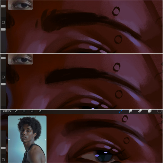
next, the eyebrow. i find it tedious to draw individual eyebrow strands when it comes to rendering, i actually prefer to blend the parameters of the eyebrows to create cohesiveness. sparse and fine eyebrow hairs are penetrated by light and shadows more than what you'd find on the scalp. it's harder to see light on someones scalp due to the bulk of hair crowding the scalp, whereas as its easier to see such light on the eyebrow. to introduce this concept to my art, i will initially draw the entire shape of the brow. then when rendering, i erase the parameters, leaving the darkest part of the brow. then i blend. the lower brow bone will be blended the least, whereas the area of the eyebrow connected to the T zone will be the most blended thanks to the shadow following the nose bridge. the far end of the brow by the hairline tends to be the lightest given the light source.
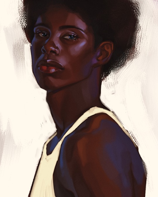
and lastly, i loosely draw a white border around the portrait for stylistic purposes. then i combine the layers (group together your layers, then duplicate and compress the duplicate group so that you still retain your individual layers) to edit. i typically add noise and play with the curve setting. and heres the finished image:
i hope you enjoyed!!
#i didnt proofread this if u find spelling errors pls lmk#black artists on tumblr#digital art#illustration#painting#black art#commissions#tutorial#art tutorial#how to shade#rendering tutorial#brushes
301 notes
·
View notes
Text
blackgapprincess on tiktok
#urdreamgirlangel#it girl#that girl#becoming that girl#pink pilates princess#it girl energy#dollcore#pink aesthetic#pinkcore#pink moodboard#makeup#soft makeup#makeup tutorial#makeup tut#black girl makeup#black princess#dolly princess#black girl magic#tumblr tv#tiktok#girlhood#girlblogging#girlblogger#girlblog#noirgyal
96 notes
·
View notes
Text
for i know that nothing good dwells within me, that is, in my flesh. i can will what is right, but i cannot do it
#red dead redemption 2#red dead redemption#rdr2#arthur morgan#black shire horse from the stable tutorial#< yes it deserves its own tag#digital art#my art#i started this in late feb and didn’t finish it until yesterday because i couldn’t get the hat right 😐
55 notes
·
View notes
Text
[[Tumblr ate another Anon's ask about my way of drawing\painting I can't with this app😭😭😭 If half a year later this ask mysteriously reappears in my notes like previous I'll edit screenshot of it up here, other then that I just hope you'll still see this post, dear Anon🕯🥀]]
Hello Anon!
I made a quick timelapse of one of my old-ish work for you, under the cut I'll go into more details about the process! I hope it'll be of use to you, but don't expect some crazy insights, I'm a messy artist ahjkakhj
So, step one! When the sketch is clean enough for me, I go in with plain colours to block out objects that I'll be refining on separate layers later. At the same time it helps me take a step back from details and break down the image into bigger, simpler shapes, so it's easier to find better composition and proportions.
Step two (actual colouring) Usually my brain shuts down on me on that part too, Anon… Basically I use a very limited palette at the start and gradually build up more hues and contrasts as I go. Sometimes I do a gray scale drawing first to get my values right, but this one is simple and was more of a vent&relax piece for me so there is none of that haha Also, since I tend to work on as little layers as possible and merge sketch layer and colour layer together at literally the first opportunity I get, most of the times I have a copy of my sketch saved on a separate hidden layer in case I overdo the painting part and need some roughness back.

Step three, Details! And when I say details I mean
D E T A I L S .

There is simply something magical in squiggly lines and dots… I can never fight them…
There is not much of advise I can really give you here, just do what feels right to you, what looks beautiful to you. Make your art finished in the way you see it finished, take another step back and ask yourself "what's missing? what feels undone? empty?". Combine styles, find new patterns and brushes, most importantly HAVE FUN!!!
Sooner or later you'll find the perfect algorithm for painting and drawing, only to 5, 20, 50 works down the line realize that's something in your own style doesn't sit right with you anymore and feels rather routinish and start that journey anew.
Never stop your searching, chase after your own definition of beauty because without you there will be nobody to show it to others.
#damn I took that personally with last couple of paragraphs#sorry anon couldn't help myself#IT IS STILL A GREAT ADVISE THOUGH#ask#kuroshitsuji#black butler#ciel phantomhive#my art#timelapse#tutorial#??
260 notes
·
View notes
Text
Chifuyu thinking he broke you after giving you a shaking orgasm.

"Chifu'...fuck, a-ah!"
Chifuyu sat behind you with his knees planted on either side of your hips.
His blonde bangs fell across his forehead, tongue lolled out of his mouth as he rubbed his thumb faster and faster in circles on your engorged clit.
Two fingers slipped inside you with very minimal resistance due to how wet you were.
"You're so wet, baby. Couldn't wait for me to get off of work so I could come fuck you, huh?"
His aquamarine eyes settled on the juncture between your spread ass cheeks and the creamy translucent substance coating your inner thighs.
"Mmm, Fuyu...feels s-so good..."
You murmured with your cheek pressed against the cool silk of the pillow. Your bonnet had slid halfway off of your head, but Chifuyu fixed it for you and laid a soft kiss upon your tawny cheek.
It was almost embarassing how close you were to cumming just from Chifuyu's fingers playing with your swollen clit, but he was so good at it that he'd often make you come several times from his fingers alone before he even put his cock in you.
"That's right, baby. You close to cumming all over my fingers, aren't you?"
He sped up his actions, thrusting deeper with the two inside and pressing his thumb down directly on top of the little button, moving it from side to side.
Your thighs enclosed around his hand and began to quiver which made Chifuyu grin like a Chesire cat.
"Come on, open up for me, babe. Trying to get you there, sweet girl."
"'Fuyu, I can't! You're about to make me cum, you-!"
A soft gasp left your parted lips as a harsh shiver raked through your entire body. Chifuyu's hand was definitely stuck between your legs now as you shook and convulsed.
His eyes widened in shock. Usually, you might shiver a bit while cumming but you'd recover quickly.
Panic began to sink into his chest and he ripped his hand from between your legs like he'd been burned when you didn't stop shaking. Your head twisted to the side and you drew your knees up towards your chest.
"Shit! Oh shit...baby? You okay? Y/N?"
Baji often spoke to Chifuyu about all the women Baji himself had fucked with and how he always had them shaking and cumming all over themselves, but Chifuyu just took his words with a grain of salt, attributing it to simple "locker room talk."
He didn't actually think that a 'shaking orgasm' was a real thing, which is why he was so horrified at your body's reaction.
Poor thing was getting ready to grab his phone and call an ambulance when you opened your eyes and smiled up at him sweetly.
"Y/N! Are you alright?!"
"Mhm. That was amazing, 'Fuyu. Why are you looking so scared?"
He grabbed your hand and pressed a chaste kiss to the back of it.
"Because I was. You should have seen the way you folded in on yourself like you were in pain. I thought I hit the wrong thing and made you have a seizure or something."
You couldn't stop the giggle from leaving your lips as you looked up into his wide baby blue eyes.
"Oh, Bunny, you're so cute. I don't know if what you just said is possible but that was one of the best orgasms you've ever given me."
"Really?" He bit his lip shyly, cheeks warm and as red as cherry tomatoes.
"...Can I maybe try it again?"
#chifuyu matsuno#chifuyu smut#chifuyu x black reader#chifuyu x reader#tokyo revengers x black!reader#chifuyu x black!reader#chifuyu matsuno x reader#tokyo revengers x reader#black coded reader#black fem reader#x black reader#tr chifuyu#tokyo revengers chifuyu#divider made using cafekitsune's tutorial#bunny fufu🐰💚#chifuyu brainrot#𖢇rose.petals🌹🗒
613 notes
·
View notes
Text
LAVA LAMP MAKEUP TUTORIAL 🔮🎨 ✨
#fashion#beauty#makeup#reelsinstagram#makeup artist#lava lamp#creative makeup#creative minds#dope#psycadelic#groovy#abstract makeup#black mua#makeup for black women#black girl magic#melanin glowing#black girls rock#makeup tutorial#black girl beauty#pink aesthetic#bubbles#colorful makeup#colorful hair#ombre hair#ombre makeup
93 notes
·
View notes
Text

If you've been wondering why certain TS2 makeup items change the color of your Sim's eyelashes or the inside of the mouth - that's why↑ Which brings me to my question:
TS2 players, have you introduced tongues to your game?
#ts2 poll#sims 2#the sims 2#-- this is totally not a#ts2 tutorial#I've played for a long time without tongue masks but once I added it there was no going back#now seeing black cavity when sim opens their mouth makes me anxious - I've just edited ~30 bits of makeup covering tongue masks
93 notes
·
View notes