#ui&ux
Explore tagged Tumblr posts
Visit Tumblr Blog
Explore Tumblr blogs with no restrictions, modern design and the best experience.
Last Seen Tumblr Blogs


Fun Fact
The Tumblr app for Google Glass was released on May 16, 2013.
Text
Kickr Technology Named as Best UI/UX Designing Company in Noida
Kickr Technology, the best UI/UX designing company in Noida, creates intuitive, user-friendly designs that enhance user experience, boost engagement, and align perfectly with client goals.
To know more about our UI UX designing services, visit us at www.kickrtechnologies.com
#kickrtechnology#UIdesign#UI&UX#UI&UXdesign#bestUI&UXdesigningcompany#bestUI&UXdesiningservice#bestUI&UXdesigningcompanyinnoida#bestUI&UXcompany
0 notes
Text
It's kind of funny how Teams users have been complaining for the better part of a decade that the minimum width of the dockable chat windows is too wide, and Microsoft has basically been telling them to get fucked, then they discontinue Skype and tell all of its former users to switch to Teams, and within 72 hours of Skype going down for good, Microsoft suddenly pushes a "critical" update for Teams that gives it more flexible dockable chat windows.
4K notes
·
View notes
Text


Blame! (2017)
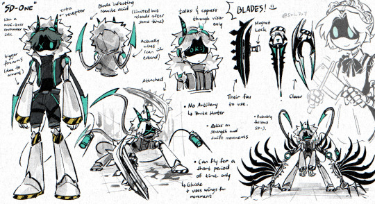
#blame!#cyberpunk aesthetic#scifi anime#user interface#anime#user interaction#graphic design#aesthetic#japanese animation#scifi aesthetic#japanese anime#anime gif#ui ux design#uidesign#ui#glitch video#glitch#glitch art#glitch aesthetic#robotics
1K notes
·
View notes
Text
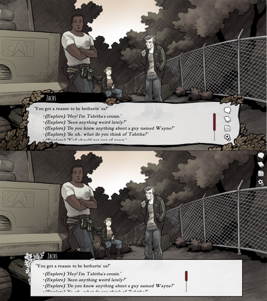
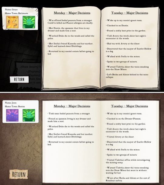
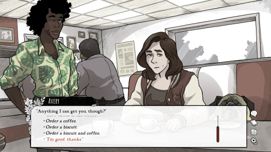
Scarlet Hollow UI Redesign Work In Progress
HELLO! As some of you may know we've been hard at work on a large overhaul patch for the first four episodes of Scarlet Hollow to bring the game closer to our ever-higher standards. While there are a lot of content changes and additions coming with the update, here's spoiler-free look at how the UI side of it is coming along. New UI on top, old UI on bottom. First, and most importantly is the updated textbox. We've been adding a lot of detail to small UI elements, and this is no exception — there are more leaves, and those leaves have some color in them now, which we feel makes the in-game art feel a lot richer. On the usability side, you'll notice that this new box is both taller, meaning that we can fit more options before you need to scroll, and that the scrollbar is located further to the right, meaning options can be longer before flowing onto the next line. (Again, meaning there will be less scrolling.) We've also moved the quick menu into the textbox so it no longer overlaps with any background art.
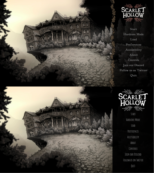
Next up, we've got the main menu. Not a ton to say here. Logo is smaller and has some color so it feels less stark. The font choice is tighter, and we added a border where the text options start to improve the feel of things. In general we're trying to make options that make the interface feel warmer, more organic, and less sterile.
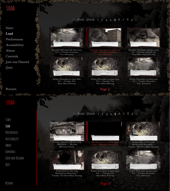
Next we've got the in-game menu. Again, framing things with organic shapes to provide better flow and separation. We've also added a wooden "frame" around each save game thumbnail give them a more natural feeling.
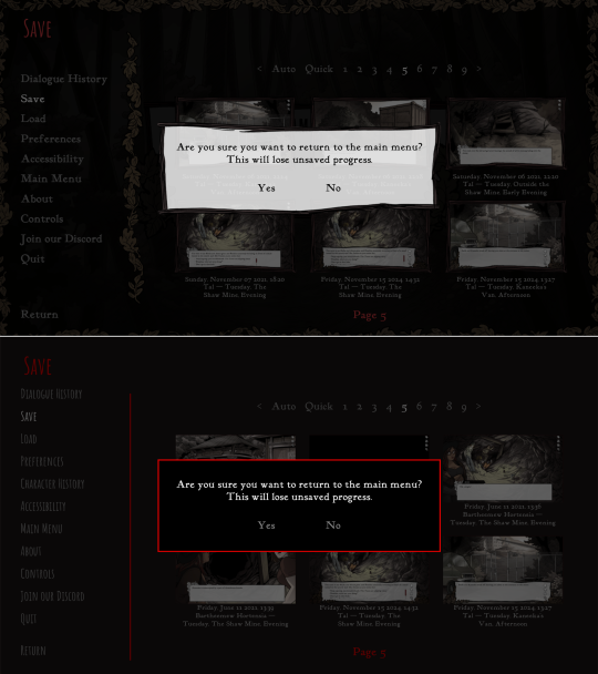
Similar notes for the new confirmation screen. We're probably going to increase the opacity a little bit. At the moment is a little too transparent.
The journal has new assets, and instead of a generic cross-hatched background, we add a semi-transparent black layer so you can still see the game world behind it.
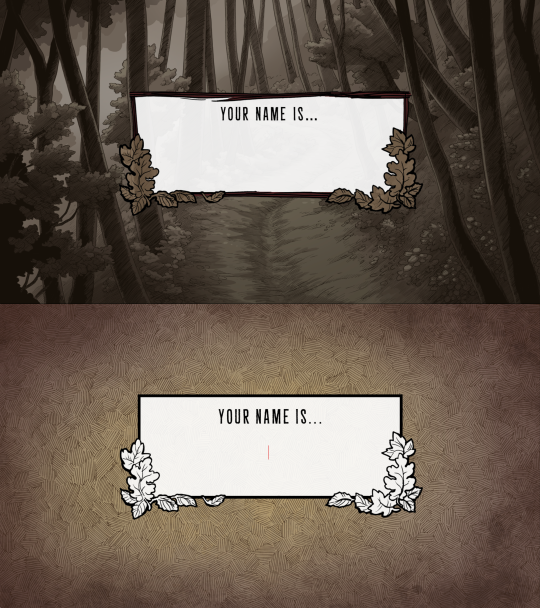
And speaking of generic cross-hatching, we've also removed it from character creation, instead replacing it with backgrounds from inside the game. Overall this should feel a lot more welcoming.
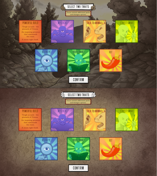
These backgrounds change with each new slide, too. Here's how trait selection works.
Anyways that's it for now! Happy new year :)
742 notes
·
View notes
Text
I just noticed this on my phone's mail app. UI design is my passion.
647 notes
·
View notes
Text
AI and the fatfinger economy
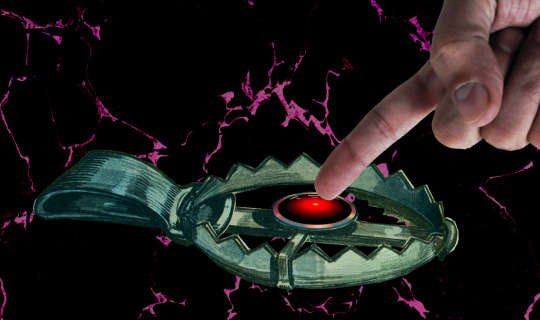
I'm on a 20+ city book tour for my new novel PICKS AND SHOVELS. Catch me at NEW ZEALAND'S UNITY BOOKS in WELLINGTON TODAY (May 3). More tour dates (Pittsburgh, PDX, London, Manchester) here.

Have you noticed that all the buttons you click most frequently to invoke routine, useful functions in your device have been moved, and their former place is now taken up by a curiously butthole-esque icon that summons an unwanted AI?
https://velvetshark.com/ai-company-logos-that-look-like-buttholes
These traps for the unwary aren't accidental, but neither are they placed there solely because tech companies think that if they can trick you into using their AI, you'll be so impressed that you'll become a regular user. To understand why you find yourself repeatedly fatfingering your way into an unwanted AI interaction – and why those interactions are so hard to exit – you have to understand something about both the macro- and microeconomics of high-growth tech companies.
Growth is a heady advantage for tech companies, and not because of an ideological commitment to "growth at all costs," but because companies with growth stocks enjoy substantial, material benefits. A growth stock trades at a higher "price to earnings ratio" ("P:E") than a "mature" stock. Because of this, there are a lot of actors in the economy who will accept shares in a growing company as though they were cash (indeed, some might prefer shares to cash). This means that a growing company can outbid their rivals when acquiring other companies and/or hiring key personnel, because they can bid with shares (which they get by typing zeroes into a spreadsheet), while their rivals need cash (which they can only get by selling things or borrowing money).
The problem is that all growth ends. Google has a 90% share of the search market. Google isn't going to appreciably increase the number of searchers, short of desperate gambits like raising a billion new humans to maturity and convincing them to become Google users (this is the strategy behind Google Classroom, of course). To continue posting growth, Google needs gimmicks. For example, in 2019, Google intentionally made Search less accurate so that users would have to run multiple queries (and see multiple rounds of ads) to find the answers to their questions:
https://www.wheresyoured.at/the-men-who-killed-google/
Thanks to Google's monopoly, worsening search perversely resulted in increased earnings, and Wall Street rewarded Google by continuing to trade its stock with that prized high P:E. But for Google – and other tech giants – the most enduring and convincing growth stories comes from moving into adjacent lines of business, which is why we've lived through so many hype bubbles: metaverse, web3, cryptocurrency, and now, of course, AI.
For a company like Google, the promise of these bubbles is that it will be able to double or triple in size, by dominating an entirely new sector. With that promise comes peril: growth must eventually stop ("anything that can't go on forever eventually stops"). When that happens, the company's stock instantaneously goes from being a "growth stock" to being a "mature stock" which means that its P:E is way too high. Anyone holding growth stock knows that there will come a day when those stocks will transition, in an eyeblink, from being undervalued to being grossly overvalued, and that when that day comes, there will be a mass sell-off. If you're still holding the stock when that happens, you stand to lose bigtime:
https://pluralistic.net/2025/03/06/privacy-last/#exceptionally-american
So everyone holding a growth stock sleeps with one eye open and their fists poised over the "sell" button. Managers of growth companies know how jittery their investors are, and they do everything they can to keep the growth story alive, as a matter of life and death.
But mass sell-offs aren't just bad for the company – it's also very bad for the company's key employees, that is, anyone who's been given stock in addition to their salary. Those people's portfolios are extremely heavy on their employer's shares, and they stand to disproportionately lose in the event of a selloff. So they are personally motivated to keep the growth story alive.
That's where these growth-at-all-stakes maneuvers bent on capturing an adjacent sector come from. If you remember the Google Plus days, you'll remember that every Google service you interacted with had some important functionality ripped out of it and replaced with a G+-based service. To make sure that happened, Google's bosses decreed that the company's bonuses would be tied to the amount of G+ activity each division generated. In companies where bonuses can amount to 90% of your annual salary or more, this was a powerful motivator. It meant that every product team at Google was fully aligned on a project to cram G+ buttons into their product design. Whether or not these made sense for users, they always made sense for the product team, whose ability to take a fancy Christmas holiday, buy a new car, or pay their kids' private school tuition depended on getting you to use G+.
Once you understand how corporate growth stories are converted to "key performance indicators" that drive product design, many of the annoyances of digital services suddenly make a great deal of sense. You know how it's almost impossible to watch a show on a streaming video service without accidentally tapping a part of the screen that whisks you to a completely different video?
The reason you have to handle your phone like a photonegative while watching a movie – the reason every millimeter of screen real-estate has been boobytrapped with an icon that takes you somewhere else – is that streaming services believe that their customers are apt to leave when they feel like there's nothing new to watch. These bosses have made their product teams' bonuses dependent on successfully "recommending" a show you've never seen or expressed any interest in to you:
https://pluralistic.net/2022/05/15/the-fatfinger-economy/
Of course, bosses understand that their workers will be tempted to game this metric. They want to distinguish between "real" clicks that lead to interest in a new video, and fake fatfinger clicks that you instantaneously regret. The easiest way to distinguish between these two types of click is to measure how long you watch the new show before clicking away.
Of course, this is also entirely gameable: all the product manager has to do is take away the "back" button, so that an accidental click to a new video is extremely hard to cancel. The five seconds you spend figuring out how to get back to your show are enough to count as a successful recommendation, and the product team is that much closer to a luxury ski vacation next Christmas.
So this is why you keep invoking AI by accident, and why the AI that is so easy to invoke is so hard to dispel. Like a demon, a chatbot is much easier to summon than it is to rid yourself of.
Google is an especially grievous offender here. Familiar buttons in Gmail, Gdocs, and the Android message apps have been replaced with AI-summoning fatfinger traps. Android is filled with these pitfalls – for example, the bottom-of-screen swipe gesture used to switch between open apps now summons an AI, while ridding yourself of that AI takes multiple clicks.
This is an entirely material phenomenon. Google doesn't necessarily believe that you will ever want to use AI, but they must convince investors that their AI offerings are "getting traction." Google – like other tech companies – gets to invent metrics to prove this proposition, like "how many times did a user click on the AI button" and "how long did the user spend with the AI after clicking?" The fact that your entire "AI use" consisted of hunting for a way to get rid of the AI doesn't matter – at least, not for the purposes of maintaining Google's growth story.
Goodhart's Law holds that "When a measure becomes a target, it ceases to be a good measure." For Google and other AI narrative-pushers, every measure is designed to be a target, a line that can be made to go up, as managers and product teams align to sell the company's growth story, lest we all sell off the company's shares.
If you'd like an essay-formatted version of this post to read or share, here's a link to it on pluralistic.net, my surveillance-free, ad-free, tracker-free blog:
https://pluralistic.net/2025/05/02/kpis-off/#principal-agentic-ai-problem
Image: Pogrebnoj-Alexandroff (modified) https://commons.wikimedia.org/wiki/File:Index_finger_%3D_to_attention.JPG
CC BY-SA 3.0 https://creativecommons.org/licenses/by-sa/3.0/deed.en
--
Cryteria (modified) https://commons.wikimedia.org/wiki/File:HAL9000.svg
CC BY 3.0 https://creativecommons.org/licenses/by/3.0/deed.en
#pluralistic#kpis#incentives matter#ui#ux#video streaming#google plus#g plus#ai#artificial intelligence#growth stocks#business#big tech
611 notes
·
View notes
Text
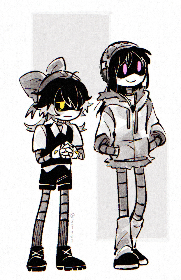
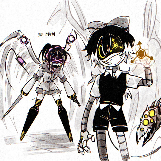
got bored and made these 🫠
#messyr#drew me & munnie as drones LMAO#then an oc bc why not ::3#ok bye again ( GOES BACK TO UI UX PROTOTYPING )#doodle#artists on tumblr#murder drones#md#murder drones oc#original character
948 notes
·
View notes
Text
Hey, everyone! I've been experimenting with some ideas I had for improving Myspace's mobile navigation. These are just personal thoughts and prototypes—not official changes—but I had a lot of fun reimagining the experience. Would love to hear your thoughts!
488 notes
·
View notes
Text
[WIP] TS3 UI "Krystal"
I figured it would be cool to finally publicly share what I've been working on behind the scenes, as well as some mockups!
A few of you on Patreon or Discord may have already seen sneak peeks/given feedback. I kept things quiet because I wasn’t sure I’d even do it in the first place as a next modding project, and I didn’t want to let anyone down.
Luckily, @lazyduchess’s Monopatcher made the job ten times easier. The biggest hurdle was that I would've had to make a core mod to override UI code (I’m normally anti–core mod), but the patcher solved that and let me push ahead.
(Psst, if you're looking at seeing the mockups bigger, I also posted this post on my site: Simblr.cc 😉)
Creating the Mockups

Fun fact: I actually have a degree in UI/UX design! (for websites) While principles like “How wide should this padding be?” or “Which colors send the right signal to the user?”—game UI is a whole different beast.😬
Main Menu


I started with the main menu:
Cut the SimPoints clutter and the “Buy TS4!” banner—after a decade, we get it exists 😉.
Grouped items into clean blocks
Added a text-free “Create New Family” icon
Swapped lot thumbnails for family shots (still baffled by EA’s original choice).
Dropped an options gear in the bottom-left; might label it if it’s too subtle.
Different backgrounds: one solid blue, one closer to the classic gradient.
A lil' sneek peek of where I'm at:

She's not finished, but it's definitely getting there! 😉
Load Screen


Not much has changed here! It's just less... busy I suppose, lol!
2 Different backgrounds to choose from
Moved the Game Tips to the bottom, so the main focus stays on that loading bar 😉

I also have a third option but I'm strongly leaning towards just having the loading bar as it's the most clear!
Live Mode

The hardest of them all lol. Kudos to EA for figuring that one all out! I really struggled with this one in regards to shape and what to even move around/remove!

I figured, it should be nice to pull really into that glassmorphism I've been using over the Mockups! Now I do realise that it can hamper user experience in the sense of not being able to read anything. But these are pictures! So that should be all fine and dandy.
The active item in the queue will now be more "visible". The queued item however, you'll see look a bit more "unactive" compared to what the current version has.

I also completely overhauled the thumbnails for your sims, showing their moods a bit better, and giving the active sim a tiny plumbob! :D

And now the real deal: The control panel! You might notice it's not the whole thing, but I'm still working on that part.
I removed the camera controls from the panel. However, upon feedback, I did hear that it's better to have them as some people are limited in their hand movements on their keyboard and that those controls are really useful. So I will make sure to share 2 versions :)
I also realised I completely forgot the Build/buy mode buttons 😬 So, err, stay tuned for that? lol.

Notifications I really just tidied up :p
I am aware that the space where the text is and the thumbnail is huge, and normally I'd wrap the surrounding text, but apparently in TS3's UI stuff that's practically impossible. Hence that they got this "2 column" effect to them 😉
About releasing the UI:
I'm hoping to release them all in bits and pieces! So first up is the Main Menu (and possibly the Loading screen given it's simplicity).
After that, I hope in my second "update" to release a big portion of Live mode, but that's a bigger task on it's own of course 😉
Any feedback at this point is also completely welcome by the way!
384 notes
·
View notes
Text
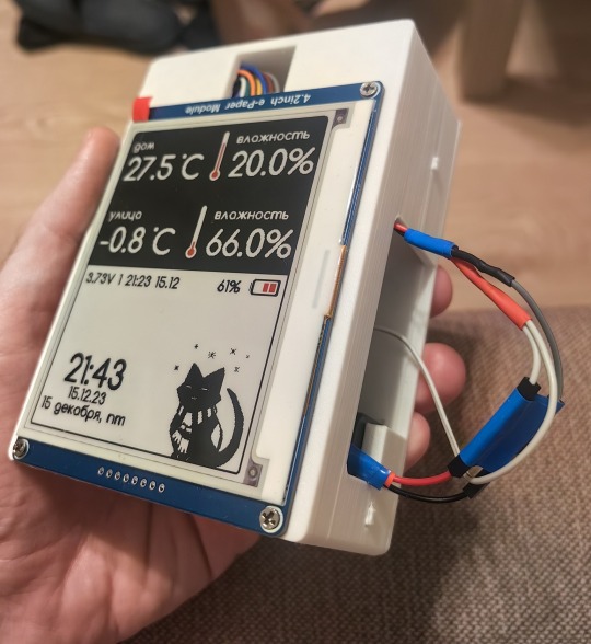
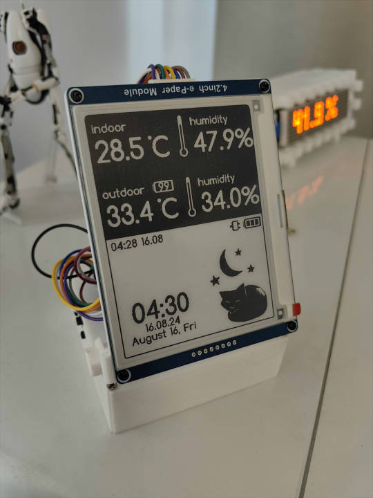

Released my open source weather station firmware, works with E-INK 4.2' \ 1.5' displays; compatible with ESP8266 \ ESP32 Default kitty icon is depends on time \ temperature; Upload custom interfaces is also available via web panel; Optional °F \ °C, English Source code : https://github.com/NC22/Volna42BW Documentation : https://volna42.com
628 notes
·
View notes
Text

#motion graphics#art#graphic design#ui design#animation#scifi art#cyberpunk#cyberpunk art#futuristic#ui#ui ux design#uidesign#black and white#monochrome#gif#dark aesthetic#dark scifi
1K notes
·
View notes
Text

Best UI/UX Designing Company in Delhi - Kickr Tech!
Kickr Technology is the best UI/UX designing company in Delhi NCR. We craft stunning, user-friendly designs that elevate user experiences, drive engagement, and turn your ideas into visually striking realities.
To know more about our UI/UX designing services, visit us at www.kickrtechnologies.com
#kickrtechnology#UIdesign#UI&UX#UI&UXdesign#bestUI&UXdesigningcompany#bestUI&UXdesiningservice#bestUI&UXdesigningcompanyinnoida#bestUI&UXcompany
0 notes
Text
I kind of love it when websites both display relative timestamps for an unreasonably long span of time before switching to absolute timestamps and use unreasonable units for the span in question. "This post was made 37 weeks ago" under what conceivable circumstance is this a useful way to communicate that?
4K notes
·
View notes
Text


The Fifth Element (1997)
#the fifth element#90s#cult classic#retro futuristic#cyberpunk aesthetic#retrofuture#retro futurism#new york city#aesthetic#90s movies#90s aesthetic#cyberpunk#graphical user interface#user interaction#user interface#graphic design#motion graphics#ui#ui ux design#uidesign
1K notes
·
View notes
Text
Been working on cleaning up the Scarlet Hollow UI! • Text box is taller, meaning you can read more dialogue options at once without scrolling. • Text box is more transparent, meaning you can more clearly see art behind it at all times • Scroll box for choices is wider, meaning it's less likely a given choice will take up multiple lines (again, less scrolling!) • Added some leaves to populate the negative space. • Quick menu now lives in the text box, clearing up space in the top right for character sprites. • Leaves slightly change colors when a character talks (vs narration) • Leaves will turn deep red when a major decision is on the screen!
For all of you who can't tolerate change: 1. Play Slay the Princess
2. We're also adding an option to use a more minimalist textbox that has less leaves/color, but keeps the increased box height
347 notes
·
View notes