#unendlich photographs
Text
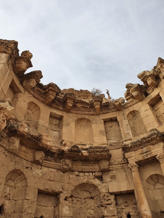

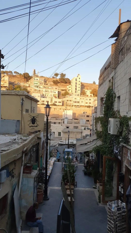
Jerash, Jordan
104 notes
·
View notes
Text
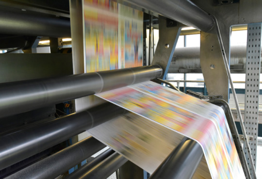
Grundlagen der Drucktechnik: Welche Farbräume und Dateiformate eignen sich für den Druck?
Du hast also ein fantastisches Design erstellt und möchtest es auf Papier zum Leben erwecken. Aber Moment mal! Bevor du deinen Finger auf den Druckknopf legst, gibt es ein paar grundlegende Dinge zu beachten. In diesem Blogartikel werde ich dir die ins und outs der Drucktechnik erklären – von Farbräumen bis hin zu Dateiformaten. Also schnall dich an und lass uns eintauchen!
Drucktechnik - Wo Magie auf Papier trifft
Drucktechnik ist die Kunst, digitale Designs in physische Werke zu verwandeln. Es ist der Moment, in dem Pixel auf Papier treffen und ein beeindruckendes visuelles Erlebnis entsteht. Aber damit diese Magie passiert, müssen wir einige Dinge berücksichtigen. Farbräume und Dateiformate sind die Schlüssel zu einem erfolgreichen Druck.
Farbräume - Das Spiel der Farben
Farbräume sind wie der Farbkasten eines Künstlers. Sie definieren den Bereich der Farben, die in einem bestimmten Medium dargestellt werden können. Im Druck gibt es zwei gängige Farbräume: CMYK und RGB.
CMYK - Vier Buchstaben, unendliche Möglichkeiten
CMYK steht für Cyan, Magenta, Yellow (Gelb) und Key (Schwarz). Diese vier Farben werden beim Drucken verwendet, um eine breite Palette von Farben zu erzeugen. Jede Farbe wird durch das Mischen der entsprechenden Tinten auf dem Papier erzeugt. CMYK eignet sich hervorragend für den Druck, da es ein breites Spektrum an Farben darstellen kann. Es ist der Standardfarbraum für den professionellen Druck.
RGB - Wenn das Licht den Ton angibt
RGB steht für Rot, Grün und Blau. Dieser Farbraum basiert auf der Kombination von Lichtfarben. RGB wird hauptsächlich für digitale Medien verwendet, da Bildschirme und elektronische Geräte Licht emittieren. Es ist wichtig zu beachten, dass RGB-Farben möglicherweise anders aussehen, wenn sie gedruckt werden, da Drucker die Farben in CMYK umwandeln müssen. Wenn du also ein Design für den Druck erstellst, verwende idealerweise den CMYK-Farbraum, um ein genaueres Ergebnis zu erzielen.
Dateiformate - Die Sprache der Drucker
Dateiformate sind die Sprache, die Drucker verstehen. Sie sind der Schlüssel, um deine Designs in ein Format zu bringen, das für den Druck geeignet ist. Hier sind einige gängige Dateiformate, die du für den Druck verwenden kannst:
PDF - Das unverwüstliche Format
PDF steht für Portable Document Format. Es ist ein vielseitiges und stabiles Dateiformat, das für den Druck sehr gut geeignet ist. PDFs bewahren die Formatierung, Schriftarten und Bilder deines Designs genau so, wie du sie erstellt hast. Sie sind plattformübergreifend kompatibel und können von den meisten Druckereien problemlos verarbeitet werden. Wenn du sicherstellen möchtest, dass dein Design genauso gedruckt wird, wie du es entworfen hast, ist das PDF-Format eine sichere Wahl.
TIFF - Das verlustfreie Format
TIFF steht für Tagged Image File Format. Es ist ein verlustfreies Dateiformat, das eine hohe Qualität der Bilder und Grafiken beibehält. TIFF-Dateien können große Dateigrößen haben, sind aber ideal, wenn du Bilder in hoher Auflösung für den Druck benötigst. Sie bieten eine ausgezeichnete Farbgenauigkeit und werden häufig in der professionellen Druckindustrie verwendet.
EPS - Das Vektorformat
EPS steht für Encapsulated PostScript. Es ist ein Vektorformat, das sich besonders gut für den Druck eignet. Vektorgrafiken verwenden mathematische Formeln, um Grafiken zu erstellen, und bieten eine unbegrenzte Skalierbarkeit. EPS-Dateien sind ideal für Logos, Illustrationen und andere grafische Elemente, die gestochen scharf gedruckt werden sollen.
JPEG - Das platzsparende Format
JPEG steht für Joint Photographic Experts Group. Es ist ein komprimiertes Dateiformat, das häufig für digitale Fotos verwendet wird. JPEG-Dateien sind platzsparend und eignen sich gut für den Druck von Fotos, bei denen eine hohe Detailtreue nicht unbedingt erforderlich ist. Allerdings sollte die Komprimierung nicht zu hoch sein, um Qualitätsverluste zu vermeiden.
Die richtige Wahl treffen
Jetzt weißt du also, welche Farbräume und Dateiformate für den Druck geeignet sind. Aber wie triffst du die richtige Wahl? Hier sind ein paar Tipps, die dir helfen können:
- Überprüfe die Anforderungen der Druckerei: Jede Druckerei hat möglicherweise spezifische Anforderungen in Bezug auf Farbräume und Dateiformate. Stelle sicher, dass du diese Anforderungen kennst und dein Design entsprechend anpasst.
- Arbeite im CMYK-Farbraum: Wenn du ein Design für den Druck erstellst, arbeite idealerweise von Anfang an im CMYK-Farbraum. Dadurch kannst du sicherstellen, dass die Farben genauer gedruckt werden.
- Speichere eine Kopie im richtigen Dateiformat: Wenn du dein Design abschließt, speichere eine Kopie in dem für den Druck geeigneten Dateiformat. Überprüfe dabei die Komprimierungseinstellungen, um die Qualität zu erhalten.
- Verwende hochwertige Bilder: Achte darauf, hochauflösende Bilder zu verwenden, insbesondere wenn du sie in gedruckter Form anzeigen möchtest. Niedrig aufgelöste Bilder können zu Pixelbildung und unscharfen Druckergebnissen führen.
Indem du diese Tipps befolgst und die richtigen Farbräume und Dateiformate für den Druck verwendest, kannst du sicherstellen, dass deine Designs in ihrer vollen Pracht auf dem Papier erscheinen.
Drucke deine Kreativität aus
Die Welt des Drucks bietet unendliche Möglichkeiten, deine Kreativität auszudrücken. Indem du die Grundlagen der Drucktechnik verstehst und die richtigen Farbräume und Dateiformate wählst, kannst du sicherstellen, dass deine Designs im Druck genauso beeindruckend aussehen wie auf dem Bildschirm. Denn let's face it, es gibt etwas Magisches daran, ein physisches Werk in den Händen zu halten, sei es ein Poster, eine Broschüre oder eine Einladungskarte.
Ein guter Druck ist wie ein Kunstwerk. Die Wahl der richtigen Farbräume und Dateiformate ist dabei entscheidend, um die Farbgenauigkeit und Qualität deiner Designs zu gewährleisten. Es ist wie das Mischen von Farben auf einer Palette – du musst die richtigen Töne wählen, um das gewünschte Ergebnis zu erzielen.
Aber hey, das bedeutet nicht, dass du deine Kreativität einschränken musst! Im Gegenteil, die richtige Beherrschung der Drucktechnik ermöglicht es dir, deine Designs noch besser zum Ausdruck zu bringen. Du kannst mit verschiedenen Farbnuancen und Texturen experimentieren, um ein einzigartiges und ansprechendes Druckwerk zu schaffen.
Und vergiss nicht den Wow-Faktor, den ein gut gestalteter Druck haben kann. Es ist wie der Moment, wenn ein Zaubertrick enthüllt wird und das Publikum staunend zurückbleibt. Ein gut gedrucktes Design kann Menschen beeindrucken, Emotionen wecken und deine Botschaft effektiv vermitteln. Es ist eine Form der visuellen Kommunikation, die ihre eigene Sprache spricht.
Also, wenn du das nächste Mal ein Design für den Druck erstellst, denke daran, dass die Wahl der richtigen Farbräume und Dateiformate einen großen Einfluss auf das Endergebnis hat. Behalte den CMYK-Farbraum im Auge, um präzise Farben zu erzielen, und wähle das geeignete Dateiformat, um die Qualität deiner Bilder und Grafiken zu erhalten. Und vor allem: Lass deine Kreativität fließen und bringe deine Designs zum Leben!
Drucktechnik ist wie eine Zauberkunst, bei der du die Kontrolle über die Farben, Texturen und Qualität hast. Also, schnapp dir deine Ideen, setz dich vor den Drucker und lass die Magie geschehen! Deine Designs verdienen es, auf Papier zum Leben zu erwachen und die Welt zu verzaubern.
Read the full article
1 note
·
View note
Photo


25th of july ‘17
breakfast with my beautiful friends in a beautiful little café at my home town. @cloudshining @in-love-with-universe
#unendlich photographs#cafe margareta#erlangen#german city#german breakfast#lifestyle#food#good morning#morning vibes
29 notes
·
View notes
Photo
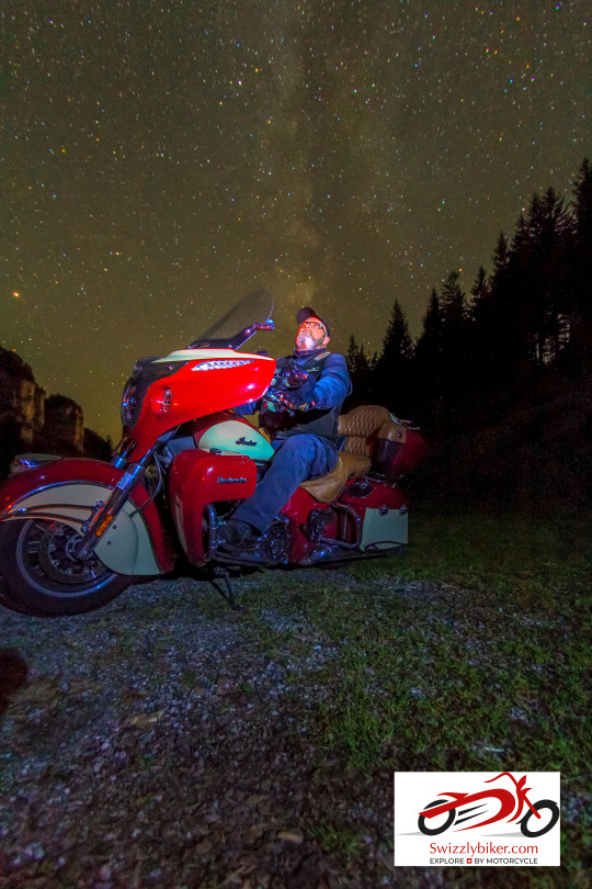
Die Milchstrasse. Unendlich weit und nur zu fotografieren, wenn Neumond ist. Die Planung jedoch fängt schon einiges früher an. Es ist wie bei geführten Motorradtouren. Vorbereitung ist alles. Und Du? Hast Du auch schon Fotos mit Dir und der Milchstrasse aufgenommen? 🇨🇭 🏍 🇨🇭 The Milky Way. Infinitely far and only to be photographed when there is a new moon. But the planning starts a lot earlier. It's like guided motorbike tours. Preparation is everything. And you? Have you already taken photos with you and the Milky Way?
#explorebymotorcycle#planning#starphotography#nightphotography#motorcycle#indianmotorcycle#switzerland
1 note
·
View note
Note
Top 5 fantasy novels you've read that don't fit the western stereotype (so, avoids aping Tolkien while missing all the subtlties)?
Oooh!
I’m gonna mix some written in English and some not (with official translated title, if there is). Also, mixing stuff for all-ages and for adults. And in no particular order.
Sooo… *cracks* fingers.
5. Cien años de soledad (aka One Hundred Years of Solitude), by Gabriel García Márquez. A family saga across nine generations in a small south American town straight out of both fable and myth, with one of the most memorable endings I have run into yet.
4. Northern Lights (aka The Golden Compass), by Philip Pullman. First book of the “His Dark Materials” trilogy, though you can read it as a stand-alone. A terrific adventure yarn set in a world where people’s souls are visible, taking the shape of animal familiars —or Daemon, as they are called in text. Forget everything you have heard about the book and check it out with no expectations —you’re in for quite a ride.
3. La ruta del hielo y la sal (aka The Road of Ice & Salt), by José Luis Zárate. The captain of a doomed, haunted ship recounts the strange voyage he has undertaken —while musing about his repressed homosexuality. A recently translated masterpiece from one of the Mexican masters of capital W Weird Literature. It’s also an homage to a very famous Horror novel —but saying more would be a huge spoiler ; )
2. Sacrament, by Clive Barker. A gay wild-life photographer recalls an encounter he had as a child (when he was starting to discover his sexuality, at that) with a mysterious, seemingly immortal couple. And in present time, deals with a supernatural force he had just tapped into. Quite possible Barker’s most underrated book, and also quite unlike anything else in gay fiction, fantasy or gay fantasy even.
1. Die unendliche Geschichte (aka The Neverending Story), by Michael Ende. Forget the movie adaptations. Marvel instead at a story about the magic of reading itself and about the beautiful yet sometimes terrifying power of Imagination. Also, a very rare fantasy epic story with a heavy-set hero who does not lose weight to show he’s now better. One former friend (who is no longer talking to me) hated this part, hehe.
*
6 notes
·
View notes
Photo

Selbst der kleinste Teich kann voller unendlicher Schönheit sein, man muss nur bereit sein sie als diese auch zu erkennen. ✨ • • • #shotoniphone #iphonephotography #photography #photooftheday #photographer #naturephotography #naturelover #roots #water #tumblraesthetic #tumblrphotography #viscocam #vsco #poetic @vsco @apple (hier: Stralsund) https://www.instagram.com/p/B_-EhgtoJgg/?igshid=2664ih21ak6o
#shotoniphone#iphonephotography#photography#photooftheday#photographer#naturephotography#naturelover#roots#water#tumblraesthetic#tumblrphotography#viscocam#vsco#poetic
1 note
·
View note
Photo

Berlin .2016 Der unendliche Sommer From that summer onwards It never came to a halt It lasted till this very day And we Stayed up Like the city Forever awake • • • • • #vsco #vscox #fujisuperia1600 #fujisuperia #bridge #schöneberg #berlin #sommer #unendlichesommer #winter #sunset #color #photodiary #allefarbendeshimmels #photographer #clouds (at Berlin, Germany) https://www.instagram.com/juanyouneverlearn/p/Bsv9r4HBxwO/?utm_source=ig_tumblr_share&igshid=co3sk106cwj5
#vsco#vscox#fujisuperia1600#fujisuperia#bridge#schöneberg#berlin#sommer#unendlichesommer#winter#sunset#color#photodiary#allefarbendeshimmels#photographer#clouds
2 notes
·
View notes
Text
Interview, Navina Khatib - Psychedelic Colours Over The Horizon

Navina! Do you have a psychedelic vision of life?
My vision of life is free, colorful, peaceful and open-minded. I wouldn’t say that it is psychedelic as for me this term is associated with a certain time, style, music and also chemical supplements. My vision of life is never to oppress creativity, to be honest about your own creativity, cherish your creativity, never give up on your creativity, no matter what they say. My vision of life is a genuine and constant discussion with creativity in order to maintain and preserve it until the end.
A person with awareness or someone in meditation is bound to have a psychedelic vision, yet some supplement with chemicals for glimpses. Where does your vision come from, was it influenced by an event or a spiritual longing?
I think the root of my imagination and creativity lies in my childhood, growing up in the laidback German countryside in the 80s. We had no TV or other distractions back then, so the only media we were exposed to were vinyl records and tapes, and, of course, books. As a child, I loved listening to fairytales. I think one of my favorites was “Tino und die Nachtigall” (Tino and the Nightingale) by Will Quadflieg, a fairytale about a boy who catches birds - until one day he catches a nightingale that takes him on a trip around the world and changes his life forever. “Die Unendliche Geschichte” (The NeverEnding Story) by Michael Ende had a deep impact on my life, too. I recently remembered that it was the first movie that I ever saw, on a friend’s video recorder.
All of my favorite fairytale recordings had a beautiful soundtrack, so the discovery of music has influenced my imagination ever since. When I create I love to listen to music, especially ambient music. The mood totally reflects my vision of life and my imagination. I still love music that expands space and time, full of lush pads and reverb. So maybe my vision of life comes from audiovisual patterns.
A large amount of your work consists of landscapes, dreamscapes, psychedelic colors all over the horizon. Showcasing poetry, hidden treasures in these moments. Now again, is that because of a spiritual longing or something else entirely?
Longing is definitely a central topic in my photos. I started photography at age 11 and along with music and film, it was my first love. It gave me the opportunity to totally lose myself – time appears to stand still when taking a photograph – to imagine foreign places and dream of traveling. I always wanted to see the world. In German, there is a word called “Fernweh” that literally means the longing for distance. In addition to photography, I also do films. Fittingly, my first attempt in filmmaking was a short with the title “Longing”.
I love distant and foreign places, but for my art, I feel a simple landscape is not enough. I view things differently, I see more in them. I see more colors and more horizons. I would say that with the abstraction of every landscape, I am referring to the conflict between the perception of our inner and outer world. My aim is the dissolution of concrete reality in order to solve this conflict and even more – to dissolve it.
Are these scapes invented through imagination? What are your feelings towards imagination and its importance in shaping human consciousness?
Imagination is everything to me. It’s free. It’s raw, It’s real and honest. You will find exactly the distance you long for with your imagination. Imagination is life and the engine for creativity. Imagination is protecting ourselves from the pressure and harshness of the reality of life. It’s like a shell that unfolds its beauty inside.
Have you had a more elaborate experience of your consciousness, something that moved you into the unknown? Could you please share that with us?
It’s mostly places that moved me and expanded my consciousness. When I was 20 I lived in California (San Francisco and Santa Barbara) for one year. I traveled a lot along the West Coast during that time – the nature just blew me away. The color and the wilderness of the Pacific Ocean has influenced me ever since. Later, I lived in Mexico City for a year, quite a chaotic place where you could easily lose yourself in all the buzz.
When I was younger I really liked the idea of losing myself. I guess on the one hand to experience my limits, and on the other hand to pull me out again.
I have always loved the unknown, so a few years later I went back to Peru to work in an orphanage, which became the content of my first documentary.
An extended trip through South America in 2011 brought me most of the photos you can see in my gallery.
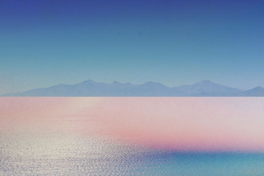
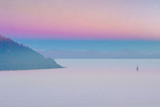
A lot of my pictures were shot in Uyuni, a huge salt desert in the Altiplano of Bolivia – the most breathtaking place I have seen so far. Experiencing it has definitely expanded my horizon. Imagine blue, pink, red lakes with pink flamingos on top of it. However, even the most breathtaking nature is still a reality. I figured out that in my imagination this is not enough. By the abstraction of these landscapes, I want to take away even the last glimpses of reality. You could say nature is my muse and inspiration; the abstraction of it makes it complete.
..and does that contribute to why you chose this medium, of being a visual artist?
I can express myself best in visual arts. When it comes to film I show reality. My first feature film “Casa Luz – House Of Light” was about the children of an orphanage in the Andes of Peru. My second film, which is still in the pipeline, will be about personal destinies in modern society. For me film is the medium to document reality, photography to document imagination.
Now, can you please bring us closer to your process? Do you usually sketch first, or use photoshop to create later? What's it like?
Almost all photos were shot in places that are already magical, such as the Altiplano of Bolivia or the foggy woods on La Gomera Island. I exaggerate the psychedelic nature of these places by giving them my vision and imagination via post-processing.
Coming back to the colors, with such an extraordinary palette - how do you think that affects the mood of the photograph itself and also the experience of the viewer?
I started creating it as a kind of therapy - you could even call it a color therapy - for myself. In Berlin where I live, we hardly have light and colors especially in the winter days, so most people get depressed. From the fields of art therapy I know about the impact colors have especially on children. I love the power of colors, the influence they have on our moods and minds.
How do you keep the perspective straight on where you wish to lead the viewers of your imagery? Does that actually shape your experience while creating as well? Do you feel it makes you want to be more grounded before you start creating?
I can tell you what the colors evoke in myself, but I can’t and I don’t want to control how other people might perceive them. I am always happy when somebody writes me a lovely message or elaborates on my work, for example saying it is like a kind of meditation for them. This makes me more than happy, for it means that the colors might have the same kind of impact on them as they have on me.
However, I don’t want to lead the viewers. I don’t want to be explanatory. I don’t want to give answers. People should see in my pictures whatever they want to see in them.
With that, can you tell us about your favorite poem that you have read since you started creating?
The magic of poems caught me at a very young age, the play with language, metaphors, myths, and images.
I love the poem “The Raven” by Edgar Allan Poe. It is really dark, but it sparks so much the imagination. I love how the language is put together. Poe was a master and it really moves me to think that it took him 10 years to finish this poem. In a world where every single second is money and everything is calculated, spending 10 years on a single poem seems unimaginable.
Lastly, What would you suggest or share with other visual artists?
Artists should free themselves from expectations and should love what they do so that this love shines through their work. They should trust their intuition.
Creativity comes from creation; life is creation, creation through love.


Interview with Navina Khatib
https://www.instagram.com/navinakhatib/
https://www.vimeo.com/navinakhatib
Interviewed by The Portfolio
5 notes
·
View notes
Photo

Unendlich lang erschien die Zeit bis zum Anfang,
die Zeit danach verging wie im Flug. © Thomas Holtbernd (*1959), Theologe, Psychologe und Humorforscher #landscape #enten #nature #birds #land #landschaft #naturelovers #shootcamp #sky #shootcamp #sony #sonyalpha6000 #photography #photographer #photooftheday #photo #insta #instagram #instagood #instagramers #instabest #ikea #mural #pictureoftheday #picture #instadaily #instapic @shootcamp #niceday #beautiful (hier: Altmühltal) https://www.instagram.com/p/B8pESoaI6zs/?igshid=1tnyeg0dm47wg
#landscape#enten#nature#birds#land#landschaft#naturelovers#shootcamp#sky#sony#sonyalpha6000#photography#photographer#photooftheday#photo#insta#instagram#instagood#instagramers#instabest#ikea#mural#pictureoftheday#picture#instadaily#instapic#niceday#beautiful
0 notes
Text

Amman, Jordan
89 notes
·
View notes
Text
Access
Beth Collar, Tobias Donat, Michael E. Smith, Andrzej Steinbach, Hanna Stiegeler
Apr 11 – May 04, 2019
Der PiK (Projektraum im KunstWerk) befindet sich in der ehema-ligen Fertigungshalle einer Gummiwarenfabrik. Dort wurden zu Beginn des 20. Jahrhunderts Fäden für Nylonstrümpfe hergestellt. In den zweiten Häuten verweben sich psychische Aspekte sexuel-len Begehrens, der Verführung, des Materialfetischs und der Opti-mierung des eigenen Körpers. Ehemals Luxus, sind Nylons heute Massenware. An die Stelle der industriellen ist die postindustrielle, digitalisierte, zunehmend individualisierte Produktion getreten und mit ihr das Prinzip der Seduktion.
In seinem Buch „The Age of Access“ (2000) beschreibt der umstrittene Wirtschaftstheoretiker Jeremy Rifkin „Zugangsgesell-schaften“, in denen durch das Internet und Modelle wie die Sharing-Economy Waren, Erlebnisse und Dienstleistungen stets verfügbar und zugänglich, nur einen Klick entfernt seien. In der zunehmenden Auflösung von materiellem Besitz, territorialen Begrenzungen, und Rifkin zufolge auch dem autonomen Individuum, wird das Bild – und in Gegenbewegung dazu auch der Körper und der Kontakt mit der Materialität von Dingen, die uns umgeben, von immer grö-ßerer Wichtigkeit. Denn die Dinge befinden sich in eigenartiger Distanz zum Menschen. Screens ziehen Glaswände zwischen ihre Benutzer und visuell präsentierten Möglichkeiten. Die Schwebe zwischen Nähe und Distanz speist einen Zustand des dauerhaft unerfüllten Begehrens. Unendliche Möglichkeiten sind in Sichtwei-te – aber verbleiben für den Großteil der Gesellschaft auch zumeist dort. Für die Verführung, deren Macht das System zusammen-hält, ist dies essentiell. Der universale Zugang, den Rifkin positiv besetzt, erinnert auch an den „glatten Raum“, wie ihn Gilles Deleuze und Felix Guattari in „Tausend Plateaus“ (1980) beschrei-ben: Den extensiven, endlosen Raum ohne Ordnung, ohne Hinder-nisse, Bordsteine und Zäune. Dieser birgt nicht nur nomadischeFreiheit, sondern ist gleichzeitig auch ein idealer militärischer, un-gesicherter Raum, auf dem der Einzelne auf seine eigene Kraft und Wahrnehmung zurückgeworfen ist. Wer sich seiner Identität aufgrund seines Begehrens unsicher ist, sich im ständigen Streben befindet, lässt sich bereitwillig von Versprechen in Bildern verfüh-ren – und beutet sich dafür im Extrem sogar selbst aus. In der in-tensiven Beschäftigung mit dem Design von Produkten und deren Oberflächen zeigt sich ein Bedürfnis nach mehr Berührung mit der physischen Realität.
Die Ausstellung Access erkundet die Wechselbeziehung zwischen dem Ideal des universalen Zugangs und dem Dauer-zustand des unerfüllten Begehrens nach Objekten und körper-lichen Erfahrungen. Die scheinbare Verfügbarkeit bedingt neue fetischisierte Beziehungen von Körper und Objekt – oder auch Menschen untereinander. Einige KünstlerInnen reflektieren die-se, einschliesslich der Zugänge zu Gesellschaftsgruppen, Szenen und zur Kunst selbst. Sie finden dabei unterschiedliche subjektive Zugänge zur Welt und emanzipieren sich mit der Aneignung der Macht der Verführung. Ihre Kunstwerke wollen auratische Objek-te sein. Viele Arbeiten entstehen aus Sampling von Material aus Youtube, andere Kunstwerke können nur geliehen oder anhand eines Zertifkats mit On-Demand Fertigung bei Verschleiss nach-produziert werden. Analoge Techniken erkunden das Bedürfnis nach Körperlichkeit und Identität, formen Materie. Wer ist Voyeur oder wer beobachtetes Objekt in Fotografien? Bilder und grafische Gestaltungen präsentieren sich als schillernde, uneindeutige Ober-flächen, Spiele mit Zeichen, die den Kräften der Wahrheit und der Produktion entgegenlaufen.
PiK (project room at KunstWerk) is located in a former rubber fac-tory‘s manufacturing facility. At the beginning of the 20th century, threads for nylon stockings were produced at this site. In those second skins psychological aspects of sexual desire, seduction, material fetish and the optimization of one's own body interweave. Formerly a luxury, nylons are now mass-produced goods. The in-dustrial production has been replaced by the postindustrial, dig-itized and increasingly individualized production, and along with that the principle of seduction manifested itself.
In his book “The Age of Access” (2000), controversial eco-nomic theorist Jeremy Rifkin describes “access societies”, in which the internet and modes of consumption like the Sharing Economy, create readily available and accessible goods, experiences and services at the click of a button. In the growing disintegration of material possessions, territorial limitations, and according to Rifkin, the autonomous individual, the image—and in counter-motion, the body and contact with the materiality of things that surround us —become increasingly important. This happens because things are at a peculiar distance. Screens create glass walls between their users and the visual presentation of their possibilities. The se-ductive hovering between proximity and distance feeds a state of permanently unfulfilled desire. Infinite possibilities are within sight — but remain there for the majority of society. This is essential for seduction as the power that holds the system together. Rifkin's idea of universal access is also reminiscent of the “smooth space”, that Gilles Deleuze and Felix Guattari describe in “A Thousand Pla-teaus” (1980): The extensive, endless space without order, without obstacles, curbs and fences. This not only holds nomadic freedom, but is also an ideal military, unsecured space in which the individ-ual is thrown back upon his own strength and perception. Those in constant pursuit of their identity, uncertain about it because of his desires, let themselves be willingly seduced — and even ex-ploit themselves. The intensive preoccupation with the design of products and their surfaces shows a need for more contact with physical reality.
Access is an exhibition exploring the interrelation between the epitome of universal access and the permanent state of un-fulfilled desire for objects and physical experiences. The apparent availability of these things causes new fetishized relationships be-tween body and object — or between people. Many artists reflect on these relationships, including access to social groups, scenes and art itself. They find different subjective approaches to the world and emancipate themselves often with the appropriation of the power of seduction. They find different subjective approaches to the world and sometimes emancipate themselves by appropriating the power of seduction. Their artworks want to be auratic objects. Many works arise from the sampling of Youtube content, other works of art can only be borrowed, and others can be reproduced with a certificate through on-demand fabrication in the case of de-terioration. Analogous techniques examine the need for corporeal-ity and identity, forming matter. Who is the voyeur or the observed object in photographs? Pictures and graphic designs present them-selves as shimmering, ambiguous surfaces, games with symbols that run against the forces of truth and production.
curated by Juliane Duft
Fotos: Alwin Lay
0 notes
Photo

Das Licht des Alterns - Robinie / Waldrebe 2009 - 2017
Als ich begann mit Pflanzen zu arbeiten, war ich oft enttäuscht, wenn sich das saftige Grün von Stengeln, Schoten und Gräsern sich schnell oder langsam in ein verblassendes Gelb verwandelte.
Im Laufe der Jahre lernte ich genauer hinzuschauen: aus dem gelb entstand langsam ein silber und das ging über in eine breite Palette an Goldtönen, die sich nicht mehr fotografieren lassen, da sie so unendlich viele feine Farb-Abstufungen haben.
Seit ich das beobachten kann, sehe ich den Prozess des Alterns in einen ganz neuen Licht.
The Light of Aging - Robinia / Clematis 2009 - 2017
When I began working with plants, I was often disappointed when the lush green of stems, pods, and grasses turned quickly or slowly into a fading yellow.
Over the years, I learned to look more closely: from the yellow slowly a silver emerged, which went over into a wide range of gold shades, which can no longer be photographed, as they have so infinitely many fine color gradations.
Since I can observe this, I see the process of aging in a new light.
Beatrice Oettinger
website | flickr | behance
45 notes
·
View notes
Text


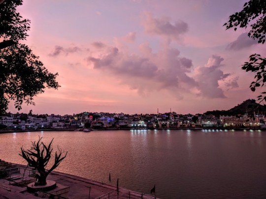
Day 4/5: Pushkar
HOLY SHIT!
Eine kleine Oase mitten in der Wüste! Pushkar hat uns am ersten Tag absolut geflasht! Der Kontrast zu Delhi könnte fast nicht größer sein. Pushkar ist eine heilige Stadt und Pilgerort für viele Inder. Hier befindet sich der weltweit einzige Tempel des Gottes Brahma. Die Gläubigen baden in dem heiligen See - ein Schauspiel, welches uns Gänsehaut bereitet hat. Es war so unendlich schön dort: die untergehende Sonne, die alles in ein goldenes Licht tauchte, Vogelschwärme, die über den See flogen, wunderschöne Inderinnen, die mit ihren bunten Saris im Wasser standen und dessen Kopfbedeckungen ihre Gesichter zart umhüllten. Alles war so friedlich und es tat gut, einmal fernab des Stadttrubels kurz inne zu halten. Am See durfte man keine Fotos machen, also haben wir den zweiten Gänsehautmoment gut in unserem Gedächtnis verwahrt.
Alle Menschen waren so unfassbar nett zu uns: von allen Seiten wurden wir freundlich angelächelt als wir durch die Straßen streiften, viele haben uns die Hand gegeben und sich ehrlich gefreut, uns zu sehen. Ein unglaublich schönes Gefühl so warmherzig in dieser Stadt empfangen zu werden.
In Pushkar sah man schon wesentlich mehr Touristen, es waren vor allem Israelis. Abends waren wir in einem israelischen Restaurant essen, es gab Buffet, “all you can eat” für 3,50 €. Um uns herum ca. 120 Israelis. Es war Freitag, also Sabbath für die Juden. Pushkar ist 2 Monate lang ein beliebtes Reiseziel für die Israelis, die nach ihrem zweijährigen Wehrdienst dort Erholung suchen. Es müssen übrigens alle Frauen und Männer dienen.
Am nächsten Tag sind wir Mal wieder früh um 5 Uhr aus unserem Betten gekrochen, um pünktlich zum Sonnenaufgang auf dem Tempelberg Savitri zu sein. Der Tempel war von außen nicht wirklich ersichtlich, er glich eher einer Ruine. Der Blick auf die Stadt war jedoch super, wenn auch der Sonnenaufgang leider etwas wolkenverhangen war.
Das Highlight waren jedoch die Affen, die dort oben zu Hause waren. Wir haben sie gefüttert und dann gnadenlos 100fach abgelichtet - sie waren einfach ziemlich fotogen!😊
Den Rest des Tages hat es leider ziemlich geschüttet und die ganze Stadt unter Wasser gesetzt. Wir haben dann die Zeit genutzt, indem wir von Shop zu Shop gehüpft sind 😋
Außerdem haben wir uns mit unserer Zimmernachbarin angefreundet. Mit ihr waren wir dann noch im sagenumwobenen Brahmatempel und später schön essen, wobei wir Mal wieder viel lernen und ihr all unsere Fragen stellen konnten, da sie Inderin war.
____________________________________________________
A small oasis in the middle of the desert! Pushkar absolutely flashed us on the first day! The contrast to Delhi almost couldn't be bigger. Pushkar is a holy city and place of pilgrimage for many Indians. Here is the world's only temple of the god Brahma.
The believers bathe in the holy lake - a spectacle that gave us goose bumps. It was so infinitely beautiful there: the setting sun, which bathed everything in a golden light, flocks of birds flying over the lake, beautiful Indian women standing in the water with their colorful saris and whose headgear delicately covered their faces. Everything was so peaceful and it was good to stop for a moment far away from the hustle and bustle of the city. We were not allowed to take photos at the lake, so we kept the second goose bump moment well in our memory.
All people were so incredibly nice to us: from all sides we were smiled at friendly as we strolled through the streets, many gave us their hands and were honestly happy to see us. A beautiful feeling to be received so warmly in this city.
In Pushkar we saw many more tourists, especially Israelis. In the evening we had dinner in an Israeli restaurant, there was a buffet, "all you can eat" for 3,50 €. Around us about 120 Israelis. It was Friday, so Sabbath for the Jews. Pushkar is a popular destination for the Israelis for 2 months, who are looking for recreation after their two-year military service. By the way, all women and men have to serve.
The next day we crawled out of our beds at 5 o'clock in the morning to be on the temple mountain Savitri in time for sunrise. The temple was not really visible from the outside, it looked more like a ruin. But the view to the city was super, although the sunrise was unfortunately a little cloudy. But the highlight were the monkeys that were at home up there. We fed them and then mercilessly photographed them 100 times - they were simply quite photogenic!😊
The rest of the day it was quite pouring and the whole city was flooded. We used the time to jump from shop to shop 😋 We also made friends with our room neighbor. With her we were then in the legendary Brahmatempel and later eating, whereby we could learn once again much and ask her all our questions, since she was Indian.
0 notes
Text
Never-ending vs. neverending vs. never ending
never-failing vs. never completion vs. never outcome\nThe number Grammarof errors involving these leash words appears to be endless. \n\nNever-ending is an adjectival meaning having no end or interminable, as in The Earth enjoys a constant add of sunlight. \n\nNeverending (one word) is a translation of the word that more and more appears in print, believably due to proceeds of the Ger art object conceive of written report The Neverending Story. The Ger gay word for never-ending unendliche doesnt harbor a hyphen, so perhaps the interpreter didnt calculate one was inevitable in English. only of this confusion is deepen by the grammatically incorrect capitalisation of the e in the title of the photographic film adaptation (The NeverEnding Story). \n\nAnd the spell out of the word as never ending just surplus involve to, well, go bad\n\n lord bear editor program: Having your novel, wretched story or nonfiction disseminated sclerosis assure or modify in th e first place submitting it after part upgrade invaluable. In an stinting mood where you breast unfathomed competition, your musical composition needs a routine warmness to slip by you the edge. I provide fork out that moment eye.\n+\n piece of music Inspiration: humankind with a artillery unit\nIf suffering get started from writers block, add something that demands explanation, a technique borrowed from reason Raymond Chandler.\n\nWhen Chandler had writers block, he would familiarize a man with a gun, which whence forced him to externalise out who the man with the gun dexterity be and what he wanted precondition what already had been written.\n\nProfessional Book Editor: Having your novel, short story or nonfiction manuscript proofread or edited before submitting it can prove invaluable. In an economic climate where you face heavy competition, your writing needs a second eye to give you the edge. I can provide that second eye.'
0 notes
Photo
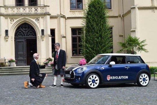
Liebe ist unendlich! 15. Hochzeitstag von Michael & Michael. Ich bin so dankbar, dass ich die Liebe meines Lebens gefunden habe, jemanden mit dem ich diesen Weg gemeinsam gehen kann. Mit dem freundlichsten Mann den ich kenne auf diesem Lebensweg gemeinsam navigieren kann, ein Mann, der mich dazu bringt ein besserer Mensch zu sein, andere Menschen besser zu behandeln, mich besser zu entwickeln. 15th Wedding Anniversary of Michael & Michael. Today we celebrate 15th year of happy marriage 👨❤️💋👨💖 thank you my love What a perfect day! I love this man with all of my being! I am so grateful to have found the love of my life, someone I can navigate this road with, the kindest man I know, a man that inspires me to be a better person, to treat others better, to treat myself better. I did a thing and got married to the love of my life! 👬👨❤️💋👨💍 #married #wedding#myman #happines #foto #amore #liebe #gaywedding#gaycouple#inowpronounceyouhusbandandhusband#longhashtag #happy #excited #love #like4like #follow4follow#love #cutestcouple #couple #iloveyou #gayselfie#bestcouplePhoto created by @ #married #gaywedding #gay #hochzeit #oldenburg #germany #gaycub#gaybears #gaybeard #instagay #instamood #marriage #gaymarriage #bodagay#relationship #couple #love #lovewins#loveislove #modernfamily #pride #lgbt#beyourself#bestfriend #lovewins #evenburg #ostfriesland #liebe #bestoftheday#bestfriends #picoftheday #instagram #instagood #instalike #gayweddingideas #weddingphotos #liebefueralle #alternativewedding #leer #urbanwedding #urbanwedding #samesexwedding #lgbtwedding #weddinginspiration #weddingideas #groom #marriageequality #weddingphotographer#weddingphotography #wedding#weddings #weddingideas #bride#weddingdress #bridal #beautiful#highend #love #photography#photooftheday #picoftheday #portrait#photogram #instawedding#photographer #photoshoot #photog#luxury #luxurybrand #gaywedding #minicooper #minideutschland #miniusa #miniuk #mininl (hier: Schloss Evenburg und Schlosspark)
#weddinginspiration#wedding#gaybeard#excited#luxury#urbanwedding#highend#gayselfie#loveislove#leer#weddingphotographer#couple#iloveyou#oldenburg#evenburg#bride#instagood#follow4follow#gaymarriage#gaycouple#germany#longhashtag#instagay#bridal#modernfamily#photography#portrait#beautiful#bestcouplephoto#bestoftheday
0 notes
Last Seen Blogs