#united visual artists
Text

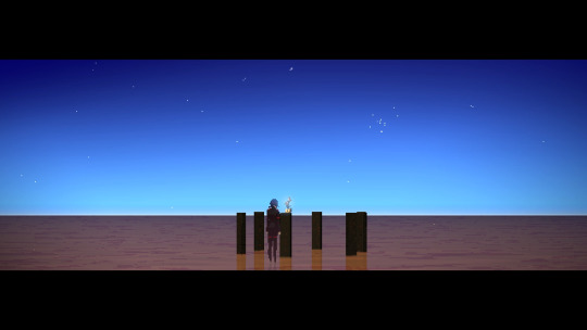
United Visual Artists (UVA) / Ensemble / Installation / 2023
207 notes
·
View notes
Video
youtube
Parkour by Fly Pan Am, live for CTM 2020 at HAU 1 (Berlin) with Animals of Distinction and United Visual Artists
#music#canadian music#fly pan am#jonathan parant#roger tellier craig#jean sébastien truchy#jean sebastien truchy#felix morel#félix morel#live#live music#coreography#animals of distinction#live video#dana gingras#united visual artists#ctm#ctm 2020#ctm festival#hau 1#video
17 notes
·
View notes
Text
0 notes
Text
Our Visualization Service: Transforming Complex Data into Engaging Visuals
Are you looking for a way to effectively present complex data in a visually appealing way? Look no further! Our Visualization Service offers cutting-edge technology to help businesses like yours transform raw data into interactive charts, graphs, and 3D models that will captivate your audience and make decision-making easier.
What is Data Visualization?
Data visualization is the graphical representation of information and data. By using visual elements like charts, graphs, and maps, data visualization tools provide an accessible way to see and understand trends, outliers, and patterns in data.
Why is Data Visualization Important?
Data visualization is crucial in today's data-driven world because it allows businesses to make informed decisions based on insights derived from their data. Visualizing data can help uncover hidden patterns, uncover relationships between variables, and communicate findings more effectively to stakeholders.
How Our Visualization Service Can Help You
With our expertise in data visualization, we can take your raw data and turn it into engaging visuals that will help you unlock the power of your data. Here are some ways our service can benefit your organization:
Interactive Visualizations: We create interactive charts and graphs that allow users to explore data and gain insights on their own.
3D Models: Our team can create immersive 3D models that bring your data to life and make it easier to understand complex relationships.
Custom Dashboards: We design custom dashboards that centralize your key performance indicators and metrics in one easy-to-read format.
Real-Time Updates: Our visualization tools can be set up to provide real-time updates, ensuring you always have the most current information at your fingertips.
How to Get Started with Our Visualization Service
Getting started with our Visualization Service is easy. Simply reach out to our team to discuss your data visualization needs. We will work closely with you to understand your goals and objectives, and create a customized solution that meets your specific requirements. Don't let your data go to waste – let us help you harness its power through our Visualization Service. Contact us today to learn more and get started on transforming your data into actionable insights. With our expertise and cutting-edge technology, the possibilities are endless!
Visit us -https://www.houston3drenderings.com/news/news_detail/84
#artistic rendering#visualization service#3d renderings#home rendering#digital rendering#United States
0 notes
Text
ฅ^•ﻌ•^ฅ 心で遊ぶ (Play With My Heart) 🤍🤍🤍
Galentine's Day (February 13, 2024) | New Series
#心で遊ぶ#play with my heart#new series#y2k babies#y2k fashion#galentine's day#february 13#2024#xo films#regal#united artists#the heat#rhythmic pop#j-pop#visual art#pink cross#daya#claira#brittney#maria#hachise#facebook watch#youtube#billboard#ladies night#party
0 notes
Text
What's New In IF? Issue 12 (2024)

By Erika, Marjorie, Axelle, and Noi
Now Available!
Due to the early release of this issue, any release or update during June 28th unmentioned here will be included in next week's issue.
Itch.io. - Keep Reading below
Due to Internal things, the June and July issues will only update on events and games. We hope to resume regular activities and include more pages by August. Note: while Axelle is mentioned, they are currently on a break.

~ ENDED ~
The Rayuela (Spanish IFComp) released the ranking for this edition. Congratulations to the winners!
Both the Otome Jam and the Josei jam have ended this week, totaling almost 200 new VNs intended for female audiences.
Love/Violence also recently ended, with a dozen entries about love… and violence!
Eleven entries were submitted to the French jam Nouvim3000, with less then 3000 words!
Thanks to the record breaking submission count, the Neo-Twiny Jam managed to raise over $600 this year!
~ ONGOING (VOTING) ~
The 17 entries of the ParserComp are ready to be played and judged! Until the end of July, you can cast your votes!
~ ONGOING (SUBMITTING) ~
Like every July, the IFComp has opened once more their website for intent of submission, a required step to submit your game! You have until August 1st for the intent, then August 28th for the game!
They are also looking for an artist to design their yearly logo! (paid)
While it is not IF-focused, the Anti-Romance Jam is once again looking for anti-romance submissions!
Did you submit an intent to the IntroComp? The deadline to submit your prototype is coming up!
Don't forget, on July 31st!
The deadline for the Fix the Worst Visual Novels (Jam) has been extended until July 15th!
Are you a fan of Bluebeard? A jam focusing on the tale and its interpretations is ending this weekend!
Thinking of trying to make a Visual Novel? Try your hand at the O2A2 Jam, where you can only have one asset (of each type) and 1.000 words!
For the francophones, the French IF community is organizing a summer-long camp to create parsers. Join the Confiture de Parser if you're interested!
Until the end of July, a chill IF (text-only) game jam is happening on itch, from the Interactive Fiction Club.
~ OTHER ~
The Interactive Fiction Showcase is still running! If you have completed an IF piece this year, consider submitting it! It is happening only on itch!

~ NEW RELEASE ~
The Siren's Bet (Twine) is a short fantasy text game, where your path crosses a siren's. @kessielrg
Summer Night (Twine) is a short slice-of-life game about meeting friends. @lokeloski
Don't forget to check the events mentioned in previous pages! There were a lot of really cool entries!
~ NEW RELEASE (WIP) ~
Secunda Reforge (RenP’y) is a highly stylistic dark-fantasy and gothic visual novel. @secundareforged
Hubris (Twine) is a dark-fantasy project where you incarnate the Champion of the Gods. @hubris-the-if-game
Dragon Kin (CScript) is a high-fantasy project about struggled and power.
The Devils Privilege (CScript) is a young adult modern-fantasy project with twists.
Prismatic (CScript) is a personality-based death game with a focus on horror.
Wake to weep (CScript) is a mature mystery project with sci-fi tones.
Eschaton: The Rebirth (CScript) is a high-fantasy project with a battle for good and evil.
Phantasmagoria (CScript) is an extension project of a previous short game based on Greek Mythology.
~ GAMES UPDATES ~
A Shriek of Ash and Fire (CScript) has updated, doubling its word count, over 100k. @krogpile
Path of Martial Arts (CScript) has updated their Patreon's demo.
Drink Your Villain Juice (CScript) has made the last major update public. @drinkyourvillainjuice
Oh Mother, Where Art Thou? (CScript) has added extra content to the demo.
The Adventures of Sherlock Holmes (CScript)'s Patreon demo has been updated. @doriana-gray-games
Luuckey United F.C. (CScript) has doubled its wordcount.
Scarlet Sorceress (CScript) has updated the demo.
Citadel (CScript)'s last update is now available to everyone. @bouncyballcitadel
Agents of Lucifer (CScript)'s demo now includes chapter 8 and 9. @aprismaticodyssey
One Knight Stand (CScript) has added the second part of Chapter 2 to the demo. @oneknightstand-if
The Bar of the Abyss (CScript) has been updated with extra content. @thebarontheabyss
The Thousand of Us (CScript) updated both the Patreon and public demo. @ivanwm-05
Honor Bound (CScript) has released Chapter 7 for the public demo. @hpowellsmith
Attollo (Twine) has released the Pariah's route for the Patreon's demo. @attollogame
Honor Among Thieves (CScript) made a quick update to the demo. @leoneliterary
The Story of Sin (Twine) added two full chapters to the demo. @devilishmango
The Abyssal Song (Twine) added Chapter 3 to the demo. @ri-writes-if
A Sun Asunder (CScript) almost doubled the wordcount of the demo. @asapostapocalypseif
The Curse of Cassandra (Twine)'s demo has been updated with more content. @thecurseofcassandra-if
~ OTHER ~
The Queer Games Bundle (@queergamesbundle) is still available on itch.io for another week!
Support a bunch of queer creators (including Interactive Fiction authors!) by purchasing the bundle!
The new issue of the Amare Fortnightly Bulletin is out! Check it out here! @amaregames
Tears of Tianchao (Twine) is looking for beta testers. @redbeanbunsworld-if
The Dragon's Flagon (CScript) is looking for beta testers.
Let's Make IF is back for a second season of tutorials on how to make Inform 7 games. @golmac
We apologize if we missed an update or a release. We are but volunteers trying to find as much info as possible, but sometimes news pass through the cracks.
Please, let us know if something should have been added to the zine, and we will shout it out next week!
ERIKA, MARJORIE, AXELLE, AND NOI
WHAT'S NEW IN IF? 2024-ISSUE 12
#interactive fiction#if news#visual novel#parser#choice of games#choicescript#twine#ink#twine games#ink games#itch.io#interactive game#interactive novel#IF#games#hobby#indie dev#choose your own adventure#if-whats-new#What's New in IF#NEW ISSUE IS OUT!!#zine
189 notes
·
View notes
Text
Okay I really need to gush about Elster. Sometimes it's hard to relate to video game protagonists and even feel like they're much of a character, but Signalis is a rare case of a protagonist I can and have absolutely fallen in love with. Visually Elster is great, I've always been a fan of android/cyborg women (thanks Android 18), and considering she looks like she stepped out of Blame, she's perfect in that regard.
She clearly has an appreciation for art, there's no way she can't having fallen so in love with an artist, but art is also something that "destabilizes" her, aka: makes her become a person again. There's a reason why Ariane was told not to show her movies or music. (Or rather would have been told if she'd bothered to read the file on LSTR units) Through art and music and being shown love, she was able to become a full person and share a love with Ariane. Maybe I'm just a sappy romantic artist myself, but this is so real to me. It's why I love all the references to other art that the game makes. I have personal experiences with some of those works and they mean a lot to me and have informed who I am as a person.
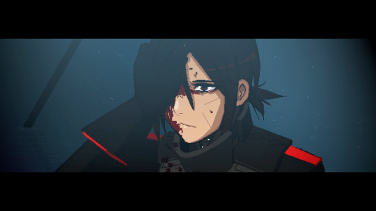
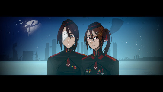
Elster has loved so fiercely that she is not only haunted by her love for Ariane, but also her love for Alina from her previous life. The memories that resurface from her Gestalts life are memories of Alina and their time on Vineta fighting a war that would ravage the planet. The memories bleed so much into each other that Elster confuses Alina and Ariane for the first half of the game. To me, this is all just another part of the repeating cycles, because not only has Elster been repeating the events of the game over and over, these two people have been dancing with each other throughout multiple lives.
And things probably didn't end well for Alina and Lilith. Both experienced a horrific war. Lilith was used as a basis for the LSTR units, something that includes having yourself erased from society and people's memories and turned into a mass produced slave for an authoritarian regime, and I doubt Alina survived, considering the image of Lilith standing before 6 markers with flowers placed atop one.
This game contains so much horror, of the cosmic, body and authoritarian flavour, but it never stops being about love. Elsters love for Ariane that sees her go through hell an endless amount of times, and Lilith's love for Alina, which was so strong that it persists in her even after she'd been turned into someone else, and is the first thing to resurface when she starts to remember who she was.
364 notes
·
View notes
Text
Madonna - Who's That Girl
1987
"Who's That Girl" is a song by Madonna from the soundtrack of the 1987 film Who's That Girl, which she starred in. In 2009, it was included on Madonna's third greatest hits compilation, Celebration.
It became Madonna's sixth single to top the Billboard Hot 100, which made her the artist with the most number one hits in USA in the 1980s decade. It also reached the top of the charts in the United Kingdom, the Netherlands, Italy, Ireland, and Belgium.
The song was nominated for Best Song Written for Visual Media at the 1988 Grammy Awards, and for Best Original Song at the 45th Golden Globe Awards.
It won the poll with 52,8% yes votes.
youtube
441 notes
·
View notes
Text

Chrysler Building. Gazing from Afar
Photographic Icon: The Chrysler Building has become an iconic subject for photographers, its gleaming facade and Art Deco details offering endless creative inspiration.
Artistic Muse: Artists and creatives worldwide continue to draw from the Chrysler Building's unique blend of elegance and innovation, making it a timeless muse in the worlds of art and design.
Architectural Symbolism: The spire of the Chrysler Building reaches high into the sky, symbolizing not just the ambition of the building's creators but also the aspirations of an entire era.
Elevated Gargoyles: The eagle gargoyles that adorn the 61st floor of the Chrysler Building's crown are among the highest architectural elements in New York City, adding to their mystique and symbolism.
Structural Drama: The Chrysler Building's design is a dramatic departure from traditional skyscraper aesthetics, with its setbacks and ornamentation creating a dynamic visual narrative.
Chrysler Building. Cultural Legacy
Literary Inspiration: The Chrysler Building has featured prominently in literature, serving as a backdrop for various novels and stories that capture the essence of New York City.
Film Icon: Its distinctive appearance has made the Chrysler Building a sought-after location for film and television productions, adding to its cultural prominence.
Design Evolution: The influence of the Chrysler Building's Art Deco style is visible in the design of numerous buildings, both in the United States and around the world.
Fashion Forward: Art Deco, epitomized by the Chrysler Building, has left an indelible mark on fashion, with its geometric patterns and sleek lines finding their way onto clothing and accessories.
Cultural Significance: Beyond its architectural marvel, the Chrysler Building is a symbol of the enduring spirit of innovation, aspiration, and creativity that defines New York City.
Chrysler Building. Preservation and Restoration
Ongoing Preservation: Dedicated efforts by preservationists ensure that the Chrysler Building's exquisite details and structural integrity continue to shine, safeguarding its heritage.
Art Deco Revival: The resurgence of interest in Art Deco design has brought renewed attention to the Chrysler Building's architectural significance.
Sustainability Initiatives: Modernization efforts have also extended to sustainability, with upgrades to the building's energy efficiency and environmental impact.
Visitor Experience: While the Chrysler Building is primarily a commercial office building, its lobby remains accessible to the public, allowing visitors to appreciate its Art Deco grandeur.
A Living Legacy: The Chrysler Building's legacy is not frozen in time but continues to evolve, adapting to the needs of a changing world while preserving the timeless essence of its design.
Chrysler Building. A Beacon of Hope
Iconic Beacon: The Chrysler Building's illuminated crown serves as a symbol of hope and unity, often illuminated in special colors to commemorate important events or causes.
Cultural Connection: Its presence in the New York City skyline is a source of cultural connection, a shared symbol that binds residents and visitors alike.
Historical Resilience: The Chrysler Building has withstood the test of time, remaining steadfast through historical events and shifts in cultural preferences.
Artistic Representation: Countless artists have depicted the Chrysler Building in their works, capturing its beauty and significance in various mediums.
A Promise of Tomorrow: As the sun sets behind the Chrysler Building, its illuminated crown stands as a beacon, reminding us that even in challenging times, there is always a brighter future on the horizon.
The Chrysler Building, with its timeless elegance and architectural innovation, continues to inspire and captivate. Its enduring legacy reminds us of the power of human creativity, determination, and the enduring spirit of New York City. In its gleaming spire and Art Deco splendor, we find not just a building, but a symbol of aspiration and a testament to the heights that can be achieved through bold vision and unwavering dedication.
Previous page Chrysler Building Next page
#Chrysler Building#new york city#new-york#new york#newyork#nyc#ny#urban#manhattan#city#usa#United States#buildings#travel#journey#outdoors#street#architecture#visit-new-york.tumblr.com
520 notes
·
View notes
Text
Lost in the Remaster: Star Trek, Vintage Special Effects, and the Charm of Old Media
by Ren Basel
renbasel.com
Originally created by Gene Roddenberry, Star Trek is a franchise that spans decades. From the original series of 1966 to current shows such as Lower Decks, it stands as a titan of television and pop culture. The real world has undergone incredible change since Star Trek’s first appearance, yet nerds everywhere still find entertainment, inspiration, and hope in its classic episodes. Recently, along with my husband and best friend, I decided I wanted to attempt the gauntlet of watching the entire franchise from beginning to end, revisiting favorites and finally checking out the ones I missed. Media and fandom studies are my passion, after all, and Star Trek is a foundational part of modern American nerd culture.
Starting with the original series proved more difficult than expected. Living in a tiny apartment, we don’t have much space for DVDs, so Star Trek wasn’t in our existing collection. The local public library didn’t have copies, either, and putting in a purchase request doesn’t guarantee it will be made available. My family doesn’t have the funds to pay for every single streaming service on the market, and Star Trek isn’t available on any we do have access to. Piracy was starting to look like the only option, but even that fell flat when we couldn’t find a version with subtitles. Finally we dug it up officially and with subtitles, for free via PlutoTV, but there were still limitations: PlutoTV only streams season one, and season one is only available in the remastered edition that replaced the original special effects with new visuals.
It wasn’t ideal, but, hey, it was Star Trek.
Watching just one episode a week gave us enough time to scrape together savings to get what we really wanted for seasons two and three: the official BluRay release, which includes both remastered and original-release versions of each episode. The remasters are fine, but as a lover of media history and practical effects, I’m always disappointed to lose a chance to appreciate the originals. It doesn’t matter how good it might look, remasters are never as much fun to me as matte paintings, camera tricks, and whatever the prop department could pull off with ten dollars and some glue.
Finally having the BluRays in hand for season two only affirmed my love of vintage practical effects. Seeing the Enterprise in her original glory, before she was ever rendered in digital form, felt like opening a time capsule. I love time capsules. My favorite pieces of media are always those which capture a moment in time, showcasing the aesthetics, concerns, and culture of the time and place they were created. Star Trek: the Original Series is rooted in the late sixties, when mainstream culture in the United States was experiencing immense upheaval and social change. That context is written all over the show. The vintage effects add to it, grounding it in a very specific time and place. Updating the show’s effects takes away some of that 60s aesthetic, and while some may see it as making the show more timeless, I don’t care for it. To me, seeing what they could pull off before modern technology is half the fun of watching old shows. The ingenuity and creativity of propmakers, makeup artists, and set designers working on shoestring budgets is unparalleled.
To be clear, digital effects are also done by skilled professionals who deserve much more respect and many more labor protections. There are some truly stunning works created with digital tools. That said, I hate when digital effects are used to cover up the practical effects that came before. It feels disrespectful to the original artists, as if telling them their work wasn’t good enough; as if their work was just a placeholder until something better could come along and fix it. Practical effects aren’t a placeholder, they’re an art form in their own right, and that art form is one for which I have deep appreciation.
It frustrates me that the original, non-remastered episodes were such a pain for us to access, but I’m very glad to have added them to my personal media collection. No matter what future tweaks Star Trek’s rights holders might make, I can always pop in our personal copies to enjoy the Enterprise and her crew in all their vintage, “outdated” glory. If you’re also too young to remember the show’s original airing, and you have the opportunity to watch the unedited version, I highly suggest you do. Watching the version that aired in 1966 gives the show a charm that no amount of remastering can ever match.
_
Like this essay? Tip me on Ko-Fi, pledge to my Patreon, or commission an essay on the topic of your choice!
#original post#original essays#star trek#the original series#star trek: the original series#star trek tos
113 notes
·
View notes
Text

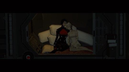
United Visual Artists (UVA) / Present Shock I, Istanbul / Installation / 2022
36 notes
·
View notes
Note
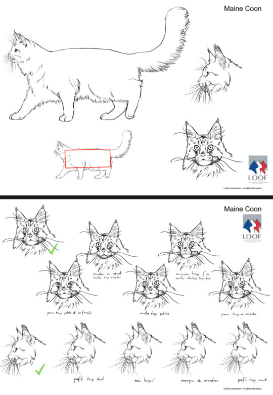
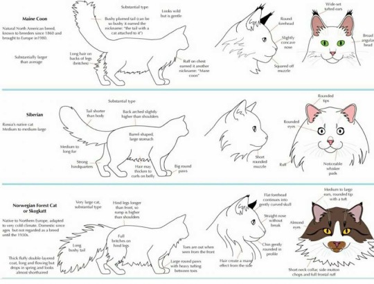
i really dont know much about maine coons but they look super cool, what are the "maine coon features" you mention in your post about people thinking their longhairs are maine coons?
The appearance of the Maine Coon is supposed to be a well-balanced. The head and muzzle should be squared with a clear stop. Ear tufts should be distinctly present.
For the sake of showing the Maine Coon is classified as a “semi-longhair,” so they aren’t supposed to be a giant puffball like the Persian or British Longhair.
I’m having a hard time explaining it in a way that I feel makes sense.
The French registry LOOF has some excellent illustrated standards for some of their breeds. Cedarseed has also put together an excellent visual guide to various breeds available for purchase as an e-book or physical copy.
It’s an awesome, huge resource that I can’t recommend enough both for the feline artist - be it big cats, other wild cats or our domestic buddies - or the purebred snob afficiando likes myself.

On the left we have Honey Sushi, a Domestic Longhair available for adoption mis-labeled as a Maine Coon mix and on the right we have Tigerfeet Billie Holiday the Maine Coon.
Honey’s ears are too wide-set and rounded, he lacks the characteristic ear tufts and his muzzle is not well-defined. His whisker pads kind of just blend into the rest of his face as an entire unit compared to Billie distinct muzzle that leaves no question where no question as to where it starts and ends. Billie also has the squared head of the breed while Honey does not.

Tallulah Gin is listed as a Maine Coon x Persian mix, although she is most likely a Domestic Longhair. Her coat is an excellent example of what a Maine Coon’s coat shouldn’t look like - not that anything is wrong with her beautiful fur, it’s just not Maine Coon fur.

Compared to this Maine Coon from The Opal Temple. You can see that the topline is smooth and “short” but the fur gets gradually longer towards the belly and pants where it achieves maximum fluff. Also note that the Maine Coon’s head doesn’t disappear into a Lion King worthy mane, the ruff is more moderate and follows the same pattern as the rest of the coat of being short up top flowing downward into the longer part of the coat.
There are random-bred cats with one or more of these “Maine Coon” features, and there are Maine Coon’s which are more moderate or more extreme and don’t meet the standard to a T.
I can show you pedigree Maine Coon’s with wide forehead, tall ears, insubstantial ear tufts, proportions not well-balanced or however many faults you want to list.
I can also show you random-bred cats with squared heads and muzzles, well-spaced ears, a coat that’s short in the right places and long in the right places and falls just so.
I’ve met cats where I’ve been told they’re a Maine Coon mix and I don’t go “Oh obviously” but “Yeah, I can see that.” This isn’t commonplace, but it’s happened a few times where the cat has been passable as a poorly bred Maine Coon or mix.
But what gets me is so often I see people - online and in person - who say their cat is a Maine Coon or Maine Coon mix, they sweat up down and sideways that it must be true because the cat looks so much like a Maine Coon…
And then the cat is the moggiest moggy to have ever moggied. Not a single Maine Coon feature in sight, unless you include long fur - and some of them don’t even have that! Is the resemblance that they’re both cats? Is that what you’re seeing?
If you’re going to try to sell me on your cat being a Maine Coon or mix at least show me you have a basic understanding of the breed’s conformation and show me what features make you feel that way about your cat that don’t include “big” and “fluffy.”
217 notes
·
View notes
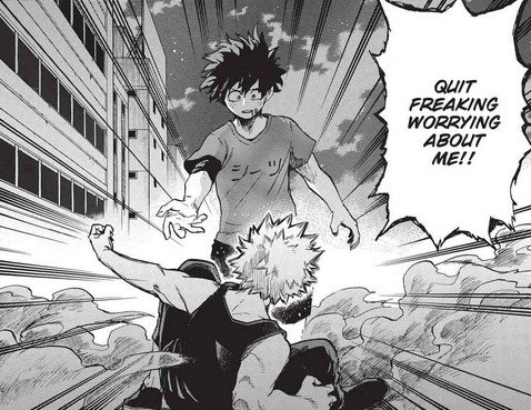
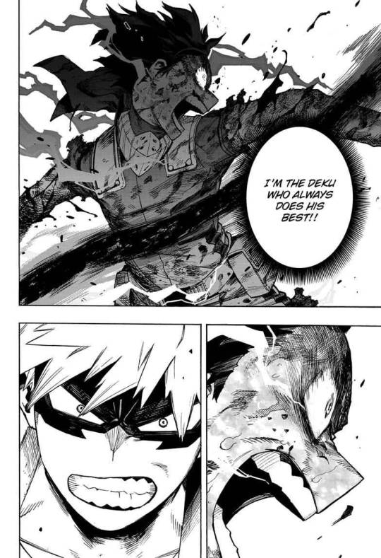
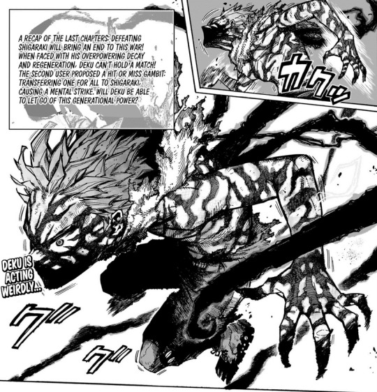
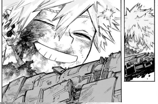
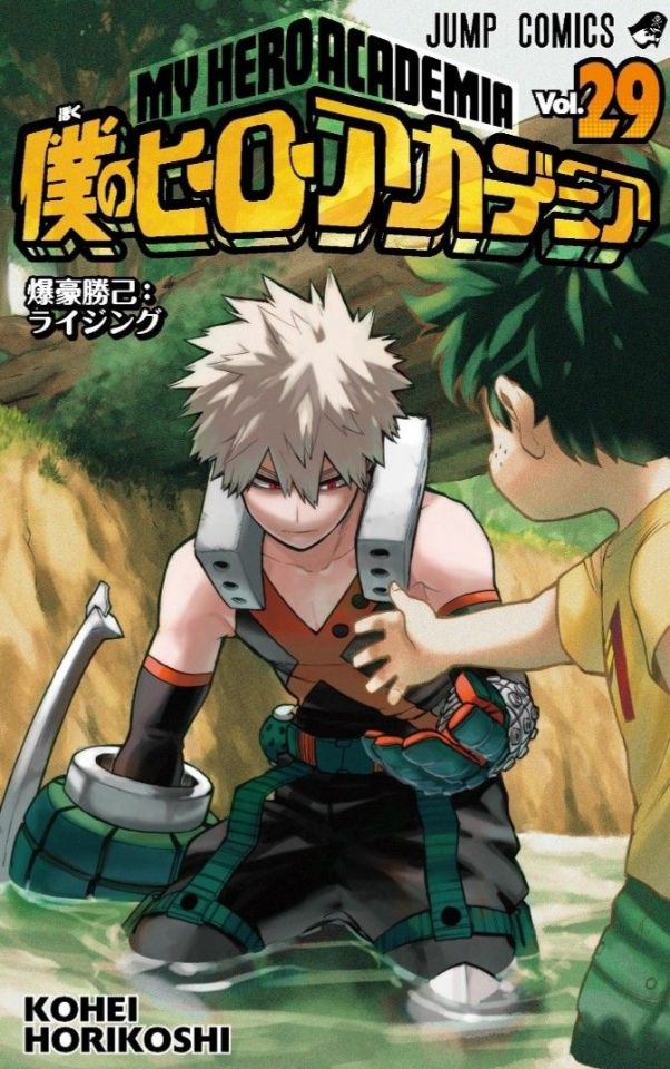
Text
Katsuki as the Light & Izuku as the Dark- Love and Harmonious Totality in The New Era
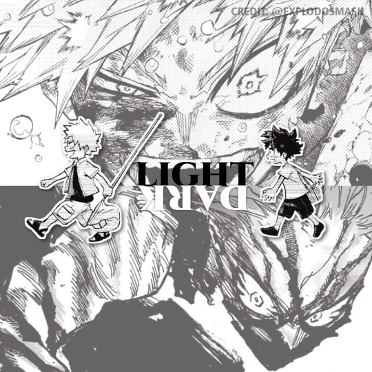
This meta analysis’ purpose is to make the case for KT/DK existing as Light and Dark in each other’s stories respectively, and explain how this dichotomy challenges black & white thinking in the narrative.
This meta analysis will also explore how this Light/Dark dichotomy lays the groundwork for why Katsuki/Izuku as a unit represent a “New Era" in the story.
[Can also be found on twitter]
Whether by Save to Win/Win to Save, or the fact they are osananajimi, the story frequently draws our attention back to Katsuki and Izuku’s complicated, influential and powerful bond. Despite all the changes they’ve gone through in MHA up until now, both individually and together, one thing has always remained constant: they are as symbolically connected as they are physically/mentally/emotionally.
We argue that one of the ways MHA’s narrative connects them symbolically as polar, balanced parts of a larger whole is through a sense of DUALITY.
Furthermore, we argue that the use of contrasting Light/Dark motifs act as both visual and text metaphor to create this duality, with Katsuki representing Light and Izuku representing Dark.
It's important to note that by Light/Dark, we aren’t referring to their moral clarity, goodness or badness. Rather, we will explore Light/Dark as a metaphor that builds on themes in MHA while creating tension (contrast, conflict leading, fear and rejection) and harmony (balance, unity, love and acceptance).
Note: the Light and Dark comparisons/metaphors between Katsuki and Izuku used in MHA sometimes get lost in translation in the anime. Here are some examples….
For Izuku:
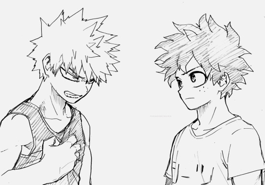
Izuku is often encased in shadows in Katsuki’s POV since the beginning.
The word used for quirk (kosei) meaning “personality”, with quirkless meaning “lack of personality”, evoking the absence of something
Character design leaning on “dark” shades (dark/filled in hair, eyes including dark pupils early in the series)
Izuku’s “Dark Hero” arc as it’s officially titled.
Izuku’s prototype/beta name “Yamikumo” meaning Dark Cloud and his personality type tending toward facades/anxiousness
Blackwhip being the OFA quirk that resonates with Izuku’s emotions (particularly his rage)
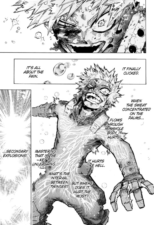
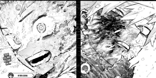
His recent “power up” moment in the current arc involving blackwhip is denoted by claws, fangs and black tendrils. This form is officially called “overlay” but Hori also calls it “carnage” in his head.
And for Katsuki:
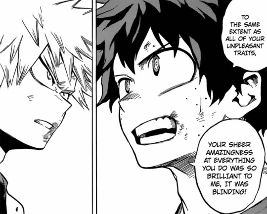
Izuku’s description of Katsuki as someone bright and blinding, often bringing light into his eyes as an artistic consistency.
His quirk “explosion” emitting light, his move “stun grenade” literally a blinding flash of light.
Character design leaning on “light” shades (light hair, eyes aren’t filled in)
Prototype/beta ‘Gogo’ Katsuki’s light clothing and his personality type overall being bubbly and overprotective (toward Yamikumo).
Katsuki’s death chapter titled “Light Fades to Rain”, and his revival evoking that visual of a bright light.
His recent “power up” moment in the current arc is denoted by flashing lights and explosions all around his body - highlighted with laughter, and glee.
Katsuki and Izuku connect with all the various opposites attract concepts that draw on the Light/Dark duality (sun/moon, yang/yin) but the first mistake people make is approaching these concepts with black & white thinking in mind.
The meaning
The Light/Dark imagery/descriptions/metaphors with KT/DK exist as a set piece that subverts expectations by challenging binary/black & white interpretations.
Katsuki’s ‘light’ is confident and inspiring - but it can also be blinding, harsh, and overwhelming.
Izuku’s ‘darkness’ is almost like a blanket. It’s comforting and sympathetic - but it can also be scary, unnerving, and mysterious.
Initially, Katsuki wanted to get away from the ‘darkness’. Izuku was like his shadow, following him relentlessly. He misinterpreted Izuku’s behavior as secrecy or deceit.
Izuku dragged in as much ‘light’ as he could, by both observing Katsuki closely as well as refusing to part with the nickname ‘Kacchan’. His pursuit was a combination of hope for the future and a fascination for something he didn’t have (envy).
Both of them have a capacity for unending love and selflessness, but also uncontrolled rage and violence.
The point of this contrast is for us as readers to highlight and dismantle the surface level perceptions of these characters in the same way Katsuki and Izuku progressively do for each other.
Building on the themes
In the same way Izuku always saw, and admired, Katsuki’s “light”, Katsuki could see, and feared, Izuku’s “darkness”. This contributed in building tension between the two, both literally and narratively. Where another story may have framed them as opposing forces, however, MHA frames them as dual forces. Where the source of tension for opposing forces may be fundamental differences, the tension between Katsuki and Izuku comes from a REJECTION of their fundamental parts. By extension, this became a rejection of their potential for harmony.
There’s enough evidence to suggest the defining concepts for prototype/beta Katsuki and Izuku(Yamikumo) weren’t entirely discarded, but rather modified and layered upon. One of the major differences was how prototype KT/DK got along, with one of the earliest scenes drafted for MHA being a scene where they fight together.
It’s ultimately a mistake to presume Izuku is purely a positive ray of sunshine just like it was a mistake to assume Katsuki was hiding a bitter and villainous darkness within him. It’s the neglect of their core that causes them to dig their heels in and become their worst selves:
Katsuki as egotistical, harsh and tightly guarded with a tendency to lash out, against Izuku as obsessive, obstinate and habitually repressing his emotions.
Society shaped their “quirks” (their power, outward appearance) but time and relationships informed their “individuality” (their ideals, hopes, inner drives).
Izuku's unwavering belief in Katsuki’s light was a tether that enabled Katsuki to embrace and flourish into it. Katsuki grew to understand the darkness in Izuku by confronting that which scared him. This allowed him to empathize with Izuku’s complex thoughts/feelings during a time where Izuku was at his worst (“Dark Hero” arc–onward) and dedicate himself to making sure Izuku didn’t carry the weight of the world and its burdens on his own.
In other words, the inevitable payoff for KT/DK facing and dismantling the tension within themselves and between each other is the harmonizing of the dual/complementary themes they’ve been written to represent, which ultimately mirrors the main messages and questions posed by MHA.
‘The New Era’
As two major pillars of the story, Katsuki and Izuku are in many ways microcosm(s) of MHA society at large.
Katsuki and Izuku as complementary forces and not opposing ones seems obvious until it is put into practice. Some characters in the story and many readers in the audience alike have struggled with understanding their multifaceted nature and reconciling what they know of KT/DK from the outside with the seemingly contradictory information KT/DK have given us about themselves over time. Rather than a fluke, this contrast is an intentional writing choice evidenced by elements like their Light/Dark symbolism.
The lines at the main center of conflict in MHA - Heroes vs. Villains - has been long since blurred. In much the same way Heroes vs. Villains has complicated good vs. evil and challenges black&white thinking, KT/DK’s relationship as counterparts is representative of a greater duality that paints a clearer picture of MHA’s philosophies on the nature of heroism, societal progress, and the difficult process of inner growth. This picture is coming to a head with the story situating them as the beginning of “A New Era.”
MHA understands people as collections of thoughts, feelings, experiences, abilities, ideals, hopes, drives, etc., and that contradictions and tension between them are inevitable.Through KT/DK, MHA has developed a beautiful narrative where strengthening oneself involves strengthening each other and broadening our understanding of who we are.
“There is a false saying: “How can someone who can’t save himself save others?” Supposing I have the key to your chains, why should your lock and my lock be the same?”

261 notes
·
View notes
Text
Pick a Card Reading: What type of practise can serve you in order to manifest your desires?
The images are not mine! I found them one Pinterest! If you know the artists mention them!!
Whenever you feel ready pick the pile that feels close to you but don't overthink it for intuition doesn't take long!
If this post is not for you scroll, don't press your spirit to read one, it might not match your situation! Some parts might be 18+, so if you are not, scroll.
💌My type of readings are brutally honest for l used to struggle with it myself; so now I only command from the spirit to tell me the truth through protection, but always the truth, I like it or not, so I warn you that I am like that.
The symbols are: Earth, Moon, Neptune, Jupiter, Venus & Mars — the planets.
Like & Reblog my pinned post (you can click my profile and do that, for it will help me to make a living from it) for it will bring the right people to my page!! thank you and may you be safe, happy and blessed!

1. Earth Group
Grounding and Practicality
Cards: The Hermit / 2 of Swords / 6 of Pentacles / Death / Queen of Swords / 10 of Pentacles / Bottom Card: 9 of Swords
Reading: For you, the best practice to manifest your desires involves a grounded and practical approach. Something that will allow you to feel confident and secured. This means taking time for introspection and seeking clarity through solitude, while also addressing any internal conflicts or indecision you might have. Engaging in practices like giving and receiving support generously will help you find balance or even activities that allows you to let go. Embrace transformation and let go of outdated beliefs or habits. Building a stable foundation, such as setting long-term goals or working on personal growth, is crucial. Additionally, overcoming fears and anxieties with practical techniques like mindfulness or grounding exercises will strengthen your manifestation efforts. Slow down what you do and let go!
---
2. Moon Group
Emotional and Intuitive Practices
Cards: 5 of Wands / The Empress / Page of Swords / The Hierophant / Queen of Cups / 5 of Cups / Bottom Card: Ace of Wands
Reading: For you, focusing on emotional and intuitive practices will be most effective. Embrace your emotions and creativity by engaging in activities that nurture your inner self, such as journaling or creative expression; since five of wands is also here and aggression can be a thing here, activities that release inner conflict can also be beneficial when you’re working in your manifestations. Crying and expressing too. Use your intuition and stay curious about new methods for personal growth. Traditional practices or spiritual guidance from mentors may also be beneficial; feminine energy might be leading you or needs additional healing. Healing from past emotional wounds and allowing yourself to move forward will help you find clarity and inspiration. Practices like meditation, emotional healing, manifesting through arts or exploring new beginnings with enthusiasm will support your manifestation process.
---
3. Neptune Group
Spiritual and Dream Work
Cards: 9 of Pentacles / 10 of Cups / The Lovers / Temperance / The Magician / Strength / Bottom Card: 8 of Cups
Reading: For you, spiritual and dream work are key to manifesting your desires. Focus on cultivating a sense of abundance and emotional fulfillment through spiritual practices. Align your actions with your values and desires, and integrate various spiritual practices in a balanced way. Alignment and letting go is crucial here. It’s like you should dream about it, “own it” and then ignore it because you’re confident that it’s happening. It’s like when you boil water for pasta, you know if you go to the living room and do something else the water will boil and you will simply put the pasta and voila. Harness your inner power and creativity through visualization or manifestation techniques. Find balance between mind and heart; unite them and be abundant in it. Just Developing inner strength and resilience will support your journey. Neville’s practices that happen during sleep can be used here too. Your mind is very anxious and on the path of changing so for that manifesting on your sleep can be more beneficial for you so you don’t overthink it; if at first you see negative dreams etc don’t worry it’s your comfort zone fighting itself, but don’t force it — open to exploring new spiritual paths or letting go of outdated practices that no longer serve you, as this will help you move forward effectively. Don’t complicate your manifestation path, simplicity and mysticism is the key here.
---
4. Jupiter Group
Growth and Learning
Cards: 8 of Pentacles / Queen of Wands / 4 of Pentacles / 3 of Swords / The Hermit / 8 of Swords / Bottom Card: 5 of Pentacles
Reading: For you, focusing on growth and learning will be most effective. Learning about your desires or presenting them in some way with diplomatic ways can boost it. For example, showing your friends what you learned about your desired degree even though you don’t have to let them know what you are trying to manifest, just to make the information alive. Dedicate yourself to mastering new skills and put in the effort required for personal development. Embrace your creativity and confidence in your practices. Build a stable foundation by being mindful of how you manage your resources and energy. Accept the abundant energy you crave to experience. Address past emotional wounds and use solitary reflection to gain deeper insights. Overcome mental blocks or limiting beliefs, and work through feelings of insecurity or lack to enhance your manifestation efforts. Reprogram your brain (this goes for everybody but here is strong).
---
5. Venus Group
Love and Harmony
Cards: The Moon / 9 of Cups / Judgment / Justice / Page of Cups / Bottom Card: 9 of Wands
Reading: For you, practices centered around love and harmony will be most effective. Your heart must open or be balanced. Dive deep into your subconscious and emotions through practices like meditation or emotional exploration. You should feel what you’re trying to manifest and avoid to feel like “you’re trying”, because the heart wants what it wants and your heart wants what you want. Focus on achieving emotional fulfillment and balance, and reflect on past experiences to gain insight. Embrace practices that align with fairness and self-expression like arts, activities for wellness and even intimacy healing methods where your heart is the lead. Working through challenges and maintaining a sense of perseverance will help you manifest your desires more effectively. Be the love you seek, and your desires will run to you for what they want is to be loved and your heart loves what you want.
---
6. Mars Group
Action and Willpower
Cards: 7 of Swords / King of Swords / The Sun / 9 of Wands / 5 of Swords / 2 of Cups / Bottom Card: 9 of Cups
Reading: For you, focusing on action and willpower is essential for manifesting your desires. Be strategic and clear-headed in your approach, using your intellect and decisiveness to navigate obstacles. Take actions and be bold with what you want. Command for everything to work in your favor with harm to none. Embrace your inner strength and enthusiasm, and engage in practices that energize and inspire you. Go to the gym, embrace your wild side; heal or lead with your masculine side. Address any conflicts or challenges with resilience, and work towards achieving harmony in your relationships and personal goals. Cultivating a sense of contentment and satisfaction will also support your manifestation process. Be your own King. Be your own Leader.
Thank you 🙏 don’t forget to check my private readings for I’m trying to save money for my desired university ❤️
#free tarot#tarot#tarot cards#tarotcommunity#pick a pile#pick a card#tarot pick a card#tarot reading#tarot related#spiritual awakening#spiritualgrowth#spirituality#manifesation#manifesting#mystical
104 notes
·
View notes
Text
Aizen, Calligraphy and Poems (?)
In addition to getting into fountain pens, I have also started to read waka poems, which are Japanese poems. While I’m personally not interested in calligraphy as a hobby, reading about the historical aspects of Japanese calligraphy and waka poems made me curious about Aizen’s relationship with calligraphy, and by extension - poetry. We don’t know much about him in relation to those two things other than:
Aizen enjoyed Japanese calligraphy/considered it a hobby
He was so good at calligraphy that he was teaching it at the academy
Hinamori began to practice calligraphy during his captaincy and he held monthly calligraphy sessions for his squad
Aizen had a column in the Sereitei Communication called “The Yin of the Pine Needle”

Japanese calligraphy is a subject often taught to children in elementary school, but it has even older historical roots tied to professional warriors of the bushi rank (samurais are a part of this ranking system). These warriors were trained in bujutsu – were bu means war, and jutsu means technique, and budo. Budo doesn’t quite have a direct translation, but some describe it as the “martial ways to peace.” Even within budo, there were two “emphasis” students needed to focus on: 1) bu which were war and combat strategies, and; 2) bun which were Japanese literature and fine arts. Warriors of the highest ranking were expected to learn all of this, and some students were even expected to learn the flute (shakuhachi), Noh dancing (shimai) and flower arrangement (kado – which was one of Unohana’s hobbies!).
Japanese calligraphy, known as shodo was considered a vital part of a warrior’s training – so it is of no surprise that the Soul Academy, would incorporate it in their curriculum as a class, in addition to kido and sword fighting training.
But why is shodo so important to a warrior’s learning?
Well to many warriors, if sword fighting was considered a reflection of one’s mind (see my post here about Aizen and Kyoka suitgetsu), then shodo is the physical representation of the artist’s spiritual force. Shodo is more than just writing – it is a visible way to sense a warrior’s mental and physical condition. For centuries, leaders in Japan were expected to be strong calligraphers, and some of the best sword fighting masters in history, such as Miyamoto Musashi, were also regarded as some of the best calligraphers of their time.
Each brush stroke must be precise and unwavering – there isn’t room for corrections. An artist must be decisive once the brush hits the paper. The same can be said for sword fighting. You do not swing your sword “hoping” you will get a strike; you swing your sword because you are certain you will strike. Just like in any of the combat arts Shinigami must learn, mistakes are ultimately final in shodo.
Just like handling a sword, holding a brush is also a particular skill. Some teachers in shodo will grab brushes out of their students hand to check their grip. But the trick is that you can’t have too tight of a grip, as your brushstroke becomes rigid and your writing becomes static. Thus, you must be concentrated, but also relaxed. Shodo has an emphasis on balance and flowing, dynamic characters, just like with sword fighting. It’s why there’s often difficulty in painting a straight line, because your mind and body must work together as a unit. Once your brush hits the paper, your hand must paint without hesitation – your thoughts are free as they are focused on the “here” and “now” of painting. Aizen, who had a strongly concentrated mind, was also relaxed – his fight with the Gotei 13 in Fake Karakura Town is an example of this.
I already talked about this in a previous post, but Kyoka suigetsu acts as a metaphor for visualizing before striking. Shodo has a similar concept as well. Skilled artists should be able to visualize the kanji they’ll paint, and then make the decision for the first brush stroke. It would not surprise me if the Soul Academy then made calligraphy an elective because for students to be relatively decent at calligraphy, it would be a safe assumption that they would be good with a katana. Both require accuracy and skills to be effective.
Aizen was already a master sword fighter, so it is then, of no surprise, that his calligraphy skills were also unparalleled. While it’s a shame we don’t see any of Aizen’s calligraphy work, he was recognized in his skill in it that he became a teacher. I also wouldn’t be surprised if this was his way to “vibe check” students as potential conspirators with him, because of the underlying assumption that brush, katana and mind are one.

Calligraphy is just one aspect though; some calligraphers were also talented poets! One specifically that comes to mind is Sugawara no Michizane. To be honest, Aizen kind of reminded me of an evil version of him lol. Sugawara no Michizane was a poet, scholar and politician employed to the Emperor of Japan. Long story short, a political conflict arose, where two other clans working for the emperor made comments that suggested Sugawara was trying to usurp power from the Emperor. As such, Sugawara was exiled from the imperial court.
Another fun fact about Sugawara no Michizane, he had a favourite plum tree in the imperial garden! So much so that on the day of his exile, he wrote a poem for it: When the east wind blows/ let it send your fragrance/ oh plum blossoms. / Although your master is gone/ do not forget the spring. The legend goes that Sugawara missed this tree so much that it flew to him during his exile. This gave the plum tree the name: tobiume.
Sugawara died not long after his exile, but the imperial palace, and those who wronged Sugawara, experienced dreadful things. Specifically the Emperor’s palace was destroyed through a fire… which was triggered by lightning. Such as the fall of the Sereitei during the first invasion of the Quincy after Aizen’s defeat (Sasikibe dying and Yamamoto burning Squad 1). While Aizen is indeed alive, the imperial court were incredibly superstitious and made temples in honor of Sugawara. And we have Shunsui (temporarily) releasing Aizen for the war (I admit, this connection is a bit of a reach!)
As for poetry, I again, wish we had an example of some of the things Aizen wrote, but the Yin of the Pine Needle is an interesting title for a reoccurring column! He wrote 50 volumes for it. (For context, Unohana’s column had 1041 volumes.)
In Japanese flower language, pine needles (matsuba) symbolize harmony. The “yin” in Aizen’s column’s title, is a bit more ambiguous, because yin can mean different things in this context. Yin can represent assimilation, quietness, sluggishness, psychological or spiritual work, it can also be interpreted as suppression when yin is associated with emotions. Regardless of what exact meaning Aizen’s column was meant to be, it would be a safe assumption that Aizen was publishing something that was could have been a critique, commentary or something where he’s pointing out the “harmony” either within Soul Society or something more ambiguous lol, is not what it seems.
Here are my rambles, thanks for reading! Would love for Kubo to write more Aizen, but alas! I'm always going to overthink the crumbs we get of Aizen's character lol.
#bleach#aizen sousuke#aizen sosuke#sosuke aizen#aizen#sousuke aizen#I don't know i'm just rambling#aizen meta
83 notes
·
View notes
Text
About scale, process, palette and canvas: a few considerations on pixel art as a medium
User moredogproblems answered an interesting and legitimate question by another, DiscountEarly125, regarding my work and canvas size. He also perfectly isolated two central concepts of pixel art, which are scale and process. Canvas size, which was the theme of DiscountEarly125's specific request, is more of a dependent variable to those two aforementioned concepts, rather than a starting point. I hope the following considerations I shared may help or prompt some other ideas, but this is what I could come up with 15-ish years of experience with pixel art (and a few more years of art and media studies). I was quite in the mood of writing down these few thoughts that have been floating for a while. I apologize as this may also result in a confusing wall of text, but it is all part of a my work and research, and I would love to polish all the material, hopefully with some thoughts, insights from other colleagues, as well as pictures and materials!
A. Scale and canvas size
It is true that the bigger the canvas, the more distance one may visually create from pixel art, but I personally think this is to be possibly considered a matter of perceiving pixels, rather than a fundative problem of the medium. In fact I concur with the idea of "process makes the medium" rather than identifying pixel art as how (evidently) pixeled the result feels. The general picture, or the sum of pixels, though, is a really important matter to the medium nonetheless! Pixels themselves work in relation one with another, so it's their overall result that gives context and makes the subject recognizable. This relationship between pixels links back to all the art fundamentals that each artist is taught, from color theory to shape and composition - and so on.
So, the canvas size debate usually boils down to a matter of scale or necessity of your subjects.
As long as the dimension (canvas) of your subject (as in: a drawing of an apple, a character sprite, a mockup environment) allows you to operate, control and keep an eye on the quantity (number/area of pixels together) and quality (color, shaping of multiple pixels, texturing obtained through color and shapes) of isolated single pixels or pixeled areas, you're in the pixel art universe.
The other way around to define the matter of scaling: in order to be operating pixel art fundamentals and techniques, your subject has to be on a scale that allows you to apply principles of pixel art within the space of your canvas and your personal style.
These very same principles, or basics, can be applied with different results and extent to bigger and smaller canvases alike, each with their own specific difficulties and variables. It is important to adapt your scale when learning, and trying classic canvases per subject like "16x16px" (standard tile or character sprite unit, tied to older consoles and screen ratios, it's a bit complicated there) is always a nice idea - they also tend to be industry benchmarks and necessities so in case you'd like to consider a professional output, that's very useful.
Scale also applies to the array of colors, and there lies the concept of palette: a number of single hexadecimal hues we are using for each single pixel. Any single pixel can have one hexadecimal color only.
Consequentially it is absolutely true that either a huge canvas or a palette too broad may prevent a viewer from perceiving immediately the "nature" of your medium, namely seeing square pixels, recognizing a certain amount of color - or more thoroughly recognizing that you made some choices for each subject on a pixel level. What could possibly happen on a huge canvas (without zooming in) is that you can't really grasp the pixels, but just the "overall picture" - and that may not differ too much from digital, raster art, which is of course also based on pixels. Therein appearently lies a sort of threshold that is really hard to pin down for us pixel artists, as it depends on screen size, visualization methods, distance, filters and lots of other inherently subjective parts.
This kinda is my case sometimes: I make big environments (possibly too big, and too detailed in each part I tell myself) that are a sum of many lesser parts: both tilesets and sprites that relate (but not strictly adhere) to a basic space unit that is 16x16pixels. You can indeed consider scale in a broader sense as a subdivision or magnification issue, much alike squinting your eyes to focus on a picture's overall contrast or, conversely, analyzing its fundamental parts with a magnifying glass, and then a microscope - an analogy as follows:
a. the picture as a whole is like a colorful rock that you can analyze by magnifying its grain.
b. the characters, geographical elements and textures, works like the different substances that compose the rock and give its visible characteristics grain and complexity,
c. single pixels constitute the very atoms of those previously recognized substances.
I mean "atom" in the traditional, classical meaning of indivisible, fundative object. That's a "quantized" part of information, which for pixel art is ultimately color (or a binary value, like yes/no black/white).
If you were, for example, to crop some parts of my work - let's say 160x144 pixels (a gameboy screen resolution in pixels) you would see the substances that are characters and elements of nature, and when you zoom in again, every atom becomes visible as a single entity of color. There are 29 different type of "atoms" in Ruin Valley as in different, singularly hexadecimal colors that work together in different combinations and shapes to create different substances and characters. 18 of them are used for the different qualities of the environment, and 11 more for extra hues for characters and other elements to pop out a bit.
It's really interesting to see how many pixel artists push this "threshold" of pixel art canvases to the extremely small or the extremely big, whereas, notably, palettes are less open to growth: it is indeed my opinion that pixel art tends to quantize color (quality) over than dimension (quantity). Palettes, notably, do not grow exponentially, but tend to a lower, fixed, controlled amount of individual values instead. This usually gives the artist the true possibility and toolkit through which is possible to think about/with pixels. In other words: color (or its absence) is the founding unit and identity of pixel art as a digital medium.
B. Pixels as process or pixels as objective?
Pixels themselves (as strange as that may sound!) are not to be considered an objective of pixel art, I think, but the founding matter of its research as a medium instead. I think that making pixel art is not just devoting oneself to show those jagged, squarey areas or blunt edges that we all know and love: this is just one of the possible aesthetics that pixel art conveys or adopts - especially on small canvases. Pixel art is not about denouncing itself as pixels, but, rather, embracing the square, atomic unit to build an ensemble that conveys a content or a style. That's the important part of the discourse that emancipated pixel art into being a medium, and not just an aesthetic choice or style of representation. Again: process makes this medium. Speaking of that, I consider pixel art as part of a broader family of "quantized art", namely media that operate on/with "indivisible, founding bricks and unities" that can assume a certain quality (color, mainly) within a certain quantity (palette, canvas size) and in relation to its surroundings to describe something.
This puts pixel art, with its specifics and with a certain degree of semplification, among other mediums such as cross-stitch, bead art, construction sets, textile art (on a warp and weft basis), (micro-)mosaics and others.
A classic threshold example of process vs objective: oekaki art. Oekaki art - which I love and also happen to make from time to time - doesn't really work or "think" specifically on a pixel base: it doesn't place pixels per se, but uses pixel-based areas and textures on bigger canvases with a certain degree of freedom, like one would normally do with brushes on raster digital art programs (adobe ps, gimp, clip studio and so on) in order to convey an aesthetic with fewer colors and a certain line style and texturing. That way, oekaki uses and knows pixels in a deep way, but doesn't see them primarily in a quantized way. As a result the "overall picture" shows pixels to a certain extent, and it's possible to recognize distinct pixels for each part, but the objective is not an analysis and use of pixel and quantized information, but the use of an aesthetic based upon accessibility of resources, their control and a certain rendering style.
A huge part of pixel art is its absolute accessibility: everyone with a fairly outdated computer or screen and a basic drawing program can study the medium.
To be fair, it's indeed considering accessiblity that I highly support an inclusive approach to the term "pixel art" and I think traditional oekaki is a close, beautiful relative that builds upon the rules and techniques of pixel art and pixel rendering, yet keeping its identity as its very own medium - somehow like a dress may be built around/upon textile design. Anyway, boundaries are meant to be crossed and I think there definitely are lots of oekaki and pixel-based art that meet traditional pixel art mid-way - or further.
I also think the "is it pixel art?" discourse possibly ensuing - and generally speaking any media belonging purist ontology - is a treacherous, slippery terrain leading to excesses, and this is not my focus today, neither am I able to tackle that subject extensively at the moment.
C. Conclusions and a few good exercises
Everything above may be farfetched or too complicated as a starting point. I tried to write all down as orderly as possible. The point of this (possibly discouraging) analysis and the reasoning between scale and process is that (pixel) art is about trying different canvases, and reasoning on one's subject and objective, rather than limiting oneself to presets sizes or styles. It's important to choose something that resonates with us and, in doing so, thinking about other, more interesting limitations: that's the discourse about quantity of space and quality in color. Limiting is the best possible exercise and one I wholeheartedly encourage: by doing so we are progressively delving deeper on the basics, as we learn the fundamental relationships between shapes and colors that we can achieve through pixels.
A few good exercises that I too implemented in my own workflow come to mind:
1. Trying different canvases (or sizes) for the same subject (sprite, character art, illustration or so on). This helps a lot finding a comfortable size to apply pixel techniques, as well as getting a hold over fundamentals such as aliasing, linework, conventional representation and so on.
2. Trying different palettes for the same subject, both by varying colors themselves (therefore learning about values and contrast and readability, as well as atmosphere and mood!) or singular hues and their components, in order to discover possible relationship between them. Have fun!
3. Reducing the width of the palette progressively for the same subject: reducing the number of singular colors forces a reasoning on shapes, rapresentation. You may go from 1-bit art (just black/white) to 3 colors, 4, 8 and so on. We'll not talk about transparency as a singular color there, but if you happen to be interested in retro art, transparency counts to the palette size. This exercise is very useful in rendering, and possibly tricky. And definitely fun. :')
4. Choosing an objective and usage of our work: for example trying to learn about old pixel art limitations for games, in order to reason within specifics. Get inspired by traditional games (spriters-resource is your best friend here, in case you have a specific retrogame you're thinking of)! I will probably talk about limitations and style on another post.
5. Four eyes (and other multiples) are better than two: try to talk with people and friends and other artists you trust and feel comfortable with to get their point of view. This can be scary, I know, especially at the beginning. You're not forced to, of course, but if you do (in a safespace) there's lots you can learn about concepts such as readability, subject recognition, rendering and composition. Our eyes and brains get accustomed to something, and pixel art being a rather analytic medium made of synergies, subtle changes, limitations and conventions is especially tricky on the artist's eyes on the long term.
Either way, the important thing about pixel art is understanding that this medium is about recognizing and enjoying the process rather than the eventual aesthetic and in order to do so the best choice is to start simple, small, with few colors and techniques at a time!
Have fun and hit me up with your progress and considerations. :')
345 notes
·
View notes
Last Seen Blogs

lehaprincesadedeus
Leh a princesa de Deus

official-sps
The official secret parkour society


odisha247
Untitled

archivegomez
archivegomez