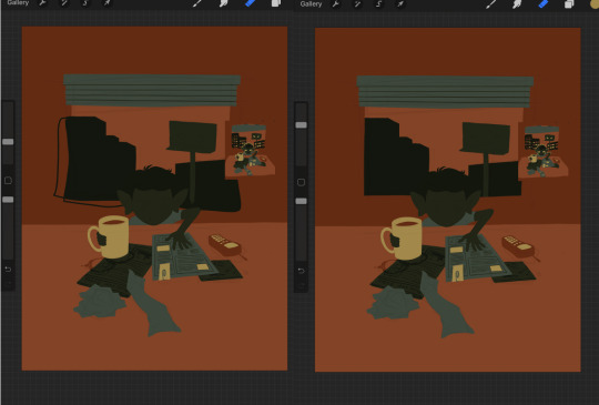
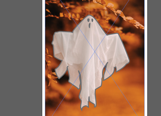
#used a flat rectangle brush this time around for ~texture~
Text

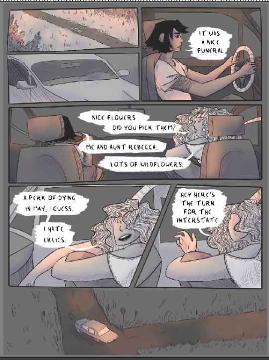
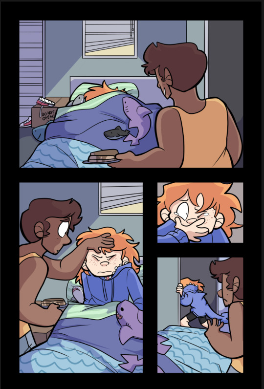
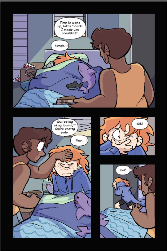
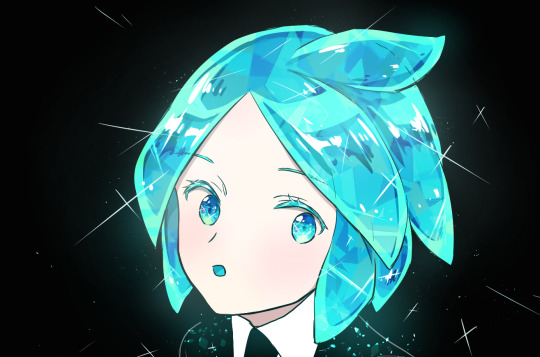
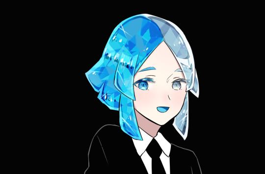
skyguy 🫶🩷
#just some more anakin practice (an excuse to stare at those dreamy blue eyes ngl) + i wanted to draw him in a shorter hairstyle#used a flat rectangle brush this time around for ~texture~#skyguy#anakin skywalker#anakin fanart#hayden christensen#star wars#star wars fanart#sw fanart#the clone wars#digital art#my art#bishiart
525 notes
·
View notes
Text
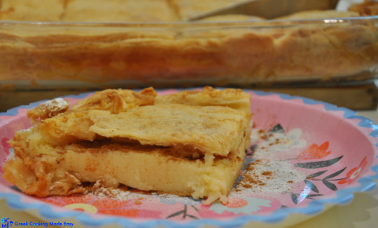
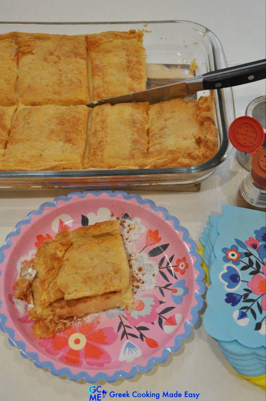
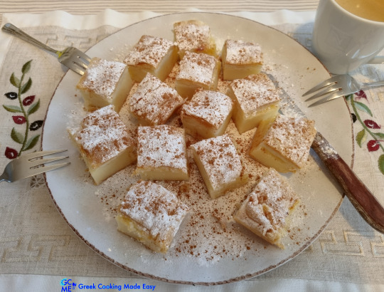
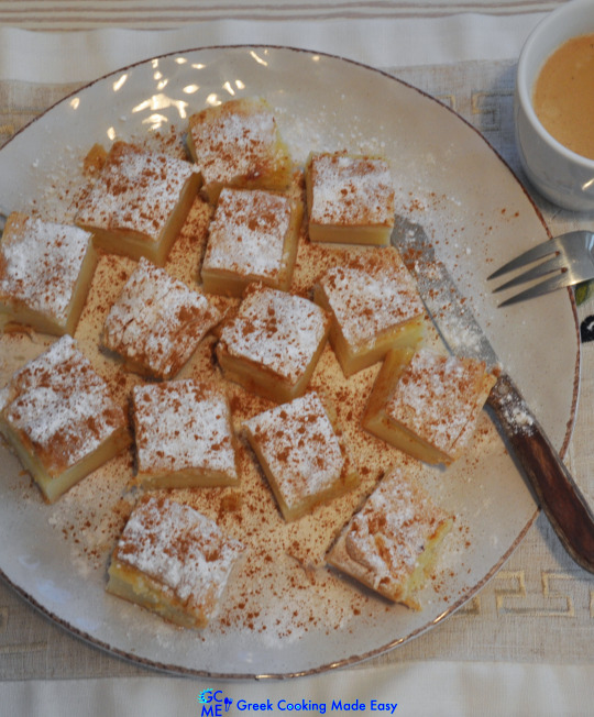
Easy, Marvelous Greek Bougatsa i.e. Cream Custard Pie with Puff Pastry and No eggs
🥧

Easy, Marvelous Greek Bougatsa i.e. Creamy Custard Pie with Puff Pastry and NO Eggs
BY: Greek Cooking Made Easy
SUBSCRIBE TO MY YOUTUBE CHANNEL: https://www.youtube.com/greekcookingmadeeasy
Check my YouTube Video: HERE
Κοιτάξτε επίσης την συνταγή μου σε YouTube βίντεο, το λίνκ είναι: ΕΔΩ
youtube
Serves 8-10 persons
Greek Bougatsa (Semolina creamy custard pie) is a traditional Greek dessert, perfect for breakfast or for any time of the day, as a delicious snack or as a filling dessert. It is made with creamy custard wrapped in golden crispy pastry.
After being baked, it is cut into serving pieces, garnished with icing sugar and cinnamon and served hot. In this recipe, I make the custard without eggs, for a lighter result, and I use puff pastry for this marvelous layered texture and taste!
Let’s find out how to make it!
Suitable for lacto vegetarians.
Interested in Savoury Bougatsa?? Check my Recipe HERE
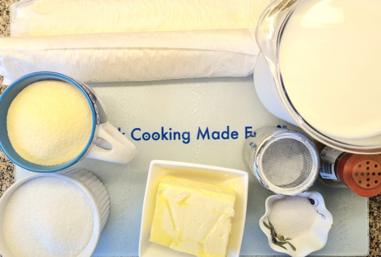
INGREDIENTS:
• 500 gr / 1 lb 2 oz / 2 rectangle sheets Puff pastry, semi thawed!!
• 100 gr / 3.50 oz Butter, soft
• 1 lt. / 4 cups fresh Milk, hot, semi skimmed
• 200 gr / 7 oz / 1 cup fine Semolina
• 225 gr / 8 oz / 1 cup Sugar
• 16 gr / 0,6 oz / 4 tsp. Vanilla Sugar (essence)
• And for garnishing: Icing Sugar and Ground Cinnamon
Note: To best work with puff pastry, it should be semi thawed. Otherwise, it becomes very soft and difficult to handle.
METHOD:
A. Prepare the custard:
1. Place a wide saucepan over low heat and pour in the hot milk.
2. Add the semolina, sugar and vanilla sugar and whisk to incorporate.
3. Let custard heat up slowly, stirring frequently, so that the milk won't stick to the bottom of the pan.
4. When milk starts to boil, stay on top of the stove and stir constantly until the mix becomes thick and creamy.
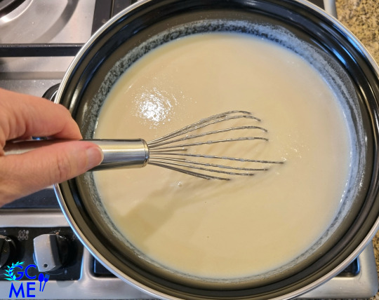
5. When custard starts to thicken, makes bubbles & the whisk leaves streaks on the surface, it is ready. Turn off the heat.
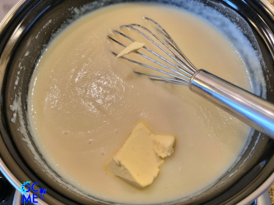
6. To finish, add 50 gr / 1.75 oz soft butter and stir to melt it in the custard.
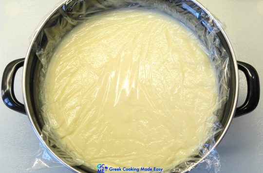
7. Now let custard cool down completely.
8. After it cools down a bit and to avoid custard forming a crust (skin) on top, cover it with plastic wrap, attached to the surface, without gaps!
B. Prepare Bougatsa Pie:
9. Open semi thawed puff pastry on a flat surface.
10. Melt the rest of butter in the microwave.
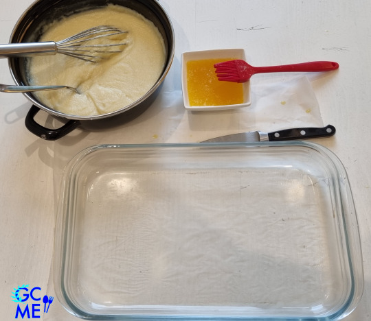
11. Brush the bottom and sides of a rectangle Pyrex dish of 23 x 35 cm / 9 x 14 in with some melted butter.
12. Place the 1st puff pastry sheet at the base of your oven dish.
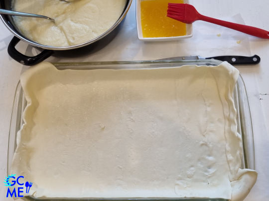
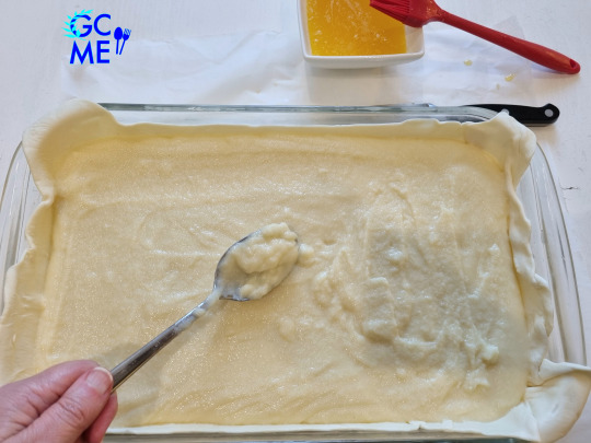
13. Now tip the custard in the tray. It should have a creamy, mash-like consistency.
14. Use a spoon to smooth and level its surface!
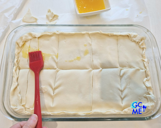
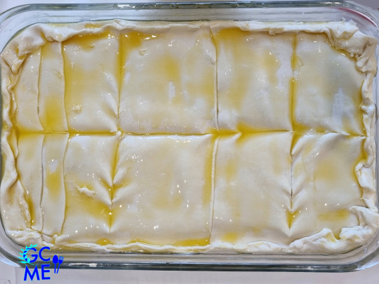
15. Take the 2nd puff pastry sheet, cut it in a large rectangles to fit better and arrange them on top, to cover the pie completely.
16. Fold the loose ends inwards to seal the pie.
17. Scar the top pastry with a sharp knife, dividing it in 8 slices.
18. Then use rest of melted butter to brush the top of Bougatsa (to achieve crispiness and a shiny glaze when baked).
19. The amazing Bougatsa is ready to be baked in the oven.
20. TIP: At this point if you want to prepare it ahead, Bougatsa can be placed in the freezer, covered with plastic wrap, for up to 1 month. Defrost for at least 6 hours before baking it.
C. Baking instructions:
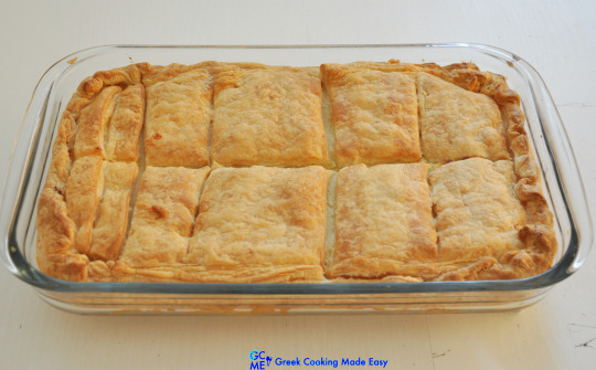
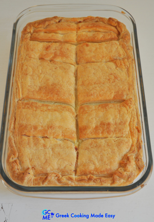
21. Bake Bougatsa in a preheated oven Fan @180℃/350℉ for 50'-1 hour or until golden brown all around (depends on the oven).
22. After about 1 h, remove it from the oven and put it on the kitchen bench for 5' to cool down. It looks marvelous!!
D. Serving instructions:
To serve a piece of Bougatsa, just cut it around and place it on a plate.
Lift the top pastry (flap) and sprinkle some icing sugar and ground cinnamon inside the piece of pie.
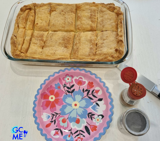
Thick and creamy!! What a pretty dessert!
Or cut Bougatsa in bite size pieces, place them in a large platter and sprinkle icing sugar and cinnamon on top. Then it becomes a treat served with good company!
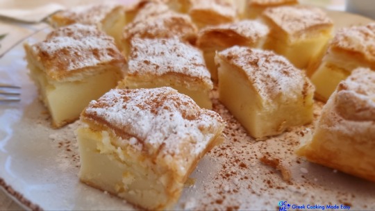
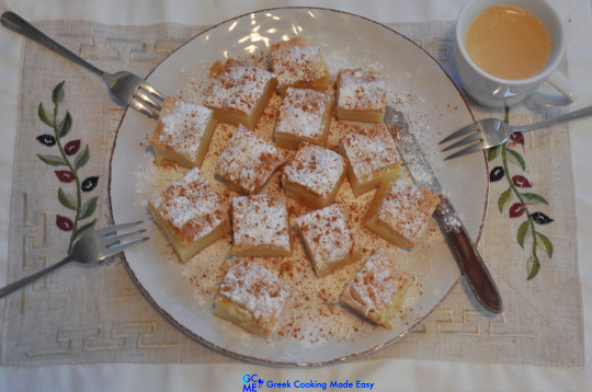
Serve amazing Bougatsa very hot as breakfast with Greek coffee or tea, or as heavenly snack or dessert!
For Greeks, Bougatsa together with koulouri (sesame bread ring), is actually breakfast on-the-go, picked up by local bakeries early in the morning, on their way to work.
If you want to learn how to make Koulouri at home, check HERE
Enjoy 😍!!
E. Storage info:
Bougatsa can be stored in the fridge, after it has cooled down. Wrap individual portions in aluminum foil without the icing sugar and cinnamon, and store them for up to 1 week. Reheat them in the oven for 10’ and then sprinkle them with the cinnamon mix.
F. Greece Travel tip:
Serres is a city in Northern Greece and second largest city in the region of Central Macedonia, after Thessaloniki. Bougatsa is said to originate in the city of Serres, an art of pastry brought with the immigrants from Constantinople.

Visit Serres to taste the original Bougatsa with homemade phyllo from the hands of the Master Bakers in the area!
Check my YouTube Video: HERE

Εύκολη, θεσπέσια Μπουγάτσα με σφολιάτα χωρίς αυγά
BY: Greek Cooking Made Easy
SUBSCRIBE TO MY YOUTUBE CHANNEL: https://www.youtube.com/greekcookingmadeeasy
Σερβίρει 8-10 άτομα
Η Μπουγάτσα είναι ένα παραδοσιακό Ελληνικό γλυκό, ιδανικό για πρωινό ή για οποιαδήποτε ώρα της ημέρας, σα νόστιμο σνακ ή χορταστικό επιδόρπιο. Είναι φτιαγμένο με κρεμώδη γέμιση τυλιγμένη σε χρυσή τραγανή ζύμη. Μετά το ψήσιμο, κόβεται σε κομμάτια, γαρνίρεται με ζάχαρη άχνη και κανέλα και σερβίρεται πάντα ζεστή.
Σε αυτή τη συνταγή, φτιάχνω την κρέμα χωρίς αυγά, για πιο ελαφρύ αποτέλεσμα και χρησιμοποιώ σφολιάτα για υπέροχη τραγανή υφή και στρώματα απόλαυσης!
Ας μάθουμε πώς να τη φτιάξουμε!
Κατάλληλη για χορτοφάγους.
Θέλετε να φτιάξετε αλμυρή Μπουγάτσα? Κοιτάξτε τη Συνταγή μου ΕΔΩ
ΥΛΙΚΑ:
• 500 γρ / 1 lb 2 oz / 2 στενόμακρα φύλλα Σφολιάτας, μισοξεπαγωμένα!!
• Περίπου 100 γρ / 3,50 oz Βούτυρο, μαλακό
• 1 lt. / 4 φλιτζάνια Γάλα φρέσκο, ζεστό, ημίπαχο
• 200 γρ / 7 oz / 1 φλ. Σιμιγδάλι ψιλό
• 225 γρ / 8 oz / 1 φλ. Ζάχαρη κρυσταλλική
• 16 γρ / 0,6 oz / 4 κ.γ. Βανίλια σκόνη (βανιλίνη)
• Και για το γαρνίρισμα: Ζάχαρη άχνη και Κανέλα σκόνη
Σημείωση: Για να δουλέψετε καλύτερα με τη σφολιάτα, θα πρέπει να είναι μισοξεπαγωμένη. Διαφορετικά, γίνεται πολύ μαλακιά και δύσκολη στον χειρισμό.
ΜΕΘΟΔΟΣ:
Α. Ετοιμάστε την κρέμα:
1. Βάλτε μια πλασοτέ κατσαρόλα σε χαμηλή φωτιά και ρίξτε μέσα το καυτό γάλα.
2. Προσθέστε το σιμιγδάλι, τη ζάχαρη και τη βανίλια και ανακατέψτε με σύρμα να ενσωματωθούν.
3. Αφήστε την κ��έμα να ζεσταθεί σιγά σιγά, ανακατεύοντας συχνά, για να μην κολλήσει το γάλα στον πάτο της κατσαρόλας.
4. Μόλις το γάλα αρχίσει να βράζει, μείνετε πάνω από τη φωτιά και ανακατεύετε συνεχώς μέχρι το μείγμα να γίνει πηχτό και κρεμώδες.
5. Όταν η κρέμα αρχίσει να πήζει, κάνει φουσκάλες και το σύρμα αφήνει ραβδώσεις στην επιφάνεια, είναι έτοιμη. Σβήστε τη φωτιά.
6. Για να τελειώσετε, προσθέστε 50 γρ / 1,75 oz μαλακό βούτυρο και ανακατέψτε το να λιώσει μέσα στην κρέμα.
7. Τώρα αφήστε την κρέμα να κρυώσει εντελώς.
8. Αφού κρυώσει λίγο η κρέμα και για να μην σχηματίσει κρούστα (πέτσα) από πάνω, σκεπάστε τη με πλαστική μεμβράνη, κολλημένη πάνω στην επιφάνεια, χωρίς κενά!
Β. Ετοιμάστε την Μπουγάτσα:
9. Ανοίξτε τη μισοξεπαγωμένη σφολιάτα σε επίπεδη επιφάνεια.
10. Λιώστε το υπόλοιπο βούτυρο στο φούρνο μικροκυμάτων.
11. Αλείψτε το κάτω μέρος και τις πλευρές ενός στενόμακρου ταψιού Pyrex 23 x 35 cm / 9 x 14 in με λίγο λιωμένο βούτυρο.
12. Τοποθετήστε το 1ο φύλλο σφολιάτας στη βάση του ταψιού σας.
13. Τώρα ρίξτε την κρέμα μέσα στο δίσκο. Θα πρέπει να έχει υφή κρεμώδη και πηχτή σαν πουρές.
14. Χρησιμοποιήστε ένα κουτάλι για να ισιώσετε την επιφάνειά της!
15. Πάρτε το 2ο φύλλο σφολιάτας, κόψτε το σε 2 μεγάλα κομμάτια για να στρωθεί καλύτερα και απλώστε τα από πάνω, να καλυφθεί εντελώς η πίτα.
16. Διπλώστε τις χαλαρές άκρες προς τα μέσα για να σφραγιστεί η πίτα.
17. Χαράξτε την πάνω ζύμη με ένα κοφτερό μαχαίρι, χωρίζοντάς την σε 8 φέτες.
18. Στη συνέχεια, χρησιμοποιήστε το υπόλοιπο βούτυρο και απλώστε το στην επιφάνεια της Μπουγάτσας (για να πετύχετε γυαλιστερή, χρυσή επιφάνεια όταν ψηθεί).
19. Η καταπληκτική Μπουγάτσα είναι έτοιμη για ψήσιμο στο φούρνο.
20. ΣΥΜΒΟΥΛΗ: Σε αυτό το σημείο αν θέλετε να την ετοιμάσετε από πριν, η μπουγάτσα μπορεί να τοποθετηθεί στην κατάψυξη, καλυμμένη με πλαστική μεμβράνη, έως και 1 μήνα. Ξεπαγώστε τη για τουλάχιστον 6 ώρες πριν τη ψήσετε.
Γ. Οδηγίες ψησίματος:
21. Ψήστε τη μπουγάτσα σε προθερμασμένο φούρνο στο ζεστό αέρα @180℃/350℉ για 50'-1 ώρα ή μέχρι να ροδίσει γύρω γύρω (εξαρτάται από τον φούρνο).
22. Μετά από 1 ώρα περίπου, βγάλτε την από το φούρνο και βάλτε τη στον πάγκο της κουζίνας για 5' να κρυώσει λίγο. Φαίνεται υπέροχη!!
Δ. Οδηγίες σερβιρίσματος:
Για να σερβίρετε ένα κομμάτι μπουγάτσας, απλά κόψτε το γύρω-γύρω και βάλτε το σε ένα πιάτο.
Ανασηκώστε το πάνω φύλλο και πασπαλίστε το εσωτερικό με λίγη ζάχαρη άχνη και κανέλα.
Παχιά και κρεμώδης!! Τι θεσπέσιο γλύκισμα!
Ή κόψτε την Μπουγάτσα σε μπουκίτσες, βάλτε τις σε μια μεγάλη πιατέλα και πασπαλίστε από πάνω ζάχαρη άχνη και κανέλα. Έτσι γίνεται παρεϊστικο κέρασμα!
Σερβίρετε την καταπληκτική Μπουγάτσα πολύ ζεστή σαν πρωινό με Ελληνικό καφεδάκι ή τσάι, ή σαν ονειρεμένο σνακ ή επιδόρπιο!
Για τους Έλληνες, η Μπουγάτσα μαζί με το κουλούρι, είναι στην πραγματικότητα πρωινό εν κινήσει, που το αγοράζουν από τοπικό φούρνο νωρίς το πρωί, στο δρόμο για τη δουλειά.
Μάθετε πώς να φτιάχνετε Κουλούρια Θεσσαλονίκης στο σπίτι ΕΔΩ
Απολαύστε 😍!!
Ε. Πληροφορίες Φύλαξης:
Η μπουγάτσα μπορεί να διατηρηθεί στο ψυγείο, αφού κρυώσει. Τυλίξτε ατομικές μερίδες σε αλουμινόχαρτο χωρίς ζάχαρη άχνη και κανέλα και φυλάξτε τις για έως και 1 εβδομάδα. Ξαναζεστάνετε στο φούρνο για 10’ και μετά πασπαλίστε με το μείγμα κανέλας.
Ζ. Τουριστικός Οδηγός Ελλάδας:
Οι Σέρρες είναι πόλη της Βόρειας Ελλάδας και δεύτερη μεγαλύτερη πόλη στην Κεντρική Μακεδονία, μετά τη Θεσσαλονίκη. Η Μπουγάτσα λέγεται ότι προέρχεται από την πόλη των Σερρών, μια τέχνη ζαχαροπλαστικής που έφεραν μαζί τους οι Έλληνες μετανάστες από την Κωνσταντινούπολη.
Επισκεφθείτε τις Σέρρες για να δοκιμάσετε την αυθεντική Μπουγάτσα με σπιτικό φύλλο από τα χέρια των μαστόρων Αρτοποιών και Ζαχαροπλαστών της περιοχής!
Κοιτάξτε επίσης την συνταγή μου σε YouTube βίντεο, το λίνκ είναι: ΕΔΩ
#breakfast#snacks#fingerfood#desserts#pie#pudding#pastry#easter#eastersweets#vegetarian#children#region#north#bougatsa#μπουγάτσα#μπουγάτσα χωρίς αυγά#μπουγατσα#μπουγάτσα με σφολιάτα#greek dessert#party
26 notes
·
View notes
Text
step-by-step comic page
@weremouse and I were talking yesterday about drawing comics, and the shortcuts and tricks that you end up figuring out to speed up the ordeal. I ended up breaking down one of my short-comic pages into the steps of my current process, and having done that I figured I’d post it here in case anyone else finds it useful!
everything under the cut, since this is pretty image heavy:
1. Panels! I freehand them these days, which saves a lot of time, and I like how it looks a bit softer and more dynamic, especially compared to the perfectly geometrical rectangles I used to do.

2. New layer for major lines, and a new layer for speech bubbles (I seem to have deleted the rough draft layer I was working on, but it was definitely there - no details, but I sketch out the panel layout/major shapes/speech bubbles beforehand and draw over that).
3. New layer for text, new layer for details like hair, tattoos, etc, and new layer for line shading (which is probably the single biggest step backwards I’ve taken in terms of saving time lmao)


4. And that’s the hard work! The rest is pretty easy. I color most of my short comics in greyscale and then add color later. Wouldn’t work nearly as nicely for full-color, but it’s a good quick way to color limited palette comics. First step is to pick a shade of grey for the overall background:
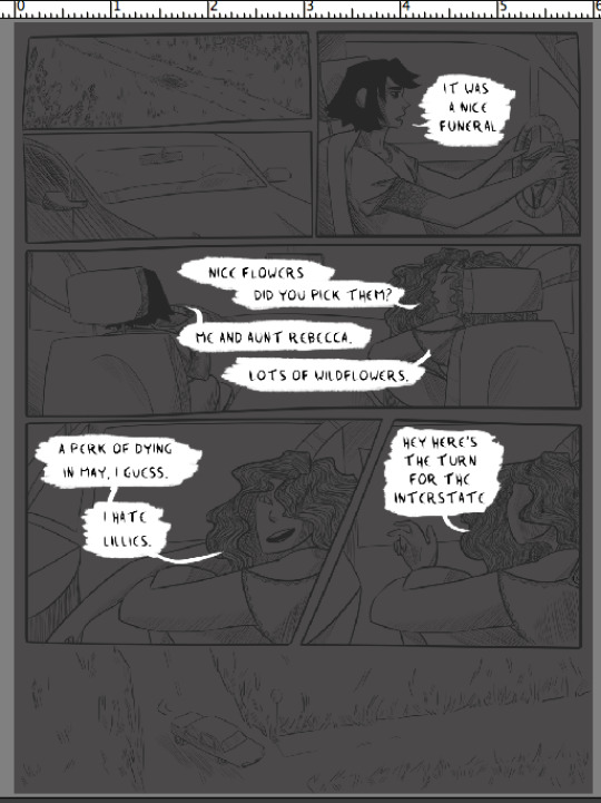
5. New layer, and block color the small panels. Use greys that contrast the background shade, either much lighter or much darker. (note - I didn’t color the car windows, since I wanted to shade what was ‘outside’ differently than the car interior. I also colored the road on this layer instead of the previous one, which was a mistake I just didn’t care enough to fix whoops).

6. New layer, color the people and any any other objects you want to shade/color separately from the background. Having the big panel background, small panel background, and people on three different layers makes it really easy to color them later.

7. Time to add color! I’ll break down the individual steps I used, but the tl:dr is that I make a couple different clipping mask layers attached to a layer of flat grey, and play around with color/opacity/layer settings with a big soft brush until I like how it looks. I use a lot of soft light and overlay! Anything on a clipping mask layer only affects the layer it’s clipped to, so you don’t have to worry about precision.
Once you’re happy with it, then do the same for the other two grey layers. Each grey layer ends up looking more or less like this:

I’ll use the people layer as the example - first clipping mask layer is set to soft light, at a low opacity, and I used purple with a soft brush to add some shadows.
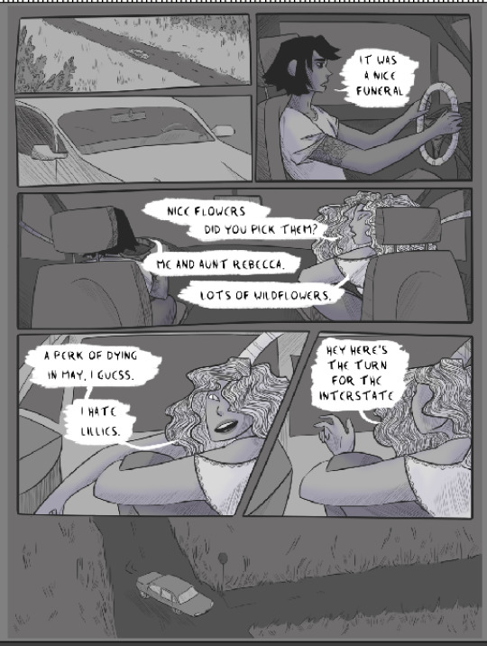
Next is another low-opacity soft light layer - yellow and purple, with a watercolor brush, to add a bit of texture. It’s very very faint on the people layer (you can barely see it, honestly) but recreating it for the background levels I turned up the opacity a bit more.
And the last clipping layer is set to high-opacity overlay, painting on pink with another big soft brush. I like how sharper shadows and highlights look but they take up a lot of time so I almost never do them in comics. And I like the kind of glowy look that less-exact soft round brushes add.

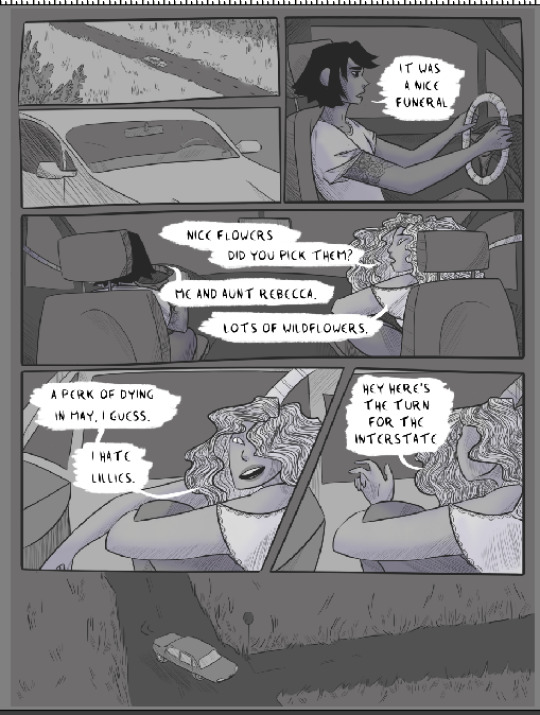
8. And that’s the people layer done! Because I wanted the same colors throughout, I did the same set of clipping masks for each of the other two grey layers. but this is also a really quick way to color something like my comic cursed - if you want the people to be one color and the background another, or the small panels to be a different color then the big panels, just add a clipping mask set to color/hue/overlay/whatever else works over the grey layer in question and fill it with the color you want.
anyway! here’s the small panels with the same treatment, and then the background with the same treatment.
9. That’s highlights, shadows, and some basic color all set! The last thing is adding some additional soft light/overlay/etc layers on top of everything, filling them with different colors, and seeing what works. I want to get rid of the last of the grey, and unify the page’s color scheme a little more.
full disclosure: I have absolutely no idea what most of the layer settings actually DO. it’s a mystery. I’ll cycle through different settings with different colors and I am surprised pretty much every time by what happens.
What I ended up with for this comic was a layer of mid-opacity light grey, set to screen, which lightened the page a little:
Then above that a mid-opacity layer set to color burn, this one filled a pale blue. Now the remaining greys are more bluish, which is closer to what I wanted:
But still not quite the right atmosphere. So above that there’s a low-opacity vivid light layer, filled with the same purple I used for shadows. Now the color’s pretty much perfect.
But it looks a little dark, and the pink has been toned down by the cool-colored layers. So one final layer, on top of everything: soft light, full opacity, using a big soft round brush to add the same pink in places I want to be brighter.
And that’s the final page! The linework still takes a while, but I’ve pared coloring down to pretty much just clipping masks, haphazard soft brush application of colors, and dicking around with layer settings. I hope this is useful!
#long post#like. long#my art#process breakdown#i learned a LOT of shortcuts from seeing how other artists made comics#even if i didn't end up using them#understanding the options available has always been helpful!#so here's this
259 notes
·
View notes
Text

After writing out the entire story of that segment of the comic, it is translated into script form:

Roughly planning all dialogue, composition, and action in the scene. This is how you make sure you have enough space to give all the information that you want and don’t end the scene on an awkward crowded or over-paced page because you didn’t plan ahead. You can deviate from this later!

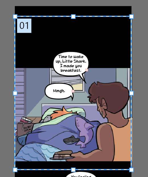
I begin in Clip Studio with the page border. It’s a transparent black rectangle that I copy/paste from the previous page so it stays consistent. Use this page for reference on page and border sizes.
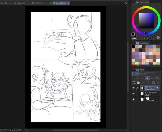
On a new layer, sketch out a thumbnail for your page. This is honestly more refined than most of mine look, usually just stick figures and border outlines. You can see that I cut out one of the panels from the script while drawing the thumbnail. Save this file as a clip file, then duplicate the file and save it as a PSD.
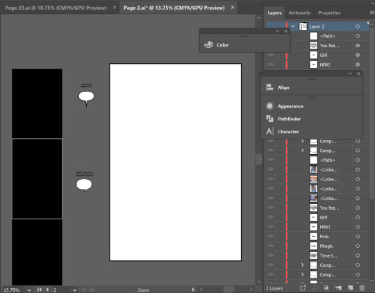
Pop on over to Adobe Illustrator. This is my template setup. The white artboard on the right is 2100x3150px, and the black bar on the right is 800px wide, with a second artboard that is 800x1280px, which is the maximum image size for Webtoon. The speech bubbles and text in the middle are just reference so I keep the bubble stroke width and character size consistent. (My print text size is 37, stroke size 4, and webtoon is text size 26, stroke size 5. Personally I find the print text size much bigger than necessary but for the sake of consistency I’m keeping it that way)

On a new layer, use File > Place to insert the PSD file onto the big artboard. It will snap into place to fill the entire board. Lock that layer by pressing the box next to the visibility toggle:

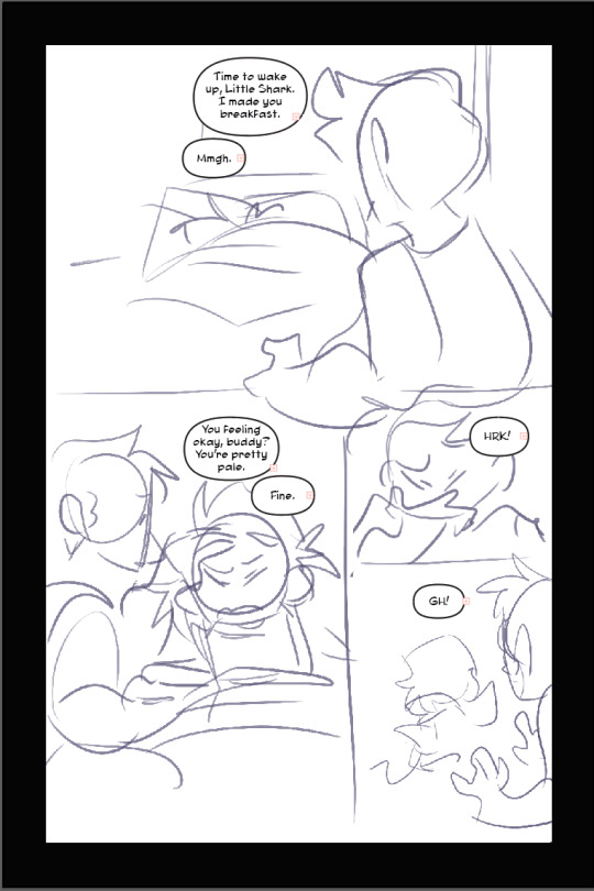
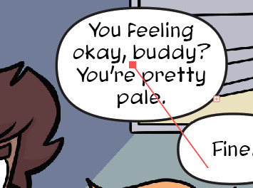
Use the oval tool to draw in speech bubbles and adjust the line width with the properties window. Using the text tool, click and drag to create a designated text box for each window, and copy/paste dialogue from the script. (Be sure to make a text box instead of just pasting the text, it’s a pain otherwise). Center the text. and if you have the text selected and hold control, it will let you round off the edges of the text box, making it fit better into the oval shape. Use the “align” window by selecting the text AND the bubble it fits in and press both the second and he second to last buttons in the top row to center the text on the bubble. (Fine tune this if necessary with the arrow keys)

You add the text this early on in the process because if you need to rearrange panels and make more room any where, this is the easiest way to do it. Head on back to Clip Studio and make any necessary changes.

Back in clip, once you’re happy with your layout, use the “create frame” tool to make one big frame around the entire drawing.

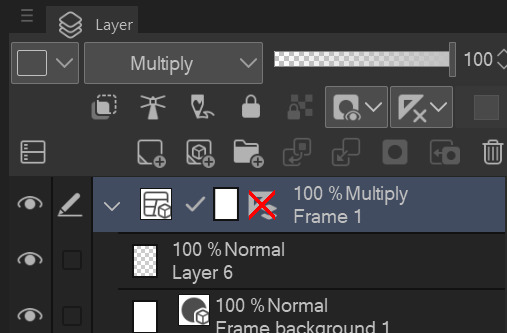
set the layer mode on the panel layer to “multiply” so you can see through it.
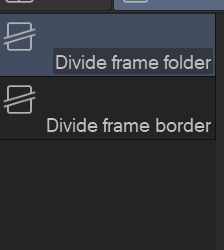
Then take the “cut frame” tool, right next to the create frame tool.

and adjust the size of however thick you’d like your frame borders to be. I work pretty large for my pages, so you probably won’t need them to be as broad as 155.
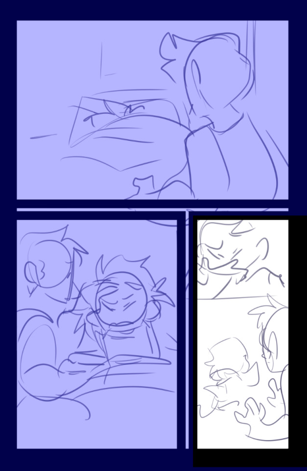
Using this tool, you can cut directly across the big panel you made and cut it up into smaller, even panels. If you hold the shift tool while using it, the lines will be perfectly straight vertically or horizontally. I broke up the first and second half of the page with my first stroke, and with the second, I further broke up the second half. It’s works very intuitively!
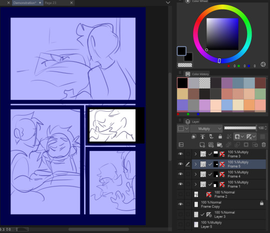
The end result leaves me with four border layers. Select all of them, right click, and press “merge selected layers”. Fill in the white space between the layer borders with black (if you want!) and press edit > convert brightness to opacity to get rid of the white and just leave the black. The end result should look like this:
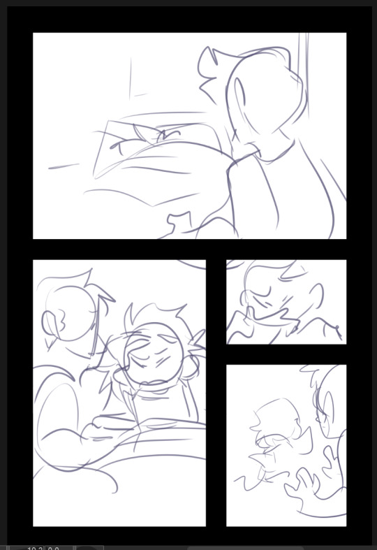
Killer moves! Now lower the opacity on your sketch and refine it on a new layer.

Save that baby and then overwrite your PSD document with the new sketch. It will automatically update itself in Illustrator.
Check your work one more time in Illustrator, this is your last chance to move things around if you need to. (Looks good to me!)

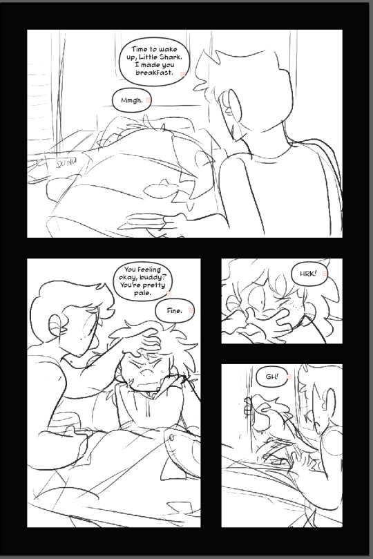
Lineart in clip on a new layer!
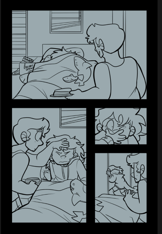
Fill in a new flats layer with a solid color (this ensures you won’t have any white spaces peeking through if you accidentally miss filling them in.
Unfortunately I don’t have separate images for flats/shading because I do them all on the same layer like a hooligan but hey! make it pretty.
Bucket tool is your friend! With “Refer other Layers” selected, and “Area scaling” enabled, you can fill in almost the entire flats section with the bucket tool! Saves a lot of time.
Using Select > Select Color Gamut, You can select all instances of a color on a canvas, and I use this all the time for shading or for quickly adjusting all instances of one color, and if you add “Show border of selected area” to your command bar, you can hide the border of the selection. (You’d have to google how to do that one i have no memory of how)
I shade with the same brush tool I use for lineart because I like the texture and I pick the colors by hand, but do feel free to use a multiply layer for shading!
Once you’re done, crop and export each one of your panels individually for webtoon. You can just save these as pngs!
Overwrite your Photoshop document once again with the full image and head back into Illustrator
That’s lookin REAL FINE fellas gj
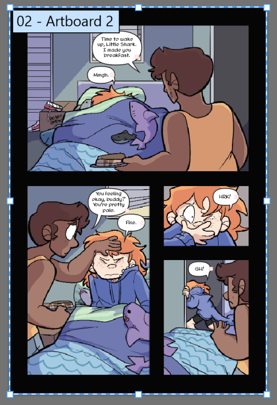
Using File > Place again, select all of your cropped webtoon size files and place them on the black bar you made earlier.
Like so! Copy the text and bubbles from the print page and resize them to whatever size you’d like for the webtoon format and arrange them on the strip.
Now to add the tails to the bubbles. Click on one of the speech bubbles you’ve made to set those colors and stroke width as your current settings.
Pen tool
tap once inside the speech bubble

click where you want the tail to end and drag to create your desired curve. (straight tails are valid too!) Press Enter on your keyboard.

Tap the dot at the end of the tail you just placed, and click and drag back inside the bubble to curve your new line going back into the bubble.
Voila! It’s hideous. Click the bubble or the tail, then shift click to select the other half. Do not select the text!

In the pathfinder window, press the four lines in the top right corner to open a sub menu. Select “Make compound shape”
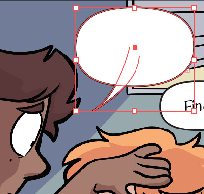
Goshdangit now your text is gone, thanks Em.

Not to be alarmed, the compound shape you made has just been moved to the top of the layer set. Just drag it back down under the text layer.
And you made a text bubble! Nice!

Repeat! And wow! You did it! You illustrated an entire comic page man!
Now to export. Using the artboard tool, you can select the artboards individually.
Select it and hit File > Export as

These are my settings. The image size can be set to whatever you want! I used to work with a much smaller canvas and scale up the webtoon strips as needed, but now I just make them the correct size in the canvas. Save that baby.
Repeat for the webtoon images, but remember, no bigger than 800x1280px. Once you export the first image, grab the top square to transform the artboard and drag it down over the next panel

If you drag from the top and don’t touch the bottom squares, it will make your cuts seamless because both Webtoon and Tapas will stitch your images together seamlessly. (Illustrator will show you how big your artboard is as you scale it so you won’t make it too big!)
And well.. that’s that! You did it! Uploading to Webtoon is super easy

You just need a preview thumbnail, a title, and you can plop all the images onto the site in order!
38 notes
·
View notes
Text
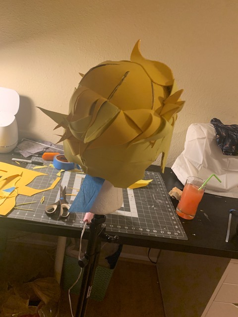
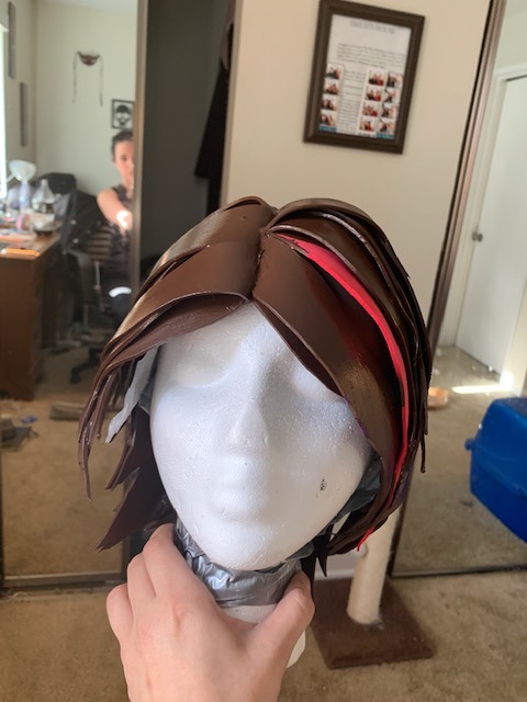
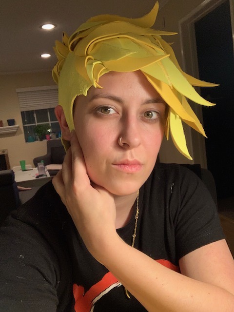
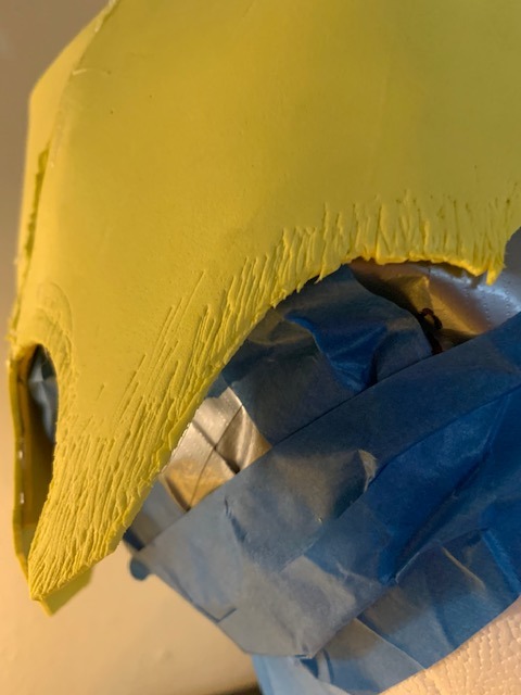
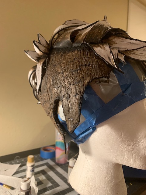
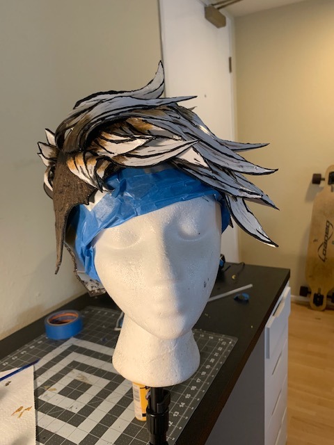
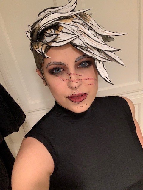
Borderlands Foam Wig Tutorial (Tyreen)
I was chatting with the lovely @void-noises-exe and it eventually circled around to offering to make a wig tutorial because you don’t see too terribly many, just thought I’d throw mine out ( especially because It was next to impossible to find good references of a foam version of Ty’s hair.) So this will be for foam wigs in general but Tyreen’s hair specifically (with a few pics of my Fiona wig from tales as well because they better accentuate my points) I didn’t plan on making this so I am missing a few pictures that might be helpful but here we go. This will not be short.
Supplies:
-Craft foam (ideally, in small and XL sheets, but you can make do with whatever size you have available)
- Spray paint as close to the BASE color of the wig you need (for Ty I used white, for Fiona a medium brown) ideally in a matte.
- a FUCKLOAD of paints (i use cheap acrylics from the craft store ) in Black, and then several shades of the colors in the hair. (For Fiona i used i think four browns? Tyreens shaved sides have three browns, and the top had an additional yellow-brown i mixed) try to vary them in darkness levels to add depth.
- multiple paint brushes. I like to use around four or five of varying sizes and hardness levels.
- plenty Hot glue, and a hot glue gun (note: you COULD use other typres of adhesive, I like hot glue because its got great hold on foam, it sets FAST and worst case scenario I can take a hair dryer to it and melt it again if I need something to be undone.)
- scissors
- duct tape
-plastic wrap
-sharpie
-wig head
-Plenty of reference images
(optional supplies include a rotary cutter and or exacto-knife [trust me, itll make your life so much easier] , and patience. )
SO to start
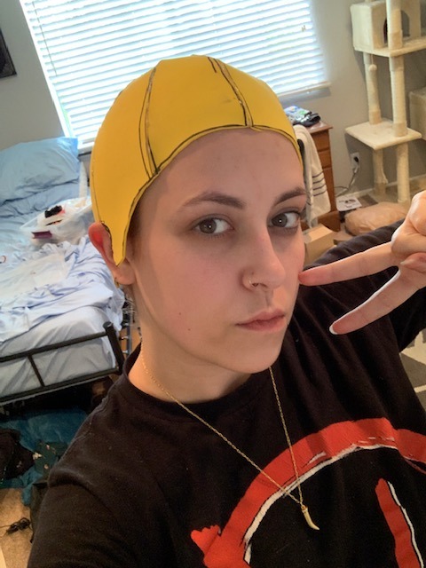
1) Put your hair in a wig cap or however you plan on wearing it under your wig. Wrap your whole hair bit of your head in plastic wrap. Make sure you get over your ears and the baby hairs on your neck if you want to keep them.
2) Wrap all the plastic covered bits in duct tape. This is easier for a friend to do on you, but not impossible to do alone, just make sure to get it all. It should be snug. Make sure you get as far down the back of your neck and down your sideburn area as you can. (Most characters have a bit of fringe hanging down in the back so its not the BIGGEST concern for them, but Ty’s got nada so you’re gonna want some good coverage for your hair line.)
3) Take your sharpie and draw an outline of where your ear is, and along the hairline you’d like your wig to have. For short haired characters you dont want to cut too far behind the ear or your hair will peek out, so I like to underestimate how big my ear is and adjust as needed later. Dont make your wig hairline too high either, particularly if you’re making a wig for a character who has no fringe in the front.
4) Take that bad boy off and cut along your outlines. Try it on again, adjust lines as needed. rinse and repeat.
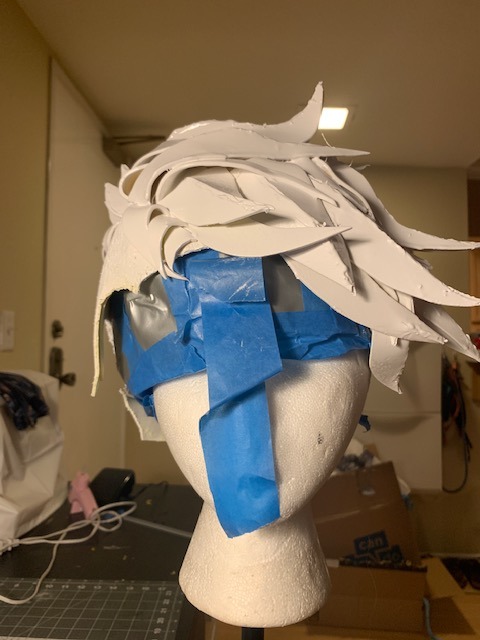
5) once you reach a semi-accurate mold of your head, you’re gonna wanna take it off and cut AT LEAST 4 (front, back, and both sides (I like to do 8, it will lay flatter) sections,coming to a point at the crown of your head. It should come out looking something like this. NOTE : they’re all still connected in the middle. If you’re doing 8, cut each of these 4 in half. )
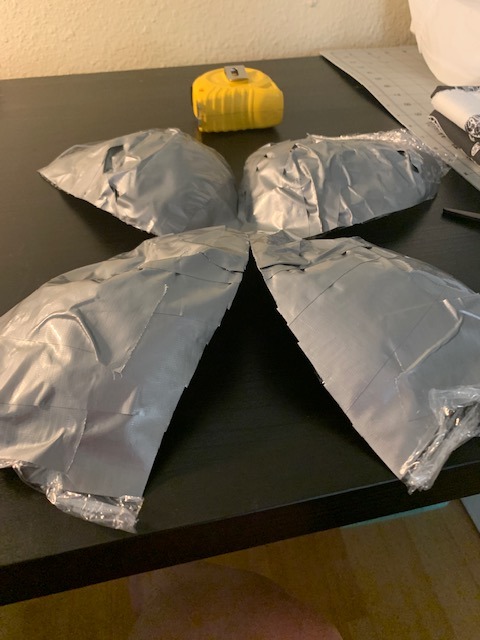
6) Lay out your foam beneath this. If you dont have a piece of foam big enough to trace this bad boy onto, what I do is literally just break out the hot glue gun a bit early, glue a couple pieces together along the edges, until i get a nice big connected surface. Trace this guy on there as accurately as you can, cut it out, and then glue all your sides together. Now you should have a foam version of your duct tape hat.
(Dont worry if the sides wont stay down, if you’re doing a character like Ty where thats an issue, we’ll get to that part later. )
7) (Optional but VERY helpful) Grab your wig head, and your duct tape head. Tape the duct tape back together and put something in it to make it hold shape, I use poly-fil. Tape the head-form to the wig head, and put your little foam cap on top of that.
8) Time to get creative. You’re gonna want to start from the bottom layers first. For Tyreen that’s the long fringe and her undercut. The strategy I decided on was to take a few large rectangular strips of foam, and lay them out everywhere I wanted the undercut to be and cut along the edges to match the hairline. I don’t have a picture of this exact point in the process but I have one from the beginning of the next step. Really the only thing to note at this point is obviously, your head is round and rectangles are not, for the curves where it sticks up along the edges, cut down where it sticks up in a little triangle and hot glue the ends together (you can sort of see this at the top left in the picture below). Dont worry about seams at this point, we’ll hide them later.
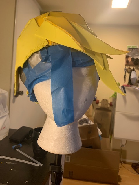
9) This was not the case for Fiona who has very flat hair ( especially because of her hat) but Tyreen has a lot of volume especially towards the front of her head. For hair pieces that need volume, such as the ones that are glued down here, cut two of the exact same foam piece (i like to do them in little waves like the side, but also just a little arch is good for volume without flips such as the front piece) and glue the matching edges together. Make sure the hair triangle is facing the way youd like it to! Then Flatten out the top as much as you can, the bottom will keep the volume and the top ill be able to be covered by “2D” hair pieces.
(NOTE: Honestly, it’s REALLY difficult to end up with an exact copy of cannon, and I ALLLLWAYS get carried away with the spikes. In the end, go by your reference images, but also follow your heart. Cosplay is half about having fun creating. )
10) Once youve started gluing, make sure to keep in mind where your part is (if you have one). For Fiona i didn’t trust myself so I glued in the hair at the part BEFORE anything, and left them ready to be glued down while I worked my way up to them.
NOTE: All the hair at the parts of BOTH wigs is a single piece of foam.You want a nice wide base whenever possible to cover up the seams of all of the other edges of the hair. For your part, Carefully glue along the very end of your strip of foam and stick it down. It will be the last piece to be glueddown on top of everything else to make it look nice and clean.
11) Slowly start working your way around the head, gluing down first anything that will need to be covered (3D pieces and bottom pieces) before getting towards the top where youll need to be more strategic about what is going down and what can cover your edges. I’d definitely recommend mixing 2D and 3D pieces if that’s something you want to experiment with, otherwise, such as in the pic below, it is possible to get volume from a 2D piece, simply by gluing it in a way where it wont lie flat against the head.
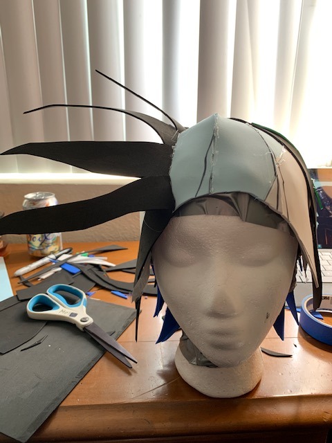
12) in the picture above you can also catch a glimpse of Ty’s cow lick. Those are done exactly the same as our 3D pieces from before, only you trace the edges of the open end, and should end up with a triangular third side to be glued in, then just glue along the edges just like the hair part.
13) Dont feel you have to overdo how many pieces the hair has, remember you may also paint in pieces and designs when it comes to the line-art!
14) Once you’ve added everything from the bottom that you’d like to, go ahead and glue down your hair-part.
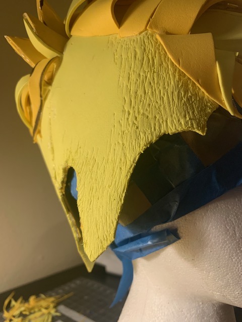
15) So, obviously, I wasn’t a big fan of Tyreen’s undercut just being flat foam across half my head. So I took an exacto to it for what felt like years. REALLY over-do it on the edges, it’ll get rid of that harsh foam line and give it a little more of a natural blend. Also pay special attention to all of your seams in the foam. The more distressing there is there, the less youll be able to spot lines later.
16) So once you have the overall structure of your wig and you’re thinking you might be happy with this, its spray paint time. (I’d recommend disposable gloves for this, you’re gonna need to maneuver it every which way to get the pain in every cranny and that paint does NOT like to come off easy.) Theres really not much advice I can offer on it, just be patient, and do a couple layers, spray it from every angle and let it dry completely before moving on to the next step unless youre as impatient as I am and dont mind ruining a few paintbrushes.
17) So, like the Fiona pic a few back or this one here, you should have a fairly flat evenly painted foam sculpture. Now is around the time you might start seeing all the inaccuracies in what you’ve made. You gotta push past that it’ll look great I promise. Time to get really creative.
18) for Ty I started by painting the buzzed bits in a base brown, and started in on the line art and her roots while i waited for it to dry before going in with two more colors of brown for depth.
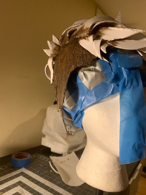
19) For her roots I ended up using three colors. Black at the very bottom (which blends into the line art) a dark brown that matches more or less the buzz, and then after the fact, a custom yellowed-brown to blend better into the white and give us a little more texture. For this and the rest of the cel-shading in the hair, dab your brush before painting and try to mostly stick to light strokes in one direction (OR: if you have one, a particularly hard bristled paint brush does wonders for this) you don’t want the ends of your strokes to be too defined.
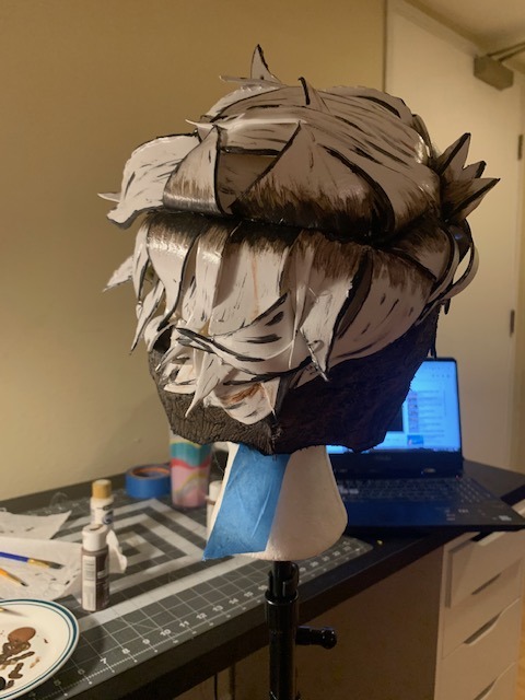
20) Outline the edges of the hair and all prominent pieces, particularly the hot-glue seams, itll make them less noticable. (dont forget the little animation squiggles for Ty’s sides) and beyond that-- honestly, black out to your hearts content. These pics are from when I thought I’d finished. I really felt I’d over detailed. The next day I looked at a picture and realized there is always WAY more texture and outlining than I feel like I see. Honestly, you cant really over-do it, especially with fine solid black lines.
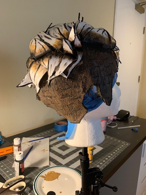
21) The next day I came back at it with the yellowed-brown and LOTS more solid black lines. (Currently in the process of taming down where I got too excessive with the spikes on the side)
22) Once it’s all dried, time to try on. Here’s where we address if you have a short haired character, and the edges of your wig just wont stay down -- invest in a little theatrical grade spirit gum. It’s not too terribly expensive, and unfortunately, I tried the cheaper halloween makeup kind, and it just wont hold how you need it too (and please for my sake, also make sure you get spirit gum remover) I took some hair gel (you could also use elmers glue) just to glue up as much of my hair as I could on the sides and the back of my neck to keep them from the spirit gum, and dabbed it along all of the prominent edges of the wig (namely, side and back) wait for it to get a little tacky and stick that MF-er down good.
Aaaaand Voila???
Let me know if I missed any steps? Its fairly simple, once you get going -- just time consuming.
58 notes
·
View notes
Text
My approach to flat colors + limited palette drawings
This is a follow up to this post i made about how i go about figuring out a color palette for my limited palette drawings. an anon asked me about my actual technique of finishing them so this is gonna be an explanation of how I work in a limited palette with flat colors. I ended up with these thumbnails for a sketch last time so we’re gonna work from here and I’m gonna sort of walk through how i got to the finished version

first things first: every part of this process is just developed as a result of me messing around. take my advice with a grain of salt and if you think you know a way to do something better/that makes you more comfortable. go with that over what I say.
I’m honestly a little surprised when people express confusion about how i draw like this because it’s SUPER simple - literally all you’re doing is just stacking solid color blocks of shape. its very imprecise despite how sharp everything ends up looking.
First things first is that you want to decide how you will be handling your edges throughout the duration. Do you want your shapes to be ultra-sharp and precise, or do you want a little bit of a wobblier, grainier edge? Both can look good but it’s VERY much a matter of situational basis. i’ve been favoring looser and grainier shapes so that’s how i’m going to be working on this.
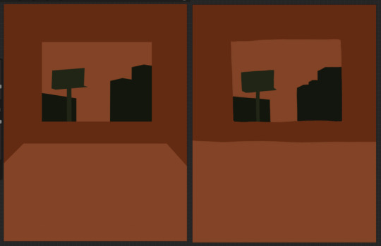
on the left here, you can see the shapes made with precise rectangular selections and an untextured pen, on the right, freehand drawn shapes and a grittier pen. There’s something immediately pretty different feeling about them. So play around with that first - its not something that’s fun to change halfway through! But lets step back a minute. It helps to work large to small. The two biggest shapes here are these orange chunks and everything gets stacked on top of them so i’m gonna do that first.
Now, a key feature of what i do: clipping masks. almost all digital art programs have them. What a clipping mask does is it constrains the pixels of a layer to the transparency of the layer below it. Here I have the light orange layer, and then on top of it the buildings and billboard are clipped to the orange. Most of you probably already know this and I’m overexplaining a bit, but there was a time when i didnt know how clipping layers worked and someone had to explain it to me.

now you’ll notice the shapes of the buildings are rough, and sloppy. here’s the fun part: since this is all about stacking shapes, only your exterior edges matter. this all gets filled in. be as sloppy as you want when you’re making your shapes. in fact, the outside edges get trimmed out a bunch to when i do this - i go in and erase them clean. Don’t be too finnicky about drawing perfect and precise! its a waste of time. As long as the silhouette is what you want, the interior can be a nightmare.
Working this way, it’s important to keep your layers stacked in a way you can make sense of. Right now there are four layers here: the background dark orange, the two main orange rectangle shapes, and then the buildings on one layer and a billboard on the other. I rack up a LOT of layers doing this and it makes it annoying in some aspects, but being able to freely recolor any one chunk without losing my detail is a key aspect of this.
So, I block those out
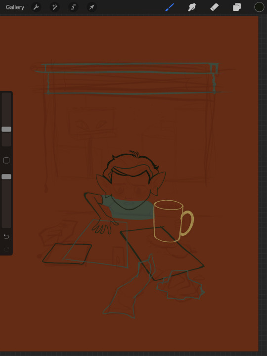
Next, I do the same for the smaller chunks that are still main shapes. There are once again, a lot of layers here. The top layer is the hair - you can see the head showing through it. The head and arm underneath the hair, same layer. Then the cup. Then the light green pieces of paper. Then the dark green ones.
The cup is technically farther forward than the head and arm so you would think it’d go on top, but the point isnt to recreate the foreground and background hierarchy with layers so much as it is to group things in a way i can work with. The cup goes underneath so it can be grouped with all the other objects on the table.
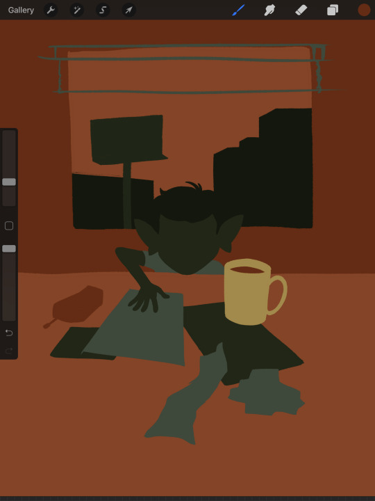
now, i just go and fill in all the shapes. i forgot to do the blinds but i get them later. you might notice a lot of these shapes are pretty rough, which was harder to notice before they were filled in. Now that I can see better, I go in with an eraser and clean up the edges until they’re the shape I want

sometimes erasing leaves little bits of ‘noise’ around objects like on this napkin here. i like to keep a little bit of this noise for texture, but if you dont like it make sure to get rid of it! if you’re working very crisp this will stand out a LOT
Next up is to add some detail onto the objects
I flipped the canvas here because the head shape was wrong - the ears were uneven and i wanted to fix it. I want to go about adding detail onto the billboard and buildings. i do all detail with clipping masks - but the objects are clipped to another layer and so nothing can be clipped to them. instead, i unclip them and just erase by selection for the same effect
all of the text on the papers is clipped to the papers below it. the buttons are clipped to the phone. the yellow photos and card are actually another independent layer on top, in case i want to recolor them separately. im indecisive and end up recoloring things a lot. For the most part these objects are starting to become recognizable as more than just shapes
i go in an add the details on the background and character now. theres some more stuff on the table. the lines of the face and ears are on one layer, and the flats of the eyes below that. Here’s what each group of layers is, and what they look like on their own

The background/bottom chunk. Just the table, window, and shirt.
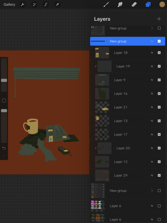
The middle bit. All the stuff on the table and the blinds.

Finally, the top, which is just his head and arm.
now this stage is the bare bones of the drawing. you can more or less tell everything that’s happening. it reads. but its very much lacking in something - it doesnt have a ton of depth or interest. and adding that additional detailing, the dept and interest, is where stuff starts getting REALLY tricky and subjective.
im gonna take you to a much simpler scenario to show the sort of options i go through at this stage
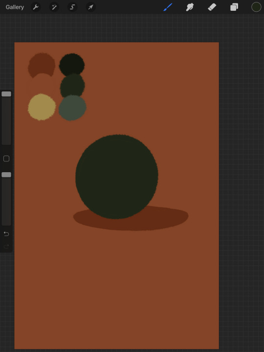
ahh its our dear friend, sphere casting shadow. this is, more or less, the kind of image we have. you can tell whats happening but it’s lackluster. there are TONSSS of ways frm here that you can go add interior detail to a shape once it has been established. here are some quick and SUPER rough examples
from top left to bottom right: flat cel shading, softer airbrushed/gradient shading, halftone, and a textured brush. Each of these has their strengths and weaknesses. They can also be combined.

for example, here’s the solid cel shading being used to contain a gradient/airbrushed detail. This image - probably the single oldest piece of my art i still willingly show people - is entirely colored with gradients being contained in cel-shaded chunks. It has a sort of soft, luminous quality but without losing its crispness.
here’s a super quick bust with some variations of stuff going on. obviously this is no masterpiece but you see how different types of detailing can interact with each other and be used to distinguish materials too.

With the mob psycho comic I did, the detailing that wasnt line was done using a variety of halftones of different shapes layered on top of each other


by contrast parts of my ace attorney comic use a textured brush and have a sort of blended, papery feel
any of them can work for pretty much anything as long as you are using it with intent. practice around. mix styles of finishing together. find a comfort zone. the more you do it the more intuitive it becomes and at the heart of it this process is a very intuitive way of drawing because of how far removed it is from realism.
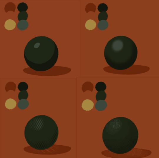
Now here is the trick - light and shadow.
Everything up to this point has been very flat and adding detail helps but there’s only so much that can accomplish. To get HEAVY light and shadow you need to think about things differently. I think if there’s any part of this process that’s complicated, its this one.
To truly get the most out of your palette, you need to pick chunks of an image to be in higher/lower light and then either ‘step up’ or ‘step down’ the colors in that chunk. here’s what I mean.
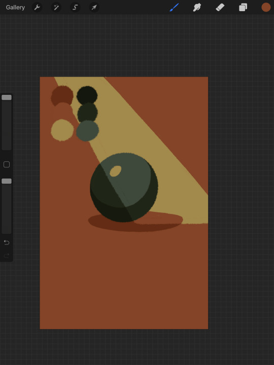
Here’s our ball with a beam of light on it. Everything Within the beam of light is one step in our limited palette lighter than anything outside of it. Here’s how I go about doing this: the shape of the beam of light is below everything else. Then, once I have the shape blocked out, i select it. With that selection in place, i go to EVERY SINGLE LAYER that’s effected, lock the opacity, and recolor that chunk. So what’s going on here is that there is only one more layer - the beam of light, below everything but the background, and the rest of this effect is just caused by every layer above it now being two-toned following the exact same silhouette. THIS is why it’s so important to keep your layers separate - if the shadow and highlight had been painted onto the base directly, i would not be able to do this without significant effort.
This works with all of the finishing techniques I talked about above
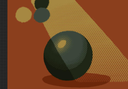
A combination of cel shading and half toning, all stepped up to give the appearance of heavier light on one area.This is also how I go about rendering transparency in this style. All of my layers are fully opaque and I allow the colors to do the work of conveying transparent material

Here’s our ball with the patterned/textured brush shading, being viewed partially through a window
it’s obviously not a very representational way of working, but as long as your audience UNDERSTANDS what you’re trying to convey, then you’re executing it successfully.
So with that, now we’re gonna go and finish this drawing.
For this one, I decide a big central shadow is necessary. In the original thumbnail, he was backlit, which I still plan on doing, and that wouldn’t make sense without casting a shadow.

I’ve had to change the colors of some objects entirely in order to get this to work right. This is what I mean when I call this an intuitive process - some stuff felt weird, so I changed it. This also involves a bit of problem solving. The newspaper is now unable to be separated from his hand. Sometimes changing the color of an object makes that object look better, but ruins its relationship with the objects around it. It’s up to you to learn how to adjust and finagle things until you get it where you want.The paper he has and the napkin underneath it also all blend together now.
The next few parts of this process are REALLY just trial and error, where I toss a bunch of spaghetti at it until it works. It’s hard to decide what to screenshot, because I don’t know what will or will not be part of the finished drawing. To that end, you can watch the recording of this drawing here. This video isn’t edited at all so it contains a couple of minutes of really shitty sketching, and then all of the color thumbnailing work i did in the last post. Actually getting started on these final colors begins around the two minute mark. It is also sideways, I am sorry I don’t know why.
Now, here you can see where I’ve more or less worked things out. His hand’s not on the cup anymore because my friend pointed out it didnt have an arm attached to it. I added some halftoning to make a gradiating effect in the sky and on the table to give the impression of a sunrise. His eyes are different but as of posting this, I don’t like them and am probably about to go back and change them again. The Cup now has a shadow and some rim lighting. His hand is in shadow. The stain on the napkin is big enough to define the edge of the paper on top of it.
Little things like that.
The more you draw like this the more the way you need to think about your space becomes natural. I hope this helps and I wish you all the best of luck!
117 notes
·
View notes
Photo
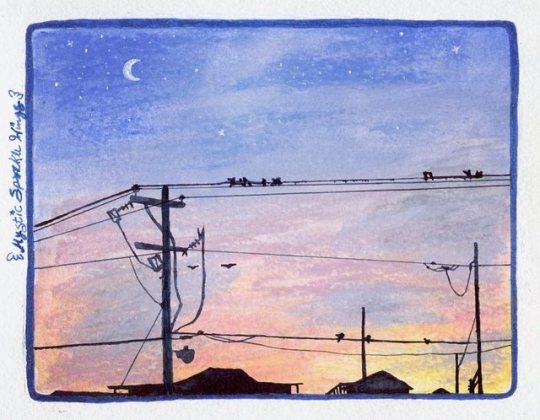
Beach Nights (Gelatos Test)
Here we have another, slightly stranger, art supply that's been on my wishlist to try for a while: the Faber Castell Gelatos! Which, for those that don't know, are one of many options available on the market for water-soluble/watercolor crayons/pigment sticks/etc.
I grabbed up every unique color my local Michael's had when I went in one day and they were on clearance for $0.97 each. They retail for usually around $3 a pop if you buy them individually like this, and so I jumped on the opportunity. I ended up with a total of 35 colors to pick from.
They do come in sets--some smaller ones of 4, a few that have 15 colors each, and there are a couple of bigger gift sets with around 30 each, as well as other specialty sets that come with a few gelatos and some other things for specific projects. As of yet, I can't comment on the arrangement of any of these sets, but I do like these well enough that I would like to end up with the full range of 80 colors eventually, so I've already worked out a few sets I'd need to purchase going forward to make that process as inexpensive and quick as possible. So perhaps I'll update this to comment on that at a later date, we'll see.
Even so, I felt like I ended up with a pretty good range to pick from, just missing a couple of colors here and there that I didn't get simply because they weren't there at the time. I even ended up with a handful of metallic colors, which are pretty interesting, though I didn't use any of them here and when scanning artwork, metallic colors consistently fall flat anyway. Though I was pleasantly surprised that in swatching the metallics they don't lose hardly any of their metallic sheens after being hit with water. (As metallics in water-soluble colored pencils tend to become not-metallic anymore when that happens.)
At first, I wasn't sure what to draw to test these things out. They come in little lipstick/chapstick/lip balm/whatever tubes, where you twist the bottom to get more product to come out, but are mostly flat on the end and so they're a little too big and super creamy to get super precise lines, unless you were to take a wet brush to them to pick up the color or be so bold as to cut chunks off to make them into a finer point/crisper edge, and even then I'm not sure how long said finer edge would last with how soft they are. My first thought was a galaxy, but that seemed a little too easy/obvious, and I had a feeling my gel pens would give me a fit over the top of these, based on how they don't like a lot of wax and they aggressively don't like watercolors.
Eventually, I decided to try replicating one of the pictures I'd taken when we went on vacation to the beach recently since that would be broad enough and not require such fine detail other than the silhouetted buildings, which I had no intention of trying to do with the gelatos from the very start. Although I had made this artwork at a much larger size, that may have been a somewhat viable option. But I like relatively small art pieces. (Though this doesn't look exactly like my reference partly because of the unpredictability of art and partly because my eyes got confused while I was figuring out so of the powerline details, as well as I added the visible moon and stars and birds for some more visual interest).
The one other thing about the gelatos I'm not crazy about is that some colors, mostly the pastels and some brights, melt almost seamlessly when hit with water, while others, mostly certain darker colors, either take more work and water to melt nicely or in some cases just won't fully dissolve the lines/texture marks. At least not on the cold-press watercolor paper I was using; I suspect some colors may have faired a little bit better on smoother hot-press paper, but I've yet to test that out.
This has its advantages and disadvantages. It can work and give you some interesting textures, as you can see peeking through in a couple of places here. But if you want a super smooth, seamless look then you'll have to be careful and pick which colors you use accordingly.
I tried a couple of different methods of applying the gelatos, mostly just to see what would happen. The most obvious thing to do is to apply the dry gelato to dry paper and then come back in with a brush to melt them down. But I also tried wetting the paper and applying the gelato straight to the wet surface, which was interesting and in most cases seemed to prevent harsher lines and textures being left behind, probably because the colors were already "floating" on top of the page without settling into the fibers. And because of that, I ended up inadvertently trying a wet gelato on dry paper. That was okay, but not much different from the other methods I'd already tried.
I also tried mixing two gelato colors--Boysenberry and Fig--on a plastic palette by scribbling a bit of each right on the palette and then adding a couple of drops of water, and then I applied my new custom color to the drawing with a brush. This was interesting, and likewise, I think those that prefer more traditional watercolor techniques would probably like this method best. But I also like this method as it gives you a way to make a few more colors if, like me, you just don't have what you want/need and don't want to risk trying to blend/mix the gelatos straight on the paper. (Which I did try and is very much an option, as is blending two colors by using just water on the paper).
And just as a side note that the edges of my scene here may not be perfectly blended or applied consistently because I lightly drew a rounded rectangle as "this is the size and roughly the area where I want the color to go" since I knew the gelatos were too imprecise to try and get right up the edges, and I was using a slightly larger piece of paper than usual. And I didn't use any tape to isolate the area, which in hindsight was probably a better idea, but oh well. Same thing with the funky outline; I defined the area with a glitter marker and tried to cover any gelato that was too far outside the guideline I'd given myself, but there were a few spots I had to cover up a bit with a white gel pen.
Speaking of which...
I was very right about my pens not liking whatever this gelato stuff is. The white gel pen did okay, but it wasn't as vibrant as I'd hoped and it did get clogged pretty easily, but I had a struggle with black pens similar to my Wire Sunset piece. Except for this time, after trying three pens I saw the light at the end of the tunnel instead of continuing to struggle with more. After a bit of thought, I ended up going with my black "Shark's Eye" Jane Davenport Mermaid Marker, since those use a dye-based ink that behaves similarly to watercolor, but not identically. That way I knew the color would go on top of the gelatos but as long as I was careful and only used so much, wouldn't reactivate any of the colors underneath and leave me panicking with a big mess.
And in the end, even if some lines are bit wobbly/imprecise and I had a few smudge accidents, I think the mermaid marker ended up being for the better because the buildings weren't pitch-black in my reference, but I was really not into the idea of trying to draw enough detail to convey that, and yet because the mermaid marker ink is similar to watercolor, the pigmentation was just inconsistent enough that I think it implies that by accident. In a good way.
Overall, I'm pretty happy with how the piece turned out and this certainly convinced me I want to try collecting all the gelatos so I can use them for backgrounds more often, despite some of the difficulties I had with them. They're a unique tool that takes some getting used to.
And this does make me want to try some other brands of water-soluble crayons, but I'm not sure if I'll follow through with that just because I feel like these are really good enough on their own for me unless I find some unique colors in other sets I'd just really like to have that I can't get in the gelatos. Time will tell, I suppose.
____
Artwork © me, MysticSparkleWings
____
Where to find me & my artwork:
My Website | Commission Info + Prices | Ko-Fi | dA Print Shop | RedBubble | Twitter | Tumblr | Instagram
1 note
·
View note
Note
would you ever consider documenting a few of your drawing steps? im so very interested on how you make your drawings like the way they do, stuff like brush types and the order in which you create your pieces! thank you for reading, and amazing work, you're very inspiring and my self confidence in my own skills lessen every time i get a glimpse of your work! talent...
Hi hi hi! Firstly, thank you so much!! this is such a sweet sweet message and I am so glad that i have had any sort of inspiration to you haha! I’ve gotten asked this before so Im gonna try to walk you through something the best I can- stick with me lmao!
Before we start- I just wanna say… for real, don’t ever get discouraged when you look at someone you like’s art- I know it can get hard not to- hell I still spend nights cryin over Kevin wada’s work just… how does he do it??- but its so important to learn from the people you admire not compare! Art is a music festival, not a battle of the bands.
anyway here we go!!

so I sketch in three parts- the first part is very very very rough. I just need to get the bare bones idea out of my head and onto the paper. I treat this like a gesture- I don’t spend more than 2 minutes on it. Just really get it out!
I use just a general pencil brush while doing this- which is the second smoothest brush my program offers. It allows some flexibility but not as messy. I don’t use a fancy program, so brush texture and such isn’t my forte!! XD

The second sketch, I look up a few references to help me get the basic shapes- I’ve been trying to get more comfortable this year with using references so I’ve been trying to use them in everything I do!
some tips when using references: draw directly next to your reference- if you can avoid it, I wouldn’t recommend clicking between two windows to use them- don’t interrupt your flow anymore than you have to!
I also put in the central movement lines- I like to keep these loose. avoiding straight lines in your work will make it look less stiff (my biggest issue is trying to get the flow better) Draw one for the spin, and then one for the shoulders and nipples- These three points are where I originally focus on. Also here, I find some of the main shapes of the human body (the rectangle of the torso, pentagon of the waist, circle of the palms and elbows etc)

Next, I clean the sketch up A LOT- I really focus on getting my main ideas down, not the cleanest still. I sketch the clothes and hair with more detail but not too much. I also draw arrows to let me know what texture and direction I want the hair to go. Monet’s hand was giving me trouble so I did some central lines for the bones. And cherish this version of Jube’s jacket because its gonna get worse.
There’s not much I can really describe here, unfortunately. A combination of just how I draw and practice, I follow my sketch and the references again to get to the final product.
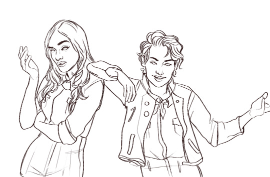
FINALLY we get to the final line layer! After the last sketch, there’s not much I have to fill out, just clean some stuff up and leave things like Jube’s glasses off (I do those in a seperate layer)
For the camp au, I use the “marker” brush at a 50 degree angle because I like the texture- It’s like a crayon brush, so it’s a little more natural looking, in my opinion!! I usually stick with a pencil or a pen(smoothest option) brush since it allows a cleaner look.

so this is sorta an unpopular opinion but… I hate… coloring??? I hate it so much- its so tedious. That’s why I use ridiculous patterns or colors when I can, to make it exciting, so my coloring process is RIDICULOUSLY simple
Step One: flat colors: so, I fill in the organic parts of the art first (skin and hair) each has its own layer. I fill in the skin with its most middle tone, then gradient the edges of every limb with the same middle tone on ~50% multiply opacity, and a ~30% hard light opacity. I then put blush (any red or pink tone) on a soft light an adjust that until I like it on the cheeks, elbows, chest, and fingers! Hair, I do about the same, but I also shade around every line, and do highlights at the middlest points.
Step Two: clothes: I speed the fuck through clothes. Usually, I will color shirts one one layer, pants on another, and accessories on a third and gradient each with its own color on a 45% multiply, with particular shading around any big shadow. I am……… a sham.
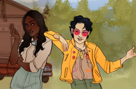
The background is something I’ve also tried to be better with- I used a scene from a previous comic I did, but its the same process essentially. I do only one sketch for backgrounds, then a final and I put in any foliage with a separate texture pent (its literally called leaf)
after that, it’s a matter of messing with overlaying colors and textures- I usaully will pick two or three main colors and use them as varies overtones (here I choose green and yellow on a soft light and a difference I think?)

yeah! so more or less that;s what I do– I’m sorry if this isnt super helpful, I just have gotten a few questions like this recently so Ifigured I get this out sooner rather than late. Seriously though, the process is so particular to everyone, so figure out what works for you and… go with god. :D :D
#ask#anon#PHEW#I HOPE THAT MAKES SENSE#IM DELERIOUS#im so fucking tired#long reply#long post#tutorial#i guess#process pictures#yeah so i hope that anwsers your question!!!#if not#geesh im sorry
67 notes
·
View notes
Note
Each time I saw your Houseki no Kuni art, I really want to know how you colouring the hair because god it's so beautiful but I have no idea how you do that. Your hand is magic! (๑´ㅂ`๑)♡*.+゜
Thank you! Heads up for long post with lots of images (*ˊv`*)
Note: I use Clip Studio Paint, but the process should be the same for other softwares, minus the downloadable assets I link here.
I start with a flat colour on a separate layer just for the hair (and any other gem parts).
Then the shading. This is the main step, but no need to spend too much effort on it.
Then on a separate layer, draw some random triangles/rectangles/diamonds with different colours (doesn’t matter what colour) and opacity, and copy and paste them on top of each other until you get something like this. This will be used as the gem texture.
Slap it on! Play around with the layer settings. I use “soft light” (idk what they call it in the English version of CSP). Depending on what colour the gem is, you may have to change the colour of the texture with Ctrl+U.
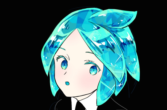
Add some sparkles and glow. I use this diamond brush for the sparkles on their shoulder, with the layer setting “brighten colours (glow)”.
For the rainbowly light, here and here are two free brushes on the CSP Asset Store that you might find useful. I haven’t tried the one on the right, but it looks promising. Play around with it until you achieve the look you want. You can also make your own using the default airbrush, locking the transparency, then giving it rainbow colours.
I think this step only works best on dark background though.
Tada!

The process is exactly the same for everyone else.
The gem pieces as well.

I hope this helps!!
154 notes
·
View notes
Text
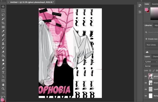
Don’t Panic Pack Postcards, Final Outcomes and Processes.
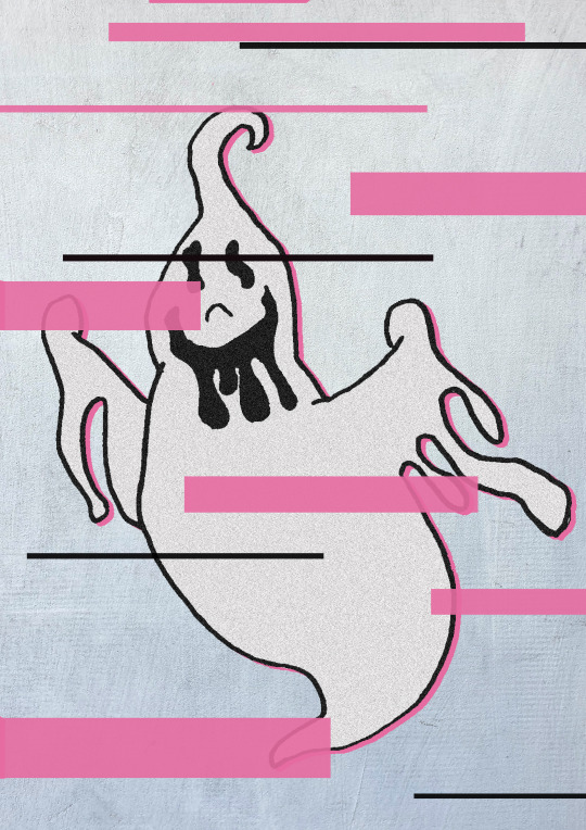
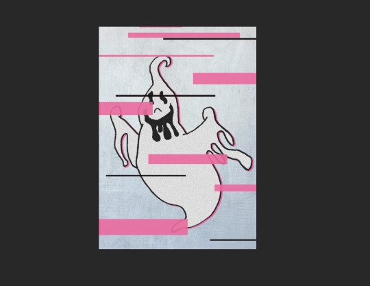
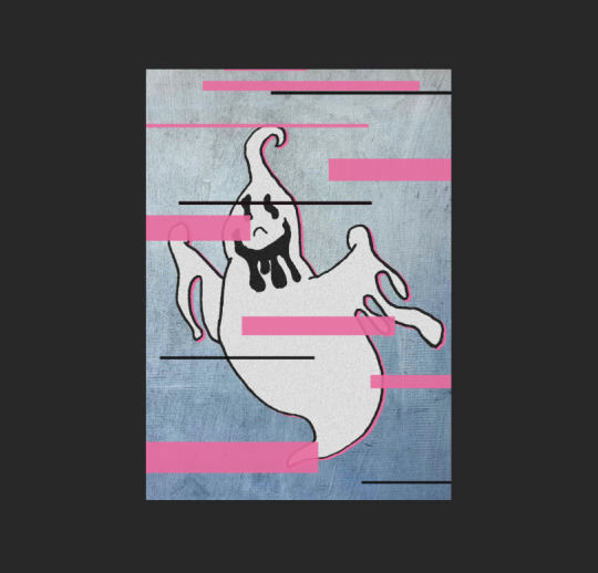
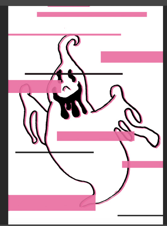
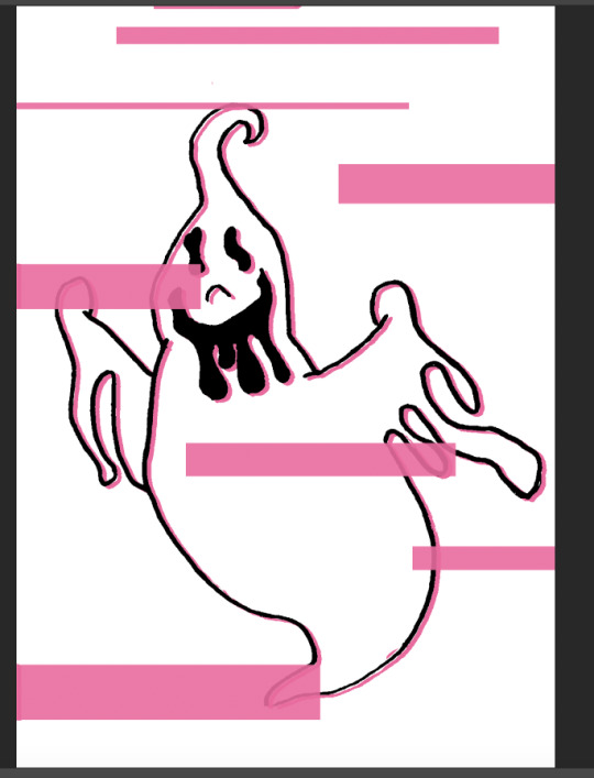
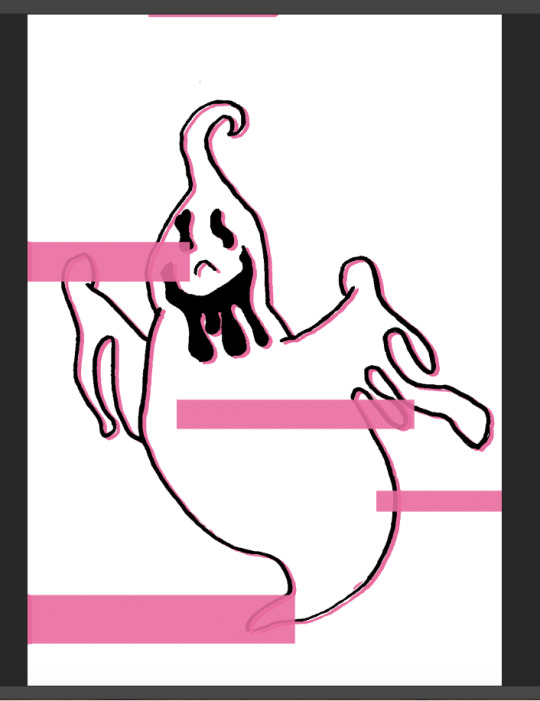
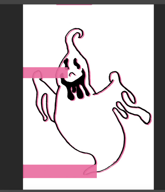
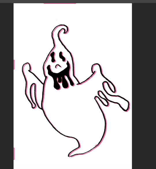
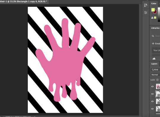
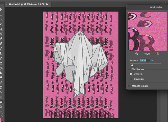
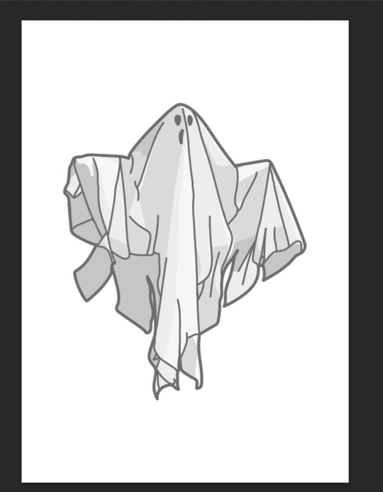
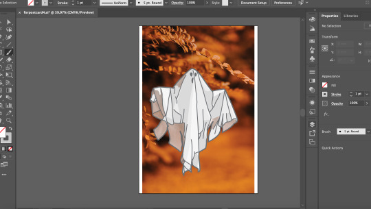
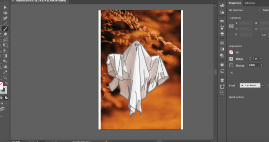
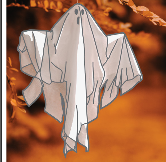
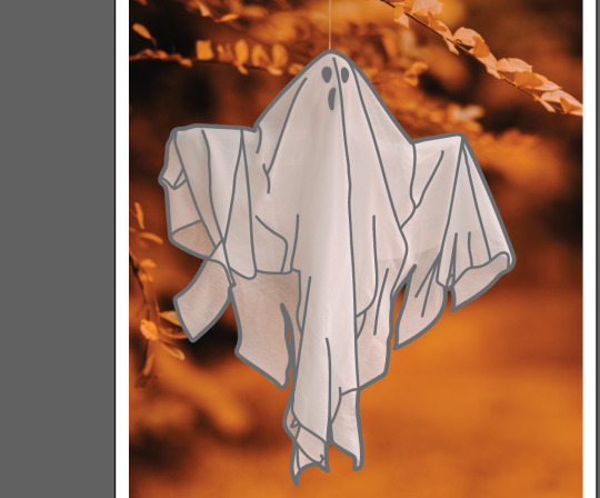
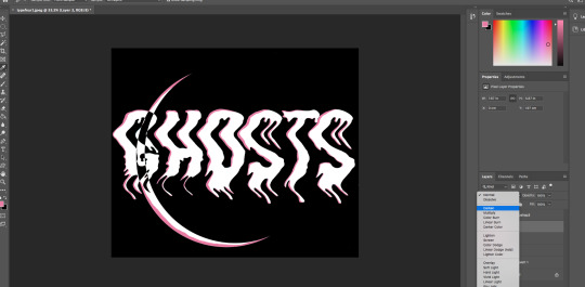
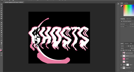
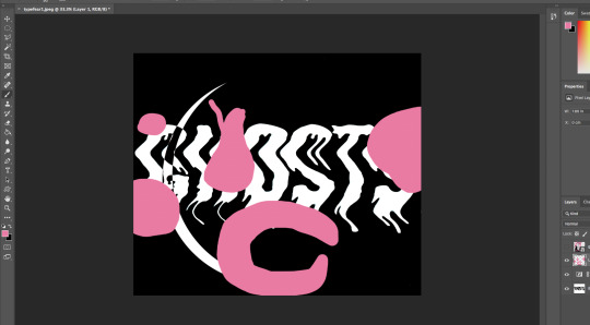
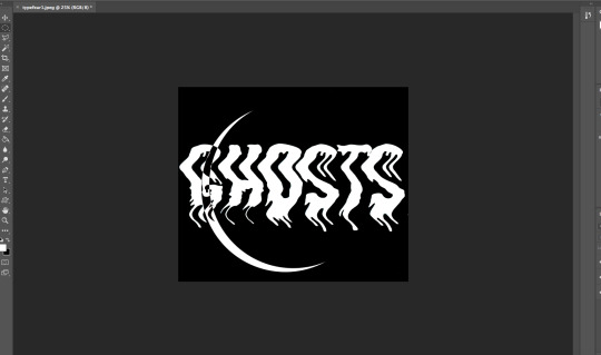
This was my first post card with the ghost on it. I used the ghost I sketched out in my stickers sketch plan out. I put it into photoshop and changed the image contrast and brightness to make it look more digital. I then added a pink drop shadow to add the pink element in. There was these weird bits of pink around the post card to I took advantage of this and decided to use this as an opportunity to add my glitch idea when planning out my postcards. I got my selection tool and selected different rectangles and filled them in with the bucket tool with the pink colour I used for my postcard theme. I thought it looks a little plain so I added 4 long and tiny black rectangles to add to the glitch effect. When the bucket tool was filling in the selected areas it filled it in a little translucent which was a good thing as it adds to the glitch effect. I thought the postcard looks too flat so I got a good grungy textured paper background of the website Pexels and added it in to photoshop. I changed the opacity of the background to 50 so the texture wasn’t too much. I then thought the ghost was too plain so I filled it in with white using the bucket tool. this removed the shadow on the inside but that wan’t too much of a worry. I then added a noise / grain and set the amount to 50. I thought this was perfect. it had texture but not too busy so I decided that was great for the finished postcard.
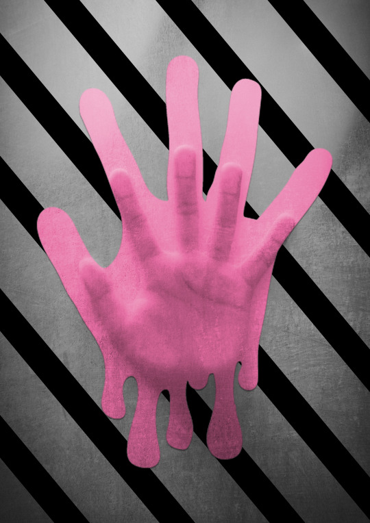
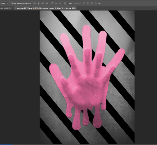
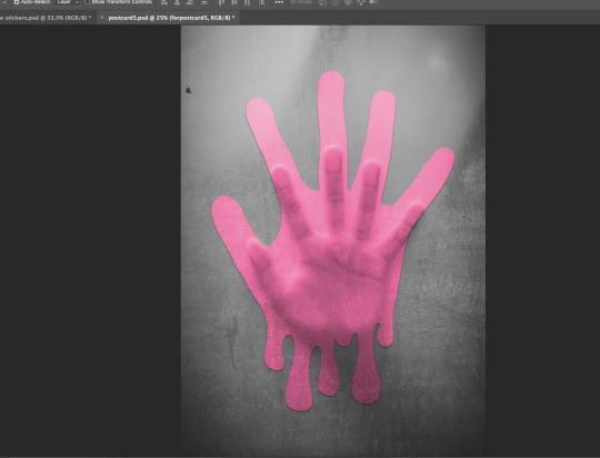
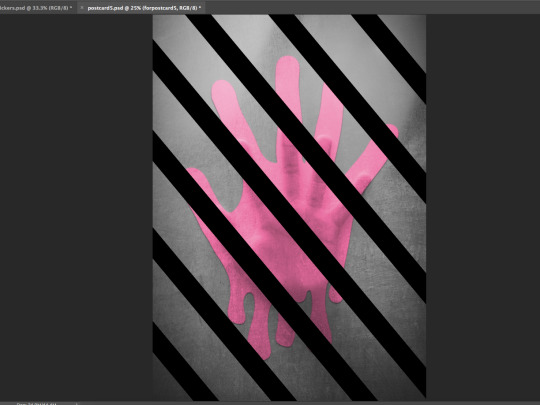
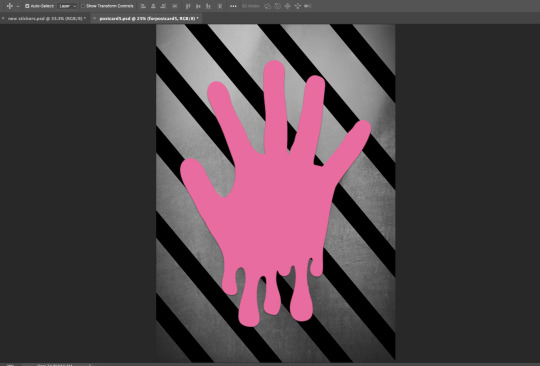
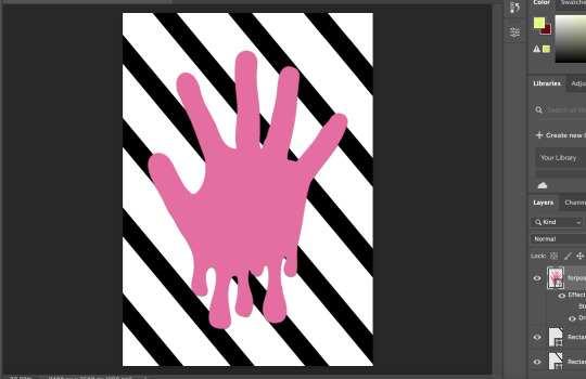
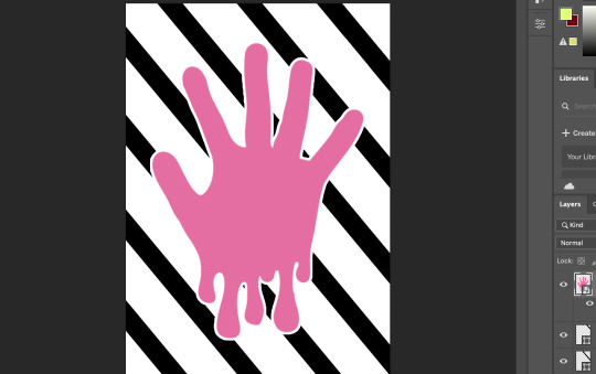
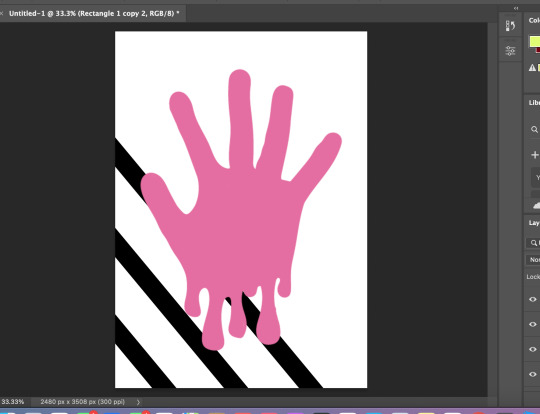
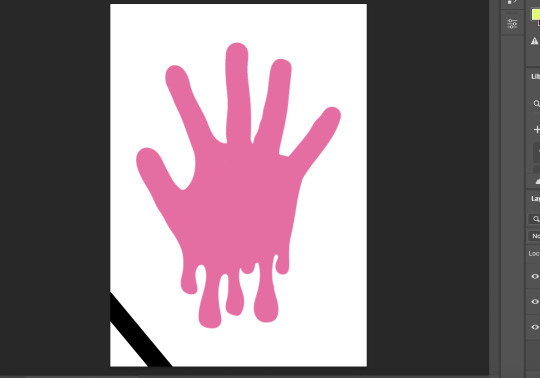
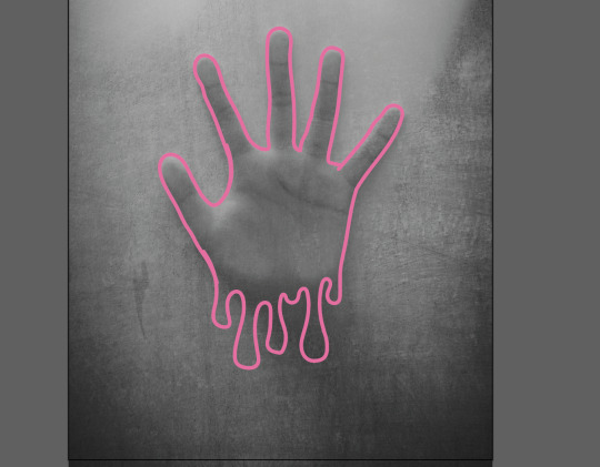
The idea for this postcard is that the hand is a ghost pressing their hand against a window of the house they died in. the ghost is trapped in the house they died in and they can’t escape. This postcard is suppose to represent life from a ghost’s view and their feelings not out reactions. I think that the ghost in this postcard it trapped and alone and can’t escape the memories of their death and that why they are stuck in the house. to create this i found a good image on pexels and outlined the hand in my postcard pink I have been using. I added drips to the bottom of the hand to add to the image. Then I filled in the hand with the pink I outlined it in. I then removed the original image and added the hand in to photoshop. I got the shape tool and added in a black line. I duplicated this line many times to create a stripped background. I added a white stroke to the hand but then I thought that didn’t look right and then decided to add a drop shadow instead. I thought the image looked way to flat so I dropped the original image of the hand pressed against the window in the background I played around with the settings and set the original image to ‘Darker Colour’ as I thought that looked best. i changed the hand setting to overlay as the other settings didn’t look as good and make the hand too faint to see. I thought the strips didn’t work with the image and turned off the layer, The postcard looked too plain so i added back the strips. Because of the setting I set for the hand, the stripes appeared in font of the hand so I got the magic wand tool at tolerance 99 and selected the hand, I then clicked on the stripes layer and clicked the back space. The hand now appeared in front of the stripes and was still able to keep the effect the overlay setting added to it. I decided this was good and used that as my final version of this specific postcard.
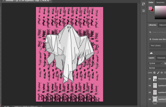
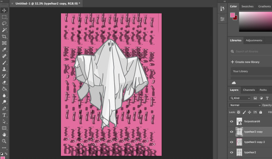
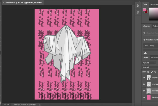
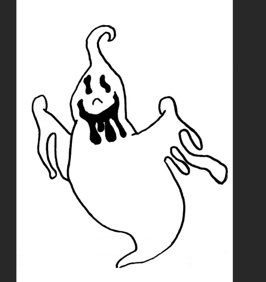
For this postcard I decided to have at most 2 postcards with ghosts on them. First I found a good image of the website Pexels and dropped it into illustrator. I Got the brush tool and outlined the ghost with a 1pt set brush, making sure there it no mistakes. Then I made my brush smaller to 0.75pt and outlines the details on / inside the ghost, making sure everything looks right and not too busy. I then coloured it with different shades of white and light grey to mimic the light and the shadows on the ghost in the image. I made sure the shadows where not too dark so they can blend in better. I then removed the original image and when into photoshop. I added in one of the warped scan type’s in for the background. I changed the image contrast and brightness to make it look more crisp and digital. I then removed the background with the want tool at 99 tolerance. I made the background the pink that I used for all postcards to make it fit in with the theme. I added in the ghost image and brought it to the front. I got the warped scan type and duplicated it, I changed the duplicated type scan and set the opacity to 50. I moved it a little below and to the right to create an echo ghost effect. I repeated this step and moved the second duplicated type scan to a little to the top left to add to the ghostly echo effect. The text became a little hard to read so I duplicated the original type scan once more and brought it to the front to make it a little more bolder and readable. I then added a noise / grain at amount 35 to add texture to the postcard.

The process for this postcard was actually and outcome of a perfect mistake. I imported one of my warped scam type’s into photoshop and adjusted the image brightness and contrast. Then I inverted the image as I though it would be better appearance wise if it was inverted instead of the black text with the white background, I don’t think that would work as well with the pink as it would me inverting the image. I got my circle selection tool and drew a circle, then I accidentally missed clicked and it created this simplistic but really creepy moon running through the text. I decided I really liked this mistake made and went with it, I think this would off been better than whatever I planed to do originally which is not as creative or effective as what I managed to create in a miss click. I got my colour selector tool and selected the pink text on my poster for the postcard. I got my brush-tool and created an offset shadow in the text. I selected the background on the text, clicked on the layer of my offset shadow layer and deleted the excess around the text. I though that the offset shadow was a bit too thick so I got the rubber tool and thinned it out a bit and enthesised the ends to make them look more drippy like ghost goo. lastly I added a grain to the whole image and set the grain amount to 35, I was gonna make it 50 but I thought 50 was too much and stuck with the amount being 35.
For this postcard I got an image of an eye from the internet and traced round it in illustrator. I added my own spin on it by adding a drip under it, making it look like the eye is dripping. I then filled it in with the set colour pallet for my postcards to keep it all in a theme style. I also added gagged lines to create veins in the eye, to make it look more creepy. I brought the eye image into photoshop and scaled it down and duplicated it in a four set formation, then I duplicated the four eyes and brought it below and repeated that step to create the background for the postcard. I added another warped scan text to the postcard and removed the background with the wand tool at 99 tolerance. Then I adjusted the image brightness and contrast to make it look more digital.
The idea for this one is a girl who is possessed by a ghost, The ghost has taken full control of her body and is not living her life. To make this, I found a good image on the website pexels. I brought it in to illustrator and outlined the image with the brush tool at 1pt brush, making sure that I have outlined everything. Once done, I removed the original image and started to colour the image in using the original image colours. A bronze / brown colour for the roses on her head, brown for the hair and eyebrows, black for the dress, gold for the neckless and a fleshy colour for the skin, I decided to leave the eyes white as I thought it would have a better effect to it and the red eyes didn’t really make her look possessed enough, I also didn’t fill in the eyes with white. I brought the image into photoshop and got my drawing from my fears penguin book for the background. I layered together three drawings for the background, two being the same image in different rotations, I also changed the the contrast and brightness for those two images. The third image I inverted it, did not change the the contrast for that layer and messed with the image and set it to lighten. This created a cool looking grain effect. I also like how the background goes through the eyes. it looks so much better to if I was to fill in the eyes with white. I then thought that this image does not fit in with my other post cards and change the colour of the roses and the neckless to the pink I used for the other postcards. This made it fit in way more and it looks like part of the postcard pack. Finally I added a noise / grain at amount 15 just to add to the image and make it not look too flat.
0 notes
Photo
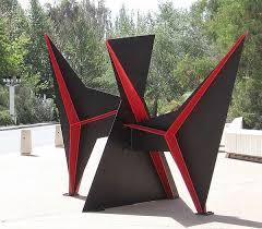
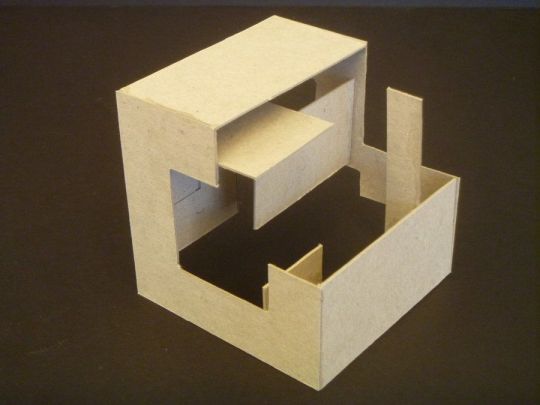
The first five pictures shown are various angles of my finished project, the three subsequent photos are inspirational.
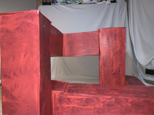
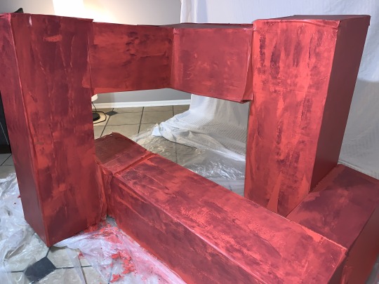
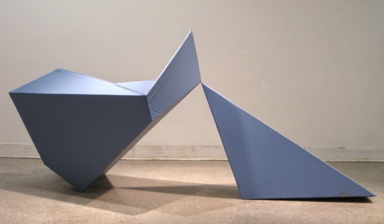
Title: “Pink Parade”
Size: 3ftx3ftx3ft
Materials: Cardboard, utility knife, hot glue gun, hot glue sticks, water-activating tape, latex house paint, paint roller, paint brush, yardstick.
For this cardboard planar project, the objective was to create a dynamic, volumetric shape out of flat planes of cardboard. I wanted to emulate my project after something sharp but soft and pliable at the same time; something with structure but movement and flexibility simultaneously.
I experienced some difficulties with this project in terms of the size, connectedness and more. I struggled with seamlessly merging the separate rectangles at the appropriate angles, and also with sizing the piece up from the maquette which gave me some trouble in the end. I also faced difficulties with the tape - it stuck to the cardboard but not in all places, so when I painted over some of the tape it peeled from the cardboard.
I believe I was successful in the overall aesthetic of the paint and creating a geometric shape with negative space and movement. I’m happy with my decision to keep the inside of the piece blank, with a sort of barricade around that negative space, and I think I maintained my original plan to convey slight movement within the piece. In addition to this, I like how I combined the pink and purple paints with the paint roller to create the illusion of a texturized surface.
From this project, I learned the importance of using separate pieces of cardboard to connect the large pieces with on the inside. I also learned that I need to better manage my time for largescale projects such as these - three feet didn’t seem grandiose, but I found otherwise shortly after beginning to assemble my pieces of cardboard.
0 notes
Text
Fantastical Creatures Weekly Summaries
Fantastical Creatures Weekly Summaries
Week 22
Day 1- Character design brief.
Today I had an introduction to the character design brief for this submission. In todays workshop we focused on generating a character for the brief which was an animal and fantastical creature. I decided that I wanted to focus on animals that where found in trees such as monkeys, koalas and sloths as I am intrigued by their anatomy. The task we had to complete was a series of sketches of multiple characters as we would receive visual feedback on the characters. While also giving feedback to other students in the group.
I found that my sloth character was the most liked and I also favoured the design heavily. I felt like the sloth would give me the right proportions when sculpting to give a cute and kind creature who would interact with human. For the I used round large shapes for the face and body , this gave a friendly aesthetic. I am looking forward to creating the character in clay as this would give me a greater understanding on proportions and structure when working in software like Maya.
Day 4 - Character design
Today I had a maquette workshop where I modelled my character for the project using previous sketches to help guide the process. A maquette is a scale model or rough draft of an unfinished sculpture. A maquette is used to visualise and test forms and ideas without the expense and effort of producing a full-scale piece. I found making the maquette to be at first a tricky process as we learned how to create the armature from two lengths of wire using a barley sugar twist to mould them together. This formed the basis of the spine and could be used to help guide the process on further as now the arms and legs of the creature can be seen with the remaining parts of the wire. I then attached the head with a separate piece of wire, this was tricker due to me not understanding where to apply the twist. The twist was then applied onto the spine and this gave the overall skeleton of the character.
Next, I applied tinfoil and masking tape to bulk out the skeleton this allowed me identify key areas of weakness in the initial armature. By doing this i could see the shape and direction I needed to take for my sloth to come to life. I then began to sculpt onto of the tinfoil and fully flesh out the sloth.
I found that sculpting was m favourite aspect of this workshop as the more I added the better the sloth looked as he came to life. I decided against focusing on detail until the very end and just tried to achieve the basic shapes of the animal. This would then give me the basis to progress as I began to add the sockets for the eyes and the overhang of the jaw. I struggled with the eyes as I didn’t know how to sculpt them so i have taken them out of the design so far and will watch a series of videos to help better understand the anatomy of the sloth.
Week 23
Day 1- Character design
Today I was introduced to a Maya sculpting workshop using both Maya and Mudbox. This initial workshop was to get used to using the tools and methods to sculpt and create a character from cubes and rectangles. As I have grown accustomed to Maya sculpting through the radio task I welcomed this new challenge with open arms. The first task was to create three cubes for each part of the body and morph them using the various cutting and extruding tools to create shoulder and legs as well as a neck. This then became the base of the character. I found that using these tools where quite challenging especially with the multi cut tool as this would. Highlight other areas I did not want to cut. In addition , I did not want to create my character I am basing my maquette and drawings on until I fully understand the software. So I was mainly focusing on creating a character which utilised all aspects of the software.
The next task was to smooth the character and change the amount of planes available. The mother the amount of planes the easier it was o sculpt with the sculpting tools on maya. I found this difficult at first as I had made my character too small for the actually brushes. SO I increased the size of the character and began to try and work out how the tools work. I decided to create a visor like head which resembled a hammerhead shark. While also adding a shell on the characters back. I found that I should have extruded these aspects of the character before morphing the planes as this would have gave me better control and precision when creating. As I had just morphed the plane this would detract from the overall animation of the character later in the pipeline.
The next aspect of the workshop was to import the character into mud box . Mud box is a sculpting software that aids character and prop creation . I found this software quite easy to use as I imported a low resolution version of my character into the software and began extruding the same aspects that I had in Maya. I am looking forward to creating my sloth in both these softwares and I will continue to watch tutorials on how to improve my modelling techniques and processes within software like Maya, Mud box and z brush.
Day 1 - Character design maquette
Today I finalised sculpting my sloth Maquette and it is now ready to be baked to set. I found the sculpting process really rewarding as I could see the shape of the character show through with each addition of super sculpt. I found that the refinement process was the best part of the experience due to the level of detail I could achieve. I used a knife to create the fur for the sloth cutting into the clay to give texture . I then decided that I would do this all over the sloth instead of smoothing the clay . I found smoothing the clay difficult as it was too thin and it would reveal some of the tinfoil from the skeleton. I used smaller pieces of clay to add further detail to the face including the eyes and snout for the face. I also added little detail like the bandana and extra pieces of hair onto of the head. Overall I am happy with how the maquette turned out and I cannot wait to paint the finished product.
Week 24
Day 1 - Character design
Today I continued to model my character in Maya. I found this to be quite challenging as at first I didn’t feel that my skills had progressed from the previous workshop. However I did feel quicker at establishing the bulk of the character with its core shapes. I restarted multiple time as I began to get frustrated over the fact my design did not look like maquette in both shape and size. I was extruding too much and this caused the structure of the character to be fundamentally floored so later in the process as the character was placed into mud box I could not smooth down the angles of the character.
Upon restarting, I got feedback off John about the shape of the head as this was causing the most issue. I previously had a square head that would round off when I used the multi cut tool. This caused issue as when extruding around the nose the nose fold would go into each other leaving a floored model. John suggested that I use a round head as this would best accompany the shape of my sloths features. When I rounded the head off I found that the face was easier to split up onto planes and allowed me to create the nose and its bridge much easier. I was also able to extruded the points above the eyes to create a raised eyebrow socket so the eyes could be placed with. I found that these features where also difficult to establish through Maya as I was thinking ahead. By not thinking ahead I miscalculated the steps needed to create the shapes I wanted and got frustrated of my lack of progress. I continued to work through this frustration and established a head and features that I was happy to move into mud box with. When in mud box I found that the same problem had occurred and I couldn’t smooth down the shape. I will have to go back and fix this by either starting again or watching youtube videos to help my understanding of Maya modelling. At current stat I am happy with the progress I am making as I have grown quicker in process of building up a character in Maya. I also have the key shape of my character with the right proportions based on reference from my maquette. However I am also frustrated due to the lack of definition I could achieve with the facial features and fingers.More work is need to establish the characters shoulders and torso and although this is flat there needs to be more bulk and shape added to the skeleton of the character.
Also in the season I was introduced to substance painter which shows me an alternative to photoshop on how I could colour and texture my character. This was a brief introduction as the main focus of the workshop was completing a base shape for the character model.
Easter Break Week 25
Day 1 - Character design
Today I started my character design again as I was not happy with my current iteration. I decided to watch a number of youtube tutorials on how to create a low poly character in Maya. I found that by following these tutorials to some extent I could better grasp an understanding in what was needed in creating the base for my character. I found a series of youtube videos where a cartoon mouse is created step by step and decided to follow the process along but manipulating it to fit my sloth design. I found that with this tutorial I learned how to input reference images which can better help the structure of the model. I imported images of my maquette as I have not drawn my character out in 2d space yet. The tutorial helped show that I did not have to extrude as much as I had in the previous iteration but by simply manipulating the vertices and edges I can create a dynamic shape. Currently in the process I have modelled the body and the head of the sloth as well as placing cuts where the arms and legs should be. I realised that instead of trying to create the head shape from a cube I could bridge a cube and the body together by removing vertices and panels and connecting them after. This greatly helped the structure of the character as I was then able o manipulate the neck with greater precision allowing a place for the chin and the overall slope of the sloths head. I will continue to work on this character design as I feel that I am getting more comfortable with modelling ing Maya. Furthermore I will begin to draw up my character design in photoshop to add more depth to the process as a whole with a character design sheet and turnaround.
Day 2 - Character design
Today I continued to work on my sloth design and focus heavily on the facial feature I continued to watch the next part of the cartoon mouse tutorial as I was intrigued into how the eye socket and the nose was made. As a sloth has a different nose and eyes to a mouse I had to alter the approach to this area. I found that by removing half of the character it made it easier to create the full character after one side was mirrored. At first I focused heavily on the eye sockets of the character altering them so it gave my enough room to create the upper brow of the sloth. I realised that this was fundamental in moving the design forward as by having this as a prominent feature it allowed the rest of the eye to form. I felt like I can create both the eyes correctly once the character is mirrored so left the rest of the eyes for another time as the structure surrounding the eyes is currently more important. I then removed half the side of the character and mirrored it. However I came into difficulty as there was a gap between the two sides of the character. To combat this I went back to having one side and duplicated it without combining the two like the tutorial had suggested. I then combined at a later stage and bridged the gap between the two halves. By doing this it gave me the right amount of room to build the bridge of the nose as before the nose stuck out from the face . This is against the anatomy of a sloth due to the nose being an extension of the face itself. Tomorrow I will focus on completing the face with the inclusion of the eyes as well as creating a suitable jaw for the character.
Day 3- Character design
Today I continued to work on my sloth and added the arms and legs to the design. I found this relatively easy as I am beginning to feel more comfortable in modelling with Maya. I extruded out multiple times and used the multi cut tool to ensure that the joint of the sloth are fully recognised. Furthermore I extruded out from the back of the character to create the tail of the sloth , angling the tail down ensures that the character has balance.To refine details in the face I used the multi cut tool to create added areas of detail and extruded where needs be. This included the ridge above the eyes and made this level with the top of the nose to keep the anatomy of the sloth. I also added a jaw to the character as the bottom of his face was flat so I could extruded in to create the mouth. I then tried to export my character into Mudbox but the software kept failing , I began to get frustrated as I am trying to keep to a specific deadline for each stage of the process. To combat this frustration I added the headband to the character and began to add smaller details like the hair that pass above the headband itself. I did this by extruding the area above the head and offsetting the angle of the extrusion to the right to give the natural flow of hair. Overall I am happy with the progress I am making on the character model and I hope I can get Mudbox to work as this will highlight any floors in the model itself.
Day 4 - Character Design
Today I was able to fix the problem from yesterday and was ready to move my character into Mudbox. This is after I sent my project over to Adam who sent a few tips I should look at before moving to Mudbox These tips where :
- Try to add geometry to support your shapes. This is a common mistake and is super easy to fix.
- Create smooth surfaces yourself rather than trying to rely on smooth preview while modelling. This will help to (as mentioned above) support the shape of the object better when smoothing with smooth preview and also sculpting in mudbox.
- Try to get the topology to flow, this will make it easier to rig, and animate later.
Have a look at other characters people made, like the Max rig you've been using.
In response to this I went over my rig and tried to smooth out the areas without relying on the smooth preview this then allowed better shapes that I could import into Mudbox.
I found that Mudbox has quite a steep learning curve so watched a number of tutorials on how to sculpt properly and how the interface/ tools work. To start with a smoothed my sloth down from its low poly version to add the details of the fur. I used the sculpt tool to add the texture of the fur to the body by drawing directly over each of the strokes. I found that this mimicked how I had used a knife to add texture to the maquette and it gave a similar output.I decided to cover the entire body in this and then focused on the facial features. I left a smooth area for the bridge of the nose and also pushed out the nose as it had been tossed through the smoothing of the whole design. I then focused on the headband keeping that relatively smooth to contrast the fur of the character. When trying to sculpt the hands and toes I found difficulty as I could distinguish what was the finger/ toes to the actual hand or foot. His is problem I am currently trying to rectify and will work on at a later stage to ensure the anatomy of the sloth is maintained. I then moved onto the eyes and used the fill tool to fill the gap I had left in the design up to a suitable point. By doing this is gave me the shape of the sloths eyes which I could manipulate further with the sculpt tool. I found that I was working back and forth between these two tools to adjust the nose and the fur around the eyes. For next time I will focus on the hands and feet as well as establishing a base for the pupils of the sloths eyes. I want to also find a suitable colour palette that can fully represent the sloth. Overall I am happy with the progress I am making and glad that I was able to work through the frustration of yesterday.
Day 5 - Character design
Today I chose to do a series of sketches around the anatomy of the sloth. I found that by drawing the sloths in motion I was able to understand and interpret how they move and their overall form. I realised that the sloth has a very small tail and not a long tail like my character. However as this is fantastical creatures I have chose ti keep the larger tail to set the character apart from normal sloths. Sloths are very slow and so they were quite easy to draw, the best sketches where those of the sloth being in branches as it shows the length of their arms. I also emphasised the length of the arms in my character design by making them a third longer than the legs. Furthermore , I found that the national geographic videos on the sloths very interesting to watch as there was a wide range of shots. These shots contained sloths from different angles and ages which helped my understanding of their overall anatomy.
Easter Break week 26
Day 1 - Character Design
Today I decided to visualise the concept of my sloth by drawing my character up digitally in their environment. This helped me understand the colour pallet I want to use for my character and also gave me a better understanding into the process of developing the character. The character is a product of its environment, after watching the national geographic videos I decided to see how this would impact the design of the character. I realised that the sloth has a similar colour pallet to the branches of the trees around them to camouflage from predators.I found myself emphasising the structure of the sloth however I foreshortened the length of the arms as the character is gripping the branches around him to show how he is interacting with his environment.
Day 2 - Character design
Today I continued to use Mudbox to complete the texture of my character design. I used the sculpt tool to create the pupils of the eyes by raising the surface of the flat plane up wards. I also created texture of the fur in any areas I had missed like under the arms and behind the tail. This helped complete the design of the character. Furthermore, I began to sculpt the hands of the character, for this I emphasised the length of the finger nails on both hands. However I struggled especially with the left hand due to the amount of fur I placed between the fingers. This meant that the fingers began to become lost within the hand. To combat this I flattened between the fingers and pushed the fingers outwards. I also created a lip above to show the knuckles of the character. I ensured this was smooth to show a clear distinction between the fingers and the hand itself. I also experimented with the use of colour in Mudbox and decided to add a base tone to the sloth itself. I then tried to export the file back into Maya so I could add fur to the character however my computer has ran out of storage so I need to sort that out before progressing tomorrow for retopology.
Day 3- Character Design
Today I began to experiment with adding fur to my character. I watched a number of tutorials of how to add fur to a model and found that it was a fairly simple process. I decided that I wanted shorter strands of hair to see the contours of the shapes of the characters head. Sloths also have very thin hair but it is vastly spread across the body. In addition I decided to experiment with retopology and began to watch a series of tutorials on the best ways to create retopology. I found that it is in my best interest to ensure my base of loops are simple and have equal spacing. This will greatly benefit the rest of the process as it ensures the best movement for animation. I learned from the tutorials that I don’t need to individually place the points using the quadrate tool as I can drag a section out from the previous selection and this then snaps to the model. However I have decided to leave the retopology for another day and have chosen to focus on the fur and ensuring that it is the correct size and shape for the character.
Day 5 - Character Design
Today I focused on the retopology of the character and proceeded to complete the base of the torso of the character. I found this process to be quite tricky especially with trying to create evenly spaced polygons around the edges of the character where the polygons would wrap around the appendages. Furthermore, I decided to watch a series of tutorials on youtube to see what was the most effective way of retopologising a character. This allowed me to understand the shortcuts of duplicating an entire Laye of polygons and extruding them outward. This greatly helped the time aspect of developing the character as I did not have to draw each polygon at a time. I decided to leave the head as there are many separate tutorials on how to retopologise the head of the character on youtube. I wanted to grasp the shape of the torso and found that by holding control and clicking this acted similarly to the multi cut tool. This allowed more polygons to be created quickly which intern helped the overall shape of the character take shape. Overall I am happy with the progress being made and can’t wait to continue on this aspect of the character design. I need to improve quickly in the aspect of retopology and will continue to watch more youtube videos to help grasp further knowledge on the subject area. This will then allow me to create the shapes of the arms , legs and ultimately the head and face.
Easter Break week 27
Day 1 - Character Design
Today I decided to continue with the retopology of the character. I focused heavily on the joints of the character around the arms, legs and tail. This proved to be the hardest part of the retopology process. I tried to keep the spacing between polygons consistent. However this was difficult as the polygons would stretch around the areas of the character making it difficult to add more polygons to the surrounding area. I decided that I needed to fix this further before moving ahead with the process.I made sure my polygons remained evenly spaced and smooth so I could add further as I begin to finalise the retopology. I am looking forward to continuing tomorrow and finalising the arms and legs of the character.
Day 2 - Character Design
Today I continued the retopology of the character and focused heavily on the limbs of the character I found that this created large problems in keeping the polygons consitsent. To fix this around the arms I created a loop around the arm of similar shaped polygons and extruded the polygons out. This helped to maintain the shapes of the polygons across the length of the arms on both sides. I found that this became even more difficult for underneath and around the tail of the character due to the tail decreasing in size towards it end. I found it hard to connect underneath the tail to the torso and around the legs. This caused the polygons to change shape and size. To combat this I tried to keep the polygons consistent around the certain aspects of the character. For the legs I created loops similar to the arms and extruded down which fixed the problems for that portion of the character. I tried a similar tactic for the tail and this proved to work as I extruded from the lower back downwards .However bridging the two proved to be the hardest part as I ultimately had to round of the eyes and place more cuts to ensure polygons could be placed to fill the area. I am looking forward to developing the retopology more , however find this a time consuming process with a great learning curve. I need to learn more in order to make the retopology easier for areas like the hands and feet of the character to ensure I don’t have the same problems as today.
Day 3 - Character Design
Today I continued the retopology of the character and finalised the mistakes around the limbs especially the arms. I chose to draw each polygon instead of extruding as this was more precise and gave me greater control. This was a time consuming process but I am happy with the finished result . The polygons are consistently shaped and there are no triangles and n-gons throughout the whole arms. I then decided to focus on the head. I watched a youtube tutorial that explained how I should start large around the features of the head. For this I started around the mouth first and the proceeded to do both the eyes. By doing this it helped enhance the characters structure around the face and was easier to connect the main features of the face together with polygons. I then proceeded to fill the back of the head to help create the arc for the headband on the top of the head. To complete the headband I extruded upward and then closed the gap onto of the head. I found today to be quite challenging especially around the eyes as sometimes the polygons would collapse into each other creating triangles and N-gons. This would detrimentally effect the structure of the retopology so I decided to make the polygons bigger when connecting them and moving them into place to follow the structure around the eye. Overall , I am happy with the progress I am making and am looking forward to finishing the retopology stage of the character design process.
Day 4 - Character Design
Today I focused on the retopology of the hands and feet of the character. I struggled greatly today due to the limitations of zooming. I was unable to place polygons in specific areas of the hands and feet and this caused me to grow increasingly frustrated. I found the best way for completing limbs like this was to work bug to ensure I covered the area in polygons and define certain areas with cuts. However, this was difficult with the feet as I worked up until the toes of the character and then struggled to create a shape that would wrap around the toes completely. So I have removed the work on the feet and completed one of the hands. Tomorrow I will work to complete the retopology of the character as this will ensure I can move smoothly on with the project.
Day 5 - Character Design
Today I finalised the retopology of the character around the feet and hands. This was the most difficult part of the process as I found that it was hard to create polygons where the surface change shape and angled towards the ground. This caused me to become frustrated as I had added to many lines of polygons to the legs and torso of the body which used the problem of completing the feet. To combat this I removed some of the lines of polygons and simplified the shapes in order to complete the feet and hands , after I then added more polygons to the design with the cut tool to restore the torso and legs.The size and consistency of the polygons around the feet vary as I was unable to keep a consistent size across the area .I am looking forward to colouring my character as well as adding more polygons to the retopology to ensure that the mesh is complete. I now need to complete the turntable sequence and cast sheet for the character. As well as adding the character into photoshop to place him in the photographs.
Week 28
Day 1 - Character Design
Today I focused heavily on the Uv’s of the character. I took the retopologised version of the character as the other version was too dense to create Uv’s from. By creating Uvs it allowed me to use the textures I had created within Mudbox and transfer a colour scheme back into Maya. I found the Uv process very challenging due to the construction of the retopologised mesh. I found myself reconstructing areas where there were gaps in the mesh and this caused later issues with the cuts of the uvs. I decided to cut around the arms , legs , head ,feet and face of the character to ensure the mesh would unfold. On inspection with Adam he said that the mesh was was not flat and began to highlight where I should cut the rest of the characters Uv’s. These included around the hands and across the back of the character. By doing this it allowed the textures of the Mudbox character to come through in Maya as before the character remained smooth.
After that I decided to colour the character in Mudbox. I chose a similar colour scheme to the mocked up 2d version of my character. However, I realised the eyes of the sloth where too dark swell as the fur colour was too bland.To change this I changed the hue of the initial base colour and created a warmer tone to show contrast on the fur of the belly of the character where it appears two toned. I found that it was quite difficult to distinguish the tones around the mouth as there was not enough space to fully develop the difference between the grey and white around the mouth. The most difficult part of the colour was the eyes as I didn’t know wether to add a reflective tone to the pupils of the character however after consultation with Adam he said to avoid any shiny surfaces as it would affect the mesh itself. When I reimported the sloth back into Maya there was a problem with the eye where the colour was lost around the left eye. This can be fixed in photoshop when placed in the pictures. However I need to fix the colour in Mudbox for the character turnaround.
I then added joints to the arms of the character so I can properly pose the sloth once placed in the setting. This process was difficult as the shape of the joints where too large and this caused the arm to bend and twist. To fix this I reduced the size of the joints and paired them to a central node in the chest. Overall I am happy with the progress I am making after past frustrations due to the software crashing. I am looking forward to completing this project and to move on to the lip-sync project on Wednesday.
Day 2- Character Design
Today I was able to complete the turnaround and images for the character. I was pleased with the ease in which I could complete a turnaround by parenting my character to the circle on the floor . This was then easy to render out. I found that my character reacted differently to the dome light and so the mouth of the character was not well lit and still showed the darkened paint where I had tried to shade the mouth in. In addition due to previous problems I am unhappy with the look of my character as I feel like some of the form and structure which was once there has been lost through the baking of the character through the uvs. The use of the the retopologised version of the character due to files crashing and the main character being too dense has led to this outcome. To combat this I will be submitting a turnaround of the dense character to show what the initial form and structure of the character should be without the added paint.
Furthermore, I found the process of compositing my character into the still images quite difficult. This was due to when I exported out of Maya the dome light would remain white instead of leaving no background. As I was not in a workshop today I improvised and went directly into photoshop. To do this I saved the image of the sloth and erased the white background therefore leaving me with no background. I then placed the sloth inside the images and began to layer paint on to create shadow and contrast to ensure that the sloth was fully in the scene. This worked well to some extent however it was difficult to know where the light sources of the character was coming from on certain photographs. I also found posing the sloth difficult due to the rigging controls warping the sloths body in unrealistic ways. This was especially difficult in the left arm and so I chose a similar pose to the maquette I made. I hope to get more clarity on this in next weeks. Lecture however these photographs are up to standard for submission as well. Furthermore, I am waiting to complete the character cast sheet. This is due to some of my friends not completing their characters yet. I will complete a 2d and 3d variation of the cast sheet to ensure it meets the submission requirements.
0 notes
Text
ILLUSTRATION METHOD #1 (Procreate-Izzy Burton)
Part 1
1- Create a mood board
2- Open it on your Pc
3- Create four storyboard panels on Procreate
4- Draw quick thumbnail drawings (using >6B Pencil Brush)
for IDEA-LAYOUT-COMPOSITION
5- Make use of Transform tool to scale or rotate sections of artwork. (Play around)
6- Choose what elements you like from each thumbnail & recreate a New thumbnail on new layer
7- Once happy with thumbnail - Select transform > Flip Horizontal to check perspective
8- To fix issues: Adjustments > Liquify (use Push function to move parts of your thumbnail to refine )
9- Now draw a more detailed sketch on a new layer using thumbnail as guide
10- Refine your sketch,i.e your roadmap for the final Illustration
Part 2
11- Create a color Roughs to experiment with mood and atmosphere
- Create new layer ; set the blend mode multiply & reduce opacity
- Fill your color layer with base color
12- Paint on top of this base color
- Use broad loose strokes (using Artistic > Acrylic)
- Make several color roughs, new layer for each one
(Experiment with different times of the day or types of weather : using Images found online for references, learning about light and color by observing the world around you )
- Choose your favorite color rough
Part 3
13- Should be only two layers: color rough and final sketch
(Create new layer for anything you want to be able to edit in isolation)
- Start with layer for Background and paint in the sky and water
- Block colors for Background (using Painting > Flat Brush)
- ( Spray Paints > Splatter brush for the clouds to create a soft grainy effect)
14- Turn sketch layer on & off to check if it is working well without the sketch
- Acrylic Brush has low opacity allowing you to layer colors
- To blend 2 colors, color pick the central color among the two overlapping colors and paint over the overlapping lines (Keep picking the overlap color and paint over the line until colors blend in nice gradient)
- Blend line between sea & sky to give artwork a misty feel
15- Create new layer for Islands (using Inking > Dry Ink & block color)
- Alpha lock the layer & and color Grass (using Sketching > Artist; Crayon & Organic > Twig )
- Use 6B Pencil for any details
-Experiment with Different brushes to achieve the desired effect
16- Create a New Layer for Bookshop; Block in the outline; fill color in
- Alpha lock layer
- Start detailing your building
- Create new layers for details like roof edging & windows
- Use clipping masks to ensure layer sits directly above the bookshop & new
layers adhere to blocked shape
17- Set a light source, add shadows & highlights
- Use Dry Ink for harsh lines & Organic > Bamboo Brush (something softer) to blend
- Add Brick & Tile Details in a loose scribbly way (6B Pencil)
- Add color variance to stop colors like wood of shop appear flat by lowering the brush opacity & brushing different vibrant colors through main color
- Then blend- Smudge tool; Painting > Old Brush
18- Add book details on a new layer with simple rectangles; set the blend mode lighten>lighten ( as if they are behind the glass )
-Group all building layers together and rename
-Add grass using 6B Pencil (where the building meets grass to integrate it into the environment)
19- Add pathway & other details
- Create new layers for trees; draw trunks using Dry Ink
-Alpha lock layer (in lighter color use Industrial > wasteland Brush to add texture to trunk )
-New Layer for Branches (Organic > Sable Brush) block in abstract foliage shapes
-New Branch layer for behind the building
-Add leaf details using 6B Pencil
When Painting, consider your Darkest & lightest points
Black & White
Use Blue to lend a coolness to artwork & Pale Yellow to create warmth
20- Add clock, If shop windows not contrasting enough? Darken them by Alpha lock & Painting black on low opacity
- Block in rocks (Dry Ink) Alpha lock (Industrial > Rusted Decay) (SprayPaints >Flicks) to add texture in different colors
- Add hills in Background ( Spray Paints > Medium Nozzle ) on base of each hill in same color as background to make them look like fog
21- New Layer to add ripples & Spray to water (6B Pencil in pale Blue Color)
-Tilt the stylus nib in places for thicker & thinner marks
- Add highlight edge to the trees & buildings in pale yellow (6B Pencil)
-Add any forgotten shadows
Zoom out regularly to check image in readable when small
22- Merge all Island Layers & position it as a reflection in water
- Reduce opacity for Reflection Layer
- Correct any areas; Erase to remove wrong reflections
- Use transform and Selection to move any areas
- On new layer on top add more fog ( Spray Paint brushes )
- Add tiny bird details using 6B Pencil
23- Add new layer & Set blend mode to overlay
- Use Spraypaint brush- Pale Yellow to paint light coming from light source
- Adjust layer opacity until looks right
-New layer; set to overlay & paint more light concentrating on areas that would have brightest highlight
24- Once happy merge all layers
- Select Adjustments > Color Balance
-Experiment with highlights, mid-tones & shadows
-Add more red and yellow to the highlights to create more warmth
0 notes
Text
ASUS ROG Strix G G531GU Gaming Laptop – Review
Tis the season of the gaming laptop refresh for 2019. And in Malaysia, the refreshes has now only begun.
ASUS ROG continues to shower the market with a big variety of gaming laptop ranges. Now, they are adding an even lower entry point to the ROG lineup with the ROG Strix G. Purely premium no more, as the ROG Strix G line offers brevity of variants for specs that most reasonable people would- and could- pay for.
After weeks of testing it out ahead of its launch in Malaysia, we can say with authority that the ROG Strix G is the new benchmark for great gaming laptops within a reasonable budget.
Note: The particular model we review here is the G531G-UAL078T for Malaysia- a distinction we need to make as features and specs vary for different regions.
Hardware
The whole ROG lineup this year has a new bold design. Partnering up with BMW Designworks, the laptop looks like a simple, muted grey rectangle from afar, but boy does it have details that only will be appreciated with your hands on it.
There is a series of flowing lines on top that is part sticks to the base of the laptop. Brushes of two asymmetric parallel lines make up the texture of the top of the body and its keyboard surface. Those brushes made it look more premium than its plastic shell suggest. For an even more subtle detail: the bottom piece has this subtle ROG motif, the pattern seen in the default wallpaper.
But more importantly: all the vents are functional. There’s two on the back, and one on the right side located the furthest possible from your hands.
There’s another point of asymmetry that serves both form and function. The oddly-shaped bottom bezel there has a purpose. Close the laptop lid and you can see your usual indicator lights like the AC plugging in and hard drive activity, through that gaping hole.
It’s a neat aesthetic, and from afar it’s not anything tryhard or overtly designed.
That said, ASUS didn’t just forget to put the flashiness here. Around the bottom front and sides of the laptop is a long strip of RGB lighting. Though it’s a one-zone RGB lighting.
Essentially, it’s RGB underglow. Yeah, like those neon lights you can put on cars in a Need For Speed game. You can disable it of course, but putting the laptop to sleep and have menacingly glow and blink in red tempting you to fire it up again is pretty cool.
The keyboard lacks a numpad, but the keys are big, sturdy and also a bit clicky. The touchpad is also surprisingly good too. The mushy-feeling touchpad buttons actually have a good click to it.
As for I/O ports, the ROG Strix G has you covered.
1 3.1 Type-C USB
1 3.1 USB
2 USB
LAN
HDMI
However, I have one gripe: there’s no USB port on the right side. I mean, having a port-less side looks sleek, but it also means if you don’t have a wireless mouse and right-handed then you will have a cable crossing over the laptop. Not a deal-breaker, but definitely annoying. It would be fine if there’s one regular USB port at the back alongside some of the I/O ports there.
There is no built-in webcam either.
Software
The ROG Armoury Crate is a one-stop app for all your unique software features on the ROG Strix G. Monitor CPU/GPU usage and temperature? Check. RGB customisation? Check. Adjust the app settings from an app on your mobile device? Ooh. Install other apps on top of the app? Huh. Install simple games through the app? Wait, it can do that too, for some reason.
Anyway, the main functionalities of the app should be enough for most of your needs. You can set up multiple profiles bounded to specific games, and if you have an Aura Sync-compatible device, then you can have those RGB patterns match up with the ones on the laptop too.
And if you don’t like the huge thump sound effect on boot up and the menacing red glow, you can turn those off too in the app. There’s a lot of options available here, and options are always a good thing.
The only drawback here is how incessant the McAfee Antivirus software pre-installed in the laptop can be, prompting you with huge boxes to subscribe to their services.
Gaming Performance
The ROG Strix G G531G-UAL078T is the highest spec of the Strix Gs with a 15.6″ display in Malaysia. And here are the main specifications you need to know:
CPU: Intel Core i7-9750H
GPU: Nvidia GeForce GTX1660Ti 6GB GDDR6
RAM: 8GB
Storage: 512GB PCIE NVME M.2 SSD
Display: 15.6″ 1080p IPS panel, 120Hz refresh
Price: RM5,499
So how good is the GTX 1660Ti? A big bump of power compared to the previous gen’s GTX1060. Paired with the 9th-gen Intel Core i7, this baby can run AAA games at 1080p at Ultra for 30fps with ease. If you prefer 60fps, 1080p at High is also pretty much guaranteed.
Playing new games like The Division 2 should not be a problem, even in Ultra settings
The Division 2, a game that was released this April, looks so, so much better than what I saw on the PS4, and it runs so much smoother. All of the usual suspects in our regular games benchmark, ran well, hitting 60fps for the most part. The ones that don’t is mostly due to its RAM capacity.
Even without dedicated ray-tracing hardware, games can still look pretty good- a good thing to know if you cannot afford those laptops with RTX cards. The CPU is blistering fast, waiting for the AI to finish their turns in Civilization VI is so quick you don’t have time to check notifications on the phone.
And I have to say, this thing handles the heat quite well. The hotspot during intense gaming is anything above the keyboard and the ridges on the right. These are where the big copper heatsinks are letting off the heat, and anywhere else on the surface is fine for the touching.
Even in the highest load we could throw, the ROG Strix G sits around not more than 80 degrees Celcius. This is some great thermal management here.
Besides that, the 120Hz screen should be a big plus for esports goers and competitive players, Of course, the power under the hood is still not enough to push AAA games at the 120fps cap, but low-spec requirement games like Warframe or esports games like CS:GO, Overwatch and Dota, which requires lower specs (and usually played on low settings) should reap the benefits of the fast refresh rate. Faster movements, better reactions, better gameplay. As long as you get good, that is.
One bit of concern is the size of storage and RAM. The Strix G comes with a 512GB SSD. Thankfully, the SSD is blazing fast so running Windows 10 is a smooth operation. Loading up a one-million-pop city in Cities: Skylines takes less than a minute. Texture streaming or in-game loading issues rarely happened.
The downside is, 512GB is not enough. Our list of 11 benchmark games easily took up all the space, and if you’re going to use this other than just gaming, that space is too limited.
We don’t see any major bottleneck with the 8GB RAM from our time with the laptop. But there are dips in framerate when running a very populated park in Planet Coaster or a city in Cities: Skylines. So you better gear up for an upgrade when the next generation of consoles, and next-generation games, arrive, which will probably need double the RAM.
On the positive side, you can totally upgrade both storage and RAM. You will have to open the whole back panel, but there are extra screws and a SATA cable included if you need to plug a regular old HDD. And there’s another empty slot of RAM.
However, don’t expect a big battery life. Our usual Le Mans 24 Hour video stress test has the battery run flat at 3 and a half hours, but daily light usage can take you more than that.
Pricing And Value
Now, the pricing. The ROG Strix G G531GU is the second-highest variant available in Malaysia.
Having the GTX 1660Ti rather than an RTX card surely helps it priced under the RM6,000 mark- anything above that should be premium gaming laptops. So this one sits in the sweet spot of a reasonably enough pricing for most people.
But the GTX1660Ti instead of the one-step lower version GTX1650 puts it comfortably above the RM5,000 range. So this is in the upper tier of the mid-range gaming laptops price-wise. We haven’t tested a GTX1650 ourselves to see how big of a difference the two GPUs are. So we can’t tell if the price bump between the two is justified enough with the price hike.
On its own, the ROG Strix G G531GU is well worth the money just for the fact that it can still run new AAA games at relative ease. It’s a good bump of performance compared to the previous generation’s offering of the 8th-gen Intel Core i7 and Nvidia GeForce GTX 1060, which occupies the same price point last year.
Again, we recommend investing in an extra stick of RAM.
Verdict
Equipped with the newest generation of the tried-and-true Intel CPU and Nvidia GPU, The ROG Strix G is a solid choice for any gamer out there. In particular, the ROG Strix G G531GU is definitely the new benchmark for mid-range gaming laptops capable of AAA gaming.
The sleek design and underbody RGB glow is a striking look without getting too gaudy, though there are a few compromises that stop it from being perfect. But that’s the nature of gaming laptops- there’s always a compromise.
But what ROG didn’t compromise is gaming performance. Want to play AAA games on a laptop, not spend over RM6,000, have it look pretty and run games all smooth? There’s plenty of good choices out there, and the ROG Strix G G531GU is one of the best.
Review unit provided by ASUS Malaysia
ASUS ROG Strix G G531GU Gaming Laptop – Review published first on https://touchgen.tumblr.com/
0 notes
Text
Natural Kids'S Pageant Checklist
When fall rolls around, a lot of us have a desire for modification. Whether it's drastic or subtle, one thing's for sure we desire a change for the better. The current patterns for fall & winter will differentiate a range of hairstyles and cuts, many of them motivated by celebrities.
Personally, I have a great time coloring my hair. I do not have a great deal of gray hair and with a strawberry blonde to light brown natural color, the gray blends in. A minimum of that was the case the last time I checked.
youtube
Put simply. You remove the protective sheet, and move the roller around your clothes. You can in fact inspect to see how much hair the particular roller sheet has gathered. After you are done, you peel off the sheet, and proceed to the next sheet.
Apply rosemary oil everyday prior to going to bed and clean it with warm water in early morning. Proper hair care is necessary to beat the loss of hair problem. Cleaning your hair routinely with great hair care items is the most important action to combating hair loss. When it is damp or by excessive using the blow clothes dryer, do not punish your hair by yanking it with a towel. Use a great quality hair brush to carefully comb your hair. Chemicals from dyes, gels and hair colors can wreak havoc to your hair, irritate the scalp and lead to constant loss of hair. Regular hair cutting and avoiding flat irons, hair loss products and curlers are some of the most basic natural loss of hair avoidance ideas.
If you have more than processed hair, you could manipulate curls by utilizing heat totally free hair rollers electric. First include the wax, then include the curlers for a couple of moments.
To get her more official look that she in some cases breaks, wash, condition and dry your hair on a low setting then simply use some powered hair rollers or a thicker curling iron to obtain the curls she has. Keep in place with a light hairspray. To include a little glam to this appearance, get some shine serum at any appeal products shop, drug shop and even Walmart.
Some of us will color our hair to attain a texture we desire or a skin tone compliment we need. Contrary to the purists, gray hair is not complimentary to all complexions. A light ash coloring or a frosted idea application can keep a bloom on our coloring that helps us appear at the very best level matching our energy.
Dress as an IPhone. This costume can be called up ('iconed up?') and tailored. Your basic square is simple to stitch out of 2 pieces of black, silver, gray, or white material. Staple or sew large rectangles from black poster board. Then choose exactly what icons you want to include. Attempt drawing your very own, cutting photos from magazine posts, and picking ones that show your character. Always remember the on/off buttons. If you're utilizing this costume for a baby or young child, rather of icons, draw on buttons that check out "dial Auntie Patsy," or "dial Granny." Make certain to add your Apple logo design and bring a genuine ring-tone or 2 with you.
0 notes
Text
DIY Mud Cloth-Inspired Envelopes and Stationery Ideas
I just love the look of white ink against dark paper. It’s so striking! I just can’t pass up a black or navy blue envelope with a calligraphed address in white ink, like these gorgeous black and white invitations (or these brush lettered envelopes!) Last year, I shared some colorful envelope ideas using Sakura of America’s 3-D opaque Soufflé pens and glossy Glaze pens – it’s still one of my all-time favorite projects that we’ve ever done! Given my love for white ink on black envelopes, I wanted to see what would happen if I used the white Soufflé and Glaze pens on black paper, along with white Gelly Roll pens! I’ve been feeling super inspired by global textiles lately, particularly African mud cloth textiles – so today I’m sharing some fun envelopes and stationery ideas with global-inspired patterns – along with some tips for recreating these DIY mud cloth-inspired envelopes and stationery ideas at home!
For this project, I used opaque white Soufflé pens, gloss white 3-D Glaze pens, and opaque white Gelly Roll pens on black envelopes and flat cards from Paper Source. The Soufflé pens also come in a range of pastel colors that I think would be really fun to play around with – can you imagine some of these patterns in pastel lavender ink on a dark navy envelope??? So good. You can see the other Soufflé colors in action in this post, but I’m loving classic black and white for these graphic global-inspired patterns.
You can definitely freehand some of these patterns, but I found it easiest to create guidelines using a ruler and a No. 2 pencil before creating the individual patterns with my Soufflé, Glaze, and Gelly Roll pens. Each pen has a slightly different texture, so you’ll want to practice on a test sheet of paper before picking the pen that works best for you. The steps vary slightly depending on whether you’re making envelopes, menus, or place cards, so I’ll write the steps out for each one below.
Supplies
White Soufflé pens, Glaze pens, and Gelly Roll pens
Ruler
No. 2 pencil
SumoGrip block eraser
Black envelopes and flat cards (I used A7 envelopes, A7 flat cards, and 4bar flat cards)
To make the envelopes:
Step 1. First, you’ll need to decide where you want your text to go: centered, left justified, or right justified. Using your ruler and a No. 2 pencil, draw a rectangle approximately 4″ wide and 3″ tall on a black A7 envelope. (For oversize envelopes or longer addresses, adjust the rectangle dimensions as needed.) Within that rectangle, draw lines that are 3.5″ wide and 1/2″ inch apart, leaving some extra room at the top and bottom. That’s where you’ll write the address in your chosen lettering style – I think it’s fun to use a mix of script, serif, and sans-serif lettering!
Step 2. Around the address rectangle, draw both vertical and horizontal lines 1/4″ apart across the entire envelope. This will give you a grid guideline for your pattern. I chose a few mud cloth-inspired patterns and freehanded them within the pencil grid. You can find some mud cloth pattern inspiration here!
Step 3. Using your white Soufflé, Glaze, and Gelly Roll pens, draw your chosen pattern on the envelope and allow the ink to dry. If you’re satisfied with the pattern, you can also use the pens to write the address on the lines within the rectangle. Once the ink is completely dry, erase all the pencil lines with the SumoGrip block eraser.
To make the menus and table numbers:
Step 1. Using your ruler and a No. 2 pencil, draw a rectangle approximately 3″ wide and 4″ tall in the middle of an A7 (5×7) flat card. The number of lines that you’ll need inside the rectangle will depend on the text you plan to use, but I spaced my lines at 1/4″ apart and left a line blank between menu items. Around the rectangle, draw both vertical and horizontal lines 1/4″ apart across the entire card. For table numbers and other signs, you can also leave the top third of the card blank and draw your pattern guidelines on the bottom 2/3 of the card.
Step 2. Using your white Soufflé, Glaze, and Gelly Roll pens, draw your chosen pattern on the card and add your text – you could even use the cards to make small signs for a party or wedding reception! Allow the ink to fully dry, then erase all the pencil lines with the SumoGrip block eraser. If you’re working with a calligrapher (which I highly recommend when lots of text is involved), draw your pattern and then hand the patterned card off to your calligrapher to add the text!
To make the place cards:
Using your ruler and a No. 2 pencil, draw horizontal and vertical lines 1/4″ apart across the lower half of a 4bar flat card. Then use your white Soufflé, Glaze, and Gelly Roll pens to draw your chosen pattern on the card, using the pencil lines as guidelines for your pattern. Allow the ink to fully dry, then erase all the pencil lines with the SumoGrip block eraser. Then write the name of each guest on the top half of the card – or hand the patterned cards off to your calligrapher for lettering!
I had SO much fun making these mud cloth-inspired patterns – and I think you will, too! The pencil guidelines help make sure everything is straight and properly spaced, but I love that these patterns are meant to look hand drawn and imperfect. You can pick up your own set of white Soufflé pens here, white Glaze pens here, and white Gelly Roll pens here – and the full color packs here, here, and here – I can’t wait to see all the gorgeous patterns you make with them!
Photos by Nole Garey for Oh So Beautiful Paper
This post is sponsored by Sakura of America. All content and opinions are my own. Thank you for supporting the sponsors that make Oh So Beautiful Paper possible!
from Oh So Beautiful Paper http://ift.tt/2pco0V2
via IFTTT
0 notes
Last Seen Blogs

tazla4-blog
fuck.
akaophoto
Anastasia Novikova photographer
missleemalee
Miss Leema Lee

klaineleadstheworld-blog
Klaine leads the world

chuckromerospooner
Untitled