#visual identity refresh
Explore tagged Tumblr posts
Visit Tumblr Blog
Explore Tumblr blogs with no restrictions, modern design and the best experience.
Last Seen Tumblr Blogs


Fun Fact
12.7% of mobile users access Tumblr.
Text
Rebranding Done Right: When and How to Refresh Your Brand
Is it time to refresh your brand? Learn when and how to rebrand for market relevance, stronger brand identity, and business growth. From modernising visuals to repositioning, discover key steps for a successful rebrand. Ensure consistency and customer trust. Contact Koobr today for expert branding solutions.
#rebranding strategy#business rebranding tips#when to rebrand#rebranding process UK#small business branding#visual identity refresh#branding agency UK#digital brand transformation#Koobr
0 notes
Text
What Is Branding and How to Keep a Brand Alive
In today’s fast-paced, visually driven market, branding is more than just a business buzzword—it's the very identity of a product, service, or company. It's how the world sees you, understands you, and ultimately decides whether to engage with you or not.
Branding is a delicate balance between what a company wants to represent and how it is perceived by its audience. A powerful brand can stick in the minds of consumers, build trust, and inspire loyalty. On the other hand, a brand that lacks consistency, relevance, or emotion may slowly fade into irrelevance—even if the products or services it offers are exceptional.
So, what exactly is branding? And more importantly, how do we ensure a brand not only survives but thrives?
Understanding Branding: More Than Just a Logo
Branding, in the most practical terms, is the internal and external story of a brand. It’s about identity, voice, personality, and values. It encompasses the visual elements (like logos, fonts, colors, and packaging) and non-visual elements (like brand tone, mission, customer experience, and core message).
Some essential components of branding include:
Name – The brand name is often the first impression and must be memorable and relevant.
Logo and Design – Consistency in colors, fonts, and imagery makes a brand instantly recognizable.
Voice and Messaging – How a brand communicates with its audience—whether it's formal, quirky, educational, or inspiring—defines its personality.
Customer Experience – Branding includes how a customer feels when they interact with a brand, online or in-person.
Reputation – A brand is also built on what others say about it—reviews, word of mouth, and public perception.
All of these elements come together to form a holistic brand experience. And once established, a brand must evolve, grow, and adapt to remain relevant in a changing world.
Why Strong Branding Matters
A strong brand does much more than look good. It influences customer behavior and business growth in several ways:
Builds Recognition – Consistent branding across all channels (web, print, social media, physical stores) makes a brand easily recognizable.
Earns Trust – Customers are more likely to buy from brands they feel familiar with.
Adds Value – A trusted brand can charge more, retain more customers, and compete better.
Encourages Loyalty – Emotional connection through storytelling, purpose, and shared values leads to long-term relationships.
Companies that invest in brand strategy see better outcomes in marketing, customer satisfaction, and long-term business performance.
The Importance of Keeping a Brand Alive
Once branding is established, the work doesn’t stop. Many businesses make the mistake of creating a brand and then leaving it untouched for years. In today’s rapidly changing consumer landscape, brand stagnation can be a silent killer.
Keeping a brand alive means:
Adapting to Generational Shifts – New generations of consumers may value different things (sustainability, authenticity, convenience, etc.). Your branding must speak their language.
Reassessing Market Trends – Branding that felt modern 10 years ago may feel outdated today. Regular audits help identify areas for visual or strategic refresh.
Maintaining Customer Connection – Are you still telling stories that matter to your audience? Are your visuals aligned with current design sensibilities?
Innovating Without Losing Identity – The trick is to modernize your brand while preserving the essence that made it successful in the first place.
When to Consider Rebranding
Sometimes, subtle tweaks aren’t enough. A brand may need a complete makeover, especially in the following scenarios:
Your business has expanded or shifted focus
The current branding no longer resonates with your target market
You're struggling with customer engagement
Competitors are outshining your presence
Your brand feels outdated or inconsistent
Rebranding can include everything from a new name and logo to revised messaging, new brand colors, redefined values, and even structural changes to customer service and design approach.
However, rebranding should always be strategic—not reactive. It requires research, planning, and a clear understanding of what needs to change and why.
Branding Is a Discipline, Not Just Design
Branding is often mistaken for just graphic design. But it’s a lot more than that.
Effective branding is:
Strategic – Grounded in market research and customer insight
Creative – Visually appealing, emotionally resonant
Consistent – Across platforms, departments, and messages
Actionable – Implemented thoroughly in signage, packaging, ads, websites, uniforms, and more
Imagine a physical retail outlet. The shop sign, the staff uniform, the color of the walls, the packaging of the products—everything should reflect the brand’s theme and message.
That’s how deep and immersive branding needs to be.
Professional Branding Requires Expertise
Successful branding doesn’t happen by accident. It requires a blend of technical knowledge, marketing insight, and creative vision. A professionally built brand stands the test of time because it was born from:
Brand positioning strategies
Audience analysis
Visual identity systems
Emotional storytelling
Long-term rollout planning
When a brand is developed (or refreshed) by a team that understands both business and human behavior, it gains a powerful edge in the market.
Final Words: Keep Evolving
The secret to brand longevity lies in this cycle: Create, Evaluate, Adjust, Repeat.
Brands that understand this process are the ones that stay alive, loved, and lucrative. Branding is not a one-time investment—it’s an ongoing journey. And like all meaningful relationships, it requires time, attention, and evolution.
If your business is feeling stuck or outdated, it might be time to look at your brand again—not with criticism, but with curiosity.
Explore expert branding solutions and free brand consultation at https://amlaconsultancy.com/branding/
#Branding#Brand identity#Brand strategy#Rebranding#Brand development#Brand positioning#Visual branding#Brand consistency#Corporate branding#Business branding#Brand awareness#Customer engagement#Creative branding#Brand storytelling#Branding for small business#Logo design#Brand refresh#Marketing strategy#Consumer psychology#Digital branding
0 notes
Text
Good Omens is queering TV/storytelling - part 1: GAZE

I would argue that part of why Good Omens is so refreshingly queer is because it does not cater to the male gaze (which centers around the preferences - aesthetic, romantic, sexual, visual, logical, emotional, political ... - of mainly white men in positions of power):
no oversexualization of groups or types of people: Women or characters that could be read as female presenting are not overly sexualized. In fact, some of them are shown to be grimy, slimy and not sexual at all. All of them are real characters and not just cardboard-cutout on-screen versions of male misogynistic fantasies. They portray real people with real people problems. They are human, or exempt from our categories when portraying angels or demons. There are no overly sexualized bodies in general (as has so far also often been the case with young gay men, PoC, etc.), no fetishization of power imbalances, and not exclusively youthful depiction of love and desire.

sex or sexual behavior is not shown directly (yet): All imagery and symbolism of sex and sexuality is used not to entice the audience but is very intimately played out between characters, which makes it almost uncomfortable to watch (e.g., Aziraphale being tempted to eat meat, Crowley watching Aziraphale eat, the whole gun imagery).
flaunting heteronormativity: Throughout GO but especially GO2, there is very little depiction of heterosexual/romantic couples; most couples are very diverse and no one is making a fuss about it. There is no fetishization of bodies or identities. Just people (and angels and demons) being their beautiful selves (or trying to).
age: Even though Neil Gaiman explained that Crowley and Aziraphale are middle-aged because the actors are, I think it is also queering the idea of romance, love and desire existing mainly within youthful contexts. Male gaze has taught us that young people falling and being in love is what we have to want to see, and any depiction of love that involves people being not exactly young anymore is either part of a fetishized power imbalance (often with an older dude using his power to prey on younger folx) or presents us with marital problems, loss of desire, etc. – all with undertones of decay and patronizing sympathy. Here, however, we get a beautifully crafted, slow-burn, and somehow super realistic love story that centers around beings older than time and presenting as humans in their 50s figuring out how to deal with love. It makes them both innocent and experienced, in a way that is refreshing and heartbreaking and unusual and real.
does not (exclusively) center around romantic/sexual love: I don’t know if this is a gaze point exactly but I feel like male gaze and resulting expectations of what a love story should look like are heavily responsible for our preoccupation with romantic/sexual love in fiction – the “boy gets girl” type of story. And even though, technically, GO seems to focus on a romantic love story in the end, it is also possible to read this relationship but also the whole show as centering around a kind of love that goes beyond the narrow confines of our conditioned boxed-in thinking. It seems to depict a love of humanity and the world and the universe and just the ineffability of existence as a whole.

disability as beautiful and innate to existence: Disability is represented amongst angels by the extremely cool Saraqael and by diversely disabled unnamed angels in the Job minisode. Representation of disability is obviously super important in its own right, but is also queers what we perceive as aesthetically and ontologically "normal". Male gaze teaches us that youth and (physical and mental) health are the desirable standard and everything else is to be seen as a deviance, a mistake. By including disability among the angels, beings that have existed before time and space, the show clearly states that disability is a beautiful and innate part of existence.
gender is optional/obsolete: Characters like Crowley, Muriel and others really undermine the (visual and aesthetic) boundaries of gender and the black-and-white thinking about gender that informs male gaze. Characters cannot be identfied simply as (binary) men or women anymore just by looking at them or by interpreting their personalities or behaviors. Most characters in GO, and especially the more genderqueer ones, display a balance of feminine and masculine traits as well as indiosyncracies that dissolve the gender binary.
Feel free to add your own thoughts on this in the comments or tags!
#good omens s2#good omens#good omens 2#go2#good omens meta#ineffable husbands#crowley#aziraphale#queer#queer TV#male gaze#thank you neil gaiman for cranking up the queer#neil gaiman#thank you neil gaiman
2K notes
·
View notes
Text
The 3 Sneaky States Blocking Your Manifestation (and How to Shift Out of Them)
So, you're affirming daily, visualizing like a manifesting ninja, maybe even whispering “it is done” to yourself in the shower. But still—nothing's happening.
Don't worry. You're not cursed, broken, or manifesting wrong. You're just stuck in one (or more) of the three mental states that secretly block your desires from materializing. The Law of Assumption works when your inner world aligns with what you want. These sneaky states throw that alignment way off course.
Let’s call them out, one by one—and then learn how to lovingly kick them to the curb.


1. The State of Lack (“I don’t have it yet”)
This one wears the disguise of ambition. It sounds like:
“I need to manifest this soon.”
“I’ll feel better when I finally get it.”
“Why isn’t it here yet?”
At first glance, it seems like you're just focused. But what you’re really doing is confirming the absence of your desire over and over again. You're basically affirming, “I don’t have it” with every thought—even if you're saying affirmations.
How to Shift:
Start acting and thinking from the end—the version of you that already has it. Even if it’s subtle.
Instead of:
“I’m manifesting my dream job.”
Say:
“I love how aligned and fulfilling my job is now.”
Even if you're still sitting at a desk you hate, your inner state is choosing “already done.” And that's what matters most.


2. The State of Desperation (“I need this to feel okay”)
Desperation is that clenchy, anxious, refreshing-your-email-500-times-a-day energy. It’s driven by fear and urgency. It sounds like:
“If this doesn’t happen, I don’t know what I’ll do.”
“I can’t be happy until this comes through.”
“Universe, PLEASE just give it to me.”
This state screams “I’m not whole without it,” which energetically separates you from the version of you who already has what you want (because that version is calm, grounded, and confident).
How to Shift:
Let go of the idea that this desire is your lifeline. Your power isn’t in the thing—it’s in you.
Affirm:
“I’m already fulfilled. This desire is just icing on the cake.”
And breathe. Seriously. Slow breaths send signals to your nervous system that you’re safe—and when you feel safe, your assumptions naturally become more powerful.


3. The State of Waiting (“I’m in the middle of the process”)
Waiting seems harmless. But it’s actually sneaky resistance in a pretty outfit.
When you’re “waiting” for your manifestation, you’re assuming that the manifestation is separate from you, and off in some distant timeline.
It sounds like:
“It’s coming soon.”
“I’m manifesting it right now.”
“I’ll have it eventually.”
But the Law of Assumption doesn’t operate on “eventually.” It responds to what you assume is already true.
How to Shift:
Stop waiting. Start being. Start embodying.
Imagine you’ve already received the desire. How would your body feel? What would your posture be like? Would you still be stalking your ex on Instagram or would you be out living your hot, self-assured life?
Use language like:
“It’s done.” “It’s mine now.” “This is who I am.”
Acting as if doesn’t mean faking it—it means choosing your new identity before the outside world catches up.
The Law of Assumption isn’t just about what you say—it’s about what you embody. You could affirm “I am loved” a thousand times a day, but if you're doing it from a place of panic, need, or disbelief… you're still living in the old story.
The shift happens when you catch yourself in those sneaky states, and gently pivot into a new one.
So next time you're feeling stuck, ask yourself:
“Am I assuming it’s done? Or am I waiting, lacking, or pleading?”
Then lovingly shift. Even a 1% change in state is progress. Manifestation isn't about being perfect—it’s about being persistent in the right direction.
You’ve got this. Assume it’s already yours—and watch the world adjust.
#manifestation#self concept#100 days of productivity#affirm and persist#affirm and manifest 🫧 🎀✨ ִִֶָ ٠˟#law of assumption#affirmyourlife#manifest abundance#affirm your life#affirmations#manifesation#manifesting#how to manifest#manifest your dreams#loa success#loassumption#loa blog#loa tumblr#manifest love#loablr#law of abundance#law of manifestation#master manifestor#master manifestation#affirmyourreality#affirming loa#affirmdaily#law of attraction#neville goddard#self concept affirmations
79 notes
·
View notes
Text
✨Stop Wavering If You Want Results✨


You’re not stuck. You’re just flip-flopping.
Okay, let’s talk about wavering, because honestly? That’s the #1 reason people don’t have their manifestations. Not because you’re doing it “wrong.” Not because the universe is confused. You’re just not staying consistent in your story.
Wavering = you say one thing, then react to the opposite. You affirm “I have it,” then turn around and say, “Why isn’t it here yet?” You script for 20 minutes, then refresh your phone and spiral because SP didn’t text. You celebrate one sale, then panic the next day because it’s quiet.
Be so serious right now. That’s wavering. That’s mixed signals. That’s confusing your subconscious.
If your story changes every time 3D changes, that’s why your results are hot and cold. You’re letting the 3D tell you who you are instead of YOU telling it what to reflect.
You either have it or you don’t. Pick one.
You can’t be in the state of the wish fulfilled and be checking the 3D every five seconds for “proof.” You can’t be like “I’m in my rich girl era” and also “Ugh why haven’t I made a sale yet.” That’s like planting a seed and digging it up every day to check if it’s growing.
You don’t need proof to believe. You decide it’s done, and that’s the end of it.
Your only job is to pick the story—and STAY THERE. Not just when 3D looks good. Not just when your SP texts back fast. EVERY 👏 SINGLE 👏 TIME the topic comes up, you return to the end. Period.
3D is NOT your parent. Stop asking it for permission.
Stop needing the 3D to validate you. 3D isn’t your mom. It’s not your teacher. It’s not in charge. It’s old. Dead. Delayed. It’s just echoing the old you.
You don’t need its permission to believe in your story. You DECIDE what’s true now, and 3D has to catch up.
So what if you get zero sales today? So what if SP ghosts? That doesn’t mean anything unless you say it does. The new story is the only thing that matters.
Say it. Own it. Repeat it. Even if nothing “happens” in 3D—especially when nothing happens. That’s when you prove to yourself you’re the operant power.
Identity creates. So who TF are you?
Get real with yourself. Who are you being?
The version of you who has it? Who gets what she wants easily? Who’s chosen, rich, loved, confident, unbothered?
Or the version who’s constantly checking 3D, doubting, hoping, reacting?
If you want different results, you have to BE different. Change your inner self-talk. Start affirming and visualizing like it’s already done. Literally brainwash yourself into a new self-concept. I don’t care if it feels fake. It’s SUPPOSED to feel weird at first.
If the old story felt “normal,” then OF COURSE the new one will feel off. That doesn’t mean it’s wrong—it means it’s working.
It takes the same energy to think you can’t have it as it does to think you can.
You’re already thinking about your desire. You’re already scripting, spiraling, stressing.
So why not choose thoughts that feel better? Flip the thought. Flip the story. Even if it’s halfway through the day. Even if you’ve been negative all morning. Flip it NOW.
You’re not stuck. You’re just practiced in lack. That’s it.
You can teach yourself a new story. One where you get what you want. One where you’re always chosen. One where 3D moves FOR YOU.
You’re the operant power. You’re the creator. You get to decide.
So stop wavering. Stop reacting. Stop waiting.
Start deciding.
#law of assumption#loa blog#loassumption#neville goddard#affirm and persist#affirmations#loa tumblr#loablr#manifestation#manifesting#affirmyourlife#affirming loa#affirm and manifest 🫧 🎀✨ ִִֶָ ٠˟#how to manifest#master manifestor
26 notes
·
View notes
Text


Captain Ursine, 30x40 inches, oil on stretched canvas by Kenney Mencher
Kenney Mencher’s Captain Ursine ($2,200) is a bold, evocative oil-on-canvas work that explores masculinity and queer identity through the lens of the bear archetype. You can view it here. With its larger-than-life presence, this painting captures the raw charisma of its subject while inviting viewers into a layered narrative about strength, pride, and self-expression.
The oil paint creates a textured, almost tactile surface, using layering and brushwork to sculpt the figure with depth and detail. The color palette is both grounded and striking, featuring muted earthy tones and cool blues that contrast beautifully with the subject’s warm skin tones. Mencher employs chiaroscuro shading to highlight the subject’s physicality and convey a sense of emotional complexity. The composition, guided by the rule of thirds, places the figure slightly off-center, emphasizing a natural balance while drawing the viewer’s focus to the expressive features and commanding posture.
Queer Identity and the Bear Archetype
Captain Ursine fits seamlessly into the broader tradition of queer art by centering a figure who represents the inclusivity and diversity within LGBTQ+ culture. The painting celebrates body positivity by focusing on a strong, fuller figure—offering a refreshing counterpoint to conventional ideals of masculinity. It validates and uplifts the interests and identities of older gay men, particularly those within the bear community, while creating space for all viewers to reflect on themes of pride and self-acceptance.
The title, Captain Ursine, adds a playful yet commanding layer to the painting’s narrative. The subject takes on an almost mythic quality, blending the contemporary and the timeless. It’s a visual love letter to the resilience, strength, and charisma of queer masculinity, celebrating how it exists outside and beyond societal norms.
Kenney Mencher’s Artistic Voice
Kenney Mencher is known for his ability to bridge classical painting techniques with contemporary queer storytelling. His work challenges traditional narratives by spotlighting the beauty, depth, and individuality within LGBTQ+ identities. Captain Ursine is a testament to his unique vision, offering an art experience that is both deeply personal and broadly resonant.
#KenneyMencher#QueerArt#LGBTQArt#GayArt#BearCulture#MasculineArt#BodyPositivity#OilPainting#Chiaroscuro#ModernArt#QueerAesthetic#GalleryWallGoals#ArtCollector#BuyArtOnline#PrideArt#BearPride#RepresentationMatters
49 notes
·
View notes
Text

Growing up in the glamourous city of Monte Carlo, Charles Leclerc had always been drawn to his family's grand piano since he was a boy. Listening into his little brother's piano lessons and plinking at the keys himself between sessions on the karting track, Charles grew alongside the presence of music from a young age. Now, at twenty-seven years old, he is proud to be releasing his debut classical album titled 'Predestined' and preparing for his inaugural world tour where he will play his self-composed piano pieces in some of the most elite symphony halls.

Upon completing research for other classical artists and pianists, I took note of what styles and colour schemes are best represented to this audience. I also wanted to keep Charles' personal identity throughout this campaign through refreshing his logo and including his signature as a motif throughout the designs. The rich, warm browns accentuate the feeling of his ethereal piano sonatas and the sense of elegancy and luxury that stems from his native Monaco and his beloved Italy. Charles' personal brand uses the serif typeface that is seen on his debut album, however creative freedom in choosing a bolder, more unique sans-serif was used for the tour branding itself as a way to create visual interest and eye-catching depth.


For more, please visit my website

#f1graphics#charles leclerc#cl16#f1#formula 1#graphic design#f1edit#il predestinato#i made more mockups and applications but tumblr REFUSED to let me upload them no matter what i did
22 notes
·
View notes
Text
But on a side note, seeing as I’m back in my MCU phase right now, can I take a second to talk about my love for Eternals.

Like, I feel so many people in the mcu fandom shit on this film or say it should have been a series but I think it’s perfect as it is. It spoke to me on such a spiritual level and as a storyteller myself I really struggle to find the faults people had with it. Also I hate that people shit on Sprite, because they are me, I am them. I am the storyteller, I am a beacon that provides hope for humanity in the illusions I weave and I think so much of that part of her is overlooked because of the whole tinkerbell ikarus thing that was thrown in. People get so much more focused on that than the rest of her character. Anyway…
I am spiritual. I believe in reincarnation and believe that I have had many lives showing up as a storyteller to help move humanity along where I can. Although my body refreshes, my soul feels eternal and so this film, their experience and story meant so much to me. It was a pivotal part of my awakening journey that started during lockdown. The reinforced idea of old stories, myths and legends that start off based on real people and things but become fantastical and exaggerated or twisted until they are only a vague recollection of what was, but their messages of hope and the power of the lessons they teach still live on; it’s the cornerstone of my awakening and identity and it just affirms that inner knowledge I have so much.
I adore how the Eternals comics and movie explore the evolution of humanity and its religion and beliefs. The way it attempts to show the connectivity of a lot of religions people don’t see because people have weaponised them for so long to divide us. I love how it really plays with the ideas of ancient gods or aliens that might have existed alongside humanity way way way back before we can even fathom. Beings that may have helped in the construction of the pyramids and bridges the gap between native humans living on opposite sides of the world at different times who knew nothing about each other. It speaks to my souls in a way I don’t think I’ll ever fully be able to comprehend whilst I live in this human body, but I know it brings my soul peace.
And on top of that it’s just a visually stunning movie. The way it mixes sci fi with natural elements, from the circular motifs in their costumes and the visuals for their power (which symbolises the natural cyclical base root shape of our existence; the circle of life, our earth and solar system). The natural stone of the Domo and choosing to have a spaceship made of rock. The way that connects back to crystals and the idea of Atlantis and having natural things like crystals that power things.
This movie just reaffirms so much of my spiritual identity, it’s not just one of my favourite marvel films but favourite movies period. When I feel down and lost I go back to it and it’s like coming back home to myself and my own internal beliefs and I know not everyone will see things in that way, but to me, this movie is so important as a reflection of our humanity and evolution and I wish people could see that and give it its dues.
#Eternals#mcu#sprite#thena#Ajax#gilgamesh#ikaris#druig#sersi#kingo#phastos#makkari#spirituality#humanity#I love this movie#storyteller#Atlantis#spiritual awakening#ancient gods#pyramids#religion
20 notes
·
View notes
Text
short n' sweet by sabrina carpenter (album astrology)


virgo sun in 4th house
short n' sweet by sabrina carpenter radiates the energy of a virgo sun in the 4th house, grounding its core message in self-reflection, honesty, and the desire for authenticity. this album feels like a gentle invitation into sabrina’s inner world, where she’s both perceptive and introspective. much like a virgo sun in the 4th house, it’s meticulous in detail yet emotionally resonant, focusing on themes of growth, home, and intimacy. there’s an earthy quality to its presentation, showing a quiet strength that emerges from vulnerability and a genuine connection to one’s roots and personal truth.
“we never talk about it; all the silence just makes it worse, really; ’cause it leaves you so top of mind for me”
aries moon in 11th house
with an aries moon in the 11th house, short n' sweet brings an emotional tone that’s lively, bold, and unapologetically sincere. this album reaches out to listeners with a sense of fearless openness, infusing every song with an energy that feels both passionate and raw. there’s a refreshing directness to its emotional depth, as if sabrina invites listeners to embrace their own individuality and inner fire. the 11th house placement adds a sense of camaraderie and community, making the album feel like an invitation to connect on a personal yet universal level, as if she’s speaking to—and with—a group of friends.
“boy, it’s not that complicated; you should stay in my good graces; or i’ll switch it up like that; so fast, ‘cause no one’s more amazin’; at turnin’ lovin’ into hatred.”
gemini rising with gemini mars & jupiter & amor in 1st house
as a gemini rising with mars, jupiter, and amor in the 1st house, short n' sweet presents itself to the world with a vibrant, playful, and curious energy. its public image feels light-hearted yet sharp, drawing listeners in with witty lyrics and an approachable style that keeps them guessing. the album’s aesthetic and visuals exude versatility and charm, inviting people to explore different facets of sabrina’s personality. mars and jupiter bring a confident, dynamic quality to its presentation, suggesting both bold ambition and an easygoing spirit. amor in the mix adds a flirty, heart-centered touch, making the album feel warm and magnetic, as if sabrina is sharing personal stories with a playful sparkle that’s hard to resist.
“move it up, down, left, right, oh; switch it up like nintendo”
leo mercury in 4th house
with a leo mercury in the 4th house, the lyrical content of short n' sweet is bold, heartfelt, and centered on themes of self-expression and personal roots. sabrina’s words shine with a warm, creative flair, as if she’s speaking directly from the heart while drawing listeners into her world. leo’s influence brings a sense of confidence and charisma to the storytelling, giving each song a memorable, radiant quality. the 4th house adds a layer of intimacy, allowing her lyrics to touch on personal themes like home, family, and inner identity. together, this placement makes the album feel both powerful and close, with lyrics that are both self-assured and emotionally resonant.
“you’re so dumb and poetic / it’s just what i fall for, i like the aesthetic”
virgo venus in 5th house
with a virgo venus in the 5th house, short n' sweet carries an aesthetic that feels thoughtfully crafted, yet delightfully playful. there’s a subtle, refined beauty in its sound—every note and lyric seems precisely placed, creating an experience that’s both polished and genuine. the 5th house influence brings a warm, creative flair, highlighting sabrina’s romantic side with a hint of modesty. rather than grandiose displays, the album’s charm lies in the small, authentic details, making it feel personal and intimate. this virgo venus adds a sense of melodic harmony, capturing both elegance and a down-to-earth vibe that’s irresistibly relatable.
“if you want forever, i bet you do; just know you’ll taste me too.”
gemini mars in 1st house
with gemini mars in the 1st house, short n' sweet pulses with a lively, curious energy that keeps listeners engaged and on their toes. the album’s pace is quick, adaptable, and full of surprises, shifting moods and styles with ease. there’s a witty boldness in the music, as if each track has something fresh to say, and it’s delivered with a playful edge. mars in gemini brings sharp lyrics and rhythmic complexity, lending an assertive but lighthearted vibe. in the 1st house, this energy feels immediate and captivating, creating a confident, dynamic presence that leaves a memorable first impression. sabrina’s passion comes through in her versatility and willingness to explore, making the album feel like an adventurous conversation with the audience.
“wanna try out my fuzzy pink handcuffs?; oh, i hear you knockin’, baby; come on up”
all observations are done by me !!! @pearlprincess02
main masterlist
#short n sweet#short and sweet#sabrina carpenter#astrology#astro notes#astro observations#astro community#astrology observations#astro tumblr#astrology notes#astroblr#astrology aesthetic#signs as songs#music#spotify#Spotify#album aesthetic#album
53 notes
·
View notes
Text
Elements and Space Objects
The elements are an elevation of gender with and added layer of properties. The Primary, or Active Qualities, are Hot and Cold, which are identical to Masculine and Feminine traits. The Secondary, or Passive Qualities, are Dry and Wet, which give form and create the Elements.
Primary / Active Qualities: Hot v. Cold - temperature, demenor, energy.
The Hot quality is identical to Masculine energy.
Extroverted, expressive, self-expressive, fast-moving, light, bright, expansive, hot, visible, direct, conscious, vocal, dynamic, manipulative, extensional, and outward.
The Cold quality is identical to Feminine energy.
Introverted, subdued, self-repressive, slow-moving, weighty, dark, contracting, cold, invisible, indirect, unconscious, quiet, stagnant, sustaining, absorbent, and internal.
Secondary / Passive Qualities: Dry v. Wet - malleability, structure, texture.
The Dry passive quality is solid, resistant, strong, immovable, rigid, and breakable. There is a maintenance of form.
The Wet passive quality is fluid, receptive, soft, yielding, smoothing, and moldable. There is cohesion and adaptability.
Each element has a combination of the two different qualities giving it a unique demenor or Temperament. When I started studying the Elements and Temperaments have shown themselves to be interchangeable, so I usually address them that way. As you look at the traits of each element, you will also see the corresponding planets and signs associated with them. Take your time to think on their inherent nature in relation to these corresponding traits.
Fire / Choleric Temperament - Hot and Dry, Fire is self-expressive, bright, strong, and resistant.
Determined, driven, strength, dominating, assertive, willful, energized, quick, impulsive, impatient, temperamental, passionate, optimistic, inspired, self-motivated, high-achieving, result-oriented, prideful, courageous, destructive, creative, straightforward, demonstrative, concerned with personal identity, independent, impersonal, freedom.
Mars, the Sun, Aries, Leo, and Sagittarius share these traits.
Air / Sanguine Temperament - Hot and Wet, Air is dynamic, light, fluid, and receptive.
Multifaceted, communicative, sociable, talkative, warm, enthusiastic, restless, youthful, charming, laidback, unfocused, scattered, anxieties, detached, opportunistic, intellectual, cerebral, visual, verbal, quick(witted), objective, studious, curious, abstract, rational, perceptive, perspective, relational.
Jupiter, Venus, Gemini, Libra, and Aquarius share these traits.
Water / Phlegmatic Temperament - Cold and Wet, Water is slow-moving, dark, yielding, and moldable.
Flexible, uniting, impressionable, reflective, observant, contemplative, intuitive, sensitive, empathetic, emotional, compassionate, refreshing, relaxed, easygoing, gentle, calm, steadfast, persistent, controlled, self-contained, yielding, deep, shy, private, secretive, deceptive, compulsive due to unconscious feeling.
The Moon, Cancer, Scorpio, and Pisces share these traits.
Earth / Melancholic Temperament - Cold and Dry, Earth is weighty, absorbent, strong, and rigid.
Grounded, secure, stagnant, regimented, enduring, patient, unyielding, ambitious, imposing, disciplined, dependable, practical, pragmatic, hard-working, materialistic, resourceful, detail-oriented, perfectionistic, tidy, sensory, analytical, premeditative, thoughtful, conventional, matter-of-fact, pessimistic, quiet, reserved, self-concerned.
Saturn, Mercury, Taurus, Virgo, and Capricorn share these traits.
Disclaimer: Please do not copy, redistribute, alter, or claim this text as your own…
#astrology#traditional astrology#natal astrology#natal chart#astrology notes#astrology basics#astroblr#astrology blog#zodiacal foundation#triplicities#elements#four temperaments
22 notes
·
View notes
Text

Rumor: DEW Rebrand Incoming in the US
If leaks prove to be correct, the Mountain Dew brand will soon get a major visual refresh in the United States - reverting away from the abbreviated “MTN Dew” mid-2000’a texting-inspired style, and embracing the drink’s full name spelled out in a style very similar to the late-90’s / early 2000’s Dew branding.
If legitimate, this would be the first major change to Mountain Dew’s visual identity since 2008 / 2009! It would be interesting to see how packaging for the modern flavor variants adapt to this more “retro” feeling design.
In 2023, PepsiCo. unveiled the new visual identity for the Pepsi product line, which was also very much a return-to-form. Canada has been using a spelled-out version of the “MTN Dew” design for over a decade.
Thoughts on DEW’s possible New Look?
(Yes, I’m still alive. When something major happens, I feel like I have to come back here and let you all know.)
40 notes
·
View notes
Text
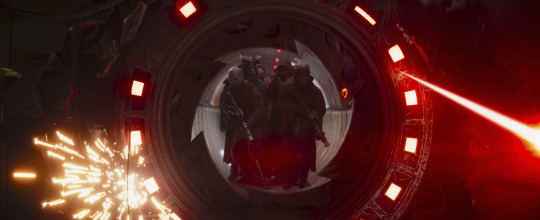
Skeleton Crew - This Could Be A Real Adventure and Way, Way Past The Barrier Thoughts
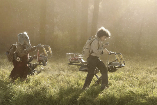
"Since the fall of the EMPIRE, the NEW REPUBLIC has maintained order.
And yet, remote hyperspace routes are increasingly plagued by piracy.
These PIRATES boldly brand their armored hulls as a sign to all ships.
Surrender or die...." The opening crawl of Skeleton Crew
The first two episodes are such a fun and refreshing open to this new Star Wars adventure. The editing in this show is top notch and full of personality. The child actors did an amazing job of selling the four kids as kids in the Star Wars galaxy. The high number of aliens in this show also really refreshing.
That opening space battle goes so hard, especially the transition from the title crawl (I'm loving how the live-action shows since Ahsoka been doing this) to the action. The action sequence is shot really well and I love how the visual effects look.
Mick Giacchino did an amazing job with the score with the kid's theme and the pirates' theme. I can't wait to see what else this man cooks in the rest of the episodes, especially with the piano.
Captain Silvo is pretty much Jude Law's character, Jod Na Nawood (at least one of his many, many identities).
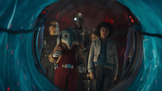
Brutus being a Shistavanen is such a good choice. Such great alien prosthetic work. It was also some good continuity to see Vane in the show, given the focus on pirates.
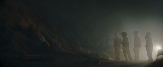
I like how Wim is a deconstruction of wanting to have a classic SW adventure and believing in the classic SW tropes. As he'll see over and over again, the galaxy is not as idealistic and happy as the stories make them out to be. But I also feel with his desire to do something more and different, especially in that scene when he looks at Neel's family and his own reflection. I hope Wendle, Wim's dad, gets further exploration in the forthcoming episodes.
Nell is the best. That boi must be protected at all costs. The prosthetics for him and his family are so amazing. He seems to have a problem with asserting and standing up for himself. It's both funny and cursed that his siblings are watching footage from the Holiday Special lmao. Fern is a bit of a brat, but she's also dealing with a mother who expects a lot from her. She tries to escape that as much as she can while trying to live up to her expectations. She also is the most level-headed of the group. KB is the most intelligent of the group but also seems to long for more in life. Her fascination in the creatures in the pirate spaceport and absent mindedness at the creatures suggest interests beyond technology. I want to know about KB about why she's given cybernetics and where her family is.
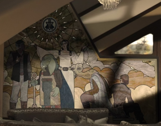
I also wonder what the mural in Fern's house means for the history of the world and the story of the show.
The production design is very impressive and I really like the electronic devices used in the show, especially how Wim uses his to look at images of the Jedi.
I always had a feeling that At Attin was pretty fishy based solely on the suburbs, lmao. They seem to have a false utopia of sorts with all the predetermined career tests (the US Department of Education would love them lol), especially toward whatever the "Great Work" is. I wonder if the Great Work mentioned by Fara is related to Soh's Great Works.
I also like the nod to how some Jedi Temples can arise from underground and arise plus the Atollon and Aldhani mentions are nice nods to the larger Canon.
I like a theory that the Barrier could be a hologram of sorts.
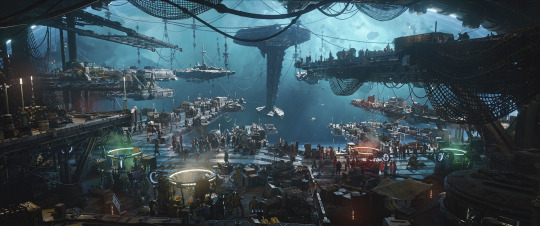
The Onyx Cinder is such a cool ship design. SM-33 (Nick Frost) is such a fun pirate droid with some kickass fighting choreography. His introduction in the red lighting is also really cool. I hope we get to see more of his antics and character in the show. Port Borgo looks so fire, and God, the visual effects for the pirate port and this show are so amazing. It blows Ahsoka's visual effects out of the water. A Teek being the driver is a fun nod to Ewok: The Battle for Endor. I also find it interesting that everyone thinks their world is not only considered a myth and doesn't exist but is full of treasure. I also like that the Theelin brothel worker wanted to help out the kids and get them back home, tho it's very understandable why Fern is distrustful of her, given the nature of the port.
The fact the kids literally know nothing that's commonplace and normal to the galaxy means most of At Attin (since they had droids from the galaxy, I wonder if the general public doesn't know about the galaxy but only a few in govt know) didn't hear anything of the Skywalker Saga. Oh God, that's going to be a depressing story to tell the kids (especially Wim on Order 66) and At Attin's public about how the galaxy went to hell for decades.
I love that rat (Snowball) that lives in SM-33's empty eye. I also like how Wim refer to Old Republic credits as dataries just as Qui-Gon said when referring to credits in The Phantom Menace. I wonder how insane the exchange rate between Old Republic credits and New Republic credits is.
I wonder what Jod's backstory is since Jude Law confirmed he is an actual Force-sensitive and not pretending to be one. Realistically, I think he's just a Force-sensitive who is posing as a Jedi to the kids. However, I feel like there could be more to his story since Law mentions we'll be learning a lot about his character in Episode 7. If he was a Jedi, I like to think he was a Jedi dropout and then using the Force subtly to rise in the pirate ranks. I hope Jod gets some character development if he is going to try to manipulate the kids at first (mainly because I like Jude Law and hope he gets to do more Star Wars.
Otherwise, these two episodes is such a great start to this show.
"The distance between us and the key...is an illusion." "Jod Na Nawood"

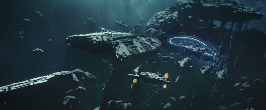
#star wars#skeleton crew#star wars skeleton crew#sw skeleton crew#skeleton crew spoilers#mandoverse#this could be a real adventure#way way past the barrier#sw wim#sw neel#sw fern#sw kb#brutus#sm 33#sm-33#jod na nawood#silvo#sw vane#my original post
30 notes
·
View notes
Text
TMNT: COLOR CODED Casey Jones
colorcoded au by @camilieroart
im so sorry, it doesn’t really look like him, but I tried 😭. I chose a skating pose, but it took me wayy too long to realize that none of the official drawings of Casey have him in skates, so i just followed those. I also tried to combine his normal clothes with his battle outfit bc i just couldn’t decide which one to draw him in
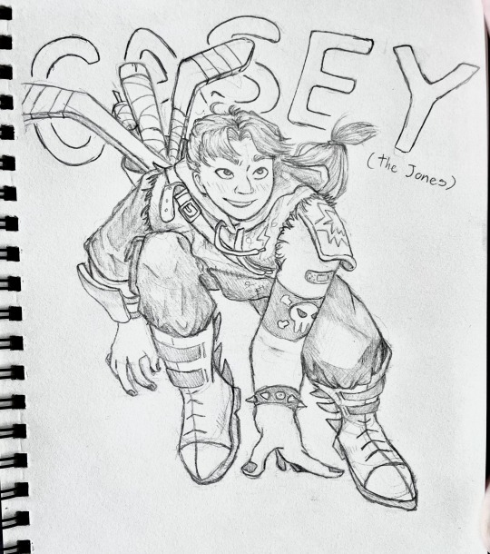
I literally have SO much to say about this Casey! this little rant is probably gonna go on for way too long lol (feel free not to read)
props to @camilieroart for writing this amazing au bc ive been obsessed ever since i saw it in passing on instagram.
Casey has always been my favorite tmnt character. Ever. Hands down. There was something about him that I just adored. As a kid and even now. That being said, finding a version of Casey that was so much like me was like an early Christmas. I was already sucked in to the AU since like, last year when I found it for the first time. But I only recently read through Casey’s backstory and found out that he was korean, which only made me double down on how much I loved his character in Colorcoded.
(I really hope this next part doesn’t come off as narcissistic, its really just me full of admiration for this character and AU)
It was incredible to see a version of my favorite character like EVER (not even joking) that looked a lot like me and came from a background a lot like mine. Beyond just his skin tone being dark and matching mine (which I think I commented about already) this Casey seriously feels like looking into a mirror of myself from a few years ago. Both visually and mentally. It’s refreshing to see Korean characters that aren’t reduced to the asian standards of beauty, but still look like their ethnicity, because we absolutely DO exist. From my darker skin color to even my wide nose shape which I share with this Casey, I was told constantly as a kid (by other koreans mind you) that I didn’t ‘look korean enough’. So it’s nice to see those features that made me so insecure growing up presented in someone I admired during that same period of time. Even Casey’s hair looks so much like the cut I had/was forced to get (lol) growing up, down to the M shaped bangs. Though I wasn’t allowed to grow out my hair like Casey has in the back, it was something I always wanted to do as a kid. I even got into ice skating BECAUSE of Casey, like, I adore him so so much.
Though I’m lucky enough to have a family much healthier than Casey’s, I still found myself relating a lot to him in terms of his Korean-American identity. Growing up, my parents wanted me to learn as much English as possible as opposed to Korean, but they switched mindsets when it came to my younger sister (Yeah! i’ve also got a younger sister too, and by just EXTREME coincidence, she also has a similar sounding name Hae-in 해인) so she speaks a lot more Korean than I do. I still struggle a little bit when speaking conversational Korean, even though it’s technically my ‘first’ language lol. My family even calls me by my english name and my sister by her Korean name. I’m not sharing my legal name online, but i’ve got the same deal as Casey where I’ve got an English legal name, but also an unofficial korean name which was REALLY surprising to read, because literally none of my korean friends have the same name situation. Beyond little nit-picky things (that don’t even count as mistakes, really) in his conversations with his sister, you got the Korean conversations down really well (like, the cadence and grammar and stuff, idk how to explain it, but it really sounds like a conversation i might’ve had with my little cousins, just translated)
TLDR: i absolutely ADORE this Casey and I see just SO much of myself in him. He is wonderfully written as a character and you nailed his korean-american identity to a T (according to me and my personal experiences at least)
SORRY FOR THE RANT
:)
#tmnt#casey jones#colorcoded#tmnt colorcoded#colorcoded au#tmnt casey#tmnt casey jones#teenage mutant ninja turtles#casey
46 notes
·
View notes
Text


Reality+ (2019) - Dir. Coralie Fargeat
In an era where digital self-enhancement is becoming the norm, Reality+ delivers a sharp and timely exploration of augmented identity. Echoing the thematic core of The Substance, the film navigates the psychological and ethical dilemmas of technology-driven self-perception but offers a more hopeful resolution.
At its heart, Reality+ is a meditation on authenticity, self-worth, and the fragile boundary between illusion and reality. The protagonist, whose inner conflict unfolds with quiet intensity, is exceptionally well-cast, bringing a relatable vulnerability to the role. His journey feels organic, avoiding exaggerated melodrama in favor of a more subdued, introspective approach.
Visually, the film is striking. The scenography is sleek yet understated, evoking a near-future world that feels both familiar and unsettlingly plausible. The production design smartly balances minimalism with technological sophistication, reinforcing the film’s themes without overwhelming the narrative.
Where Reality+ truly succeeds is in its ability to provoke thought without resorting to heavy-handed moralizing. Rather than painting a purely dystopian vision, it suggests that while technology may reshape our perceptions, it does not necessarily have to strip us of our humanity. The ending, rather than leaving the audience in despair, offers a glimmer of optimism—a refreshing divergence from the genre’s more cynical tendencies.
Polished, well-acted, and thematically resonant, Reality+ is a compelling sci-fi short that lingers in the mind long after the credits roll.
#film#aesthetic#movies#reality+#coralie fargeat#the substance#cinema#art#artists on tumblr#film photography#filmedit#cinematography#filmgifs#cinephile
13 notes
·
View notes
Text
Review of Mickey 17 (2025)
Mickey 17 is a visually captivating, thought-provoking film that explores the complexities of human identity, technology, and the unknown. Directed by Bong Joon-ho, this sci-fi masterpiece blends emotional depth with stunning visuals, creating a narrative that's as touching as it is intriguing.
One of the standout aspects of the film is the palpable chemistry between the characters Mickey, played by Robert Pattinson, and Nasha, portrayed by Naomi Ackie. Their dynamic feels organic, with their relationship grounded in authenticity and emotional resonance. Both Pattinson and Ackie give stellar performances, bringing their characters to life with layers of vulnerability, strength, and compassion. It's truly a testament to their talent.
The central concept of Mickey 17—the idea of "printing" a human—adds a fascinating ethical dimension to the story. The notion that humanity can be replicated, and the consequences that come with it, raises questions about identity, morality, and what it means to truly live. Bong Joon-ho directs with a delicate touch, letting the story unfold at its own pace while maintaining an artistic, almost meditative, quality throughout.
A pleasant surprise for me was the way the plot avoided typical sci-fi tropes. I initially expected Mickey 18 to be the antagonist or for Timo to take a darker turn, but I was relieved and impressed when the director chose to explore the humanity still present in these characters. This direction feels more optimistic, subtly challenging the viewer to reconsider how we view not only ourselves but also the beings that might exist beyond our world.
Another highlight is the film's take on extraterrestrial life. Mickey 17 flips the common narrative about aliens being hostile invaders. Instead, it suggests that with the right communication, even the most alien beings could become allies. This refreshing perspective fosters a sense of hope and curiosity rather than fear, promoting a message of understanding and connection.
The only slight critique I have is the design of the aliens. While their appearance as creatures resembling tardigrades or caterpillars is unique, it did remind me a bit of District 9’s insect-like aliens. It would have been interesting to see a more distinctive approach to their design, offering something truly original in how we envision extraterrestrial life.
Overall, Mickey 17 is an extraordinary film that combines artistic direction, strong performances, and a rich, thought-provoking narrative. Bong Joon-ho's storytelling continues to captivate audiences, and this film is no exception. If you're looking for a sci-fi film that challenges expectations and invites deep reflection, this one is a must-see.
#movieaddicts🎬#cinephile#movie review#mickey 17#bong joon ho#robert pattinson#naomi ackie#mark ruffalo#toni collette
16 notes
·
View notes
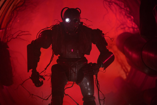
Note
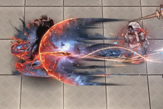
OK but when you're free of all the other obligations and able to do it can we get the Ines skin writeup anyway because I liked the Eine Variation one and why do they keep giving Caprinae ops skin like this do they just hate goats at hypergryph or what
Okay so I got this ask a month and a half ago and am just now getting to responding to it. In that time, I got a job as a professional VFX artist so my opinion means double what it did before. So that's fun! Respect me and bow to me, peasants.
I wrote a massively long writeup here and then my page refreshed and I lost all of it twice. Let's speedrun this shit, alright? (She says, immediately writing a 5 page unhinged rant.)
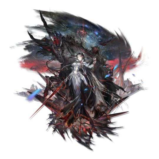
This skin sucks because of the exact opposite reason Eine Variation does, it's just too fucking detailed for its own good.
...Also what the fuck is that in the background is that a goddamned alien spaceship has anyone else noticed this?? This is a bloodline of combat skin this is canon does ines just fight aliens at some point what the FUCK?
Anwyay VFX in the readmore.
Deploy animation. I hate you. I hate this. I hate it.
It's rare I get to see an entire skin's mistakes in microcosm like this! That's fun!
This is so detailed that it actually ceases to have any real shape or identity. This doesn't look like shadow, because skins can just. Change character lore to make something look cool yes I'm still mad. Is it stars? That would explain the weird yellow dots, and there are stars in the art. Fire? No, it's not actually fire, there'd be fire here. Burning fabric? It only looks like that if I squint and zoom in, but I can't... think of anything else.
The colors are so awful. The way that there is a hard line between the dark lavender and the scarlet which then fades into orange is. A choice. I would not have made. At all. In any way. Ever. At any point. Also the random dots of yellow are very funny because they are so clearly just random pixels of yellow. Some of them even aren't in the orange, so they're just like, highlights that have decided to break out of the highlighted areas. Did they.. want this to look like her burning dress? In which case, why are they.. blue? Her dress is black with orange embers, I don't GET IT.
Also small thing but it has a drop shadow, but like. She's literally in all black until she fully appears. And the swirling ribbons are dark-colored. There's no worry about them not standing out against a light background. Is that just supposed to look like she's surrounded by shadow if that's the case then why isn't the rest of this shadow AGH.
This looks weirdly... JPEG compressed??? Like, you can kiiinda see it in the big version, but if I shrink this down to phone resolution...
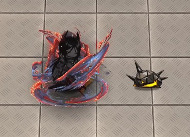
GOOD LORD SHE'S BEEN DEEP-FRIED.
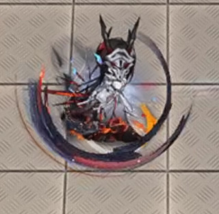
S1 is good. I like it. It's simple, elegant. Good use of colors, and I think the impact looks great, good use of red and orange to create visual interest. Not gonna bother to screenshot it, it's not that interesting NEXT
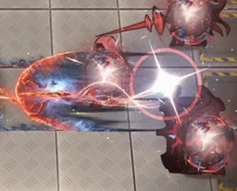
S2!
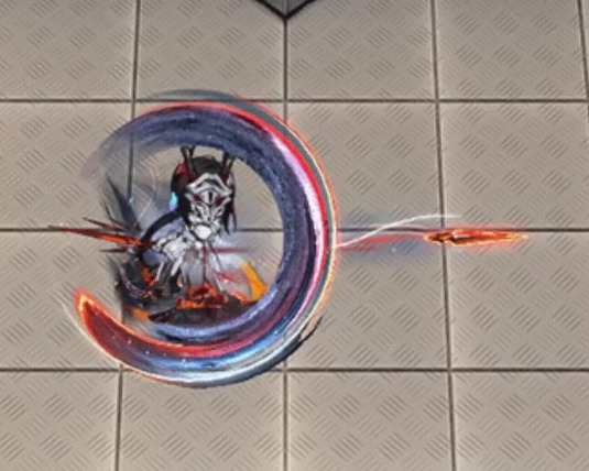
Stop it. Stop it. Put a few colors away. I am counting 8 distinct colors in this one swing alone, and then two more for Ines herself. Stop it. That is too many colors. Add less colors.
I don't even see what the colors are there FOR. Are they selling the tip of the swing? That's not right, because the red highlights start at the tip, then swirl inwards until the red is in the inner part.
I do actually think this one is a lot better at actual resolution.
It's still too detailed, and that detail ends up being crunched and not really... serving any purpose in the grand scheme of the effect, but I do think it is... better. It makes it more clearly light on the outside, dark on the inside.
Also I hate the ends of this swing. I hate it. Why is one a perfect circle that's been stretched out and the other end a rectangle that's fading out. Why is that how you did this. This effect looks like two different swings that have been stapled together like goddamned Catdog.
BUT WHEN IT FADES IT HAS AN INKBRUSH LOOK SO WHAT IS THIS EFFECT.
Why not lean into the burning dress look? Have it be a black trail that like, burns away when it fades? That would be STUNNING, anything but. Whatever is happening here. Mrgrgr okay fine it can't get worse right
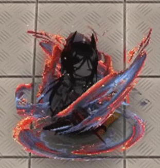
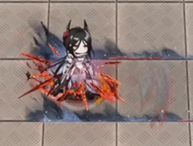
DEAR READER. I PRESENT. S3. THE CULMINATION OF EVERY SINGLE PROBLEM.
So this IS a stars theme after all. This IS stars? Just wanna make sure we're all on the same fucking page here.
Dear reader. I hate this. So fucking much. This may be, and I do truly mean this, the worst piece of VFX I have ever seen in any game. This doesn't read as a piece of VFX in an anime game, it reads like the background of a YA fantasy novel's cover.
The nebula doesn't move. It's static. It is clearly just a jpeg. It's not even doing the Chowder screen-space orientation thing. It's just. There. Inescapable.
The comet itself just. Ends. It doesn't fade out or taper. It just. Stops. There's barely any anti-aliasing here. It's just a hard line between the comet and the background.
Ines herself is surrounded by identical dark lavender and orange energy, so there's no visible difference between the effect and herself. Sure. It's not going to be onscreen long anyway. Who cares.
The center of the comet is bright white as if it's the highlight of the effect, but it's... it's off-center?? so it's ultimately... Highlighting something. is it highlighting the sword? Is it supposed to be a haze that shows you the sword? But it doesn't look like it because it took me 15 minutes while writing this to realize that the sword was there at all because it's the same orange color as all the other highlights and so it gets eaten. If your highlight color stops drawing my eye, then you've fucked up because that is literally what a highlight color is supposed to do. Where am I supposed to look at this thing, where is the focus, the shape?
It's even funnier that the blade leaves a little cartoony goofy team rocket blink when it leaves, before immediately turning into whatever public domain NASA star image they're using for the comet. A real glimpse into what it would look like if Spiderverse sucked ass. (I do like the blink itself tho, a small little blue haze to add color and contrast against light backgrounds, smart touch.)

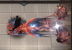
Explosion sucks. Suddenly they decide the palette is something entirely different. Where did the yellow come from. Yellow isn't even on the art. I guess when your palette is that big, you can change them up how you want. I would actually like this effect if it was slightly less detailed and in a skin that had actually used this pallette. It reminds me a bit of Specter the Laurentina. But with this level of detail and these colors... This somehow looks more like a YA book cover. A Sword of Goats and Stars. Fuck me I hate it.
I almost like this buff uptime indicator, It's just that the red from the swords fades into the orange on her dress and makes the whole thing muddy. Also she has an actual roiling flame behind her LMAO GET DUNKED ON HOEDERER THAT'S RIGHT I WILL DUNK ON HIM EVERY TIME EVEN THIS PIECE OF TRASH HAS ONE UP ON THE HOE LMAOOOOO
(In fact I actually... think this might be a recurring texture? It looks familiar, but I can't pin down from where. This is a bad screenshot for showing it but I'm not bothering to get a new one. This is my mental breakdown and I get to choose the visual aids.)
Anyway, maybe I'm being mean. After all I'm criticizing an effect for being too detailed when I am actively zooming in and looking at the details. So let's shrink down to the resolution of my phone just to see how it would-
Ah.
Final Ouroboros VFX ranking: A jpeg compressed photo of a wizard airbrushed on a van / 18 Originium Prime. Actually wait no that sounds too cool. Uh. The wizard is also racefaking. Now it's no longer cool. Nailed it.
#arknights#arknights vfx breakdown#emphasis on breakdown again#I don't have as personal a vendetta against this one as I do Eine Variation#but I do think this one is genuinely bad#Shame. Ines would have crushed it with an actual skin
49 notes
·
View notes