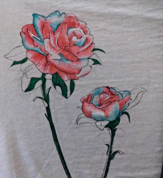
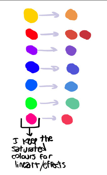
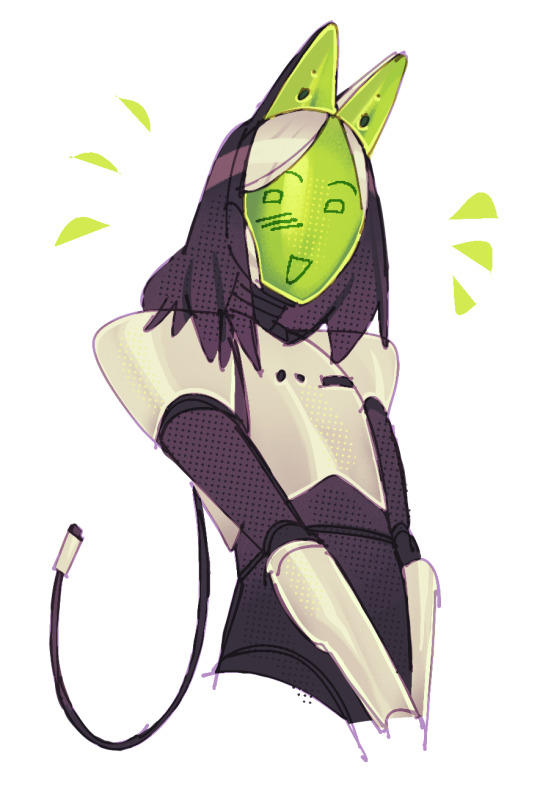
#wanted to make something with more solid/saturated colors
Text
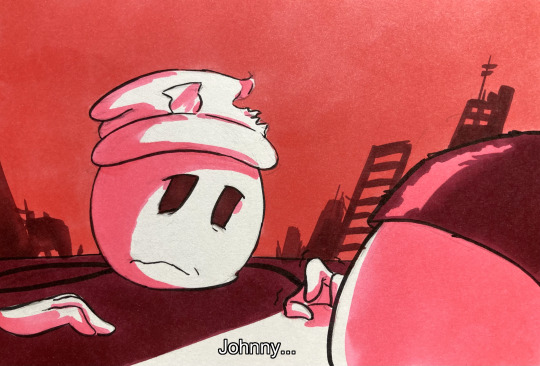


I'm so scared.
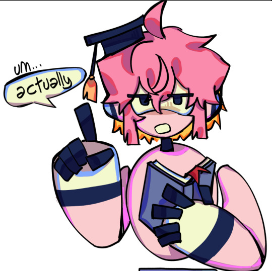
#thsc#art#comic#the henry stickmin collection#thsc dave panpa#thsc johnny panzer#comic i've had in my head for a little bit#wanted to make something with more solid/saturated colors#wasn't originally gonna make a third panel. but i reread 'of thunder & lightning' by kimberly wang#and got inspired to add that as well!
95 notes
·
View notes
Text
wip 😁
#rex.png#svt#kpop#llaonkim on ig u saved this album design#hm. alcohol markers came out rlly dark and saturated. but overall color scheme is consistent#am missing a lighter.. true svt pink.. also a solid tan color... or a nice yellow...#alas. do i want to go to joannes/michaels or something..#not rlly#although!!!! my tutor literally did ask if i would make her one!!!!!!!!!!!!#so i would like more accurate colors#but ... if its gonna look obvi hand drawn maybe the diff colors make everything seem more intentional#instead of me not wanting to spend money#i will just ask tho
1 note
·
View note
Text

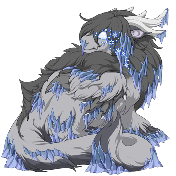


Color Guide for matching Festival Genes + Primal Eyes
Now i want to say this is not meant to be some definitive guide. These are just my attempts at matching colors as closely as i could find with what's available on the color wheel currently. Some of which were quite tricky to find a good match for (or is maybe not even the best use for the gene, looking at you Crystalline...). Will list the colors used for the scries above, but I'll also have some notes for some other similar matches or other color ideas. Overall, this was just a fun little project to work on as the genes released, and maybe some will find some use from it ¯\_(ツ)_/¯
Light: Sanddollar (Flaxen is a very close 2nd, if you want a very slight warmer color. Banana could also pass, but i find it a little too dark compared to the eyes)
Lightning: Robin (This one's tricky since the color IS the lightning rather than the outline, but Robin is bright enough to give the illusion of being white with a matching blue outline. Aqua is a close 2nd, but again is a little to dark in comparison)
Fire: Sunshine (Saffron if you want darker, more orange fire. Marigold if you want a lighter, more yellow fire. Sunshine is the middle ground of these two. All 3 of these match very closely, so up to your personal preference here)
Arcane: Bubblegum (Matching to the little runes. If you want to match to the eyes themselves, Orchid is the closest match without being too dark in color)
Plague: Vermilion (Berry if you want something less egregiously bright. But i do think Vermilion is technically a closer color match, tho both are very close. If you want a color flipped match, Chartreuse matches the colors pretty well, or Crocodile is you want a similar pallet but less bright (and also has a slight bit more red to it's accents). Bonus color: while it doesn't really match the eyes, Red has a very good Plague-y vibe, if you're a fan of the red+green aesthetic)
Earth: Pumpkin (This one has been the most difficult one to match with all the colors going on with both the eyes and genes. But it leads to a bunch of potential options that just kinda almost match. Ultimately tho there's not really a perfect match for these, just go by your own preference. Ginger matches close for a solid color match. For multi-toned picks, some other good options are Caramel, Peach, Ivory, Seafoam, and Cream. Sadly there's not really any colors that adds more pink secondary tones. (also as an added bonus for these: if you want to match with the geode currency used for the festival: teal, ultramarine, and splash are some good picks)
Ice: Eggplant (Indigo if you want just a very slight more saturation, but ultimately the two are nearly indistinguishable from each other. if you want some really dark blue ice in the same hue, Sapphire works well. If you want a lighter ice color: Sky, Periwinkle, Twilight, and Storm are the closest without going just full on white)
Shadow: Grape (Royal or Violet for a more subdued color, tho i find them a little too bright. The strong highlights on this gene make it tricky to match perfectly, especially when we don't have many darker purples as is. But at the same time, you really can't go too wrong with most of the purple range with this gene, it's just a matter of preference)
Wind: Peridot (Not much to say about this one. This color is incredibly spot on. I guess, if you want something a little darker, Pear matches the darker tips of the eyes)
Water: Cornflower (The whole Lapis-to-Sky range works here, for varying degrees of saturation and brightness, but i think overall Cornflower has the best balance out of all of them? (it looks the closest on adult dragons at least). Idk, this one's really tricky too xP And i am once again painfully reminded that we don't really have any good super vibrant colors in the sky blue range T___T All the closest colors are either too green or too faded. Also as a bonus option: If you want a foamy look, Ice and Pistachio work really well for this)
Nature: Orca (I initially thought Peridot would win this one, but then Orca came out of nowhere. Peridot's still another good option tho, the flowers are just a little more on the green side than the ones on the eyes (but they do match with the actual 'eye' part of the eyes). Also for a bonus color, Pearl also looks really nice paired with nature eyes, even tho it does have a lot of purple in the vines. the leaves and flowers still match really well. And as far as i can find, there's not really a good way to match the vines to the vines of the eyes, since that parts seems to stick to darker colors and browns)
#flight rising#scrying workshop#cobalt speaks#long post#sorry i do a lot of rambling here ;^^#maybe some peeps can find better color matches for some of these than i could#but i had a lot of fun putting these together!
354 notes
·
View notes
Text

Thank you @cobbbvanth for asking me for this; I’ve never been more flattered! ☺️ I’ve only been making gifs for a little more than 2 years, so I’m really still only figuring Photoshop out, and my colouring owes everything to other people’s tutorials (some of which can be found here). To be honest, I was only asked some tips, but I have no clue what to include and what to leave out; so, here’s my complete (if random) colouring process.
NOTE: This is a colouring tutorial, not a gif-making one. The tutorial that taught me everything I know about that (and to which I am eternally grateful) is this one by @hayaosmiyazaki.
I. SHARPENING
My standard sharpening settings are:
One Smart Sharpen filter set to Amount: 500 | Radius: 0,4
A second Smart Sharpen filter set to Amount: 10 | Radius: 10
One Gaussian Blur filter set to Radius: 1,0 and Opacity: 30%
One Add Noise filter set to Amount 0,5 | Distribution: Gaussian
II. BASIC COLOURING
This is the part where I add most of the adjustment layers available and just play around with them. Obviously different settings work for different scenes, but I do have some standard ones.
Brightness/Contrast
I usually up the Brightness to +10-30, and the Contrast to about +10.
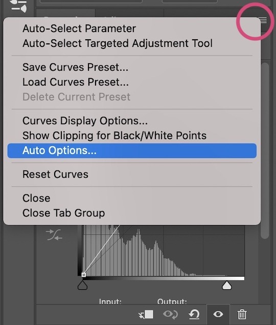
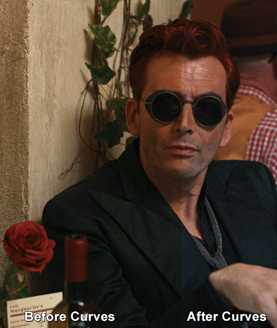
Curves
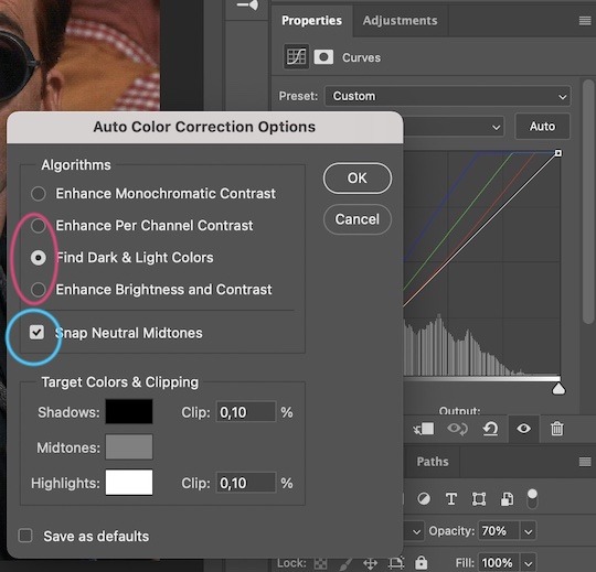
For the first Curves layer I go to Auto Options > Enhance Brightness and Contrast, and then adjust the opacity until I’m happy.
I might repeat the above step if the gif still looks too dark to me.
I add another Curves layer, I go to Auto Options and this time I pick either Find Dark & Light Colors or Enhance Per Channel Contrast, and check or uncheck the Snap Neutral Midtones option, until I see something I like. I will then adjust the opacity.
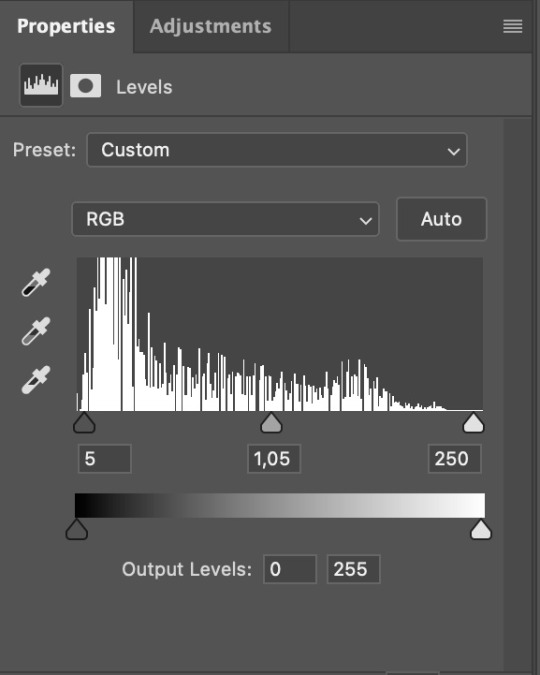
Levels
I add a Levels layer that usually looks something like this:
Exposure
I add an Exposure layer, where I usually set the Offset to around -0,0010.
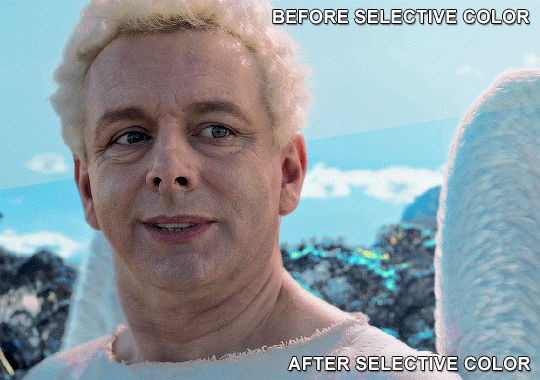
Selective Color
To make the faces look okay, I create a Selective Color layer, select the Reds and usually add some Cyan (+10-20%) and play around a little (±5%) with Magenta and Yellow too. I might also add another layer, select the Yellows and make slight tweaks there too.
III. FUN COLOURING
About colour manipulation: PiXimperfect just uploaded a tutorial that explains everything so much better than I ever could, so I highly recommend you go watch it. It’s made for static images though, and things are more complicated with moving images, so I also recommend @elizascarlets’s tutorial.
The reason I usually go for a softer colouring is that a more vivid one requires a lot of patience and precision, and I honestly can’t be bothered. Instead, I try to tweak the colous only a little, so that the edges can be a little rough without it looking too wrong.
One thing to remember is that each gif is different, and there isn’t one foolproof way to do this, so you will need to use a different technique depending on the gif you’re working with.
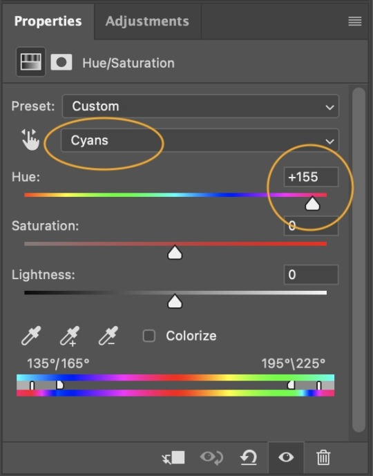
Okay, so, after I’ve decided what colour I want my background to be:
1. I create a Hue/Saturation layer and change the greens, cyans, blues and magentas to that colour. That’s easy enough, since it doesn’t mess with the face colour. I then set the blending mode to Color. If your background doesn’t include any yellow or red, you might be done here, like in the case bellow:
2. To change the yellows and reds, I create a new Hue/Saturation layer, select the yellows/reds, move Saturation to 100 (temporarily) and then play around with the sliders until the face colour isn’t affected. I then change it to whatever I’ve chosen and change the blending mode to Color.
3. If for whatever reason step 3 doesn’t work (the background is white or black for example, or just too red), I might create a Solid Color layer set to whatever colour I want, set the blending mode to Color and then select the layer mask and carefully paint with a soft, black brush over the people’s faces/bodies. I will then lower the Opacity, to whatever looks smooth enough. If there’s a lot of movement in your gif, you might have to use keyframes (see elizascarlets’s tutorial linked above). However, my main goal is to avoid using those; that’s why I try my hardest to tweak around as many Hue/Saturation layers as needed and not have to create a solid color layer.
4. Once my background looks the colour I want it, I might add a Selective Color layer that matches my background color and then try to make it look more vibrant. For this Aziraphale gif below for example, I’ve selected the Cyans and then set Cyan to +100%, Yellow to -100% and Black to +60, then created another one, selected the Cyans again and then set Cyan to +20 and Black to +20.
5. If the gif has a white area, I create a Solid Color layer with a colour that matches the rest of the background and then set the Opacity low. I might also create a Selective Color layer, increase the Black and then play around with the colours.
IV. FINISHING TOUCHES
I create a Vibrance layer and set the Vibrance to around +30 and the Saturation to about +5.
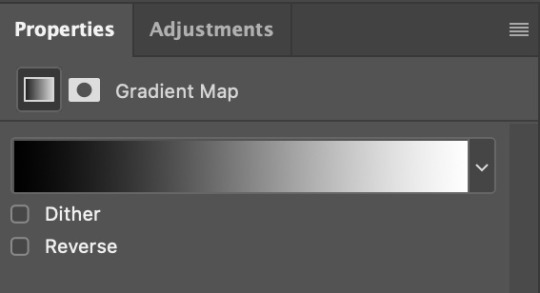
I create a black and white Gradient Map layer (with black on the left end of the spectrum and white on the right), set the blending to Luminosity and the Opacity to about 20-30%.
AAAND that’s about it I think! This ended up way too long and perhaps a little incoherent. I tried to make it as general as possible, so you might have to mix and match for best results. Feel free to ask me for further explanations about any one of these steps, and please tell me if you want me to go through the colouring of a specific gifset (although, as I said, I'm by no means an expert). Happy gifmaking!
#gif tutorial#allresources#completeresources#dailyresources#photoshop tutorial#chaoticresources#uservivaldi#userdanahscott#usersanshou#userfanni#userbuckleys#userrobin#tuserjen#userdavid#userzaynab#tusermimi#thingschanged#tuserju#usertj#userhallie#tutorial#minee
283 notes
·
View notes
Note
how do you make your colours so scrumptious... that's a vague ask but it's like, how do you make the colours mash together well and make sure they don't clash against eachother. And when you do designs, what inspires you to make your agent ocs outfits or do you just make them because they look silly.
hmmm... no.1 i stay away from pure black and pure white. i always use an off-white and a dark desaturated color of whatever i'm using, as well as for when i use grays. here's an example vv
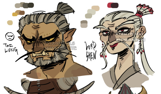
^^ all of the colors on my tai lung come from yellow hues in various shades (if that makes sense). same with my lord shen. the red is a reddish-pink, and the black is, of course, a desaturated and darker shade of the red

i tend to stay in the middle area here, i don't really like to use bright or very saturated colors. another example is when i choose an ink color for marina, i don't use something that's TOO bright, but going for something a little darker to pair with the primary color of her tentacles and her skin
now, here's my chameleon vv
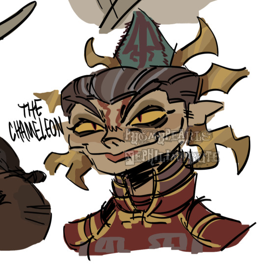
her colors were a little difficult to figure out, but i'd say they work together somewhat...they all fall into the category of being desaturated and such. mainly warm colors with the exception of the green, but i made the red a little pinkish/purpleish so it wouldn't contrast as much
it REALLY depends on the character but most of the time my lighter colors will be less saturated, and for darker colors they'll be saturated. this obviously varies, like with undead characters all of their colors would be a little more muted
i also have a theme i keep in mind for my colors. like with my fantasy marina, i think of olive or yellow-green. the only colors that i don't change (often) in the palette are the skin tones. another example is my young craig design, i think of the sepia filter and...old looking colors? like grayish browns and yellows and stuff like tha.t...i dunno
the main way i learned how to color is actually by coloring...normally? the colors all looked weird and had such contrast, but i'd overlay another layer on top with a solid color, set the blending mode to multiply, and lower the opacity. sometimes i'd do this with the mono color filter instead of a solid color
i also take inspiration from other artists! wolfythewitch is one of my biggest inspos for art in general, great coloring and anatomy. if you're looking for an artist with saturated colors that pop, check out bigskycastle!
now onto the second question...if you mean their uniforms..yeah i just went with whatever looked silly. (OLD ART ALERT ERR ERRR) cap3's uniform is intended to be a few sizes larger since it was most likely supposed to be for val before she got fired. and she wears pants instead of shorts since she wants to cover up a lot
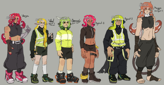
not much is different with maggie. other than the fact that she's wearing a uniform too small for him and it ended up looking weird
but if it's for outfits in general i just scroll through the lists of gear on inkipedia and pick whatever i think the character would wear
98 notes
·
View notes
Note
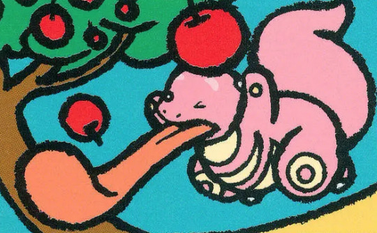
Lickitung line review

Lickitung is fairly forgotten about in the grand scheme of things, but I do like it quite a bit. The tongue thing is super in-your-face obvious and is a very unique theme (it also might be vaguely based off of an akaname yokai).
But what makes it work for me isn't just that it's a weird abstract creature with a tongue—it's that it's a very organic, cool-looking creature with a tongue. I love how its very vaguely salamander-esq in the face but is also bipedal, with a huge tail that mimics the tongue. It feels like something that could exist, and I always enjoy those kind of designs.
The stomach markings are also pretty interesting; it's an usual pattern that I don't think any other Pokemon sports, and they add a lot of shape to the body. Color-wise, pink is an obvious choice, and the cream works well to accent it. I do wish the pink was a bit deeper or more saturated as it feels a bit washed-out, but otherwise, this is a solid weird tongue thing.

Lickitung also had a beta evo design in the Spaceworld Demo. I like the rolled tongue, mustache, and markings... but the way it's some kind of Indian snake charmer(??) feels uncomfortable, and the body shape needed to change more.

Speaking of evos, Lickilicky is also as a weird tongue thing, but unfortunately it's not particularly well designed. My favorite thing about Lickitung is, as I just said, that it feels like an actual animal—but Lickilicky is anything but. The completely circular body, perfectly straight tongue, and stubby legs make it feel more like a toy.
But my other issue with it is that it doesn't really feel like a progression of Lickitung. Lickitung's thing is, surprise, the tongue, so you'd expect the tongue to be longer or more prominent in the design. Instead, it's shorter. Yes, it can presumably extend to be longer, but why would you de-emphasize the most important part of the design?
Similarly, the markings are reduced down, making them once again feel like a regression instead of a progression. They at least attempted to add something with the markings under the chin being more bib-like, but that's not enough to make the entire design work. Also, the wi-fi markings don't add much at this point and they would've worked at least a bit better in white.
You want to know an easy fix for this problem? Make Lickilicky the pre-evo. It feels weird to imagine Lickitung evolving into Lickilicky, but a Lickitung surrounded by little baby Lickilicky? Adorable! It would also make sense with things like the bib and the little curl of "hair" at the top.
If there's one thing I can give Lickilicky, it's that it at least has better colors than Lickitung. That, and the :P expression is kind of fun. Otherwise, though, I don't think this one works much at all.
(I also have to give a quick shoutout to @inprogresspokemon's Lickitung evo. This, to me, is a much better direction at all—it emphasizes and doubles down on the tongue paralysis thing and it still has a very organic body shape.)
Anyway, overall, Lickitung has a strong theme and a nice abstract design that conveys said theme well, but Lickilicky feels like a step backwards and would've been much better as a pre-evo. Maybe consider putting an everstone on this one.
262 notes
·
View notes
Text
"Depths of Despair, will soon come rooting out."
A warning that shan't be ignored. For it's far too dangerous.
Deja vu
Part 1, Part 2, Part 4


—n—i—a—t—r—e—c—n—U—
Primogems is the most voted!

Ability: Charming Fate★
With this current ability, you are able to charm people rather easily. And if you're talking with your awakened acolytes, you'll charm them in no time! But be wary, because the more you talk to people with visions or delusions or any element, the more you lose yourself. You'll lose your mind in hysteria. It'll give you a new life!
It felt so unreal. So painfully true.
You see yourself, mourning a beloved.
They died from war. Correction. He died from war.
Was it your father? No. It can't be. You don't live in Teyvat. You never did. You have no memories of this world. You didn't belong here. You were never here. Never ever.
But who was he? It was child you. Child you was hoping he was still alive and when we found out they're not we were mourning. The place looks a lot like Inazuma.
For some odd reason, the nameless man who the child you is mourning, feels like they were important to you. You felt your heart tighten at the sight. It just felt like it just had happened in your life.
But that's not true. You were never in Teyvat. You never had a life here. You were never meant to be here. You don't belong here.
A thunder strikes you down.
—d—e—t—n—a—w—n—W—
You gaped for a breath of air. Electrifying yet fresh air fills your lungs. And you exhale. You recognize where you are currently. I'm at the Kujou Encampment. The headquarters of the Shogun's Army under the control of Tenryou Commision.
Despite winning against the argument whether you stay to get patched up or you just patch yourself, you still ended up getting patched up by her.
Why did it feel like this was an order? It must have been just you. Cause no way Kujou Sara would do this without it being an order. I think.
Well either way, you were still patched. So you were thankful. Right now, you're thinking what to give back to her, just so that you can ease that one feeling deep inside you of her using that one tiny thing against you. Maybe you could activate her C6?
You look around, you find no one around, you open the screen menu, open the wish menu and see all of the banners are there! It's just like Silly Wisher... you look at your primogems amount and wow that made your jaw drop.
2,684,290 primogems... And it's continuously going up! You convert 300,000 primogems to an interwined fate. And went to a banner that has Kujou Sara in it and pulled 10x.
It turns purple and ah, you hear something outside. You look outside and oh that's so pretty. It was your wishes in the sky!
It's like shooting stars! No it is shooting stars! You see the purple star falling down and the screen appears and it gives you a Kujou Sara constellation. (PS. I still don't have her C6...) A commotion happens because of what you just did..
And for some reason they all thanked (S/M) for it. Oh, she happened to be praying for Kujou Sara's sixth constellation. It was a coincidence.
Well, that's great? No no no it's bad. It's giving more proof that she's an oracle. It should be you, who acts as the oracle. You don't even feel any connection to the oracle! No nothing! You don't even know who she is! She is no oracle, she's a fraud.
You sighed and went back to sleep in the comfortable futon prepared for you.
—n—i—a—t—r—e—c—n—U—
You woke up in cold sweat, another nightmare... It's making me lose my mind.
The way it started off as dark, dull, saturated then with no warning it explodes with solid and flashing colors, hurting your eyes, your brain! It was hypnotizing. It was driving you insane.
You held out a hand and oh. It was, fake.

You walked around, it was heavenly. The more you walk, the more you notice that it drips like water.
How ethereal... How mesmerizing.. don't you just want to stay here forever? In heaven.
The more you stay the more people that'll love you. Stay. Stay for the sake of your beloved followers. Stay like a good creator.
For them.
—s—e—i—r—o—m—e—M—
#genshin impact#genshin sagau#sagau#sagau x reader#sagau cult au#sagau creator#genshin impact sagau#yandere genshin x reader#yandere#yandere x reader#genshin x reader#yandere genshin#reader#female reader#sagau impostor au#yandere genshin impact#genshin
181 notes
·
View notes
Text

Explaining some of my color thoughts and process using this piece and my other recent figure drawings, hope it’s helpful to someone!
Setting up the drawing to color
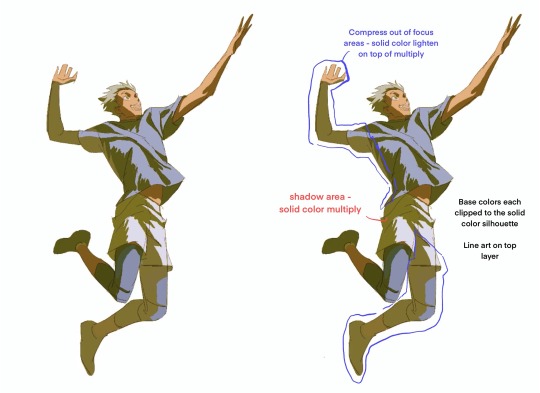
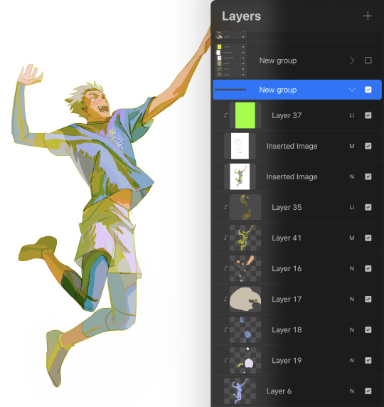
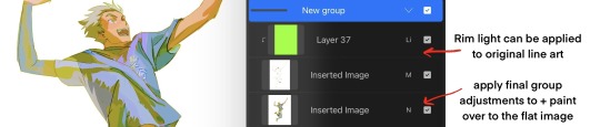
Final drawing layer breakdown from top:
Layer 37: lighten layer clipped to line art below
Inserted Image: line art set to multiply (because it’s non-transparent)
2nd Inserted Image: final drawing flattened (will explain why at last step)
Layer 35 : lighten layer to compress values for elements that receding and out of focus (back arm + leg for example) something like atmospheric perspective
Layer 41: solid color multiply for shadow
Layers 16-19: every element of the same color on it’s own layer clipped to the silhouette
Layer 6: solid fill silhouette
Color picking the base:
This is loosely what I think about rather than a hard and fast rule! This thinking helps me navigate when the colors don’t quite look right and applying a rule usually helps me work towards a direction I like.
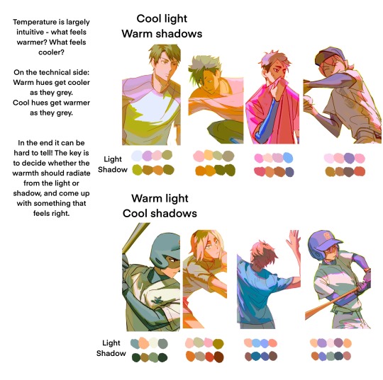
When thinking of the light and shadow scheme:
Temperature: warm light & cool shadow or cool light & warm shadow?
Color schema: complimentary scheme? split compliment? analogous?

When picking the light color base:
Even in the light areas things have a light, medium, and dark local value
I pick colors that read as the right value of the local color at the right temperature for the light:

Coloring Shadow
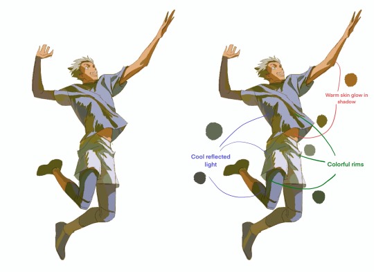
1) Reflected light into the shadow areas - typically I go for a colder and slightly lighter reflected light because in natural sunlight, the main reflected light is from the blue sky. Otherwise think about what the color of the surroundings are and reflect that into the shadow.
2) If the shadow color on the skin makes it look either gray or the wrong hue, true up the color of the shadow by making it warmer and more saturated and add warm reflected light to the shadows around it, such as on the shirt collar
3) Make the shadow colorful - add bright colors that are adjacent to the main shadow colors to make the shadow overall more colorful, and add colors that are closer to the local colors of what’s in shadow (such as blues to the “black” compression sleeves)
Keep value range within the shadow relatively close - as long as the value of the shadow is approximately uniform, the shadow area will read as a shadow
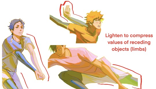
Lighten-layer areas for value compression/”atmospheric perspective”: I adjust the color of the lighten areas so that local colors show through or have a bright accent - it looks nice but doesn’t detract from the focus areas with higher contrast, and gives an opportunity to introduce bright colors.
Even in low value contrast areas, the colors are legible as light vs shadow because they generally conform to the temperature of the light and shadows

Glow - I like to add a bright rim to the edge of the multiply layer in a bright color that indicates the color of the light or local color if it was more saturated i.e. red, orange, pink, gold glow for warm lights, purple, blue, green-ish glow for cool lights
I don’t add this everywhere, just in the parts that I want to stand out more
Hue Variation
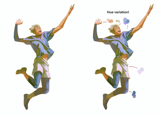
On the base color layers, I add hue variations to add color variety to the lights. Usually adjacent colors but sometimes something completely different to add interest. I can also add this on the lighten layer if I want the bright accent to read as more flat (like the hair accent).
I also add a lighten layer with warm red/orange on top of the line art areas that are in the light to add more glow.
In the end, if there are certain color areas that just don’t look right, I will just paint in the exact color I want on a new layer on top.
Finalizing
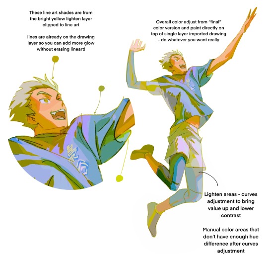
I export the whole image as a jpg when I’m generally happy with it, then mess around with it using color filters like the ones in the iOS photo app edit or whatever else. They end up showing you if you can push the colors brighter, which I like (I don’t always do this but it usually shows me something interesting I can try).
I import the image over the color but under the line art and apply general adjustments to it (curves, saturation, etc). This way you can mask out different versions of the full image to combine versions with different adjustments.
I also select certain areas by themselves and adjust them manually to fine tune aka paint over if some parts don’t look right.
I like to apply a lighten layer to the line art which is on multiply, and use a neon/bright color to give the whole picture a bright rim. It just looks cool but can add a slight bit of new bright color to the drawing along the line art, which is interesting and subtle.
And that’s it so far!
#my art#process#ask questions if you have i'm happy to answer!#i like having my processes written out in detail to look at later…workflow is like it’s own art I’m saving it and moving on to new ones!
1K notes
·
View notes
Text
Brotherly Art
alt. title: Love Is Stored In the Infodump
This is the first of a three part series on Thrawn's relationship to art. He's such a nerd, I love him so much.
-----
People who meet Thrawn often think he’s quiet. People who know him, at least for any length of time, often wish he was.
Thrass understands the complaint, but he doesn’t share it. When his brother gets onto certain topics, the stiff poise and awkward reserve melt away; his eyes shine with more than bioluminescence, and he lays out his opinions with the enthusiasm of a child and the earnestness of a professor. True, no one else can get a word in edgewise. But Thrass has spent enough time in university to appreciate the free dispersal of knowledge by someone passionate about the topic. And Thrawn rarely looks so alive, let alone happy. Thrass wants to see him happy.
“-but in 68 BCA, you start to see a shift in the assembly technique, as though the makers’ perspective on the physical possibilities of their craft has begun to shift. The history books say they didn’t have any contact with outsiders until at least 50 BCA, but I think we can see from the pottery alone that the date of first contact can be pushed back by almost a decade. It shows up in other artifacts, but it’s most clear here that their whole conception of their place in the universe underwent a seismic shift-” Thrawn looks up from the zoomed-in picture of a potshard on his questis and glances at Thrass. “This isn’t boring, is it?”
Someday, Thrass reflects, he’d like to meet whoever told Thrawn his interests were boring. There’ll be an assault charge, of course, but he’s fairly certain he can talk his way out of the worst of it. “Not at all. I like hearing what you think.” His own questis pings. “Delivery’s almost here.”
“Ok. I have to use the fresher anyway.” A look of urgency crosses Thrawn’s face and he practically vaults the couch on his way. Thrass shakes his head. Trust Thrawn to get so wrapped up in a topic he forgets to pee. Thrass gets up to clear the table for their meal and brings Thrawn’s questis with him. When he sets it down, the jolt causes the screen to switch back on. He blinks. Instead of the potshard, the screen is a solid, alarming blue.
“Thrawn, I think something is wrong with your questis.”
Thrawn emerges from the fresher, still drying his hands. Thrass hands him the device.
“It’s gone all blue. If I broke it, I’ll replace it-”
“Oh, no, it’s fine.” Thrawn breathes a visible sigh of relief. “That’s just the lock screen.”
“You set your lock screen to The Blue Screen of Death?” In fairness, it’s not the strangest thing his brother’s ever done. Thrawn shakes his head.
“It’s a painting by Cli’ure’akoio, one of her Color Studies. I’ve got downloads of all her older work, this one’s my favorite. Most people just see skin tone when they look at it, but a blue this saturated and even is really difficult to produce outside electronic media. And look how she applied it, it’s hard to tell here but there are no visible brushstrokes. That’s what makes this picture unique: she’s taken something absurdly simple and executed it so perfectly it’s like she’s daring people to say they could do the same thing, openly flexing on her critics-”
And just like that, he’s off on an extended explanation of the experimental paintings of Cli’ure’akoio.
Later, as Thrawn scrolls through his questis looking for a particular painting, Thrass peers over his shoulder. Most people’s image files are full of family members, tookas, or scantily clad individuals they deny any knowledge of; Thrawn’s is full of art downloads.
“Do you have any pictures you took yourself?”
“Oh, certainly.” He pauses on a blurry picture of a stack of duracrete slabs. “I took this at the sculpture festival last year. I usually stick to downloads, though. I don’t take very good pictures.”
Thrass shakes his head. “Have you ever thought about collecting any pieces yourself?”
Thrawn doesn’t look up from scrolling. “I don’t have the room; I live on a light cruiser. Besides, most of these cost more money than I’ll ever see.” There’s a wistfulness in his voice that only someone who knows him well would pick up on. An idea takes root in Thrass’s mind; he files it away for later.
Thrawn’s shore leave is over entirely too soon, in Thrass’s opinion. He hurries to the shuttle station to see him off, careful not to drop the package under his arm.
He spots his brother on the edge of a knot of CEDF personnel, waiting for the shuttle to blackdock. Thrawn stands outside the chattering conversations of his peers, hands behind his back, waiting his turn to contribute to the discussion. He turns when he sees Thrass approaching.
“I was worried you wouldn’t make it,” he says by way of greeting. Thrass envelops him in a hug.
“Had an appointment I had to keep. Besides, I have a going away present I have to give you.”
He takes the package from under his arm and presents it to Thrawn. By now the others have taken note and gathering around to watch.
“Open it.”
Thrawn strips the wrapping away and stares at the transparesteel case. Then he registers its contents and his mouth falls open. “You didn’t-”
“I told her what you said about her Color Studies. She says she’d be honored to have this piece in the hands of someone who can appreciate it.”
One of Thrawn’s peers looks over his shoulder at the painting. “I don’t get it.”
“It’s one of Cli’ure’akoio’s latest series, Studies In Color and Texture.” Thrawn looks like he’s tearing up. “Each tile is done in a different pigment and brush stroke.” He holds the painting in its case as though receiving a holy covenant. “This is for me?”
Thrass nods. “I had it mounted in a protective case. It’ll be as safe as anything on the ship- probably safer.”
Thrawn meets his eyes, a significant effort for him, Thrass knows. “I’ll treasure it forever.”
“It’s a good start to your collection.” A tone clangs over the loudspeakers, announcing the arrival of the shuttle. “There’s no time now. But when you get home, you’ll have to explain the series to me.”
Thrawn won’t be able to wait until his next shore leave, Thrass reflects as he waves goodbye. His next letter is likely to be several densely packed pages, expounding on the technical aspects and deeper meaning of the work of Cli’ure’akoio, fit more for a graduate level art history paper than a casual conversation.
Thrass can’t wait to read it.
#star wars#fanfic#fanfiction#thrawn#grand admiral thrawn#mitth'raw'nuruodo#mitth'ras'safis#thrass#thrawn/art#thrawn is autistic coded#short fiction
49 notes
·
View notes
Text
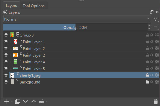
How I color manga panels: a tutorial
I'm no expert at doing recolors, I'm simply an artist who's occasionally too lazy to do my own lineart, and uses that of my favorite mangaka's so I can focus on other styles to simply have fun with my colors. I always try and choose panels or pages that are high quality, to avoid too much pixelization. Often I end up sourcing these from scanners or google images.
As far as programs, I use Krita (a free software). This all can be done with the standard brushes and tools that come with the software. But for some of the coloring, I have brushes from brush packs i like to use, as well as a few brushes I have customized myself. The main ones I use are from David Revoy, so if you want a recommendation for a great free brush pack, that's mine.
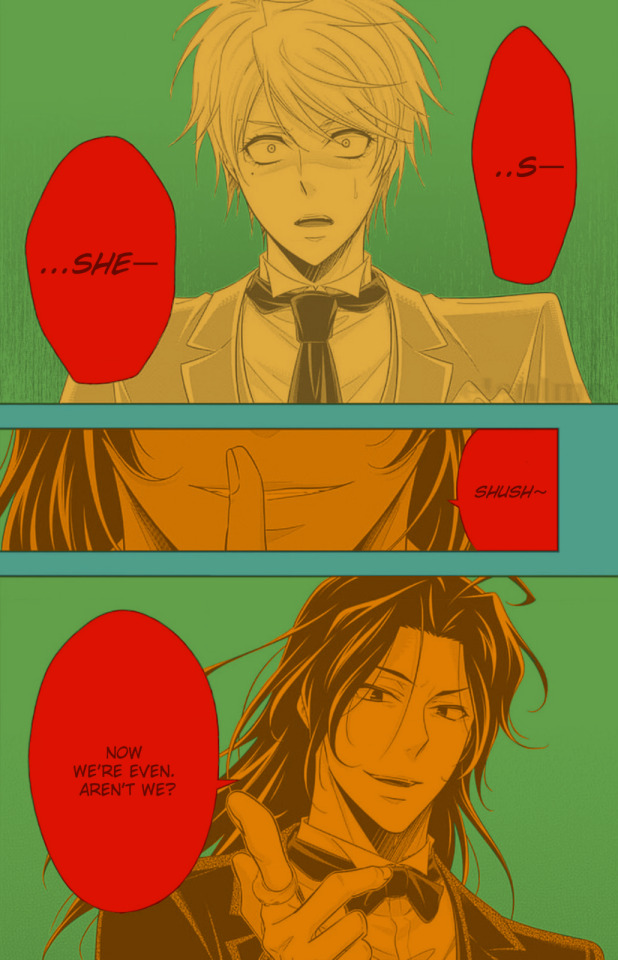
For this example I'll be using this panel from Chapter 58 of Moriarty the Patriot (I believe this would be Volume 15 of the manga) that I posted earlier here.

I'm not including the step where I crop the image, but I personally chose to remove some of the white borders that are needed for a traditional volume's page borders. Since I'm doing digital art, I don't always include them.
My next step is always to outline and fill the individual base layers. This includes the speech bubbles, each character, any independent props, the panels themselves and the backgrounds. There's no correct way to do this, but personally I use a brush to outline the object, then fill tool to well. Fill it, as well as the rectangle tool for the panels or straight lines I need to do.
For layers, I usually put all of these color base layers in a single group that's set to multiply, and change the opacity of the base panel so that I can fill the blacked out areas with a solid color easily, here you can see I was working with the base panel at 50%, but honestly i just kind of turn it down to whatever I think looks good.
The colors I use for this step are usually brightly saturated rainbow colors so it's easy to tell the different elements apart from each other. So you end up with something that ends up looking rather horrific like this:
From here, I usually create a copy of the base panel to put over the top of the colors. This way I can have transparency for the colors on some of the blacked out parts, but don't loose some of the nuance of the shading entirely. Moriarty the Patriot is a very black heavy cell style, which is the style I find the "panel above, panel below" method works best on. However as I work on the colors, I tend to toggle between having it on or off.
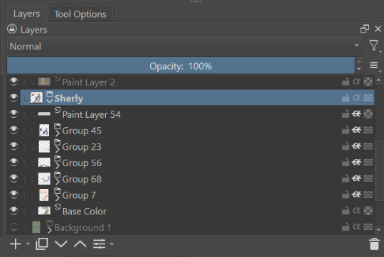
It's about here where I start doing my coloring. Of course this will depend on your coloring style and art habits, however personally, I like to start with the characters. I use those colored layers as the base layer I can clip my coloring layers to.
I will often turn off the layers that I'm not currently using so I don't have to deal with eyestrain, and will change the base layer to something more suitable (often a grey or light tan) so my color theory doesn't get all messed up. The bright colors in previous steps are to make sure they're visually separate. Now they've been established, I don't have to worry about that.

I don't usually label my layers, but for the sake of the tutorial I have to make it clearer which layer grouping is which.
I find in this step because of the multiply layer the colors can be a bit washed out, so I tend to either use much more saturated colors than I usually do, or switch to another layer style like Linear Burn of the overall color group to make the colors pop more. Ultimately though this comes down to personal preference. If your coloring style is very de-saturated, you might not have any problems with it. (I do suggest making your base color white, so the coloring of the base panel isn't off, you'll see in the screenshots above I forgot to when working on Sherlock. Ignore my mistake)
For the parts of the image where it's primarily blacked out (such as Sherlock's hair or coat) I don't bother shading at all, and only do the highlighting, as the black takes care of the darkest tones anyways.
During my coloring, I also add a separate grouping above everything for adding rendering and details above the panels. This includes things like the eye highlights (which I always do in pure #000000 white) and making certain parts of the heavily blacked out areas pop more.
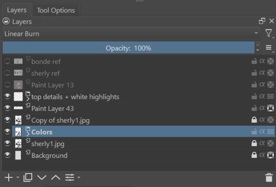
(those refs and paint layer 13 are what I'm using to color pick off of, and keep the shading colors consistent throughout the piece. There's probably a better way to do it, but I just paste them directly into the image and then delete them at the end, paint layer 43 is a color dodge layer, and so has to be outside of the layer grouping to work)
Comparison of the art without:

And with the top details and white highlights:

It's a pretty subtle difference, but I find it's the little things that truly make the piece. Especially with the strands going over the face, they need just a bit more to make them really pop. I also just really like my fancy eyes which is hard to do without the top layer.
Insert several hours of coloring here, and about another hour just trying to figure out what gradient to use for the background, and you end up with the the base colors. From here I usually mess with overlay layers as well to get the colors to all look fancy and nice together without having to do color theory (pro tip /lh).
I forgot to grab screenshots while doing the background, but for the top panel I essentially just used the [deevad 5c screentones] brush and a transparency mask to add a screentone gradient, and totally didn't google "splatter overlay" or something like that and picked something off of google, and added some borders.
Because both the base manga panel and manga panel over the top are both not at full opacity, if there is text in the page or panel (such as this one) I like to copy the just the text part of the panel and add it as full opacity in the "colors" folder to make sure it's legible and matches up the rest of the colors.
And after all that, its basically done. I'll sometimes continue to mess around with certain aspects to make sure I like how it look, but that's essentially it. This is when I add my signature, and then it's queued to post!

#krita#long post#eyestrain#art tutorial#tutorial#digital art#my art#manga recolor#manga edit#manga pannel#manga coloring#sherlock moriarty the patriot#moriarty the patriot fanart#yuukoku no moriarty#moriarty the patriot#james bonde#james bonde mtp#artists on tumblr#art resources#art help#art tips#drawing tips
62 notes
·
View notes
Note
hii sorry if you’ve already answered something like this in the past but how do you shade? ur art is always rendered so nicely and the colors are chosen so well!!
HELLOO THANK YOU! SO let’s start from the basics
when something is white or black you can change that to something else, here’s an example (for black you can just pick any colour and make it darker)

2. if you have space (in the background? idk how you call it) you can put a showy colour

3. colour picking - i tone it down / take the saturation
i dont add lighting unless there's something like glass
separation line cuz its gonna get a bit long
1.
you get your base colours ( i revived my oc for this ) (now after the basics u know where the white, black and [in this case] yellow came from)
2. i hope you know how to use layers
specific art style thing, i dont know what that is
3. if you arent the type of person to stick all the layers of your base colours then CHANGE IT!! for this tutorial
so what you are going to do is create a gray layer, all gray, fill it, the layer has to be on top of the base colour layer
u click that button, it has to look like this
4. you create another layer (above the gray one) (it has to be on the same layer mode with the second button so what you do doesnt go out from the base colors)

then you put your shading, I use red
+ i like to remark around the lineart bc yes
5.
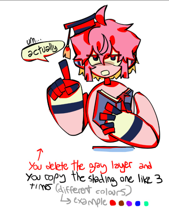
trust me
[extra unnecessary info = a good mix is red + blue, and purple or brown are good on their own (in multiply)]
6.
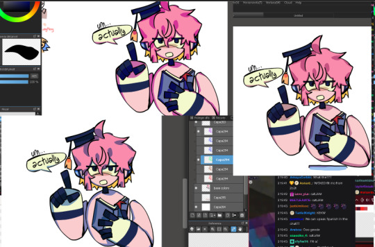
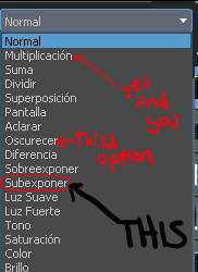
you experiment with the layers, adding or deleting until you like it (i usually dont like if the shading ends up too not-colourful or too heavy) (the modes for these layers are multiply and SUBEXPONER) (I DONT KNOW THE TRANSLATION BUT ITS THIS ONE)
7. once you get what you want you merge the shading layers one per one to the base colour layer, so its all gone, you have all in one layer

8. BORDERS
you make outlines around the shading, in a colour that is more ?saturated? / showy <- you can use these same lines you are doing to just remark what you want (like the speechbubble, bad example but u get it)
in the black color i used (here its darker blue) i didnt use a lighter saturated colour like everywhere else, i used a darker blue
9. SECOND ROUND OF BORDERS
whats the difference between these and the ones from before? in this step your starter color is the base color (in the other you picked from the shading) , you dont go too far to make it outstanding
all of this it makes it more solid
10. AND LAST you colour the lineart (in the same layer mode you used before where what u do doesnt go out of the layer)
very saturated here and i randomly added orange bc reusing colors is cool (since the filling behind the hair was yellow it ended up like this)
edit: i dont like to change much from the outlines, more the inside because i like it when it looks like a sticker
thank u for reading
#art tag#adding in the tags that this is only a way of the many to colour#you can stop at any step#add more#modify anything#i guess what i keep the most is that in the shading there are outlines#also its better to have a grey-darker background colour while picking colours#bc if its white you will be like 'naah these colours are too strong' and you wont dare to try more#tutorial
77 notes
·
View notes
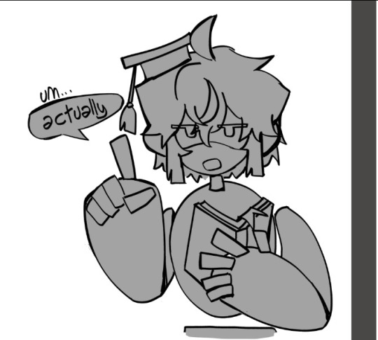
Text
Okay, need to type this out just so I will stop thinking about it, so stay with me for a "why Buck and Natalia won't last based on the use of the blue and green thing with the two of them"
Okay, so pretty much every couple in the show ever is seen in blue and green at some point. Even random couples in calls.


And they are very careful with patterns, we see Hen and Karen with patterned stuff that's blue and green but since their style is build around patterns it makes sense for them to have that in a way that doesn't for the rest of them.
My point is, it's one piece in a solid color. A shirt or a jacket.

Why is that relevant? Well, while Buck and Natalia are wearing blue and green both in the date at the loft and at the hospital, it's not solid. Buck is fully in blue, yeah, but she's in a black dress with green detailing, that's not even fully green.

And since she never takes her jacket off, you can totally see both of them as the blue character.
And I had left it at that until the other day where I was watching 6x18 on my tv and I noticed something (because i am an insane person who calibrated the colors in my tv because i was bored one day)
Please excuse the terrible job lighting this screenshot, I added the swatch to prove my point but if you want you can take the og down there and brightened it and bump the saturation and you'll see I'm not crazy
But the thing is, I thought she was wearing black and he was wearing grey. Until I realized her cardigan is green. Really dark green but green. And once you brigten the scene up, his jacket is blue, but it's patterned.


And there's also the way the shades don't fully match. Like, when bathena, madney and henren are wearing blue and green, they MATCH.


But for example, Buck and Taylor don't. Like, Karen's green looks way better with the blue of the uniform than Taylor's.


And like, here, his green doesn't look as good as it could look with her blue.
And Buck and Natalia? You can fully miss the way they are wearing blue and green in the scene they get together. Like? Everything is on purpose with the costume department, so this is a choice.
Even more when you realize his jacket is blue and green.

I'm sitting here torn between wanting to give the costume department a standing ovation and checking myself into a psychiatric hospital.
Edit: The way she's wearing blue and green in the loft but Buck is fully blue and she's fully green but he's blue and green in the hospital is what gonna make me go crazy. Like? The symbolism of him ready to be all the way in when she's not and then turning that around once she comes back???????????? Hello????????????????
29 notes
·
View notes
Text
Moon Knight City of the Dead Issue 1… why…?
So. New MK side run has begun, the hyped up full on debut of Layla/new Scarlet Scarab in the comics, with a premise that most writers would twist into an epic and breathtaking journey.
We don’t get that here.
And I have a lot of thoughts on why and how I feel so frustrated with what we got. There’s pieces of something awesome, potential to go to some really fascinating places, and yet it is held back in almost every aspect, creating something messy and clunky that makes me mad to read.
(This is long btw)
First off though, some things I did enjoy!
I really love the art and coloring of this issue. The anatomy and movement and shadows, the stylization of character’s faces and costumes, the sprawling city with its deep reds and blues that feel saturated and weighty. It’s great. Besides a few moments that it comes out of left field with some bad stuff (Layla’s whole face at the end or the MK mask w teeth during the memory slideshow like whaTtt is that), it’s super solid and made for a very enjoyable looking comic.
It was also really fun to see Badr for a little. I think it would’ve been cool to get more, and the pacing of things as I’ll get to later sapped his importance in the story for me some, making him feel more like a prop or a plot device to get it going, but overall it was lovely to see him again. And it was cool to see him being a doctor as well, as we haven’t seen that as recently in MacKay! Always a joy my dear sir please come back soon.
The story in concept. Going to the underworld, detaching a headmate supernaturally to journey to a different plane of reality to save one life, and meeting a dead ally along the way is fascinating stuff, an idea that inspires me to want to explore it myself.
Because (and now it’s time to get into the stuff I didn’t like) the writing doesn’t do this idea justice at all.
This is not the worst MK comic ever rn, not their worst writing. It’s not as violently ableist or antisemitic as things like Bemis or making a joke out of MK like some others, but it’s just stupid, and what it glosses over or gets wrong is weird and uncomfortable and harmful in its own right.
To start this isn’t my Marc. His guilt is not one of punishment for penance, of believing he’s sinned and needs to be washed clean by pain. He is a man stuck in bad coping mechanisms and trying to pretend he’s not. He’s a man who hates himself and uses violence as what I would describe as a form of self harm. But it is not with the goal of erasing his past.
Yes, he runs from the person of Marc Spector, he runs from the idea and the responsibility, but Marc doesn’t try to forget. He holds onto things with a vice grip and never lets himself drop it. He believes in his own mythos and is grappling with his complicated and traumatized history to remember he can love and care and trust people again, that the work of making his life better is not solely on his shoulders. That’s what MacKay’s been dealing with.
MacKay Marc is guilty and self flagellating but in a way he tries not to think about, that he brushes over. He puts on an air of confident collectedness and has more hate for Marc as a concept then specifically his actions, and he’s still able to move forward and find a type of momentum and bravado in the MK suit.
Or in simpler terms: yes Marc has guilt. He does not have this kind of guilt.
The first few pages read so strangely, just this over dramatic spiel that feels more like daredevil than moon knight, like a rehashed dramatic intro to a moody sad 90s comic. And not in a good way. It’s not deep it’s just annoying and tedious and the prose is clunky and again, extremely off in its vibes and message. I think it could’ve been alright, if some of the talk of his guilt had been shifted and the narration hadn’t continued constantly throughout the rest of the issue (which I’ll get to later), but as is in its full context it’s just… weird.
In addition to the weird guilt vibes, there’s further issues with the Khonshu religiosity in this.
Khonshu isn’t something Marc worships, he’s something he uses for his own means. He’ll call on him or talk about being the priest of the mission, but that’s because Khonshu doesn’t have oversight, he’s a tool and form of direction and theming, and at the story’s core Marc is the priest for his mission, not this god’s.
At points in this issue he genuinely sounds dedicated though, and it shifts the flavor of earlier pieces more in line with his usual monologuing to seeming more like strange spiritual devotion. Especially calling Khonshu the greatest of great gods, or saying that him being in the underworld is Khonshu’s mission. It changes his actions from that of Marc to that of a real Khonshu follower and its…. Just weird. It’s all just weird and very ooc.
On top of that, there’s no mention or interrogation or even presence of discussing Judaism alongside all of this. I’m not Jewish myself but have had multiple convos around the topic w those who are n who have made their own posts discussing it and can add on more nuance n info to this should they like (bc more thoughts for discussion are always awesome), but just on a surface level it’s strange. It’s strange to have a plot revolving around going to another belief system’s afterlife and not at all bringing up how it clashes or relates to Jewish beliefs. Yes Marc isn’t really actively practicing anymore but I’d hazard Jake probably is, and Marc has still talked about his connection to his faith and how it’s impacted his time as moon knight and serving Khonshu.
The text treats the Egyptian pantheon belief system as the True and Accepted default here, with Marc not even discussing anything about going to an afterlife he doesn’t belong in (and shouldn’t even have) as a Jewish man, or even thinking about how Badr discussing Ka conflicts with Jewish beliefs on the soul and how Neshamah differ.
And yes, Marc works regularly with the very real Egyptian pantheon and mystical systems but it’s in a different way, and under a different context and understanding by readers of his acceptance of it.
A whole other layer of depth, conflict, and exploration could’ve been added by really digging into the theological implications of this plot, of a Jewish soul in the Egyptian afterlife, and yet it’s not brought up at all, not referenced or mentioned and it makes it all feel weirdly out of place, or like stuff is being glossed over.
That, on top of Jake and Steven (not to mention the entire rest of the main mission cast) being completely absent in mention, consultation, presence, or anything just feeds into this strange sense of Pepose wanting Marc to be the idea he has of him in his head, this guilty, sad, and violent merc serving a moon god with not a ton else. And yes again those are all aspects of Marc, but there is nuance to each of those aspects and treating him as a singlet with no thoughts on the conflicts in faith of his present is… just weird.
I don’t know if he’ll be treated as a singlet the whole run, but the fact that the body’s soul being sent into the afterlife has not already brought in any system conflict at all is an issue. Is it their collective soul? Is it just Marc’s? How does this comic understand alter soul distinction? Has it thought about it at all? I mean the answer is no but the thing is it should’ve.
That’s where so many of my issues with this come from though: choices just being… not good. Not thought out or in line with the characters and world. The writing is off and out of place and gOD THE CONSTANT NARRATION IS GRATING!!
I don’t know why it was chosen for Marc to novel write his thoughts and observations the whole issue but it’s bad. It goes past introducing plots or observations that can’t be shown in text to either:
1. Filling space that doesn’t need to be filled
2. Restating what has just been said or shown in a panel (“we have the power of the four horsemen” “wow they just got the power of the four horsemen”)
3. At worst, telling us stuff that was not indicated at all by anything else (“oh I know something is wrong here even though I have not been given enough reason to pique that suspicion” “oh I reunite with Layla and hold her and take her in but haha you don’t see that ig”)
It’s annoying and makes reading things difficult because he’s blabbering on the whole time in places he DOESNT NEED TO!! And it makes the action and emotional movement feel awkward and forced. I don’t need to know every second of Marc’s thoughts Pepose I can parse out things with my eyes I promise you that. Also can he stop talking about penance for TWO SECONDS!!!
The worst part is narration works when done well! When it highlights things that can’t be shown in art or gives some bits of exploration into feelings or exposition, but we don’t need it in every panel. It actually confused some parts of where to look for me by telling me what was about to happen before it did. Stop being like “I thought it was over but—“ JUST LET US SEE ITS NOT OVER!!
Another moment (similar ish to the start) where the narration would’ve worked for me (if it was not surrounded by just more constant narrating monologue) is when Marc first arrives in the Duat. The prose is pretty, it’s vibrant, it describes things the audience wouldn’t be able to pick up from static pictures and helps to set the scene. The only issue is that it doesn’t stand on its own, it’s not an interjection of observations and thoughts, it’s another entry in the never ending cycle of Marc just talking. And it loses some of its luster because of that.
There’s also just a handful of pieces of either dialogue or thoughts that (in the context of Steven and Jake being absent at the moment despite not being absent at the point in time this should be taking place) make me feel very uncomfortable with Pepose’s vibes on their mental health. Some lines that rubbed me the wrong way in context include “The rage fills within me—and suddenly I have a plan. That said, it would help if my plan wasn’t dangerously insane.” “You know me Badr, mental discipline is my middle name.” And a few similar ones I don’t want to reread again for.
They’re just unnecessary man. We don’t need vaguely or directly ableist vibes in words with MK anymore. It works if it feels like it’s coming from Marc’s internalized ableism IE when he was talking about being called crazy during the discussion with Steven and Jake and Jake called him out for it, but when it’s obvious it’s just how the author sees things it sucks!
Stop using insane, stop using crazy, stop being like “oh I’m so good at keeping myself in check,” WE DONT NEED IT!! ALSO THEY R AT A GENERAL POINT OF SYSTEM COMMUNICATION N HARMONY RN!!
Which also just… man this feels like it’s trying to introduce MK instead of continuing an already established and well under way arc. Yea, this isn’t MacKay writing it, but it’s still in the continuity and set up for his run and like… sorry not sorry but I think you should take that context into account if you’re going to be working within it???
Instead the story props itself up by trying to introduce everything at once and Marc feels like he’s starting from the bottom of development.
And speaking of introducing everything at once! Oh boy the pacing!
No one besides Badr is consulted before Marc goes into the Duat, Badr just. Sends him there. There’s no real build up for why there’s a need go that far, for what the threat is or why Marc would go to these lengths so suddenly. Like yeah I know he wants to save a kid who’s a traveler of the night, but like… Others have died or almost died on his watch and he’s never gone to this point before, even though it seems like it’s always something they’ve had as an option. Like… ok ig if Soldier hadn’t been vamped he would just be dead lmao (though also hey! Why and how do souls end up in this afterlife? Do they have to believe in the gods? Do they have to be in some way tied to the pantheon? Is it just where souls go if they’re near moon knight lmaO? If you want to have your afterlife plot you have to do the worldbuilding for it)
And while yes, a lot of this is because This Plot Wasnt Thought Up During Earlier Parts Of Mackay, it also isn’t introduced in a way that feels natural or makes sense.
Events just Happen. Mysteries or drives are just Said without a good basis for why they’re there. Again, this cult was talked about as just kinda a sadistic gang but then they’re a big deal? And oh the kid is dying and oh he’s worth going to the afterlife for and OH WERE JUST HERE NOW and “oh there’s a conspiracy I’ve decided with no real evidence” and HEY FOUND THE GUY and—Suddenly a whole lot of what is happening. God heart full on cult horsemen of the apocalypse memory flashback and BOMBS NOW APPARENTLY and LAYLA and MK BIG PAST BADDIES BOSS FIGHT INCOMING!!
Like ohhhh my god stuff is so rushed and happens so inorganically and with no time to really understand what’s happening. It’s a type of story where my suspension of disbelief isn’t there and it fully just feels like seeing the writer trying to get to the end goal of what they want to write about (moon knight fighting old villains) as quickly as possible. And it SUCKS! Like this genuinely should’ve been more than one issue, there should’ve been at least sOme more build up to gEtting to the city of the dead in the first place, no matter additionally uncovering a plot of some sort happening and Layla turning up.
It’s just…. It’s so rushed and strange and forced and it didn’t have to be and IT MAKES ME MAD IT IS and it’s just not enjoyable to read. It all feels so shallow and stilted and weird, all while having this underlying idea with so much weight, some generally gorgeous art, some moments that could’ve been really awesome, and last but not least…. Literally a good reference to doing a Duat plot well.
This whole mini run is for MCU synergy, bringing Layla in, exploring the Duat and it’s lore, and again yes, the run isn’t done, but it just…. Compared to the MCU plot for the Duat this feels so…. GraaggHhggh. Especially when it comes to system interaction and exploring different painful memories that effect headmates in different ways.
It’s just. It was an extremely frustrating read from both a technical writing standpoint and a character exploration standpoint, and it worries me and doesn’t excite me at all for future issues. Like we’ll sEe but goddamn this is not a good start no matter how it plays out and it doesn’t give me confidence if it turns out I have to read several more issues of this kind of stuff.
Petty nitpicks speed run because there wasn’t enough enjoyable padding for them to not stand out!
I don’t know if Pepose could’ve specified or not but Marc’s not drinking vodka in the opening scene, it looks more like whiskey or something similar by the bottle, again nailing home how strangely off this Marc is from the Marc he’s meant to be with how Mackay has built him up.
Why do they use Duat and City of the Dead like they’re interchangeable titles it’s just the Duat like I get calling it “the city of the dead” since it is that but like. Let that just b the run title they shouldn’t be calling it that like it’s a final name.
They misspell Dr. Alraune’s name lmao
How did the kid get… hurt..? The only point in the opening fight I can think he maybe got hit was with the gunfire but it didn’t seem like that was aimed towards him and there wasn’t any moment of having a detail in the background showing him get injured. And he wasn’t lethally injured at the start so ???
What… is the continuity between the Hydra vs Karnak Cowboys fight we see in MacKay and the flashback here. They were on an empty road there when they crashed? And now they’re in the heart of the city? AlsO bOMBS???
Anyway all I’ll wrap it up with is when the only thing I genuinely smile at is the cameo and namedrop of Apocalypse you know something is wrong with your story lmaO
#moon knight#moon knight comics#moon knight city of the dead#the fruit is talking again#marc spector#mikes mk meta
29 notes
·
View notes
Note
hii!! i was wondering if I could ask what is your usual colouring process? how much time one fully coloured piece and doodle take! I adore your ocs so much they inspire me to draw more myself:3 they feel so alive!
hi anon! thank you vey much, i'm very happy to hear that you feel inspired!
i wrote up a little something for your questions under the cut:
so, first of all, the way i color things ranges from drawing to drawing, especially if i feel like playing around in the process. sometimes i decide to try something out (palette, filter, technique, brush etc) and if i really like how it looks i may recolor the entire drawing lol. point is, there's a lot of sidetracks to my process (especially now, since i'm trying to get used to a different art program than the one i used previously) but the very basics of it are as follows:
1. i sketch and line whatever it is that i want to draw (this might take a while depending on whether i have a solid idea right away or not; in the latter case i might do some thumbnails first to figure out how i want the drawing to look. you can't really see here, but when i line things i usually draw on the same layer as the sketch, and after i'm done i adjust the brightness/contrast settings of the layer to get rid of the sketch underneath. it might seem like i'm just making my life harder this way, especially since this method only works if you sketch with a lighter color (or make it lighter in settings before starting lineart) and your lineart is drawn with a solid opaque brush (which is how i always draw), but it helps me to not get caught up on trying to make the lineart precisely follow the sketch. it also makes changing things on the go much easier, since i only have to erase on one layer.

2. after i'm done lining, i underpaint with a solid color (usually the skin color, but sometimes something random), then block the alpha channel and color over it with flats;
3. i don't color everything at once, instead going piece by piece, which helps to keep the drawing balanced color and contrast wise. i pick a desired area with magic wand and then go about rendering it properly (which usually involves adding some value variance with an airbrush and then laying down shadows/highlights/etc). you can't see this here either, because for some reason i forgot to do it this once, but i also usually lower the opacity of the lineart layer halfway when i color. it helps me concentrate on colors and how they look together better;
4. when i'm satisfied with color, i recolor the lineart to be whatever color i think fits the piece better and change lineart layer settings to either multiply, color burn, or linear burn. after that i just play around with filters, add decorative details, and clean everything up. it's also worth noting that sometimes i starts trying out filters/effects directly while coloring because i want to explore some alternative colors or palettes; i also have a tendency to pick very pale & unsaturated colors so messing around with HSB (hue/saturation/brightness) & depth/contrast settings while coloring helps a lot.
5. cropping it & there you go!
this one took me 1,2 hours. depending on how complex the drawing is it might take me much longer (especially if im working on a commission) so i'd say my average time drawing is somewhere between 2-6 hours. if a drawing takes longer than that i break it apart into several days of work. don't draw for too long! it's bad for your health.
as for sketches, as i mentioned previously, it all depends on whether i know what i want to draw or not, and if i do, i usually just go straight at it:

this one took me 20 minutes. on average, a doodle can take anywhere from 10 to 40 minutes, more if i want to make it look fancy, but at that point it enters the vast limbo between sketch and finished piece.

that's it! sorry the gif quality is really bad, it's the best i could do. here's a video of the same stuff, hopefully in somewhat better resolution
#character: kotya#character: shurik#setting: robot#artist: cbge#askbox#had to cut out footage of me playing with filters bc it was flashing rly bad
27 notes
·
View notes
Note
https://at.tumblr.com/sylvaur/fusion-commissions-i-did-over-the-last-month-some/xpavefljfy3i
https://at.tumblr.com/sylvaur/legendary-fusions/ytuo60c5tt3h
oh! thank you for answering my ask, these were the two posts that got be thinking about it, i was referring to how the soft shading around some of the areas around the characters have a soft glow to them or a warmth that makes it look rendered
I'll use my Vaporeon/Ninetales fusion as an example to demonstrate how I do my glow effects, cause there's SO much going on in the legendary fusion files that it'd be completely incomprehensible to anyone but me probably :'D
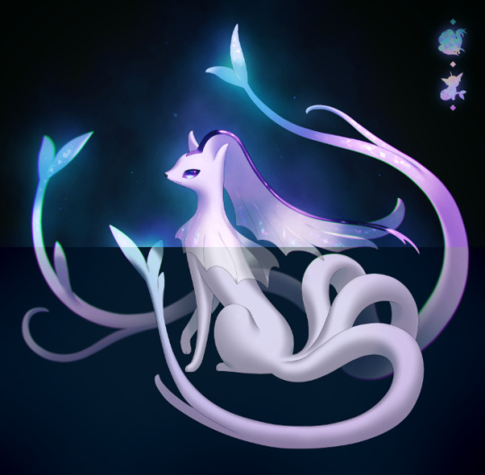
This post turned out LONG so I'm putting it under the cut, but TL;DR - I like to layer a bunch of different glow effect layer on top of each other, incl. behind the subject of the drawing as well as on top of it
So this is my starting point, i. e. the plain drawing of the fusion on a plain dark background. I say 'plain' and not 'uniform' or 'solid' or whatever lmao cause you can see that it already has a faint blue glow in the center that fades into the black edges
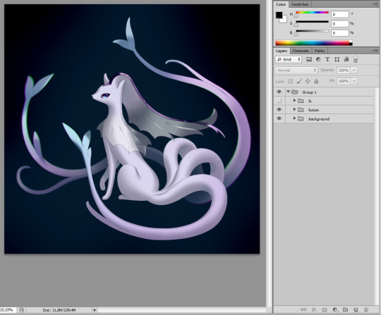
2. I added a stronger color 'haze' in the background in neutral blues and pinks that match the colors of the fusion, and I (mostly) placed it around the focal points of the design, like the head and the ends of the tails. Looking back on it now, I realize I should've probably been a little more conservative with the distribution of this really intense airbrushing cause that would've given me a way more interesting kind of visual depth lol

3. At this point I add a whole bunch of filters on top of the whole thing, mostly to up the contrast and saturation, adjust the color palette and to add the fun scales/frills textures
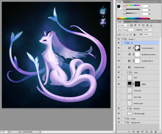
^ you can see the three glow layers i've hidden here so we can look at them more closely now
4.1. If the character features a prominent pale color (which they almost always do), I like to make a layer where I softly airbrush that same pale color on top of where you can see it, so in this case the tails, the ends of the tails, the head, etc. I'll always set this layer on the Lighter Color mode and I'll call it 'color haze' or 'white haze' or 'white glow' or something to that effect


additional example from my Groudon/Kyogre fusion -
4.2. I'll also add a 'Color glow' layer for whatever the character's colorful glowy features are, and for that I'll use a layer mode that creates a lot of vibrant saturation like Hard Light or Linear Dodge, whatever works


4.3. And for this fusion in particular I wanted to emphasize the ends of its tails even further by creating a rainbowy glare to correlate to its aquatic theme
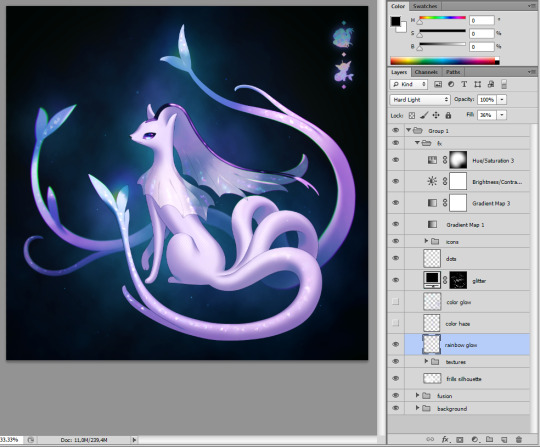
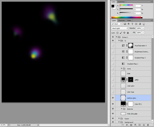
5. And that's about it! Here's all the glow effects stacked together

Hope this was helpful!✌️
105 notes
·
View notes
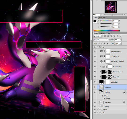
Note
hey!! just wanted to say I really really enjoy seeing your art on my dash especially how shade and the color schemes you use are amazing! if i can ask how do you usually go about picking such good combos and also how do you always manage to always get your art to look so soft and comfortable?
thank you so much for your words!!! ;; sorry this is so late... truthfully, i'm really bad at explaining things, especially with something i have trouble with!
coloring is the thing i spend the longest on while drawing. i usually revise the colors a good 3 or 4 times, and sometimes even post it not totally satisfied, especially they're just doodles. but i think when you have a solid mood you want to achieve with your drawings, it'll come a bit easier.
with more solemn or easygoing pieces i draw on light backgrounds and pile on the dark colors, with unsaturated and colors leaning towards the left side of the pallet. with more energetic or offputting pieces, try with a darker background with more saturated and top left colors.

another thing that i've really wished i paid more attention to earlier is that coloring is hard because it really does play with your mind. looking at the miku pic - you'll find the mud in the red pigment, the teal snakes are actually more green leaning, and her skin and dress actually pretty similar in tone. i made sure to surround her skin with the snakes and her dress with the rock to really make them distinct, and in the places they do meet, making sure the dress is shaded so the flesh stands out. again with the finn picture, the greens are actually more orange and the purples moreso red -- it's just the *surrounding* colors that trick your eye. when you color and paint, you should try experimenting with the other colors surrounding it! opposing colors, such as shading blue on yellow tones, really help your colors pop too.
with doodles i feel like overlays and multiply layers help as a lil cheat to make colors look pretty. it's a double edged sword as they don't exist in real life, but hey, it's a tool given to you digitally so you may as well use it. i've really liked playing around with mspaint recently, as i don't have layers for a crutch, so i have to rely on the coloring tips i've learned.
...i feel like i've talked a lot but said nothing LOL i'm sorry. ;; i hope i've helped, just a little bit! at the end of the day, coloring with experience is the true key. and don't forget to study artists, both the classicals and even your peers. we rely on each other!
24 notes
·
View notes
Last Seen Blogs

donnerndestille
29 / married / m

mileycyrus-confessions-blog
Mileycyrus-confessions
dragoncortex
♡Shy Artist♡

feedthebears-blog1
Feed The Bears

sofiadragon
Dragon Ramblings