#why is flexbox?
Explore tagged Tumblr posts
Visit Tumblr Blog
Explore Tumblr blogs with no restrictions, modern design and the best experience.
Last Seen Tumblr Blogs


Fun Fact
The “We are the 99%” Tumblr blog became the slogan for the Occupy Wall Street movement.
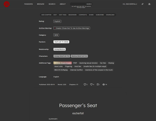
Text
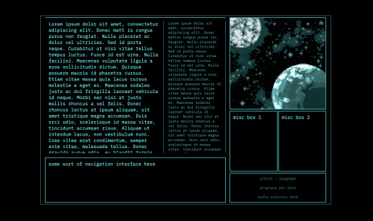
every so often i rediscover css and rediscover why i hate it
#caique posts#i hate absolutely everything about css but if there's one thing i hate more than using css it's not using css#why is flexbox?#it's like a horse. powerful but fragile. most other parts of css are robust but flexbox will just die for no reason even though#you did your all to take care of it#grid layouts (like the one pictured here) are fun to make though
3 notes
·
View notes
Text
i would like to formally inform the developers of html/css: i hate you forever and ever and ever and ever and you are NOT invited to my birthday party. i hope your pet rock dies
#cs50web why... why would you do this to me...#i was but a little fawn and you set me out to die in the stalking woods when i had barely learned to stand on my own flimsy legs...#<-he has to make a google.com clone for his project 0 in cs50web and is Struggling to Center The Damn Divs Relative To Each Other#🌙rambling#wait. why don't i just put the stupid heading inside of the div that contains the form#allow me one moment#will report#// update: no.#// update: i love flexbox
22 notes
·
View notes
Text
there's nothing quite like using ancient code with all the example images broken and for some god forsaken reason they keep putting everything in tables
#writing#rant#html#they're going directly into divs#i dont know why you used a table and i dont care i will not stand for it#im losing my mind over this tho. literally why a table? its the worst structure. yeah its helpful sometimes. i guess.#but literally the only valid usecase imo is for pre-flexbox times#if you're not using it to have an adjustable variable layout what are you even doing with it#literally? just use a div??? what is happening you're not even using the cells theyre just SITTING THERE IN YOUR CODE#benefit of the doubt says they too were working with restrictions and just doing the best they could#judgement says there is no valid explanation for this tomfoolery
9 notes
·
View notes
Text
not gonna lie now that I've mastered flexboxes I don't really get the point of tables anymore. they're just kind of annoying to use looool
#bellspeaks#jokes aside I am aware flexboxes came later along in html's life. which is why they coexist & are taught later then tables#but imo they should just be in the css basics of every html course. they're so fucking useful like oh my god
4 notes
·
View notes
Text
i haven’t touched my neocities in eons so i’m relearning everything..
0 notes
Note
hello. Im steepling my hands like an evil villain. Would you happen to know what the restrictions of the 3ds browser are, exactly? Eg, why most sites don’t work on it aside from ao3? I do neocities and have too much free time.
i think it's largely due to the fact that modern browsers simply have more features. the best way to make a website able to work on 3DS would be to avoid using any modern CSS- avoiding things like flexbox and instead use <table> ect ect.
to do a bit more research, i'd recommend looking into the browser that its based on and what things it can render. (which i linked above)
it's also important to keep in mind that the 3DS will automatically resize any text to be readable, so that could mess up layouts ect.
when making a website for 3DS imagine you are making it for a very low resolution phone.

^ once you're done, then you could add this button to your site proudly ^-^
#i believe you can also call a check to see if the person is viewing on their 3DS so that you can force the website to render differently.#many websites do this for mobile#asks#webdev is my hobby lmao
158 notes
·
View notes
Text
My Neocities!
I'd like to introduce my Neocities page, which I've been building with HTML/CSS.
The splash page features two doors that open when you hover over them, which lead to my other pages. I animated the doors using the CSS "transform" property.
I recently updated this to make it look more like a 3d building, using box-shadow and transform: skewX :)

Then in the Cat Clubhouse, you will find a drag n drop game in which you position cute kitties into a bedroom! (Let me know if you try it out!!!)
The drag n drop function doesn't work on touch screens, unfortunately. I may have to find a clever alternative for non-desktop use.
Upcoming tasks:
Creating a sticky sidebar for site navigation. I don't know why I've been struggling so much with this, but whether using flexbox or relative/absolute positioning, I've been struggling to position things with the spacing and centering I want, and to also make it responsive to smaller screens.
Adding a guestbook using ayano's neocities comment widget (so excited to try this out!)
Uploading my first tribute page. I've been working on something fun and cheeky, and I'll update here with progress!
An About Me page.
Feel free to add me on Neocities [https://neocities.org/site/clubjessica] and I'll check out your site too!
42 notes
·
View notes
Text
Revisiting CSS Multi-Column Layout
New Post has been published on https://thedigitalinsider.com/revisiting-css-multi-column-layout/
Revisiting CSS Multi-Column Layout
Honestly, it’s difficult for me to come to terms with, but almost 20 years have passed since I wrote my first book, Transcending CSS. In it, I explained how and why to use what was the then-emerging Multi-Column Layout module.
Hint: I published an updated version, Transcending CSS Revisited, which is free to read online.
Perhaps because, before the web, I’d worked in print, I was over-excited at the prospect of dividing content into columns without needing extra markup purely there for presentation. I’ve used Multi-Column Layout regularly ever since. Yet, CSS Columns remains one of the most underused CSS layout tools. I wonder why that is?
Holes in the specification
For a long time, there were, and still are, plenty of holes in Multi-Column Layout. As Rachel Andrew — now a specification editor — noted in her article five years ago:
“The column boxes created when you use one of the column properties can’t be targeted. You can’t address them with JavaScript, nor can you style an individual box to give it a background colour or adjust the padding and margins. All of the column boxes will be the same size. The only thing you can do is add a rule between columns.”
She’s right. And that’s still true. You can’t style columns, for example, by alternating background colours using some sort of :nth-column() pseudo-class selector. You can add a column-rule between columns using border-style values like dashed, dotted, and solid, and who can forget those evergreen groove and ridge styles? But you can’t apply border-image values to a column-rule, which seems odd as they were introduced at roughly the same time. The Multi-Column Layout is imperfect, and there’s plenty I wish it could do in the future, but that doesn’t explain why most people ignore what it can do today.
Patchy browser implementation for a long time
Legacy browsers simply ignored the column properties they couldn’t process. But, when Multi-Column Layout was first launched, most designers and developers had yet to accept that websites needn’t look the same in every browser.
Early on, support for Multi-Column Layout was patchy. However, browsers caught up over time, and although there are still discrepancies — especially in controlling content breaks — Multi-Column Layout has now been implemented widely. Yet, for some reason, many designers and developers I speak to feel that CSS Columns remain broken. Yes, there’s plenty that browser makers should do to improve their implementations, but that shouldn’t prevent people from using the solid parts today.
Readability and usability with scrolling
Maybe the main reason designers and developers haven’t embraced Multi-Column Layout as they have CSS Grid and Flexbox isn’t in the specification or its implementation but in its usability. Rachel pointed this out in her article:
“One reason we don’t see multicol used much on the web is that it would be very easy to end up with a reading experience which made the reader scroll in the block dimension. That would mean scrolling up and down vertically for those of us using English or another vertical writing mode. This is not a good reading experience!”
That’s true. No one would enjoy repeatedly scrolling up and down to read a long passage of content set in columns. She went on:
“Neither of these things is ideal, and using multicol on the web is something we need to think about very carefully in terms of the amount of content we might be aiming to flow into our columns.”
But, let’s face it, thinking very carefully is what designers and developers should always be doing.
Sure, if you’re dumb enough to dump a large amount of content into columns without thinking about its design, you’ll end up serving readers a poor experience. But why would you do that when headlines, images, and quotes can span columns and reset the column flow, instantly improving readability? Add to that container queries and newer unit values for text sizing, and there really isn’t a reason to avoid using Multi-Column Layout any longer.
A brief refresher on properties and values
Let’s run through a refresher. There are two ways to flow content into multiple columns; first, by defining the number of columns you need using the column-count property:
Second, and often best, is specifying the column width, leaving a browser to decide how many columns will fit along the inline axis. For example, I’m using column-width to specify that my columns are over 18rem. A browser creates as many 18rem columns as possible to fit and then shares any remaining space between them.
Then, there is the gutter (or column-gap) between columns, which you can specify using any length unit. I prefer using rem units to maintain the gutters’ relationship to the text size, but if your gutters need to be 1em, you can leave this out, as that’s a browser’s default gap.
The final column property is that divider (or column-rule) to the gutters, which adds visual separation between columns. Again, you can set a thickness and use border-style values like dashed, dotted, and solid.
These examples will be seen whenever you encounter a Multi-Column Layout tutorial, including CSS-Tricks’ own Almanac. The Multi-Column Layout syntax is one of the simplest in the suite of CSS layout tools, which is another reason why there are few reasons not to use it.
Multi-Column Layout is even more relevant today
When I wrote Transcending CSS and first explained the emerging Multi-Column Layout, there were no rem or viewport units, no :has() or other advanced selectors, no container queries, and no routine use of media queries because responsive design hadn’t been invented.
We didn’t have calc() or clamp() for adjusting text sizes, and there was no CSS Grid or Flexible Box Layout for precise control over a layout. Now we do, and all these properties help to make Multi-Column Layout even more relevant today.
Now, you can use rem or viewport units combined with calc() and clamp() to adapt the text size inside CSS Columns. You can use :has() to specify when columns are created, depending on the type of content they contain. Or you might use container queries to implement several columns only when a container is large enough to display them. Of course, you can also combine a Multi-Column Layout with CSS Grid or Flexible Box Layout for even more imaginative layout designs.
Using Multi-Column Layout today
Patty Meltt is an up-and-coming country music sensation. She’s not real, but the challenges of designing and developing websites like hers are.
My challenge was to implement a flexible article layout without media queries which adapts not only to screen size but also whether or not a <figure> is present. To improve the readability of running text in what would potentially be too-long lines, it should be set in columns to narrow the measure. And, as a final touch, the text size should adapt to the width of the container, not the viewport.
Article with no <figure> element. What would potentially be too-long lines of text are set in columns to improve readability by narrowing the measure.
Article containing a <figure> element. No column text is needed for this narrower measure.
The HTML for this layout is rudimentary. One <section>, one <main>, and one <figure> (or not:)
<section> <main> <h1>About Patty</h1> <p>…</p> </main> <figure> <img> </figure> </section>
I started by adding Multi-Column Layout styles to the <main> element using the column-width property to set the width of each column to 40ch (characters). The max-width and automatic inline margins reduce the content width and center it in the viewport:
main margin-inline: auto; max-width: 100ch; column-width: 40ch; column-gap: 3rem; column-rule: .5px solid #98838F;
Next, I applied a flexible box layout to the <section> only if it :has() a direct descendant which is a <figure>:
section:has(> figure) display: flex; flex-wrap: wrap; gap: 0 3rem;
This next min-width: min(100%, 30rem) — applied to both the <main> and <figure> — is a combination of the min-width property and the min() CSS function. The min() function allows you to specify two or more values, and a browser will choose the smallest value from them. This is incredibly useful for responsive layouts where you want to control the size of an element based on different conditions:
section:has(> figure) main flex: 1; margin-inline: 0; min-width: min(100%, 30rem); section:has(> figure) figure flex: 4; min-width: min(100%, 30rem);
What’s efficient about this implementation is that Multi-Column Layout styles are applied throughout, with no need for media queries to switch them on or off.
Adjusting text size in relation to column width helps improve readability. This has only recently become easy to implement with the introduction of container queries, their associated values including cqi, cqw, cqmin, and cqmax. And the clamp() function. Fortunately, you don’t have to work out these text sizes manually as ClearLeft’s Utopia will do the job for you.
My headlines and paragraph sizes are clamped to their minimum and maximum rem sizes and between them text is fluid depending on their container’s inline size:
h1 font-size: clamp(5.6526rem, 5.4068rem + 1.2288cqi, 6.3592rem); h2 font-size: clamp(1.9994rem, 1.9125rem + 0.4347cqi, 2.2493rem); p font-size: clamp(1rem, 0.9565rem + 0.2174cqi, 1.125rem);
So, to specify the <main> as the container on which those text sizes are based, I applied a container query for its inline size:
main container-type: inline-size;
Open the final result in a desktop browser, when you’re in front of one. It’s a flexible article layout without media queries which adapts to screen size and the presence of a <figure>. Multi-Column Layout sets text in columns to narrow the measure and the text size adapts to the width of its container, not the viewport.
Modern CSS is solving many prior problems
Structure content with spanning elements which will restart the flow of columns and prevent people from scrolling long distances.
Prevent figures from dividing their images and captions between columns.
Almost every article I’ve ever read about Multi-Column Layout focuses on its flaws, especially usability. CSS-Tricks’ own Geoff Graham even mentioned the scrolling up and down issue when he asked, “When Do You Use CSS Columns?”
“But an entire long-form article split into columns? I love it in newspapers but am hesitant to scroll down a webpage to read one column, only to scroll back up to do it again.”
Fortunately, the column-span property — which enables headlines, images, and quotes to span columns, resets the column flow, and instantly improves readability — now has solid support in browsers:
h1, h2, blockquote column-span: all;
But the solution to the scrolling up and down issue isn’t purely technical. It also requires content design. This means that content creators and designers must think carefully about the frequency and type of spanning elements, dividing a Multi-Column Layout into shallower sections, reducing the need to scroll and improving someone’s reading experience.
Another prior problem was preventing headlines from becoming detached from their content and figures, dividing their images and captions between columns. Thankfully, the break-after property now also has widespread support, so orphaned images and captions are now a thing of the past:
figure break-after: column;
Open this final example in a desktop browser:
You should take a fresh look at Multi-Column Layout
Multi-Column Layout isn’t a shiny new tool. In fact, it remains one of the most underused layout tools in CSS. It’s had, and still has, plenty of problems, but they haven’t reduced its usefulness or its ability to add an extra level of refinement to a product or website’s design. Whether you haven’t used Multi-Column Layout in a while or maybe have never tried it, now’s the time to take a fresh look at Multi-Column Layout.
#:has#ADD#almanac#Article#Articles#back up#background#book#box#browser#challenge#clamp#colours#columns#container#content#course#creators#CSS#CSS Grid#css-tricks#Design#designers#desktop#developers#digitalocean#display#easy#English#Explained
2 notes
·
View notes
Text
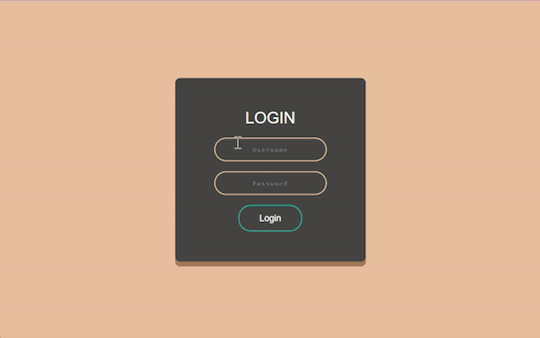
Revamp Old Webpages | #2
Tuesday 17th October 2023
Continuing from yesterday's post on the project, I've working on old website #2 which is called 'Beta-Peach-Brown-Login-Form' or 'Beta' for short! There wasn't too much to change on her (yes all of my projects are girls) visually but just sorted some code structuring! Again, didn't want to change the visuals of the old projects too much as it's lowkey nostalgic to me~!
Also want to highlight what @indigotech mentioned that it is important to go over old projects so see how far we've come. That's why it's important to build as many projects as we can!
Link to project: live page | github repo ♡

🛠️ Issues
✘ switched the positioning method to the flex method to center the form in the middle of the page ✘ click the login button and error appears - attributes to the form tag
🏆 Fixes
✔ Added flexbox in ✔ Added required to the input elements ✔ Responsive on other devices ✔ Added the colours in a :root so no repeat of colour codes

⤷ ♡ my shop ○ my mini website ○ pinned ○ navigation ♡
#xc: project logs#revamp old websites project#codeblr#coding#progblr#programming#studyblr#studying#computer science#tech#dev logs#comp sci#programmer#devlogs
17 notes
·
View notes
Text
Learn HTML and CSS: A Comprehensive Guide for Beginners
Introduction to HTML and CSS
HTML (HyperText Markup Language) and CSS (Cascading Style Sheets) are the core technologies for creating web pages. HTML provides the structure of the page, while CSS defines its style and layout. This guide aims to equip beginners with the essential knowledge to start building and designing web pages.
Why Learn HTML and CSS?
HTML and CSS are fundamental skills for web development. Whether you're looking to create personal websites, start a career in web development, or enhance your current skill set, understanding these technologies is crucial. They form the basis for more advanced languages and frameworks like JavaScript, React, and Angular.
Getting Started with HTML and CSS
To get started, you need a text editor and a web browser. Popular text editors include Visual Studio Code, Sublime Text, and Atom. Browsers like Google Chrome, Firefox, and Safari are excellent for viewing and testing your web pages.
Basic HTML Structure
HTML documents have a basic structure composed of various elements and tags. Here’s a simple example:
html
Copy code
<!DOCTYPE html>
<html>
<head>
<title>My First Web Page</title>
<link rel="stylesheet" type="text/css" href="styles.css">
</head>
<body>
<h1>Welcome to My Web Page</h1>
<p>This is a paragraph of text on my web page.</p>
</body>
</html>
: Declares the document type and HTML version.
: The root element of an HTML page.
: Contains meta-information about the document.
: Connects the HTML to an external CSS file.
: Contains the content of the web page.
Essential HTML Tags
HTML uses various tags to define different parts of a web page:
to : Headings of different levels.
: Paragraph of text.
: Anchor tag for hyperlinks.
: Embeds images.
: Defines divisions or sections.
: Inline container for text.
Creating Your First HTML Page
Follow these steps to create a simple HTML page:
Open your text editor.
Write the basic HTML structure as shown above.
Add a heading with the tag.
Add a paragraph with the tag.
Save the file with a .html extension (e.g., index.html).
Open the file in your web browser to view your web page.
Introduction to CSS
CSS is used to style and layout HTML elements. It can be included within the HTML file using the <style> tag or in a separate .css file linked with the <link> tag.
Basic CSS Syntax
CSS consists of selectors and declarations. Here’s an example:
css
Copy code
h1 {
color: blue;
font-size: 24px;
}
Selector (h1): Specifies the HTML element to be styled.
Declaration Block: Contains one or more declarations, each consisting of a property and a value.
Styling HTML with CSS
To style your HTML elements, you can use different selectors:
Element Selector: Styles all instances of an element.
Class Selector: Styles elements with a specific class.
ID Selector: Styles a single element with a specific ID.
Example:
html
Copy code
<!DOCTYPE html>
<html>
<head>
<title>Styled Page</title>
<link rel="stylesheet" type="text/css" href="styles.css">
</head>
<body>
<h1 class="main-heading">Hello, World!</h1>
<p id="intro">This is an introduction paragraph.</p>
</body>
</html>
In the styles.css file:
css
Copy code
.main-heading {
color: green;
text-align: center;
}
#intro {
font-size: 18px;
color: grey;
}
CSS Layout Techniques
CSS provides several layout techniques to design complex web pages:
Box Model: Defines the structure of an element’s content, padding, border, and margin.
Flexbox: A layout model for arranging items within a container, making it easier to design flexible responsive layouts.
Grid Layout: A two-dimensional layout system for more complex layouts.
Example of Flexbox:
css
Copy code
.container {
display: flex;
justify-content: space-around;
}
.item {
width: 100px;
height: 100px;
background-color: lightblue;
}
Best Practices for Writing HTML and CSS
Semantic HTML: Use HTML tags that describe their meaning clearly (e.g., , , ).
Clean Code: Indent nested elements and use comments for better readability.
Validation: Use tools like the W3C Markup Validation Service to ensure your HTML and CSS are error-free and standards-compliant.
Accessibility: Make sure your website is accessible to all users, including those with disabilities, by using proper HTML tags and attributes.
Free Resources to Learn HTML and CSS
W3Schools: Comprehensive tutorials and references.
MDN Web Docs: Detailed documentation and guides for HTML, CSS, and JavaScript.
Codecademy: Interactive courses on web development.
FreeCodeCamp: Extensive curriculum covering HTML, CSS, and more.
Khan Academy: Lessons on computer programming and web development.
FAQs about Learning HTML and CSS
Q: What is HTML and CSS? A: HTML (HyperText Markup Language) structures web pages, while CSS (Cascading Style Sheets) styles and layouts the web pages.
Q: Why should I learn HTML and CSS? A: Learning HTML and CSS is essential for creating websites, understanding web development frameworks, and progressing to more advanced programming languages.
Q: Do I need prior experience to learn HTML and CSS? A: No prior experience is required. HTML and CSS are beginner-friendly and easy to learn.
Q: How long does it take to learn HTML and CSS? A: The time varies depending on your learning pace. With consistent practice, you can grasp the basics in a few weeks.
Q: Can I create a website using only HTML and CSS? A: Yes, you can create a basic website. For more complex functionality, you'll need to learn JavaScript.
Q: What tools do I need to start learning HTML and CSS? A: You need a text editor (e.g., Visual Studio Code, Sublime Text) and a web browser (e.g., Google Chrome, Firefox).
Q: Are there free resources available to learn HTML and CSS? A: Yes, there are many free resources available online, including W3Schools, MDN Web Docs, Codecademy, FreeCodeCamp, and Khan Academy.
#how to learn html and css#html & css course#html & css tutorial#html and css#html course#html css tutorial#html learn#html learn website#learn html#learn html and css#html and css course#html and css full course#html and css online course#how to learn html and css for beginners
3 notes
·
View notes
Text
heh, just added some lines to a javascript and it didnt break :3c also!!! found a js that maximizes in the browser window!!! it wont resize back to its original size but im trying to figure out how to fix that rn...also still trying to find out how to make my window resizable w/o having to do flexbox bc i have to be real with you...flexbox is the Ugliest and Dumbest way to make a code. its worse than grid and i HATE grid =_= like dont me wrong, i get why ppl use them and i understand it makes sites more accessible, but its just doesnt feel necessary for my code. like its HONESTLY the last resort for me :/
#and like i dont need this layout to be accessible since its resizable. it Is accessible for larger/smaller screens already#like. thats the benefit of resizable#🎆.txt
2 notes
·
View notes
Text
That voice inside your head that says, “Hey, you should write an AO3 skin that fully replaces the default. It will be fun :D”?
Yeah, that’s the devil talking.


I don’t want to know how long I spent on this, even excluding the year-long break where I gave up after realizing I couldn’t use flexbox, grid, or calc. The only reason why I decided to finish it this week was because I forgot that was the case and then I was too stubborn to stop.
Oh, and you bet it’s responsive. Well, responsive in the way that AO3 allows you two breakpoints and no custom media-queries.
It needs a bit more tweaking in some places, but for the sake of my own sanity I want to say that version 1.0 of this skin is finished now.
#the great whine shark#hobbyscream#fanfic stuff#theme stuff#sort of#id in alt text#this was an awful idea. do not do this#i am goign to pass away
4 notes
·
View notes
Text
CAN SOMEONE TELL ME WHY IT'S LIKE FLEXBOX WANTS ME TO KILL MYSELF. CAN IT FUCKING CHANGE WIDTH ALREADY
2 notes
·
View notes
Note
line-height anon! sorry for disturbing, but could you explain (if you don’t mind) why i couldn’t add “line-height” under the CSS class(? identifier??) “.tags”? it already has some properties like height above the tag and font-weight, so it boggles my mind a little when adding line-height did nothing but break the code.
I use flexbox to "hold the tags" and a "gap: 20px;" to keep spacing/margins between the tags. it would only affect the tags container itself. You need to target the links inside the tag container 😊
1 note
·
View note
Text
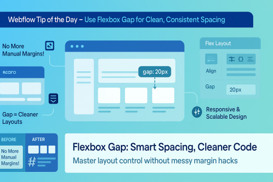
🌟 Webflow Tip of the Day – Use Flexbox Gap for Clean, Consistent Spacing
When building layouts in Webflow using Flexbox, don’t manually add margins between elements. Instead, use the “Gap” property for smarter, scalable, and more elegant spacing.
🔧 How to Use Flex Gap:
Select your Flex container
In the Style Panel → under Layout → enable Flex
Use the Gap field to set uniform spacing (e.g., 20px)
This works both for horizontal and vertical spacing!
✅ Why It’s Better Than Margins:
Maintains consistent spacing across breakpoints
Cleaner code — no messy margin overrides
Easier to manage on large-scale layouts
Improves responsiveness and scalability
💡 Practical Examples:
Equal spacing between buttons in a CTA
Neat rows of cards or feature boxes
Structured menu items in navbars
🔄 Bonus Tip: Use with Grid layout too — Gap is a game-changer there as well!
🚀 Want to build pixel-perfect, responsive Webflow sites like a pro? 📌 Connect With Me:
🌐 Portfolio: www.webflowwork.com 🎯 Upwork: https://bit.ly/4iu6AKd 🎯 Fiverr: https://bit.ly/3EzQxNd
#webflow#freelancewebdeveloper#web design#web development#webflowdesign#webflowexperts#webflowlandingpage#website#nocode#ui ux design#fiverr tutorial#fiverr#freelancing#upwork
0 notes
Text
Best Courses for Front End Development: Build Skills That Bring Designs to Life

When you land on a sleek, fast-loading website or interact with a cool web app, you’re experiencing the work of a front-end developer. These are the people who bridge the gap between design and functionality—translating visuals into code that works on browsers, phones, and every screen in between.
If you’re interested in building user interfaces that not only look great but also function smoothly, learning front end development is a smart move. And in 2025, there’s no shortage of online programs to get you started.
Let’s explore the best courses for front end development, how to choose the right one for your goals, and where to find the front end developer best courses online.
What Is Front End Development?
Front end development focuses on the “client side” of web applications. This means anything users interact with directly:
Layouts, typography, and navigation
Buttons, forms, animations, and transitions
Mobile responsiveness and performance
Accessibility and browser compatibility
A front end developer typically works with:
HTML/CSS – the foundation of any web page
JavaScript – to add interactivity and dynamic features
Frameworks – like React, Vue.js, or Angular
Tools – Git, Webpack, VS Code, Chrome DevTools
Why Become a Front End Developer?
High demand – Every business needs a fast, functional, responsive website Remote-friendly – Freelance or full-time from anywhere Creative meets technical – A great career for people who like visual problem-solving Fast-growing career path – Junior to Senior Developer, UI Engineer, or even Full Stack
Skills You'll Gain from the Best Courses for Front End Development
A strong front end course should help you master:
HTML5 and CSS3 fundamentals
Responsive design with Flexbox and Grid
Advanced JavaScript and ES6+ syntax
DOM manipulation and event handling
Front end frameworks (React is most popular in 2025)
REST APIs and async programming
Git, GitHub, and version control basics
Performance optimization and accessibility
Top Online Front End Developer Courses in 2025
1. NIIT Digital – Full Stack Product Engineering (Front End-Focused Track)
Though it’s a full stack course, the front end module is exceptionally strong.
Live mentor-led sessions + interactive labs
Covers HTML, CSS, JavaScript, React, Git, APIs
Includes capstone projects and GitHub-ready portfolio
Certification + career services included
Best for: Beginners to intermediates looking to become job-ready fast.
2. Coursera – Meta Front-End Developer Professional Certificate
Offered by Meta, this course has a structured path.
Beginner-friendly, self-paced
Strong focus on React and UI design principles
Taught by experienced engineers
Includes certification
3. Udemy – Front-End Web Development Bootcamp
This is a popular choice for beginners.
Budget-friendly, with lifetime access
Covers everything from HTML/CSS to React
Tons of hands-on exercises
Taught by experienced developers
Best for: Self-motivated learners who like learning at their own pace.
How to Pick the Front End Developer Best Course for You
Use this checklist before enrolling:
1. Is the course beginner-friendly? If you're starting from scratch, look for courses that explain both the theory and hands-on parts.
2. Are there projects included? Employers love to see portfolios. Your course should help you build one.
3. Does it cover React or modern frameworks? React is the most widely used library in 2025. Knowing it can land you jobs faster.
4. Is there mentor or peer support? Sometimes, a little guidance goes a long way—especially if you're learning solo.
5. What’s the career support like? NIIT Digital, for instance, not only teaches but also helps you prep for interviews.
Career Opportunities After Learning Front End Development
Once trained, here are some job roles you can explore:
Front End Developer
UI Developer
JavaScript Developer
Web Designer with Dev Skills
Junior React Developer
Freelance Web Developer
You can also use your skills to launch side projects, freelance websites, or even your own startup.
Conclusion
Front end development is an exciting, creative, and fast-paced career with tons of flexibility and growth. But to thrive, you need the right foundation—and that starts with the best courses for front end development.
Look for programs that balance code with creativity, include lots of practice, and help you build real-world projects. Whether it’s through a comprehensive course like NIIT Digital or a self-paced bootcamp online, what matters most is consistency and hands-on learning.
So, if you’ve got a flair for design, an eye for detail, and a desire to code, front end development could be your path to a rewarding tech career.
0 notes