#you paid for it
Text
because i'm getting a bit more messages like this
here's your reminder to
✨stop asking for when Life Mission will update✨
/gen
doing so will just give me unnecessary pressure which ain't good for my mental health which i need to keep decent to make life mission stuff :DDD
it will update when it will update. be patient and don't ask pls :D
#dae talks#i'm not pissed... maybe a little#i can tell a lot that are asking are kids#but damn please don't put unnecessary pressure on me#this next update is already hard to do because of so many new things i need to make#it will be like this for episode 2 and 3#honestly going to be some of the hardest episodes i'm making#all of this is /gen#im serious#unless you're a patron then you are free to ask because yknow#you paid for it
170 notes
·
View notes
Text
Quick question for the people who decide to stand around with crossed arms at a concert: why?
#rambling#went to lordi and so many people stood there looking rather annoyed#why standing there with crossed arms#why are you not moving at all?#you look like you have to give a presentation about a subject you hate#WHY DO YOU HATE HAVING FUN FOR ONCE#YOU PAID FOR IT#at least I and the older woman had some fun#she had the night of her life and I loved her for that!!
3 notes
·
View notes
Text
Oh…. Well, it’s over for Crunchyroll I guess
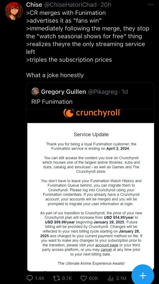
#Crunchyroll#piracy#funimation#money hungry ass streaming service#rambling#I’ve never paid for a streaming service in my life thank god#I appreciated using others accounts but I personally cannot see myself paying this much for a service if I had the funds 😭!#get back to pirating kings!!!#anime has always been one of the easiest forms of media to pirate anyway so y’all got this#CR is definitely not worth paying for though#CR is certainly not worth paying this much for even if it’s a yearly one time fee#capitalism#the fact that CR has always had pretty bad quality as a streaming service anyway#it buffers every time you pause or rewind anything
82K notes
·
View notes
Text
I’m tired of men doing things. a customer at work wants some hats embroidered with his logo, i’m like great so send me the logo. he doesn’t have it but another local company created it for them. he sends me a picture of his hat which i told him our digitizer couldn’t work from. our digitizer said he can’t work from it. so i told the customer to reach out to other local company and get the files. he doesn’t want to because it’s too much of a hassle and yet i can’t reach out to the because i am not necessarily associated with them. so he expects me to find a similar logo online and then create it. there are no similar ones online and that’s not in my job description
#it’s your logo dude#just email them and say hey I need my logo for reasons#you paid for it#they should send it to you#or you should already have it on file#like wtf kind of company can’t get their own logo emailed to them
1 note
·
View note
Text
The leftism/anticapitalism leaving people's bodies the zeptosecond you imply that disabled people who aren't "productive" still matter in society and need to be treated like intrinsic equals who have a place in this world:

#disability#disability advocacy#described images#image description in alt#ableism#ableism tw#my full-time job is my disability and you're lucky that i am still 'productive' as-is#your boss doesn't care that you think you're superior for being hired by them. they're still going to treat you like profit machines#it astounds me how people will capitulate for oppression because they place their intrinsic value in their ability to be at the top...#...or at least 'at the top' compared to others. it's the same impulse that makes people think their cisgender status makes them superior...#...you are placing your worth into systems which not only oppress others but offer you no true sense of worth...#...ESPECIALLY if you're also being exploited (even if just a bit)...#...you have a job sure but... do you actually get treated like a human being? are you actually paid? are you actually safe?...#...if the answer to any of those questions and more is 'no' then why do you place your value in capitalistic production. genuinely.#and why would you DEMAND disabled people to have the same exploitation you experience. why do you DEMAND productivity if you are proletaria#yes being a leftist and anticapitalist are linked but. some people still internalize capitalism without questioning it#being a leftist is about challenging that rather than assuming you're correct i think#also scientists were very silly when describing time that's like. less than a millisecond i think
7K notes
·
View notes
Text
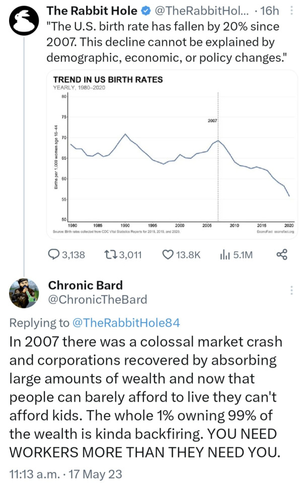
Imagine purporting to be a journalist and saying there were no economic changes after 2007.
#this is why history is important#economics#politics#also why you shouldn't trust paid-for blue checkmarks on the muskrat's birdsite
16K notes
·
View notes
Text
there's something so poetic about coyote vs acme being the thing that causes wb's 'the producers' ass scheme of shitcanning movies for tax breaks to blow up in their face and cause them to turn to the camera, blink twice, and dissolve into a little pile of ash that their eyes fall down into with a little bounce
#to be honest. my partner keeps saying that movies that were canned for tax breaks should be public domain and i agree#we literally paid for them? they're ours now????#anyway i really hope it makes it out into theatres/streaming and i'm glad that the backlash worked#but also like. why shitcan a nearly finished movie that made it to test screenings when the industry's been at a standstill for a year?#where's you buy your intelligence? at the stupid store?
6K notes
·
View notes
Text
public service message that thinking "Maybe speaking up about Palestine is too controversial/political for me to do" or "maybe mentioning good aspects about Palestinians while they're suffering so much is not okay" is exactly the kind of mindset zionists want you to have and have been hard at work for years for people to develope. thank you.
#palestine#current events#free palestine#POST ABOUT PALESTINE TF#POST IN ANY WAY YOU CAN#in case you didnt know this is a PR WAR#They paid billions for PR it's important for you to speak up about Palestine in every fucking aspect of your life so they lose#have a nice day
5K notes
·
View notes
Text
80s anime dubbing is truly a lost art form
#i watched it subbed and then I went and watched it dubbed and it was technically worse but it made me laugh many times so mayb it was better#you probably have seen clips from it already but tbh the whole thing is full of gems#it’s like instead of t he thing where you only get 1 f word per movie it’s like they thought if they didn’t hit a certain quota of fucks#they just wouldn’t get paid#devilman
2K notes
·
View notes
Text
instead of bitching why don’t we all just be thankful ao3 doesn’t have ads xxx
#ao3#respect authors#fan fiction#stop crying bitch boy they’ll update when they’re ready#faith shit posts#fanfic author appreciation#but like genuinely understand what i’m saying here#no ads = no revenue#=authors don’t get paid#and so riddle me this wise guy#why are you whimpering and begging in comments for updates#from authors who are providing you with their work#FOR FREE?!
9K notes
·
View notes
Text
all this blood is on the hands of everyone who decided to ‘stand with israel’ this week, knowingly or unknowingly, every single one of them
#war crime by definition but strangely not being denounced by any western governments who are so interested in calling for peace#does this look like peace to you??? is genocide your definition of peace???#you know anyone who paid attention in history class is recognising these signs#the feeling of helplessness is one that never goes away#it’s devastating#free palestine
5K notes
·
View notes
Text
i hope all video game devs go on strike. not just the writers and actors.
4K notes
·
View notes
Text
I think 90% of my gripes with how modern anime looks comes down to flat color design/palettes.
Non-cohesive, washed-out color palettes can destroy lineart quality. I see this all the time when comparing an anime's lineart/layout to its colored/post-processed final product and it's heartbreaking. Compare this pre-color vs. final frame from Dungeon Meshi's OP.


So much sharpness and detail and weight gets washed out and flattened by 'meh' color design. I LOVE the flow and thickness and shadows in the fabrics on the left. The white against pastel really brings it out. Check out all the detail in their hair, the highlights in Rin's, the different hues to denote hair color, the blue tint in the clothes' shadows, and how all of that just gets... lost. It works, but it's not particularly good and does a disservice to the line-artist.
I'm using Dungeon Meshi as an example not because it's bad, I'm just especially disappointed because this is Studio Trigger we're talking about. The character animation is fantastic, but the color design is usually much more exciting. We're not seeing Trigger at their full potential, so I'm focusing on them.
Here's a very quick and messy color correct. Not meant to be taken seriously, just to provide comparison to see why colors can feel "washed out." Top is edit, bottom is original.
You can really see how desaturated and "white fluorescent lighting" the original color palettes are.
[Remember: the easiest way to make your colors more lively is to choose a warm or cool tint. From there, you can play around with bringing out complementary colors for a cohesive palette (I warmed Marcille's skintone and hair but made sure to bring out her deep blue clothes). Avoid using too many blend mode layers; hand-picking colors will really help you build your innate color sense and find a color style. Try using saturated colors in unexpected places! If you're coloring a night scene, try using deep blues or greens or magentas. You see these deep colors used all the time in older anime because they couldn't rely on a lightness scale to make colors darker, they had to use darker paints with specific hues. Don't overthink it, simpler is better!]
#not art#dungeon meshi#rant#i'm someone who can get obsessive over colors in my own art#will stare at the screen adjusting hues/saturation for hours#luckily i've gotten faster at color picking#but yeah modern anime's color design is saddening to me. the general trend leans towards white/grey desaturated palettes#simply because they're easier to pick digitally#this is not the colorists fault mind you. the anime industry's problems are also labor problems. artists are severely underpaid#and overworked. colorists literally aren't paid enough to do their best#there isn't a “creative drought” in the anime industry. this trend is widespread across studios purely BECAUSE it's not up to individuals#until work conditions improve anime will unfortunately continue to miss its fullest potential visually#don't even GET ME STARTED ON THE USE OF POST-PROCESSING FILTERS AND LIGHTING IN ANIME THOUGH#SOMEONE HOLD ME BACK. I HATE LENS FLARES I HATE GRADIENT SHADING I HATE CHROMATIC ABBERATION AND BLUR
2K notes
·
View notes
Text
It has been very hard to know what to say in the light of all the atrocities we've witnessed in Gaza these last few months, but harder still to stay silent. I'm heartbroken pretty much all the time, but I think we cannot look away; for all that it's worth, I will continue to march and learn and boycott and call for a permanent ceasefire.
Olive trees grow deeper than the occupation can reach. From the river to the sea, Palestine will be free
#ceasefire now#free palestine#zionists will be blocked instantly#if you see a zionist in the wild btw: just block them. 80% chance they're literally being paid to defend is2822l online#and blocking them costs the propaganda department money <3
1K notes
·
View notes
Text
There’s a $500 laptop at the phone store across the street that would let me stream and start making money and building my community again, but realistically I can’t afford to spend that much money in one month, that’s more than my rent.
I know this isn’t the best cause or most important thing ever but I’ve had the same shit laptop that barely functions for 5 years now, and it’s probably going to die soon anyways, in which case I will be completely fucked as I am disabled and can’t make it to most in person jobs, I mostly work from home when I’m employed. Plus you know, there’s that whole thing where my entire life is online and all of my relationships are long distance.
So yeah, if you have a few spare bucks I’d really appreciate it if you could throw some my way. I can also do writing commissions for you for any fandom and premise if that’s something you’re interested in.
My PayPal is [email protected]
If you’d prefer to make a payment through wise or interac e transfer if you’re in Canada please DM me for those details. I can also share my AO3 and some other writing examples if you’d like.
Reblogs are also greatly appreciated!
0/500
#going to try and get a loan from my mother but who knows if she’ll bite#it’s been there for two weeks and I get paid in roughly 10 days#so I’d like to get it when I get paid#it would mean so much#going to set the goal as 500 but realistically even $100 would help an incredible amount#and for my US and UK friends you can give me even a small amount and currency conversion will turn it into nearly double that#mutual aid#signal boost#donations
786 notes
·
View notes
Text

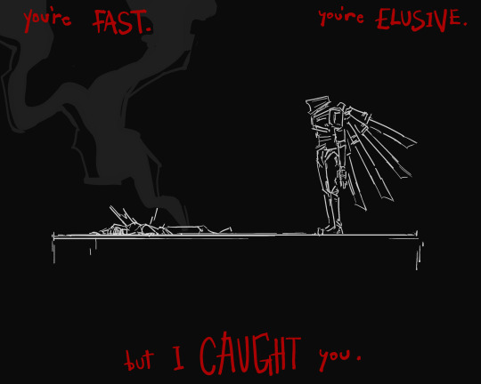
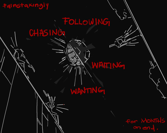
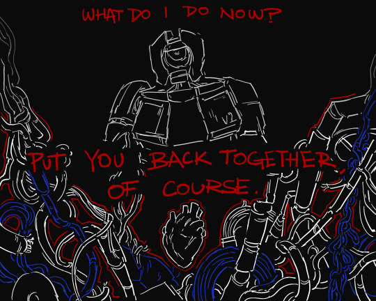
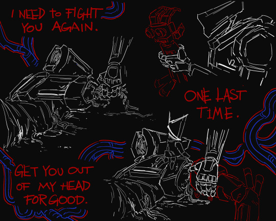


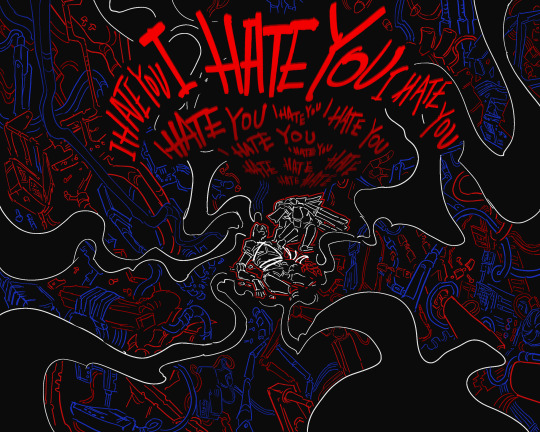
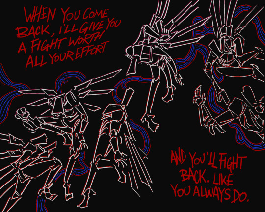
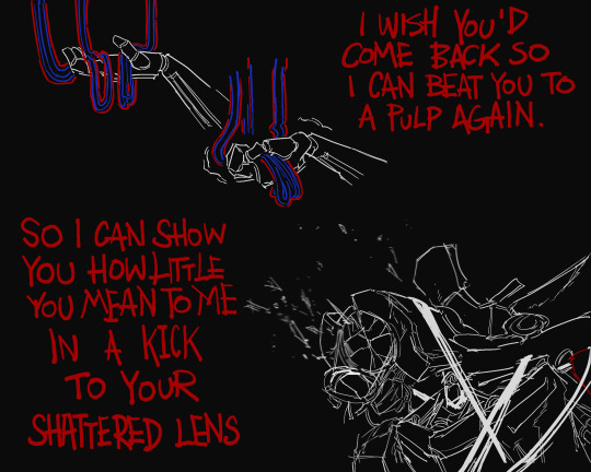
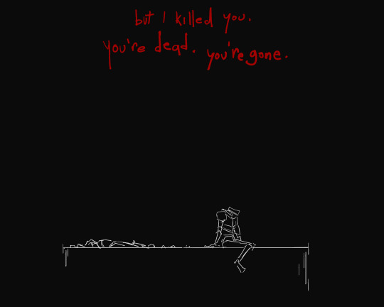
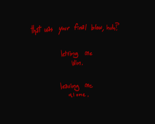
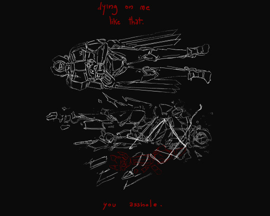
comic about v2 and the goal they'll never fully reach alongside a dissatisfying conclusion. intimate rivalry and all
(alternative ending comic. V1 dies instead of V2 during 4-4. V2 is narrating. V1 is dead.)
#high of victory drops to an overwhelming crushing feeling of what comes next now that youre done#if it wasnt clear v2 is trying very hard to put v1 back together after it kills them. very very poorly. weight of your actions hits#v2#v1#ultrakill#v4v#heavy implied at the very least. see as you will#i realize now that the writing is very disconnected and so are the drawings but bear with me here. do you see my vision#theres something going on between these two that is beautiful but also extremely codependent#at least on v2s end#tried to do those two descriptive pages in a way where it went like. 2 - 3 small details about v1. and then something very specific. some-#-thing theyd only know if they paid close attention to how the other acted or looked#took me a few days to put together and im pretty happy with it i think#feel free to dub or do whatever as long as you gimme credit where credits due#there are many ways to interpret v2 and this is one of them#gen art
3K notes
·
View notes
Last Seen Blogs

mariyamunsey
MARIYA MUNSEY
jillychristmas
the absolutely true blog of jill c.
down-the-yaoi-hole
Down the Yaoi Hole

countrysong-x
it can’t happen

moringmark
Thank you blanchin' MoringMark bot