#
film
Explore tagged Tumblr posts
Visit Tumblr Blog
Explore Tumblr blogs with no restrictions, modern design and the best experience.
Last Seen Tumblr Blogs


Fun Fact
In Q3 of 2020, 31% of US users access the Tumblr app daily.
Text
garamond is cooked now like i'm just calling it and i'm calling it rn
#itc garamond condensed has been being used by a lot of advertising/brands lately bcus of the 90s nostalgia hit#but guess what. it's also the main title font being used by the white house rn on the website*#buddy it's cooked it's burnt itc garamond condensed all caps is now fash graphic design can u believe#im glad i didnt actually get around to creating my film round up graphic bcus i used a derivative font that looks like that#*i've seen it used on the 404 page and pages showing off the eos that have been signed#this is wild and stupid and i feel crazy even writing this but there are some things that cannot be unlinked#every time i see that font style now i will associate it w this bullshit administration and wanna kms
1 note
·
View note
Text
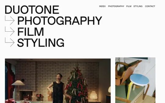
Duotone
#Duotone#photography#film#styling#design#studio#Helsinki#Finland#portfolio#typography#type#typeface#font#Favorit Std#Reckless#2024#Week 06#website#web design#inspire#inspiration#happywebdesign
0 notes
Text
The Cadence of Part-Time Poets


The Cadence of Part-Time Poets by @motswolo
Have been working on this 10 volume set for the past few months now, and they are finally complete. My Magnum Opus. I have peaked and probably depleted all of my brain power.
Thank you to @motswolo for writing such a beautiful story. My brain chemistry has been favourably altered. Will forever flinch when I hear Queen, The Beatles or Bob Dylan. Love to you from western Canada (west coast best coast lets gooooo).
I also posted a TikTok Reel of these since posts here are limited and I love the insides as much as the covers, so if you wanna see between the pages, here’s that.
Also thank you @avisbindery for letting me scream and cry in your DMs while I read the fic. May you get some uninterrupted sleep now LOLLL.
Going to write a whole essay below about the ideas and details because uhhh I wanna yap bit!
So for starters, I wanted to make these binds look like magazines because of the epilogue where (spoiler) Tonya sees Remus in a copy of New Musical Express. But of course this fic is long, so I was like, what if I do multiple volumes? This very quickly spiralled into me painstakingly (finding publication-accurate fonts almost sent me to an early grave) recreating 10 different music-focused magazines from the 70s and 80s from scratch (thank you to Photoshop, Affinity, Procreate and Canva). Each volume features a unique cover, along with stylized typesets to match that display the songs for each chapter but in different designs. And then I went a little crazy and made a 45 sleeve and a cassette too, to really set the scene when I took the photos lol
While the covers display the dates pertaining to the contents of that particular volume (Sept 1975 for volume one, for example) I was thinking about what the magazines would say if they were really published when Marauders are traipsing about being spectacular and famous in the future. I sprinkled in details from the fic itself and fanon-ed it a bit, but that was the general inspiration :-) Tried to keep the photos used either faceless/obscured, or to use the fancasts on Mots’ Cadence master post. I also tried to use period-accurate photos but didn’t always succeed, so settled for photos of 4 member bands where I had to :”) But the general intent with the facelessness was that they could be implied to be Marauders. If you squint? lol. Just pretend. Pls.
Volume One: Based upon The Record Song Book. This magazine went on to inspire the typesets, since it publishes lyrics and such. The cover images are of Spacey Jane and David Thewlis.
Volume Two: Based on ZigZag, specifically the issue from July 1978 featuring Siouxie and the Banshees just because I thought it looked sick as fuck. I re-drew the abstract shapes and such in procreate. The cover images are The Clash and a young Gary Oldman. Lord he was foiiine.
Volume Three: Based on Trouser Press, November 1980. The cover images are a young Metallica, and my personal fav fan cast for James, Reiky De Valk. The film negatives are from a Bruce Springsteen tour, 1976.
Volume Four: Based on Gay Times (November 1984), a queer magazine from the UK because this volume contains Wolfstars first kiss hehe. Also hence Somebody To Love plastered all over the covers. The Front cover is Inhaler. The “4A” on this one is of course the boys’ dorm number, but I made the A the lambda symbol as this was a pride symbol in the 70s after Stonewall.
Volume Five: Based on Melody Maker. Front image is Alex Turner. All of the text on this one is pulled directly from the fic. The scene where they all drop acid and James jumps off the roof Almost Famous style had me hootin’ and hollerin’… until Tomny showed up hahaha :”)
Volume Six: Based on IT (International Times, Aug 1971). Front image for this one is Joy Division, and the back features Jane Asher for Lily
Volume Seven: Based on Record Mirror, June 1976. Front image is John Taylor of Duran Duran. Yum.
Volume Eight: Based on Rolling Stone. More vibes than anything for this one, but the quote still makes me laugh. Front image is of Matt Hitt. Can you tell I photoshopped a cell phone out of this one? IDK. This photo just screamed ‘Remus’ to me so I had to use it. The back image is an old cigarette ad, but the photo is taken in Shepherd’s Bush.
Volume Nine: Based on Fusion magazine. Front image for this one is once again Inhaler. Oops. Back cover is our gals. Images are Jodie Foster as Cherry, Brenda Sykes as Mary, and Goldie Hawn as Lottie.
Volume Ten: Based on New Musical Express. You know why :”) These are all victims of fanon, but this one especially. I wanted it to be NME instead of the re-invented logos I’d been doing for all the rest, as I wanted it to look like the magazine the Sister gives to Tonya. I referred to an issue of NME from October 1979 for this and layered in fic references where it made sense to. The cover image for this one is (I think) Cigarettes After Sex. This issue also contains all of the B-Side chapters, and the Marauders song lyrics too just for fun :)
Slasher Chick: This is just my take on what Sybill’s zine could’ve looked like. Prob way off but I just wanted to have fun with this one since I had no cover to reference lol. The zine contains her little write-up and the interview, lifted straight from the fic :")
ok yap sesh over byeeeeeeeeeeeeeeee lmfaooooo
#fic: the cadence of part-time poets#motswolo#wolfstar#fanfic#sirius black#remus lupin#james potter#peter pettigrew#regulus black#bookbinding#tcoptp#coptp#the cadence of part time poets#marauders#moony#padfoot#my binds
1K notes
·
View notes
Text
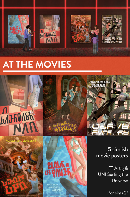
ive been really busy and wasn't able to finish this in time for halloween! but i hope someone will enjoy these now regardless lol, more details and DL under the cut!
its no secret i like to obsessively pose scenes in sims 2 lol and i edited some various "movie" posters (they aren't real movies obv). I tried to keep them with a pretty true-to-sims-energy style. Some of them have video game energy and could be used in gaming stores too!
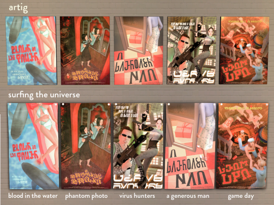
the posters come on artig and also surfing the universe for super collection peeps. Idk why I put them on a poster that isn't nearly the same aspect ratio, it made it way harder for no reason lol. The films are:
Blood in the Water (tagline: at the beach...looking like a snack)
Phantom Photo (j horror-inspired, you can prob guess the game! :P)
A Generous Man (a Rod Humble horror movie..whats in the box!!)
Virus Hunters (tagline: the best way to kill a virus...is with a gun)
Game Day (tagline: there's no "I" in scream)
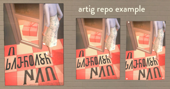
here's how the artig recolors look on various add-ons by @littlelittlesimmies . Sadly as you can see the posters get a bit cut-off on the artig poster add-on because I extended outside of artig's white border and didn't realize they got cut off until late in the process ;_;
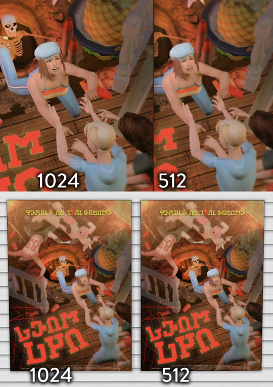
i made the artig ones at 1024 originally so included them just in case someone wants hq textures. up close you can tell a difference, but from normal game distance they look essentially the same. So you can pick between 512 or 1024 in the folder.
DOWNLOAD BOX compressorized and swatch included
credits: textures from freepik, blood on sims leg in the shark movie poster is from the preview pic of zerographic's layerable facial wounds at mts, and simlish fonts by ChèreIndolente, franzilla, ozyman4, and ajaysims 1 2
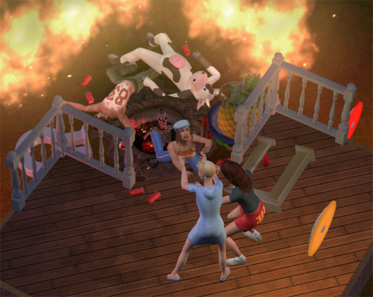
one of the unedited screenshots from in-game just for fun lol, unfortunately the girl at the bottom's i'm-not-really-helping-that-much flip-flop foot pose didn't make it into the final poster
788 notes
·
View notes
Text
i don't think an accessibility feature should be "elegantly and creatively weaved inho the show" i think it should be standardised and in the same place every time. if i wanted to watch a movie and it had fucking tiktok style subtitles i would stop watching the movie.
you should be able to control the font and contrast of subtitles. the film fucking with accessibility features to make a "better experience" would not be good.
993 notes
·
View notes
Text
RECLAMATION OF THE DAMNED ˚₊‧꒰ა ☆ ໒꒱ ‧₊˚
DIRECTORY
variant! mark x reader

SYNOPSIS: in your world, nothing is particularly wrong; there are no superheroes, but you do get to mindlessly indulge in shows and books. in fact, you're a casual fan of the show invincible. today, you’re perusing an old article about a haunted place when you stumble upon a house that's definitely out of the ordinary, and despite the absolute gloom that emits from the place, you can’t help but go in. what you don’t expect is encountering powers beyond that of your world. somehow, within the hour, your fate finds itself intertwining with that of mark grayson. but the real question is: can you save him?
WARNINGS: creepy town/off-putting vibes, you literally die, and descriptions of said death, blood mentions, that's all!
A/N : a silly little chapter, i had a few ideas on how this would go, but this is what i ended up with, sorry for the slow burn, i can't help but build tension...is this too short? too long? please let me know i'm lowkey losing it
CHAPTER ONE: CURSED
You’d arrived at the town of Hornnewle a few hours ago, and the train was slow but scenic. Pulling out your phone, you huffed at the walk from here to the town’s library. You’d already checked in at your motel, which was slightly rundown, but the town itself had a sort of charm. It wasn’t exactly charming in a touristy way; something heavier hung in the air. You watched as crows gathered by the streetlights, beaks twisted at an unseen force.
Must have found something shiny.
The town looked like a snapshot of a horror film, paused mid-breath. Victorian buildings lined the misty streets, which reminded you of Gotham City from the comics. You snorted a bit at the thought. Somehow, the weather was warm, but the city seemed slightly shrouded in darkness. You admired the weird charm and happily walked towards your destination. It was getting closer and closer until you saw the wooden sign hanging from the building. It bore a gothic style font, and looked as if it had never been replaced in the past fifty years.
You opened the creaky door, and the bell rang loudly. Your digits ran through your hair, startled, you tried to make yourself smaller. A woman who looked to be in her 70s made eye contact with you, and her wrinkled face offered you a small smile. You gave her a nod and hurried inside, light on your feet. You gripped your satchel and mouth parted to speak— the library, however, had other plans. You looked around in awe at the rustic place. A warm, red carpeted floor, walls littered with books, and the smell of incense and books filled your nose.
“Feels like home, right? I figure you’re not from here.” She begins, offering her hand up for a greeting. Your fingers hesitantly move towards hers, giving her a handshake feeling the cool metal from her ring touch your skin.
“How’d you guess?” You sheepishly smile. Her orbs run up and down your form, surveying you, not just observing.
“I’ve lived here long enough to know everyone in the town,” She chuckles, and you watch her pink lips curl up sweetly. “So I know a new face when I see one!” she shrugs. She looks to be average height, and her skin is a pale colour, her gray hair falling in loose strands surrounding her clavicle.
“Well, I need some help finding a book, I’m doing some research…” You start, you cannot exactly reveal the true nature of your visit, because you do technically intend to trespass on barred land. You pretend to be in thought and furrow your brows.
“I’m doing a research project for school about the haunted place here called Maledictus.” You query with your hand on your chin.
Her face scrunches at your request.
“You came all the way here for that book?” She confirms. Her eyes glaze over ever so slightly, you notice and shift in your spot.
“That place is barred in this town, though I imagine if you researched, you already know that, it is the only book on the matter, despite having a past reputation in the province.” She thinks and meets your eyes before sighing,
She nods her head towards an aisle in the back.
“It's on the back wall. I hope you do well on your research project.” She smiled, twisting the ring on her finger. You notice an insignia on it and squint at it before nodding and heading to the back wall.
Dragging your digits against the spines of the books lining the walls, reverence settles itself into your chest. You wished you could capture this moment in a painting, seal it away, and never drown in the feeling of loneliness again. Your fingers stop once they hit the book you’ve been searching for. A giddy feeling bubbles up in your chest, and you push it down gently.
Grabbing the book, you step to the front of the store, the lady's eyes settle onto you, and she smiles, waving you farewell. You leave the mystic library with a huff as you run towards the nearest cafe you can find. The feeling of the book grasped between your fingers, blooming a feeling in your chest again, you don’t push it down this time.
Your digits greedily prod at the book as you find a seat to settle into. Your skin is digging into the gaps between the wood seat, but you haven’t a care in the world.
As you iris’s skim over the pages, your first order of business is seeking the location of the Maledictus. You read through a few words of warning, all things you’ve read before, nothing seemingly out of the ordinary.
There it is.
The location, just on the outskirts of the main square, threaded deep into the forest, like a secret waiting to be revealed. You hum in contentment, scratching at the nape of your neck. You rise to your feet, slightly tender from the walking you’ve been doing. You loosely mapped out the path in your head and decided to persevere before it gets too dark.
Your boots crunch into the sticks and leaves on the path to the forest, it has a cavernous aspect to it that you find oddly comforting. You continue skimming through the pages, trying to detect any mentions of relics and such. You bite your lip in focus as you walk, the book perched in your hands. You stop in your tracks as you finally find something.
Relics! You hold back a shit-eating grin before humming in contentment and trekking forward. The photos are faded, but clear enough to make out minor details; there are many, they look dipped in gold, edges faded from standing the test of time. Ornate details catch your eye, carved neatly into them. Some pots, some rings and more. Before you know it, you’ve reached the point in the book where it details each—
You’re cut off by the sound of your head crashing into a tree. You grunt in pain, the book shielding your sternum from the same fate as your head—you cradle your head in response, feeling for any sign of blood. You had not paid any mind to the world around you as you ventured deeper into the forest—that was a mistake. You took a second to survey your surroundings, and that’s when you saw it.
The building was tenebrous, gloomy like death encapsulated. It stood tall in the forest; a copious amount of cautious tape surrounded the exterior, in your head, it was practically ushering you inside.
It was a deep shade of brown, a fractured sort of building, oozing miasma. It loomed above you, with a mansion-like stature. You hesitated before shutting the book in your grip, jaw tightening in eagerness to trespass. You tucked the book gently into your satchel before your digits tapped the caution tape. You threaded yourself through the tape like a needle, eventually landing in front of the door.
“That’s enough hesitating, I’m heading inside.” You mused.
The door creaked open, as a rickety groan escaped the hinges. It was surprisingly orderly. As much as a place this ancient could be. It had rickety flooring, sure, but it held a timeless design inside. You took note of the cracked cornices and cobwebs; no matter how decent it was, it was still ancient. With it came a must in the air—a scent that felt decrepit, but also as if someone had inhabited this place recently. Like something or someone had been here.
That made the corners of your mouth twitch.
Your eyes raked over your surroundings as you stepped further into the place, shutting the door behind you. It’s you and a dwelling etched in time and memories, said to bear a curse. You wouldn’t trade that for anything else. You spent your time delicately surveying the place, picking up items that matched the photographs in the book you had tucked away. It felt precious, a secret only you got to keep.
Not long after, you found your feet heading towards the billowing staircase, your fingers nimbly traced over the cracked wood as you made your way deeper into the stilled mansion. A darkness loomed around you, but you were no stranger to feelings like those. When you reached the top of the creaky steps, you made your way into a room on the far left of the gloomy hallway.
Your breath hitched in your throat when you entered. The room reeked of age, old, rotted pages from a book and decaying flowers. The floorboards screaming beneath your feet, the sound thrumming in your eardrum like a warning. You pressed onwards into the large room, eyes landing on the stained mullions, the curtains drawn back as if inviting a fresh breath into the carcass of a room.
That’s when something glinted from the corner of your eye, it pulled your gaze like a magnet. Your feet padded across the room, measuring your steps as you went to grasp it, ignoring everything in your stomach that twisted and furled at the creaking in the floorboard.
You grasped it—before—
C R E A K
The floor crooned beneath you and gave out, your weight pulling you down, crashing through the rotted ceiling of the floors beneath you. A sickening feeling churned in your stomach as you fell through not one, not two, but five dark stories. Your life flashed before your eyes as you desperately clawed at the stale air for something to hold onto, but to no avail. The splinters from the decayed board sharply dig into your skin as you fall.
Your body then smashed onto what felt like solid concrete, nearly bouncing from the impact, your head collided with the ground with a deafening crack, your eyes watering as your breath dies in your throat. You feel warmth seeping out of your head, you’re sure it’s your blood, leaking from your cracked skull, you feel panic rise in your chest, your heart humming at a pace far too fast to be normal.
Your eyes wander down weakly to the relic in your hand. It looks untouched from the fall, pristine and shiny still. It looks like an angel, wings delicately curved in on itself. Your eyes wander around it, and you notice something carved into it.
An insignia, huh, that looks just like the one the librarian had on her ring.
The thought fades away as you feel the sudden urge to sleep, your body is heavy and lies in a pool of your blood, you swear you can see the relic in your hand glow before your eyes droop shut, for eternity.
For some odd reason, you feel yourself waking up in a field of green grass, as fresh as could be. A TV was placed in the middle of the field, which was extremely out of place. Your eyebrows scrunch as the sun's rays dilate across your skin.
The TV flickers on, and you watch as the channel plays—
Invincible?
A voice suddenly sounds from behind you.
“Why hello there, it seems you’ve made it.”
Made it?
Where?

TAGLIST: @lalana1703 @lilacoaks @thatoneraeder @heiankyonoeiyuukun @decadentrebelkitten
#invincible x reader#mark grayson x reader#yandere mark grayson#sinister mark#sinister!mark x reader#☆invincible#variant mark x reader#mark variant x reader#fanfic#mohawk mark x reader#no goggles mark#viltrumite mark x reader#☆reclamation of the damned#☆series
106 notes
·
View notes
Text


NETWORKING NETWORKING NETWORKING
it is fairly difficult to take pictures of silkscreen prints man, especially with my bad phone camera. but looking at how this came out is a ton of fun. I need to play more with inks overlapping one another
little bit of progress under the cut!
the digital mockup before printing things out!

immediately followed by all three layers of the film stacked up before i exposed them onto my screen! you have to do each layer individually but i thought it looked really cool like this

the first two layers of ink laid down! i finally figured out how to get my ink to the right consistency so it's not having terrible dry-in all the time, but unfortunately i figured that out AFTER i placed down the green. but that's alright!! it looks cool

finally, i spent a decent amount of time trying to get the right orientation and styling for the font. this was one of the first mockups using impact. wasn't my favorite, it detracted from the actual drawing.
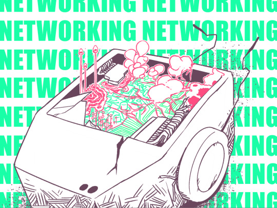
#silkscreen#silkscreening#The Robot#Mezzanine#fungus#spores#fungi#networking#mycelium#slime mold#most of the fungi is made up/from imagination but inspiration was taken from real life molds and fungi!!#circuits#circuit board#motherboard#screen printing#silkscreen print#my art#my oc#my ocs
82 notes
·
View notes
Text
observations from grading hundreds of american college students' discussion posts and essays about film
before i get into this i want to be SO clear that this is not meant to be a "kids these days" thing, but more a commentary on the contemporary media landscape and the impacts of new media on young people's consumption habits. i think that young people's expectations of film are primarily a reflection of how they've been taught to watch and process film.
also, i teach intro, so these are not necessarily film or even humanities majors. many of my students are in computer science, engineering, etc. okay yay let's go <3
most american college students have quite literally Never seen a single movie that was not in english, and are very resistant to reading subtitles.
i've had multiple students comment that non-english language films which require them to read subtitles force them to actually look at the screen, which makes them notice more details in the film. they are not accustomed to actually Watching films, and doing so is novel to them. they're used to just turning things on in the background before doing other tasks/scrolling on their phones.
students frequently comment upon whether or not a film was able to hold their attention, and many consider it a failing of the film itself if not. many students also lose interest when they are confused or uncertain about what is happening in a movie, rather than becoming more invested or intrigued.
some do note that they have short attention spans, and will clearly state that they do not watch or enjoy many movies because of this.
things which students see as inherently boring include black and white films, silent films, non-English-language films, and films more than twenty years old. many students were shocked when they enjoyed a film within any of the aforementioned categories.
a lot of students will see all of the pieces of the puzzle, but struggle to put them together. for example: they will note that a detective character seems to care more about pinning a crime on somebody than they care about actually solving it, that the detective is bad at their job, that the detective brutalizes suspects, but they will not quite reach the conclusion that the film is doing these things intentionally. rather than concluding that the film is criticizing the police, they will be upset that the character is so awful.
one student insisted that mad max: fury road is a deeply misogynistic film because the women were treated as objects and wore skimpy clothes. the fact that the entire plot of the film is about said women asserting their personhood and overthrowing the patriarchal order to establish a more egalitarian and empathetic matriarchy was not relevant to her; what mattered was how they looked, and no amount of explanation could change her mind. i don't really have a clear theory of what was going on here, but i wanted to share it because it feels. poignant. in a way i cannot articulate.
many students see "old" films as inherently worse than contemporary films. they will often say things like, "the movie was really good for something from the fifties."
a lot of people have never heard of alfred hitchcock. i don't rly have a take on this it just stunned me.
and this last one isn't necessarily film-specific, but i do think it's relevant to discussing media literacy and the quality of k-12 + STEM-focused university education: so many students do not know how to format a paper, and do not know how/do not think to look up a style guide or even consult the syllabus or assignment sheet.
students often add additional spaces between paragraphs, and/or use 1.15 pt. spacing rather than double spacing their papers. they'll use calibri or arial rather than times new roman, in 11 pt. font rather than 12. they'll write out their thesis separately from their paragraphs, or not write in paragraphs at all, instead writing something that looks closer to stream-of-consciousness bullet-point notes.
it seems to me that many students somehow make it through high school and into university without ever learning how to write a paper. what really concerns me however is the fact that this information is extremely available to them; in the class syllabus, on their assignment sheet, even if you just google how to write a paper. i'm no expert in education and i don't want to be alarmist, but i do think that there is a concerning lack of curiosity and care in many students, primarily those studying in STEM fields. part of this is just the fact that many of my students are used to writing lab reports and this is a different sort of writing, but the lack of flexibility and ability to engage with other subjects is very sad to me.
plenty of my students are curious and read the syllabus and pay attention to the films and know how to write! but the number of those who struggle to formulate a coherent paragraph, let alone paper, who cannot identify basic themes, indicates to me that young people are seriously suffering from shortened attention spans, the lack of popular non-english language film and television in american culture, and the proliferation of "second-screen" streaming content designed to be "viewed" by audiences who are not paying attention.
i don't have a remedy for this. i don't totally know why i'm typing this all out, except that my tenure as a teaching assistant is coming to an end and i felt an irrepressible urge to reflect upon the experience. idk i suppose i hope this will be interesting to somebody. if you made it this far, thank you and i hope you're well <3
81 notes
·
View notes
Text

Once again remembering the '90s VHS release of the 1958 French film of Les Misérables that obviously tried to trick buyers into thinking it was the musical.
A black and white illustration of little Cosette, obviously not Bayard's but similar in style and tone.
The title written in a font similar to the musical's Caslon Antique.
"A vivid retelling of the French Classic that inspire the award-winning musical!" with the word "musical" in the biggest letters.
I wonder how many people these tricks actually fooled?
49 notes
·
View notes
Text
hey who wants to read bad hasty analysis of the new mcr video
here we go!

frame 1: the deer (later seen in the logo) is shown as dead in the official flag, with lots of plants and rot around it…. DECAY! AS IN FOUNDATIONS OF! Also yk four squares above it….like the four members….

frame 2: statue of the dictator as seen in previous videos. more on him later.

frame 3: the city! in full view! same as from previous videos, yet this has the sepia tone of a white man making a film in Mexico. Suggests again that DRAAG is meant to be a communist style state, thru the use of brutalist architecture

frame 4: grain! meant to symbolize prosperity and health, also corroborates the theory that it’s meant to be a USSR/CCP type state- ahem five year plans anybody.

frame 5: 2KM (I assume) logo. likely just the station BUT! Uses the same font as everything else, further suggesting DRAAG is a universal, all-encompassing force that suppresses creative expression

frame 6: hey king! what the fuck is a Dragoshka. Is it a nation? A group of people? A caste? Who knows! But this anchorman assumes we are dragoshkas! one again, Slavic sounding word, lending to the USSR themes here

frame 7: eeeeeeey the boys are back! so it takes the Mexico City show (their last show as the black parade) and uses it as the basic start point of our story. Why were they thought to be dead? Where were they for all this time? Questions questions
frame 8: ok. so is DRAAG interpol style government? is it a fixed location? who knows! but they are holding these guys hostage it seems?
frame 9: Ok so the leader from earlier is the Grand Immortal Dictator (GID) sounds like god lol. and he is revered by people in (supposedly) other countries- is he a threat to them? does he rule them openly or from under the table?

frame 10: the cabinet of operatic retaliations? this implies 1: the “opera” video was possibly the testing of a weapon and 2 that music IS a weapon, this guitar kills fascists etc

frame 11: end salute! we are still in a highly controlled news space! also DRAAG is definitely controlling Mexico and likely other states. Also the deer is alive in this one? Theories could be made here
in conclusion holy FUCK bro
#mcr#my chem#my chemical romance#Gerard way#Mikey way#frank iero#ray toro#mcrblr#yay lore!#tbp#the black parade#long live the black parade
60 notes
·
View notes
Note
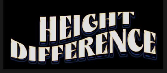
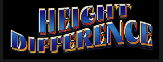
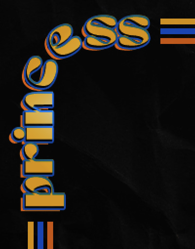
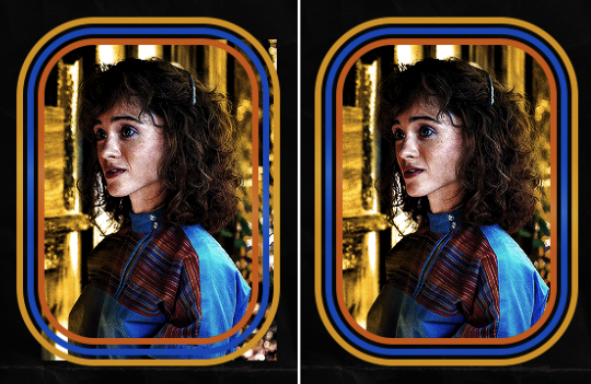
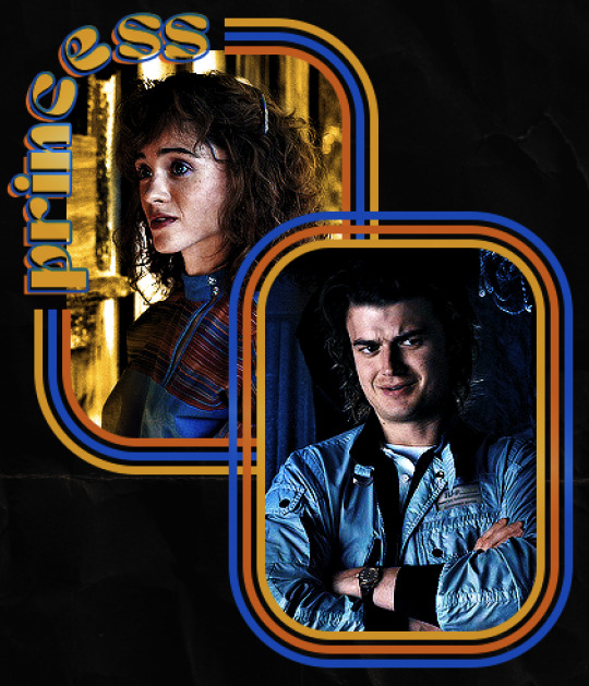
hello! I love your edits and I wanted to know, for the "Steve Robin and Nancy" Gif you posted.. How would I go about doing something like that? More specificly, the bottom two where it says "Height Difference" and where it labels them as "Princess, Jock and Loser"
Thank you! Sorry this took a while to answer. I finally had time to sit down and write this. Link to original post.

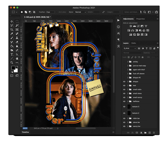
Quick notes: I'm using Photoshop 2021 on Mac and working in video timeline. Must have basic gifmaking skills and know how to use layer masks. This is primarily a gif layout and text tutorial.
Fonts used in first gif:
Pea Wolfe Tracks — link here
King & Queen — link here
Fonts used in second gif:
Kiera — link here
Post — link here
Ellianarelle's Path — link here
Heina's hurry — link here
I used a light leaks/film texture, ripped paper textures, folded paper textures, and transparent pngs (arrows + post-it notes + smiley face).
We'll start with this gif.
Make your gif! The gif here is 540x600px. I color and sharpen it to my liking. Go to image > canvas size > change height from 600 to 770px. I left the anchor in the middle, though it doesn't really matter.
I drag and drop my folded paper texture and change the layer order so it's under my gif. Then I change the blending mode on my gif to Screen so the texture shows through the gif, but I keep the texture at 100% Opacity and Fill.
Now I move my gif around and add my ripped paper textures. I wanted to give it a sort of poster-like feel to it, so I made more room on the bottom for my main text and ended up with something like this. Blending mode is set to Lighten for the ripped paper textures.
I then use layer masks to hide what I don't want shown and add my light leaks/film texture. Blending mode on light leaks/film texture set to Pin Light, Opacity: 50%, Fill: 70%.
I use Levels and Brightness/Contrast adjustment layers to darken the gif up a bit more, then I add a patterned paper texture. Blending mode for patterned paper texture set to Lighten, Opacity: 100%, Fill: 75%. Result:
Now on to the text!
I'm going to be honest here, a lot of this was clicking around until I settled on something I liked. There's three layers to create this text effect. The font used here is King & Queen.
For the first text layer, the font color is set to black (#000000), font size: 87 pt, leading: 80 pt, tracking: 25.
Layer styles used here are stroke and drop shadow.
Text Layer 1
Stroke settings:
Size: 1px
Position: Outside
Blend Mode: Hard Light
Opacity: 40%
Overprint: unchecked
Fill Type: Color
Color: #5911ed
Drop Shadow settings:
Blend Mode: Difference
Color: #2d5ba8
Opacity: 85%
Angle: 70°
Use Global Light: checked
Distance: 7px
Spread: 0%
Size: 6px
Contour: Cone - Inverted
Anti-aliased: unchecked
Noise: 0%
Layer Knocks Out Drop Shadow: checked
Blending mode for text layer set to Overlay, Opacity: 100%, Fill: 85%.
Warp text settings:
Style: Wave
Horizontal: checked
Bend: +60%
Horizontal Distortion: +10%
Vertical Distortion: 0%
With all those settings applied, the first text layer looks like this:
Duplicate the layer, clear all layer styles, and change the color for the second text layer to white (#ffffff). All other text settings (including warp settings) should stay the same. The only layer style then applied to this text layer is stroke.
Text Layer 2
Stroke settings:
Size: 1px
Position: Outside
Blend Mode: Difference
Opacity: 100%
Overprint: unchecked
Fill Type: Color
Color: #d48f16

Blending mode for the second text layer is set to Difference, Opacity: 90%, Fill: 100%. Nudge the second text layer a bit so the first text layer is a little more visible or move to your liking.
With both those layers active, it looks like this:
Duplicate the second text layer, clear layer styles, and change the color of this third text layer to a dark grey (#1a1919). Again, all other text (and warp) settings should stay the same.
Layer styles applied to this layer are stroke and gradient overlay.
Text Layer 3
Stroke settings:
Size: 1px
Position: Outside
Blend Mode: Difference
Opacity: 100%
Overprint: unchecked
Fill Type: Color
Color: #d48f16
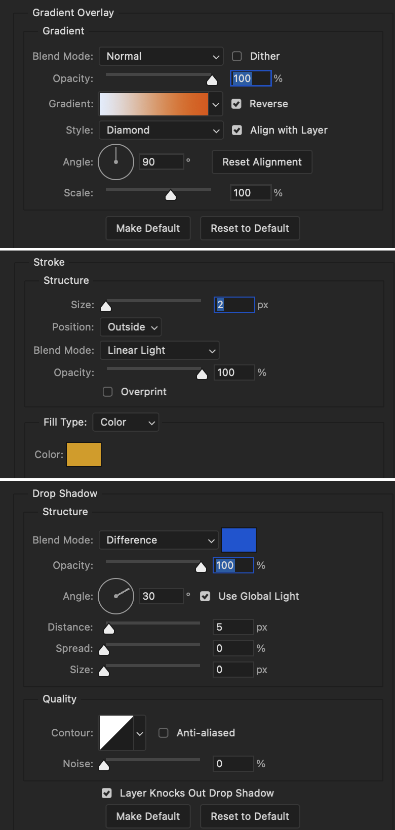
Gradient Overlay settings:
Blend Mode: Difference
Dither: unchecked
Opacity: 100%
Gradient: #cd3f00 > #ffdb5d
Reverse: unchecked
Style: Reflected
Align with Layer: checked
Angle: 90°
Scale: 100%

Blending mode for the third text layer set to Exclusion, Opacity: 100%, Fill: 100%. I also moved the third text layer around, down and to the right a few pixels to give it that 3-D Word Art effect.
With all three text layers active:
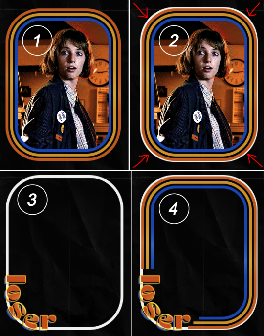
Next are the arrows.
Take your transparent pngs and place them to your liking. Blending mode for these is set to Difference, Opacity: 100%, Fill: 100%.
Command + click on an arrow thumbnail to select all the pixels in that layer. This is why the image must be transparent!
With that selection made and on a new blank layer, right click the selection and click on stroke. Settings for that are width: 2px, color: white, location: center. Move that a couple of pixels over.
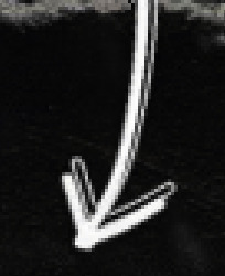
Do this for all arrows for a total of 6 layers for arrows. I group them together to keep my workspace clean, then I duplicate my arrows group with no further changes made to the second group to get what you see in the final gif.
Next is the smaller text. It's three separate text layers for each word, so I can move each of them around to my liking.
Font used is Pea Wolfe Tracks, font color: white (#ffffff), font size: 24 pt, leading: 6 pt, tracking: 25. Bold and italic options checked. I set the blending mode to Difference, Opacity: 100%, Fill: 100%.
And that's it! That concludes the tutorial for this gif!
Now on to this gif.
We'll start with the background gif. There are three separate gifs. You could make them one gif, but I wanted the option to order them differently if I needed to.
All gifs in the background are the size of the canvas: 540x770px. Color and sharpen to your liking, but keep them all black and white. To get the blurry effect go to filter > blur > guassian blur. Set radius to 7.0 pixels. Add this to all three gifs.
Then I add two folded paper textures. Blending mode for one set to Lighten, Opacity: 60%, Fill: 100%. The other set to Screen, Opacity: 70%, Fill: 90%.
I found this tutorial a while back for a halftone effect. They include links to the halftone pattern used here as well as textures and gradient maps not used here.
I'm only using the halftone pattern here.
Pattern fill settings:
Angle: 66°
Scale: 8%
Link with Layer: checked
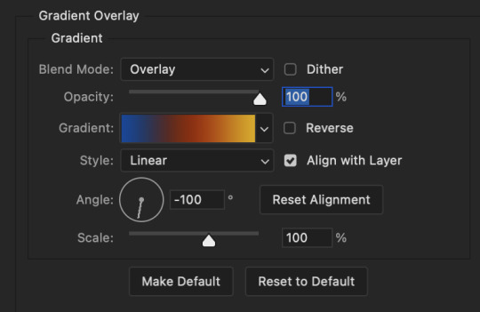
I also added a gradient overlay layer style to the halftone pattern which gives the gifs the color you see above.
Gradient Overlay settings:
Blend Mode: Overlay
Dither: unchecked
Opacity: 100%
Gradient: #0059ac > #a33600 > #e6b801
Reverse: unchecked
Style: Linear
Align with Layer: checked
Angle: -100°
Scale: 100%
Now on to the square shapes with rounded corners. In the interest of keeping this tutorial short(er), I found this tutorial on youtube that explains how to make squares with rounded corners.
I set my stroke size to 6px, stroke color to white (#ffffff), and fill to no color. I don't use the stroke layer style to make the borders of the shape like in the video! I'm only linking the video to show how to curve corners with square shapes.
Note: Be sure you know how big or small you want these to be and how they're going to fit on your canvas in order to make all the shapes and edit them. It can be tedious to change the settings.
Duplicate and resize to your liking.
In this instance, I wanted to make three squares total, so I had to duplicate twice and resize until I had something I liked.
Settings for the shapes used here are:
Innermost shape: W: 200px, H: 280px, corners: 50px
Middle shape: W: 220px, H: 300px, corners: 60px
Outer shape: W: 240px, H: 320px, corners: 70px
Once I have the size I want for all three shapes, I group them together to make a set and duplicate that group twice, then adjust each set on the canvas for my layout.
What the sets look like all together:
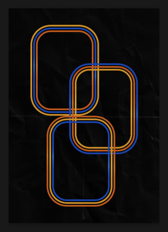
Colors used: orange #e47100, blue #0062d1, yellow #ecac00
To add color to the shapes, either change the color of the shape itself or use layer styles. I used layer styles.
Note: I didn't add the colors until the end after I knew what gifs went where and what color scheme I wanted, but I don't want to add more images than I need to here.
To keep this short, I found this tutorial on youtube that explains how to wrap text around a shape. However, I wanted the text to align on the outside where the white line is and not the green line (left image):
So I created another shape just inside the innermost square and used that as a path for my text (right image). Adjust the text to your liking until you have your text where you want it. Refer to the video tutorial if you need help moving the text along the path!
You don't need the shape path once you have your text where you want it, so use the layer visibility tool to hide it. You can hide your other shapes too so you can work with your text.
Do not delete your shape path!
I duplicate it once I start working with my "jock" text since all the sets are the same size. The "loser" text has to be worked a little differently, but we'll get to that later.
For the princess, jock, and loser text, there are two text layers to create the overall effect. For both layers, font used is Kiera, font color set to white (#ffffff), font size: 60 pt, blending mode set to Normal.
I added a gradient overlay layer style to the first text layer which I'll call the base layer. Opacity for this layer is 100%, Fill: 100%.
Base Layer
Gradient Overlay settings:
Blend Mode: Normal
Dither: unchecked
Opacity: 100%
Gradient: #f0b002 > #e7f0fd
Reverse: checked
Style: Diamond
Align with Layer: checked
Angle: 90°
Scale: 100%
The second text layer is your stroke and drop shadow layer. For this layer, opacity is set to 100%, Fill: 0%.
Stroke and Drop Shadow Layer
Stroke settings:
Size: 2px
Position: Outside
Blend Mode: Linear Light
Opacity: 100%
Overprint: unchecked
Fill Type: Color
Color: #0064cb
Drop Shadow settings:
Blend Mode: Difference
Color: #fb7c00
Opacity: 100%
Angle: 30°
Use Global Light: checked
Distance: 5px
Spread: 0%
Size: 0px
Contour: Linear
Anti-aliased: unchecked
Noise: 0%
Layer Knocks Out Drop Shadow: checked
End result looks like this:

When I make my shapes visible again (minus the one I used as a path), I get this:
The shapes are clearly in the way of the text, whether they're above my shapes layer or under it. I use layer masks to hide what I want, so the text is legible. It looks cleaner this way and I wanted the text to be a part of the shape itself. I do that for each rounded square.
Now on to my smaller gifs. I like to crop, resize, sharpen, and color separately because my laptop and Photoshop would kill me if I tried to do it all on one canvas. I use the size of the middle shape for my gifs (220x300px), so I can have a little wiggle room when adjusting. I then use a layer mask to hide the parts of the gif that are outside of the shape.
A quick way to do this is to command + click on the thumbnail of the innermost square. With that selection made, I got to my gif layer and add a layer mask. Sometimes you need to invert it. Use command + i with the layer mask selected (not the gif) to invert the layer mask.
I repeat this process with my Steve and Robin gifs. I have to go back and forth with all the layer masks to hide parts of the gif/shapes I don't want for each set. It's kind of a long process, but not all that difficult. I label and group my layers together as I work to keep things clean and it helps me keep track of what I edited and what needs to be edited when it comes to things like this.
The picture below shows where I hid the bottom right corner of Nancy as well as the shapes that make up her set using layer masks. I also did this with the Steve and Robin sets, hiding the bottom left corner of Steve.

Similar text settings used for jock. The gradient overlay layer style for this base layer is different than that of princess because of the positioning of the text. Again, same as princess, two text layers are used here. Blending mode, opacity, and fill for both are the same as the princess text layers as mentioned before.
Base Layer
Gradient Overlay settings:
Blend Mode: Normal
Dither: unchecked
Opacity: 100%
Gradient: #007aec > move bottom middle dot to 80% > #e7f0fd
Reverse: checked
Style: Diamond
Align with Layer: checked
Angle: -140°
Scale: 100%
Stroke and Drop Shadow Layer
Stroke settings:
Size: 2px
Position: Outside
Blend Mode: Linear Light
Opacity: 100%
Overprint: unchecked
Fill Type: Color
Color: #a05700
Drop Shadow settings:
Blend Mode: Difference
Color: #ffba00
Opacity: 100%
Angle: 30°
Use Global Light: checked
Distance: 5px
Spread: 0%
Size: 0px
Contour: Linear
Anti-aliased: unchecked
Noise: 0%
Layer Knocks Out Drop Shadow: checked
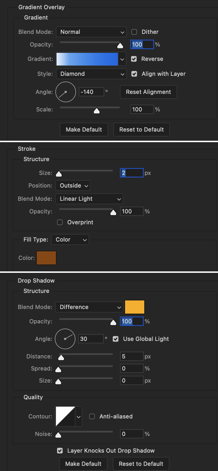
Image 1: We start with Robin.
Image 2: To make the loser text, I had to create a new path.
Image 3: I make it so the text is on the inside of the path instead of the outside. (Hint: Refer to video tutorial if you don't know how to do that.) I then adjusted the tracking between the letters in the word "loser" so they didn't look so squished together.
Image 4: Then I use layer masks to hide the parts of the shape I don't want shown.
You can then hide the path or delete it. You only need it if you want to adjust the placement of the text. I keep it (hidden) just in case.
Text settings for loser are just like those for princess. Blending mode, opacity, and fill are also the same.
Base Layer
Gradient Overlay settings:
Blend Mode: Normal
Dither: unchecked
Opacity: 100%
Gradient: #eb6400 > #e7f0fd
Reverse: checked
Style: Diamond
Align with Layer: checked
Angle: 90°
Scale: 100%
Stroke and Drop Shadow Layer
Stroke settings:
Size: 2px
Position: Outside
Blend Mode: Linear Light
Opacity: 100%
Overprint: unchecked
Fill Type: Color
Color: #e1a900
Drop Shadow settings:
Blend Mode: Difference
Color: #0068de
Opacity: 100%
Angle: 30°
Use Global Light: checked
Distance: 5px
Spread: 0%
Size: 0px
Contour: Linear
Anti-aliased: unchecked
Noise: 0%
Layer Knocks Out Drop Shadow: checked
Next are the post-it notes! This is probably the easiest part of making this gif. You just have to repeat this process for however many post-it notes you're making.
Image 1: To start, place your transparent post-it note where you want it. You can also rotate it if you'd like.
Image 2: Then create a text layer and write what you want. Font used here is Post. I wanted this text underlined to give emphasis, so I click on the underline option. I also adjusted the leading because I wanted more space between the word and the line. Rotate the text so it looks like it's written on the post-it note. Note: It looks better if you choose a font that looks handwritten.
Image 3: I wanted another line to give emphasis to the "Dingus!!" text and make it seem more handwritten. I use the line tool to create another line.
Image 4: Then I adjust that line to my liking.

Fonts used for notes: Post, Ellianarelle's Path, and Heina's hurry
Repeat this process for all post-it notes!
That finishes the tutorial! (And I hit the 30 image limit lol.) I hope this helps. If you have any further questions, feel free to send an ask or IM and I'll try to answer to the best of my ability.
Happy photoshopping!
#ask#pcocana#photoshop#photoshop tutorial#tutorials#*tutorials#userchibi#userbunneis#uservivaldi#userriel#userabs#usertiny#useralien#useraljoscha#userfanni#userraffa#tusermona#userbess#userrobin#userroza#quicklings#janielook#usernaureen#userrlorelei#tsusermels#tusermimi#userelio#usertj#userbarrow#usernolan
288 notes
·
View notes
Note
Hi ✨ I was wondering if you'd have some tips/advices to share for someone who'd like to start drawing comics ? About storyboarding, composition or everything you think could be useful for a start ?
I'm absolutely in love with your comics so I figured you'd be the best to ask 💕
Ahh thank you @paracosm-draw! I’d be happy to share a few tips and resources with you 😁
1. Start Small
I would start with short comics (4-6 panels). Comics notoriously take a long time, so starting out with a long form story will quickly burn you out if you haven’t found your own shortcuts/established an efficient process yet. The more you practice the faster you’ll get!
2. Thumbnails
This is the most important stage in the process. I always start here to establish layout, action, and pacing. You want these to be quick and loose so you can freely discard anything that’s not working.
✨TIP✨ After you finish thumbnails, add the text before you start sketching. Often you’ll find you actually need more room for your dialogue than you thought and will need to adjust the composition further. This will save you time!
3. Text
Don’t get too fancy with fonts when starting out. One font for dialogue that has a bold and italic style is all you need. (And maybe a different font for sound FX) Too many fonts can be very distracting for readers!
4. Layout
Use the paneling and bubble placement to lead the eye in the right direction. Reading panels/dialogue in the wrong order will quickly take readers out of the story. Clarity is key!
(image source: GlobalComix)
✨TIP✨ I like to use fairly simple grid layouts so when I do break from them it stands out. I save unique layouts for emotional beats, but be sure to still keep the eye moving in the right direction!
5. Backgrounds
Try to have at least one establishing shot every time the setting changes. Doesn’t need to be super detailed, but avoid having characters sitting in a blank void for too long.
6. Reference
I’m sure you’re already familiar with using references for poses, but start saving images that you could use as reference for framing. I like looking to film/animation for this.
7. Beta/Test Readers
Fresh eyes can tell right away if something is confusing or unclear. I send my beta a tight sketch before I start inking. That way it’s easier to change things if they point anything out.
8. Resources
Making Comics by Scott McCloud is a great comics 101 book and super thorough. I also love the podcast Screen Tones. They discuss all aspects of making webcomics!
I hope some of this was helpful! Happy comic making! ✨
#rocket-talks#comics#not me secretly hoping someone would ask me about comic making#you made my day lol#cannot wait to see your comics!!
63 notes
·
View notes
Text
what i did and didn't (but mostly didn't) like about until dawn remake's character trait changes
hello friends and fans. i am super excited to welcome all my pals back to the latest episode of Laura Yaps About Until Dawn Remake. i've talked about the prologue here and here, and i plan on talking about other elements of the game (visuals, gameplay, narrative changes) whenever life and time allows.
before i go off about the character traits, thanks to @claarria for posting this handy side-by-side of old vs new. super helpful! i'll be using those images here.
and generally speaking, let it be known that i think the font change is so fucking ugly 💖 like god bless but it is so bad 💖💖 and they've made the layout so much less dynamic by just listing all the traits straight down, bullet point style?? it is all very microsoft powerpoint core and it sucks. anyway. onto the characters, in order of appearance.
sam
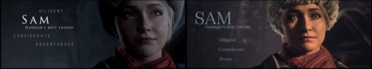
off topic but very importantly, how did they fuck up sam's face THAT bad?? ballistic moon sapped the life out of her and now there is literally nothing behind those eyes. HOMEGIRL WAKE UP 👏👏
one trait change here: adventurous -> brave. not wrong, but super redundant, because brave is one of the character stats in the menu, so like. at any point when i'm playing her, i can pop in the menu and see exactly how brave she is. it's pointless to put it here.
chris
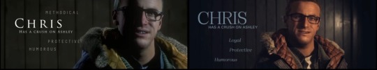
one change: methodical -> loyal. and honestly. this one slays i can't lie. like yeahhhh 🔥🔥🔥🔥🔥
i know everyone loves to hate on chris now, but he pushes to help sam even when it puts himself at risk and he goes to the shed to get josh even though josh just traumatized the hell out of him lmao. boy is loyal asf and i'm more than happy to see it replace methodical.
jess
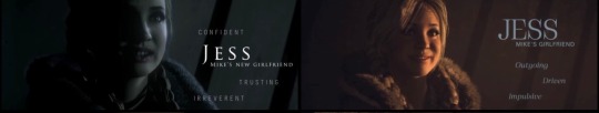
big changes here. i'm not jazzed to see confident go. i always thought smg included it purposefully, because this is how jess is trying to come across, even though she's actually insecure.
and imo trusting fits her far better than, say, driven. based on em's comment about her grades (and the fact that jess doesn't deny it lmao), i don't think she has much drive or ambition at this point in her life. she's always struck me as the kind of person who doesn't have a big dream or passion, and as high school graduation approaches she would feel sort of aimless? like she doesn't know where to go next.
i don't mean these as negatives, btw. jess is a top 3 ud character for me. i just don't think she's driven. and i think she is irreverent. and that's fine. 💖
emily
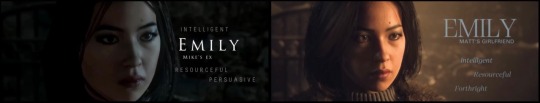
one change: persuasive -> forthright. like sam's change, this isn't wrong. emily is definitely forthright. but i don't like that we're shifting her further from mike (more on that later), and this change makes her use of words seem less purposeful. like she says what she wants just for the sake of it, instead of: she knows what to say to get people to do what she wants.
matt
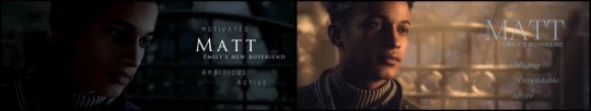
matt's trait changes make for a much different impression. motivated and ambitious have been swapped with obliging and dependable, which shifts the focus from himself to others. we're drawing attention to an agreeable, go-with-the-flow personality, rather than the fact that he's got big dreams for himself (get that scholarship, bud).
i'm not sure i'm the biggest fan, because it kind of makes him seem like a doormat? it's possible that he never talks to emily about how she treats him, and he does film the prank on hannah even though he doesn't seem like he would. still...i guess i wish there was more of a mix here. he can be obliging and dependable, but he doesn't have to be, depending on your choices, and this really makes him feel like everything he does is for the sake of others.
mike
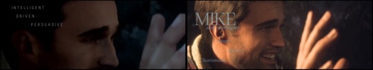
i appreciate ballistic moon pulling these shots back a little - some of them were really, like, up the character's nose lmfao. but bro those traits are unreadable against mike's skin 😭😭
anyway, mikey gets a complete overhaul. i've been over brave with sam. it's a waste of a slot. and it's not that mike isn't driven or charismatic. i mean, he is definitely charismatic, given his popularity in fandom. even i have this feeling of 'man, i should not be charmed by him' <- is definitely charmed by him. but i think we're losing a lot by separating him from emily, with whom he used to share 2 out of 3 traits (intelligent and persuasive). i always thought that said a lot about why they would be drawn to each other and start a relationship - but also why that relationship wouldn't last.
if i were to give mike any new trait, it'd probably be impulsive, which i think is a great fit for him. mike may be intelligent, but when it comes to decisions, he's a man of action - a doer, not a thinker. which is just as likely to lead to a bad outcome as it is a good one.
ashley
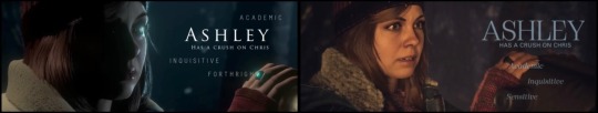
one change here (forthright -> sensitive), but god does it fucking suck. SENSITIVE?????? be fr. is ashley sensitive or is she traumatized nonstop for eight hours? she was upset when she was chained to a wall and thought she was going to die! when she thought her friend died! when she thought her other dead friend's ghost was trying to communicate with them! when she was put in a life-or-death trap a second time! that sure was sensitive of her!
if i could revert only one trait change, it would be this one. 0/10.
josh
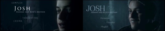
must be said that josh's shot is much better in the remake. it could not have been worse, like i will never understand how anyone looked at that half-closed eye and open mouth and was like yeah that's a good first impression LMAO. so, cool with that.
tbh i also like josh's trait changes? this is another total overhaul, but honestly, at the risk of getting booed offstage, i'm happy with this. if i'm being real, complex was always a waste of a slot. like...yeah? i hope so? all of your characters should be complex to some degree. it feels like a weird shade to the other characters to point out one guy, specifically, as complex. so the rest of them are simple, then? 🤨 it's not that i would argue against josh being the most complex - i do think he is (though i realize my stance on that means little because i'm up this man's ass). it's just weird to draw attention to it.
as for the other traits, yeah, josh is thoughtful and loving. for sure. but i feel like these are sort of...level 2 traits. ykwim? and the new traits are level 1. if you hung out with josh in a casual way, in a group setting, remake traits would be more likely to spring to mind, to match that initial impression. i think you'd have to look more closely or spend more time to clock that he's thoughtful and loving, because outside of his sisters, i don't think he's particularly straightforward or overt in the way he conveys those things, and he wouldn't draw attention to them. maybe i'm leaning too hard on the version of him i've fleshed out in my mind, but josh is the kind of guy who would, like, remember one offhand comment matt made about liking a specific brand of beer. months later, at the next lodge trip, it's there in the fridge, and josh says nothing about it. but he remembered, and he got it. that's josh's brand of thoughtfulness. in my opinion.
none of these six traits are wrong, i just think the new ones are better 'first impression' traits for him.
#wow look at that i wrote the most about josh. who could've guessed#anyway many tags ahoy because the gang's all here!!!#until dawn#until dawn remake spoilers#sam giddings#chris hartley#jess riley#emily davis#matt taylor#mike munroe#ashley brown#josh washington
94 notes
·
View notes
Text
so i’m probably late to the party because the movie was just released here, but i really loved “i saw the tv glow” and thought it would be fun to write down some of the buffy coded stuff in it. so there’s the obvious “female lead supernatural teen drama with a monster of the week format that deals with adolescence and destiny etc etc etc” stuff but here’s a list of some of the other similarities/references i spotted:
List of Buffy References/Similarities I Found in “I Saw the TV Glow”
♡the opening credits of “the pink opaque” uses the same font as buffy
♡doublelunch = a reference to “doublemeat palace”
♡amber benson cameo (duh!)
♡a character named “tara” (bonus points because maddie/tara is a lesbian)
♡”the pink opaque” is cancelled at season 5 and buffy was meant to end at the 5th season
♡buffy season 6 starts with buffy having to claw herself out of her own grave after being brought back from the afterlife and (presumably) season 6 of “the pink opaque” would begin with isabel & tara also doing the same - we know maddie/tara does this obviously, but it’s left ambitious whether owen/isabel will but it’s implied that season 6 can’t properly start til owen/isabel does…
♡having actual irl musicians perform at a club just reminded me of when irl bands performed at “the bronze” (and also like in “p3” in “charmed” and other shows of that era) …not so much a reference but i thought that was neat
♡so “snail mail” did a cover of “tonight, tonight” for the film and on the cover of the single she’s holding a buffy style scythe
♡the plot kinda reminded me of “normal again” where due to demonic stuff buffy starts to believe her sunnydale life was just fantasy/delusion and that she’s just a regular girl in a mental institution in la
#buffy#buffy the vampire slayer#buffy summers#buffyposting#i saw the tv glow#buffy fandom#buffy fan#amber benson#queer cinema#pink opaque#the pink opaque
108 notes
·
View notes
Note
Hey so I'm crashing out. Do you think they would really have the cast stealth guest star in a show without anyone knowing? Or do you think TLOU on the SPN page is just marketing? Please help
I think it's pretty hard to stealth cast and I think near impossible to keep that secret and film but also I am not an authority on that topic so who knows xD
It would def fit marketing, given that Supernatural and TLOU are relatively close in style, especially the end!verse episode, and the kind of cult-like status of the fandom. But at the same time, Jensen said that he did audition for Pedro Pascal's role in TLOU so networking has already happened plus Jensen and Misha are an actual easter egg in the TLOU 2 game. I think the Supernatural font in the the Last of Us style is quite promising, because it is not just promo, it's more like a cross-over so the IPs are being mixed.
Anyways, my brain is not really in focus mode right now to properly answer this and who knows xD
26 notes
·
View notes
Text
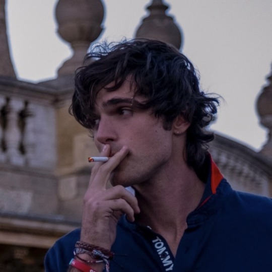
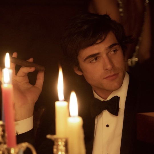
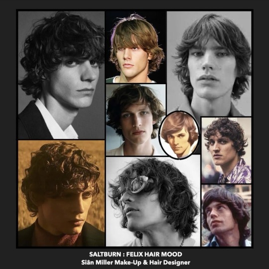
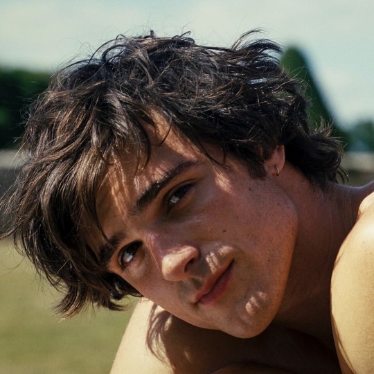
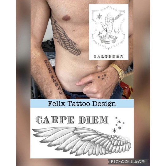
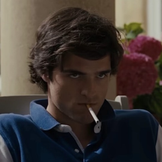
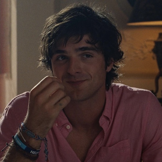
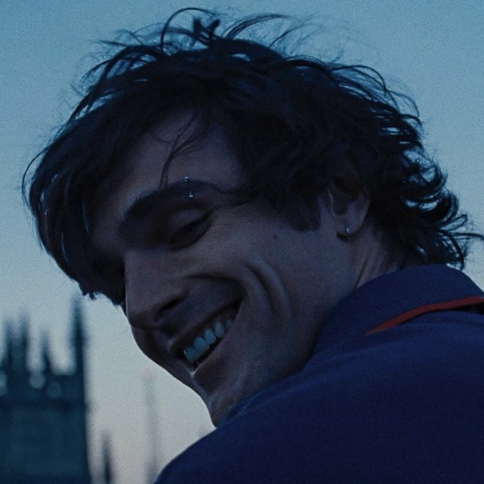
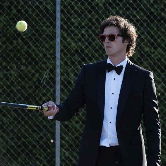
siantmiller: FELIX played by Jacob Elordi in Emerald Fennell's Saltburn
•
Earth shatteringly beautiful, wearing a moth eaten jumper, clean shaven, tattooed with the family crest star. An easy smile.
•
This was my starting point for hair and make-up design; Felix is a superstar on arrival - it's always been that way, handed to him on a plate- but he's not cool.
•
Felix needed to have undone, tousled hair; a just- rolled-out-of-bed-looking-gorgeous kind of vibe. Nothing contrived and certainly nothing that smacked of a haircut anytime recently.
•
Fortunately, Jacob had been growing his hair, and in my first fitting with him, I cut in a structure to support the shape I wanted to create, but without it looking like it had just been done in any way, with period accurate long sideburns. A few weeks ahead of filming, this provided us time for the shape to settle in.
•
Contriving the uncontrived in this job is often one of the trickiest of things to achieve, and daily preparation of this style with product and diffusion was required to create the tousled shape, whilst looking as if Jacob hadn't been anywhere near the hair and makeup trailer!
•
For the tattoo design, images were created in-house and processed for printing using ProCreate. We tested traditional tattoo colours, tones and sizes for the right look.
•
Emerald requested 'carpe diem' on Felix's inner arm, and for this I extracted the font from the family crest.
•
The single star from the family crest was tested with different configurations of multiple stars, finally settling on matching clusters seen on Felix and Venetia's hands.
•
The singular, torso positioned, angel wing, serves as a rather ironic mirror to later events.
•
The eyebrow piercing; two cut ends taken from a fake nose ring, were applied with Telesis.
•
Tattoo cover airbrushed on with MaqPro Creamy Air.
•
Makeup was super-natural looking for a clean, fresh and handsome look.
•
Hair cut by me
•
Hair & make-up perfectly styled and applied, during filming, by Nabeel Hussain and @simoneidalondon
222 notes
·
View notes